

A blue salmon color palette blends muted coral warmth with oceanic blues, creating a modern coastal balance that feels friendly, clean, and easy to read. It’s a reliable choice when you want contrast without harshness—especially for branding, UI, and print.
Below are 20+ ready-to-use blue salmon palette ideas with HEX codes, plus practical guidance for pairing, accessibility, and real-world applications.
In this article
- Why Blue Salmon Palettes Work So Well
-
- coastal blush bay
- coral tide minimal
- seashell denim
- harbor rose slate
- arctic salmon pop
- lagoon apricot balance
- powder blue petal
- sunset pier neutrals
- crisp coral blueprint
- muted salmon stonewash
- oceanfoam peachlight
- salmon ink serenity
- marina blush contrast
- dusk coral harbor
- blushwave poster night
- seabreeze clay calm
- frosted salmon quartz
- vintage salmon nautical
- coral mist ui soft
- bluefin salmon punch
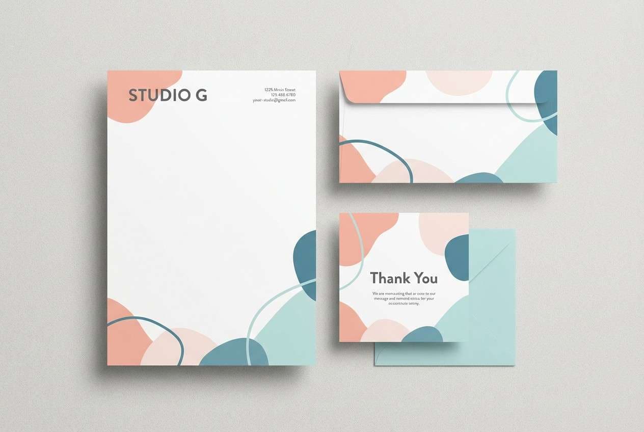
- pastel reef stationery
- salmon harbor botanical
- What Colors Go Well with Blue Salmon?
- How to Use a Blue Salmon Color Palette in Real Designs
- Create Blue Salmon Palette Visuals with AI
Why Blue Salmon Palettes Work So Well
Blue salmon palettes succeed because they balance temperature: salmon introduces human warmth and approachability, while blue adds trust, structure, and clarity. Together, they feel coastal and contemporary without drifting into overly “cute” pastel territory.
They also create usable contrast in real layouts. Deep slate or inky blues naturally support typography and UI chrome, while pale blush and light aqua tones provide spacious backgrounds for cards, sections, and print margins.
Finally, blue salmon color combinations are flexible across industries. By shifting saturation (muted vs. punchy) and choosing the right neutral (cream vs. charcoal), you can make the same warm-cool pairing feel premium, playful, or editorial.
20+ Blue Salmon Color Palette Ideas (with HEX Codes)
1) Coastal Blush Bay
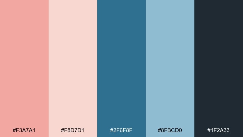
HEX: #f3a7a1 #f8d7d1 #2f6f8f #8fbcd0 #1f2a33
Mood: breezy, romantic, coastal
Best for: travel brochure cover
Breezy blush sand meets clean ocean air, like a quiet morning on the pier. These tones keep contrast crisp without feeling harsh, making headlines and photos pop. It is a blue salmon color palette that works best with lots of whitespace and airy typography. Tip: use the deep slate for text and the soft blush as a wide background wash to avoid a sugary look.
Image example of coastal blush bay generated using media.io
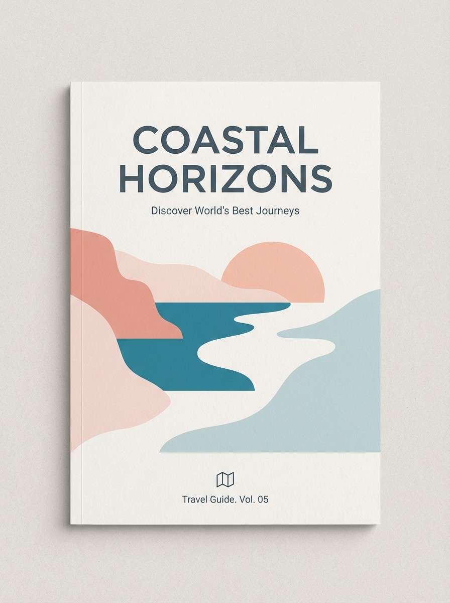
Media.io is an online AI studio for creating and editing video, image, and audio in your browser.

2) Coral Tide Minimal

HEX: #ffb0a6 #ffd9d4 #3b7ea1 #c7e2ee #2b3a42
Mood: clean, modern, calming
Best for: saas landing page UI
Clean coral warmth against cool marine blue feels modern, optimistic, and tidy. The lighter tints are ideal for sections and cards, while the darker blue anchors navigation and CTAs. Pair it with a geometric sans and subtle line icons to keep it crisp. Tip: reserve the coral for one primary action to maintain a premium, uncluttered hierarchy.
Image example of coral tide minimal generated using media.io

3) Seashell Denim
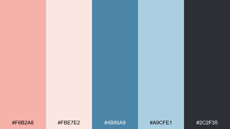
HEX: #f6b2a8 #fbe7e2 #4b86a8 #a9cfe1 #2c2f35
Mood: soft, friendly, approachable
Best for: cafe menu design
Soft seashell pink and denim blue create a welcoming, everyday comfort vibe. The palette reads friendly in print, especially for menus and small format layouts. Add cream paper texture or subtle grain to make the colors feel tactile. Tip: use denim blue for category headers and keep body copy in the near-black for readability under warm lighting.
Image example of seashell denim generated using media.io
4) Harbor Rose Slate
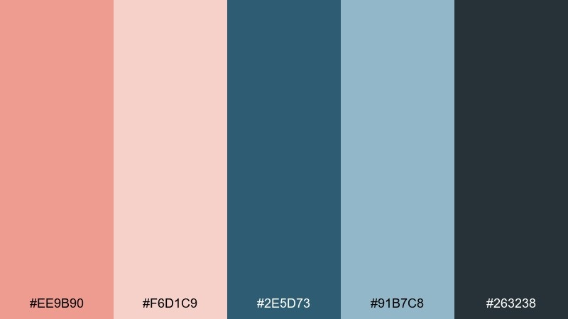
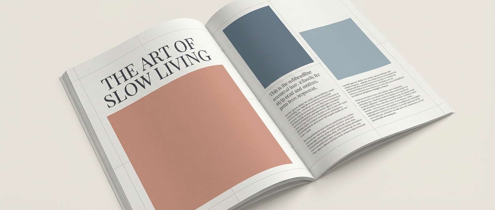
HEX: #ee9b90 #f6d1c9 #2e5d73 #91b7c8 #263238
Mood: moody, refined, understated
Best for: editorial magazine spread
Harbor mist and dusty rose bring a refined mood, like an overcast seafront with warm light in the windows. The slate blues keep it grounded, while the blush tones soften large photo blocks. It suits editorial layouts where you want elegance without high drama. Tip: treat the blush as a margin tint and let the darker blue carry pull quotes and rules.
Image example of harbor rose slate generated using media.io
5) Arctic Salmon Pop

HEX: #ff9e94 #ffe1db #1f7aa6 #9ad6ee #0f1c24
Mood: fresh, energetic, punchy
Best for: social media promo post
Icy aqua and bright salmon feel like a cold drink with a citrus twist. The contrast is strong enough for small screens, making it great for promotional graphics and fast-scrolling feeds. Keep shapes bold and type weight heavy to match the energy. Tip: use the darkest ink tone for all text and let the salmon drive the focal badge or price tag.
Image example of arctic salmon pop generated using media.io

6) Lagoon Apricot Balance
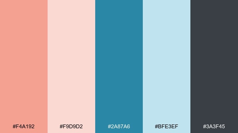
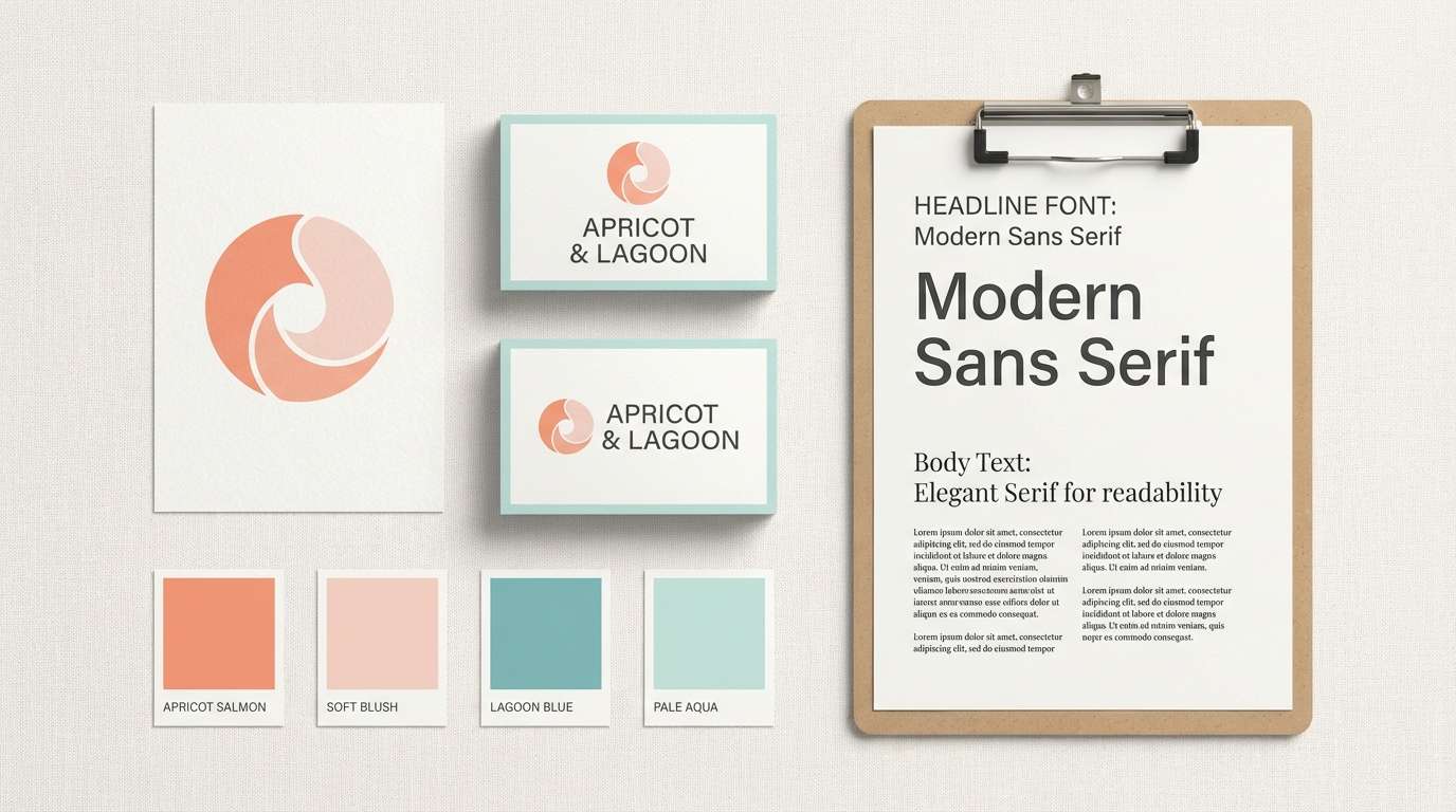
HEX: #f4a192 #f9d9d2 #2a87a6 #bfe3ef #3a3f45
Mood: balanced, optimistic, polished
Best for: brand identity kit
Optimistic apricot and lagoon blue balance warmth and clarity, like sunlight hitting shallow water. These blue salmon color combinations are reliable for brands that want friendly but professional visuals. Pair with a neutral gray system and simple iconography for consistency across touchpoints. Tip: define one hero accent (either lagoon or apricot) and keep the other as a supporting highlight to avoid competition.
Image example of lagoon apricot balance generated using media.io
7) Powder Blue Petal

HEX: #f7b3aa #fde9e5 #5a9bb7 #d2eef7 #23313a
Mood: gentle, airy, wholesome
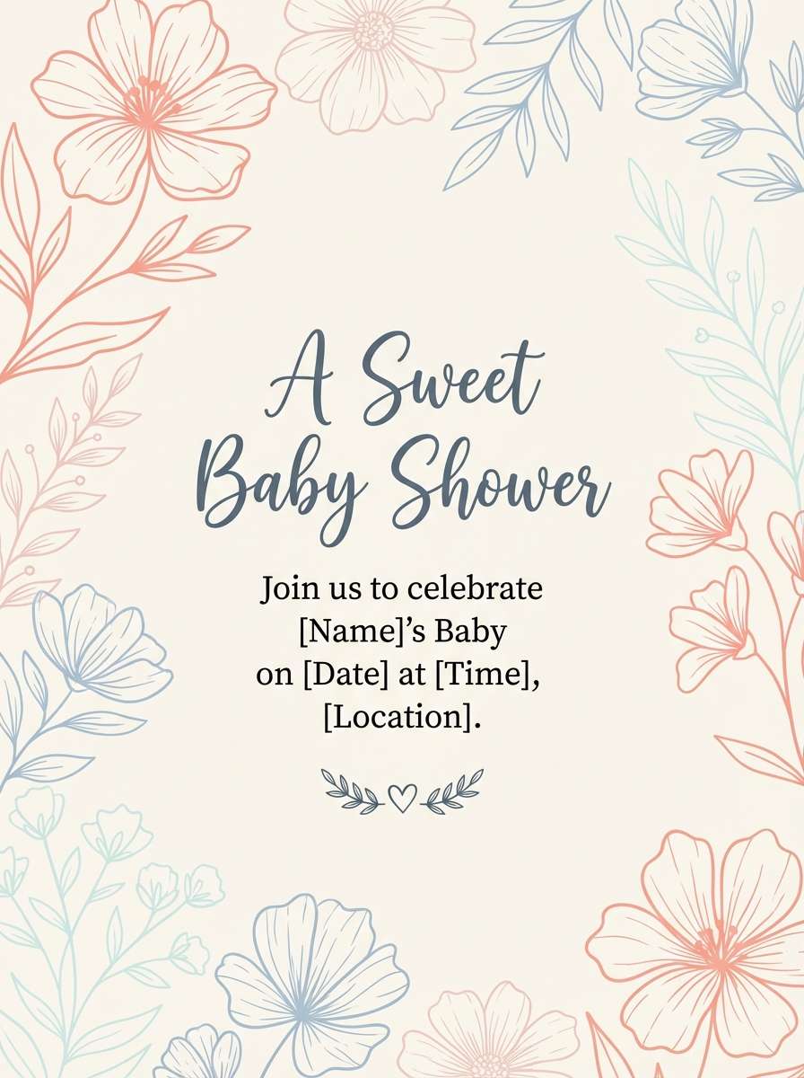
Best for: baby shower invitation
Powdery blues and petal pinks feel tender and celebratory, like soft ribbons and fresh blooms. The lightest shades give plenty of room for script fonts and delicate line art. Keep contrast readable by using the deep blue-gray for names and key details. Tip: add a thin border in the mid-blue to frame the invitation without making it feel heavy.
Image example of powder blue petal generated using media.io
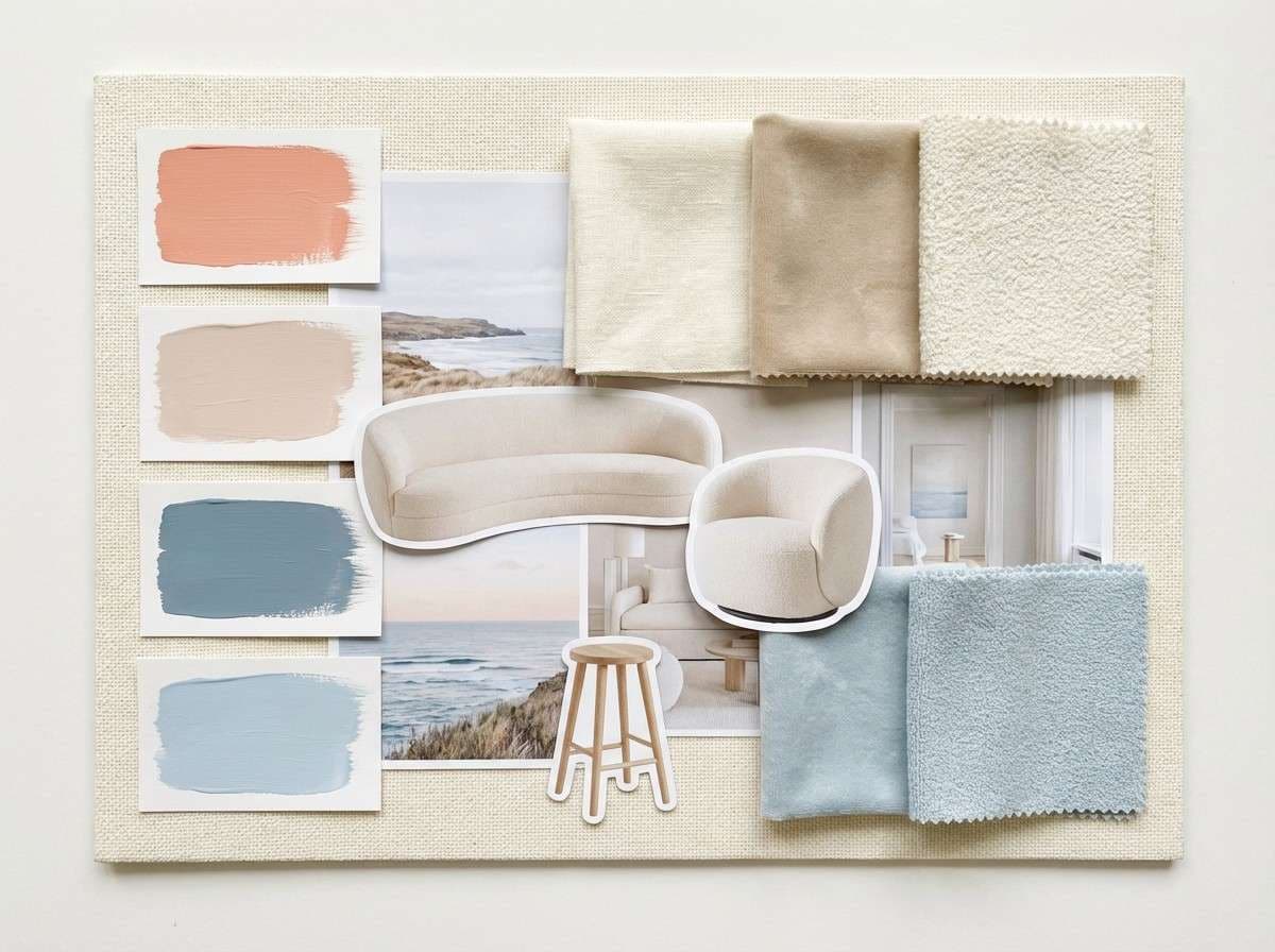
8) Sunset Pier Neutrals
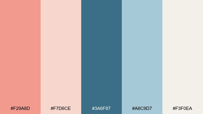
HEX: #f29a8d #f7d6ce #3a6f87 #a6c9d7 #f3f0ea
Mood: warm, nostalgic, relaxed
Best for: interior moodboard
Warm sunset salmon with muted pier blues feels nostalgic, like sun-faded boards and salty air. The creamy neutral softens everything and makes the colors more livable for interiors. Use the darker blue for hardware, textiles, or statement pieces while keeping walls and large surfaces light. Tip: repeat the cream tone in trims or rugs to tie warm and cool accents together.
Image example of sunset pier neutrals generated using media.io
9) Crisp Coral Blueprint
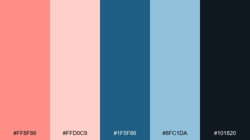
HEX: #ff8f86 #ffd0c9 #1f5f86 #8fc1da #101820
Mood: bold, structured, confident
Best for: dashboard UI
Crisp coral against blueprint blue feels focused and confident, like a clean plan brought to life. This blue salmon color combination holds up well in dense interfaces where you need clear states and hierarchy. Use blueprint for navigation and surfaces, then reserve coral for alerts, highlights, and primary actions. Tip: keep charts mostly in the blue range and use coral only for the key series you want users to notice first.
Image example of crisp coral blueprint generated using media.io
10) Muted Salmon Stonewash
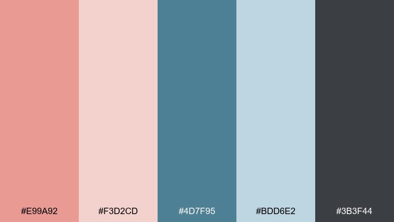
HEX: #e99a92 #f3d2cd #4d7f95 #bdd6e2 #3b3f44
Mood: casual, grounded, vintage
Best for: denim product ad
Muted salmon and stonewashed blue evoke worn-in comfort, like favorite jeans and a soft knit tee. The desaturated range feels authentic for lifestyle ads without looking too trendy. Add natural shadows and matte textures to keep the look believable. Tip: make the product the sharpest element and use the pale blue as the main background to avoid color cast on fabrics.
Image example of muted salmon stonewash generated using media.io

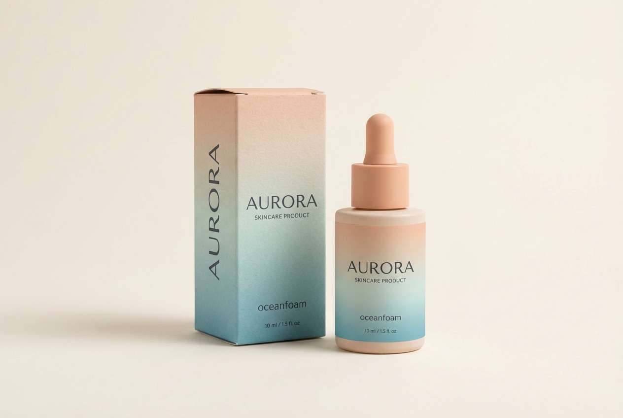
11) Oceanfoam Peachlight
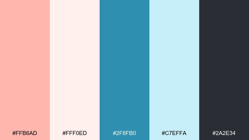
HEX: #ffb6ad #fff0ed #2f8fb0 #c7effa #2a2e34
Mood: sparkling, clean, uplifting
Best for: skincare packaging
Oceanfoam blue with peachy light feels fresh and clean, like a just-rinsed face and cool water. The palette suits minimalist skincare where clarity and trust matter. Use a lot of pale space and let the mid-blue carry brand blocks and ingredient callouts. Tip: print the darkest tone for small text to keep labels legible on curved bottles.
Image example of oceanfoam peachlight generated using media.io
12) Salmon Ink Serenity

HEX: #f2a39b #fadcd7 #265f7a #9fc7d8 #15222b
Mood: serene, thoughtful, elegant
Best for: book cover design
Serene salmon warmth with inky blue feels thoughtful, like a quiet story told in soft light. The deep ink tone gives you strong title contrast, while the blush keeps the cover approachable. Pair with a classic serif and restrained illustration for a literary look. Tip: keep the illustration in two tones and let the salmon act as a subtle gradient backdrop.
Image example of salmon ink serenity generated using media.io
13) Marina Blush Contrast

HEX: #ff9a8f #ffe2dd #3b7c99 #b4d7e5 #222b31
Mood: fresh, versatile, high-contrast
Best for: app onboarding screens
Fresh marina blues and blush coral create a clear, friendly first impression. It is a blue salmon color palette that makes onboarding feel helpful instead of clinical, especially with rounded cards and simple illustrations. Keep backgrounds light and move the stronger colors into buttons, progress bars, and key icons. Tip: use the darkest shade only for primary text and accessibility-critical UI elements.
Image example of marina blush contrast generated using media.io
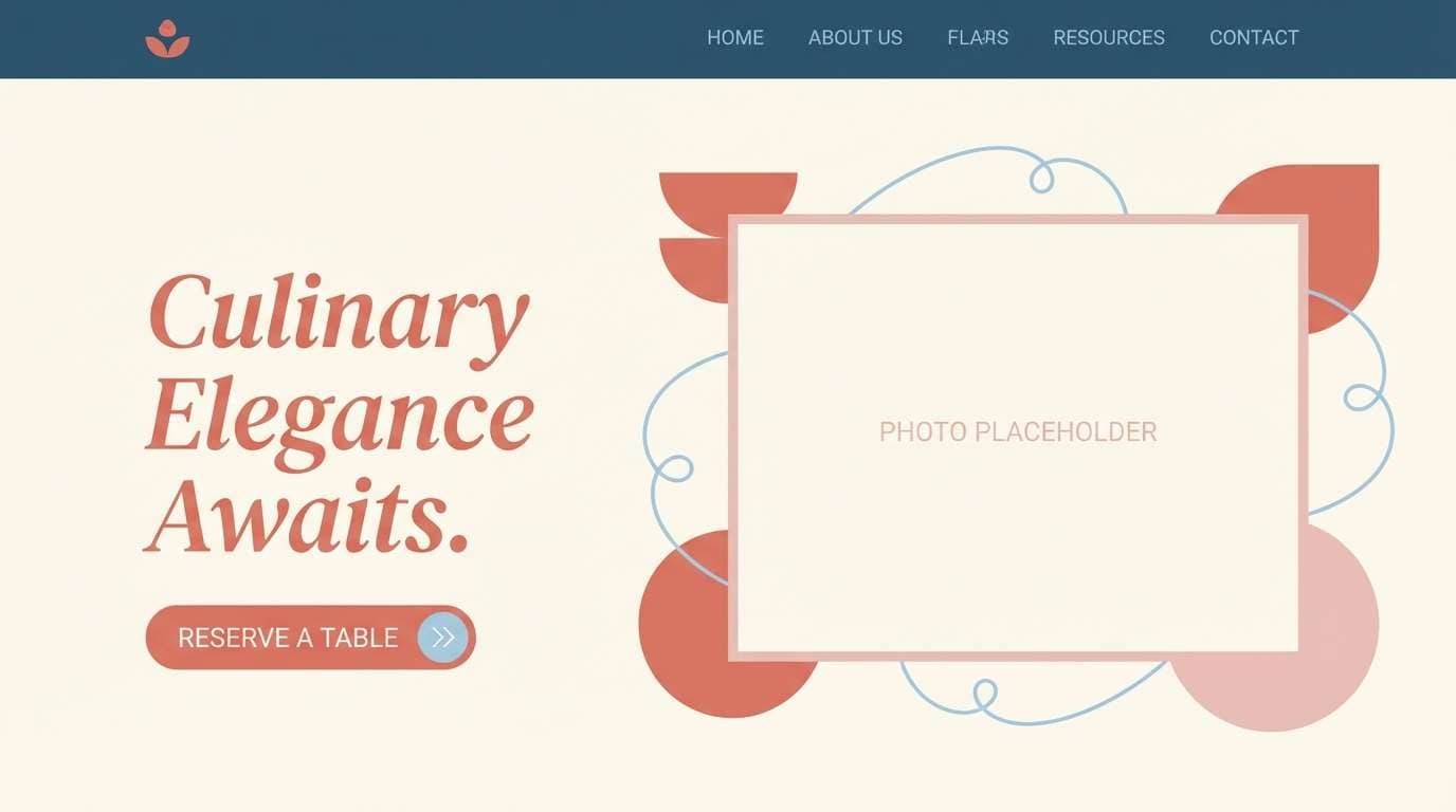
14) Dusk Coral Harbor
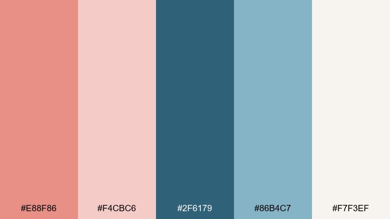
HEX: #e88f86 #f4cbc6 #2f6179 #86b4c7 #f7f3ef
Mood: soft, cinematic, mellow
Best for: restaurant website hero
Dusk coral and harbor blue feel cinematic, like dinner by the water as the sky cools. The creamy off-white keeps the palette from going too dark, which is ideal for food photography. Use harbor blue for navigation and overlays, and dusk coral for subtle highlights around calls to action. Tip: add a light gradient from cream to blush behind headings to separate text from photos.
Image example of dusk coral harbor generated using media.io
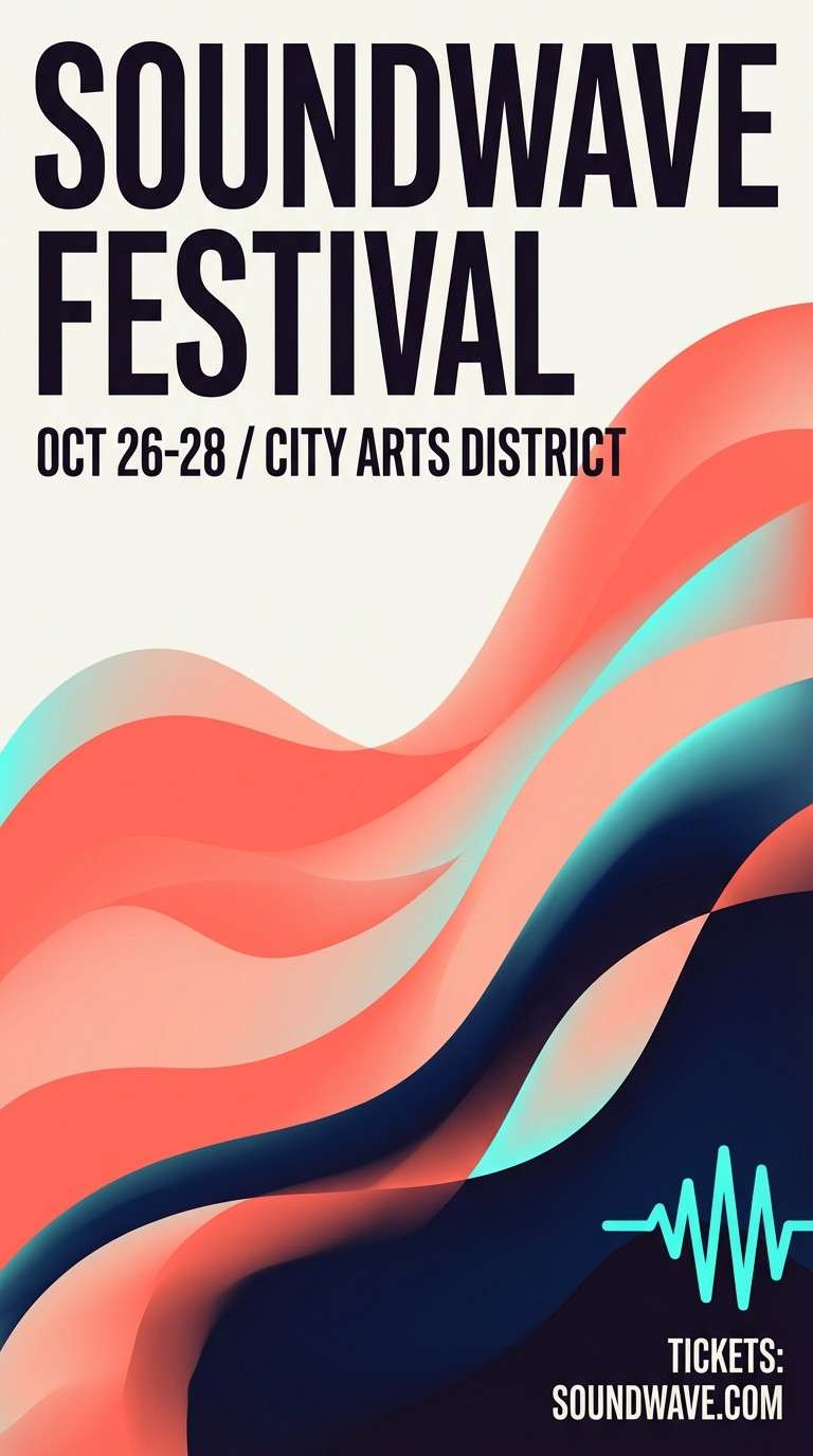
15) Blushwave Poster Night
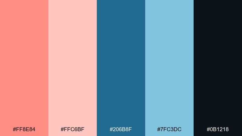
HEX: #ff8e84 #ffc6bf #206b8f #7fc3dc #0b1218
Mood: bold, artsy, nightlife
Best for: event poster design
Bold blushwave coral with deep night blue feels like neon reflections on wet pavement. The palette supports dramatic type and simple abstract shapes without needing extra colors. Keep the layout tight and let the coral lead the headline for maximum impact. Tip: use the light aqua only as a thin highlight line or small icon color so the poster stays punchy.
Image example of blushwave poster night generated using media.io
16) Seabreeze Clay Calm

HEX: #f1a69d #f7dfda #4b8aa5 #d6eef6 #334047
Mood: calm, natural, spa-like
Best for: wellness newsletter
Seabreeze blue and clay-salmon warmth feel calming and natural, like a slow exhale by the shore. The light tints are perfect for email sections, dividers, and soft callouts. Pair it with warm gray typography and simple botanical icons for a grounded tone. Tip: keep the salmon to one or two modules per email so the layout stays restful.
Image example of seabreeze clay calm generated using media.io

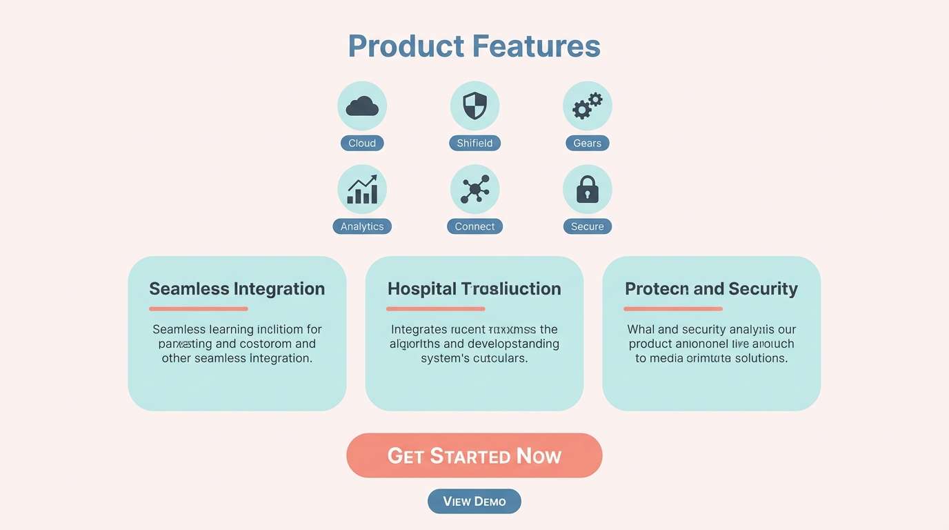
17) Frosted Salmon Quartz
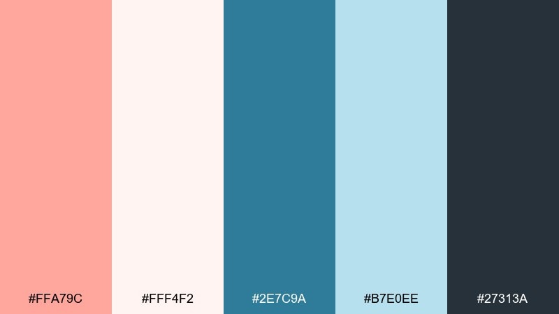
HEX: #ffa79c #fff4f2 #2e7c9a #b7e0ee #27313a
Mood: bright, clean, contemporary
Best for: tech product feature page
Frosted salmon and quartz-blue tones feel sleek and contemporary, like polished glass and clean UI surfaces. The high-key background makes it easy to layer illustrations, icons, and light shadows. Use the stronger blue for key modules and reserve salmon for one focal interaction. Tip: keep gradients subtle and prefer flat fills to maintain a sharp, tech-forward look.
Image example of frosted salmon quartz generated using media.io
18) Vintage Salmon Nautical
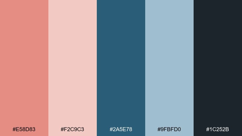
HEX: #e58d83 #f2c9c3 #2a5e78 #9fbfd0 #1c252b
Mood: classic, nautical, mature
Best for: wedding invitation suite
Vintage salmon with nautical blue reads classic and mature, like heirloom stationery with a seaside twist. The deeper blue gives formal structure for monograms and borders, while the warm tints soften the overall tone. Choose textured paper and letterpress-style typography for extra depth. Tip: limit embellishments to one border and one icon so the suite feels timeless rather than themed.
Image example of vintage salmon nautical generated using media.io

19) Coral Mist UI Soft
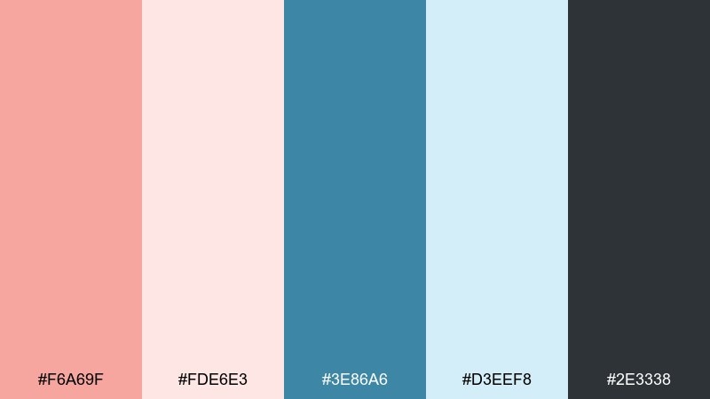
HEX: #f6a69f #fde6e3 #3e86a6 #d3eef8 #2e3338
Mood: soft, friendly, user-first
Best for: health app UI
Coral mist and gentle blue feel reassuring, like a supportive check-in rather than a warning. These blue salmon color combinations are great for health or habit apps where trust and calm matter. Use the pale aqua as the main canvas, with coral reserved for progress highlights and encouragement moments. Tip: keep error states in the deep charcoal and rely on icons plus text, not brighter reds.
Image example of coral mist ui soft generated using media.io

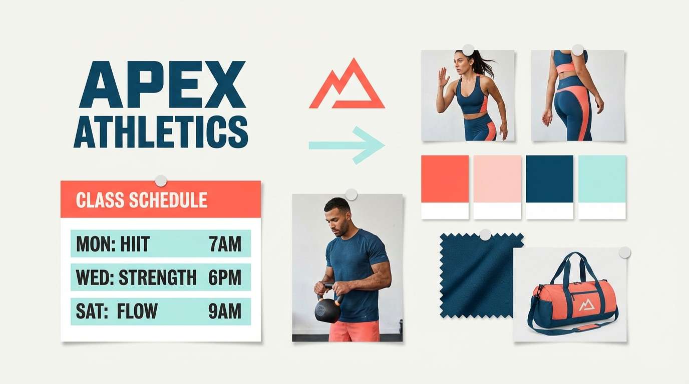
20) Bluefin Salmon Punch
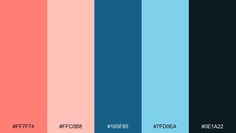
HEX: #ff7f74 #ffc0b8 #165f85 #7fd0ea #0e1a22
Mood: sporty, bold, high-energy
Best for: fitness studio branding
Sporty salmon punch with bluefin depth feels energetic and disciplined, like a training plan with personality. Use the darkest blue for strong wordmarks and the bright salmon for energetic accents and badges. The light aqua works well as a cool highlight for stats or class schedules. Tip: keep backgrounds mostly light and use the dark blue for large blocks so the bright salmon does not overwhelm.
Image example of bluefin salmon punch generated using media.io
21) Pastel Reef Stationery

HEX: #f7a8a0 #ffeceb #4f97b3 #cfeaf4 #3b444b
Mood: light, playful, polished
Best for: small business stationery
Pastel reef hues feel playful but polished, like neatly wrapped parcels and clean thank-you notes. The soft salmon warms up the page, while the airy blues keep it modern. It fits stationery sets, stickers, and packing slips without looking loud. Tip: print the mid-blue as a single-color pattern on envelopes and save salmon for the logo mark or stamp.
Image example of pastel reef stationery generated using media.io
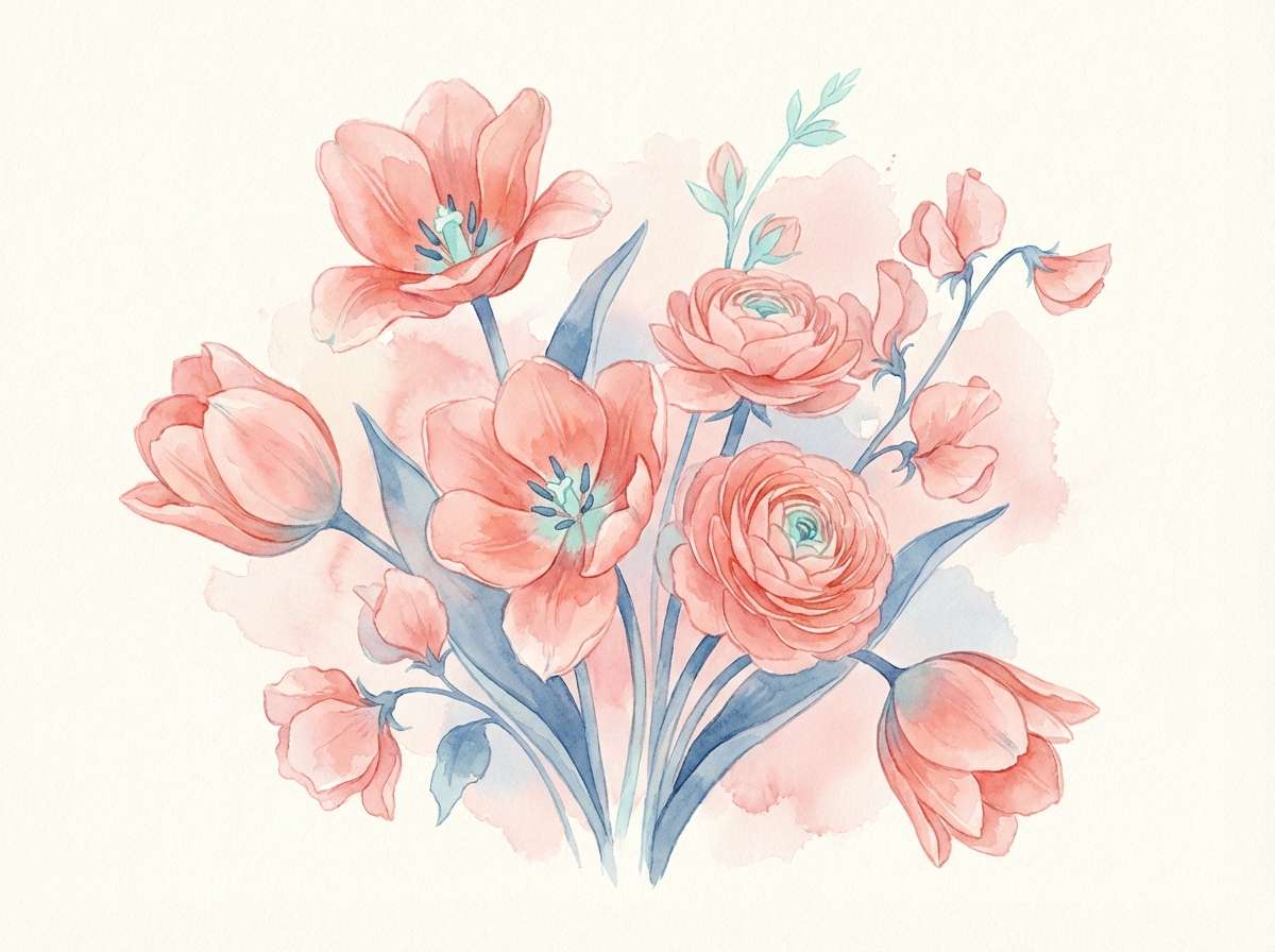
22) Salmon Harbor Botanical
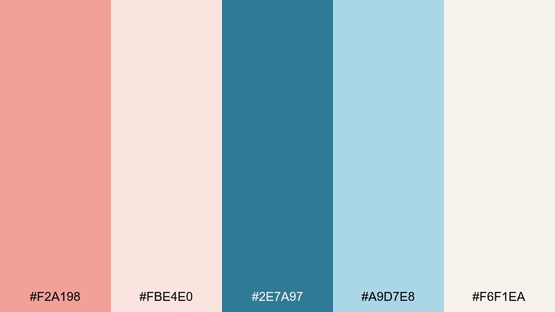
HEX: #f2a198 #fbe4e0 #2e7a97 #a9d7e8 #f6f1ea
Mood: botanical, fresh, delicate
Best for: watercolor spring illustration
Delicate salmon petals and harbor-blue shadows feel like spring blooms by the sea. The creamy neutral gives the watercolor room to breathe, keeping the scene soft and natural. Use the deeper blue to define stems and fine details, while blush tones wash across petals. Tip: limit hard edges and let colors blend slightly to maintain a gentle, hand-painted look.
Image example of salmon harbor botanical generated using media.io
What Colors Go Well with Blue Salmon?
Blue salmon pairs naturally with soft neutrals like warm cream, off-white, and light stone gray—these keep the look airy while letting salmon and blue do the expressive work. For typography, charcoal and deep slate usually outperform pure black, especially on blush backgrounds.
For a stronger, more modern edge, add cool steel blue, navy, or blueprint tones to anchor layouts and create clear UI states. If you want a gentler feel, lean into powder blue and pale aqua tints to soften transitions between sections.
As an accent strategy, treat salmon as the “attention” color and keep most supporting elements in the blue range. That approach helps your design stay calm and structured while still feeling warm and approachable.
How to Use a Blue Salmon Color Palette in Real Designs
In branding, use a deep blue or slate as the core identity color (logo, headers, packaging text), then apply blue salmon tones as secondary fills and seasonal accents. This keeps the system flexible across different backgrounds and photo styles.
In UI, assign roles: light blush/aqua for surfaces, mid blues for components, and salmon for primary actions or key highlights. Keep readable contrast by using the darkest tone for body text and accessibility-critical elements like form labels.
In print, watch for ink coverage and paper warmth. Creamy neutrals and muted salmon often look more premium on uncoated stock, while brighter corals can shift; test small swatches and keep fine text in deep slate or near-black.
Create Blue Salmon Palette Visuals with AI
If you already have HEX codes, the fastest way to validate a palette is to preview it in realistic contexts—landing pages, packaging, posters, invitations, and more. Generating quick mock visuals helps you spot balance issues (too much salmon, not enough contrast) before committing to production.
With Media.io, you can turn a palette idea into style-matched images using prompts—then iterate by adjusting mood words like “minimal,” “editorial,” “spa-like,” or “high-contrast.” This makes it easier to align your colors with typography, layout density, and brand tone.
Start with one of the prompts above, swap in your use case, and keep the ratio tag as-is to match the format you need.
Blue Salmon Color Palette FAQs
-
What is a “blue salmon” color palette?
A blue salmon palette combines salmon/coral-pink hues with blue tones (from powder blue to navy), usually supported by a neutral like cream or charcoal to keep the scheme readable and balanced. -
Is blue salmon good for branding?
Yes. The warm salmon adds friendliness and personality, while blue communicates trust and stability—making the combo work well for lifestyle brands, wellness, SaaS, hospitality, and modern retail. -
Which color should be the primary: blue or salmon?
For most systems, use blue (or deep slate) as the primary foundation and reserve salmon for accents like buttons, badges, or highlights. This keeps layouts calmer and prevents the warm tone from overpowering. -
What neutrals work best with blue salmon palettes?
Warm off-white, cream, light beige, and charcoal are the safest choices. They reduce color clash and help you control contrast in both digital UI and print. -
How do I keep text readable on blush or salmon backgrounds?
Use a deep slate/ink tone for text (instead of pure black) and keep salmon backgrounds lighter/tinted rather than fully saturated. For small text, avoid mid-tone blues on pink because contrast can drop quickly. -
Are blue salmon palettes suitable for dashboards and data-heavy UI?
They can be, especially when you anchor the interface with a blueprint/ink base and use salmon sparingly for priority states (primary CTA, key series, alerts). Keep most charts in the blue family for consistency. -
How can I generate blue salmon palette mockups quickly?
Use Media.io text-to-image prompts (like the examples above) to create brochure covers, UI screens, posters, and packaging shots—then iterate by changing mood keywords and keeping your HEX palette consistent.


