

Bright green combinations are built to get noticed. Whether you’re designing a logo, UI, or packaging, this high-energy green can instantly signal freshness, speed, and modernity.
Below are 20 curated bright green color palette ideas with HEX codes, plus practical pairing tips and AI prompts you can use to generate matching visuals fast.
In this article
- Why Bright Green Palettes Work So Well
-
- neon meadow
- lime and clay
- sport field pop
- botanical glasshouse
- fresh mint retail
- citrus splash
- green tech minimal
- herb and stone
- verdant ui night
- matcha cream
- electric garden party
- leafy denim
- green and graphite
- skatepark lime
- orchard sunrise
- alpine fresh air
- candy lime soda
- urban park signage
- neon fern poster
- tropical lime watercolor
- What Colors Go Well with Bright Green?
- How to Use a Bright Green Color Palette in Real Designs
- Create Bright Green Palette Visuals with AI
Why Bright Green Palettes Work So Well
Bright green sits in a sweet spot between “natural” and “electric.” It can reference plants and sustainability, but it also reads as digital, sporty, and high-performance when paired with dark neutrals.
Because it’s visually loud, bright green creates instant hierarchy. A small amount can guide attention to CTAs, active states, sale tags, or key information without needing extra decoration.
It also plays nicely with contrast: charcoal, navy, and off-white make it easier to keep typography readable while still letting the green feel bold and modern.
20+ Bright Green Color Palette Ideas (with HEX Codes)
1) Neon Meadow
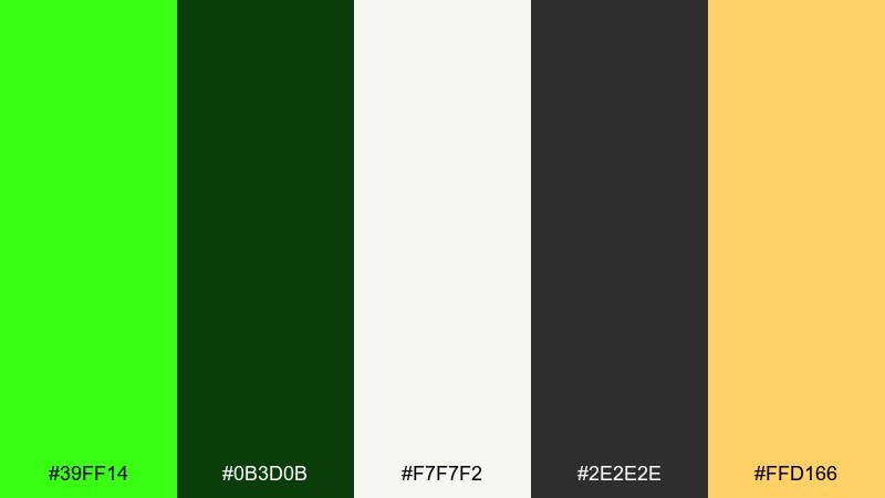
HEX: #39FF14 #0B3D0B #F7F7F2 #2E2E2E #FFD166
Mood: electric, outdoorsy, upbeat
Best for: festival poster design
Electric grass tones and late-summer sunlight make this mix feel loud, fresh, and a little wild. One of the easiest bright green color combinations to modernize is pairing neon with charcoal and an off-white base for readability. Use the yellow as a spotlight color for headlines or key dates, and keep the dark green for grounding blocks. Tip: reserve the neon for 10 to 20 percent of the layout so it stays punchy.
Image example of neon meadow generated using media.io

Media.io is an online AI studio for creating and editing video, image, and audio in your browser.

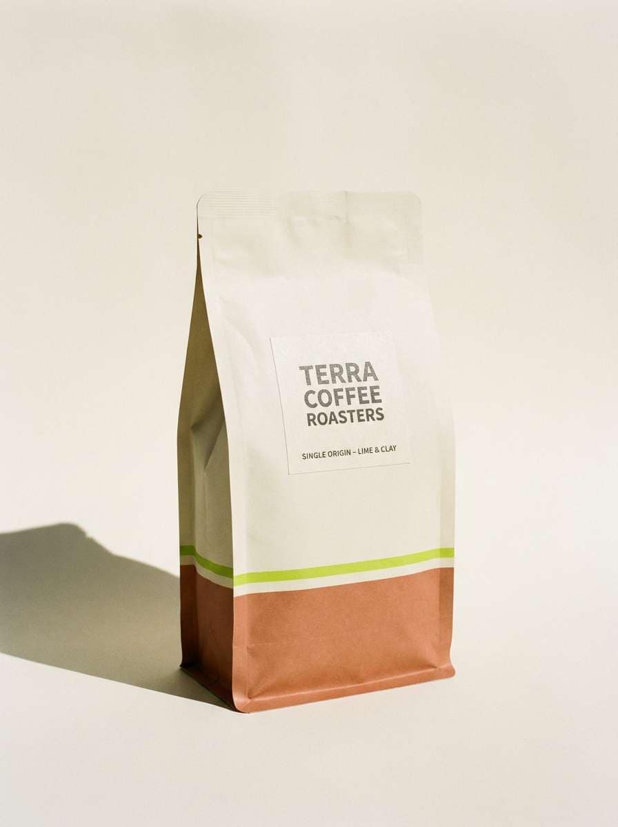
2) Lime and Clay
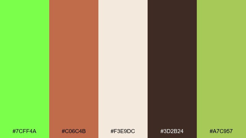
HEX: #7CFF4A #C06C4B #F3E9DC #3D2B24 #A7C957
Mood: earthy, modern, welcoming
Best for: coffee packaging and labels
Lime brightness over warm clay and cream reads like a sunlit cafe with natural materials. The tan and espresso tones keep the green from feeling too sporty, making it great for premium labels. Pair it with simple serif type and plenty of cream space to let the accent colors breathe. Tip: use the clay shade for seal stamps or flavor bands to create quick shelf differentiation.
Image example of lime and clay generated using media.io
3) Sport Field Pop
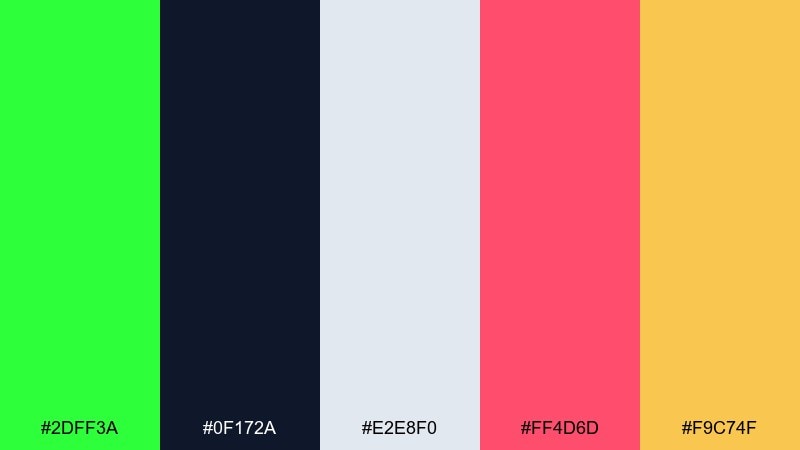
HEX: #2DFF3A #0F172A #E2E8F0 #FF4D6D #F9C74F
Mood: energetic, competitive, bold
Best for: sports event flyer
High-voltage green against deep navy feels like stadium lights and fast plays. Pink and amber add a playful edge without sacrificing contrast for quick scanning. Use navy for type blocks, keep the light gray for breathing room, and let green carry the primary calls to action. Tip: limit the pink to small badges so it reads as a highlight, not a second hero color.
Image example of sport field pop generated using media.io

4) Botanical Glasshouse
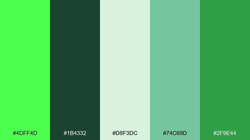
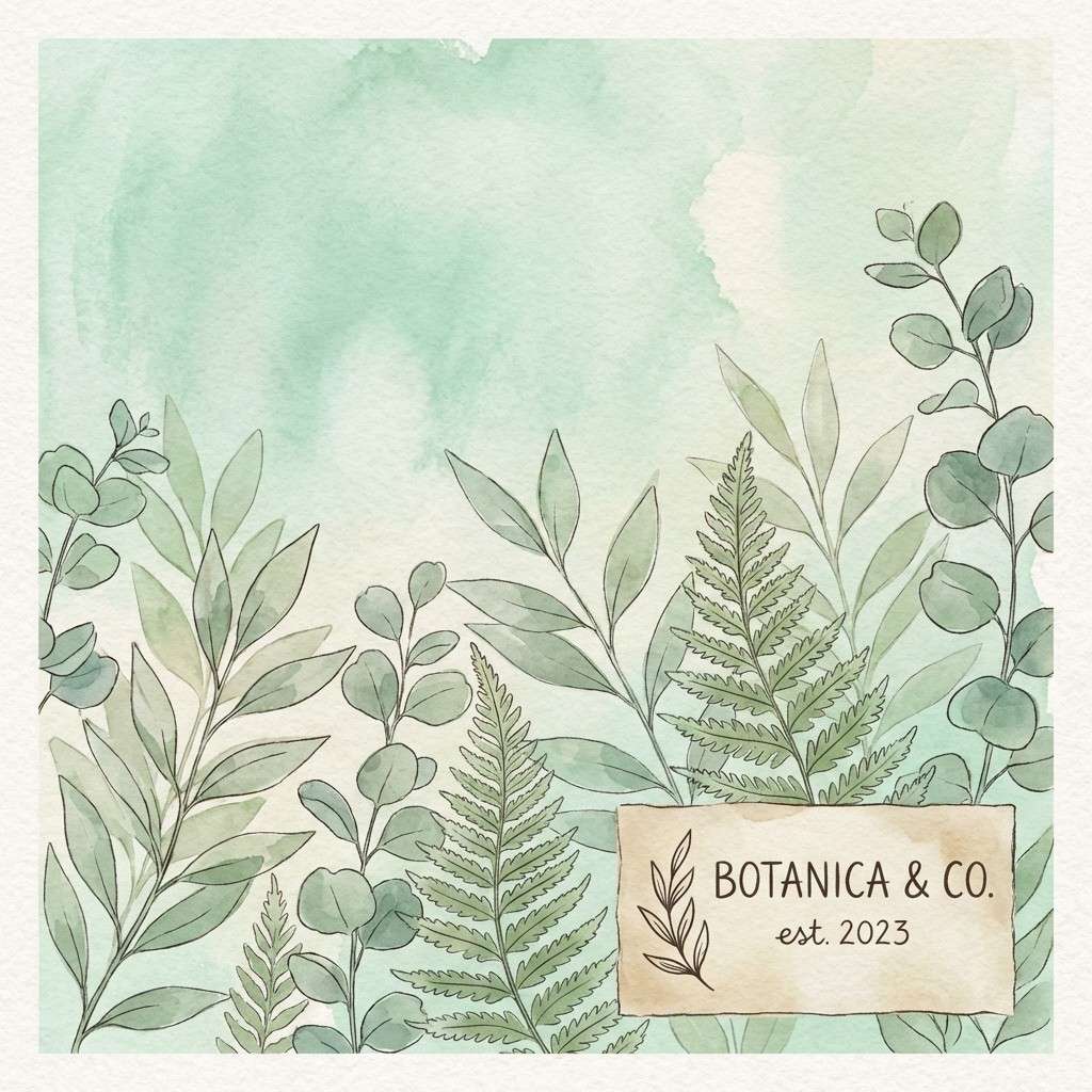
HEX: #4DFF4D #1B4332 #D8F3DC #74C69D #2F9E44
Mood: lush, calm, garden-fresh
Best for: plant shop brand illustration
Layered greens and soft mint washes evoke leaves pressed against greenhouse glass. The pale backdrop keeps the deeper forest shade from feeling heavy, especially in illustrations and icons. Pair this bright green color scheme with thin linework and subtle gradients to suggest depth without clutter. Tip: use the darkest green only for outlines and key labels to maintain an airy feel.
Image example of botanical glasshouse generated using media.io
5) Fresh Mint Retail
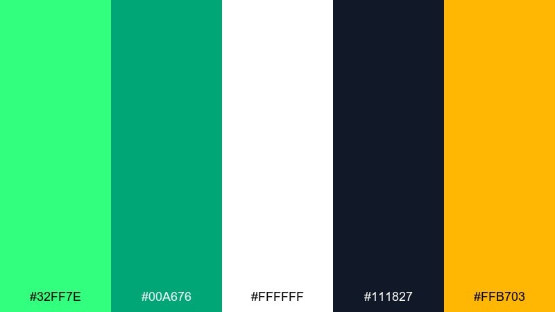
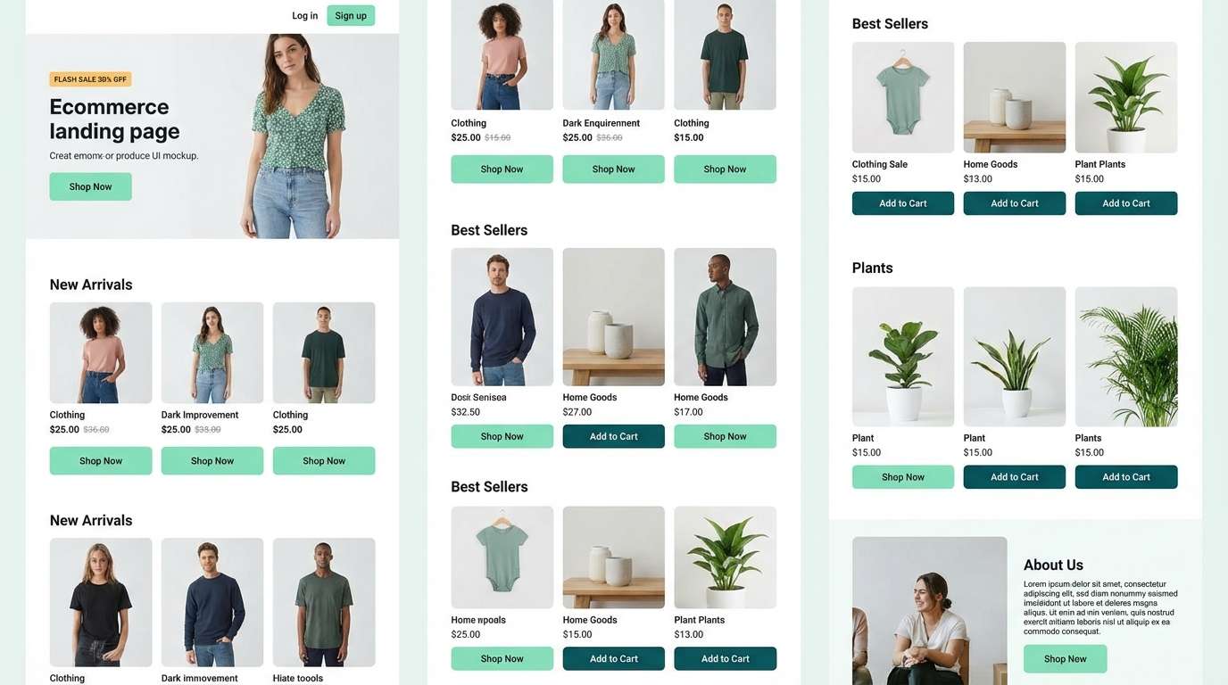
HEX: #32FF7E #00A676 #FFFFFF #111827 #FFB703
Mood: clean, friendly, high-contrast
Best for: ecommerce landing page UI
Crisp mint and deep teal feel like a just-opened bottle of sparkling water. For a bright green color palette that still reads professional, the near-black text and white base do most of the heavy lifting. Use the amber as a checkout or promo highlight, and keep teal for secondary buttons. Tip: apply the mint as a soft section background at low opacity to avoid glare.
Image example of fresh mint retail generated using media.io
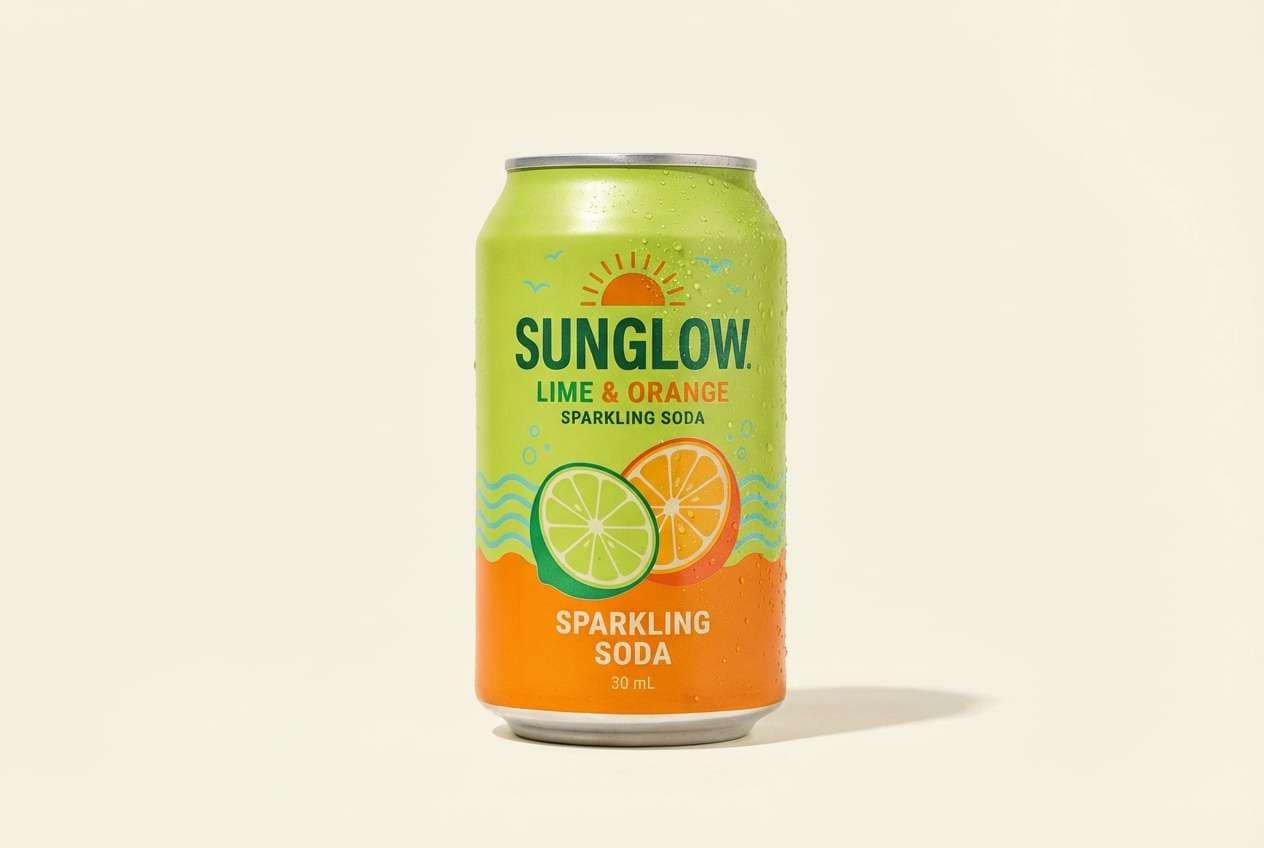
6) Citrus Splash
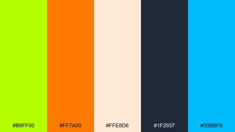
HEX: #B6FF00 #FF7A00 #FFE8D6 #1F2937 #00BBF9
Mood: playful, sunny, sporty
Best for: summer drink product ad
Zesty lime with orange and a clean aqua hit feels like a fizzy summer cooler. The dark slate adds structure so the warm hues do not overwhelm headlines and pricing. Use cream as the main background, then bring lime forward for the hero flavor cue. Tip: keep aqua limited to small spark elements so it reads as refreshment, not a competing theme.
Image example of citrus splash generated using media.io
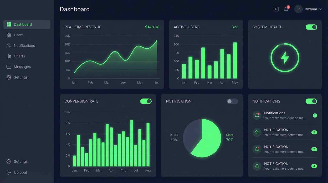
7) Green Tech Minimal
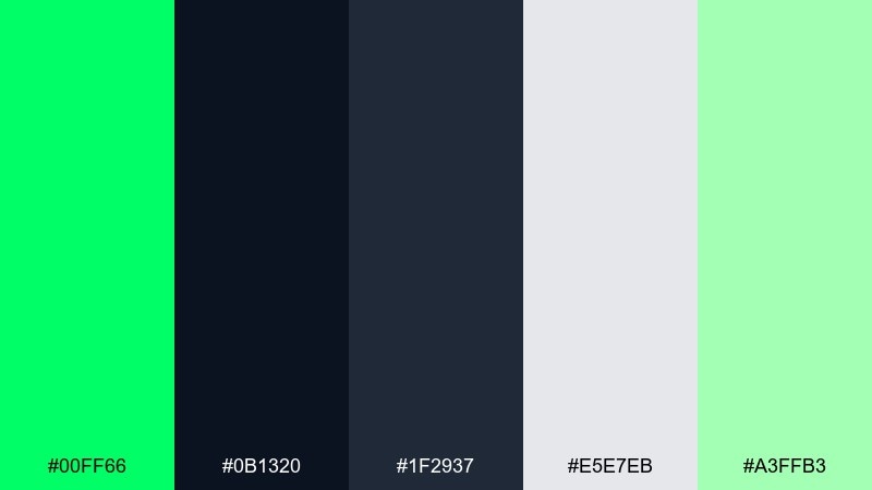
HEX: #00FF66 #0B1320 #1F2937 #E5E7EB #A3FFB3
Mood: sleek, futuristic, focused
Best for: SaaS dashboard UI
A neon-green pulse against near-black panels gives a data-driven, high-performance vibe. The pale gray and soft mint keep the interface readable while still feeling modern. Use the neon for status indicators and success states, and rely on the darker grays for navigation and charts. Tip: reserve pure neon for small UI moments to avoid eye fatigue.
Image example of green tech minimal generated using media.io
8) Herb and Stone
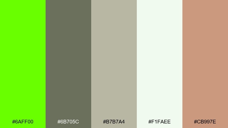
HEX: #6AFF00 #6B705C #B7B7A4 #F1FAEE #CB997E
Mood: calm, grounded, organic
Best for: wellness blog header
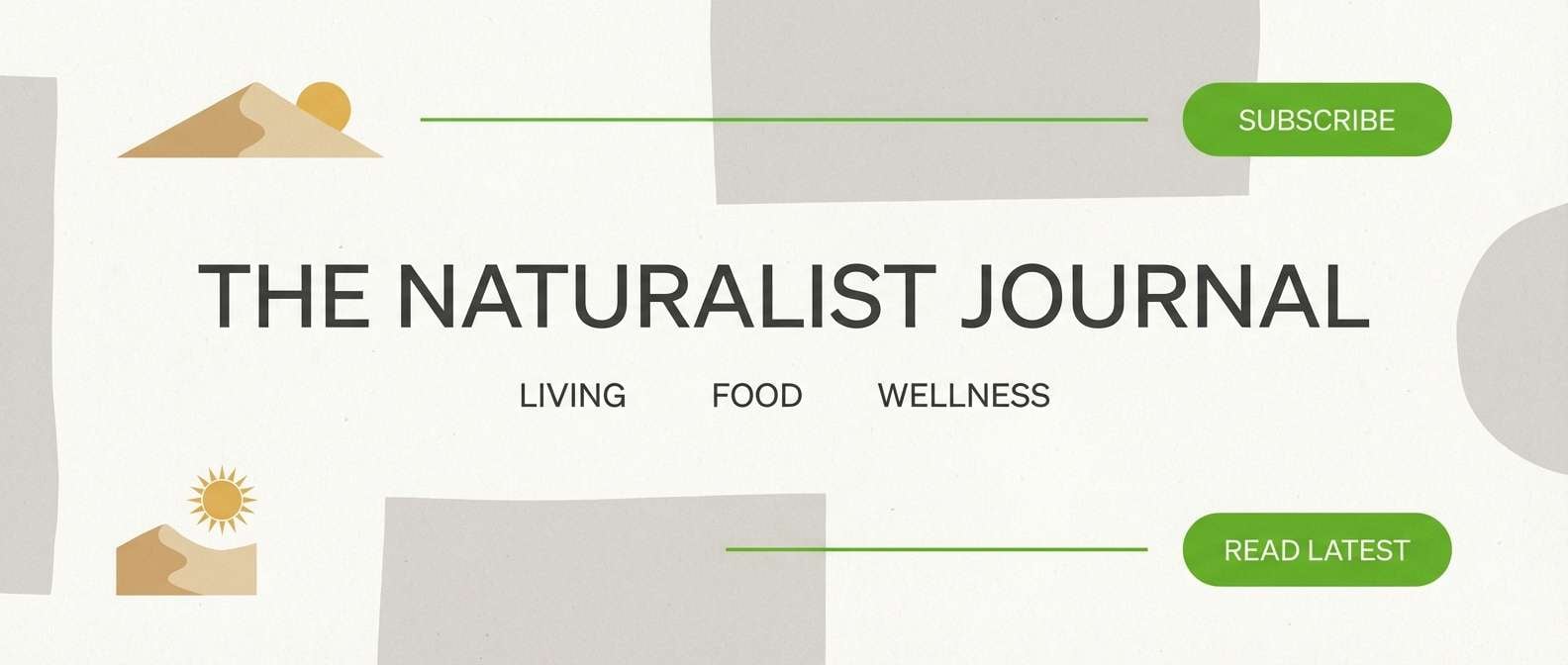
Bright herb green paired with stone neutrals feels like a hike trail opening into sun. The muted grays and warm sand soften the energy, making it ideal for long-read layouts. Use the off-white for generous margins and let green highlight categories or section dividers. Tip: keep the warm sand for small icon fills to add friendliness without clutter.
Image example of herb and stone generated using media.io
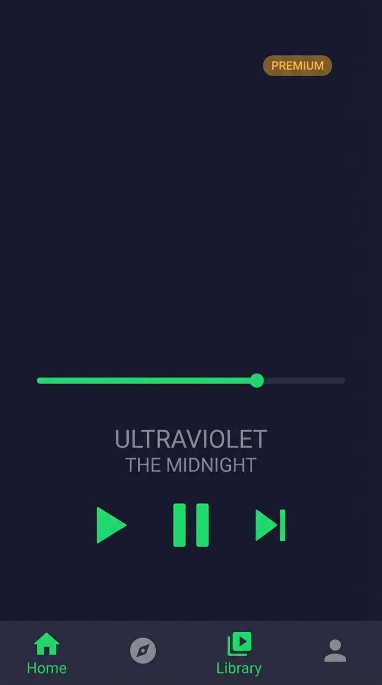
9) Verdant UI Night
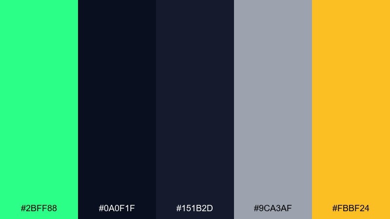
HEX: #2BFF88 #0A0F1F #151B2D #9CA3AF #FBBF24
Mood: nightlife, sharp, premium
Best for: music app UI
Night-sky navies with a vivid green glow feel like neon signage outside a club. This bright green color scheme works best when the glow color is used for active states, progress bars, and micro-interactions. Add the amber sparingly for premium badges or featured playlists so it reads as a reward. Tip: keep body text in soft gray to reduce glare on dark screens.
Image example of verdant ui night generated using media.io
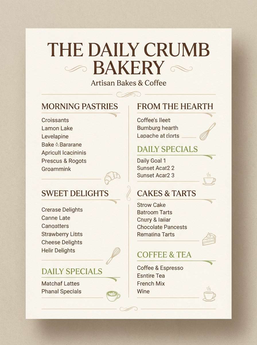
10) Matcha Cream
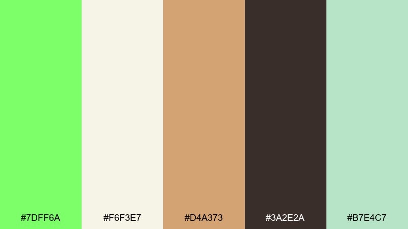
HEX: #7DFF6A #F6F3E7 #D4A373 #3A2E2A #B7E4C7
Mood: soft, cozy, boutique
Best for: bakery menu design
Matcha green with cream and cocoa browns feels like a quiet afternoon treat. The palette stays bright without turning harsh, thanks to the warm tan and gentle mint. Use cream as the menu base, set headings in cocoa, and add green for category tags or prices. Tip: keep green away from long text blocks and use it instead for small highlights and rules.
Image example of matcha cream generated using media.io
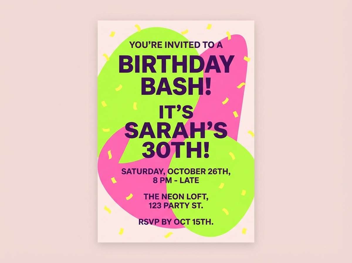
11) Electric Garden Party
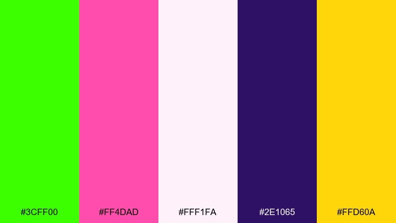
HEX: #3CFF00 #FF4DAD #FFF1FA #2E1065 #FFD60A
Mood: party, playful, bold
Best for: birthday invitation
Hot pink, neon green, and lemon yellow feel like confetti under blacklight. The pale blush background keeps the brights usable for print, while the deep purple adds contrast for readable type. Pair big type with simple shapes and avoid tiny thin fonts in neon areas. Tip: use purple for names and details so the bright accents can stay decorative.
Image example of electric garden party generated using media.io
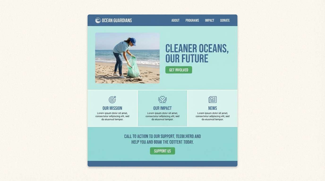
12) Leafy Denim
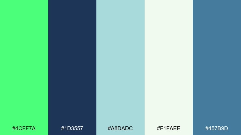
HEX: #4CFF7A #1D3557 #A8DADC #F1FAEE #457B9D
Mood: fresh, coastal, trustworthy
Best for: eco nonprofit website UI
Denim blues with a crisp green accent feel reliable, clean, and outdoors-forward. The soft aqua and off-white keep it friendly for content-heavy pages. Use the green for primary buttons and success states, while denim anchors navigation and headings. Tip: keep charts mostly blue-toned and use green only to call out impact highlights.
Image example of leafy denim generated using media.io
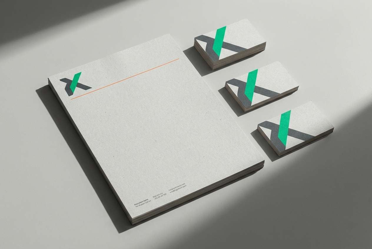
13) Green and Graphite
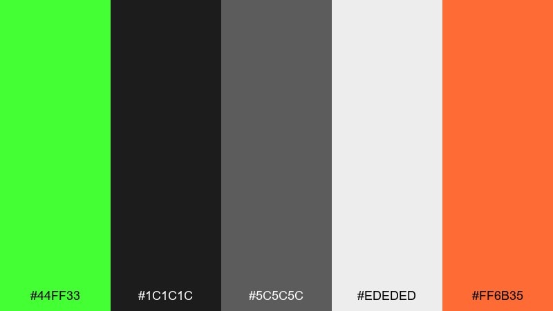
HEX: #44FF33 #1C1C1C #5C5C5C #EDEDED #FF6B35
Mood: industrial, modern, punchy
Best for: construction brand logo and stationery
Graphite neutrals make the vivid green feel sharp and engineered. The orange adds a safety-gear kick that works well for marks, badges, and callouts. Use gray gradients sparingly and lean on flat fills for a tougher, more confident look. Tip: test the green on both light and dark backgrounds to lock in a consistent brand lockup.
Image example of green and graphite generated using media.io
14) Skatepark Lime
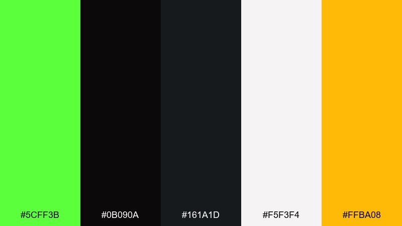
HEX: #5CFF3B #0B090A #161A1D #F5F3F4 #FFBA08
Mood: street, bold, high-contrast
Best for: streetwear product drop poster
Sharp lime on inky blacks feels like night skating under bright lamps. These bright green color combinations work best with lots of negative space and a single loud highlight color, like the warm amber here. Use black for the core typography, then reserve lime for the hero wordmark or drop date. Tip: add the off-white as a buffer behind small text so it stays legible from a distance.
Image example of skatepark lime generated using media.io

15) Orchard Sunrise
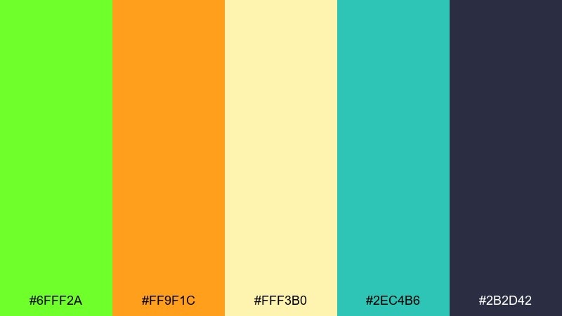
HEX: #6FFF2A #FF9F1C #FFF3B0 #2EC4B6 #2B2D42
Mood: optimistic, sunny, lively
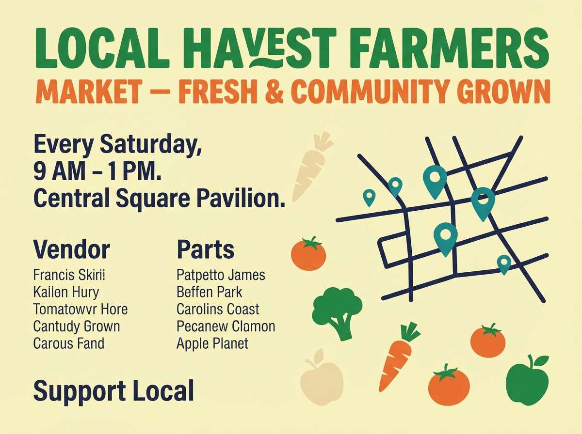
Best for: farmers market flyer
Sunrise orange and orchard green feel cheerful, local, and full of flavor. The pale butter tone keeps the warm hues from becoming too intense, while the deep ink adds needed contrast. Pair big produce photography blocks with simple labels in the dark navy for clarity. Tip: use teal for map pins or vendor highlights so it reads as helpful, not decorative noise.
Image example of orchard sunrise generated using media.io
16) Alpine Fresh Air
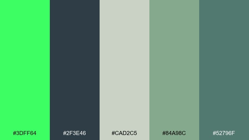
HEX: #3DFF64 #2F3E46 #CAD2C5 #84A98C #52796F
Mood: crisp, natural, calming
Best for: outdoor gear catalog spread
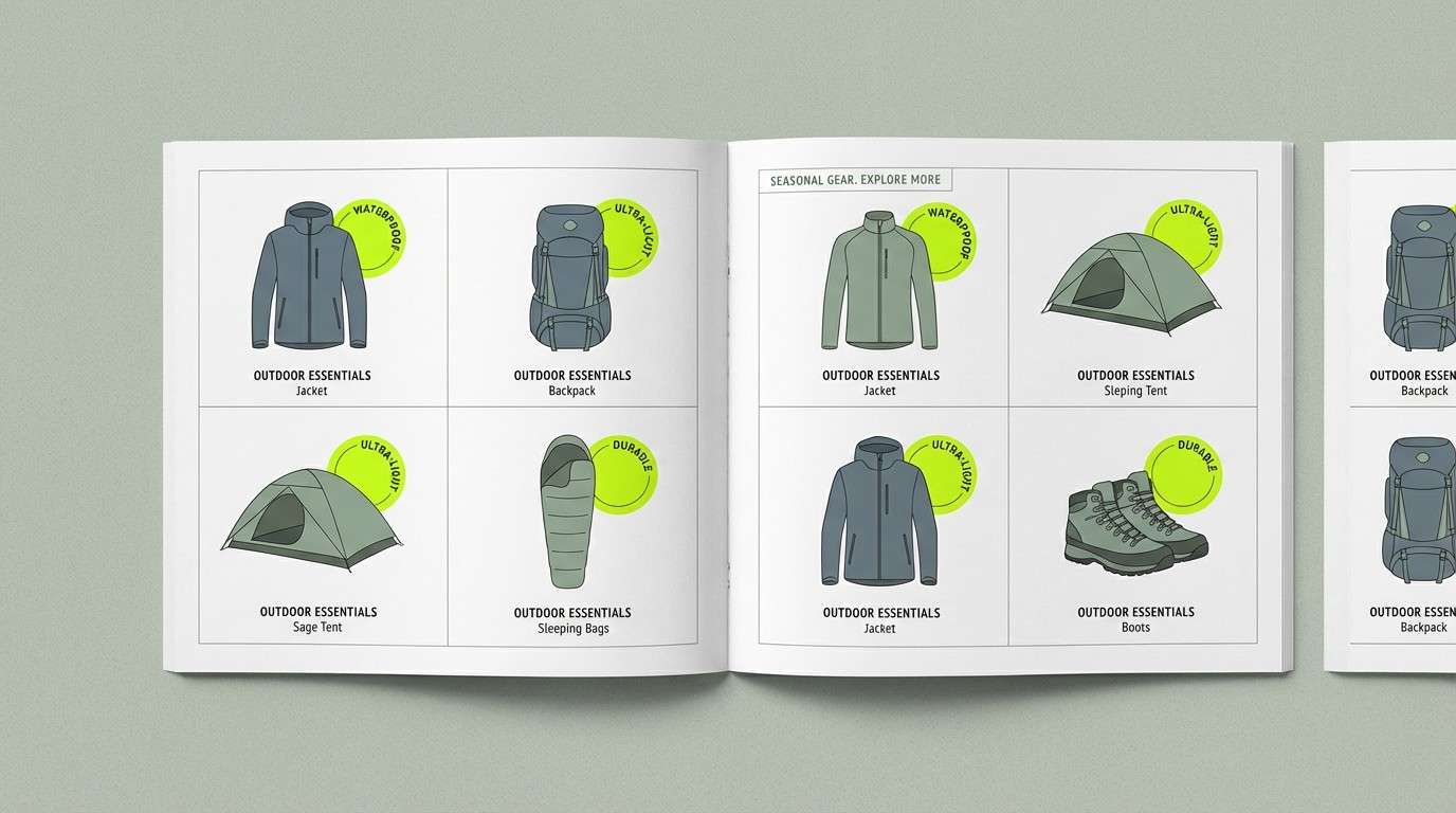
Crisp green with cool slate and sage feels like mountain air and technical fabric. The soft gray-green base makes it easy to set long descriptions and specs without visual fatigue. Use the bright green for feature callouts and icons, and keep slate for body copy. Tip: choose matte textures and thin rules so the palette stays premium, not sporty-loud.
Image example of alpine fresh air generated using media.io
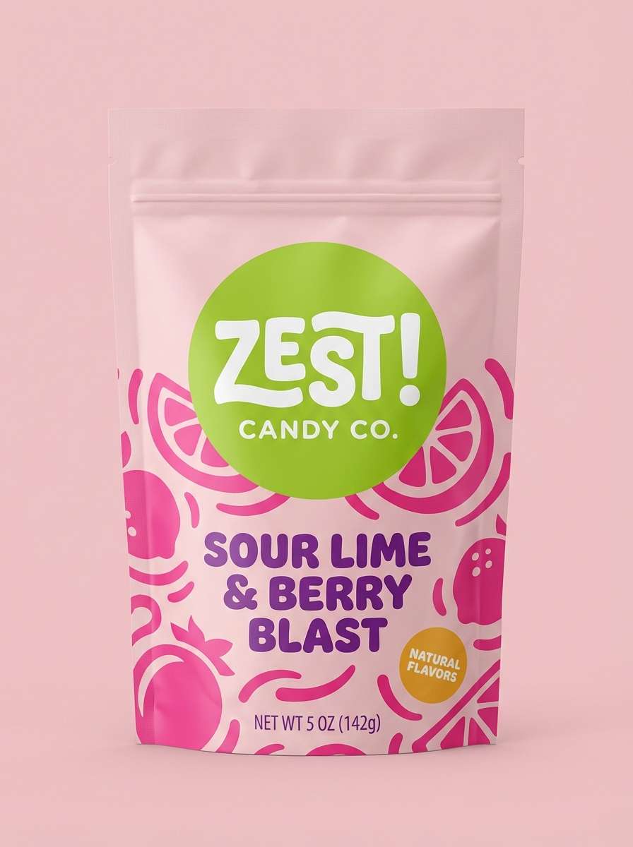
17) Candy Lime Soda
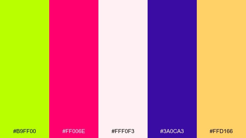
HEX: #B9FF00 #FF006E #FFF0F3 #3A0CA3 #FFD166
Mood: sweet, pop, youthful
Best for: candy packaging design
High-sugar lime with hot pink feels like soda fizz and chewy candy. The blush background softens the intensity, while purple gives you a strong type color that still feels playful. Use lime for the flavor name and keep pink for patterning or stripes. Tip: print-test the lime on different stocks, since neon yellow-green can shift dramatically on matte paper.
Image example of candy lime soda generated using media.io
18) Urban Park Signage
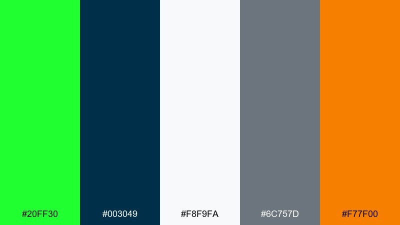
HEX: #20FF30 #003049 #F8F9FA #6C757D #F77F00
Mood: public, clear, energetic
Best for: wayfinding signage system
A vivid green marker against civic navy and cool grays feels practical and easy to navigate. The orange adds a caution note that is perfect for alerts, closures, or priority routes. Use white as the primary field color for maximum legibility and accessibility. Tip: keep icon sets single-color navy to reduce visual noise across multiple sign types.
Image example of urban park signage generated using media.io
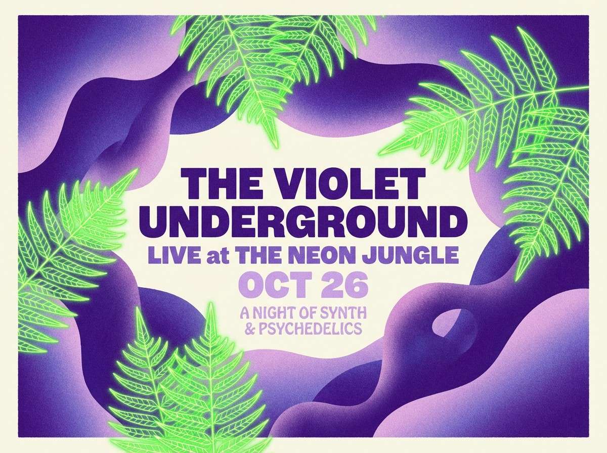
19) Neon Fern Poster
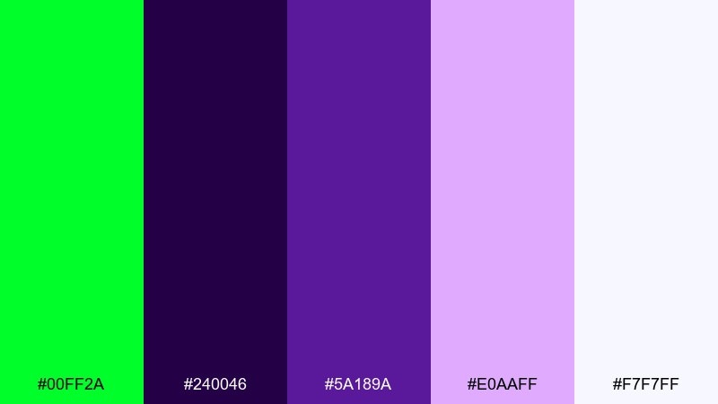
HEX: #00FF2A #240046 #5A189A #E0AAFF #F7F7FF
Mood: retro-futurist, artsy, luminous
Best for: concert poster illustration
Glowing fern green against violet gradients feels like synthwave lights in a dark room. Lavender and near-white keep the purple spectrum readable for names, venues, and ticket info. Use the neon green only for the focal illustration element or the band name for maximum impact. Tip: add subtle grain to the purples so the neon looks even brighter by contrast.
Image example of neon fern poster generated using media.io
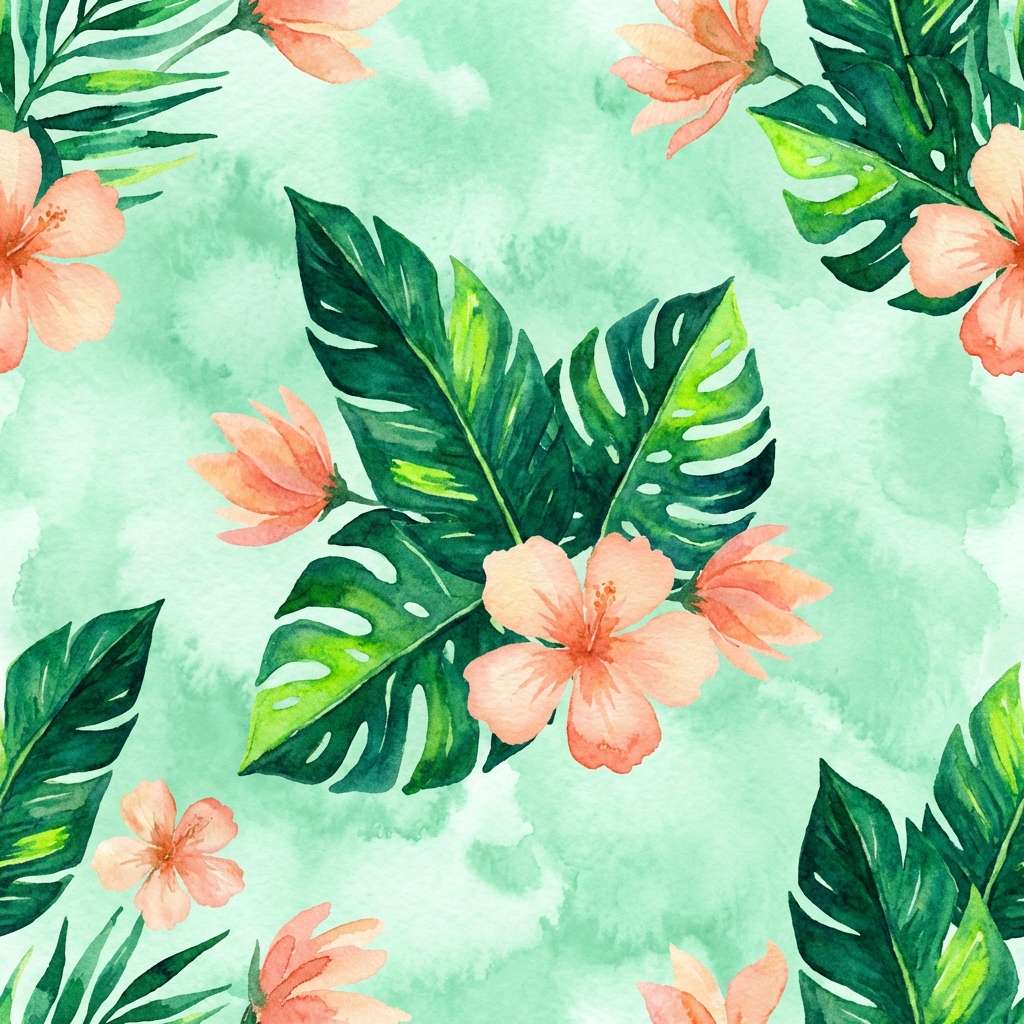
20) Tropical Lime Watercolor
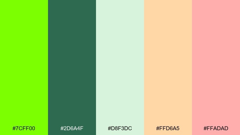
HEX: #7CFF00 #2D6A4F #D8F3DC #FFD6A5 #FFADAD
Mood: tropical, light, artistic
Best for: spring botanical wallpaper
Juicy lime with soft coral and peach feels like a tropical garden painted in morning light. The deeper green keeps the palette from drifting too pastel, which helps patterns feel crisp at scale. Use the minty light green as your base wash and layer coral petals sparingly. Tip: repeat the darkest green only in a few anchor leaves so the pattern stays airy.
Image example of tropical lime watercolor generated using media.io
What Colors Go Well with Bright Green?
Bright green pairs best with strong neutrals that control its intensity: charcoal, near-black, slate, and off-white are the most reliable options for clean contrast and readable typography.
For a modern, energetic look, add a warm accent like amber, orange, or safety red in small doses. For a softer, more natural direction, use muted sages, creams, tans, and warm browns to “ground” the neon edge.
If you want a bold creative palette, bright green also works with purple, hot pink, and deep navy—just assign clear roles (hero, background, text) so the colors don’t compete.
How to Use a Bright Green Color Palette in Real Designs
Use bright green as an accent first, not the base. In logos and branding, it’s often strongest as a highlight stroke, icon fill, or a single standout letter rather than a full wordmark.
In UI, reserve the brightest green for active states, success indicators, progress, and primary CTAs. Let whites/grays handle layout spacing, and use dark text colors to protect readability across devices.
For packaging and print, always proof neon greens: paper stock and coating can shift the hue. Keep fine text away from pure neon backgrounds, and add buffers (off-white panels) for legibility.
Create Bright Green Palette Visuals with AI
If you already have HEX codes, you can turn them into on-brand visuals quickly by describing the layout, style, and where each color should dominate (background, typography, accents).
Start with one palette above, reuse its prompt, then swap the design type (poster, UI, label, wallpaper) while keeping the same color “roles” to maintain consistency across assets.
Generate a few variations, pick the clearest composition, and iterate by tightening details like “no mockup scene,” “plain background,” or “high contrast” for better results.
Bright Green Color Palette FAQs
-
What does bright green communicate in design?
Bright green commonly signals energy, growth, freshness, and “go” momentum. In digital products it often reads as success or active status, while in branding it can suggest modernity, youthfulness, or eco-adjacent themes depending on the supporting colors. -
Is bright green the same as neon green or lime green?
They’re closely related but not identical. “Bright green” is a broad umbrella, while neon green is more fluorescent and high-impact, and lime green leans more yellow-green. The best choice depends on your background and how much contrast you need. -
What neutrals work best with bright green?
Charcoal, near-black, navy, slate gray, and off-white are the safest pairings. They stabilize the palette and make it easier to keep text readable while still letting bright green pop. -
How do I keep a bright green palette from looking too harsh?
Use bright green as 10–20% accent color and let soft whites, light grays, creams, or muted sages take up most of the space. Also avoid placing long paragraphs directly on neon backgrounds. -
What accent colors pair well with bright green?
Warm accents like amber, orange, and yellow add friendly energy, while pink and purple create a bold, nightlife or pop-art vibe. Keep accents small so bright green remains the primary attention cue. -
Can I use bright green in professional UI design?
Yes—especially for CTAs, success states, toggles, and progress indicators. The key is to avoid overuse: rely on whites and dark text for structure, and reserve pure neon greens for small UI moments to reduce eye fatigue. -
How can I generate bright green palette images quickly?
Use a text-to-image tool and specify a plain background, clean layout, and where the bright green should appear (headline, buttons, icons, or label stripes). Reuse the prompts in this article and iterate on typography, spacing, and contrast.


