

Old rose sits right between blush and mauve—soft enough for romantic work, but muted enough to feel modern. That balance makes it a reliable anchor color for branding, weddings, packaging, and UI.
Below are old rose color combinations with HEX codes, plus ready-to-copy AI prompts you can use to generate matching visuals in seconds.
In this article
- Why Old Rose Color Combinations Work So Well
-
- vintage velvet
- tea rose linen
- modern mauve
- brass and blush
- rosewood studio
- powdered clay
- french bistro
- autumn rosette
- minimal warmth
- botanical bouquet
- copper rose
- dusty romance
- cocoa petals
- stonewashed rose
- champagne rose
- terracotta tulle
- nightfall rose
- soft editorial
- wedding heirloom
- rose quartz pop
- What Colors Go Well with Old Rose?
- How to Use These Old Rose Color Combinations in Real Designs
- Create Old Rose Palette Visuals with AI
Why Old Rose Color Combinations Work So Well
Old rose has a “soft but serious” personality: it carries warmth and emotion like pink, yet the dusty undertone keeps it grounded and sophisticated. That’s why it works across industries—from beauty and weddings to tech UI.
It’s also easy to pair. Old rose can lean warm (with champagne, terracotta, cocoa) or cool (with slate, lavender-gray, or sage), so you can steer the mood without changing the core identity.
Most importantly, it supports readable contrast. With the right deep neutral (espresso, charcoal, near-black), old rose becomes a clean accent that doesn’t overpower layouts, typography, or product information.
20+ Old Rose Color Palette Ideas (with HEX Codes)
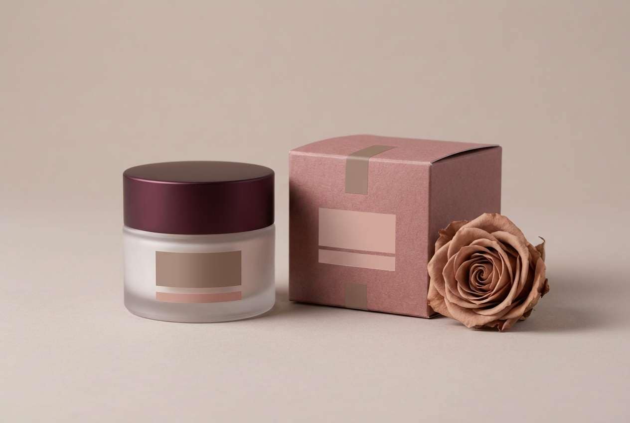
1) Vintage Velvet
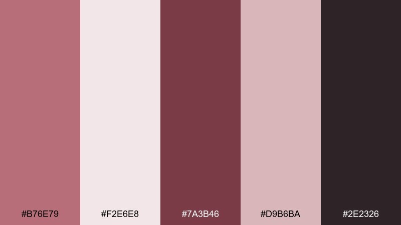
HEX: #B76E79 #F2E6E8 #7A3B46 #D9B6BA #2E2326
Mood: romantic, luxe, moody
Best for: beauty product packaging
Romantic velvet tones and soft blush light feel like a vintage vanity at dusk. Use the deep wine shade for typography and the pale blush as clean breathing space. Pair with matte black or warm metals to keep it premium, not sugary. Tip: reserve the darkest color for small, high-contrast details like ingredient lines and seals.
Image example of vintage velvet generated using media.io
Media.io is an online AI studio for creating and editing video, image, and audio in your browser.

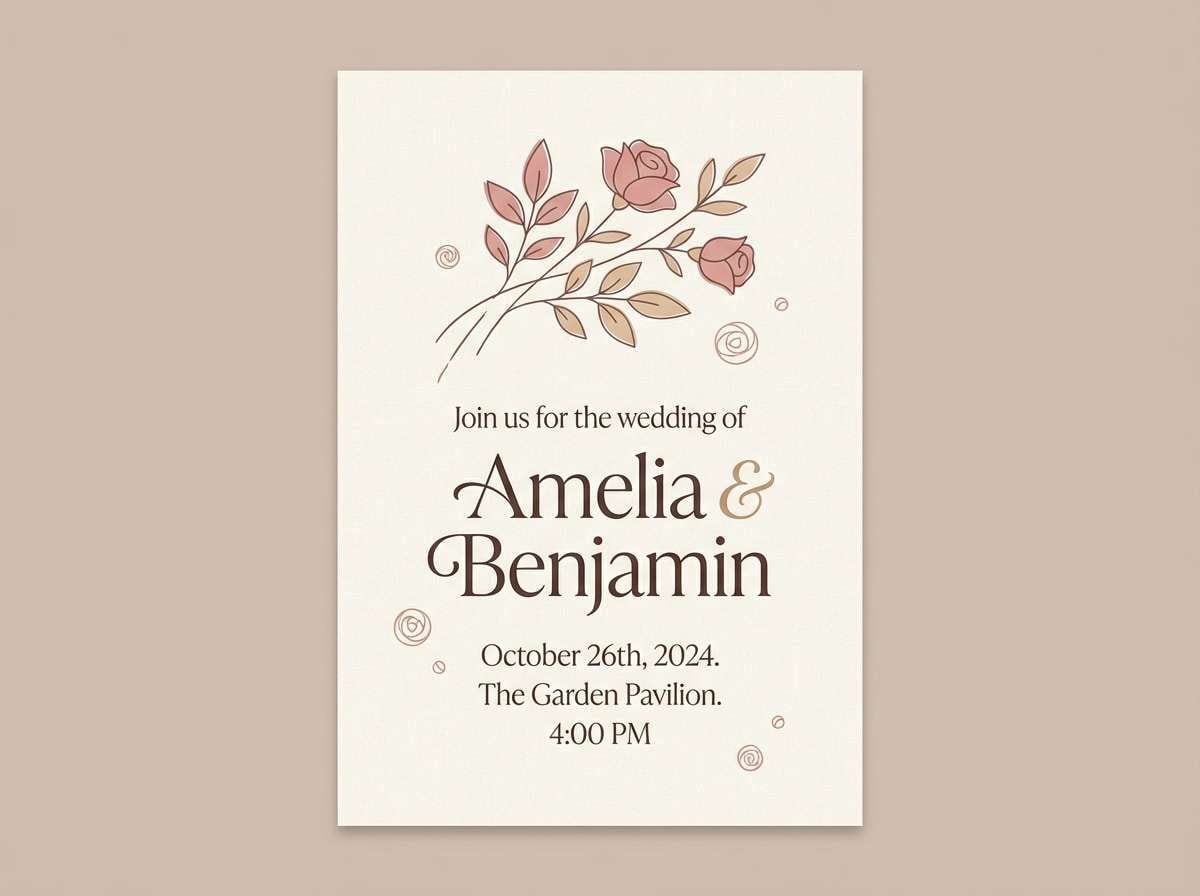
2) Tea Rose Linen
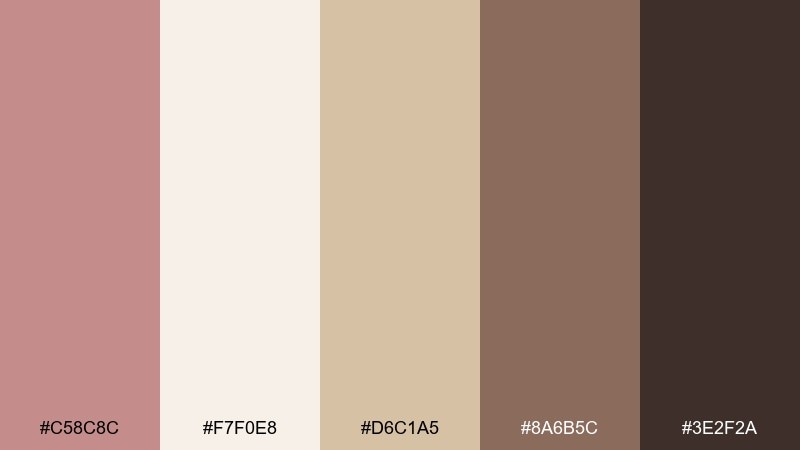
HEX: #C58C8C #F7F0E8 #D6C1A5 #8A6B5C #3E2F2A
Mood: soft, rustic, welcoming
Best for: rustic wedding invitation
Gentle tea-rose pink with linen cream reads like handwritten vows on textured paper. The warm tan and cocoa browns keep the look grounded and readable for long copy. Pair with uncoated stock and a simple serif to lean into the natural charm. Tip: print the darkest brown for names and dates, and keep the pink as a border or monogram.
Image example of tea rose linen generated using media.io
3) Modern Mauve
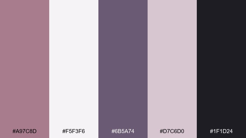
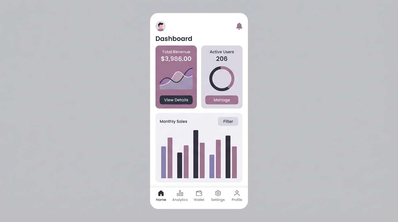
HEX: #A97C8D #F5F3F6 #6B5A74 #D7C6D0 #1F1D24
Mood: modern, calm, tech-forward
Best for: mobile app UI
Clean mauve and lavender-gray feel like a quiet interface with a confident edge. Use the near-black for core text, then let mauve handle primary buttons and highlights without shouting. This old rose color combination works especially well with rounded cards and subtle shadows. Tip: keep the pale gray-lilac as your main surface color to reduce visual fatigue.
Image example of modern mauve generated using media.io
4) Brass and Blush
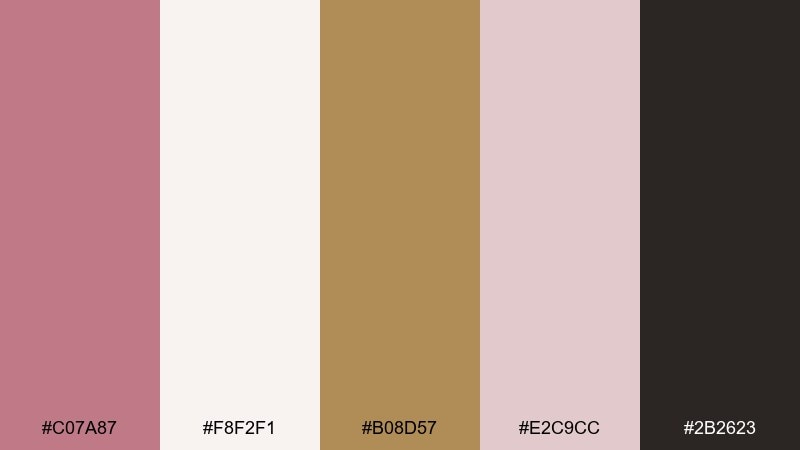
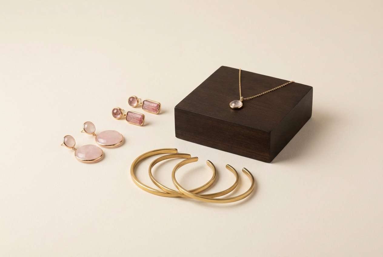
HEX: #C07A87 #F8F2F1 #B08D57 #E2C9CC #2B2623
Mood: glam, warm, upscale
Best for: jewelry brand ad
Warm blush and brass tones evoke candlelit displays and heirloom shine. The gold-leaning accent adds instant prestige while the deep espresso keeps copy crisp. Pair with cream backdrops and minimal line art for a refined campaign look. Tip: use the brass shade sparingly on logo marks, borders, or small callouts to avoid overpowering the rose tones.
Image example of brass and blush generated using media.io
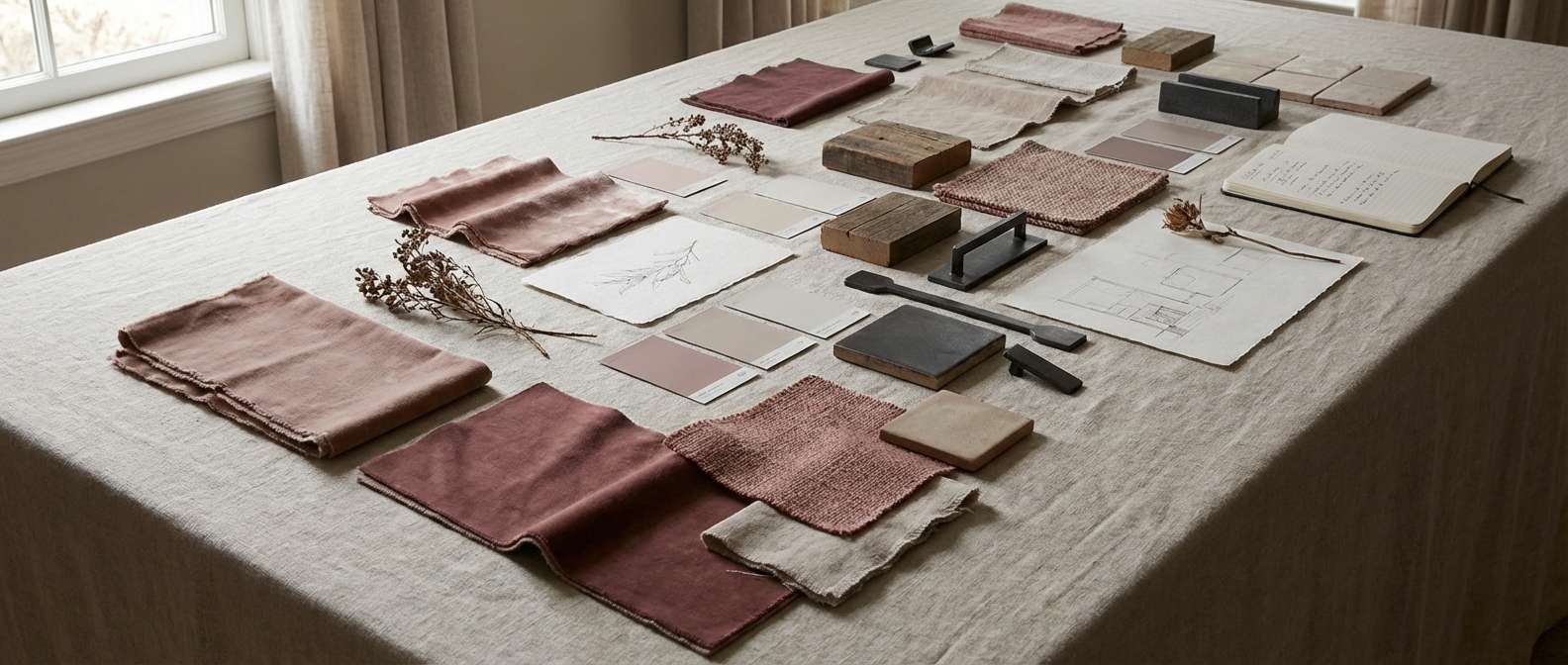
5) Rosewood Studio
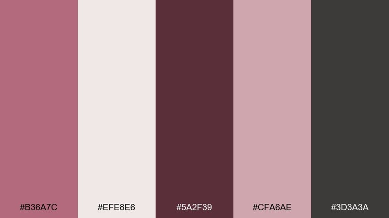
HEX: #B36A7C #EFE8E6 #5A2F39 #CFA6AE #3D3A3A
Mood: artistic, intimate, sophisticated
Best for: interior mood board
Smoky rosewood and soft plaster neutrals feel like a sunlit studio with worn hardwood floors. As an old rose color palette, it shines when you balance the deep rose-brown with plenty of pale wall space and textured fabrics. Pair with charcoal details, black metal, and natural wood to keep it modern. Tip: repeat the darkest shade in small touches like lamp bases, frames, and handles for cohesion.
Image example of rosewood studio generated using media.io
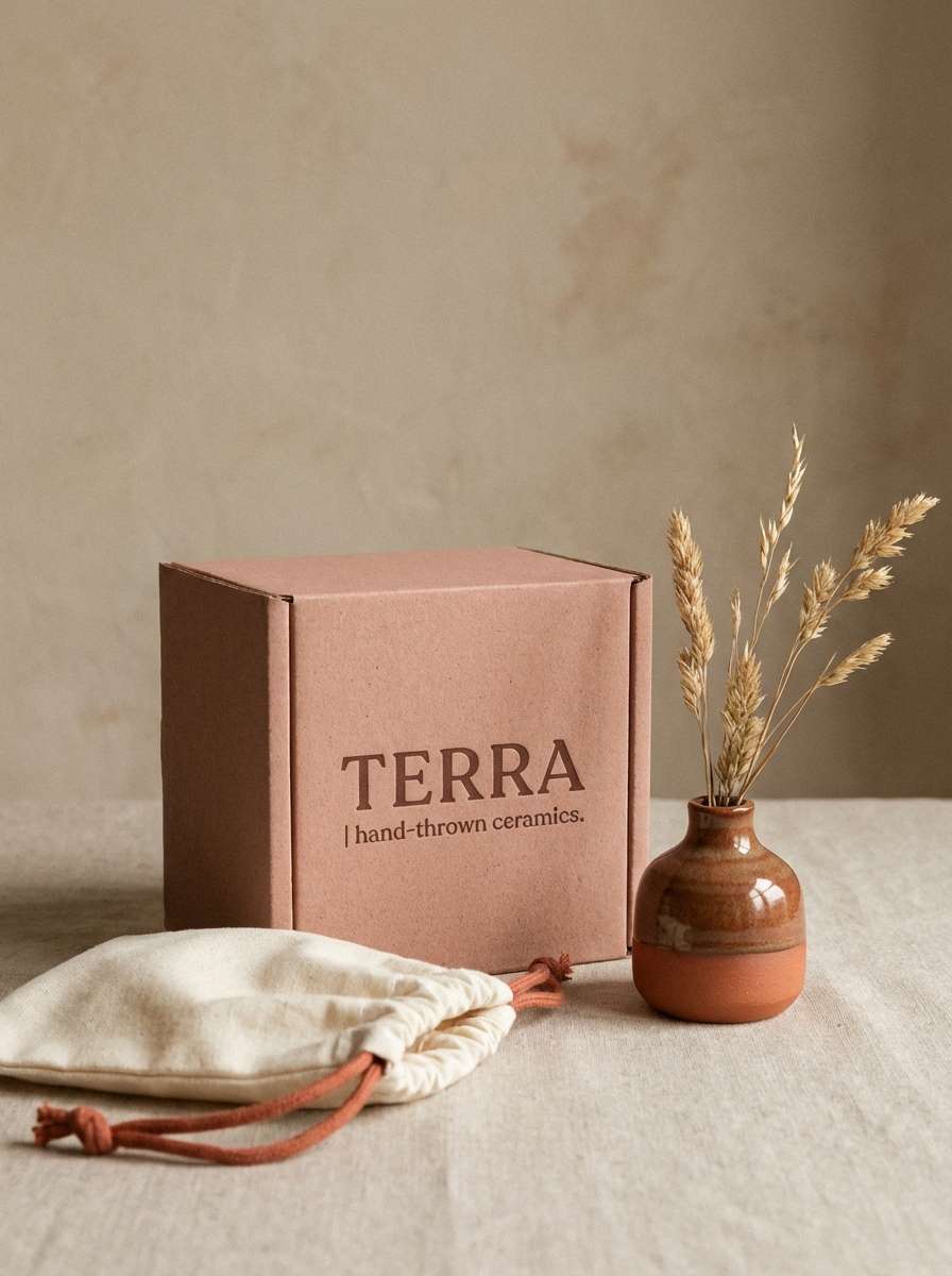
6) Powdered Clay
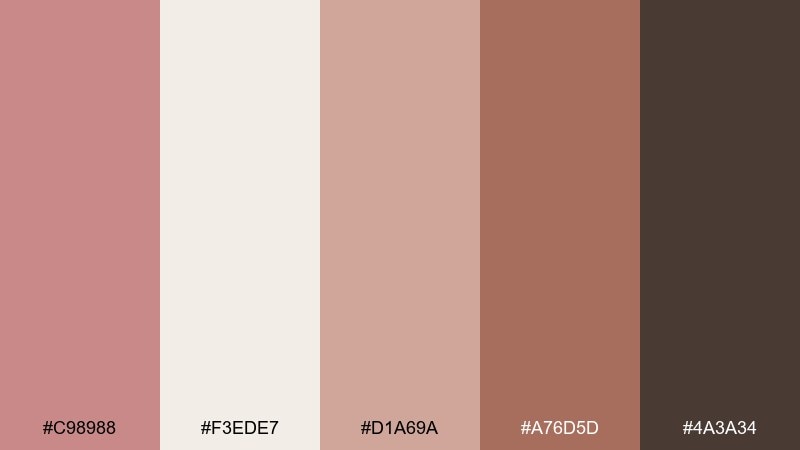
HEX: #C98988 #F3EDE7 #D1A69A #A76D5D #4A3A34
Mood: earthy, handmade, cozy
Best for: ceramics brand packaging
Powdery rose clay and warm terracotta feel like fresh pottery pulled from the kiln. The creamy neutral keeps labels readable while the deeper brown adds an artisan stamp vibe. Pair with recycled paper textures and simple icons for a crafted, honest look. Tip: let the mid clay tone lead, and use terracotta only for key badges or product names.
Image example of powdered clay generated using media.io
7) French Bistro
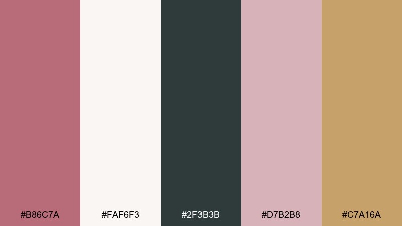
HEX: #B86C7A #FAF6F3 #2F3B3B #D7B2B8 #C7A16A
Mood: chic, nostalgic, inviting
Best for: cafe menu design
Bistro rose with cream and charcoal feels like a tucked-away cafe with handwritten specials. The dark green-charcoal makes prices and headings pop, while the warm gold adds a subtle premium note. Pair with a classic serif and plenty of white space to keep the layout breathable. Tip: use the gold only for section dividers or small icons so the menu stays easy to scan.
Image example of french bistro generated using media.io
8) Autumn Rosette
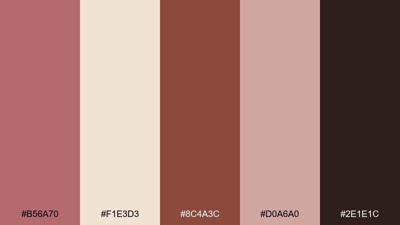
HEX: #B56A70 #F1E3D3 #8C4A3C #D0A6A0 #2E1E1C
Mood: warm, seasonal, grounded
Best for: fall fashion lookbook
Warm rose and spiced browns evoke fallen leaves and suede boots. These old rose color combinations feel especially rich when you let the cream act like soft daylight behind the palette. Pair with tactile photography and simple captions for an elevated seasonal story. Tip: use the deepest brown for page numbers and headers so the spreads stay legible.
Image example of autumn rosette generated using media.io
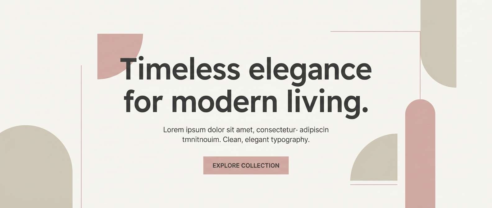
9) Minimal Warmth
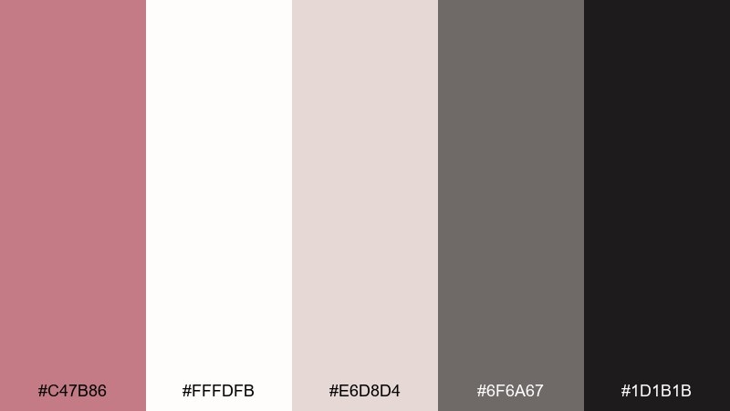
HEX: #C47B86 #FFFDFB #E6D8D4 #6F6A67 #1D1B1B
Mood: minimal, airy, modern
Best for: minimalist website hero UI
Airy blush and soft stone neutrals feel like quiet morning light on clean surfaces. The charcoal and near-black give you strong contrast without turning harsh. Pair with a geometric sans and generous spacing for a premium minimalist vibe. Tip: make the rose tone a single focal element, like one primary button or a hero accent line.
Image example of minimal warmth generated using media.io
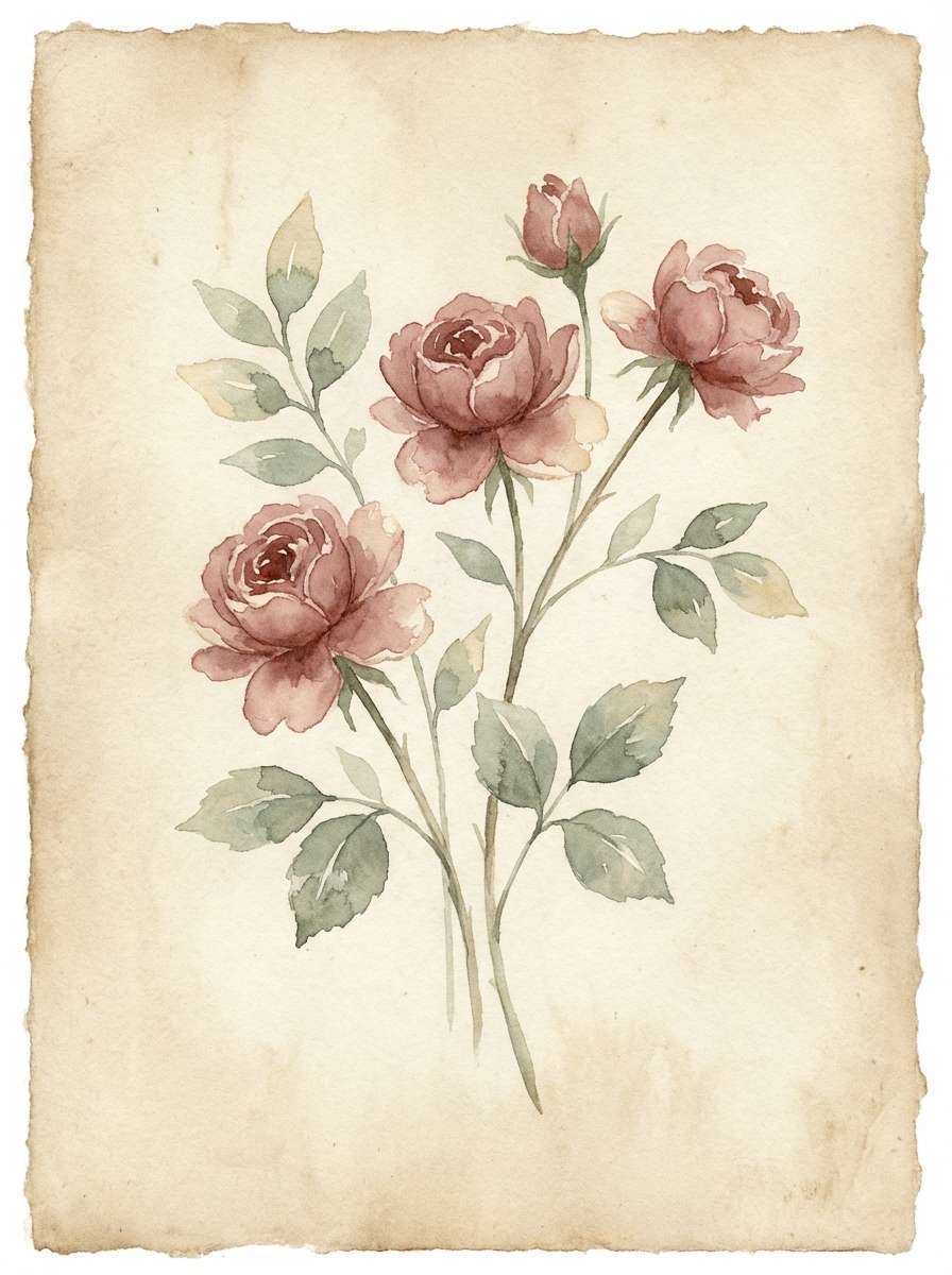
10) Botanical Bouquet
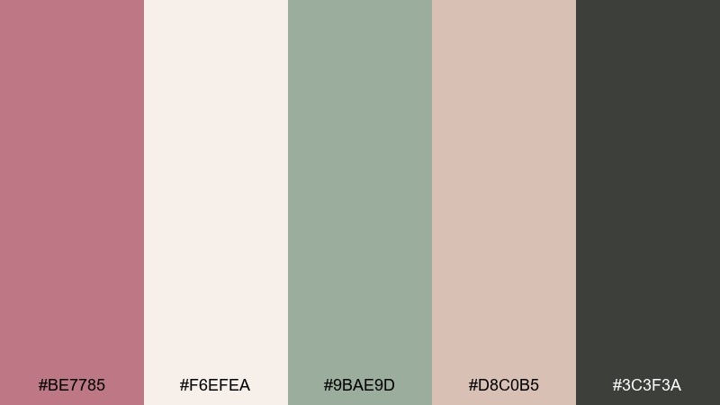
HEX: #BE7785 #F6EFEA #9BAE9D #D8C0B5 #3C3F3A
Mood: fresh, gentle, botanical
Best for: spring botanical illustration
Soft rose with muted sage feels like pressed flowers in a sketchbook. The cream base keeps everything light, while the deep gray-green anchors stems and outlines. Pair with watercolor textures and fine linework for a calm, giftable print. Tip: let sage take the secondary role so the pink stays the emotional center.
Image example of botanical bouquet generated using media.io
11) Copper Rose
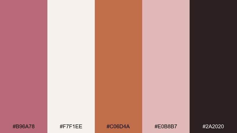
HEX: #B96A78 #F7F1EE #C06D4A #E0B8B7 #2A2020
Mood: warm, glowing, energetic
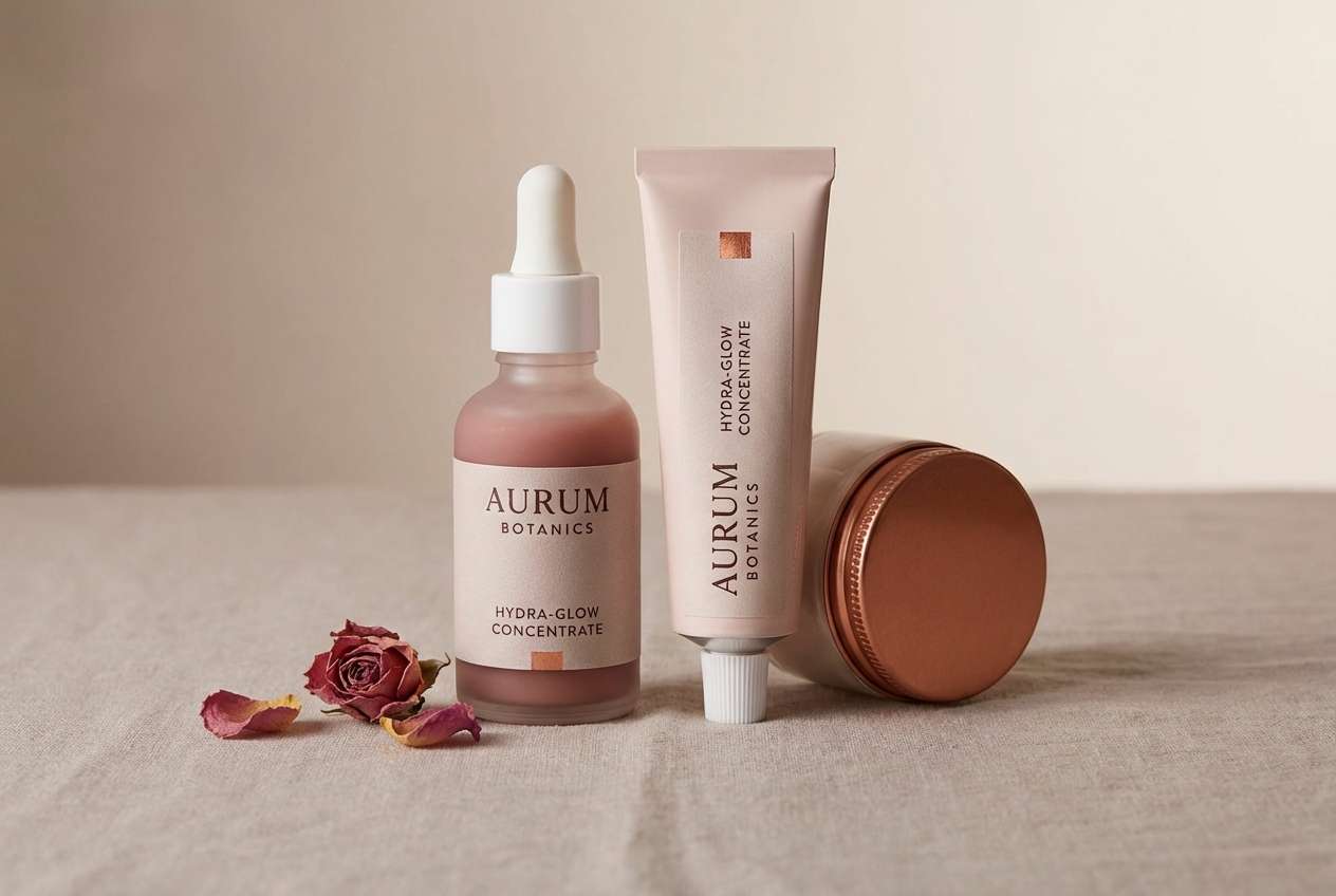
Best for: skincare product ad
Copper warmth against rosy blush evokes late-afternoon glow and polished skin. The pale base keeps the ad clean while the copper-orange accent adds movement and interest. Pair with soft gradients and a single hero product for a modern, luminous feel. Tip: use copper for highlights and callouts, not large blocks, to avoid overwhelming the softness.
Image example of copper rose generated using media.io
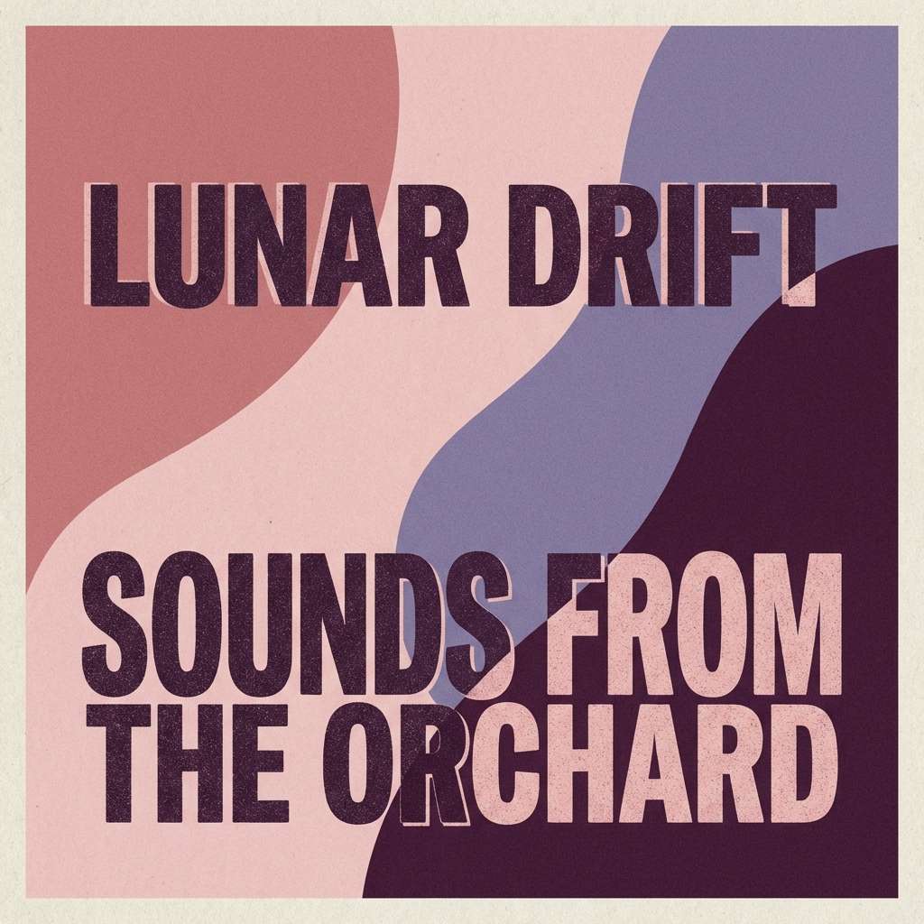
12) Dusty Romance
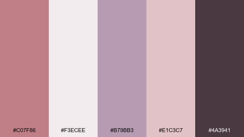
HEX: #C07F86 #F3ECEE #B79BB3 #E1C3C7 #4A3941
Mood: dreamy, soft, romantic
Best for: album cover design
Dusty pink and muted violet feel like a slow song in a hazy room. The deep plum-brown gives you enough weight for titles and artist names. Pair with grainy textures and minimalist type to keep it contemporary. Tip: use the violet as a secondary glow or border so the rose stays the lead tone.
Image example of dusty romance generated using media.io
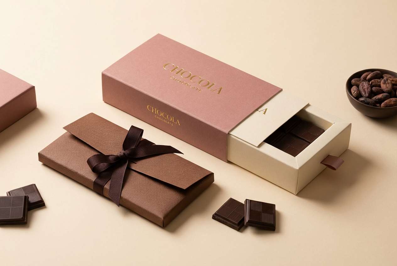
13) Cocoa Petals
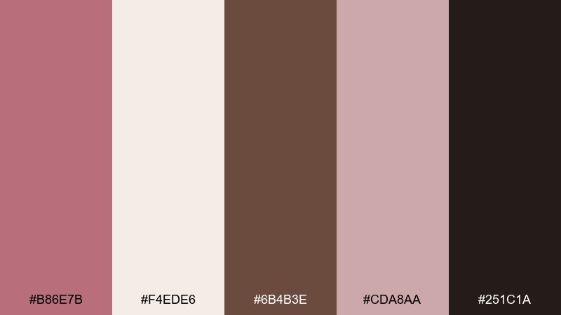
HEX: #B86E7B #F4EDE6 #6B4B3E #CDA8AA #251C1A
Mood: cozy, rich, appetizing
Best for: chocolate packaging
Rosy petals and cocoa browns evoke truffles, velvet ribbons, and cozy gifting. The cream tone makes ingredient lists easy to read while the darker browns suggest depth and flavor. Pair with foil details or embossed patterns for an elevated box. Tip: keep the darkest shade for barcode areas and small legal text to maintain clarity.
Image example of cocoa petals generated using media.io
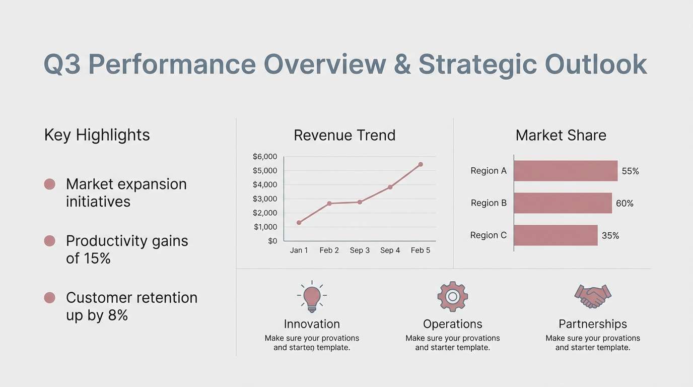
14) Stonewashed Rose
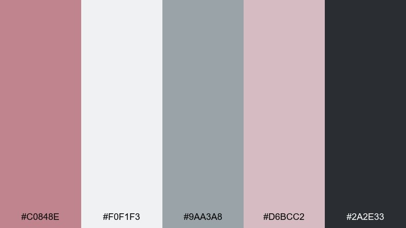
HEX: #C0848E #F0F1F3 #9AA3A8 #D6BCC2 #2A2E33
Mood: cool, balanced, professional
Best for: corporate presentation template
Stone-gray and cool rose feel like polished slides with a human touch. The blue-gray neutrals keep charts and tables crisp, while the rose adds warmth to section headers and highlights. Pair with thin dividers and clean icon sets for a modern corporate look. Tip: use the darkest slate for titles, and reserve rose for emphasis on key numbers.
Image example of stonewashed rose generated using media.io
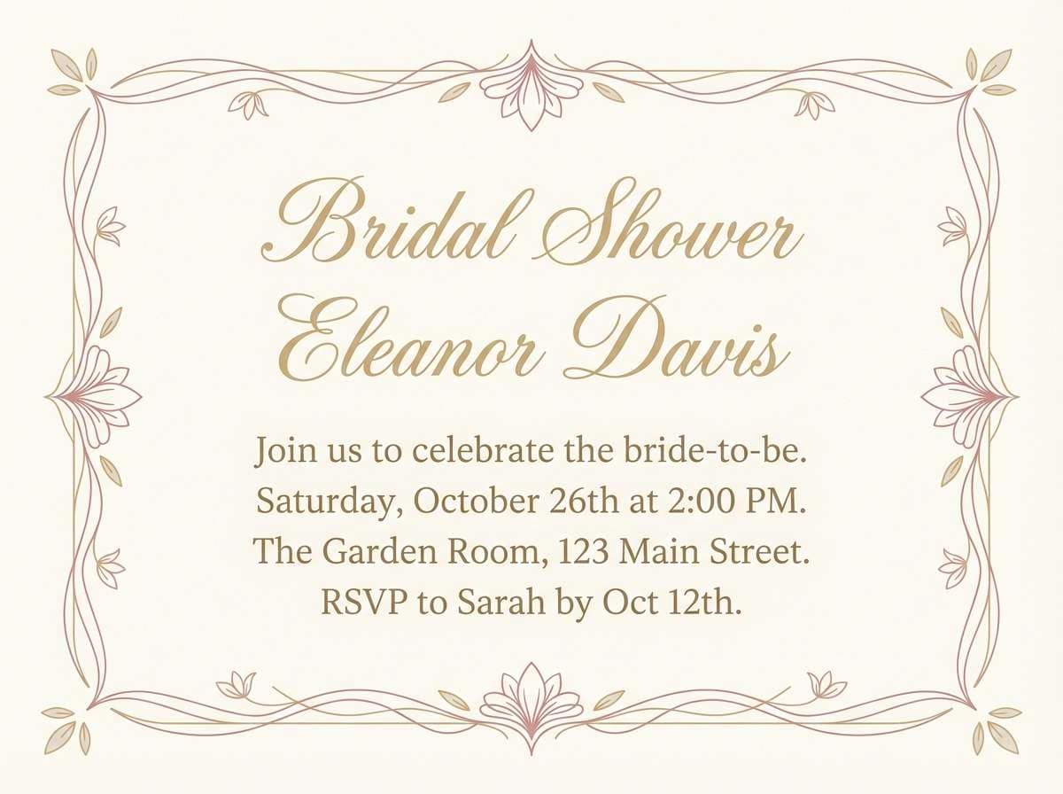
15) Champagne Rose
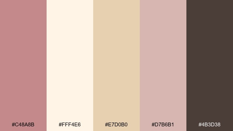
HEX: #C48A8B #FFF4E6 #E7D0B0 #D7B6B1 #4B3D38
Mood: celebratory, soft, elegant
Best for: bridal shower invitation
Champagne cream and rosy blush feel like clinking glasses and soft candlelight. The warm beige-gold works beautifully for borders, monograms, and subtle icons without looking flashy. These old rose color combinations pair well with script fonts when you keep body copy in the deep cocoa tone. Tip: add plenty of cream negative space so the invite stays airy and upscale.
Image example of champagne rose generated using media.io
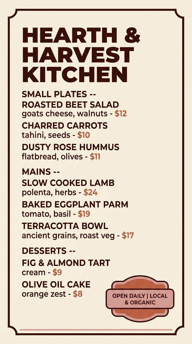
16) Terracotta Tulle
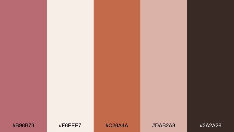
HEX: #B96B73 #F6EEE7 #C26A4A #DAB2A8 #3A2A26
Mood: warm, playful, handcrafted
Best for: restaurant flyer
Terracotta spice and dusty rose feel like a cozy menu special on a warm evening. The creamy base keeps the layout clean, while the deep brown adds strong hierarchy for headings and prices. Pair with bold type and simple shapes for a modern, approachable look. Tip: use terracotta for one attention-grabbing badge, like new or limited, and keep the rest calm.
Image example of terracotta tulle generated using media.io
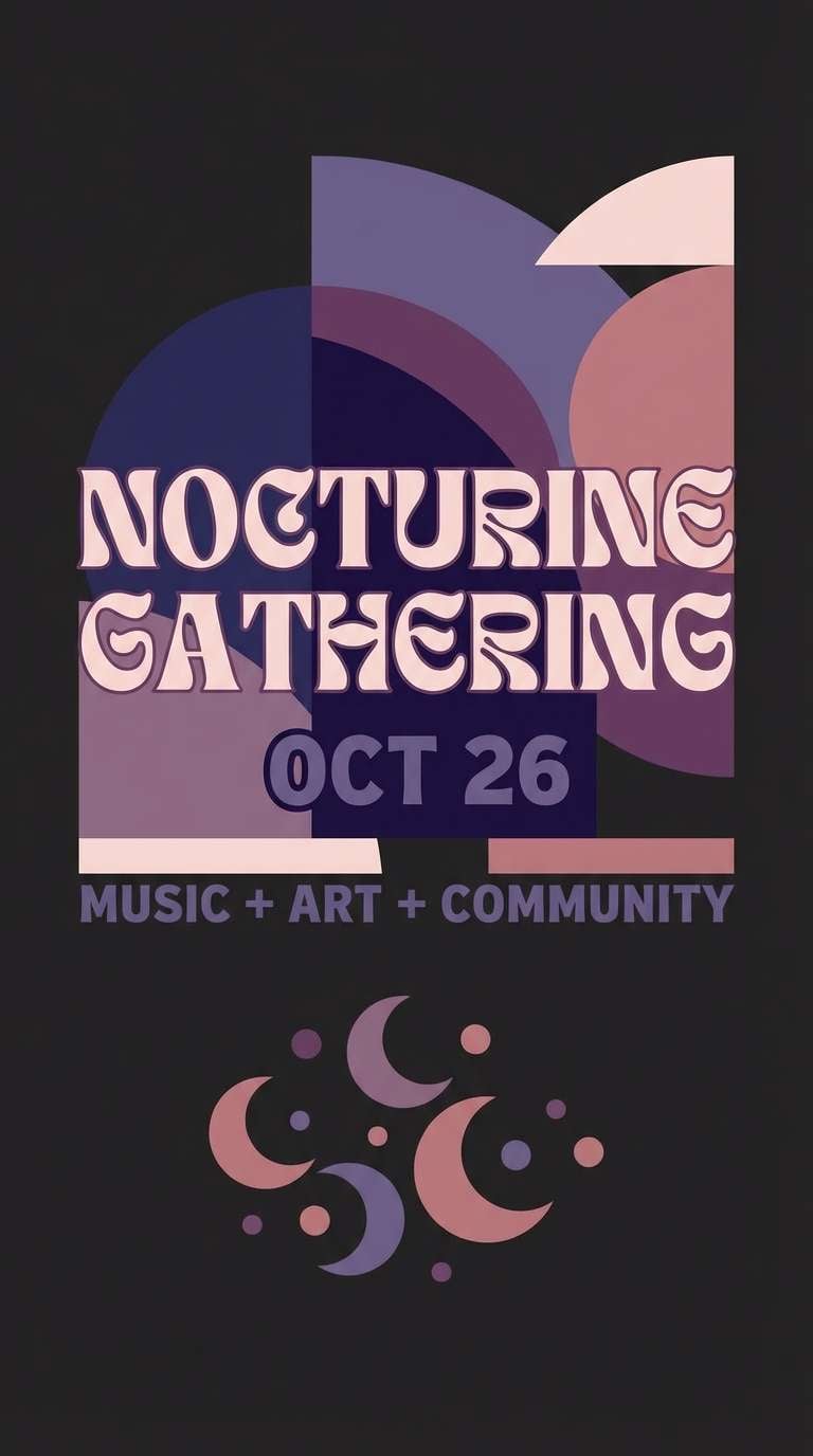
17) Nightfall Rose

HEX: #A95E71 #1F1C22 #4A3B56 #D0A7AE #E7D8DB
Mood: dramatic, nocturnal, bold
Best for: nighttime event poster
Deep night tones with a rose highlight feel like neon reflections on wet streets, but still refined. Use the black-violet base for the background and let the lighter blush carry key details and dates. Pair with condensed type and high contrast spacing for instant readability from a distance. Tip: keep accent rose to one or two elements so the poster stays striking, not busy.
Image example of nightfall rose generated using media.io
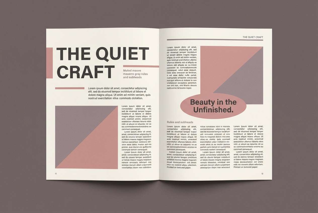
18) Soft Editorial
HEX: #B87484 #F8F7F5 #3E3D43 #D9C1C6 #8E7D8A
Mood: editorial, refined, modern classic
Best for: magazine editorial spread
Soft rose and ink-like neutrals feel like a quiet fashion feature with plenty of white space. The gray-violet supports captions and pull quotes without competing with headlines. Use rose as a subtle section color for tabs, small rules, and quote marks. Tip: keep body text in the charcoal tone to maintain print-like readability.
Image example of soft editorial generated using media.io
19) Wedding Heirloom
HEX: #C18286 #FFF8F4 #D9C7C0 #A99086 #5A4A45
Mood: timeless, tender, classic
Best for: wedding website landing page UI
Creamy whites and heirloom rose feel like lace, handwritten notes, and family photographs. These old rose color combinations work best when the layout stays airy and typography does the heavy lifting. Pair with warm-gray icons and subtle dividers to keep things elegant on mobile. Tip: use the deepest brown only for nav and body text, and keep the rose for buttons and highlights.
Image example of wedding heirloom generated using media.io
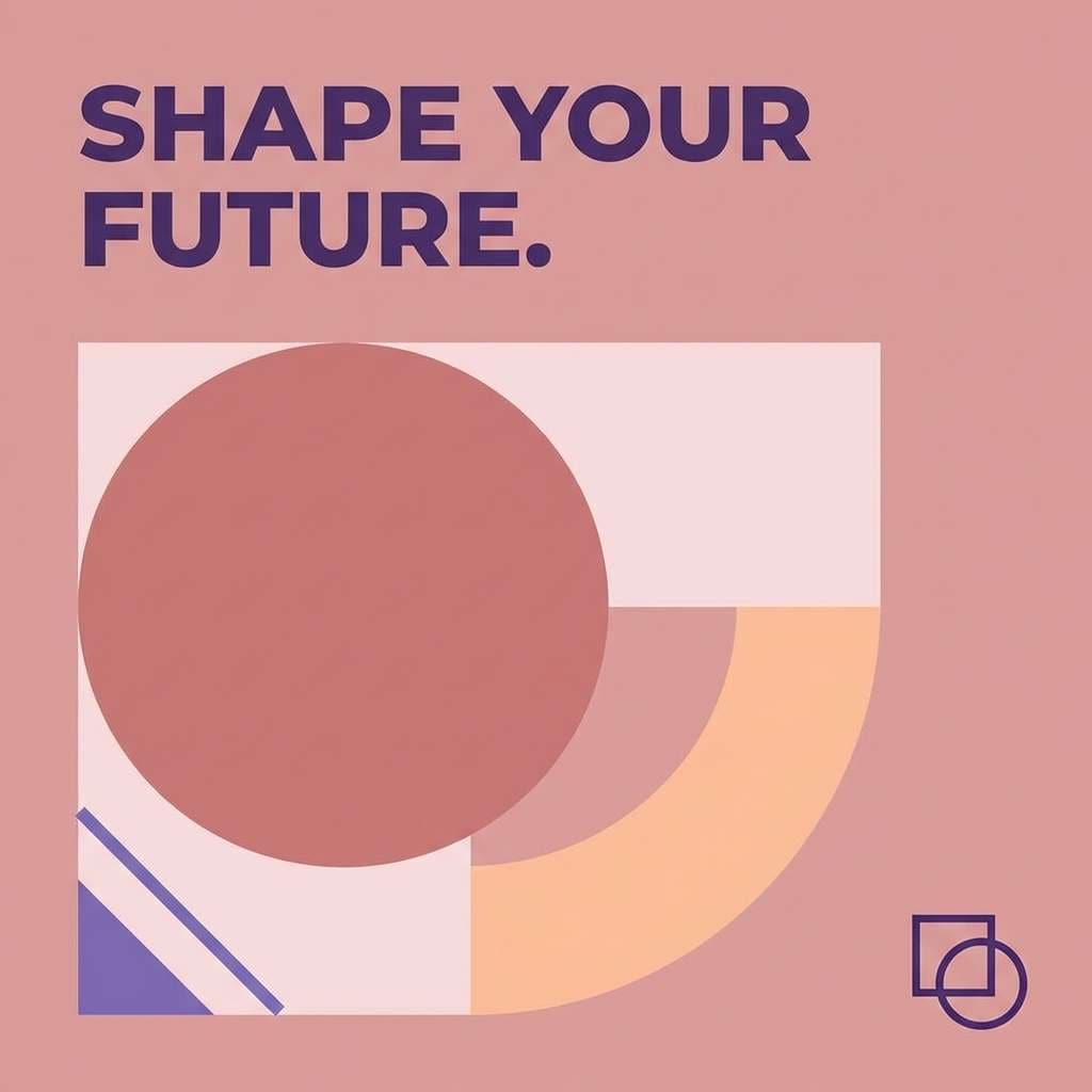
20) Rose Quartz Pop
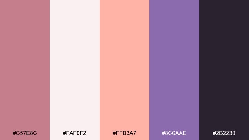
HEX: #C57E8C #FAF0F2 #FFB3A7 #8C6AAE #2B2230
Mood: playful, creative, youthful
Best for: creative brand social post
Rose quartz with a peachy pop feels like bold stickers and fresh studio energy. The violet adds contrast for headlines and gives the palette a modern twist. Pair with chunky type and simple geometric shapes for a scroll-stopping post. Tip: limit the peach accent to one focal element, like a badge or underline, so it stays punchy.
Image example of rose quartz pop generated using media.io
What Colors Go Well with Old Rose?
Old rose pairs beautifully with warm neutrals like cream, linen, oatmeal, and taupe—these keep the palette airy and “skin-tone friendly” for lifestyle or wedding design. For richer moods, add cocoa, espresso, or deep wine to create premium contrast.
For a fresher, modern direction, combine old rose with cool supports like slate gray, blue-gray, lavender-gray, or muted violet. If you want a natural vibe, muted sage and dusty greens are a classic match that keeps the pink from feeling too sweet.
For accents, metallic gold/brass works well for luxury, while terracotta/copper adds energy. Use those accents sparingly so old rose stays the emotional center of the scheme.
How to Use These Old Rose Color Combinations in Real Designs
Start with role assignment: pick one light neutral for backgrounds, one deep neutral for text, and let old rose be the brand accent (buttons, badges, section headers, or key highlights). This keeps readability high while still delivering a recognizable tone.
In print and packaging, old rose looks best with tactile cues—uncoated paper, matte finishes, subtle emboss/foil, and soft shadows. In UI, it shines as a restrained highlight color, especially with rounded components and generous spacing.
When in doubt, keep old rose under 20–30% of the visible area and let neutrals do the heavy lifting. You’ll get a modern, calm design instead of an overly pink layout.
Create Old Rose Palette Visuals with AI
If you already have HEX codes, the fastest way to explore mood is to generate a few consistent visuals—ads, invitations, UI mockups, posters—using the same palette. That makes it easier to compare styles without rebuilding layouts from scratch.
Use the prompts under each palette above, then tweak the subject (product, scene, layout) while keeping the color direction consistent. After that, refine contrast by making sure your darkest shade is reserved for text or key edges.
Old Rose Color Combinations FAQs
-
What is the HEX code for old rose?
There isn’t one universal HEX for old rose, but common “old rose” tones sit around muted pink-mauve values like #B76E79 or #C07A87. Use a dusty, slightly brown or mauve-leaning pink rather than a bright blush. -
Is old rose more pink or more mauve?
Old rose is typically a muted pink with mauve/brown undertones. It reads less sweet than blush and less purple than pure mauve, which is why it works well in both romantic and modern designs. -
What neutrals pair best with old rose?
Cream, off-white, linen, warm gray, taupe, and cocoa are the easiest neutrals to pair with old rose. For a cooler, more corporate look, try light gray with slate or blue-gray. -
What are good accent colors for an old rose palette?
Brass/gold adds a luxury feel, terracotta/copper adds warmth and energy, sage adds a botanical calm, and muted violet can create a dreamy modern contrast. Keep accents small so the palette stays balanced. -
How do I keep an old rose color scheme from looking too “pink”?
Use old rose as an accent instead of a base, and anchor it with a strong deep neutral (espresso, charcoal, near-black). Add plenty of cream/stone background space and keep saturated pinks out of the palette. -
Does old rose work for UI and branding?
Yes—old rose works especially well for calm, premium branding and accessible UI when paired with high-contrast text colors. Use it for CTAs, highlights, and section headers rather than large background blocks. -
Can I generate old rose palette images for presentations or social posts?
Yes. Copy a prompt from the palette you like, keep the HEX direction consistent, and generate matching visuals for posters, slides, ads, and social graphics with an AI image tool.
Next: Sapphire Color Palette


