Sapphire is a deep, gemstone-inspired blue that feels confident without being loud. It’s a go-to base color for designs that need trust, clarity, and a premium edge.
Below are practical sapphire color palette ideas with HEX codes, plus tips for pairing sapphire in branding, UI, and print—so your blue stays intentional and readable.
In this article
- Why Sapphire Palettes Work So Well
-
- midnight harbor
- gemstone glow
- coastal ink
- velvet night
- arctic sapphire
- vintage ledger
- neon arcade
- botanical bluebells
- museum editorial
- cerulean sand
- tech minimal
- wedding seaspray
- coffeehouse contrast
- space observatory
- kids learning ui
- luxury watch ad
- mountain twilight
- soft office calm
- festival poster pop
- night swim
- What Colors Go Well with Sapphire?
- How to Use a Sapphire Color Palette in Real Designs
- Create Sapphire Palette Visuals with AI
Why Sapphire Palettes Work So Well
Sapphire sits in the “trustworthy blue” range, so it naturally supports themes like stability, intelligence, and professionalism. That’s why it shows up so often in finance, SaaS, healthcare, and editorial layouts.
It also has strong contrast range: sapphire can pair with near-black for cinematic depth or with icy tints for clean, data-forward interfaces. This flexibility makes it easy to build a full system of states (primary, hover, borders, backgrounds) around one hero color.
Finally, sapphire takes accents well. Gold, coral, cyan, blush, and even coffee browns can pop against it—so you can dial the mood from premium to playful without changing your core brand color.
20+ Sapphire Color Palette Ideas (with HEX Codes)
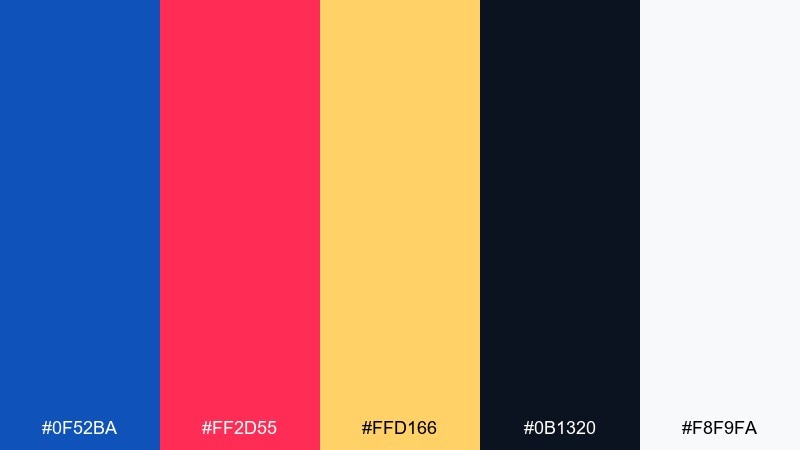
1) Midnight Harbor
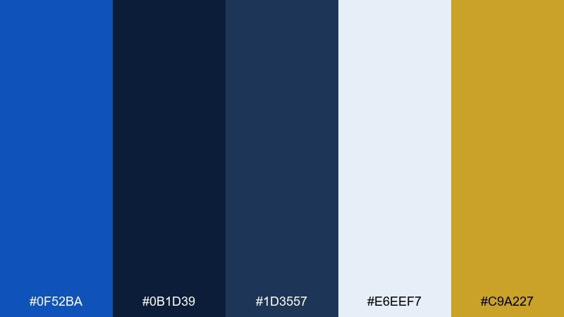
HEX: #0F52BA #0B1D39 #1D3557 #E6EEF7 #C9A227
Mood: moody, polished, nautical
Best for: brand identity for finance or maritime services
Moody harbor blues with a brass-like accent evoke night docks, crisp uniforms, and quiet confidence. Use the deep navy as your foundation and let the brighter blue handle links, buttons, and key headlines. Pair the off-white for breathing room and reserve the gold for small highlights like badges or icons. Tip: keep the gold under 5 percent of the layout to maintain a premium feel.
Image example of midnight harbor generated using media.io
Media.io is an online AI studio for creating and editing video, image, and audio in your browser.

2) Gemstone Glow
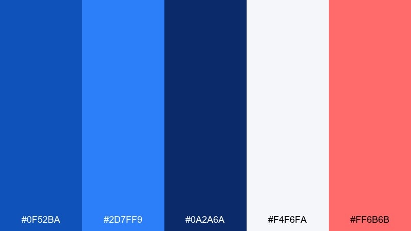
HEX: #0F52BA #2D7FF9 #0A2A6A #F4F6FA #FF6B6B
Mood: vivid, modern, energetic
Best for: app landing page hero section
Vivid blues with a warm coral spark feel like light refracting through a cut gem. This sapphire color palette shines on hero areas where you need instant contrast and clear hierarchy. Keep the darkest blue for navigation, push the bright blue into gradients, and use coral only for primary calls to action. Tip: test coral against the off-white background first to avoid over-saturation in large blocks.
Image example of gemstone glow generated using media.io
3) Coastal Ink
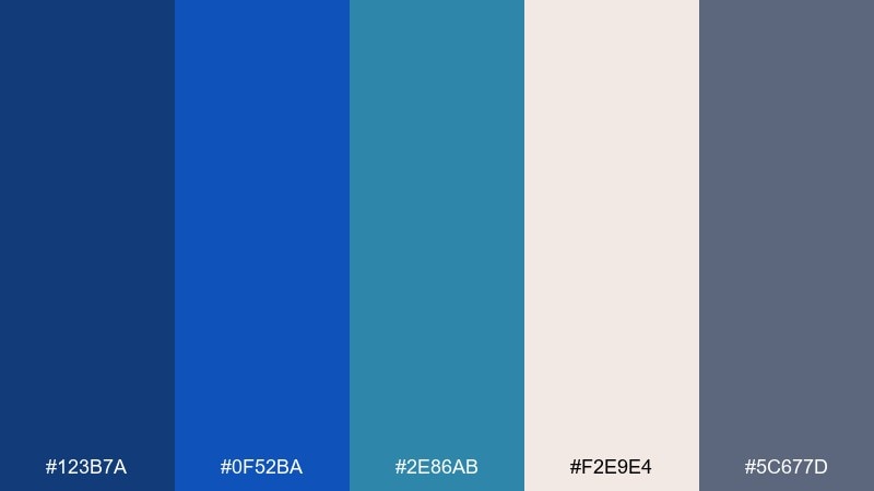
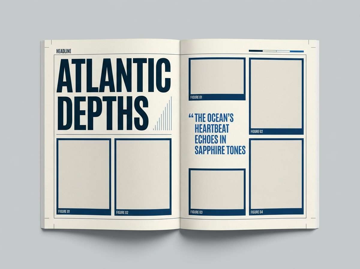
HEX: #123B7A #0F52BA #2E86AB #F2E9E4 #5C677D
Mood: calm, coastal, editorial
Best for: magazine feature layout
Inky blues and sea-glass tones bring to mind ocean horizons and sun-faded paper. Use the cream as a page base to keep long reads comfortable, then lean on the sapphire-like blue for pull quotes and section headers. The cool gray works well for rules, captions, and subtle UI-like dividers in print. Tip: keep body text in the deep ink tone to preserve readability.
Image example of coastal ink generated using media.io
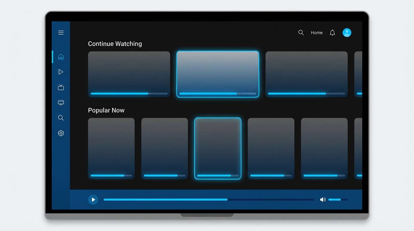
4) Velvet Night
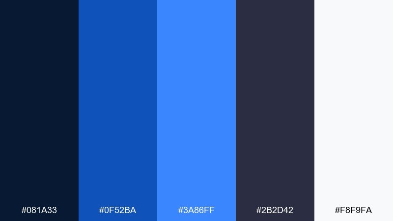
HEX: #081A33 #0F52BA #3A86FF #2B2D42 #F8F9FA
Mood: sleek, cinematic, high-contrast
Best for: streaming service UI theme
Velvety darks with electric blue highlights feel like a cinema lobby just before the show starts. Build the interface on near-black panels and use the brighter blues for focus states, progress bars, and active tabs. The soft white should appear mainly in text and icons to avoid glare. Tip: increase line height slightly on dark backgrounds to keep copy crisp.
Image example of velvet night generated using media.io
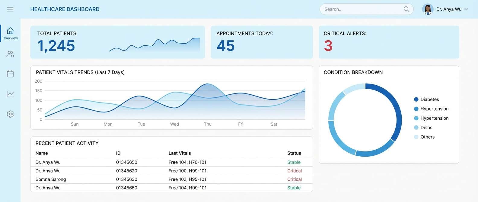
5) Arctic Sapphire
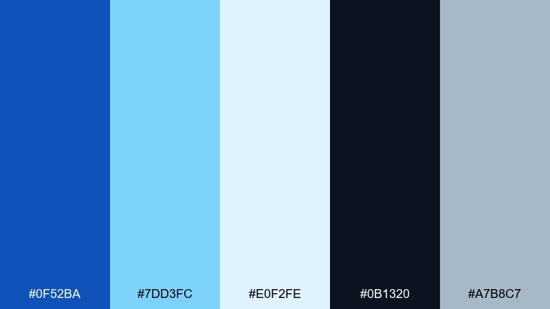
HEX: #0F52BA #7DD3FC #E0F2FE #0B1320 #A7B8C7
Mood: fresh, airy, winter-clean
Best for: healthcare dashboard UI
Icy tints and crisp blues evoke clean air, clear data, and a calm clinical space. Use the palest blue as the background, then apply the saturated blue to chart highlights and key metrics. The near-black is ideal for headings and critical labels without feeling harsh. Tip: add generous spacing so the cool palette stays friendly rather than sterile.
Image example of arctic sapphire generated using media.io
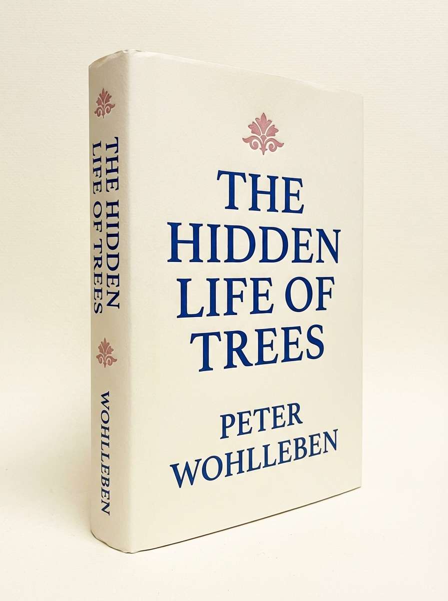
6) Vintage Ledger
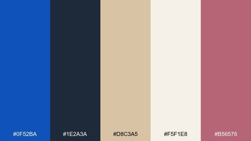
HEX: #0F52BA #1E2A3A #D8C3A5 #F5F1E8 #B56576
Mood: heritage, bookish, refined
Best for: book cover and spine design
Heritage tones like old paper, ink, and worn cloth make the blues feel collected and timeless. Use the creamy paper shade for the main cover field and let the deep blue anchor the title and author name. The dusty rose works as a small foil for stamps, rules, or a subtitle band. Tip: try a subtle texture overlay to reinforce the vintage mood without muddying the text.
Image example of vintage ledger generated using media.io
7) Neon Arcade
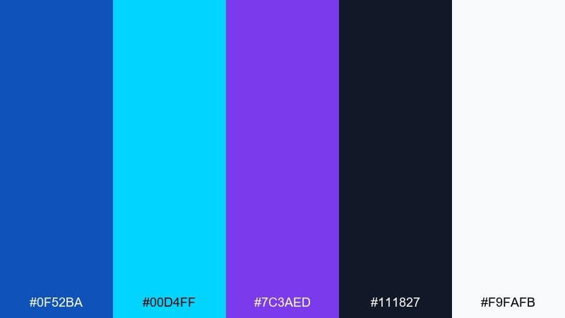
HEX: #0F52BA #00D4FF #7C3AED #111827 #F9FAFB
Mood: bold, playful, futuristic
Best for: event poster for a gaming night
Punchy blues with violet and cyan feel like neon signs reflecting on glossy floors. These sapphire color combinations work best with big type, simple shapes, and high contrast. Keep the background dark to let the bright accents glow, and use white only for key details like date and location. Tip: limit gradients to one focal area so the poster stays readable from a distance.
Image example of neon arcade generated using media.io

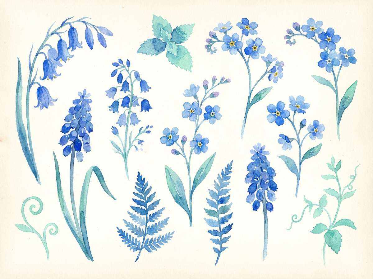
8) Botanical Bluebells
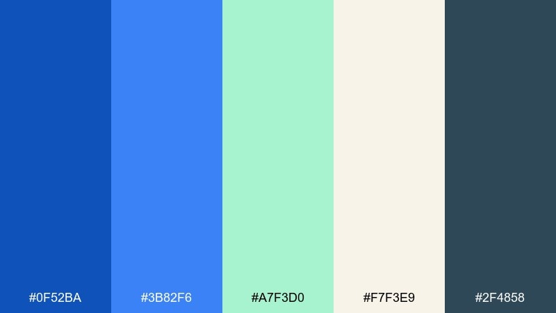
HEX: #0F52BA #3B82F6 #A7F3D0 #F7F3E9 #2F4858
Mood: fresh, botanical, optimistic
Best for: spring floral illustration set
Fresh blues and minty greens evoke bluebells, morning dew, and a light breeze. Let the cream tone act as paper, then paint petals in mid-blue while using the darker slate for linework and shadows. The mint works best as a secondary leaf tone rather than a dominant fill. Tip: keep outlines slightly muted so the illustration stays soft and natural.
Image example of botanical bluebells generated using media.io
9) Museum Editorial
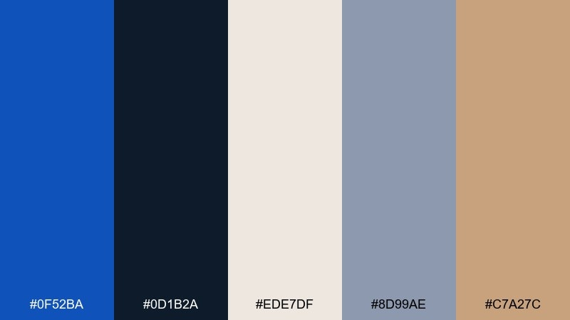
HEX: #0F52BA #0D1B2A #EDE7DF #8D99AE #C7A27C
Mood: cultured, calm, gallery-like
Best for: museum brochure layout
Gallery neutrals with a deep blue accent feel curated, quiet, and intentional. Use the warm off-white for the page and apply the sapphire-toned blue to headings, section tabs, and wayfinding marks. The tan works beautifully for small callouts or exhibit categories without turning the design rustic. Tip: keep margins wide to mimic the breathing space of a museum wall label.
Image example of museum editorial generated using media.io
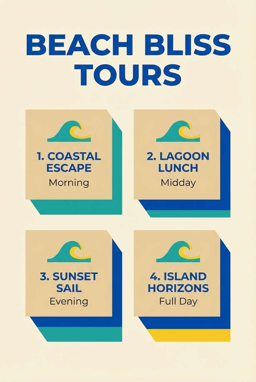
10) Cerulean Sand
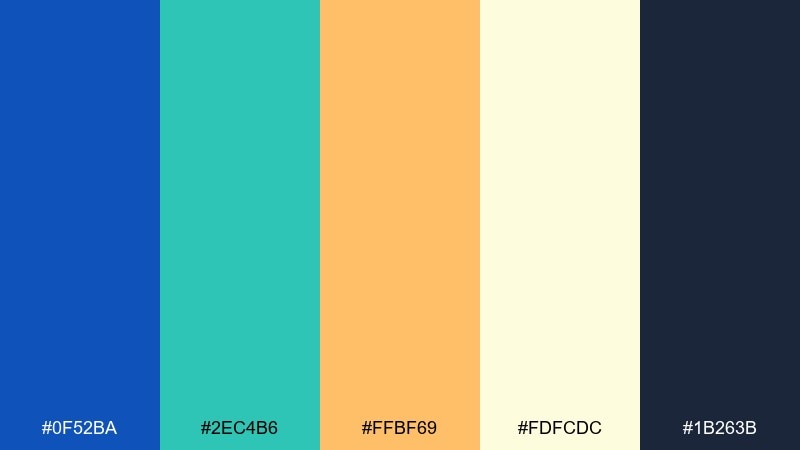
HEX: #0F52BA #2EC4B6 #FFBF69 #FDFCDC #1B263B
Mood: sunlit, coastal, cheerful
Best for: travel flyer for beach tours
Sunlit blues with sandy yellow feel like clear water and warm shorelines. Use the creamy background to keep the flyer bright, then apply the sapphire-blue for titles and key price blocks. Teal and yellow should act as supporting accents for icons, badges, and section dividers. Tip: use the darkest navy for body text to maintain contrast on light paper tones.
Image example of cerulean sand generated using media.io
11) Tech Minimal
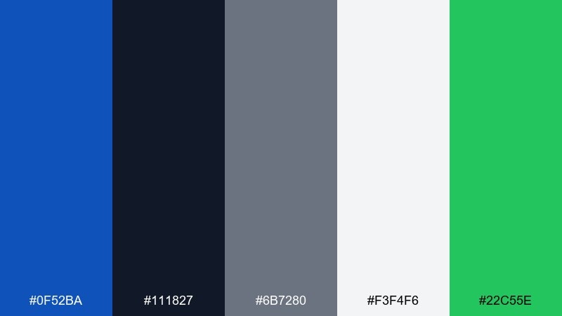
HEX: #0F52BA #111827 #6B7280 #F3F4F6 #22C55E
Mood: clean, modern, trustworthy
Best for: SaaS product dashboard UI
Clean neutrals with a confident blue read like crisp documentation and well-structured data. This sapphire color scheme fits dashboards where clarity matters, with blue for primary actions and status highlights. Use green only for success states and keep gray for secondary text and borders. Tip: maintain consistent button styles so the blue remains the single strongest interaction cue.
Image example of tech minimal generated using media.io
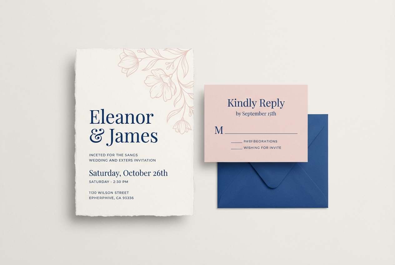
12) Wedding Seaspray
HEX: #0F52BA #94A3B8 #F8FAFC #F1D4D4 #1F2937
Mood: romantic, airy, elegant
Best for: wedding invitation suite
Airy blues with blush and soft gray feel like sea spray, silk ribbons, and early evening light. Use the near-white as the card base and keep the blue for monograms, borders, and RSVP headings. The blush works best in tiny floral motifs or a subtle accent line. Tip: choose a slightly heavier paper texture so the cool tones feel warm and tactile.
Image example of wedding seaspray generated using media.io
13) Coffeehouse Contrast
HEX: #0F52BA #3B2F2F #C9B29B #F5F0E6 #2E2A24
Mood: cozy, grounded, sophisticated
Best for: cafe menu design
Grounded browns with a sharp blue accent feel like espresso crema beside a polished ceramic cup. Use the warm cream for the menu background, then set headings in the deep brown for a handcrafted look. The blue should be reserved for section markers, prices, or a small logo to create a memorable contrast. Tip: keep the accent consistent across pages so the menu reads as one system.
Image example of coffeehouse contrast generated using media.io
14) Space Observatory
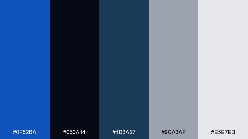
HEX: #0F52BA #050A14 #1B3A57 #9CA3AF #E5E7EB
Mood: mysterious, precise, cosmic
Best for: science conference slide deck
Dark space tones with a vivid blue highlight feel like star maps and instrument readouts. Use the near-black for slide backgrounds, then apply the saturated blue for section titles and key numbers. The light grays keep charts readable without introducing harsh white glare. Tip: use one consistent blue for emphasis to avoid a cluttered, sci-fi look.
Image example of space observatory generated using media.io

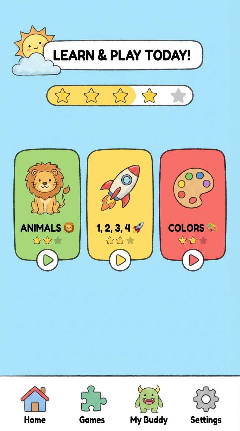
15) Kids Learning UI
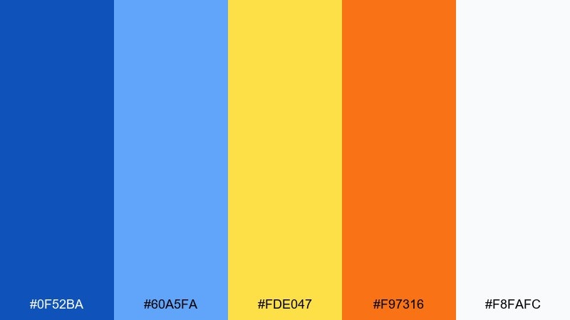
HEX: #0F52BA #60A5FA #FDE047 #F97316 #F8FAFC
Mood: friendly, bright, upbeat
Best for: kids education app UI
Bright blues with sunny yellow and orange feel playful, confident, and easy to follow. Use the lighter blue for surfaces and cards, while the deeper blue anchors navigation and key labels. Yellow and orange are perfect for rewards, badges, and progress moments when you want a burst of joy. Tip: keep text areas mostly white so the colorful accents do not compete with reading.
Image example of kids learning ui generated using media.io
16) Luxury Watch Ad
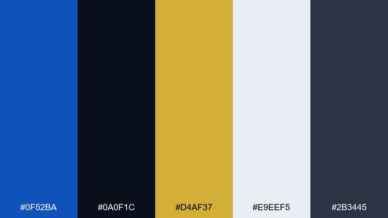
HEX: #0F52BA #0A0F1C #D4AF37 #E9EEF5 #2B3445
Mood: luxury, dramatic, precise
Best for: product ad for a luxury watch
Dramatic midnight tones with a gold accent evoke precision engineering and showroom lighting. This sapphire color palette is ideal for premium product ads where you want strong contrast and a restrained glow. Keep the background nearly black, use the blue for subtle rim light or typography, and apply gold only for the logo or a single detail line. Tip: use plenty of negative space so the product remains the hero.
Image example of luxury watch ad generated using media.io

17) Mountain Twilight
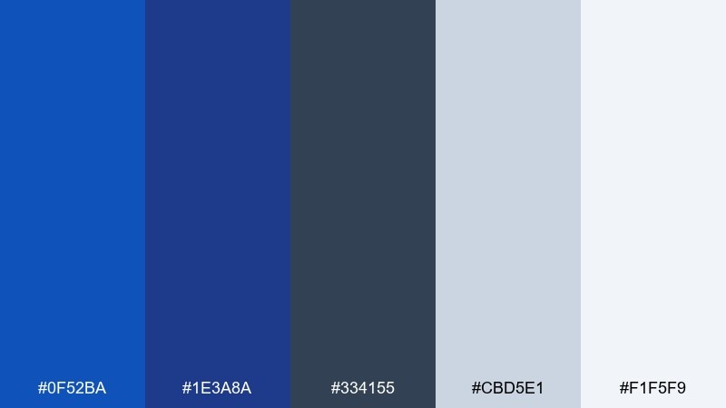
HEX: #0F52BA #1E3A8A #334155 #CBD5E1 #F1F5F9
Mood: cool, outdoorsy, steady
Best for: outdoor gear ecommerce banner
Cool twilight blues and slate grays feel like mountain air and distant ridgelines. Use the deeper blue for headlines and product names, then rely on light grays for background panels and price blocks. This mix works especially well with monochrome product photography and minimal icons. Tip: add one bold blue button per banner to keep attention focused on the primary action.
Image example of mountain twilight generated using media.io

18) Soft Office Calm
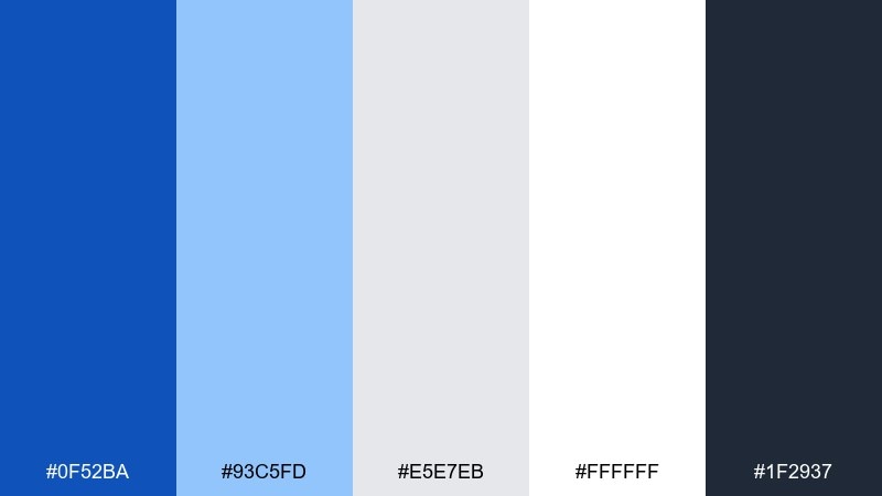
HEX: #0F52BA #93C5FD #E5E7EB #FFFFFF #1F2937
Mood: calm, approachable, professional
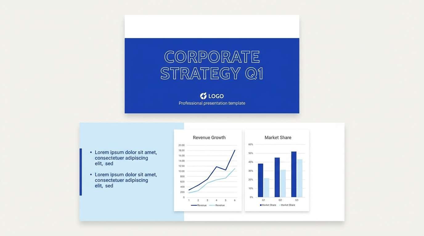
Best for: corporate presentation template
Soft blues with clean neutrals feel organized, reassuring, and easy on the eyes. Use white as the dominant canvas, then set a consistent blue for section headers and charts. The light blue is perfect for subtle shapes and callout boxes without overpowering content. Tip: keep one font weight for body text and let color, not typography, do the hierarchy work.
Image example of soft office calm generated using media.io
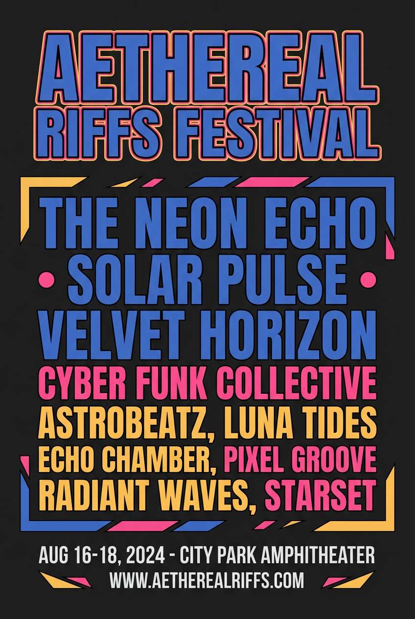
19) Festival Poster Pop
HEX: #0F52BA #FF2D55 #FFD166 #0B1320 #F8F9FA
Mood: loud, festive, punchy
Best for: music festival poster
Punchy pink and warm yellow against bold blue feel like stage lights and big-city nights. These sapphire color combinations are made for posters where you need instant energy and sharp readability. Use the dark base for contrast, keep blue for the main headline, and let pink lead the key callouts like dates and ticket info. Tip: limit your typefaces to two so the colors carry the excitement without visual noise.
Image example of festival poster pop generated using media.io
20) Night Swim
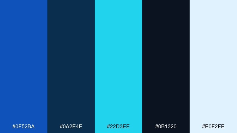
HEX: #0F52BA #0A2E4E #22D3EE #0B1320 #E0F2FE
Mood: cool, refreshing, late-night
Best for: skincare packaging design
Cool blues with a bright aqua pop evoke moonlit water and a clean, refreshing rinse. Use the deepest tones for the bottle or tube base, then bring in aqua for key claims and small iconography. The pale ice shade works well as a label field to keep text legible. Tip: use spot gloss on the bright accent to amplify the fresh, wet look without adding new colors.
Image example of night swim generated using media.io
What Colors Go Well with Sapphire?
Sapphire pairs beautifully with crisp neutrals like off-white, light gray, and charcoal because they keep the blue feeling structured and modern. These combinations are especially reliable for dashboards, editorial layouts, and brand systems with lots of text.
For a premium look, combine sapphire with metallic-like accents (gold, brass, warm tan) and limit the accent to small UI moments or print details. For energy, add warm complements like coral, hot pink, or yellow—best used as CTAs, labels, or badges.
If you want a fresh, airy direction, mix sapphire with icy blues, mint, or teal. This keeps the palette cool while adding variety, ideal for healthcare, wellness, and clean product packaging.
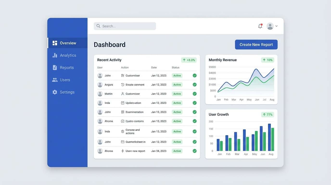
How to Use a Sapphire Color Palette in Real Designs
Start by assigning roles: pick one sapphire as your primary brand/UI color, then choose a darker “ink” tone for text and navigation. Add a background neutral (white, off-white, or pale blue) to protect readability and spacing.
Use accents with restraint. A single warm accent (coral, gold, or yellow) works best when it signals action or importance—like primary buttons, key metrics, or limited print embellishments.
Before shipping, check contrast in both light and dark modes. Sapphire can look brighter on screens than in print, so test real devices and consider slightly muting saturation for large surfaces.
Create Sapphire Palette Visuals with AI
If you already have HEX codes, you can quickly turn them into mockups—posters, UI screens, packaging, or brand boards—to see how sapphire behaves in context. Visual testing is the fastest way to validate contrast, hierarchy, and accent balance.
With Media.io text-to-image, you can generate consistent design examples by describing layout, lighting, and style (for instance: “editorial brochure,” “dark mode UI,” or “studio product ad”) and keeping sapphire as the dominant color.
Try generating a few variations with different accent colors (gold vs coral vs cyan) to find the tone that best matches your brand personality.
Sapphire Color Palette FAQs
-
What HEX code is sapphire blue?
A common sapphire blue used in design palettes is #0F52BA. Depending on the shade (more navy or more electric), sapphire can vary, so it’s best to lock one primary HEX and build tints/shades around it. -
Is sapphire a warm or cool color?
Sapphire is typically a cool blue. It feels cleaner and more structured when paired with cool grays and icy tints, and it becomes more luxurious or energetic when paired with warm accents like gold or coral. -
What colors complement sapphire blue?
Warm complements that pop against sapphire include coral, gold, and warm yellow. They’re most effective as small accents for CTAs, highlights, badges, or callouts. -
What neutrals work best with sapphire?
Try off-white, light gray, and charcoal to keep sapphire readable and modern. For print or editorial, a slightly warm paper tone can make sapphire feel less clinical. -
How do I use sapphire in UI without overpowering the screen?
Use sapphire for primary actions (buttons, links, active tabs) and keep large surfaces in light neutrals or very dark panels. Save bright accents for focus states or one key action per screen. -
Does sapphire print darker than it looks on screen?
Often yes—deep blues can shift darker in print, especially on uncoated paper. Print proofs (or at least CMYK conversions) help you adjust saturation and ensure text and icons stay crisp. -
What’s a safe accent-color rule for sapphire palettes?
Pick one accent color and keep it limited (for example, 5–10% of the layout). This prevents the palette from feeling busy and keeps sapphire as the clear visual anchor.
