

Gold beige sits right between cozy neutral and polished luxury. It gives designs warmth and credibility without the harshness of pure black or the flatness of plain beige.
Below are 20+ gold beige color combinations with HEX codes, plus AI image prompts you can use to generate matching visuals for branding, UI, packaging, and interiors.
In this article
- Why Gold Beige Palettes Work So Well
-
- antique linen glow
- champagne dune
- museum brass
- honeyed sandstone
- quiet cashmere
- gilded minimal ui
- desert pearl
- oat latte menu
- sunlit courtyard
- golden clay pottery
- wheatfield stationery
- silk and saffron
- vintage map patina
- desert nightfall
- linen and brass hardware
- pearl jewelry highlight
- modern gallery walls
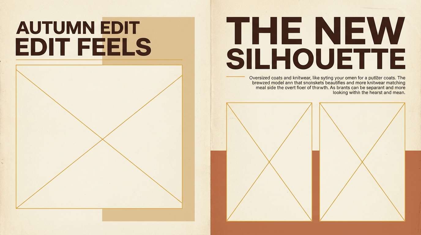
- autumn harvest label
- soft portfolio neutrals
- calm finance dashboard
- botanical biscotti
- evening lobby luxe
- What Colors Go Well with Gold Beige?
- How to Use a Gold Beige Color Palette in Real Designs
- Create Gold Beige Palette Visuals with AI
Why Gold Beige Palettes Work So Well
Gold beige palettes feel premium because they echo familiar materials: parchment, linen, wood, leather, and brushed metal. That material vibe makes layouts feel tactile even when they’re purely digital.
They also make typography and photography easier to manage. Warm neutrals reduce glare, soften contrast edges, and create a calm background where product shots and headlines can stand out.
Finally, gold beige is flexible across styles. With the right dark anchor color, it can read minimalist and modern, rustic and handmade, or cinematic and luxe.
20+ Gold Beige Color Palette Ideas (with HEX Codes)
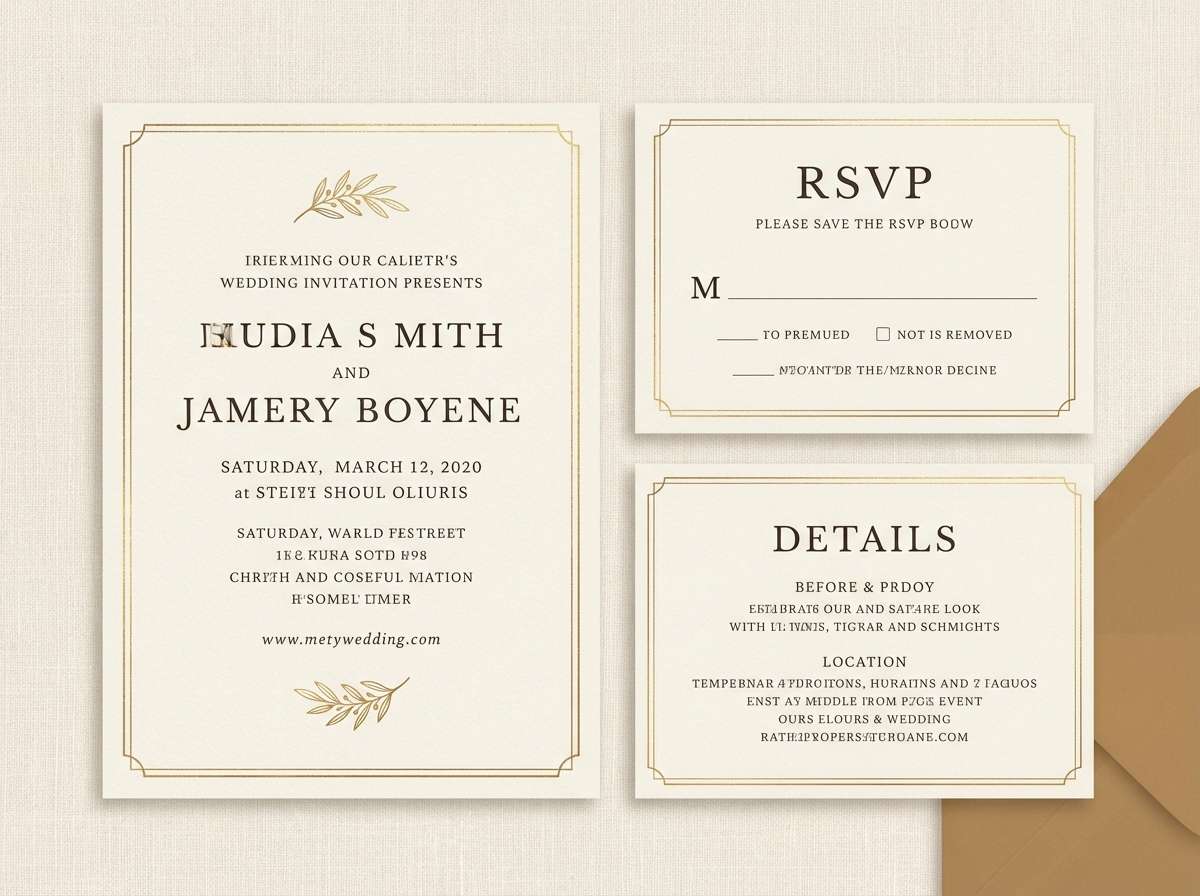
1) Antique Linen Glow
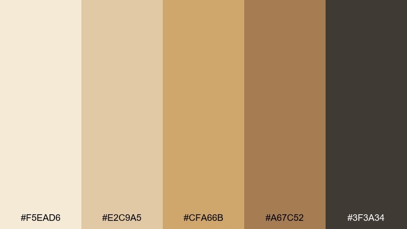
HEX: #F5EAD6 #E2C9A5 #CFA66B #A67C52 #3F3A34
Mood: cozy, heritage, sunlit
Best for: rustic wedding invitations
Cozy and heirloom-like, it feels like linen paper warmed by late-afternoon light and a hint of antique brass. Use this gold beige color palette for invites, menus, and day-of signage that should read elegant but approachable. Pair it with deckled edges, serif typography, and a deep espresso ink for contrast. Tip: keep the darkest tone for names and dates so the softer creams stay airy.
Image example of antique linen glow generated using media.io
Media.io is an online AI studio for creating and editing video, image, and audio in your browser.

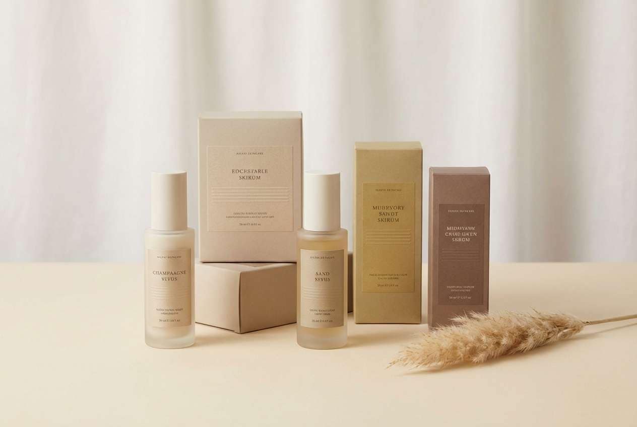
2) Champagne Dune
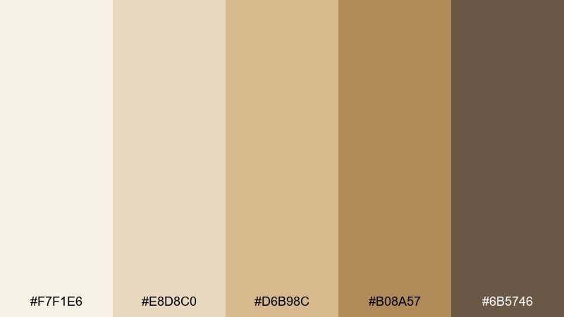
HEX: #F7F1E6 #E8D8C0 #D6B98C #B08A57 #6B5746
Mood: polished, airy, upscale
Best for: luxury skincare packaging
Polished and airy, these tones evoke champagne foam, clean dunes, and a soft satin sheen. They work beautifully on skincare boxes, bottles, and minimalist labels where warmth matters more than bright color. Pair with matte off-white backgrounds and a single metallic print touch for premium restraint. Tip: use the mid-gold for key claims and keep body copy in the cocoa tone for readability.
Image example of champagne dune generated using media.io
3) Museum Brass
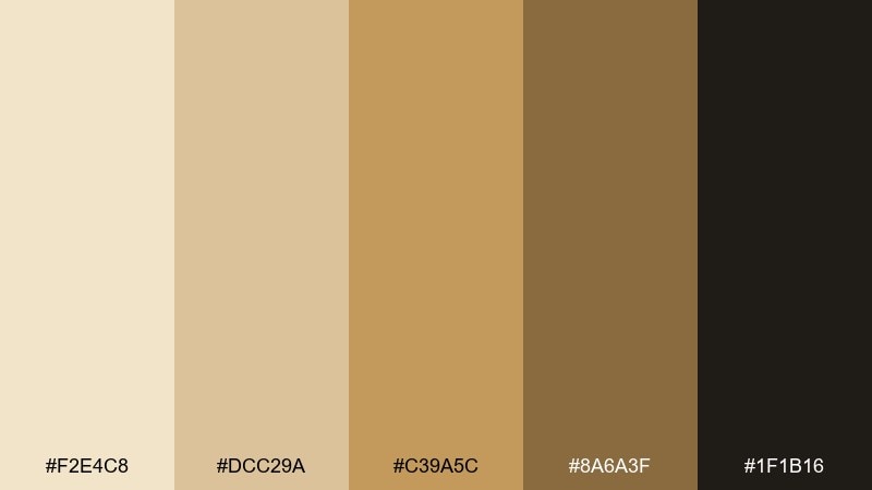
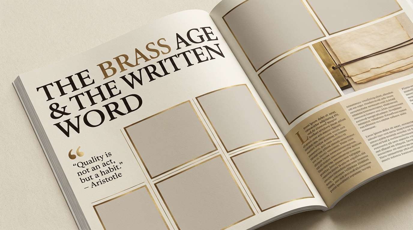
HEX: #F2E4C8 #DCC29A #C39A5C #8A6A3F #1F1B16
Mood: classic, scholarly, dramatic
Best for: editorial magazine layouts
Classic and slightly dramatic, it suggests museum placards, brushed brass frames, and old paper under gallery lights. Use it for feature openers, pull quotes, and section dividers where a refined hierarchy is key. Pair with lots of negative space and crisp black photography for an elevated contrast. Tip: reserve the deepest near-black for headlines and captions to keep the warm tones feeling intentional, not muddy.
Image example of museum brass generated using media.io
4) Honeyed Sandstone
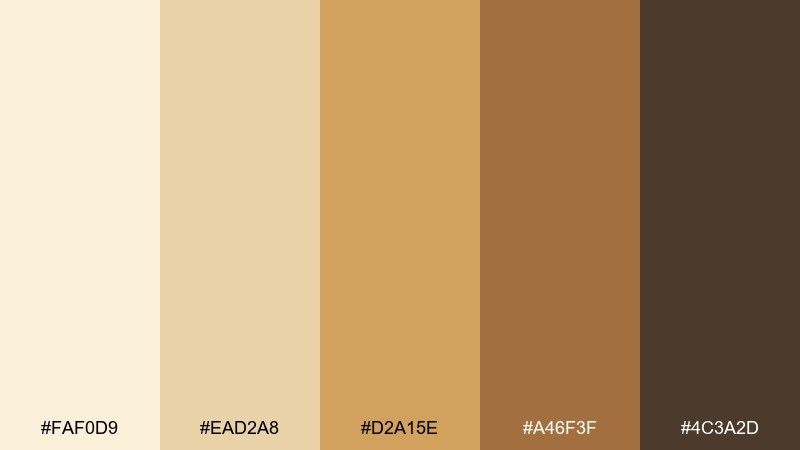
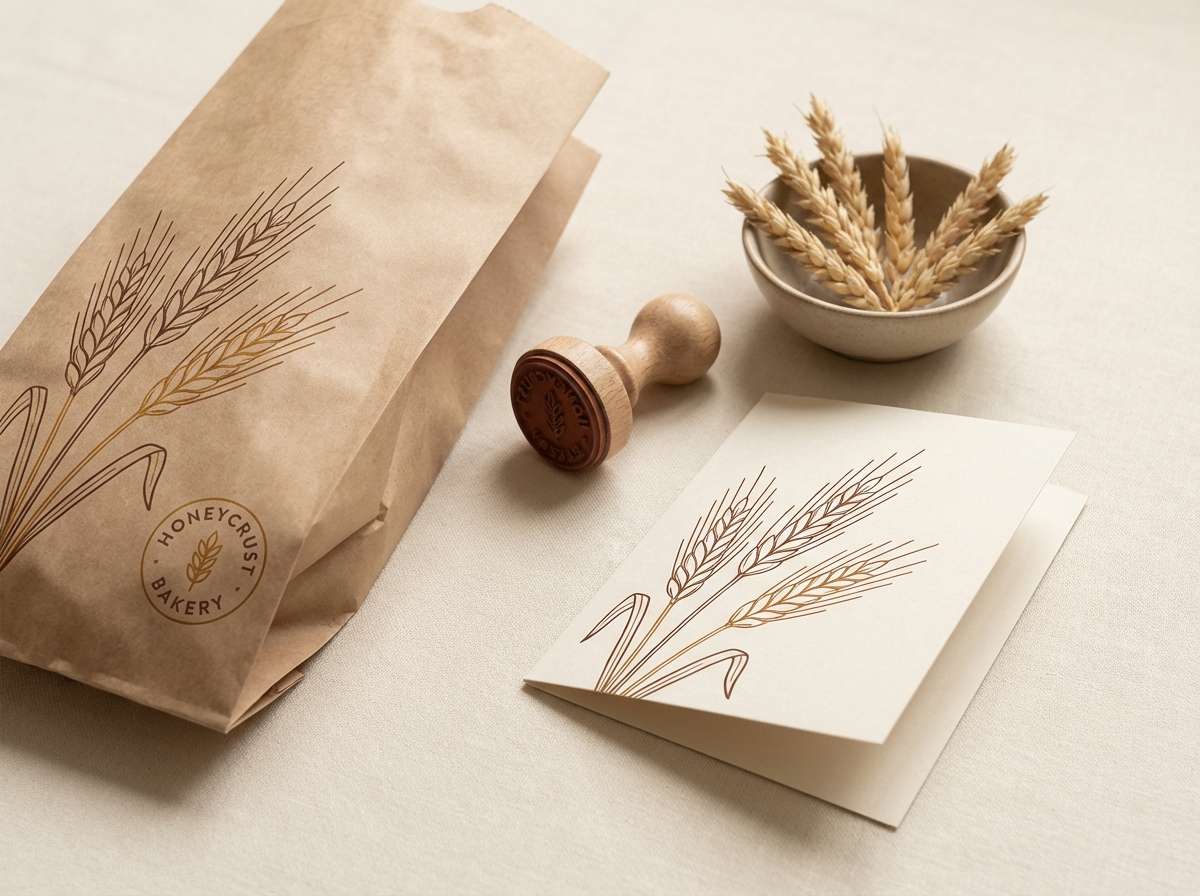
HEX: #FAF0D9 #EAD2A8 #D2A15E #A46F3F #4C3A2D
Mood: inviting, sun-baked, artisanal
Best for: boutique bakery branding
Inviting and sun-baked, it brings to mind honey drizzle over warm stone and fresh-baked crust. This gold beige color combination shines on logos, takeout bags, and window decals for bakeries and cafes. Pair it with a clean cream base and a hand-drawn illustration style to keep things friendly. Tip: use the honey tone for stamps and seals so brand marks pop without looking loud.
Image example of honeyed sandstone generated using media.io
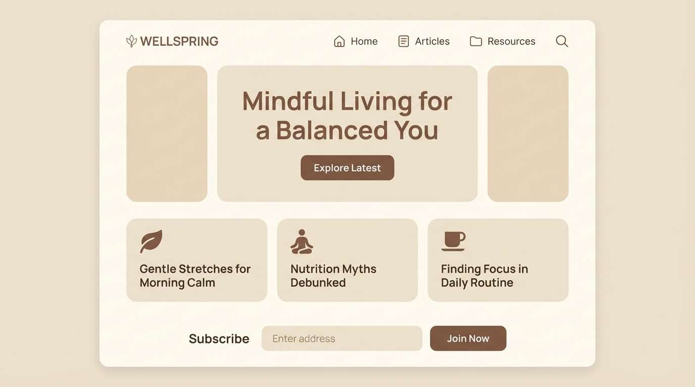
5) Quiet Cashmere
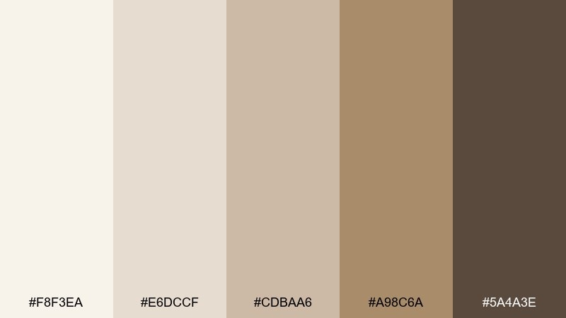
HEX: #F8F3EA #E6DCCF #CDBAA6 #A98C6A #5A4A3E
Mood: soft, calm, understated
Best for: wellness blog design
Soft and understated, it feels like cashmere throws, oat milk, and a calm morning routine. These tones suit long-form reading experiences where comfort and clarity matter. Pair with warm gray line icons and subtle paper textures for depth. Tip: keep links and buttons in the deeper mocha shade to preserve a gentle, low-glare interface.
Image example of quiet cashmere generated using media.io
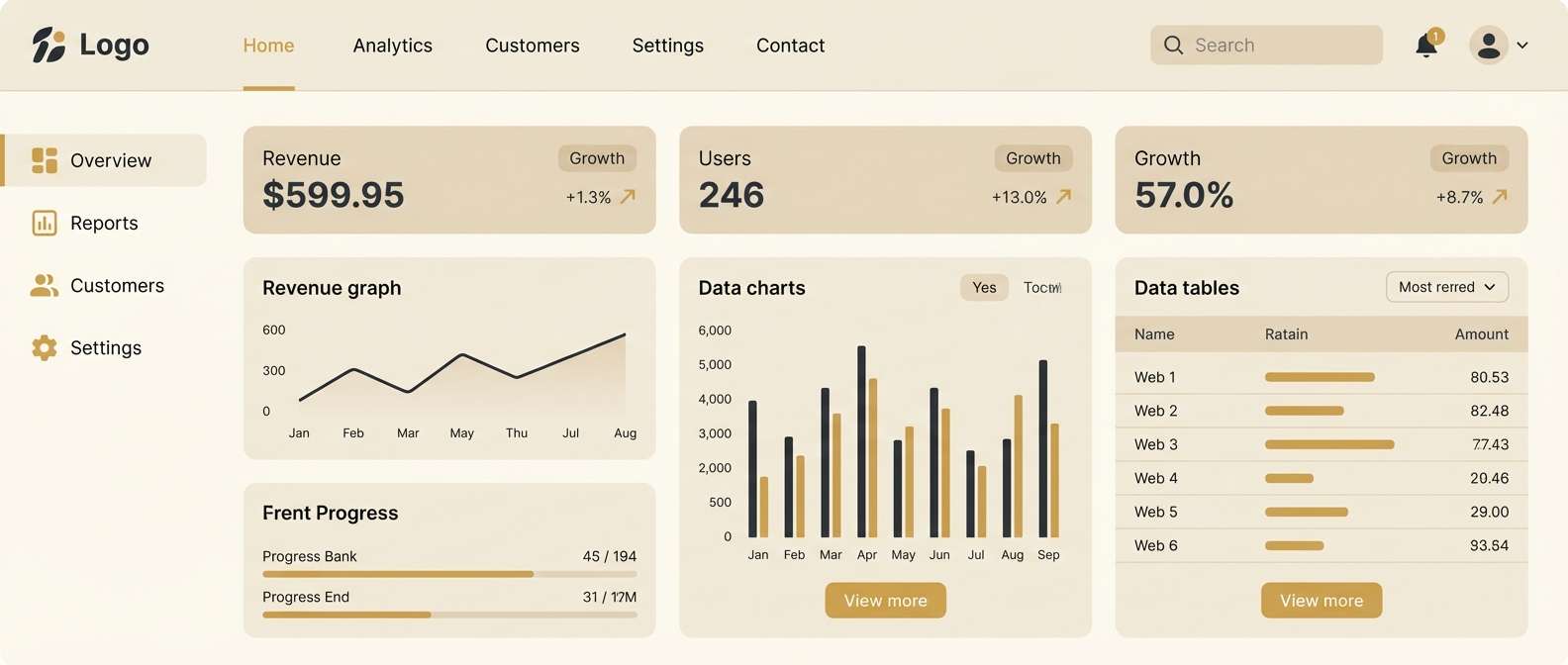
6) Gilded Minimal UI
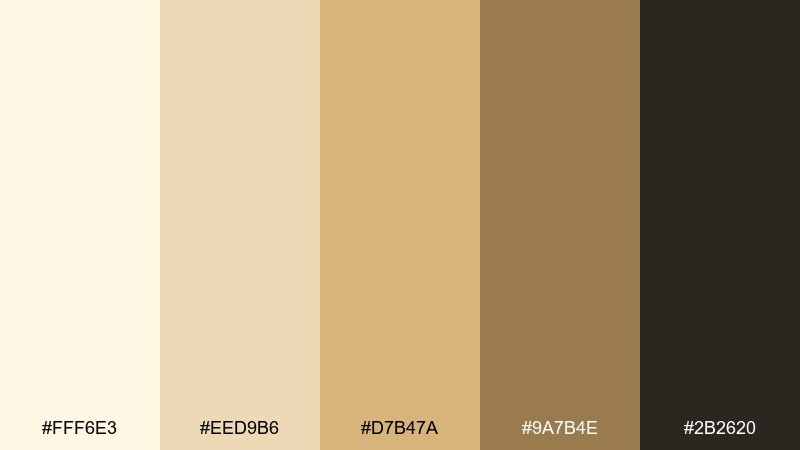
HEX: #FFF6E3 #EED9B6 #D7B47A #9A7B4E #2B2620
Mood: modern, premium, crisp
Best for: saas dashboard UI
Modern and premium, it reads like a bright workspace with a subtle gold edge. Use it for dashboards that need to feel trustworthy while still looking high-end. Pair with strong typography and clear spacing to avoid beige-on-beige fatigue. Tip: apply the deepest tone to charts and key metrics while keeping surfaces in the palest cream for contrast.
Image example of gilded minimal ui generated using media.io
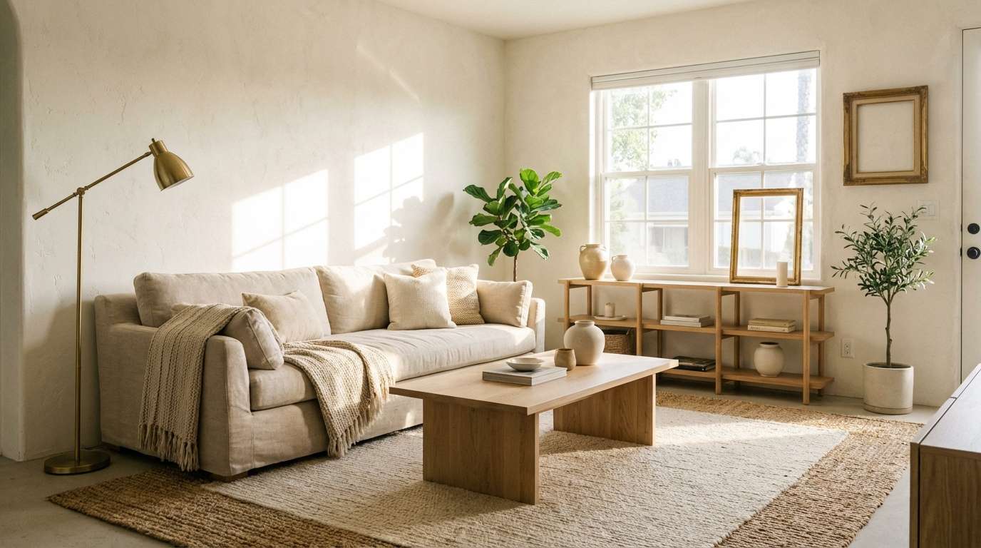
7) Desert Pearl
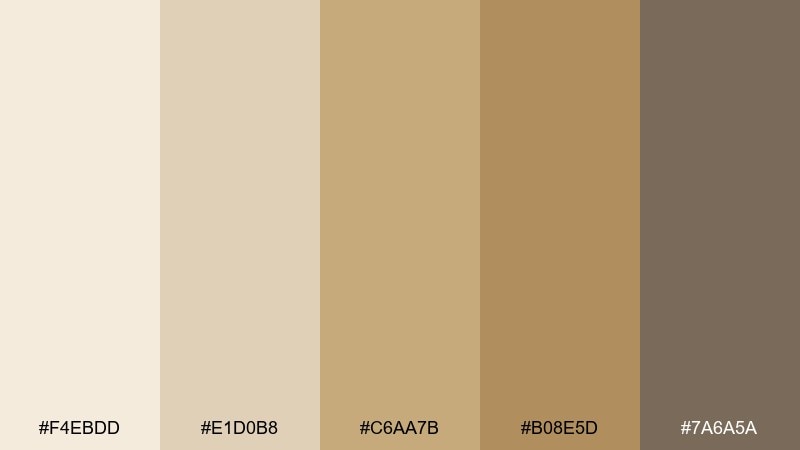
HEX: #F4EBDD #E1D0B8 #C6AA7B #B08E5D #7A6A5A
Mood: natural, breezy, earthy
Best for: boho living room styling
Natural and breezy, it suggests sunlit plaster walls, woven rugs, and a pearly sand haze. It fits interior styling boards, home blogs, and decor catalogs where warmth should feel organic. Pair with raw wood textures, black metal accents, and plenty of greenery for balance. Tip: use the pearl tone on walls and let the camel shades carry furniture and textiles.
Image example of desert pearl generated using media.io
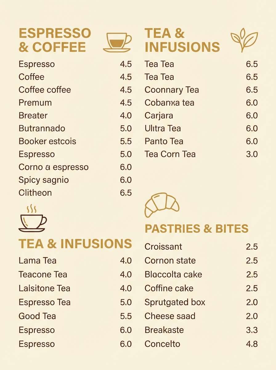
8) Oat Latte Menu

HEX: #FFF7ED #E9D7C3 #D2B28A #B18455 #4A3A2B
Mood: friendly, cozy, approachable
Best for: cafe menu design
Friendly and cozy, it evokes oat lattes, toasted pastries, and a warmly lit counter. These colors are ideal for menus that need to feel inviting while staying legible in print and on screens. Pair with simple iconography and a single bold typeface to keep the look clean. Tip: place prices in the darkest brown to anchor the layout and reduce visual clutter.
Image example of oat latte menu generated using media.io
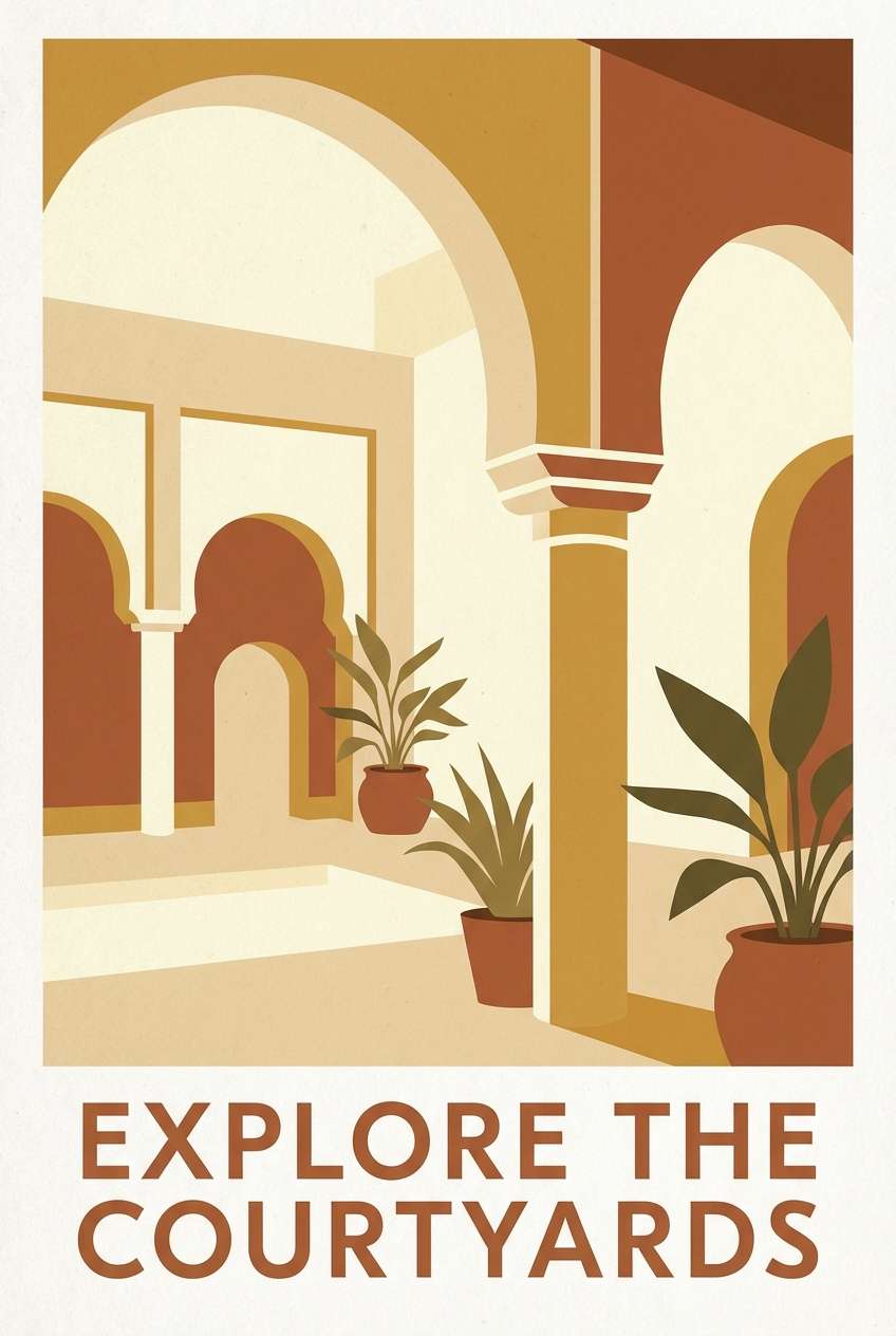
9) Sunlit Courtyard
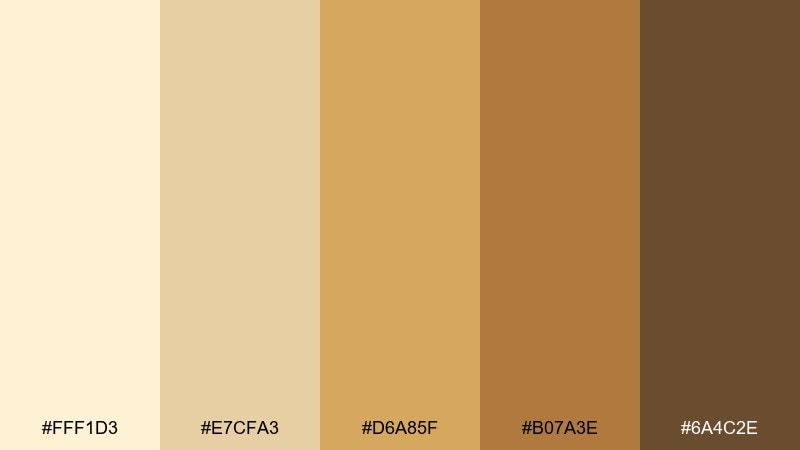
HEX: #FFF1D3 #E7CFA3 #D6A85F #B07A3E #6A4C2E
Mood: bright, travel-ready, nostalgic
Best for: travel poster artwork
Bright and nostalgic, it feels like a sunlit courtyard with ochre walls and warm stone underfoot. These gold beige color combinations work well for posters, postcards, and cover art that need warmth without oversaturation. Pair with simple geometric shapes and soft grain for a vintage print vibe. Tip: keep the lightest tone as the sky or background so the darker ochres read like architecture.
Image example of sunlit courtyard generated using media.io
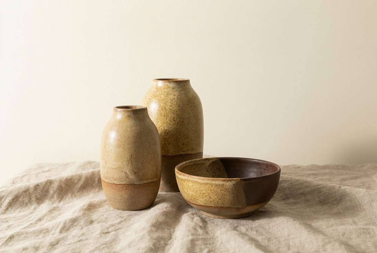
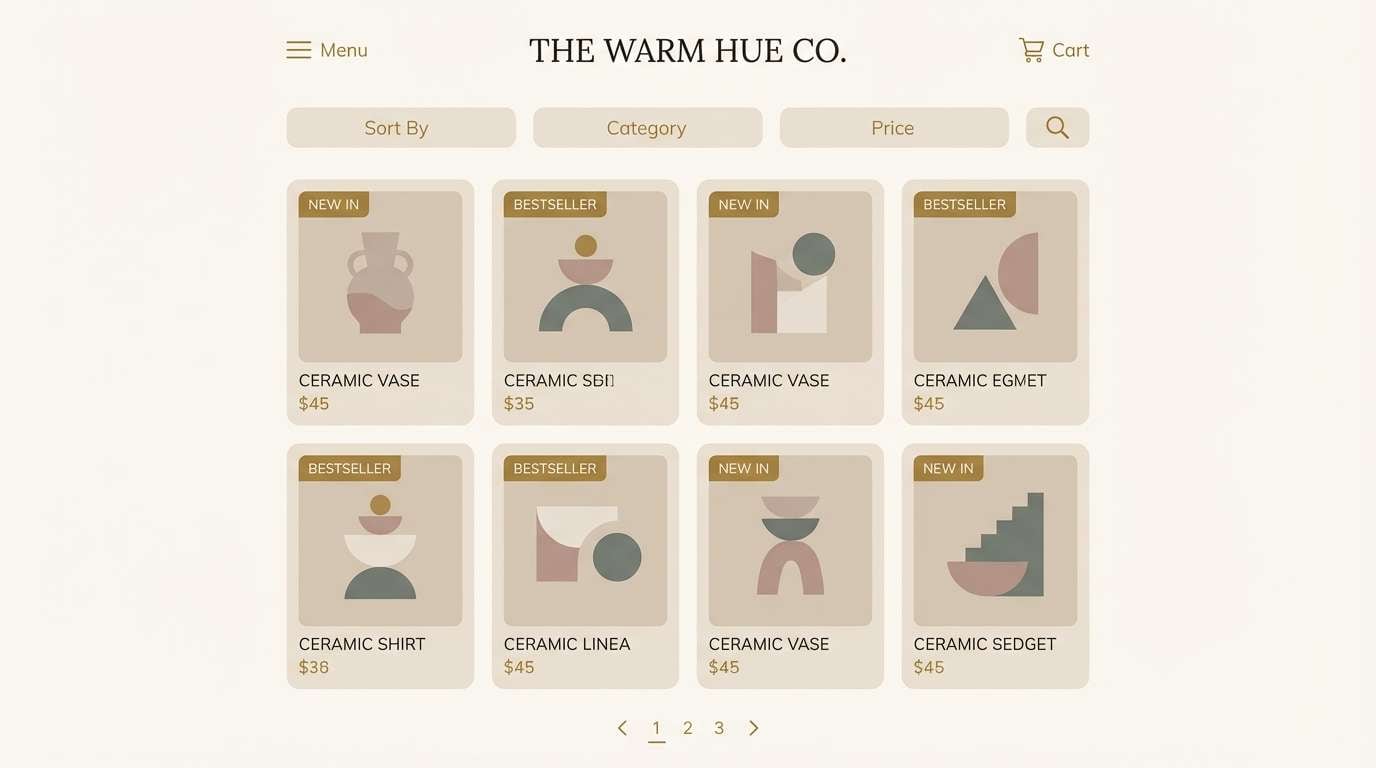
10) Golden Clay Pottery
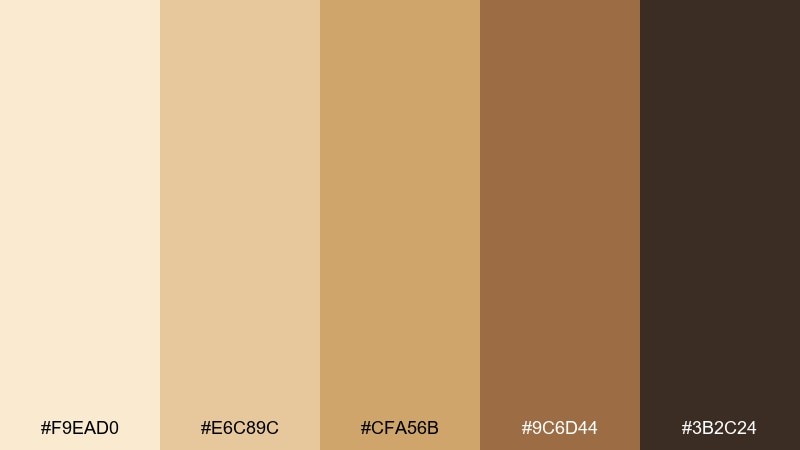
HEX: #F9EAD0 #E6C89C #CFA56B #9C6D44 #3B2C24
Mood: handcrafted, warm, grounded
Best for: ceramics product ads
Handcrafted and grounded, it recalls clay vessels, kiln warmth, and a soft golden wash. Use it in product ads where texture and craft should lead the story. Pair with natural shadows and minimal props like linen or wood for authenticity. Tip: make the mid-gold the hero tone on the product and keep the background in pale cream to avoid muddy contrast.
Image example of golden clay pottery generated using media.io
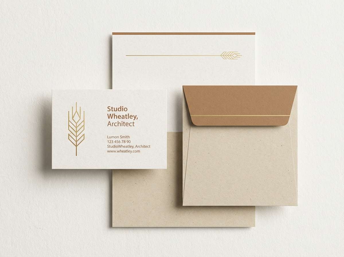
11) Wheatfield Stationery
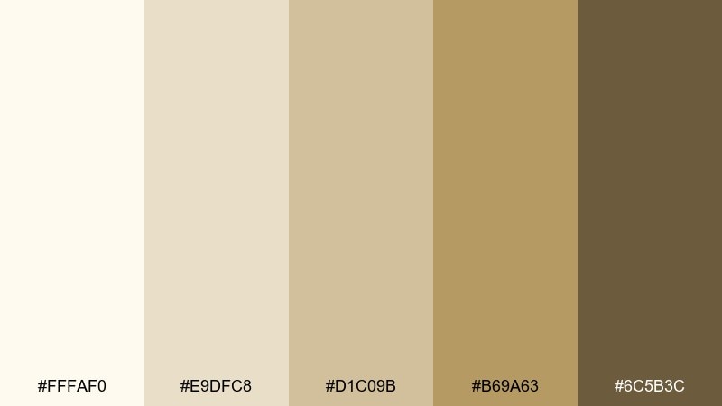
HEX: #FFFAF0 #E9DFC8 #D1C09B #B69A63 #6C5B3C
Mood: clean, optimistic, professional
Best for: personal brand stationery
Clean and optimistic, it suggests wheatfields, crisp paper, and a thoughtful handwritten note. It is a strong fit for stationery systems: letterhead, business cards, and email signatures. Pair with a modern serif and fine line motifs for a calm, premium look. Tip: use the wheat gold for small rules and icons, and keep large areas mostly off-white.
Image example of wheatfield stationery generated using media.io
12) Silk and Saffron
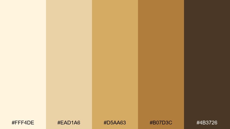
HEX: #FFF4DE #EAD1A6 #D5AA63 #B07D3C #4B3726
Mood: luxurious, fashion-forward, warm
Best for: fashion lookbook design
Luxurious and fashion-forward, it feels like silk lining and saffron light on polished wood. Use this gold beige color palette in lookbooks and campaign PDFs where neutrals should still feel rich. Pair with high-contrast black-and-white photography and generous margins for runway-level polish. Tip: let the saffron tone highlight section titles and page numbers to keep the system cohesive.
Image example of silk and saffron generated using media.io
13) Vintage Map Patina
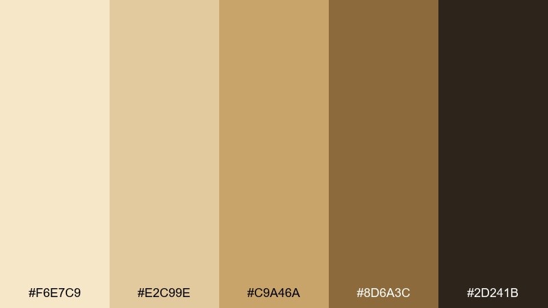
HEX: #F6E7C9 #E2C99E #C9A46A #8D6A3C #2D241B
Mood: nostalgic, adventurous, aged
Best for: historical book cover design
Nostalgic and adventurous, it recalls aged maps, parchment folds, and a patinaed compass. These tones work best on covers and chapter openers where texture and story carry the design. Pair with engraved illustration styles and subtle grunge overlays for authenticity. Tip: keep the darkest tone for title and author so the aged background stays readable.
Image example of vintage map patina generated using media.io
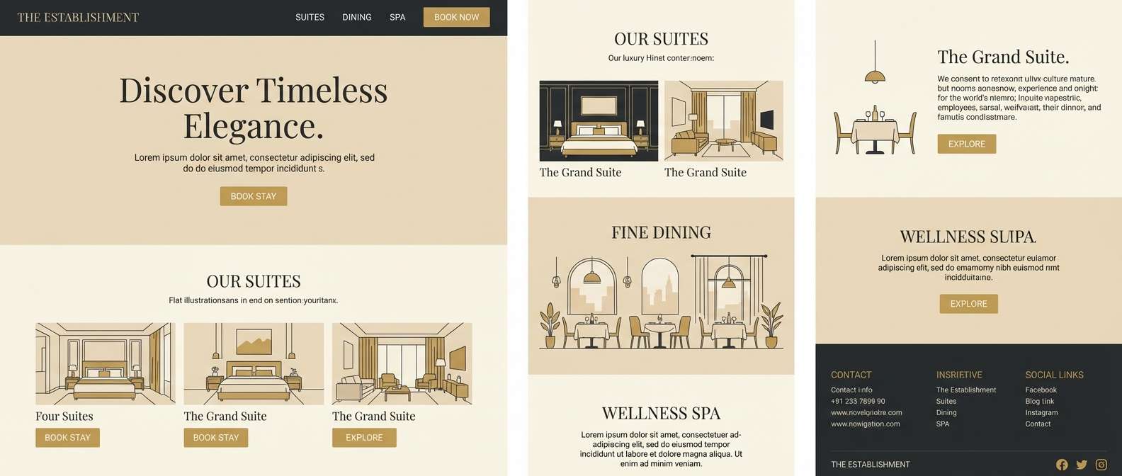
14) Desert Nightfall
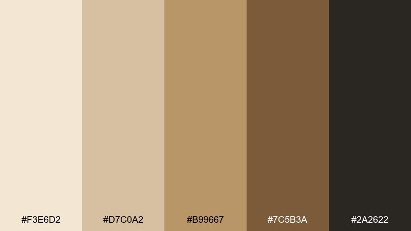
HEX: #F3E6D2 #D7C0A2 #B99667 #7C5B3A #2A2622
Mood: moody, cinematic, warm-dark
Best for: luxury hotel website
Moody and cinematic, it feels like desert dusk when the air turns cool but the ground still holds warmth. It is ideal for hotel websites and landing pages that need depth without heavy blacks. Pair with large imagery, subtle overlays, and refined serif headlines to signal luxury. Tip: use the near-black sparingly for navigation and CTAs so the page stays inviting.
Image example of desert nightfall generated using media.io
15) Linen and Brass Hardware

HEX: #FFFBF3 #EDE1CE #D8C2A0 #C29A63 #695A45
Mood: fresh, organized, airy
Best for: home organization product pages
Fresh and organized, it suggests linen storage bins and brushed brass pulls in a bright pantry. Use it on ecommerce pages where product photography needs a warm, clean frame. Pair with white space, thin dividers, and simple sans-serif text for clarity. Tip: set key badges like best seller in the brass tone to draw attention without overwhelming the grid.
Image example of linen and brass hardware generated using media.io
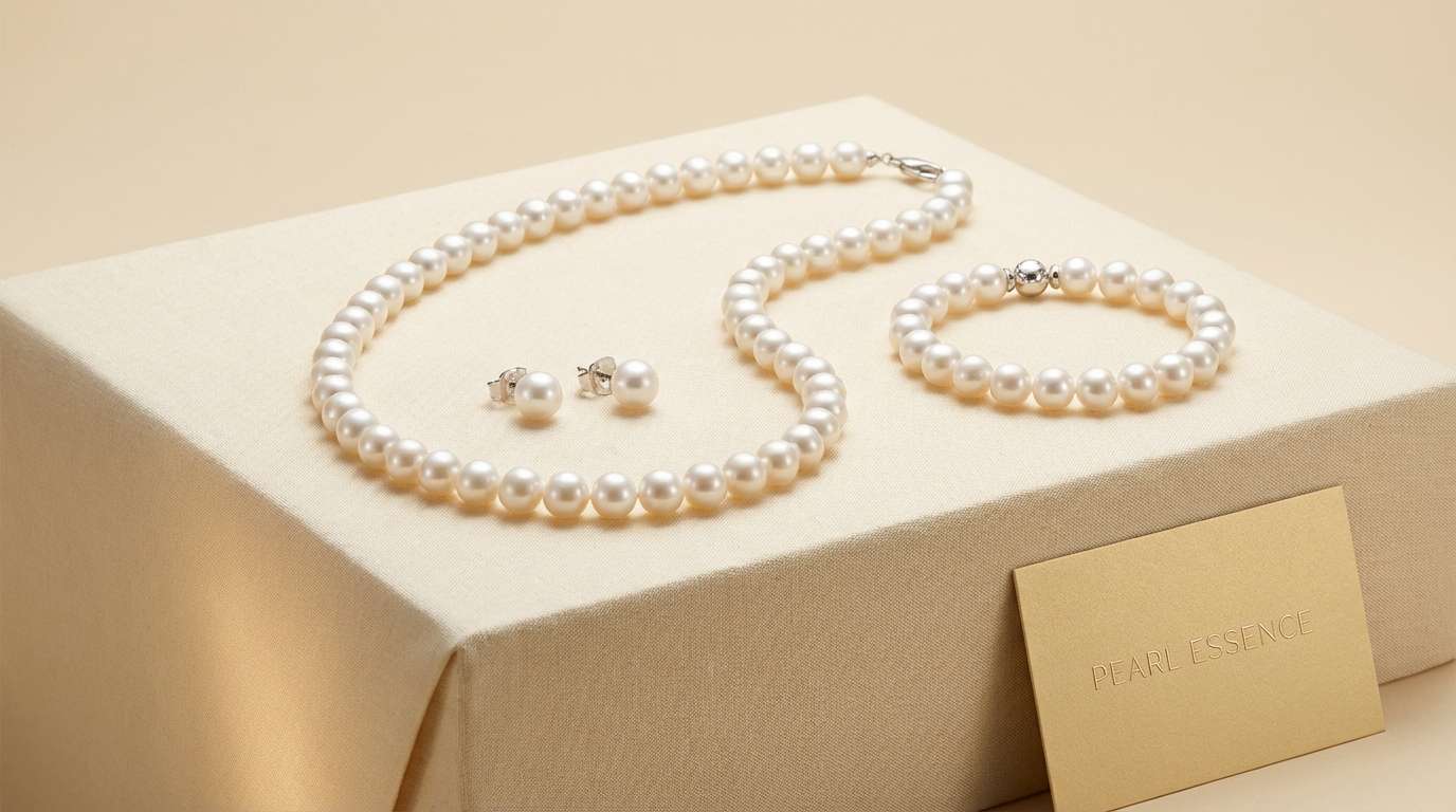
16) Pearl Jewelry Highlight
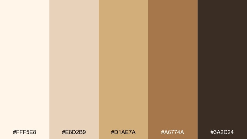
HEX: #FFF5E8 #E8D2B9 #D1AE7A #A6774A #3A2D24
Mood: glamorous, soft, romantic
Best for: jewelry ecommerce banner
Glamorous yet soft, it evokes pearls, candlelight, and warm metal reflections. These gold beige color combinations are perfect for hero banners and product launches that need a romantic, premium feel. Pair with macro photography and minimal copy so the tones do the luxury signaling. Tip: place CTAs in the cocoa shade and outline them with the mid-gold for a subtle glow effect.
Image example of pearl jewelry highlight generated using media.io
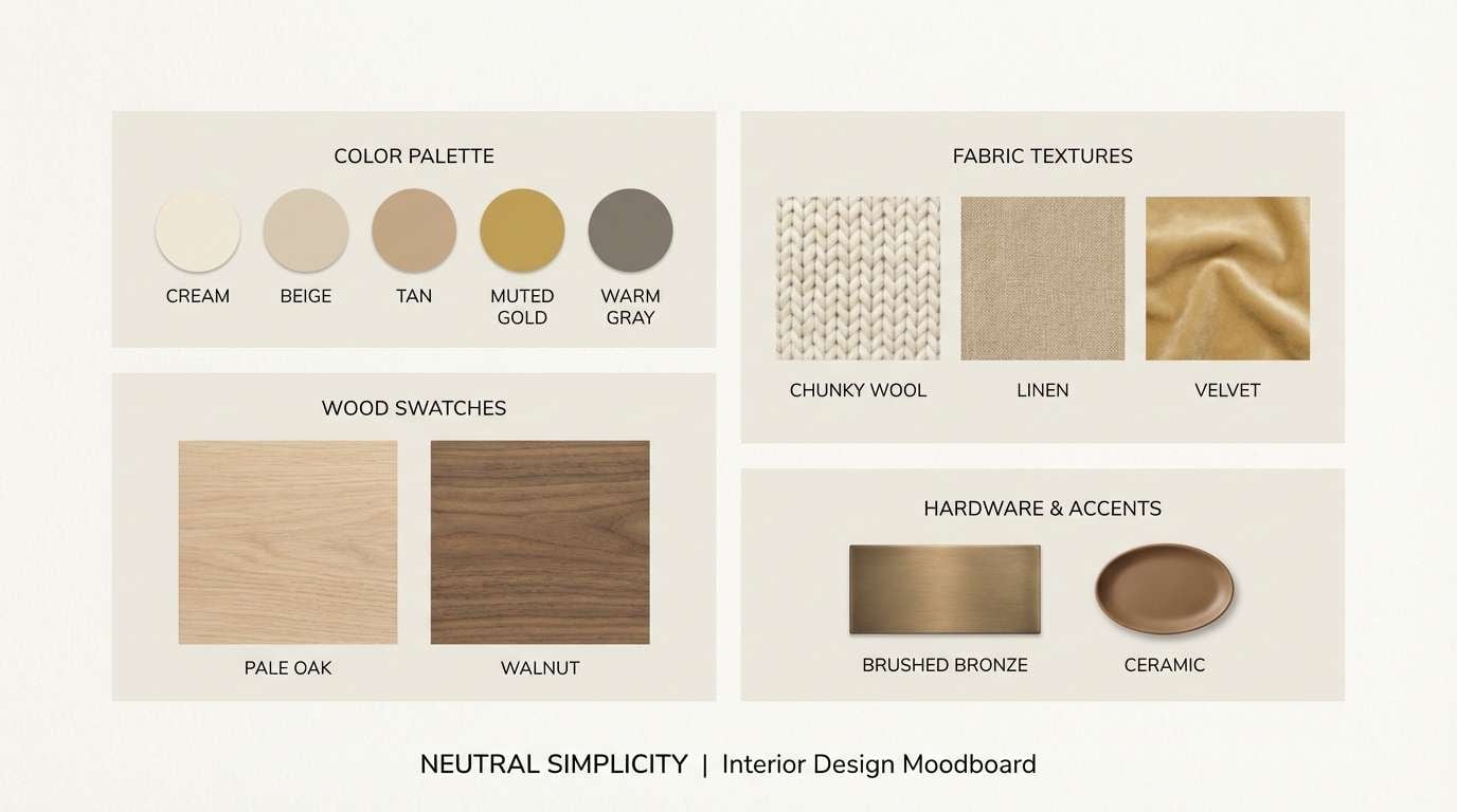
17) Modern Gallery Walls
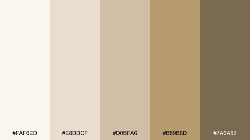
HEX: #FAF6ED #E8DDCF #D0BFA6 #B89B6D #7A6A52
Mood: neutral, curated, modern
Best for: interior moodboard presentations
Neutral and curated, it resembles modern gallery walls with warm plaster and light oak. It is great for presentation decks where you want materials and finishes to feel cohesive. Pair with grayscale photography and thin grid lines to keep the moodboard looking professional. Tip: use the gold-tan tone only for key swatches and headings to preserve the minimalist vibe.
Image example of modern gallery walls generated using media.io
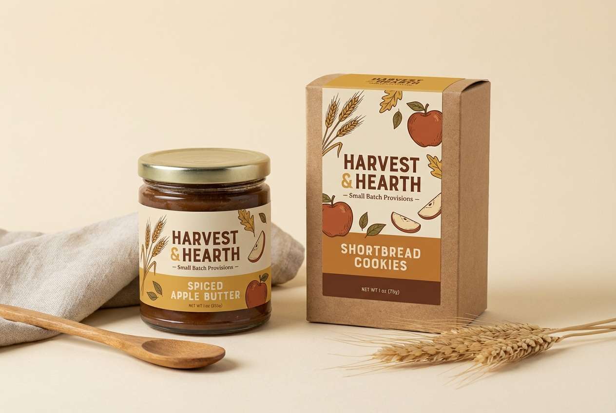
18) Autumn Harvest Label
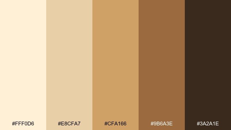
HEX: #FFF0D6 #E8CFA7 #CFA166 #9B6A3E #3A2A1E
Mood: seasonal, hearty, rustic
Best for: artisan food packaging
Seasonal and hearty, it brings to mind harvest markets, baked spices, and kraft paper textures. Use it on labels and cartons for honey, granola, or small-batch sauces where warmth sells the story. Pair with stamped illustration elements and a tactile paper stock for a handcrafted feel. Tip: set nutrition or ingredients panels on the palest cream to keep fine text readable.
Image example of autumn harvest label generated using media.io
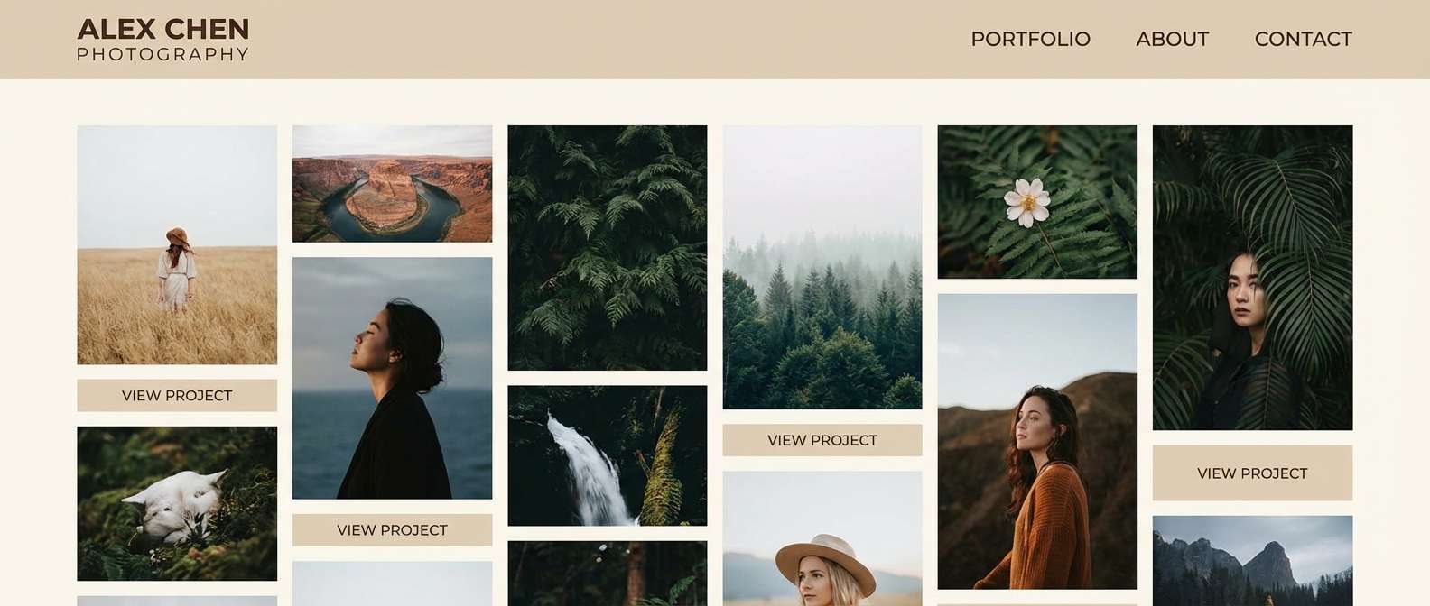
19) Soft Portfolio Neutrals
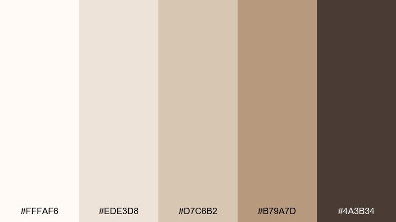
HEX: #FFFAF6 #EDE3D8 #D7C6B2 #B79A7D #4A3B34
Mood: creative, calm, approachable
Best for: photographer portfolio website
Creative and calm, it feels like matte prints, clean studio light, and a warm paper edge. These tones suit portfolio sites where the work should stay center stage. Pair with minimal UI components and subtle hover states so images remain the hero. Tip: use the deepest brown for navigation and keep buttons slim to maintain a gallery-like experience.
Image example of soft portfolio neutrals generated using media.io
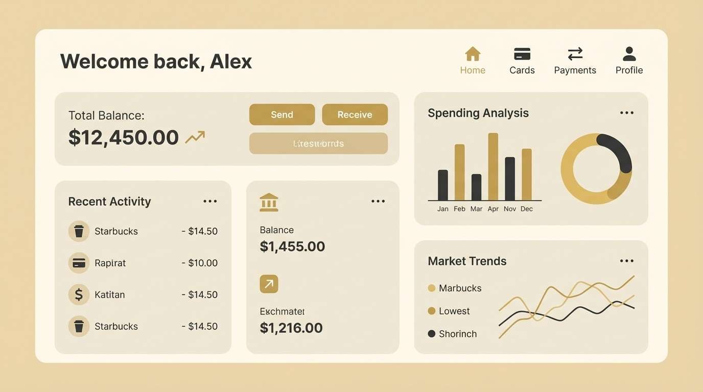
20) Calm Finance Dashboard
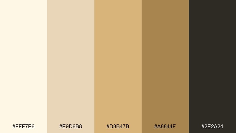
HEX: #FFF7E6 #E9D6B8 #D8B47B #A8844F #2E2A24
Mood: steady, reassuring, refined
Best for: fintech app UI
Steady and refined, it feels like well-worn leather, warm lighting, and quiet confidence. A gold beige color scheme can make finance screens feel less sterile while still looking credible. Pair with clear data visualization, minimal shadows, and consistent spacing for trust. Tip: set alerts and status chips with the mid-gold and keep the background near-cream to reduce eye strain.
Image example of calm finance dashboard generated using media.io
21) Botanical Biscotti
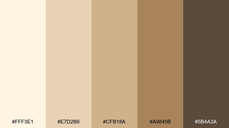
HEX: #FFF3E1 #E7D2B6 #CFB18A #A9845B #5B4A3A
Mood: gentle, botanical, handmade
Best for: watercolor botanical prints
Gentle and handmade, it recalls biscotti crumbs, dried grasses, and pressed botanicals in a sketchbook. Use it for art prints, journaling pages, and seasonal stationery where softness is the point. Pair with fine ink outlines and plenty of blank space for an airy composition. Tip: keep washes light and save the mocha tone for stems and shadow accents.
Image example of botanical biscotti generated using media.io
22) Evening Lobby Luxe
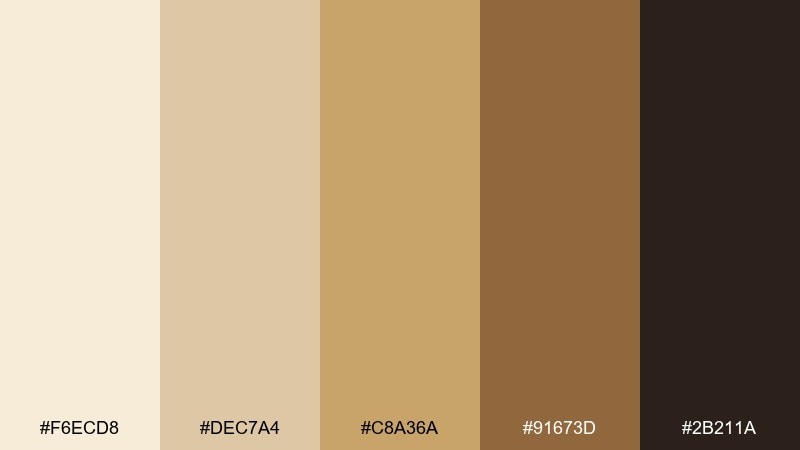
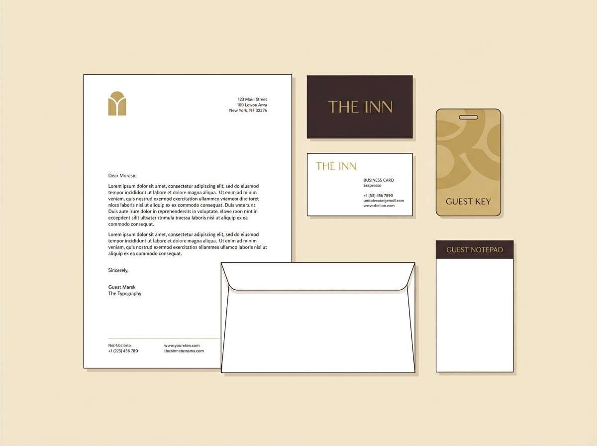
HEX: #F6ECD8 #DEC7A4 #C8A36A #91673D #2B211A
Mood: luxe, intimate, evening
Best for: hospitality branding kits
Luxe and intimate, it feels like an evening lobby with warm sconces and polished wood. It is ideal for hospitality identity kits spanning business cards, key cards, and web touchpoints. Pair with deep shadows, high-quality paper, and restrained metallic accents to keep it sophisticated. Tip: use the darkest tone as a backdrop for the logo mark to create instant premium contrast.
Image example of evening lobby luxe generated using media.io
What Colors Go Well with Gold Beige?
Gold beige pairs naturally with deep browns, charcoal, and near-black because those darker anchors keep warm neutrals from looking washed out. This combination is especially effective for luxury branding and editorial layouts.
For a fresher feel, combine gold beige with off-white, warm gray, and muted greens (sage, olive). The green adds a grounded, organic counterpoint that still stays soft.
If you want more energy, introduce a controlled accent like terracotta or saffron. Use it sparingly—small rules, icons, or highlights—so the palette remains premium and calm.
How to Use a Gold Beige Color Palette in Real Designs
Start by assigning roles: a light cream for backgrounds, a mid beige for surfaces/cards, a gold tone for highlights, and a deep cocoa/charcoal for text. This creates hierarchy and prevents “beige-on-beige” blur.
In print, gold beige looks best with tactile cues—uncoated paper, subtle grain, emboss, or minimal foil accents. In UI, rely on spacing and typography weight to add clarity instead of adding more colors.
For photography-heavy pages, keep UI elements quiet (cream + mocha) and let the gold tone appear only in micro-interactions like badges, active states, and key numbers.
Create Gold Beige Palette Visuals with AI
If you already have HEX codes, you can quickly generate matching mockups, banners, and concept boards by describing the scene and restricting colors to your gold beige range. This helps you validate mood and composition before committing to production design.
With Media.io, you can turn prompts into consistent visuals for packaging, UI, interiors, and posters—then iterate fast by tweaking lighting, texture, and layout while staying in the same warm neutral palette.
Gold Beige Color Palette FAQs
-
What is a gold beige color?
Gold beige is a warm neutral that blends beige with a subtle golden undertone. It can range from creamy sand to richer honey-beige, depending on how much yellow/brown is present. -
Is gold beige good for luxury branding?
Yes. Gold beige signals warmth and premium restraint, especially when paired with deep cocoa, charcoal, or near-black typography and one metallic-like accent tone. -
How do I keep gold beige designs from looking flat?
Use contrast and texture: add a dark anchor for text, vary values (very light cream to deep brown), and introduce subtle materials like paper grain, linen, or soft shadows. -
What text color works best on gold beige backgrounds?
Deep brown, espresso, or charcoal usually reads better than pure black while still providing strong accessibility. Avoid mid-beige text on light beige backgrounds because it reduces legibility. -
What accent colors pair well with gold beige?
Muted greens (sage/olive), terracotta, and warm grays pair especially well. For a more premium feel, keep accents minimal and let the dark neutral handle most of the contrast. -
Can I use gold beige in UI design?
Absolutely. Gold beige can reduce glare and feel more welcoming than stark white. Define clear UI roles (background, surface, highlight, text) and keep interactive states in darker tones for clarity. -
How can I generate gold beige palette images for my project?
Use Media.io’s text-to-image tool: describe your design scenario (e.g., packaging, dashboard, poster) and include palette guidance by referencing warm cream, beige, gold, and cocoa tones for consistent outputs.


