

Mustard is one of those rare “warm neutrals” that can feel vintage, modern, rustic, or bold depending on what you pair it with. It sits between golden yellow and olive, so it brings sunshine without the neon energy of bright yellow.
Below are 20 mustard color palette ideas with HEX codes, plus practical pairing tips for branding, interiors, UI, and social graphics.
In this article
- Why Mustard Palettes Work So Well
-
- golden harvest
- sunlit stucco
- retro diner
- modern minimal
- botanical saffron
- cozy library
- desert market
- soft mustard pastels
- industrial mustard and steel
- plum evening
- autumn orchard
- mustard and ocean contrast
- earthy kitchen
- vintage map tones
- night market glow
- coastal sand and mustard
- olive grove wedding
- warm data viz
- artisan leather
- field notes
- What Colors Go Well with Mustard?
- How to Use a Mustard Color Palette in Real Designs
- Create Mustard Palette Visuals with AI
Why Mustard Palettes Work So Well
Mustard has built-in depth: it’s warmer than beige but more grounded than bright yellow, which makes it easy to use as an accent or a hero color. That “gold-meets-olive” character helps it look rich even in flat designs.
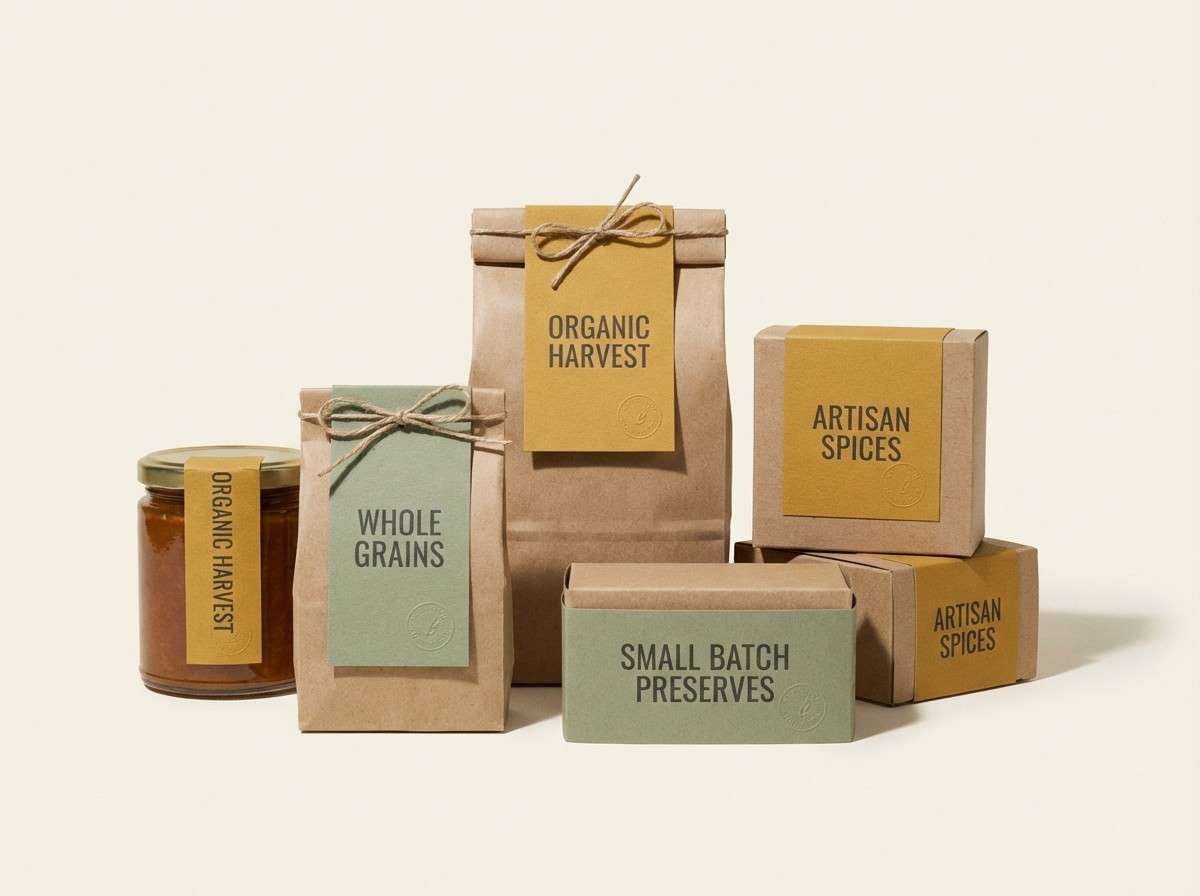
It also pairs naturally with materials and textures people already associate with quality—kraft paper, linen, leather, wood, brass, and ceramics. This is why mustard color combinations often feel premium in packaging and interiors.
From a design system perspective, mustard offers strong hierarchy without shouting. Against cream, charcoal, navy, or deep green, it pops for buttons, highlights, and headings while staying readable and mature.
20+ Mustard Color Palette Ideas (with HEX Codes)
1) Golden Harvest
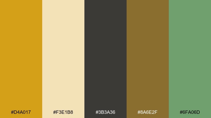
HEX: #D4A017 #F3E1B8 #3B3A36 #8A6E2F #6FA06D
Mood: rustic, warm, grounded
Best for: organic food packaging and labels
Rustic and sun-baked, these tones feel like late-afternoon fields and pantry staples. The mustard-gold works beautifully as the hero color on labels, balanced by creamy neutrals and a dark ink-like charcoal. Pair it with sage for an earthy, fresh accent that still feels premium. Tip: use charcoal for typography to keep small print sharp and legible.
Image example of golden harvest generated using media.io
Media.io is an online AI studio for creating and editing video, image, and audio in your browser.

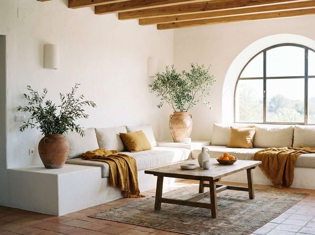
2) Sunlit Stucco
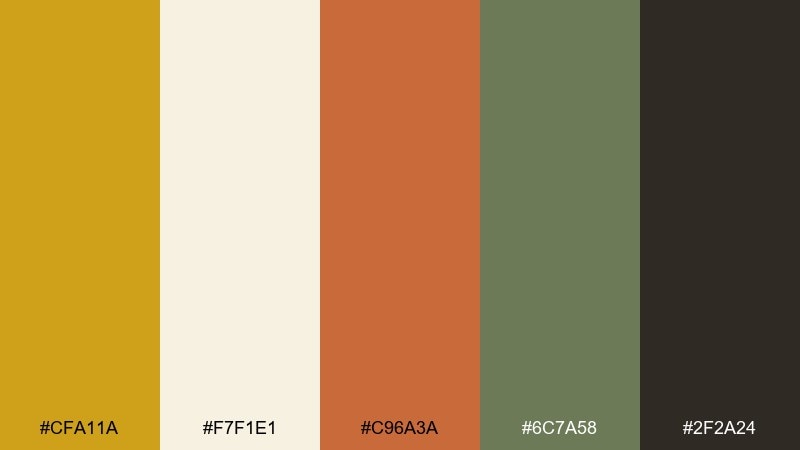
HEX: #CFA11A #F7F1E1 #C96A3A #6C7A58 #2F2A24
Mood: mediterranean, airy, inviting
Best for: mediterranean interior moodboards
Airy and coastal, this mix evokes white stucco walls, terracotta roofs, and olive trees. Mustard adds warmth without turning the palette too orange, while deep espresso anchors the room. Use terracotta for accents like pillows or art, and keep the cream as the main wall or background tone. Tip: repeat the olive green in small details to make the scheme feel intentional rather than busy.
Image example of sunlit stucco generated using media.io
3) Retro Diner
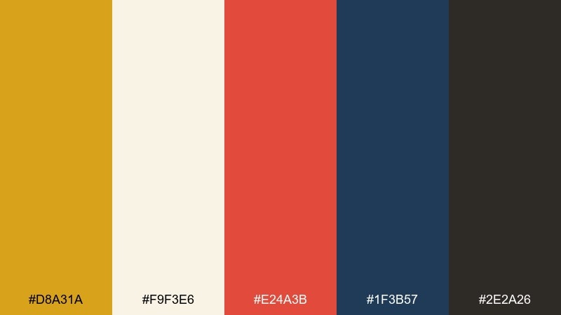
HEX: #D8A31A #F9F3E6 #E24A3B #1F3B57 #2E2A26
Mood: playful, nostalgic, punchy
Best for: retro poster and flyer design
Playful and nostalgic, these colors feel like a classic diner menu with bold signage. The warm yellow sets the upbeat tone, while navy and charcoal bring strong contrast for type and shapes. Use the tomato red as a call-to-action color to create instant hierarchy. Tip: keep the cream as negative space so the poster stays readable from a distance.
Image example of retro diner generated using media.io
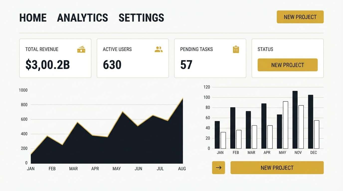
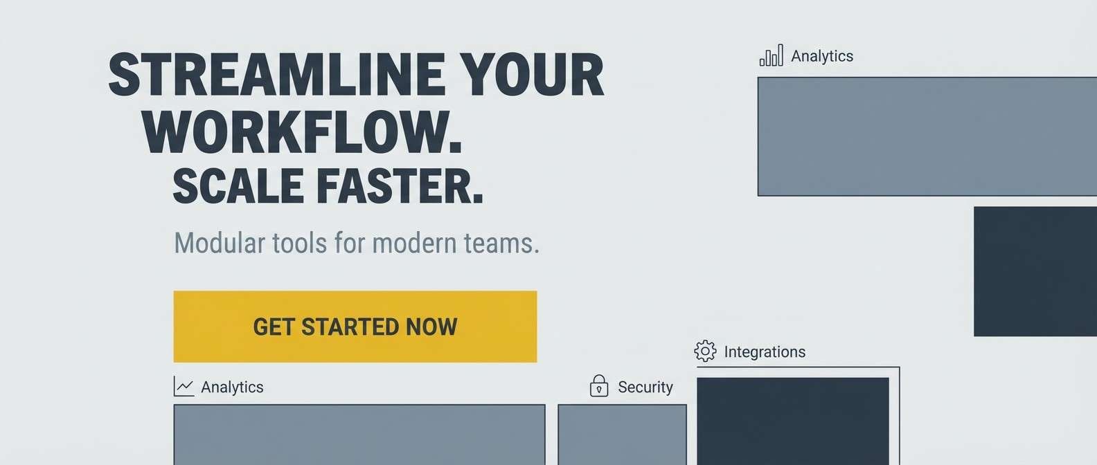
4) Modern Minimal
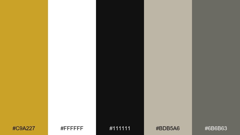
HEX: #C9A227 #FFFFFF #111111 #BDB5A6 #6B6B63
Mood: clean, modern, confident
Best for: dashboard UI and web apps
Clean and confident, this set feels like a crisp interface with a warm highlight. Mustard works best as a focused accent for buttons, active states, and key metrics against white and near-black. The soft greige tones help you build subtle depth without adding new hues. Tip: reserve the mustard for one primary action to avoid competing highlights across the UI.
Image example of modern minimal generated using media.io
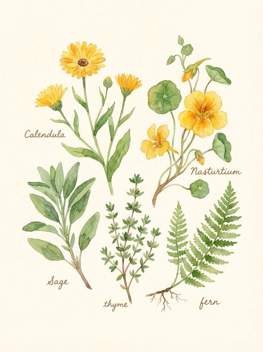
5) Botanical Saffron
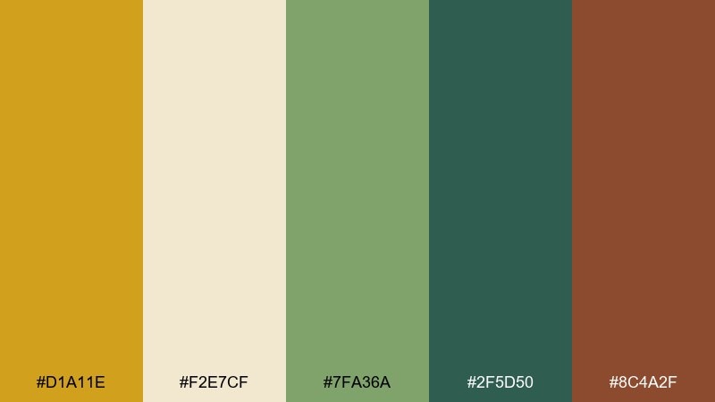
HEX: #D1A11E #F2E7CF #7FA36A #2F5D50 #8C4A2F
Mood: natural, fresh, handcrafted
Best for: watercolor botanical illustrations
Natural and handcrafted, this palette evokes herb gardens and dried petals. The saffron-yellow reads like sunlight on paper, while the greens range from soft leaf to deep botanical ink. Add the warm clay brown for stems, seed pods, or type accents. Tip: keep the cream as paper texture so the watercolor look stays light and breathable.
Image example of botanical saffron generated using media.io
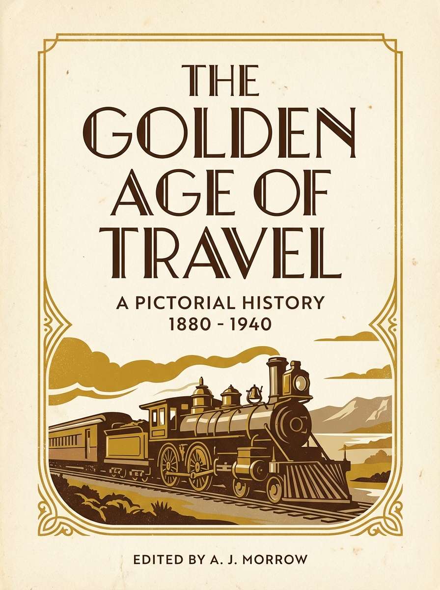
6) Cozy Library
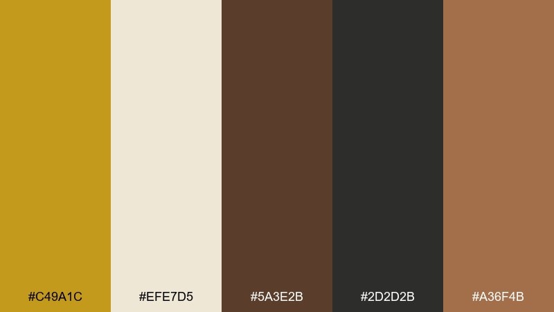
HEX: #C49A1C #EFE7D5 #5A3E2B #2D2D2B #A36F4B
Mood: cozy, vintage, literary
Best for: book covers and editorial titles
Cozy and vintage, this mix suggests worn leather, aged paper, and lamplight. It is a mustard color palette that pairs especially well with serif typography and textured backgrounds. Use the deep brown or charcoal for title text, then layer the tan tones for subtle borders and ornaments. Tip: add a light paper grain to the cream to enhance the classic print feel.
Image example of cozy library generated using media.io
7) Desert Market
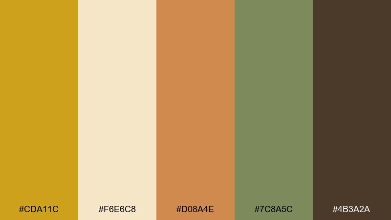
HEX: #CDA11C #F6E6C8 #D08A4E #7C8A5C #4B3A2A
Mood: adventurous, earthy, sun-warmed
Best for: travel flyers and event promos
Adventurous and sun-warmed, these hues feel like spice stalls, woven baskets, and dusty streets. The golden tone brings energy, while olive and espresso keep the design grounded and mature. Use the sandy cream as a background to let headlines pop without harsh contrast. Tip: try terracotta for icons and small badges to create a cohesive rhythm across the layout.
Image example of desert market generated using media.io

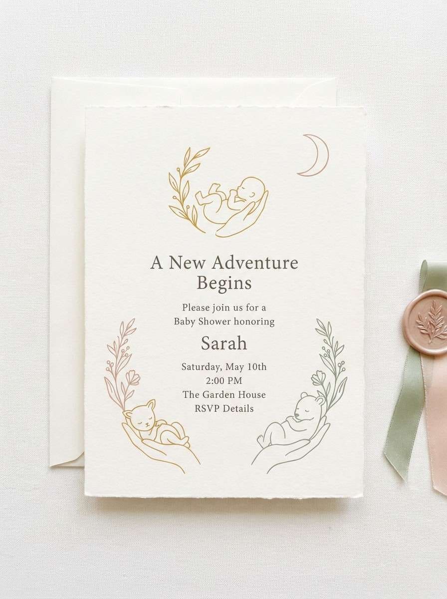
8) Soft Mustard Pastels
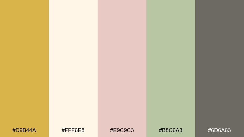
HEX: #D9B44A #FFF6E8 #E9C9C3 #B8C6A3 #6D6A63
Mood: gentle, sweet, airy
Best for: baby shower invitations and cards
Gentle and airy, this mix looks like soft linen, blush petals, and sunlit nurseries. The muted mustard keeps the palette warm without feeling loud, especially next to blush and sage. Use the off-white for plenty of breathing room, then let the gray-brown handle small text. Tip: keep illustrations thin-lined so the pastels stay the star.
Image example of soft mustard pastels generated using media.io
9) Industrial Mustard and Steel
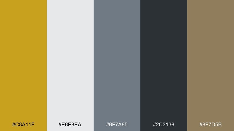
HEX: #C8A11F #E6E8EA #6F7A85 #2C3136 #8F7D5B
Mood: urban, functional, bold
Best for: SaaS landing pages and hero sections
Urban and functional, this set feels like concrete, brushed metal, and high-visibility workwear. The warm yellow is perfect for highlighting primary buttons, while the cool grays create structure for sections and navigation. Add the muted khaki as a bridge color to soften transitions between light and dark areas. Tip: use the darkest gray for body text to keep contrast accessible without pure black.
Image example of industrial mustard and steel generated using media.io
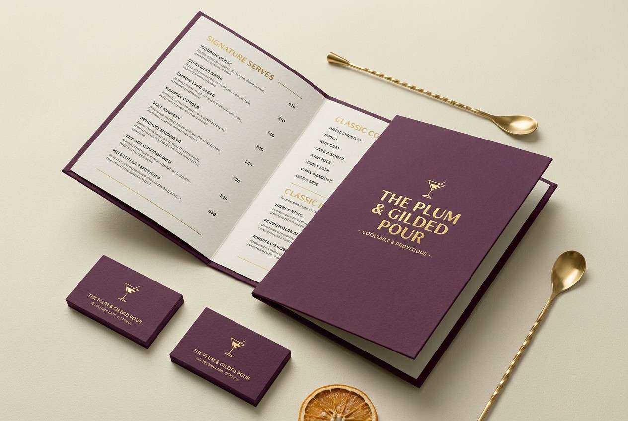
10) Plum Evening
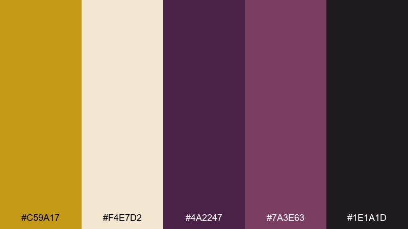
HEX: #C59A17 #F4E7D2 #4A2247 #7A3E63 #1E1A1D
Mood: luxurious, moody, refined
Best for: cocktail bar branding and menus
Luxurious and moody, these colors evoke velvet booths, dim lighting, and a golden glow in the glass. Mustard provides a warm spark against plum and near-black, making it ideal for logos and small highlights. Use the cream for menu backgrounds or negative space so the deep tones do not overwhelm. Tip: foil-stamp the mustard elements for a premium finish that still feels restrained.
Image example of plum evening generated using media.io
11) Autumn Orchard
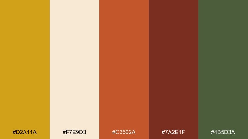
HEX: #D2A11A #F7E9D3 #C3562A #7A2E1F #4B5D3A
Mood: seasonal, cozy, vibrant
Best for: fall-themed social media graphics
Seasonal and cozy, this mix brings to mind apple picking, spiced cider, and crisp leaves. It is one of those mustard color combinations that looks great with warm photography and bold headline overlays. Use the deep red-brown for type, and keep the cream for padding so posts do not feel crowded. Tip: limit the orange to small pops like stickers, tags, or icons for balance.
Image example of autumn orchard generated using media.io
12) Mustard and Ocean Contrast
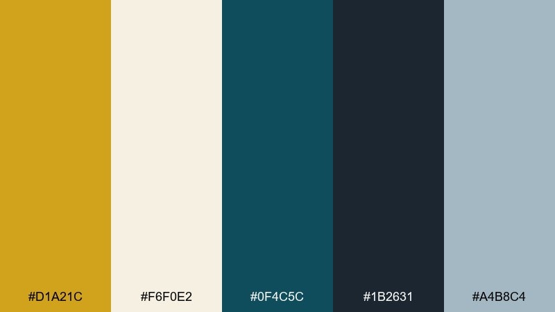
HEX: #D1A21C #F6F0E2 #0F4C5C #1B2631 #A4B8C4
Mood: fresh, bold, contemporary
Best for: presentation slides and pitch decks
Fresh and contemporary, this palette feels like bright sunlight over deep water. Mustard energizes the layout, while teal and navy give you reliable structure for charts, headings, and dividers. Use the misty blue-gray for secondary blocks so the deck stays calm and professional. Tip: keep mustard to highlights and key numbers to avoid visual fatigue across many slides.
Image example of mustard and ocean contrast generated using media.io
13) Earthy Kitchen
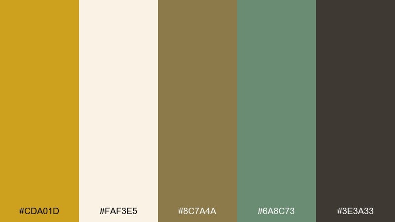
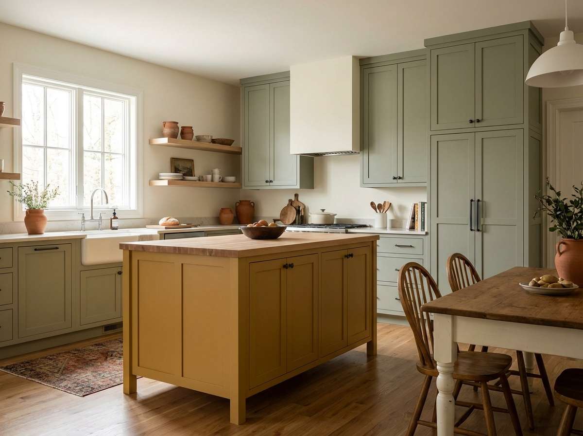
HEX: #CDA01D #FAF3E5 #8C7A4A #6A8C73 #3E3A33
Mood: homey, natural, balanced
Best for: kitchen paint and decor pairing
Homey and balanced, these tones resemble ceramic tiles, timber shelves, and dried grasses. The mustard note works beautifully on an island cabinet or as a backsplash accent, while sage keeps the room feeling fresh. Use the cream for walls or countertops, and rely on charcoal for hardware and fixtures. Tip: repeat the khaki-brown in wood textures so the palette feels cohesive rather than themed.
Image example of earthy kitchen generated using media.io
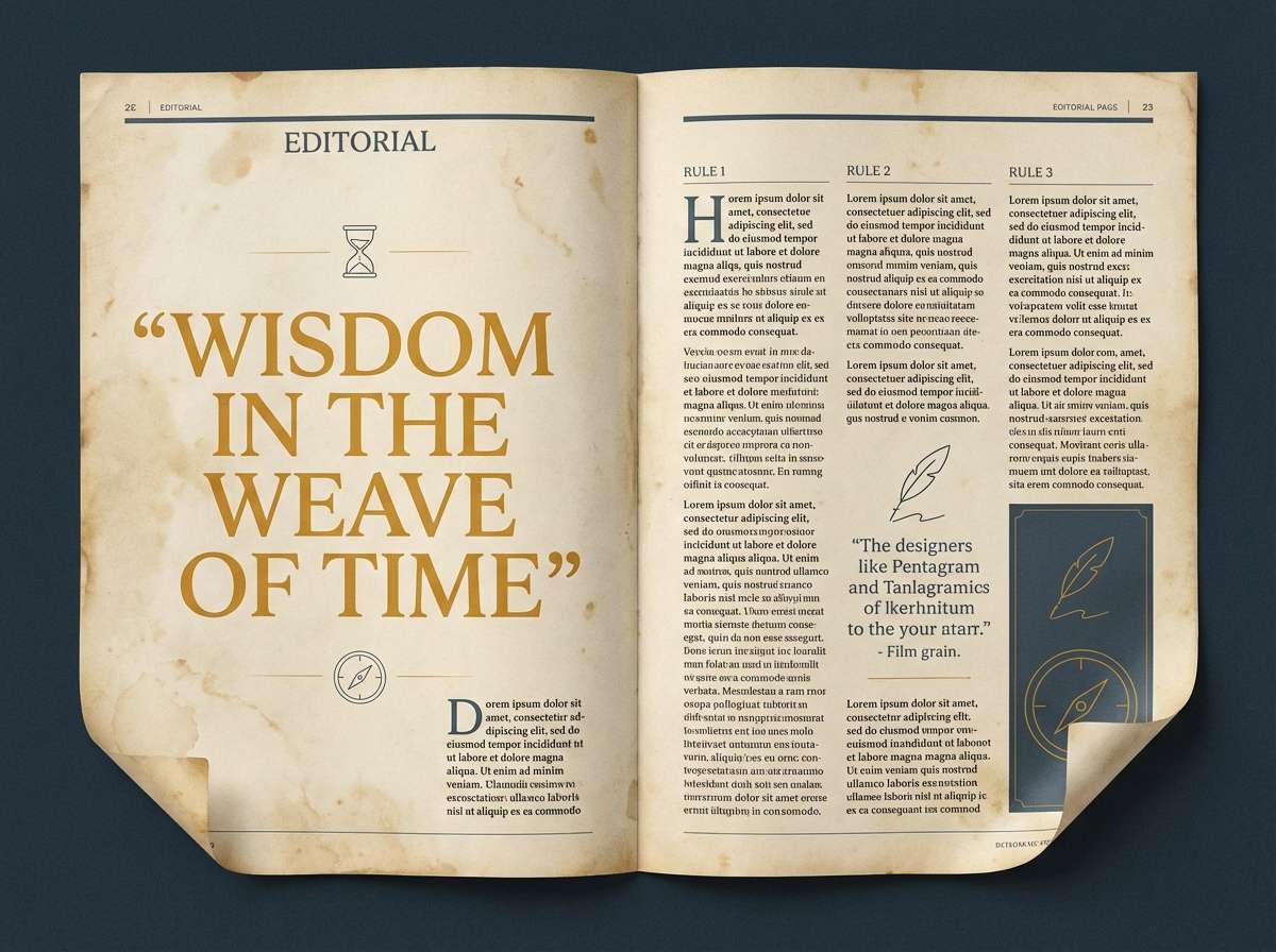
14) Vintage Map Tones
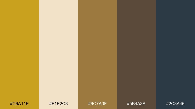
HEX: #C9A11E #F1E2C8 #9C7A3F #5B4A3A #2C3A46
Mood: heritage, exploratory, academic
Best for: editorial magazine spreads
Heritage and exploratory, this set feels like aged maps and well-traveled notebooks. The golden hue adds warmth to headings, while deep blue-gray introduces an unexpected, scholarly contrast. Use the parchment tones for page backgrounds and sidebars to keep the layout readable. Tip: add thin linework in the brown shades for borders, rules, and small icons.
Image example of vintage map tones generated using media.io
15) Night Market Glow
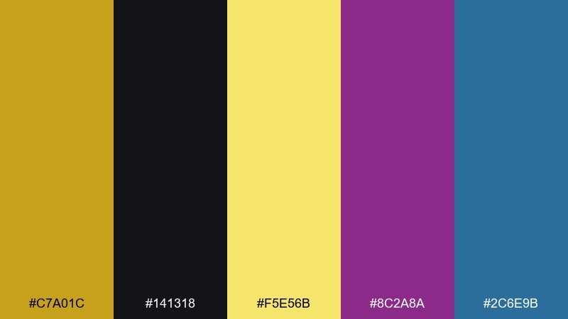
HEX: #C7A01C #141318 #F5E56B #8C2A8A #2C6E9B
Mood: electric, nightlife, high-contrast
Best for: music event posters
Electric and high-contrast, these tones evoke neon signs and a buzzing night market. The mix delivers mustard color combinations that pop against near-black, especially when paired with magenta for energetic headlines. Use the bright yellow as a spotlight color for dates, venues, or QR codes. Tip: keep the blue to secondary elements like lines and small shapes so the poster stays focused.
Image example of night market glow generated using media.io

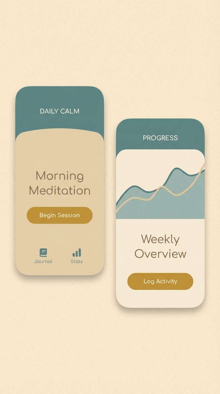
16) Coastal Sand and Mustard
HEX: #D0A21B #FFF2D8 #C9D6D0 #6F8F8B #3A3F41
Mood: calm, breezy, modern
Best for: wellness app UI screens
Calm and breezy, this set feels like sand dunes, sea glass, and soft morning light. The mustard accent keeps the screens from feeling cold, while the teal-gray range provides calming structure for navigation and cards. Use the pale sand tone for backgrounds and keep dark gray for text and icons. Tip: apply mustard sparingly to progress states or key actions so the wellness vibe stays quiet.
Image example of coastal sand and mustard generated using media.io
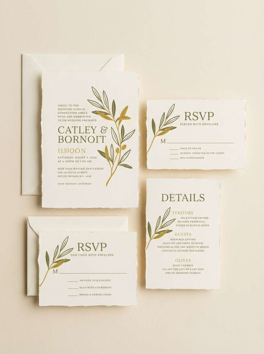
17) Olive Grove Wedding
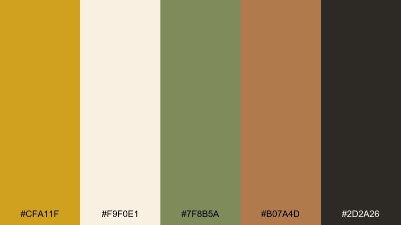
HEX: #CFA11F #F9F0E1 #7F8B5A #B07A4D #2D2A26
Mood: romantic, earthy, timeless
Best for: wedding invitation suites
Romantic and timeless, these tones suggest olive branches, linen paper, and candlelit dinners. Mustard adds a warm glow without overpowering the soft cream and botanical green. Use the dark ink tone for names and details, and bring in clay-brown for monograms or small motifs. Tip: print on textured stock so the natural colors feel even more elevated.
Image example of olive grove wedding generated using media.io
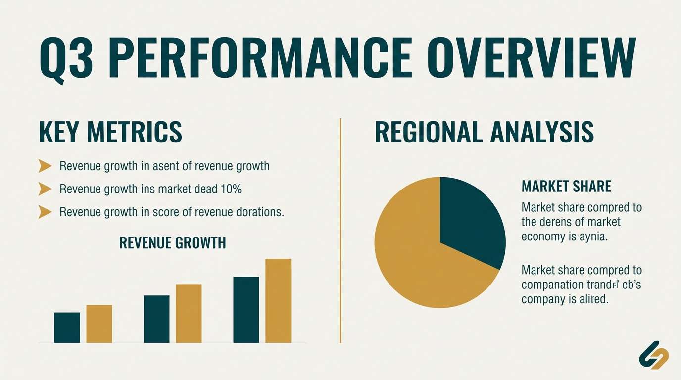
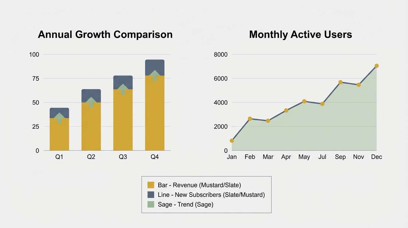
18) Warm Data Viz
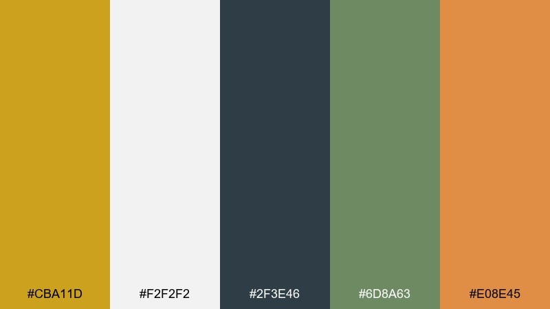
HEX: #CBA11D #F2F2F2 #2F3E46 #6D8A63 #E08E45
Mood: clear, analytical, friendly
Best for: charts, dashboards, and infographics
Clear and friendly, this palette makes analytics feel approachable instead of sterile. Use mustard for primary data series, then rotate in sage and soft orange for comparisons while keeping the dark slate for axes and labels. The light gray background prevents glare and keeps visuals print-ready. Tip: use the orange only for warnings or standout values so it retains meaning.
Image example of warm data viz generated using media.io
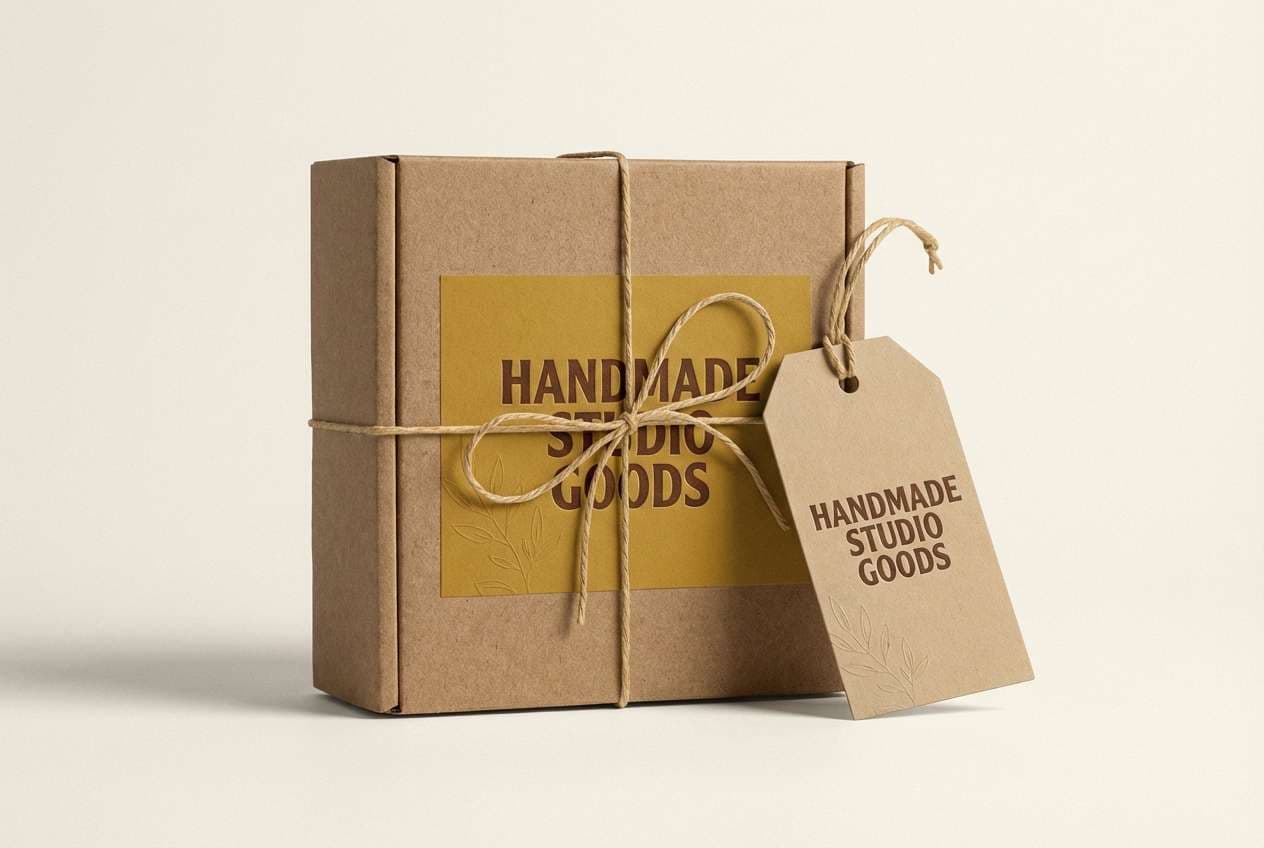
19) Artisan Leather
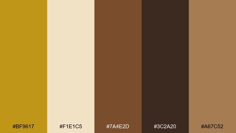
HEX: #BF9617 #F1E1C5 #7A4E2D #3C2A20 #A67C52
Mood: craft, heritage, premium
Best for: handmade goods packaging
Craft-forward and premium, these shades resemble tanned leather, brass tools, and parchment tags. It is a mustard color palette that shines on packaging for candles, small-batch grooming, or handcrafted accessories. Use the darkest brown for logos and stamps, and keep the cream for labels to maintain contrast. Tip: add a subtle emboss to the mustard elements for an understated luxury feel.
Image example of artisan leather generated using media.io
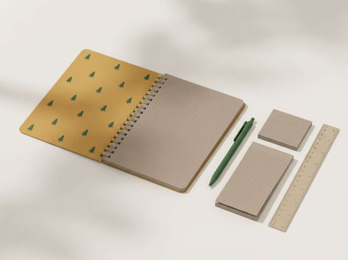
20) Field Notes
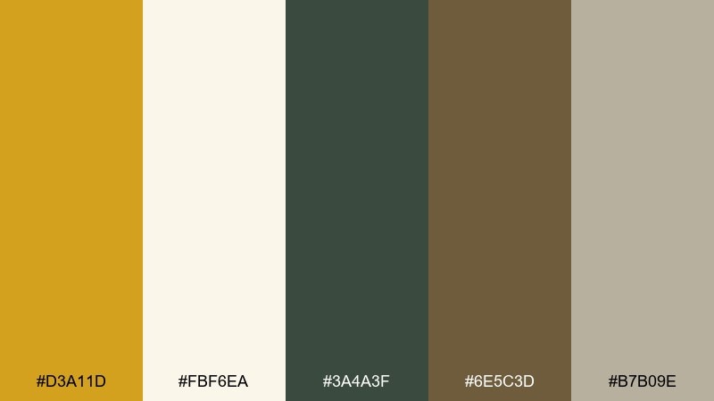
HEX: #D3A11D #FBF6EA #3A4A3F #6E5C3D #B7B09E
Mood: outdoorsy, practical, calm
Best for: stationery and journaling sets
Outdoorsy and calm, these colors feel like trail journals, canvas bags, and pressed leaves. The mustard tone brings warmth to covers and tabs, while forest green adds a sturdy, natural counterpoint. Use the soft off-white for pages and keep the taupe-gray for lines, grids, or secondary text. Tip: repeat the green in small icons to create a cohesive system across notebooks and inserts.
Image example of field notes generated using media.io
What Colors Go Well with Mustard?
Mustard plays especially well with grounded neutrals like cream, parchment, greige, taupe, and charcoal—these keep it feeling sophisticated instead of loud. For typography and UI, charcoal and near-black are often more comfortable than pure black.
For richer contrast, pair mustard with deep cool tones like navy, teal, and blue-gray. This combination is popular in pitch decks, dashboards, and modern branding because it balances warmth with structure.
If you want a more organic look, mustard pairs beautifully with sage, olive, forest green, terracotta, clay, and leather browns. These combinations naturally suit interiors, packaging, and lifestyle visuals.
How to Use a Mustard Color Palette in Real Designs
Use mustard as a “signal” color: buttons, tags, highlights, icons, and key numbers. Because it has strong visual weight, a little goes a long way—especially on white or cream backgrounds.
In branding, mustard often works best as the hero accent while a darker anchor (charcoal, espresso, navy) handles typography and logos. This keeps the system flexible across print, web, and social formats.
For interiors and moodboards, repeat mustard in 2–3 touchpoints (textiles, art, ceramics) and let neutrals dominate the big surfaces. This prevents the space from skewing too yellow while still feeling warm and curated.
Create Mustard Palette Visuals with AI
If you want to preview how a mustard color scheme looks on a poster, label, UI screen, or invitation, generating quick mockups can save hours. The fastest approach is to start with a clear prompt and specify the mood, materials, and lighting.
With Media.io’s text-to-image tool, you can iterate on styles (minimal, watercolor, editorial, neon, rustic) while keeping your palette consistent. Once you get a result you like, reuse the prompt structure for a full set of matching visuals.
Try building your prompt around: subject + background + materials + “dominant colors” + style + aspect ratio.
Mustard Color Palette FAQs
-
What hex code is mustard yellow?
Mustard varies by shade, but a classic mustard often sits around #D4A017 to #CFA11A. For UI accents, slightly muted mustard values tend to look more premium and less neon. -
Is mustard a warm or cool color?
Mustard is generally a warm color because it’s based on yellow with earthy, brown/olive undertones. Those undertones also help it pair well with cool anchors like navy and teal. -
What is the best background color for mustard?
Soft neutrals like cream, off-white, and light gray make mustard feel clean and readable. For dramatic looks, near-black or deep navy creates strong contrast and a more premium mood. -
What colors go best with mustard for branding?
For modern branding, try mustard with charcoal/black, white/cream, and one cool counterbalance like navy or teal. For organic brands, pair mustard with sage/olive and kraft-like neutrals. -
How do I keep mustard from looking too retro?
Use mustard sparingly as an accent, keep typography modern, and rely on clean neutrals (white, greige) plus a cool dark (navy, slate). Avoid pairing it with overly saturated reds unless you want a vintage vibe. -
Can mustard work in UI design?
Yes—mustard is excellent for primary actions, active states, and key metrics when paired with white, slate, and accessible dark text. Limit it to one main action color so your interface doesn’t feel visually noisy. -
What are the best “earthy” mustard color combinations?
Mustard pairs naturally with sage, olive, terracotta, leather browns, and parchment creams. These combinations feel grounded and are popular for packaging, interiors, and lifestyle social graphics.


