

Desert oasis palettes blend sun-warmed sands with cooling greens and teals, creating a look that feels both relaxed and premium. They’re especially effective when you want a modern, natural mood without going overly rustic.
Below are 20 curated desert oasis color palette combinations with HEX codes, plus practical usage notes and AI image prompts you can reuse for mockups, branding, and UI.
In this article
Why Desert Oasis Palettes Work So Well
Desert oasis tones are built on a satisfying contrast: warm, sunlit neutrals (sand, clay, adobe) balanced by cool water and shade hues (sage, lagoon teal, palm green). That temperature mix instantly feels refreshing and modern.
They’re also naturally “brandable.” Neutrals make clean, flexible backgrounds, while teals and greens provide clear accents for CTAs, icons, and highlights without needing loud primaries.
In UI and print alike, these palettes read calm and confident. With the right contrast choices, you can keep things airy and minimal while still maintaining strong hierarchy.
20+ Desert Oasis Color Palette Ideas (with HEX Codes)
1) Palm Spring Sand
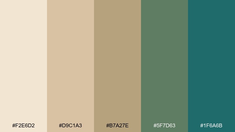
HEX: #F2E6D2 #D9C1A3 #B7A27E #5F7D63 #1F6A6B
Mood: sunlit, calm, resort-like
Best for: wellness branding and landing pages
Sunlit sand and shaded palms bring a quiet resort calm with a crisp lagoon edge. Use the pale cream as your main background, then layer camel and stone for sections and cards. Let the deep teal carry buttons and links, with the palm green as a softer secondary accent. Pair with clean sans typography and generous spacing to keep the airy, premium feel.
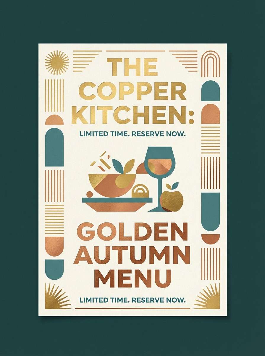
Image example of palm spring sand generated using media.io
Media.io is an online AI studio for creating and editing video, image, and audio in your browser.

2) Turquoise Mirage
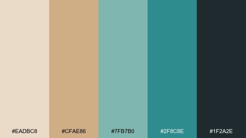
HEX: #EADBC8 #CFAE86 #7FB7B0 #2F8C8E #1F2A2E
Mood: refreshing, modern, airy
Best for: app UI and travel dashboards
Cool water tones shimmer against sandy neutrals like a mirage coming into focus. This desert oasis color scheme works best with the cream as a base and the teal range for navigation and data highlights. Keep the charcoal for text to maintain contrast without harsh black. Tip: use the mid teal for charts and the deep teal for primary actions so hierarchy stays clear.
Image example of turquoise mirage generated using media.io
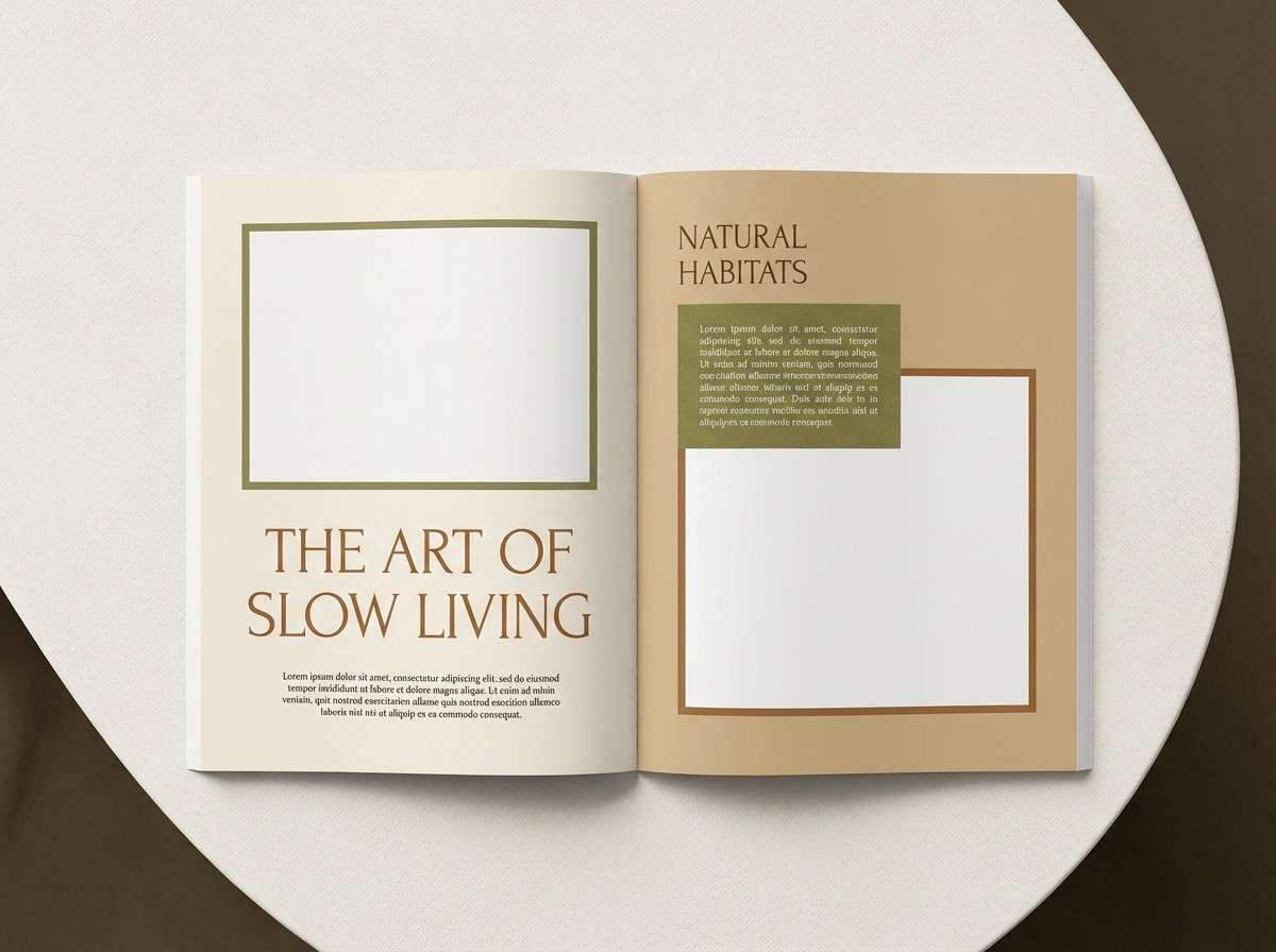
3) Date Grove Neutral
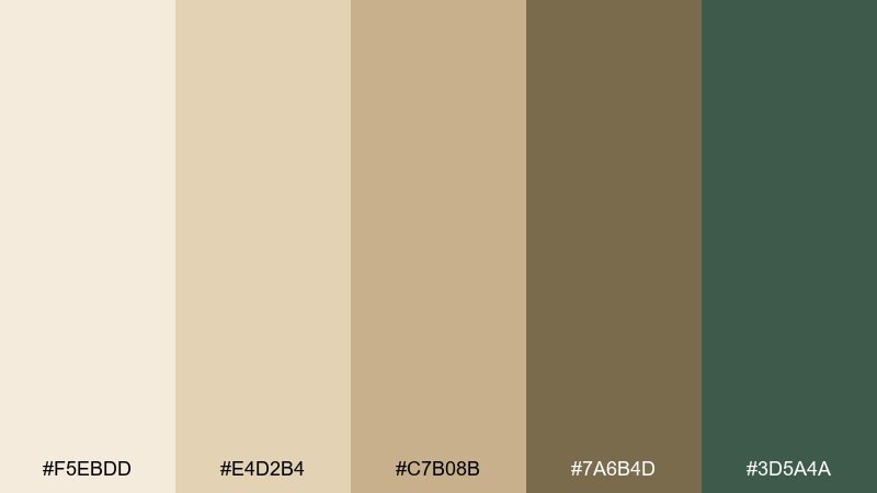
HEX: #F5EBDD #E4D2B4 #C7B08B #7A6B4D #3D5A4A
Mood: grounded, natural, understated
Best for: editorial layouts and lifestyle blogs
Creamy paper, dried fronds, and date-palm shade create an understated, grounded atmosphere. Use the light neutrals for margins and negative space, then bring in the olive green for pull quotes and section labels. The warm brown is ideal for headlines, giving a print-like richness without feeling heavy. Try pairing with soft photography and subtle grain to make the page feel tactile.
Image example of date grove neutral generated using media.io
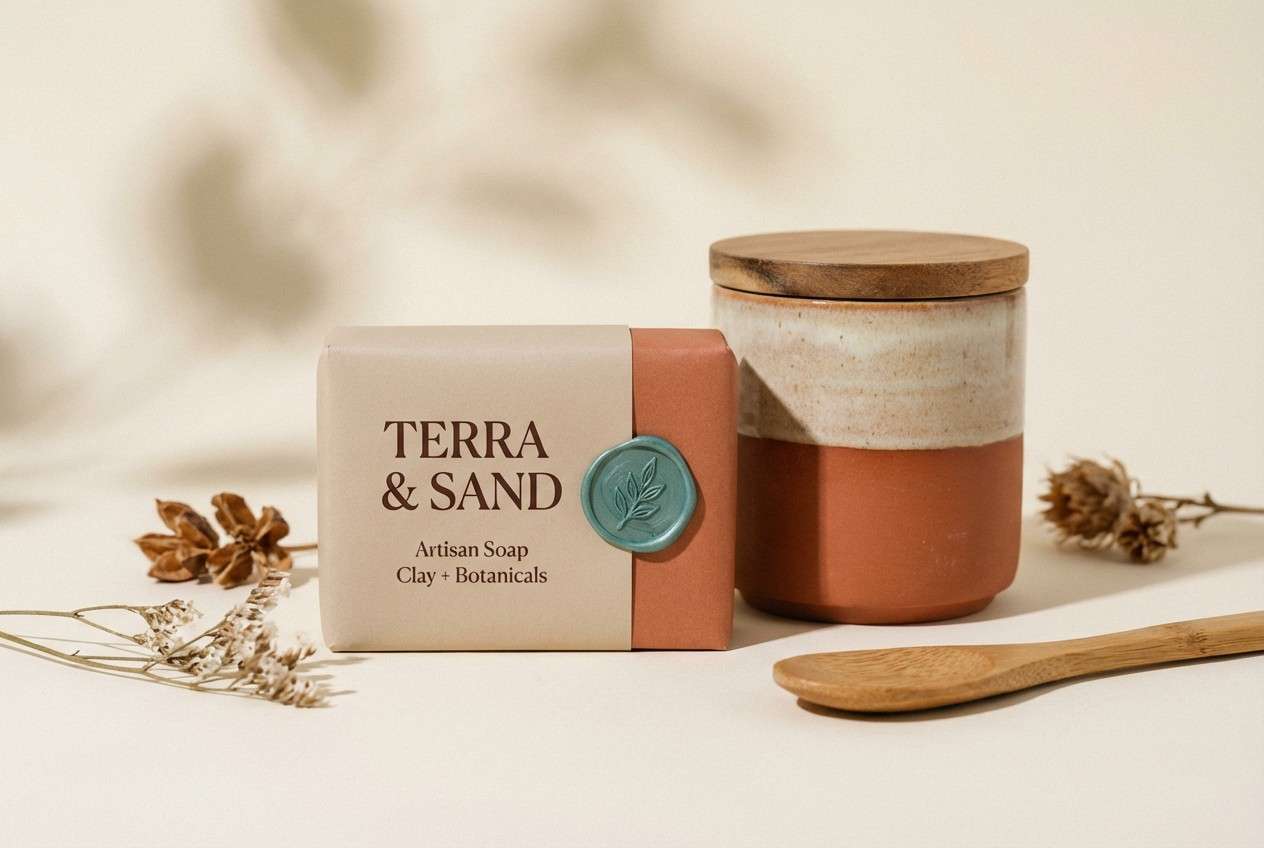
4) Sunbaked Clay
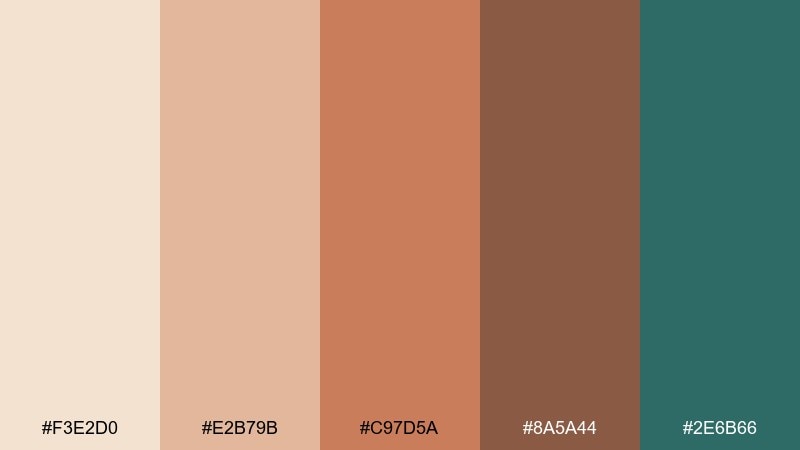
HEX: #F3E2D0 #E2B79B #C97D5A #8A5A44 #2E6B66
Mood: warm, handcrafted, confident
Best for: packaging for soaps and ceramics
Sunbaked clay and soft adobe warmth feel handcrafted, with a cool oasis teal to sharpen the edges. Let the peachy beige cover most surfaces, then use terracotta for key panels and labels. The deep brown reads like fired glaze for type and linework, while teal works as a modern stamp or seal. Tip: keep teal to small hits so the earthy tones stay dominant and authentic.
Image example of sunbaked clay generated using media.io
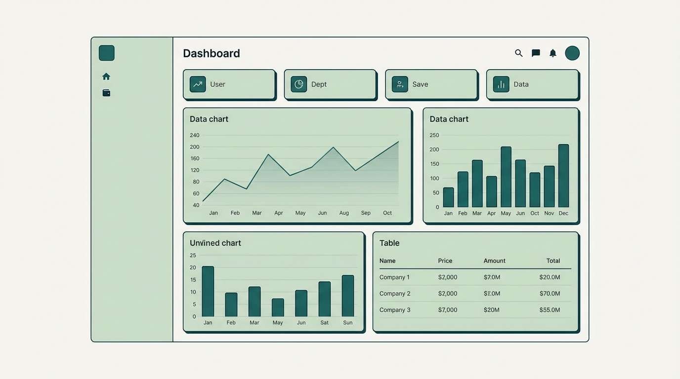
5) Lagoon Shade
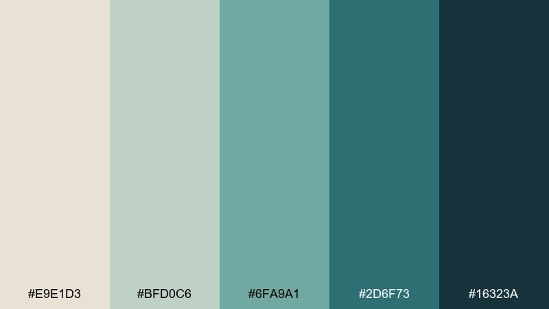
HEX: #E9E1D3 #BFD0C6 #6FA9A1 #2D6F73 #16323A
Mood: cool, shaded, minimalist
Best for: SaaS UI and fintech cards
Shaded lagoon blues with muted stone neutrals give a sleek, minimalist calm. Use the off-white for backgrounds and the pale sage for surfaces like cards and tables. The mid and deep teals create a clean ladder for hover, active, and emphasis states. For accessibility, keep body text in the near-black blue and reserve the darkest teal for primary CTAs.
Image example of lagoon shade generated using media.io
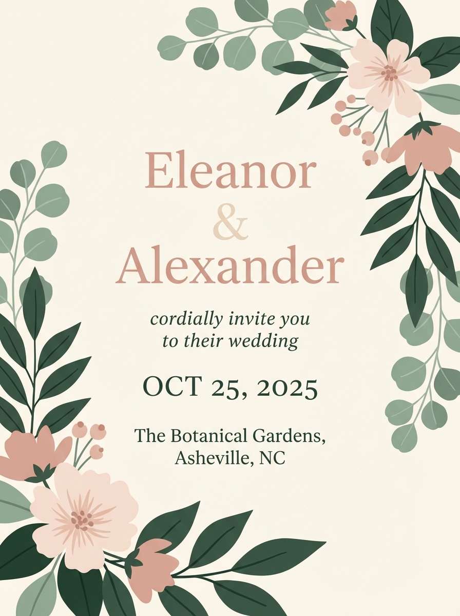
6) Cactus Blossom
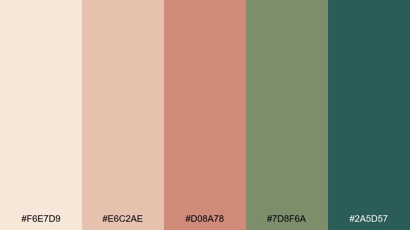
HEX: #F6E7D9 #E6C2AE #D08A78 #7D8F6A #2A5D57
Mood: romantic, botanical, soft
Best for: wedding invitations and stationery
Blush sand and cactus bloom tones feel romantic, botanical, and gently sun-warmed. Use the cream as the paper base, then bring in dusty rose for headings and monograms. Sage and deep green add structure for borders, icons, or foliage illustrations. Tip: choose a warm metallic foil like champagne for finishing, and keep the darkest green for small details only.
Image example of cactus blossom generated using media.io
7) Desert Dusk
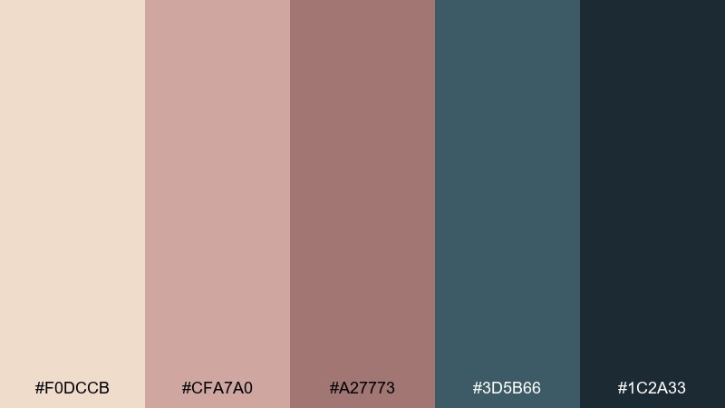
HEX: #F0DCCB #CFA7A0 #A27773 #3D5B66 #1C2A33
Mood: moody, cinematic, refined
Best for: poster design and album art
Dusty dusk roses fade into cool night blues for a cinematic, refined mood. Use the pale sand-rose as negative space, then anchor compositions with slate and deep navy for type and framing. The mauve and cocoa tones work well for gradients and soft overlays. Tip: add subtle texture and wide tracking in headlines to amplify the atmospheric feel.
Image example of desert dusk generated using media.io
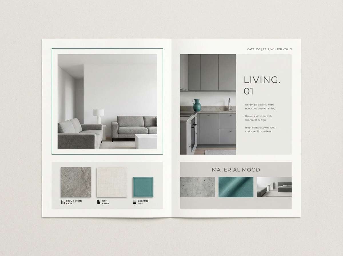
8) Stone Courtyard
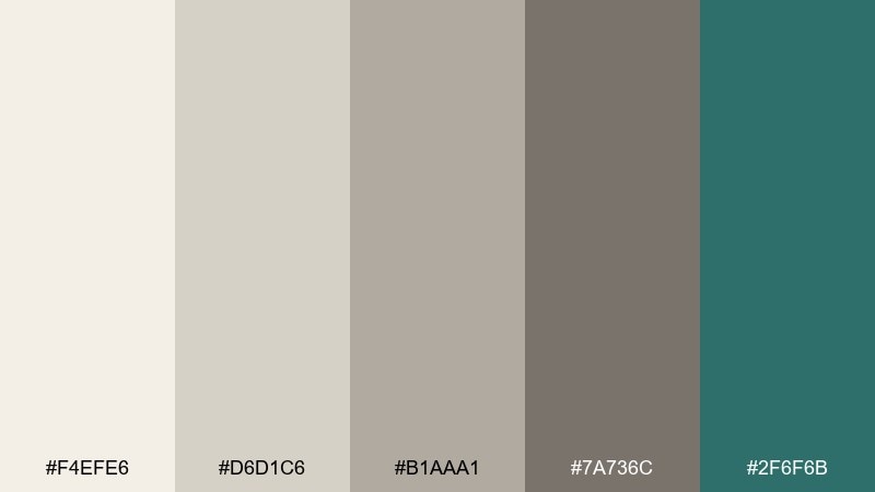
HEX: #F4EFE6 #D6D1C6 #B1AAA1 #7A736C #2F6F6B
Mood: clean, architectural, balanced
Best for: interior moodboards and catalogs
Courtyard stone and smooth plaster neutrals feel architectural and quietly luxurious. Use the lightest tones for backgrounds and product grids, while mid greys define dividers and captions. Teal adds a controlled pop for callouts, tags, or a single hero element. Tip: keep contrast gentle and rely on spacing and alignment to make the design feel high-end.
Image example of stone courtyard generated using media.io
9) Oasis Lantern
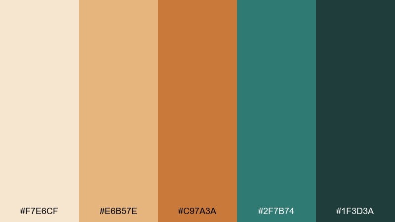
HEX: #F7E6CF #E6B57E #C97A3A #2F7B74 #1F3D3A
Mood: golden, welcoming, festive
Best for: event flyers and restaurant promos
Golden lantern light over cool water reads welcoming, festive, and a little nostalgic. These desert oasis color combinations shine in bold headers using amber and copper, balanced by teal for blocks and buttons. Keep the cream for breathing room and let the deep green anchor type and icons. Tip: limit gradients to one area, like a header band, to avoid overwhelming the warmth.
Image example of oasis lantern generated using media.io
10) Sage Breeze
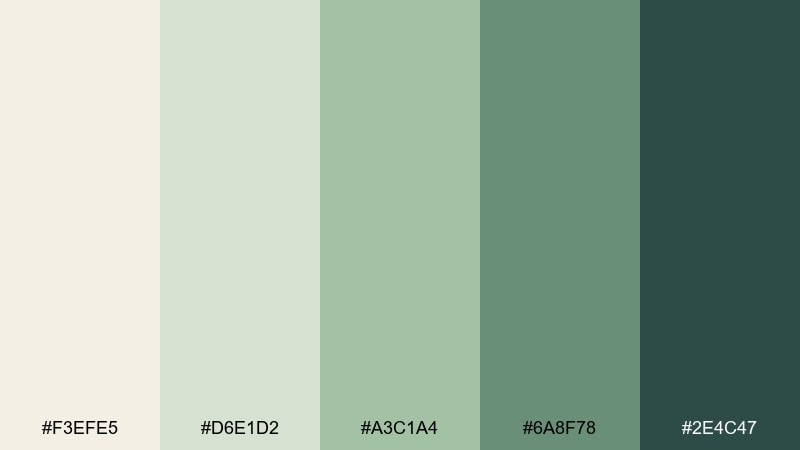
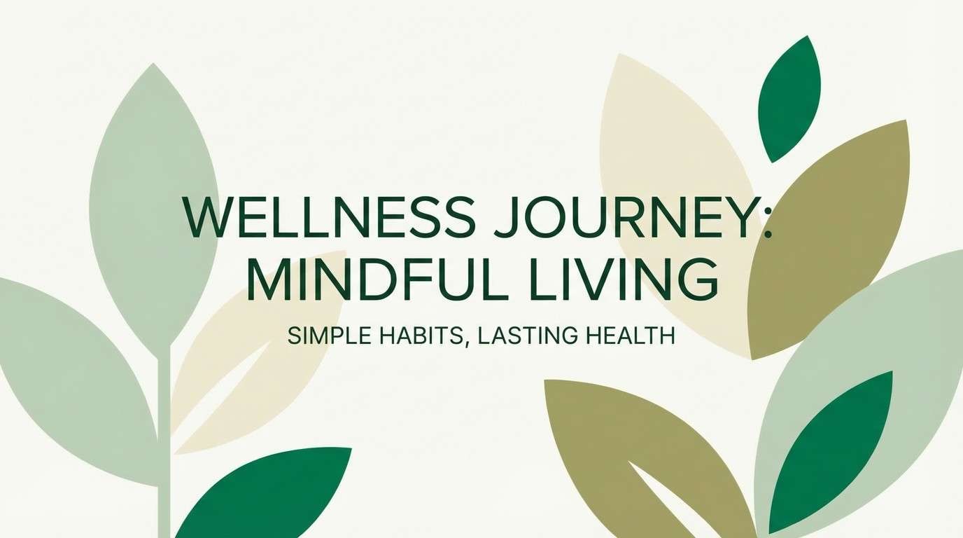
HEX: #F3EFE5 #D6E1D2 #A3C1A4 #6A8F78 #2E4C47
Mood: fresh, soft, restorative
Best for: health brands and blog graphics
A sage breeze across pale sand feels restorative, soft, and clean. Use the off-white as the canvas, then layer the minty grey-green for panels and quote blocks. The deeper greens are perfect for buttons, badges, and navigation, especially when you want calm authority. Tip: pair with warm neutrals in photography so the greens stay natural rather than clinical.
Image example of sage breeze generated using media.io
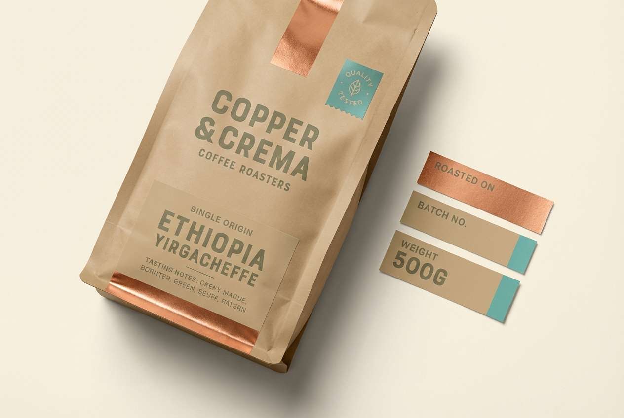
11) Copper Canopy
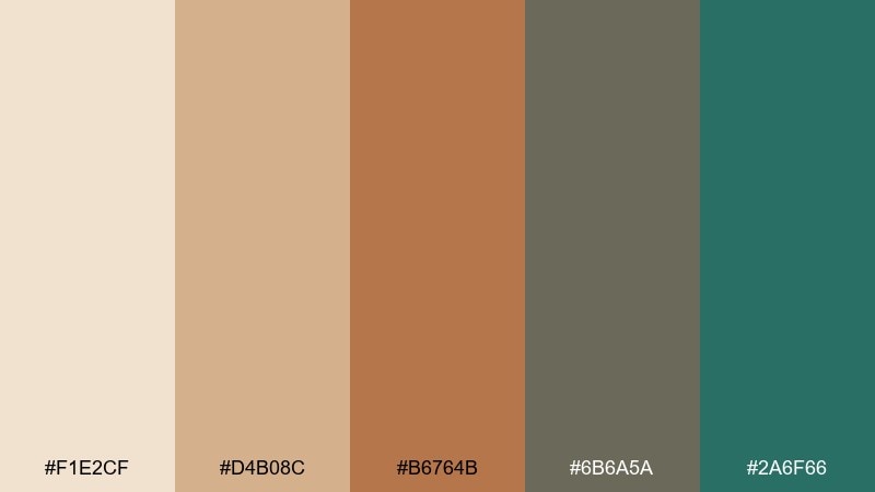
HEX: #F1E2CF #D4B08C #B6764B #6B6A5A #2A6F66
Mood: rustic, premium, grounded
Best for: coffee packaging and labels
Copper warmth under a shaded canopy feels rustic, premium, and grounded. Build your label system with the cream and tan for background fields, then use copper for key brand marks. The muted olive-grey balances the heat and helps small text stay readable. Tip: use the teal as a tiny quality badge or roast indicator for a modern twist.
Image example of copper canopy generated using media.io
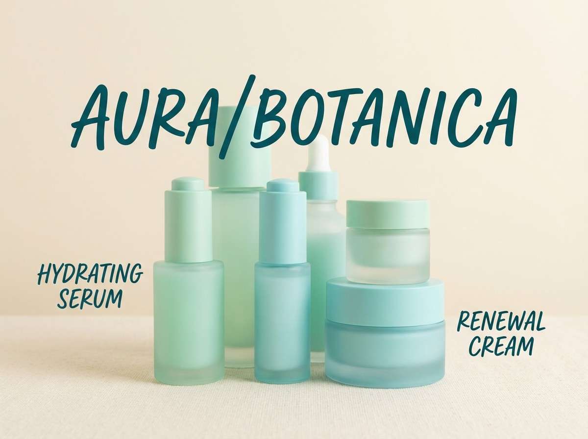
12) Minted Water
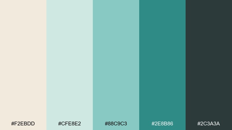
HEX: #F2EBDD #CFE8E2 #88C9C3 #2E8B86 #2C3A3A
Mood: crisp, clean, uplifting
Best for: skincare ads and product pages
Minted water and soft sand feel crisp, clean, and uplifting like a splash in dry heat. Use the pale cream for negative space and let mint and aqua own the product highlights. The deep teal works well for trust signals like guarantees, ingredient icons, and CTA buttons. Tip: keep shadows soft and use rounded corners to maintain the gentle, hydrating vibe.
Image example of minted water generated using media.io
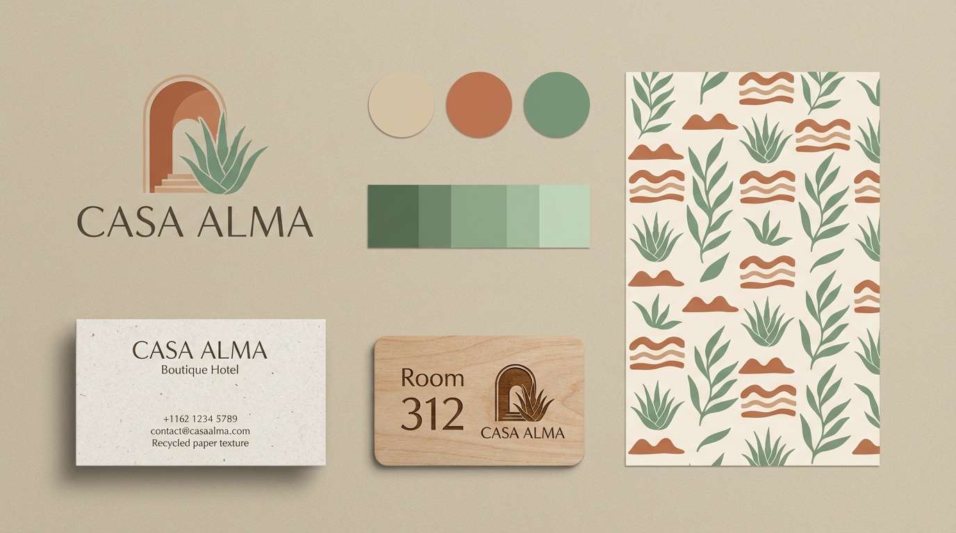
13) Adobe and Aloe
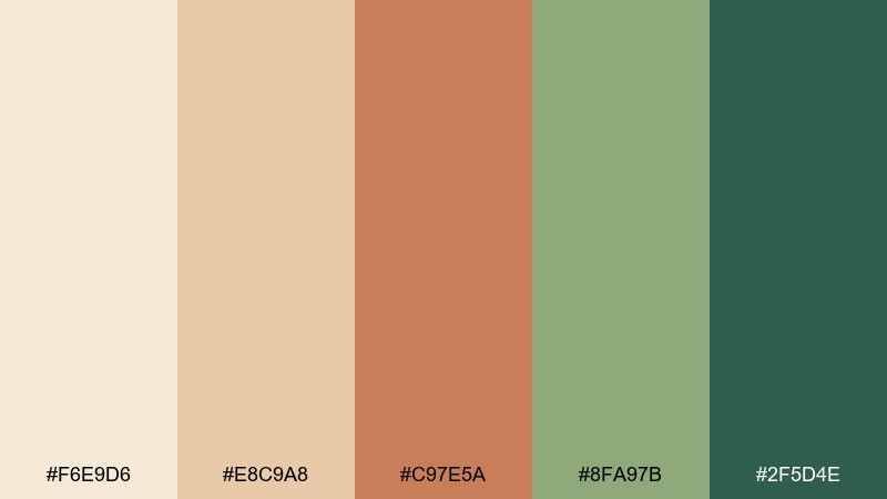
HEX: #F6E9D6 #E8C9A8 #C97E5A #8FA97B #2F5D4E
Mood: earthy, lively, approachable
Best for: boutique hotel branding
Adobe walls and aloe greens create an earthy mood that still feels lively and approachable. Use the light sand for stationery and signage backgrounds, then let terracotta lead for logos and hero typography. The two greens work best as supporting accents, especially for patterns and wayfinding icons. Tip: pair with natural textures like linen and uncoated paper to enhance the warm authenticity.
Image example of adobe and aloe generated using media.io
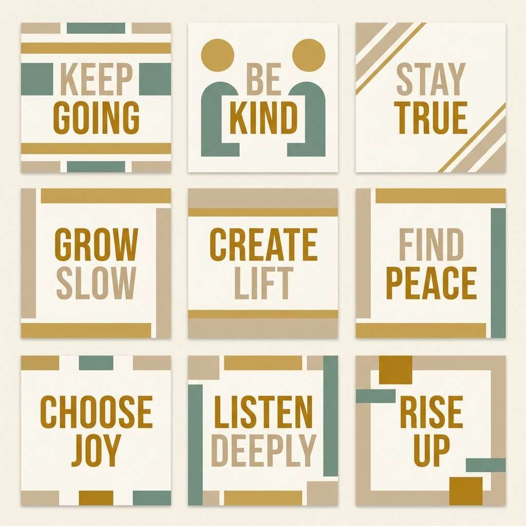
14) Golden Reed
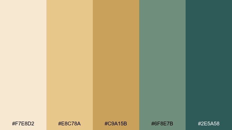
HEX: #F7E8D2 #E8C78A #C9A15B #6F8E7B #2E5A58
Mood: sunny, natural, optimistic
Best for: social graphics and quote cards
Golden reeds in bright sun feel optimistic, natural, and quietly energizing. This desert oasis color palette is easy to scale for templates: cream for backgrounds, golds for headline bands, and green-teals for icons and highlights. Keep the deepest teal for small but important elements like handles, dates, or a subscribe badge. Tip: use simple shapes and consistent padding so the warm gold stays readable on small screens.
Image example of golden reed generated using media.io
15) Night Market
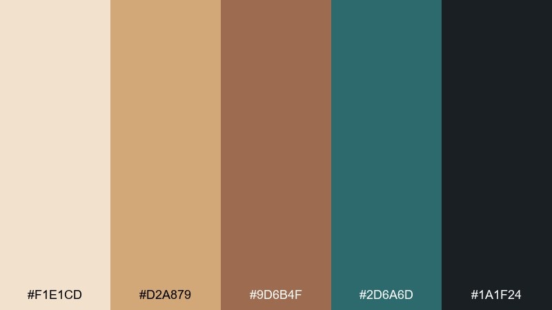
HEX: #F1E1CD #D2A879 #9D6B4F #2D6A6D #1A1F24
Mood: vibrant, urban, moody
Best for: food festival posters and banners
Warm spice stalls against cool night air feel vibrant, urban, and a bit mysterious. Use sand and amber for large headline areas, then bring in deep teal for secondary panels and directional arrows. The near-black keeps type crisp and helps the warm browns avoid looking washed out. Tip: lean on high contrast and strong hierarchy for readable outdoor signage.
Image example of night market generated using media.io

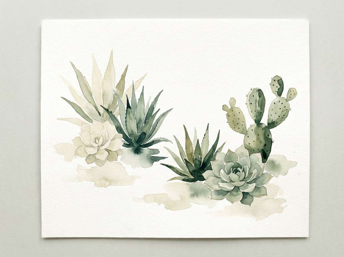
16) Soft Succulent
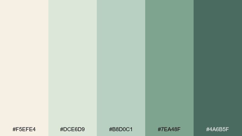
HEX: #F5EFE4 #DCE6D9 #B8D0C1 #7EA48F #4A6B5F
Mood: gentle, airy, botanical
Best for: watercolor illustrations and prints
Powdery succulents and pale sand create a gentle, airy botanical softness. Use the cream and misty greens for large washes, then define stems and shadows with the deeper green. This mix works especially well for stationery prints and subtle wall art where you want calm without blandness. Tip: keep edges loose and let the mid green do most of the contrast work.
Image example of soft succulent generated using media.io
17) Citrus Oasis
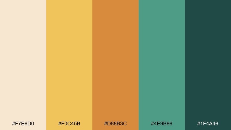
HEX: #F7E6D0 #F0C45B #D88B3C #4E9B86 #1F4A46
Mood: bright, playful, energizing
Best for: summer campaign ads and banners
Citrus sun and cool water greens feel playful, energizing, and made for summer campaigns. Use the creamy sand as breathing room, then push yellow for attention-grabbing highlights. This desert oasis color combination works best when teal carries the supporting blocks and the deep green anchors typography. Tip: avoid overusing orange and yellow together in large areas, and separate them with cream to keep the design fresh.
Image example of citrus oasis generated using media.io
18) Terracotta Towel
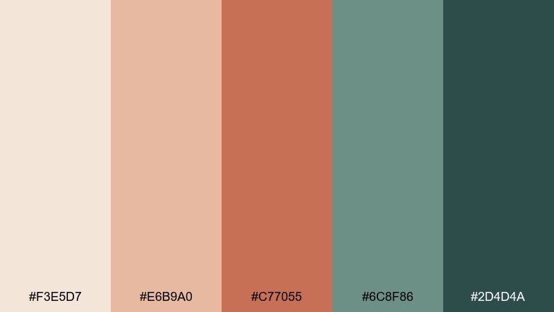
HEX: #F3E5D7 #E6B9A0 #C77055 #6C8F86 #2D4D4A
Mood: cozy, sunwashed, relaxed
Best for: home goods lookbooks
Sunwashed terracotta and soft sea-glass greens feel cozy and relaxed, like linens drying in warm air. Use the pale sand as the page base, then add coral clay for big product callouts and section headers. The muted green-grey supports secondary text and UI chips without stealing attention. Tip: pair with warm photography and keep the darkest tone for prices and key details.
Image example of terracotta towel generated using media.io
19) Cool Palm Shadow
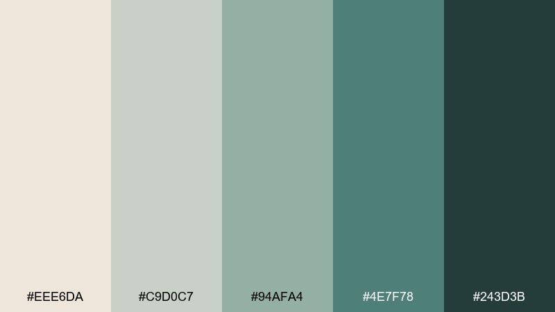
HEX: #EEE6DA #C9D0C7 #94AFA4 #4E7F78 #243D3B
Mood: cool, quiet, sophisticated
Best for: portfolio sites and case studies
Cool palm shadows over pale sand feel quiet, sophisticated, and a little editorial. Use the warm off-white for backgrounds and the soft grey-green for cards and section breaks. The deeper greens work best for nav, links, and small emphasis elements that should feel confident but not loud. Tip: combine with monochrome photography to keep the palette doing the storytelling.
Image example of cool palm shadow generated using media.io
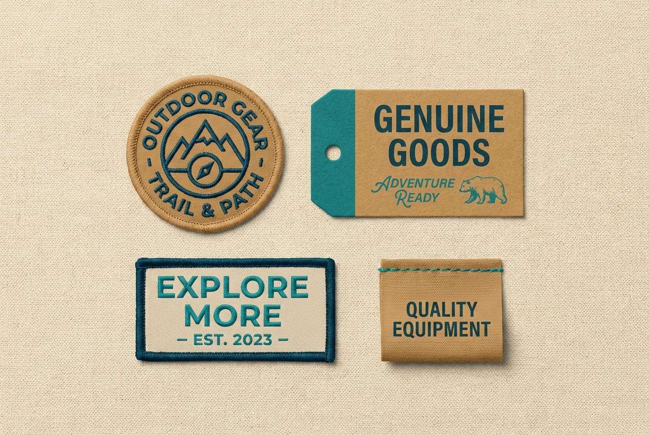
20) Caravan Canvas
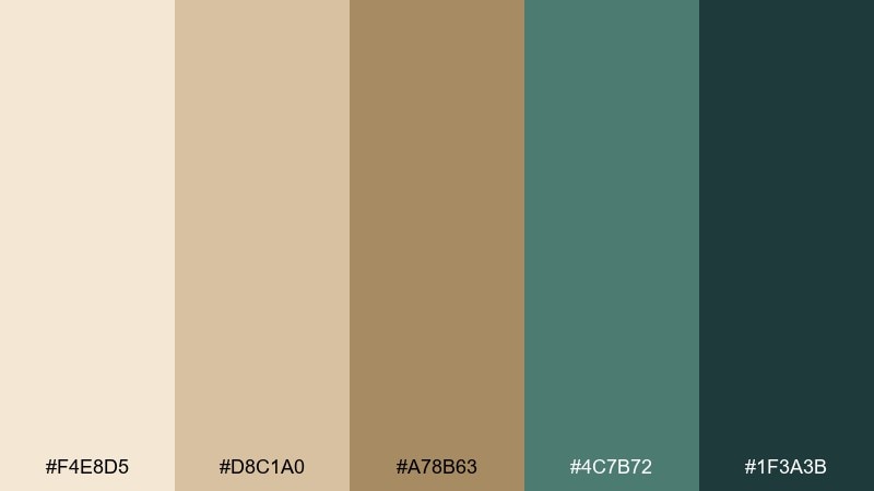
HEX: #F4E8D5 #D8C1A0 #A78B63 #4C7B72 #1F3A3B
Mood: adventurous, timeless, rugged
Best for: outdoor gear branding
Canvas tents, sunlit dunes, and a cool waterline create a timeless, adventurous feel. Build logos and badges with the tan and camel tones, then use teal for modern contrast on tags and web headers. The deep blue-green anchors type and helps the palette stay rugged rather than pastel. Tip: keep shapes bold and simple so the warm neutrals feel strong, not delicate.
Image example of caravan canvas generated using media.io
What Colors Go Well with Desert Oasis?
Desert oasis tones pair smoothly with warm neutrals like ivory, oatmeal, camel, and clay—these keep layouts spacious and let accent colors feel intentional rather than busy.
For contrast, lean into deep blue-greens (ink, pine, near-black teal) instead of pure black; it preserves the soft, natural vibe while improving readability in UI and print.
If you want extra energy, add small hits of sun-gold or copper. Keep those bright warms controlled (badges, icons, header bands) so the “oasis” coolness remains the signature.
How to Use a Desert Oasis Color Palette in Real Designs
Start with a sand/cream base for backgrounds, then build surfaces with a second neutral (stone, tan, pale sage). This creates depth without relying on heavy shadows.
Assign your teal/green tones to function: one for primary actions, one for secondary actions or hovers, and one darkest tone for text or high-importance labels. That keeps hierarchy consistent across pages.
In branding and packaging, let terracotta/copper lead as the hero color, and use teal as a “seal” accent—small, sharp, and memorable. This prevents the design from turning too colorful or seasonal.
Create Desert Oasis Palette Visuals with AI
If you’re building a moodboard, landing page, label, or poster, generating a quick visual mockup helps you confirm contrast, tone, and hierarchy before you commit to production.
Reuse the prompts above (or swap in your product type and layout), then iterate by changing lighting, typography style, and aspect ratio while keeping the same 5-color set.
With Media.io, you can create consistent concept images fast—useful for pitching, A/B testing, and social templates.
Desert Oasis Color Palette FAQs
-
What defines a desert oasis color palette?
A desert oasis palette typically mixes warm sand/adobe neutrals with cool greens and teals inspired by palms and water, creating a balanced warm–cool contrast. -
Which desert oasis colors are best for UI design?
Use a light sand or off-white for backgrounds, a mid teal/green for interactive states, and a deep blue-green (instead of pure black) for readable text and strong CTAs. -
How do I keep desert oasis palettes from looking too “beachy”?
Reduce saturated turquoise, add stone greys or olive tones, and use deeper teals for structure. Clean typography and restrained accents make it feel modern and editorial. -
What are good accent colors for sand and sage combinations?
Terracotta, copper, and sun-gold work well as small accents. They add warmth and energy while the sage/teal keeps the palette grounded and fresh. -
Is a desert oasis palette suitable for luxury branding?
Yes—choose quieter creams and stone neutrals, keep accents minimal, and rely on deep teal or pine for type. The result feels calm, premium, and timeless. -
How can I make desert oasis colors print-friendly?
Favor slightly muted teals and earthy terracottas, avoid neon greens, and test contrast on uncoated paper. Warm neutrals usually print reliably and add a tactile feel. -
Can I generate desert oasis palette mockups with AI?
Yes. Use a consistent palette and a clear prompt describing layout, lighting, and style (UI, packaging, poster, etc.), then iterate on compositions while keeping the same HEX direction.
Next: Cool Grey Color Palette


