

Museum color palettes balance quiet neutrals with aged metals and patina greens, creating a look that feels curated, trustworthy, and timeless.
Below are 20+ museum color scheme ideas with HEX codes you can use for UI, branding, signage, posters, and exhibit graphics.
In this article
- Why Museum Palettes Work So Well
-
- gallery stone
- curator's linen
- bronze artifact
- marble hall
- velvet rope
- antiquarian ink
- terracotta exhibit
- patina frame
- quiet archive
- modern wing
- fossil dust
- indigo label
- gold leaf catalog
- sculpture garden
- sepia ticket
- glass atrium
- chalk plaque
- cedar display
- night at the museum
- sunlit gallery
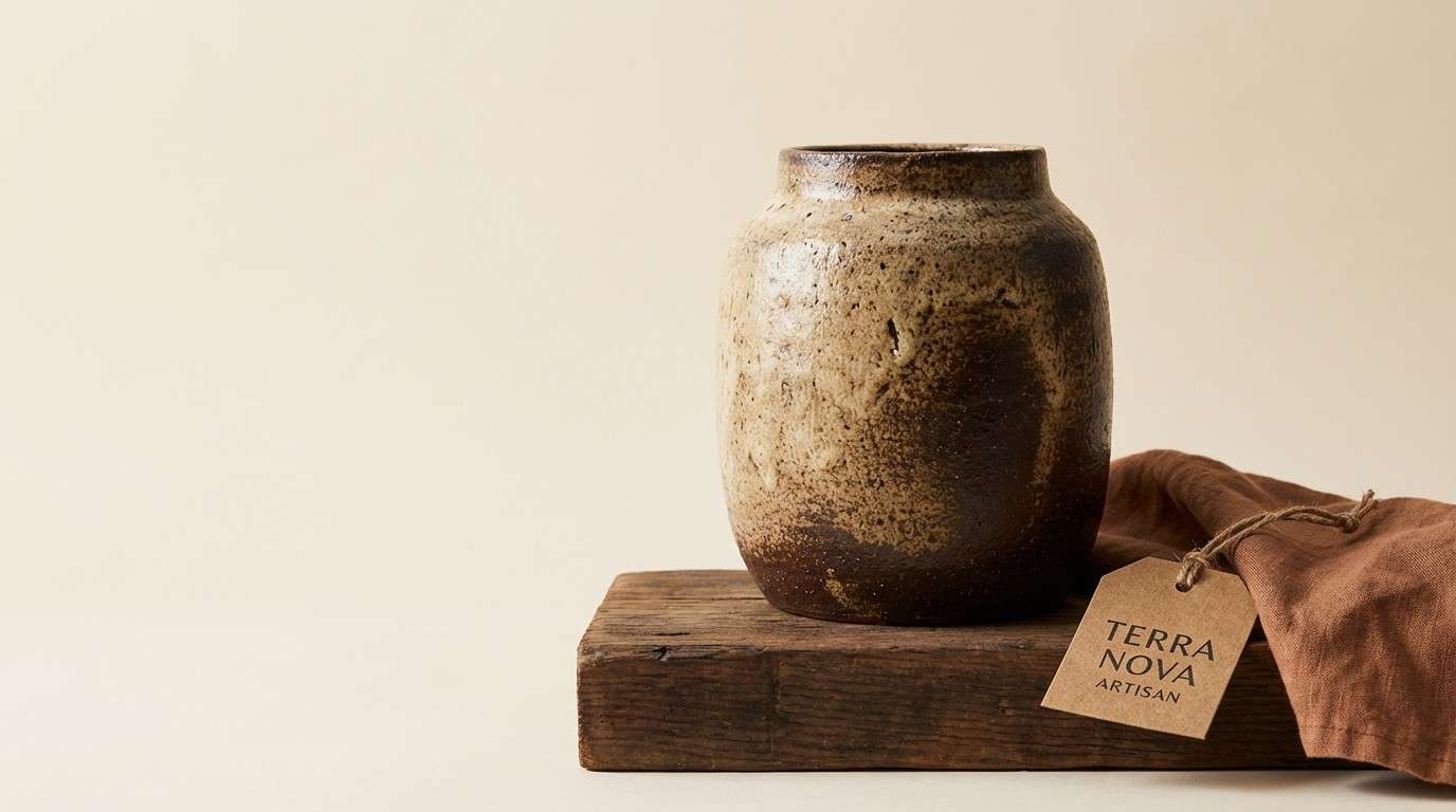
- ceramic relic
- map room
- What Colors Go Well with Museum?
- How to Use a Museum Color Palette in Real Designs
- Create Museum Palette Visuals with AI
Why Museum Palettes Work So Well
Museum colors feel “designed but not trendy” because they borrow from real materials: stone, paper, bronze, ink, and patina. That material-first logic helps your layouts feel credible and curated.
They also support hierarchy. Deep charcoals and navy-blacks make type readable, while warm creams and soft grays give content space to breathe—ideal for exhibit text, labels, and information-heavy UI.
Finally, these palettes photograph well. Whether you’re pairing them with artifact imagery or modern architecture shots, museum color schemes tend to harmonize rather than compete.
20+ Museum Color Palette Ideas (with HEX Codes)
1) Gallery Stone
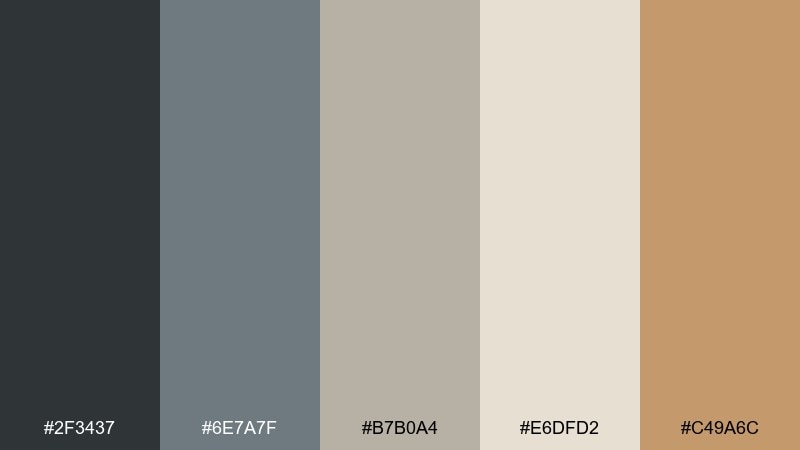
HEX: #2f3437 #6e7a7f #b7b0a4 #e6dfd2 #c49a6c
Mood: grounded and refined
Best for: museum website UI
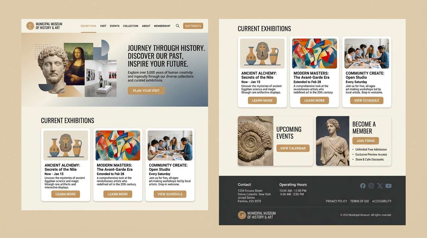
Grounded and refined, these tones feel like cool stone floors, soft plaster walls, and a touch of aged brass. They read clean and trustworthy on screens, especially for navigation, headers, and content-heavy pages. Pair the warm tan with crisp cream for buttons and highlights, and keep the darkest charcoal for type. Tip: use the mid gray-blue for subtle dividers so the layout stays airy, not heavy.
Image example of gallery stone generated using media.io
Media.io is an online AI studio for creating and editing video, image, and audio in your browser.

2) Curator's Linen
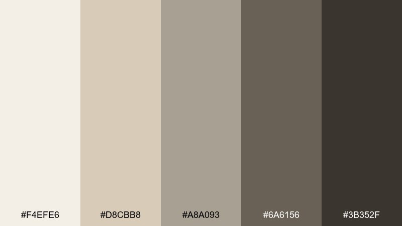
HEX: #f4efe6 #d8cbb8 #a8a093 #6a6156 #3b352f
Mood: warm and archival
Best for: editorial catalog layout
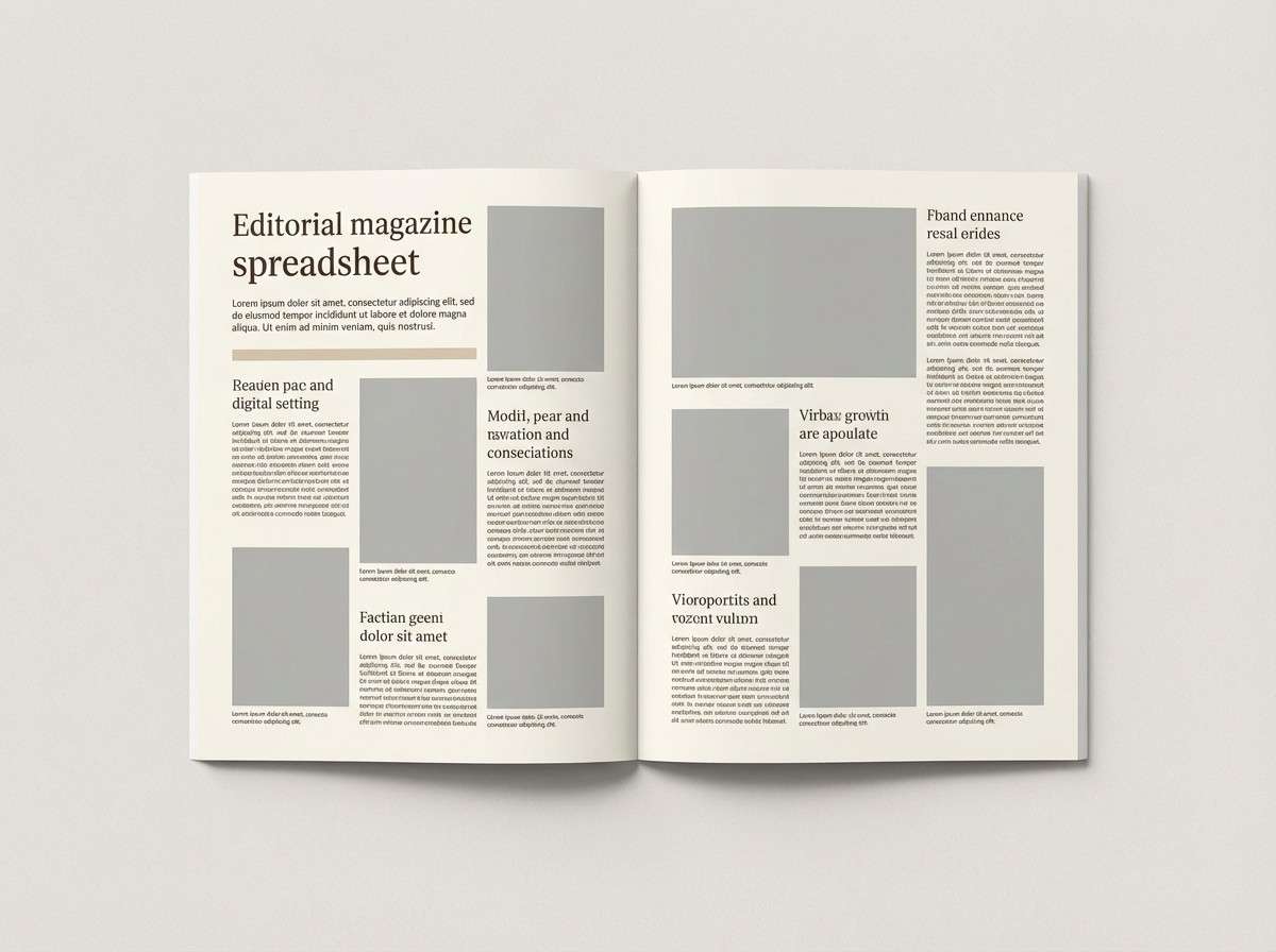
Warm and archival, it brings to mind linen book covers, penciled notes, and quiet reading rooms. The creamy base keeps long-form text comfortable, while the deeper browns add structure for headings and pull quotes. Pair it with uncoated paper textures and thin rules for a classic print feel. Tip: reserve the darkest brown for small text only so spreads stay light and collectible.
Image example of curator's linen generated using media.io
3) Bronze Artifact
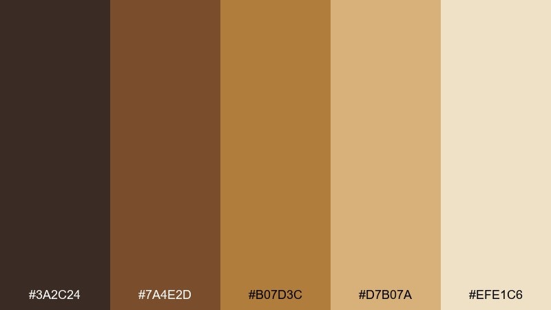
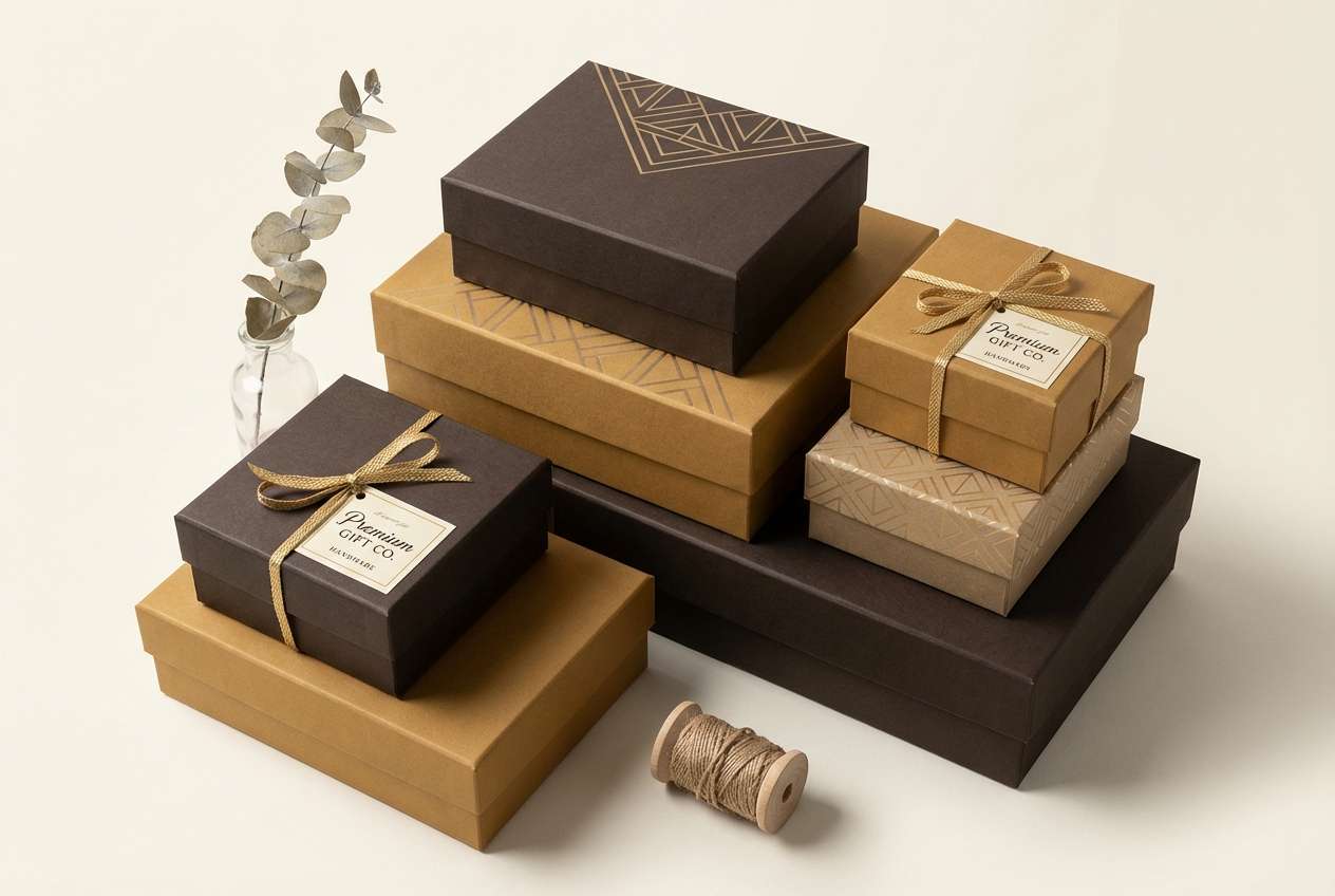
HEX: #3a2c24 #7a4e2d #b07d3c #d7b07a #efe1c6
Mood: rich and historic
Best for: product packaging for gift shop items
Rich and historic, it recalls bronze statuettes, worn leather, and spotlighted display cases. These museum color combinations work best when you let the deep brown anchor the layout and use the bronze tones as premium accents. Pair with matte paper, embossed details, or foil for an elevated finish. Tip: keep the light cream as breathing room so the warm metals feel intentional, not muddy.
Image example of bronze artifact generated using media.io
4) Marble Hall
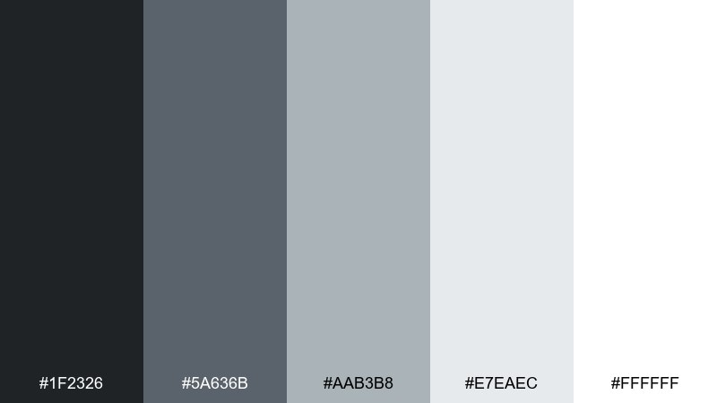
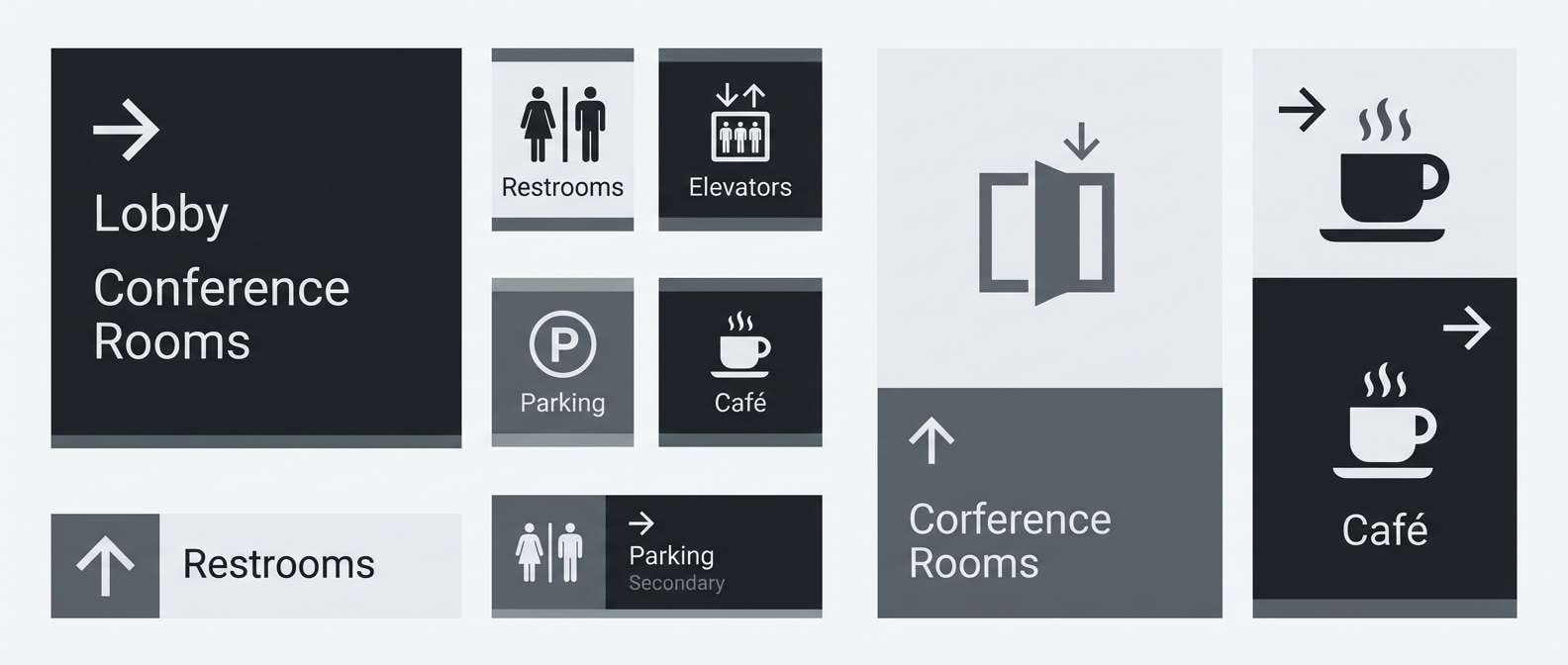
HEX: #1f2326 #5a636b #aab3b8 #e7eaec #ffffff
Mood: clean and architectural
Best for: wayfinding signage system
Clean and architectural, it feels like marble corridors with crisp shadows and polished fixtures. The grayscale range makes icons, arrows, and typography immediately legible from a distance. Pair with a single accent material like brushed steel or black acrylic for a modern finish. Tip: use the near-white for large fields and keep pure black for small type to avoid harsh contrast blocks.
Image example of marble hall generated using media.io
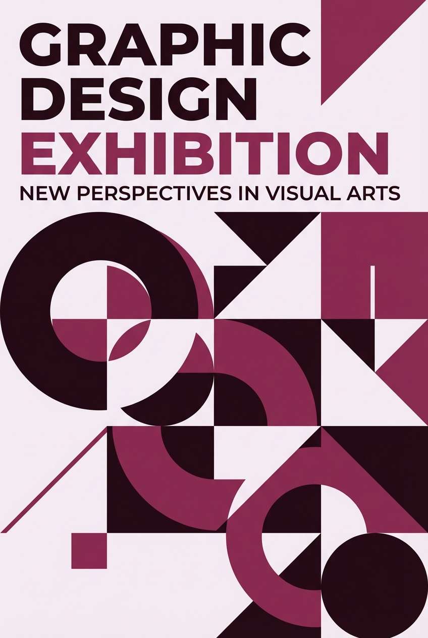
5) Velvet Rope
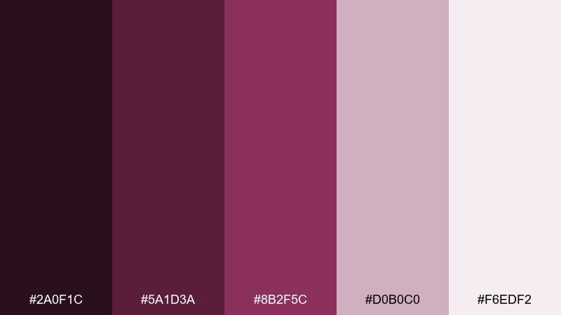
HEX: #2a0f1c #5a1d3a #8b2f5c #d0b0c0 #f6edf2
Mood: dramatic and elegant
Best for: exhibition poster design
Dramatic and elegant, it evokes velvet ropes, evening openings, and deep gallery lighting. The plum-to-rose range makes titles feel cinematic while still remaining sophisticated. Pair with high-contrast serif typography and plenty of pale blush space for balance. Tip: keep the darkest wine for the headline only and let the mid plum carry supporting text.
Image example of velvet rope generated using media.io
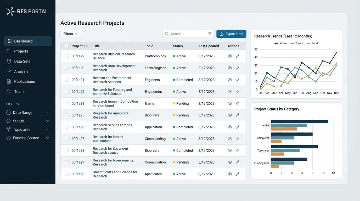
6) Antiquarian Ink

HEX: #0f1a24 #1f3a4a #4c6675 #c7d0d6 #f2f4f5
Mood: scholarly and calm
Best for: research portal dashboard UI
Scholarly and calm, it suggests ink drawings, reference cards, and late-night study sessions. The deep blue-black supports strong hierarchy, while the cool grays keep tables and filters readable. Pair with clean sans-serif type and restrained icons for a professional, academic feel. Tip: use the lightest gray as the main canvas and bring in the dark tone for only the most important actions.
Image example of antiquarian ink generated using media.io
7) Terracotta Exhibit
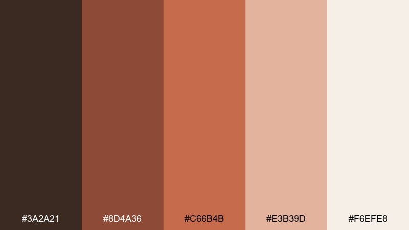
HEX: #3a2a21 #8d4a36 #c66b4b #e3b39d #f6efe8
Mood: earthy and welcoming
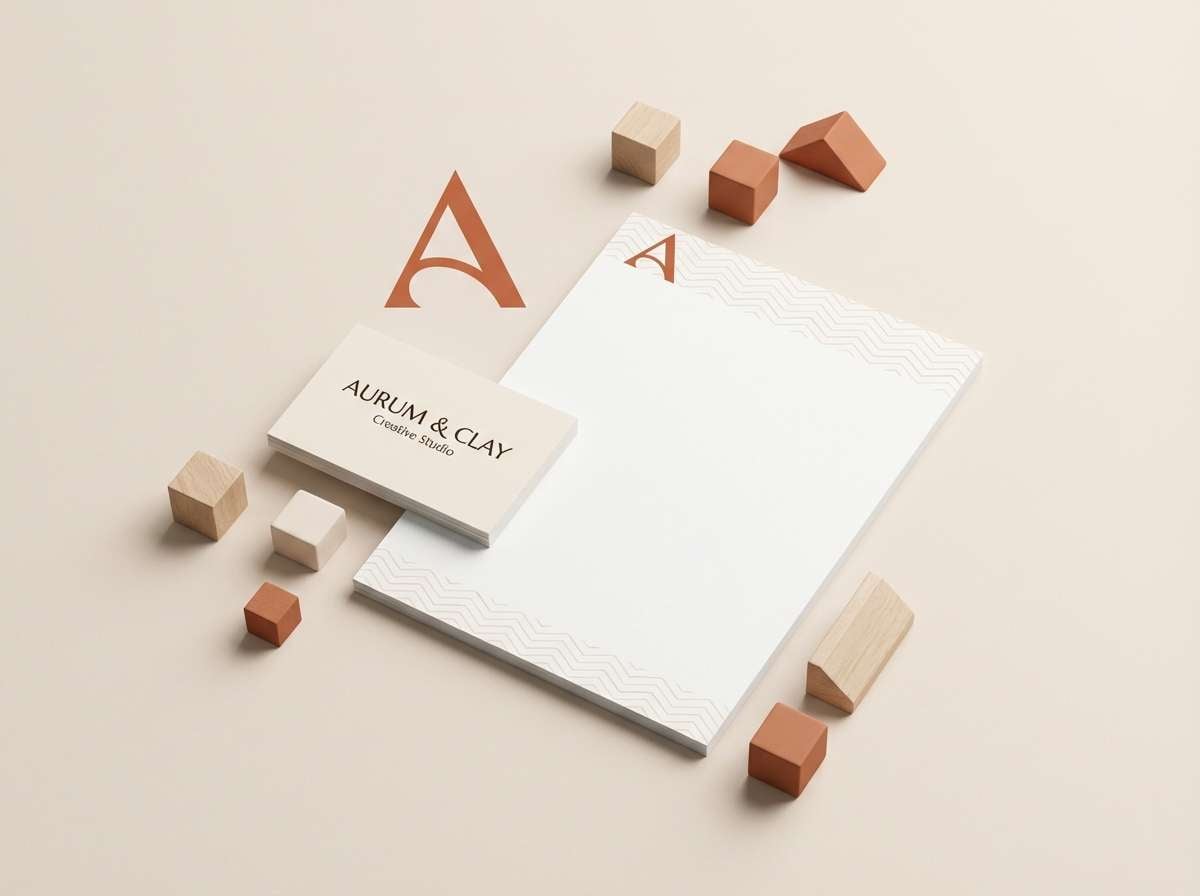
Best for: brand identity kit for a local museum
Earthy and welcoming, it feels like fired clay, carved wood, and sunlit display niches. As a museum color palette, it shines in logos and stationery where warmth should lead the story. Pair the terracotta with soft cream backgrounds and use the dark brown for stamps, outlines, and small print. Tip: keep the mid terracotta as the primary brand color and treat the peach as a supporting highlight, not a background.
Image example of terracotta exhibit generated using media.io
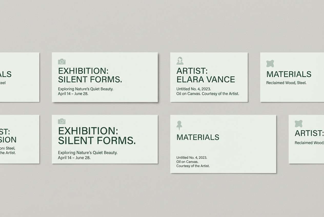
8) Patina Frame
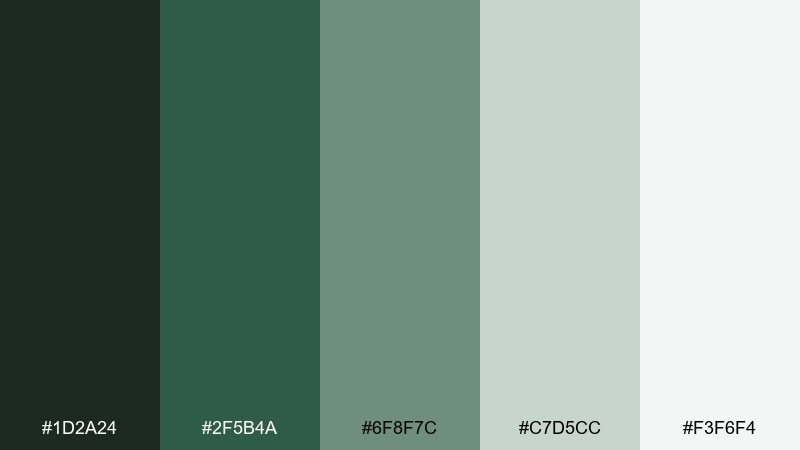
HEX: #1d2a24 #2f5b4a #6f8f7c #c7d5cc #f3f6f4
Mood: fresh and timeworn
Best for: gallery label cards and placards
Fresh and timeworn, it brings patinated metal, mossy stone, and quiet courtyards to mind. The greens feel organic without turning playful, which suits informational labels and understated brand accents. Pair with warm off-white stock and minimal line art for a refined, natural look. Tip: use the darkest green for text and the mid green for borders to keep readability high.
Image example of patina frame generated using media.io
9) Quiet Archive
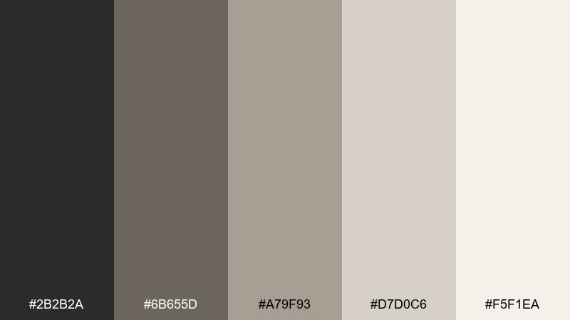
HEX: #2b2b2a #6b655d #a79f93 #d7d0c6 #f5f1ea
Mood: soft and contemplative
Best for: portfolio website for an archivist
Soft and contemplative, it feels like stacked document boxes and well-loved folders. The warm neutrals give a human touch to a minimal layout without drifting into beige monotony. Pair with a single accent typeface and generous spacing to let projects breathe. Tip: use the taupe midtone for hover states so interactions stay subtle and calm.
Image example of quiet archive generated using media.io
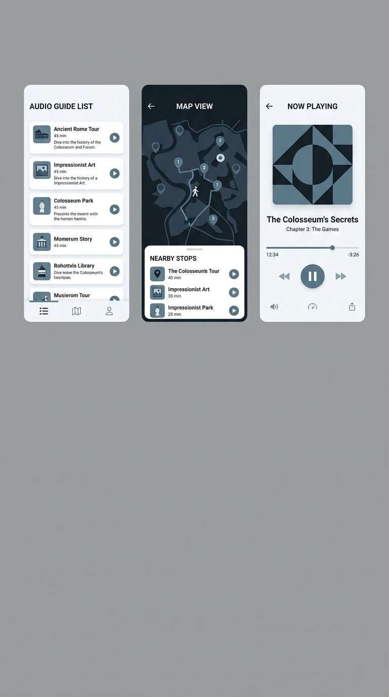
10) Modern Wing
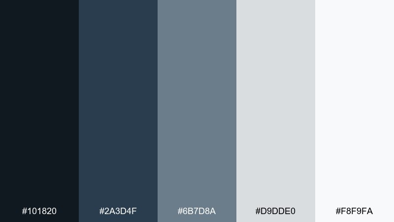
HEX: #101820 #2a3d4f #6b7d8a #d9dde0 #f8f9fa
Mood: sleek and contemporary
Best for: app UI for audio guide
Sleek and contemporary, it resembles glass walls, steel beams, and crisp interpretive graphics. A museum color combination like this works beautifully for an audio guide where clarity and contrast matter most. Pair the deep navy with cool light grays for panels and keep the mid slate for secondary buttons. Tip: add one warm accent element outside the interface, like photography, to prevent the UI from feeling too cold.
Image example of modern wing generated using media.io
11) Fossil Dust
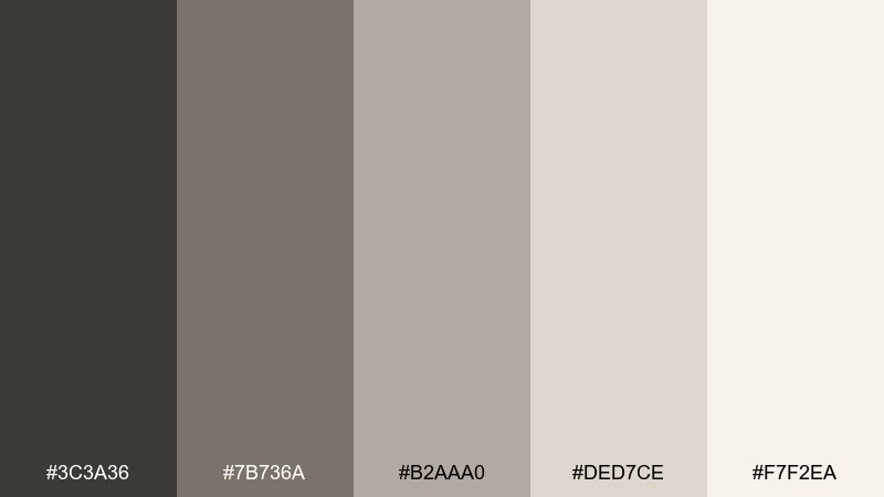
HEX: #3c3a36 #7b736a #b2aaa0 #ded7ce #f7f2ea
Mood: muted and natural
Best for: educational infographic
Muted and natural, it recalls fossil casts, sanded stone, and exhibit cases under warm light. The grayscale-brown balance is ideal for charts, labels, and annotation-heavy graphics. Pair with simple illustrations and consistent line weights for a classroom-friendly look. Tip: keep the darkest tone for key numbers and titles so the infographic stays scannable.
Image example of fossil dust generated using media.io
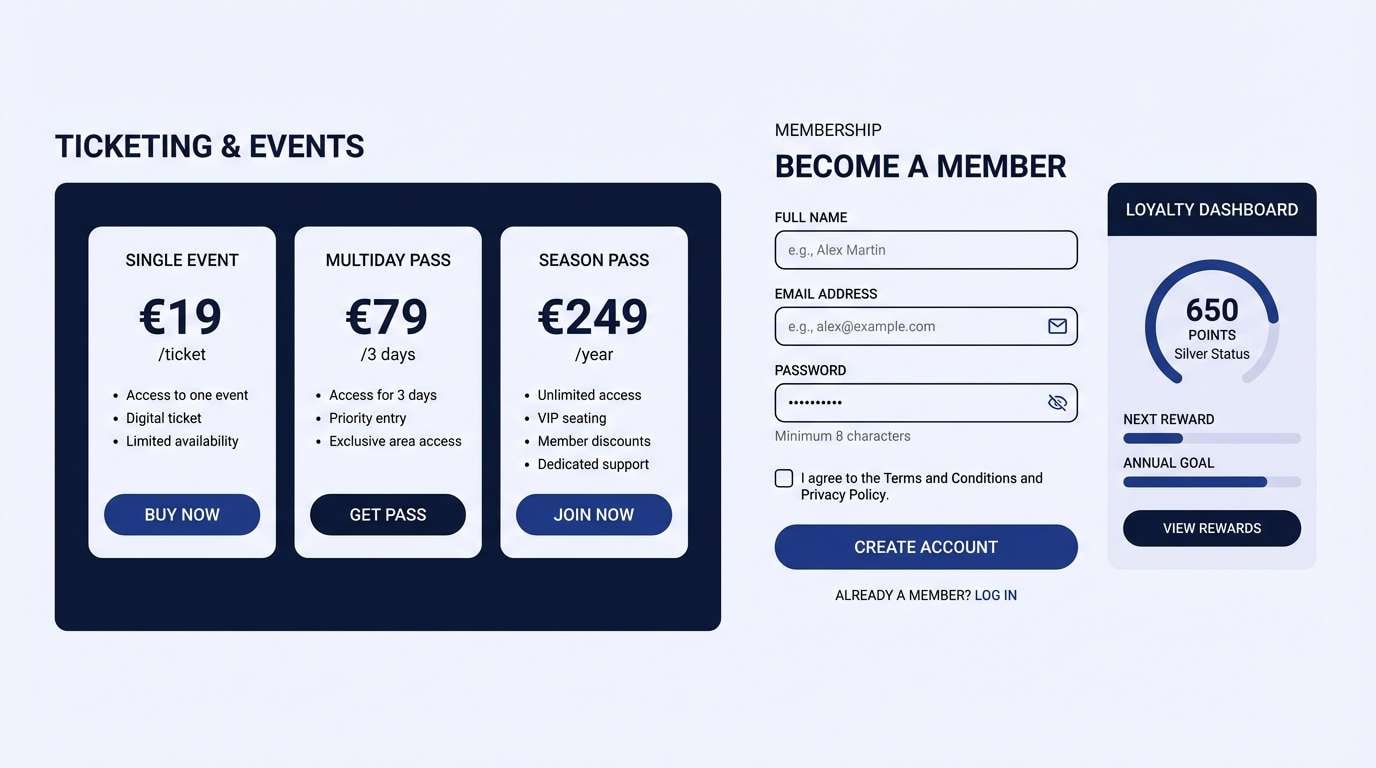
12) Indigo Label
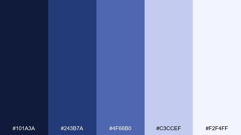
HEX: #101a3a #243b7a #4f66b0 #c3ccef #f2f4ff
Mood: precise and intelligent
Best for: ticketing and membership UI
Precise and intelligent, it feels like stamped labels and midnight-blue signage. The indigo range adds confidence to CTAs without turning loud, while the pale lavender keeps forms friendly. Pair with crisp white space and a touch of charcoal text for accessibility. Tip: use the mid blue for active states and save the deepest shade for the primary action button only.
Image example of indigo label generated using media.io
13) Gold Leaf Catalog
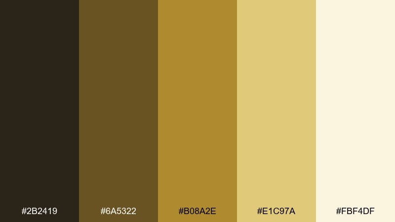
HEX: #2b2419 #6a5322 #b08a2e #e1c97a #fbf4df
Mood: luxurious and curated
Best for: event invitation flyer
Luxurious and curated, it conjures gold leaf details and softly lit vitrines. The warm metallic range looks premium even in flat print when you balance it with deep brown type. Pair with minimalist typography and plenty of cream space for a high-end opening-night feel. Tip: keep the brightest gold as a thin rule or emblem so it stays tasteful.
Image example of gold leaf catalog generated using media.io

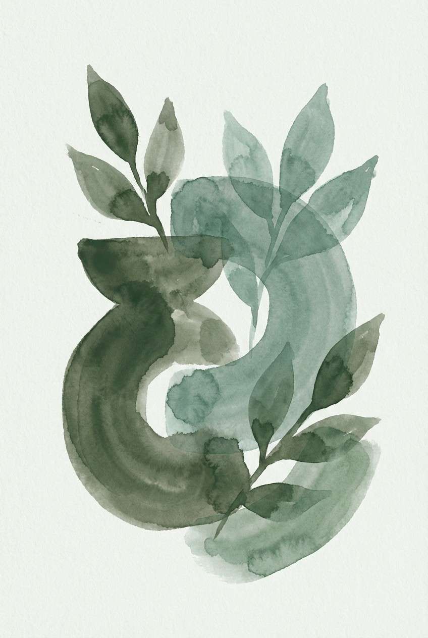
14) Sculpture Garden
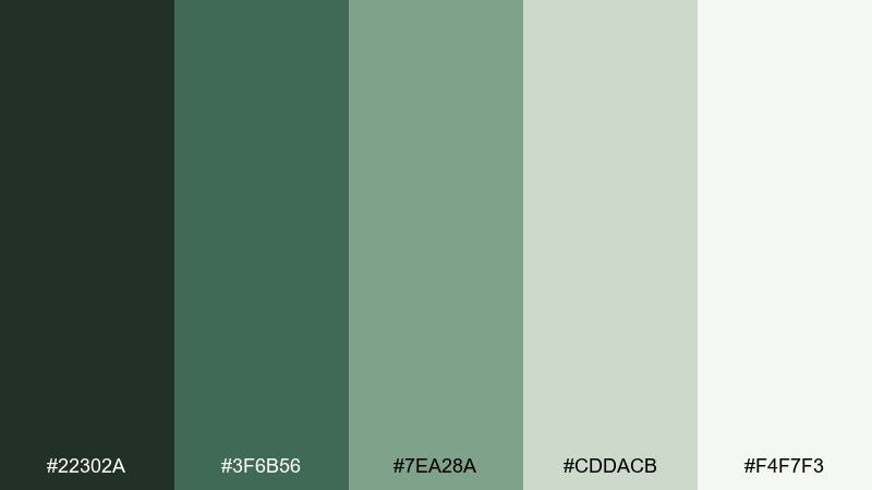
HEX: #22302a #3f6b56 #7ea28a #cddacb #f4f7f3
Mood: calm and botanical
Best for: watercolor botanical poster
Calm and botanical, it suggests leafy courtyards and stone sculptures after rain. The greens stay muted enough for a refined print, while the pale tints keep the composition fresh. Pair with hand-drawn linework and textured paper effects for an artisanal look. Tip: choose two dominant greens and let the lightest shade act as negative space.
Image example of sculpture garden generated using media.io
15) Sepia Ticket
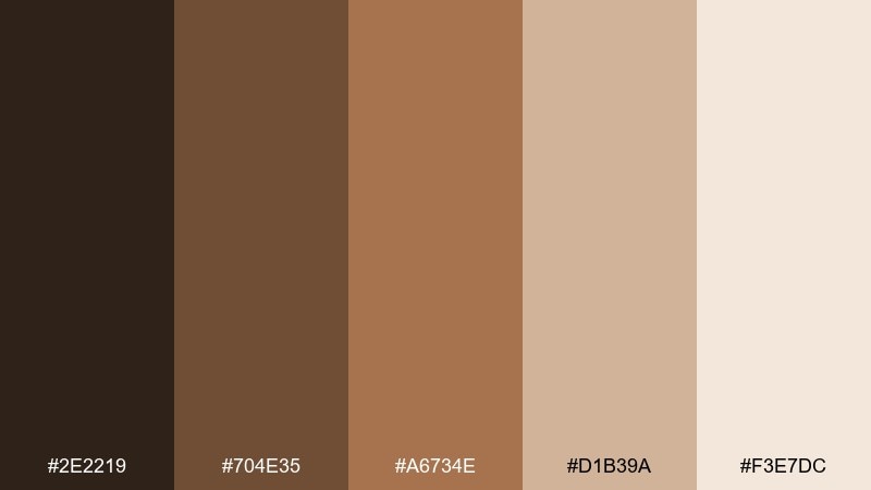
HEX: #2e2219 #704e35 #a6734e #d1b39a #f3e7dc
Mood: nostalgic and friendly
Best for: retro-themed poster series
Nostalgic and friendly, it feels like sepia tickets, aged postcards, and warm lamplight. These museum color combinations are perfect for retro posters when you want warmth without going overly vintage. Pair with bold condensed type and simple halftone textures, keeping the darkest brown for the title. Tip: use the pale blush as the poster base so the mid browns pop cleanly.
Image example of sepia ticket generated using media.io
16) Glass Atrium
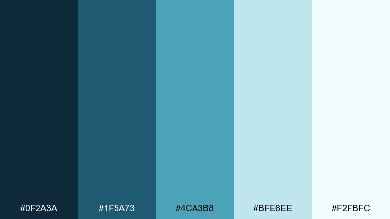
HEX: #0f2a3a #1f5a73 #4ca3b8 #bfe6ee #f2fbfc
Mood: bright and airy
Best for: website hero banner design
Bright and airy, it mirrors sunlight through glass ceilings and cool reflections on polished floors. The teal range feels modern and open, great for hero banners and campaign pages. Pair with clean photography and dark navy typography for a crisp, contemporary contrast. Tip: keep the light aqua as the main field and use the saturated teal only for key highlights.
Image example of glass atrium generated using media.io

17) Chalk Plaque
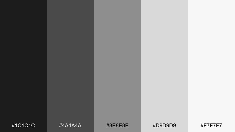
HEX: #1c1c1c #4a4a4a #8e8e8e #d9d9d9 #f7f7f7
Mood: minimal and serious
Best for: typography poster
Minimal and serious, it looks like chalk plaques, graphite sketches, and gallery labels under neutral light. The tight grayscale keeps typography crisp and makes negative space feel intentional. Pair with one bold type family and a strict grid for maximum impact. Tip: avoid using all five tones at once and stick to three for a cleaner hierarchy.
Image example of chalk plaque generated using media.io
18) Cedar Display
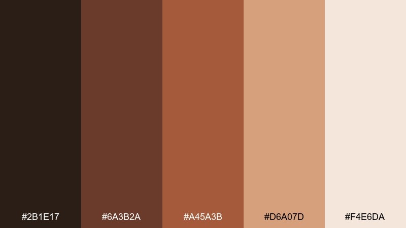
HEX: #2b1e17 #6a3b2a #a45a3b #d6a07d #f4e6da
Mood: crafted and warm
Best for: artisan product ad
Crafted and warm, it suggests cedar display cases, carved details, and soft spotlight glow. The browns feel authentic for handmade goods, while the pale peach keeps the ad modern and approachable. Pair with natural materials like kraft textures and clean sans-serif type. Tip: use the medium cedar tone for the product name and reserve the darkest shade for small supporting copy.
Image example of cedar display generated using media.io
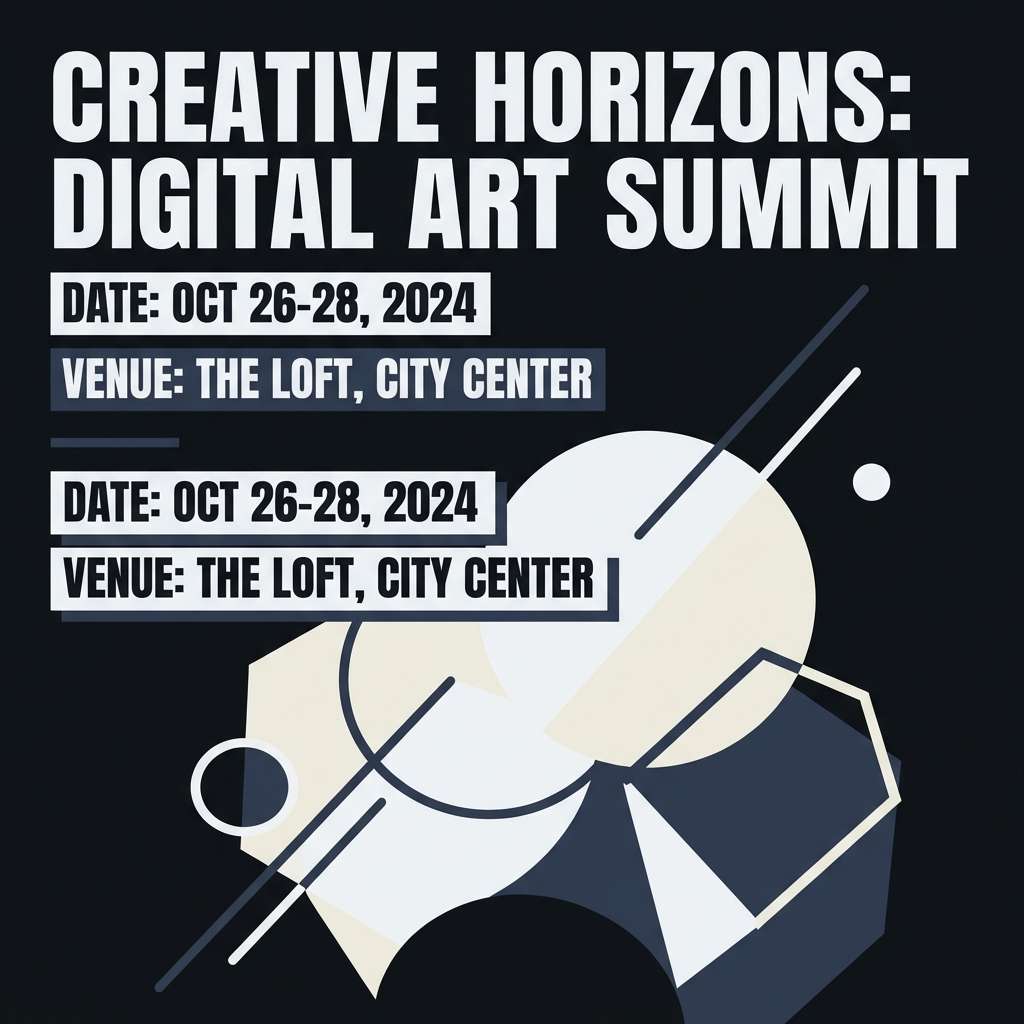
19) Night at the Museum
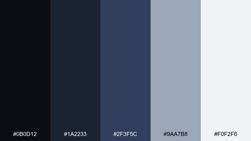
HEX: #0b0d12 #1a2233 #2f3f5c #9aa7b8 #f0f2f6
Mood: moody and cinematic
Best for: social media event announcement
Moody and cinematic, it feels like late hours in a quiet hall with focused pools of light. As a museum color palette, it makes event announcements look premium and modern, especially with large type and high contrast. Pair the icy gray with deep navy for legibility, and add subtle gradients for depth. Tip: keep the background nearly black and let the lightest tone frame the key details like date and venue.
Image example of night at the museum generated using media.io
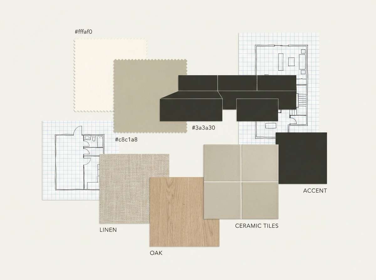
20) Sunlit Gallery
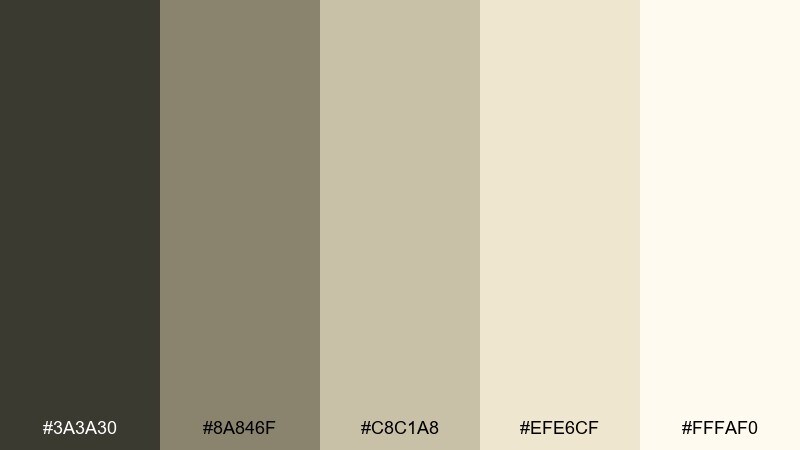
HEX: #3a3a30 #8a846f #c8c1a8 #efe6cf #fffaf0
Mood: soft and optimistic
Best for: interior mood board
Soft and optimistic, it brings sunlit walls, pale oak, and calm afternoons to mind. The warm neutrals make spaces feel open and curated without looking sterile. Pair with natural textures like linen, light wood, and matte ceramics for a cohesive look. Tip: use the deepest olive-brown sparingly in frames or hardware to keep the room bright.
Image example of sunlit gallery generated using media.io
21) Ceramic Relic
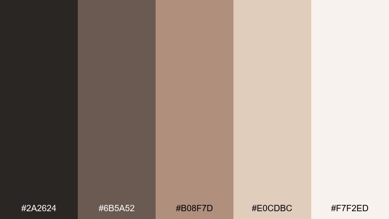
HEX: #2a2624 #6b5a52 #b08f7d #e0cdbc #f7f2ed
Mood: handmade and balanced
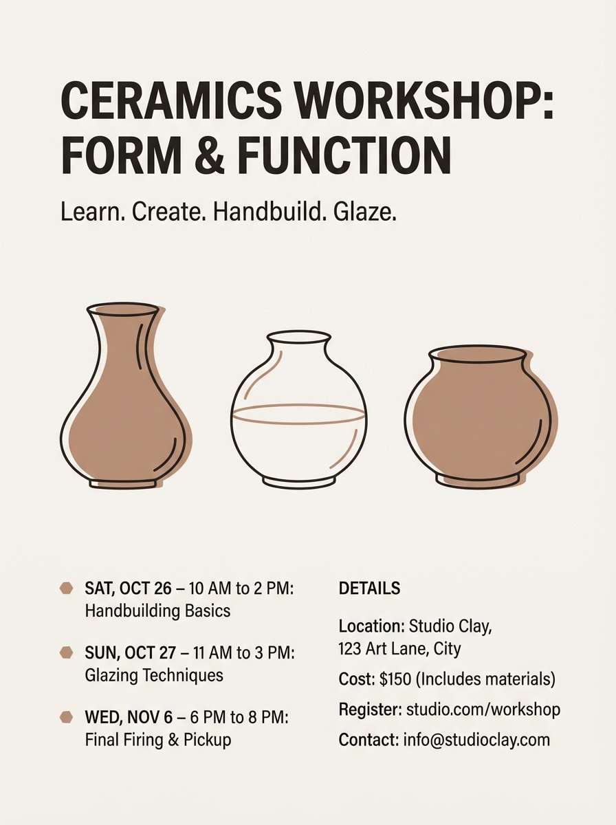
Best for: ceramics workshop flyer
Handmade and balanced, it suggests clay bodies, kiln heat, and softly glazed surfaces. The dusty taupes keep layouts approachable while still feeling sophisticated. Pair with simple illustrations, rounded shapes, and plenty of off-white for a modern craft vibe. Tip: use the clay midtone as the main block color and keep dark charcoal for fine text.
Image example of ceramic relic generated using media.io
22) Map Room
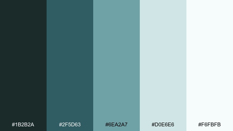
HEX: #1b2b2a #2f5d63 #6ea2a7 #d0e6e6 #f6fbfb
Mood: cool and exploratory
Best for: interactive map UI
Cool and exploratory, it feels like an old map room refreshed with modern screens and clean overlays. The teal spectrum supports layers, routes, and markers without overwhelming the content. Pair with thin lines, subtle shadows, and generous margins for clarity. Tip: make the light aqua your base layer and use the darkest teal only for the active route and selected pins.
Image example of map room generated using media.io
What Colors Go Well with Museum?
Museum palettes pair best with material-inspired neutrals: warm creams, stone grays, and soft taupes. These keep typography readable and make artwork or photography feel like the focus.
For accents, choose restrained heritage tones—patina green, deep indigo, or brass/gold—so CTAs, icons, and key labels stand out without looking flashy.
If you need extra energy, add one modern highlight color (like teal or lavender) in small amounts, while keeping the foundation calm and editorial.
How to Use a Museum Color Palette in Real Designs
Start with a quiet base (cream, off-white, light gray) for backgrounds, then assign your darkest tone to body text and navigation for consistent contrast. This mirrors how galleries use light walls and strong labeling.
Use one “artifact” color as your signature accent—brass, terracotta, indigo, or patina—and repeat it for buttons, active states, and badges. Repetition makes the system feel curated.
Finally, keep saturation controlled. Museum color schemes look premium when the palette is disciplined: fewer loud colors, more thoughtful spacing and hierarchy.
Create Museum Palette Visuals with AI
If you want to preview a museum color scheme before committing to print or UI builds, generate quick mockups (posters, signage, dashboards, invitations) from a text prompt.
With Media.io’s text-to-image tool, you can paste a palette’s HEX codes into your prompt and iterate styles fast—minimal, editorial, cinematic, or contemporary.
Create multiple variations for stakeholders, then standardize the winners into your brand guidelines or design system.
Museum Color Palette FAQs
-
What is a museum color palette?
A museum color palette is a curated set of tones inspired by gallery spaces and heritage materials—think stone neutrals, archival paper creams, ink-like darks, patina greens, and brass or bronze accents. -
Are museum colors good for modern UI design?
Yes. Museum palettes often have strong neutrals for backgrounds and legible darks for typography, making them ideal for content-heavy interfaces like collections, audio guides, and ticketing pages. -
What accent colors work best with museum neutrals?
Muted metallics (brass/gold), patina green, indigo, and terracotta are reliable accents. Use them sparingly for CTAs, highlights, and key labels to keep the look refined. -
How do I keep a museum color scheme from looking dull?
Increase contrast with a deeper anchor color (charcoal or navy), add one controlled accent, and rely on layout hierarchy (spacing, type scale, thin rules) rather than extra saturation. -
What are the best museum colors for posters and event announcements?
For posters, dramatic palettes like Velvet Rope or Night at the Museum work well because they support big headlines and high contrast. Add a pale tint for breathing room and readability. -
Can I use museum palettes for branding and packaging?
Absolutely. Warm archival neutrals and bronze/gold accents feel premium on stationery and gift-shop packaging, especially with matte paper, embossing, or subtle foil details. -
How can I generate museum palette mockups quickly?
Use Media.io text-to-image: describe the design (UI, signage, flyer) and include your HEX codes in the prompt to generate consistent visual directions you can refine.
Next: Modern Color Palette


