

Mauve taupe is a modern neutral that blends rosy softness with grounded, earthy warmth. It’s subtle enough for everyday UI and branding, yet rich enough to feel elevated in interiors and print.
Below are 20 curated mauve taupe color combinations with HEX codes—each one paired with a practical use case and an AI prompt you can reuse to generate matching visuals.
In this article
- Why Mauve Taupe Color Combinations Work So Well
-
- dusty rose studio
- vintage lilac linen
- cocoa mauve minimal
- smoke plum office
- blush taupe wedding
- clay orchid kitchen
- rosewood boutique
- foggy mauve ui
- heirloom velvet editorial
- quiet desert branding
- mauve taupe sunset poster
- mushroom bloom packaging
- ash rose landing page
- warm stone nursery
- antique mauve stationery
- twilight taupe social
- soft garnet accent
- botanical mauve watercolor
- modern taupe gallery
- cozy mauve café menu
- What Colors Go Well with Mauve Taupe?
- How to Use a Mauve Taupe Color Palette in Real Designs
- Create Mauve Taupe Palette Visuals with AI
Why Mauve Taupe Color Combinations Work So Well
Mauve taupe sits in a sweet spot between warm and cool, which makes it easy to pair with creams, browns, grays, and even muted blues. That flexibility is why it shows up in everything from modern interiors to minimalist product packaging.
It also creates naturally “premium” contrast: taupe anchors layouts and typography, while mauve adds an emotional, human touch. The result is calm and refined, without feeling sterile.
Because these tones are softer than pure black-and-white, they’re especially useful for wellness, lifestyle, and boutique brands where you want readability with a gentle mood.
20+ Mauve Taupe Color Palette Ideas (with HEX Codes)
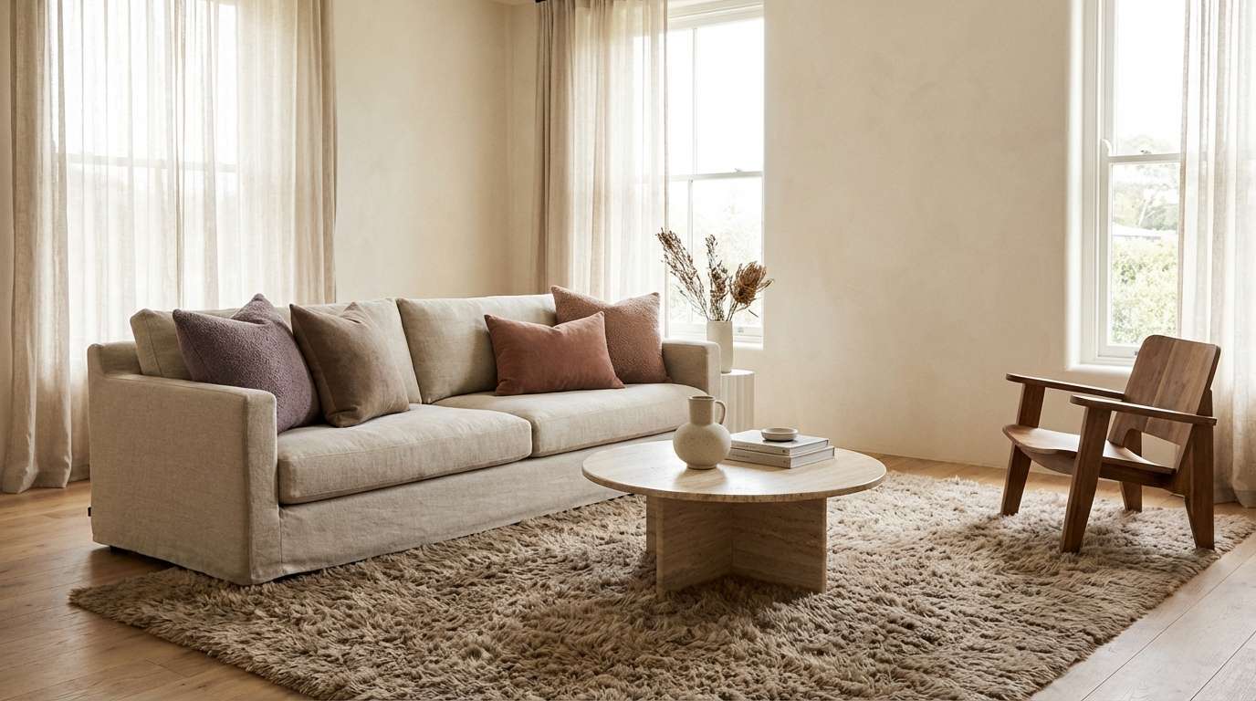
1) Dusty Rose Studio
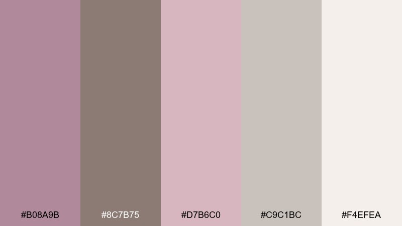
HEX: #B08A9B #8C7B75 #D7B6C0 #C9C1BC #F4EFEA
Mood: calm, airy, and refined
Best for: minimalist living room styling
Calm and airy like morning light on linen, these mauve taupe color combinations feel polished without turning cold. Use the deeper taupe for anchors like sofas or cabinetry, then let dusty mauve soften the room through textiles. Pair with matte black hardware or brushed brass for a modern edge. Usage tip: repeat the light cream on walls and ceiling to keep the palette feeling spacious.
Image example of dusty rose studio generated using media.io
Media.io is an online AI studio for creating and editing video, image, and audio in your browser.

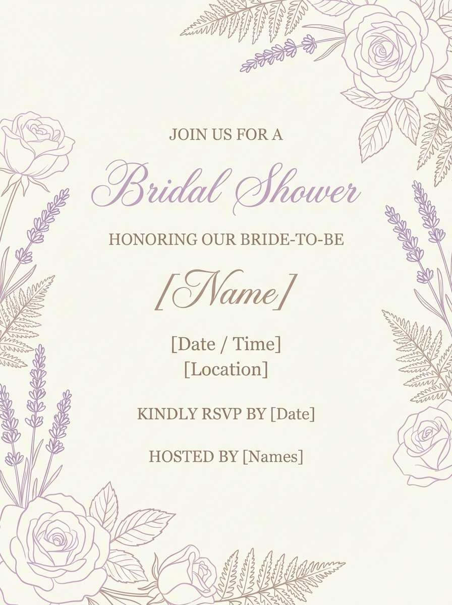
2) Vintage Lilac Linen
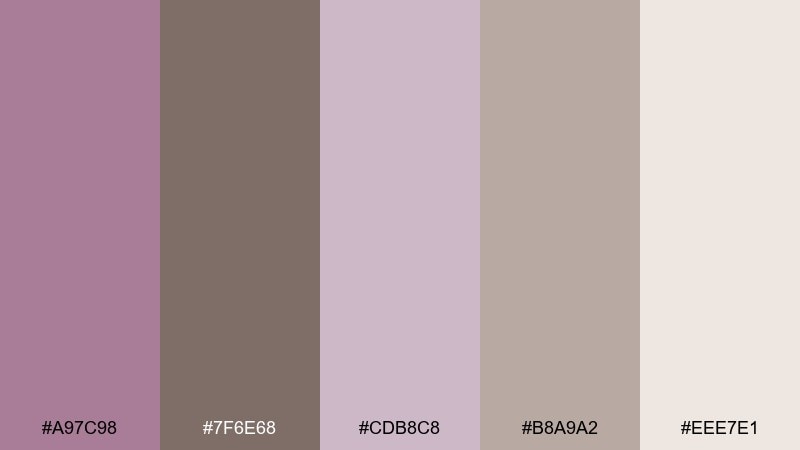
HEX: #A97C98 #7F6E68 #CDB8C8 #B8A9A2 #EEE7E1
Mood: nostalgic, soft, and elegant
Best for: bridal shower invitation design
Nostalgic and elegant, these hues echo pressed flowers and heirloom lace. Use the lilac-mauve as the hero for headers, with taupe and warm gray for body copy and borders. Cream keeps the layout breathable, especially on printed pieces. Usage tip: add subtle line art and leave generous margins to make the design feel premium.
Image example of vintage lilac linen generated using media.io
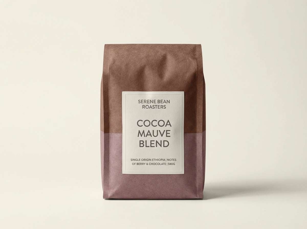
3) Cocoa Mauve Minimal
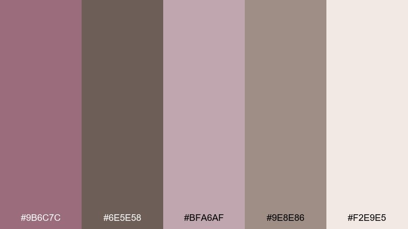
HEX: #9B6C7C #6E5E58 #BFA6AF #9E8E86 #F2E9E5
Mood: grounded, cozy, and modern
Best for: coffee packaging and label system
Grounded and cozy, the mix feels like cocoa powder stirred into rose cream. Let the deeper brown-taupe carry the logo mark, while mauve shades highlight flavor notes and badges. The light neutral works well for label stock and keeps text highly readable. Usage tip: choose one accent mauve for each product variant to create a tidy shelf system.
Image example of cocoa mauve minimal generated using media.io
4) Smoke Plum Office
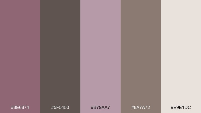
HEX: #8E6674 #5F5450 #B79AA7 #8A7A72 #E9E1DC
Mood: serious, quiet, and confident
Best for: corporate slide deck template
Serious and quiet like smoke over plum velvet, these mauve taupe color combinations bring authority without harsh contrast. The mauve-to-taupe range creates mauve taupe color combinations that feel mature for business storytelling. Use the darkest taupe for titles and charts, and reserve the mauve for highlights and callouts. Usage tip: keep charts to two series colors max so the deck stays clean.
Image example of smoke plum office generated using media.io

5) Blush Taupe Wedding
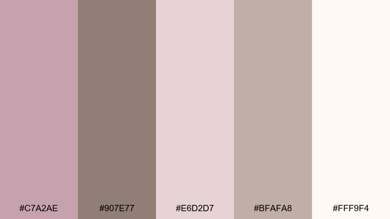
HEX: #C7A2AE #907E77 #E6D2D7 #BFAFA8 #FFF9F4
Mood: romantic, warm, and graceful
Best for: wedding website hero section
Romantic and warm, the blush tones read like petals against sun-warmed stone. Use soft cream as the page base, with taupe for navigation and buttons to keep the interface clear. Add blush-mauve for hero headings and subtle background shapes. Usage tip: apply the darkest taupe to CTA text to maintain contrast on light blush fills.
Image example of blush taupe wedding generated using media.io

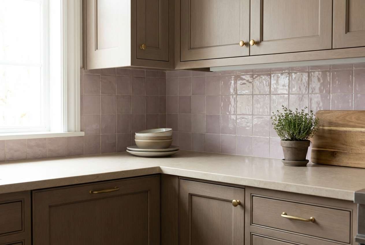
6) Clay Orchid Kitchen
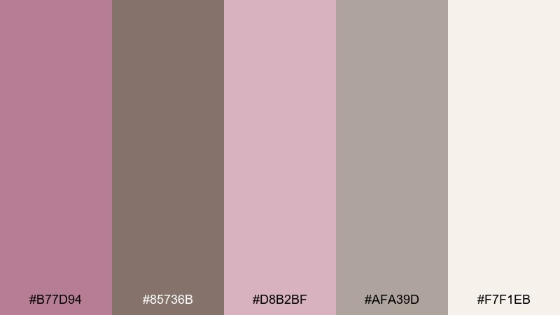
HEX: #B77D94 #85736B #D8B2BF #AFA39D #F7F1EB
Mood: homey, fresh, and understated
Best for: kitchen backsplash and cabinetry pairing
Homey and understated, these mauve taupe color combinations feel like clay pottery next to dried orchids. Bring taupe into cabinetry or grout, and use the mauve shades as small moments through tile, linens, or painted niches. The pale neutral keeps the whole kitchen from feeling too sweet. Usage tip: test mauve on large samples under warm bulbs, since it can shift rosier at night.
Image example of clay orchid kitchen generated using media.io
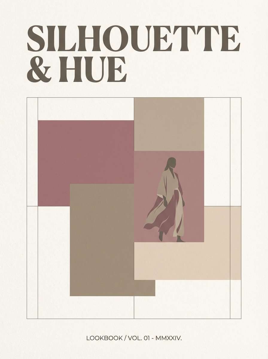
7) Rosewood Boutique
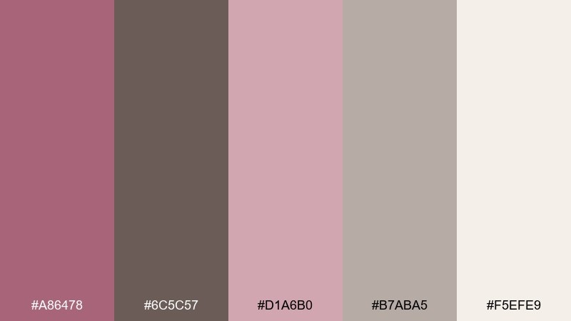
HEX: #A86478 #6C5C57 #D1A6B0 #B7ABA5 #F5EFE9
Mood: boutique, chic, and inviting
Best for: fashion brand lookbook cover
Chic and inviting, the rosewood note adds a subtle boutique drama. Let the deep mauve lead in headlines and cover typography, while the softer blush supports imagery and margins. Warm taupe keeps the editorial feel grounded and premium. Usage tip: use one bold type weight only, and rely on color blocks for hierarchy.
Image example of rosewood boutique generated using media.io
8) Foggy Mauve UI

HEX: #B58FA2 #7A6B66 #E0C8D2 #C3BAB5 #FBF7F3
Mood: soft, modern, and user-friendly
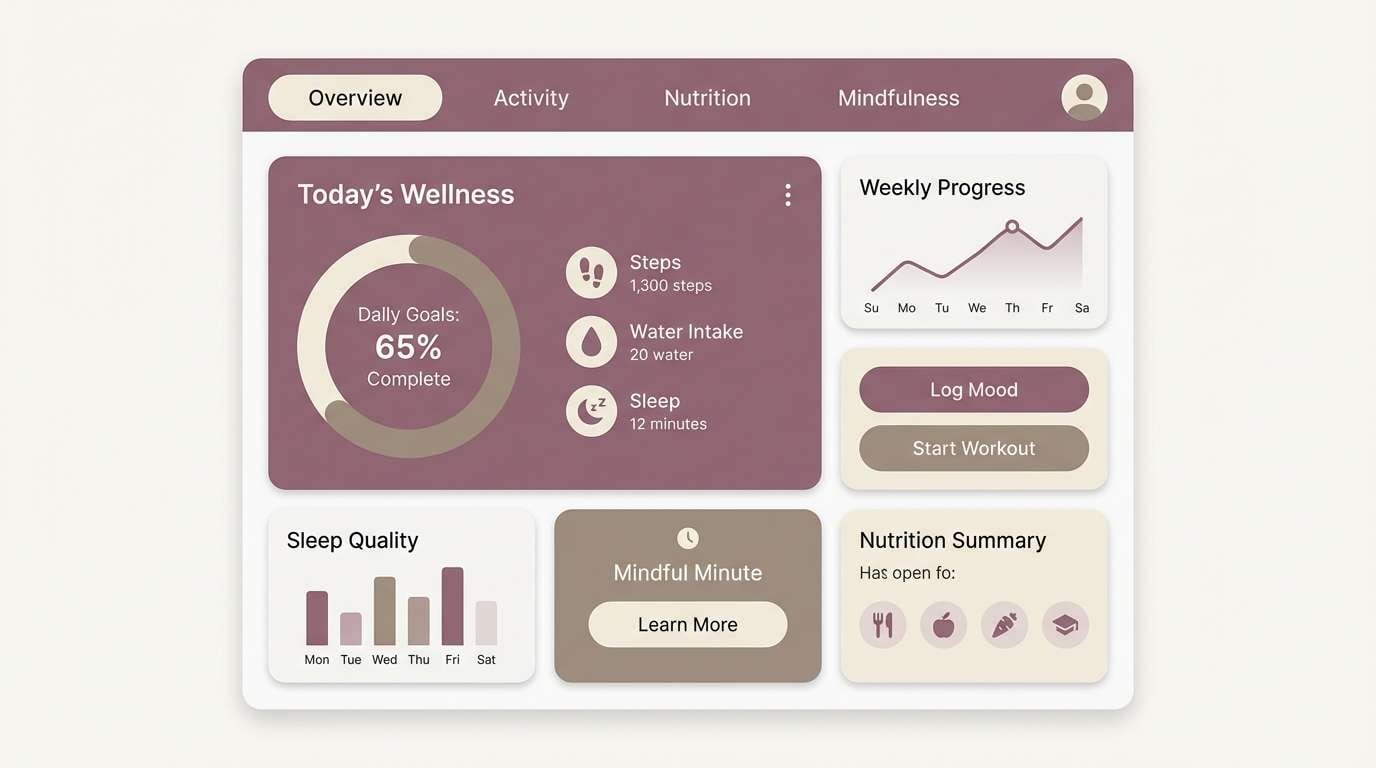
Best for: wellness app dashboard UI
Soft and modern like fog rolling over warm stone, these colors stay gentle even in dense layouts. A mauve taupe color scheme works well for wellness apps where calm and clarity matter. Use the near-white for panels, taupe for navigation, and mauve for progress states and selected tabs. Usage tip: set icons to taupe rather than mauve to avoid a overly rosy interface.
Image example of foggy mauve ui generated using media.io
9) Heirloom Velvet Editorial
HEX: #925B70 #4F4643 #C09CAB #9D8B84 #EFE6E2
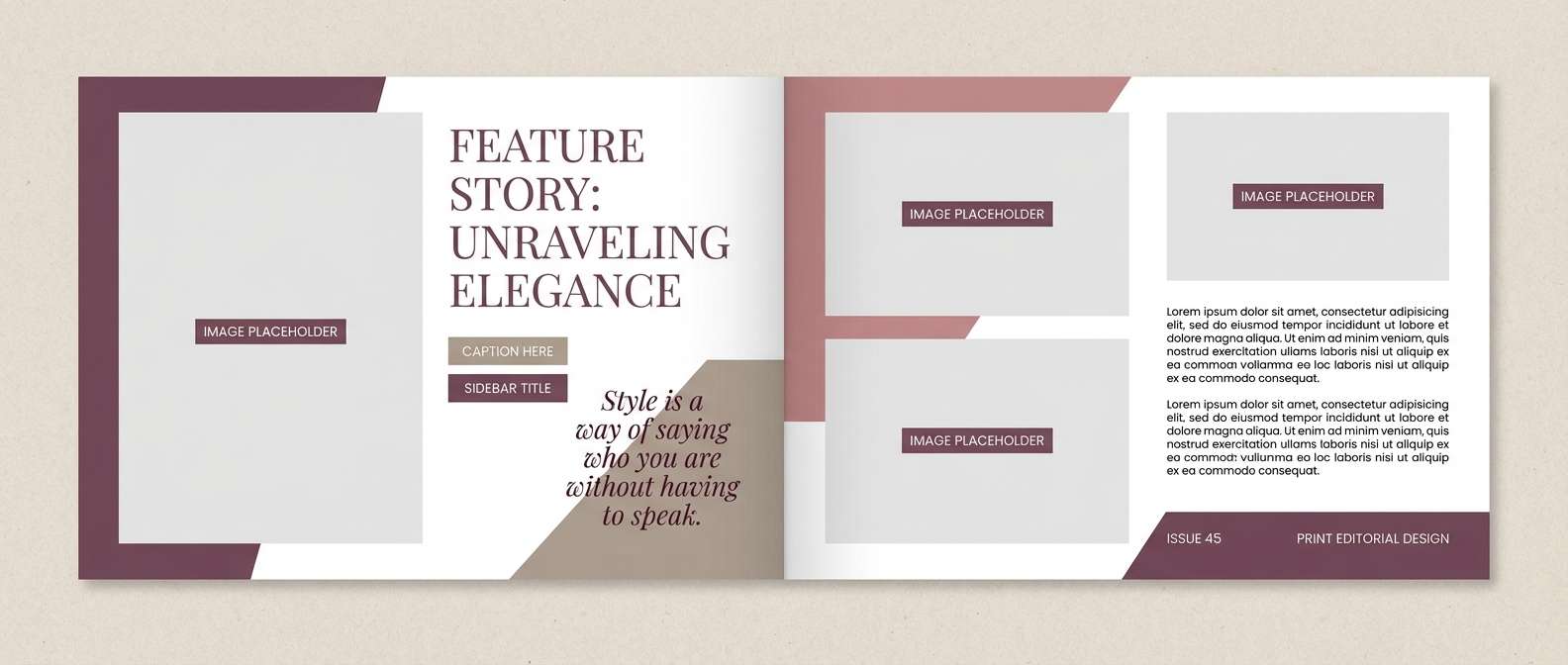
Mood: luxurious, moody, and classic
Best for: magazine feature spread layout
Luxurious and moody, these shades evoke heirloom velvet and old book covers. Use the deep charcoal-taupe for headlines and pull quotes to create a strong editorial rhythm. Keep backgrounds light and let mauve accents mark section dividers or captions. Usage tip: add generous letter spacing on small taupe text to improve legibility on print.
Image example of heirloom velvet editorial generated using media.io
10) Quiet Desert Branding
HEX: #B693A1 #85746E #DCC9CF #C1B7B2 #F6F2ED
Mood: earthy, calm, and trustworthy
Best for: therapist brand identity kit
Earthy and calm, this mauve taupe color palette set feels like desert dusk with a hint of rose in the sky. Build trust by using taupe for logotypes and core text, then introduce mauve on secondary marks and social templates. The pale neutrals keep everything approachable and warm. Usage tip: choose an uncoated paper stock so the mauve prints softly rather than glossy.
Image example of quiet desert branding generated using media.io
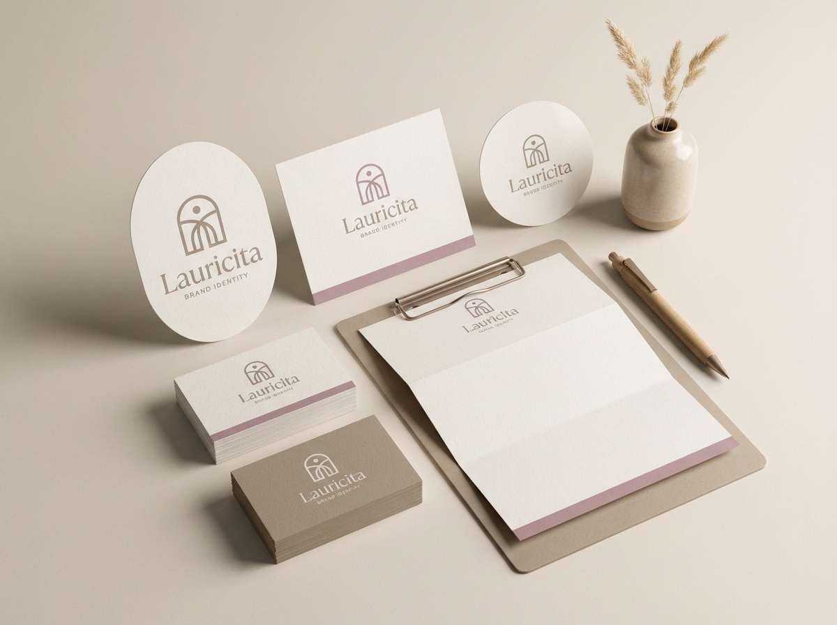
11) Mauve Taupe Sunset Poster
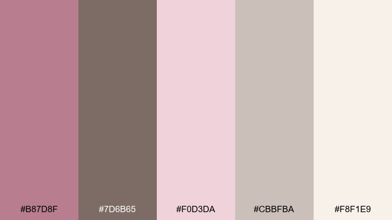
HEX: #B87D8F #7D6B65 #F0D3DA #CBBFBA #F8F1E9
Mood: dreamy, artistic, and warm
Best for: modern art poster design
Dreamy and warm, these shades resemble a sunset filtered through sheer fabric. Use the pale blush as the base, then layer taupe typography for a sophisticated contrast. A stronger mauve can highlight dates, venues, or geometric shapes. Usage tip: limit the poster to two main blocks of color so the type remains the focal point.
Image example of mauve taupe sunset poster generated using media.io
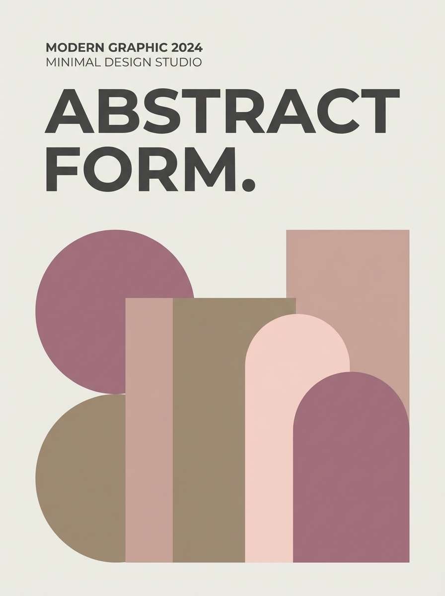
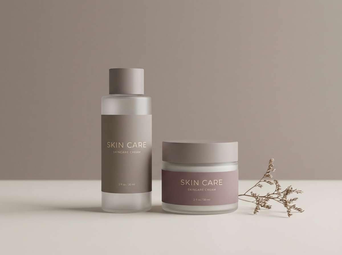
12) Mushroom Bloom Packaging
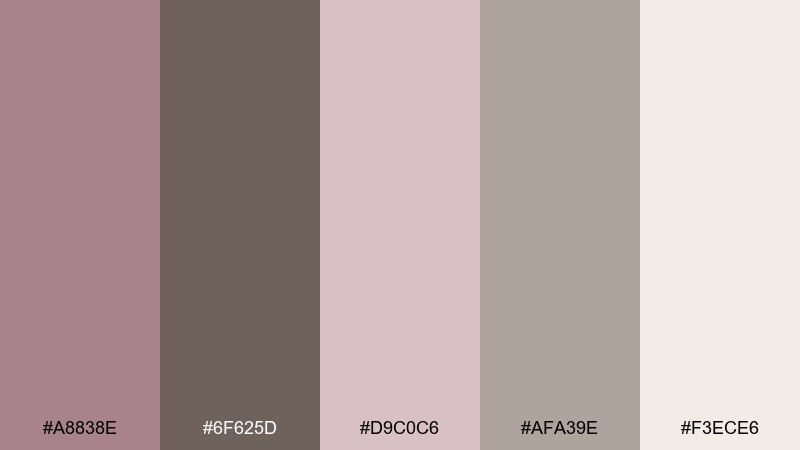
HEX: #A8838E #6F625D #D9C0C6 #AFA39E #F3ECE6
Mood: natural, gentle, and premium
Best for: skincare packaging and product ad
Natural and gentle, the tones feel like mushroom caps and soft petals. This mauve taupe color palette suits skincare where you want warmth, calm, and a clean premium finish. Use taupe for type and ingredient callouts, and keep mauve on caps, seals, or small brand marks. Usage tip: add a subtle emboss on taupe text to elevate the packaging without adding new colors.
Image example of mushroom bloom packaging generated using media.io
13) Ash Rose Landing Page
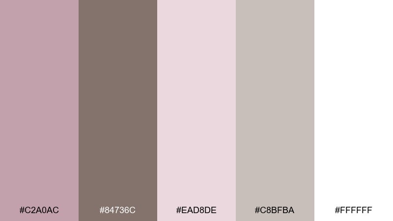
HEX: #C2A0AC #84736C #EAD8DE #C8BFBA #FFFFFF
Mood: clean, friendly, and contemporary
Best for: SaaS landing page UI
Clean and friendly, these mauve taupe color combinations read like ash rose paint on bright white plaster. Use white for breathing room, taupe for navigation and form labels, and mauve for primary buttons or key stats. The softer blush works well as section backgrounds to guide scrolling. Usage tip: keep hover states within the mauve range so the UI feels consistent and intentional.
Image example of ash rose landing page generated using media.io

14) Warm Stone Nursery
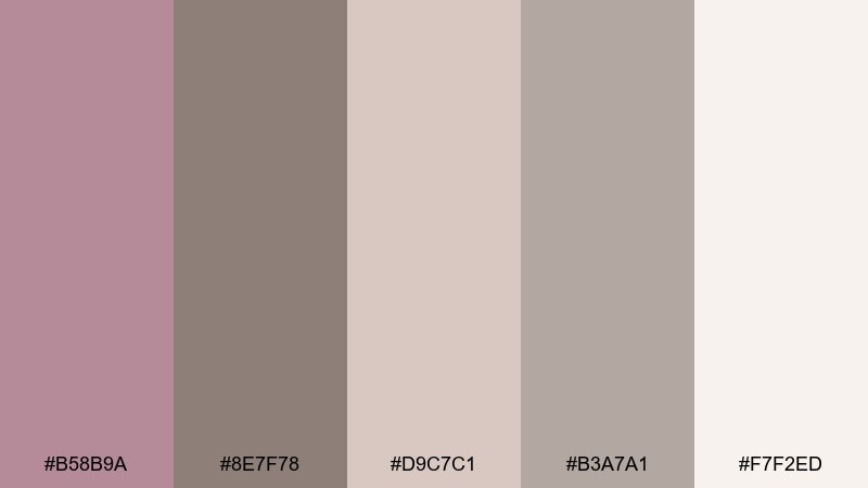
HEX: #B58B9A #8E7F78 #D9C7C1 #B3A7A1 #F7F2ED
Mood: soothing, warm, and gentle
Best for: nursery wall paint and textiles
Soothing and gentle, the palette feels like warm stone with a whisper of rosy comfort. Use the light neutral on walls, then bring taupe into larger textiles like rugs and curtains. Mauve works best in small doses through bedding, art prints, or a single accent wall. Usage tip: choose warm white lighting to keep the mauve from turning too cool.
Image example of warm stone nursery generated using media.io
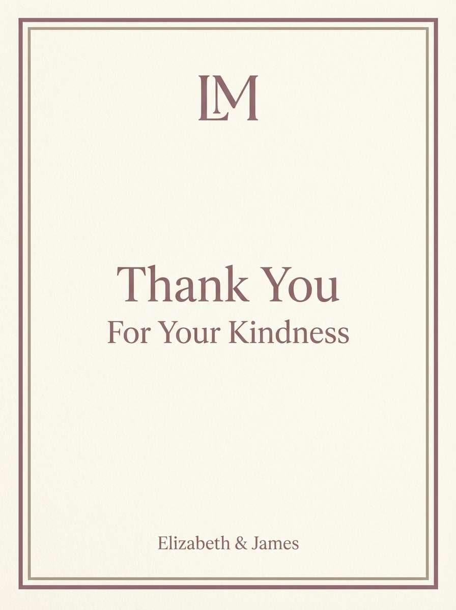
15) Antique Mauve Stationery
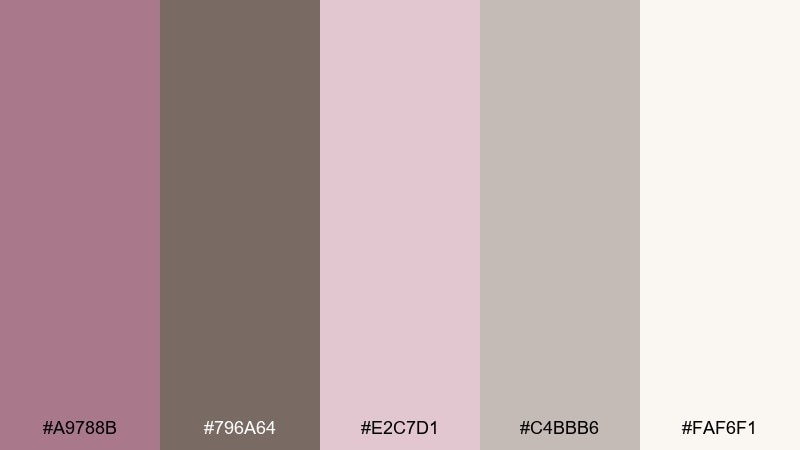
HEX: #A9788B #796A64 #E2C7D1 #C4BBB6 #FAF6F1
Mood: classic, delicate, and timeless
Best for: personal stationery and thank-you cards
Classic and delicate, these tones feel like antique ink on creamy paper. Use taupe for body text and envelopes, while the mauve shades bring charm to monograms and borders. The pale blush is perfect for subtle patterns or a watermark effect. Usage tip: print mauve elements slightly lighter than on-screen to keep the paper feel airy.
Image example of antique mauve stationery generated using media.io
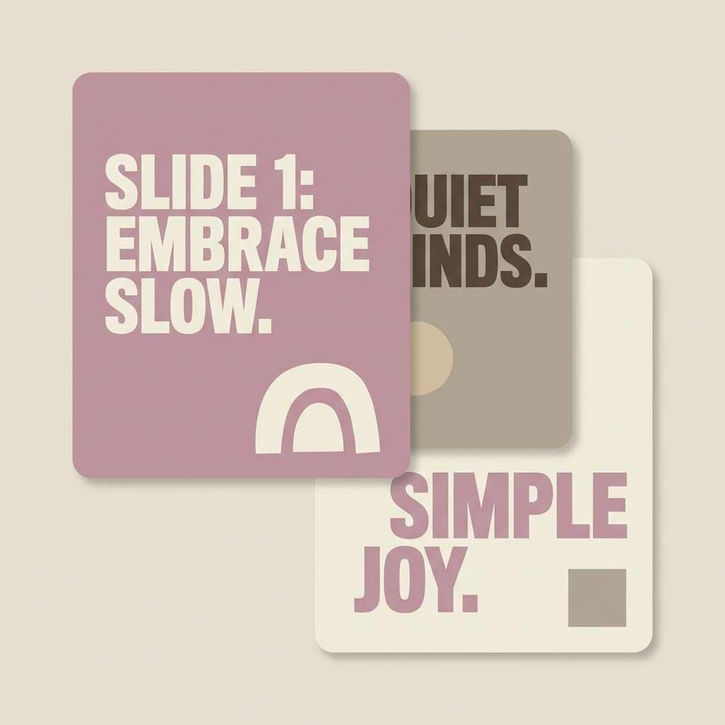
16) Twilight Taupe Social
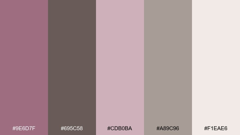
HEX: #9E6D7F #695C58 #CDB0BA #A89C96 #F1EAE6
Mood: trendy, muted, and expressive
Best for: instagram quote carousel
Trendy and muted, these hues look like twilight shadows with a soft rosy lift. Build carousels with light neutral backgrounds, then use taupe for readable text blocks and frames. Mauve makes a great highlight for keywords, icons, and swipe cues. Usage tip: keep one consistent mauve accent across all slides to strengthen brand recognition.
Image example of twilight taupe social generated using media.io
17) Soft Garnet Accent
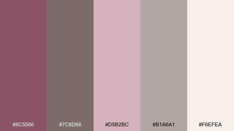
HEX: #8C5566 #7C6D66 #D5B2BC #B1A6A1 #F6EFEA
Mood: bold, intimate, and modern
Best for: restaurant menu design
Bold and intimate, the garnet-leaning mauve adds depth like red wine in a dim room. These mauve taupe color combinations work especially well for menus where you want warmth and clarity. Use taupe for item names and rules, and reserve the deep mauve for section headers and price highlights. Usage tip: keep the background light so the darker tones stay crisp and readable.
Image example of soft garnet accent generated using media.io
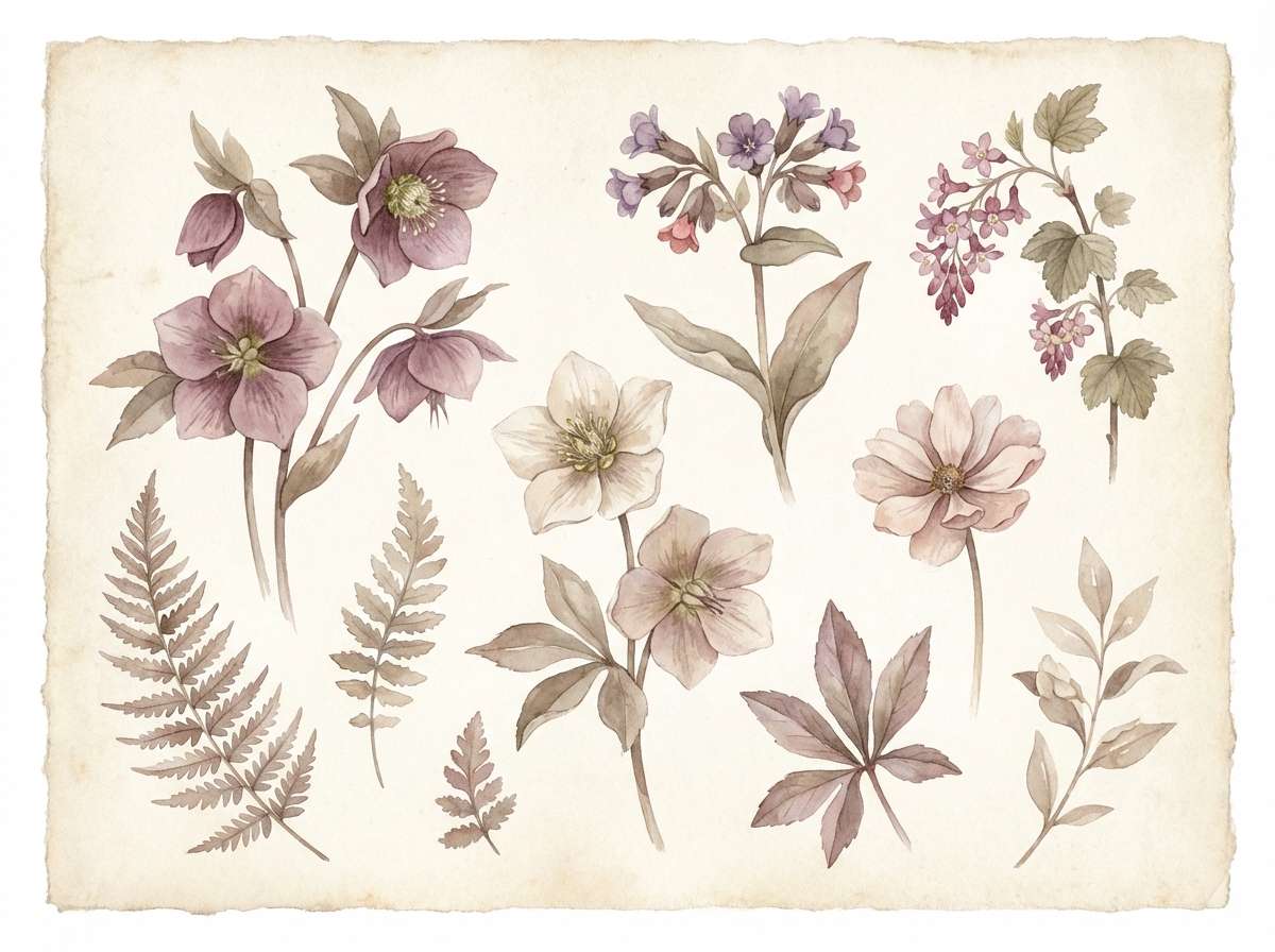
18) Botanical Mauve Watercolor
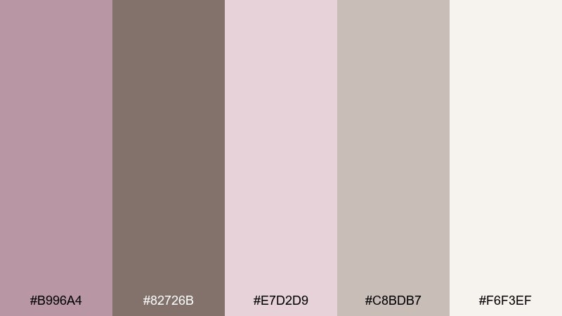
HEX: #B996A4 #82726B #E7D2D9 #C8BDB7 #F6F3EF
Mood: delicate, botanical, and serene
Best for: spring floral illustration set
Delicate and serene, the colors feel like watercolor petals drying on textured paper. Use the pale blush for washes, then build depth with mid mauve on florals and taupe on stems and shadows. The warm neutrals keep the artwork natural rather than candy-like. Usage tip: limit hard edges and let the mauve bleed slightly for a true watercolor look.
Image example of botanical mauve watercolor generated using media.io
19) Modern Taupe Gallery
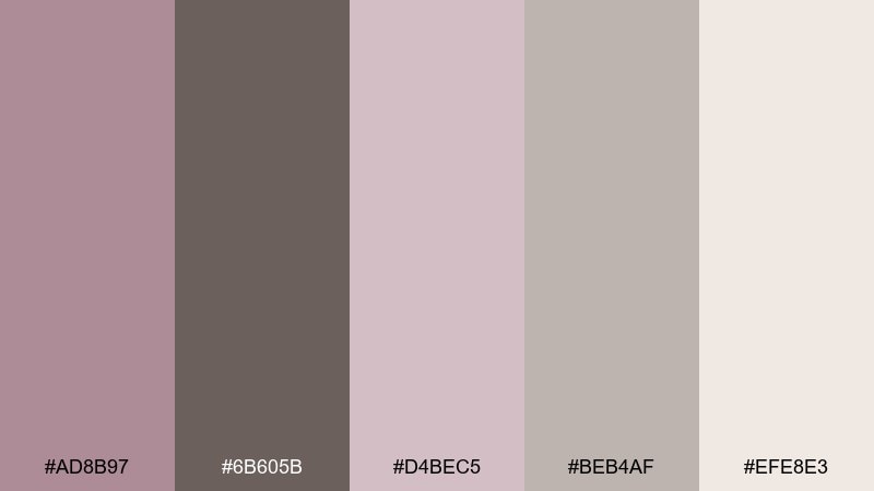
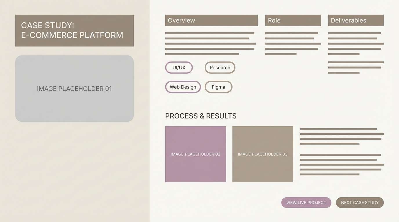
HEX: #AD8B97 #6B605B #D4BEC5 #BEB4AF #EFE8E3
Mood: gallery-clean, balanced, and modern
Best for: portfolio website case study page
Gallery-clean and balanced, these neutrals keep attention on the work while still feeling warm. Use the light tones for content sections, and rely on darker taupe for headings and UI chrome. Mauve is best as a subtle highlight for links, tags, and selected filters. Usage tip: choose muted photography overlays so the interface stays cohesive with the warm neutrals.
Image example of modern taupe gallery generated using media.io
20) Cozy Mauve Café Menu
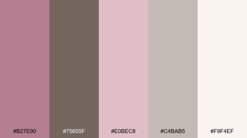
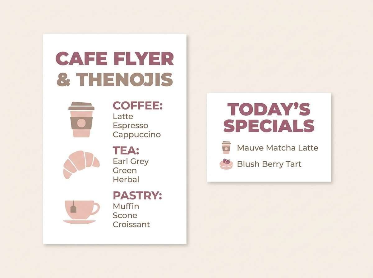
HEX: #B27E90 #75655F #E0BEC8 #C4BAB5 #F9F4EF
Mood: cozy, friendly, and inviting
Best for: cafe flyer and counter sign
Cozy and inviting, the colors suggest steamed milk, berry pastries, and warm wood tables. Use taupe for the main menu text, then let mauve highlight seasonal specials and small icons. The pale neutral keeps the flyer easy to scan even from a distance. Usage tip: set prices in the darkest tone and align them neatly to improve readability.
Image example of cozy mauve café menu generated using media.io
What Colors Go Well with Mauve Taupe?
Mauve taupe pairs naturally with warm whites (cream, ivory, off-white) to keep designs light and breathable. It also sits beautifully next to oatmeal, sand, mushroom, and other soft neutrals for a cohesive, tonal look.
For contrast, try charcoal, espresso brown, or matte black—these deepen the palette while keeping it sophisticated. Metallics like brushed brass and champagne gold also work well, especially in interiors and wedding stationery.
If you want a cooler counterbalance, muted slate blue or dusty navy can add structure without fighting the mauve undertone.
How to Use a Mauve Taupe Color Palette in Real Designs
Start with roles: use a light neutral as the base, taupe for typography and UI chrome, and mauve as your emotional accent (buttons, highlights, badges, or small decor elements). This keeps the palette modern and avoids a “too pink” feel.
In branding systems, assign one hero mauve and one anchor taupe, then use the remaining tones as supporting tints for backgrounds, cards, and subtle section breaks. It’s an easy way to create depth while staying minimal.
For print, test swatches under your real lighting and paper choice—mauves can shift warmer or cooler depending on stock and finish.
Create Mauve Taupe Palette Visuals with AI
If you already have HEX codes, you can turn them into consistent lifestyle scenes, UI mockups, posters, and packaging concepts by using a single prompt style and swapping only the subject. This makes your branding look intentional across channels.
Media.io’s text-to-image tool is especially handy for generating on-theme visuals quickly—use the prompts above as templates, then iterate on lighting, composition, and aspect ratio.
Mauve Taupe Color Palette FAQs
-
What is mauve taupe?
Mauve taupe is a muted neutral that blends taupe’s brown-gray base with a soft mauve (pink-purple) undertone, creating a warm, modern, slightly rosy beige. -
Is mauve taupe warm or cool?
It’s usually warm-leaning, but it can read neutral-to-cool depending on lighting and surrounding colors. Pair it with cream for warmth or slate/charcoal for a cooler look. -
What colors complement a mauve taupe palette?
Warm whites, sand, mushroom, charcoal, espresso brown, brushed brass, and muted blues (slate or dusty navy) all complement mauve taupe without overpowering it. -
Does mauve taupe work for UI and app design?
Yes—use off-white for backgrounds, taupe for text/icons, and mauve for interactive states (selected tabs, progress, primary buttons). Keep contrast checks for accessibility. -
How do I keep mauve taupe from looking too pink?
Let taupe lead your typography and structure, keep mauve as a controlled accent, and add a strong neutral (charcoal or deep taupe) to anchor the overall scheme. -
What finish works best for printing mauve taupe (invitations, stationery, packaging)?
Uncoated or soft-touch stocks tend to make mauve taupe look elegant and natural. Glossy coatings can increase saturation and shift mauve tones brighter than intended. -
Can I generate mauve taupe mockups and scenes with AI?
Yes—use a consistent prompt style, specify “colors dominated by mauve and taupe with warm off-white,” and keep props minimal to maintain a clean, premium look.


