

Yellow and dark blue is one of the clearest high-contrast pairings you can use—bold enough to grab attention, but structured enough to feel professional.
In branding, UI, and print, deep blues bring trust and readability while yellow adds energy for highlights, calls to action, and key information.
In this article
- Why Dark Blue and Yellow Combinations Work So Well
-
- sunlit harbor
- midnight mustard
- nautical beacon
- museum spotlight
- coastal taxiway
- denim daffodil
- industrial safety
- eclipse lemonade
- royal workshop
- stormy marigold
- city tram glow
- blue hour picnic
- vintage stationery
- golden observatory
- campus crest
- night market signs
- autumn sailcloth
- gallery nightfall
- athletic classic
- quiet library lamp
- What Colors Go Well with Yellow and Dark Blue?
- How to Use a Yellow Dark Blue Color Palette in Real Designs
- Create Yellow Dark Blue Palette Visuals with AI
Why Dark Blue and Yellow Combinations Work So Well
Dark Blue and Yellow Combinations work because they balance temperature and contrast: blue feels stable and deep, while yellow feels bright and immediate. Together, they create a natural visual hierarchy without needing many extra colors.
Dark blue also provides a reliable base for typography and UI components, especially when you need legibility and a “trustworthy” tone. Yellow then becomes the perfect accent for highlights, notifications, and calls to action.
When used with restraint, the pairing of dark blue and yellow can look premium rather than loud—especially if you add a soft neutral (cream, off-white, or gray) to give the eye a place to rest.
20+ Dark Blue and Yellow Color Palette Ideas (with HEX Codes)
1) Sunlit Harbor
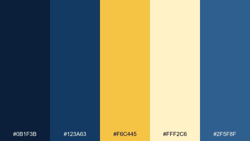
HEX: #0b1f3b #123a63 #f6c445 #fff2c6 #2f5f8f
Mood: fresh, nautical, optimistic
Best for: travel branding and hero banners
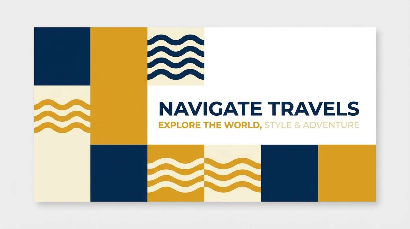
Fresh and nautical, it feels like early sun on a quiet dock with crisp air and clear water. Use the navy tones for headings and navigation, then let the warm yellow highlight CTAs and key badges. Pair it with plenty of white space for a clean, coastal look. Tip: keep the brightest yellow to small, high-impact elements so it reads premium, not loud.
Image example of sunlit harbor generated using media.io
Media.io is an online AI studio for creating and editing video, image, and audio in your browser.

2) Midnight Mustard
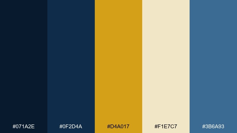
HEX: #071a2e #0f2d4a #d4a017 #f1e7c7 #3b6a93
Mood: moody, refined, high-contrast
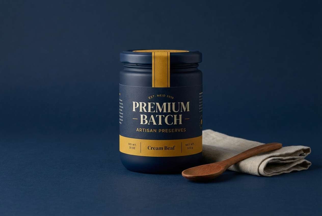
Best for: premium packaging and product ads
Moody and refined, it brings to mind candlelit rooms and polished brass against midnight walls. As a dark blue and yellow color combination, it excels when the darkest blue carries the background and the mustard works as a controlled accent. Add the warm cream for breathing room in labels and ingredient panels. Tip: use a matte deep blue surface and a single glossy mustard highlight to make the design feel tactile.
Image example of midnight mustard generated using media.io
3) Nautical Beacon
HEX: #0a2440 #1b4f72 #ffd24a #f7f9fc #2d2a32
Mood: clear, confident, energetic
Best for: sports graphics and team merch
Clear and confident, it feels like a lighthouse beam cutting through sea mist. Keep the bright yellow for numbers, stripes, and calls to action, while the deep blues anchor the base garments. The near-white supports legibility for small text and stitching details. Tip: reserve the charcoal as an outline color to sharpen edges without adding extra hue.
Image example of nautical beacon generated using media.io
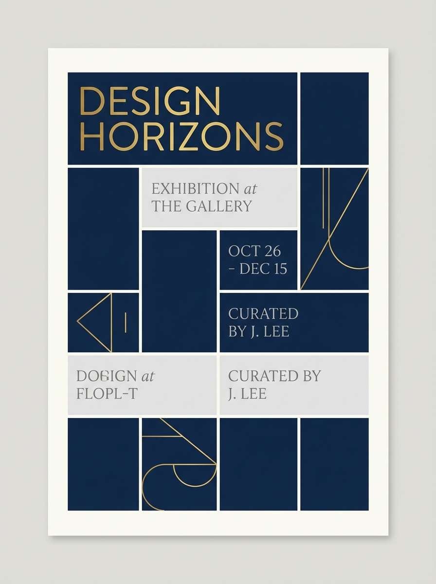
4) Museum Spotlight
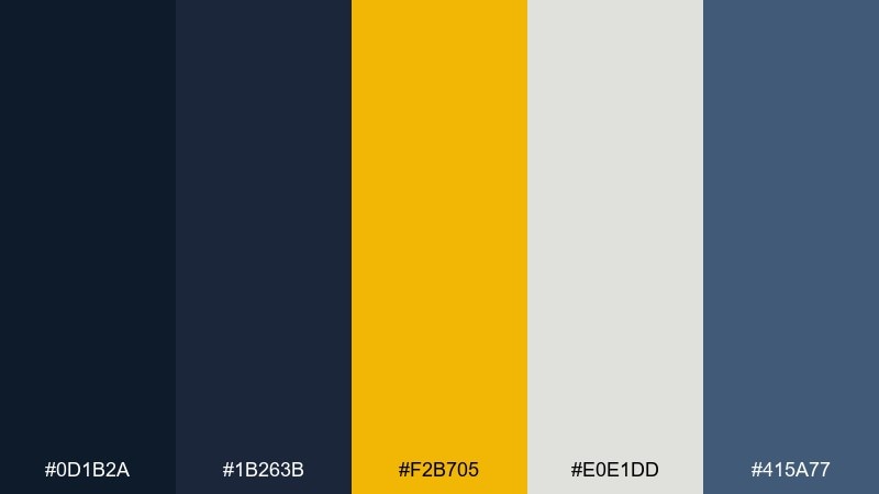
HEX: #0d1b2a #1b263b #f2b705 #e0e1dd #415a77
Mood: dramatic, curated, elegant
Best for: exhibition posters and editorial covers
Dramatic and curated, it evokes gallery halls where a warm spotlight hits a single artwork. This yellow dark blue color palette works best when the deep blues form large, quiet fields and the golden tone marks titles or dates. Use the soft gray as paper-like negative space for captions and credits. Tip: set the yellow as a narrow vertical bar to create an immediate focal line.
Image example of museum spotlight generated using media.io
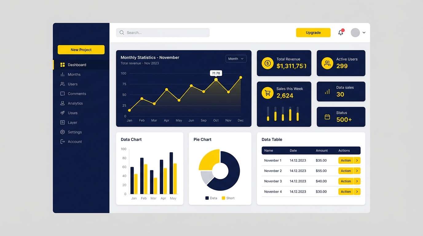
5) Coastal Taxiway
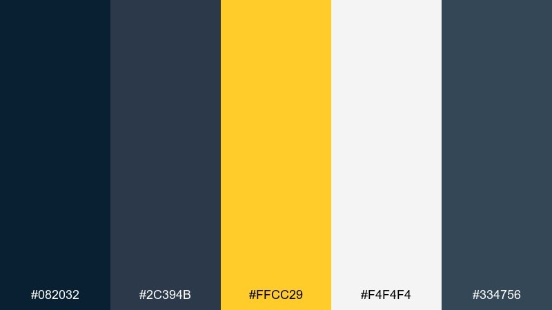
HEX: #082032 #2c394b #ffcc29 #f4f4f4 #334756
Mood: modern, structured, assertive
Best for: dashboard UI and data-heavy apps
Modern and structured, it suggests runway markings and crisp directional signage. Use the darkest blues for sidebars and data tables, then rely on the bright yellow for active states and alerts. The off-white keeps charts readable and prevents the interface from feeling heavy. Tip: limit yellow to one UI role, such as primary buttons, so users learn the pattern instantly.
Image example of coastal taxiway generated using media.io
6) Denim Daffodil
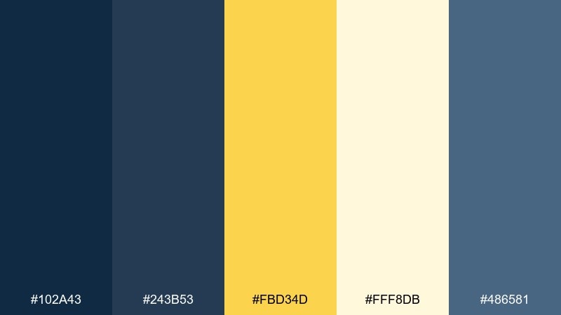
HEX: #102a43 #243b53 #fbd34d #fff8db #486581
Mood: friendly, casual, sunny
Best for: social templates and lifestyle blogs
Friendly and casual, it feels like denim with a daffodil tucked into a pocket. Let the mid blues handle body text and frames, while the soft yellow lifts highlights and stickers. The pale cream keeps the overall look airy for long reads and carousel posts. Tip: add subtle rounded shapes in the lightest tone to soften hard edges on busy layouts.
Image example of denim daffodil generated using media.io
7) Industrial Safety
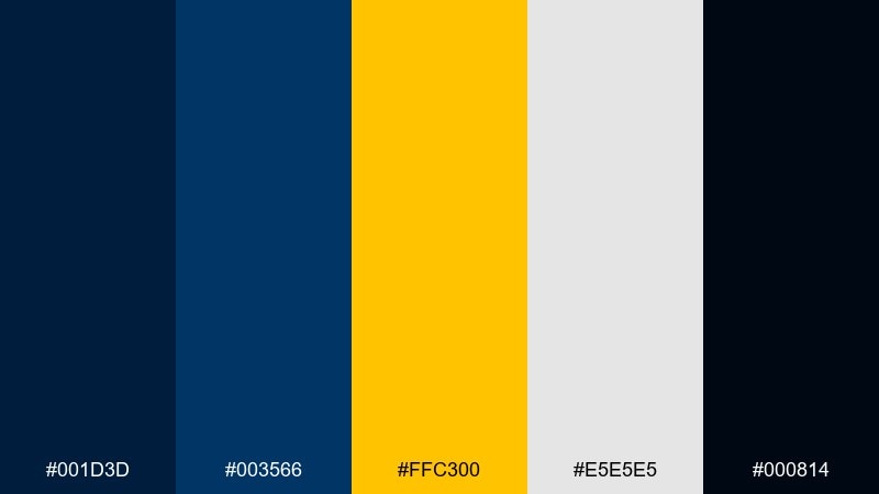
HEX: #001d3d #003566 #ffc300 #e5e5e5 #000814
Mood: bold, utilitarian, warning-ready
Best for: construction branding and safety signage
Bold and utilitarian, it channels hazard tape against steel and nighttime work lights. Use the near-black and deep blue for maximum contrast on sign backgrounds, then apply the bright yellow to icons and key instructions. The neutral gray keeps secondary notes readable without competing. Tip: increase letter spacing slightly on yellow text over dark blue to reduce vibration and improve legibility at a distance.
Image example of industrial safety generated using media.io

8) Eclipse Lemonade
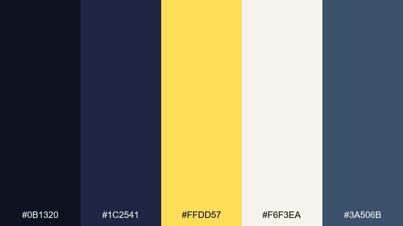
HEX: #0b1320 #1c2541 #ffdd57 #f6f3ea #3a506b
Mood: cinematic, smooth, slightly playful
Best for: event flyers and music promos
Cinematic and smooth, it looks like a solar eclipse glow with a fizzy lemonade twist. Build the flyer on deep blues for a night-sky base, then let the lemon yellow spotlight the lineup and ticket link. Creamy off-white keeps smaller text crisp without turning stark. Tip: use a soft gradient between the two blues to add depth while staying on-brand.
Image example of eclipse lemonade generated using media.io
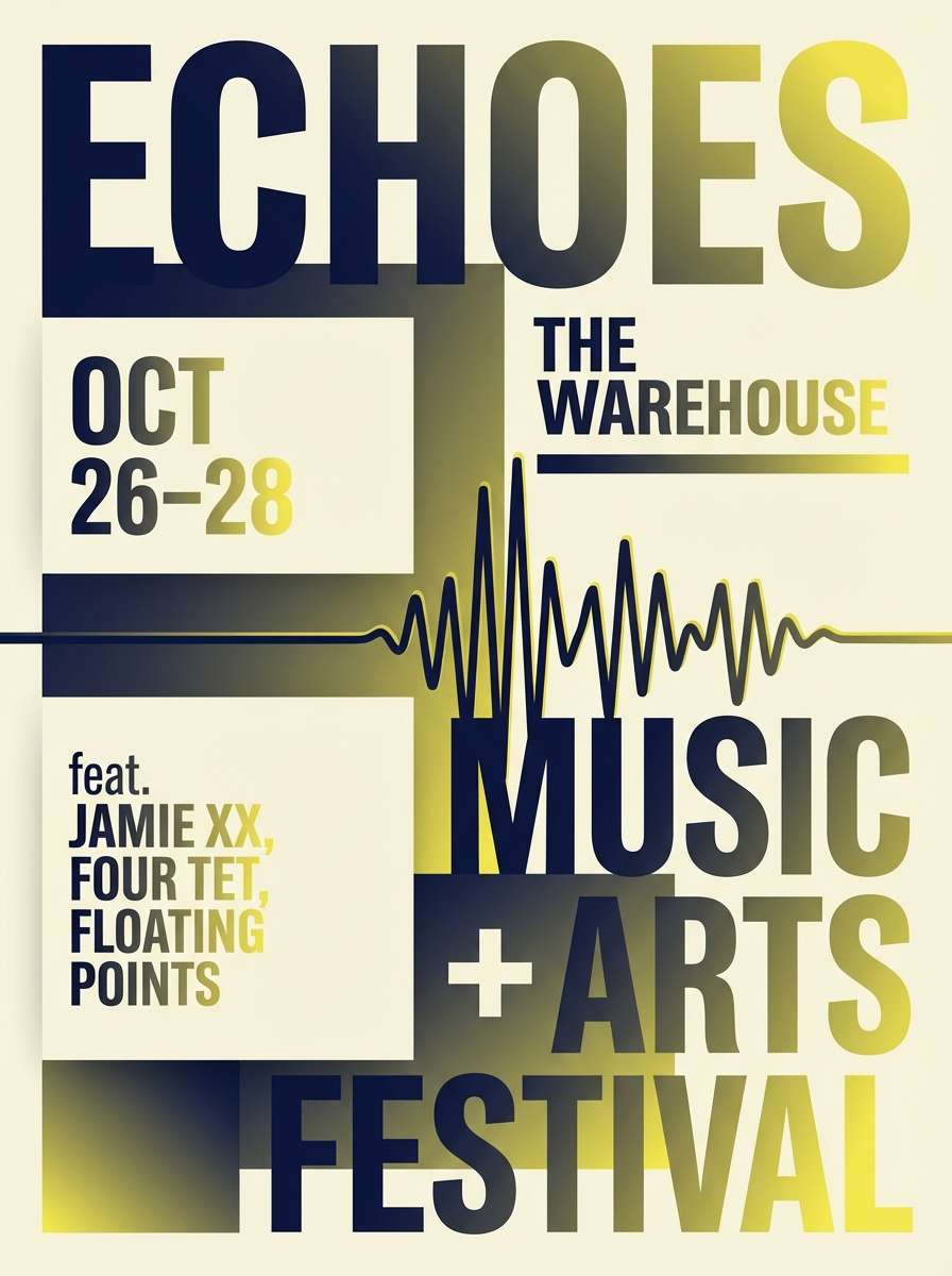
9) Royal Workshop
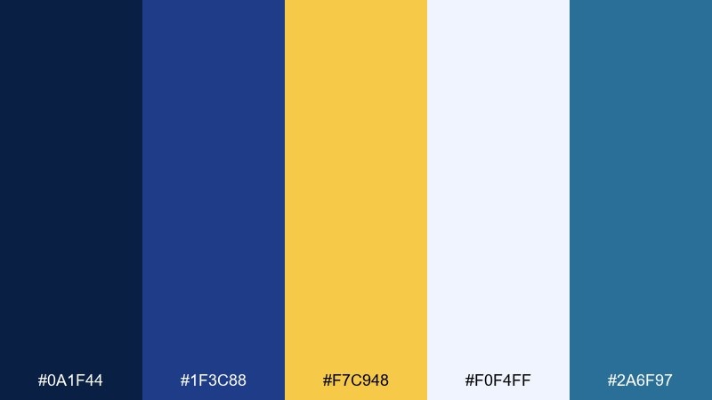
HEX: #0a1f44 #1f3c88 #f7c948 #f0f4ff #2a6f97
Mood: smart, inventive, optimistic
Best for: startup landing pages and feature sections
Smart and inventive, it feels like a bright workshop where ideas click into place. These yellow dark blue color combinations shine on landing pages: use deep blue for structure and credibility, and apply yellow sparingly to guide attention to product value. The pale blue-white makes content blocks feel light and scannable. Tip: keep icons in one consistent blue and reserve yellow for interactive states only.
Image example of royal workshop generated using media.io

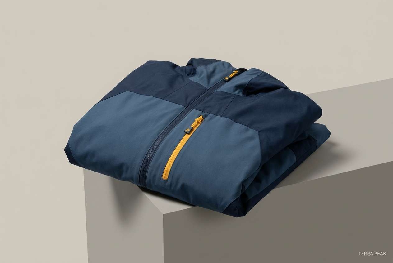
10) Stormy Marigold
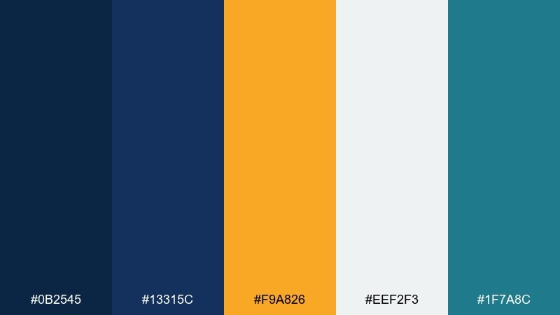
HEX: #0b2545 #13315c #f9a826 #eef2f3 #1f7a8c
Mood: adventurous, coastal, windswept
Best for: outdoor gear ads and lookbooks
Adventurous and windswept, it recalls storm clouds rolling over a warm marigold horizon. Use the darker blues for jackets, typography, and high-contrast headers, then punctuate with the orange-yellow for tags and price points. The cool off-white supports product details and technical specs. Tip: keep the teal as a minor accent for stitching or small UI chips so the palette stays cohesive.
Image example of stormy marigold generated using media.io
11) City Tram Glow
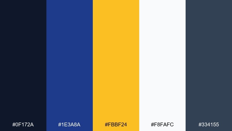
HEX: #0f172a #1e3a8a #fbbf24 #f8fafc #334155
Mood: urban, crisp, energetic
Best for: wayfinding and public info graphics
Urban and crisp, it feels like tram lights reflecting off wet pavement at night. The deep navy and slate create a strong information hierarchy, while the amber-yellow makes stops and alerts instantly noticeable. Use the near-white for maps and labels so details stay sharp. Tip: apply yellow to only one symbol family, like icons, to prevent visual clutter in complex diagrams.
Image example of city tram glow generated using media.io
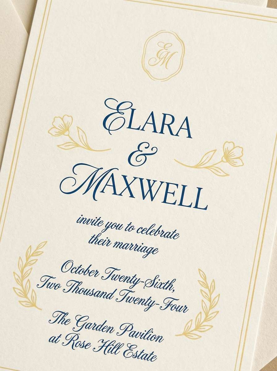
12) Blue Hour Picnic
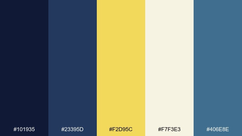
HEX: #101935 #23395d #f2d95c #f7f3e3 #406e8e
Mood: calm, nostalgic, gentle
Best for: wedding invitations and stationery
Calm and nostalgic, it brings to mind twilight picnics with lantern light and soft laughter. Use the deep blue for names and formal details, and let the buttery yellow appear in borders, wax-seal motifs, or tiny florals. The warm paper-like cream keeps it romantic and printable. Tip: choose a textured stock and keep the yellow at low coverage for elegant ink results.
Image example of blue hour picnic generated using media.io
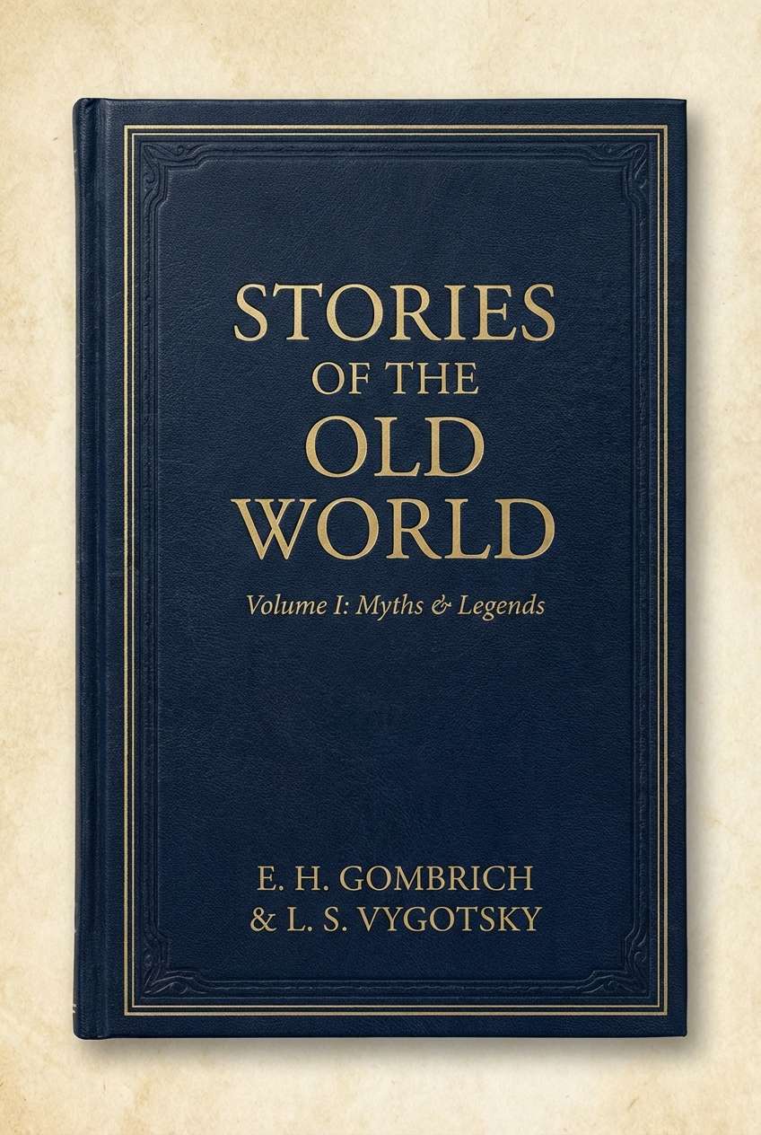
13) Vintage Stationery
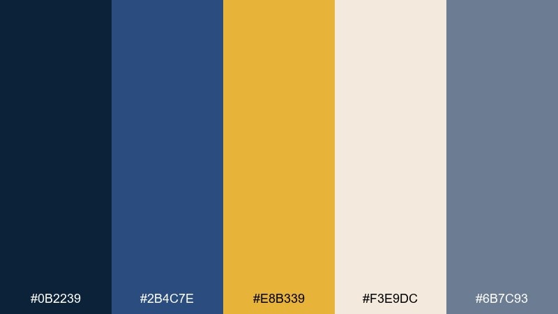
HEX: #0b2239 #2b4c7e #e8b339 #f3e9dc #6b7c93
Mood: heritage, academic, warm
Best for: book covers and stationery sets
Heritage and academic, it feels like aged notebooks, ink stamps, and brass desk tools. The deep blues suit titles and spines, while the muted yellow reads like antique foil without screaming. Use the parchment cream for large backgrounds and keep the gray-blue for secondary text. Tip: add a thin border in the mid blue to frame layouts and reinforce the vintage vibe.
Image example of vintage stationery generated using media.io
14) Golden Observatory
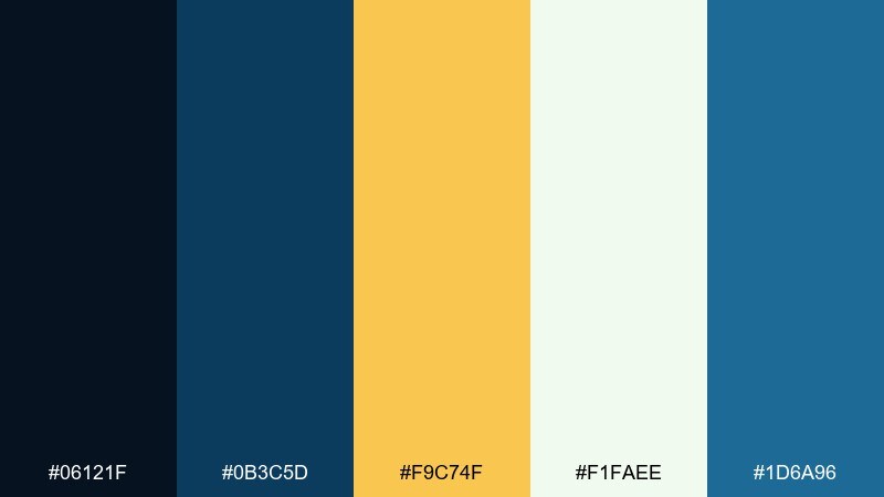
HEX: #06121f #0b3c5d #f9c74f #f1faee #1d6a96
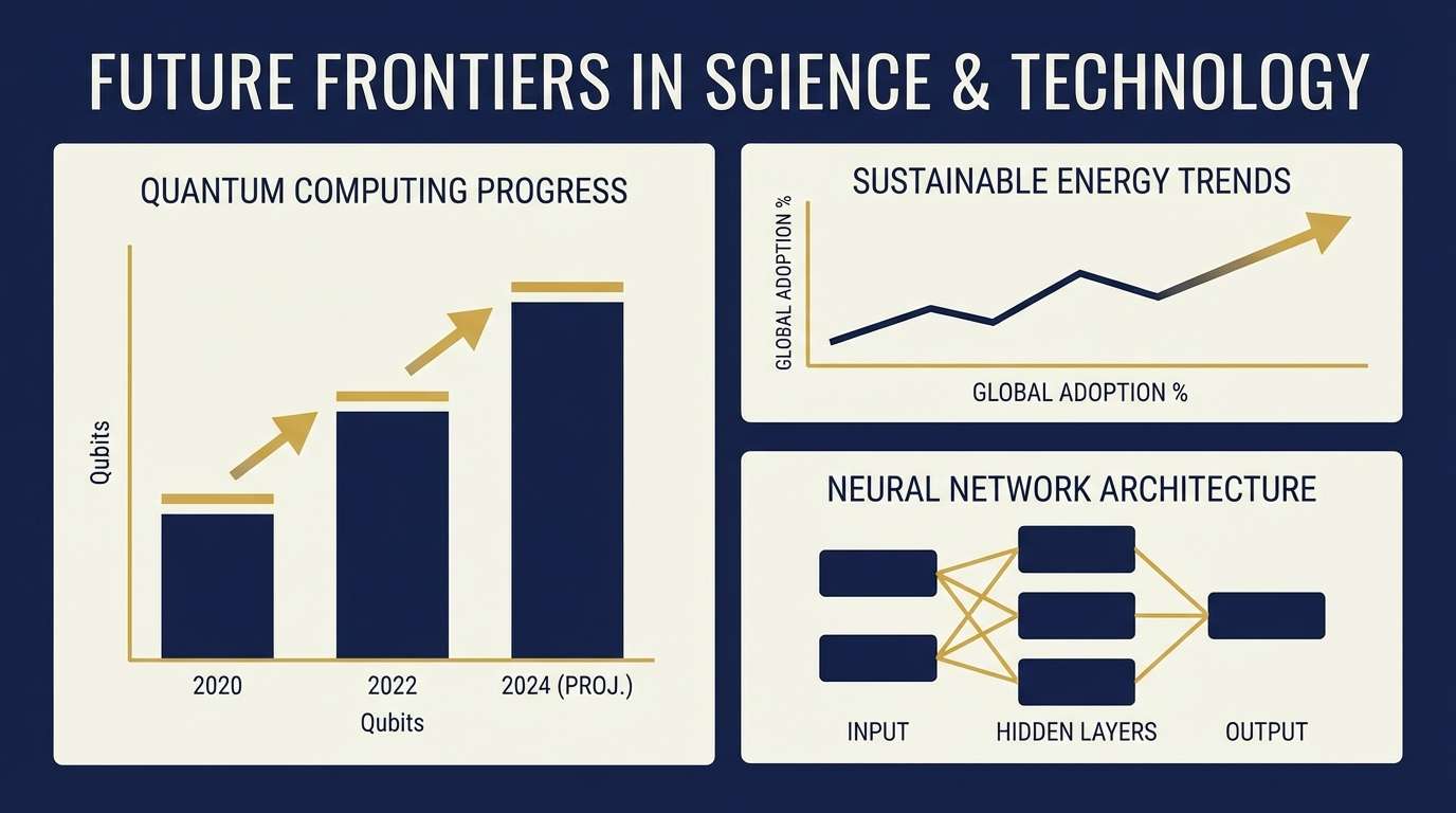
Mood: inquisitive, cosmic, polished
Best for: science posters and conference slides
Inquisitive and cosmic, it suggests star charts with a warm golden marker tracing constellations. Use the darkest blue for backgrounds and diagrams, then deploy yellow for key findings and callouts. The cool off-white supports dense information without glare. Tip: keep chart grids in the mid blue so the yellow data points stay the hero.
Image example of golden observatory generated using media.io
15) Campus Crest
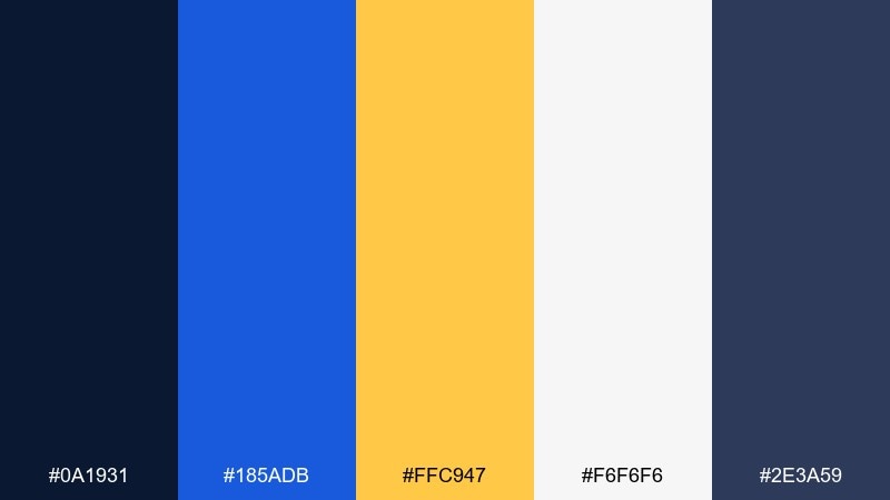
HEX: #0a1931 #185adb #ffc947 #f6f6f6 #2e3a59
Mood: bold, collegiate, spirited
Best for: club branding and campus posters
Bold and collegiate, it recalls crests, banners, and bright stadium lights. This yellow dark blue color palette is a strong choice for student org branding where you need instant visibility from a distance. Keep the royal blue for large shapes and the yellow for punchy headlines, then use the light gray as your poster base. Tip: print a small proof first, since the royal blue can shift on uncoated paper.
Image example of campus crest generated using media.io
16) Night Market Signs
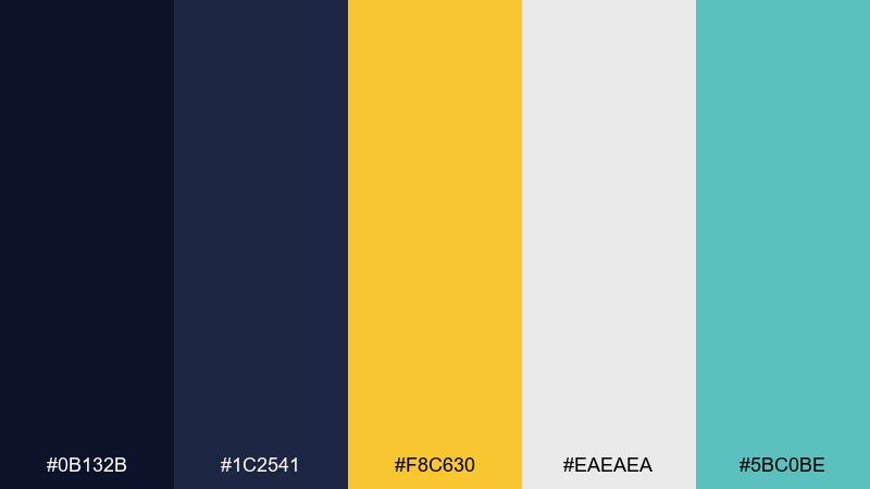
HEX: #0b132b #1c2541 #f8c630 #eaeaea #5bc0be
Mood: lively, neon-tinted, streetwise
Best for: restaurant menus and promo cards
Lively and streetwise, it feels like glowing signs over a busy night market. Use the deep blues for menu backgrounds and photography frames, then place the yellow on price tags and feature callouts for quick scanning. The light gray keeps text readable in dense sections. Tip: use the teal only for small markers, like spice levels, to avoid competing with the main highlight color.
Image example of night market signs generated using media.io
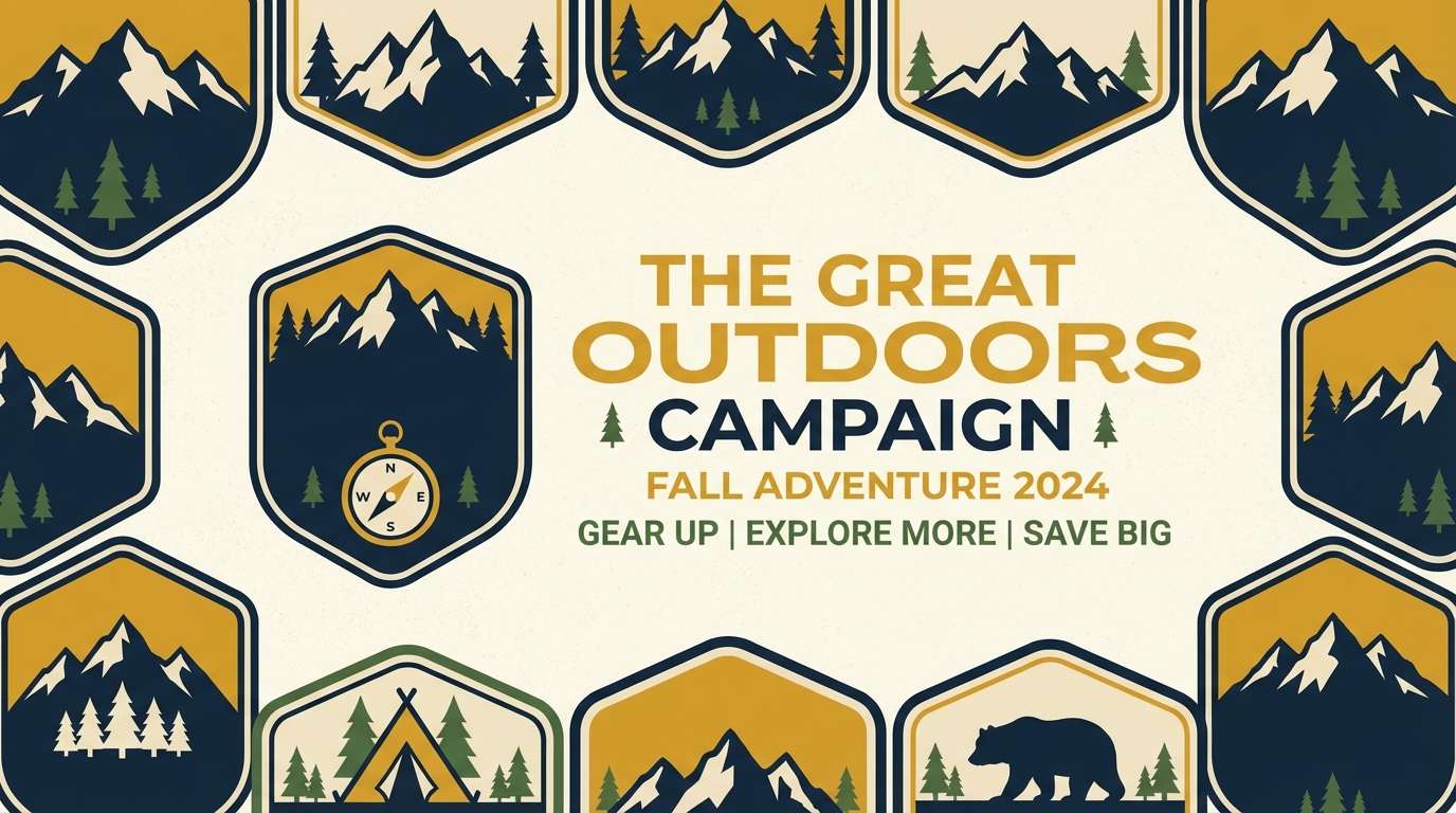
17) Autumn Sailcloth
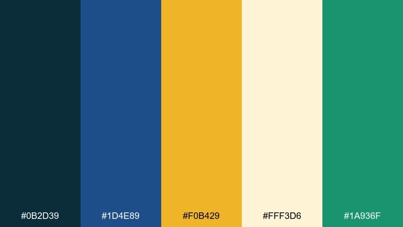
HEX: #0b2d39 #1d4e89 #f0b429 #fff3d6 #1a936f
Mood: earthy, outdoorsy, confident
Best for: camping brands and seasonal campaigns
Earthy and confident, it evokes sailcloth, pine needles, and late-season sun. The deep blues create sturdy foundations for logos and banners, while the golden yellow adds warmth to badges and limited-time offers. Use the cream for breathable backgrounds and the green as a subtle nature cue. Tip: keep the green below 10 percent of the layout so the palette still reads as blue-yellow first.
Image example of autumn sailcloth generated using media.io
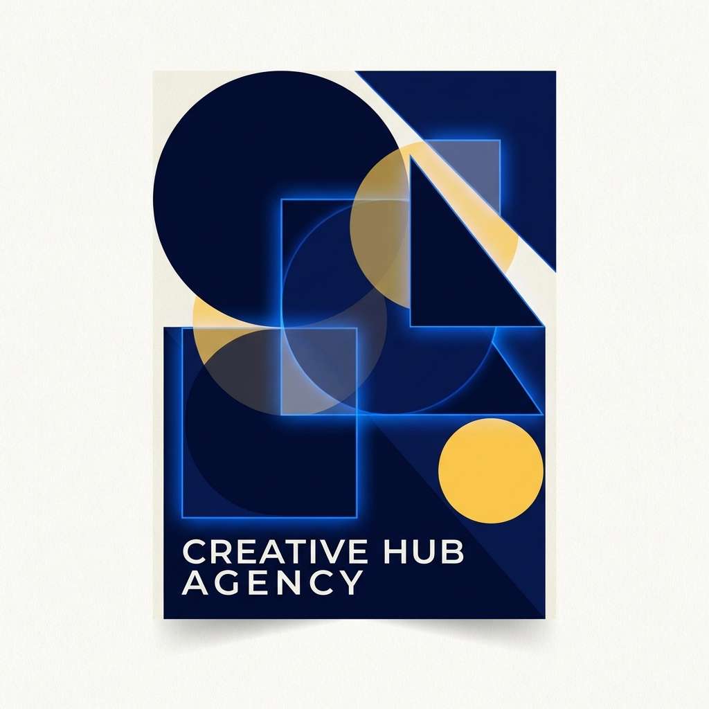
18) Gallery Nightfall
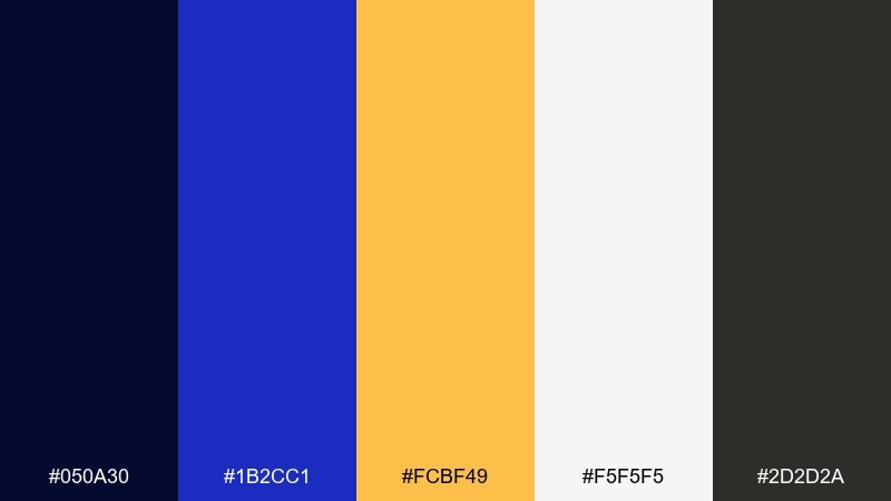
HEX: #050a30 #1b2cc1 #fcbf49 #f5f5f5 #2d2d2a
Mood: artsy, high-energy, modern
Best for: creative agency branding and reels covers
Artsy and high-energy, it feels like a gallery opening with bold lights and sharp shadows. The electric blue adds modern punch, while the warm yellow keeps the composition inviting and human. Use white for breathing room and the charcoal for small typographic details. Tip: apply the brightest blue to just one element per frame, such as a logo mark, to avoid overpowering the yellow accent.
Image example of gallery nightfall generated using media.io
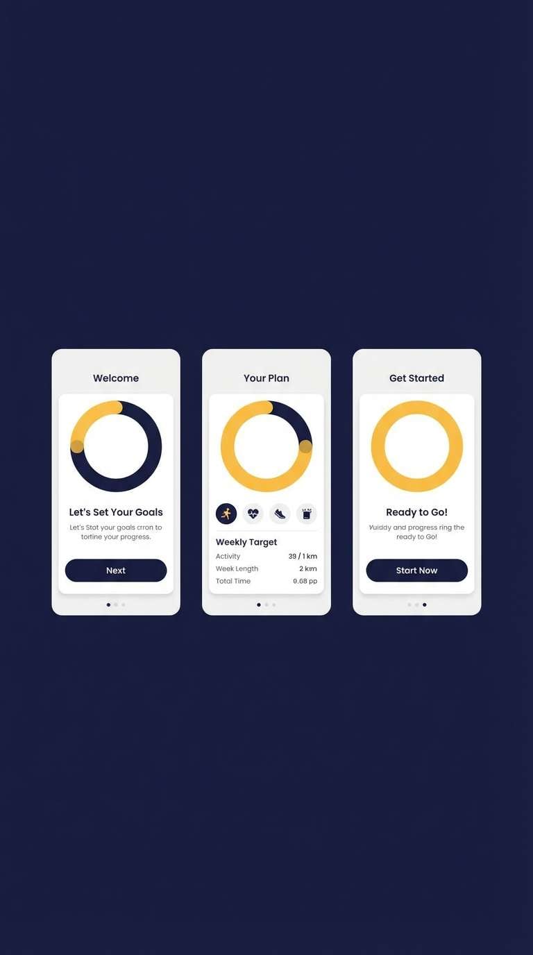
19) Athletic Classic
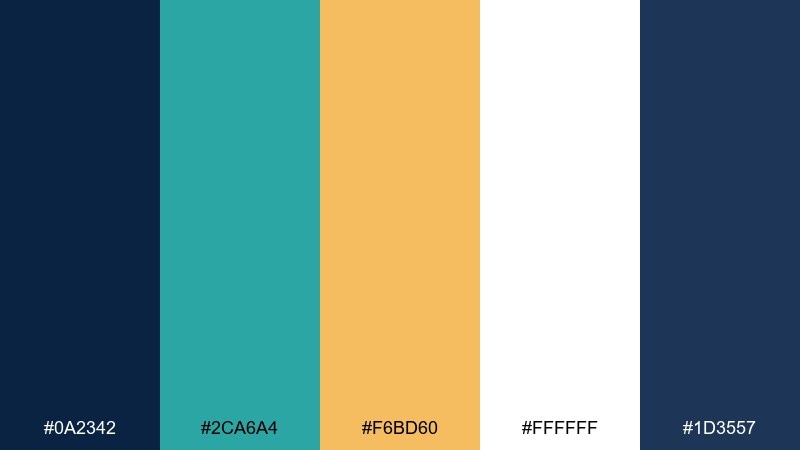
HEX: #0a2342 #2ca6a4 #f6bd60 #ffffff #1d3557
Mood: clean, sporty, upbeat
Best for: fitness app UI and onboarding
Clean and sporty, it brings the feel of fresh uniforms and bright training cones. Use the darkest blue for headers and navigation, then let the warm yellow mark progress, streaks, or rewards. White keeps the interface airy and encourages quick scanning. Tip: assign teal to secondary actions only, so primary goals stay tied to the yellow accent.
Image example of athletic classic generated using media.io
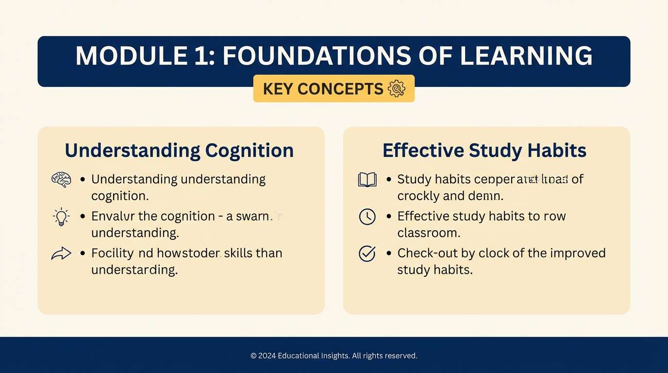
20) Quiet Library Lamp
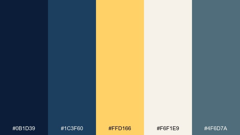
HEX: #0b1d39 #1c3f60 #ffd166 #f6f1e9 #4f6d7a
Mood: calm, studious, warm
Best for: educational blogs and course slides
Calm and studious, it feels like a warm desk lamp in a quiet library after hours. These yellow dark blue color combinations are excellent for lessons and tutorials because the contrast stays readable without feeling harsh. Use the deep blues for structure and headings, then add yellow sparingly for key terms and checkpoints. Tip: keep body text in the softer blue-gray to reduce eye strain on long pages.
Image example of quiet library lamp generated using media.io
What Colors Go Well with Yellow Dark Blue?
Neutrals are the easiest win: white, cream, and light gray keep the palette breathable and help both yellow and dark blue stay readable. For print, a warm off-white can make the yellow feel richer and less harsh.
If you need a third “color” accent, teal and seafoam can bridge yellow and blue in a coastal, sporty way. Charcoal or near-black works well for outlines, shadows, and small typography without adding a new hue.
For a more premium direction, try metallic-inspired tones like muted gold or brass (as a yellow variant), plus a cool slate blue for UI surfaces and charts.
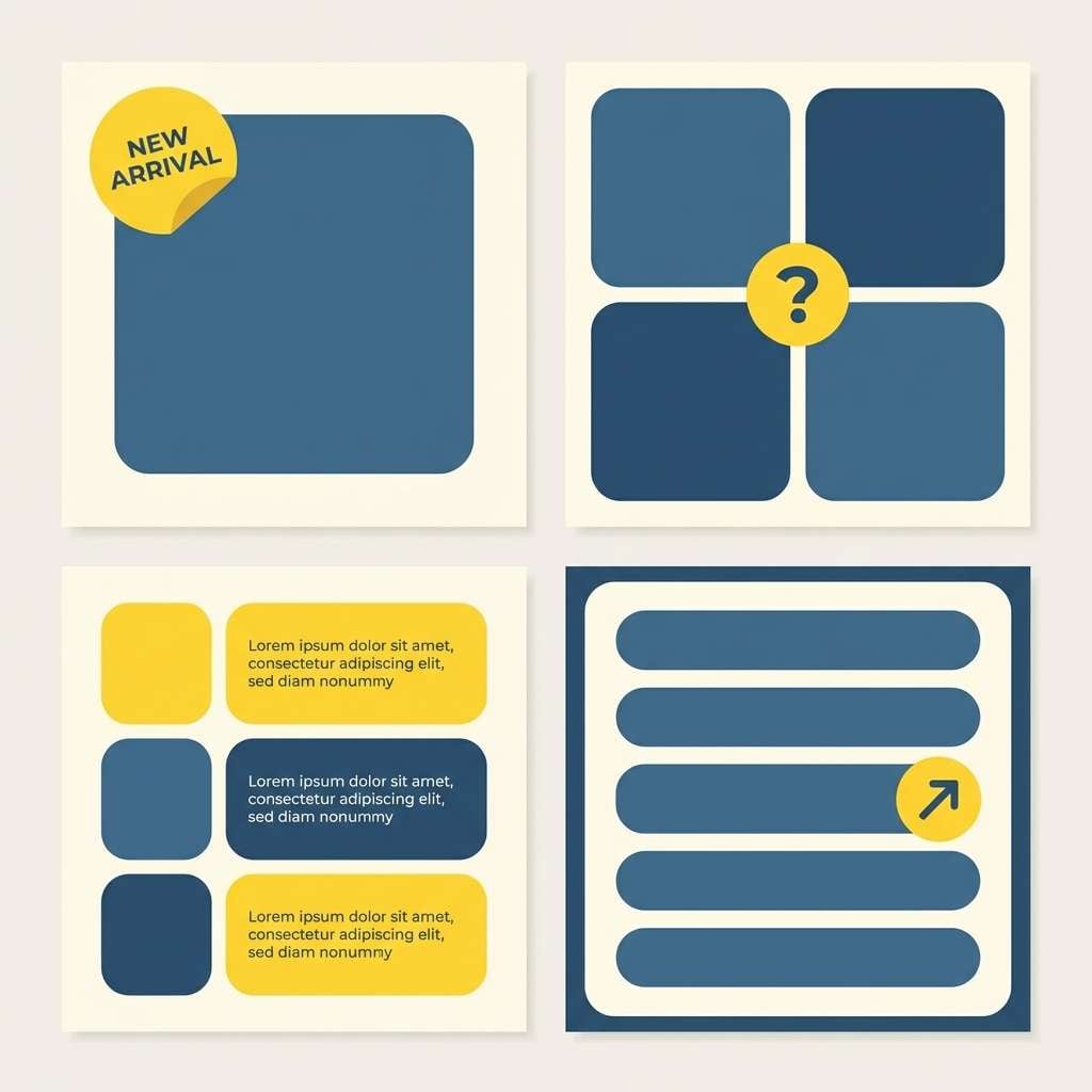
How to Use a Yellow Dark Blue Color Palette in Real Designs
Start with dark blue as your foundation: backgrounds, headers, navigation, or large shapes. This creates structure and makes the design feel intentional rather than noisy.
Use yellow like a spotlight: primary buttons, key numbers, badges, and important labels. Keeping yellow limited to one main role (CTA, alerts, or highlights) makes the interface easier to learn and the layout easier to scan.
Add a neutral panel color (cream/off-white) for content areas, forms, and long text blocks. This reduces visual fatigue and helps maintain accessibility across different devices and lighting conditions.
Create Yellow Dark Blue Palette Visuals with AI
If you want to preview how a yellow and dark blue palette looks on a poster, landing page, packaging, or UI screen, generating quick mockups is the fastest way to validate contrast and mood.
With Media.io’s text-to-image tool, you can paste a prompt, describe the layout, and iterate color emphasis in seconds—so you can decide whether your yellow should be lemon-bright, mustard, or gold.
Yellow Dark Blue Color Palette FAQs
-
What does a yellow and dark blue color palette communicate?
It typically communicates trust and stability (dark blue) paired with optimism and attention (yellow). This makes it popular for brands that want to feel credible while still energetic and modern. -
How do I keep yellow from overpowering dark blue?
Use dark blue for the large areas and treat yellow as an accent for a single purpose (like CTAs or key labels). Adding an off-white/cream background tone also helps balance brightness. -
Is yellow on dark blue readable for text?
It can be, but use it carefully: increase font weight, avoid very thin type, and consider slightly increasing letter spacing. For long paragraphs, use off-white text on dark blue and reserve yellow for highlights. -
What neutral colors pair best with yellow and dark blue?
Warm creams, off-whites, and light grays pair best because they soften the contrast and make layouts feel more premium. Charcoal can also work well for outlines and secondary typography. -
What accent colors work with a yellow dark blue palette?
Teal and seafoam are great secondary accents for a coastal or sporty feel, while slate blue supports UI surfaces. If you want a more elegant look, lean into muted gold/brass tones instead of neon yellow. -
What industries commonly use navy and yellow palettes?
Sports and team branding, travel and nautical brands, construction and safety signage, and SaaS dashboards often use this pairing because it’s high-contrast, memorable, and easy to systematize. -
How can I quickly mock up these palettes on real designs?
Use an AI mockup generator like Media.io Text-to-Image: describe the design type (poster, UI, packaging), specify “dark navy base with yellow accents,” and iterate prompts until the balance feels right.


