

Light cyan is a bright, airy color that instantly makes layouts feel clean, calm, and modern. It’s especially popular in UI design, wellness branding, and print systems that need a lot of “breathing room.”
Below are 20 light cyan color palette ideas with HEX codes, plus practical pairing tips and AI prompts you can use to generate matching visuals.
In this article
- Why Light Cyan Palettes Work So Well
-
- sea glass morning
- icy harbor neutrals
- aqua sorbet pop
- minimal spa tiles
- coastal coral accent
- misty tech gradient
- paperwhite and cyan ink
- nordic winterlight
- poolside citrus
- quiet library bluegreen
- celadon office calm
- glacier denim contrast
- soft cloud pastels
- botanical mint wash
- midnight lagoon
- ceramic studio
- arctic cherry punch
- sandbar breeze
- vintage pharmacy
- skyline after rain
- What Colors Go Well with Light Cyan?
- How to Use a Light Cyan Color Palette in Real Designs
- Create Light Cyan Palette Visuals with AI
Why Light Cyan Palettes Work So Well
Light cyan sits in that sweet spot between “fresh” and “safe”: it’s more energetic than gray or off-white, but softer than saturated blues. That makes it easy to use across big surfaces like backgrounds, cards, and hero sections without feeling heavy.
It also pairs naturally with both cool and warm accents. Add slate or navy for readable contrast in UI, or bring in peach, blush, and soft yellows to make the palette feel friendly and human.
Because light cyan is visually associated with cleanliness and clarity, it’s a strong choice for wellness, healthcare, SaaS, and editorial layouts where trust and legibility matter.
20+ Light Cyan Color Palette Ideas (with HEX Codes)
1) Sea Glass Morning
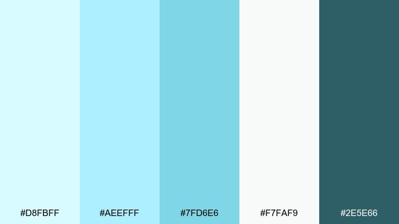
HEX: #D8FBFF #AEEFFF #7FD6E6 #F7FAF9 #2E5E66
Mood: fresh, airy, coastal
Best for: wellness brand identity
Fresh coastal air and sunlit sea glass set a calm, optimistic tone. This light cyan color combination stays clean when you balance it with the near-white and anchor it with the deep teal. Use it for wellness logos, labels, and social templates where clarity matters. Tip: keep body text in the darkest shade and reserve the brightest cyan for icons and highlights.
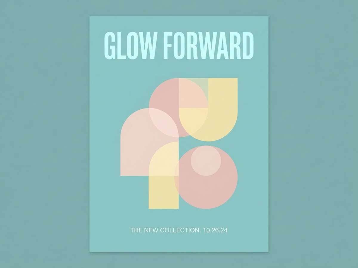
Image example of sea glass morning generated using media.io
Media.io is an online AI studio for creating and editing video, image, and audio in your browser.

2) Icy Harbor Neutrals
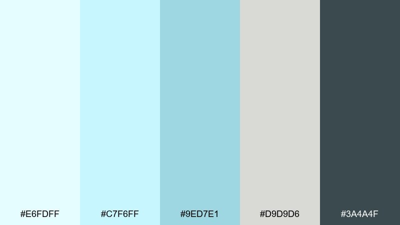
HEX: #E6FDFF #C7F6FF #9ED7E1 #D9D9D6 #3A4A4F
Mood: cool, modern, understated
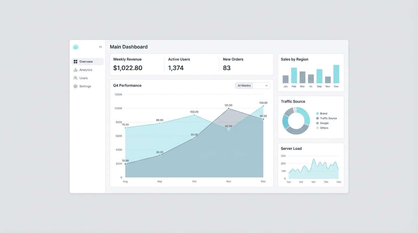
Best for: dashboard ui
Cool harbor fog and brushed metal give this mix a quiet, modern edge. The grays keep the cyan from feeling sugary, while the dark slate delivers strong contrast for data. It works especially well for analytics cards, tables, and settings screens. Tip: use the lightest cyan for backgrounds and reserve the mid cyan for active states and charts.
Image example of icy harbor neutrals generated using media.io
3) Aqua Sorbet Pop
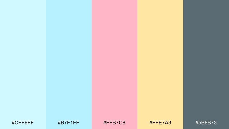
HEX: #CFF9FF #B7F1FF #FFB7C8 #FFE7A3 #5B6B73
Mood: playful, sweet, upbeat
Best for: beauty launch campaign
Candy-sweet sorbet vibes make the cyan feel lively instead of chilly. The blush and warm yellow add cheerful contrast, while the muted gray keeps layouts from getting loud. This light cyan color palette is a great fit for beauty drops, limited editions, and creator promos. Tip: let pink carry the call-to-action and keep cyan as the spacious background color.
Image example of aqua sorbet pop generated using media.io
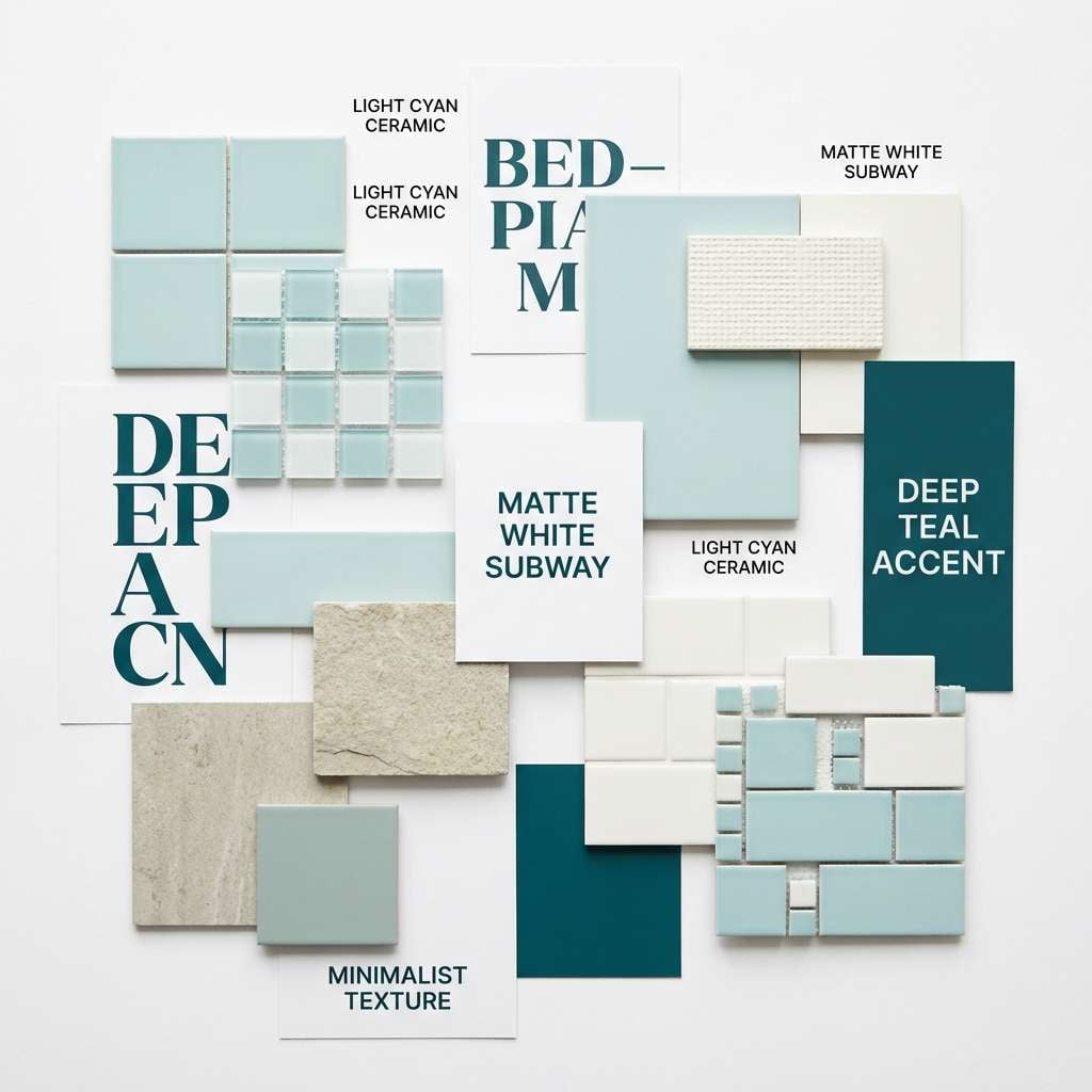
4) Minimal Spa Tiles
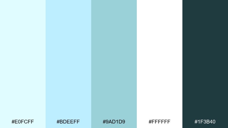
HEX: #E0FCFF #BDEEFF #9AD1D9 #FFFFFF #1F3B40
Mood: clean, serene, spa-like
Best for: bathroom interior moodboard
Polished tile, steam, and soft daylight create a spa-clean feeling. The whites make everything breathable, and the deep teal adds a crisp, premium edge. Use it in interior moodboards, hotel concepts, or minimalist web pages where you want calm without boredom. Tip: repeat the mid cyan as a subtle pattern to mimic tile grout lines.
Image example of minimal spa tiles generated using media.io
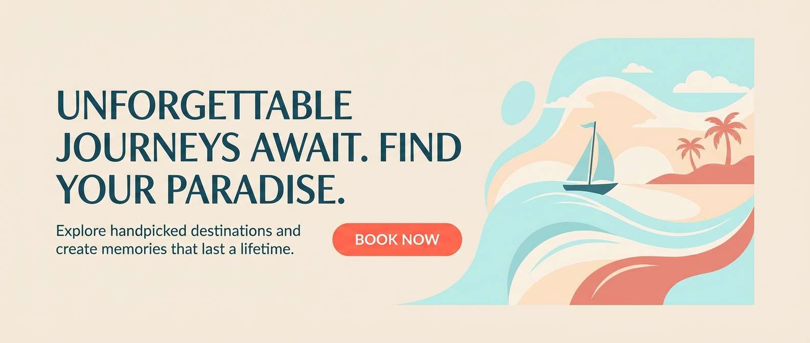
5) Coastal Coral Accent
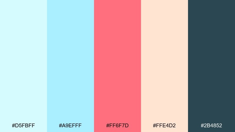
HEX: #D5FBFF #A9EFFF #FF6F7D #FFE4D2 #2B4852
Mood: bright, friendly, summery
Best for: travel landing page
Sun-warmed boardwalk energy meets clear water tones for a friendly, summery look. The coral works like a built-in button color, while the dark blue-green keeps typography sharp. Light cyan color combinations like this shine on travel landing pages, newsletters, and promo banners. Tip: keep coral to one action per section so the page still feels breezy.
Image example of coastal coral accent generated using media.io
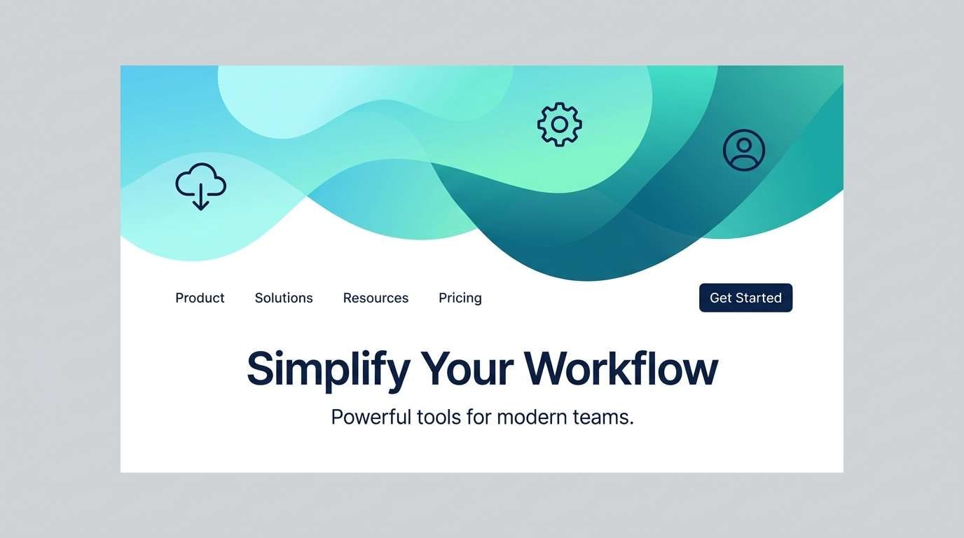
6) Misty Tech Gradient
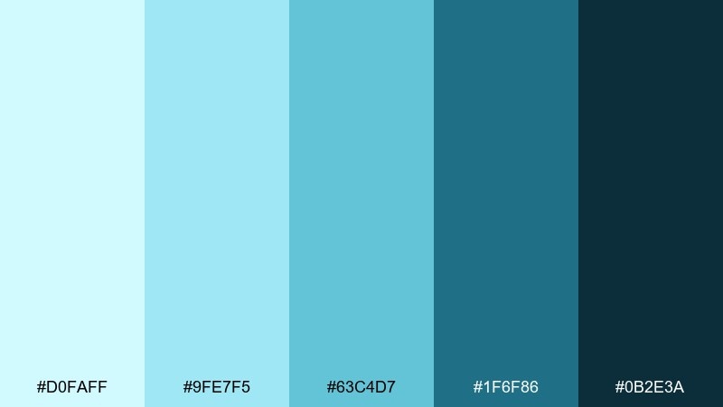
HEX: #D0FAFF #9FE7F5 #63C4D7 #1F6F86 #0B2E3A
Mood: sleek, futuristic, confident
Best for: saas website header
Misty glow and deep-ocean shadows give this set a sleek, tech-forward mood. The gradient range makes it easy to build depth without switching hues. It works well for SaaS hero headers, feature panels, and sign-up flows that need trust and clarity. Tip: use the darkest shade only for headings and nav so the light tones stay luminous.
Image example of misty tech gradient generated using media.io
7) Paperwhite and Cyan Ink
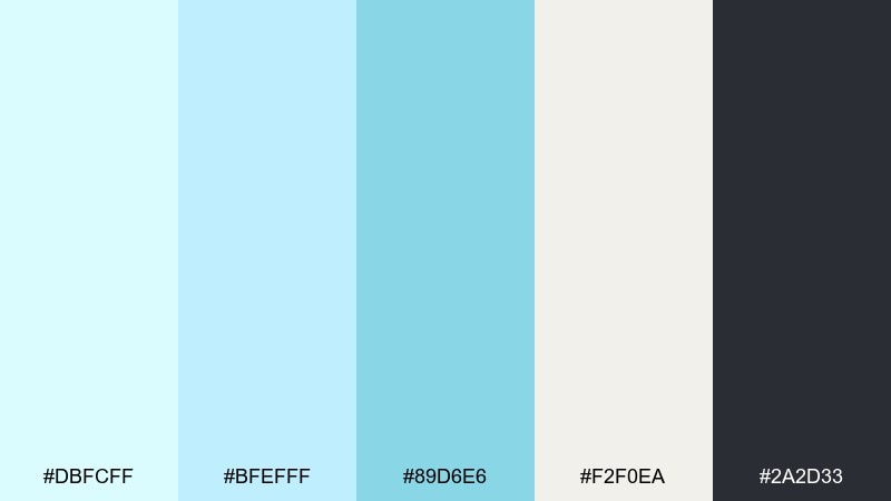
HEX: #DBFCFF #BFEFFF #89D6E6 #F2F0EA #2A2D33
Mood: editorial, crisp, thoughtful
Best for: magazine layout
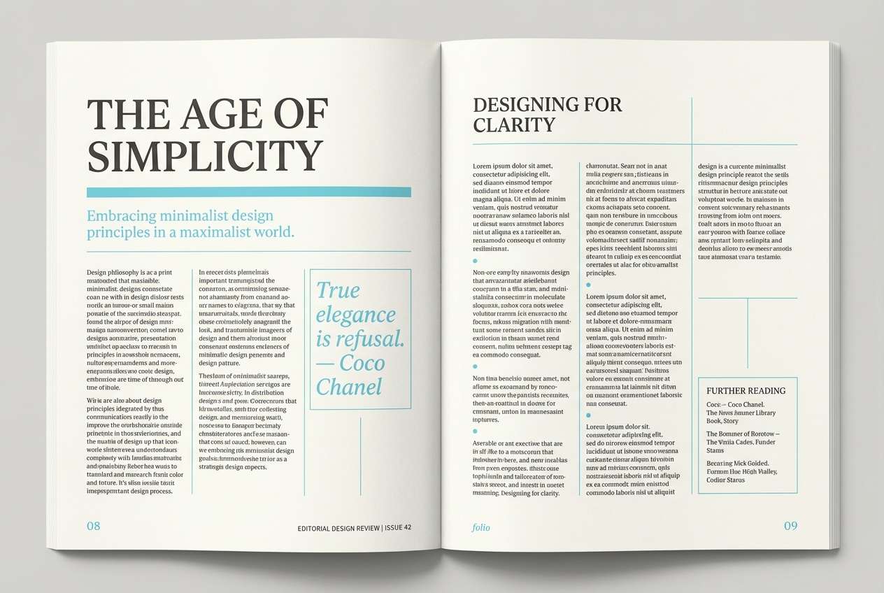
Crisp paper and a hint of cyan ink feel smart and editorial. The warm off-white prevents the palette from going icy, while charcoal text stays readable in long-form layouts. Use it for magazines, reports, or case studies where you want calm sophistication. Tip: keep cyan to pull quotes, rules, and section dividers rather than body text.
Image example of paperwhite and cyan ink generated using media.io
8) Nordic Winterlight
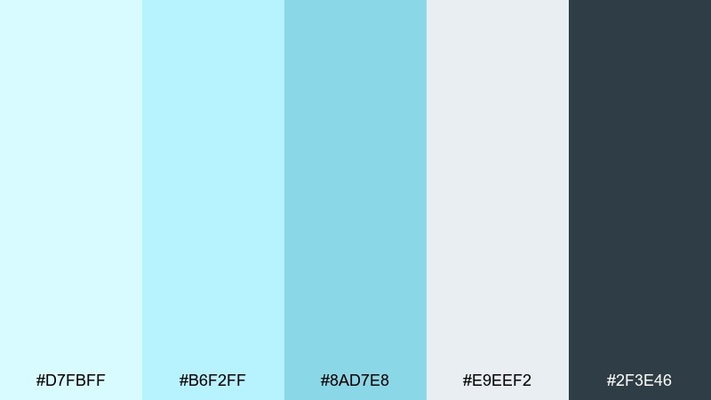
HEX: #D7FBFF #B6F2FF #8AD7E8 #E9EEF2 #2F3E46
Mood: quiet, Nordic, refreshing
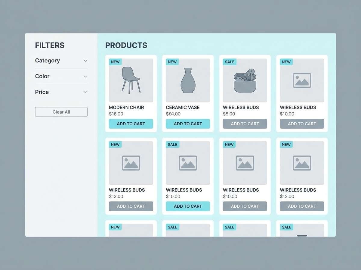
Best for: minimal ecommerce ui
Nordic winter light feels quiet, refreshing, and neatly organized. The cool grays support the airy blues, and the deep slate gives you dependable contrast for prices and product names. This light cyan color palette works beautifully for minimal ecommerce where you want products to feel clean and premium. Tip: use the mid cyan for tags like new or limited instead of bright, distracting badges.
Image example of nordic winterlight generated using media.io
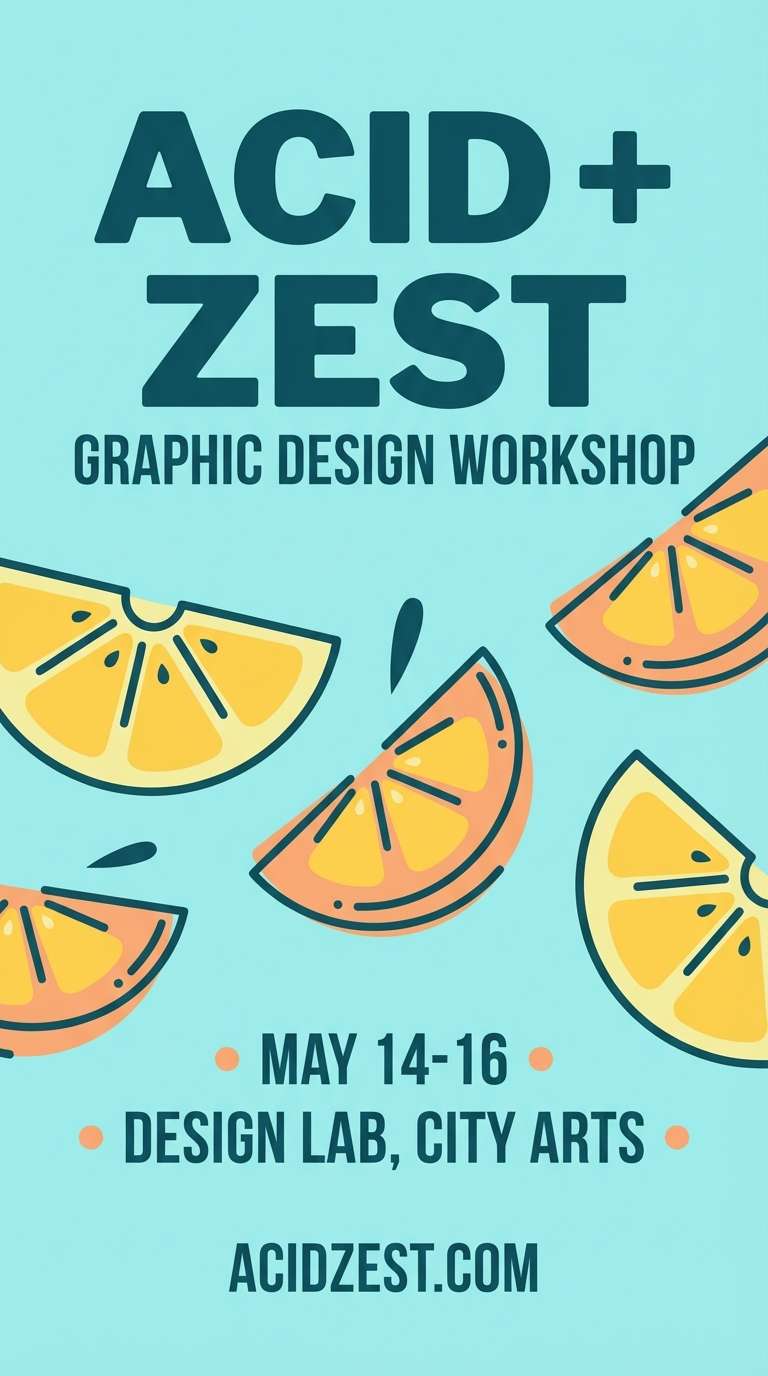
9) Poolside Citrus
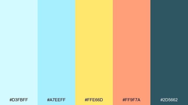
HEX: #D3FBFF #A7EEFF #FFE66D #FF9F7A #2D5662
Mood: fun, sunny, energetic
Best for: summer event flyer
Pool water sparkle and citrus slices make the mood instantly summery. Yellow and apricot bring warmth so the cyan reads playful, not clinical. Use it for summer flyers, pop-up events, and upbeat social posts with bold typography. Tip: set the background in pale cyan and keep the warm colors for the headline and key details.
Image example of poolside citrus generated using media.io
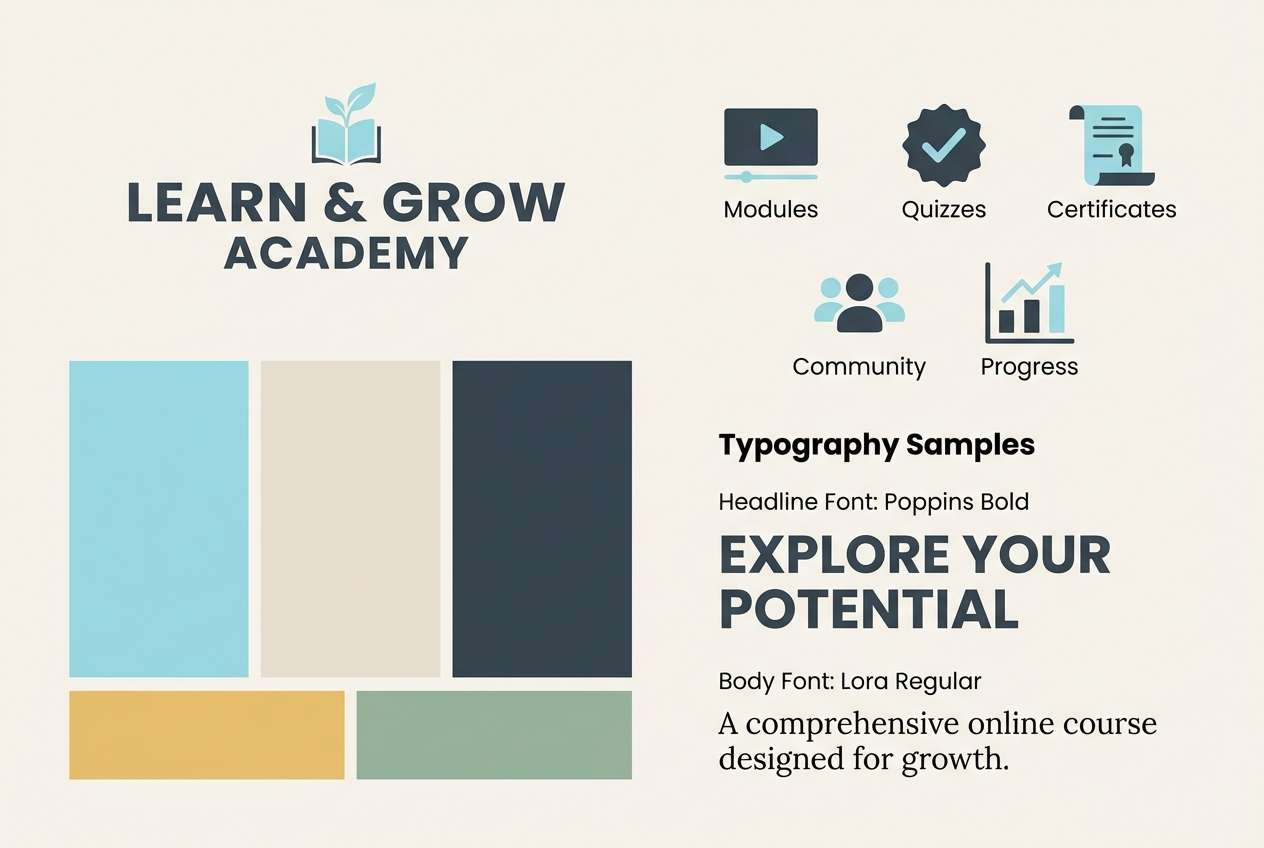
10) Quiet Library Bluegreen
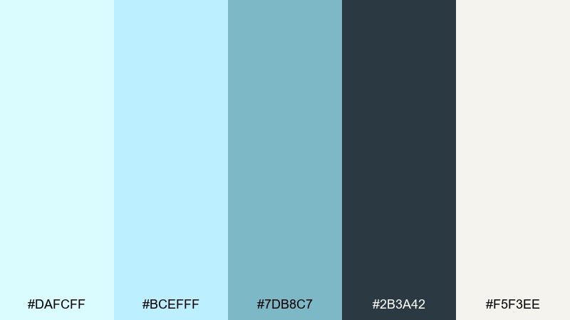
HEX: #DAFCFF #BCEFFF #7DB8C7 #2B3A42 #F5F3EE
Mood: calm, academic, reliable
Best for: online course branding
Soft bluegreen tones feel like a quiet library and steady focus. The warm paper neutral keeps the palette human, while the deep slate is perfect for headings and navigation. Light cyan color combinations like this suit course branding, learning portals, and calm productivity tools. Tip: keep buttons in the deeper teal so calls-to-action do not disappear into the soft background.
Image example of quiet library bluegreen generated using media.io
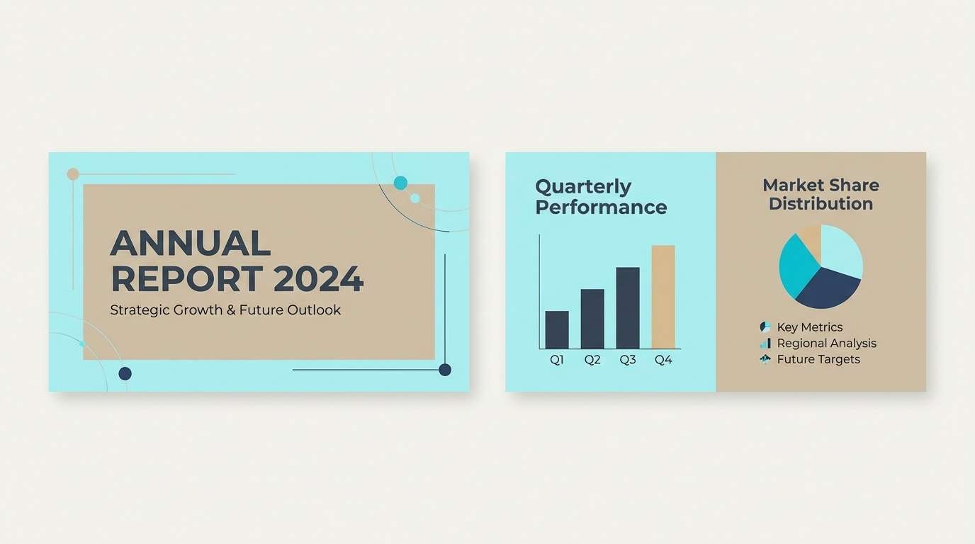
11) Celadon Office Calm
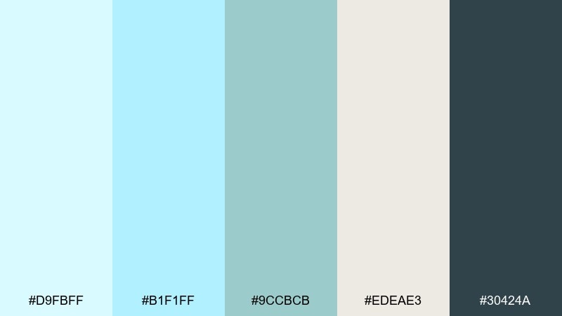
HEX: #D9FBFF #B1F1FF #9CCBCB #EDEAE3 #30424A
Mood: balanced, professional, calming
Best for: presentation template
Balanced and professional, these tones feel like a tidy desk and a clear plan. The celadon note adds softness, while the deep gray-blue keeps slides readable from the back of the room. If you want a light cyan color scheme that still feels corporate, this mix is a safe bet. Tip: use the warm neutral for large text blocks to reduce glare on bright projectors.
Image example of celadon office calm generated using media.io
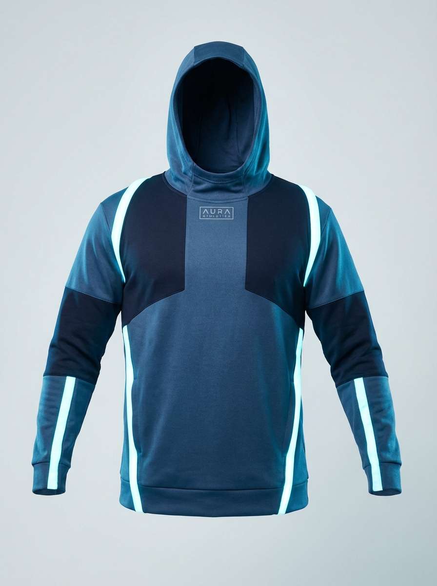
12) Glacier Denim Contrast
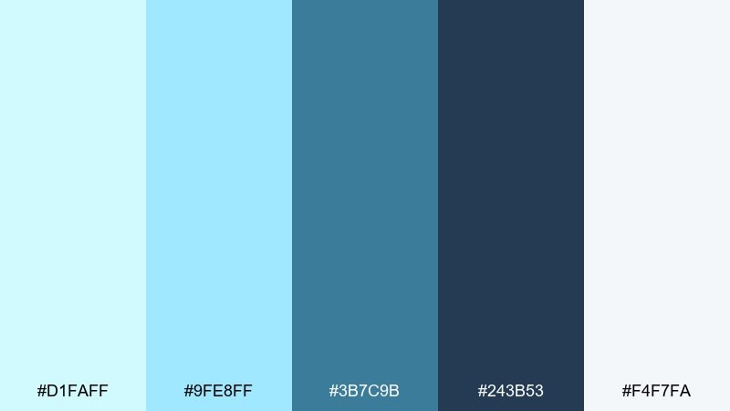
HEX: #D1FAFF #9FE8FF #3B7C9B #243B53 #F4F7FA
Mood: crisp, outdoorsy, bold
Best for: sportswear product ad
Glacier air and denim blues create a crisp, outdoorsy contrast. The deeper blues bring strength and make the light tones feel extra bright. Use it for sportswear ads, performance product pages, or bold promo banners. Tip: spotlight the product with the palest cyan and keep the darkest navy for the logo and pricing.
Image example of glacier denim contrast generated using media.io
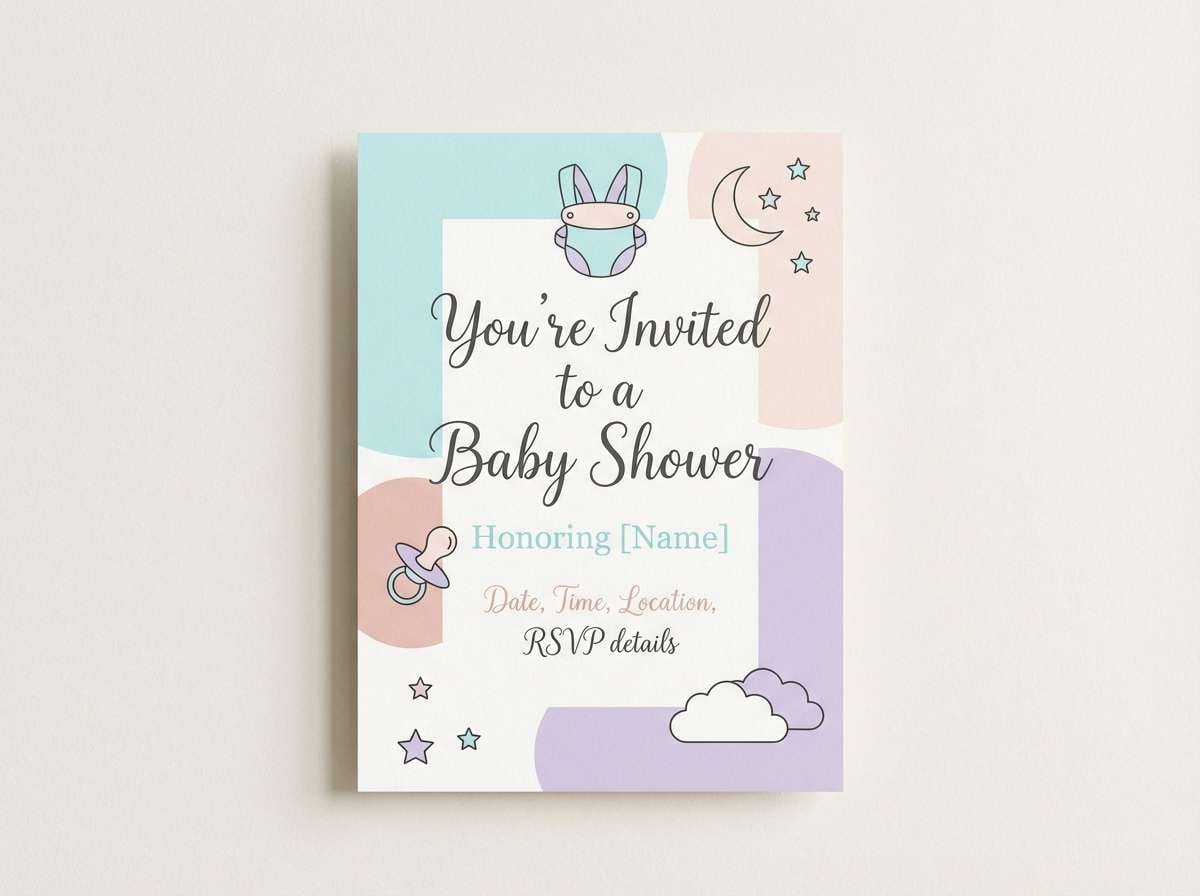
13) Soft Cloud Pastels
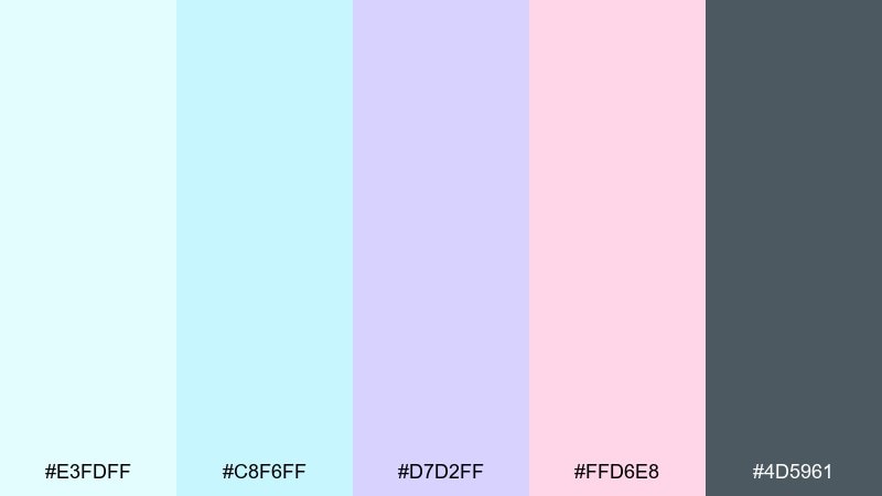
HEX: #E3FDFF #C8F6FF #D7D2FF #FFD6E8 #4D5961
Mood: dreamy, gentle, romantic
Best for: baby shower invitation
Dreamy cloud pastels feel gentle, romantic, and a little nostalgic. The lavender and blush soften the cyan, while the gray-blue keeps type from looking too cute. Use it for baby shower invitations, gentle announcements, and soft lifestyle graphics. Tip: print on warm white stock so the pastels stay creamy instead of cold.
Image example of soft cloud pastels generated using media.io
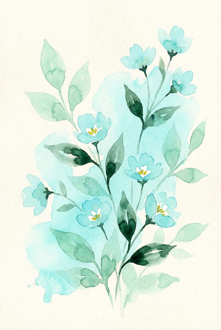
14) Botanical Mint Wash
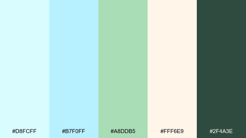
HEX: #D8FCFF #B7F0FF #A8DDB5 #FFF6E9 #2F4A3E
Mood: natural, light, restorative
Best for: watercolor botanical illustration
A minty wash and fresh stems evoke a restorative, natural calm. The warm cream keeps the greens and cyans feeling organic rather than sterile. It is ideal for botanical illustrations, eco packaging concepts, and springtime stationery. Tip: let the cream act as negative space so the watery cyan stays translucent.
Image example of botanical mint wash generated using media.io
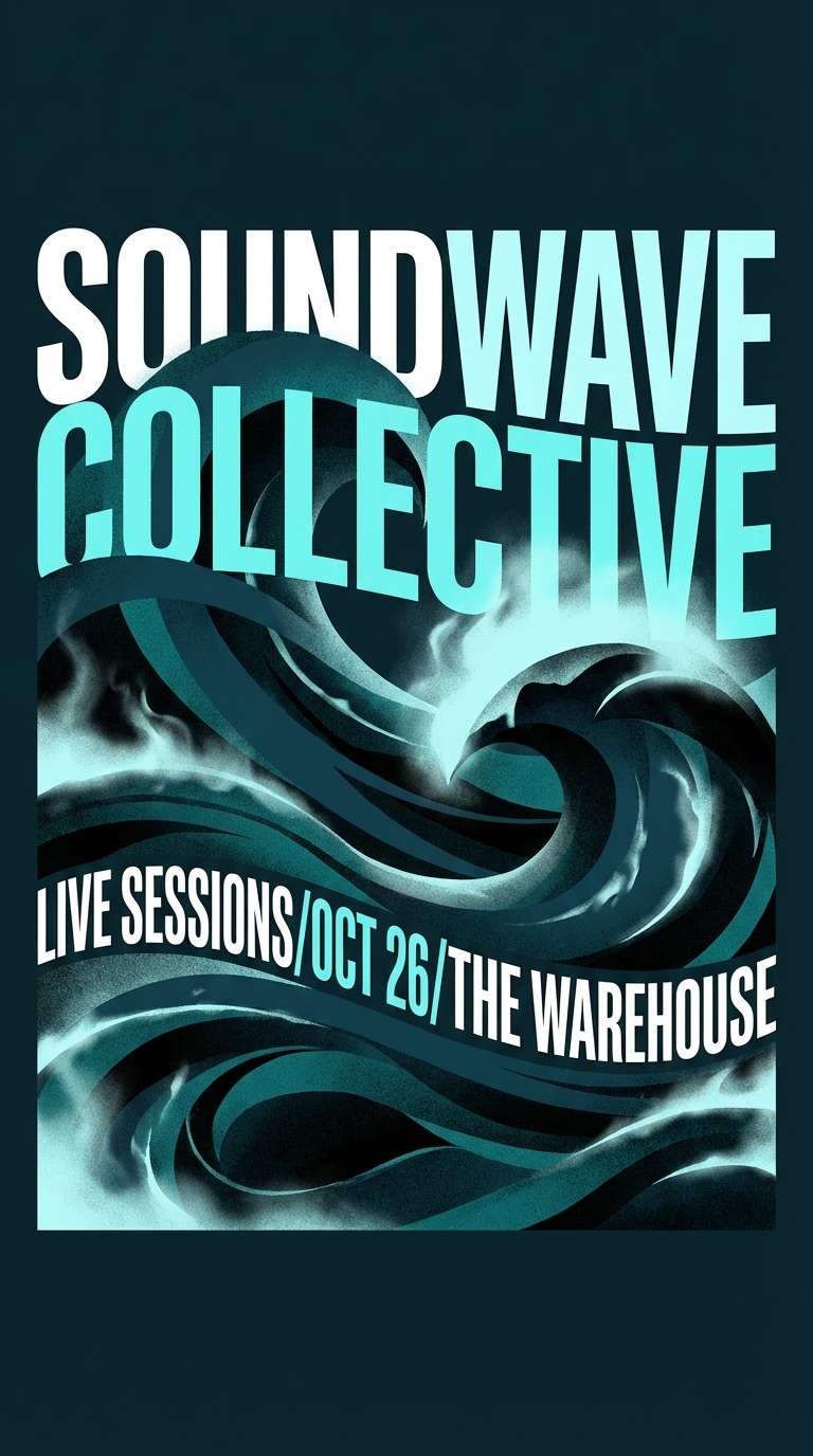
15) Midnight Lagoon
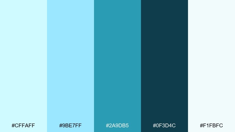
HEX: #CFFAFF #9BE7FF #2A9DB5 #0F3D4C #F1FBFC
Mood: moody, luxurious, aquatic
Best for: music poster
Moody lagoon depths and neon-free glow make this feel luxurious and aquatic. The darker teals create drama without turning harsh, and the pale tint keeps the layout breathable. Use it for music posters, night events, or premium digital covers. Tip: apply the darkest shade to large blocks and overlay the lightest tint for a soft mist effect.
Image example of midnight lagoon generated using media.io
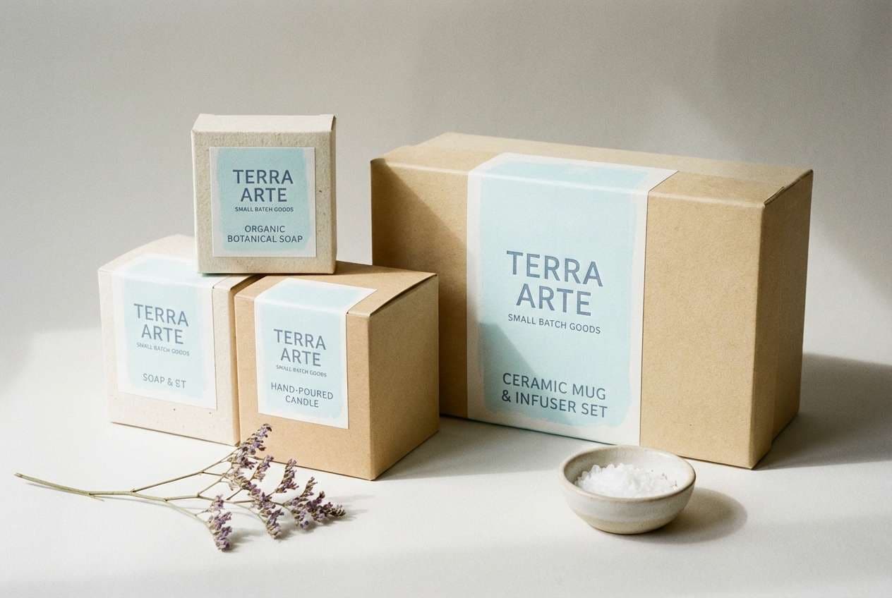
16) Ceramic Studio
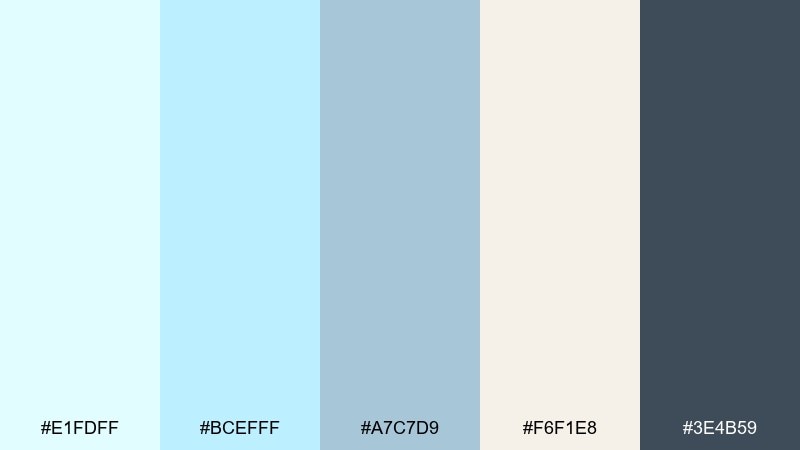
HEX: #E1FDFF #BCEFFF #A7C7D9 #F6F1E8 #3E4B59
Mood: crafted, soft, gallery-like
Best for: artisan product packaging
Hand-thrown ceramic and gallery walls come to mind with these crafted, soft tones. The warm beige adds tactility, while the slate blue keeps labels crisp. Use it for artisan packaging, handmade skincare, or small-batch coffee branding. Tip: choose uncoated paper and let the pale cyan appear as a matte ink for a more tactile look.
Image example of ceramic studio generated using media.io
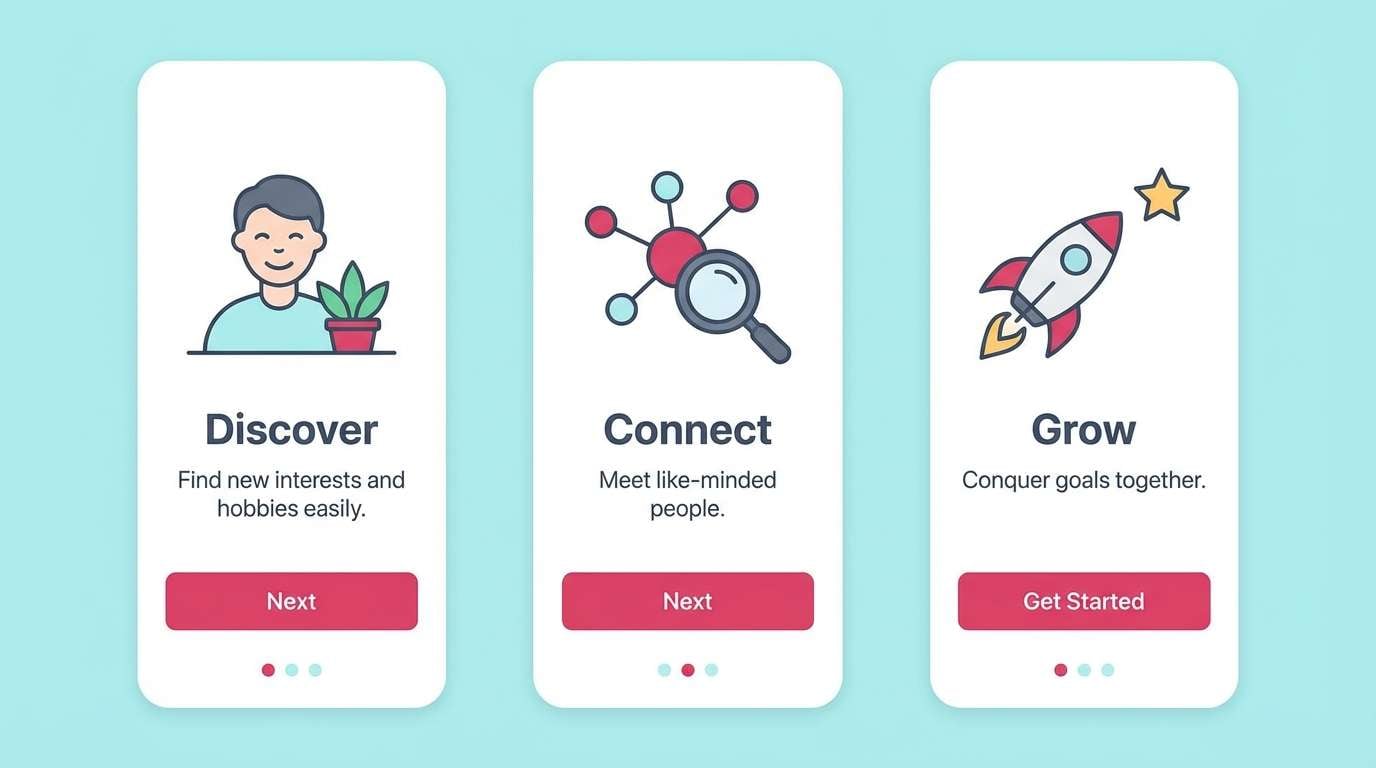
17) Arctic Cherry Punch
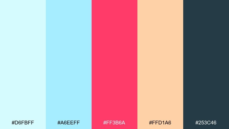
HEX: #D6FBFF #A6EEFF #FF3B6A #FFD1A6 #253C46
Mood: bold, trendy, high-contrast
Best for: app onboarding screens
Arctic air meets cherry punch for a bold, trendy contrast. The hot pink is perfect for progress indicators and key moments, while the deep blue-gray stabilizes the layout. Use it for energetic onboarding flows, youth campaigns, and splash screens. Tip: keep the pink to one focal element per screen so the cyan can still feel spacious.
Image example of arctic cherry punch generated using media.io
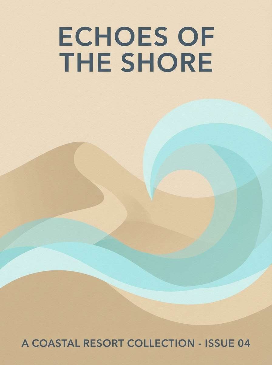
18) Sandbar Breeze
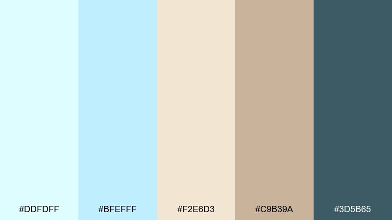
HEX: #DDFDFF #BFEFFF #F2E6D3 #C9B39A #3D5B65
Mood: beachy, relaxed, warm-cool balance
Best for: resort brochure
Sandbar neutrals and cool water tones feel relaxed and quietly upscale. The tans warm up the cyan, making the palette friendlier for print and travel materials. Use it in resort brochures, spa menus, and hospitality signage. Tip: set large background areas in sand tones and use cyan as a refreshing highlight for headings and icons.
Image example of sandbar breeze generated using media.io
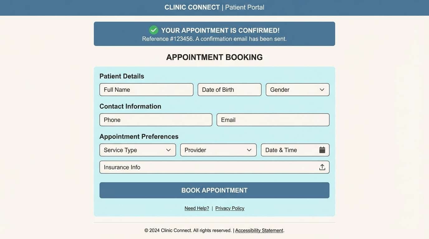
19) Vintage Pharmacy
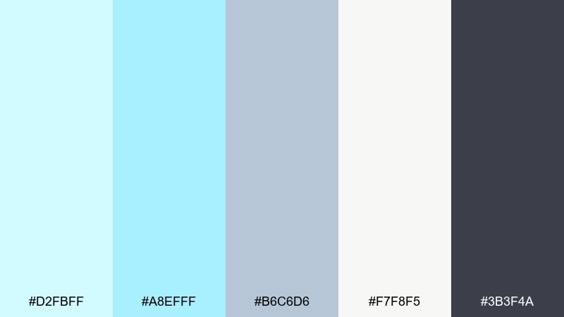
HEX: #D2FBFF #A8EFFF #B6C6D6 #F7F8F5 #3B3F4A
Mood: clean, trustworthy, retro-modern
Best for: healthcare clinic website
A vintage pharmacy vibe makes the cyan feel trustworthy and a touch nostalgic. Powdery blue-gray adds a retro note, while off-white keeps pages bright and clinical in a good way. Use it for healthcare sites, appointment flows, and patient portals. Tip: keep form fields on off-white and use the light cyan only for focus rings and confirmation states.
Image example of vintage pharmacy generated using media.io
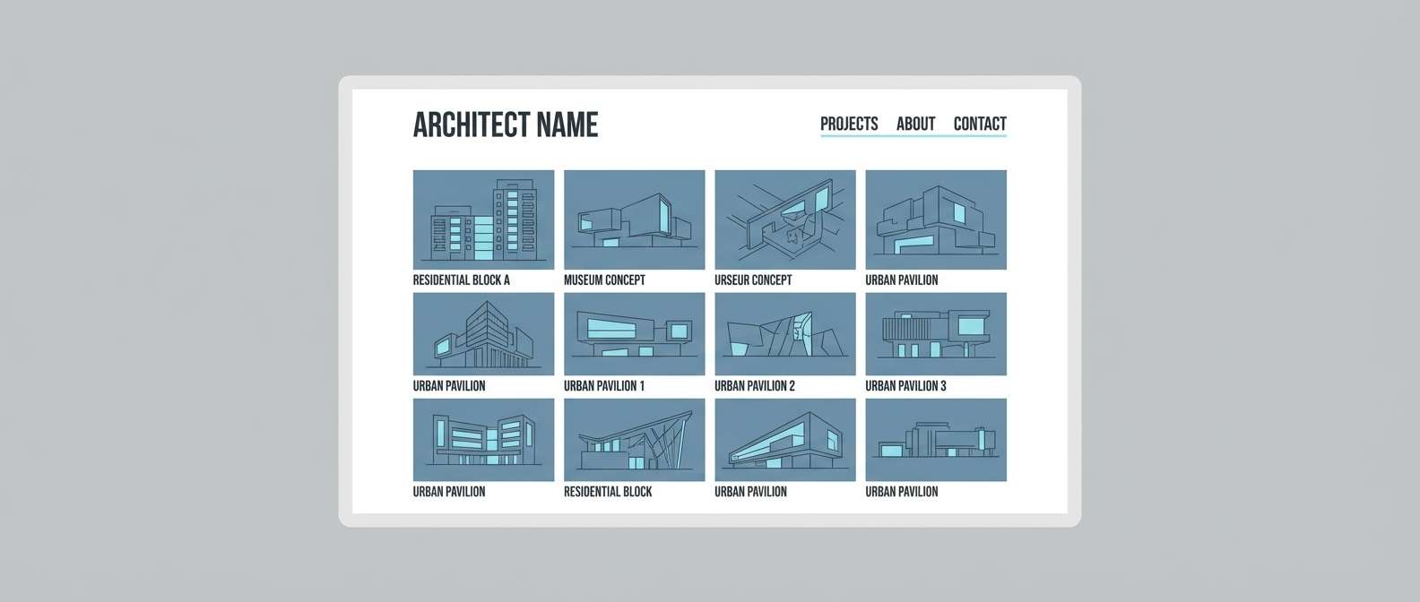
20) Skyline After Rain
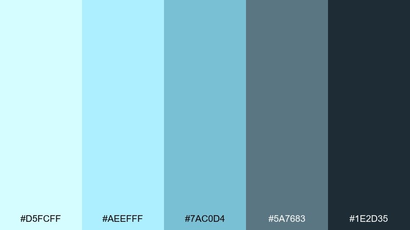
HEX: #D5FCFF #AEEFFF #7AC0D4 #5A7683 #1E2D35
Mood: cool, urban, polished
Best for: architecture portfolio site
Cool air and glassy streets after rain create a polished, urban mood. The stepped blue-grays make it easy to build hierarchy across grids and captions. It works beautifully for architecture portfolios, studio sites, and project galleries. Tip: use the mid cyan for hover states on thumbnails and keep captions in the darkest tone for readability.
Image example of skyline after rain generated using media.io
What Colors Go Well with Light Cyan?
Neutrals like soft white, warm ivory, cool gray, and charcoal make light cyan feel structured and readable. If you’re designing UI, pairing light cyan backgrounds with deep slate text is a reliable, modern formula.
Pastels such as blush pink, lavender, and butter yellow turn light cyan into something more playful and approachable. These combinations are great for lifestyle branding, invitations, and social templates.
For higher contrast, use deeper teals, navy, or a punchy accent like coral or hot pink. Keep the bright accent limited to key actions (buttons, badges, progress) so the palette stays airy.
How to Use a Light Cyan Color Palette in Real Designs
Start by assigning roles: use the palest cyan for large backgrounds, a mid cyan for interactive states (hover/active), and a dark teal or slate for typography. This keeps the interface clean while still building hierarchy.
In branding and print, light cyan works best when you add a warm counterbalance (cream, sand, beige) to avoid a cold or clinical feel. It’s also effective as a highlight color for rules, labels, and icons rather than long body text.
If you’re unsure where to begin, build one gradient or two-surface system first (background + card), then introduce a single accent color for calls-to-action.
Create Light Cyan Palette Visuals with AI
Once you pick your HEX set, you can generate matching mockups and mood images to test how the palette behaves in real layouts. This is useful for checking contrast, vibe, and how the colors read across different subjects (packaging, UI, posters, and more).
Use the included prompts above as a starting point, then swap the subject (e.g., “skincare packaging” to “app dashboard”) while keeping the same color direction. You’ll get fast, consistent visuals that make presentations and approvals easier.
With Media.io’s text-to-image tool, you can iterate quickly and export assets for concept boards, landing pages, or campaign drafts.
Light Cyan Color Palette FAQs
-
What HEX code is considered “light cyan”?
Many shades can qualify, but popular light cyan tints include #D8FBFF, #D0FAFF, and #E6FDFF. In practice, “light cyan” usually means a very high-lightness cyan that works well as a background or soft accent. -
Is light cyan good for website backgrounds?
Yes—light cyan is excellent for backgrounds because it feels clean and open. Pair it with dark slate/charcoal text and keep strong accents (coral, pink, deep teal) for buttons and key highlights. -
What colors pair best with light cyan for contrast?
Deep teal, navy, and charcoal provide strong contrast while staying harmonious. If you want a brighter contrast, coral and hot pink can work well as controlled accents. -
Can I use light cyan in professional or corporate designs?
Definitely. Add muted grays, off-white, and a deep blue-gray for typography (like in “Icy Harbor Neutrals” or “Celadon Office Calm”) to keep the palette polished and business-friendly. -
Does light cyan print well?
It can, but very pale cyans may print lighter than expected. For print, consider warming the palette with cream/beige and avoid relying on the lightest cyan for important details. -
How do I keep light cyan from looking too cold?
Introduce a warm neutral (ivory, sand, warm gray) or a gentle warm accent (peach, blush, soft yellow). This balance makes the palette feel more welcoming and less clinical. -
How can I generate images that match my light cyan palette?
Use an AI text-to-image tool and describe the scene plus your intended color direction (light cyan dominant, deep teal text, etc.). Media.io lets you iterate quickly using prompts like the examples shown in each palette.


