

Jasmine is a soft, sunlit yellow that instantly adds warmth without turning loud. It’s a reliable choice when you want visuals that feel calm, optimistic, and human.
Below are 20+ jasmine color palette ideas with HEX codes, plus practical tips for pairing them across branding, UI, and print.
In this article
- Why Jasmine Palettes Work So Well
-
- sunlit linen
- honeyed sage
- citrus cream pop
- gilded clay
- butter & ink
- sunroom pastels
- golden hour neutrals
- jasmine tea ceremony
- marigold & midnight
- candlelight blush
- cream soda pop
- daffodil denim
- lemon meringue marble
- sunflower graphite
- apricot garden
- coastal pollen
- autumn mustard check
- vanilla orchid
- studio spotlight
- blooming botanical wash
- modern apothecary label
- festival confetti warmth
- quiet workspace glow
- What Colors Go Well with Jasmine?
- How to Use a Jasmine Color Palette in Real Designs
- Create Jasmine Palette Visuals with AI
Why Jasmine Palettes Work So Well
Jasmine yellow sits in a “friendly” zone: bright enough to catch attention, but soft enough to feel welcoming. That balance makes it useful as both a hero color and a highlight color.
It also pairs easily with neutrals (cream, taupe, charcoal) to create premium minimal looks, or with greens and blues for fresher, more modern contrast. In UI, it performs especially well as an accent for active states, badges, and micro-highlights.
Because jasmine isn’t neon, it prints more predictably and feels less fatiguing on large surfaces. With the right dark text color, it stays readable while still delivering a sunny mood.
20+ Jasmine Color Palette Ideas (with HEX Codes)
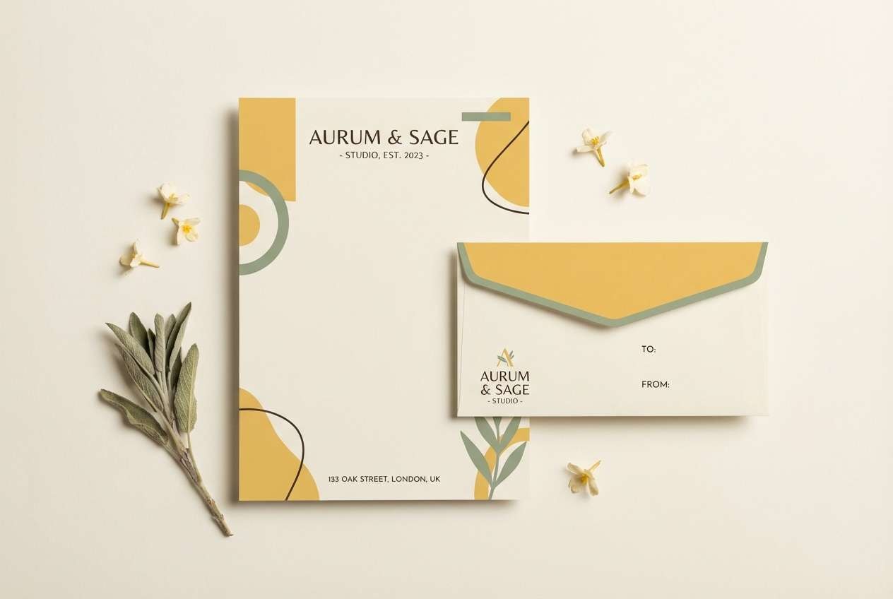
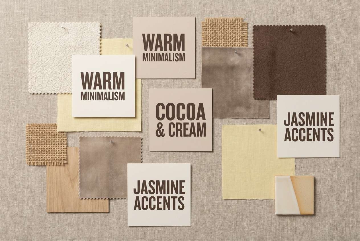
1) Sunlit Linen
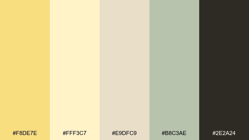
HEX: #F8DE7E #FFF3C7 #E9DFC9 #B8C3AE #2E2A24
Mood: airy, warm, minimal
Best for: clean brand identity and stationery
Airy warmth like late-morning sun on linen, with soft yellow and creamy neutrals that feel instantly inviting. It works beautifully for premium stationery, lifestyle branding, and calm landing pages. Pair the light tones with deep espresso text for contrast, and use the sage as a quiet accent. Tip: keep large background areas in the cream and reserve the jasmine yellow for highlights and seals.
Image example of sunlit linen generated using media.io
Media.io is an online AI studio for creating and editing video, image, and audio in your browser.

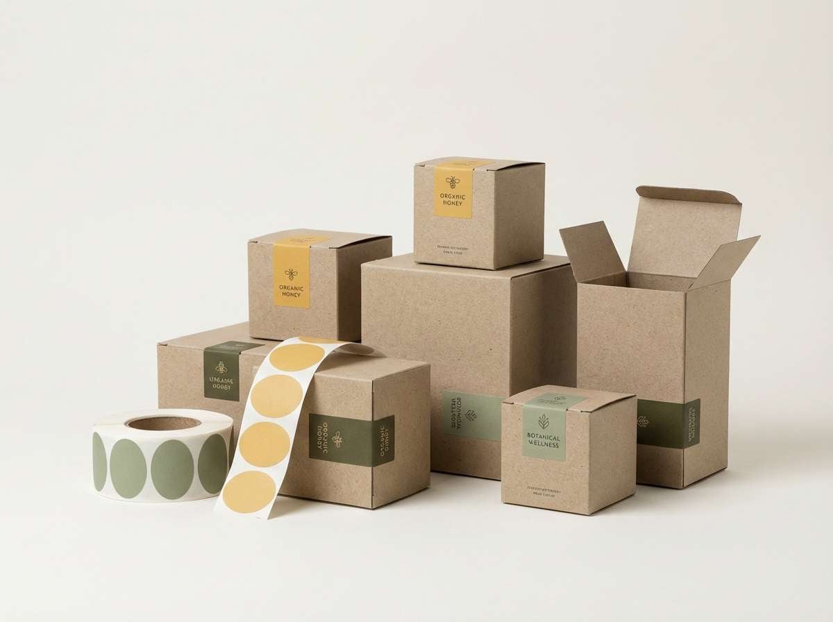
2) Honeyed Sage
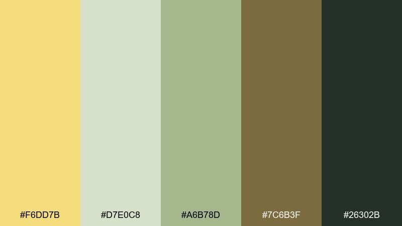
HEX: #F6DD7B #D7E0C8 #A6B78D #7C6B3F #26302B
Mood: grounded, natural, fresh
Best for: eco packaging and wellness labels
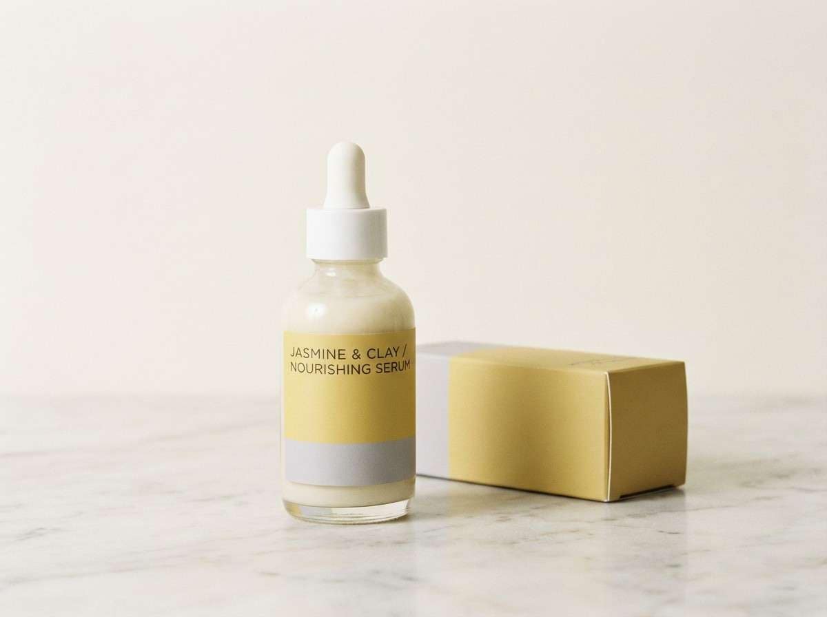
Grounded and botanical, these tones evoke honey tea, herb gardens, and earthy calm. The muted greens keep the yellow from feeling too sweet, making it great for wellness labels and sustainable packaging. Pair with uncoated paper textures and simple line icons for a modern organic look. Tip: use the darker olive for key claims and the honey yellow for badges or flavor cues.
Image example of honeyed sage generated using media.io
3) Citrus Cream Pop
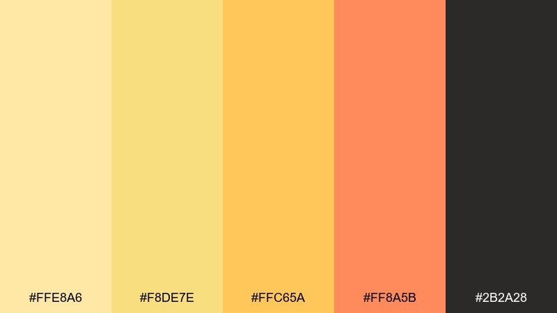
HEX: #FFE8A6 #F8DE7E #FFC65A #FF8A5B #2B2A28
Mood: playful, sunny, energetic
Best for: social posts and product promos
Playful and sun-drenched, this mix feels like citrus sorbet with a warm, modern edge. It shines in social graphics, sale banners, and product promos where you want cheerful urgency without neon. Balance the bright orange with lots of cream space and anchor the layout with near-black type. Tip: set the yellow as the main field and use coral for one clear call-to-action.
Image example of citrus cream pop generated using media.io

4) Gilded Clay
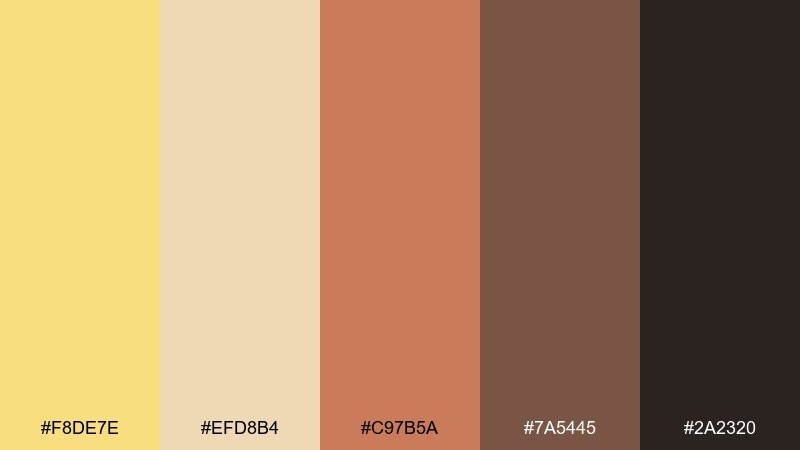
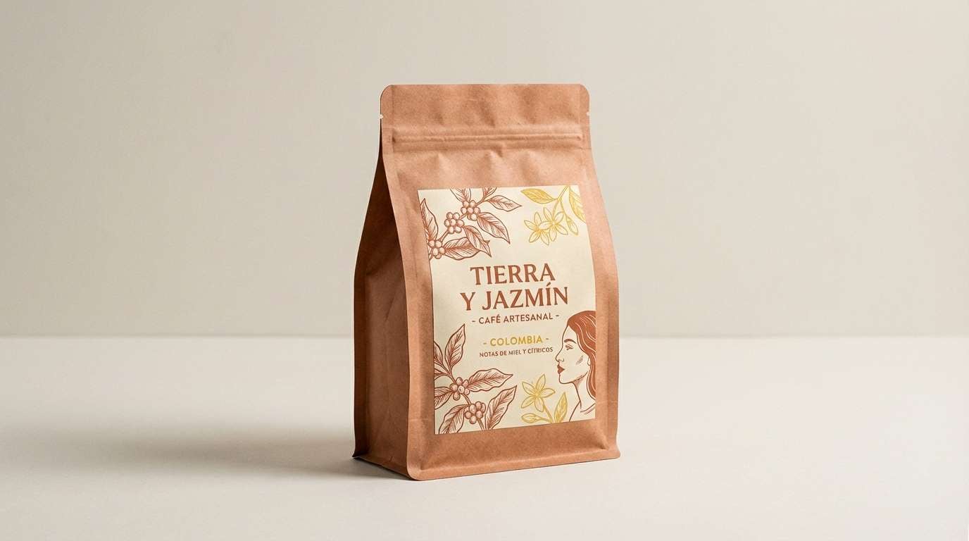
HEX: #F8DE7E #EFD8B4 #C97B5A #7A5445 #2A2320
Mood: rustic, warm, artisanal
Best for: coffee brands and craft packaging
Rustic and glowing, these colors bring to mind kiln-fired clay, café interiors, and golden afternoon light. They are ideal for craft packaging, coffee labels, and artisanal menus where warmth matters. Pair with tactile materials like kraft paper and add small metallic foiling touches to elevate the yellow. Tip: keep clay as the hero color and use the jasmine tone for stamps, icons, or borders.
Image example of gilded clay generated using media.io
5) Butter & Ink
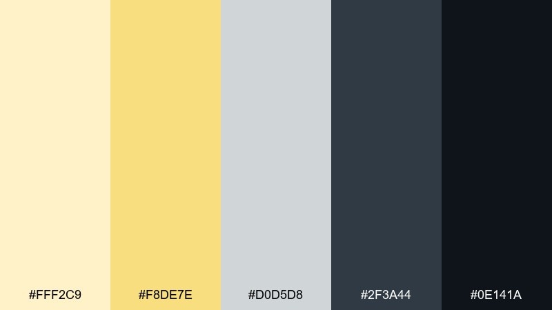
HEX: #FFF2C9 #F8DE7E #D0D5D8 #2F3A44 #0E141A
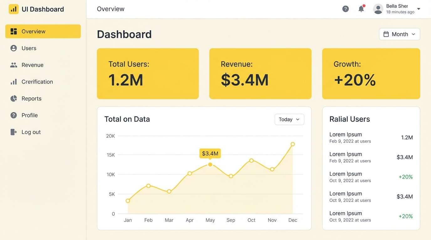
Mood: clean, editorial, confident
Best for: dashboard UI and data cards
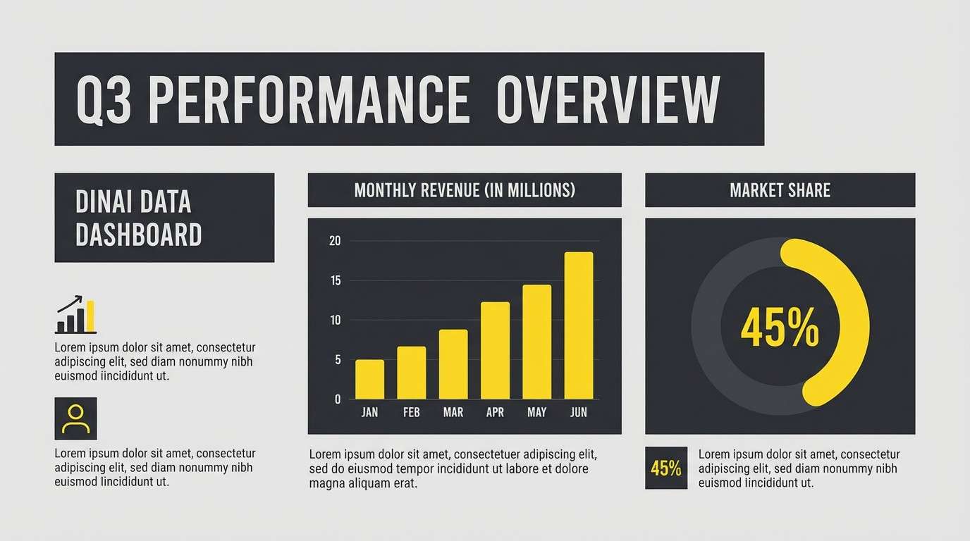
Clean and editorial, the buttery yellow reads like a soft highlighter against crisp slate and ink. It is a strong fit for dashboard UI, data cards, and SaaS marketing pages that need clarity. Use the palest cream for surfaces, then let the yellow mark key states like active tabs and success indicators. Tip: keep icon strokes in slate so the accent color stays special and readable.
Image example of butter & ink generated using media.io
6) Sunroom Pastels
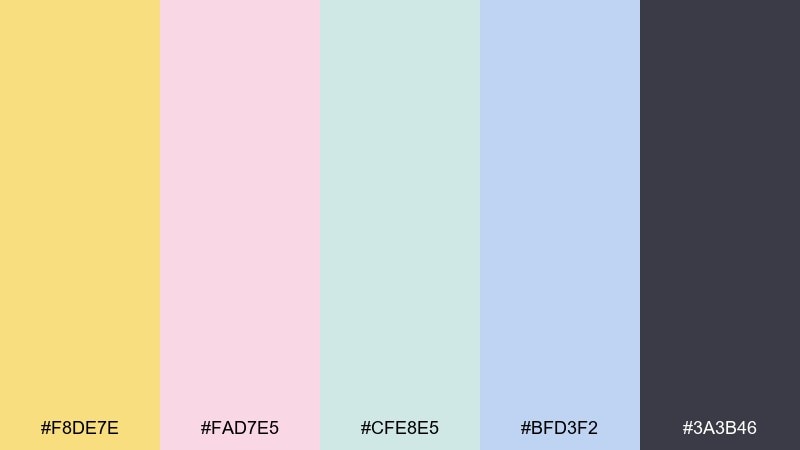
HEX: #F8DE7E #FAD7E5 #CFE8E5 #BFD3F2 #3A3B46
Mood: soft, optimistic, airy
Best for: beauty launches and lookbooks
Soft and optimistic, these pastels feel like a bright sunroom with fresh flowers and sheer curtains. They work well for beauty launches, lookbooks, and gentle lifestyle branding where you want lightness without losing structure. Pair the yellow with blush for warmth and use the deeper gray for headings and captions. Tip: limit the palette to two pastels per page to keep the layout calm.
Image example of sunroom pastels generated using media.io
7) Golden Hour Neutrals
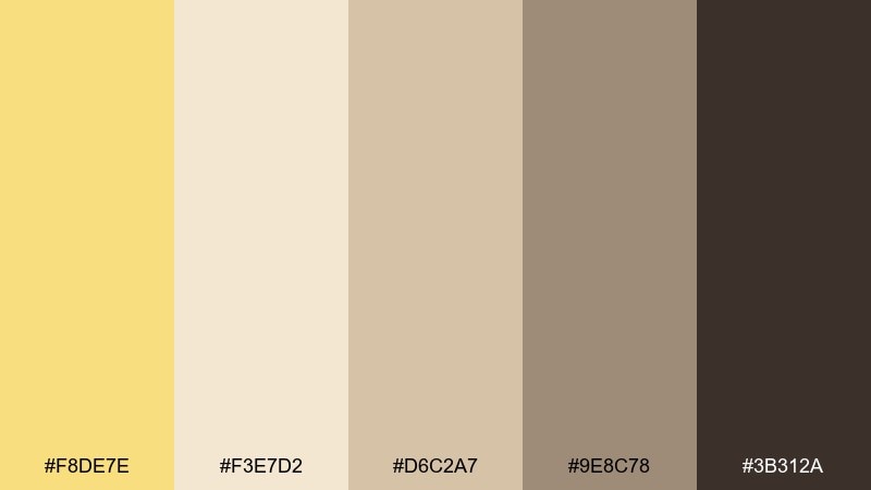
HEX: #F8DE7E #F3E7D2 #D6C2A7 #9E8C78 #3B312A
Mood: cozy, timeless, premium
Best for: interior mood boards and catalog pages
Cozy and timeless, these neutrals echo golden hour light on wood, wool, and stone. The range is perfect for interior mood boards, catalog pages, and premium service websites that rely on texture. Pair with serif headlines and warm photography to keep it elevated, not flat. Tip: use the mid taupe for UI dividers and cards so the yellow can act as a refined accent.
Image example of golden hour neutrals generated using media.io
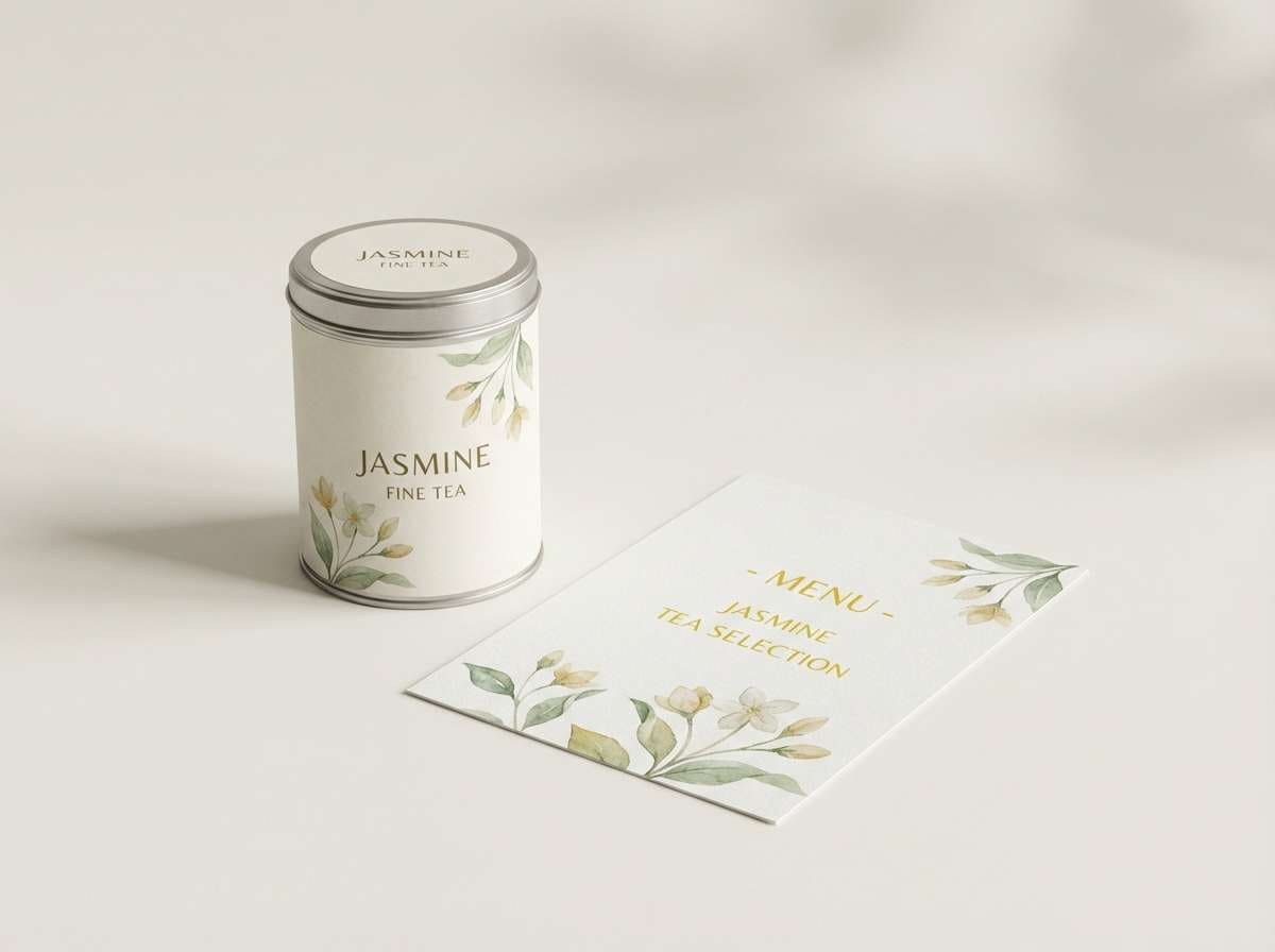
8) Jasmine Tea Ceremony
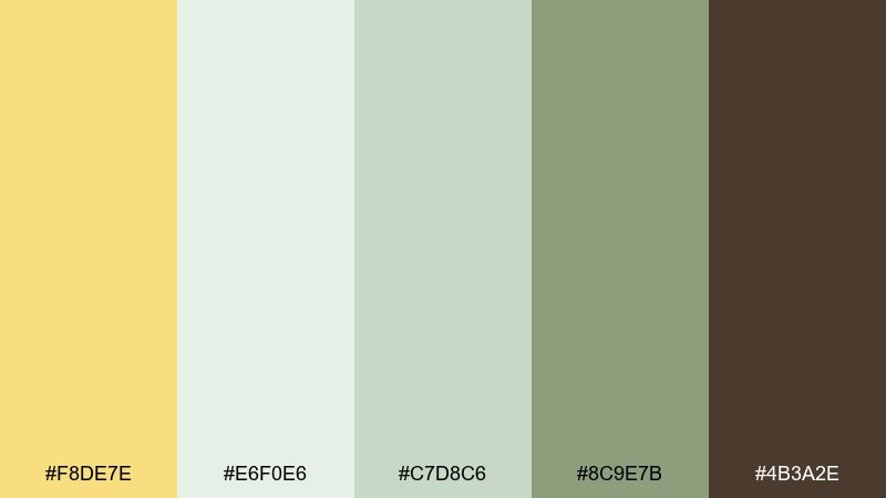
HEX: #F8DE7E #E6F0E6 #C7D8C6 #8C9E7B #4B3A2E
Mood: calm, ritual, botanical
Best for: tea packaging and cafe menus
Calm and ritual-like, the tones suggest steamed porcelain, green leaves, and a warm tea glow. This jasmine color palette is a natural match for tea packaging, café menus, and mindful product storytelling. Pair the pale minty white with lots of breathing room, then use the deeper herb green for structure. Tip: print the yellow as a small seal or band to avoid overpowering the delicate greens.
Image example of jasmine tea ceremony generated using media.io
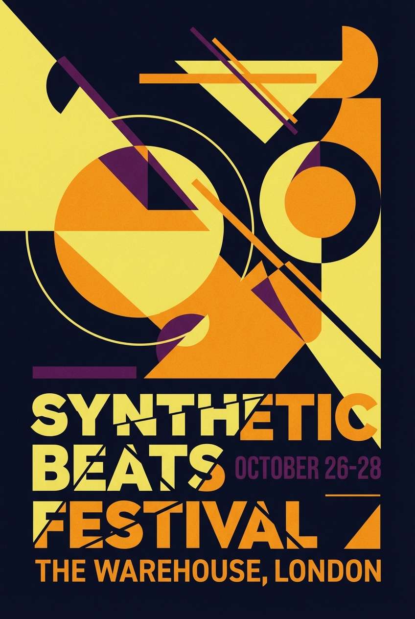
9) Marigold & Midnight
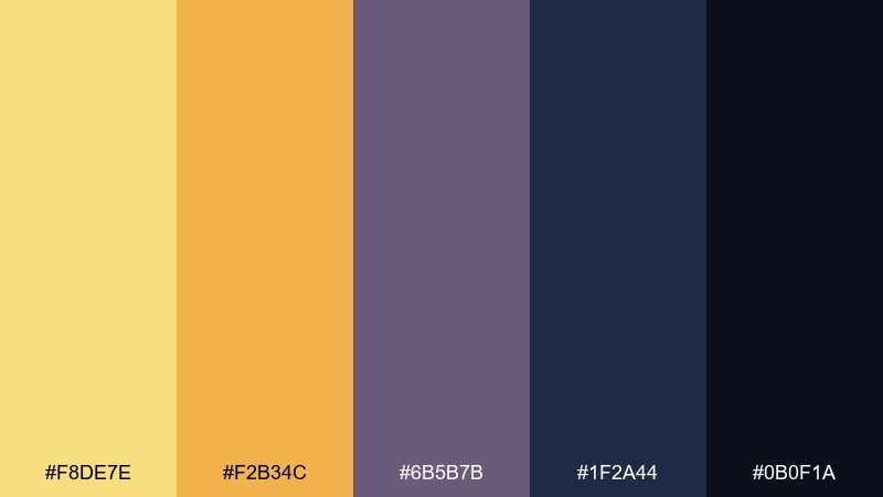
HEX: #F8DE7E #F2B34C #6B5B7B #1F2A44 #0B0F1A
Mood: bold, dramatic, modern
Best for: event posters and music flyers
Bold contrast like a marigold spotlight in a midnight room, balancing warmth with deep, inky blues. It is great for event posters, album art, and striking hero sections where you want energy and sophistication. Pair the yellow with the dark navy as the core duo, then use purple sparingly for depth. Tip: keep type in near-black or white and let the yellow serve as the primary attention cue.
Image example of marigold & midnight generated using media.io
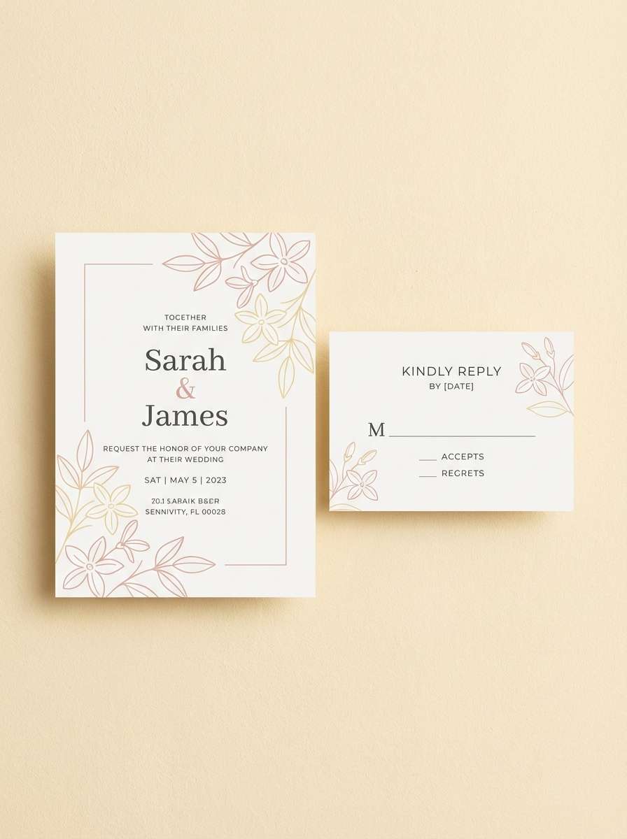
10) Candlelight Blush
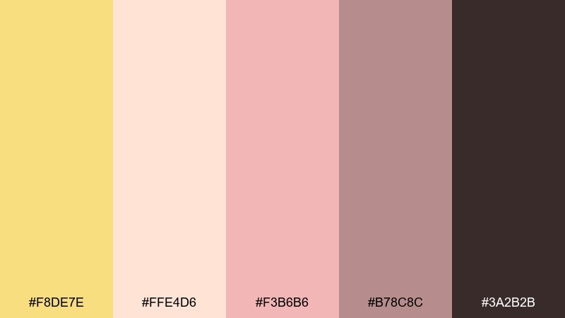
HEX: #F8DE7E #FFE4D6 #F3B6B6 #B78C8C #3A2B2B
Mood: romantic, soft, intimate
Best for: wedding invitations and RSVP sets
Romantic and intimate, these shades feel like candlelight on blush petals and satin ribbons. They suit wedding invitations, RSVP sets, and elegant event branding that leans warm and personal. Pair with delicate script accents and plenty of whitespace so the palette stays airy. Tip: use the deeper mauve for envelope liners or monograms to add richness without heavy contrast.
Image example of candlelight blush generated using media.io
11) Cream Soda Pop
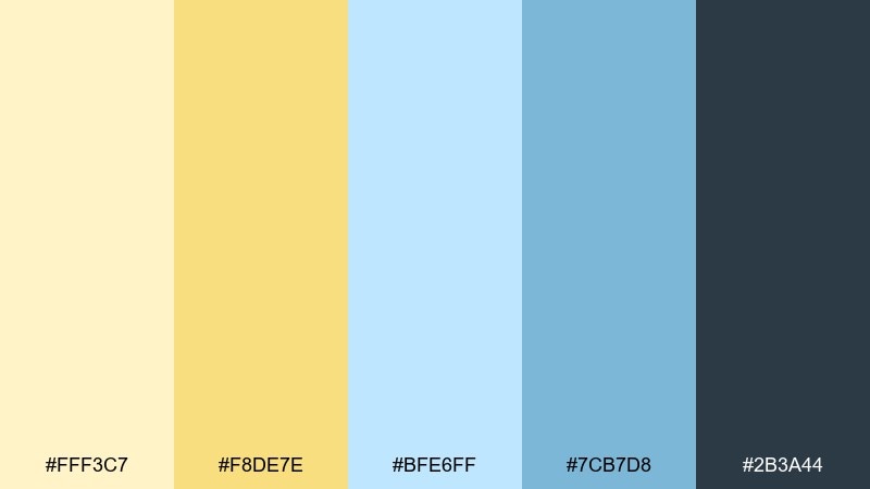
HEX: #FFF3C7 #F8DE7E #BFE6FF #7CB7D8 #2B3A44
Mood: fresh, retro, upbeat
Best for: summer campaigns and menu boards
Fresh and slightly retro, this combo feels like cream soda on a hot day with a cool splash of sky. It works well for summer campaigns, menu boards, and playful brand assets that still need readability. Pair the yellow with the pale blue for big blocks, and reserve the darker teal for headings and prices. Tip: keep outlines thin and use the cream as your main background to avoid visual noise.
Image example of cream soda pop generated using media.io
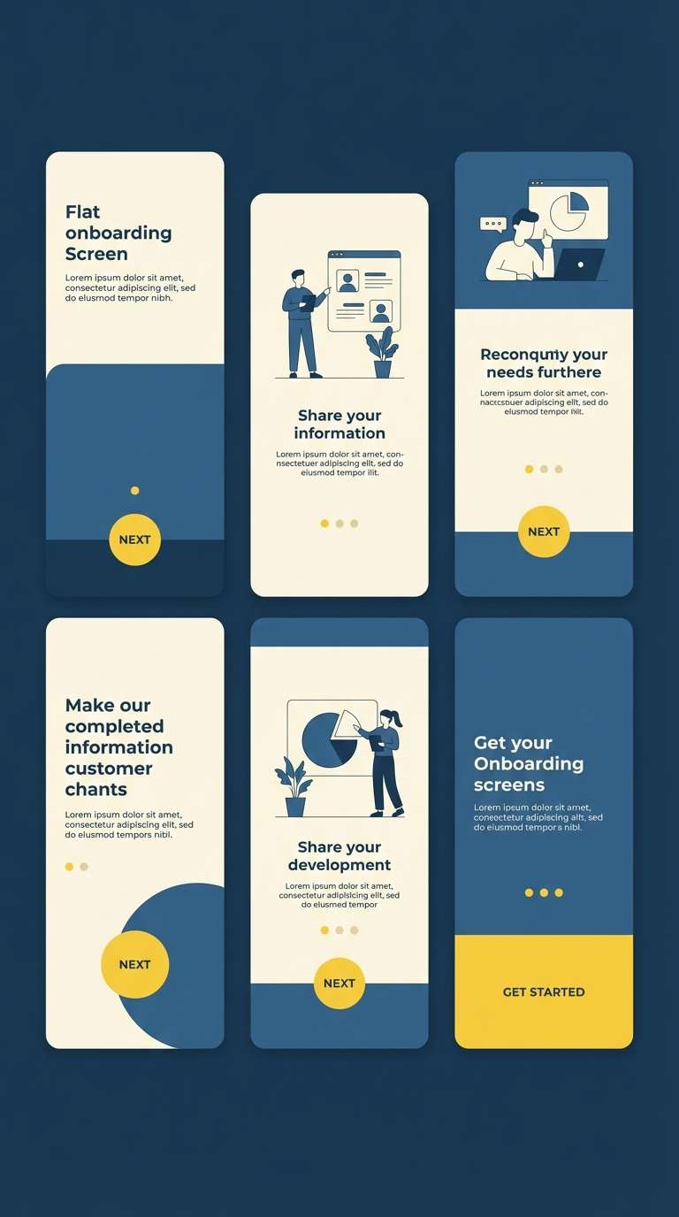
12) Daffodil Denim
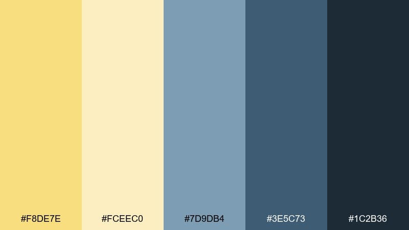
HEX: #F8DE7E #FCEEC0 #7D9DB4 #3E5C73 #1C2B36
Mood: casual, confident, contemporary
Best for: app onboarding and feature pages
Casual confidence comes through like a daffodil pin on a denim jacket, sunny but not precious. This set is strong for app onboarding screens, feature pages, and friendly UI where you want a warm welcome. Pair the pale cream with denim blues for structure, then use the yellow for progress states and micro-highlights. Tip: keep gradients off and rely on solid blocks for a cleaner, more modern feel.
Image example of daffodil denim generated using media.io
13) Lemon Meringue Marble
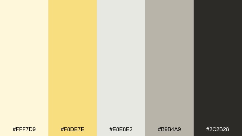
HEX: #FFF7D9 #F8DE7E #E8E8E2 #B9B4A9 #2C2B28
Mood: sleek, refined, quiet luxury
Best for: skincare packaging and product ads
Sleek and refined, these tones evoke marble counters, whipped meringue, and a soft golden gleam. They are ideal for skincare packaging, minimalist product ads, and premium ecommerce pages. Pair with thin sans-serif type and subtle embossing so the palette reads luxurious, not flat. Tip: let the light gray do most of the work and use the yellow only for a cap, label stripe, or small icon.
Image example of lemon meringue marble generated using media.io
14) Sunflower Graphite
HEX: #F8DE7E #FFD25E #9AA3A9 #4B545B #151A1E
Mood: sharp, urban, high-contrast
Best for: tech branding and pitch decks
Sharp and urban, the bright yellow cuts through graphite grays like signage in a city night. It is a smart choice for tech branding, pitch decks, and presentations that need focus and authority. Pair the yellows with charcoal blocks for headlines, then keep body text in mid-gray for easier reading. Tip: use the lighter yellow for highlights and the deeper gold for buttons or key metrics.
Image example of sunflower graphite generated using media.io
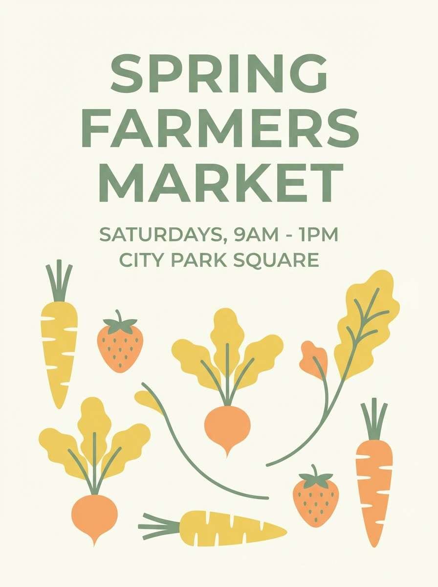
15) Apricot Garden
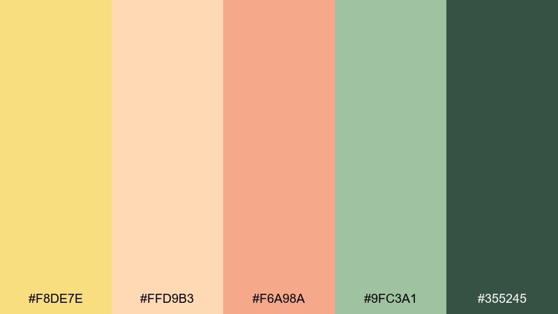
HEX: #F8DE7E #FFD9B3 #F6A98A #9FC3A1 #355245
Mood: friendly, fresh, garden-bright
Best for: farmers market flyers and spring promos
Friendly and garden-bright, these tones feel like apricots, soft petals, and fresh herbs in a market basket. They work well for farmers market flyers, spring promos, and small-business signage that wants warmth and approachability. Pair the greens with the deeper teal for legible type, and let the yellow and apricot carry the visual charm. Tip: use illustrated icons in a single dark shade to keep the palette cohesive.
Image example of apricot garden generated using media.io
16) Coastal Pollen
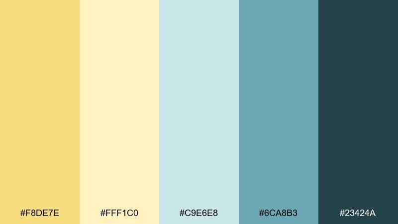
HEX: #F8DE7E #FFF1C0 #C9E6E8 #6CA8B3 #23424A
Mood: breezy, clean, coastal
Best for: travel branding and resort web pages
Breezy and clean, this palette feels like coastal air with a hint of pollen-yellow sunshine. It fits travel branding, resort web pages, and relaxed editorial layouts that need a crisp, modern look. Pair aqua tones with generous white space, then use the deeper teal for navigation and captions. Tip: keep the yellow as a small accent on buttons and links to maintain that airy coastal vibe.
Image example of coastal pollen generated using media.io

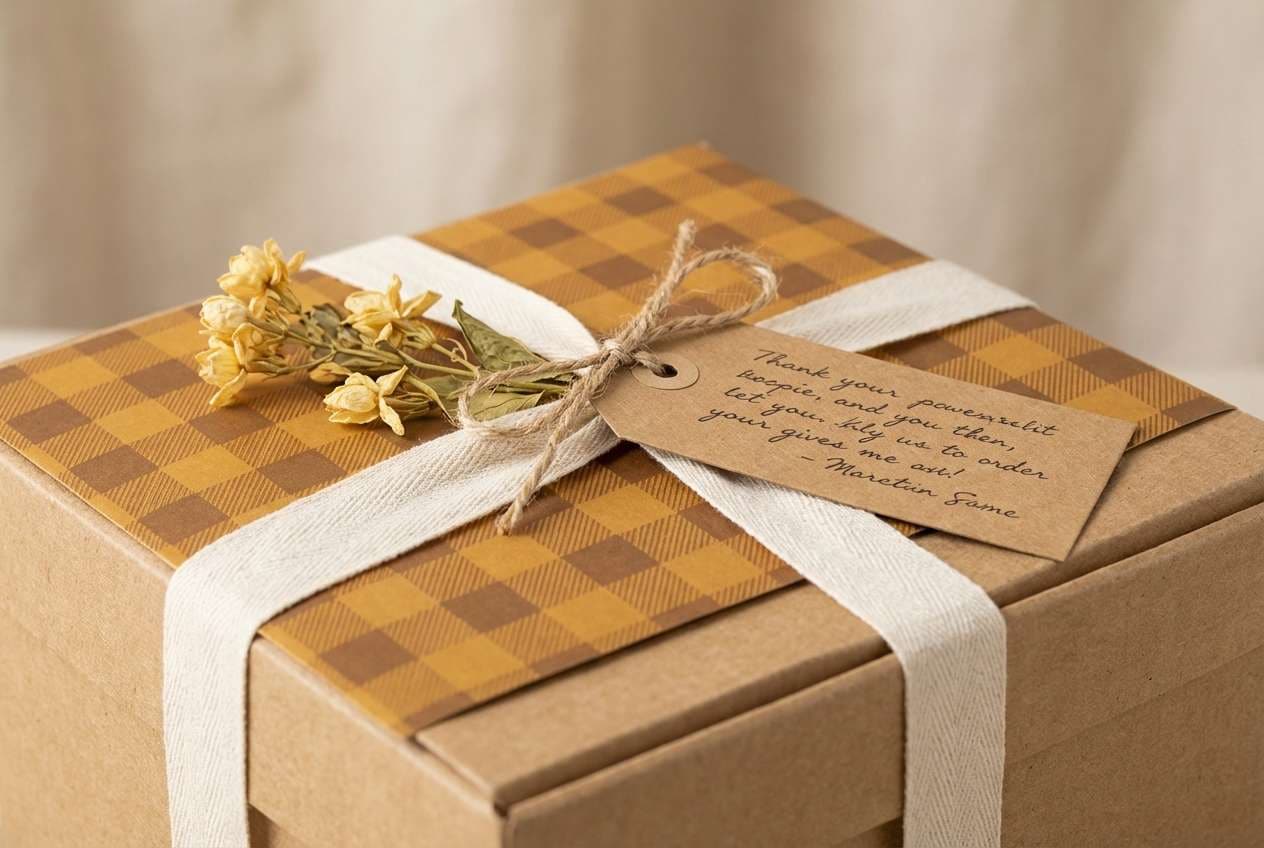
17) Autumn Mustard Check
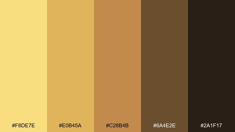
HEX: #F8DE7E #E0B45A #C28B4B #6A4E2E #2A1F17
Mood: heritage, cozy, earthy
Best for: boutique packaging and gift tags
Heritage and cozy, these mustards and browns suggest knit scarves, vintage checks, and warm spiced pastries. They are a strong fit for boutique packaging, seasonal gift tags, and handmade product photography backdrops. Pair with simple serif type and small pattern blocks to create a classic feel. Tip: keep the darkest brown for text and barcodes so the warm tones stay readable.
Image example of autumn mustard check generated using media.io
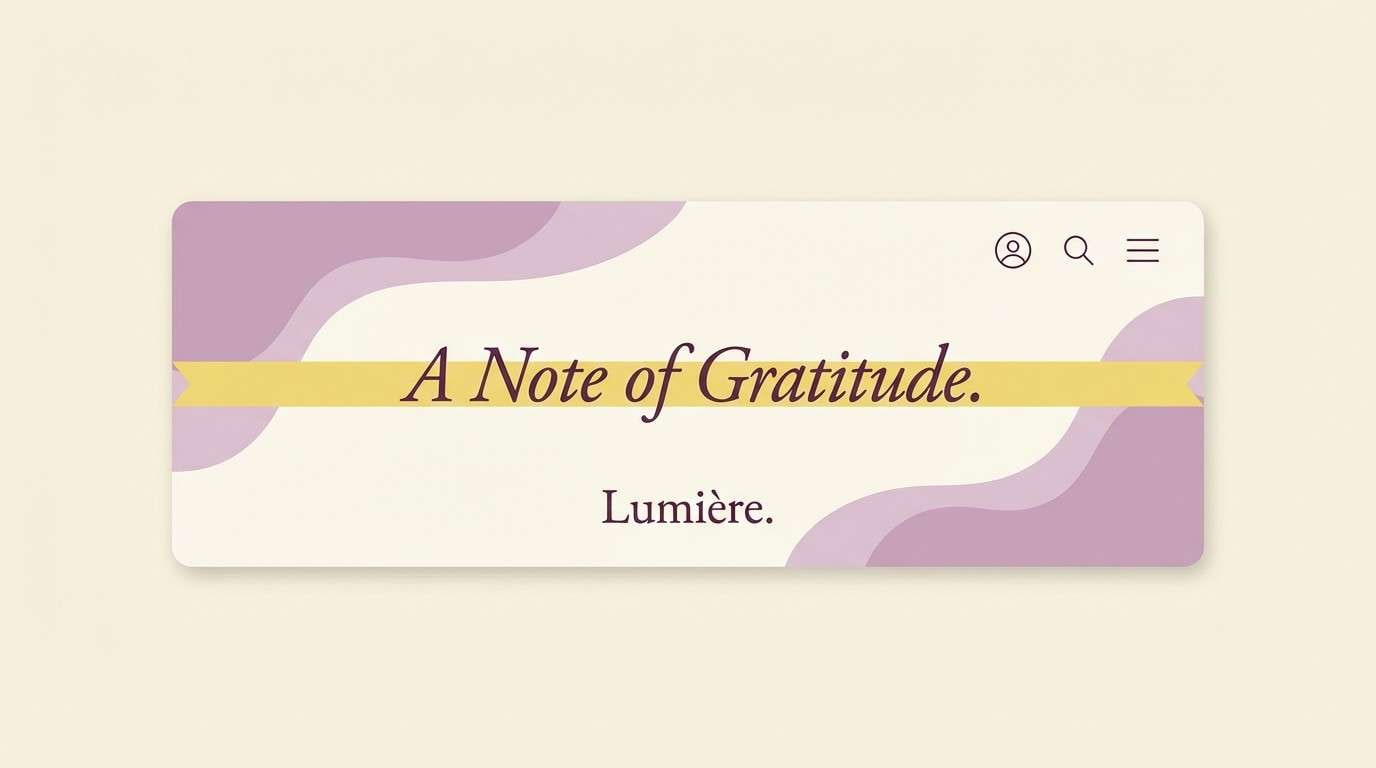
18) Vanilla Orchid
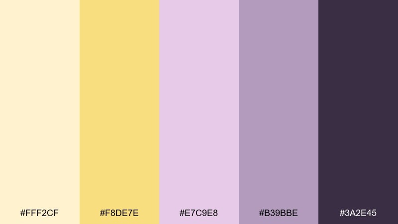
HEX: #FFF2CF #F8DE7E #E7C9E8 #B39BBE #3A2E45
Mood: dreamy, soft, elegant
Best for: boutique cosmetics and email headers
Dreamy and elegant, the vanilla yellow and orchid lilac feel like soft perfume notes and satin packaging. It works for boutique cosmetics, email headers, and gentle promotional banners where you want a feminine but modern mood. Pair with deep plum for headlines and keep the background creamy for an upscale finish. Tip: avoid heavy shadows and use thin borders to maintain the airy look.
Image example of vanilla orchid generated using media.io
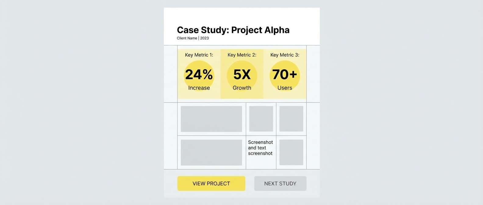
19) Studio Spotlight
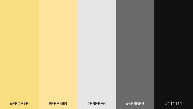
HEX: #F8DE7E #FFE39B #E6E6E6 #6B6B6B #111111
Mood: neutral, professional, crisp
Best for: portfolio sites and case studies
Neutral and professional, these tones feel like a bright studio spotlight against clean gray backdrops. They are excellent for portfolios, case studies, and product pages that need a calm frame around visuals. Pair the grays for structure and grids, then add the yellow as a subtle highlight for links and key stats. Tip: keep UI components monochrome and use the accent only once per section for clarity.
Image example of studio spotlight generated using media.io
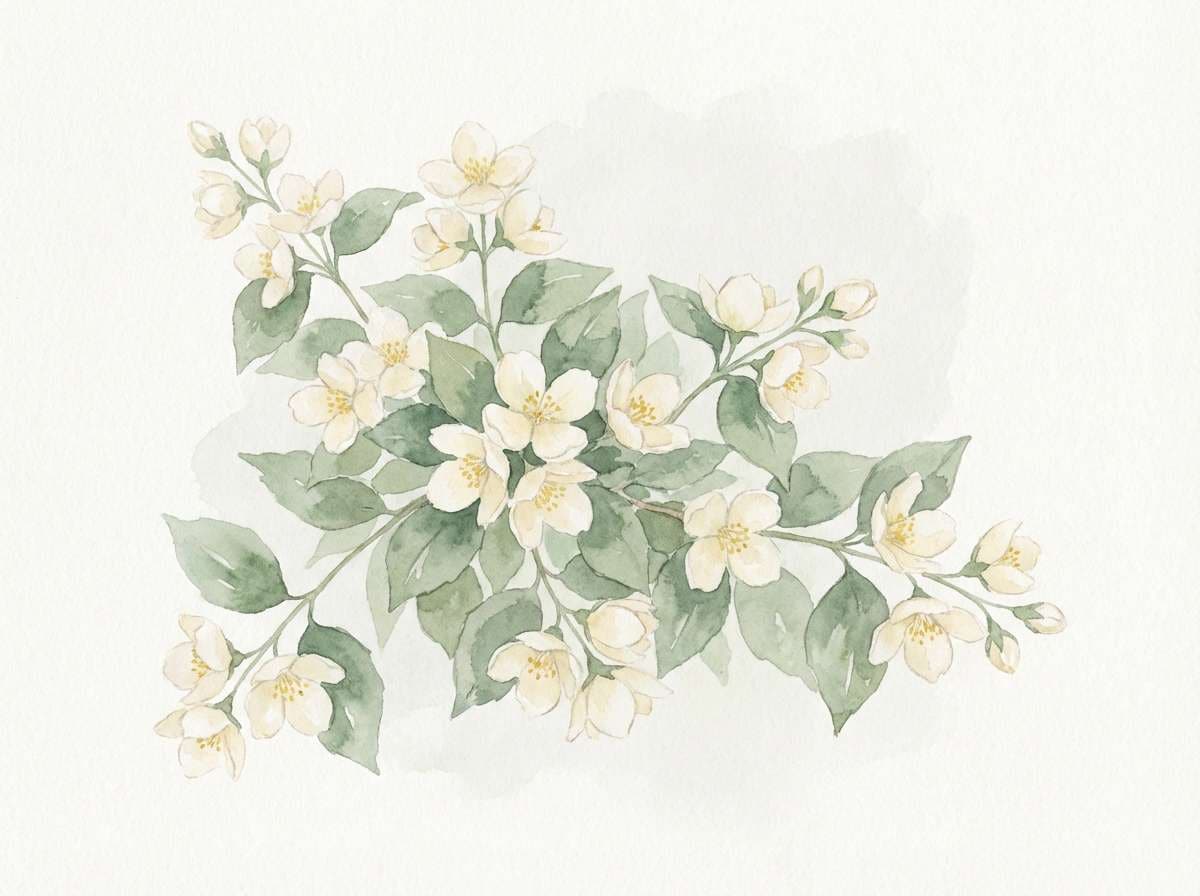
20) Blooming Botanical Wash
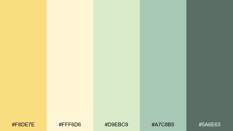
HEX: #F8DE7E #FFF6D6 #D9EBC9 #A7C8B5 #5A6E63
Mood: fresh, delicate, springlike
Best for: watercolor florals and blog illustrations
Fresh and springlike, this set reads like watercolor washes on handmade paper with a gentle sunlit glow. It is perfect for botanical illustrations, blog headers, and seasonal campaign art where softness matters. Pair the pale cream with light green gradients for depth, then add the yellow in flower centers or small highlights. Tip: use a single muted dark for outlines so the washes stay airy.
Image example of blooming botanical wash generated using media.io
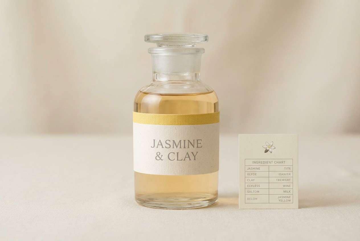
21) Modern Apothecary Label
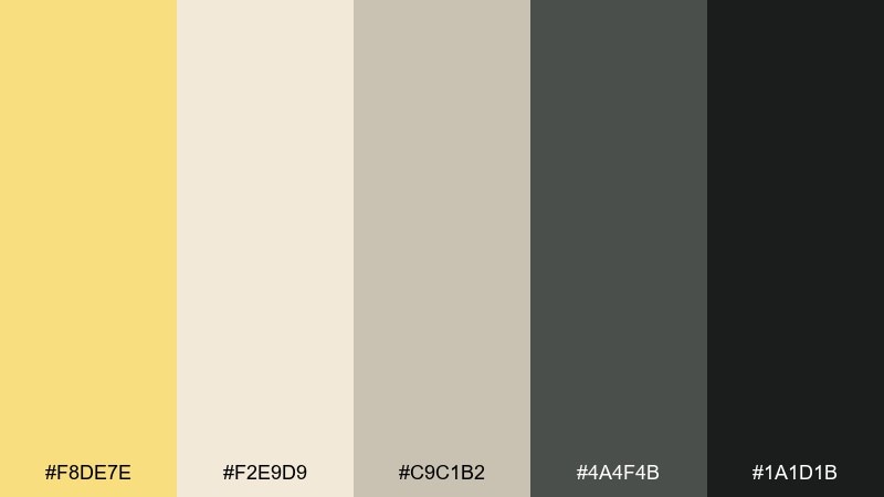
HEX: #F8DE7E #F2E9D9 #C9C1B2 #4A4F4B #1A1D1B
Mood: calm, clinical, heritage-modern
Best for: apothecary packaging and ingredient charts
Calm and heritage-modern, the muted neutrals feel clinical without going cold, while the yellow adds a gentle human touch. These jasmine color combinations work especially well for apothecary packaging, ingredient charts, and label systems with lots of small text. Pair with condensed typography and clear hierarchy, using the darkest shades for legibility. Tip: set the yellow as a thin band or small icon to guide scanning across long labels.
Image example of modern apothecary label generated using media.io
22) Festival Confetti Warmth
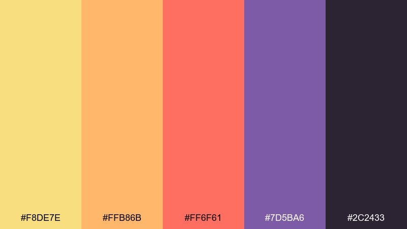
HEX: #F8DE7E #FFB86B #FF6F61 #7D5BA6 #2C2433
Mood: lively, bold, celebratory
Best for: festival posters and announcement graphics
Lively and celebratory, it feels like confetti in warm sunset light with a punchy purple twist. Use it for festival posters, announcement graphics, and bold campaign tiles where you want movement and joy. Pair the yellow with coral as the main duo, and keep purple as a secondary accent for depth. Tip: if text gets busy, switch to simple blocks of near-black behind key lines for readability.
Image example of festival confetti warmth generated using media.io

23) Quiet Workspace Glow
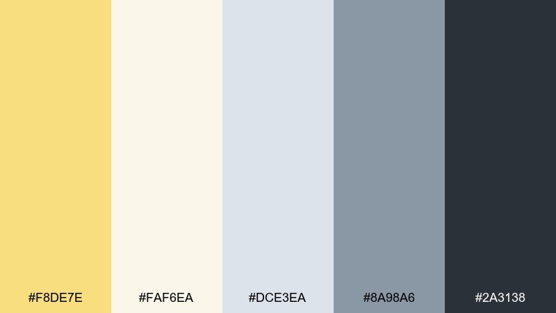
HEX: #F8DE7E #FAF6EA #DCE3EA #8A98A6 #2A3138
Mood: focused, calm, productive
Best for: productivity UI and web apps
Focused and calm, the tones suggest a quiet workspace lit by a warm desk lamp. This mix is a practical jasmine color combination for productivity UI, web apps, and knowledge tools that need gentle emphasis. Pair the cool grays for structure and use the yellow only for active states and important notifications. Tip: keep contrast high for text and reserve the softest tones for background panels.
Image example of quiet workspace glow generated using media.io
What Colors Go Well with Jasmine?
Jasmine pairs best with warm neutrals like cream, sand, taupe, and cocoa when you want a soft, premium feel. These combinations keep the yellow elegant and prevent it from looking overly saturated.
For fresher contrast, combine jasmine with botanical greens (sage, olive, eucalyptus) or coastal blues (aqua, denim, deep teal). These cool tones make the yellow feel cleaner and more modern.
If you need drama, anchor jasmine with deep ink shades like charcoal, navy, or near-black. The dark base increases readability and turns jasmine into a high-impact accent for buttons, badges, and hero highlights.
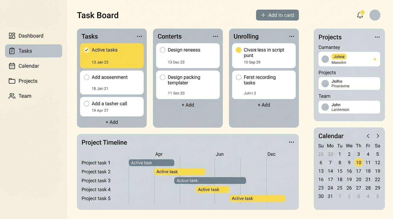
How to Use a Jasmine Color Palette in Real Designs
In branding, treat jasmine as an “attention color” rather than a full-background color: seals, highlights, icons, and packaging bands are often enough. Pair it with a strong dark text tone so your identity stays legible across print and digital.
In UI design, use jasmine for state-based meaning (active tab, selected filter, success highlight) and keep most surfaces neutral. This improves scanning and reduces visual fatigue on long sessions.
For print, test jasmine on the intended paper stock because warm yellows shift with coating and lighting. Keeping a nearby cream or light gray in the palette helps you control perceived brightness and maintain a consistent look.
Create Jasmine Palette Visuals with AI
If you already have HEX codes, the fastest way to validate a jasmine color scheme is to generate mock visuals: packaging, UI screens, posters, or mood boards. Seeing the palette applied helps you confirm contrast, hierarchy, and the overall “temperature” of the design.
With Media.io, you can turn a short prompt into on-brand images, then iterate quickly by adjusting style, layout, and lighting cues. It’s especially useful for exploring multiple jasmine color combinations before committing to a final direction.
Start with one of the prompts above, then swap the subject (label, dashboard, invite) to match your project.
Jasmine Color Palette FAQs
-
What HEX code is “jasmine” yellow?
A common jasmine tone is #F8DE7E, a soft warm yellow that works well as a highlight or gentle hero color. -
Is jasmine a good color for UI accents?
Yes. Jasmine is bright enough to signal active states and key metrics, but softer than neon yellow, so it’s easier to use consistently across dashboards and web apps. -
What text color works best on jasmine backgrounds?
Use deep espresso, charcoal, or near-black for readable body text. For small text, avoid light grays and increase contrast to meet accessibility guidelines. -
What colors pair well with a jasmine color scheme?
Jasmine pairs beautifully with warm creams and taupes for a premium neutral look, or with sage/olive greens and denim/aqua blues for fresher contrast. -
How do I keep jasmine from feeling too “sweet” or childish?
Anchor it with dark neutrals (charcoal, ink, navy), use plenty of whitespace, and limit jasmine to highlights (badges, borders, buttons) instead of large fills. -
Does jasmine print well on packaging and stationery?
Generally yes, but yellows can shift depending on paper stock and coating. Test on the final material and keep a supporting cream/gray to control brightness. -
Can I generate jasmine palette mockups with AI?
Yes. Use Media.io Text-to-Image to generate quick visuals (labels, posters, UI) from prompts, then iterate by adjusting style and composition while keeping your HEX direction consistent.
Next: Pharmacy Color Palette


