

Ice cream color palettes blend creamy neutrals, soft pastels, and fruity brights—making them a reliable shortcut to designs that feel friendly, fresh, and instantly “tasty.” They’re especially effective when you want warmth and approachability without heavy, dark visuals.
Below are ice cream color palette ideas with HEX codes you can use for branding, UI, packaging, posters, and more—plus AI-ready prompts to generate matching visuals fast.
In this article
- Why Ice Cream Palettes Work So Well
-
- vanilla swirl
- strawberry shortcake
- mint chip
- blueberry froyo
- mango sorbet
- raspberry ripple
- pistachio gelato
- chocolate fudge
- cotton candy cone
- lemon cream
- peach melba
- cherry sundae
- coconut milk
- salted caramel
- blackberry scoop
- rainbow sprinkles
- matcha soft serve
- bubblegum pop
- neapolitan classic
- seafoam sherbet
- What Colors Go Well with Ice Cream?
- How to Use a Ice Cream Color Palette in Real Designs
- Create Ice Cream Palette Visuals with AI
Why Ice Cream Palettes Work So Well
Ice cream-inspired color schemes are built around appetite-friendly cues: creamy bases, soft gradients, and fruit-like accents. That combination feels comforting and upbeat, which helps brands look approachable and memorable.
These palettes also tend to be naturally “UI-safe.” Pastels and creamy neutrals make excellent backgrounds, while deeper chocolate/berry tones give you readable contrast for text, icons, and CTAs.
Most importantly, ice cream colors communicate a story fast—vanilla, strawberry, mint, mango—so your visuals carry a mood before anyone reads a single word.
20+ Ice Cream Color Palette Ideas (with HEX Codes)
1) Vanilla Swirl
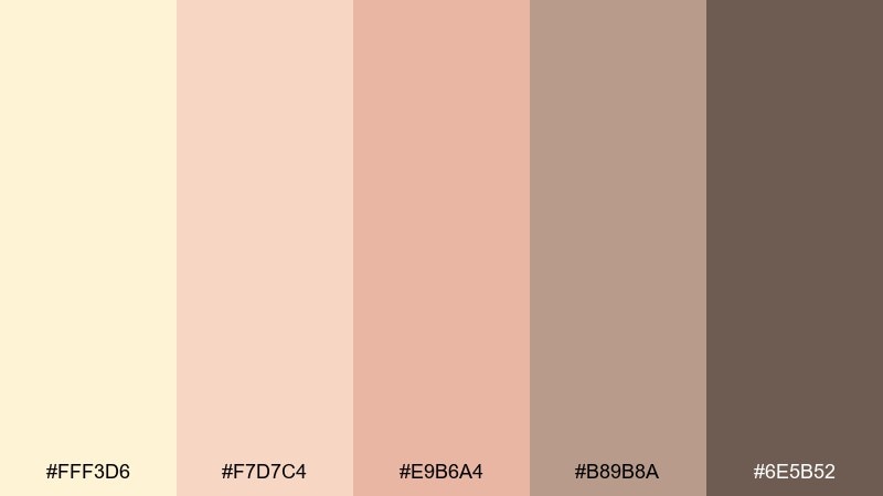
HEX: #FFF3D6 #F7D7C4 #E9B6A4 #B89B8A #6E5B52
Mood: creamy, cozy, nostalgic
Best for: bakery brand identity and menu design
Creamy warmth with a toasted-sugar glow, like soft serve melting on a waffle cone. It works beautifully for bakery logos, menu layouts, and packaging that needs a handmade feel. Pair it with warm neutrals, craft paper textures, and one deep cocoa accent for contrast. Usage tip: keep the darkest brown for type only to preserve the airy, dessert-like vibe of this ice cream color palette.
Image example of vanilla swirl generated using media.io
Media.io is an online AI studio for creating and editing video, image, and audio in your browser.

2) Strawberry Shortcake
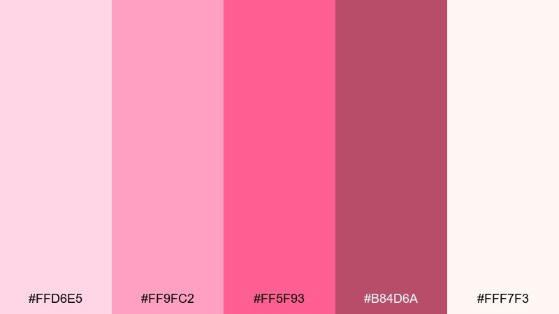
HEX: #FFD6E5 #FF9FC2 #FF5F93 #B84D6A #FFF7F3
Mood: sweet, playful, romantic
Best for: beauty social ads and product labels
Juicy pinks and whipped-cream lightness bring a flirty, candy-like energy. Use it for beauty promos, lip balm labels, or pastel-forward social creatives where you want instant charm. Pair the brighter pink with lots of off-white space and a muted berry shade for headlines. Usage tip: set body text in the darker berry tone to keep readability on pale backgrounds.
Image example of strawberry shortcake generated using media.io
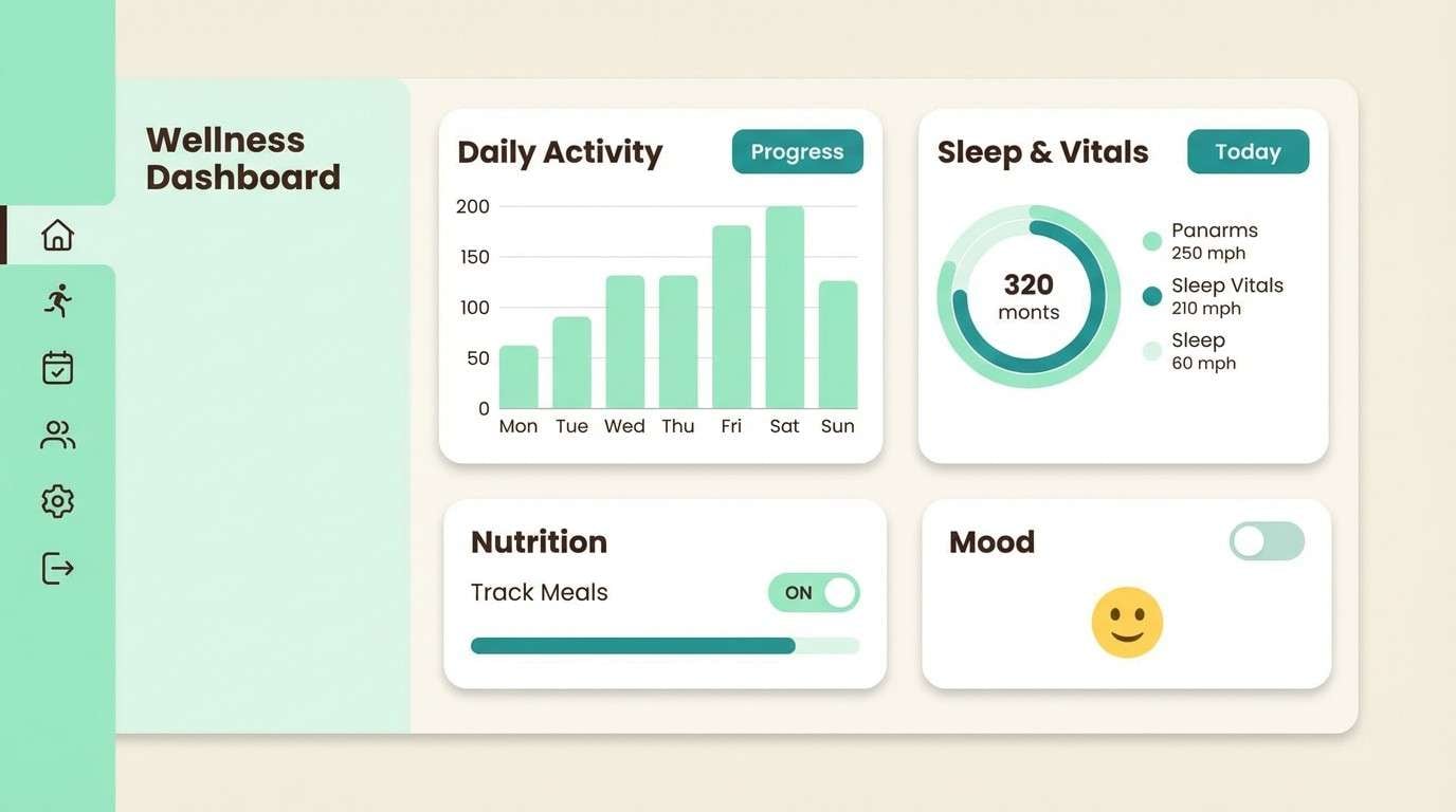
3) Mint Chip
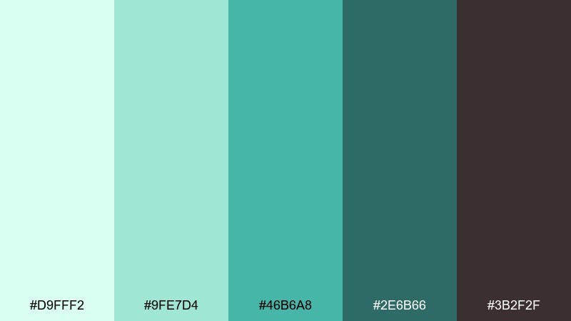
HEX: #D9FFF2 #9FE7D4 #46B6A8 #2E6B66 #3B2F2F
Mood: fresh, crisp, modern
Best for: wellness app UI and dashboards
Cool mint tones with a dark chocolate anchor feel clean and energizing. This mix suits wellness apps, habit trackers, and dashboards that need calm color with confident contrast. Pair it with lots of white and use the deep brown as a sparing accent for icons or key metrics. Usage tip: reserve the brightest mint for highlights so the interface stays balanced.
Image example of mint chip generated using media.io
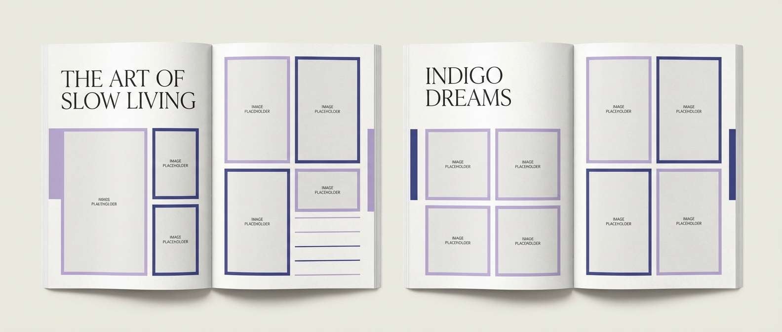
4) Blueberry Froyo
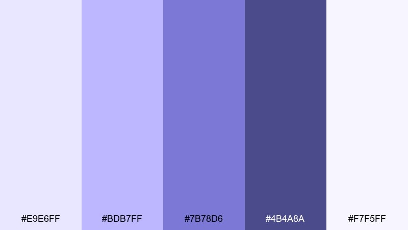
HEX: #E9E6FF #BDB7FF #7B78D6 #4B4A8A #F7F5FF
Mood: cool, dreamy, polished
Best for: editorial layouts and lookbooks
Soft lavender-blue tones feel like chilled yogurt and twilight skies. They shine in editorial grids, lookbooks, and brand stories where you want a refined, modern calm. Pair with crisp white margins and a deep indigo for captions and page numbers. Usage tip: keep imagery slightly desaturated so the purples stay the hero.
Image example of blueberry froyo generated using media.io
5) Mango Sorbet
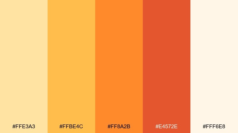
HEX: #FFE3A3 #FFBE4C #FF8A2B #E4572E #FFF6E8
Mood: sunny, bold, tropical
Best for: summer event posters and promos
Bright mango and tangerine tones feel like sunshine and fresh fruit. Use them on summer flyers, pop-up event posters, and limited-time promo graphics where you need high energy. Pair with creamy off-white and let the deeper orange handle typography for punch. Usage tip: add generous spacing so the warm hues do not overwhelm the layout.
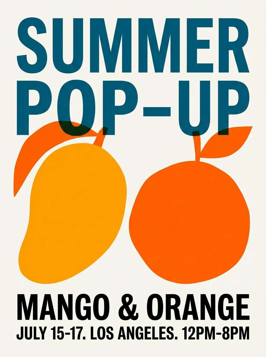
Image example of mango sorbet generated using media.io
6) Raspberry Ripple
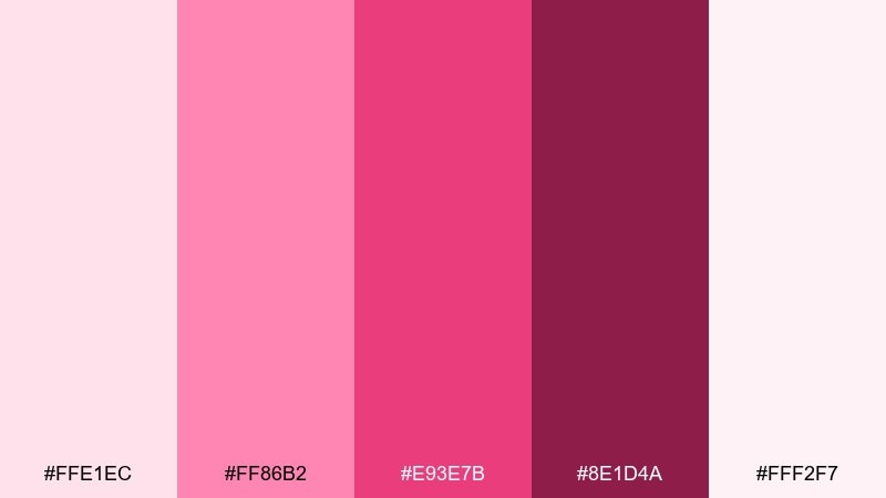
HEX: #FFE1EC #FF86B2 #E93E7B #8E1D4A #FFF2F7
Mood: vibrant, confident, juicy
Best for: fashion drops and campaign banners
Raspberry pinks with a deep wine base bring runway-level confidence. It is a strong fit for fashion drop banners, hero headers, and campaign graphics that need a bold focal color. Pair with pale blush backgrounds and keep the darkest tone for CTA buttons. Usage tip: use ripple-like curves or gradients to echo the palette story without adding clutter.
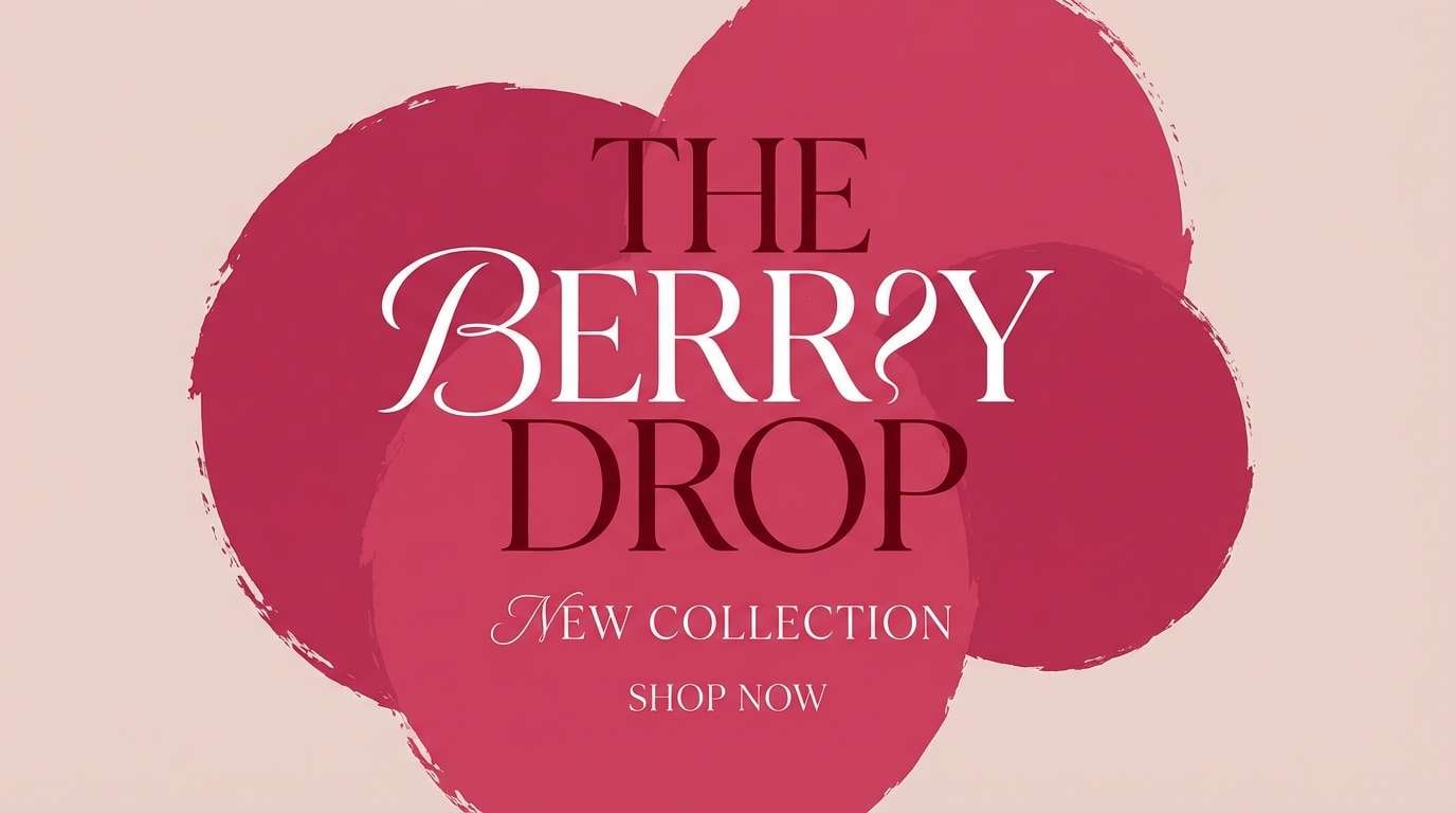
Image example of raspberry ripple generated using media.io
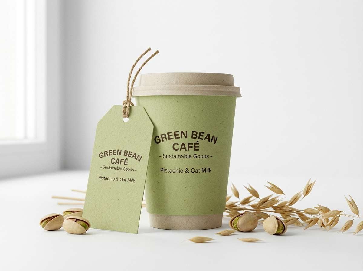
7) Pistachio Gelato
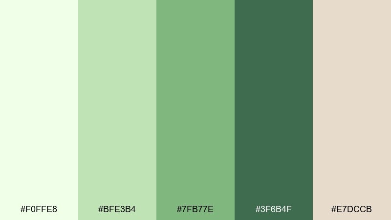
HEX: #F0FFE8 #BFE3B4 #7FB77E #3F6B4F #E7DCCB
Mood: natural, soothing, artisanal
Best for: eco packaging and café signage
Herbal greens and a creamy oat neutral feel like a small-batch gelato counter. This set works well on eco-minded packaging, café signage, and ingredient-forward labels. Pair it with kraft textures, minimal line icons, and a single dark green for hierarchy. Usage tip: keep the lightest green as the base so the palette stays fresh instead of muddy.
Image example of pistachio gelato generated using media.io
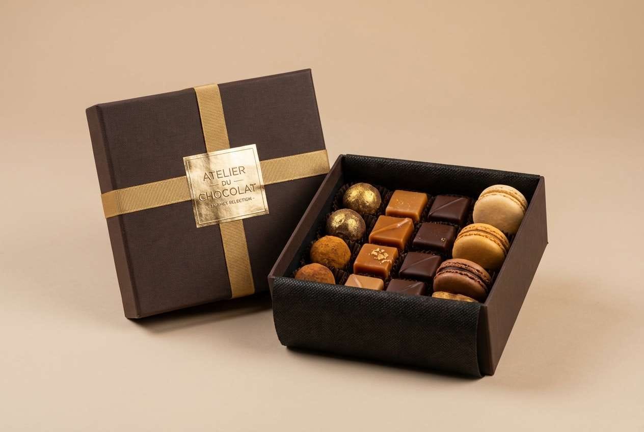
8) Chocolate Fudge
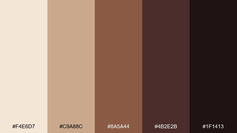
HEX: #F4E6D7 #C9A88C #8A5A44 #4B2E2B #1F1413
Mood: rich, premium, grounded
Best for: luxury dessert packaging and labels
Deep cocoa shades and caramel browns create a rich, premium mood. Use it for upscale dessert boxes, coffee labels, and moody product photography overlays. Pair with creamy highlights and minimal gold foil details for a luxe finish. Usage tip: increase line spacing in dark-on-dark layouts to keep text crisp.
Image example of chocolate fudge generated using media.io
9) Cotton Candy Cone
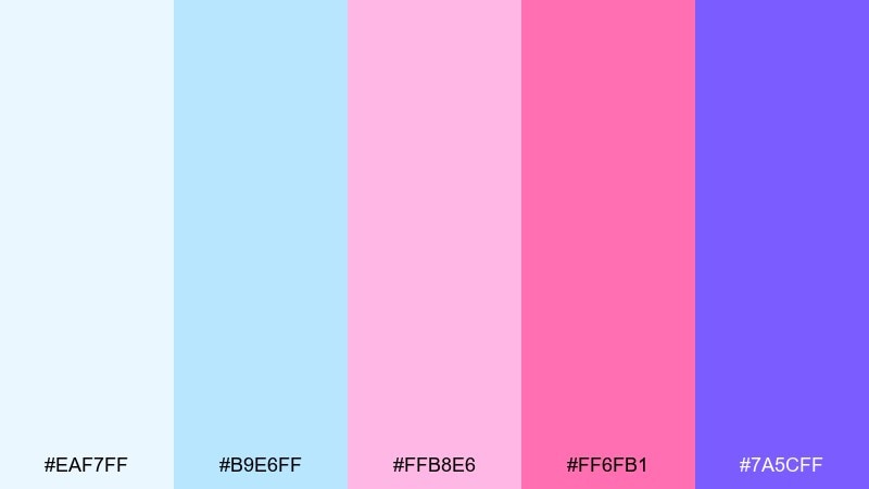
HEX: #EAF7FF #B9E6FF #FFB8E6 #FF6FB1 #7A5CFF
Mood: whimsical, youthful, upbeat
Best for: kids party invitations and stickers
Airy sky blues and bubbly pinks feel like spun sugar and carnival lights. These ice cream color combinations are perfect for kids invitations, sticker sheets, and playful merch where you want instant fun. Pair the bright pink with plenty of pale blue to keep it light, then use the violet as a small accent for names or dates. Usage tip: choose rounded typefaces so the colors read friendly, not loud.
Image example of cotton candy cone generated using media.io

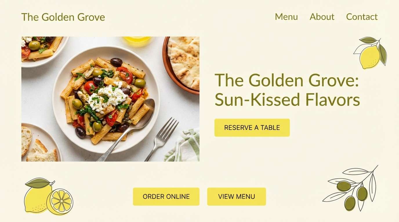
10) Lemon Cream
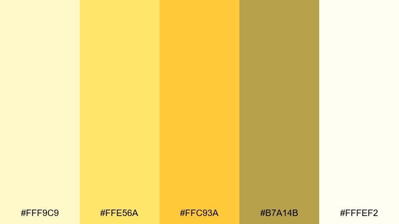
HEX: #FFF9C9 #FFE56A #FFC93A #B7A14B #FFFEF2
Mood: bright, clean, optimistic
Best for: restaurant websites and CTA design
Zesty yellows with a creamy base give a clean, uplifting pop. It is great for restaurant sites, landing pages, and CTA buttons that need to feel sunny without turning neon. Pair with lots of white space and a muted olive for nav and small text. Usage tip: keep the strongest yellow on buttons only so the page stays readable.
Image example of lemon cream generated using media.io
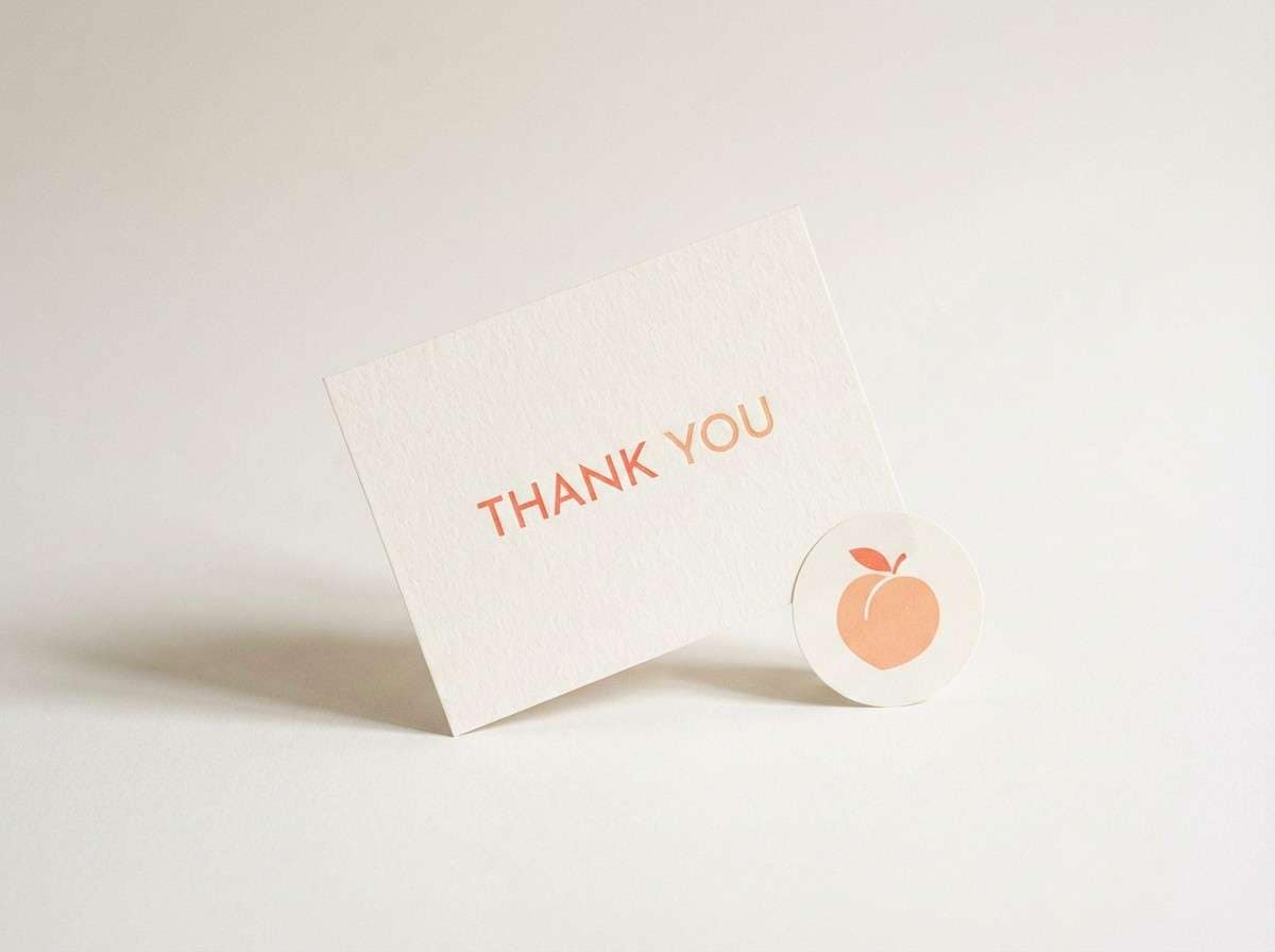
11) Peach Melba
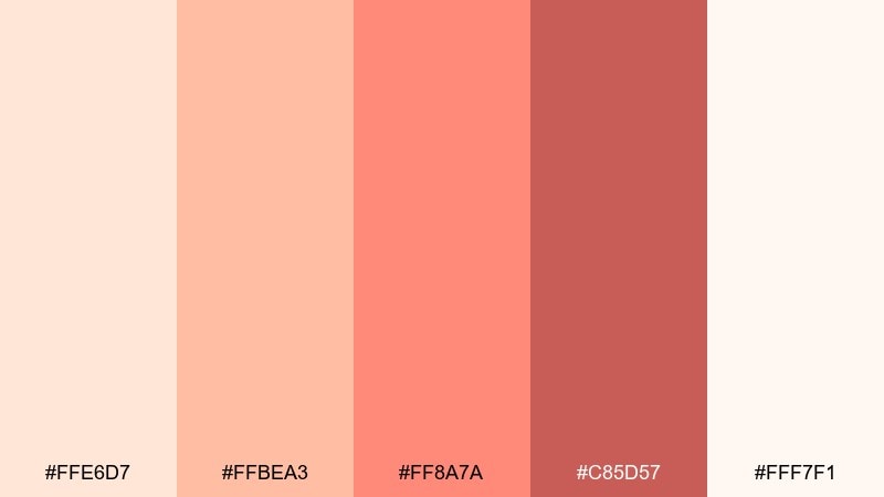
HEX: #FFE6D7 #FFBEA3 #FF8A7A #C85D57 #FFF7F1
Mood: soft, friendly, welcoming
Best for: boutique branding and thank you cards
Peach and coral tones feel warm, approachable, and lightly romantic. They work well for boutique branding, thank you inserts, and small business stationery that aims to feel personal. Pair with off-white paper texture and a muted rose for headings. Usage tip: use the deeper coral for stamps or seals to add contrast without harshness.
Image example of peach melba generated using media.io
12) Cherry Sundae
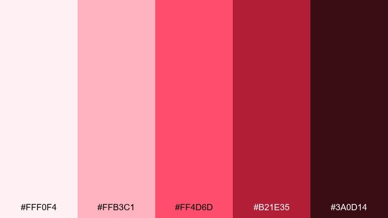
HEX: #FFF0F4 #FFB3C1 #FF4D6D #B21E35 #3A0D14
Mood: bold, punchy, dramatic
Best for: music promo graphics and merch
Cherry reds with a near-black base feel like a neon sign in a late-night diner. Use it for music promos, merch drops, and bold thumbnails where you want immediate impact. Pair with pale pink highlights to keep the reds from feeling too heavy. Usage tip: keep gradients subtle so the dark tones do not crush detail.
Image example of cherry sundae generated using media.io
13) Coconut Milk
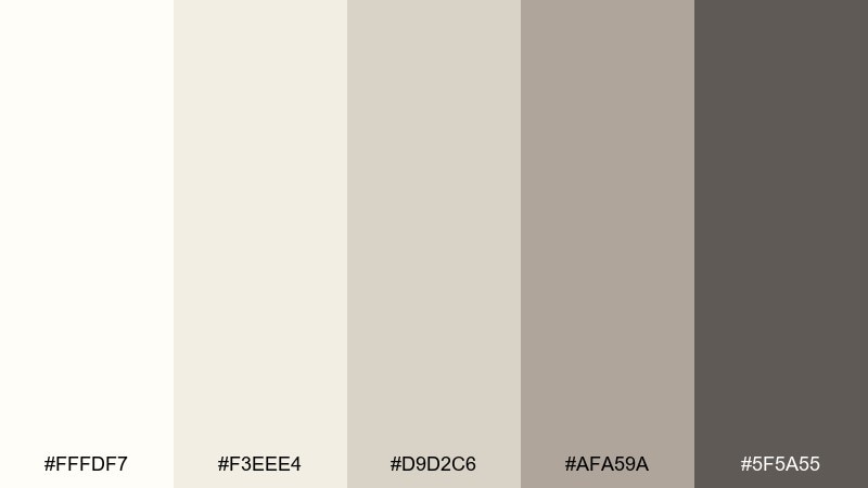
HEX: #FFFDF7 #F3EEE4 #D9D2C6 #AFA59A #5F5A55
Mood: minimal, calm, airy
Best for: clean UI kits and editorial neutrals
Soft coconut neutrals feel airy and uncluttered, like linen and fresh whipped cream. Ideal for UI kits, editorial templates, and product pages where content should lead. Pair with one muted accent color outside the neutrals if you need brand personality. Usage tip: use the mid-gray for dividers instead of pure black to keep the look gentle.
Image example of coconut milk generated using media.io
14) Salted Caramel
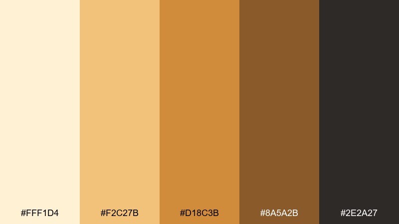
HEX: #FFF1D4 #F2C27B #D18C3B #8A5A2B #2E2A27
Mood: warm, inviting, refined
Best for: coffee shop branding and packaging
Toasty caramel and espresso tones bring instant warmth and appetite appeal. Great for coffee shop branding, bean labels, and loyalty cards that need a cozy premium look. Pair the light cream with the darker roast shade for strong hierarchy and easy readability. Usage tip: keep caramel as the dominant fill color and use the darkest tone for small text only.
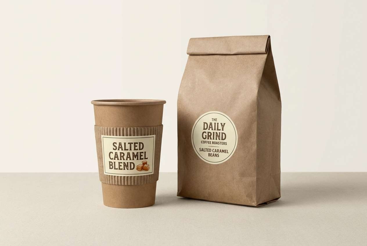
Image example of salted caramel generated using media.io
15) Blackberry Scoop
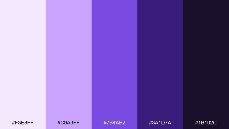
HEX: #F3E8FF #C9A3FF #7B4AE2 #3A1D7A #1B102C
Mood: moody, luxe, artistic
Best for: night-themed brand campaigns and banners
Velvety purples with a deep night base feel like berry compote over chilled cream. Use it for night-themed campaigns, dramatic web banners, or artsy brand moments that need depth. Pair with pale lilac highlights and minimal line art to keep it sophisticated. Usage tip: avoid pure black and use the darkest purple instead for a softer finish.
Image example of blackberry scoop generated using media.io
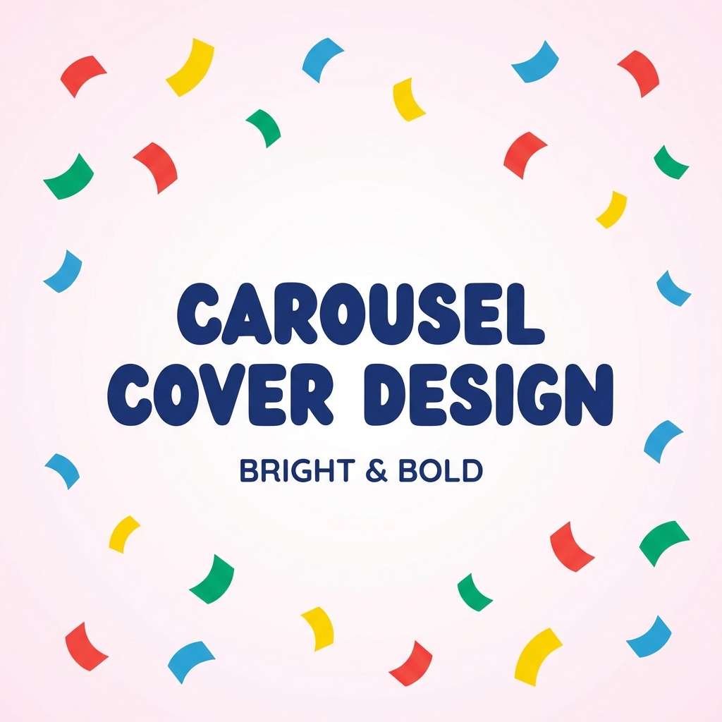
16) Rainbow Sprinkles
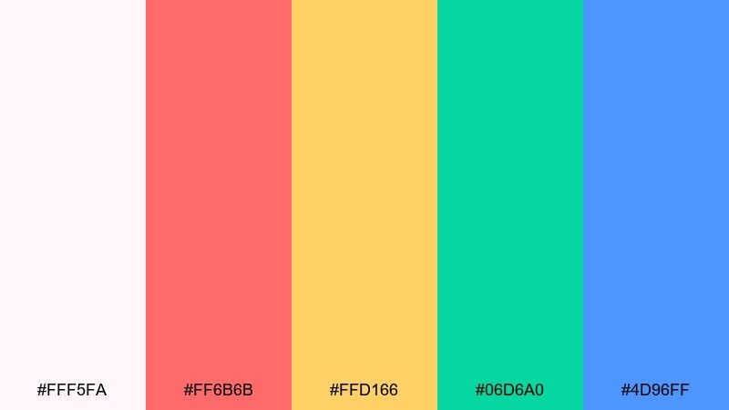
HEX: #FFF5FA #FF6B6B #FFD166 #06D6A0 #4D96FF
Mood: fun, energetic, celebratory
Best for: playful brand graphics and carousel posts
Sprinkle brights on a soft base feel like a party in a cone. Use it for playful brand graphics, carousel posts, and promo stickers where variety is the point. Pair one bright as the hero and keep the others as small accents so it stays readable. Usage tip: limit backgrounds to the pale base and let the colors live in shapes and icons.
Image example of rainbow sprinkles generated using media.io
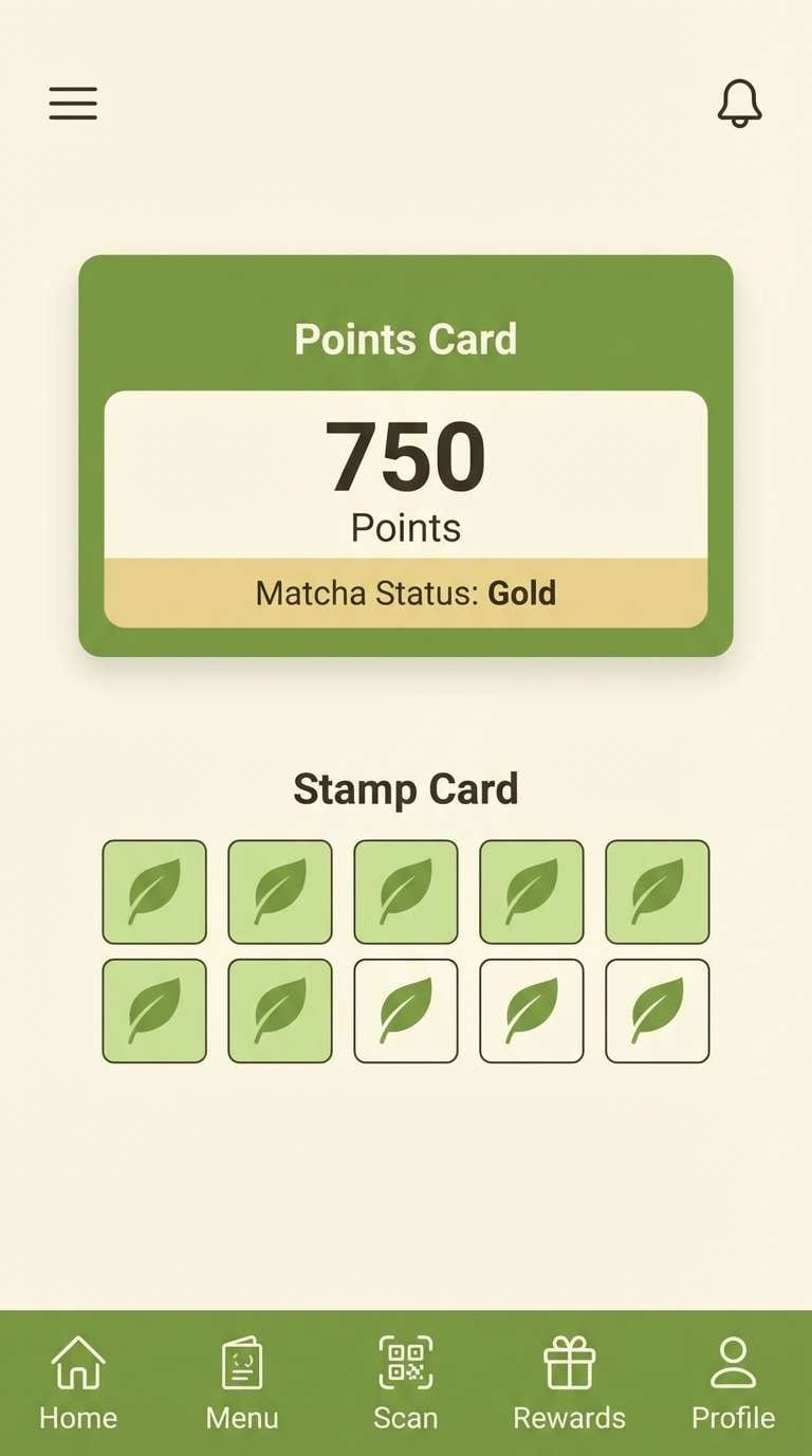
17) Matcha Soft Serve
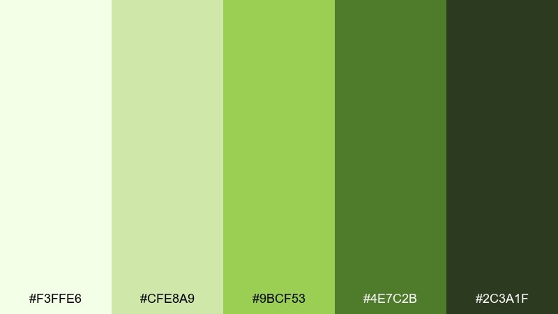
HEX: #F3FFE6 #CFE8A9 #9BCF53 #4E7C2B #2C3A1F
Mood: fresh, earthy, balanced
Best for: modern café menus and loyalty apps
Matcha greens with deep leafy shadows feel grounded yet modern, like a minimalist tea bar. Use it for café menus, loyalty app screens, and packaging where you want calm energy and clear hierarchy. This ice cream color scheme pairs nicely with cream paper, thin line icons, and warm wood photography. Usage tip: use the mid-green for buttons and save the darkest tone for headings only.
Image example of matcha soft serve generated using media.io
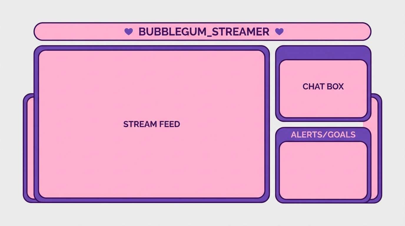
18) Bubblegum Pop
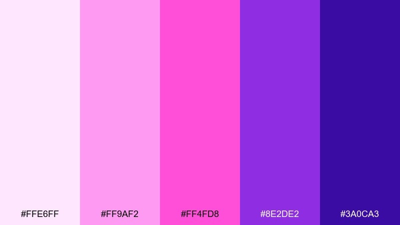
HEX: #FFE6FF #FF9AF2 #FF4FD8 #8E2DE2 #3A0CA3
Mood: bold, pop, futuristic
Best for: creator branding and stream overlays
Electric bubblegum pinks with vivid violet edges feel loud in the best way. Perfect for creator branding, stream overlays, and splash screens that need a modern pop signature. Pair with lots of white or very dark purple to keep the neon energy controlled. Usage tip: use flat color blocks instead of gradients for a sharper, more graphic look.
Image example of bubblegum pop generated using media.io
19) Neapolitan Classic
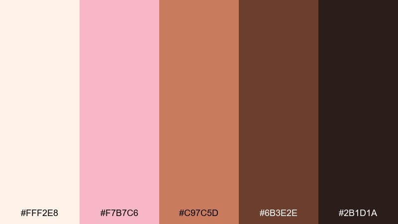
HEX: #FFF2E8 #F7B7C6 #C97C5D #6B3E2E #2B1D1A
Mood: classic, comforting, timeless
Best for: dessert shop logos and storefront signs
Cream, strawberry, and chocolate tones feel timeless, like a nostalgic scoop trio. These ice cream color combinations are a safe win for dessert shop logos, storefront signage, and loyalty cards that need instant recognition. Pair with simple badge shapes and a bold serif to lean into the classic vibe. Usage tip: keep the cream as the main background so the darker browns do not dominate.
Image example of neapolitan classic generated using media.io
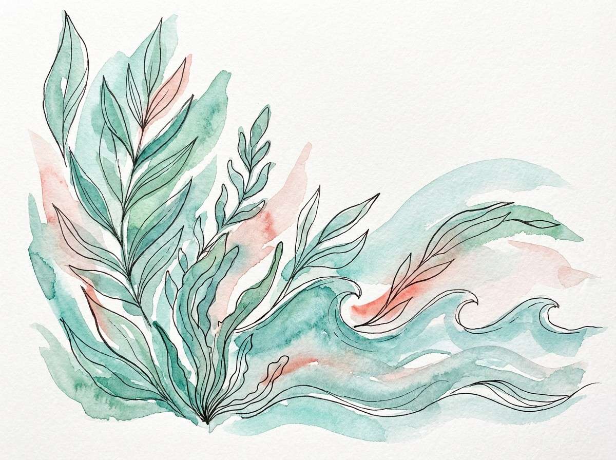
20) Seafoam Sherbet
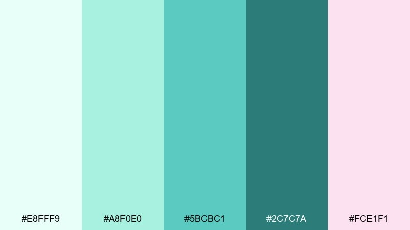
HEX: #E8FFF9 #A8F0E0 #5BCBC1 #2C7C7A #FCE1F1
Mood: breezy, refreshing, coastal
Best for: spring illustrations and pastel packaging
Seafoam greens with a blush accent feel like a coastal breeze and a spoonful of sherbet. It fits spring illustrations, pastel packaging, and lighthearted brand refreshes. Pair with watercolor textures and thin outlines to keep the look airy. Usage tip: use blush as a small accent for labels or seals to avoid tipping the palette too sweet.
Image example of seafoam sherbet generated using media.io
What Colors Go Well with Ice Cream?
Creamy neutrals (warm whites, oat, beige, soft gray) are the easiest companions for ice cream palettes because they mimic real dessert bases and give your layout breathing room.
For contrast, pair pastels with a “flavor anchor” like cocoa brown, deep berry, or indigo—these darker shades make headlines, icons, and buttons readable without breaking the soft vibe.
If you want extra energy, add one fruit-bright accent (mango orange, cherry red, or sprinkle blue) and keep everything else calm so the design still feels clean.
How to Use a Ice Cream Color Palette in Real Designs
Start with a creamy base color for backgrounds, then assign one mid-tone as your primary UI/brand color (cards, sections, labels). Use the darkest shade for typography and key UI states to keep accessibility strong.
In packaging and posters, treat the brightest color like a topping: use it for badges, prices, or short CTAs—while keeping large areas in lighter tones to avoid visual overload.
To make the theme feel intentional (not childish), use minimal typography, generous spacing, and just one or two playful shapes (swirls, scoops, sprinkle dots) as supporting graphics.
Create Ice Cream Palette Visuals with AI
Want on-brand images that match your ice cream color scheme? Generate consistent visuals by describing the design use case (menu, label, app UI, banner) plus the mood (creamy, tropical, luxe) and composition (minimal, studio shot, vector).
With Media.io, you can turn those prompts into high-quality images quickly—then iterate styles for social posts, product mockups, landing pages, or seasonal campaigns.
Pick a palette above, reuse its prompt as a starting point, and swap the subject (e.g., “cosmetic label” → “sticker sheet” or “website hero”) to produce a full set.
Ice Cream Color Palette FAQs
-
What is an ice cream color palette?
An ice cream color palette is a set of soft pastels, creamy neutrals, and fruit-inspired brights that mimic classic flavors (vanilla, strawberry, mint, mango) and create a friendly, appetizing look. -
Are ice cream palettes only for dessert brands?
No. Ice cream color schemes also work well for beauty labels, wellness apps, kids products, spring campaigns, and any design that benefits from warmth, softness, and playful clarity. -
How do I keep pastel “ice cream” designs readable?
Use creamy light shades for backgrounds, but set text in a dark anchor color (cocoa brown, deep berry, indigo). Reserve the brightest pastel for highlights and small UI elements. -
What’s the best background color for an ice cream theme?
Off-white and cream tones (like coconut milk or vanilla) are the safest backgrounds because they reduce glare, feel premium, and let accent colors stand out. -
Which ice cream palette works best for modern UI?
Mint Chip and Lemon Cream are strong UI options because they offer clean primary tones plus dark accents for contrast, making dashboards and CTAs easier to structure. -
How can I use ice cream colors in packaging design?
Pick one “flavor hero” color for the main label area, keep the container/base neutral, and use the darkest tone for ingredients and legal text. Add small accents (like blush or violet) for seals and badges. -
Can I generate matching visuals for these palettes with AI?
Yes. Use Media.io’s text-to-image tool with prompts that describe the product (menu, label, UI, poster), lighting/style (studio, vector, watercolor), and mood. Then iterate while keeping the same palette feel.
Next: Light Cyan Color Palette


