Hygge color palettes make spaces (and screens) feel lived-in, warm, and calm. Think soft creams, toasted browns, candlelit ambers, and muted greens that are easy on the eyes.
Below are modern hygge tones you can use for branding, interiors, UI, and content templates—each with HEX codes and an AI prompt to generate matching visuals.
In this article
- Why Hygge Palettes Work So Well
-
- candlelit oatmeal
- wool blanket browns
- nordic pine and cream
- chestnut latte
- fireside clay
- winter birch neutrals
- cinnamon cocoa
- amber hearth
- soft sage linen
- dusk rose tea
- terracotta knit
- honeyed walnut
- pebble and smoke
- toasted almond
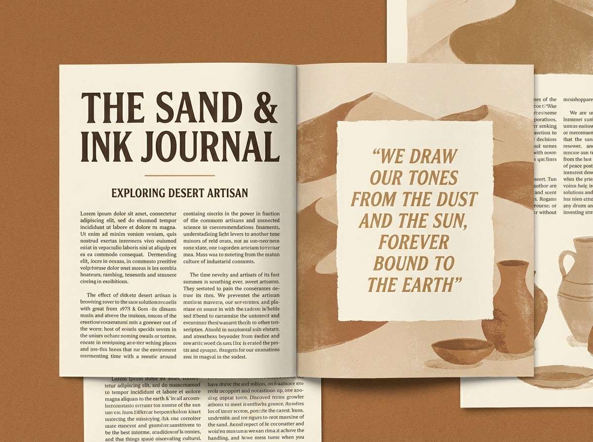
- cozy ink and sand
- mulled berry
- warm stone cottage
- copper lantern
- sourdough crust
- oat milk minimal
- fawn and flannel
- quiet cocoa night
- What Colors Go Well with Hygge?
- How to Use a Hygge Color Palette in Real Designs
- Create Hygge Palette Visuals with AI
Why Hygge Palettes Work So Well
Hygge colors lean warm, muted, and natural—so they feel comfortable instead of attention-grabbing. That softness reduces visual stress and makes content easier to linger on.
Most hygge color schemes are built on creamy neutrals plus a few grounded darks (espresso, charcoal, pine). This creates dependable contrast for readability while keeping the overall mood calm.
Because the tones are inspired by real materials—linen, wood, clay, wool—they translate well across print, packaging, and digital UI without looking overly trendy.
20+ Hygge Color Palette Ideas (with HEX Codes)
1) Candlelit Oatmeal
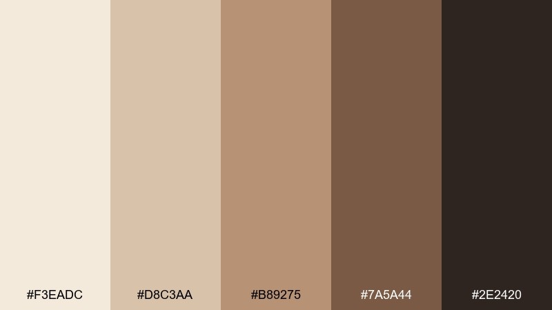
HEX: #f3eadc #d8c3aa #b89275 #7a5a44 #2e2420
Mood: soft, warm, comforting
Best for: home decor moodboards and cozy blog headers
Soft and comforting, like oatmeal by candlelight and linen curtains at dusk. These warm neutrals shine in lifestyle headers, interior moodboards, and calm landing pages. Pair with matte black icons or a single brass accent to keep it refined. Usage tip: let the cream lead for backgrounds, then layer browns in 60-30-10 for instant coziness.
Image example of candlelit oatmeal generated using media.io
Media.io is an online AI studio for creating and editing video, image, and audio in your browser.

2) Wool Blanket Browns

HEX: #efe2d2 #c9b09a #9f7a60 #6a4c3a #3a2b25
Mood: rustic, grounded, snug
Best for: coffee shop menus and rustic brand kits
Rustic and snug, like a wool throw draped over a wooden chair. The browns and creams work beautifully for cafe menus, artisan labels, and warm editorial blocks. Pair with textured paper, kraft packaging, and simple serif type for a handcrafted feel. Usage tip: keep contrast readable by using the darkest brown for text and the lightest cream for backgrounds.
Image example of wool blanket browns generated using media.io
3) Nordic Pine and Cream
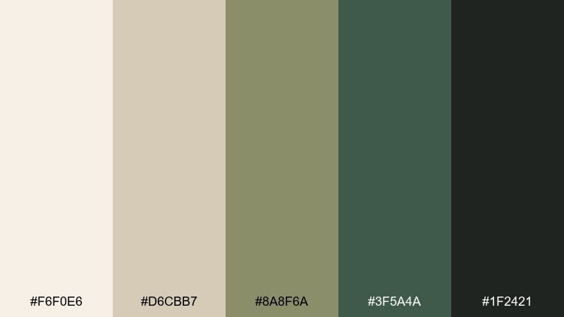
HEX: #f6f0e6 #d6cbb7 #8a8f6a #3f5a4a #1f2421
Mood: fresh, calm, woodsy
Best for: wellness branding and nature-inspired packaging
Fresh and calm, like pine needles on a snowy path with cream-toned light. This hygge color palette balances airy neutrals with grounded greens for wellness brands and clean packaging. Pair it with natural textures like recycled paper and uncoated finishes to keep the look authentic. Usage tip: use the deep green sparingly for logos or stamps so the cream stays bright and breathable.
Image example of nordic pine and cream generated using media.io
4) Chestnut Latte

HEX: #f2e6d6 #d3b89a #b07d5a #7b4f39 #2b1f1c
Mood: creamy, inviting, classic
Best for: bakery branding and product labels
Creamy and inviting, like a latte topped with cinnamon in a quiet bakery. The mix of beige and chestnut feels classic for labels, loyalty cards, and storefront signage. Pair with off-white space and a single warm metallic accent for a premium finish. Usage tip: reserve the darkest tone for small text and outlines to keep the palette soft instead of heavy.
Image example of chestnut latte generated using media.io
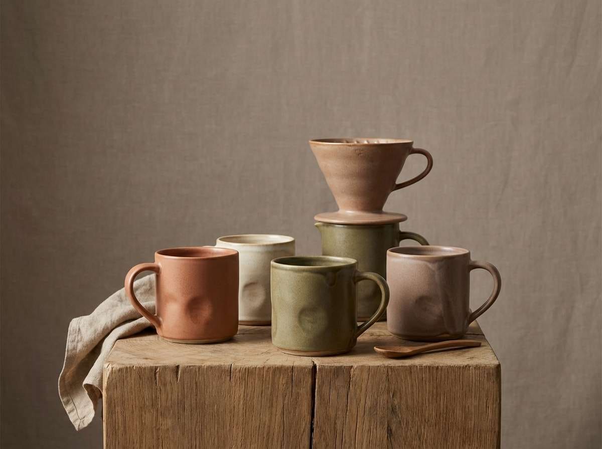
5) Fireside Clay

HEX: #f7efe7 #e2cbbd #c98f7a #8b5146 #2a1d1b
Mood: toasty, earthy, intimate
Best for: ceramics shops and artisan landing pages
Toasty and intimate, like clay mugs warming near a crackling fire. These earthy tones suit ceramics brands, artisan landing pages, and product storytelling sections. Pair with warm photography and generous whitespace to let the clay hues breathe. Usage tip: use the rose-clay color for buttons or highlights and keep backgrounds in the pale cream for a gentle glow.
Image example of fireside clay generated using media.io
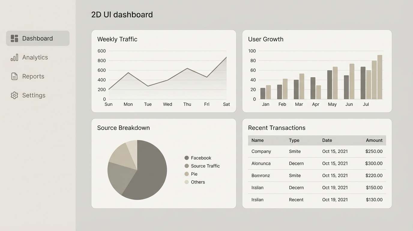
6) Winter Birch Neutrals
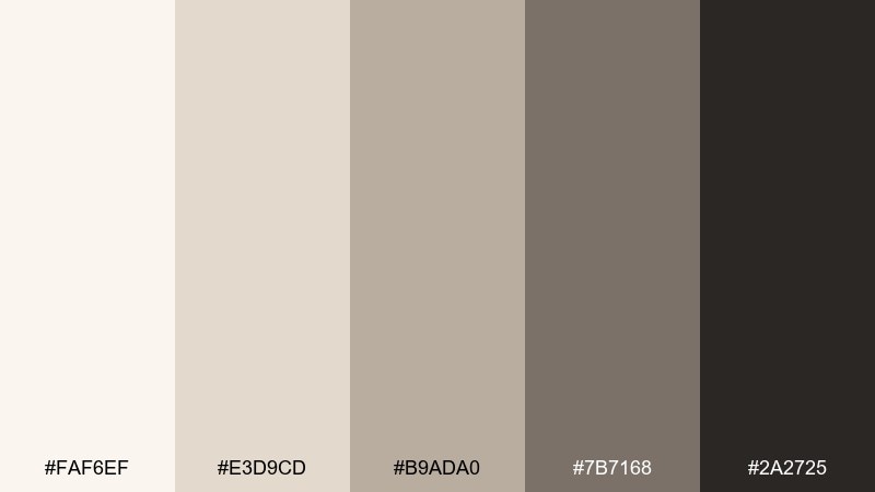
HEX: #faf6ef #e3d9cd #b9ada0 #7b7168 #2a2725
Mood: clean, quiet, minimalist
Best for: modern UI dashboards and typography-led pages
Clean and quiet, like birch bark against a pale winter sky. The neutral range makes UI dashboards, documentation sites, and typography-led layouts feel calm and readable. Pair with simple line icons and subtle shadows rather than loud gradients. Usage tip: use the mid taupe for dividers and cards, then anchor navigation with the deep charcoal.
Image example of winter birch neutrals generated using media.io
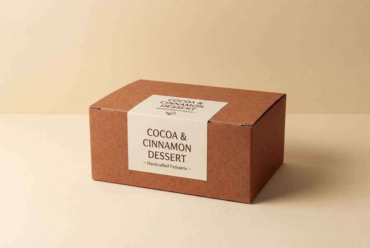
7) Cinnamon Cocoa

HEX: #f4e7d7 #d7bfa8 #b97855 #6b3f2e #241917
Mood: sweet, cozy, appetizing
Best for: seasonal social ads and dessert packaging
Sweet and cozy, like cocoa steam and cinnamon sticks on a wooden tray. These hygge color combinations are perfect for seasonal social ads, dessert packaging, and warm email banners. Pair with creamy backgrounds and rounded type to keep it friendly. Usage tip: make the cinnamon tone your primary accent and keep the darkest brown for headlines only.
Image example of cinnamon cocoa generated using media.io
8) Amber Hearth

HEX: #fff1df #f0cf9a #d59a4b #8b5b2e #2a1c12
Mood: glowing, cheerful, nostalgic
Best for: event posters and autumn promotions
Glowing and nostalgic, like amber light spilling from a cabin window. The golden tones work well for autumn promotions, event posters, and warm call-to-action sections. Pair with deep brown text for strong contrast and a touch of grain for character. Usage tip: keep large areas in the pale cream and use amber as a spotlight color for key info.
Image example of amber hearth generated using media.io

9) Soft Sage Linen
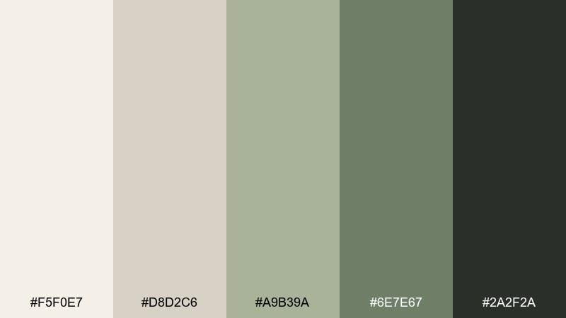
HEX: #f5f0e7 #d8d2c6 #a9b39a #6e7e67 #2a2f2a
Mood: airy, soothing, natural
Best for: spa websites and botanical stationery
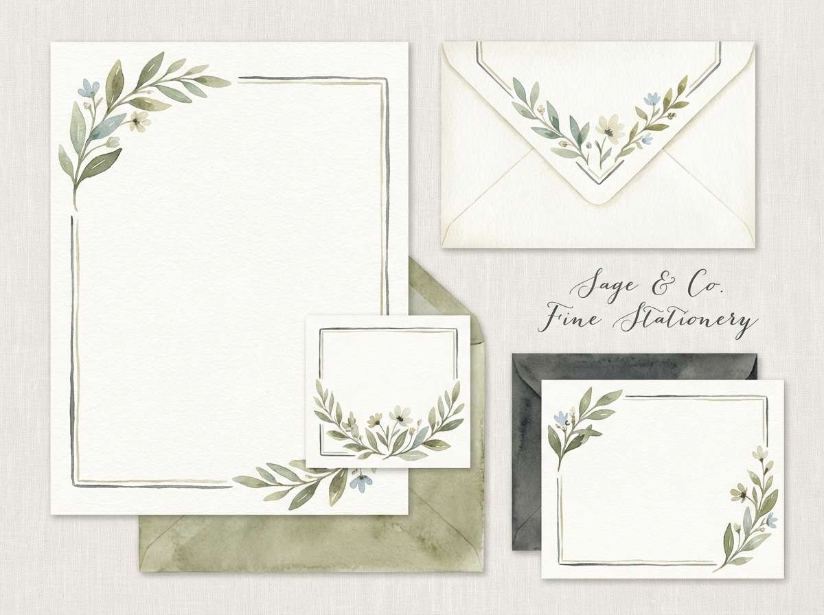
Airy and soothing, like sage leaves on crisp linen. The muted greens feel effortless for spa sites, calm product pages, and subtle stationery. Pair with thin serif headings and plenty of negative space for a modern organic look. Usage tip: use the sage midtone on buttons and keep the darkest charcoal for body text to maintain clarity.
Image example of soft sage linen generated using media.io
10) Dusk Rose Tea
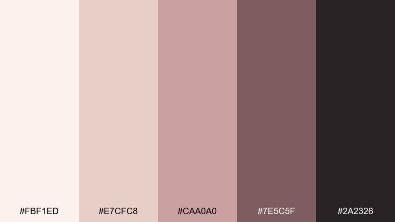
HEX: #fbf1ed #e7cfc8 #caa0a0 #7e5c5f #2a2326
Mood: gentle, romantic, quiet
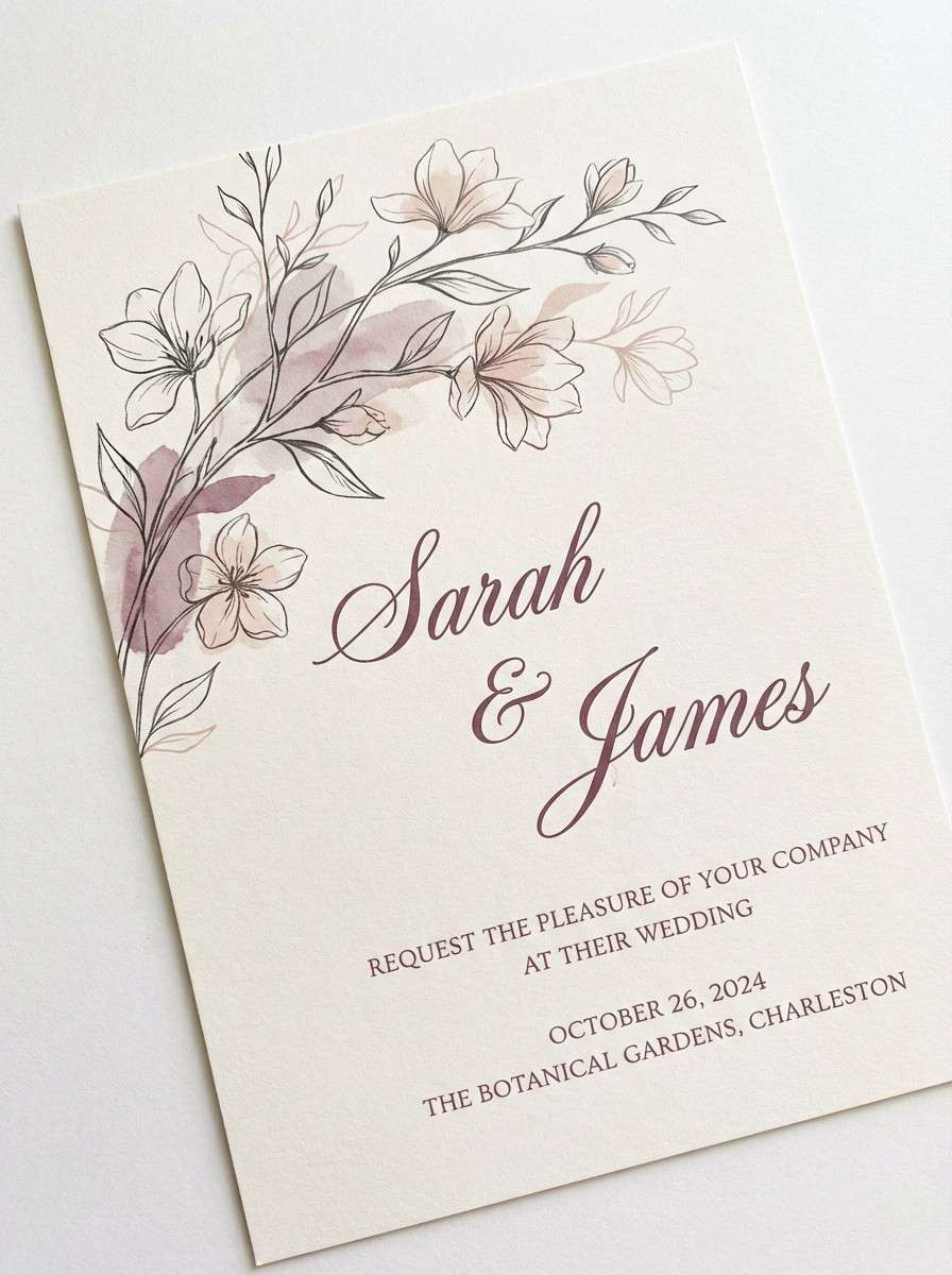
Best for: wedding invitations and boutique lookbooks
Gentle and quiet, like rose tea at dusk with soft lamplight. The blush and mauve tones suit wedding invitations, boutique lookbooks, and elegant product cards. Pair with warm ivory paper and minimalist florals to avoid feeling overly sweet. Usage tip: keep typography in the deep plum for legibility and let blush act as a subtle wash.
Image example of dusk rose tea generated using media.io
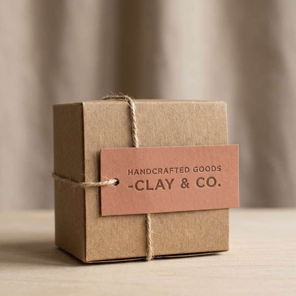
11) Terracotta Knit
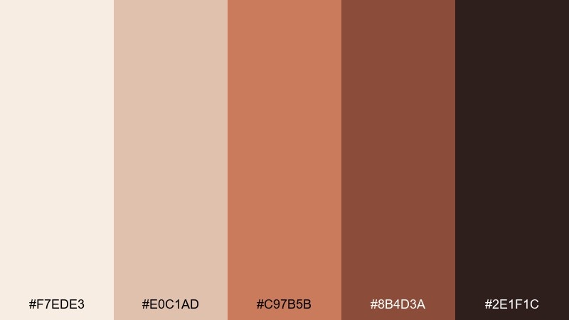
HEX: #f7ede3 #e0c1ad #c97b5b #8b4d3a #2e1f1c
Mood: handmade, warm, tactile
Best for: handcrafted goods shops and maker branding
Handmade and tactile, like a terracotta pot beside a knitted blanket. These warm earth tones are great for maker brands, handcrafted goods shops, and story-driven product pages. Pair with textured backgrounds and simple icon sets to keep it approachable. Usage tip: use terracotta as a repeat accent across buttons, badges, and highlights for cohesion.
Image example of terracotta knit generated using media.io
12) Honeyed Walnut
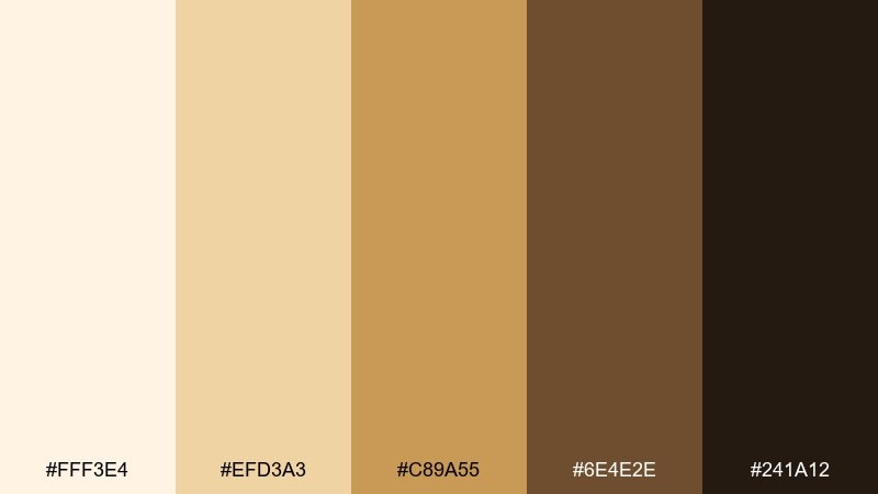
HEX: #fff3e4 #efd3a3 #c89a55 #6e4e2e #241a12
Mood: golden, cozy, welcoming
Best for: food photography overlays and recipe blogs
Golden and welcoming, like honey drizzled over toasted walnuts. The palette feels right for recipe blogs, food overlays, and warm lifestyle thumbnails. Pair with creamy whitespace and natural shadows to keep the gold from feeling too loud. Usage tip: treat the honey tone as your highlight and keep walnut brown for type and frames.
Image example of honeyed walnut generated using media.io

13) Pebble and Smoke
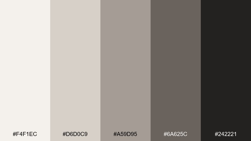
HEX: #f4f1ec #d6d0c9 #a59d95 #6a625c #242221
Mood: moody, modern, understated
Best for: architecture portfolios and minimalist branding
Moody and understated, like river pebbles in soft smoke. These refined grays and taupes suit architecture portfolios, minimalist branding, and product detail pages. Pair with sharp grid layouts and a single warm accent elsewhere in your system if needed. Usage tip: rely on tonal contrast and spacing rather than heavy borders for a premium feel.
Image example of pebble and smoke generated using media.io
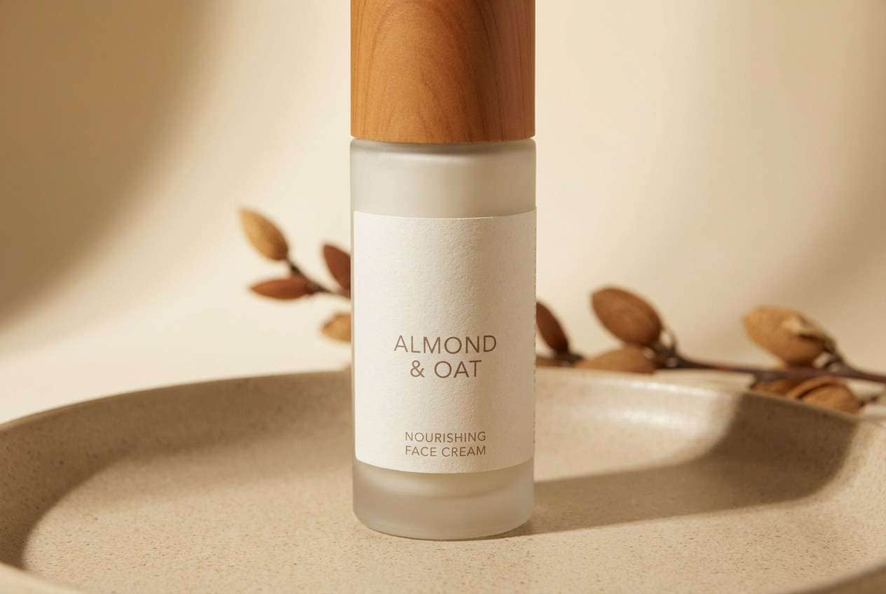
14) Toasted Almond
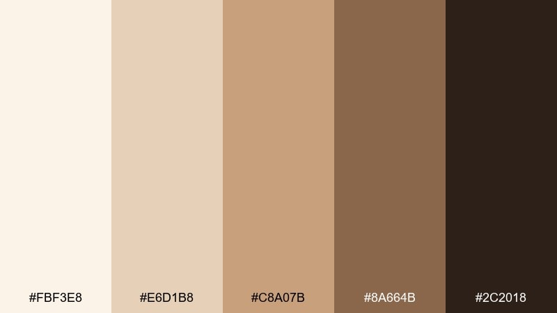
HEX: #fbf3e8 #e6d1b8 #c8a07b #8a664b #2c2018
Mood: warm, mellow, natural
Best for: skincare packaging and boutique e-commerce
Warm and mellow, like toasted almonds and sunlit wood. The beige-to-brown range works well for skincare packaging, boutique e-commerce, and calm product grids. Pair with minimal sans-serif type and close-up textures for a clean, sensorial look. Usage tip: keep product cards in the light cream and use almond brown for price and CTA emphasis.
Image example of toasted almond generated using media.io
15) Cozy Ink and Sand
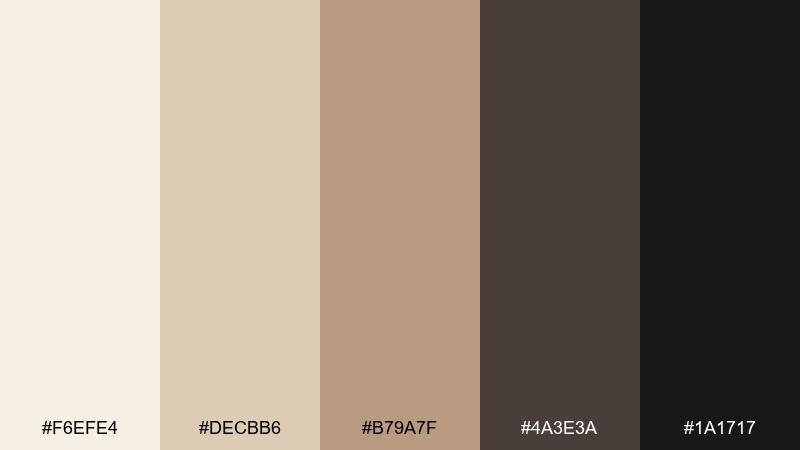
HEX: #f6efe4 #decbb6 #b79a7f #4a3e3a #1a1717
Mood: calm, inky, sophisticated
Best for: book covers and editorial layouts
Calm and sophisticated, like ink on warm paper in a quiet reading nook. This hygge color palette is ideal for book covers, editorial spreads, and premium storytelling pages. Pair with classic serif headlines and subtle paper grain to amplify the literary mood. Usage tip: let the near-black handle titles while sand tones support margins, captions, and dividers.
Image example of cozy ink and sand generated using media.io
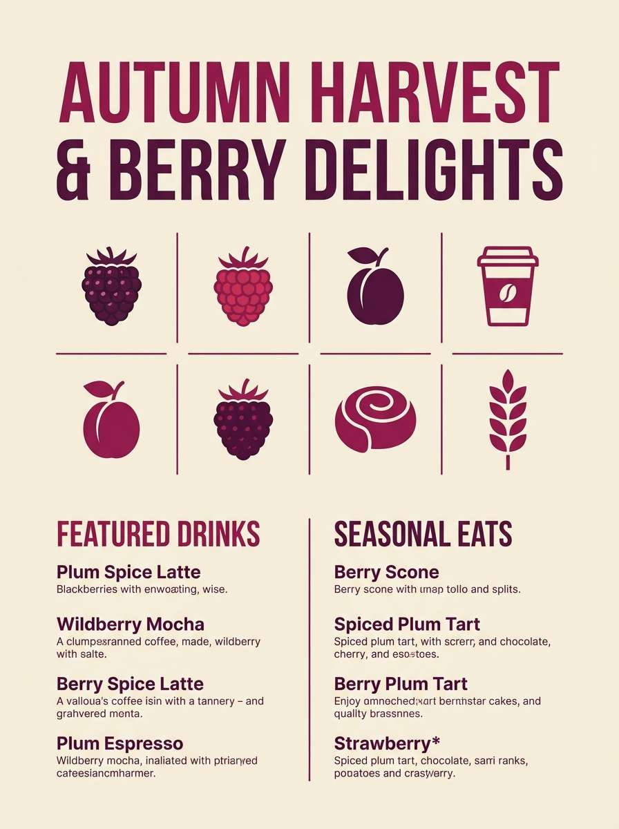
16) Mulled Berry

HEX: #f8efe9 #e2c7c1 #b07a7f #6d3f46 #23181a
Mood: festive, cozy, rich
Best for: holiday campaigns and cafe seasonal boards
Festive and rich, like mulled berries simmering on the stove. The berry and plum shades bring warmth to holiday campaigns, seasonal cafe boards, and gift guides. Pair with soft cream backgrounds and minimal illustration for a modern seasonal feel. Usage tip: use berry as the hero color in small doses so it reads cozy, not loud.
Image example of mulled berry generated using media.io
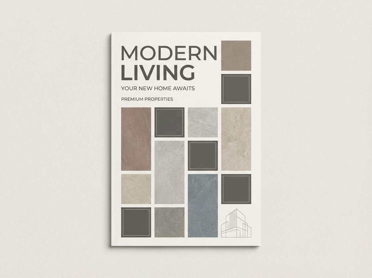
17) Warm Stone Cottage
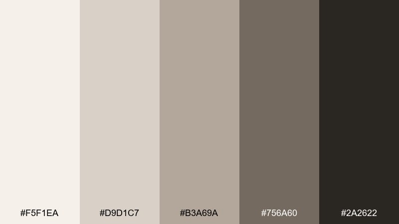
HEX: #f5f1ea #d9d1c7 #b3a69a #756a60 #2a2622
Mood: cozy, timeless, grounded
Best for: real estate brochures and interior styling guides
Timeless and grounded, like warm stone walls and soft lamplight in a cottage hallway. These neutral tones are strong for real estate brochures, interior styling guides, and calm presentation decks. Pair with warm photography and understated iconography to keep it friendly. Usage tip: keep headings in charcoal and use mid-stone for section panels and pullouts.
Image example of warm stone cottage generated using media.io
18) Copper Lantern
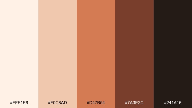
HEX: #fff1e6 #f0c8ad #d47b54 #7a3e2c #241a16
Mood: glowy, bold, inviting
Best for: product ads and warm brand launches
Glowy and bold, like a copper lantern in a misty evening garden. These hygge color combinations create instant warmth for product ads, hero banners, and brand launches. Pair with deep brown typography and minimal shapes so the copper feels intentional. Usage tip: use the copper midtone for one standout element, such as a button, badge, or price tag.
Image example of copper lantern generated using media.io
19) Sourdough Crust
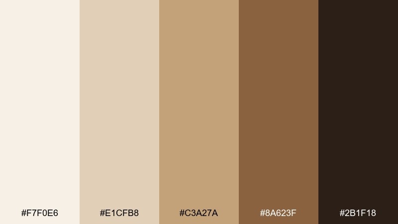
HEX: #f7f0e6 #e1cfb8 #c3a27a #8a623f #2b1f18
Mood: homey, hearty, warm
Best for: bakery flyers and food truck branding
Homey and hearty, like sourdough crust cooling on a wooden board. The warm wheat and caramel tones fit bakery flyers, food truck branding, and packaging stickers. Pair with hand-drawn icons and simple patterns to keep the vibe friendly. Usage tip: make the light crumb color your base and save the crust brown for outlines and headers.
Image example of sourdough crust generated using media.io
20) Oat Milk Minimal
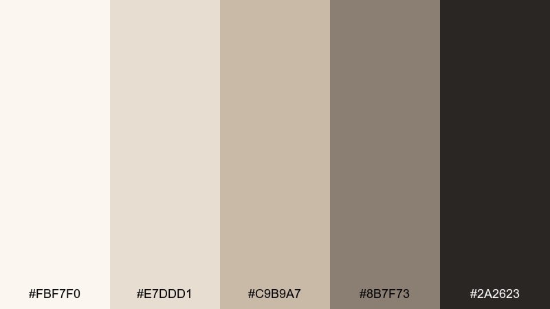
HEX: #fbf7f0 #e7ddd1 #c9b9a7 #8b7f73 #2a2623
Mood: minimal, creamy, modern
Best for: app onboarding screens and clean brand systems
Minimal and creamy, like oat milk foam on a quiet morning. The gentle neutrals are ideal for onboarding screens, subscription pages, and clean brand systems. Pair with a single accent color outside the core UI if you need stronger hierarchy, but keep it muted. Usage tip: use the mid greige for secondary buttons and the deep charcoal for primary text.
Image example of oat milk minimal generated using media.io
21) Fawn and Flannel
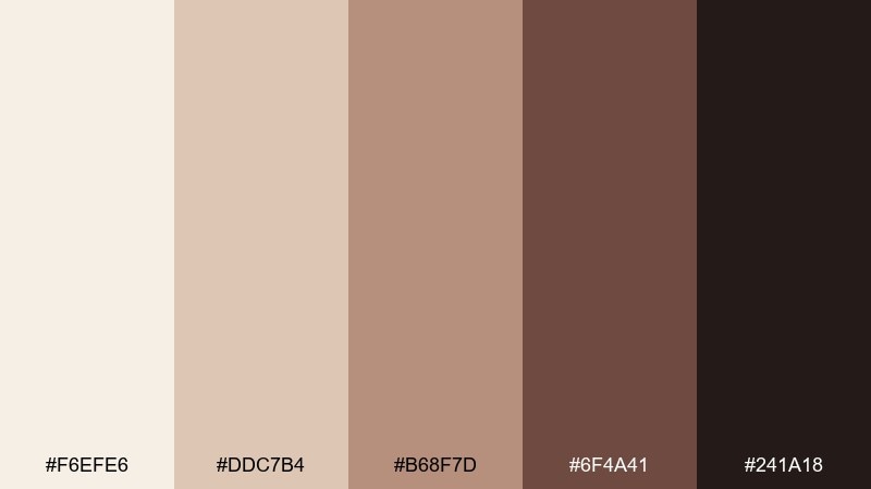
HEX: #f6efe6 #ddc7b4 #b68f7d #6f4a41 #241a18
Mood: soft, rustic, cozy
Best for: fashion lookbooks and lifestyle banners
Soft and rustic, like flannel layers in a cabin wardrobe. The fawn and cocoa tones work for fashion lookbooks, lifestyle banners, and warm social templates. Pair with film-grain photography and clean type to keep it contemporary. Usage tip: keep the light cream for margins and use the mid brown to frame images and captions.
Image example of fawn and flannel generated using media.io
22) Quiet Cocoa Night
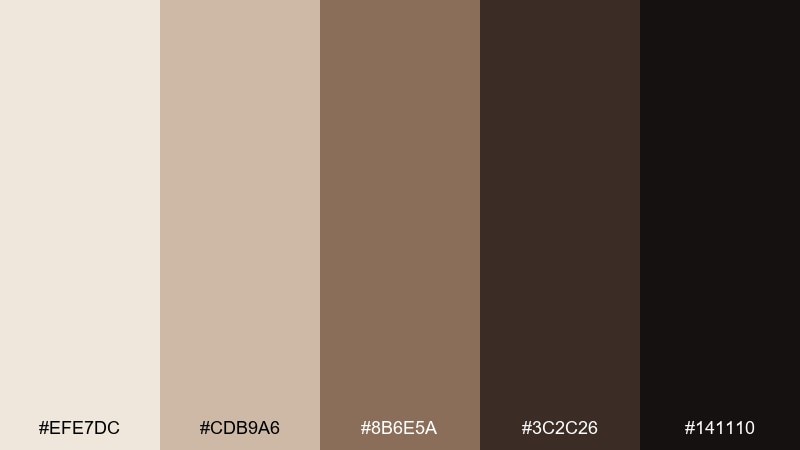
HEX: #efe7dc #cdb9a6 #8b6e5a #3c2c26 #141110
Mood: dark, cozy, intimate
Best for: luxury branding and nighttime UI themes
Dark and intimate, like cocoa at midnight with a single lamp on. The deep browns and warm neutrals suit luxury branding, candle labels, and nighttime UI themes. Pair with soft gradients and subtle shadows rather than hard edges for a gentler dark mode. Usage tip: keep text in the light cream and avoid using the near-black as a large background to prevent a harsh look.
Image example of quiet cocoa night generated using media.io
What Colors Go Well with Hygge?
Hygge colors pair best with warm neutrals: oat, cream, sand, taupe, caramel, and cocoa. These shades keep the mood soft while giving you enough range for backgrounds, surfaces, and type.
For accents, choose candlelit tones like amber, honey, terracotta, or copper. If you want a cooler counterbalance without breaking the cozy feeling, add muted greens like sage or pine.
For contrast, avoid icy whites and harsh blues; instead, use warm charcoal, espresso brown, or near-black for text, icons, and outlines.
How to Use a Hygge Color Palette in Real Designs
Start with a light cream as your main background, then build structure with mid-tone greige or taupe for cards, panels, and dividers. This creates a layered “soft materials” look that still feels clean.
Use the darkest shade only where contrast matters: headings, navigation, small labels, and key UI controls. Hygge design works best when dark tones are anchors—not large, heavy blocks.
Finish with one warm accent (amber, terracotta, copper) repeated across CTAs, badges, or highlights. Consistent accent usage makes the palette feel intentional and modern.
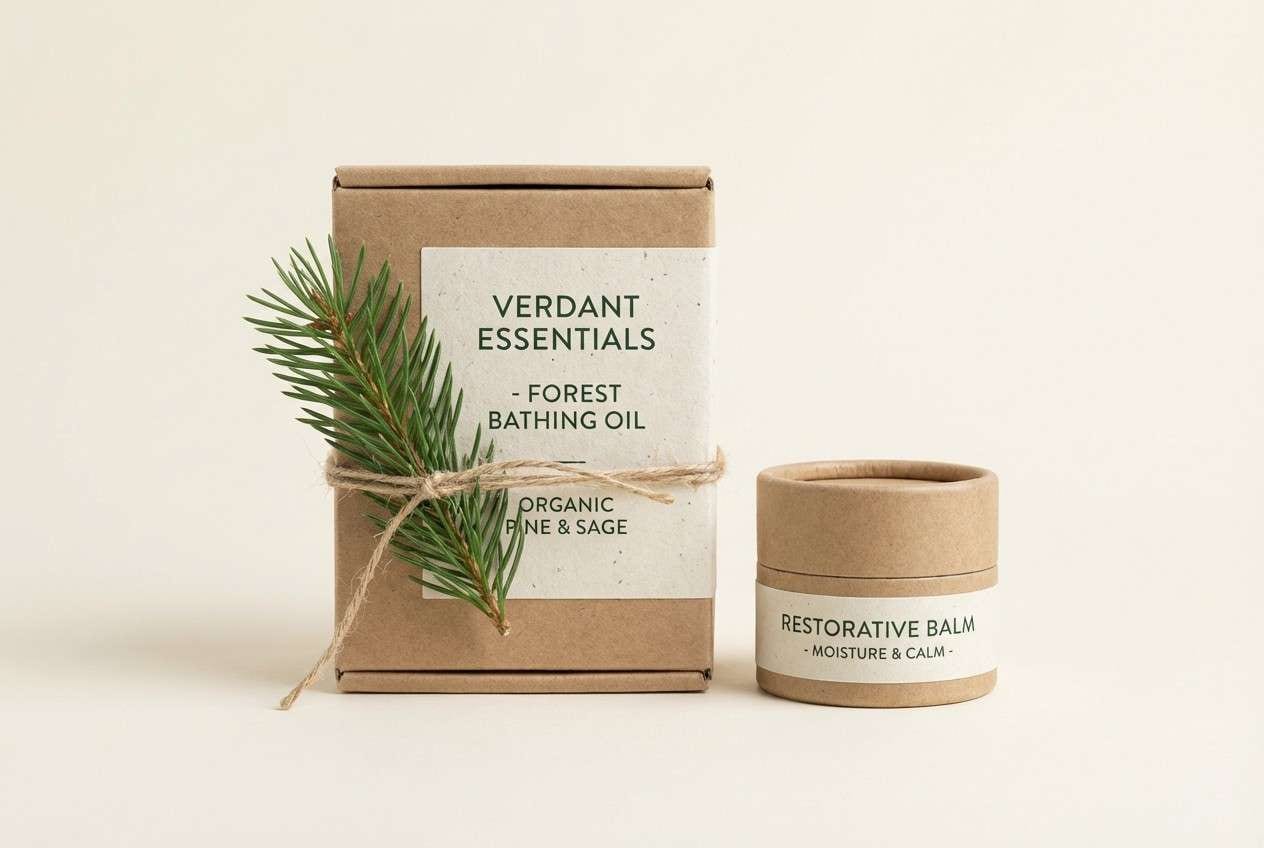
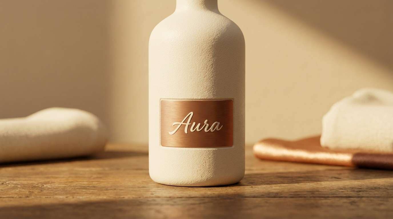
Create Hygge Palette Visuals with AI
If you’re building a moodboard, brand kit, or social templates, generating matching images can help you validate the vibe fast. Hygge visuals look most authentic when you specify textures like linen, paper grain, ceramics, wood, and soft shadows.
Use the prompts under each palette to create consistent hero images, packaging mockups, posters, or UI screens—then refine by adjusting lighting (warm, diffused) and keeping props minimal.
When you have a favorite palette, generate a few variations and pick the one that matches your brand’s warmth level (more cream for airy, more cocoa for intimate).
Hygge Color Palette FAQs
-
What is a hygge color palette?
A hygge color palette is a set of warm, muted, comforting colors—often creams, beiges, warm browns, soft grays, and gentle accents like amber, terracotta, or sage—designed to feel cozy and calm. -
Are hygge colors the same as Scandinavian colors?
They overlap, but hygge tends to be warmer and more candlelit (creams, woods, cocoa tones). Scandinavian palettes can be cooler and brighter, often with more crisp whites and cool grays. -
Which hygge colors work best for websites and UI?
Look for palettes with a light cream background, a mid greige for surfaces, and a warm charcoal/espresso for text (for example, Winter Birch Neutrals or Oat Milk Minimal). This keeps readability high while staying cozy. -
How do I keep a cozy palette readable for text?
Use the lightest cream for backgrounds and reserve the darkest brown/charcoal for body text. Avoid placing mid-tone text on mid-tone backgrounds, and use spacing and hierarchy to reduce the need for heavy borders. -
What accent colors fit a hygge theme without feeling loud?
Muted accents like cinnamon, terracotta, honey, amber, dusty rose, and soft sage work well. Use them in small doses for buttons, badges, and highlights so the overall palette stays calm. -
Can I use black in a hygge color scheme?
Yes—use warm black or near-black sparingly for typography and icons. Hygge looks best with warm charcoals and espresso shades rather than harsh, pure black backgrounds. -
How can I generate hygge-themed images that match my palette?
Use a text-to-image generator and include material cues (linen, wool, ceramic, wood), lighting cues (warm, diffused, candlelight), and a “colors restricted to palette” instruction—like the prompts included with each palette on this page.
Next: Warm Black Color Palette
