

A strong hospital color palette makes information feel clear, environments feel calm, and care feel trustworthy. The right mix of cool neutrals and gentle accents helps patients navigate services with less stress.
Below are 20 hospital color palette ideas with HEX codes you can use for healthcare branding, medical UI, signage systems, and print collateral.
In this article
- Why Hospital Palettes Work So Well
-
- sterile mint calm
- skyline blue white
- warm beige care
- lavender hush
- seafoam teal clean
- sunrise coral accent
- graphite clinical
- powder pink gentle
- sage linen balance
- aqua gray modern
- navy trust
- citrus lift
- sandstone healing
- ice blue minimal
- plum comfort
- forest waiting room
- copper wood tones
- monochrome sterile
- turquoise energy
- golden hour hospitality
- What Colors Go Well with Hospital?
- How to Use a Hospital Color Palette in Real Designs
- Create Hospital Palette Visuals with AI
Why Hospital Palettes Work So Well
Hospital color schemes are designed to reduce anxiety and improve comprehension. Clean whites, light blues, and soft greens naturally suggest hygiene, order, and calm—exactly what patients hope to feel in a medical setting.
These palettes also support readability and accessibility. High-contrast typography, clear hierarchy, and restrained accent colors make forms, instructions, and wayfinding easier to scan in stressful moments.
Finally, hospital palettes scale across mediums. The same set of tones can stay consistent from signage and uniforms to apps and PDFs, helping healthcare brands look coordinated and dependable.
20+ Hospital Color Palette Ideas (with HEX Codes)
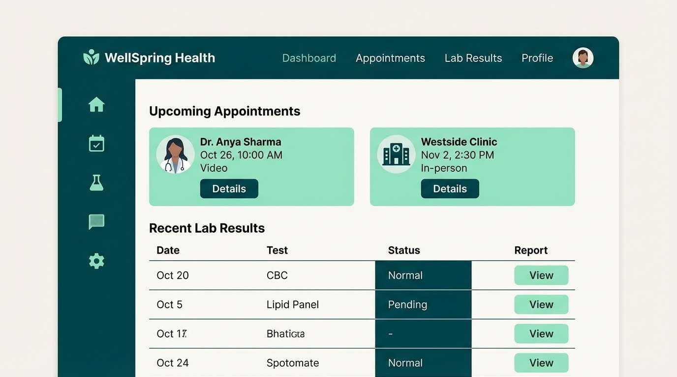
1) Sterile Mint Calm
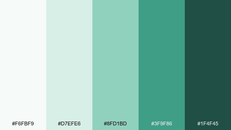
HEX: #F6FBF9 #D7EFE6 #8FD1BD #3F9F86 #1F4F45
Mood: fresh, sterile, reassuring
Best for: patient portal UI and form-heavy dashboards
Fresh mint and clean whites evoke sanitized surfaces, soft daylight, and a steady sense of care. These tones keep dense layouts readable while still feeling friendly. Pair the darker green with thin dividers, icons, and focus states for clear hierarchy. Usage tip: reserve the mid mint for primary buttons so the interface stays calm rather than busy.
Image example of sterile mint calm generated using media.io
Media.io is an online AI studio for creating and editing video, image, and audio in your browser.

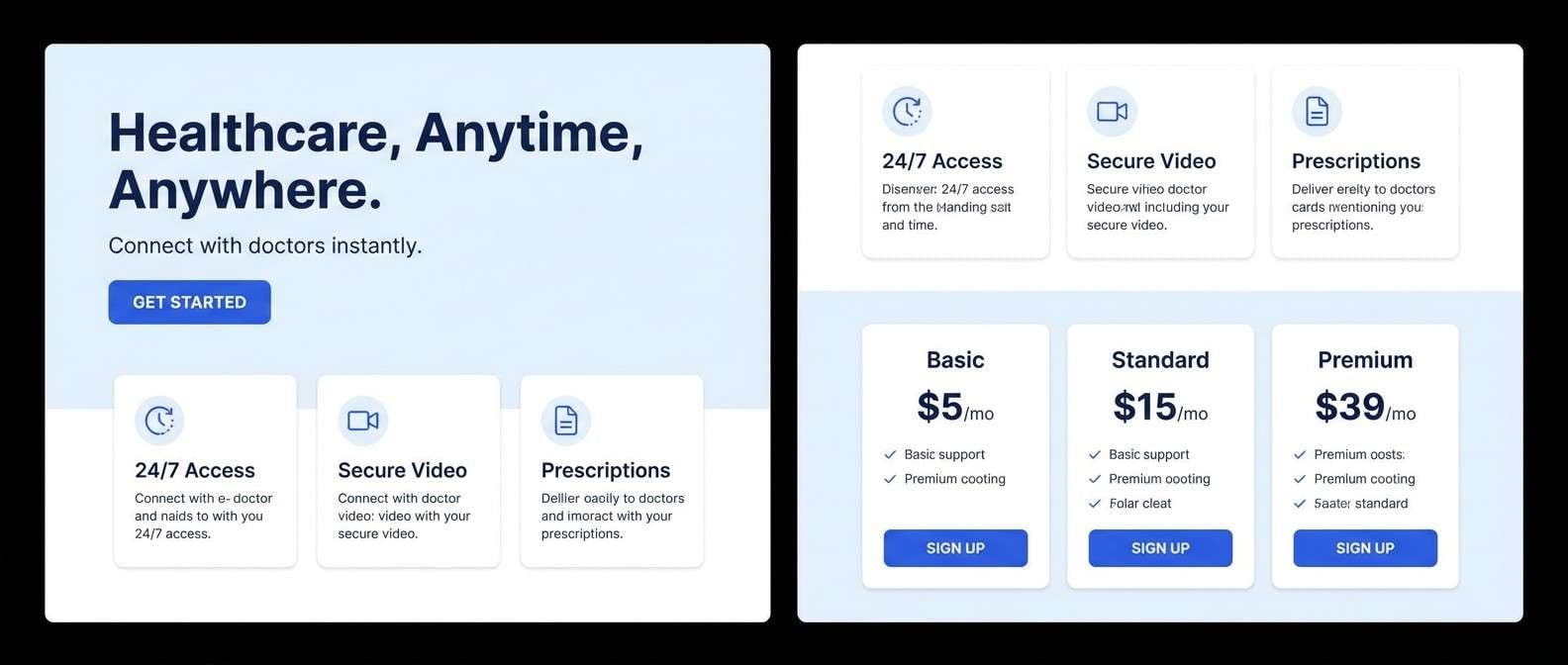
2) Skyline Blue White
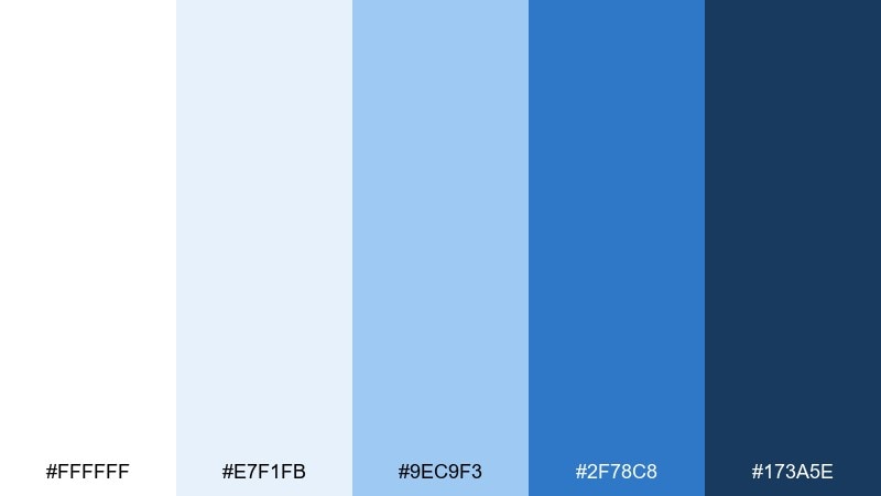
HEX: #FFFFFF #E7F1FB #9EC9F3 #2F78C8 #173A5E
Mood: trustworthy, airy, professional
Best for: telehealth landing pages
Bright sky blues and crisp whites feel like open air, clear communication, and dependable expertise. For a hospital color scheme that reads modern, keep most sections white and use the cobalt as your primary call-to-action. Add the navy for headlines and footer areas to ground the page. Usage tip: maintain generous spacing so the light blue never turns into a heavy block of color.
Image example of skyline blue white generated using media.io
3) Warm Beige Care
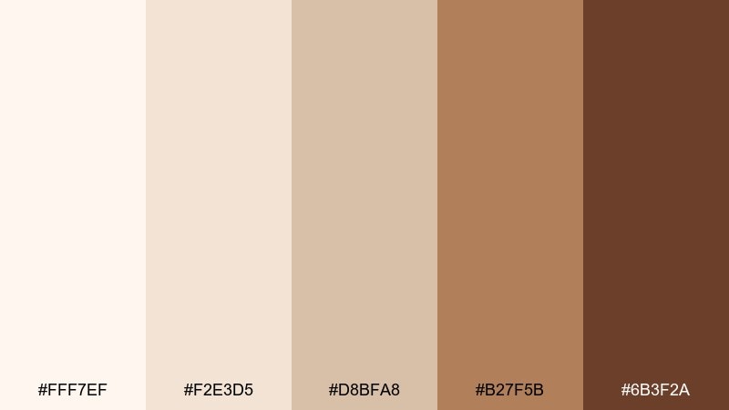
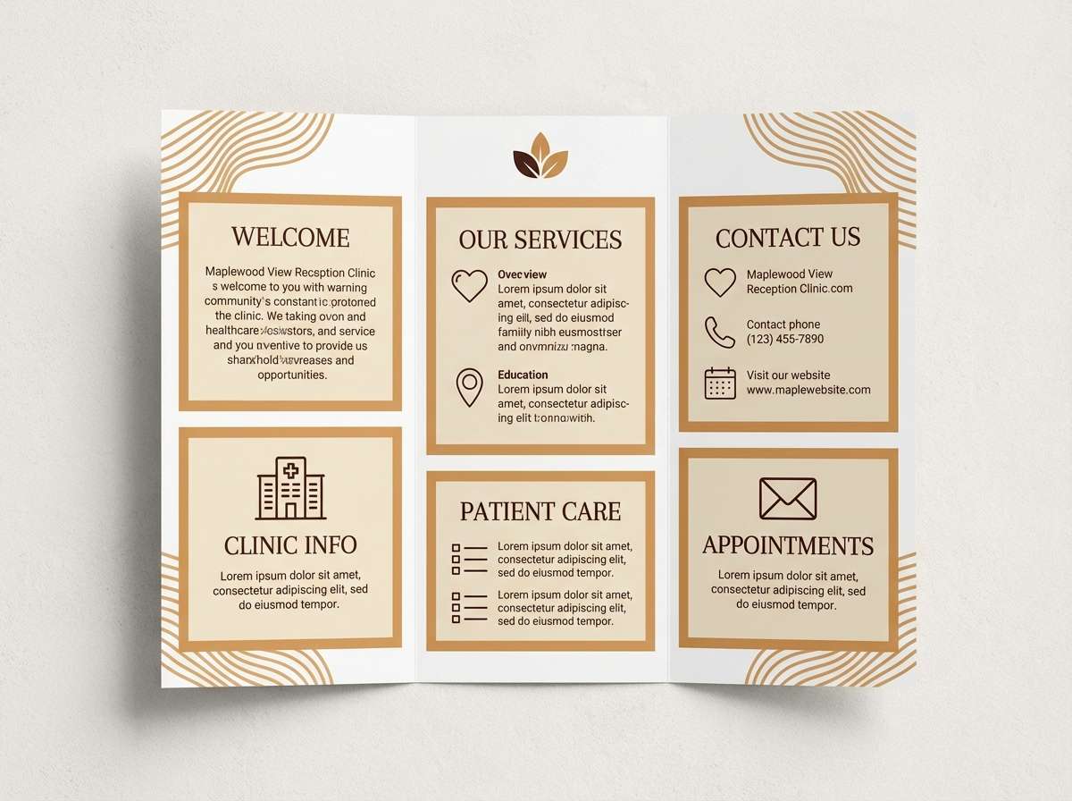
HEX: #FFF7EF #F2E3D5 #D8BFA8 #B27F5B #6B3F2A
Mood: welcoming, human, grounded
Best for: reception branding and printed brochures
Creamy beige and soft caramel tones bring to mind calm waiting areas, warm lighting, and a reassuring handshake. They work well when you want healthcare messaging to feel less clinical and more personal. Pair with plenty of white space and simple sans-serif typography to keep it contemporary. Usage tip: use the darkest brown sparingly for headings and key stats so the brochure stays light.
Image example of warm beige care generated using media.io
4) Lavender Hush
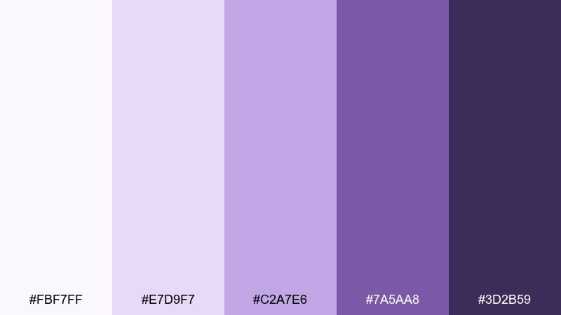
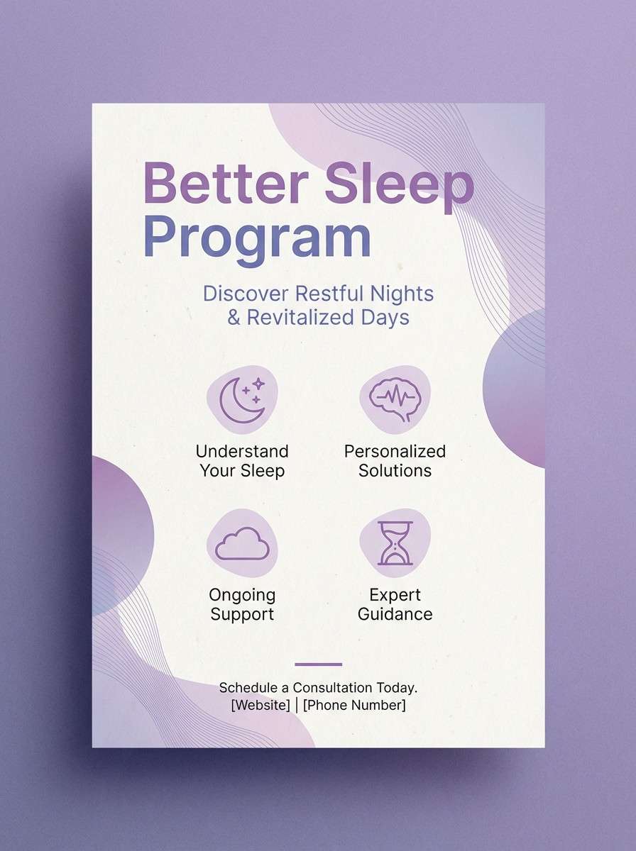
HEX: #FBF7FF #E7D9F7 #C2A7E6 #7A5AA8 #3D2B59
Mood: gentle, soothing, restorative
Best for: sleep clinic and maternity collateral
Soft lavender feels like evening quiet, dimmed hallway lights, and a slow exhale. These hospital color combinations are ideal for services where comfort and reassurance matter as much as clarity. Pair with warm white paper and rounded typography to keep it tender rather than formal. Usage tip: let the deepest purple appear only in small badges or headings to avoid a heavy look.
Image example of lavender hush generated using media.io
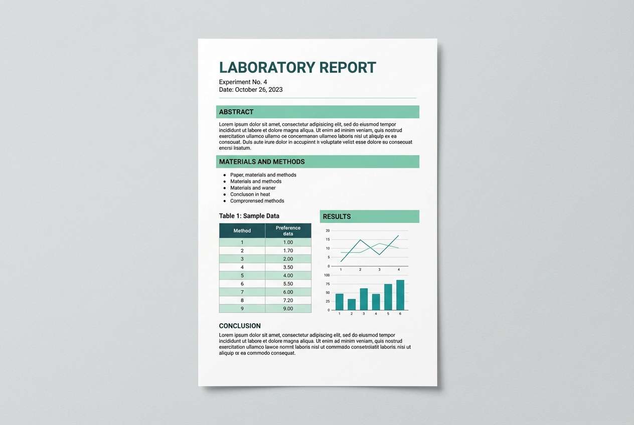
5) Seafoam Teal Clean
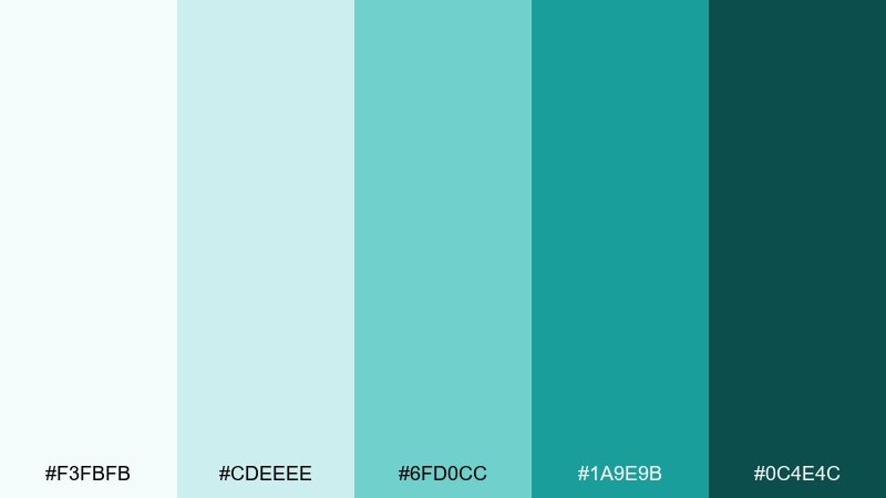
HEX: #F3FBFB #CDEEEE #6FD0CC #1A9E9B #0C4E4C
Mood: clean, crisp, confident
Best for: lab report PDF templates
Seafoam and teal evoke clear water, spotless counters, and precision you can trust. The palette keeps technical documents approachable while still feeling rigorous. Pair with neutral grays for tables and use teal to highlight abnormal values or key findings. Usage tip: apply the lightest seafoam as subtle row shading to improve scanability.
Image example of seafoam teal clean generated using media.io
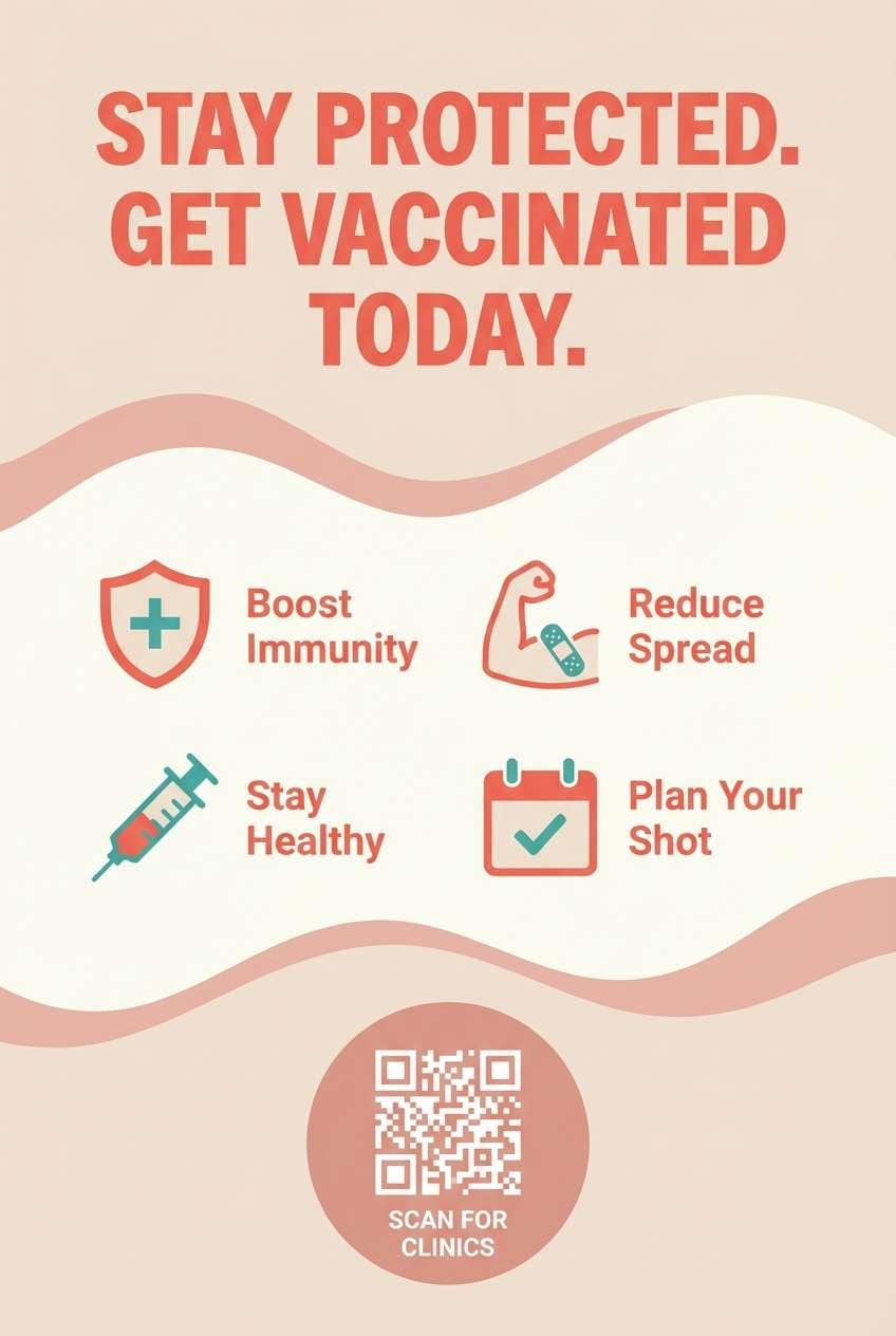
6) Sunrise Coral Accent
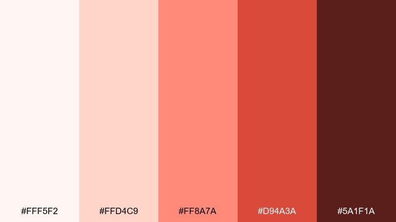
HEX: #FFF5F2 #FFD4C9 #FF8A7A #D94A3A #5A1F1A
Mood: uplifting, motivating, friendly
Best for: vaccination campaign posters
Coral and soft blush feel like early morning light and a boost of optimism. These tones are great when you need public health messaging to feel inviting rather than intimidating. Pair with plenty of white and simple iconography so the coral reads as a clear call-to-action. Usage tip: keep the deepest maroon for a single headline or QR code area to anchor the design.
Image example of sunrise coral accent generated using media.io
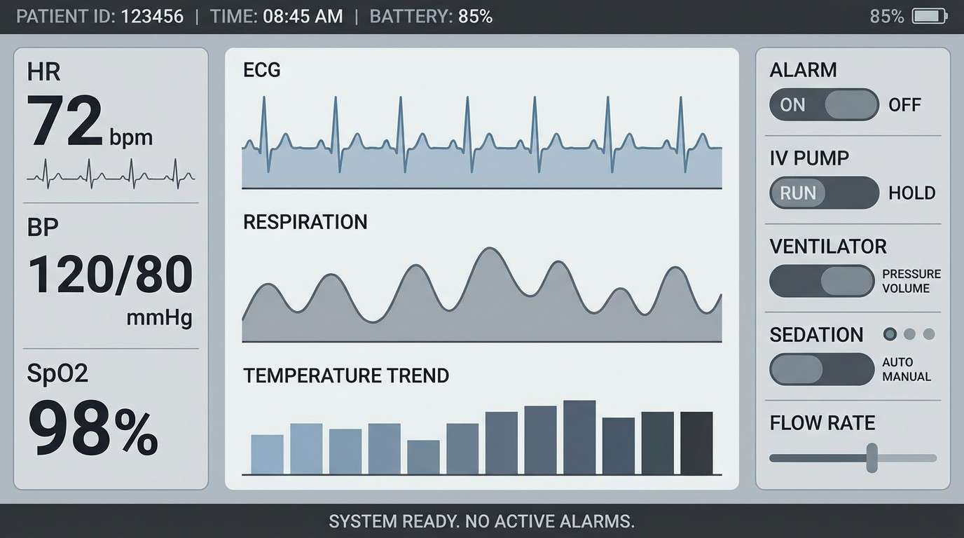
7) Graphite Clinical
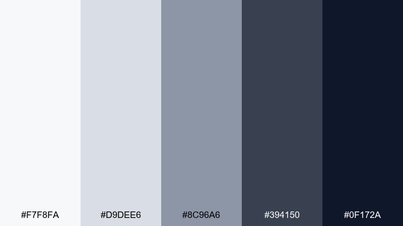
HEX: #F7F8FA #D9DEE6 #8C96A6 #394150 #0F172A
Mood: focused, technical, controlled
Best for: medical device UI and control panels
Cool grays and graphite evoke precision instruments, quiet alarms, and a controlled environment. As a hospital color palette for serious interfaces, it supports high contrast without feeling harsh. Pair with a single bright status color in small doses if you need alerts, and keep typography bold and legible. Usage tip: use the near-black only for critical data to prevent visual fatigue.
Image example of graphite clinical generated using media.io
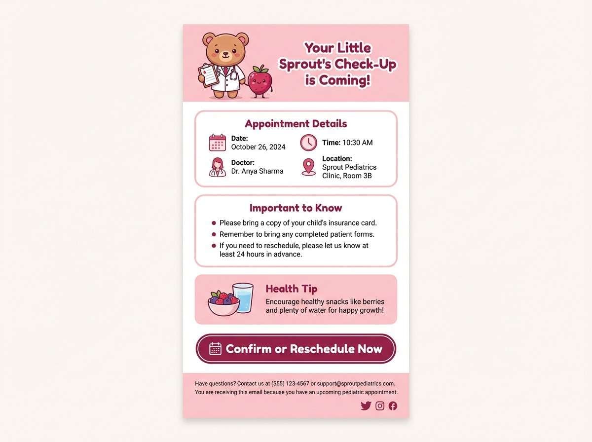
8) Powder Pink Gentle
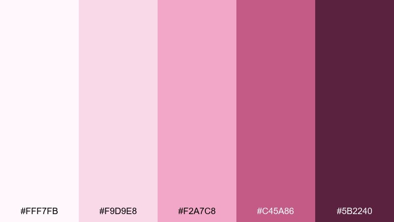
HEX: #FFF7FB #F9D9E8 #F2A7C8 #C45A86 #5B2240
Mood: caring, soft, supportive
Best for: pediatric appointment reminder emails
Powder pinks bring to mind kindness, gentle reassurance, and a softer bedside tone. They work especially well for messaging that needs warmth without losing professionalism. Pair with crisp white backgrounds and a deep berry for links and emphasis. Usage tip: keep the mid pink limited to small illustrations or buttons so the email stays readable.
Image example of powder pink gentle generated using media.io
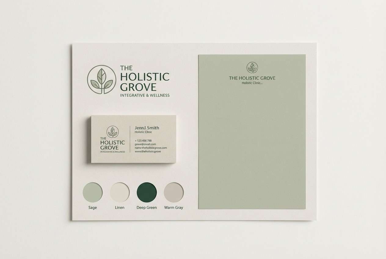
9) Sage Linen Balance
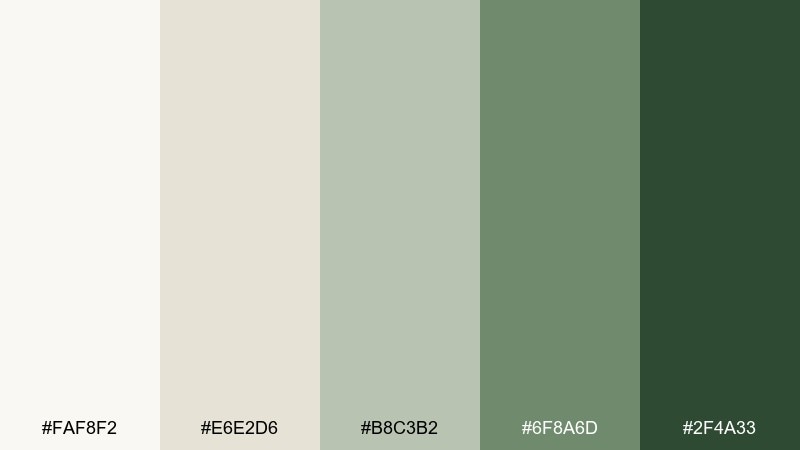
HEX: #FAF8F2 #E6E2D6 #B8C3B2 #6F8A6D #2F4A33
Mood: balanced, natural, quiet
Best for: holistic clinic brand kits
Sage and linen neutrals feel like soft textiles, plants by the window, and a calm conversation. The muted greens keep branding grounded while still looking clean and contemporary. Pair with warm photography and simple line icons for a cohesive system. Usage tip: use the darkest green for logomarks and keep the lighter tones for backgrounds and stationery.
Image example of sage linen balance generated using media.io
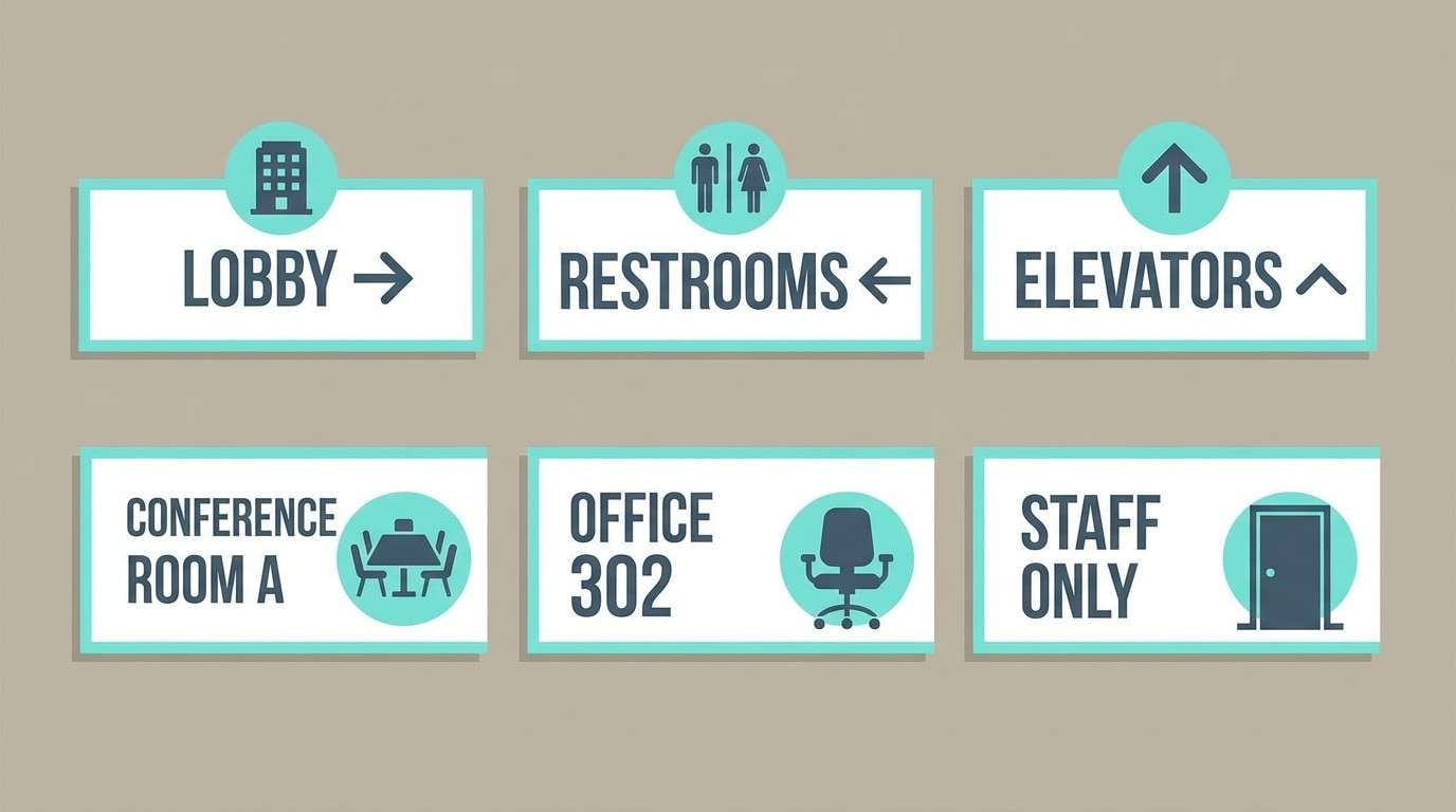
10) Aqua Gray Modern
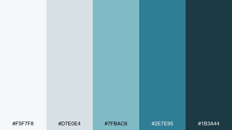
HEX: #F5F7F8 #D7E0E4 #7FBAC6 #2E7E95 #1B3A44
Mood: modern, tidy, dependable
Best for: wayfinding signage systems
Aqua with cool grays suggests clear directions, polished surfaces, and calm movement through corridors. The contrast is strong enough for quick readability without feeling loud. Pair the deep blue-gray with large typography and simple pictograms for accessibility. Usage tip: reserve the brighter aqua for department markers so navigation cues pop at a glance.
Image example of aqua gray modern generated using media.io
11) Navy Trust
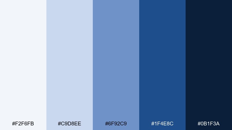
HEX: #F2F6FB #C9D8EE #6F92C9 #1F4E8C #0B1F3A
Mood: authoritative, calm, credible
Best for: annual reports and editorial layouts
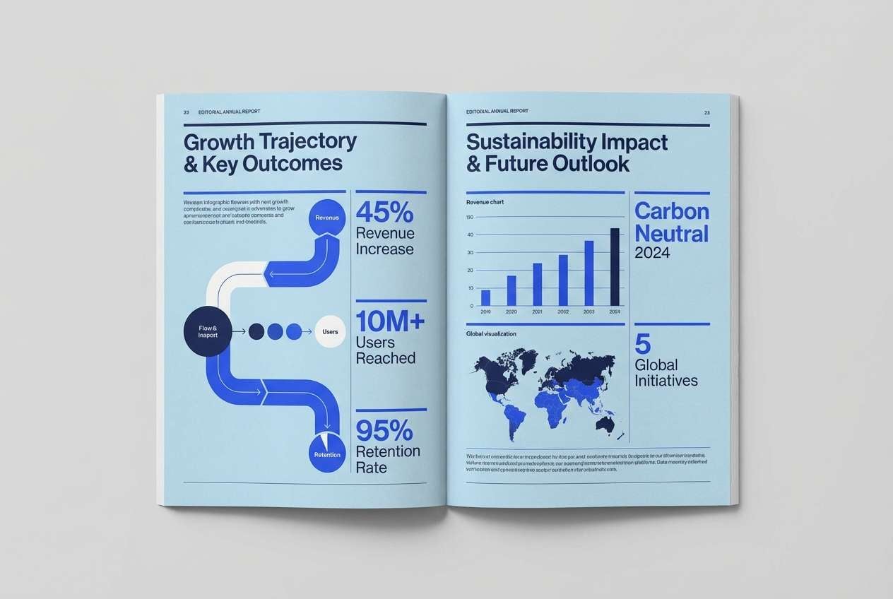
Deep navy and soft blues evoke stability, expertise, and well-structured information. The palette supports long-form reading with strong hierarchy and clean contrast. Pair with subtle grayscale charts and plenty of margins to maintain an editorial feel. Usage tip: keep the darkest navy to headings and pull quotes so pages stay light.
Image example of navy trust generated using media.io
12) Citrus Lift
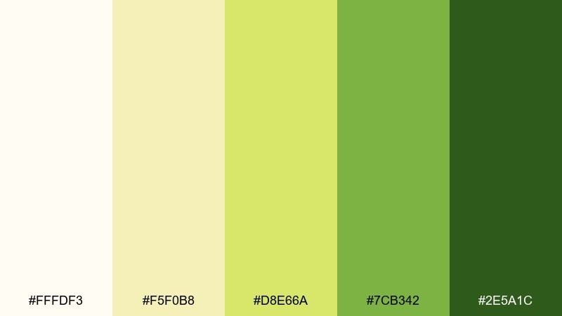
HEX: #FFFDF3 #F5F0B8 #D8E66A #7CB342 #2E5A1C
Mood: energetic, optimistic, health-forward
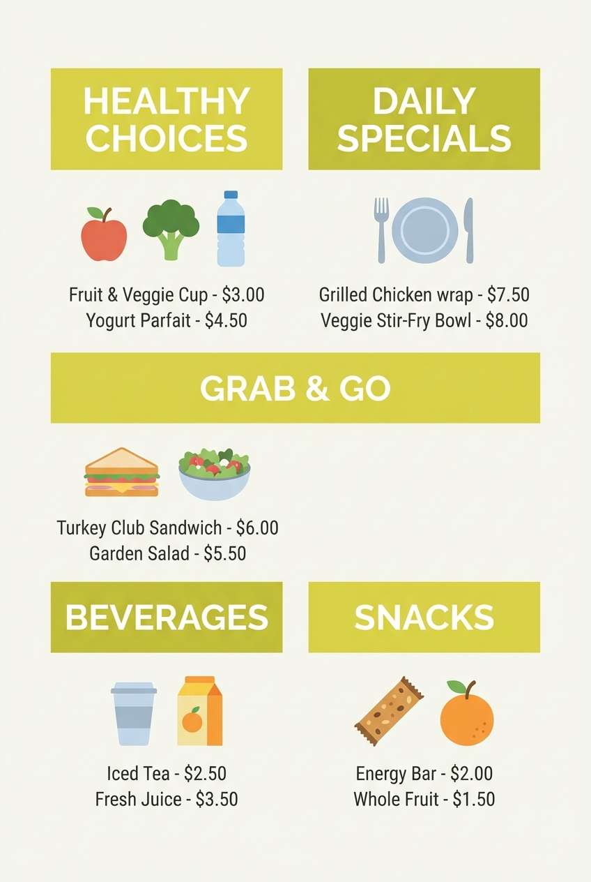
Best for: cafeteria menus and nutrition posters
Citrus yellow-green feels like fresh produce, bright daylight, and an upbeat reset. A hospital color combination like this works best in small bursts to spotlight healthy choices and key labels. Pair with lots of white and clean black typography for easy reading from a distance. Usage tip: use the darkest green for category headers so the lighter shades can stay airy.
Image example of citrus lift generated using media.io
13) Sandstone Healing
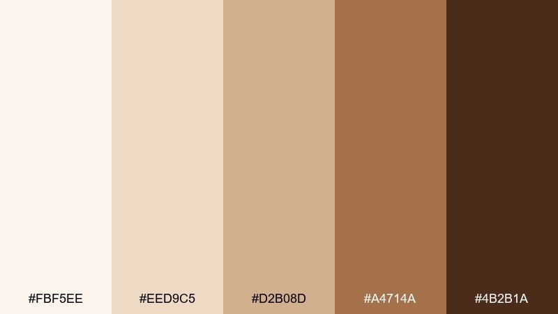
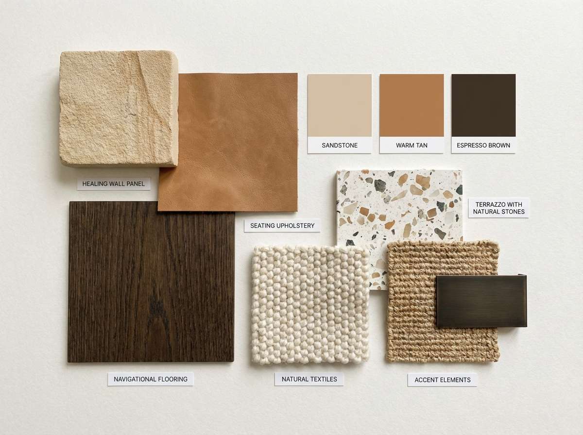
HEX: #FBF5EE #EED9C5 #D2B08D #A4714A #4B2B1A
Mood: healing, earthy, reassuring
Best for: rehab center interior moodboards
Sandstone and clay tones evoke steady progress, warm light, and a grounded sense of wellbeing. They are excellent for spaces meant to reduce anxiety and encourage patience. Pair with soft textiles, light wood, and matte finishes to keep the look cohesive. Usage tip: use the medium tan for large wall areas and keep the dark brown to signage or trim.
Image example of sandstone healing generated using media.io
14) Ice Blue Minimal
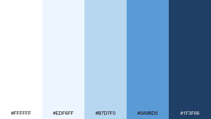
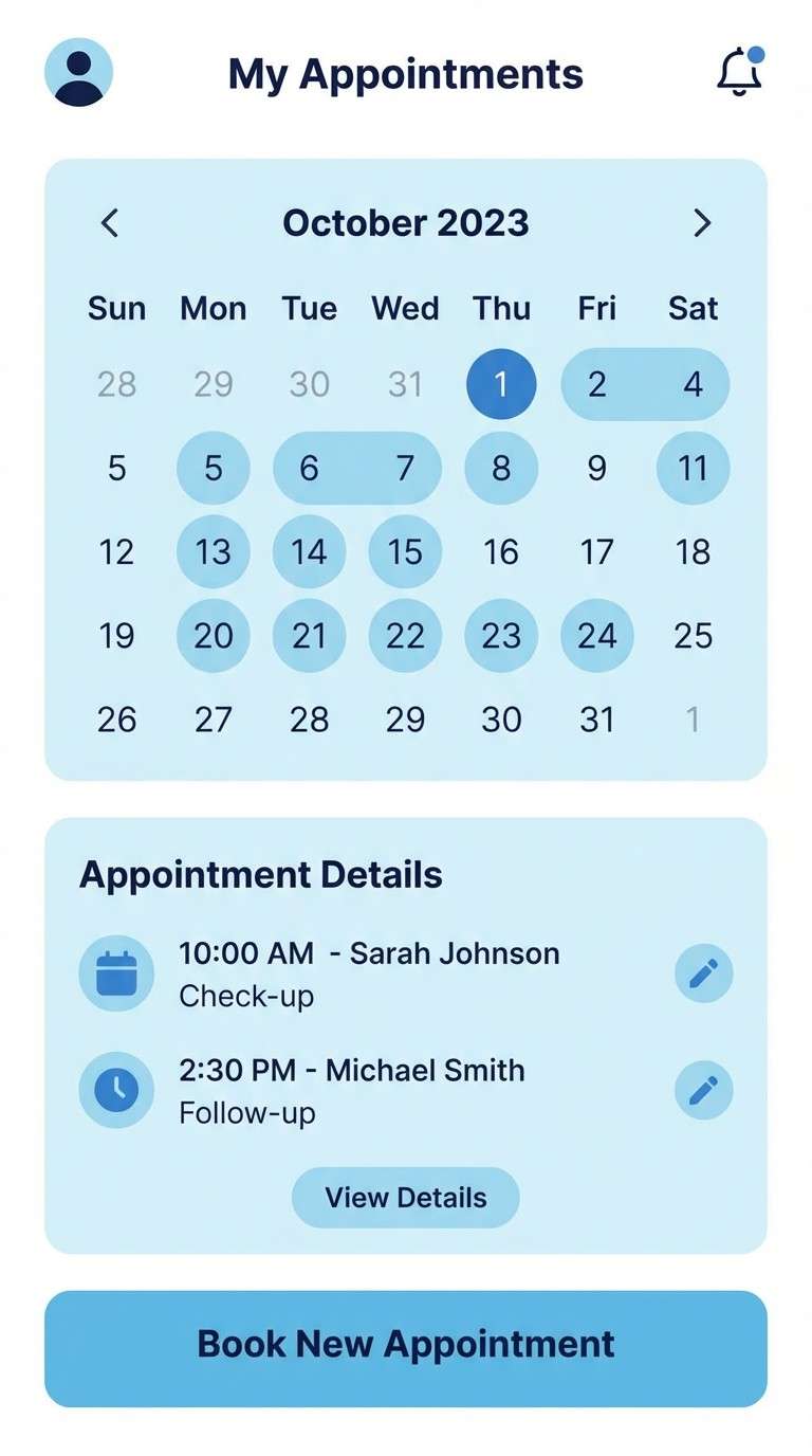
HEX: #FFFFFF #EDF6FF #B7D7F0 #5A9BD5 #1F3F66
Mood: minimal, clear, calming
Best for: clinic scheduling app UI
Icy blues and bright white feel like crisp linens, quiet hallways, and clear answers. As a hospital color palette, it keeps scheduling flows simple and reduces visual stress during busy moments. Pair with subtle gray dividers and use the medium blue for active states and links. Usage tip: keep backgrounds nearly white and lean on blue only for interaction cues.
Image example of ice blue minimal generated using media.io
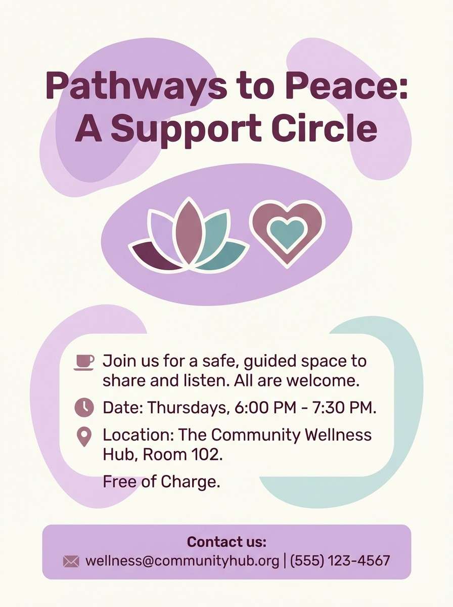
15) Plum Comfort
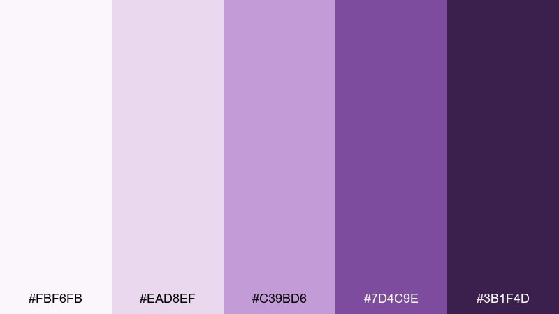
HEX: #FBF6FB #EAD8EF #C39BD6 #7D4C9E #3B1F4D
Mood: comforting, thoughtful, supportive
Best for: oncology support group flyers
Plum and lilac suggest empathy, quiet strength, and a safe space to talk. These tones can make sensitive communications feel more personal while staying polished. Pair with simple line illustrations and a lot of white space to avoid heaviness. Usage tip: use the deepest plum only for titles and dates to keep the flyer gentle.
Image example of plum comfort generated using media.io
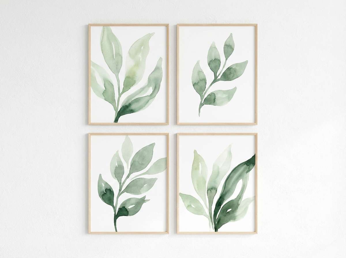
16) Forest Waiting Room
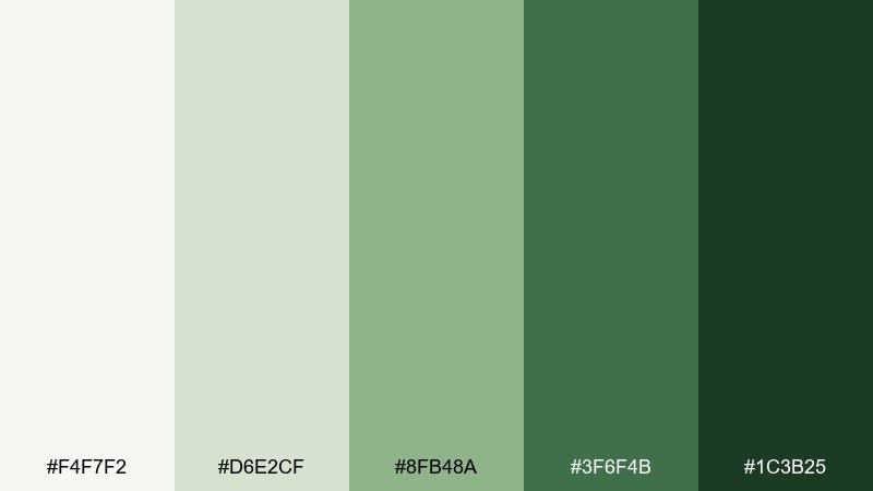
HEX: #F4F7F2 #D6E2CF #8FB48A #3F6F4B #1C3B25
Mood: restorative, natural, steady
Best for: waiting room wall art illustrations
Forest greens feel like a quiet garden view and a moment to reset before an appointment. The deeper shades add stability while the pale greens keep the atmosphere light. Pair with warm neutrals and soft textures so the space stays inviting. Usage tip: repeat the mid green as a consistent accent across frames for a cohesive wall.
Image example of forest waiting room generated using media.io
17) Copper Wood Tones
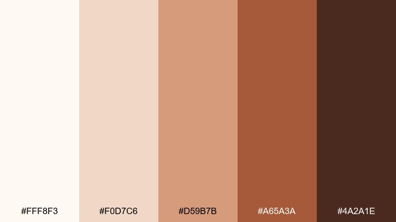
HEX: #FFF8F3 #F0D7C6 #D59B7B #A65A3A #4A2A1E
Mood: artisan, warm, premium
Best for: pharmacy packaging and labels
Copper and warm wood tones evoke craft, comfort, and a premium apothecary feel. They work well for over-the-counter products or wellness lines that need warmth without looking rustic. Pair with clean white label areas and modern sans-serif type for clarity. Usage tip: keep the darkest brown for dosage info so it stays readable against lighter paper stock.
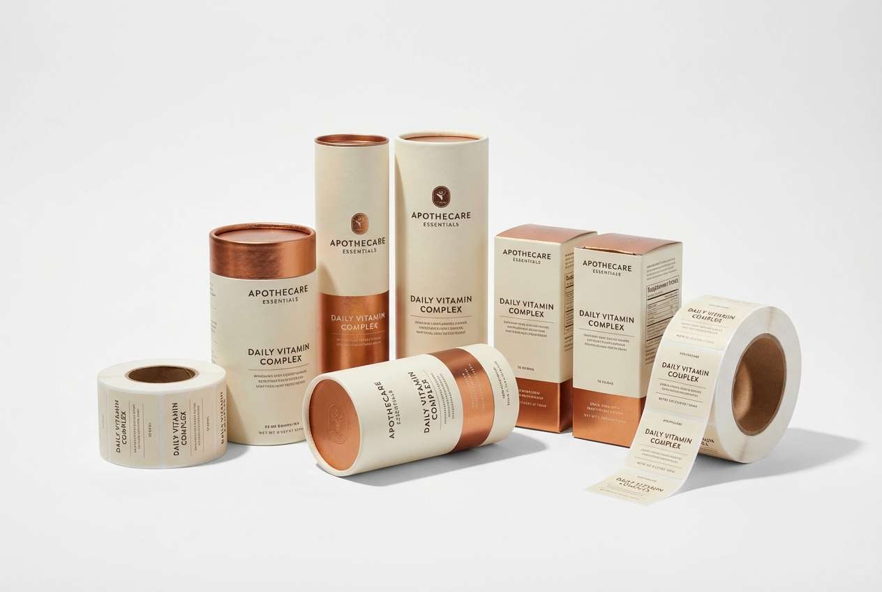
Image example of copper wood tones generated using media.io
18) Monochrome Sterile
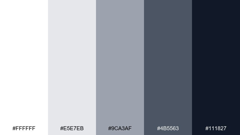
HEX: #FFFFFF #E5E7EB #9CA3AF #4B5563 #111827
Mood: neutral, sharp, procedural
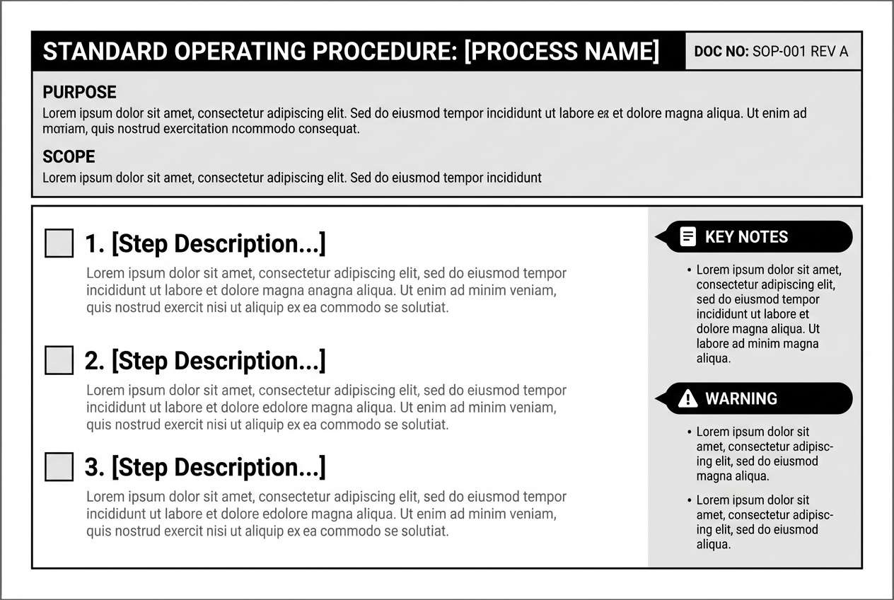
Best for: clinical SOP document templates
Monochrome grays feel like polished steel, printed checklists, and no-nonsense clarity. These hospital color combinations are ideal when consistency and legibility matter more than brand personality. Pair with simple icons and structured tables to guide the eye through procedures. Usage tip: use the mid gray for callout boxes and keep the near-black for warnings and critical steps.
Image example of monochrome sterile generated using media.io
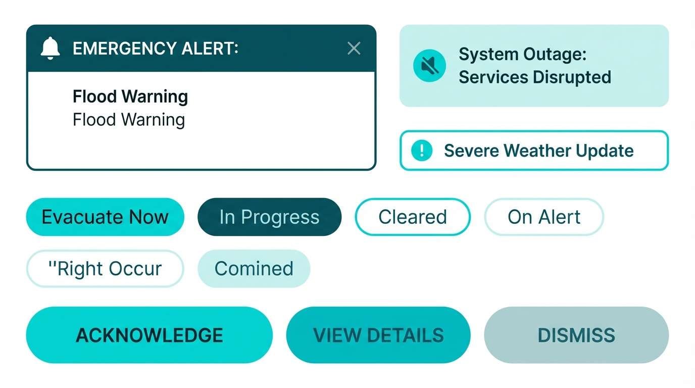
19) Turquoise Energy
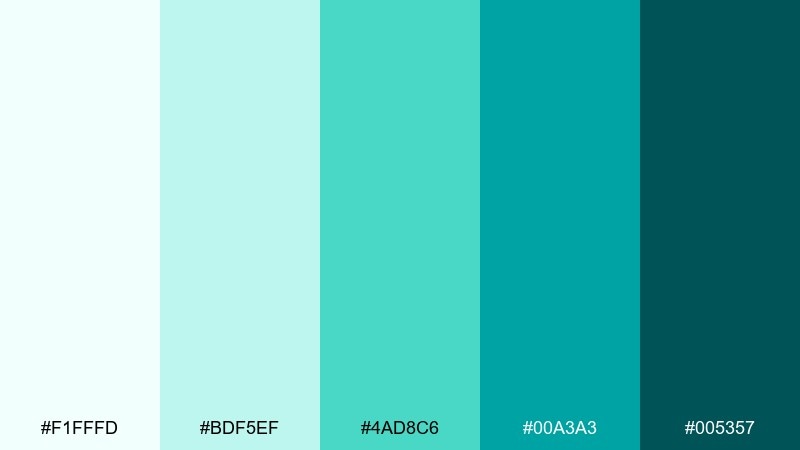
HEX: #F1FFFD #BDF5EF #4AD8C6 #00A3A3 #005357
Mood: alert, responsive, modern
Best for: emergency department alert UI components
Bright turquoise reads like rapid response, clear signals, and modern equipment displays. The high-chroma accents help key actions stand out without resorting to harsh reds. Pair with white and charcoal typography for strong contrast and quick scanning. Usage tip: reserve the brightest turquoise for alerts and primary actions, then keep the rest muted.
Image example of turquoise energy generated using media.io
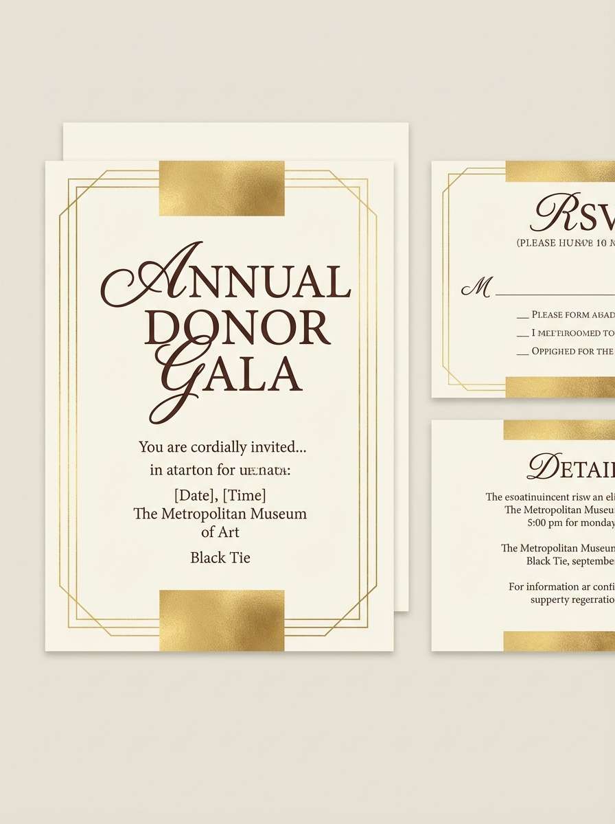
20) Golden Hour Hospitality
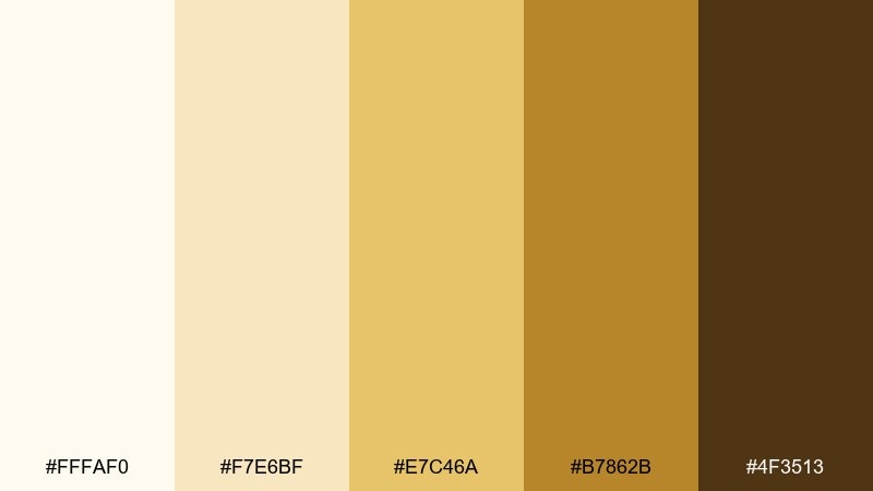
HEX: #FFFAF0 #F7E6BF #E7C46A #B7862B #4F3513
Mood: optimistic, celebratory, warm
Best for: donor gala invitation sets
Warm golds feel like late-afternoon light, gratitude, and a refined welcome. These tones elevate formal communications while still staying approachable. Pair with deep brown typography and minimal ornamentation so the design feels premium, not flashy. Usage tip: use the brightest gold as a foil-like accent on headers and seals, then keep body text dark.
Image example of golden hour hospitality generated using media.io
What Colors Go Well with Hospital?
Hospital palettes pair best with clean neutrals (white, light gray, soft charcoal) because they maintain legibility across forms, labels, and UI components. Neutrals also help clinical spaces feel brighter and more organized.
Cool hues like light blue, teal, and soft green are classic healthcare branding colors because they signal calm, stability, and cleanliness. They work particularly well for navigation cues, buttons, and section headers.
For warmth, use muted coral, beige, or gentle gold as accent colors—especially in patient-facing campaigns and hospitality-style communications. Keep warm tones controlled so the overall system still reads professional.
How to Use a Hospital Color Palette in Real Designs
Start with a high-clarity base: whites and very light tints for backgrounds, then choose one primary brand color for CTAs and wayfinding highlights. This keeps screens and signage calm while ensuring key actions stand out.
Build hierarchy with contrast, not saturation. Use deep navy/teal/graphite for headings and critical data, mid tones for dividers and secondary UI, and the lightest tints for panels or table striping.
Test accessibility early. Healthcare interfaces often include dense information, so verify color contrast for text, icons, and states (hover, active, error) to keep experiences readable for everyone.
Create Hospital Palette Visuals with AI
If you want to preview a hospital color scheme in real layouts (dashboards, posters, brochures, or signage), generate quick mockups with AI. It’s a fast way to validate contrast, spacing, and the overall tone before production.
Reuse the prompts above to produce consistent examples, then tweak keywords like “flat,” “print-ready,” “minimal,” or “editorial” to match your medium. You can also specify aspect ratios to fit web banners, mobile UI, or flyers.
Once you like a direction, keep your palette consistent across brand touchpoints by saving HEX codes and applying them to components (buttons, alerts, chips, and headers) as a repeatable system.
Hospital Color Palette FAQs
-
What is the best hospital color palette for UI design?
For UI, start with white or near-white backgrounds, add a soft blue/teal for primary actions, and use navy or charcoal for text. Palettes like Skyline Blue White, Ice Blue Minimal, and Sterile Mint Calm keep interfaces calm while preserving clear hierarchy. -
Why are blue and green common in hospital color schemes?
Blue and green are associated with cleanliness, stability, and calm. They also tend to be comfortable for long viewing sessions in clinical environments, making them popular for signage, uniforms, and digital products. -
Can a hospital brand use warm colors like coral or beige?
Yes—warm accents can make healthcare communications feel more human and welcoming. Use warm tones as highlights (CTAs, headers, campaign messages) while keeping the base neutral and the text high-contrast. -
What colors should be avoided in hospital signage?
Avoid large blocks of highly saturated colors that reduce readability or increase visual stress. Also be cautious with low-contrast combinations (light gray on white) and color-only meaning (e.g., relying on red/green without labels or icons). -
How do I make a hospital palette accessible?
Choose text colors that meet contrast requirements against backgrounds, and test interactive states (hover, focus, disabled). Use shape, labels, and icons alongside color for critical alerts and navigation to support color-blind users. -
Which palette works best for medical documents and SOPs?
Monochrome Sterile and Graphite Clinical are strong choices for documents because they emphasize structure and legibility. Add a single restrained accent color for callouts if needed, but keep the overall system consistent. -
How can I preview my hospital color combinations before design production?
Generate quick mockups with AI using your HEX palette and a prompt describing the layout you need (dashboard, flyer, signage, report). This helps you evaluate tone, contrast, and visual balance before committing to final assets.
Next: Nature Color Palette


