

Heliotrope is a vivid purple-pink that can read dreamy, futuristic, romantic, or editorial—depending on the neutrals and accents you pair with it. It’s bold enough for standout brand moments, yet flexible enough for soft, minimal UI.
Below are curated heliotrope color palette ideas with HEX codes, mood notes, and practical pairing tips for branding, UI, print, and décor—plus AI prompts you can reuse to generate matching visuals.
In this article
- Why Heliotrope Palettes Work So Well
-
- amethyst glow
- orchid mist
- neon heliotrope pop
- velvet twilight
- lilac latte
- cosmic iris
- sunset bougainvillea
- berry sorbet
- hushed mauve
- electric studio
- garden violets
- retro arcade
- minimal lavender
- plum smoke
- spring hyacinth
- celestial gradient
- rose quartz violet
- night market
- soft candy bloom
- modern editorial violet
- gilded violet night
- iris clay neutral
- digital heliotrope blueprint
- What Colors Go Well with Heliotrope?
- How to Use a Heliotrope Color Palette in Real Designs
- Create Heliotrope Palette Visuals with AI
Why Heliotrope Palettes Work So Well
Heliotrope sits between purple and magenta, so it naturally feels expressive—creative enough for hero moments, but still refined when anchored with deep plums or near-black violets.
It also scales across styles: push it toward neon with hot pinks and aquas, or calm it down with warm off-whites, clay neutrals, and gray-lilacs. That range makes it useful for both brand identity and product UI.
Most importantly, heliotrope creates instant hierarchy. A small hit of saturated violet can guide attention to CTAs, badges, or pull quotes—without requiring extra shapes or heavy borders.
20+ Heliotrope Color Palette Ideas (with HEX Codes)
1) Amethyst Glow
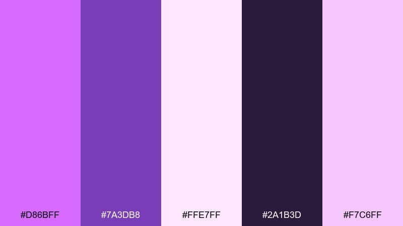
HEX: #D86BFF #7A3DB8 #FFE7FF #2A1B3D #F7C6FF
Mood: radiant, dreamy
Best for: beauty brand hero banner
Radiant and dreamy, this mix feels like amethyst catching light at dusk. It shines in beauty and lifestyle visuals where you want softness with a bold focal point. Pair the vivid violet with deep plum for contrast, then let the pale pinks act as breathable negative space. Tip: keep the dark shade for headlines and use the bright heliotrope as a small, high-impact accent.
Image example of amethyst glow generated using media.io
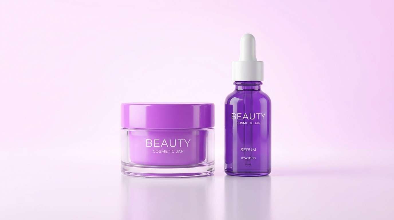
Media.io is an online AI studio for creating and editing video, image, and audio in your browser.

2) Orchid Mist
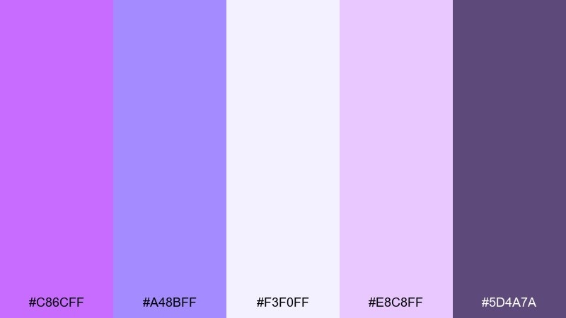
HEX: #C86CFF #A48BFF #F3F0FF #E8C8FF #5D4A7A
Mood: airy, calming
Best for: wellness app onboarding UI
Airy and calming, these tones feel like a foggy orchid garden in the morning. They work beautifully for wellness UI where readability matters but the mood should stay gentle. Pair the lilac tints with the muted charcoal-violet for typography and icons. Tip: use the palest shade as your main canvas and reserve the brighter violet for progress states and primary buttons.
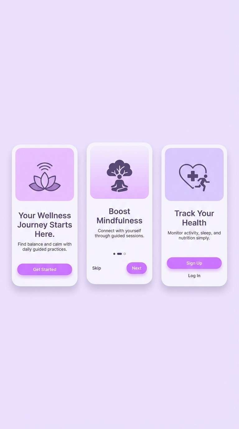
Image example of orchid mist generated using media.io
3) Neon Heliotrope Pop
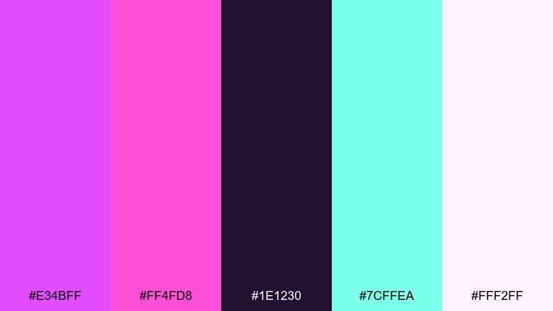
HEX: #E34BFF #FF4FD8 #1E1230 #7CFFEA #FFF2FF
Mood: playful, electric
Best for: music festival poster
Playful and electric, it brings to mind neon signage and late-night beats. This heliotrope color palette is built for posters and social promos that need instant energy. Pair the hot magenta with the dark ink base to keep the layout punchy, then use the aqua as a sparing highlight for dates or CTAs. Tip: limit the neon accents to small shapes so the typography stays legible from a distance.
Image example of neon heliotrope pop generated using media.io

4) Velvet Twilight
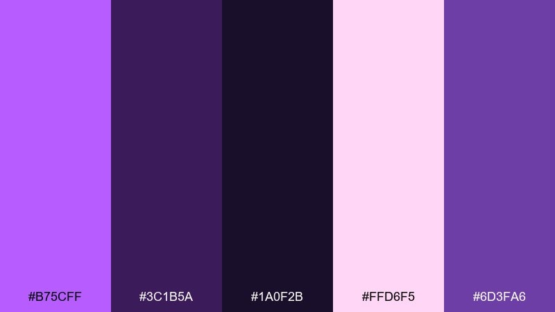
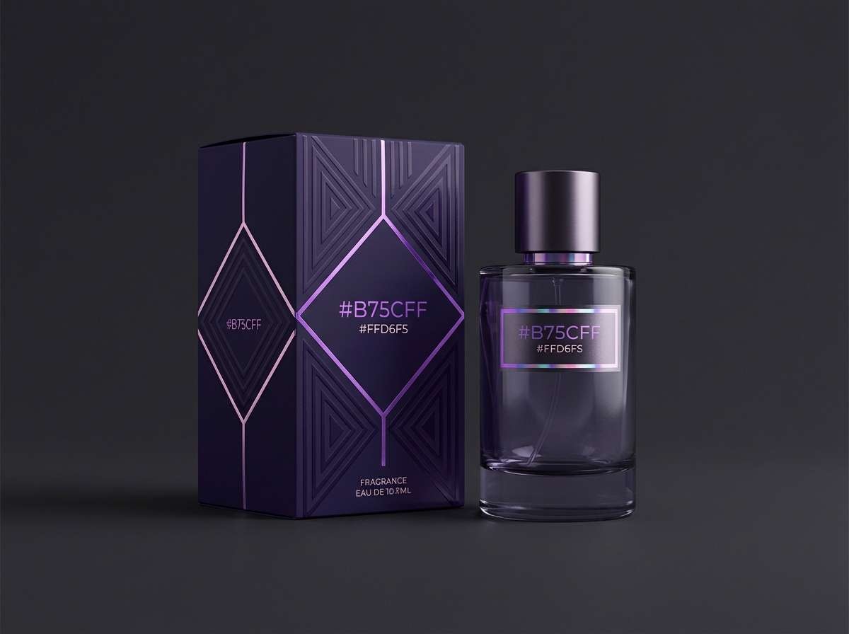
HEX: #B75CFF #3C1B5A #1A0F2B #FFD6F5 #6D3FA6
Mood: luxurious, moody
Best for: premium fragrance packaging
Luxurious and moody, it feels like velvet curtains in a twilight theater. The deep shadows make the brighter violet look richer and more expensive. Pair it with soft blush highlights for foil details or embossed marks. Tip: use the near-black as the base on packaging and keep the light pink only for small gleams to avoid washing out the drama.
Image example of velvet twilight generated using media.io
5) Lilac Latte
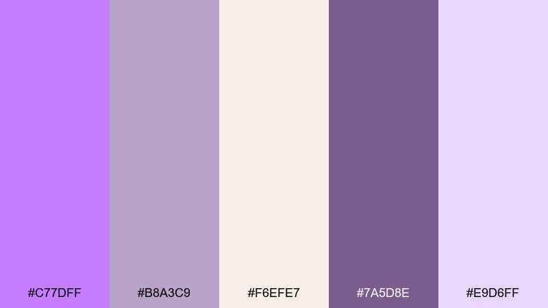
HEX: #C77DFF #B8A3C9 #F6EFE7 #7A5D8E #E9D6FF
Mood: cozy, modern
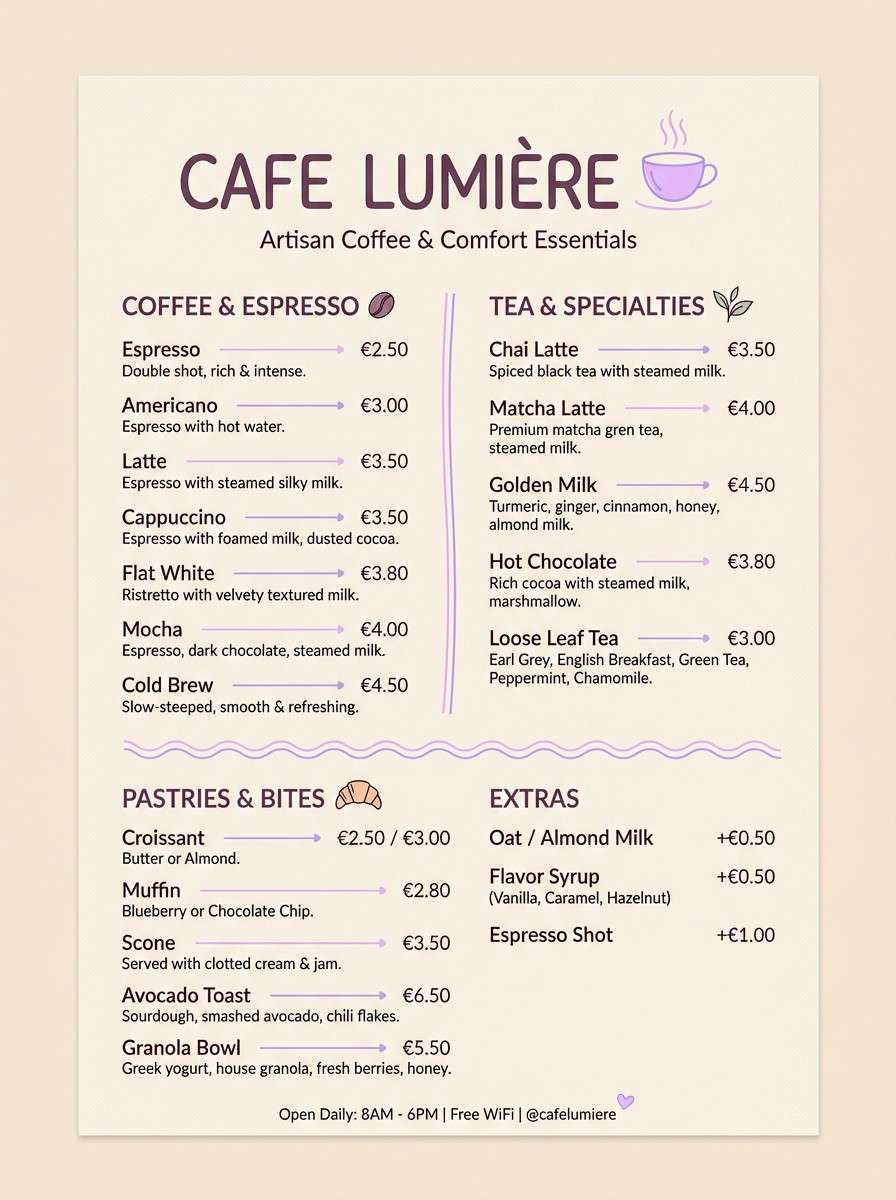
Best for: cafe brand menu design
Cozy and modern, these hues read like a lavender latte with cream. They fit menus, cafe branding, and packaging where you want warmth without going beige. Pair the creamy neutral with the dusty violet for body text, then add the brighter lilac for section headers. Tip: keep plenty of whitespace so the palette stays airy rather than overly sweet.
Image example of lilac latte generated using media.io
6) Cosmic Iris
HEX: #D067FF #5E2B97 #0D0B1F #9B8CFF #F2E9FF
Mood: mysterious, futuristic
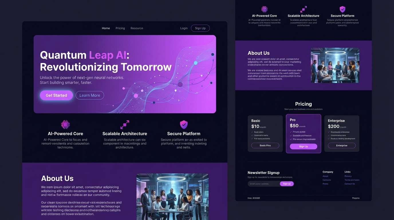
Best for: tech startup landing page
Mysterious and futuristic, it suggests an iris nebula against a dark sky. The near-black base makes the purples feel sharper and more high-tech. Pair the soft lavender with the saturated violet to create depth in gradients and section dividers. Tip: use the pale tint behind cards to separate content without adding extra lines.
Image example of cosmic iris generated using media.io
7) Sunset Bougainvillea
HEX: #E06BFF #FF7AB6 #FFEEE6 #FFB86B #6A2E87
Mood: sunlit, romantic
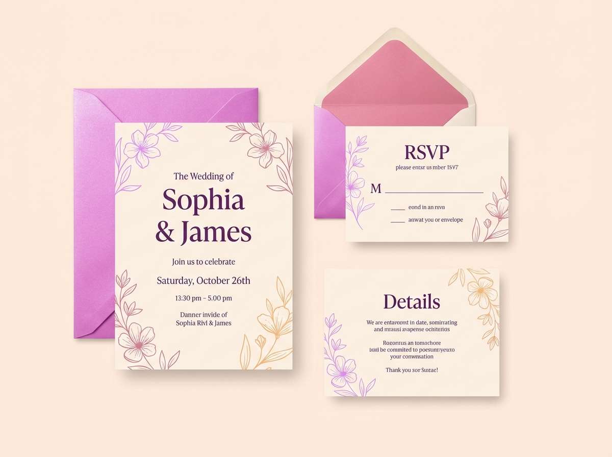
Best for: summer wedding invitation
Sunlit and romantic, it feels like bougainvillea petals glowing at golden hour. The peach and coral notes keep the violet from turning too cool, making it ideal for warm-season invites. Pair the cream base with the deep purple for elegant type contrast. Tip: print the bright violet as a spot accent for monograms or borders to avoid overpowering the page.
Image example of sunset bougainvillea generated using media.io
8) Berry Sorbet
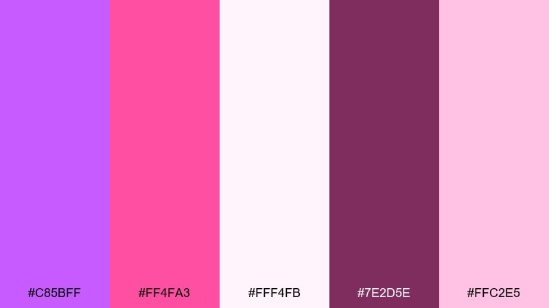
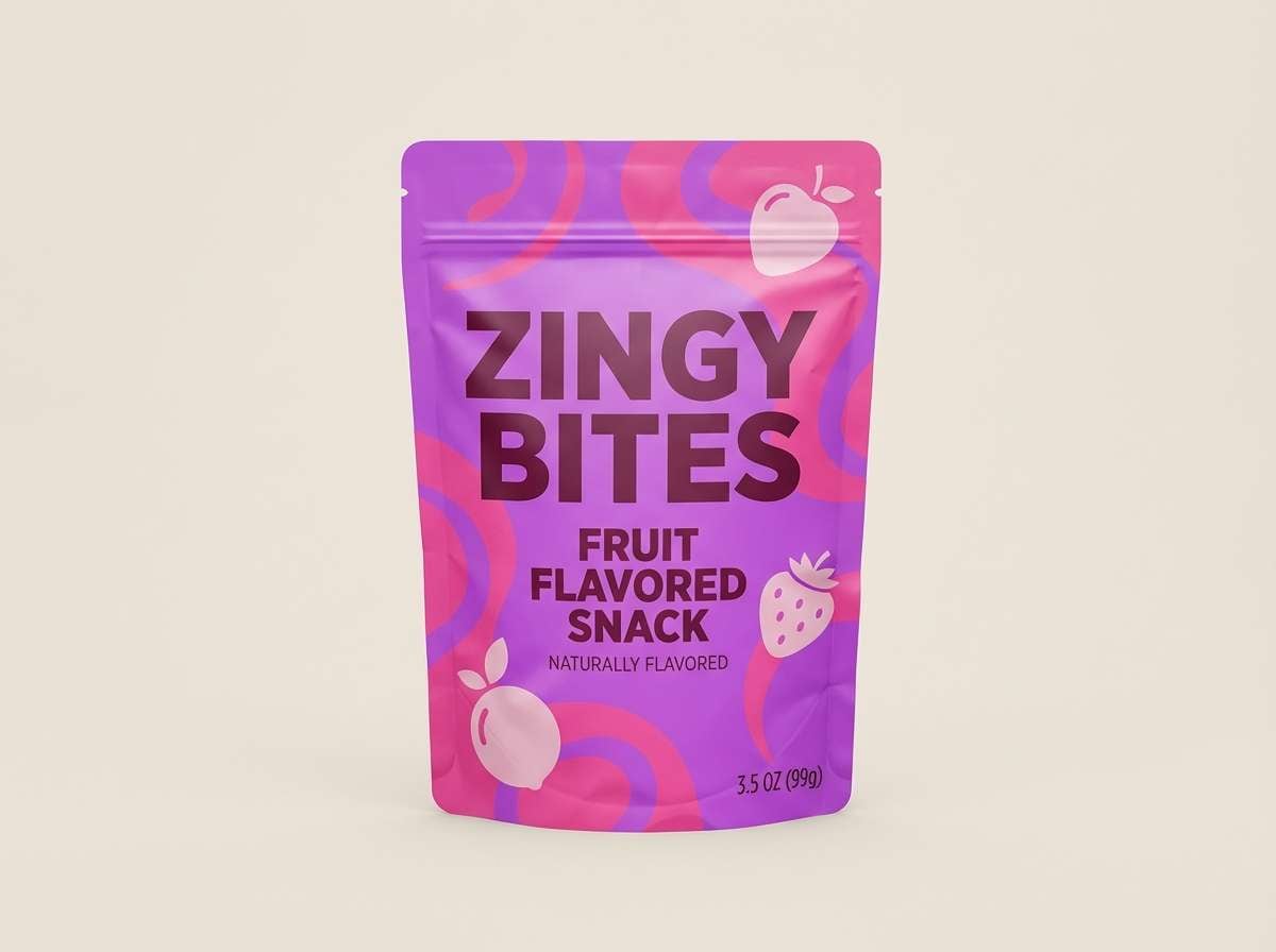
HEX: #C85BFF #FF4FA3 #FFF4FB #7E2D5E #FFC2E5
Mood: sweet, upbeat
Best for: DTC snack product ad
Sweet and upbeat, it reads like berry sorbet with a tangy finish. These heliotrope color combinations fit playful DTC ads and scroll-stopping social tiles. Pair the bright pink with the rich berry shade for a clear hierarchy, then let the pale background keep everything clean. Tip: use the darkest color for pricing and benefits so the offer stays readable on mobile.
Image example of berry sorbet generated using media.io
9) Hushed Mauve
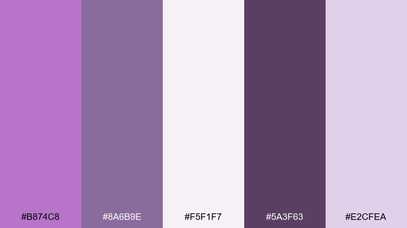
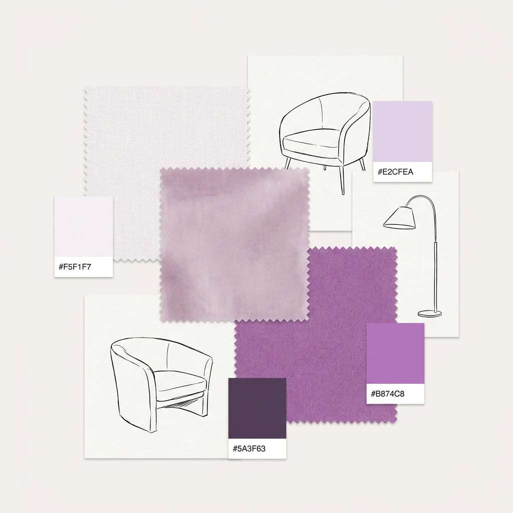
HEX: #B874C8 #8A6B9E #F5F1F7 #5A3F63 #E2CFEA
Mood: soft, understated
Best for: interior mood board
Soft and understated, it evokes mauve textiles and quiet mornings. The muted mid-tones are great for interiors where you want color without loud saturation. Pair it with warm whites and natural wood textures, keeping the darkest plum for small anchors like frames or fixtures. Tip: repeat the mid-mauve across two or three materials to make the room feel cohesive.
Image example of hushed mauve generated using media.io
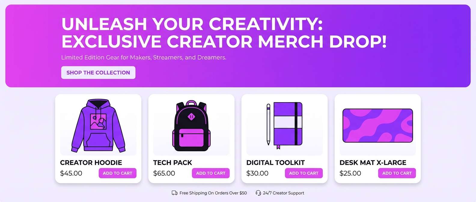
10) Electric Studio
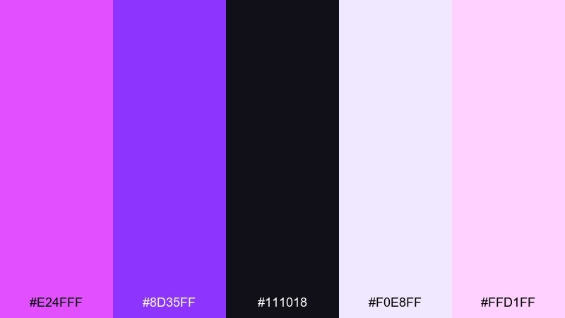
HEX: #E24FFF #8D35FF #111018 #F0E8FF #FFD1FF
Mood: bold, glossy
Best for: creator merch landing banner
Bold and glossy, it feels like studio lights reflecting off vinyl and chrome. The strong violet pair creates a clear focal zone for headlines and product shots. Pair the light lavender with the near-black to keep the layout crisp while still feeling vibrant. Tip: use a subtle gradient between the two purples to add depth without adding extra elements.
Image example of electric studio generated using media.io
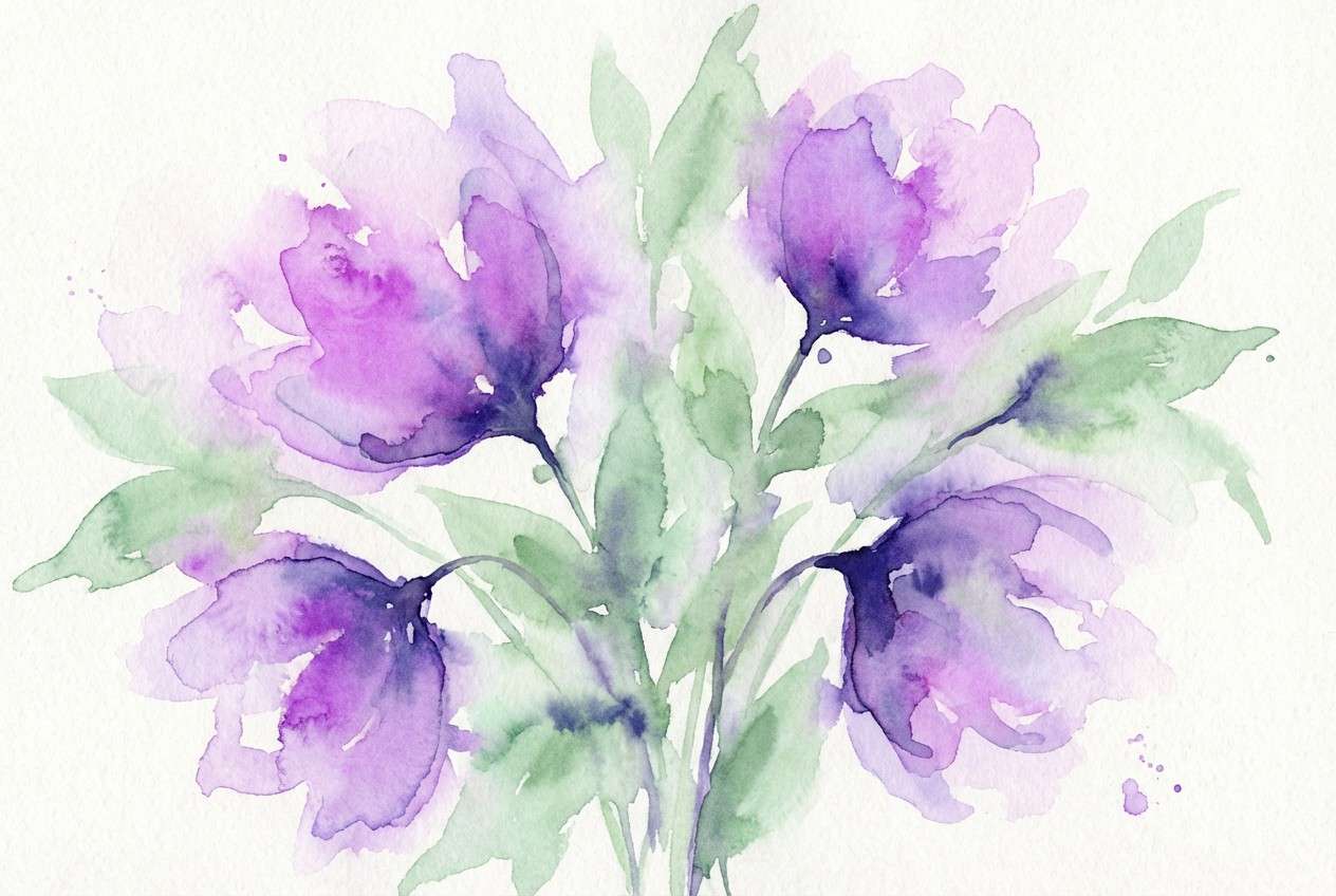
11) Garden Violets
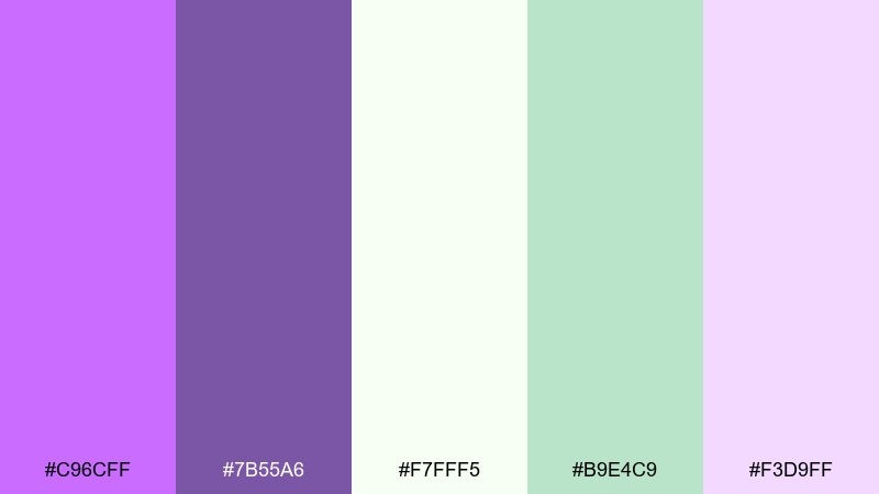
HEX: #C96CFF #7B55A6 #F7FFF5 #B9E4C9 #F3D9FF
Mood: fresh, botanical
Best for: watercolor floral illustration
Fresh and botanical, it suggests violet blooms tucked into leafy greens. The minty green adds a natural counterpoint that keeps the purples from feeling too candy-like. Pair these tones in florals, stationery, or spring campaigns where you want gentle contrast. Tip: let the green stay secondary, used in stems and shadows, so the violets remain the hero.
Image example of garden violets generated using media.io
12) Retro Arcade
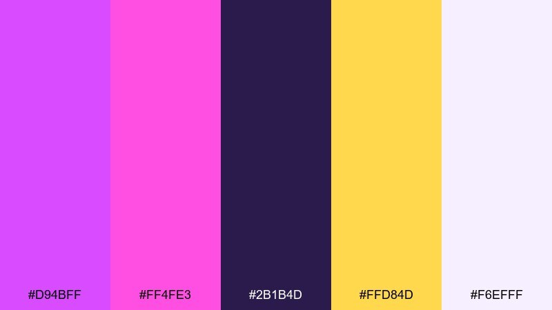
HEX: #D94BFF #FF4FE3 #2B1B4D #FFD84D #F6EFFF
Mood: nostalgic, energetic
Best for: gaming event flyer
Nostalgic and energetic, it channels arcade lights and pixel glow. The yellow pop creates instant contrast against the deep purple base, perfect for attention-grabbing flyers. Pair the two brights for badges or stickers, then keep body text on the pale tint for clarity. Tip: outline key text in the dark shade to improve readability over busy shapes.
Image example of retro arcade generated using media.io

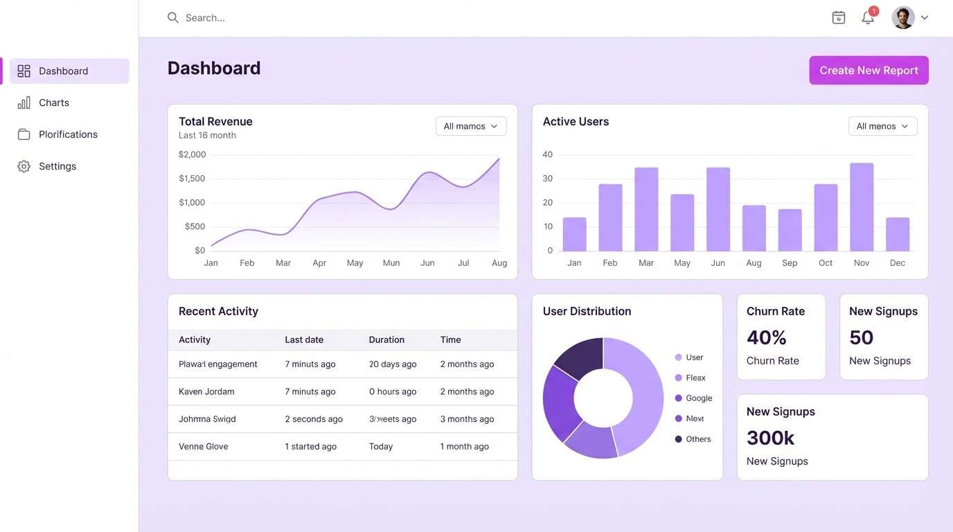
13) Minimal Lavender
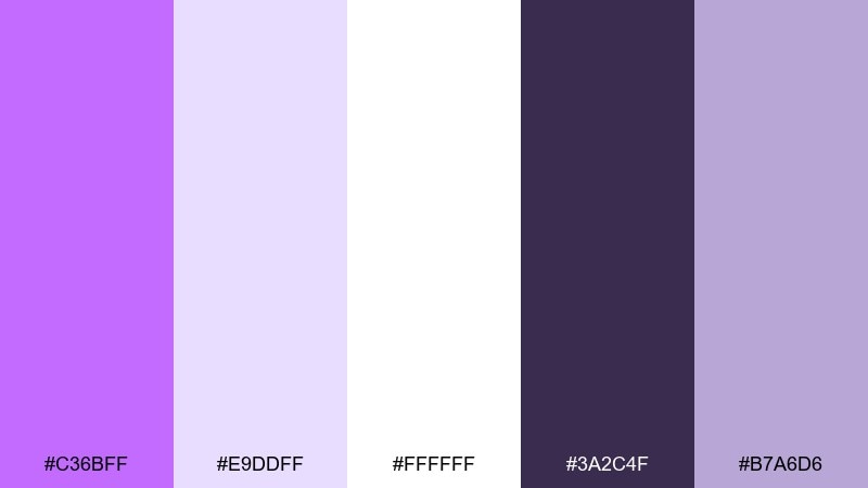
HEX: #C36BFF #E9DDFF #FFFFFF #3A2C4F #B7A6D6
Mood: clean, balanced
Best for: SaaS dashboard UI
Clean and balanced, it feels like a neat desk with a hint of lavender ink. This heliotrope color scheme is ideal for dashboards where structure and hierarchy come first. Pair the white and pale lilac for panels, and use the deep charcoal-violet for text and data labels. Tip: reserve the saturated purple for one primary action and one chart highlight to avoid visual noise.
Image example of minimal lavender generated using media.io
14) Plum Smoke
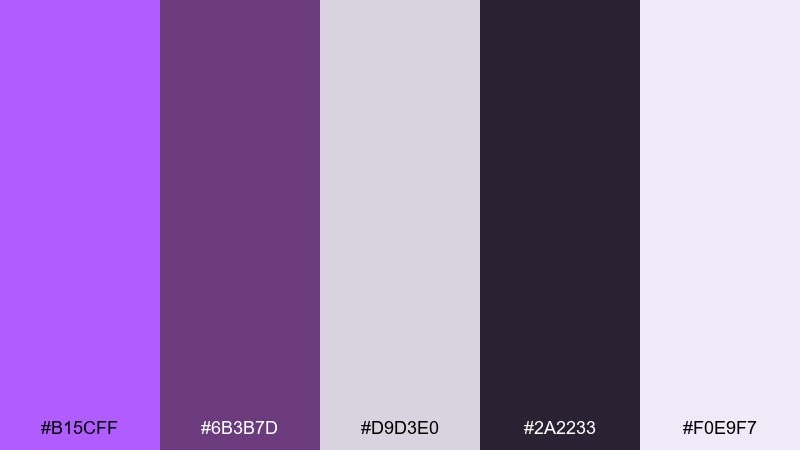
HEX: #B15CFF #6B3B7D #D9D3E0 #2A2233 #F0E9F7
Mood: smoky, sophisticated
Best for: book cover design
Smoky and sophisticated, it reads like plum incense drifting through a quiet library. The gray-lilac tones help the brighter purple feel mature rather than playful. Pair the near-black for title type and use the soft gray for texture or grain overlays. Tip: add subtle noise in the background to make the cover feel tactile while keeping the palette restrained.
Image example of plum smoke generated using media.io

15) Spring Hyacinth
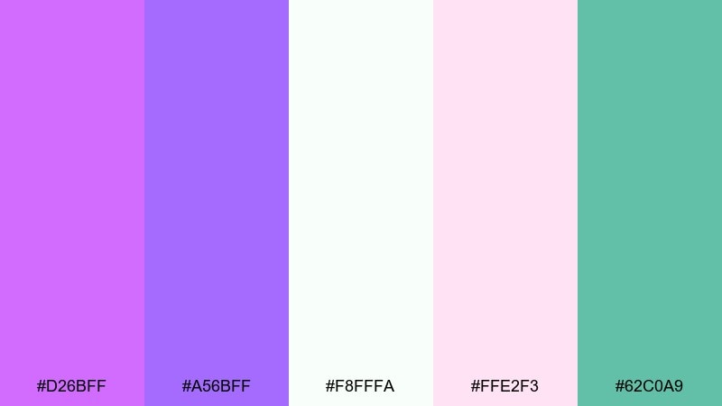
HEX: #D26BFF #A56BFF #F8FFFA #FFE2F3 #62C0A9
Mood: bright, optimistic
Best for: skincare launch social post
Bright and optimistic, it feels like hyacinths and fresh air after rain. The teal note adds a crisp twist that keeps the purples feeling modern. Pair the clean off-white with violet for a luminous skincare look, then use pink as a soft secondary accent. Tip: keep teal only for tiny callouts or icons so the overall tone stays airy and calm.
Image example of spring hyacinth generated using media.io

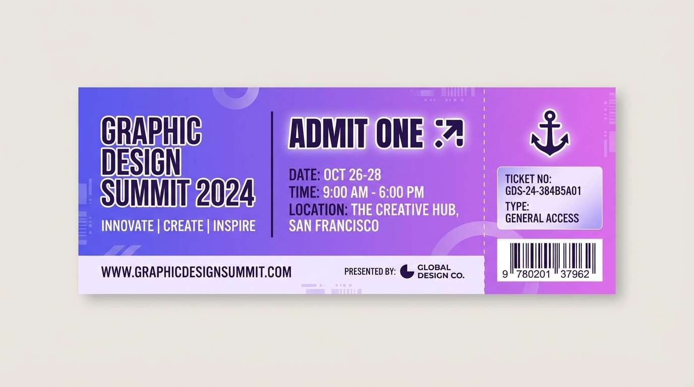
16) Celestial Gradient
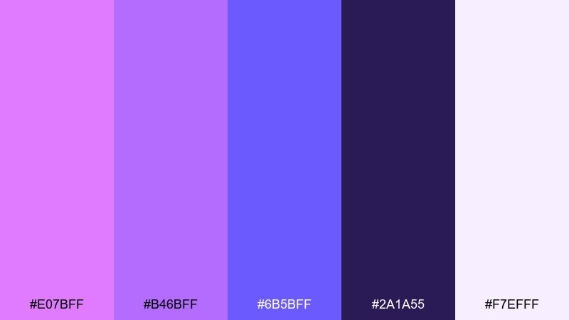
HEX: #E07BFF #B46BFF #6B5BFF #2A1A55 #F7EFFF
Mood: ethereal, smooth
Best for: event ticket background
Ethereal and smooth, it resembles a slow-moving sky gradient from violet to indigo. The trio of purples is perfect for layered backgrounds that still feel polished. Pair the dark shade for QR zones or fine print, and let the pale tint carry the whitespace. Tip: add a gentle diagonal gradient behind text blocks rather than under the entire layout to keep contrast consistent.
Image example of celestial gradient generated using media.io
17) Rose Quartz Violet
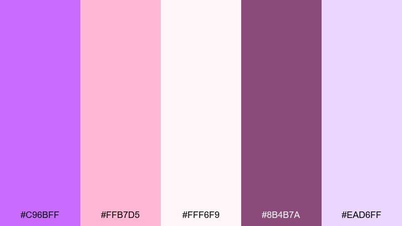
HEX: #C96BFF #FFB7D5 #FFF6F9 #8B4B7A #EAD6FF
Mood: romantic, gentle
Best for: valentines email header
Romantic and gentle, it blends rose quartz softness with a clear violet spark. These tones work well for seasonal emails, gift guides, and small-brand promotions that need warmth. Pair the blush with the pale background for calm breathing room, then use the deeper mauve-violet for type. Tip: keep the saturated purple only on one element like a button to guide clicks.
Image example of rose quartz violet generated using media.io
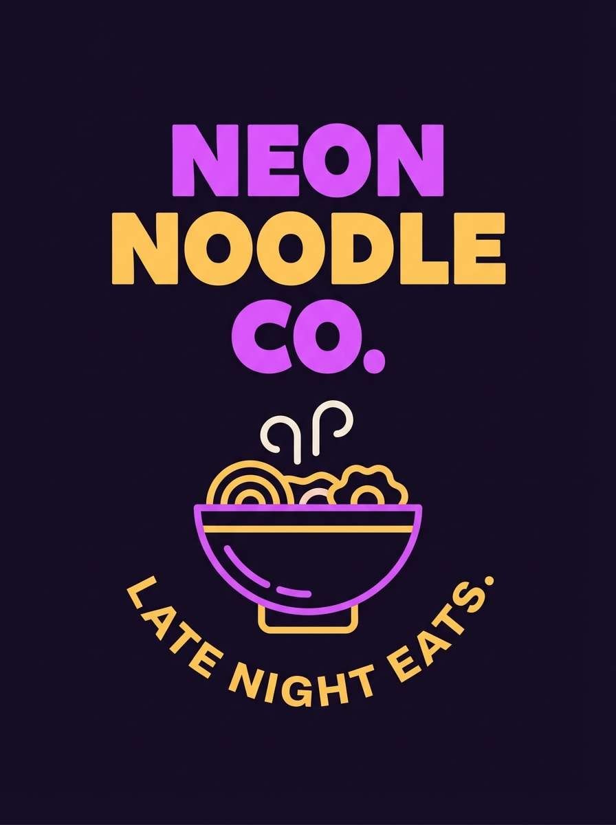
18) Night Market
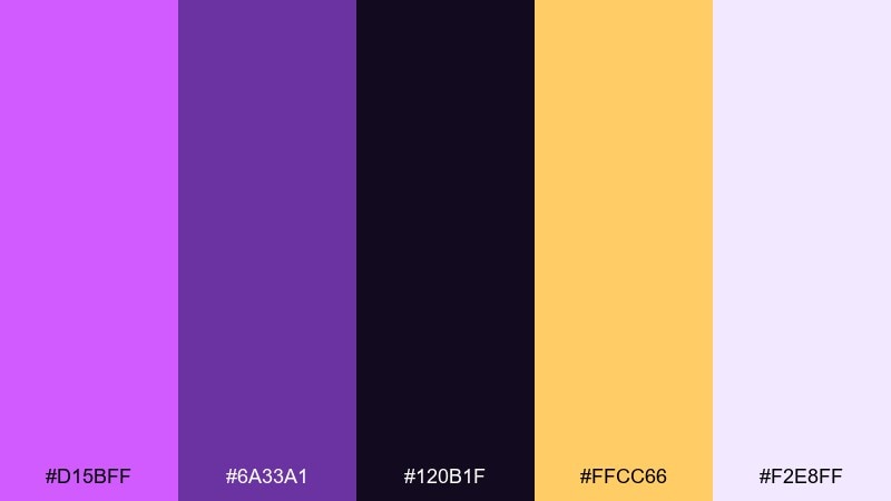
HEX: #D15BFF #6A33A1 #120B1F #FFCC66 #F2E8FF
Mood: dramatic, vibrant
Best for: street food brand poster
Dramatic and vibrant, it recalls lantern light cutting through a night market. The warm gold adds appetite and energy while the dark base keeps everything grounded. Pair the gold for price tags and key callouts, with pale lavender as the breathing space around dense copy. Tip: use the bright purple on a single large shape to frame the main product message.
Image example of night market generated using media.io
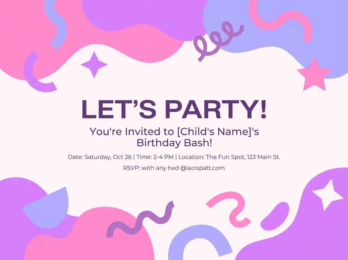
19) Soft Candy Bloom
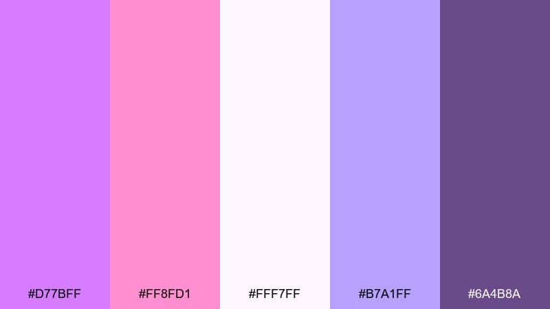
HEX: #D77BFF #FF8FD1 #FFF7FF #B7A1FF #6A4B8A
Mood: cute, pastel
Best for: kids party invitation
Cute and pastel, it feels like cotton candy and spring confetti. The palette stays light while still offering enough contrast for readable type. Pair the soft pink with lavender for playful shapes, then use the darker violet for names and RSVP details. Tip: avoid using all brights at once; choose one dominant pastel and let the others support it in small bursts.
Image example of soft candy bloom generated using media.io
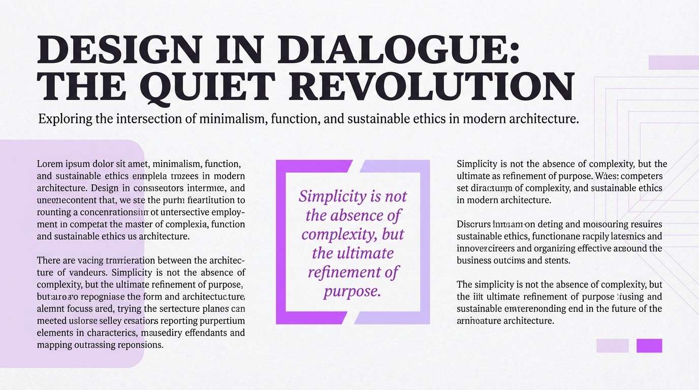
20) Modern Editorial Violet
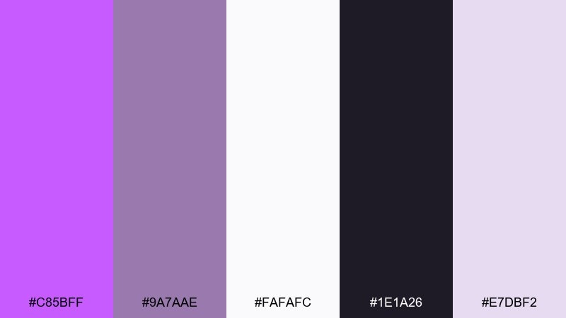
HEX: #C85BFF #9A7AAE #FAFAFC #1E1A26 #E7DBF2
Mood: editorial, polished
Best for: magazine feature layout
Editorial and polished, it brings the feel of a modern fashion spread with a violet edge. The near-black and soft gray-lilac make the bright accent look intentional rather than loud. Pair the saturated purple with thin rules, pull quotes, or section labels for a high-end rhythm. Tip: keep accent usage under 10% of the page to maintain that clean magazine pacing.
Image example of modern editorial violet generated using media.io
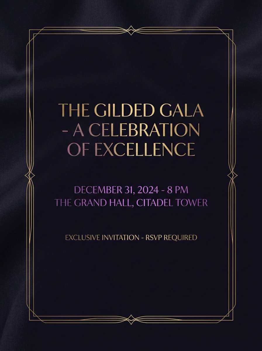
21) Gilded Violet Night
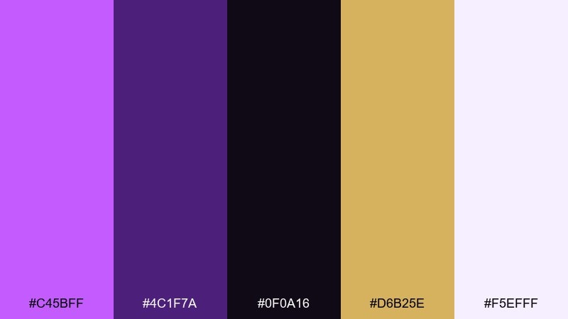
HEX: #C45BFF #4C1F7A #0F0A16 #D6B25E #F5EFFF
Mood: opulent, cinematic
Best for: luxury event invitation
Opulent and cinematic, it feels like gilded details against a velvet night sky. This heliotrope color palette is perfect for luxury invites where you want glamour without clutter. Pair the gold with the deep purple for borders and monograms, keeping the pale tint for spacing and readability. Tip: print the gold as foil or metallic ink to make the contrast truly pop.
Image example of gilded violet night generated using media.io
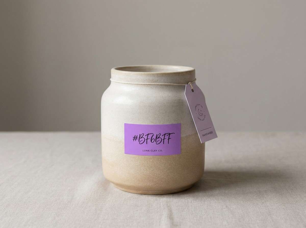
22) Iris Clay Neutral
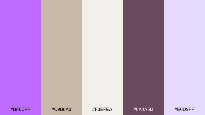
HEX: #BF6BFF #C9B8A8 #F3EFEA #6A4A5D #E6D9FF
Mood: earthy, modern
Best for: ceramics shop branding
Earthy and modern, it combines iris purple with clay neutrals for a grounded feel. The beige and warm off-white make the violet read more artisanal than neon. Pair it with matte textures, craft paper, and simple icons for a handmade brand vibe. Tip: use the clay tone for backgrounds and let the violet appear on labels, stamps, and small logo marks.
Image example of iris clay neutral generated using media.io
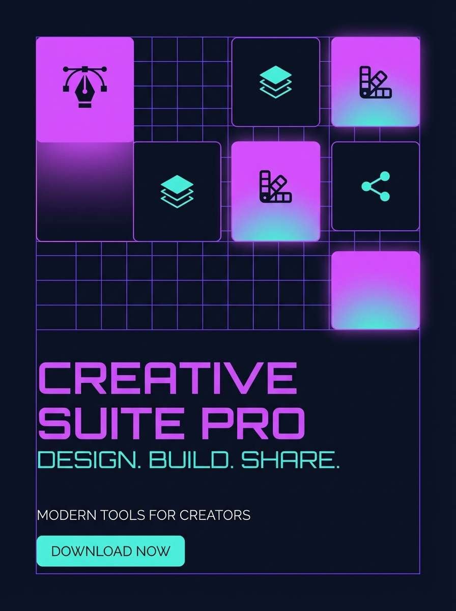
23) Digital Heliotrope Blueprint
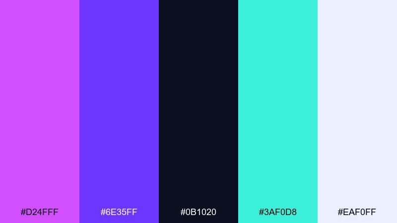
HEX: #D24FFF #6E35FF #0B1020 #3AF0D8 #EAF0FF
Mood: techy, sharp
Best for: app promo poster
Techy and sharp, it feels like a blueprint rendered in vivid violet. The cool aqua adds a precise, digital edge that reads as innovation. Pair the dark navy as the foundation, then use violet for major blocks and aqua for micro-highlights like icons or badges. Tip: keep the pale tint behind text to prevent color vibration when the brights sit close together.
Image example of digital heliotrope blueprint generated using media.io
What Colors Go Well with Heliotrope?
Heliotrope pairs cleanly with deep anchors like near-black, ink purple, or charcoal-violet to keep layouts legible and premium. If you want a softer look, warm off-white, pale lavender, and gray-lilac keep the mood airy without turning flat.
For contrast, try complementary warmth: gold, peach, and coral make heliotrope feel sunlit and romantic. For a modern edge, add cool accents like mint, teal, or aqua—best used sparingly to avoid visual vibration.
When in doubt, treat heliotrope as the “hero” accent and let neutrals do most of the work. That approach maintains clarity in UI and keeps print designs from feeling oversaturated.
How to Use a Heliotrope Color Palette in Real Designs
In branding, heliotrope is strongest as a signature accent: logos, labels, social templates, and campaign badges. Pair it with a dark base for luxury or a soft off-white base for approachable lifestyle brands.
In UI, prioritize accessibility by keeping text on very light tints or deep anchors, then use heliotrope for one primary action (CTA button) and one highlight state (active tab, progress, or key data point). This creates a consistent hierarchy across screens.
In print and décor, heliotrope benefits from texture: matte paper, grain, textiles, or foil details. Those materials help the color feel intentional—less “neon” and more crafted.
Create Heliotrope Palette Visuals with AI
If you already have HEX codes, you can generate matching mockups fast by describing a simple layout and listing your dominant + accent colors. Using consistent prompts across assets helps your brand visuals look cohesive across ads, UI, and print.
Start with one scene (poster, landing page, invitation, packaging), then iterate by swapping only the palette and keeping the composition similar. This makes it easy to compare which heliotrope color scheme best matches your message.
Use Media.io Text-to-Image to turn these palette prompts into on-brand examples in minutes—no advanced design setup required.


