

Green turquoise sits right between calm green and bright aqua, so it can feel coastal and relaxed or crisp and modern depending on the accents you pair it with.
Below are 20 curated green turquoise color palette ideas with HEX codes—built for branding, UI, interiors, and print—plus AI prompts you can reuse to generate matching visuals.
In this article
- Why Green Turquoise Palettes Work So Well
-
- sea glass mint
- lagoon linen
- coral reef accent
- rainy harbor
- palm springs pool
- alpine lake deep
- vintage apothecary
- botanical glasshouse
- modern spa stone
- arctic surf
- monochrome teal
- desert oasis
- neon signage pop
- coastal cottage
- retro diner cool
- clean dashboard
- jewel tones night
- sunny market
- watercolor meadow
- minimal editorial
- What Colors Go Well with Green Turquoise?
- How to Use a Green Turquoise Color Palette in Real Designs
- Create Green Turquoise Palette Visuals with AI
Why Green Turquoise Palettes Work So Well
Green turquoise is naturally “in-between,” which makes it incredibly flexible: it can read as clean and aquatic, botanical and fresh, or tech-forward and minimal with just a small shift in neutrals and contrast.
It also plays well with both warm and cool companions. Pair it with sand, cream, and terracotta for a grounded, resort-like feel, or with white, charcoal, and icy grays for a sharp UI/brand system.
Most importantly, green turquoise creates instant mood with high readability potential—especially when you reserve deep teals for typography and let lighter mints carry backgrounds and spacious layouts.
20+ Green Turquoise Color Palette Ideas (with HEX Codes)
1) Sea Glass Mint
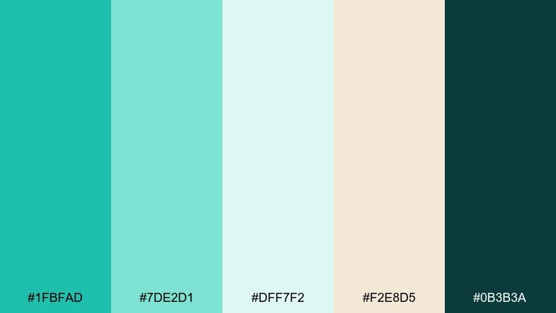
HEX: #1FBFAD #7DE2D1 #DFF7F2 #F2E8D5 #0B3B3A
Mood: airy, coastal, refreshing
Best for: bathroom refresh, wellness brands, summer social posts
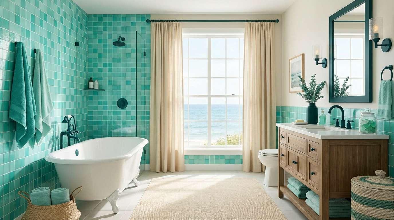
Airy sea-glass tones feel like sunlit water and smooth shoreline stones. This green turquoise color palette works beautifully with warm creams, light oak, and brushed brass for an easy coastal look. Keep the darkest teal for typography or hardware so the mint stays bright. Tip: use the beige as a buffer between the aqua shades to avoid a too-saturated block of color.
Image example of sea glass mint generated using media.io
Media.io is an online AI studio for creating and editing video, image, and audio in your browser.

2) Lagoon Linen
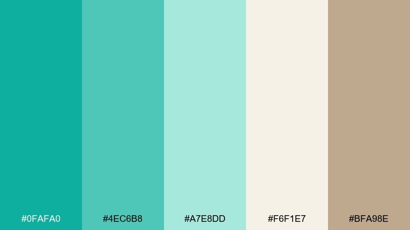
HEX: #0FAFA0 #4EC6B8 #A7E8DD #F6F1E7 #BFA98E
Mood: soft, relaxed, resort-like
Best for: boutique hotel branding, lifestyle packaging, landing pages
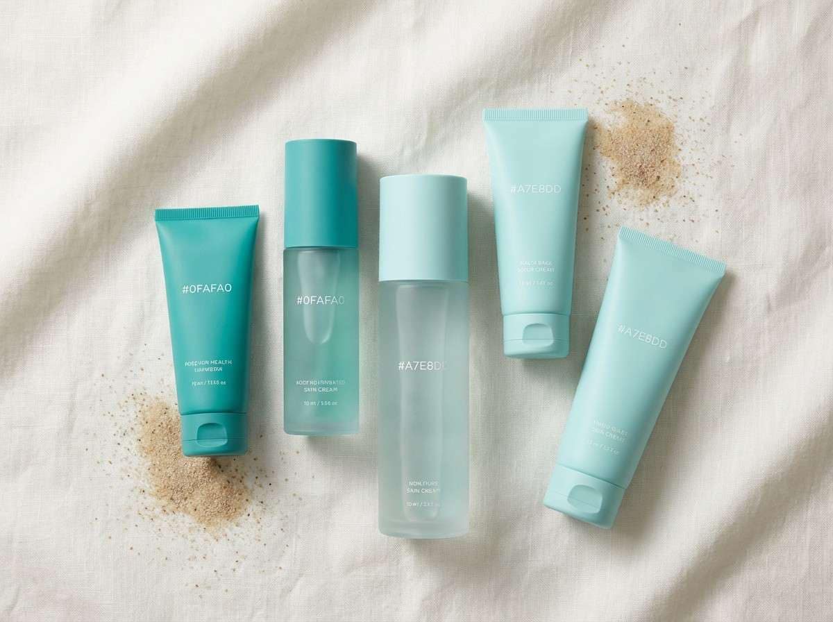
Soft lagoon greens paired with linen neutrals evoke breezy resorts and effortless weekends. The warm sand tone grounds the cool aqua so layouts feel inviting, not icy. Pair with minimalist typography and plenty of whitespace for a premium look. Tip: reserve the deepest teal for buttons and links to create instant hierarchy.
Image example of lagoon linen generated using media.io
3) Coral Reef Accent
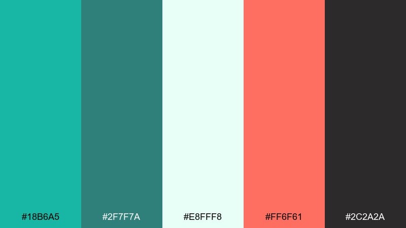
HEX: #18B6A5 #2F7F7A #E8FFF8 #FF6F61 #2C2A2A
Mood: playful, energetic, modern
Best for: event posters, punchy CTAs, creator branding
Vivid reef teal with a coral pop feels like snorkeling over bright marine life. Use the coral as a sparing highlight against the airy mint-white so it stays crisp and contemporary. Charcoal adds legibility for headlines and icons without dulling the color. Tip: keep coral under 10 percent of the composition for a clean, high-impact finish.
Image example of coral reef accent generated using media.io

4) Rainy Harbor
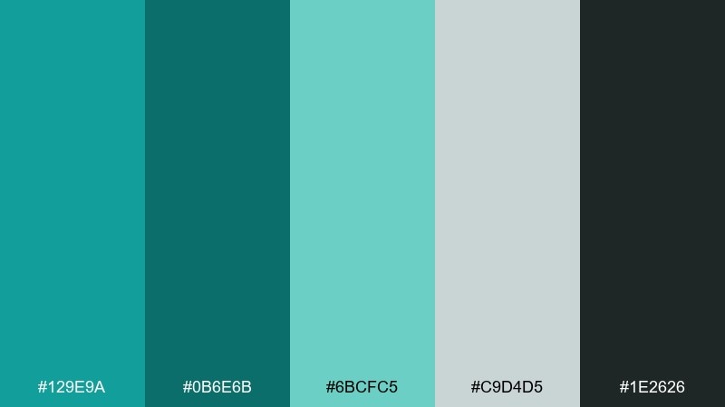
HEX: #129E9A #0B6E6B #6BCFC5 #C9D4D5 #1E2626
Mood: moody, calm, urban-coastal
Best for: editorial layouts, architecture sites, subdued dashboards
Muted harbor teals and soft fog gray create a calm, rainy-day atmosphere. The darker teal and charcoal make strong anchors for headers, navigation, and charts. Pair with cool grays and simple grids to keep it modern and understated. Tip: use the light teal for hover states so interactions feel gentle, not flashy.
Image example of rainy harbor generated using media.io
5) Palm Springs Pool
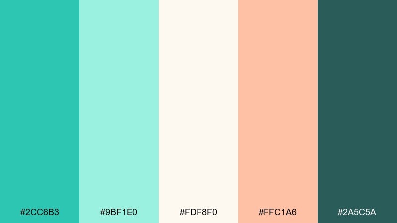
HEX: #2CC6B3 #9BF1E0 #FDF8F0 #FFC1A6 #2A5C5A
Mood: sunny, retro, vacation-ready
Best for: summer campaigns, cafe menus, upbeat social templates
Poolside turquoise with peachy warmth brings instant Palm Springs energy. The creamy off-white keeps the look bright, while the deep teal adds structure for text and logos. Pair with rounded type and playful shapes for a friendly, retro vibe. Tip: use peach for badges or prices to guide the eye without overpowering the aqua.
Image example of palm springs pool generated using media.io
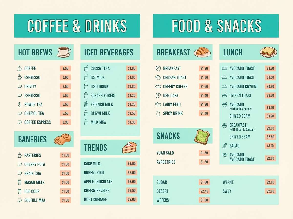
6) Alpine Lake Deep
HEX: #0A8F84 #044A4B #1CC9B6 #BFEFE6 #E9F0F2
Mood: crisp, serene, outdoorsy
Best for: travel banners, nature blogs, calm product pages
Deep alpine water tones feel fresh, cool, and quietly adventurous. Layer the darkest teal behind lighter aqua elements to create depth without going too heavy. Pair with icy grays and clean photography for a modern outdoors look. Tip: keep gradients subtle and use the pale aqua as a soft highlight around key content.
Image example of alpine lake deep generated using media.io

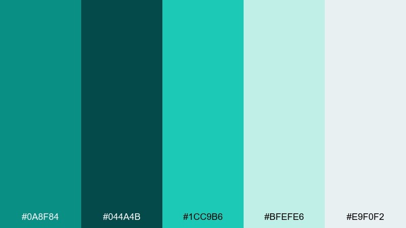
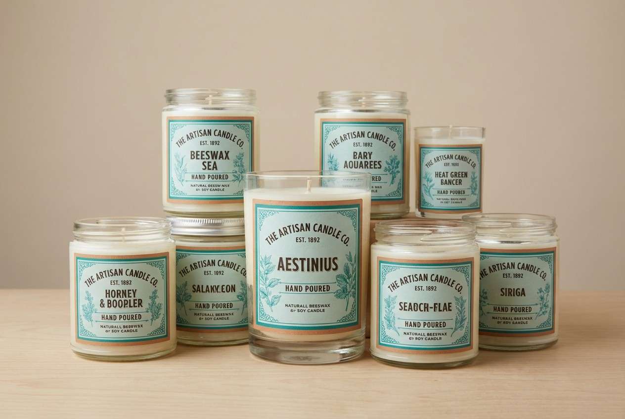
7) Vintage Apothecary
HEX: #1AA89A #4A6F6A #CFECE6 #F2D6C3 #3B2F2A
Mood: heritage, earthy, comforting
Best for: artisan labels, candles, natural skincare packaging
Earthy teal and warm clay-beige feel like glass bottles on a wooden shelf. These green turquoise color combinations shine when you add kraft paper textures and serif typography for a handcrafted mood. Use the dark brown for stamps, ingredient lists, and fine outlines to keep details readable. Tip: let the pale mint be the main label background so the palette stays soft and inviting.
Image example of vintage apothecary generated using media.io
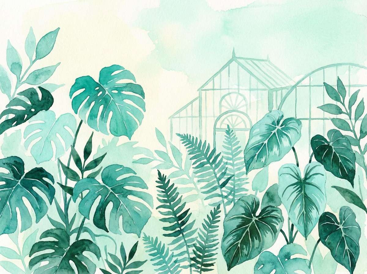
8) Botanical Glasshouse
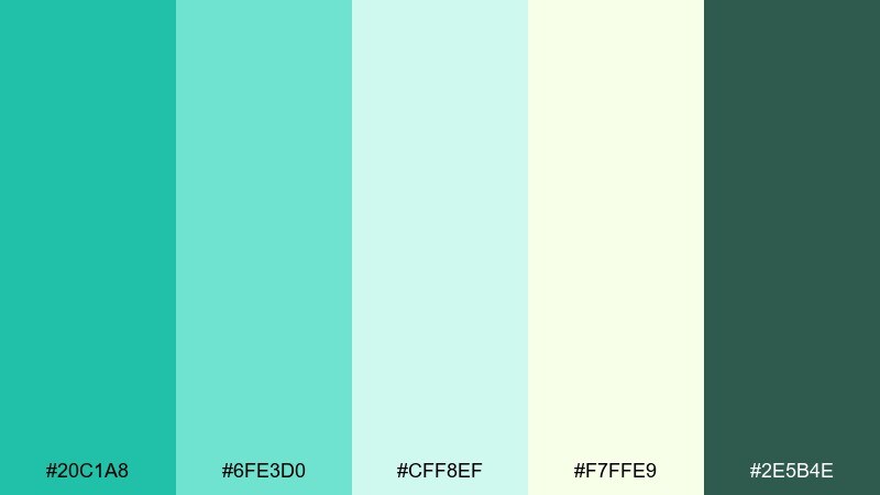
HEX: #20C1A8 #6FE3D0 #CFF8EF #F7FFE9 #2E5B4E
Mood: fresh, botanical, optimistic
Best for: spring illustrations, eco campaigns, garden event flyers
Bright greenhouse teals and leafy undertones feel like new sprouts and misted glass. The pale yellow-green adds sunlight without turning the palette overly warm. Pair with simple plant illustrations and lots of breathing room for a clean eco feel. Tip: use the dark green as a thin outline color to keep graphics crisp on light backgrounds.
Image example of botanical glasshouse generated using media.io
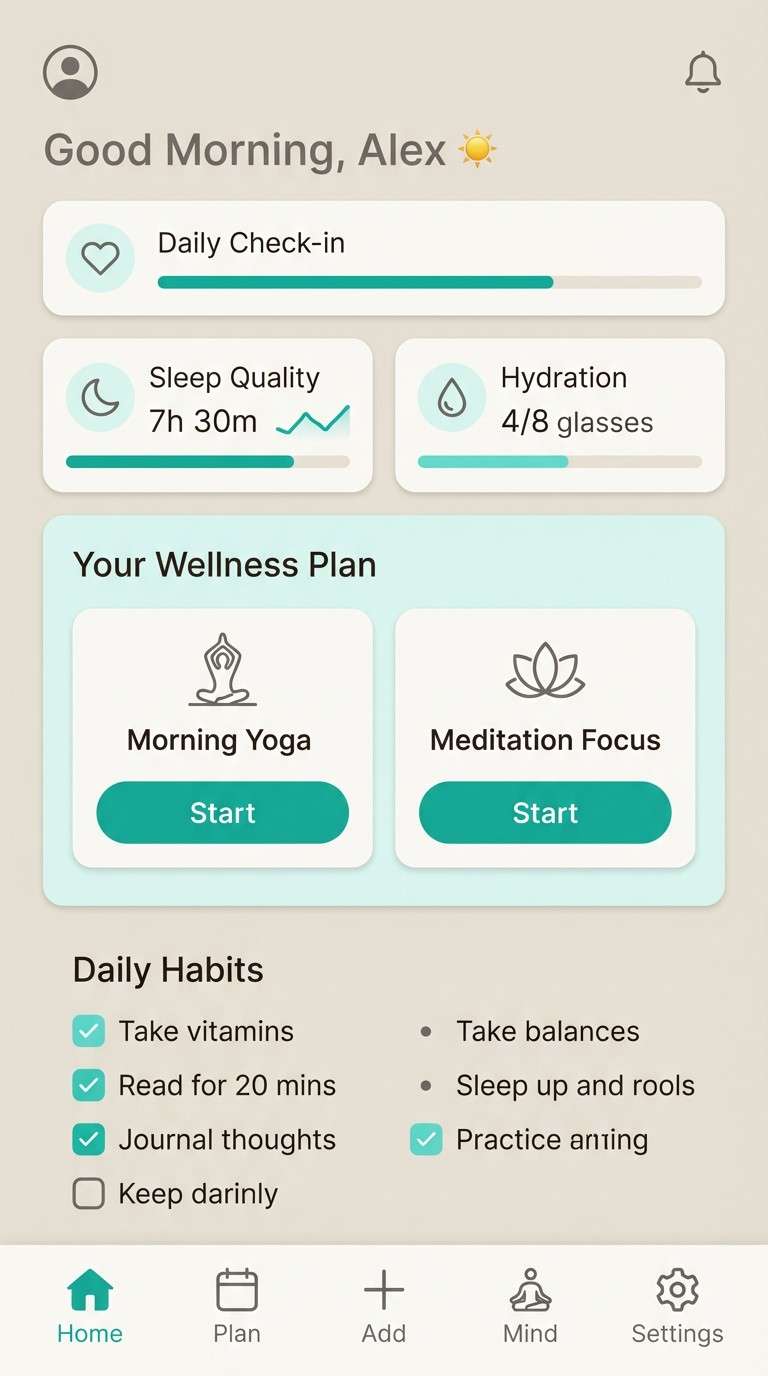
9) Modern Spa Stone
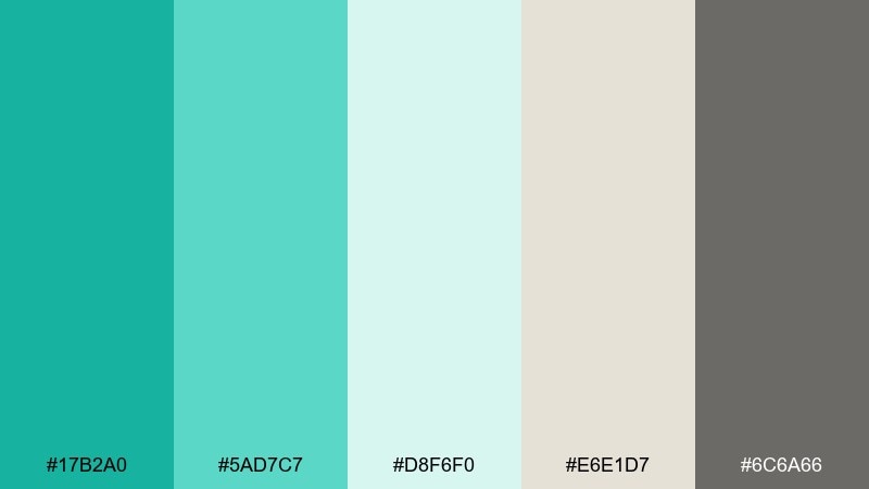
HEX: #17B2A0 #5AD7C7 #D8F6F0 #E6E1D7 #6C6A66
Mood: clean, balanced, zen
Best for: spa websites, wellness apps, calm presentations
Cool spa teal against stone neutrals creates a quiet, grounded calm. Use the light mint and warm gray as large background blocks, then bring in teal for icons and callouts. Pair with soft photography, rounded cards, and gentle shadows. Tip: keep contrast high on text by leaning on the charcoal-gray rather than mid-tone teal.
Image example of modern spa stone generated using media.io
10) Arctic Surf
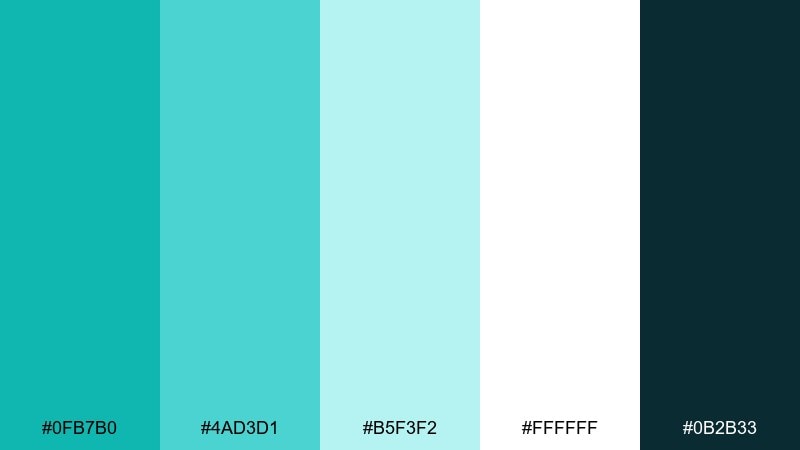
HEX: #0FB7B0 #4AD3D1 #B5F3F2 #FFFFFF #0B2B33
Mood: bright, crisp, tech-forward
Best for: startup sites, SaaS hero sections, data visuals
Icy surf teals feel sharp and refreshing, like cold sea spray under bright light. White space keeps the look ultra-clean, while the deep blue-black adds confident contrast. Pair with thin line icons and subtle gradients for a polished tech vibe. Tip: use the light aqua for chart fills and the darkest tone for axes and labels.
Image example of arctic surf generated using media.io

11) Monochrome Teal
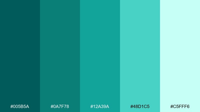
HEX: #005B5A #0A7F78 #12A39A #48D1C5 #C5FFF6
Mood: sleek, cohesive, confident
Best for: brand systems, monochrome posters, icon sets
A full teal range feels sleek and intentional, from deep ocean to pale mint. Use the darkest shade for logotypes and the lightest for spacious backgrounds so the set stays readable. Pair with black-and-white photography for a modern, editorial edge. Tip: create depth by stacking two adjacent shades rather than jumping from dark to light.
Image example of monochrome teal generated using media.io
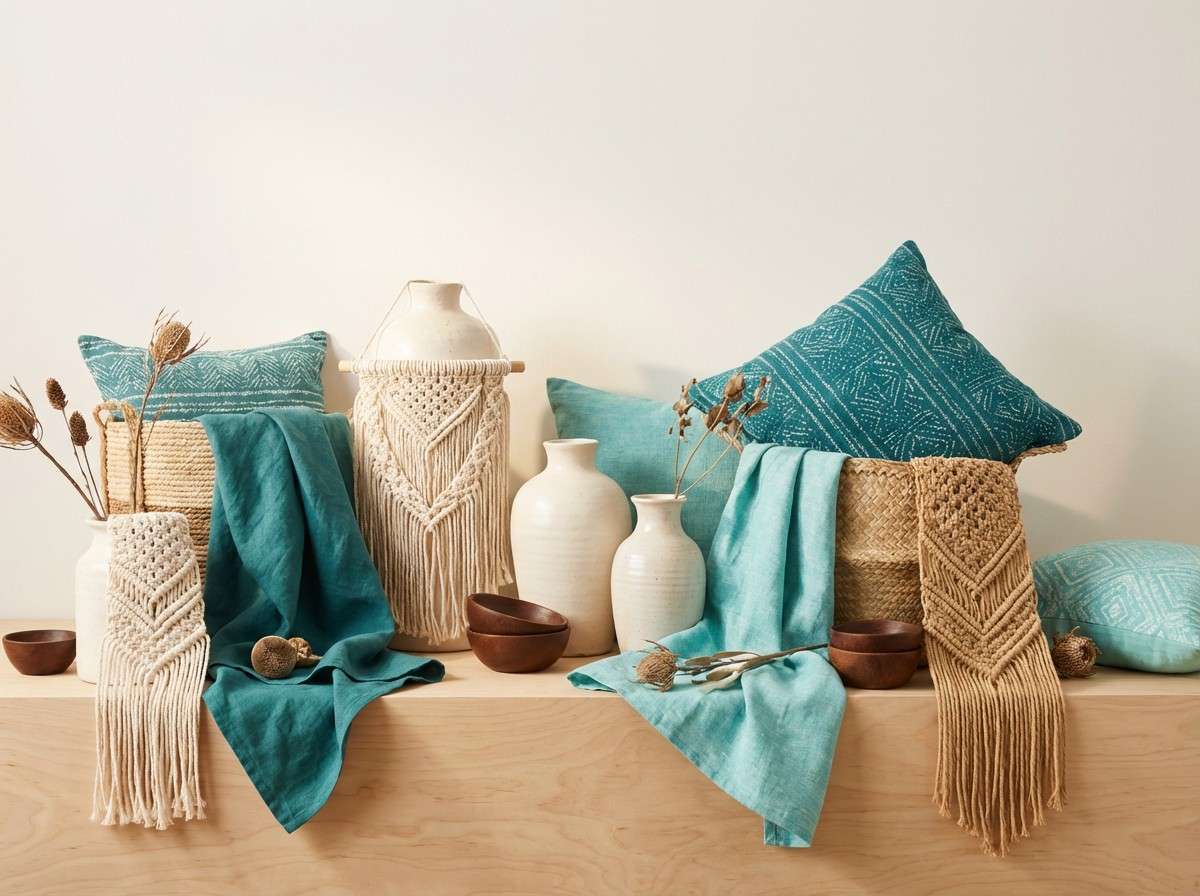
12) Desert Oasis
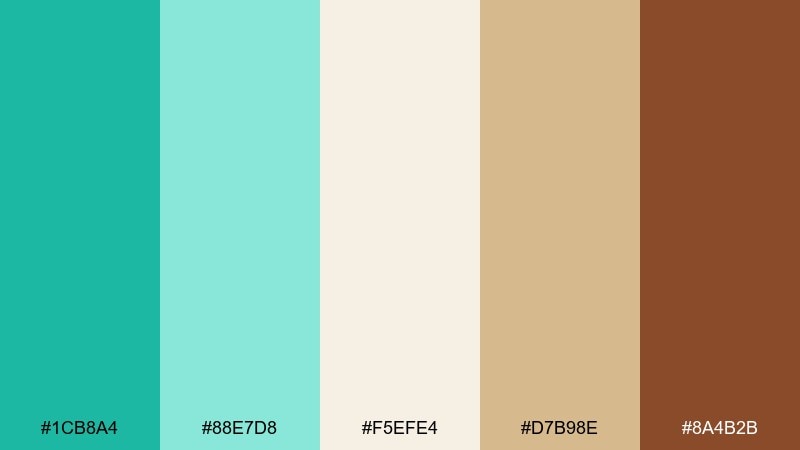
HEX: #1CB8A4 #88E7D8 #F5EFE4 #D7B98E #8A4B2B
Mood: warm, earthy, restorative
Best for: boho interiors, resort promos, handmade product shots
Cool oasis teal against sunbaked sands feels like shade after a long walk in the desert. These green turquoise color combinations are especially strong with terracotta pottery, woven textures, and warm lighting. Use the chocolate brown sparingly for outlines and small type to keep the palette airy. Tip: balance teal-heavy layouts with generous cream sections so the warm neutrals can breathe.
Image example of desert oasis generated using media.io
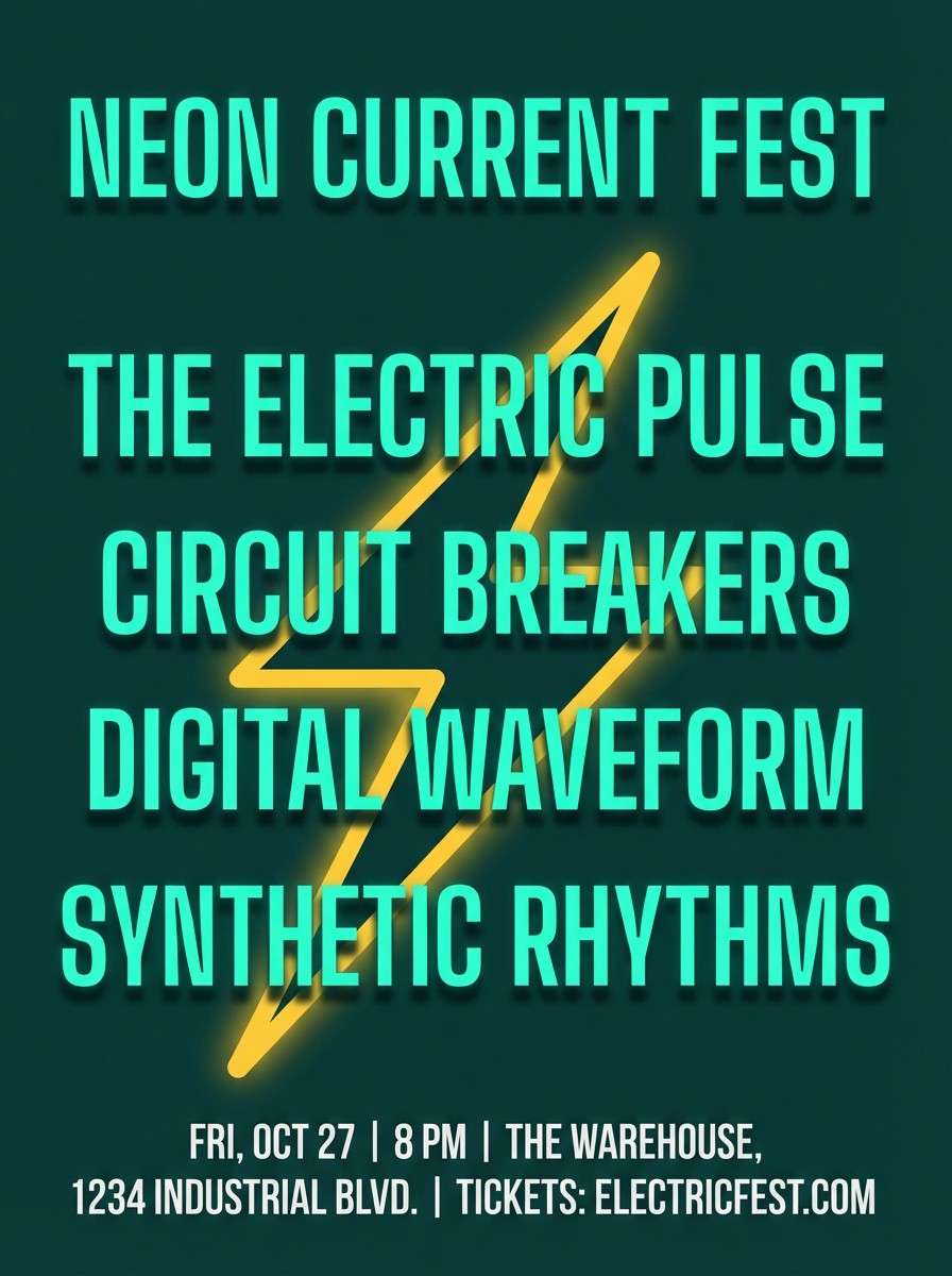
13) Neon Signage Pop
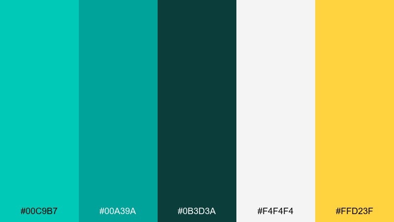
HEX: #00C9B7 #00A39A #0B3D3A #F4F4F4 #FFD23F
Mood: bold, electric, nightlife
Best for: music flyers, promo banners, high-energy ads
Electric turquoise with a punch of yellow reads like neon lights against a dark street. Keep the background deep and let the bright teal do most of the work, then use yellow for a single focal point. Pair with condensed type and strong geometric shapes for maximum impact. Tip: limit gradients and rely on solid fills to keep the look crisp and poster-ready.
Image example of neon signage pop generated using media.io
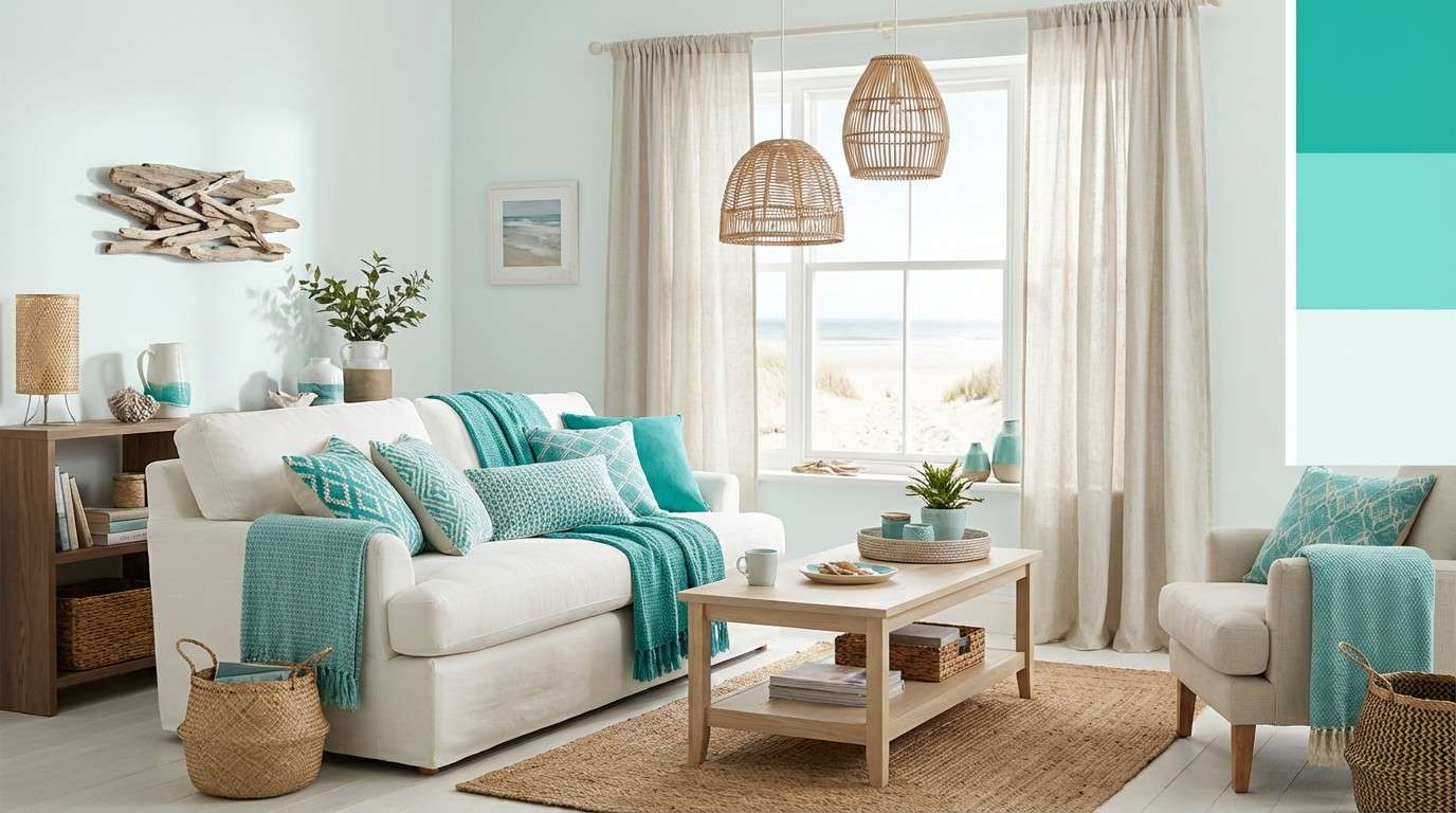
14) Coastal Cottage
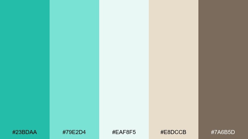
HEX: #23BDAA #79E2D4 #EAF8F5 #E8DCCB #7A6B5D
Mood: homey, light, breezy
Best for: home decor blogs, real estate posts, cozy newsletters
Gentle coastal teals with driftwood neutrals feel like a quiet cottage morning. The palette stays soft enough for long-form reading while still giving plenty of color for buttons and accents. Pair with natural textures like rattan, linen, and light oak. Tip: use the brown as a divider and caption color to add warmth and structure.
Image example of coastal cottage generated using media.io
15) Retro Diner Cool
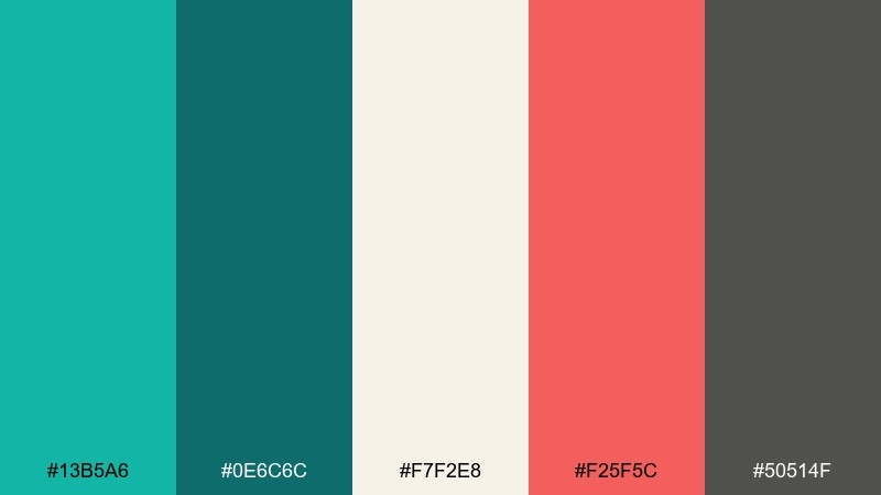
HEX: #13B5A6 #0E6C6C #F7F2E8 #F25F5C #50514F
Mood: retro, friendly, upbeat
Best for: restaurant branding, stickers, playful UI accents
Cool diner teal with tomato-red energy feels nostalgic and upbeat. Use the cream as the main canvas, then bring in teal for big blocks and red for small highlights like badges. Pair with chunky sans-serif type and simple icons for a classic menu-board vibe. Tip: keep the mid-gray for secondary text so the red stays the star.
Image example of retro diner cool generated using media.io
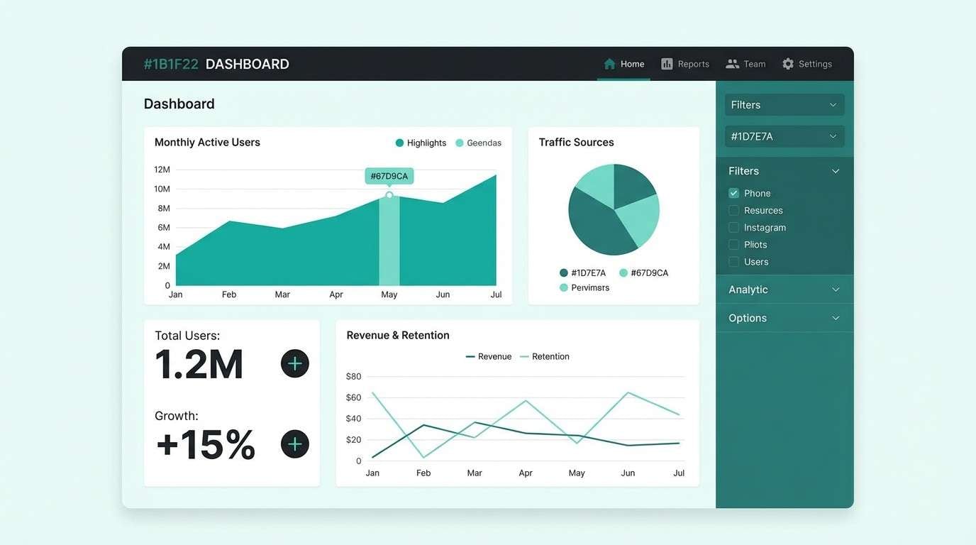
16) Clean Dashboard
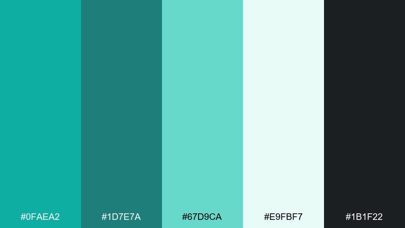
HEX: #0FAEA2 #1D7E7A #67D9CA #E9FBF7 #1B1F22
Mood: clear, professional, modern
Best for: analytics dashboards, fintech UI, admin panels
Crisp teal tones against a soft mint background feel organized and easy to scan. This green turquoise color palette supports strong hierarchy when you use the darkest tones for navigation and key numbers. Pair with thin dividers, consistent spacing, and restrained iconography for a reliable UI. Tip: reserve the brightest teal for active states so interactions are obvious without being loud.
Image example of clean dashboard generated using media.io
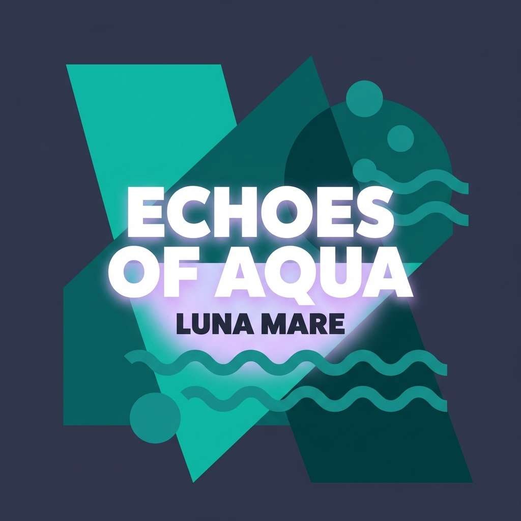
17) Jewel Tones Night
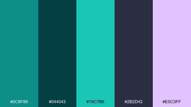
HEX: #0C8F86 #044043 #19C7B6 #2B2D42 #E0C3FF
Mood: dramatic, luxe, nightlife
Best for: album covers, fashion promos, moody branding
Deep night tones with jewel teal feel luxurious and a little mysterious. The lilac highlight adds a modern twist that looks great with metallic effects and high-contrast typography. Pair with glossy gradients, spotlight imagery, and bold titles. Tip: use the lilac only for small glow details so the teal remains the primary identity color.
Image example of jewel tones night generated using media.io
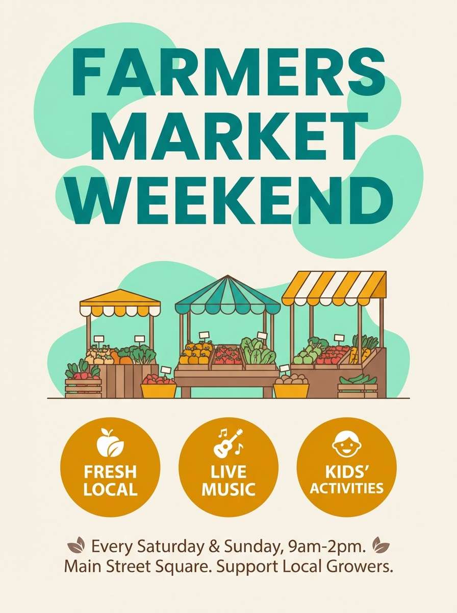
18) Sunny Market
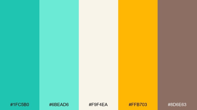
HEX: #1FC5B0 #6BEAD6 #F9F4EA #FFB703 #8D6E63
Mood: cheerful, approachable, handmade
Best for: farmers market posters, small business promos, packaging
Bright teal with sunny amber feels like fresh produce stands and weekend strolls. The cream base keeps everything friendly, while the brown adds a grounded, craft-market touch. Pair with handwritten-style accents and simple illustrations for warmth. Tip: use amber for price tags and CTAs to create instant focal points.
Image example of sunny market generated using media.io
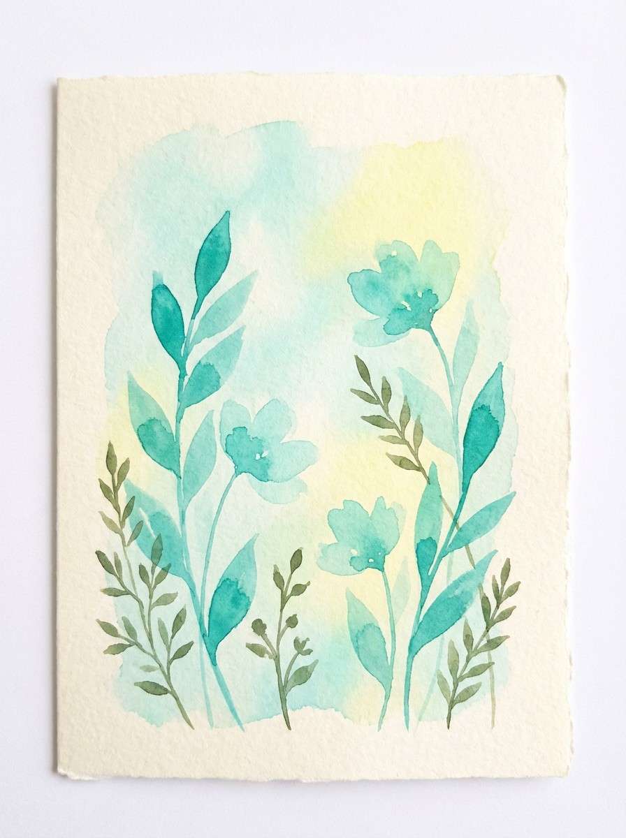
19) Watercolor Meadow
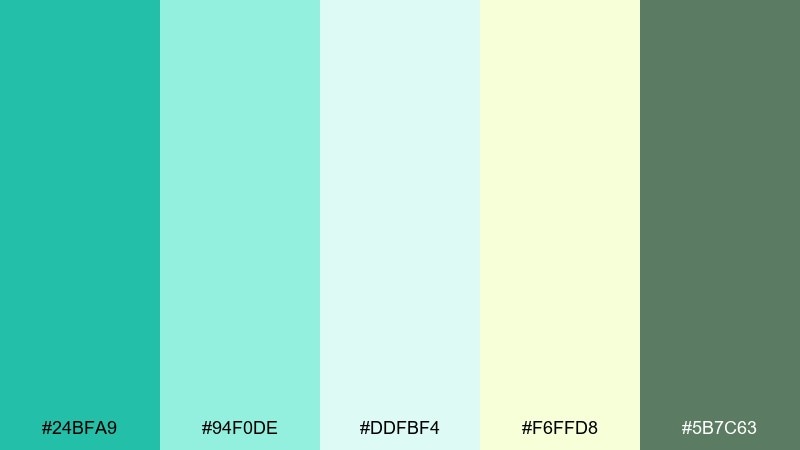
HEX: #24BFA9 #94F0DE #DDFBF4 #F6FFD8 #5B7C63
Mood: gentle, springtime, artistic
Best for: greeting cards, spring invites, illustrated stories
Soft turquoise washes and meadowy greens feel light, painterly, and calm. The pale yellow-green adds a sunlit glow that keeps illustrations from feeling cold. Pair with delicate linework and textured paper backgrounds for a handcrafted finish. Tip: let the lightest mint be the page background so the watercolor edges look natural.
Image example of watercolor meadow generated using media.io
20) Minimal Editorial
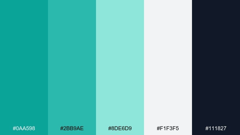
HEX: #0AA598 #2BB9AE #8DE6D9 #F1F3F5 #111827
Mood: minimal, sharp, contemporary
Best for: magazine layouts, portfolio sites, product one-pagers
Clean teals on a cool gray base feel contemporary and editorial, like a modern design journal. Use the near-black for strong typographic contrast and the mid teal for section headers and links. Pair with generous margins, grid alignment, and one standout photo per section. Tip: keep the brightest mint for subtle highlights and tags so it reads as premium, not loud.
Image example of minimal editorial generated using media.io
What Colors Go Well with Green Turquoise?
Warm neutrals are the easiest match: cream, beige, sand, and light wood tones soften turquoise and make it feel welcoming rather than cold. These pairings are ideal for lifestyle branding and interiors.
For clean contrast, use crisp white plus deep charcoal or near-black. This gives green turquoise a modern, tech-ready edge and keeps UI text and charts highly legible.
If you want a bolder accent, try coral/peach for a playful pop, amber/yellow for high-energy highlights, or lilac for a luxe, night-mode twist—keep these accents small so teal stays the hero.
How to Use a Green Turquoise Color Palette in Real Designs
Start with roles, not just colors: pick one deep teal for text/navigation, one mid turquoise for buttons and key UI states, and one pale mint for backgrounds and card fills. This creates consistent hierarchy across pages and screens.
In print and packaging, let texture do part of the work. Matte paper, kraft stock, linen patterns, or brushed metal finishes can make green turquoise feel more premium and less “flat.”
For interiors and social creatives, balance saturation carefully. Use turquoise as a focal (tile, sofa, hero block), then give it breathing room with off-whites and warm neutrals to avoid visual fatigue.
Create Green Turquoise Palette Visuals with AI
If you already have HEX codes, you can turn them into on-brand images by describing the scene (product shot, UI mockup, poster, room) and explicitly naming the palette colors in the prompt.
For the cleanest results, keep one dominant background neutral, then assign turquoise shades to specific materials or components (buttons, tiles, labels). This helps the AI “place” the colors instead of blending them randomly.
Use the prompts above as templates, swap the subject, and keep the same HEX anchors to generate consistent green turquoise visuals across campaigns.
Green Turquoise Color Palette FAQs
-
What is the difference between turquoise, teal, and green turquoise?
Turquoise is typically brighter and more blue-leaning, teal is darker and more muted, and green turquoise sits between them with a slightly greener cast that feels fresh and aquatic. -
Is green turquoise a good brand color?
Yes—green turquoise signals freshness and clarity while still feeling friendly. It works especially well for wellness, skincare, travel, eco products, and modern SaaS brands when paired with strong neutrals for contrast. -
What neutral colors pair best with green turquoise?
Warm creams, beige/sand, soft stone gray, and charcoal are the most reliable. Choose warm neutrals for a cozy resort vibe and cool grays/white for a crisp, modern look. -
How do I keep green turquoise designs from looking too “beachy”?
Reduce saturation, add cool grays or near-black typography, and limit sandy accents. Using a monochrome teal range (deep-to-mint) also makes the palette feel more editorial and less themed. -
What’s a good accent color for green turquoise CTAs?
Coral/peach is a classic high-contrast accent for small highlights, while amber/yellow is great for energetic badges and price tags. Keep accents under about 10–15% so turquoise stays dominant. -
How can I use green turquoise in UI without hurting readability?
Use deep teal or near-black for body text, reserve bright turquoise for buttons/active states, and use pale mint for backgrounds. This keeps contrast strong while preserving the calming color identity. -
Can I generate matching green turquoise images with AI using HEX codes?
Yes—include the HEX values directly in your prompt and assign them to objects/materials (background, buttons, labels, tiles). This improves color accuracy and keeps your visuals consistent across outputs.


