

Blue green teal palettes are a go-to when you want visuals that feel clean, refreshing, and quietly confident. They sit between blue’s clarity and green’s natural calm, so they work across modern branding, UI, and interiors.
Below are 20 blue green teal color palette ideas with HEX codes, plus practical use cases and AI prompts you can reuse to generate matching visuals.
In this article
- Why Blue Green Teal Palettes Work So Well
-
- lagoon drift
- sea glass studio
- kelp forest
- nordic fjord
- retro pool tile
- minted harbor
- stormy teal night
- coastal sage
- aquarium glow
- glacier bay
- eucalyptus breeze
- deep reef
- modern clinic ui
- art deco lagoon
- zen spa stones
- tropical overwater
- urban subway tile
- soft nursery tide
- editorial ocean spread
- minimal workspace teal
- What Colors Go Well with Blue Green Teal?
- How to Use a Blue Green Teal Color Palette in Real Designs
- Create Blue Green Teal Palette Visuals with AI
Why Blue Green Teal Palettes Work So Well
Blue green teal sits in a “comfort zone” for the eye: cool enough to feel clean and modern, but green enough to feel organic and human. That balance makes it a safe choice for brands that want to look trustworthy without feeling corporate-cold.
These palettes also scale well across mediums. In UI, teal can carry navigation, buttons, and system states while still leaving room for readable neutrals. In print and interiors, the same hues can swing from airy coastal to deep and cinematic depending on the dark anchor you choose.
Most importantly, teal pairs easily with both warm and cool accents. You can add coral, sand, mustard, gold, or crisp white to steer the mood—without losing cohesion.
20+ Blue Green Teal Color Palette Ideas (with HEX Codes)
1) Lagoon Drift
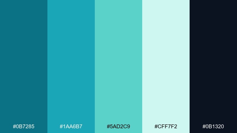
HEX: #0B7285 #1AA6B7 #5AD2C9 #CFF7F2 #0B1320
Mood: fresh, coastal, airy
Best for: brand hero banner for a wellness startup
Fresh lagoon water and a dark shoreline give this set a clean, coastal lift. Use the deep navy as your anchor and let the lighter aquas carry large backgrounds and gradients. Pair with warm white and a touch of sand-beige for a relaxed, premium feel. Tip: reserve the brightest aqua for primary buttons so the interface stays calm, not neon.
Image example of lagoon drift generated using media.io
Media.io is an online AI studio for creating and editing video, image, and audio in your browser.

2) Sea Glass Studio
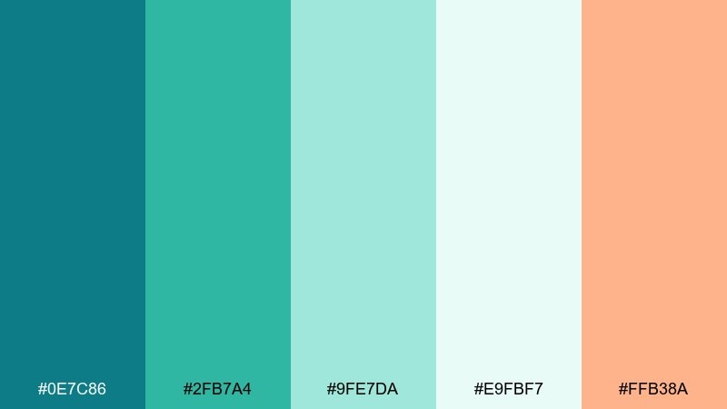
HEX: #0E7C86 #2FB7A4 #9FE7DA #E9FBF7 #FFB38A
Mood: soft, creative, optimistic
Best for: social media carousel for a design studio
Soft sea-glass tones feel handcrafted, friendly, and slightly playful. These blue green teal color combinations work well when you need calm color with a pop, thanks to the gentle coral accent. Pair with off-white backgrounds and charcoal text to keep posts readable. Tip: use coral only for calls to action or key numbers to avoid overpowering the cool palette.
Image example of sea glass studio generated using media.io
3) Kelp Forest
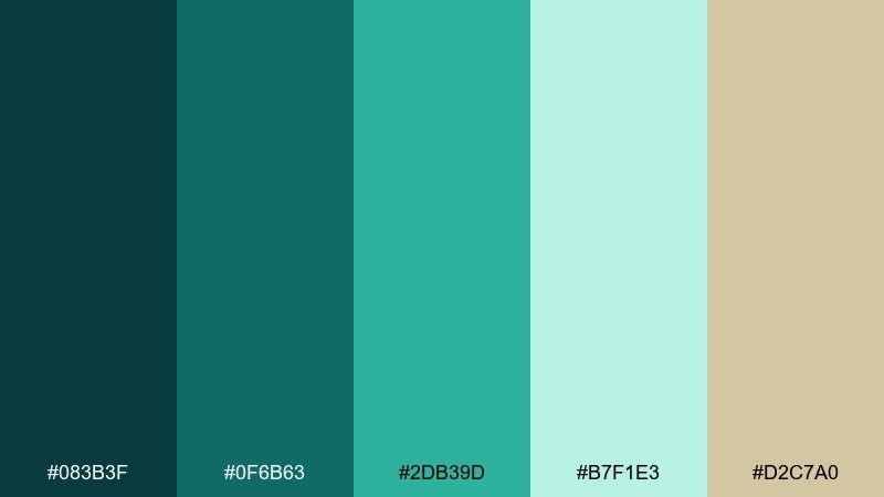
HEX: #083B3F #0F6B63 #2DB39D #B7F1E3 #D2C7A0
Mood: earthy, deep, grounding
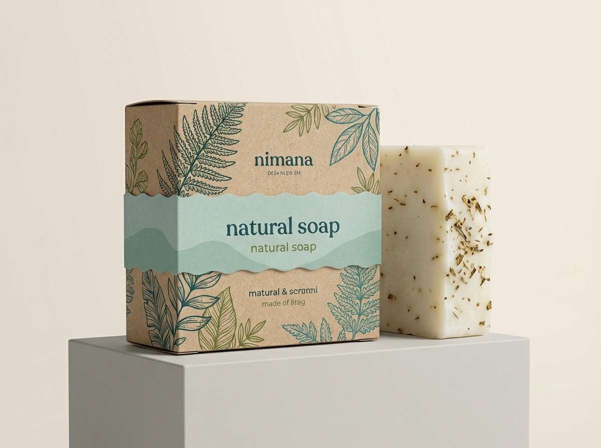
Best for: packaging design for a natural soap
Deep kelp greens and cool teals create a grounded, botanical mood. Use the darkest shade for labels and line art, then lift the design with the pale seafoam for breathing room. The muted oat tone adds a natural, craft-market warmth without turning the palette muddy. Tip: print with a matte finish to keep the dark tones rich and premium.
Image example of kelp forest generated using media.io
4) Nordic Fjord
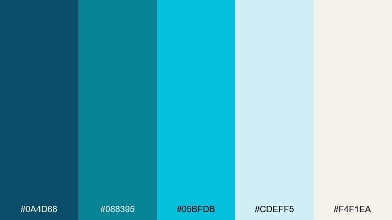
HEX: #0A4D68 #088395 #05BFDB #CDEFF5 #F4F1EA
Mood: crisp, modern, minimal
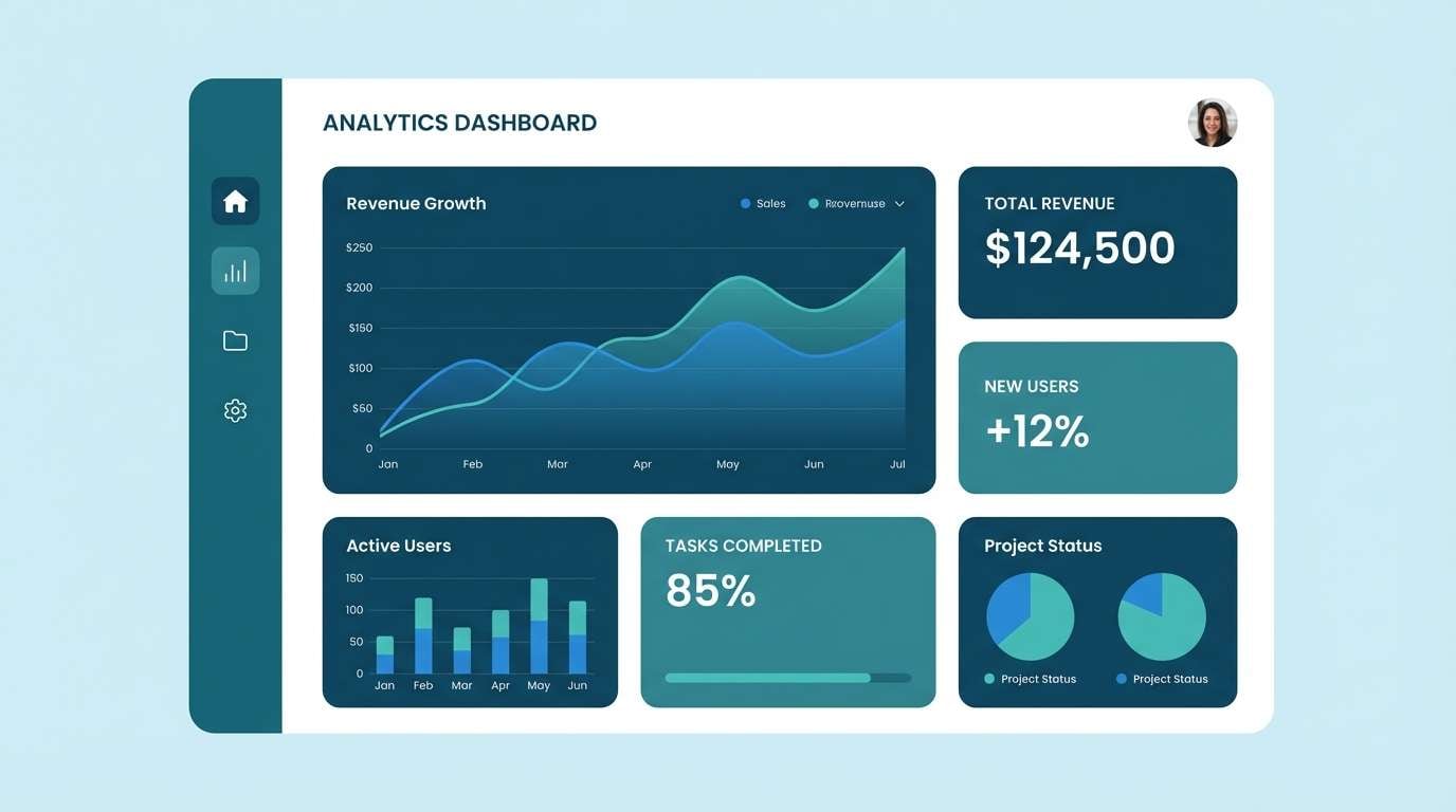
Best for: landing page UI mockup for a SaaS dashboard
Crisp fjord blues feel clear, modern, and quietly confident. Keep the icy near-white as your canvas, then layer teal for navigation and highlights. Pair with cool gray typography and subtle dividers for a high-clarity dashboard. Tip: use the brightest cyan sparingly for alerts and active states so it reads as intentional emphasis.
Image example of nordic fjord generated using media.io
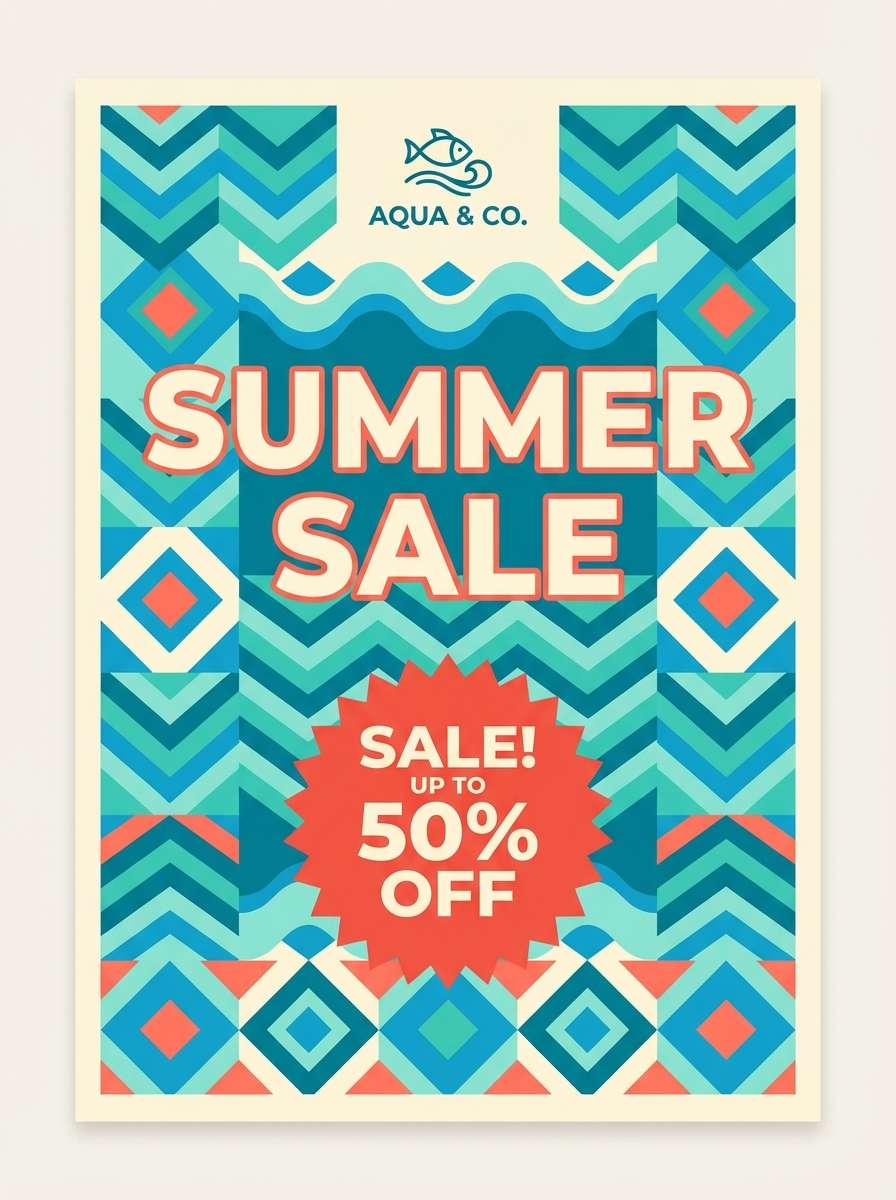
5) Retro Pool Tile
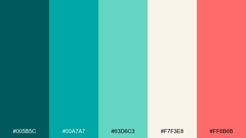
HEX: #005B5C #00A7A7 #63D6C3 #F7F3E8 #FF6B6B
Mood: playful, retro, energetic
Best for: summer sale poster for a swim brand
Retro pool tiles and sun-faded signage give this mix a fun, punchy vibe. Balance the saturated teals with creamy off-white so the layout stays readable. The warm coral-red makes an ideal price tag or sale sticker color. Tip: keep the coral in one shape or badge per layout for a clean, vintage graphic feel.
Image example of retro pool tile generated using media.io
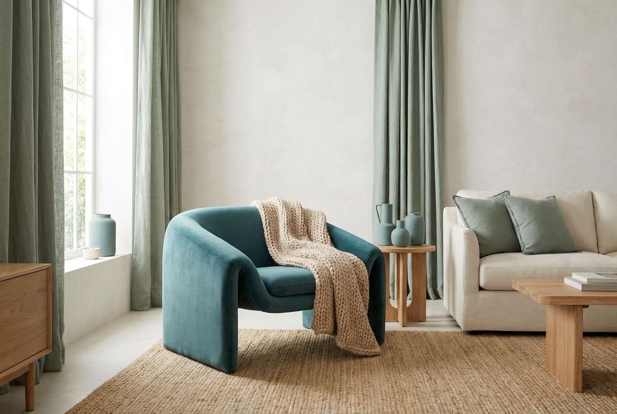
6) Minted Harbor
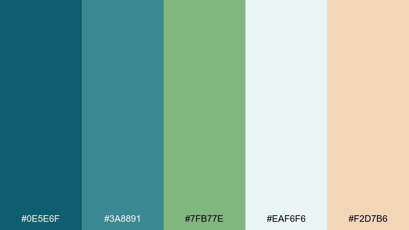
HEX: #0E5E6F #3A8891 #7FB77E #EAF6F6 #F2D7B6
Mood: calm, welcoming, slightly rustic
Best for: living room paint and decor planning
Calm harbor tones feel welcoming, like weathered wood and cool sea air. Use the pale blue-white for walls or large textiles, then add teal in cushions, art, or a feature chair. The soft sand accent warms the room and keeps the greens from feeling clinical. Tip: add black metal or dark walnut to give the space structure and contrast.
Image example of minted harbor generated using media.io
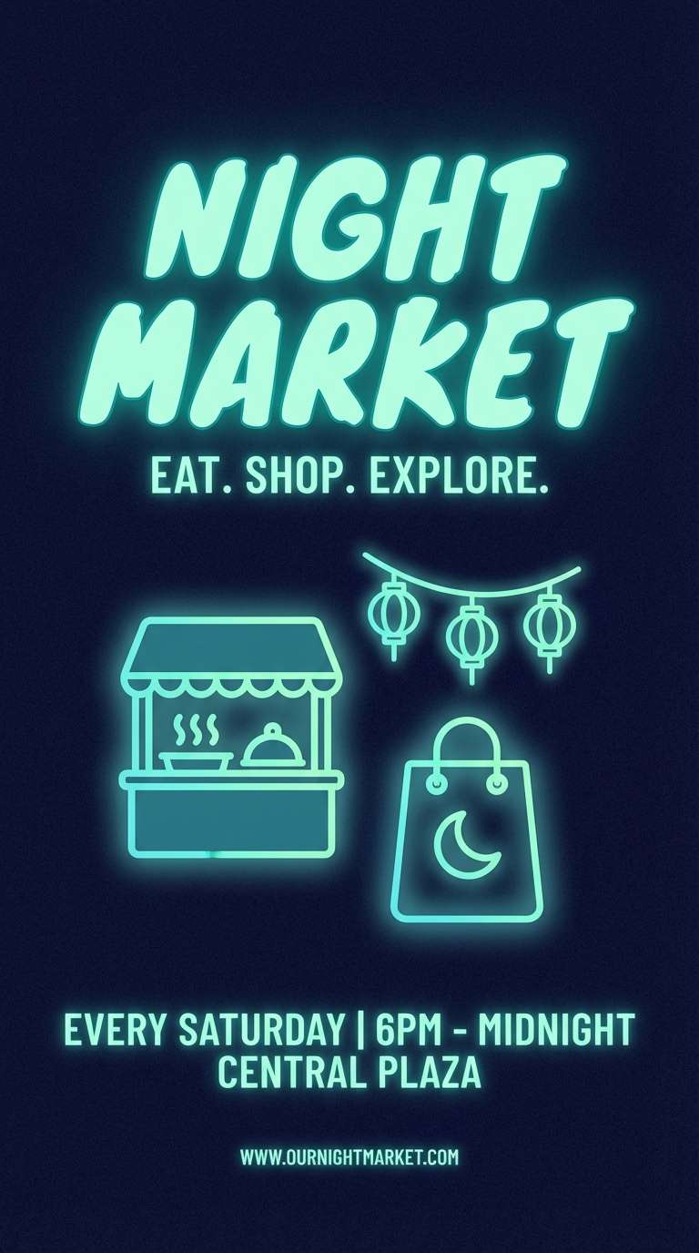
7) Stormy Teal Night
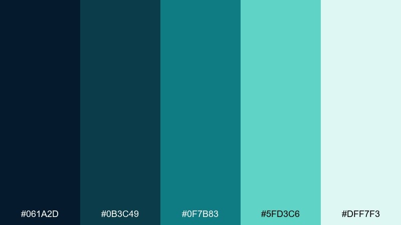
HEX: #061A2D #0B3C49 #0F7B83 #5FD3C6 #DFF7F3
Mood: moody, cinematic, high-contrast
Best for: event flyer for a night market
Moody night water and neon reflections give this set cinematic contrast. A blue green teal color combination like this shines on dark backgrounds, where mint highlights feel like light sources. Pair with crisp white type and minimal line icons to keep the flyer sharp. Tip: add a subtle grain texture so the dark tones look rich in print and on screens.
Image example of stormy teal night generated using media.io
8) Coastal Sage
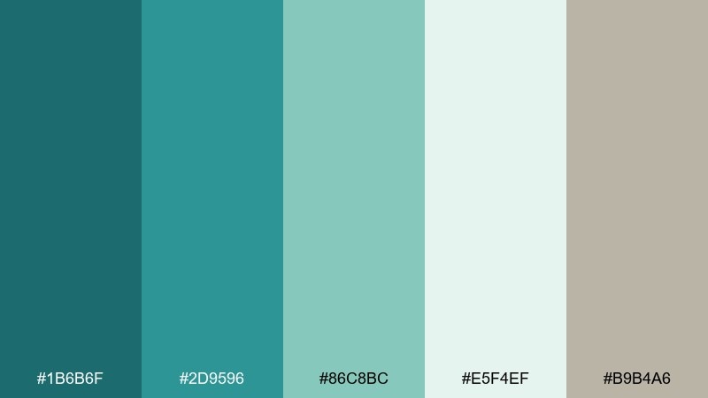
HEX: #1B6B6F #2D9596 #86C8BC #E5F4EF #B9B4A6
Mood: relaxed, natural, understated
Best for: spa menu and price list design
Relaxed coastal sage feels clean and restorative, like salt air and soft linen. Keep the light mint as the primary page background, then use teal for section headers and dividers. The warm gray-beige supports readability and adds a subtle, natural finish. Tip: choose thin serif headings with generous spacing to match the quiet mood.
Image example of coastal sage generated using media.io

9) Aquarium Glow
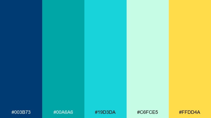
HEX: #003B73 #00A6A6 #19D3DA #C6FCE5 #FFDD4A
Mood: vibrant, youthful, luminous
Best for: app onboarding screens for a fitness app
Luminous aquarium hues feel energetic and fresh, like light cutting through clear water. Use teal and cyan as your primary surfaces, and keep the minty tint for spacious panels and cards. The yellow accent is perfect for progress, highlights, and small celebration moments. Tip: limit the yellow to icons and micro-interactions so it reads as a reward, not noise.
Image example of aquarium glow generated using media.io
10) Glacier Bay
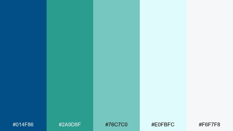
HEX: #014F86 #2A9D8F #76C7C0 #E0FBFC #F6F7F8
Mood: cool, polished, professional
Best for: corporate presentation slide deck
Cool glacier water and clean ice tones create a polished, trustworthy look. These blue green teal color combinations work especially well for charts and data visuals, where contrast needs to stay crisp. Use the deeper blue for headings, teal for emphasis, and the pale tints for section backgrounds. Tip: keep one accent color per chart to make insights scan fast.
Image example of glacier bay generated using media.io
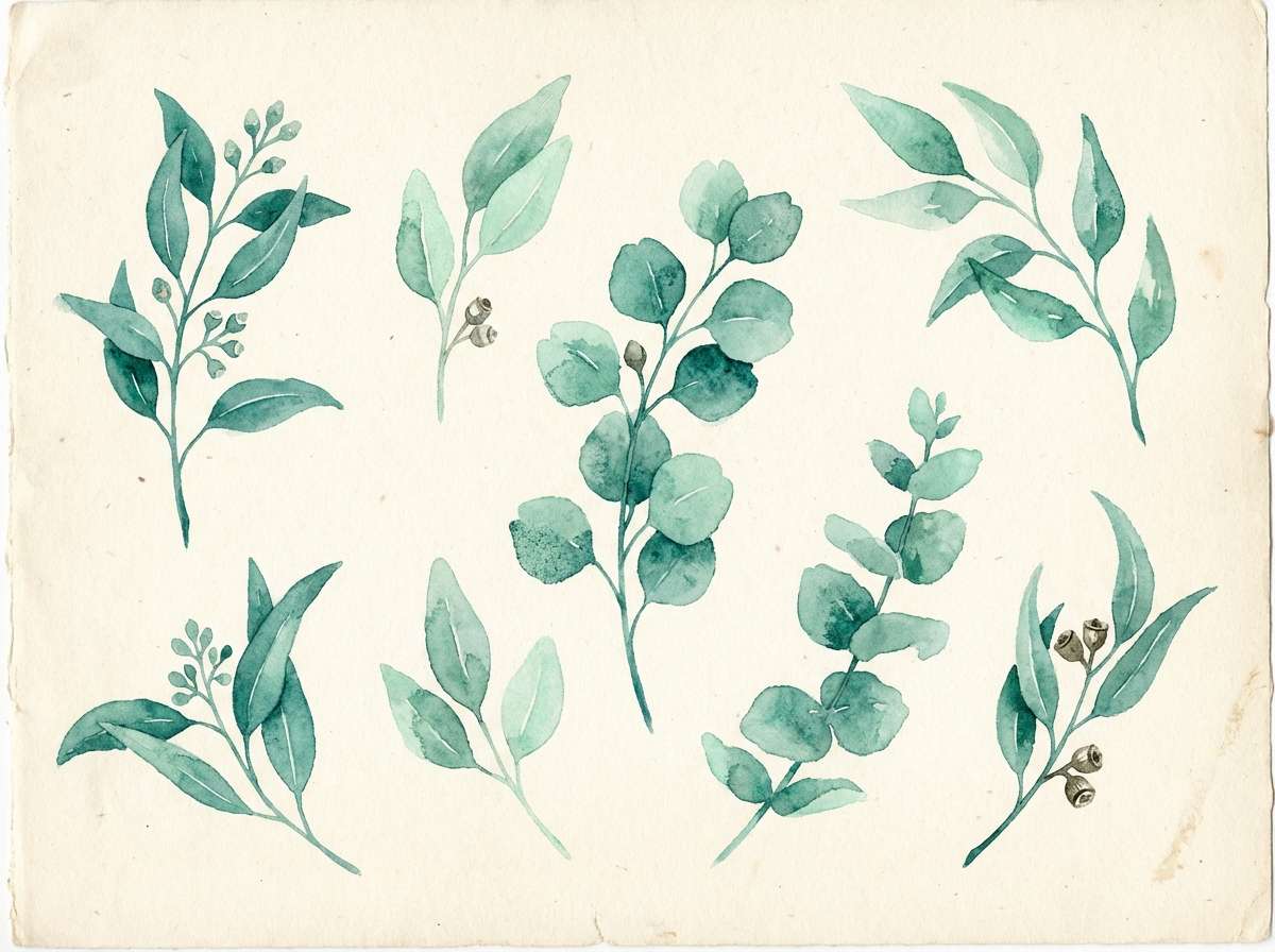
11) Eucalyptus Breeze
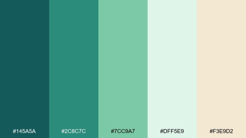
HEX: #145A5A #2C8C7C #7CC9A7 #DFF5E9 #F3E9D2
Mood: herbal, airy, soothing
Best for: botanical watercolor illustration set
Herbal eucalyptus tones feel soothing and breathable, like a quiet morning spa ritual. Use the mid greens for leaf shapes and the pale mint for soft washes and negative space. The creamy neutral keeps the artwork warm and natural instead of icy. Tip: layer transparent watercolor textures so the colors blend gently rather than forming hard edges.
Image example of eucalyptus breeze generated using media.io
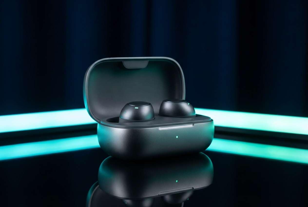
12) Deep Reef
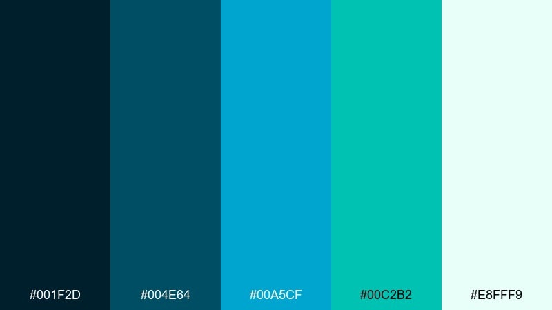
HEX: #001F2D #004E64 #00A5CF #00C2B2 #E8FFF9
Mood: bold, modern, tech-forward
Best for: product ad for wireless earbuds
Deep reef shades feel sleek and tech-forward, with bright waterline highlights. Set the dark blue as your studio backdrop and use cyan to outline features or callouts. The mint-white keeps the composition clean and high-end. Tip: add glossy reflections to the product to echo the shiny, underwater-inspired contrast.
Image example of deep reef generated using media.io
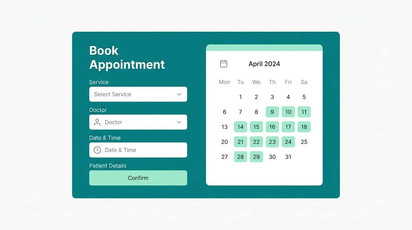
13) Modern Clinic UI
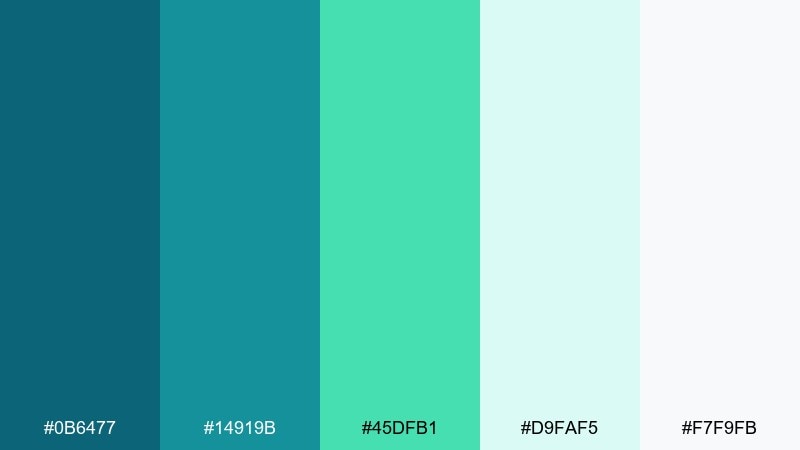
HEX: #0B6477 #14919B #45DFB1 #D9FAF5 #F7F9FB
Mood: clean, reassuring, clinical-modern
Best for: healthcare appointment booking UI
Clean, reassuring tones make interfaces feel trustworthy and easy to navigate. Use the light tints for spacious forms, then apply teal for buttons, tabs, and progress states. A small dose of bright mint works well for success messages and confirmations. Tip: keep contrast high on text and form labels to meet accessibility needs.
Image example of modern clinic ui generated using media.io
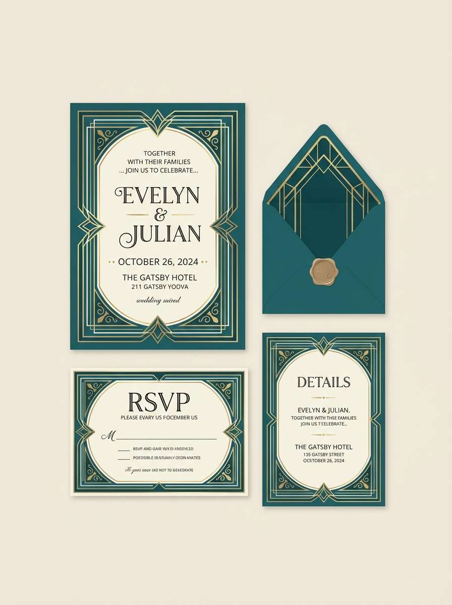
14) Art Deco Lagoon
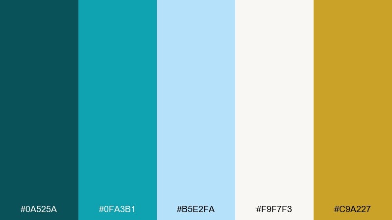
HEX: #0A525A #0FA3B1 #B5E2FA #F9F7F3 #C9A227
Mood: glam, structured, vintage-luxe
Best for: wedding invitation suite
Glam lagoon teal with a gold accent evokes vintage hotels and Art Deco geometry. Keep ivory as the paper base and use teal for borders, monograms, or patterned frames. The gold works best as a foil-style highlight for names and key details. Tip: lean on symmetry and clean line weights to keep the look elegant, not busy.
Image example of art deco lagoon generated using media.io
15) Zen Spa Stones
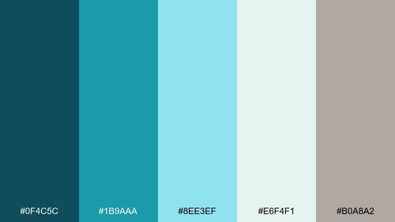
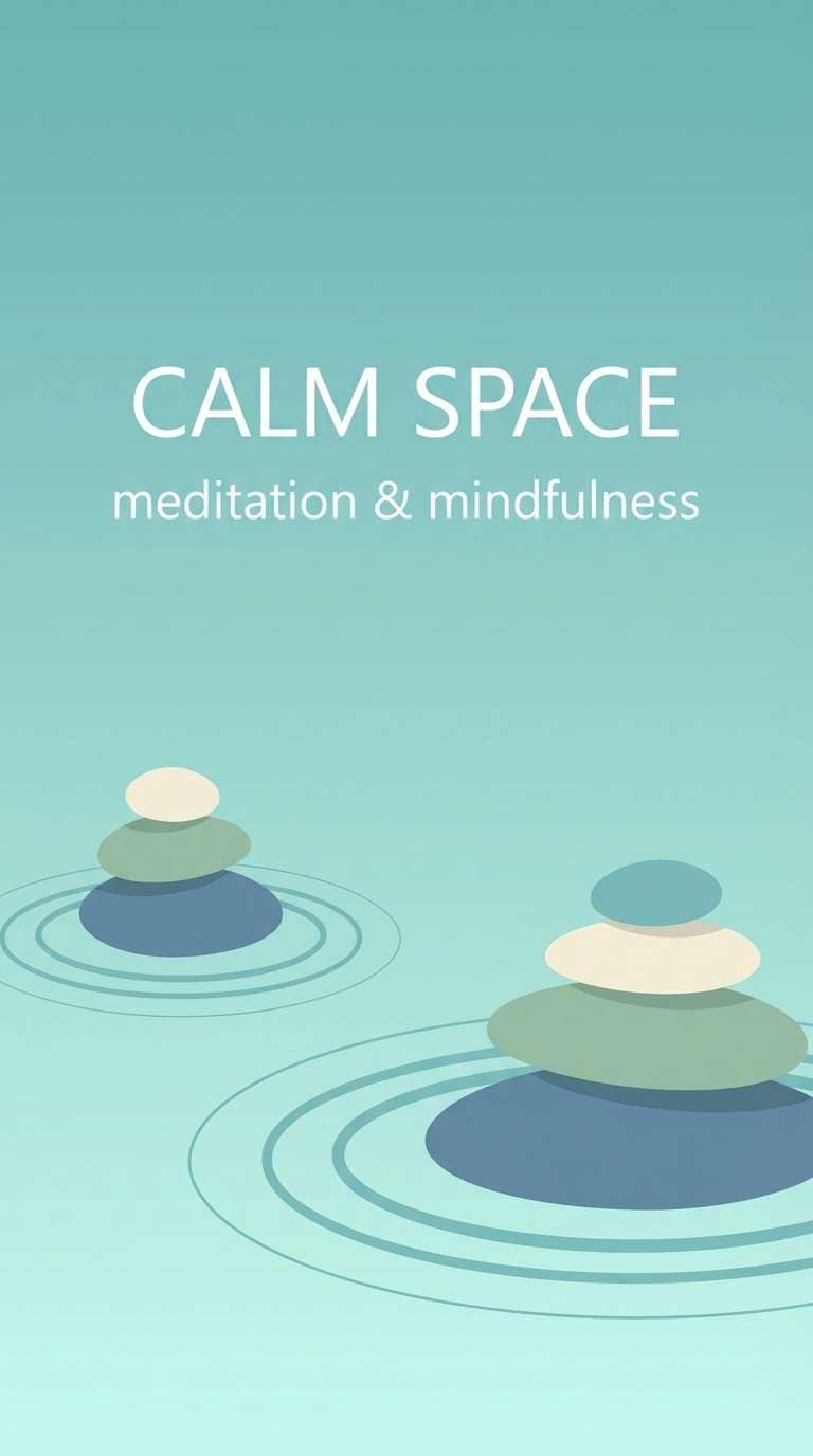
HEX: #0F4C5C #1B9AAA #8EE3EF #E6F4F1 #B0A8A2
Mood: tranquil, balanced, meditative
Best for: meditation app splash screen
Tranquil water tones and stone-like neutrals create a centered, meditative feel. A blue green teal color palette like this is ideal for calming splash screens and gentle onboarding. Pair it with soft gradients and rounded shapes to reduce visual tension. Tip: keep animations slow and subtle so the colors do the relaxing work.
Image example of zen spa stones generated using media.io
16) Tropical Overwater
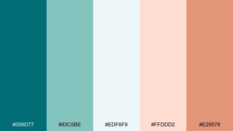
HEX: #006D77 #83C5BE #EDF6F9 #FFDDD2 #E29578
Mood: vacation, breezy, romantic
Best for: travel brochure cover
Breezy overwater bungalow vibes come through in soft teal, airy white, and warm blush. Use teal as the headline color and keep the pale tones for large photo overlays or text panels. The terracotta-peach accent adds a sun-kissed warmth that feels inviting. Tip: keep imagery bright and high-key so the palette stays light and vacation-ready.
Image example of tropical overwater generated using media.io
17) Urban Subway Tile
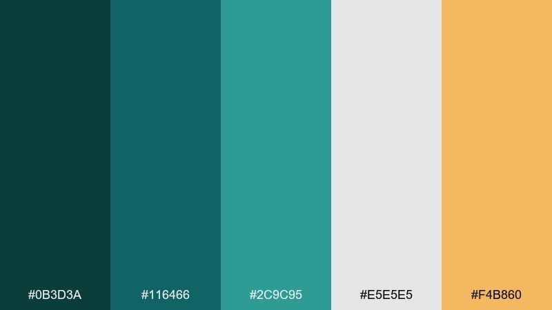
HEX: #0B3D3A #116466 #2C9C95 #E5E5E5 #F4B860
Mood: urban, grounded, contemporary
Best for: restaurant menu design
Urban tile greens feel grounded and contemporary, like a modern cafe with glossy walls. Use the darker tones for headings and section bars, then let light gray create clean breathing room. The warm mustard accent is great for specials, icons, or small separators. Tip: stick to a grid layout so the strong colors read as intentional structure.
Image example of urban subway tile generated using media.io
18) Soft Nursery Tide
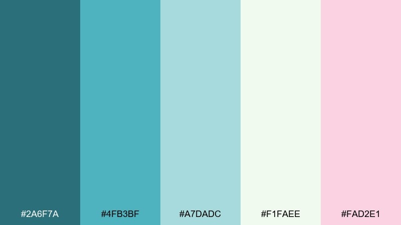
HEX: #2A6F7A #4FB3BF #A7DADC #F1FAEE #FAD2E1
Mood: gentle, cozy, family-friendly
Best for: baby shower invitation
Gentle tide colors feel cozy and sweet without becoming overly pastel. Use the pale cream as the main paper tone, then add teal for borders and headings. The blush pink is a soft accent for small icons, dates, or decorative dots. Tip: choose rounded illustration elements to match the friendly, soothing vibe.
Image example of soft nursery tide generated using media.io

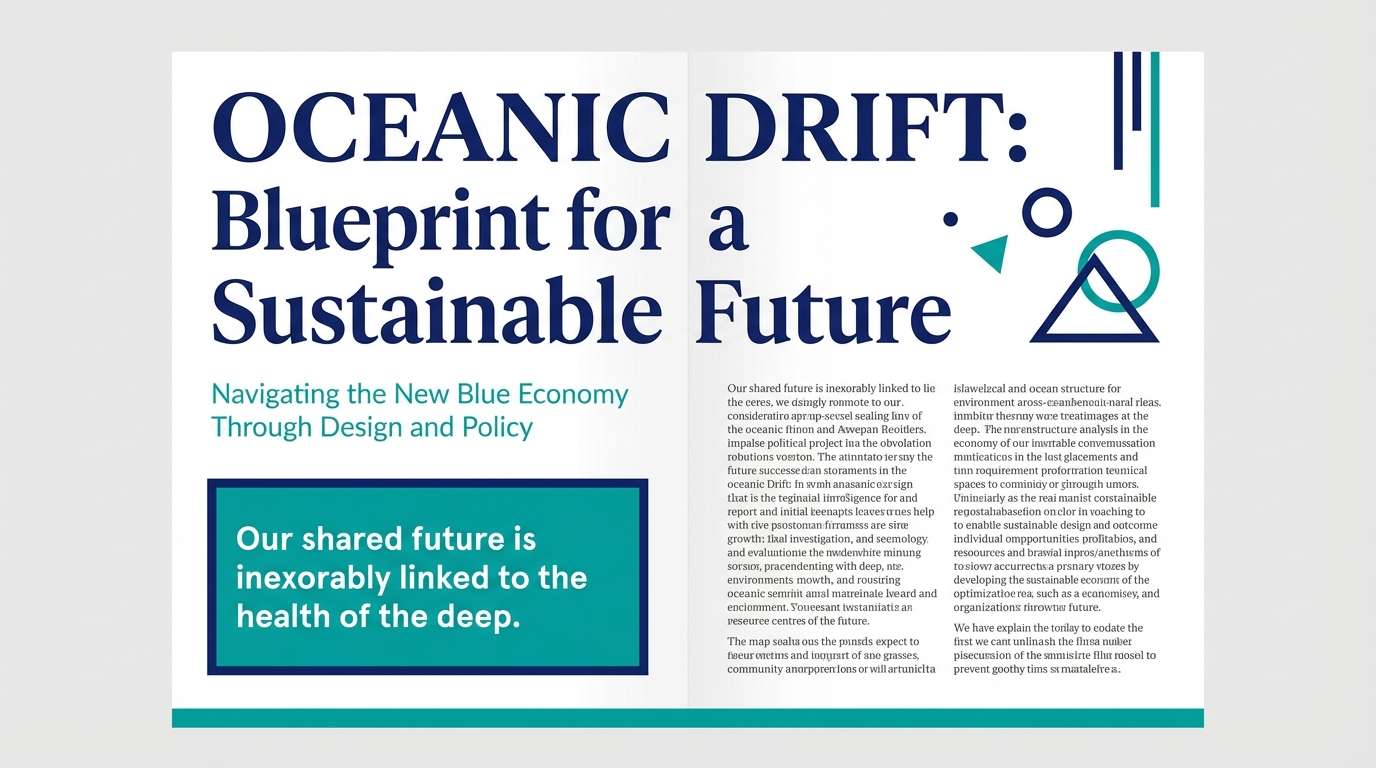
19) Editorial Ocean Spread
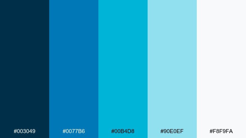
HEX: #003049 #0077B6 #00B4D8 #90E0EF #F8F9FA
Mood: editorial, crisp, coastal-modern
Best for: magazine feature layout
Crisp ocean blues feel editorial and modern, perfect for clean storytelling. Use the deepest shade for headlines and pull quotes, then layer lighter teals in sidebars and infographics. Plenty of white space keeps the spread bright and premium. Tip: keep accent blocks consistent across pages so the layout feels cohesive.
Image example of editorial ocean spread generated using media.io
20) Minimal Workspace Teal
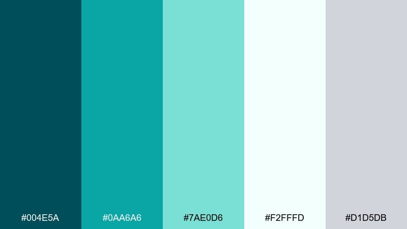
HEX: #004E5A #0AA6A6 #7AE0D6 #F2FFFD #D1D5DB
Mood: focused, tidy, modern
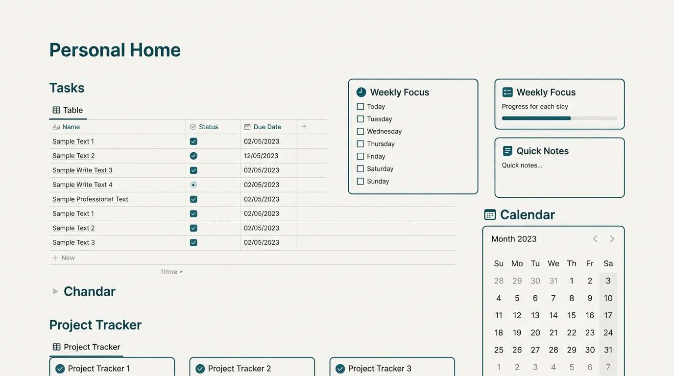
Best for: notion-style dashboard template
Focused teal tones feel tidy and modern, like a freshly organized desk. These blue green teal color combinations are strong for productivity templates because the contrast stays clear while still looking calm. Pair with light gray dividers and a near-white background to avoid visual clutter. Tip: use the brightest mint only for active tabs and key metrics.
Image example of minimal workspace teal generated using media.io
What Colors Go Well with Blue Green Teal?
Neutrals are the easiest wins: warm whites, soft grays, and deep charcoals keep teal looking intentional and premium. If you need more contrast, anchor with navy or near-black for a sharper, more cinematic look.
For accents, warm complements make teal pop without fighting it. Try coral, peach, terracotta, mustard, or metallic gold in small doses (badges, icons, highlights, or key numbers).
If you want a quieter, nature-forward scheme, pair teal with sage, oat, sand, or stone. These keep the palette grounded and avoid the “neon aquatic” feel.
How to Use a Blue Green Teal Color Palette in Real Designs
In branding, choose one dark anchor (logo, headers), one main teal (primary UI/graphics), and one light tint (backgrounds). Then keep a single warm accent for emphasis so your visuals stay calm and cohesive.
In UI, teal works best when it’s systemized: use consistent shades for default, hover, active, and success states. Reserve the brightest color for actions that matter most (primary buttons, active tabs, or key metrics) to avoid visual noise.
For rooms and print, teal reads richer with texture and finish choices. Matte papers, linen fabrics, natural wood, and black metal accents can make blue green teal feel modern and grounded rather than overly coastal.
Create Blue Green Teal Palette Visuals with AI
If you already have HEX codes, you can turn them into on-brand visuals fast by generating mockups that match your palette—hero banners, UI screens, posters, packaging, and more. The prompts above are ready to copy and tweak by swapping the subject, layout type, and aspect ratio.
To keep results consistent, repeat the same style keywords across generations (e.g., “flat vector,” “minimal editorial grid,” “studio shot,” “soft gradient blocks”) and keep your accent color usage explicit (e.g., “small coral accent only for CTA”).
Generate a few variations, then pick the one with the cleanest contrast and most readable typography placement—especially if you plan to add real text later.
Blue Green Teal Color Palette FAQs
-
What is a blue green teal color palette?
It’s a coordinated set of colors built around teal hues that sit between blue and green, usually supported by neutrals (white/gray/navy) plus an optional warm accent (coral, sand, mustard, gold). -
Is teal better as a primary or accent color?
Teal can be either. In UI and branding, it often works best as a primary with a dark anchor (navy/charcoal) and a light tint background, while warm accents are kept small for emphasis. -
What colors complement blue green teal the most?
Warm complements like coral, peach, terracotta, and mustard create lively contrast. For a quieter look, pair teal with sand, oat, stone, or warm gray-beige. -
How do I keep teal designs from looking too “aquatic” or neon?
Use a deep anchor (navy or charcoal), increase the amount of neutral space, and limit saturated cyan tones to small areas like buttons, badges, or highlights. -
Are blue green teal palettes good for professional brands?
Yes. Cooler teal-leaning blues can feel polished and trustworthy, especially when paired with clean whites and restrained typography—great for SaaS, healthcare, and presentations. -
What’s a good text color on teal backgrounds?
For dark teals, use white or near-white. For light teals and mints, use charcoal or deep navy to maintain contrast and readability. -
Can I generate matching teal visuals with AI prompts?
Yes—describe the layout (UI, poster, packaging), add style keywords (minimal, flat, studio shot), and specify your teal/mint/navy accent usage. Then iterate with small prompt changes to keep the look consistent.


