

Green and lavender palettes blend herbal greens with soft purples for a look that feels calm, fresh, and quietly premium. They’re especially useful when you want “soothing” without drifting into dull or overly pastel.
Below are 20+ green and lavender combinations with HEX codes, plus practical tips for using them in branding, UI, and print designs.
In this article
- Why Green and Lavender Combinations Work So Well
-
- sage lilac whisper
- eucalyptus orchid calm
- matcha heather minimal
- pistachio wisteria pop
- moss mauve heritage
- seafoam lavender breeze
- celadon violet studio
- fern iris contrast
- aloe amethyst glow
- olive lilac editorial
- mint lavender ui soft
- juniper thistle night
- avocado periwinkle retro
- spring meadow violet
- dewy sage purple clay
- herbal mist lilac light
- garden party pastels
- forest lavender metallic
- soft sage neon lilac edge
- pastel garden bloom
- granite sage lavender
- linen sage violet ink
- What Colors Go Well with Green Lavender?
- How to Use a Green and Lavender Color Combinations in Real Designs
- Create Green Lavender Palette Visuals with AI
Why Green and Lavender Combinations Work So Well
Green brings an organic, restorative base (think sage, eucalyptus, and moss), while lavender adds softness and a subtle sense of creativity. Together, they balance “natural” and “elevated” in a way that works across both digital and print.
These palettes also make it easy to build hierarchy: greens can hold large surfaces, backgrounds, and supportive UI states, while lavender can be reserved for accents like buttons, highlights, or monograms. That separation helps designs feel calm instead of chaotic.
Finally, green and lavender pair naturally with modern neutrals (cream, stone, charcoal) and premium details (champagne gold). That makes it a reliable option for wellness, lifestyle, events, and polished editorial layouts.
20+ Green Lavender Color Palette Ideas (with HEX Codes)
1) Sage Lilac Whisper
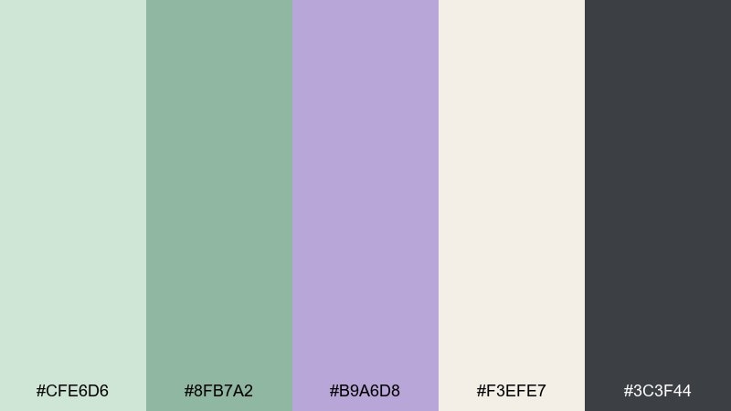
HEX: #CFE6D6 #8FB7A2 #B9A6D8 #F3EFE7 #3C3F44
Mood: airy, soothing, modern
Best for: wellness brand identity and social templates
Airy and restorative, like a quiet herb garden with a soft lilac haze. Use this lavender and green combination for wellness branding, skincare labels, or gentle quote posts where readability matters. Pair the cream with charcoal for clean type, then let sage and lilac carry the mood. Tip: keep lilac for headlines or small accents so the greens stay calming, not candy-sweet.
Image example of sage lilac whisper generated using media.io
Media.io is an online AI studio for creating and editing video, image, and audio in your browser.

2) Eucalyptus Orchid Calm
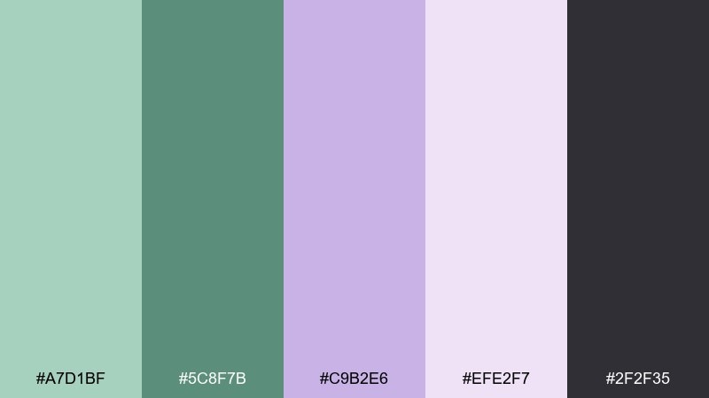
HEX: #A7D1BF #5C8F7B #C9B2E6 #EFE2F7 #2F2F35
Mood: fresh, clean, balanced
Best for: spa menus and boutique hotel collateral
Fresh and clean, evoking eucalyptus leaves against a faint orchid tint. It works beautifully for menus, amenity cards, and calm promotional layouts where you want a premium feel. Let the darker green anchor headings and use the pale lilac as breathing room in margins and blocks. Tip: add plenty of white space and keep icons line-based to maintain the airy vibe.
Image example of eucalyptus orchid calm generated using media.io
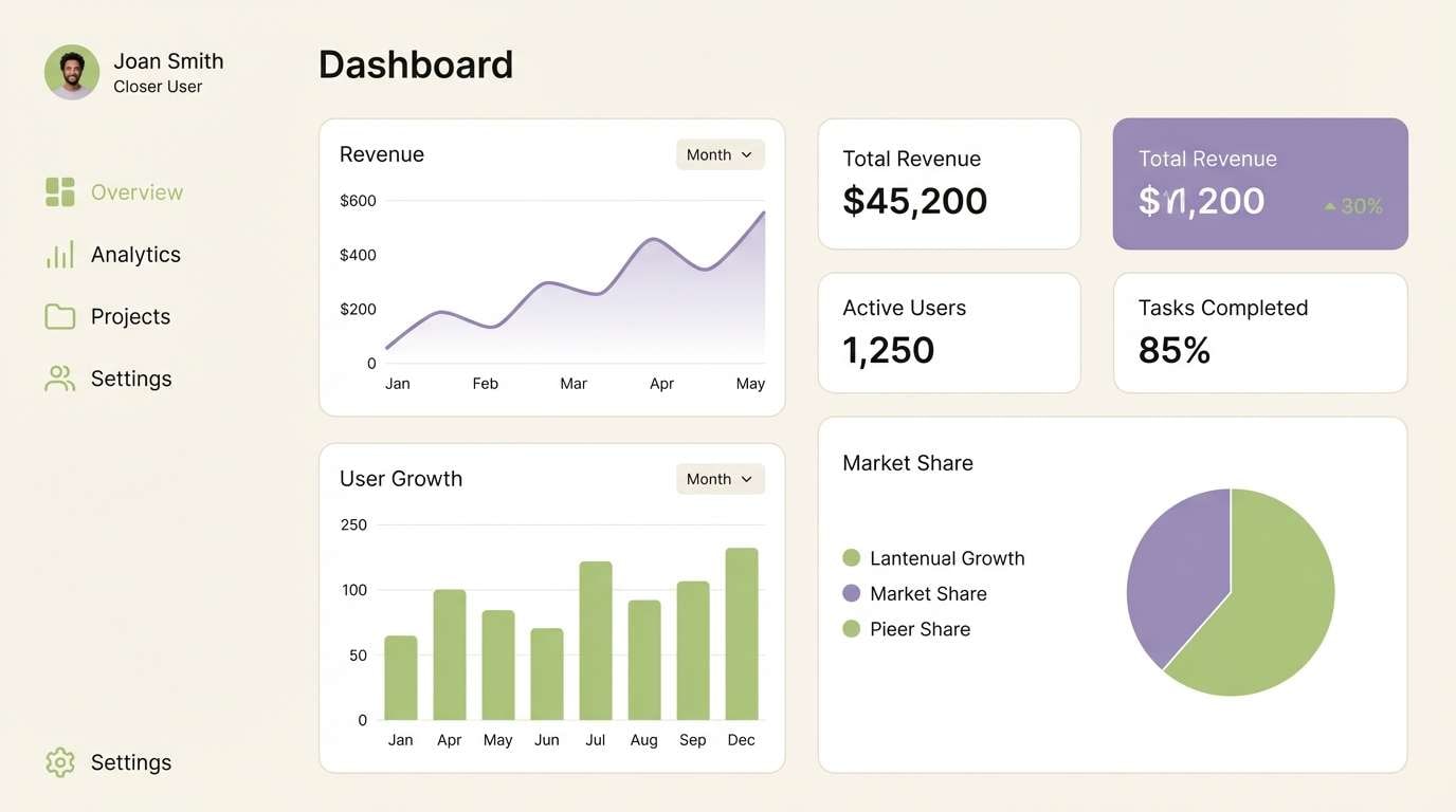
3) Matcha Heather Minimal
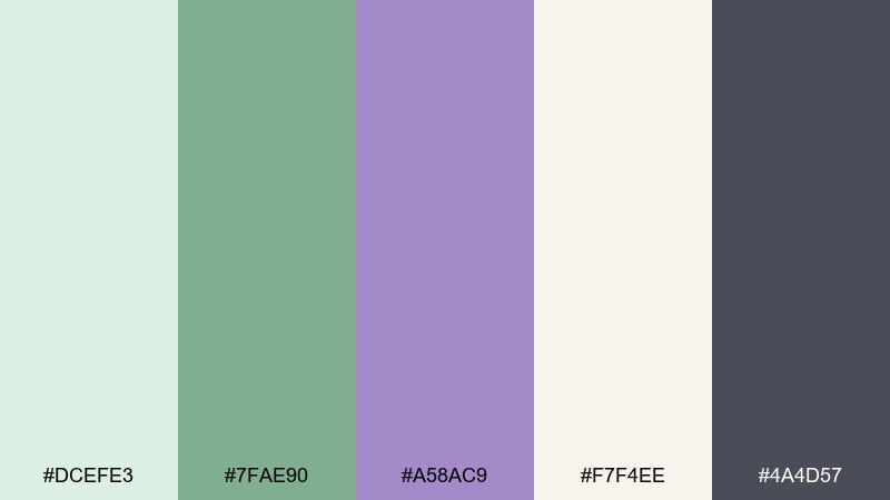
HEX: #DCEFE3 #7FAE90 #A58AC9 #F7F4EE #4A4D57
Mood: minimal, gentle, editorial
Best for: modern UI kits and dashboard themes
Minimal and gentle, like matcha foam with a dusty heather shadow. This green and lavender color palette is ideal for UI kits where you need soft surfaces without losing contrast. Use the cream as the main canvas, then apply the darker gray for text and components. Tip: reserve lavender for states like focus, active, or selected to make interactions feel polished.
Image example of matcha heather minimal generated using media.io
4) Pistachio Wisteria Pop
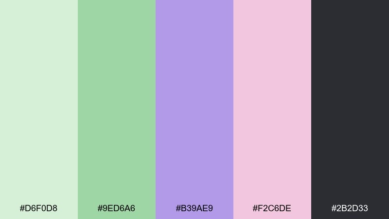
HEX: #D6F0D8 #9ED6A6 #B39AE9 #F2C6DE #2B2D33
Mood: playful, upbeat, springy
Best for: event posters and creative promotions
Playful and springy, like pistachio gelato topped with wisteria petals. It shines on posters and promo graphics that need energy without going neon. Keep charcoal for bold type, and use the pink as a small accent to warm up the purples. Tip: limit the brightest green to shapes and callouts so the layout stays readable from a distance.
Image example of pistachio wisteria pop generated using media.io

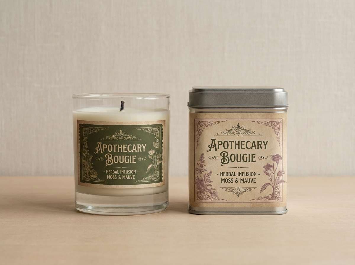
5) Moss Mauve Heritage
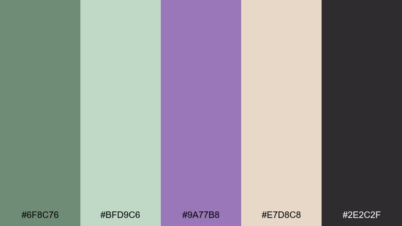
HEX: #6F8C76 #BFD9C6 #9A77B8 #E7D8C8 #2E2C2F
Mood: heritage, grounded, refined
Best for: packaging for candles, tea, and apothecary goods
Grounded and refined, like old moss on stone paired with muted mauve ink. These green and lavender color combinations work especially well for heritage-style packaging and labels. Use the deep green for borders and badges, then soften the layout with warm beige. Tip: add subtle paper grain or letterpress texture to make the palette feel handcrafted.
Image example of moss mauve heritage generated using media.io
6) Seafoam Lavender Breeze
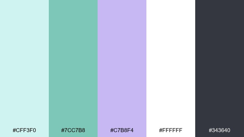
HEX: #CFF3F0 #7CC7B8 #C7B8F4 #FFFFFF #343640
Mood: breezy, light, coastal
Best for: wedding invitations and bridal stationery
Breezy and light, like seafoam rolling under a pastel lavender sky. It fits wedding suites, save-the-dates, and vow cards when you want softness without fading. Keep white dominant, then bring in seafoam for borders and lavender for monograms or florals. Tip: print lavender slightly darker than you expect so it holds up on textured paper.
Image example of seafoam lavender breeze generated using media.io
7) Celadon Violet Studio
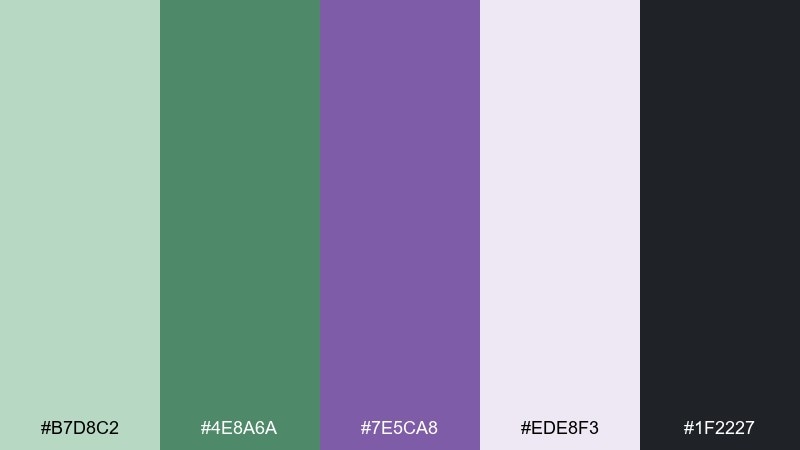
HEX: #B7D8C2 #4E8A6A #7E5CA8 #EDE8F3 #1F2227
Mood: creative, confident, modern
Best for: portfolio websites and design studio branding
Creative and confident, like celadon ceramics with a violet glaze. Use this green and lavender color scheme for portfolio sites where you want a calm base but a distinctive signature color. Let the near-black carry navigation and body text, then use violet sparingly for links and highlights. Tip: build a simple two-tone system, green for surfaces and violet for actions, to stay consistent.
Image example of celadon violet studio generated using media.io
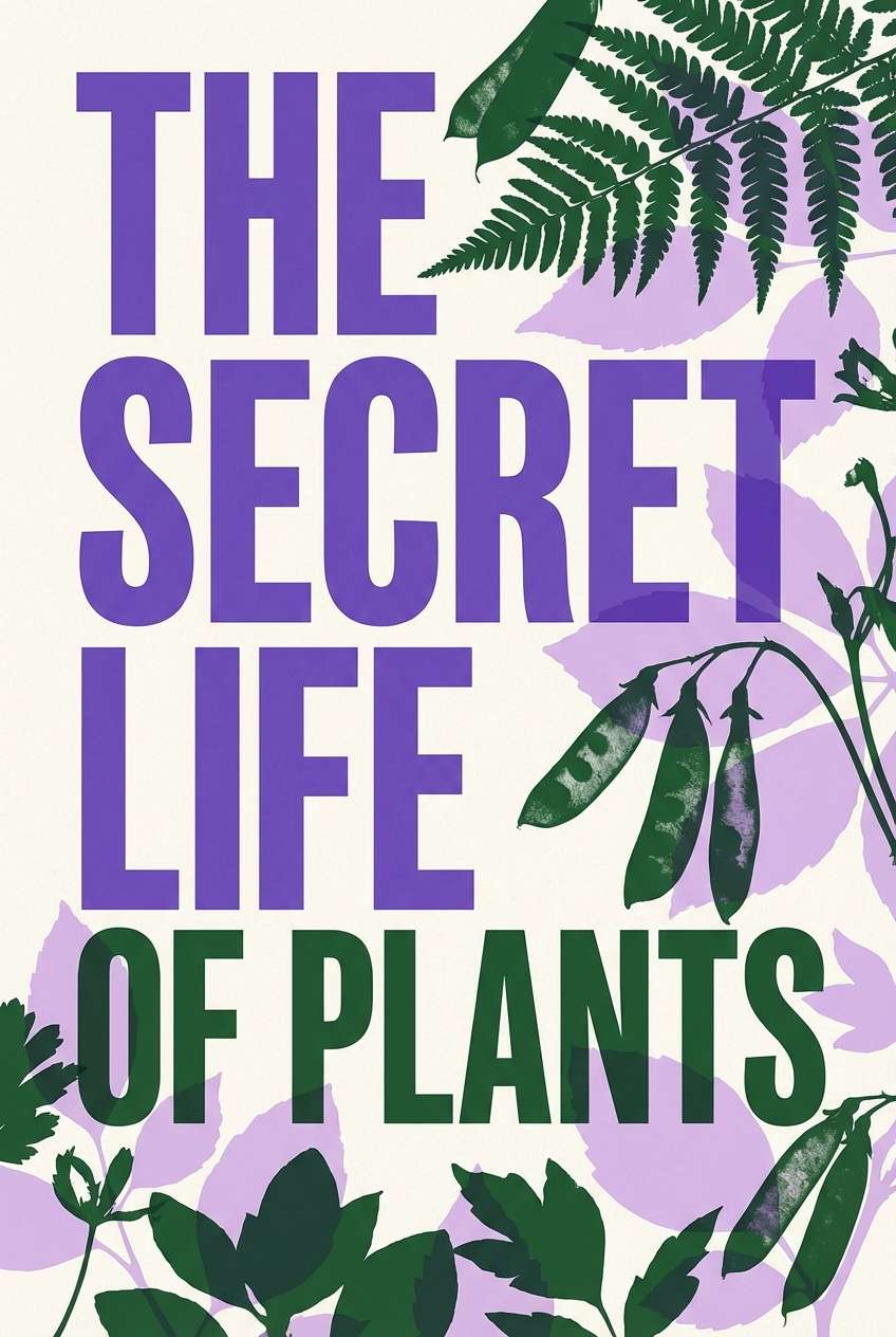
8) Fern Iris Contrast
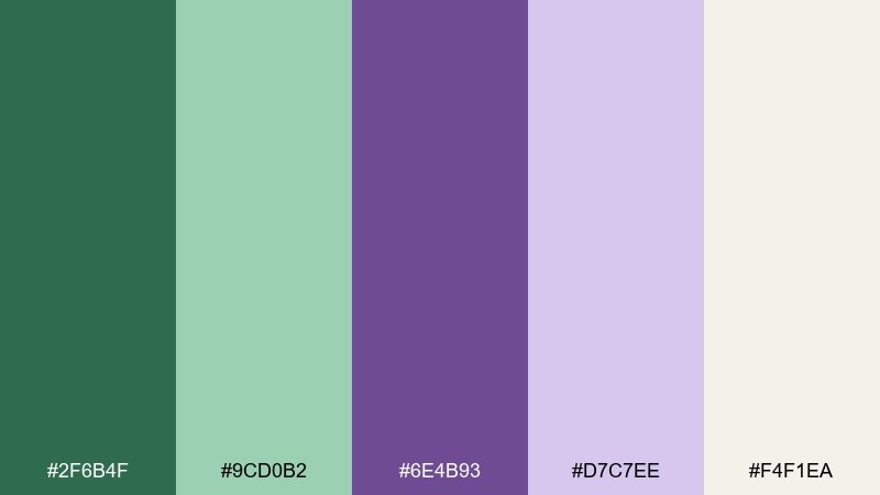
HEX: #2F6B4F #9CD0B2 #6E4B93 #D7C7EE #F4F1EA
Mood: bold, botanical, high-contrast
Best for: book covers and podcast artwork
Bold and botanical, like deep fern fronds set against iris petals. The contrast makes it great for covers and square artwork that must read at thumbnail size. Use the dark green as your title block, then layer lavender tints behind supporting text. Tip: keep one large shape and one accent color per panel to avoid visual noise.
Image example of fern iris contrast generated using media.io
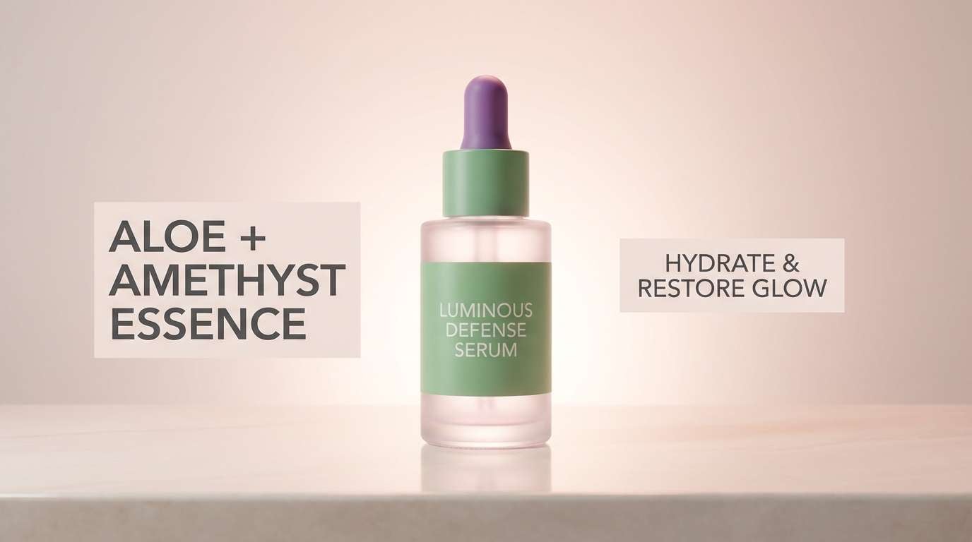
9) Aloe Amethyst Glow
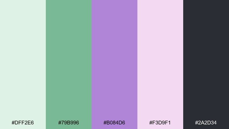
HEX: #DFF2E6 #79B996 #B084D6 #F3D9F1 #2A2D34
Mood: soft glow, friendly, uplifting
Best for: beauty ads and product launch banners
Soft and uplifting, like aloe gel catching a faint amethyst glow. The green and lavender combination works well in beauty ads where you want freshness with a hint of luxury. Pair the amethyst with charcoal for crisp claims, then use blush as a gentle gradient accent. Tip: apply the brighter purple only on the hero product outline or key price tag to guide the eye.
Image example of aloe amethyst glow generated using media.io
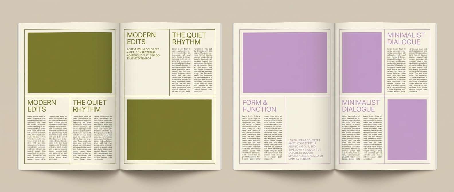
10) Olive Lilac Editorial
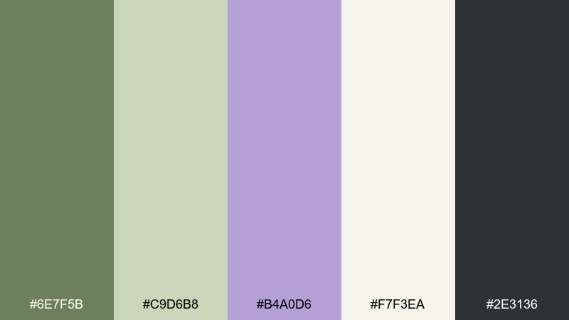
HEX: #6E7F5B #C9D6B8 #B4A0D6 #F7F3EA #2E3136
Mood: editorial, mature, stylish
Best for: magazine layouts and lookbooks
Editorial and mature, like olive leaves pressed into a lilac-tinted paper. This green and lavender color scheme feels sophisticated for lookbooks, catalogs, and long-form layouts. Use olive for section headers and rules, then keep backgrounds mostly warm cream so photos or illustrations breathe. Tip: choose one type family with multiple weights to keep the palette doing the heavy lifting.
Image example of olive lilac editorial generated using media.io
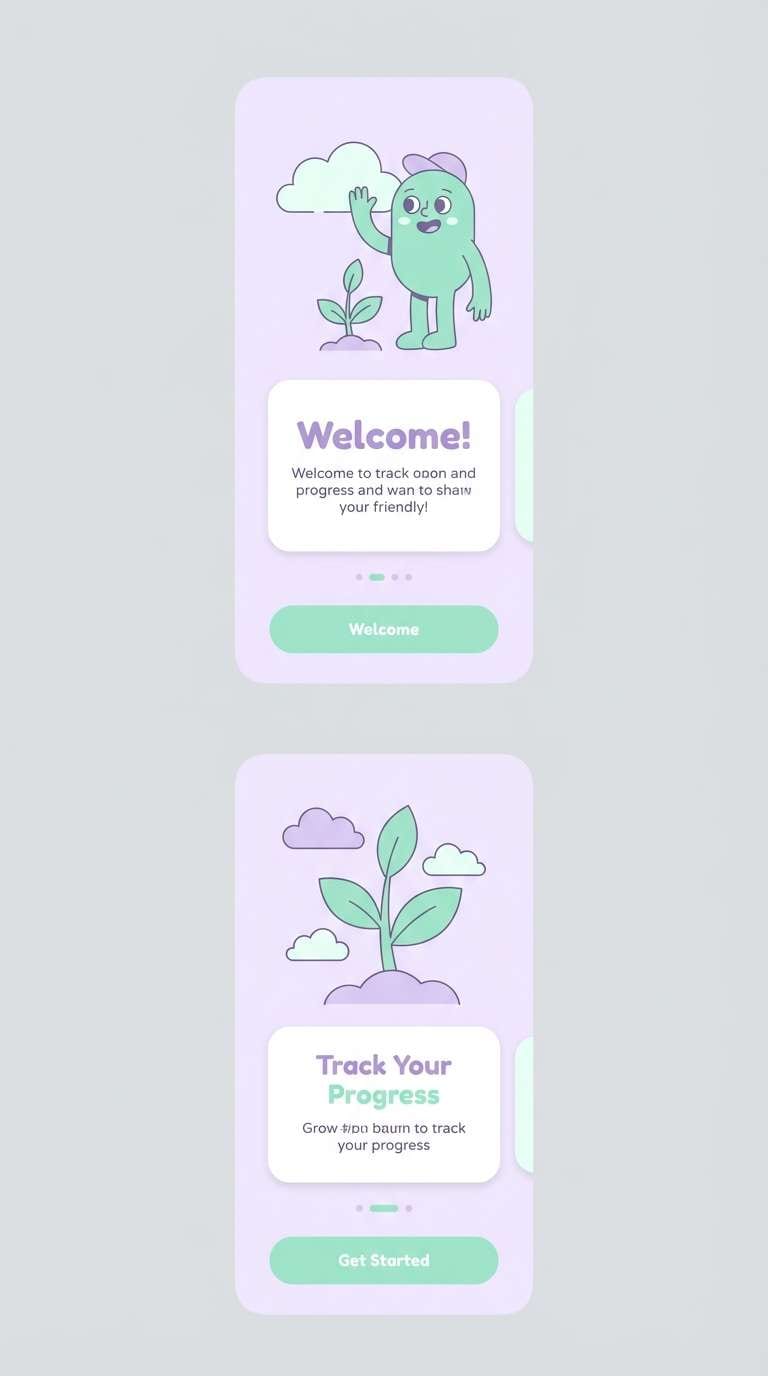
11) Mint Lavender UI Soft
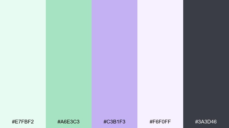
HEX: #E7FBF2 #A6E3C3 #C3B1F3 #F6F0FF #3A3D46
Mood: soft, friendly, approachable
Best for: mobile app UI and onboarding screens
Soft and friendly, like mint sherbet beside a lavender macaron. This green and lavender color palette is a natural fit for onboarding screens and habit apps where calm encourages action. Use the darkest gray for text, keep lavender for primary buttons, and mint for success states or progress. Tip: test accessibility early and deepen the button color if text contrast drops on pale tints.
Image example of mint lavender ui soft generated using media.io
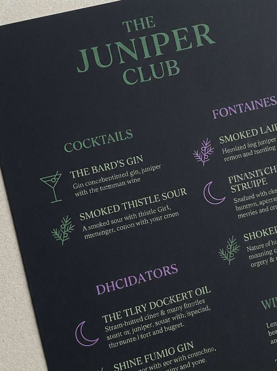
12) Juniper Thistle Night
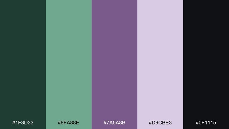
HEX: #1F3D33 #6FA88E #7A5A8B #D9CBE3 #0F1115
Mood: moody, luxe, nighttime
Best for: premium branding and cocktail bar menus
Moody and luxe, like juniper needles and thistle blooms at dusk. The deep tones are perfect for premium menus, invitations, and brand marks that need drama without harshness. Use black as the backdrop, then bring in juniper and thistle for typography and line art. Tip: add a lot of negative space so the dark palette feels intentional, not heavy.
Image example of juniper thistle night generated using media.io
13) Avocado Periwinkle Retro
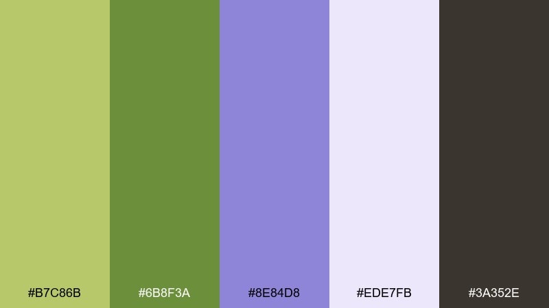
HEX: #B7C86B #6B8F3A #8E84D8 #EDE7FB #3A352E
Mood: retro, quirky, energetic
Best for: merch graphics and sticker packs
Retro and quirky, like an avocado green tee with periwinkle screen print. This green and lavender color palette works for merch, stickers, and playful brand collabs that want a throwback edge. Use the darker brown for outlines and typography, then let periwinkle soften the limey greens. Tip: keep shapes chunky and avoid thin lines so the palette stays punchy in small formats.
Image example of avocado periwinkle retro generated using media.io
14) Spring Meadow Violet
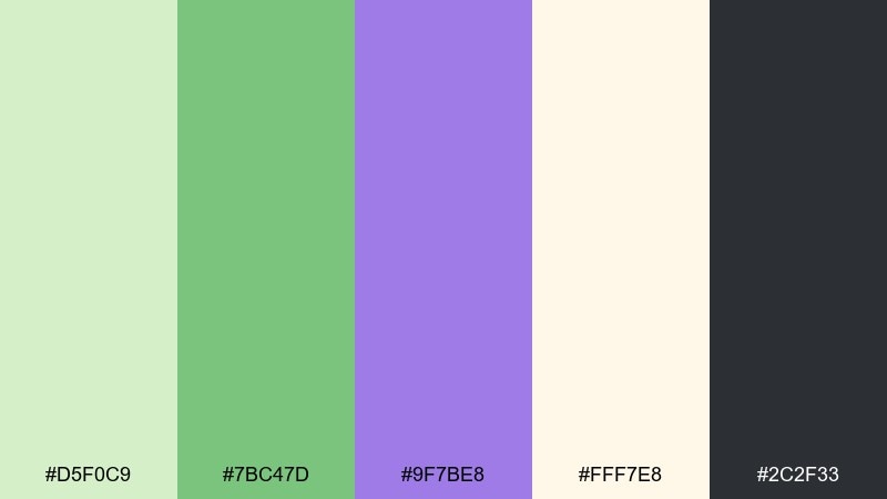
HEX: #D5F0C9 #7BC47D #9F7BE8 #FFF7E8 #2C2F33
Mood: bright, optimistic, outdoorsy
Best for: seasonal campaigns and spring sale banners
Bright and optimistic, like a spring meadow sprinkled with violet wildflowers. It is great for seasonal campaigns when you want cheerful color without overwhelming saturation. Keep the butter-cream as your background and use green for big shapes, then place violet as a crisp accent for prices or CTAs. Tip: stick to two dominant colors per banner to avoid a busy, patchwork feel.
Image example of spring meadow violet generated using media.io

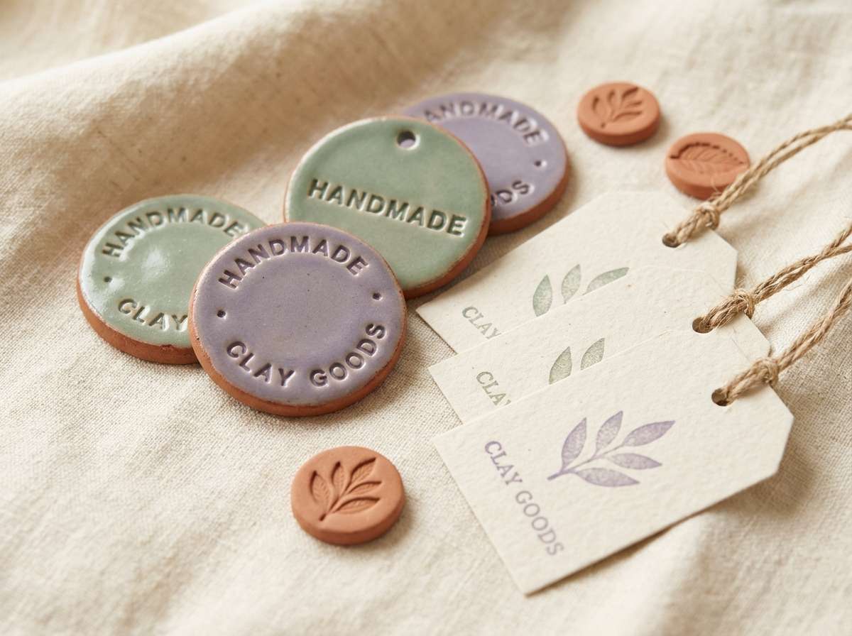
15) Dewy Sage Purple Clay
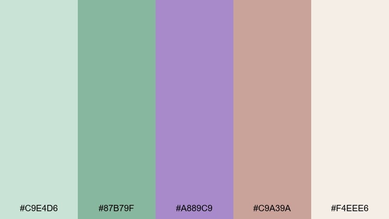
HEX: #C9E4D6 #87B79F #A889C9 #C9A39A #F4EEE6
Mood: earthy, soft, artisanal
Best for: ceramic shop branding and handmade product labels
Earthy and artisanal, like dewy sage leaves beside purple-tinted clay. It suits handmade labels, craft markets, and small-batch storefronts that lean natural. Use clay as a warming counterpoint to lavender, and keep cream for generous negative space. Tip: choose uncoated paper and let the muted tones look slightly imperfect for an authentic feel.
Image example of dewy sage purple clay generated using media.io
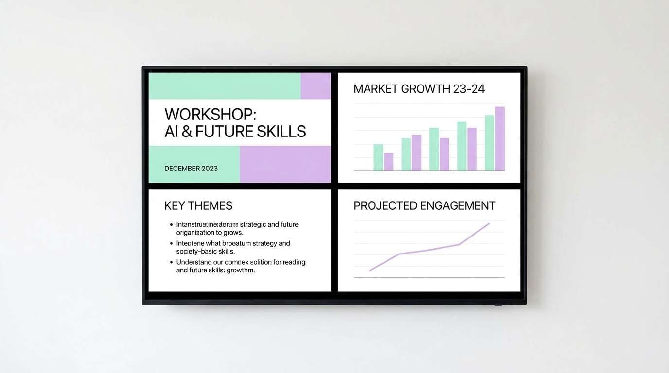
16) Herbal Mist Lilac Light
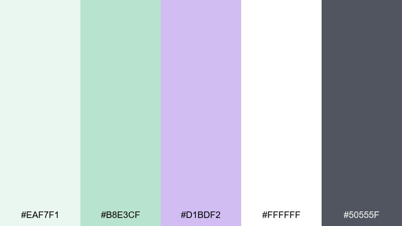
HEX: #EAF7F1 #B8E3CF #D1BDF2 #FFFFFF #50555F
Mood: clean, light, calming
Best for: presentation decks and workshop materials
Clean and calming, like a herbal mist drifting through a sunlit room. These green lavender tones are excellent for slide decks where you want clarity, not visual noise. Use white for most slides, mint for section breaks, and lilac for callouts or key takeaways. Tip: keep charts mostly green and reserve purple for one highlight series so insights pop instantly.
Image example of herbal mist lilac light generated using media.io
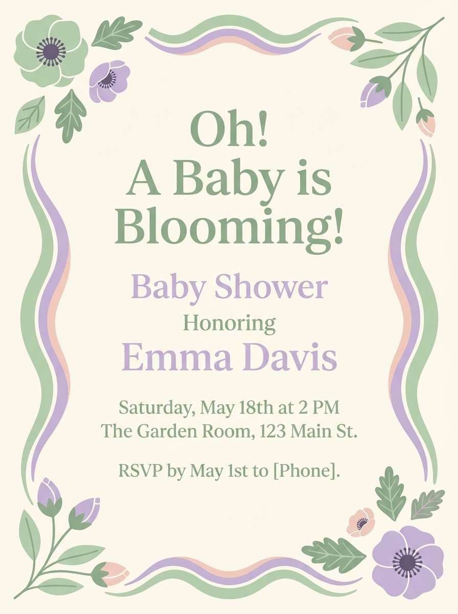
17) Garden Party Pastels
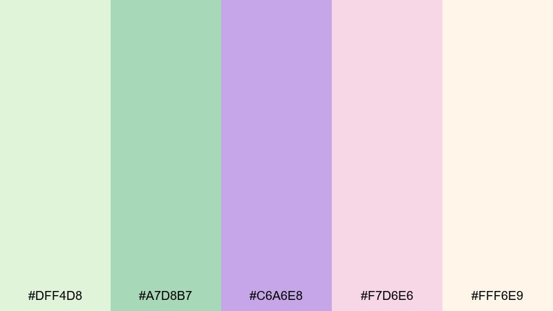
HEX: #DFF4D8 #A7D8B7 #C6A6E8 #F7D6E6 #FFF6E9
Mood: sweet, festive, pastel
Best for: baby shower invites and party printables
Sweet and festive, like a garden party with pastel bunting and sugared petals. It is ideal for baby showers, birthdays, and printable décor where softness is the point. Use cream as the base, then alternate green and lavender for blocks, borders, and icons. Tip: keep text in a darker muted tone and avoid pure black so the overall feel stays gentle.
Image example of garden party pastels generated using media.io
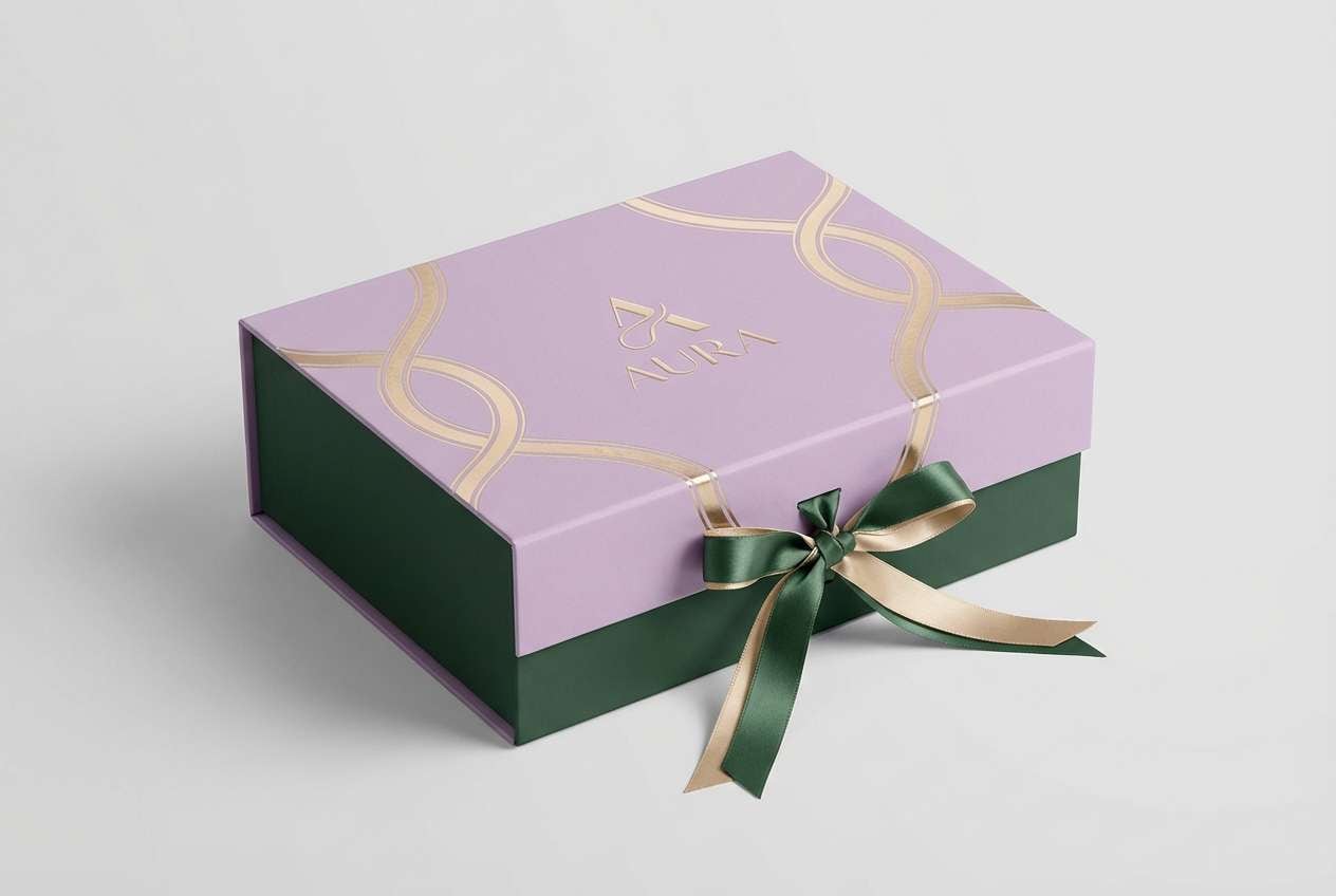
18) Forest Lavender Metallic
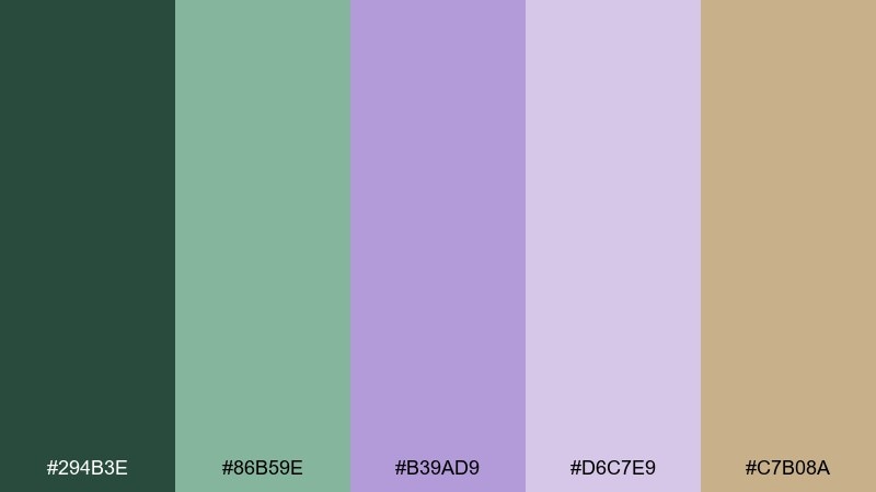
HEX: #294B3E #86B59E #B39AD9 #D6C7E9 #C7B08A
Mood: luxury, dramatic, elegant
Best for: premium logo systems and gift box packaging
Luxurious and dramatic, like forest shade meeting lavender satin with a hint of champagne metal. It is a strong choice for premium marks, gift boxes, and holiday editions. Use the gold tone as a foil accent, keep lavender in backgrounds, and let forest green hold the logo. Tip: if printing, treat gold as a spot or emboss detail so it looks intentional rather than beige.
Image example of forest lavender metallic generated using media.io
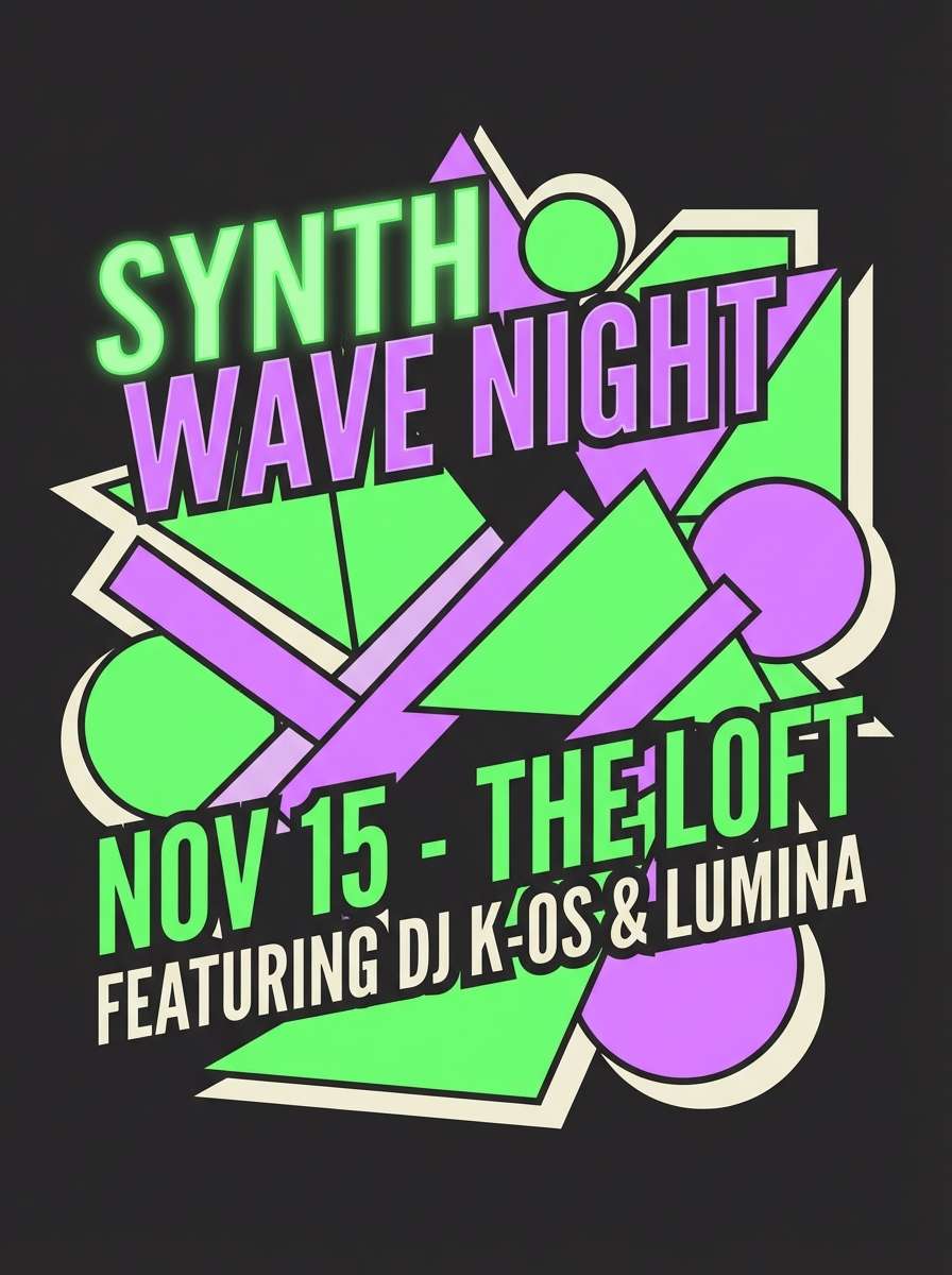
19) Soft Sage Neon Lilac Edge
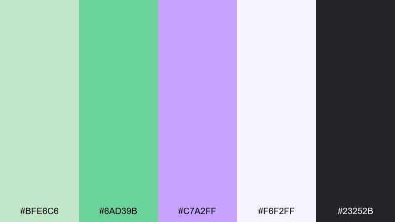
HEX: #BFE6C6 #6AD39B #C7A2FF #F6F2FF #23252B
Mood: modern, punchy, youthful
Best for: music flyer graphics and creator announcements
Modern and punchy, like fresh sage with a lilac glow stick edge. These green and lavender color combinations are great when you want energy without going full neon rainbow. Use near-black for the base, then let the brighter green and lilac become the headline and key shapes. Tip: apply the punchy tones in big blocks, not gradients, to keep the design crisp.
Image example of soft sage neon lilac edge generated using media.io
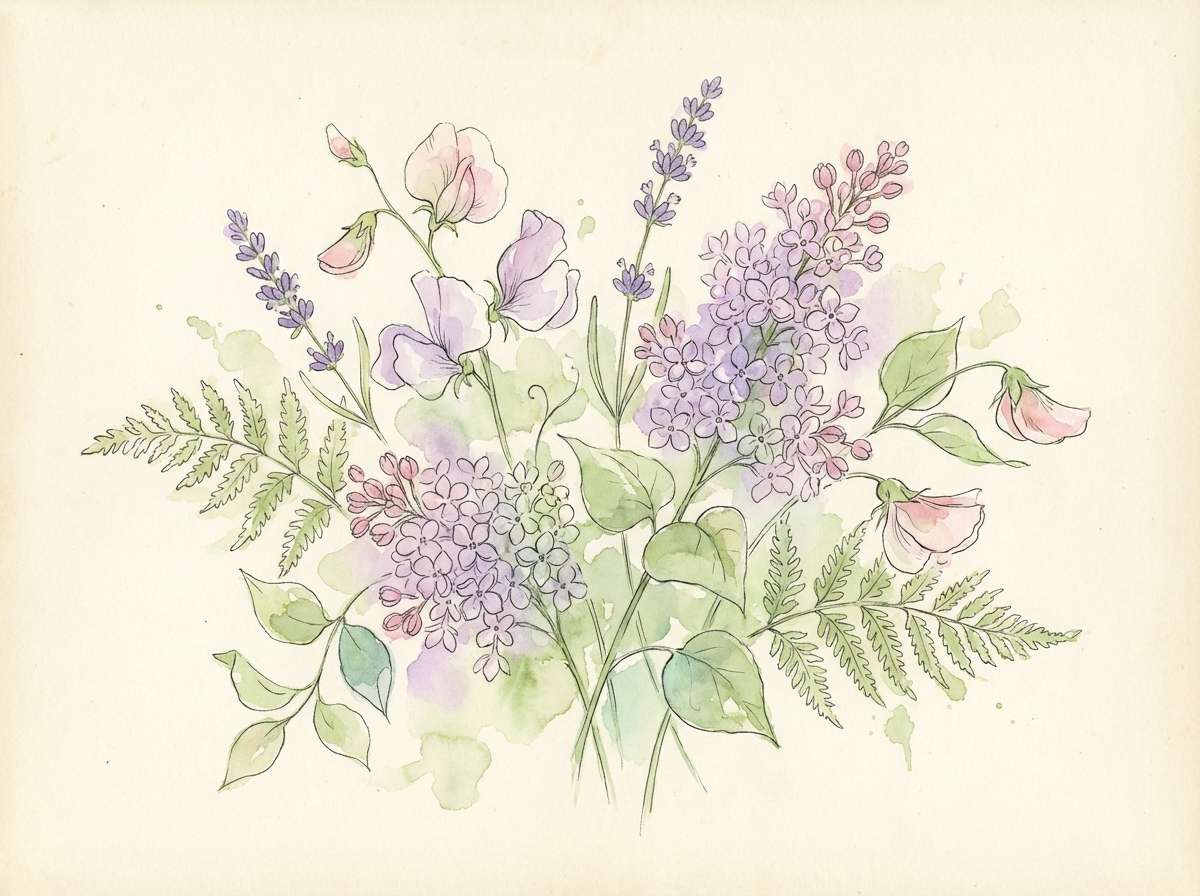
20) Pastel Garden Bloom
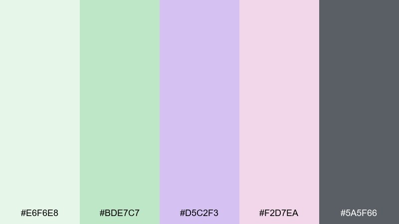
HEX: #E6F6E8 #BDE7C7 #D5C2F3 #F2D7EA #5A5F66
Mood: romantic, light, illustrative
Best for: botanical illustrations and spring artwork
Romantic and light, like watercolor blooms washed with pale green and lavender. It is perfect for botanical illustration, greeting cards, and soft seasonal prints. Keep the gray for fine outlines and lettering, then layer the pastels in translucent washes. Tip: choose two dominant washes and let the remaining colors appear only as tiny petal accents.
Image example of pastel garden bloom generated using media.io
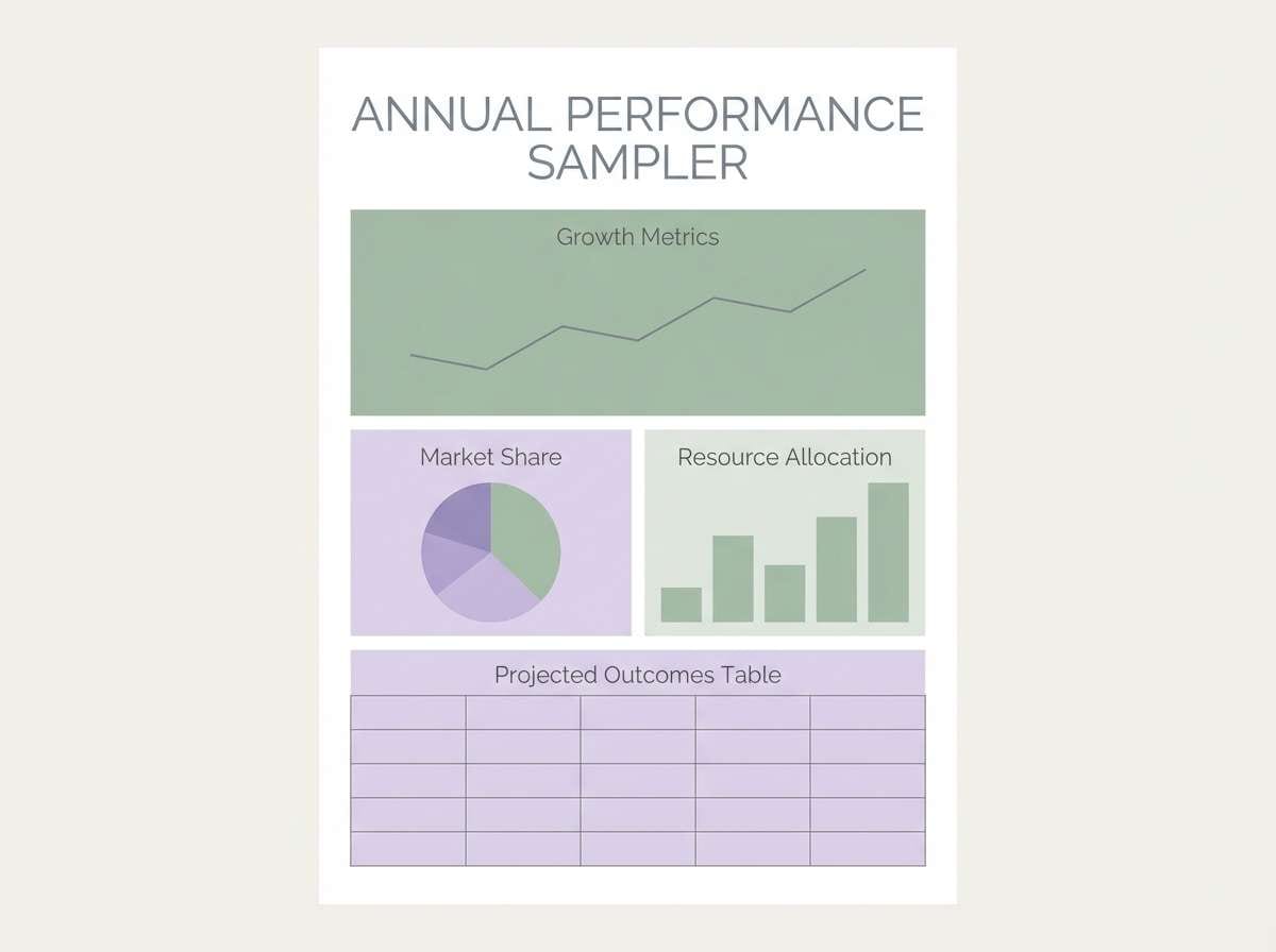
21) Granite Sage Lavender
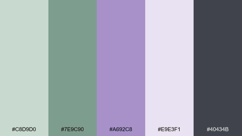
HEX: #C8D9D0 #7E9C90 #A692C8 #E9E3F1 #40434B
Mood: calm, structured, professional
Best for: corporate reports and data-driven one-pagers
Calm and structured, like granite softened by sage and a faint lavender cast. It works well for reports and one-pagers where you need a modern but conservative palette. Use the mid sage for tables and dividers, and keep lavender tints for secondary panels or pull quotes. Tip: maintain a strict grid and rely on weight and spacing more than extra color.
Image example of granite sage lavender generated using media.io
22) Linen Sage Violet Ink
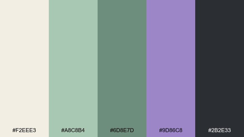
HEX: #F2EEE3 #A8C8B4 #6D8E7D #9D86C8 #2B2E33
Mood: cozy, natural, understated
Best for: home decor mood boards and interior styling
Cozy and understated, like linen fabric with sage stitching and violet ink notes. Use it for interior mood boards, look-and-feel comps, and lifestyle brand styling. Keep linen as the main field, then add sage blocks for materials and finishes while violet stays as an accent swatch. Tip: repeat the dark charcoal in small labels to tie the whole board together.
Image example of linen sage violet ink generated using media.io
What Colors Go Well with Green Lavender?
Neutrals are the easiest match: warm cream, off-white, stone, and charcoal keep green lavender feeling modern and readable. If your palette is very light, a deep gray (instead of pure black) often looks softer and more on-brand.
For warmth, try clay, blush, or sand tones to prevent the greens and purples from feeling chilly. For a premium finish, champagne gold or brushed brass accents can elevate packaging and event stationery.
When you need more contrast, lean into deep forest, juniper, or near-black backgrounds, then use lavender as a highlight color. This approach keeps the palette calm but makes CTAs and headlines pop.
How to Use a Green and Lavender Color Combinations in Real Designs
In branding, let green do the heavy lifting (backgrounds, supporting patterns, packaging fields) and reserve lavender for your signature moments like a logo accent, seal, or headline. This creates consistency without making everything feel purple.
In UI design, green works well for surfaces and positive states, while lavender can map to focus, selected, or primary actions. Keep one neutral for text (charcoal or near-black) so accessibility stays manageable across light tints.
In print, choose paper and finishing that complements the softness—uncoated stocks, subtle grain, or foil accents. If you’re using pale lavender inks, consider printing slightly darker than expected so the details hold up.
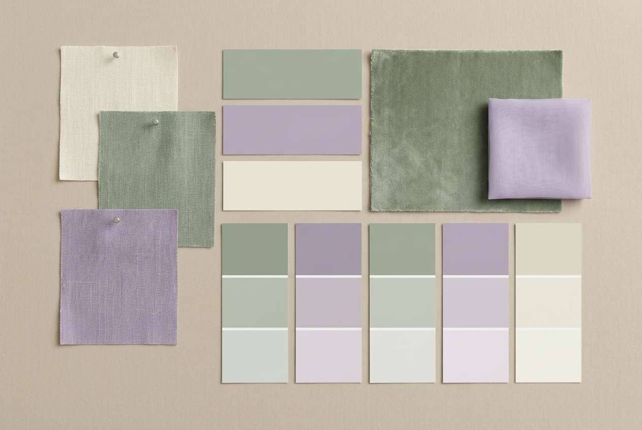
Create Green Lavender Palette Visuals with AI
If you want to preview how your green and lavender color combinations look on real objects—like packaging, invitations, or UI screens—AI mockups can save hours of manual comp work. Start with one palette, then generate a few variations to test mood and contrast.
With Media.io, you can turn a simple prompt into clean, on-brand visuals and iterate quickly. It’s especially helpful when you’re exploring whether lavender should be an accent, a background tint, or your primary CTA color.
Green Lavender Color Palette FAQs
-
What does a green lavender color palette communicate?
Most green lavender palettes communicate calm, care, and modern softness—green signals nature and restoration, while lavender adds a gentle, creative, slightly luxe note. -
Is green lavender good for wellness or spa branding?
Yes. Sage/eucalyptus greens paired with lilac tones are widely associated with relaxation and cleanliness, making them a strong fit for skincare, yoga, spa menus, and boutique hospitality. -
How do I keep green lavender from looking too “pastel” or childish?
Anchor the palette with a dark neutral (charcoal/near-black) and use lavender as an accent rather than a full background. Adding warm cream or beige also helps it feel more mature. -
What neutral colors pair best with green lavender?
Warm off-white, cream, linen, and soft greige keep the palette soothing. For typography and UI contrast, charcoal or deep slate usually reads cleaner than pure black. -
Can I use green and lavender in UI design without losing accessibility?
Yes, but test contrast early. Keep text in a dark neutral, deepen your primary button lavender if needed, and avoid placing light lavender text on mint/seafoam backgrounds. -
What accent colors work with sage and lavender?
Blush/clay tones add warmth, while champagne gold adds a premium feel (especially for packaging). For higher contrast, forest green or near-black backgrounds make lavender highlights pop. -
How do I choose which color should dominate: green or lavender?
Use green as the dominant color for a natural, grounded vibe (great for wellness and interiors). Make lavender dominant when you want a softer, more whimsical or romantic direction (great for invitations and illustration styles).
Next: Spa Color Palette


