

A spa color palette is built to slow things down visually: airy neutrals, softened greens, and water-leaning teals that feel clean without turning sterile.
Below are 20 curated spa color schemes with HEX codes, plus practical tips for interiors, branding, and calm UI design.
In this article
Why Spa Color Schemes Work So Well
Spa palettes work because they reduce visual noise. Most of the colors sit in low-to-mid saturation ranges, which keeps the eye from “buzzing” and helps spaces, screens, and packaging feel calmer.
They also balance temperature: cool water tones (mint, seafoam, teal) are softened with warm neutrals (linen, sand, cream). That mix creates cleanliness with comfort, instead of a cold “medical” look.
Finally, spa schemes are easy to scale across real projects. You can use the palest tones as backgrounds, mid tones for surfaces or UI components, and reserve the deepest shade for contrast, text, and anchors.
20+ Spa Color Palette Ideas (with HEX Codes)
1) Eucalyptus Mist
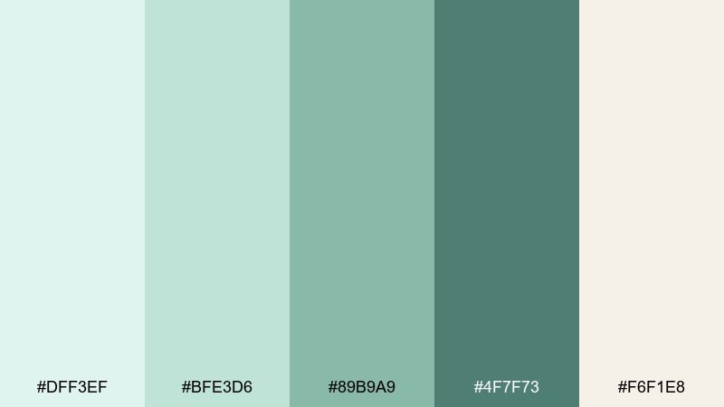
HEX: #DFF3EF #BFE3D6 #89B9A9 #4F7F73 #F6F1E8
Mood: fresh, breathable, restorative
Best for: bathroom interior styling
Fresh steam and crushed eucalyptus leaves come to mind, with cool green air softened by creamy light. This spa color scheme works beautifully in bathrooms and powder rooms where you want clean calm without feeling cold. Pair the deeper green with brushed nickel or matte black hardware, and keep the lightest tones for tile and towels. Usage tip: repeat the mid green in two places only (paint and textiles) to keep the space serene.
Image example of eucalyptus mist generated using media.io

Media.io is an online AI studio for creating and editing video, image, and audio in your browser.

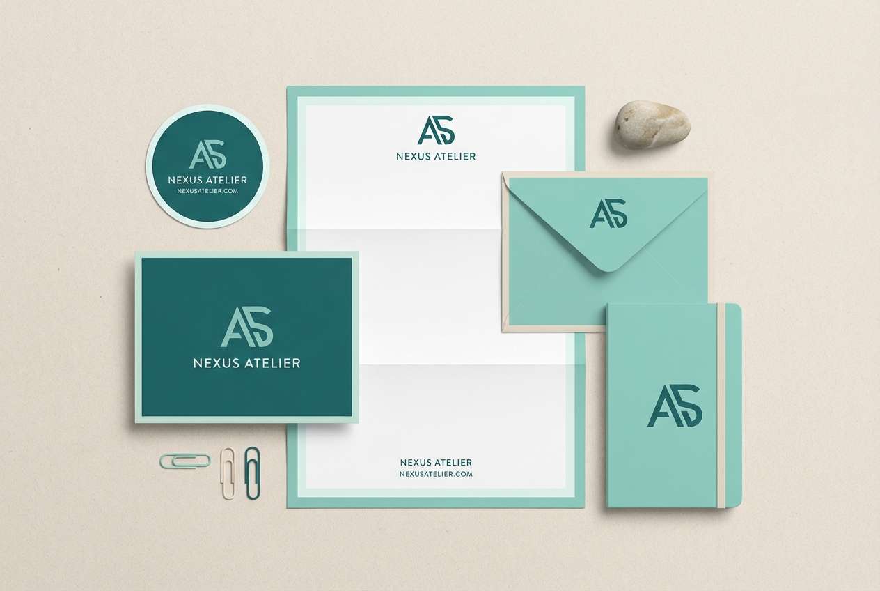
2) Sea Glass Serenity
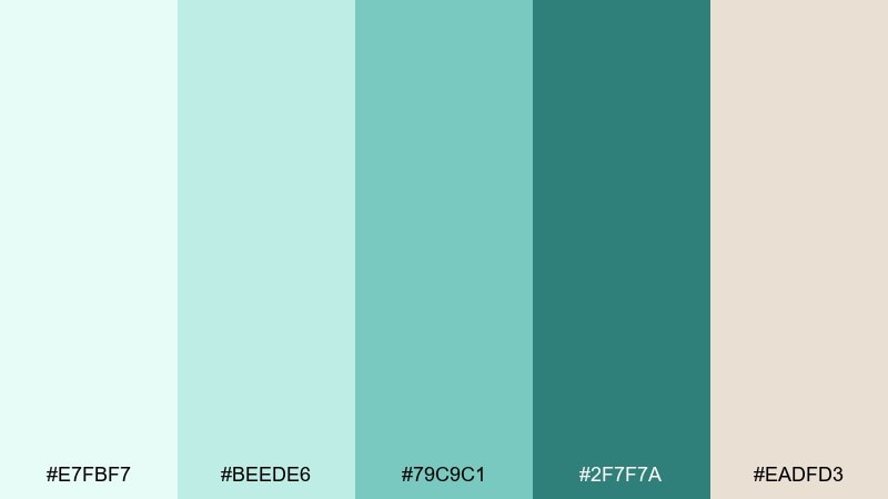
HEX: #E7FBF7 #BEEDE6 #79C9C1 #2F7F7A #EADFD3
Mood: coastal, soothing, polished
Best for: wellness brand logo and stationery set
Polished sea glass and gentle surf set an easygoing, clean tone with a hint of ocean depth. These spa color combinations feel especially strong for wellness brands that want trust and clarity without looking clinical. Use the dark teal for the wordmark, then lean on seafoam and warm beige for paper, envelopes, and subtle patterns. Usage tip: keep plenty of white space so the palette reads premium, not busy.
Image example of sea glass serenity generated using media.io
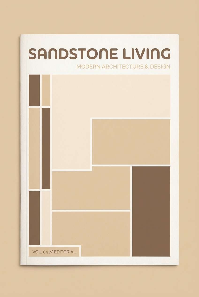
3) Warm Sandstone
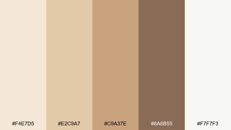
HEX: #F4E7D5 #E2C9A7 #C9A37E #8A6B55 #F7F7F3
Mood: sun-warmed, grounded, inviting
Best for: resort brochure cover design
Sunlit stone and warm sand create a grounded calm that feels welcoming and high-end. This spa color palette is ideal for resort collateral, spa menus, or hospitality brochures where natural textures matter. Let the light cream carry the background, then use the brown as the headline anchor with sandy accents for dividers and icons. Usage tip: add subtle paper grain or a soft gradient to amplify the sun-washed vibe.
Image example of warm sandstone generated using media.io
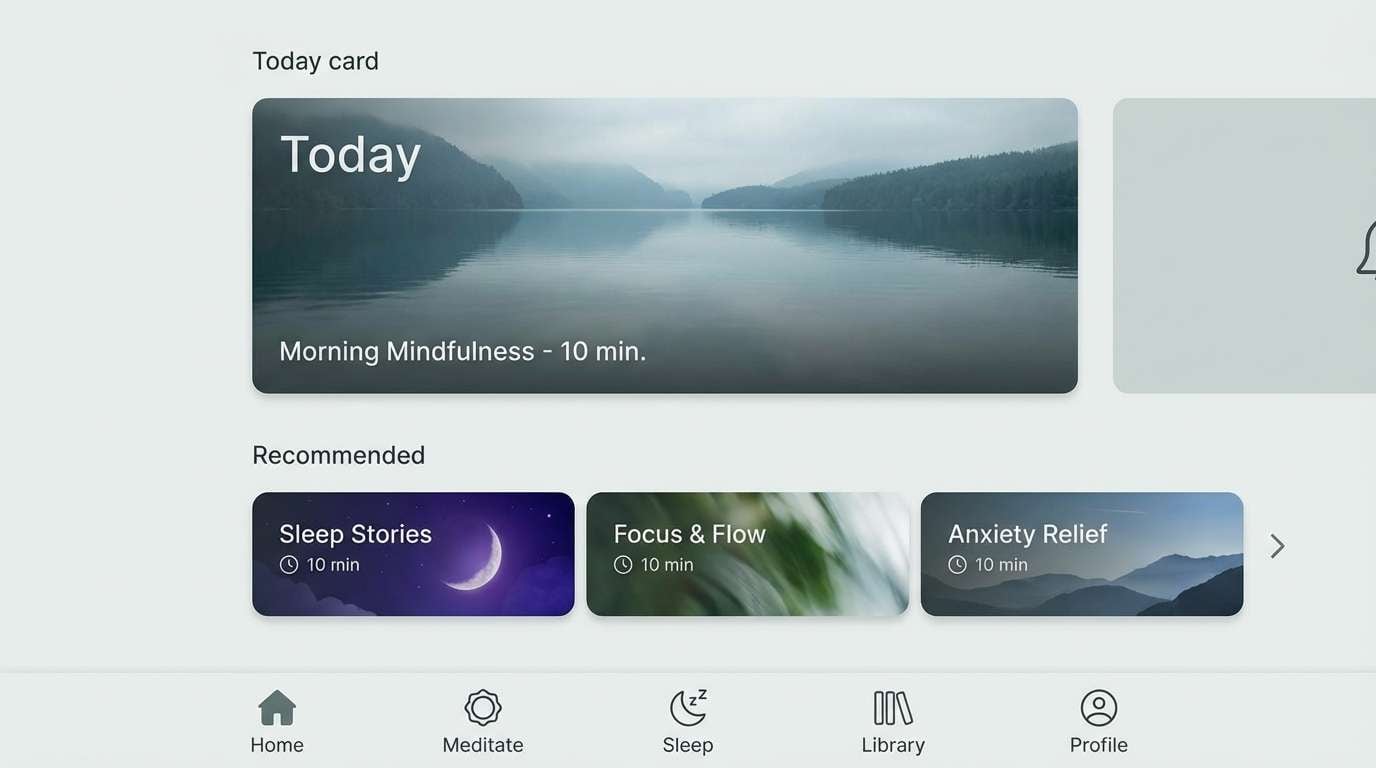
4) Pebble Creek
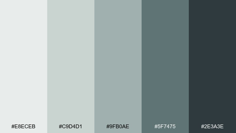
HEX: #E8ECEB #C9D4D1 #9FB0AE #5F7475 #2E3A3E
Mood: cool, balanced, quietly modern
Best for: meditation app UI screens
Smooth river pebbles and shaded water give this mix a calm, modern edge. It performs well in interface design where you need contrast that stays gentle on the eyes. Use the darkest tone for text and navigation, and keep the pale grays for backgrounds and cards. Usage tip: reserve the mid gray-green for active states so interactions feel subtle, not loud.
Image example of pebble creek generated using media.io
5) Aloe Linen

HEX: #F3F0E6 #DDE6D8 #A9C3A9 #6C8E79 #3F5E4F
Mood: clean, herbal, softly warm
Best for: skincare packaging design
Herbal aloe and fresh linen feel clean, comforting, and quietly luxurious. It fits skincare packaging where you want natural cues without going overly rustic. Pair the linen cream with simple sans-serif type, and use the deeper greens for ingredient callouts or seals. Usage tip: print the light green as a large matte field and keep dark green for small, crisp details to avoid heaviness.
Image example of aloe linen generated using media.io

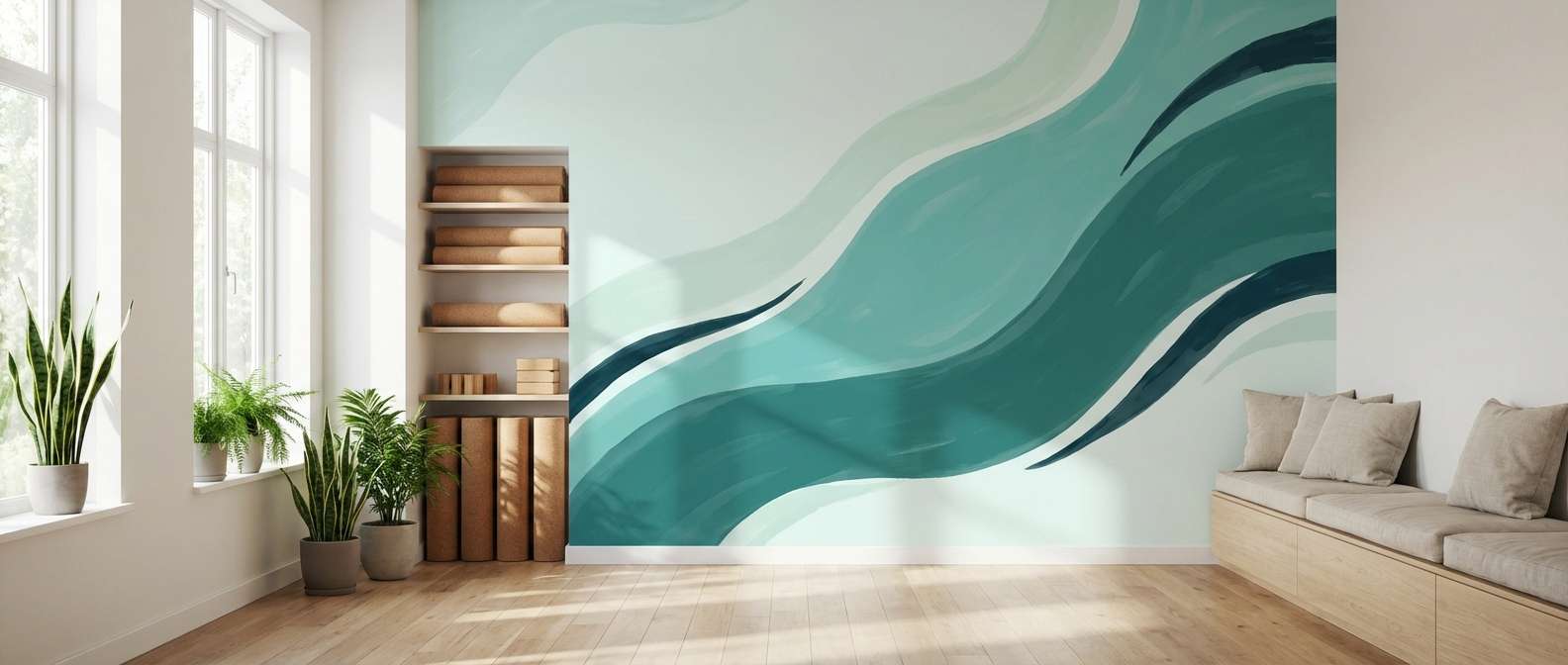
6) Lagoon Drift
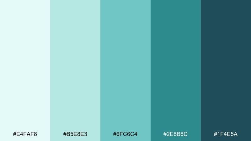
HEX: #E4FAF8 #B5E8E3 #6FC6C4 #2E8B8D #1F4E5A
Mood: watery, refreshing, contemporary
Best for: yoga studio wall mural concept
A bright lagoon shimmer meets deeper blue-green water for a refreshing, contemporary feel. As a spa color scheme, it works especially well when you want energy that still reads calm and clean. Use the light aqua for large mural fields and bring in the darker tones as flowing linework or geometric waves. Usage tip: keep outlines thin so the room stays airy rather than graphic-heavy.
Image example of lagoon drift generated using media.io
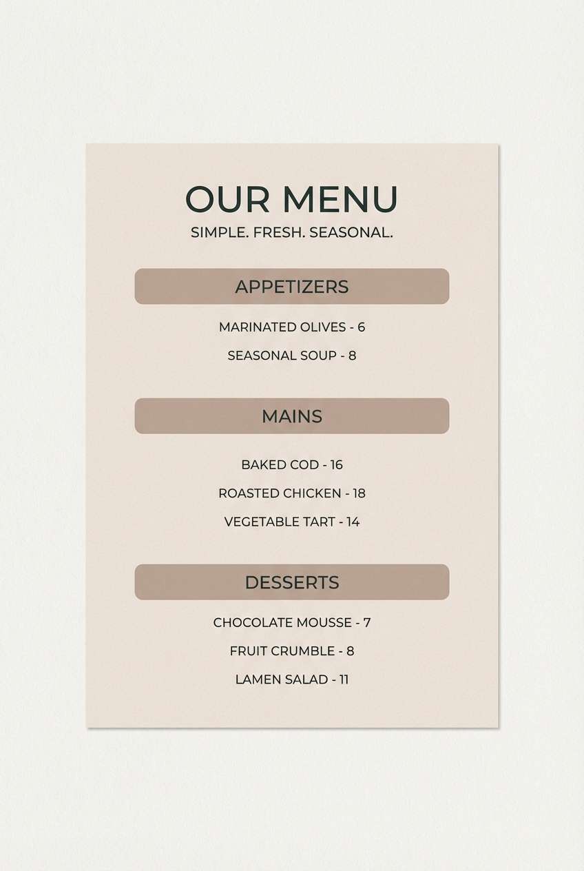
7) Coastal Clay
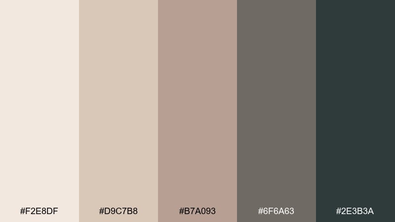
HEX: #F2E8DF #D9C7B8 #B7A093 #6F6A63 #2E3B3A
Mood: earthy, calm, artisan
Best for: spa menu flyer design
Hand-thrown clay and driftwood neutrals create an earthy calm that feels artisan and warm. This spa color palette suits menus and flyers when you want softness with legible contrast. Let the creamy tone be the paper color, then use charcoal for headers and taupe for section blocks. Usage tip: add one small dark accent line per section to guide the eye without clutter.
Image example of coastal clay generated using media.io
8) Cloudy Quartz
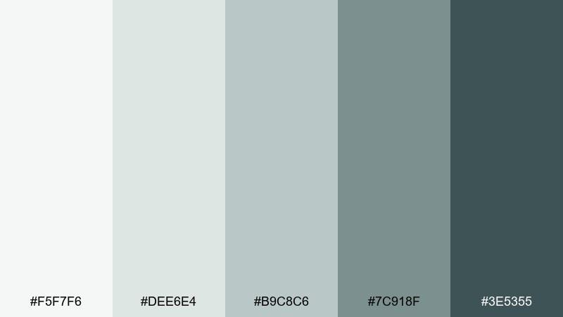
HEX: #F5F7F6 #DEE6E4 #B9C8C6 #7C918F #3E5355
Mood: misty, clean, understated
Best for: hotel lobby interior concept
Soft quartz haze and cool misty neutrals create a quiet, polished atmosphere. It is a strong choice for hotel lobbies and reception areas where you want calm without feeling flat. Pair the pale tones with light oak or limestone, then use the darker blue-gray for signage and wayfinding. Usage tip: layer textures (stone, linen, brushed metal) to keep the palette from looking monochrome.
Image example of cloudy quartz generated using media.io

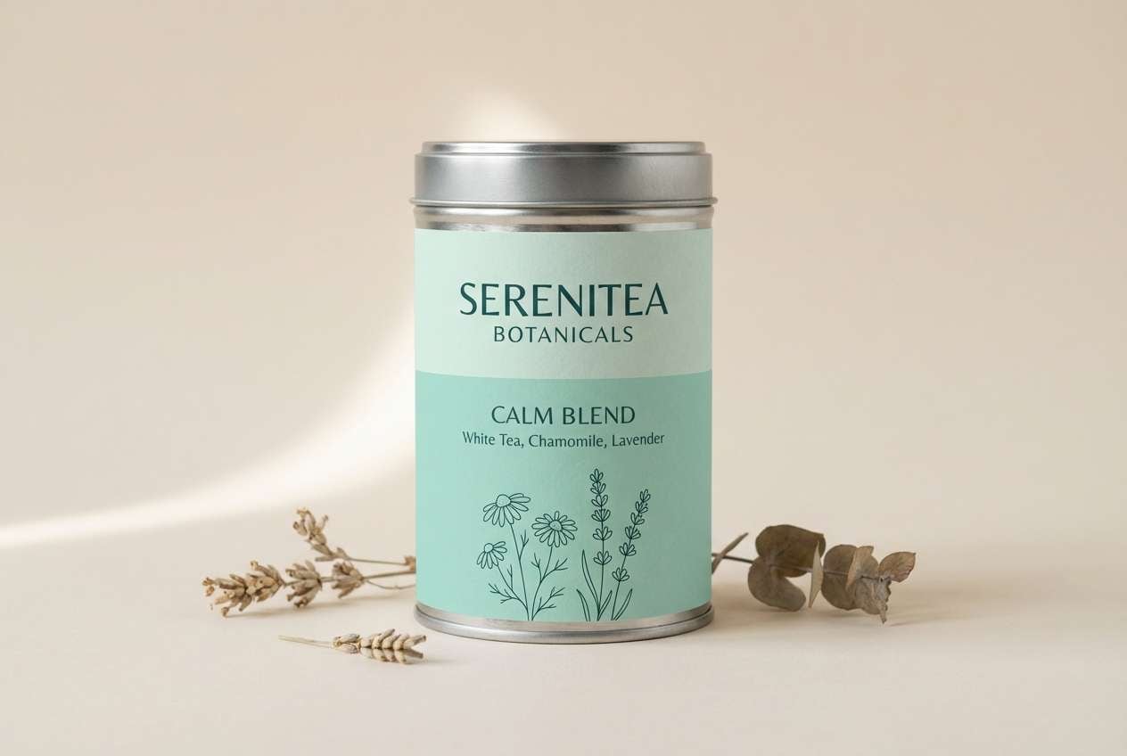
9) Mint Tea Calm
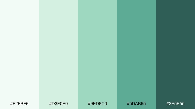
HEX: #F2FBF6 #D3F0E0 #9ED8C0 #5DAB95 #2E5E55
Mood: light, soothing, cheerful
Best for: tea label and tin design
Mint leaves steeping in a pale cup of tea bring a light, soothing cheer. It is perfect for labels where you want freshness that still feels gentle and premium. Use the deep green for product names, then let soft mint carry the main label field with a creamy background. Usage tip: keep illustrations simple and use one tint level for patterns to avoid a busy shelf look.
Image example of mint tea calm generated using media.io
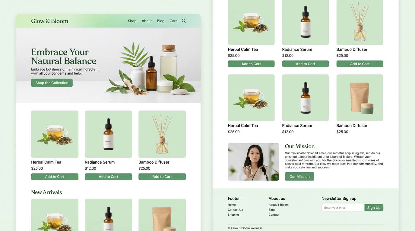
10) Bamboo Spa
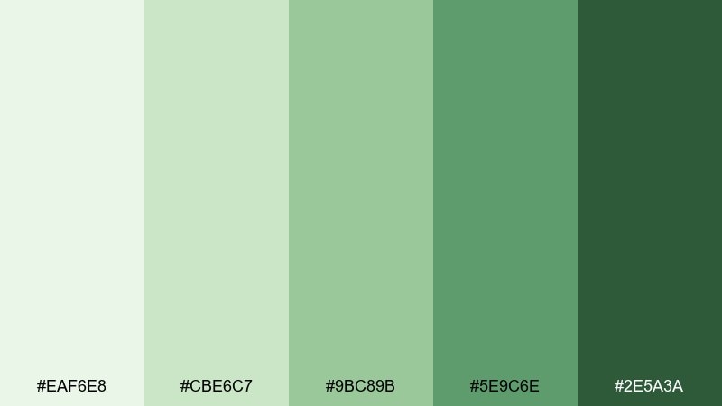
HEX: #EAF6E8 #CBE6C7 #9BC89B #5E9C6E #2E5A3A
Mood: natural, energizing, balanced
Best for: ecommerce website UI for wellness products
Crisp bamboo greens feel natural and energizing, like stepping into a bright garden after rain. This spa color palette is a great match for ecommerce UI where trust and clarity matter. Keep backgrounds pale, use the mid greens for buttons, and reserve the dark green for pricing and key calls to action. Usage tip: avoid using more than two greens in the same component so the hierarchy stays obvious.
Image example of bamboo spa generated using media.io
11) Rainwashed Stone
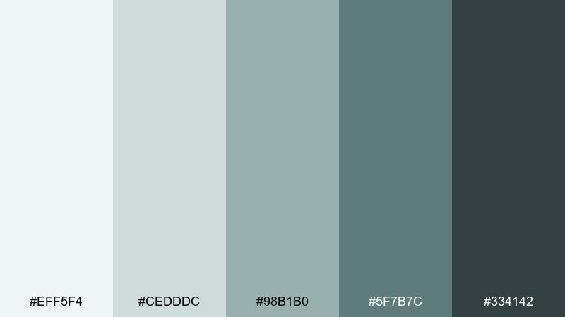
HEX: #EFF5F4 #CEDDDC #98B1B0 #5F7B7C #334142
Mood: cool, steady, contemplative
Best for: massage room interior styling
Rain on stone feels steady and contemplative, with muted blue-greens that lower the visual volume. It is ideal for treatment rooms where you want clients to relax as soon as they enter. Pair these tones with natural linen, dark walnut, and soft warm lighting to prevent the cool hues from feeling sterile. Usage tip: paint one accent wall in the deeper slate tone and keep the rest in pale mist for a cocoon effect.
Image example of rainwashed stone generated using media.io
12) Saltwater Pearl

HEX: #FAF7F1 #E7E1D8 #C9C2B8 #8E8A83 #3C3B3A
Mood: soft, luminous, refined
Best for: candle product ad creative
Pearly neutrals and soft gray shadows feel luminous, like saltwater mist on a calm morning. It is a refined fit for candle ads, beauty launches, and minimalist home goods. Use the cream and pearl grays for the set, and rely on near-black for tiny type and legal lines. Usage tip: add one reflective element (glass or glossy label) to echo the pearl vibe without adding color noise.
Image example of saltwater pearl generated using media.io

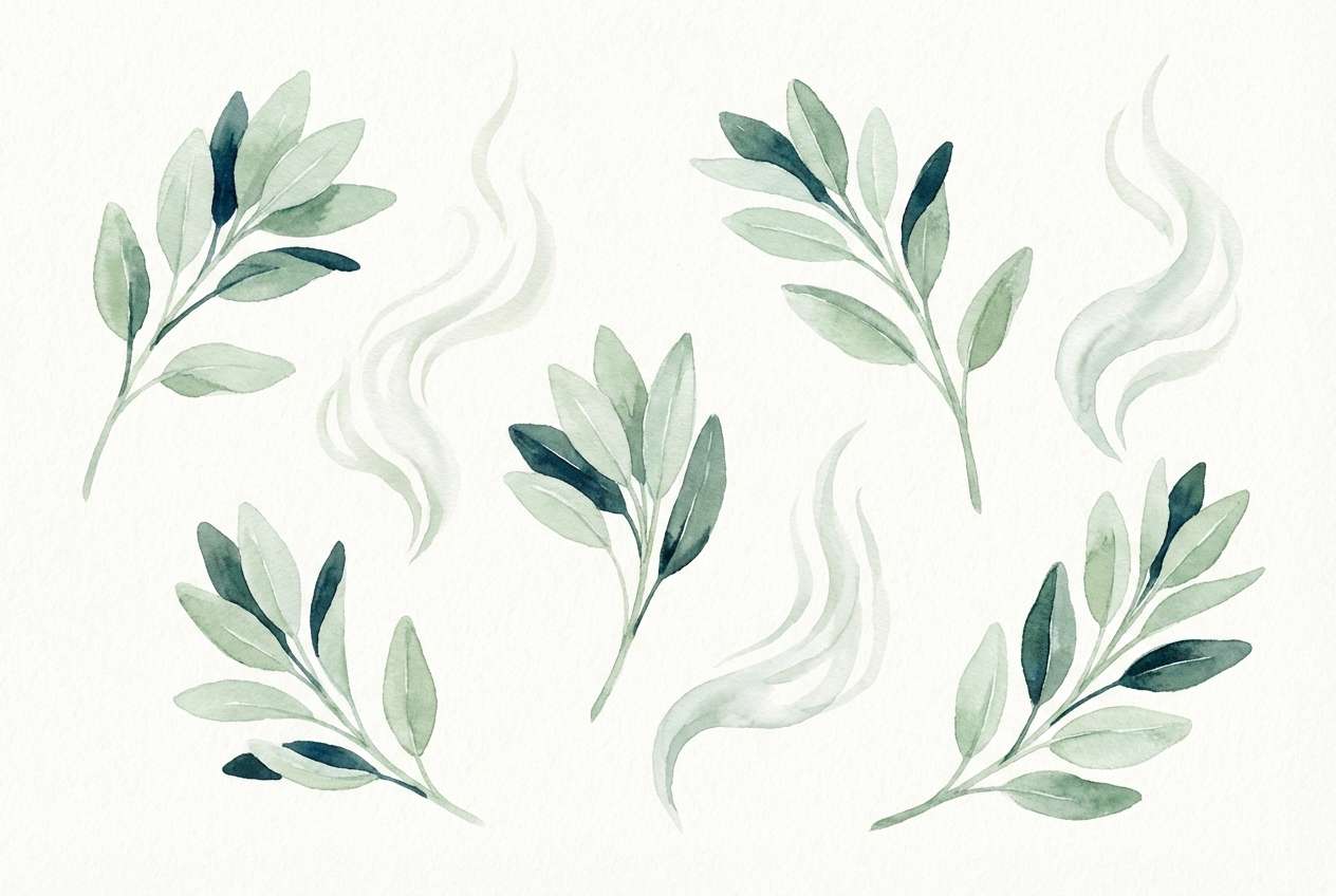
13) Sage Steam
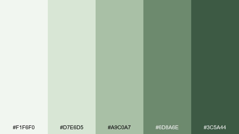
HEX: #F1F6F0 #D7E6D5 #A9C0A7 #6D8A6E #3C5A44
Mood: herbal, gentle, restorative
Best for: botanical illustration set for wall art
Herbal steam and soft sage leaves create a gentle, restorative mood. These tones are perfect for botanical prints, wellness wall art, and calming packaging illustrations. Keep linework in the darkest green, then fill shapes with the mid sage and pale mist for a layered look. Usage tip: limit shading to one extra tint so the artwork stays airy and modern.
Image example of sage steam generated using media.io
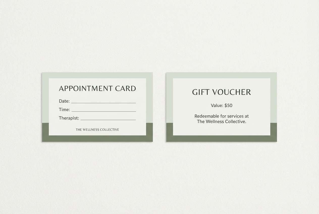
14) Zen Garden Path
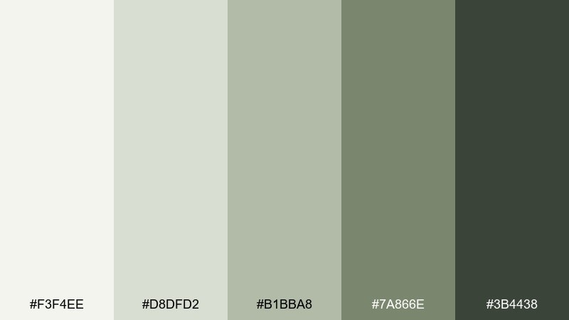
HEX: #F3F4EE #D8DFD2 #B1BBA8 #7A866E #3B4438
Mood: grounded, meditative, organic
Best for: appointment card and voucher design
Raked sand and garden stones feel grounded and meditative, with olive-grays that read organic and calm. These spa color combinations shine on appointment cards and vouchers where you want understated luxury. Use the pale tone for the card base, then bring in the darkest green for names and times to ensure readability. Usage tip: add a single minimalist pattern band in the mid olive to make the card feel designed, not plain.
Image example of zen garden path generated using media.io
15) Coconut Milk Foam
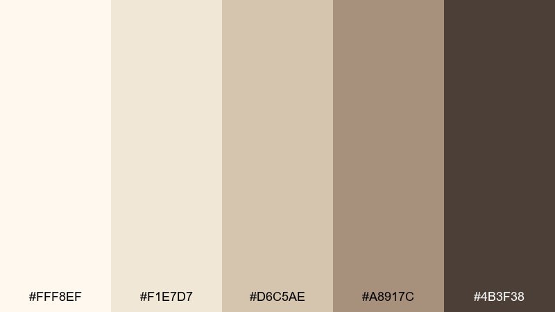
HEX: #FFF8EF #F1E7D7 #D6C5AE #A8917C #4B3F38
Mood: creamy, cozy, elevated
Best for: minimalist bedroom interior styling
Coconut milk foam and warm latte shadows feel creamy, cozy, and elevated. It is a great fit for bedrooms and lounges where you want calm warmth rather than cool freshness. Pair these neutrals with light oak, woven textures, and soft brass for a gentle, modern glow. Usage tip: use the darkest brown sparingly (frames or lamps) so the room stays light and airy.
Image example of coconut milk foam generated using media.io

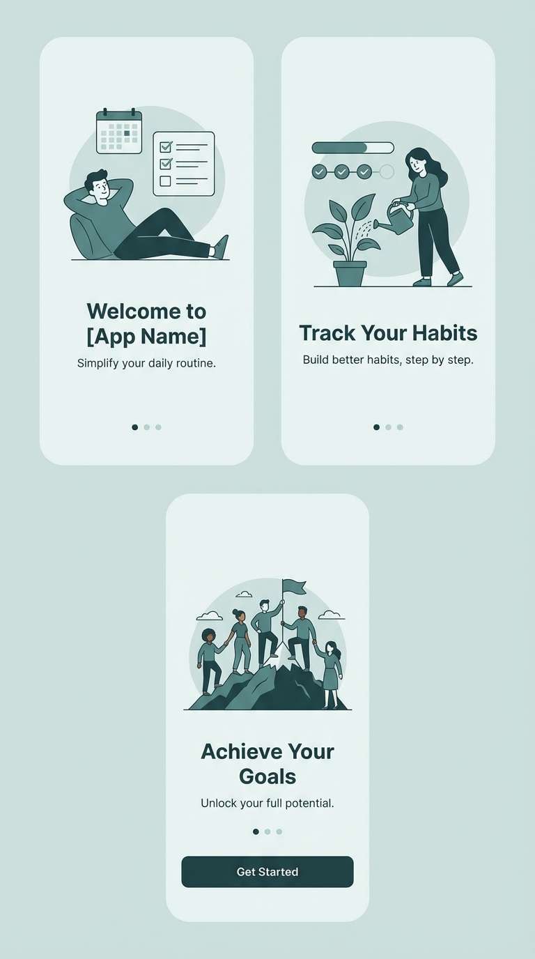
16) Tidal Fog

HEX: #E9F2F1 #CFE1E0 #9FBDBB #5A8586 #234247
Mood: misty, crisp, quietly bold
Best for: mobile app onboarding screens
Tidal fog feels misty and crisp, with a deep ocean note that adds quiet confidence. This spa color scheme is ideal for onboarding screens where you need calm visuals plus clear hierarchy. Use the palest aqua for backgrounds, then let the deep teal carry headings and primary buttons for strong contrast. Usage tip: introduce the mid teal as a progress indicator so motion feels smooth and reassuring.
Image example of tidal fog generated using media.io
17) Herbal Tonic
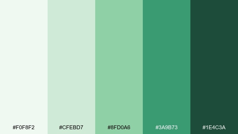
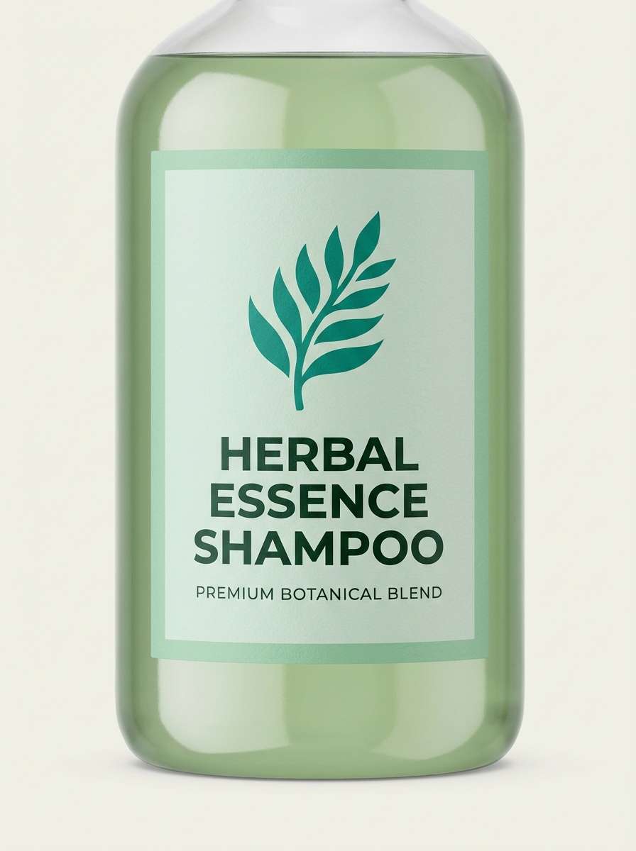
HEX: #F0F8F2 #CFEBD7 #8FD0A6 #3A9B73 #1E4C3A
Mood: bright, clean, revitalizing
Best for: herbal shampoo bottle packaging
A bright herbal tonic vibe comes through, like fresh greens and cool clarity after a rinse. It is well suited for shampoo packaging and health-forward product lines that want to look revitalizing. Use the light mint as the label base, and let the saturated green carry key claims and icons. Usage tip: keep caps and secondary elements neutral so the green reads intentional, not overpowering.
Image example of herbal tonic generated using media.io
18) Soft Granite Glow
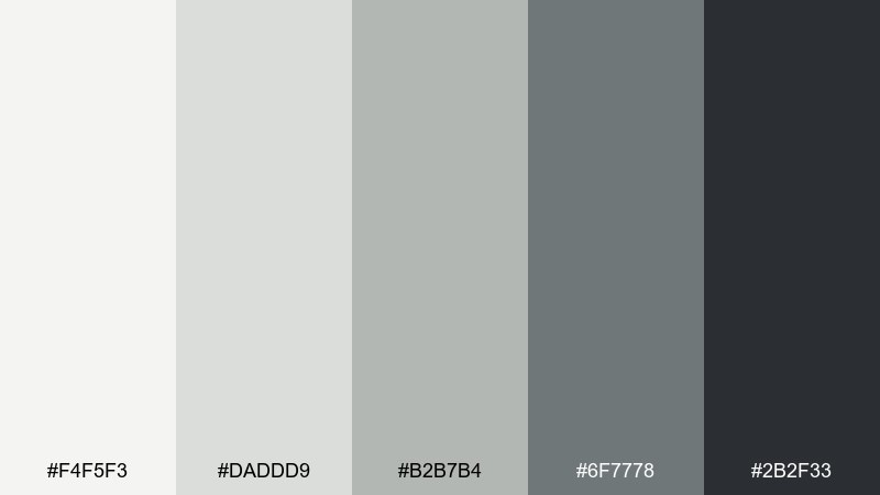
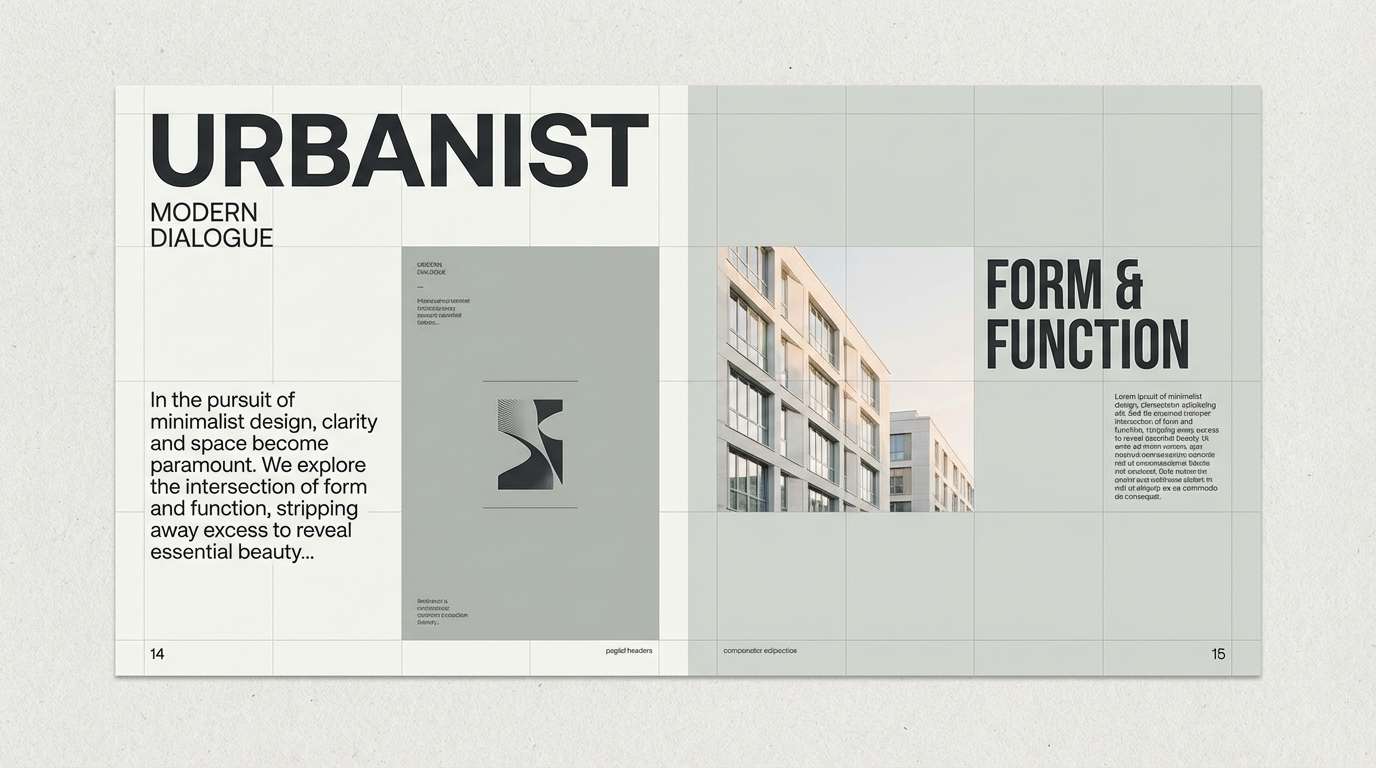
HEX: #F4F5F3 #DADDD9 #B2B7B4 #6F7778 #2B2F33
Mood: minimal, strong, sophisticated
Best for: editorial magazine layout
Soft granite and clean shadowy grays feel minimal, strong, and sophisticated. As a spa color scheme, it is perfect when you want modern restraint with high readability. Use the near-black for headlines and body copy, then build structure with light gray columns and subtle dividers. Usage tip: add one small warm paper tint or texture so the grayscale does not feel cold.
Image example of soft granite glow generated using media.io
19) Quiet Cove

HEX: #EAF7F7 #C7E6E8 #7FBFC6 #3B7F8A #1F3E45
Mood: cool, tranquil, confident
Best for: social media post template set
A quiet cove mood comes through with cool aquas and deeper teal shadows that feel tranquil yet confident. This spa color palette works well for social templates where you need consistent structure across multiple posts. Use the pale aqua for backgrounds, then pick one deeper teal for headlines and another for buttons or stickers. Usage tip: keep photo overlays subtle by using a low-opacity teal wash that matches the palette.
Image example of quiet cove generated using media.io
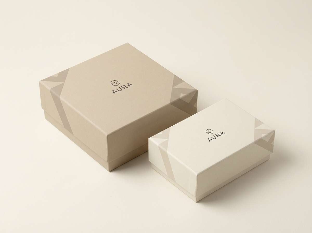
20) Linen and Lather

HEX: #F7F3EA #E6E0D2 #C8C1AF #8A8578 #3A3A35
Mood: soft, clean, timeless
Best for: gift box packaging design
Warm linen and clean lather feel timeless, like freshly folded towels in a quiet room. It is a reliable choice for gift boxes and sets where you want premium simplicity. Use the cream for the box base, then bring in taupe for patterns and near-black for a crisp logo stamp. Usage tip: choose a matte finish and subtle embossing to make the neutrals feel intentional and tactile.
Image example of linen and lather generated using media.io
What Colors Go Well with Spa?
Spa colors pair best with soft neutrals (warm white, linen, sand) because they keep watery greens and teals from feeling too cold. If you want an elevated look, add one grounded anchor like charcoal or deep evergreen for contrast.
For a fresher, more modern spa vibe, lean into seafoam, mint, and pale aqua with a single deep teal for headings or hardware. For a warmer “resort spa” feel, add clay, sandstone, and latte browns.
In digital design, prioritize readability: use the deepest tone for text and primary actions, keep backgrounds very light, and introduce mid tones only for states (active, hover) or small decorative accents.
How to Use a Spa Color Palette in Real Designs
In rooms, treat spa palettes like layers: light base (walls/tile), mid tones (textiles/art), and one dark accent (fixtures, frames, mirror trim). This keeps the space calm while still giving it structure.
In branding, let the lightest neutral carry most surfaces (labels, stationery, web backgrounds), then use one strong teal/green as the signature brand color. Add texture (paper grain, matte finishes, linen photography) to prevent the palette from feeling flat.
In UI, map your palette to a system: background, surface, border, text, and action colors. Consistency is what makes “calm” feel intentional, not washed-out.
Create Spa Palette Visuals with AI
If you want to see these spa color palette ideas in real scenes (bathrooms, product shots, brand kits, or app screens), generating mockups is the fastest way to validate mood and contrast.
Start by copying one prompt, then swap only the subject (e.g., “skincare bottle” to “soap box”) while keeping the same HEX-led color direction. This makes your visuals consistent across a whole collection.
Spa Color Palette FAQs
-
What are spa colors?
Spa colors are usually low-saturation hues that feel clean and relaxing—think seafoam, sage, misty aqua, soft gray-greens, warm cream, sand, and gentle stone neutrals. -
What is the best calming spa color palette for a bathroom?
Try pale aqua or misty green with warm cream and a deep teal/charcoal for hardware. A set like Eucalyptus Mist (#DFF3EF … #4F7F73) keeps the room fresh while still feeling cozy. -
How do I keep spa colors from looking too cold?
Add a warm neutral (linen, beige, sandstone) and use warm lighting or natural wood. Avoid making every surface cool-toned; balance water hues with creamy highlights. -
Which spa palette works best for modern UI design?
Pebble Creek and Tidal Fog are strong for UI because they include gentle light backgrounds plus a dark readable text color (#2E3A3E or #234247) for clear hierarchy. -
Can spa palettes work for wellness branding without feeling generic?
Yes—choose one distinctive anchor (deep teal, forest green, or charcoal), then keep the rest minimal with lots of whitespace. Texture, typography, and photography style will make it feel unique. -
What’s a good spa palette for packaging?
Aloe Linen and Herbal Tonic are packaging-friendly: they signal “natural and clean” with soft bases for labels and a darker green for claims, icons, and product names. -
How many colors should I use from a spa palette?
In most designs, use 2–3 core colors and keep the remaining tones for backgrounds, dividers, and states. This preserves the calm, premium feel and prevents visual clutter.
Next: Chartreuse Color Palette


