

Gold peach is a warm blend of soft peach and gentle gold that feels sunny, inviting, and premium without being loud.
Below are 20 ready-to-use gold peach color palette ideas with HEX codes, plus practical pairing tips for branding, UI, invitations, and packaging.
In this article
- Why Gold Peach Palettes Work So Well
-
- sunlit apricot
- honeyed blush
- gilded nectar
- peach sorbet glow
- sandstone peach
- rosy brass
- champagne orchard
- warm minimal ui
- desert peach dusk
- copper petal
- soft citrus linen
- vintage peach poster
- bridal peach gold
- autumn peach market
- peach gelato packaging
- golden hour editorial
- botanical peach garden
- cozy café menu
- peachy gradient ui
- luxe peach branding
- What Colors Go Well with Gold Peach?
- How to Use a Gold Peach Color Palette in Real Designs
- Create Gold Peach Palette Visuals with AI
Why Gold Peach Palettes Work So Well
Gold peach palettes balance comfort and polish: peach brings softness and approachability, while gold adds a subtle “highlight” effect that reads premium in both print and digital.
They’re also naturally flattering and human-centric, which is why they work across lifestyle branding, beauty, food, and event stationery. The warmth makes layouts feel welcoming, even with minimal graphics.
From a usability standpoint, gold peach schemes pair easily with readable dark neutrals (espresso, charcoal) and spacious light creams, making it simpler to maintain contrast and hierarchy.
20+ Gold Peach Color Palette Ideas (with HEX Codes)
1) Sunlit Apricot
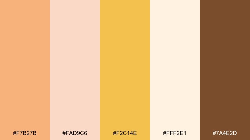
HEX: #F7B27B #FAD9C6 #F2C14E #FFF2E1 #7A4E2D
Mood: bright, friendly, optimistic
Best for: lifestyle branding header and social post templates
Sunny apricot and creamy light tones evoke late-morning light and fresh fruit at a market stall. Use the soft cream as breathing room and let the golden yellow carry your highlights and buttons. Pair with warm brown typography for readability and an earthy finish. Tip: keep gradients subtle by blending apricot into cream for a clean, modern hero section.
Image example of sunlit apricot generated using media.io
Media.io is an online AI studio for creating and editing video, image, and audio in your browser.

2) Honeyed Blush
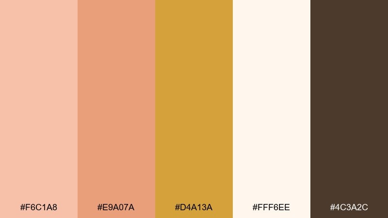
HEX: #F6C1A8 #E9A07A #D4A13A #FFF6EE #4C3A2C
Mood: soft, romantic, cozy
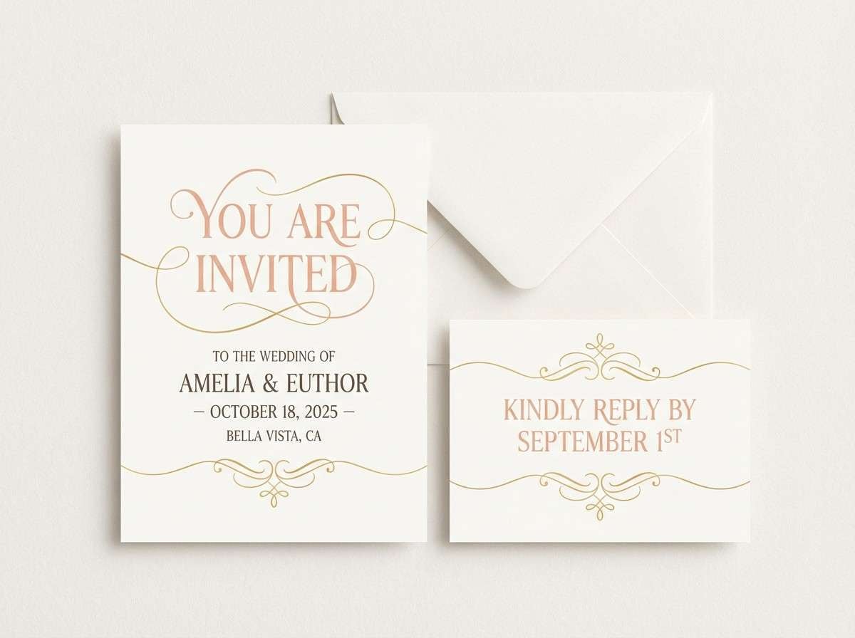
Best for: wedding invitation suite
Blush peach and honey gold feel like candlelight on satin, warm and intimate. Let the off-white act as the paper base, then layer peach for headings and gold for small motifs. Deep mocha adds elegant contrast for names and details. Tip: use gold sparingly as thin rules and monograms to avoid a heavy metallic look.
Image example of honeyed blush generated using media.io
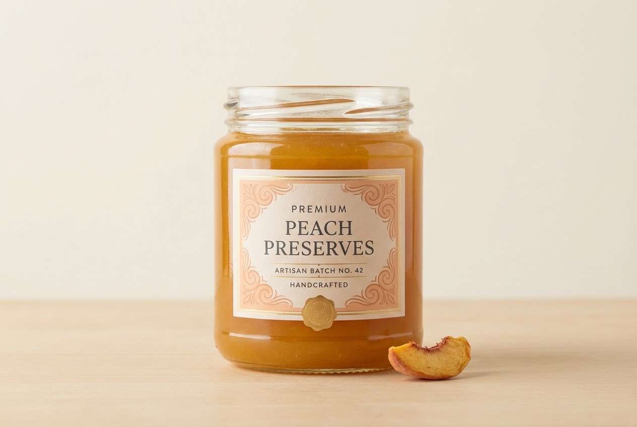
3) Gilded Nectar
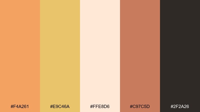
HEX: #F4A261 #E9C46A #FFE8D6 #C97C5D #2F2A26
Mood: rich, artisanal, inviting
Best for: food packaging label and jar mockup
Rich peach and golden nectar tones suggest handmade preserves and slow summer afternoons. The contrast from deep charcoal makes this gold peach color palette work well for premium labels and clear hierarchy. Pair the light cream with warm gold for background blocks, then use the deeper terracotta for secondary badges. Tip: keep text on cream or gold, and reserve charcoal for small but high-contrast type.
Image example of gilded nectar generated using media.io
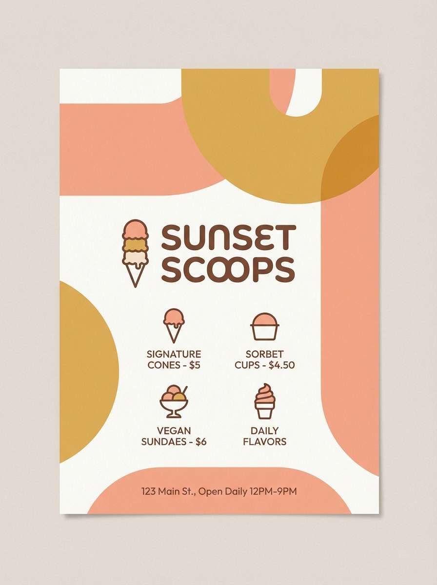
4) Peach Sorbet Glow
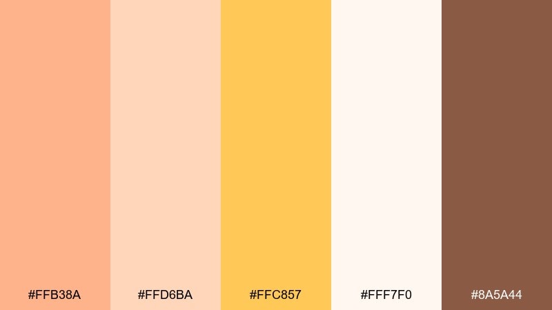
HEX: #FFB38A #FFD6BA #FFC857 #FFF7F0 #8A5A44
Mood: playful, sweet, airy
Best for: ice cream shop flyer
Sorbet peach and whipped-cream neutrals create a light, cheerful vibe that feels instantly tasty. Use the bright peach for big headline shapes and the warm gold for price tags and callouts. Add cocoa brown for small text so the design stays readable without turning harsh. Tip: keep the background mostly off-white and let color appear in bold, rounded blocks.
Image example of peach sorbet glow generated using media.io
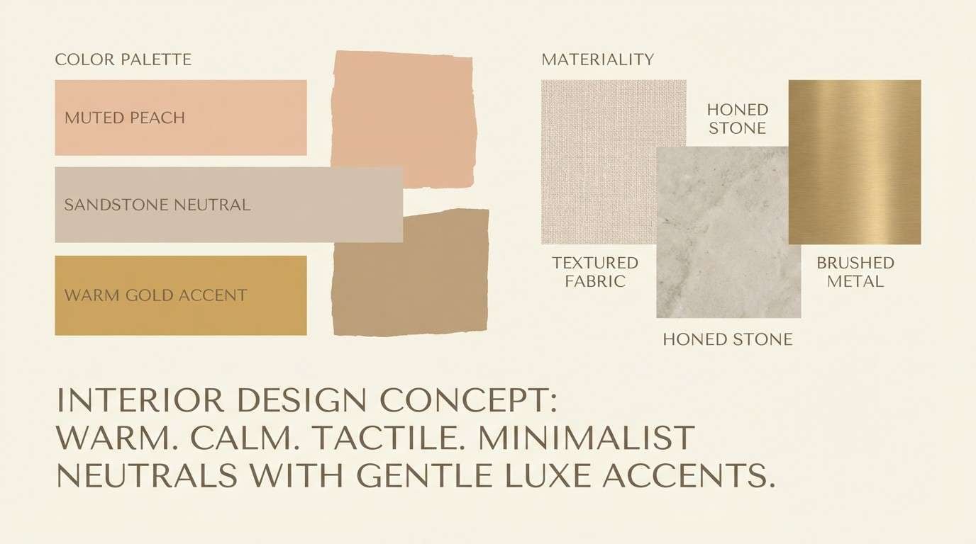
5) Sandstone Peach
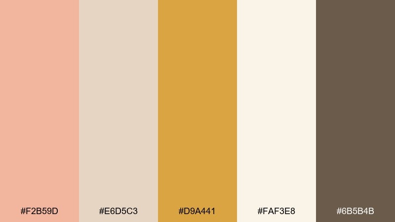
HEX: #F2B59D #E6D5C3 #D9A441 #FAF3E8 #6B5B4B
Mood: calm, earthy, understated
Best for: interior design moodboard slide
Muted peach against sandstone neutrals feels like sun on plaster walls and linen curtains. The warm gold reads best as a small accent for pins, labels, or thin dividers. Pair with the deep taupe for body text and swatch captions to keep the board grounded. Tip: repeat the cream tone across large areas to unify mixed textures and materials.
Image example of sandstone peach generated using media.io
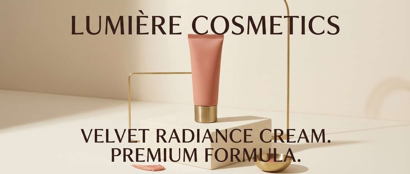
6) Rosy Brass
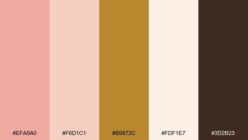
HEX: #EFA9A0 #F6D1C1 #B9872C #FDF1E7 #3D2B23
Mood: elegant, warm, confident
Best for: beauty product ad banner
Rosy peach with brass highlights evokes polished metal, soft blush, and boutique luxury. These gold peach color combinations shine in beauty ads where you want warmth without neon intensity. Keep the light cream as the base, then use brass for small spark points like pricing or key claims. Tip: set headlines in dark espresso to avoid low contrast on pale peach backgrounds.
Image example of rosy brass generated using media.io
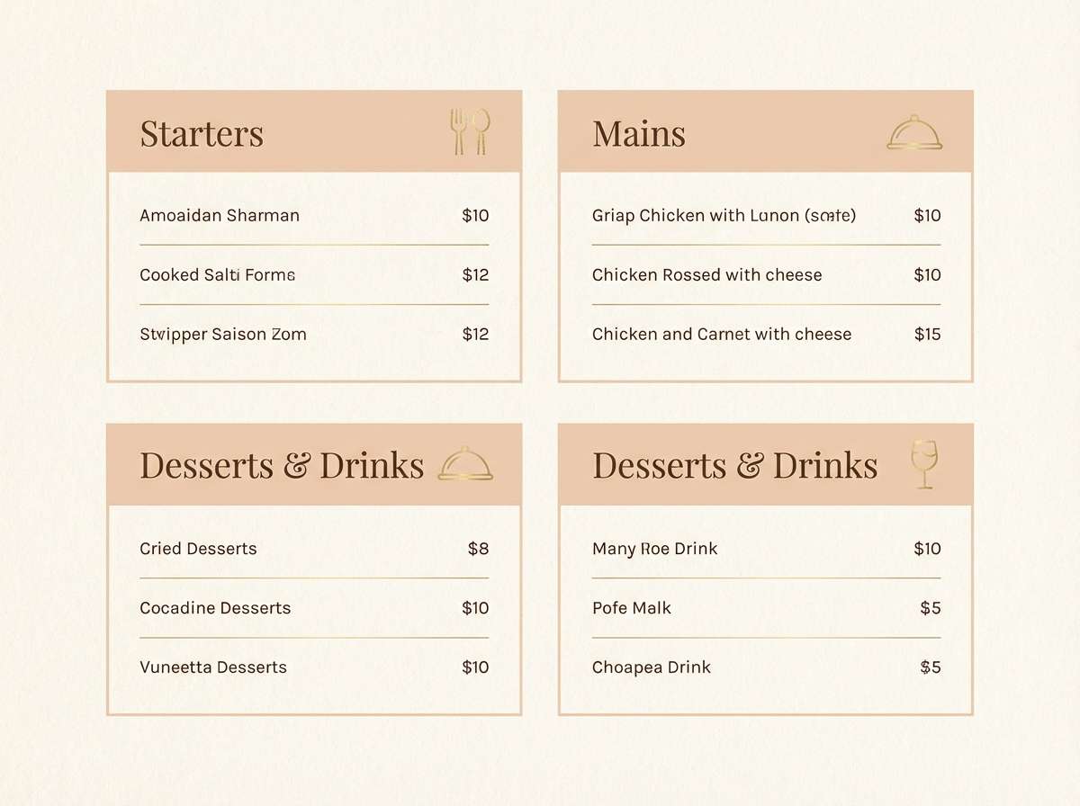
7) Champagne Orchard
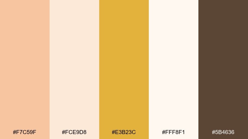
HEX: #F7C59F #FCE9D8 #E3B23C #FFF8F1 #5B4636
Mood: fresh, welcoming, refined
Best for: restaurant menu design
Champagne peach tones feel like sparkling cider and ripe fruit served on white ceramic. Use the lightest cream for the menu background and introduce gold only for section headers and small icons. Cocoa-brown text stays readable while keeping the warmth intact. Tip: limit peach to 1 or 2 blocks per page so the layout stays airy and premium.
Image example of champagne orchard generated using media.io
8) Warm Minimal UI
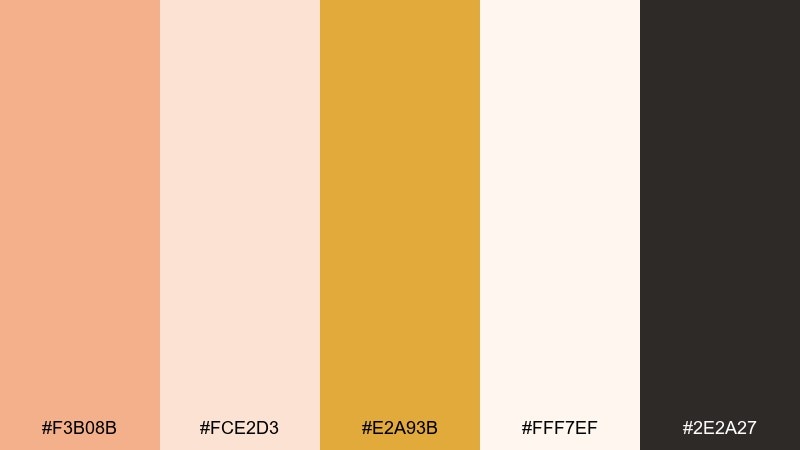
HEX: #F3B08B #FCE2D3 #E2A93B #FFF7EF #2E2A27
Mood: minimal, modern, friendly
Best for: 2D UI dashboard mockup
Soft peach and cream create a modern interface that feels warm instead of sterile. Use charcoal for navigation and primary text, then reserve gold for status dots, badges, and key metrics. Peach works best as a gentle surface color for cards and highlights. Tip: keep contrast strong by placing text only on cream or very light peach panels.
Image example of warm minimal ui generated using media.io

9) Desert Peach Dusk
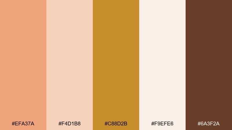
HEX: #EFA37A #F4D1B8 #C88D2B #F9EFE6 #6A3F2A
Mood: moody, grounded, cinematic
Best for: travel blog hero image overlay
Desert peach at dusk feels like sun fading over canyon stone, warm but slightly dramatic. Use the deeper brown for title text over light cream overlays, and let gold mark buttons or small highlights. The muted peach works well as a translucent overlay panel behind copy. Tip: keep the overlay opacity high enough to protect readability while preserving the sunset warmth.
Image example of desert peach dusk generated using media.io

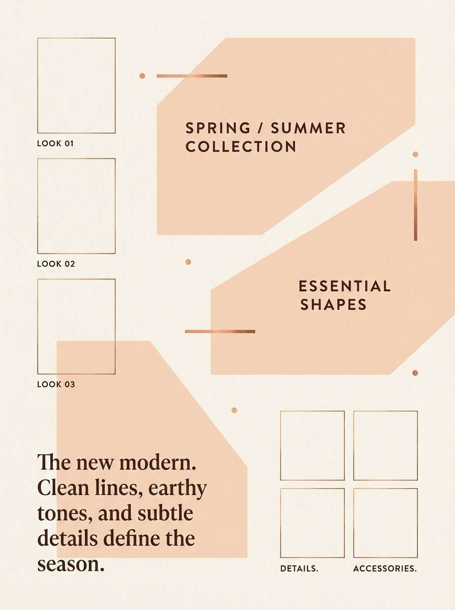
10) Copper Petal
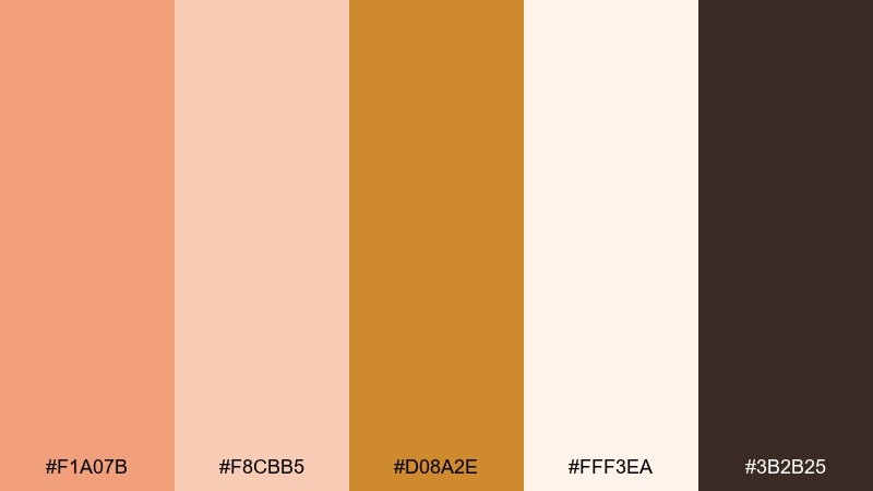
HEX: #F1A07B #F8CBB5 #D08A2E #FFF3EA #3B2B25
Mood: trendy, expressive, warm
Best for: boutique fashion lookbook page
Coppery peach and petal pink bring a fashion-forward warmth that feels editorial but approachable. Use the creamy background for whitespace and let copper gold act as a refined accent for prices and page numbers. Dark espresso grounds the typography and makes small text crisp. Tip: keep imagery frames or blocks consistent so the palette reads intentional, not busy.
Image example of copper petal generated using media.io
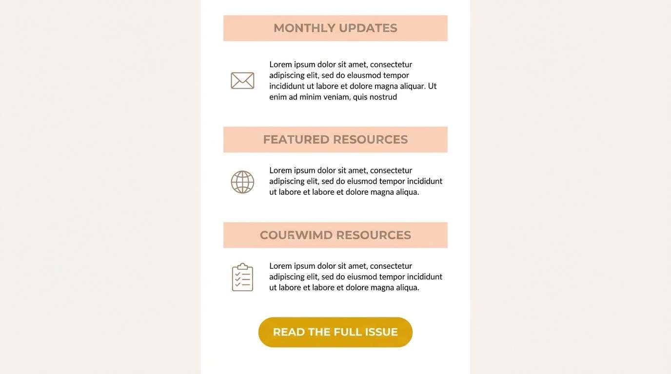
11) Soft Citrus Linen
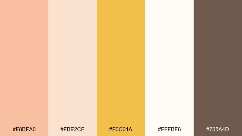
HEX: #F8BFA0 #FBE2CF #F0C04A #FFFBF6 #705A4D
Mood: light, clean, wholesome
Best for: wellness newsletter template
Linen cream and soft citrus peach feel clean, calming, and friendly like a sunlit studio. Use the pale tones for sections and dividers, then add golden yellow for highlights and links. Taupe text keeps the palette gentle while maintaining legibility. Tip: use gold for only one action per email so the call to action stays obvious.
Image example of soft citrus linen generated using media.io
12) Vintage Peach Poster
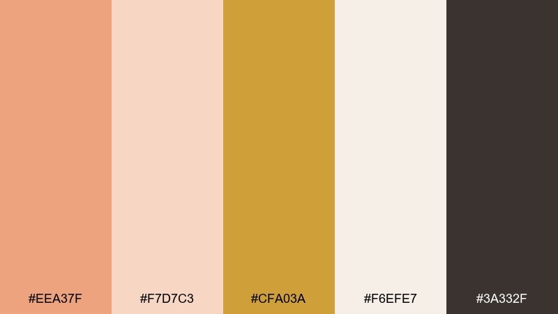
HEX: #EEA37F #F7D7C3 #CFA03A #F6EFE7 #3A332F
Mood: nostalgic, artsy, warm
Best for: retro event poster
Faded peach and parchment cream evoke printed posters, worn edges, and analog charm. A single gold peach color combination like this works best with bold typography and simple shapes rather than detailed illustrations. Use the warm gold for date and venue emphasis, and keep the darkest shade for the main title. Tip: add a light grain effect only if it stays within the same warm tones.
Image example of vintage peach poster generated using media.io

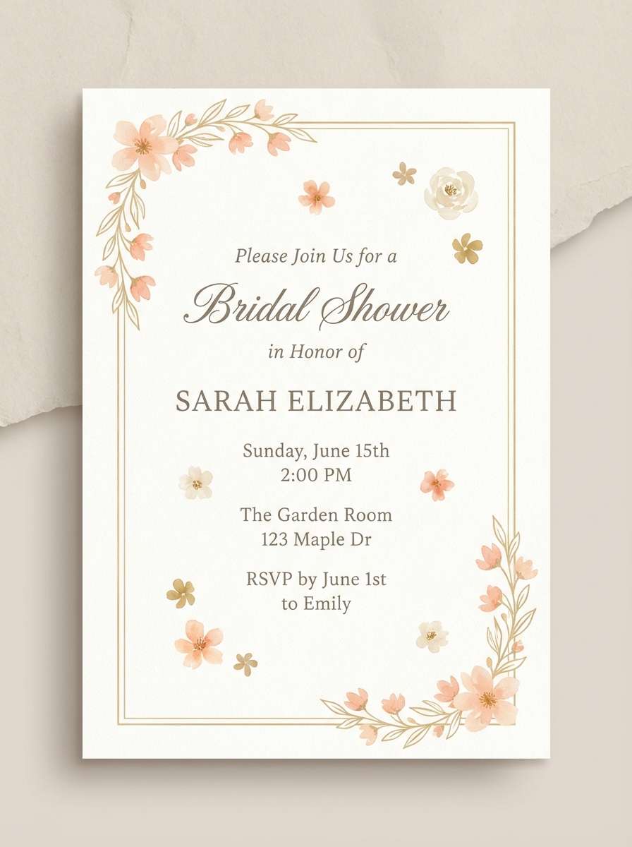
13) Bridal Peach Gold
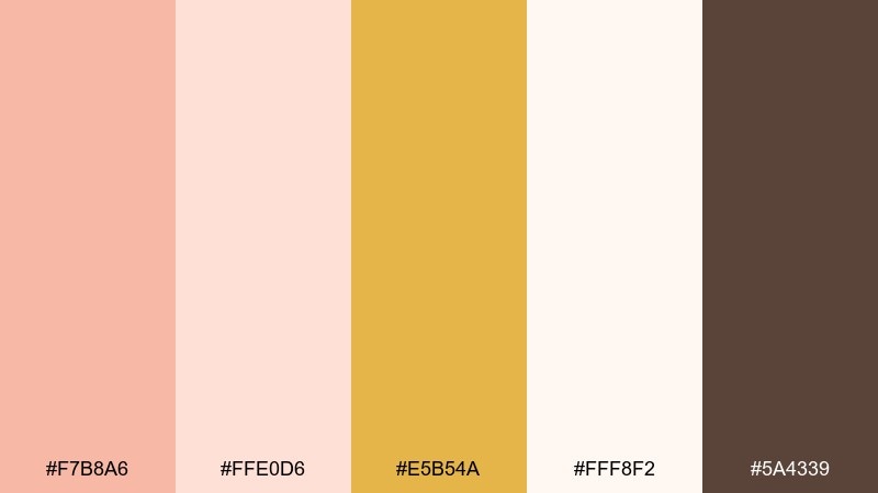
HEX: #F7B8A6 #FFE0D6 #E5B54A #FFF8F2 #5A4339
Mood: delicate, celebratory, polished
Best for: bridal shower invitation
Delicate peach and soft gold feel like tulle, champagne, and warm laughter. Keep the background creamy and let gold highlight borders, tiny florals, or a monogram. Deep taupe text adds a refined finish without turning too stark. Tip: choose one elegant script for names and pair it with a clean sans for details.
Image example of bridal peach gold generated using media.io
14) Autumn Peach Market
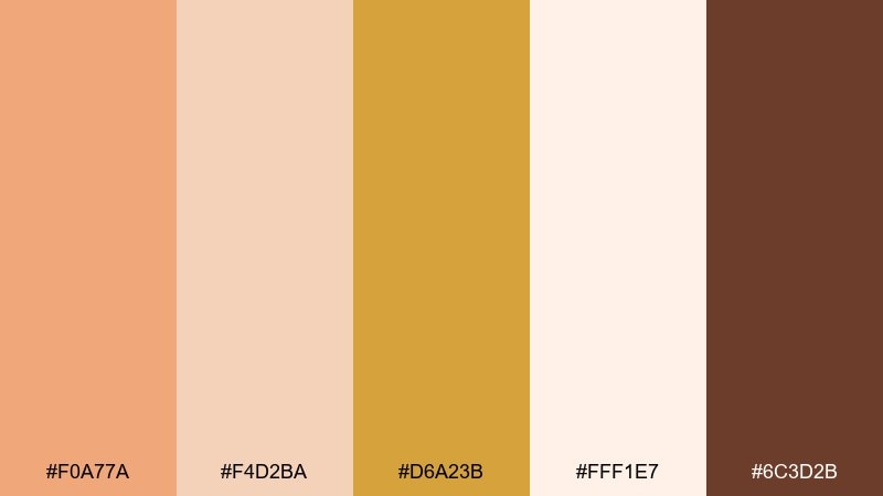
HEX: #F0A77A #F4D2BA #D6A23B #FFF1E7 #6C3D2B
Mood: seasonal, rustic, inviting
Best for: farmers market poster
Autumn peach and golden tones suggest harvest baskets and warm bakery stands. Use the light cream for readability, then stack peach and gold blocks for vendor lists and times. The deep brown works well for bold headers and simple icon outlines. Tip: keep your palette split 70 percent light neutrals, 20 percent peach, 10 percent gold for a clean poster.
Image example of autumn peach market generated using media.io

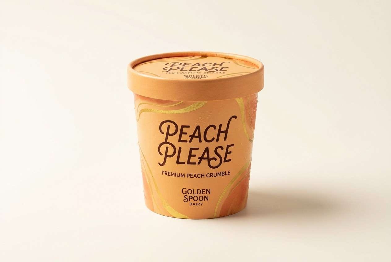
15) Peach Gelato Packaging
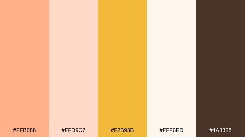
HEX: #FFB088 #FFD9C7 #F2B93B #FFF6ED #4A3328
Mood: fun, fresh, appetizing
Best for: ice cream pint packaging design
Creamy peach and warm gold read like gelato under a bright shop window, playful yet premium. Use peach as the main label field, then keep product info on the light cream for clarity. Gold works best for flavor cues or a small badge, while the dark brown anchors the brand name. Tip: keep ingredient icons in one color so the front stays clean at shelf distance.
Image example of peach gelato packaging generated using media.io
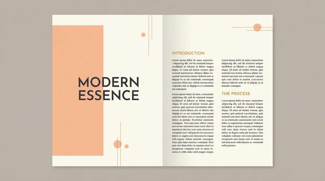
16) Golden Hour Editorial
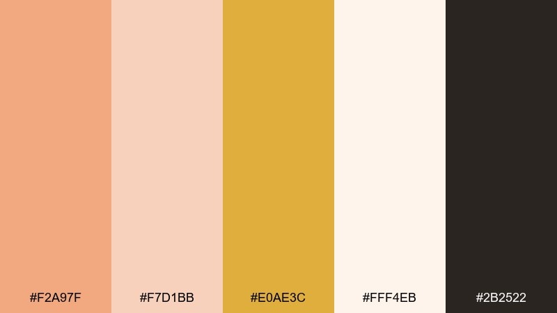
HEX: #F2A97F #F7D1BB #E0AE3C #FFF4EB #2B2522
Mood: editorial, luminous, modern
Best for: magazine feature spread layout
Golden-hour peach with soft cream feels like warm light washing over a clean page. The deep near-black makes this gold peach color palette ideal for editorial typography and sharp contrast. Use gold for pull-quote marks or section labels, and keep large background areas in the lightest cream. Tip: set body text in the darkest shade and reserve peach for margins and sidebars.
Image example of golden hour editorial generated using media.io
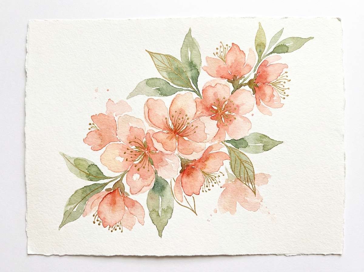
17) Botanical Peach Garden
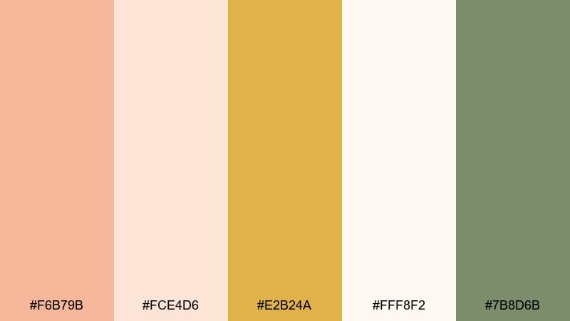
HEX: #F6B79B #FCE4D6 #E2B24A #FFF8F2 #7B8D6B
Mood: fresh, natural, uplifting
Best for: spring botanical illustration
Peach petals with leafy sage feel like a garden sketch in warm sunlight. Let cream carry the paper feel, then use peach for blooms and gold for pollen or tiny highlights. Sage provides a quiet counterbalance that keeps the palette from going overly sweet. Tip: limit outlines to a single muted tone so the watercolor look stays soft.
Image example of botanical peach garden generated using media.io
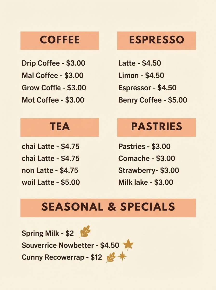
18) Cozy Café Menu
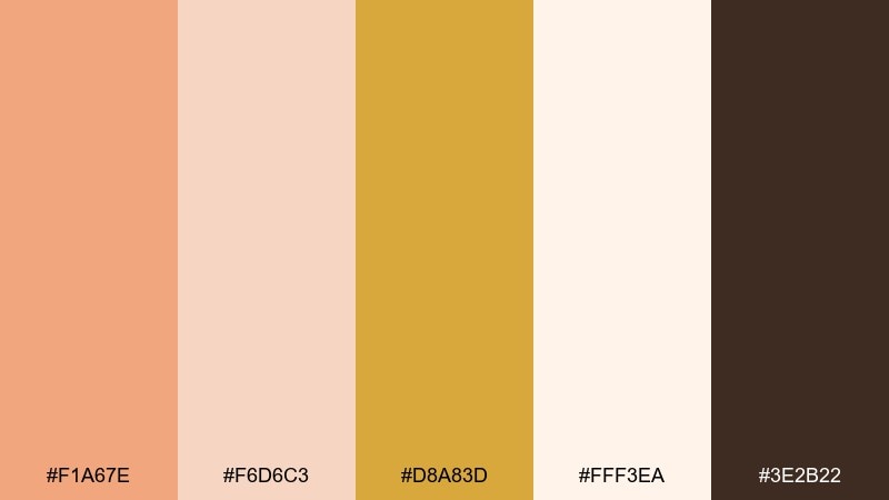
HEX: #F1A67E #F6D6C3 #D8A83D #FFF3EA #3E2B22
Mood: cozy, friendly, comforting
Best for: coffee shop menu board
Warm peach and latte-like neutrals feel inviting, like a cozy café corner. These gold peach color combinations help prices and sections pop without feeling loud. Use the cream as the board background, peach for category blocks, and gold for small emphasis like seasonal tags. Tip: keep all menu item names in the darkest shade for consistent readability from a distance.
Image example of cozy café menu generated using media.io
19) Peachy Gradient UI
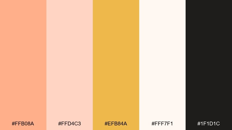
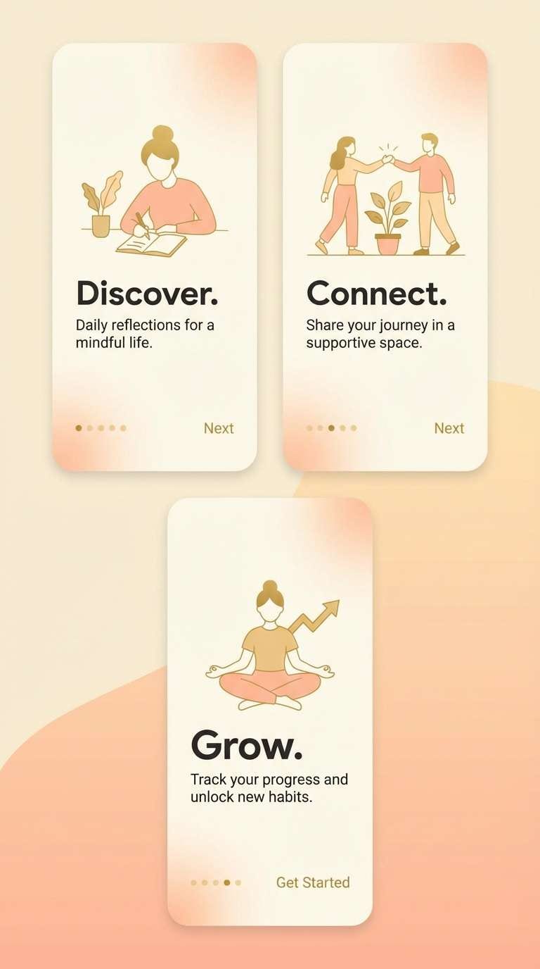
HEX: #FFB08A #FFD4C3 #EFB84A #FFF7F1 #1F1D1C
Mood: sleek, warm, contemporary
Best for: 2D mobile app onboarding screens
Peach gradients and soft gold highlights create a smooth, modern warmth that feels welcoming at first launch. Use near-black for titles and small UI labels to keep contrast sharp. Let peach-to-cream gradients live behind simple illustrations or feature cards, and use gold for progress dots or icons. Tip: keep gradients consistent across screens so the onboarding feels cohesive.
Image example of peachy gradient ui generated using media.io
20) Luxe Peach Branding
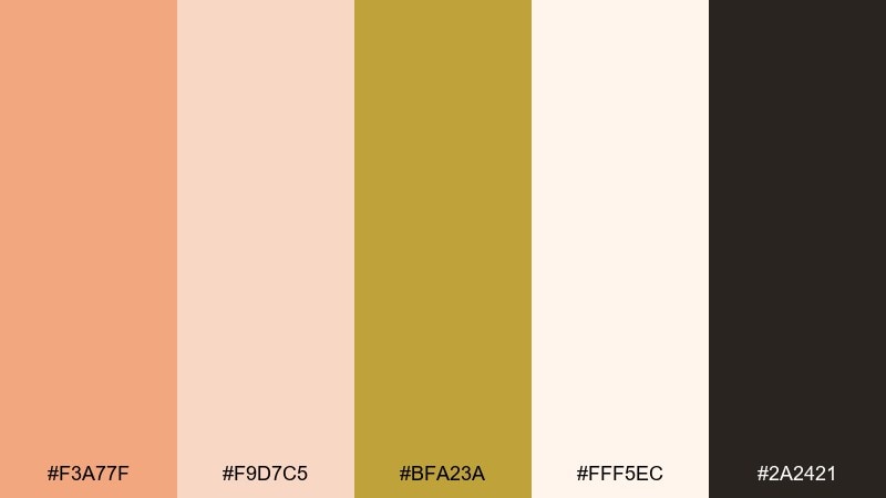
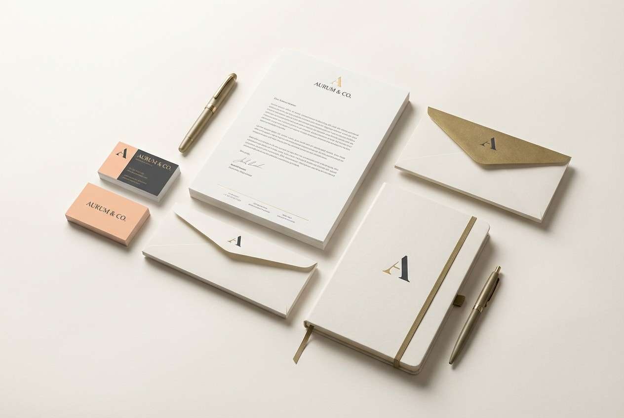
HEX: #F3A77F #F9D7C5 #BFA23A #FFF5EC #2A2421
Mood: luxury, warm, sophisticated
Best for: premium brand identity kit
Peach warmth with muted antique gold feels refined, like soft leather and brushed metal. A restrained gold peach color palette like this works beautifully for logos, stationery, and minimalist packaging. Keep most surfaces in cream, then use gold for foils or tiny marks while the darkest shade handles typography. Tip: choose one signature accent, either peach blocks or gold lines, so the identity stays timeless.
Image example of luxe peach branding generated using media.io
What Colors Go Well with Gold Peach?
Gold peach pairs best with warm neutrals that keep the palette airy and readable: ivory, cream, sand, and oatmeal tones are easy background choices for web pages, packaging, and stationery.
For contrast, choose deep warm darks like espresso, cocoa, or charcoal-brown instead of pure black. They preserve the cozy feel while giving you strong typography and clear UI hierarchy.
For accents, muted greens (sage, olive) add a natural counterbalance, while a soft teal or dusty blue can add modern freshness without clashing with the warm base.
How to Use a Gold Peach Color Palette in Real Designs
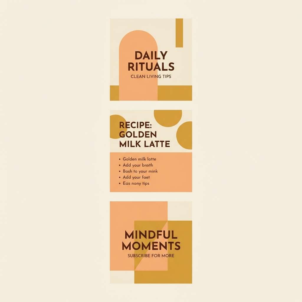
Start with a light cream as your main canvas, then use peach as your “surface color” for cards, panels, or hero blocks. Keep gold for intentional emphasis (buttons, icons, prices, tags) so it reads like a highlight instead of a second background.
In print, gold is strongest when used in small details such as rules, monograms, and badge shapes; in digital UI, it works well for status indicators and primary actions. Use dark brown or near-black for body text to protect accessibility.
If you’re mixing multiple peach tones, keep them in one temperature (all warm) and avoid adding extra saturated colors. This makes the palette look cohesive and premium across layouts.
Create Gold Peach Palette Visuals with AI
If you want to see how a gold peach palette looks in a real layout, generate quick mockups like posters, menus, UI screens, or product labels before committing to final design files.
With Media.io’s text-to-image tool, you can paste a prompt (like the ones above), specify an aspect ratio, and produce consistent visual directions for branding or campaigns.
Gold Peach Color Palette FAQs
-
What is a gold peach color palette?
A gold peach palette combines peach-based warm tones (apricot, blush, sorbet peach) with golden accents (honey, brass, champagne gold) and usually includes light creams plus a dark neutral for contrast. -
Is gold peach good for branding?
Yes. Gold peach communicates friendliness and warmth with a premium “glow,” making it popular for lifestyle brands, beauty, food packaging, and boutique services. -
What neutral works best with gold peach?
Cream and warm off-white are the easiest neutrals because they keep the palette bright and soft. For text, espresso or cocoa-brown typically looks more natural than pure black. -
How do I keep gold from overpowering the design?
Use gold as an accent (small icons, thin lines, badges, buttons) rather than a large background. Let cream carry most of the layout, and treat gold as a highlight color. -
What accent colors pair well with gold peach besides neutrals?
Sage or olive green adds a fresh, botanical balance. Dusty blue or muted teal can create a modern contrast while still feeling soft and refined. -
Is a gold peach palette suitable for UI design?
It can be, as long as contrast is handled carefully. Use very light creams/peaches for surfaces, reserve gold for UI highlights, and keep primary text in a deep charcoal or near-black for readability. -
How can I generate palette-based mockups quickly?
Use Media.io text-to-image and include your palette direction in the prompt (e.g., “dominant peach and warm gold, cream background, charcoal typography”), then iterate with consistent aspect ratios for social, UI, or print layouts.
Next: Finance Color Palette


