

Planning a gender reveal and want colors that feel fresh (not the same old pink-and-blue split)? The right palette makes invites, décor, and social posts look instantly more intentional.
Below are 20 modern gender reveal color palette ideas with HEX codes, plus AI image prompts you can reuse to generate matching visuals in minutes.
In this article
- Why Gender Reveal Palettes Work So Well
-
- powder blue blush
- buttercream confetti
- modern pink blue pop
- sage linen neutral
- lavender sky mist
- peachy sprinkle blue
- midnight blush reveal
- cloud cotton candy
- terracotta denim
- champagne navy sparkle
- mint rose gold
- classic pink blue white
- sunset coral aqua
- dusty mauve baby blue
- lemonade lilac pop
- stone ivory soft teal
- berry indigo sky
- eucalyptus blush gold
- icy blue silver pink
- cocoa cream baby pink
- What Colors Go Well with Gender Reveal?
- How to Use a Gender Reveal Color Palette in Real Designs
- Create Gender Reveal Palette Visuals with AI
Why Gender Reveal Palettes Work So Well
A strong gender reveal color palette creates instant “theme recognition” across everything guests see: the invitation, the backdrop, the cake table sign, and your announcement post. When the colors match, even simple designs look cohesive.
Palettes also help you control the vibe. Pastels feel soft and baby-like, while deeper navies, charcoals, or metallic accents make the event feel more modern and elevated.
Most importantly, a planned set of colors prevents last-minute mixing that can look cluttered. With five coordinated tones, you can assign roles (background, headline, accents, text) and keep every piece readable.
20+ Gender Reveal Color Palette Ideas (with HEX Codes)
1) Powder Blue Blush
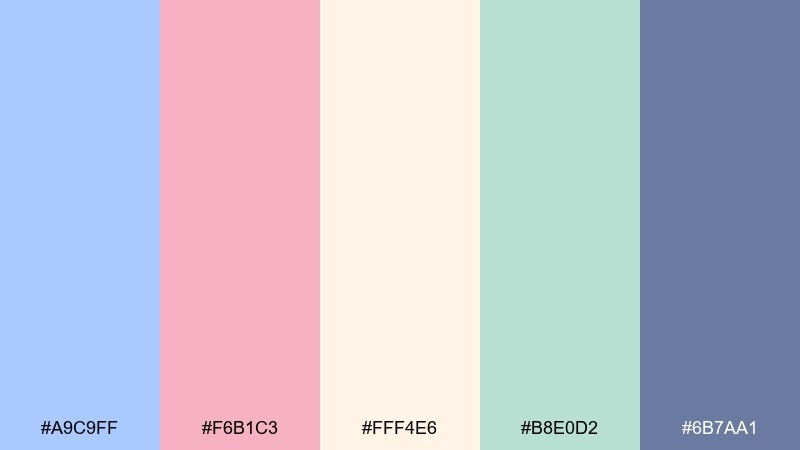
HEX: #A9C9FF #F6B1C3 #FFF4E6 #B8E0D2 #6B7AA1
Mood: airy, sweet, welcoming
Best for: Baby shower invitation design
Airy pastels and soft cream feel like baby breath and satin ribbons in morning light. Use the powder blue and blush as your headline duo, then let the creamy tone keep the layout calm and readable. This works beautifully on invitations, RSVP cards, and simple announcement graphics. Tip: keep one color for text accents only so the pastels stay light instead of muddy.
Image example of powder blue blush generated using media.io
Media.io is an online AI studio for creating and editing video, image, and audio in your browser.

2) Buttercream Confetti
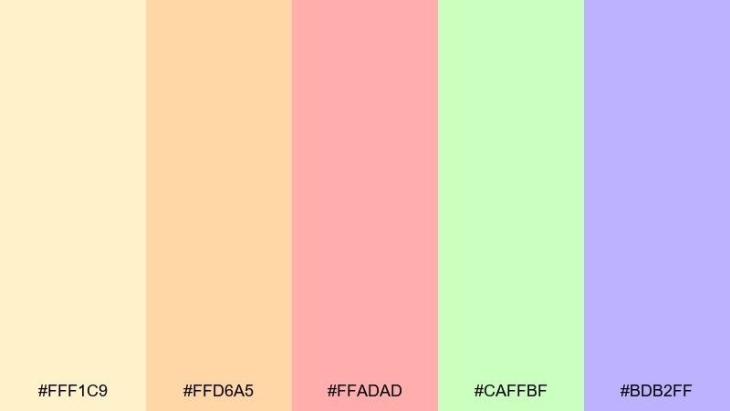
HEX: #FFF1C9 #FFD6A5 #FFADAD #CAFFBF #BDB2FF
Mood: cheerful, playful, bright
Best for: Party banner and backdrop text
Cheerful buttercream tones with candy-like accents evoke confetti popping and laughter in a sunny room. Let the pale yellow lead the background while peach and soft red carry the big words for maximum visibility. The mint and lilac are perfect as small sprinkles, borders, and icon shapes. Tip: limit the banner to two dominant colors and use the rest as tiny confetti dots to avoid visual noise.
Image example of buttercream confetti generated using media.io

3) Modern Pink Blue Pop
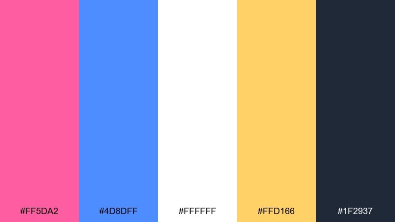
HEX: #FF5DA2 #4D8DFF #FFFFFF #FFD166 #1F2937
Mood: bold, energetic, modern
Best for: Social media announcement post
Bold neon-leaning pink and crisp blue feel like a spotlight moment and a drumroll before the reveal. Use the dark charcoal for text and outlines so the bright hues stay clean and punchy on screens. For gender reveal color combinations that look modern, pair the pink and blue as big blocks and reserve the warm yellow as a tiny highlight. Tip: add generous white space so the post reads instantly in a feed.
Image example of modern pink blue pop generated using media.io

4) Sage Linen Neutral
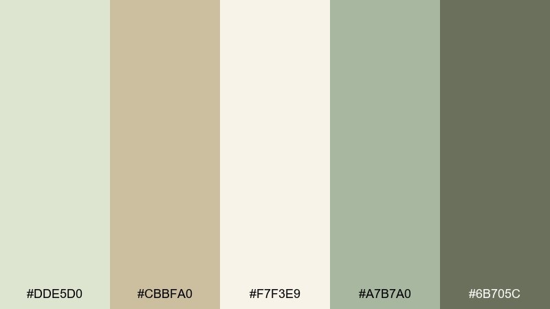
HEX: #DDE5D0 #CBBFA0 #F7F3E9 #A7B7A0 #6B705C
Mood: calm, natural, minimal
Best for: Nursery wall art print
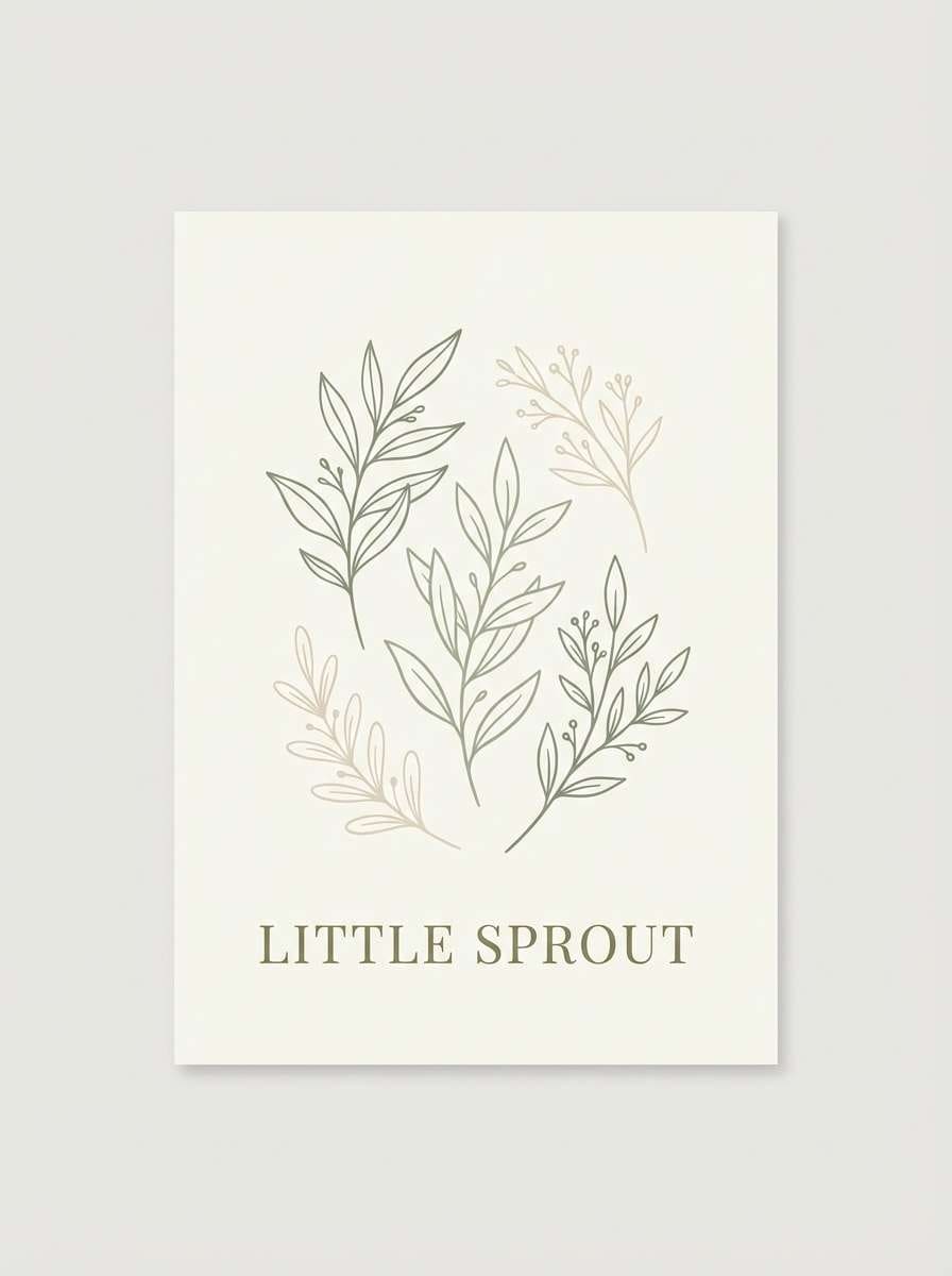
Calm sage and linen neutrals bring to mind soft muslin, dried florals, and a quiet afternoon nap. Keep the ivory as the main paper tone, then layer sage for illustration fills and the deeper olive for typography. It fits nursery prints, name signs, and minimal décor where you want warmth without loud color. Tip: use a slightly darker text color than you think you need for print clarity.
Image example of sage linen neutral generated using media.io
5) Lavender Sky Mist
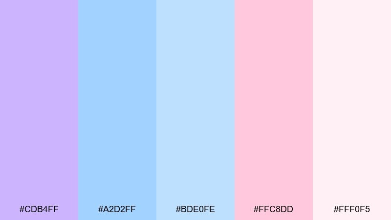
HEX: #CDB4FF #A2D2FF #BDE0FE #FFC8DD #FFF0F5
Mood: dreamy, soft, romantic
Best for: Watercolor floral illustration
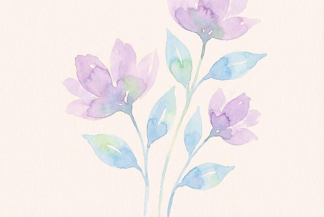
Dreamy lavender and sky blues feel like watercolor clouds with a blush sunrise. Use the pale pink and misty cream as your paper wash, then add lilac and light blue for petals and gentle shadows. This pairing works well for delicate invites, thank-you notes, and illustrated social covers. Tip: keep edges soft and let colors overlap slightly for that true watercolor bloom.
Image example of lavender sky mist generated using media.io
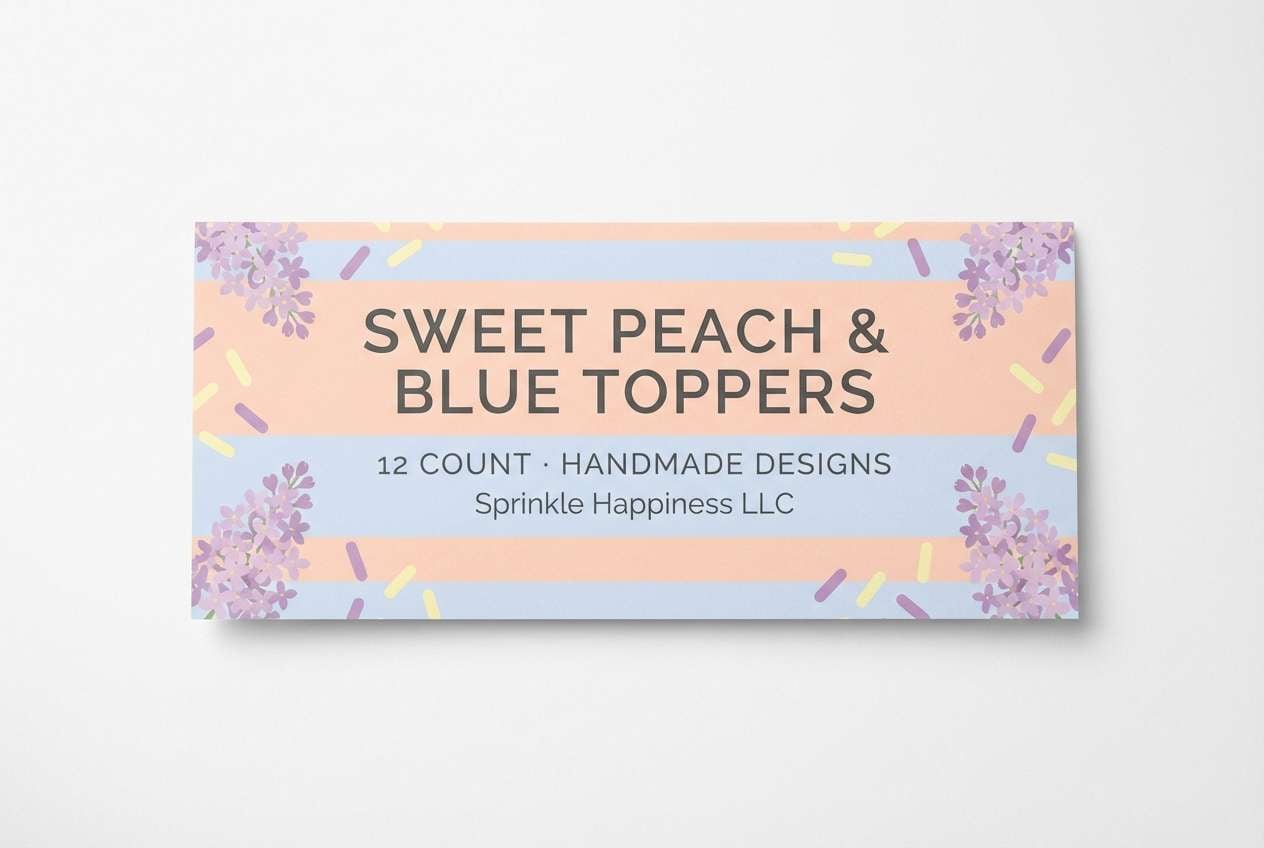
6) Peachy Sprinkle Blue
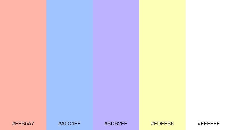
HEX: #FFB5A7 #A0C4FF #BDB2FF #FDFFB6 #FFFFFF
Mood: fun, light, dessert-like
Best for: Cupcake topper packaging label
Peach and soft blue read like frosted cupcakes with pastel sprinkles. Use white as the label base, then set peach for the main brand mark and blue for secondary text or icons. The lilac and pale yellow are ideal for small confetti shapes or flavor callouts. Tip: print a tiny test strip first, since pastel yellows can fade if the paper is too warm.
Image example of peachy sprinkle blue generated using media.io
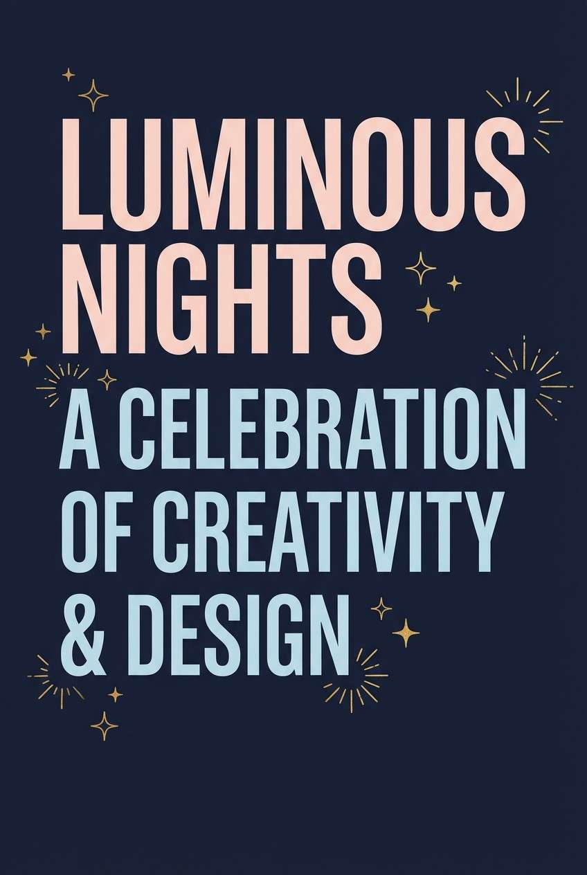
7) Midnight Blush Reveal
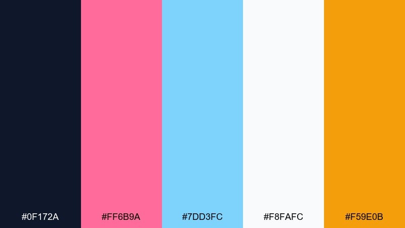
HEX: #0F172A #FF6B9A #7DD3FC #F8FAFC #F59E0B
Mood: dramatic, celebratory, chic
Best for: Event poster and digital flyer
Midnight navy with blush and icy blue feels like a night-time countdown with sparkler light. Use the dark background for drama, then set blush and blue as competing headline accents to build suspense. If you want a gender reveal color scheme that feels grown-up, keep the gold as a tiny starburst or date highlight rather than a full block. Tip: increase line spacing on light text over navy to keep it crisp on screens.
Image example of midnight blush reveal generated using media.io
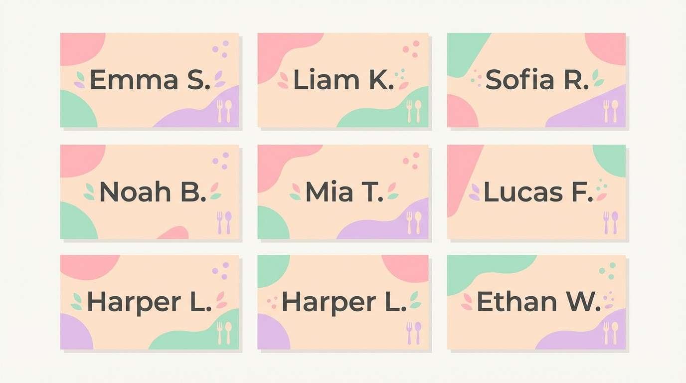
8) Cloud Cotton Candy
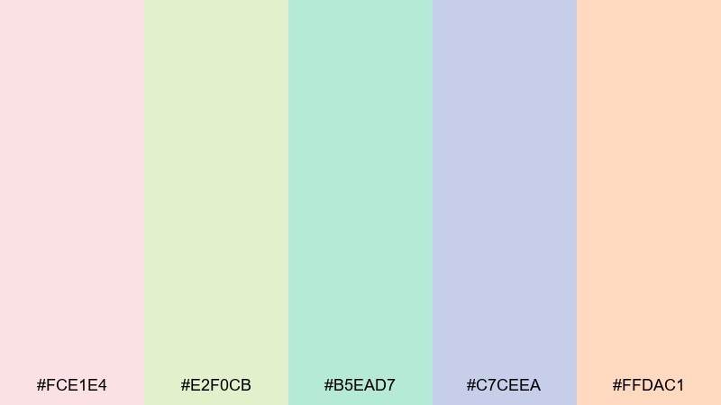
HEX: #FCE1E4 #E2F0CB #B5EAD7 #C7CEEA #FFDAC1
Mood: gentle, cozy, nostalgic
Best for: Place cards and seating labels
Gentle candy pastels evoke cotton candy clouds and soft baby blankets. Keep the peachy cream as the base, then alternate lilac and mint for name blocks to help each card feel unique. This mix prints beautifully on textured cardstock and works well with simple line icons. Tip: use a darker gray ink for names so the pastel background stays the star without hurting readability.
Image example of cloud cotton candy generated using media.io
9) Terracotta Denim
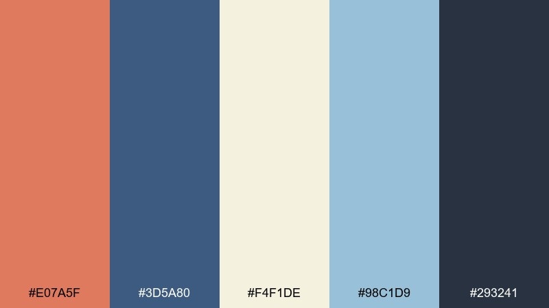
HEX: #E07A5F #3D5A80 #F4F1DE #98C1D9 #293241
Mood: earthy, confident, rustic-modern
Best for: Outdoor signage and picnic decor
Earthy terracotta and denim blue feel like a cozy backyard picnic with sun-warmed clay and vintage jeans. Use the sand tone as a background for signs, then choose terracotta for directional arrows and denim for headings. The lighter blue is a clean secondary accent for icons and borders without competing with the main text. Tip: for large signage, keep contrast high by pairing the dark navy with the light sand.
Image example of terracotta denim generated using media.io

10) Champagne Navy Sparkle
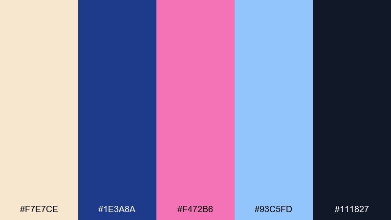
HEX: #F7E7CE #1E3A8A #F472B6 #93C5FD #111827
Mood: polished, festive, upscale
Best for: Brand guidelines sheet layout
Champagne cream with navy and sparkly accents gives a polished, celebration-ready feel. Use navy and charcoal for typography hierarchy, then let pink and light blue appear as small brand highlights like buttons, dividers, and icons. This pairing fits a more modern, editorial look for brand kits and sponsor graphics. Tip: keep the champagne background slightly textured only if your printing method can hold fine detail.
Image example of champagne navy sparkle generated using media.io
11) Mint Rose Gold
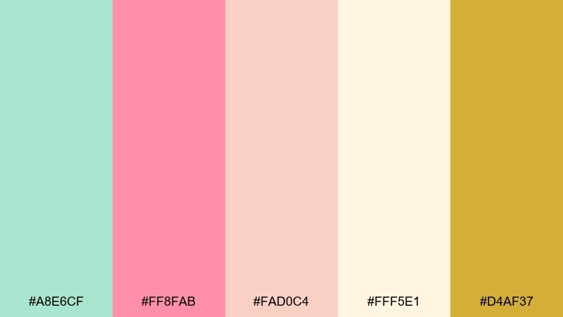
HEX: #A8E6CF #FF8FAB #FAD0C4 #FFF5E1 #D4AF37
Mood: fresh, elegant, modern-soft
Best for: Product label and candle packaging
Fresh mint with rosy warmth and a touch of gold feels like a boutique celebration with a clean scent and soft glow. Use the cream as the label base, mint for borders, and rose for the main badge or name mark. Gold works best as foil-like linework or a tiny seal so it stays premium rather than loud. Tip: avoid printing gold as a flat fill on matte paper unless you can add a metallic finish.
Image example of mint rose gold generated using media.io
12) Classic Pink Blue White
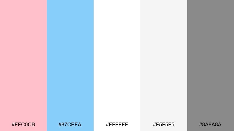
HEX: #FFC0CB #87CEFA #FFFFFF #F5F5F5 #8A8A8A
Mood: clean, classic, friendly
Best for: Website landing page UI
Clean pink and sky blue on bright whites feels timeless, like fresh balloons against a sunny wall. This gender reveal color palette works best when you keep the interface mostly white, then use pink for primary buttons and blue for secondary actions. The soft grays help with borders, form fields, and subtle dividers without making the page feel heavy. Tip: apply one accent per section so the UI stays scannable and balanced.
Image example of classic pink blue white generated using media.io
13) Sunset Coral Aqua
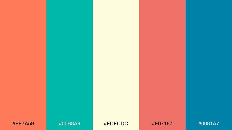
HEX: #FF7A59 #00B8A9 #FDFCDC #F07167 #0081A7
Mood: sunny, lively, tropical-modern
Best for: Balloon arch color guide infographic
Sunny coral and crisp aqua feel like a beachside party with bright paper fans. Use the pale butter tone as your canvas, then assign coral and aqua to the main swatches for quick readability. The deeper teal is great for labels and line icons, while the warm coral-red adds punch in small headings. Tip: align swatches in a neat grid so the guide reads clearly when printed or shared.
Image example of sunset coral aqua generated using media.io
14) Dusty Mauve Baby Blue
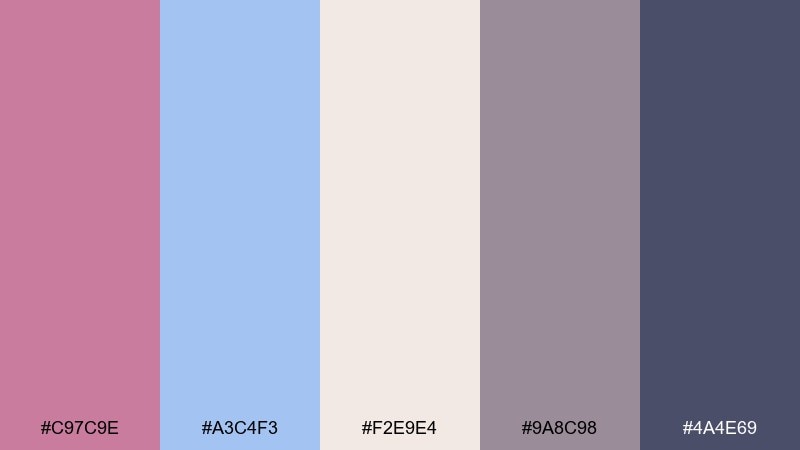
HEX: #C97C9E #A3C4F3 #F2E9E4 #9A8C98 #4A4E69
Mood: soft, vintage, refined
Best for: Thank-you card design
Dusty mauve and baby blue evoke vintage silk, handwritten notes, and a calm, romantic tone. Use the warm off-white as the card base, then lean on the deep slate for the message so it stays legible. Mauve works nicely for monograms, while the light blue makes a gentle border or backing shape. Tip: add a small amount of negative space around the text block to keep the vintage look modern.
Image example of dusty mauve baby blue generated using media.io
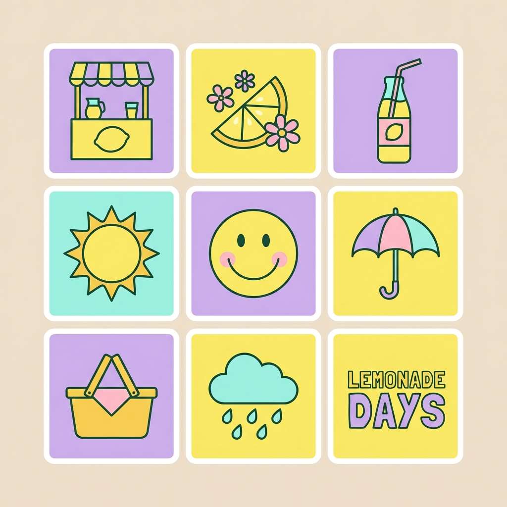
15) Lemonade Lilac Pop
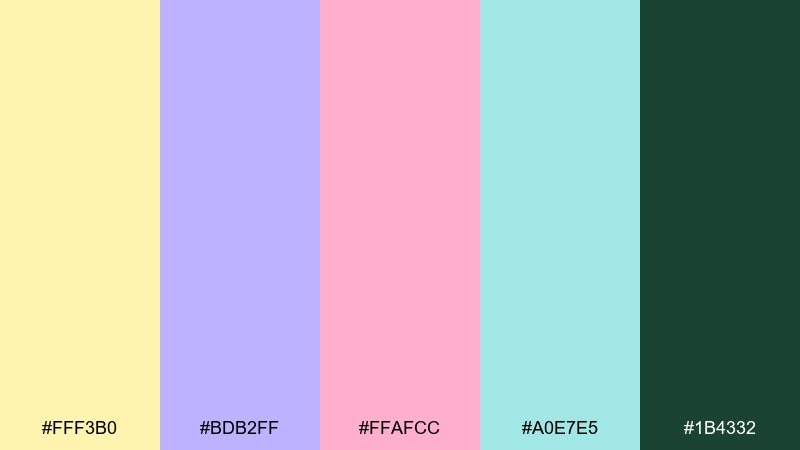
HEX: #FFF3B0 #BDB2FF #FFAFCC #A0E7E5 #1B4332
Mood: playful, punchy, youthful
Best for: Sticker pack design
Playful lemonade yellow with lilac and pink feels like a sticker sheet full of surprises. Use the dark green sparingly for outlines and tiny text so the stickers pop without losing clarity. This mix is great for cute icons, gift bag seals, and printable party favors. Tip: test cut lines at small sizes, since pale yellow can hide edges if the border is too light.
Image example of lemonade lilac pop generated using media.io
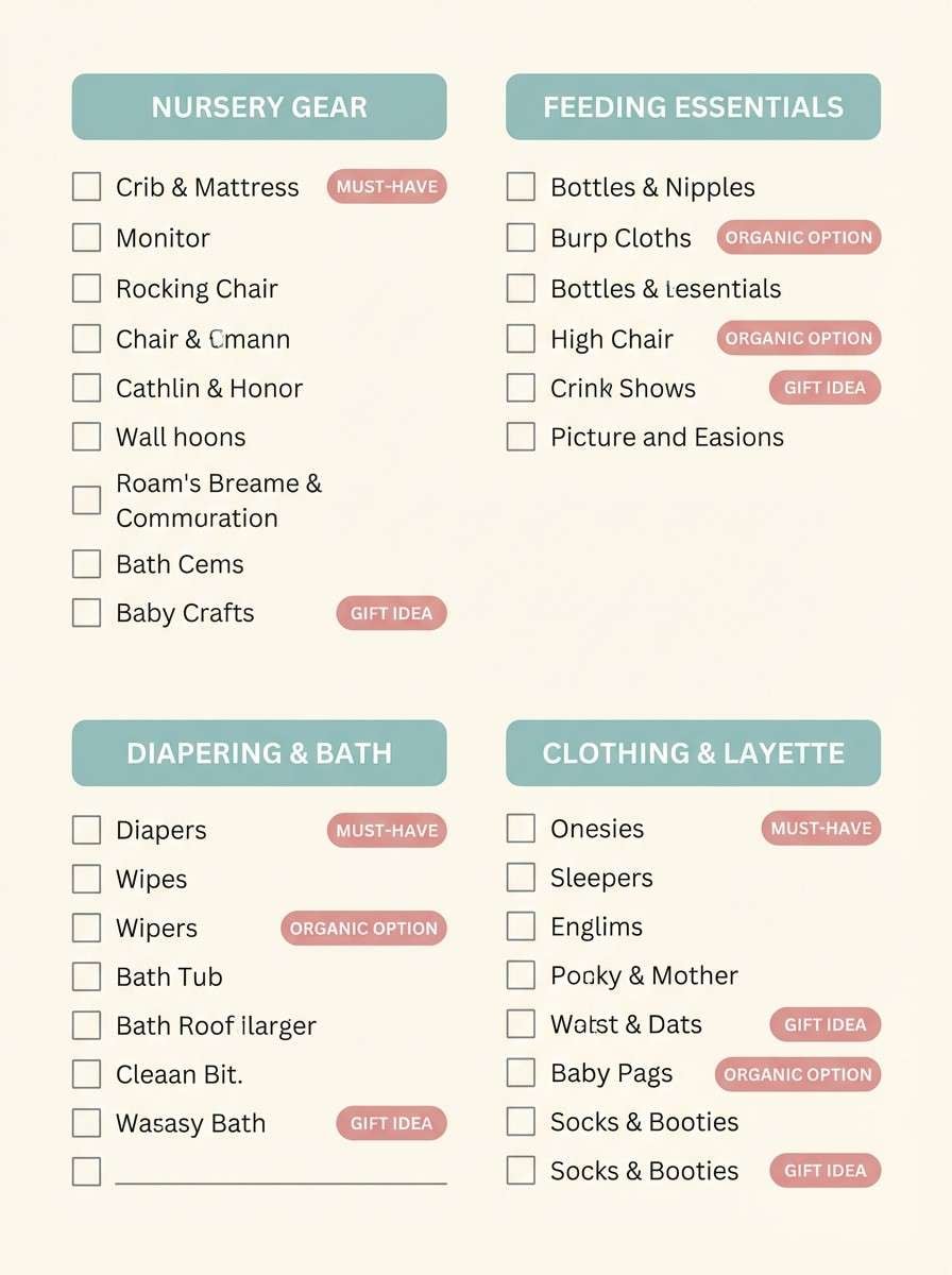
16) Stone Ivory Soft Teal
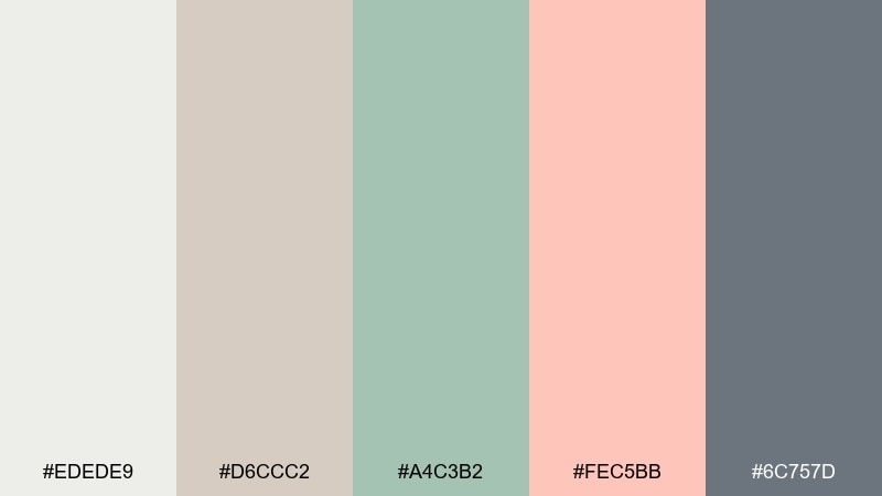
HEX: #EDEDE9 #D6CCC2 #A4C3B2 #FEC5BB #6C757D
Mood: muted, airy, modern-neutral
Best for: Baby registry checklist printable
Muted stone and ivory with soft teal feels tidy, organized, and quietly stylish. Use ivory for the page background and lean on the cool gray for text, checkboxes, and table lines. The teal and blush are perfect for section headers or small icons without overwhelming the checklist. Tip: keep accent fills under 15 percent of the page so it still prints cleanly in grayscale if needed.
Image example of stone ivory soft teal generated using media.io
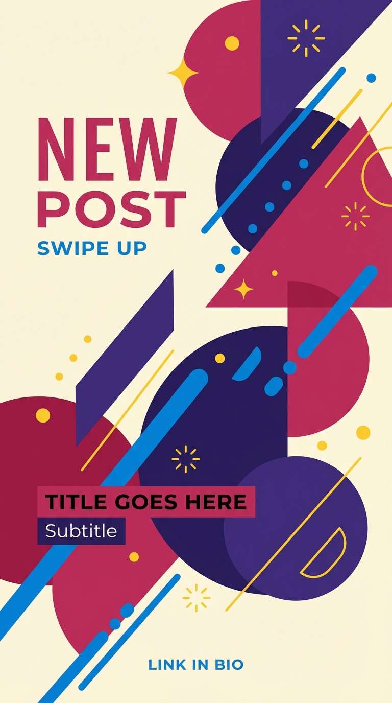
17) Berry Indigo Sky
HEX: #7B2CBF #3A86FF #FF006E #FFBE0B #FBF8CC
Mood: vibrant, confident, trend-forward
Best for: Instagram story template
Vibrant berry, indigo, and sunshine yellow feel like a big reveal moment with fireworks energy. Use the pale cream as breathing room, then pick two bold colors for main shapes so the story stays readable. This set is ideal for countdown frames, quiz stickers, and animated text overlays. Tip: keep body text in a darker tone and reserve the bright yellow for tiny highlights and icons.
Image example of berry indigo sky generated using media.io
18) Eucalyptus Blush Gold
HEX: #CCD5AE #F4ACB7 #FFF1E6 #D4AF37 #6B705C
Mood: warm, botanical, elevated
Best for: Menu card and table signage
Warm eucalyptus greens with blush and gold evoke a garden brunch with soft linens and candlelight. For gender reveal color combinations that lean elegant, keep the cream as the background, use blush for headings, and add gold as thin rules or tiny icons. The deeper olive anchors body text and keeps the layout readable at a distance. Tip: if you cannot foil print, use gold only in small elements so it still looks premium.
Image example of eucalyptus blush gold generated using media.io
19) Icy Blue Silver Pink
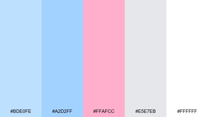
HEX: #BDE0FE #A2D2FF #FFAFCC #E5E7EB #FFFFFF
Mood: cool, modern, polished
Best for: Email newsletter header
Cool icy blues with a soft pink accent feel clean and modern, like frosted glass with a blush tint. Use white as the main space, then build the header with blue gradients and a small pink button or badge. The light silver is ideal for dividers and subtle background panels in email-safe layouts. Tip: keep contrast strong on key CTA text, since pale blues can wash out on some screens.
Image example of icy blue silver pink generated using media.io

20) Cocoa Cream Baby Pink
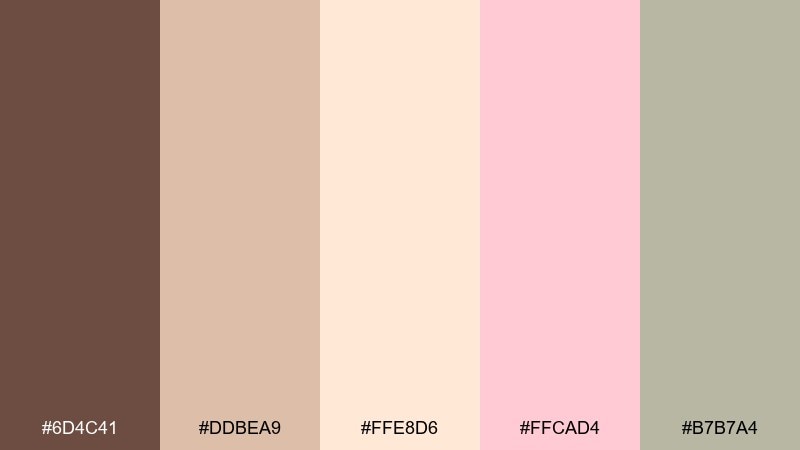
HEX: #6D4C41 #DDBEA9 #FFE8D6 #FFCAD4 #B7B7A4
Mood: cozy, warm, comforting
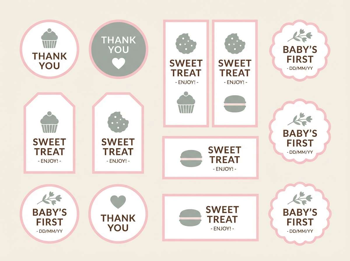
Best for: Dessert labels and favor tags
Cozy cocoa and cream with baby pink feels like homemade treats and soft, warm lighting. Use the light cream for the tag base, then set cocoa for text so small labels stay readable. Pink is best as a small ribbon motif or border, while the muted sage-gray supports icons and pattern fills. Tip: choose a matte stock so the warm neutrals look rich rather than shiny.
Image example of cocoa cream baby pink generated using media.io
What Colors Go Well with Gender Reveal?
Beyond classic pink and blue, gender reveal palettes work best when you add a neutral “base” (white, ivory, cream, or champagne) plus one dark anchor (navy, charcoal, olive) for readable text and contrast.
Soft accents like mint, lilac, dusty mauve, or peach can make the reveal feel more modern while still reading “baby celebration.” Metallic touches (gold or silver) also elevate signage and menus without overpowering the main colors.
If you’re aiming for a gender-neutral or surprise-first approach, try sage-and-linen neutrals or icy blues with silver—then introduce blush/pink as a small highlight rather than a 50/50 split.
How to Use a Gender Reveal Color Palette in Real Designs
Assign roles to your five colors: one background, one headline, one secondary, one accent, and one text/outline. This simple rule keeps banners, invites, and social graphics consistent even when layouts change.
For print items (cards, tags, signage), prioritize contrast: pair dark text with light backgrounds and keep pastel yellows or blush tones for decorative elements. For screens, add more white space so bright pinks/blues don’t feel overwhelming.
To tie décor and graphics together, match large “blocks” (balloons/backdrop) to your top two colors, then use the remaining tones for small details like icons, borders, confetti dots, and buttons.
Create Gender Reveal Palette Visuals with AI
Once you’ve picked your palette, you can generate matching invitation mockups, story templates, banners, and signage concepts using AI—fast. Start with a clean prompt, then iterate by swapping only one element at a time (layout, ratio, or style).
Media.io makes it easy to turn these palette ideas into consistent visuals for your whole event. Just paste a prompt, choose a ratio, and generate variations until the vibe is right.
Gender Reveal Color Palette FAQs
-
What are the best gender reveal colors besides pink and blue?
Great alternatives include sage and linen neutrals, peach and powder blue, lavender with sky tones, or champagne and navy with subtle blush/blue accents. Adding a light neutral base keeps everything cohesive. -
How do I keep a gender reveal palette looking modern (not childish)?
Use one deep anchor (navy, charcoal, olive) for typography, keep backgrounds mostly white/cream, and treat bright colors as accents rather than full-page fills. Small metallic details (gold/silver) can also elevate the look. -
What’s the easiest way to pick a background color for invitations?
Choose the lightest neutral in your palette (white, ivory, cream, champagne). It improves readability, prints cleanly, and lets your pink/blue (or alternative accents) stand out. -
How many colors should I use in a gender reveal design?
Three is usually enough for a single piece (background + headline + accent), while five works best for a full event set. If it feels busy, reduce the accent usage and increase white space. -
Do pastel gender reveal colors print well?
Yes, but very pale yellows and light pinks can look washed out depending on paper warmth and printer settings. Do a small test print and keep text in a darker tone for clarity. -
How can I match my balloon arch to my HEX codes?
Use the HEX set to choose the closest balloon shades, then build the arch with two dominant colors and one to two supporting accents. Keep the remaining tones for signage and table details to avoid visual overload. -
Can I generate gender reveal invitation images with AI using these palettes?
Yes. Use the provided prompts as a base, then specify the palette colors in your prompt (or keep the same mood and style). Generate a few versions and refine typography and spacing for the cleanest result.
Next: Gold Peach Color Palette


