

Dandelion yellow brings instant warmth, optimism, and visibility—perfect for accents, highlights, and sunlit brand moments.
Below are 20 curated dandelion color palette ideas with HEX codes, plus practical pairing tips for modern UI, print, packaging, and illustration.
In this article
- Why Dandelion Palettes Work So Well
-
- sunlit meadow
- citrus brunch
- warm minimal
- vintage botanica
- modern ui glow
- honeyed neutrals
- golden hour poster
- craft paper studio
- sunny navy contrast
- marigold clay
- spring picnic
- retro travel badge
- clean brand kit
- soft nursery bloom
- urban market signage
- editorial highlight
- cozy kitchenware
- garden invitation
- sustainable packaging
- art deco shine
- What Colors Go Well with Dandelion?
- How to Use a Dandelion Color Palette in Real Designs
- Create Dandelion Palette Visuals with AI
Why Dandelion Palettes Work So Well
Dandelion is a warm yellow that reads as energetic and friendly without feeling overly neon. It’s easy to spot, so it naturally fits highlights, badges, and “look here” UI moments.
Because it sits in the warm spectrum, dandelion pairs smoothly with creams, tans, and browns for cozy brands, or with deep navies/charcoals for clean contrast in modern layouts.
It also complements spring-forward visuals: botanical greens, soft pastels, and sun-washed neutrals. With the right balance, it can feel playful, premium, or minimalist.
20+ Dandelion Color Palette Ideas (with HEX Codes)
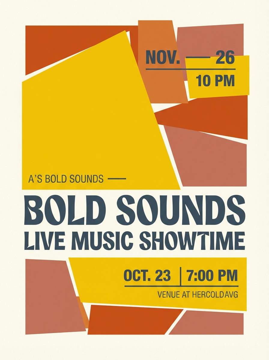
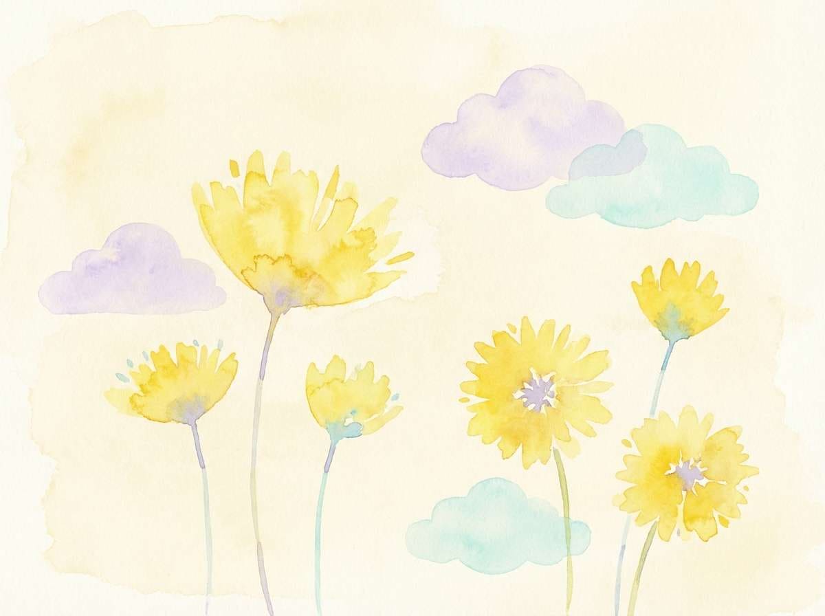
1) Sunlit Meadow
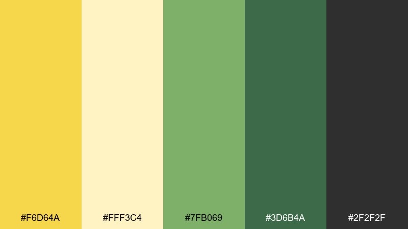
HEX: #F6D64A #FFF3C4 #7FB069 #3D6B4A #2F2F2F
Mood: fresh, cheerful, outdoorsy
Best for: botanical illustrations, spring campaigns, lifestyle branding
Fresh and bright like sunlight on new grass, these tones feel optimistic and clean. Use the yellow as the hero, then balance it with leafy greens for a natural rhythm. A soft cream keeps layouts airy while charcoal adds legible contrast for type. Tip: reserve the darkest tone for headings so the yellow stays luminous.
Image example of sunlit meadow generated using media.io
Media.io is an online AI studio for creating and editing video, image, and audio in your browser.

2) Citrus Brunch
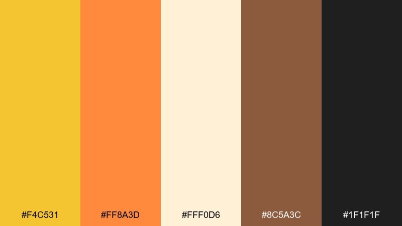
HEX: #F4C531 #FF8A3D #FFF0D6 #8C5A3C #1F1F1F
Mood: zesty, warm, welcoming
Best for: cafe menus, food posters, social ads
Zesty and appetizing, this mix feels like citrus peel, toasted pastry, and morning light. For dandelion color combinations that pop, let the orange carry calls to action while the yellow supports icons and highlights. Cream creates a friendly canvas, and cocoa brown brings a handcrafted feel. Tip: keep black text sparing and rely on brown for a softer, premium read.
Image example of citrus brunch generated using media.io
3) Warm Minimal
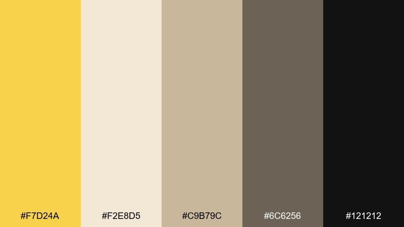
HEX: #F7D24A #F2E8D5 #C9B79C #6C6256 #121212
Mood: calm, modern, understated
Best for: minimal brands, portfolios, presentation decks
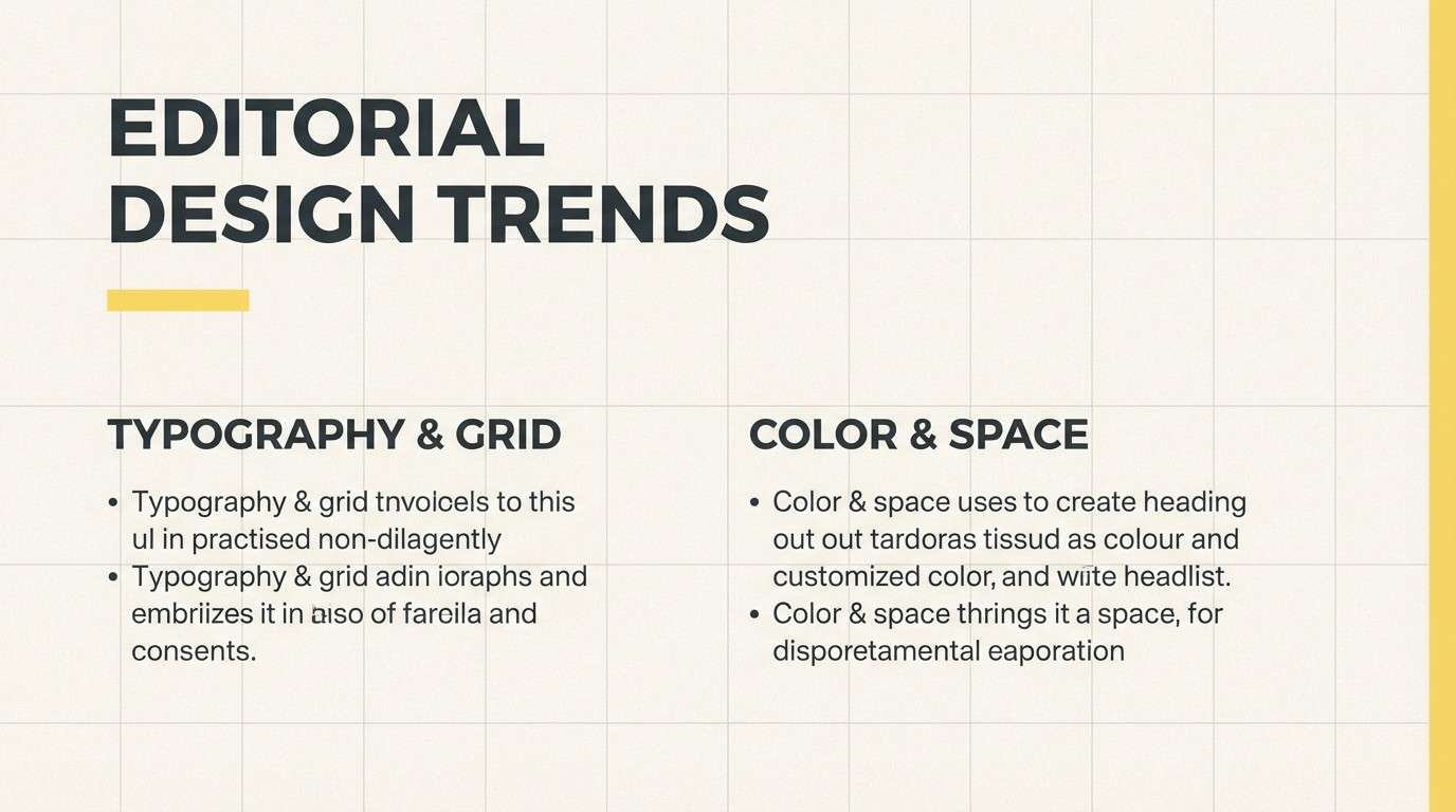
Calm and refined, these shades evoke sunlit paper and softly aged stone. The yellow works best as a thin accent line, badge, or small icon to avoid overpowering the neutrals. Pair with warm beige blocks and deep graphite type for a polished editorial feel. Tip: try a 90-10 split with neutrals dominating and yellow used only for emphasis.
Image example of warm minimal generated using media.io
4) Vintage Botanica
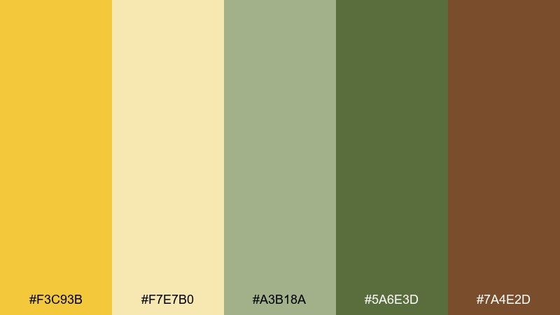
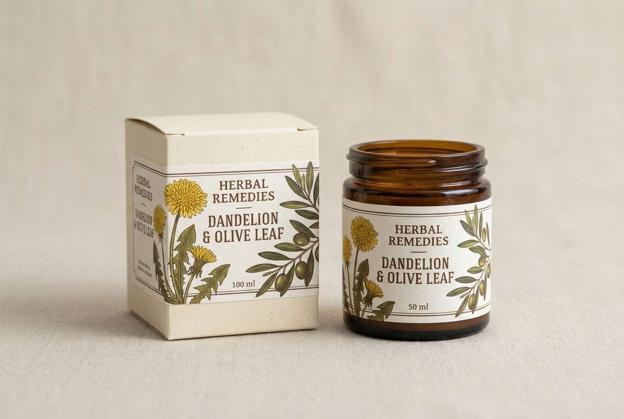
HEX: #F3C93B #F7E7B0 #A3B18A #5A6E3D #7A4E2D
Mood: nostalgic, earthy, naturalist
Best for: apothecary labels, herbal packaging, vintage posters
Nostalgic and earthy, this set recalls pressed flowers and old field guides. A dandelion color palette like this shines on textured paper stocks and craft-inspired packaging. Use olive greens for botanical illustrations and keep the yellow for seals, stamps, and small highlights. Tip: add subtle grain and let brown replace pure black to keep the vintage tone believable.
Image example of vintage botanica generated using media.io
5) Modern UI Glow
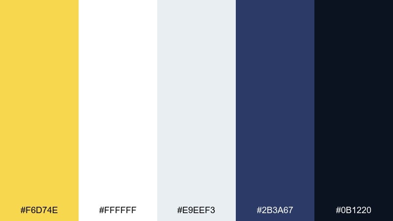
HEX: #F6D74E #FFFFFF #E9EEF3 #2B3A67 #0B1220
Mood: sleek, crisp, high-contrast
Best for: 2d ui dashboards, fintech apps, product onboarding
Sleek and crisp, this palette feels like a warm spotlight on a deep night interface. Use the yellow for active states, progress, and key metrics, while navy anchors navigation and cards. Soft grays keep surfaces readable without stealing attention from highlights. Tip: apply the yellow consistently to one interaction pattern to avoid visual noise.
Image example of modern ui glow generated using media.io

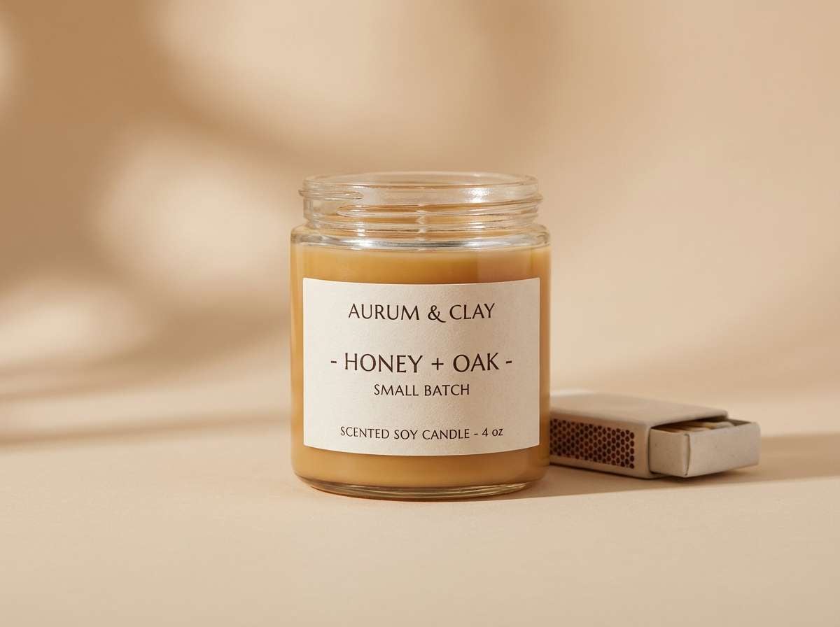
6) Honeyed Neutrals
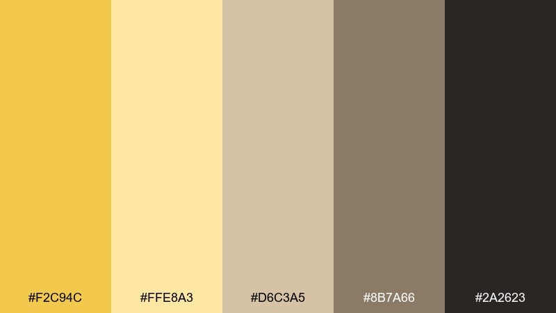
HEX: #F2C94C #FFE8A3 #D6C3A5 #8B7A66 #2A2623
Mood: cozy, artisanal, comforting
Best for: craft brands, candles, cozy ecommerce
Cozy and tactile, these shades bring to mind honey, linen, and warm wood. Lean on beige and tan for backgrounds, then use yellow sparingly for badges and small graphic motifs. The dark espresso tone reads as premium and keeps product titles sharp. Tip: test the yellow on matte paper or muted screens to keep it rich rather than neon.
Image example of honeyed neutrals generated using media.io
7) Golden Hour Poster
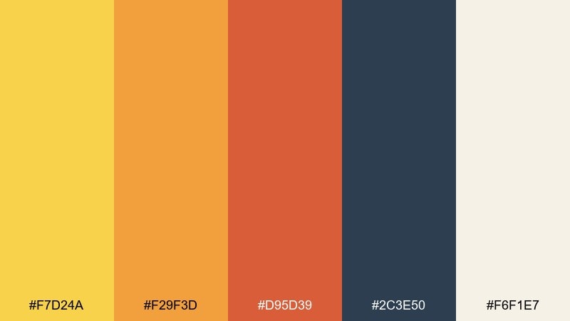
HEX: #F7D24A #F29F3D #D95D39 #2C3E50 #F6F1E7
Mood: bold, energetic, sun-warmed
Best for: event posters, music flyers, streetwear graphics
Bold and sun-warmed, this set feels like late-afternoon light hitting city walls. Let the yellow lead headlines, then stack orange and terracotta for depth in shapes and gradients. Deep blue-gray brings stability and makes warm tones feel even brighter. Tip: keep the warm colors in large, simple blocks for a graphic, screen-printed vibe.
Image example of golden hour poster generated using media.io
8) Craft Paper Studio
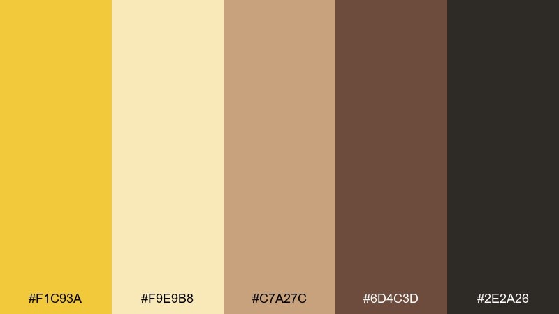
HEX: #F1C93A #F9E9B8 #C7A27C #6D4C3D #2E2A26
Mood: handmade, earthy, workshop
Best for: stationery, maker brands, workshop promotions
Handmade and grounded, these tones evoke kraft paper, stamped ink, and sunlit desks. Use yellow as a stamp color or small emblem, and build most surfaces from tan and brown. The deep charcoal keeps typography readable while staying warmer than pure black. Tip: pair with simple line icons and a slightly rounded serif to reinforce the crafted feel.
Image example of craft paper studio generated using media.io

9) Sunny Navy Contrast
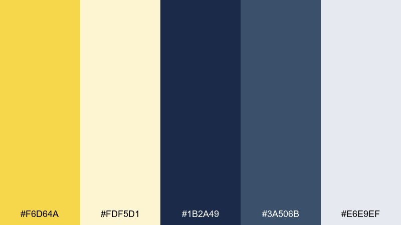
HEX: #F6D64A #FDF5D1 #1B2A49 #3A506B #E6E9EF
Mood: confident, nautical, bright
Best for: corporate branding, landing pages, infographics
Confident and crisp, this pairing feels like a bright flag against deep open water. A dandelion color combination works especially well as a highlight on navy charts, icons, and navigation states. Keep most content on pale cream or cool gray to avoid heavy pages. Tip: use the lighter navy for secondary buttons so the yellow stays reserved for primary actions.
Image example of sunny navy contrast generated using media.io
10) Marigold Clay
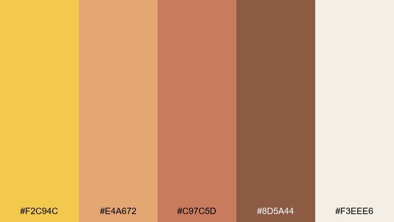
HEX: #F2C94C #E4A672 #C97C5D #8D5A44 #F3EEE6
Mood: warm, rustic, grounded
Best for: ceramics brands, home decor, artisan packaging
Warm and grounded, these colors feel like clay dust, glazed pottery, and soft sunlight. Use the yellow as a bright glaze note, then build depth with terracotta and warm browns. The creamy off-white keeps layouts breathable and works well as negative space around product shots. Tip: combine with natural textures like paper grain or ceramic speckle for authenticity.
Image example of marigold clay generated using media.io
11) Spring Picnic
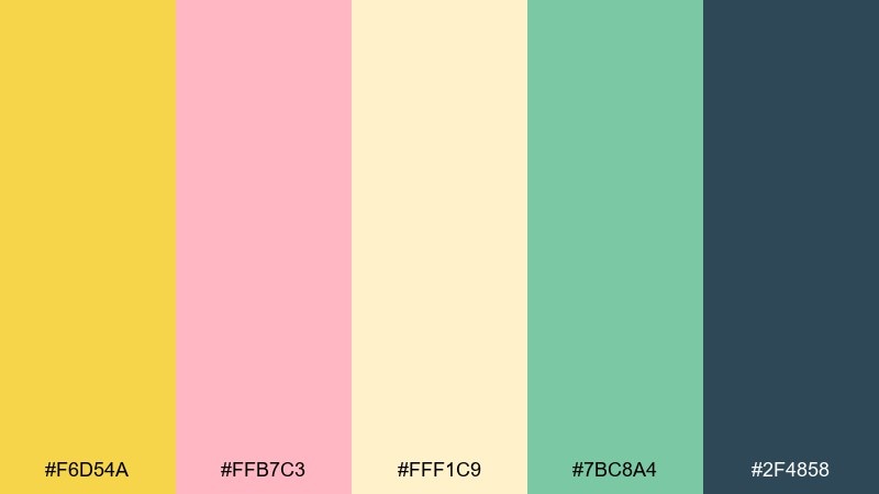
HEX: #F6D54A #FFB7C3 #FFF1C9 #7BC8A4 #2F4858
Mood: playful, light, friendly
Best for: party invites, seasonal promos, cheerful illustrations
Playful and light, this mix suggests gingham blankets, lemonade, and fresh blossoms. Use the pink as a secondary accent for buttons or stickers, while green supports icons and small illustrations. The deep teal-blue gives you strong type without turning the palette heavy. Tip: keep backgrounds mostly cream so the bright accents stay punchy and fun.
Image example of spring picnic generated using media.io

12) Retro Travel Badge
HEX: #F3C93B #4FA3A5 #1D3557 #E9D8A6 #B5654D
Mood: adventurous, retro, graphic
Best for: sticker packs, travel posters, badge logos
Adventurous and retro, these tones recall enamel pins and old travel signage. Let yellow and teal do the heavy lifting in badges, then ground the design with deep navy outlines. Sandy beige works well for background fields, while rust adds a vintage punch in small details. Tip: outline shapes in navy to keep the palette crisp and print-friendly.
Image example of retro travel badge generated using media.io

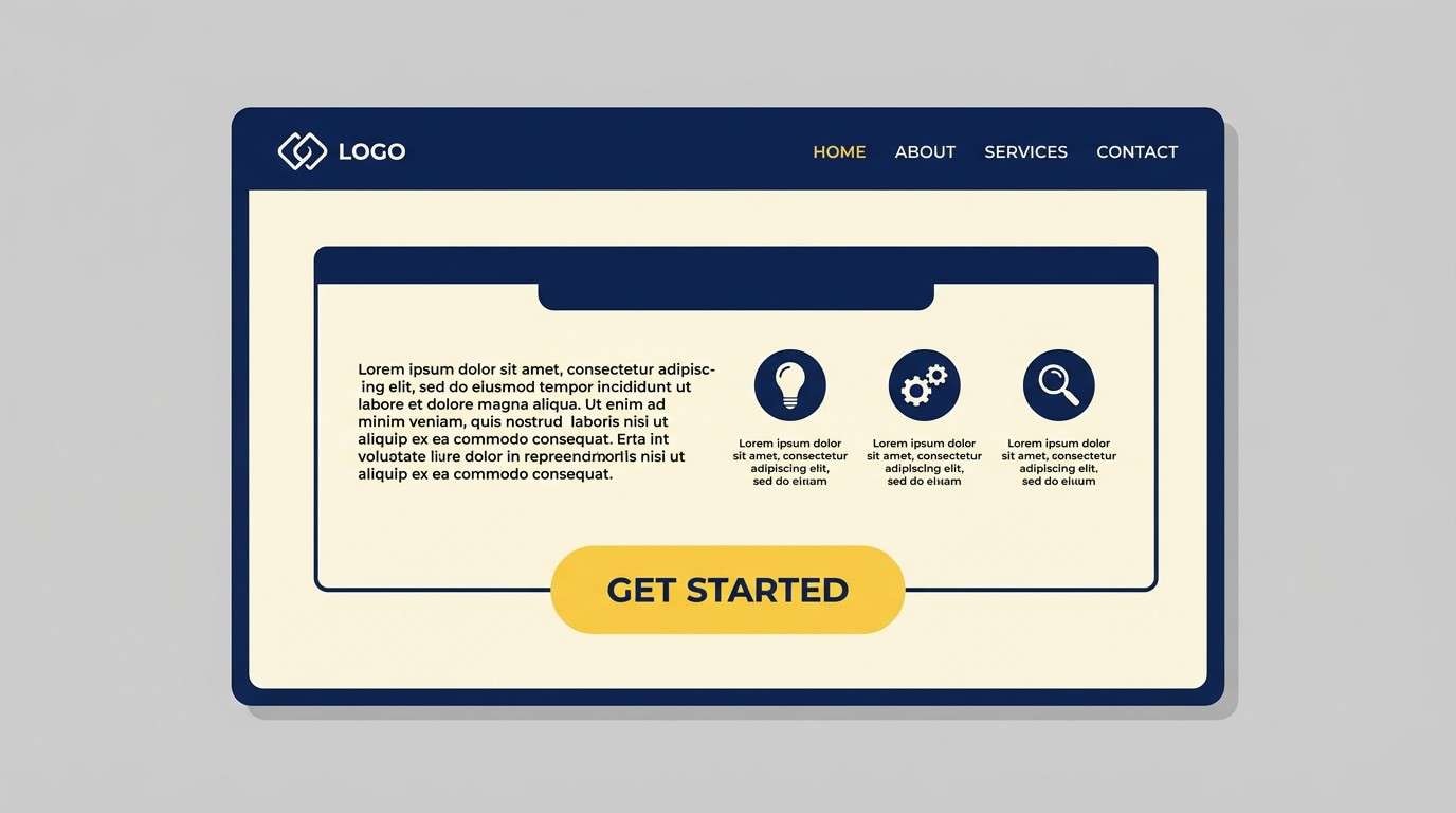
13) Clean Brand Kit
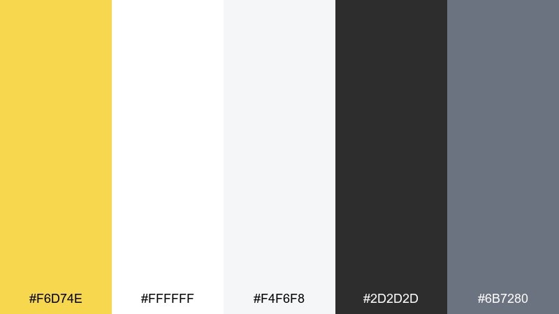
HEX: #F6D74E #FFFFFF #F4F6F8 #2D2D2D #6B7280
Mood: clean, versatile, professional
Best for: brand guidelines, SaaS marketing, pitch decks
Clean and versatile, this set feels like a bright studio with crisp typography. A dandelion color palette in this style is ideal for modern brands that want warmth without losing clarity. Use yellow for key moments like highlights, tags, and success states, while grays handle the system UI. Tip: keep yellow off large backgrounds and use it as a consistent brand marker.
Image example of clean brand kit generated using media.io
14) Soft Nursery Bloom
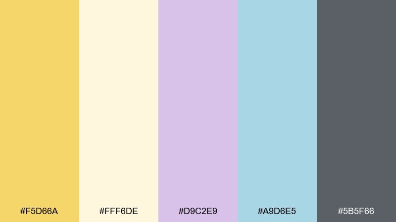
HEX: #F5D66A #FFF6DE #D9C2E9 #A9D6E5 #5B5F66
Mood: soft, gentle, dreamy
Best for: baby brands, nursery prints, gentle packaging
Soft and dreamy, these pastels feel like morning light through curtains. Use the yellow as a warm highlight, then lean on lavender and pale aqua for calm supporting blocks. A muted gray keeps text readable without feeling harsh. Tip: choose rounded type and plenty of spacing to keep the overall look soothing.
Image example of soft nursery bloom generated using media.io
15) Urban Market Signage
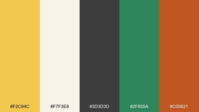
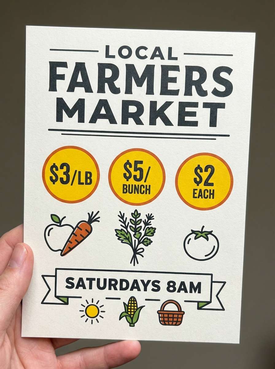
HEX: #F2C94C #F7F3E8 #3D3D3D #2F855A #C05621
Mood: street-smart, friendly, bold
Best for: market signage, small business branding, wayfinding
Street-smart and friendly, this palette evokes chalkboards, fresh produce, and bright price tags. Use yellow for pricing bursts and directional cues, then rely on charcoal for structure and readability. Green and burnt orange add a produce-inspired accent that keeps the design lively. Tip: keep the accents to small shapes so signs stay easy to scan from a distance.
Image example of urban market signage generated using media.io
16) Editorial Highlight
HEX: #F6D64A #FFFFFF #E5E7EB #111827 #B45309
Mood: sharp, modern, editorial
Best for: magazine layouts, reports, blog graphics
Sharp and modern, these tones read like crisp ink with a warm highlighter swipe. This dandelion color scheme works best for pull quotes, callouts, and key data points in long-form pages. Keep the base neutral and let a small amber-brown add warmth to section dividers or icons. Tip: use the yellow behind short text only, so contrast stays accessible.
Image example of editorial highlight generated using media.io
17) Cozy Kitchenware
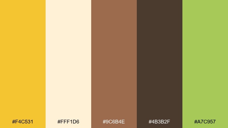
HEX: #F4C531 #FFF1D6 #9C6B4E #4B3B2F #A7C957
Mood: homey, warm, wholesome
Best for: kitchen product ads, recipe cards, food packaging
Homey and warm, these colors feel like butter, baked bread, and herbs on a cutting board. Use the yellow for appetizing highlights and labels, while browns build a grounded, rustic base. A fresh green works as a subtle cue for natural ingredients and healthy notes. Tip: keep product copy on cream to maintain a clean, kitchen-bright look.
Image example of cozy kitchenware generated using media.io
18) Garden Invitation
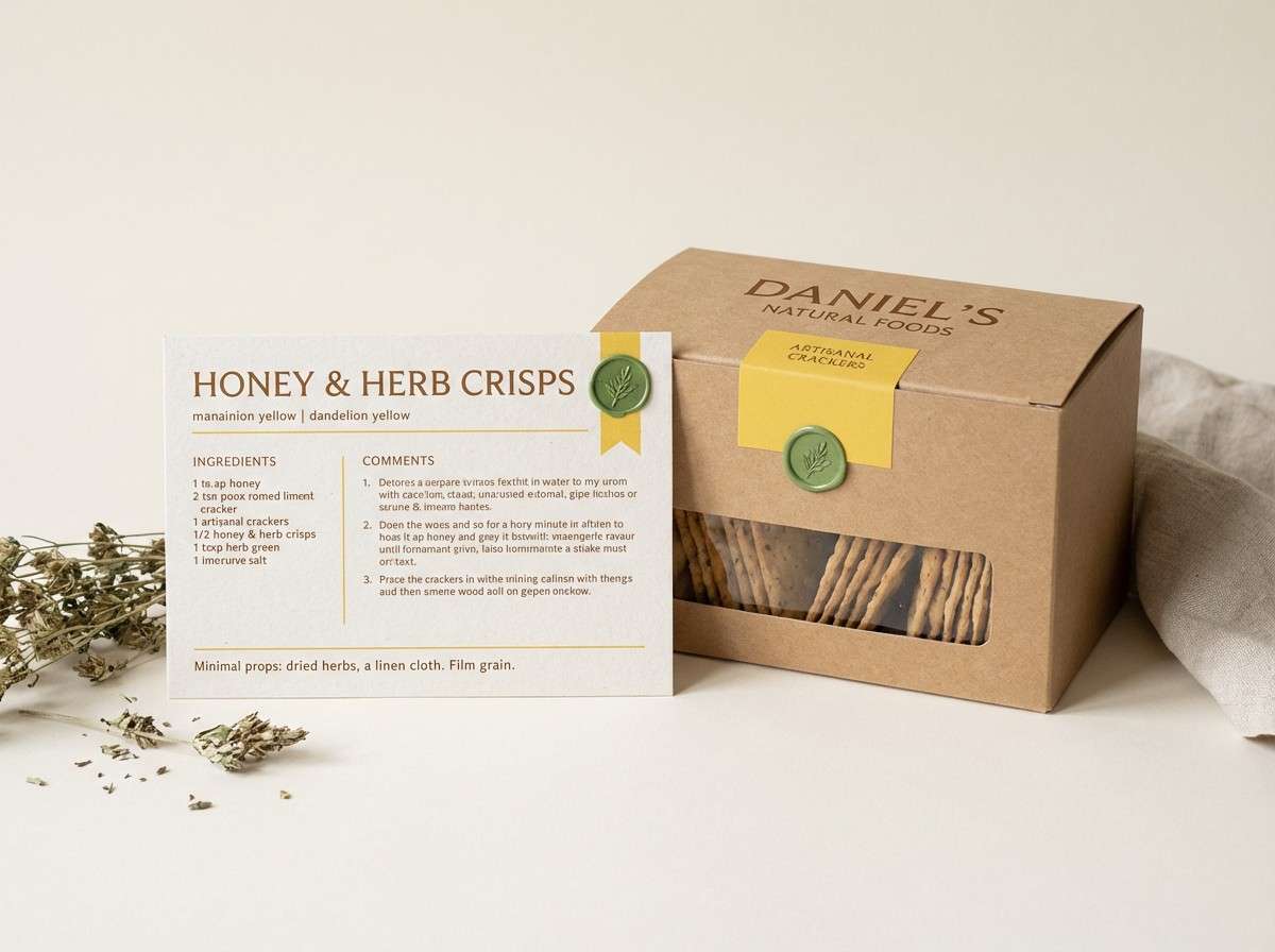
HEX: #F6D54A #FCE7F3 #E9F5DB #6D9773 #3A3A3A
Mood: romantic, airy, garden-fresh
Best for: wedding invites, spring announcements, stationery
Romantic and airy, these pastels suggest petals, fresh leaves, and soft afternoon light. Use yellow as a tiny accent in borders or monograms, then let blush and pale green carry the gentle mood. A mid green supports botanical line art, while charcoal keeps names and dates readable. Tip: try letterpress-style type with generous margins for an elegant finish.
Image example of garden invitation generated using media.io
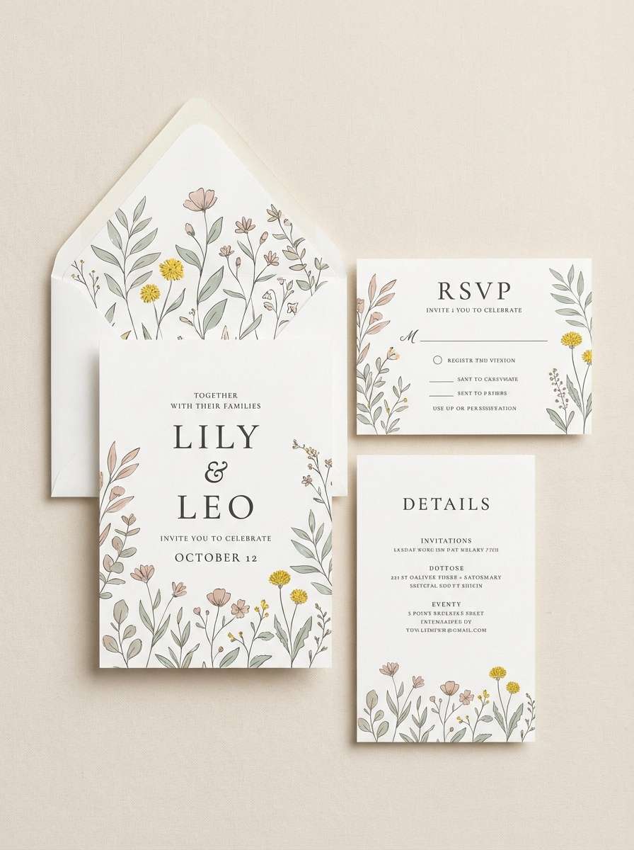
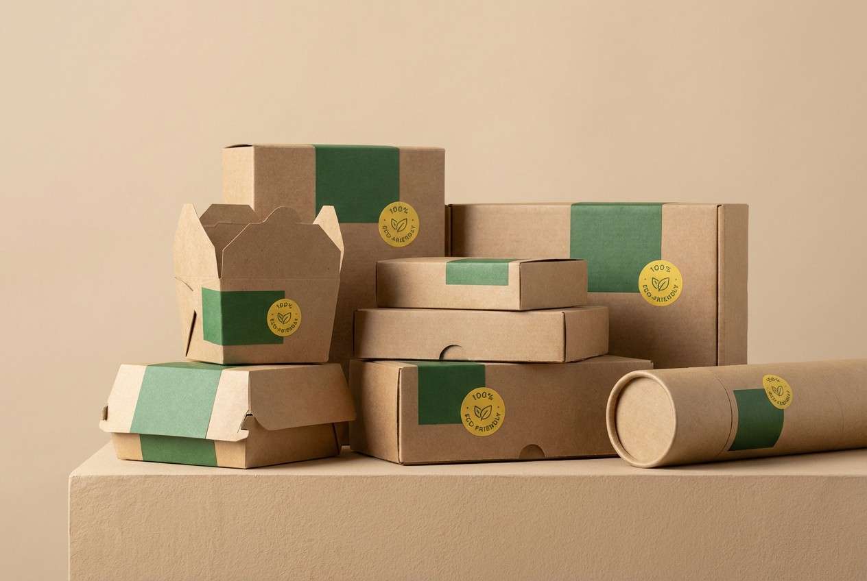
19) Sustainable Packaging
HEX: #F2C94C #F1E7D3 #7A8450 #3F4A3C #8C6A4A
Mood: eco, grounded, trustworthy
Best for: sustainable product packaging, eco labels, wellness brands
Eco and grounded, these shades feel like recycled paper and sunlit leaves. Use yellow as a certification badge or highlight, and let sage and forest tones communicate sustainability. Warm tan and brown keep the palette human and approachable on packaging. Tip: print on uncoated stock and keep ink coverage light for an authentic eco look.
Image example of sustainable packaging generated using media.io
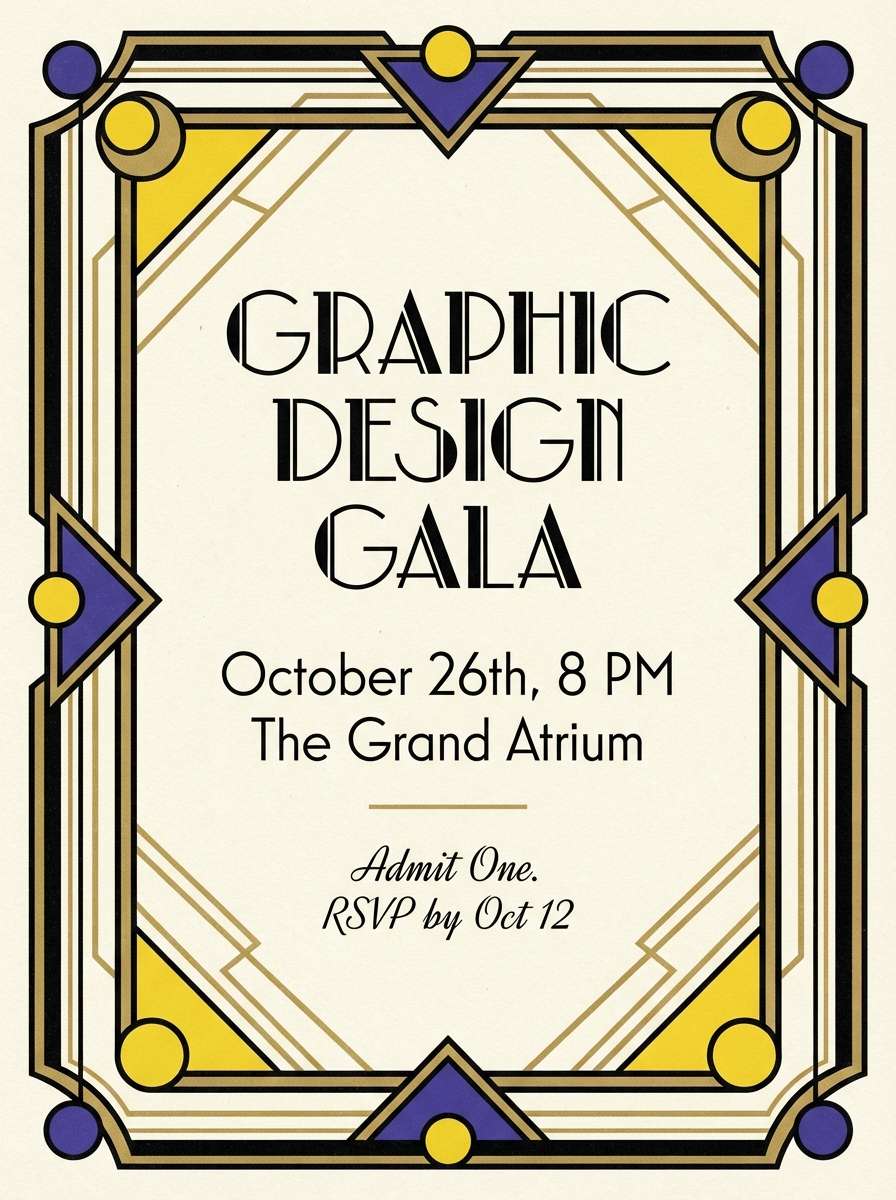
20) Art Deco Shine
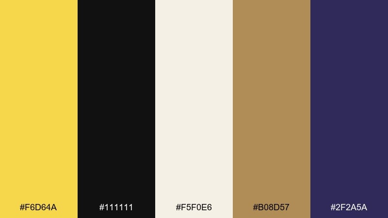
HEX: #F6D64A #111111 #F5F0E6 #B08D57 #2F2A5A
Mood: glamorous, dramatic, refined
Best for: luxury branding, gala invites, premium ads
Glamorous and dramatic, this set recalls gilded details against a deep, inky backdrop. Use yellow and antique gold for lines, frames, and small geometric motifs, while black carries the luxury weight. Cream keeps negative space elegant, and a dark violet-blue adds depth without competing. Tip: stick to thin strokes and symmetrical layouts for a true deco finish.
Image example of art deco shine generated using media.io
What Colors Go Well with Dandelion?
Dandelion pairs beautifully with deep neutrals like charcoal, black, and navy—these give the yellow a clean stage and make it feel brighter and more intentional. This is especially effective for UI states, charts, and CTA buttons.
For a softer look, match it with creams, warm beiges, and cocoa browns to create a honeyed, tactile feel. If you want a spring vibe, add botanical greens or gentle pastels like blush, lavender, and pale aqua.
To keep it modern, limit dandelion to accents (lines, icons, tags) and let neutrals carry the layout. That balance prevents the palette from turning overly loud.
How to Use a Dandelion Color Palette in Real Designs
Start by deciding the job of dandelion: highlight, brand marker, or hero color. In most interfaces, it performs best as a consistent accent for active states, key metrics, or primary actions.
In print and packaging, consider the material: dandelion looks richer on uncoated stock and warmer papers, while glossy finishes can push it brighter. Pair it with browns or dark blues for strong hierarchy and legibility.
When combining multiple warm tones (yellow + orange + terracotta), simplify shapes and spacing so the design stays readable. Let one warm color lead and keep the others supportive.
Create Dandelion Palette Visuals with AI
If you have a palette but need on-brand visuals fast, generate mockups, posters, or UI concepts with AI—then iterate by swapping one color at a time. This helps you validate contrast, mood, and hierarchy before production.
Use prompts that specify background, style, and where dandelion should appear (hero vs accent). Clear constraints produce cleaner results that match real-world design systems.
Dandelion Color Palette FAQs
-
What HEX code is “dandelion yellow”?
Dandelion yellow doesn’t have a single universal HEX, but common dandelion-like picks in these palettes include #F6D64A, #F6D74E, and #F2C94C. -
Is dandelion a good color for UI buttons?
Yes—dandelion is highly noticeable, so it works well for primary CTAs and active states. Pair it with dark navy/charcoal text and keep it consistent across interaction patterns. -
What colors pair best with dandelion for a modern look?
Try dandelion with white, cool light grays, and deep charcoal or navy. This creates crisp contrast and keeps the yellow feeling intentional rather than overwhelming. -
How do I keep dandelion from feeling too bright?
Use it as an accent (5–15% of the layout) and build the base with creams, beiges, or soft grays. You can also warm it down with tan, cocoa brown, or muted olive. -
What’s a good complementary accent to dandelion besides blue?
Greens (sage, olive, forest) are a natural fit for botanical and eco themes. For playful designs, blush pink and mint can add a light, friendly contrast. -
Can I use dandelion in luxury branding?
Yes—combine dandelion with black, cream, and metallic gold tones, and use thin lines or geometric motifs. Limiting yellow to details helps it read as “gilded” rather than casual. -
What’s the safest text color on a dandelion background?
Use very dark text (charcoal/near-black) for readability. For accessibility, avoid white text on dandelion unless the yellow is significantly darkened and contrast is verified.
Next: Tomato Color Palette


