

A farmhouse color palette is all about calm neutrals, worn-in woods, and soft nature accents that feel clean, bright, and lived-in.
Below are 20+ farmhouse color schemes with HEX codes you can use for home interiors, branding, and UI—plus AI prompts you can recreate instantly on Media.io.
In this article
- Why Farmhouse Palettes Work So Well
-
- whitewashed oak
- iron & linen
- sage kitchen
- barnwood blush
- stone hearth
- cotton wreath
- antique pitcher
- dusty shiplap
- warm milk & mocha
- clay pot garden
- brass lantern
- weathered denim
- charcoal mantel
- pumpkin spice porch
- eucalyptus fields
- grain sack stripe
- old map paper
- pewter & parchment
- cranberry quilt
- winter pine
- buttercream & brick
- blueberry jam jar
- chalkboard market
- What Colors Go Well with Farmhouse?
- How to Use a Farmhouse Color Palette in Real Designs
- Create Farmhouse Palette Visuals with AI
Why Farmhouse Palettes Work So Well
Farmhouse colors succeed because they’re built on forgiving neutrals—creams, beiges, greiges, and soft charcoals—that make spaces and layouts feel bright without being stark.
These palettes also rely on texture cues (linen, weathered wood, stone, iron), so even simple color combinations look layered and intentional when you pair them with the right materials.
Finally, farmhouse color schemes are easy to refresh seasonally: swap in botanical greens, warm terracottas, or deep winter evergreens while keeping the same neutral base.
20+ Farmhouse Color Palette Ideas (with HEX Codes)
1) Whitewashed Oak
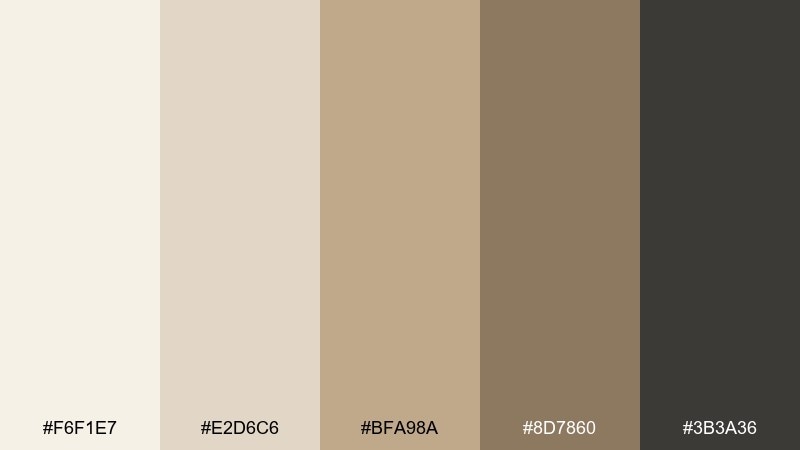
HEX: #F6F1E7 #E2D6C6 #BFA98A #8D7860 #3B3A36
Mood: airy, warm, timeless
Best for: living room walls and natural wood furniture styling
Airy neutrals and sun-bleached wood tones evoke bright mornings, linen curtains, and a well-loved oak floor. Use the light cream as your base, then build depth with warm tan and toasted brown. It works beautifully in living rooms, entryways, and open-plan spaces where you want calm without feeling cold. Pair with matte black hardware for contrast, and keep patterns subtle to let textures do the work.
Image example of whitewashed oak generated using media.io

Media.io is an online AI studio for creating and editing video, image, and audio in your browser.

2) Iron & Linen
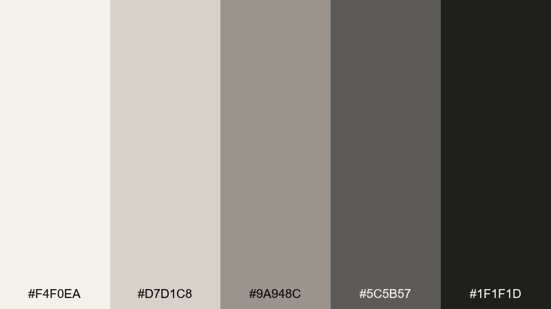
HEX: #F4F0EA #D7D1C8 #9A948C #5C5B57 #1F1F1D
Mood: clean, grounded, modern rustic
Best for: minimal brand identity and packaging for home goods
Clean linen whites and forged-iron grays bring to mind crisp bedding, steel fixtures, and a tidy pantry shelf. Keep the off-white dominant for a modern, uncluttered look, then use charcoal for type, labels, and thin dividers. This farmhouse color scheme shines on packaging, logo systems, and monochrome product photography overlays. Tip: print on uncoated paper to make the grays feel softer and more tactile.
Image example of iron & linen generated using media.io

3) Sage Kitchen
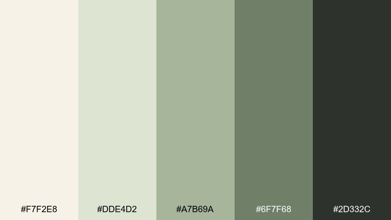
HEX: #F7F2E8 #DDE4D2 #A7B69A #6F7F68 #2D332C
Mood: fresh, herbal, comforting
Best for: kitchen cabinet paint planning and recipe blog visuals
Fresh herb greens and creamy parchment tones feel like a sunny kitchen with a bowl of pears on the counter. Try the pale cream on walls, then bring in sage for cabinets or a backsplash accent. These farmhouse colors also work for recipe cards and food blog graphics where you want a natural, appetizing calm. Usage tip: keep countertops light so the greens stay bright instead of muddy.
Image example of sage kitchen generated using media.io

4) Barnwood Blush
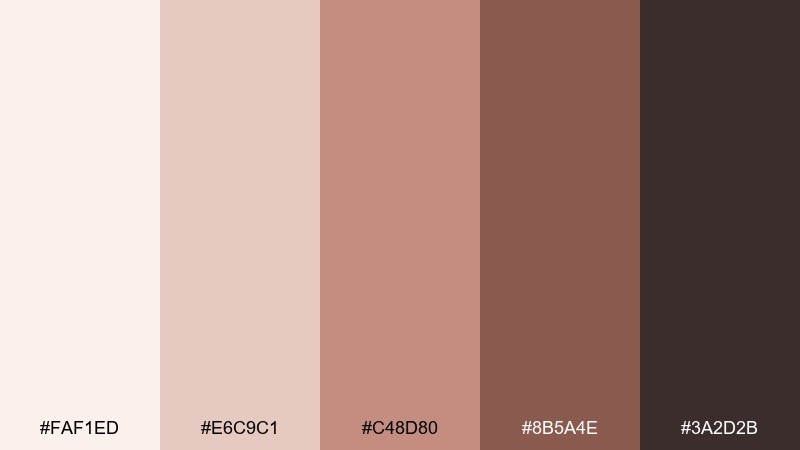
HEX: #FAF1ED #E6C9C1 #C48D80 #8B5A4E #3A2D2B
Mood: cozy, romantic, vintage
Best for: wedding invitations and rustic event stationery
Soft blush and aged wood browns suggest hand-tied bouquets, antique frames, and candlelight in a barn loft. Use the pale rose as your paper tone and reserve the deep cocoa for typography and monograms. This farmhouse color palette fits invitations, menus, and place cards where you want warmth without going overly sweet. Tip: add fine line illustrations in the dark brown to keep everything elegant and readable.
Image example of barnwood blush generated using media.io

5) Stone Hearth
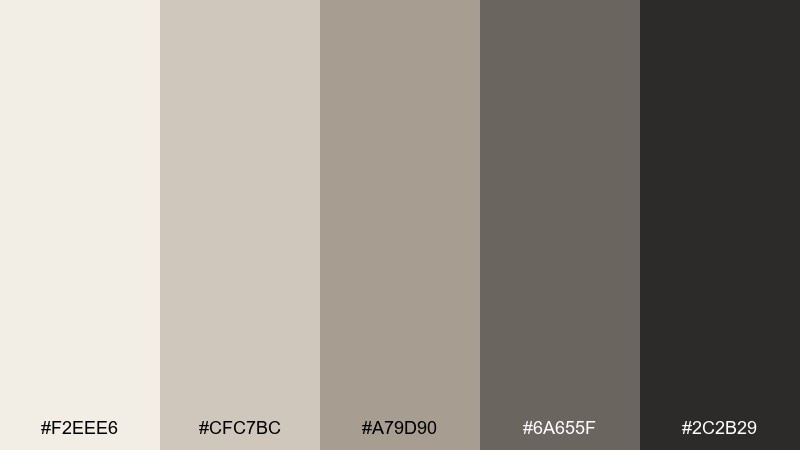
HEX: #F2EEE6 #CFC7BC #A79D90 #6A655F #2C2B29
Mood: grounded, quiet, sturdy
Best for: fireplace surround, stone textures, and interior renderings
Smoky stone grays and ash-brown neutrals feel like a hearth that has warmed a home for generations. Let the light greige lead, then layer midtone stone for tile, grout, and textured fabrics. The farmhouse color scheme works especially well in interiors with natural limestone, concrete, or weathered brick. Tip: keep metals either matte black or brushed nickel so the palette stays cohesive and calm.
Image example of stone hearth generated using media.io

6) Cotton Wreath
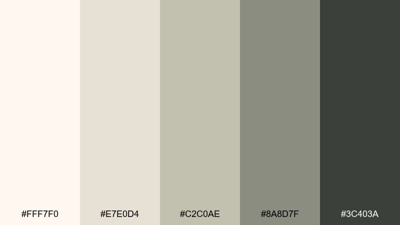
HEX: #FFF7F0 #E7E0D4 #C2C0AE #8A8D7F #3C403A
Mood: soft, natural, welcoming
Best for: front porch decor planning and seasonal social posts
Soft cottony whites and muted olive-grays bring up images of a wreath on a weathered door and dried stems in a clay vase. As a farmhouse color palette, it excels as a neutral base with a gentle green-gray that never feels loud. Use the darkest shade for door numbers, borders, or small graphic accents to keep contrast clear. Tip: repeat the green-gray in textiles like throws or porch cushions for a pulled-together look.
Image example of cotton wreath generated using media.io

7) Antique Pitcher
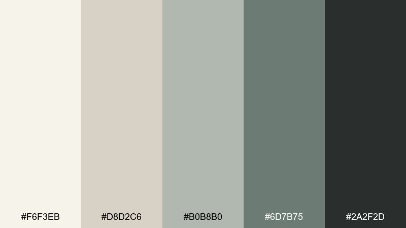
HEX: #F6F3EB #D8D2C6 #B0B8B0 #6D7B75 #2A2F2D
Mood: vintage, calm, collected
Best for: editorial layouts for home decor blogs and magazines
Muted pottery gray-greens and paper-like neutrals feel like an antique enamel pitcher on an open shelf. Keep the page background warm and creamy, then use the blue-green midtones for pull quotes, section headers, and subtle rules. It suits editorial layouts where you want a lived-in feel without sacrificing clarity. Tip: use generous white space so the darker green-gray reads as intentional, not heavy.
Image example of antique pitcher generated using media.io

8) Dusty Shiplap
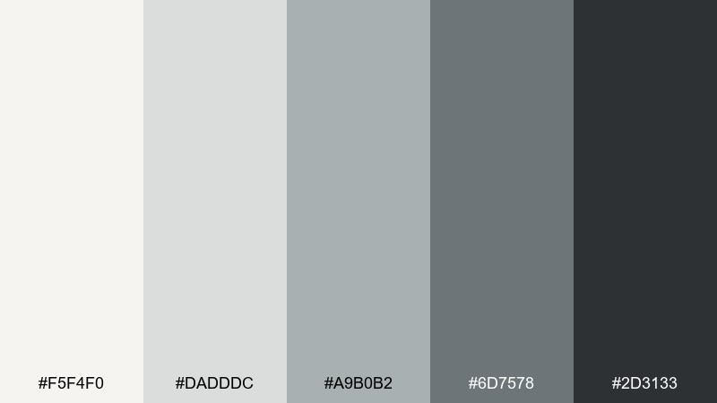
HEX: #F5F4F0 #DADDDC #A9B0B2 #6D7578 #2D3133
Mood: breezy, coastal farmhouse, crisp
Best for: website UI backgrounds and clean dashboards
Dusty whites and cool gray-blues feel like shiplap boards catching soft window light. Use the near-white for primary surfaces, then the mid grays for cards, dividers, and secondary UI panels. It is a strong choice when you want a bright interface that still has depth and structure. Tip: reserve the darkest charcoal for key actions and headings to keep hierarchy obvious.
Image example of dusty shiplap generated using media.io

9) Warm Milk & Mocha
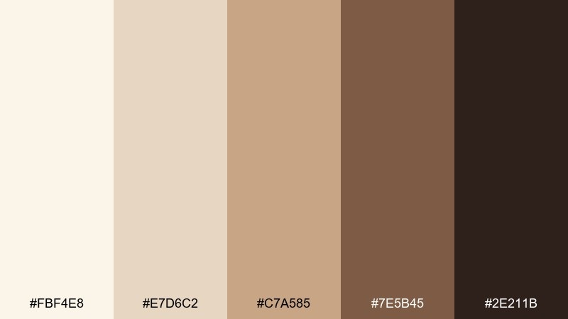
HEX: #FBF4E8 #E7D6C2 #C7A585 #7E5B45 #2E211B
Mood: cozy, appetizing, rich
Best for: coffee shop branding and menu design
Creamy milk tones and roasted mocha browns evoke espresso steam, worn leather stools, and a chalkboard menu. Build your design with the light cream and caramel, then use the deeper browns for type and icons. As a farmhouse color scheme, it feels especially natural on kraft paper and textured backgrounds. Tip: add a thin high-contrast border in the darkest brown to keep layouts sharp on light surfaces.
Image example of warm milk & mocha generated using media.io

10) Clay Pot Garden
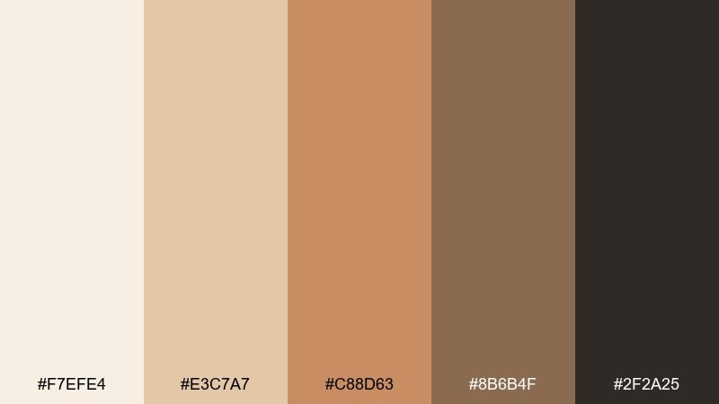
HEX: #F7EFE4 #E3C7A7 #C88D63 #8B6B4F #2F2A25
Mood: earthy, sunny, handcrafted
Best for: plant shop product labels and ceramic packaging
Sun-warmed terracotta and sandy neutrals feel like clay pots lined up on a greenhouse bench. Let the pale oatmeal shade dominate, then use terracotta for badges, seals, and key callouts. It is ideal for plant labels, seed packets, and handmade ceramics where warmth matters. Tip: keep typography in the near-black so the orange-browns stay expressive without losing legibility.
Image example of clay pot garden generated using media.io

11) Brass Lantern
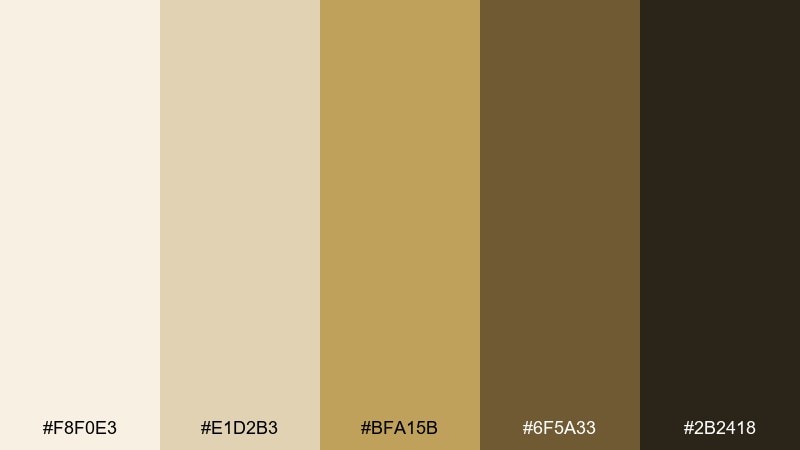
HEX: #F8F0E3 #E1D2B3 #BFA15B #6F5A33 #2B2418
Mood: glowing, nostalgic, refined
Best for: holiday flyers and cozy event posters
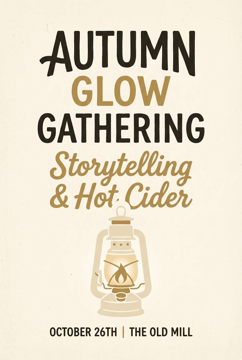
Warm brass and candlelit browns bring the glow of a lantern swinging on a porch at dusk. Use the pale cream as the background, then treat the brass as the hero accent for titles and small decorative shapes. This farmhouse color scheme works well for holiday posters, workshop flyers, and seasonal promos that need warmth without going red or green. Tip: keep gradients subtle so the brass reads like metal, not mustard.
Image example of brass lantern generated using media.io
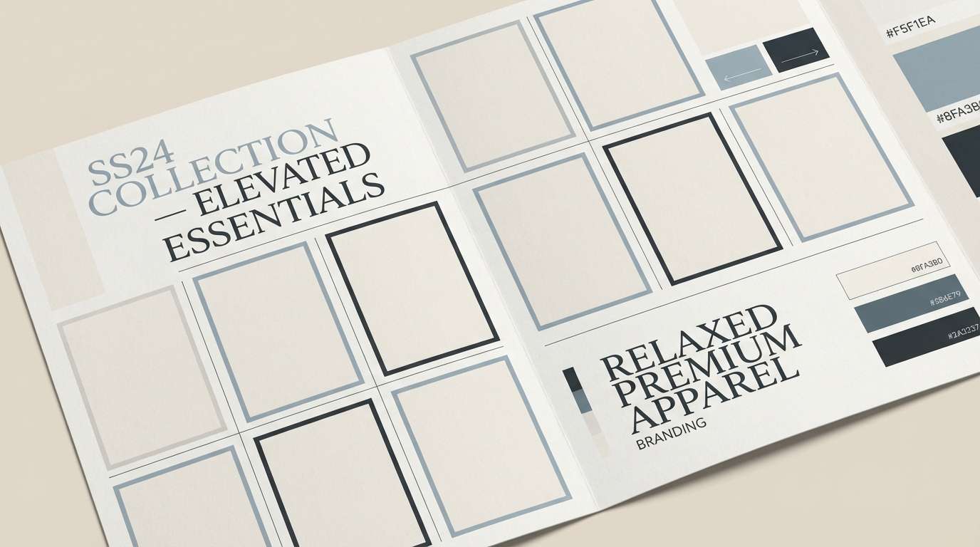
12) Weathered Denim
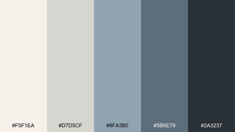
HEX: #F5F1EA #D7D5CF #8FA3B0 #5B6E79 #2A3237
Mood: cool, relaxed, understated
Best for: casual apparel branding and lookbook layouts
Faded denim blues with soft parchment neutrals feel like a broken-in jacket and a stack of vintage quilts. These farmhouse color combinations keep things relaxed while still offering enough contrast for strong typography. Use the light neutrals for backgrounds, then choose denim for buttons, highlights, and editorial sidebars. Tip: avoid bright whites and stick to creamy off-white to keep the blue feeling worn-in, not sporty.
Image example of weathered denim generated using media.io
13) Charcoal Mantel
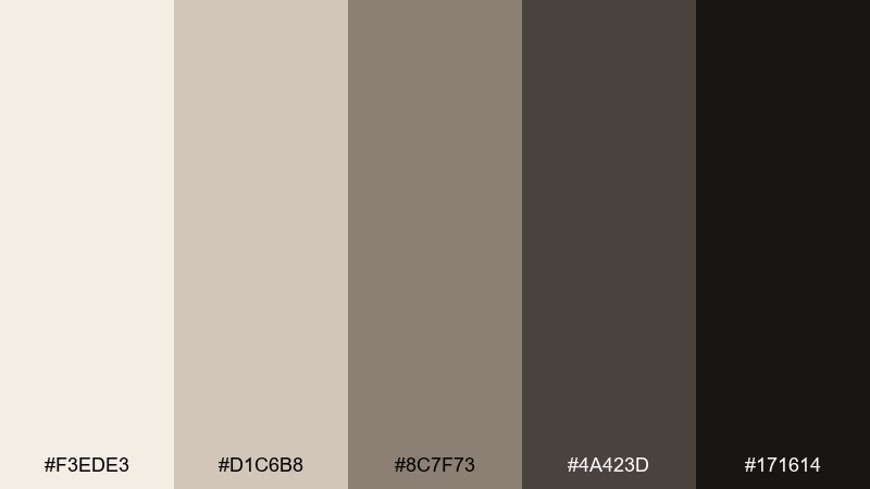
HEX: #F3EDE3 #D1C6B8 #8C7F73 #4A423D #171614
Mood: moody, elegant, high-contrast
Best for: modern farmhouse logo marks and premium website headers
Deep charcoal and warm putty tones suggest a dramatic mantel, framed art, and soft candle smoke. Keep the pale sand as breathing room, then use the darkest charcoal for headers and logo marks. It is a strong fit for premium home services, interior studios, and hero sections that need punch. Tip: use the mid brown-gray for secondary text so the layout stays readable without looking washed out.
Image example of charcoal mantel generated using media.io

14) Pumpkin Spice Porch

HEX: #FBF1E4 #F0D3B0 #D08A4B #8A5C39 #2F2019
Mood: autumnal, friendly, festive
Best for: fall sale graphics and seasonal email banners
Toasty pumpkin and caramel browns feel like porch steps covered in leaves and a warm mug in hand. Use the pale cream as negative space, then bring in pumpkin for buttons, stickers, and discount callouts. The farmhouse color palette works great for seasonal campaigns, farmers market signage, and cozy product promos. Tip: keep orange accents clustered so the design feels intentional rather than noisy.
Image example of pumpkin spice porch generated using media.io

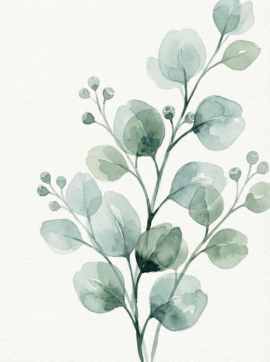
15) Eucalyptus Fields
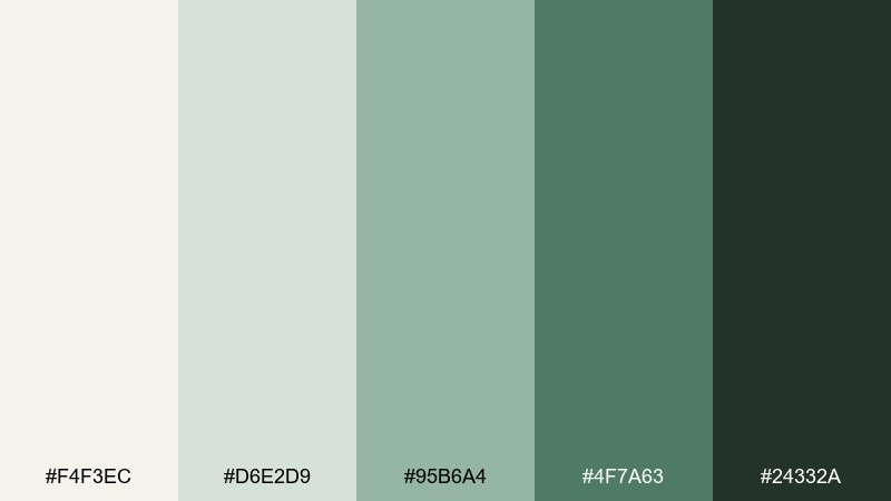
HEX: #F4F3EC #D6E2D9 #95B6A4 #4F7A63 #24332A
Mood: refreshing, botanical, balanced
Best for: watercolor botanical prints and spa branding
Cool eucalyptus greens and misty neutrals evoke a breezy field, bundled stems, and a calm, spa-like inhale. Use the pale gray-cream for paper, then let the mid green carry leaves and soft shadows. It suits wellness branding, stationery, and botanical art where you want nature without neon. Tip: keep outlines in deep green-black rather than pure black to stay gentle.
Image example of eucalyptus fields generated using media.io
16) Grain Sack Stripe
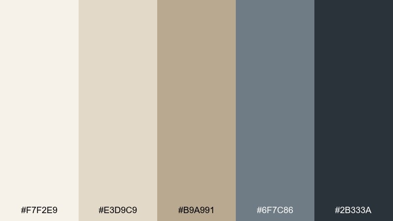
HEX: #F7F2E9 #E3D9C9 #B9A991 #6F7C86 #2B333A
Mood: heritage, practical, crisp
Best for: textile mockups and pattern design for pillows
Wheat-colored neutrals with a cool blue-gray stripe feel like vintage grain sacks and ticking fabric. Keep the light beige as your ground, then use the blue-gray for clean lines, checks, or narrow borders. This farmhouse color scheme is perfect for pillow patterns, kitchen textiles, and subtle backgrounds in social templates. Tip: vary stripe thickness slightly to make the pattern feel authentic and not too digital.
Image example of grain sack stripe generated using media.io

17) Old Map Paper
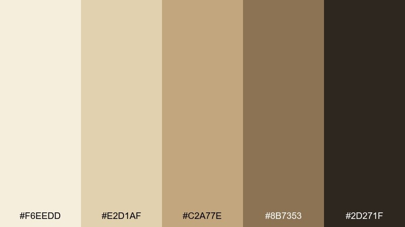
HEX: #F6EEDD #E2D1AF #C2A77E #8B7353 #2D271F
Mood: vintage, exploratory, warm
Best for: heritage brand story pages and brochures
Aged paper tans and inky browns recall folded maps, wooden crates, and handwritten notes. Use the light parchment for backgrounds, then move into deeper sepia for headings and ornamentation. It works well for brochures, brand story sections, and editorial sidebars that lean nostalgic. Tip: add subtle paper grain so the palette feels printed rather than flat.
Image example of old map paper generated using media.io

18) Pewter & Parchment
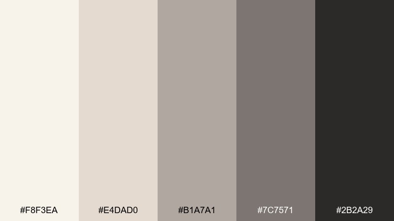
HEX: #F8F3EA #E4DAD0 #B1A7A1 #7C7571 #2B2A29
Mood: neutral, polished, versatile
Best for: client proposals and clean document templates
Soft parchment and pewter grays create a professional calm that still feels warm and approachable. Use the light tones for generous margins and content areas, then lean on pewter for tables, dividers, and subtle charts. It is excellent for proposals, pitch decks, and printable templates where clarity matters. Tip: keep the darkest shade for titles only, so the page never looks heavy.
Image example of pewter & parchment generated using media.io

19) Cranberry Quilt
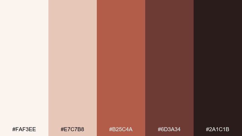
HEX: #FAF3EE #E7C7B8 #B25C4A #6D3A34 #2A1C1B
Mood: homey, bold, nostalgic
Best for: holiday cards and handmade product branding
Cranberry reds and cozy browns feel like a quilt folded at the foot of the bed and a mug warming your hands. Use the blush-cream as the backdrop, then add cranberry as a confident accent for stamps, seals, and headings. This farmhouse color palette is great for holiday cards, handmade goods, and small-batch labels that want personality. Tip: balance red areas with plenty of cream space so the design stays modern.
Image example of cranberry quilt generated using media.io

20) Winter Pine
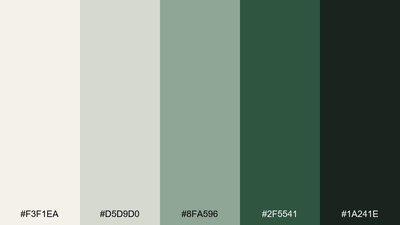
HEX: #F3F1EA #D5D9D0 #8FA596 #2F5541 #1A241E
Mood: crisp, woodsy, calm
Best for: seasonal packaging for candles and soaps
Evergreen and frosted neutrals bring the quiet of a winter walk and pine boughs on a mantle. Let the pale gray-white carry the label base, then use deep pine for brand marks and ingredient lists. As a farmhouse color palette, it feels especially fitting for candles, soaps, and cozy winter collections. Tip: add small evergreen icons in the mid green so the darkest shade can stay reserved for text.
Image example of winter pine generated using media.io

21) Buttercream & Brick
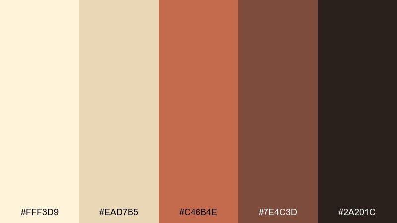
HEX: #FFF3D9 #EAD7B5 #C46B4E #7E4C3D #2A201C
Mood: sunny, rustic, inviting
Best for: bakery branding and storefront signage
Buttercream yellows with warm brick tones feel like a small-town bakery window and a fresh loaf cooling on the counter. Use the pale butter as your main field color, then apply brick as a bold accent for logos and signs. It is a friendly pairing for menus, price tags, and loyalty cards. Tip: keep the darkest brown for outlines so the warm midtones stay the stars.
Image example of buttercream & brick generated using media.io

22) Blueberry Jam Jar
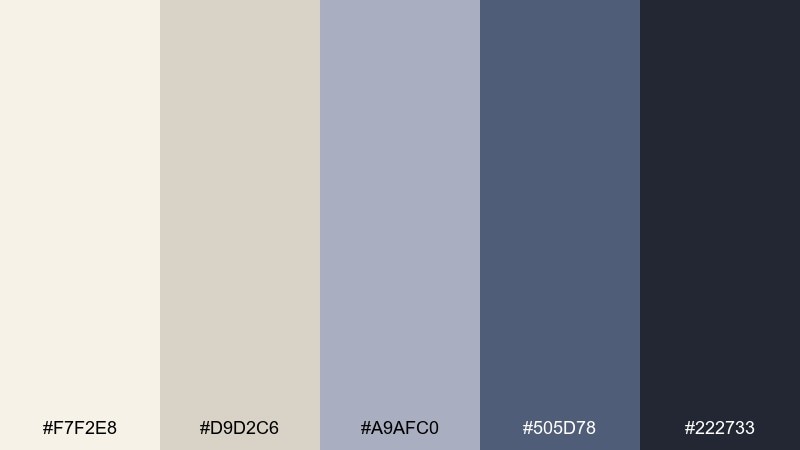
HEX: #F7F2E8 #D9D2C6 #A9AFC0 #505D78 #222733
Mood: comforting, classic, slightly cool
Best for: jam label design and farmers market product ads
Dusty blueberry blues with creamy neutrals feel like a jam jar on a gingham cloth and a handwritten tag. These farmhouse color combinations give you a sturdy, trustworthy look that still feels homemade. Use the deep blue for the label name and the pale cream for nutrition or ingredients panels. Tip: add a thin border in the mid blue-gray to tie the label together without making it busy.
Image example of blueberry jam jar generated using media.io

23) Chalkboard Market
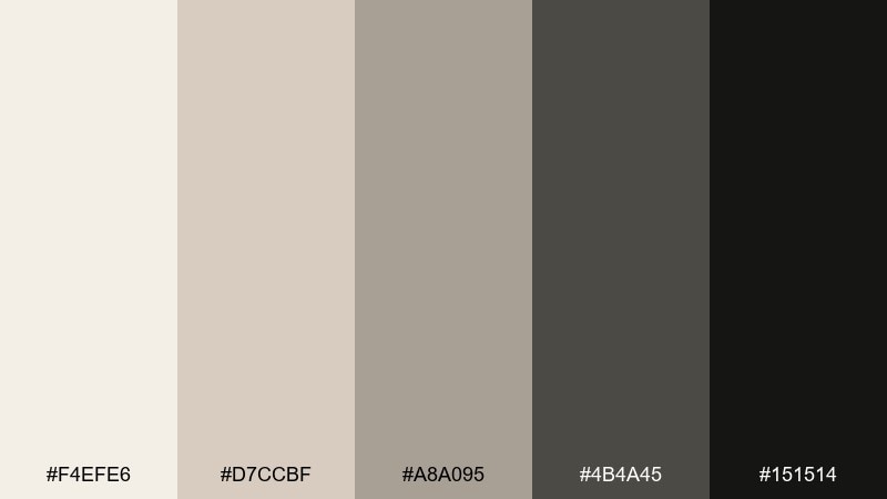
HEX: #F4EFE6 #D7CCBF #A8A095 #4B4A45 #151514
Mood: bold, artisanal, high-contrast
Best for: farmers market posters and chalkboard-style menus
Creamy paper tones and chalky charcoals evoke a market sign written by hand and smudged just enough to feel real. Keep the light cream for negative space, then use charcoal for big headlines and icon-style illustrations. It is ideal for posters, menus, and quick promos that need instant readability. Tip: use the mid gray for secondary info so your main headline can stay punchy.
Image example of chalkboard market generated using media.io

What Colors Go Well with Farmhouse?
Farmhouse style pairs best with warm whites, creamy beiges, and soft greiges—these shades keep rooms and designs bright while still feeling relaxed and natural.
For accent colors, lean into muted greens (sage, eucalyptus, olive-gray), weathered blues (denim, slate), and warm browns (oak, mocha, terracotta) to add “lived-in” depth.
For contrast, use small amounts of charcoal or near-black (often in hardware, borders, and typography) to sharpen edges without making the palette feel harsh.
How to Use a Farmhouse Color Palette in Real Designs
Start with a light neutral base (cream or parchment) across the largest surfaces: walls, backgrounds, or primary UI panels. This creates the airy farmhouse foundation.
Next, add midtones that mimic materials—wood tan, stone greige, dusty blue, or sage green—for secondary areas like cabinets, cards, headers, or textiles.
Finish with one deep anchor (charcoal, cocoa, pine) for legibility and structure: use it for headlines, outlines, icons, and small high-impact details.
Create Farmhouse Palette Visuals with AI
If you want to preview a farmhouse color scheme before committing to paint, packaging, or a UI theme, generate quick moodboards and mockups with AI.
Use your chosen HEX set as “dominant tones” and specify textures like linen, oak, stone, and matte black hardware to make the results feel authentically farmhouse.
Media.io Text to Image makes it easy to iterate: try the same palette on a living room board, a label mockup, and a website hero—then compare what reads best.
Farmhouse Color Palette FAQs
-
What is a farmhouse color palette?
A farmhouse color palette typically uses warm whites, soft beiges/greiges, weathered wood browns, and muted accents like sage green, denim blue, or charcoal for contrast. -
What are the best farmhouse paint colors for walls?
Creamy off-whites and light greiges are the most reliable farmhouse wall colors because they brighten a space while keeping it warm (avoid icy blue whites if you want a classic farmhouse feel). -
How do I make a modern farmhouse palette look less “gray”?
Shift your neutrals warmer (cream, oatmeal, putty) and add natural accents like oak, terracotta, or muted green; keep charcoal only for small, intentional contrast. -
Do farmhouse color palettes work for branding and packaging?
Yes—farmhouse colors communicate trust, simplicity, and handcrafted quality. Use a light neutral base for “clean,” then a deep ink/charcoal for legible typography and a single earthy accent for personality. -
What accent colors match cream and beige farmhouse schemes?
Sage/eucalyptus green, weathered denim blue, brass/gold tones, and deep cocoa/charcoal all pair well—choose one accent family and repeat it in a few small places for cohesion. -
Can I use farmhouse colors in UI design?
Absolutely. Use near-white and light greige for backgrounds, mid grays for cards/dividers, and a dark charcoal for text and buttons to keep contrast and accessibility strong. -
How can I generate farmhouse palette mockups quickly?
Use Media.io Text to Image with prompts that mention your HEX colors plus material cues (linen, oak, stone, matte black). Generate multiple layouts (room board, label, hero header) to compare outcomes fast.
Next: Hygge Color Palette


