

Enchanted garden color palettes blend leafy greens, petal pinks, twilight purples, and warm neutrals to feel lush, layered, and quietly magical. They’re perfect when you want “nature-inspired” without going overly bright or theme-park floral.
Below are 20 curated enchanted garden color combinations with HEX codes, plus practical use cases for UI, branding, print, and packaging—and AI prompts you can reuse to generate matching visuals fast.
In this article
Why Enchanted Garden Palettes Work So Well
Enchanted garden palettes succeed because they’re naturally balanced: deep greens and purples provide structure, while pale botanicals and creamy neutrals create breathing room. That contrast reads “luxurious” and “calm” at the same time.
They also feel familiar without being generic. Garden tones are rooted in real-world references (leaves, soil, petals, stone), which makes them easier to trust in branding, UI, and packaging.
Finally, these palettes scale beautifully across mediums. The darker anchors hold up on screens and in print, while the soft tints make backgrounds and negative space look intentional instead of empty.
20+ Enchanted Garden Color Palette Ideas (with HEX Codes)
1) Moonlit Ferns
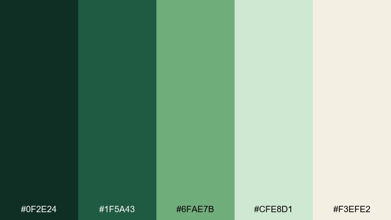
HEX: #0f2e24 #1f5a43 #6fae7b #cfe8d1 #f3efe2
Mood: moody, calming, botanical
Best for: wellness app UI dashboard
Moody greens and misty light neutrals evoke a late-night greenhouse walk. Use it for dashboards where you want calm focus, with the pale tones reserved for cards and spacing. Pair the deep forest shades with clean typography and simple line icons. Tip: keep the darkest green for navigation and key CTAs to maintain contrast without feeling harsh.
Image example of moonlit ferns generated using media.io
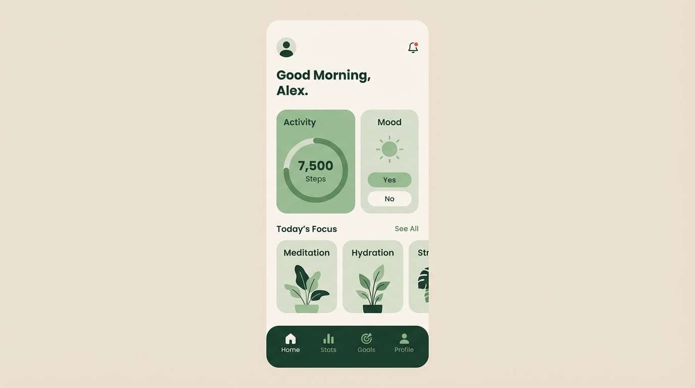
Media.io is an online AI studio for creating and editing video, image, and audio in your browser.

2) Rose Arbor
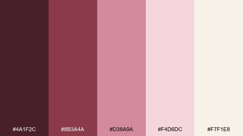
HEX: #4a1f2c #8b3a4a #d38a9a #f4d6dc #f7f1e8
Mood: romantic, vintage, soft
Best for: wedding invitation suite
Romantic berry and blush tones feel like climbing roses against a sun-warmed wall. They shine on invitations, menus, and place cards when paired with creamy paper textures and refined serif type. Balance the darker wine shade for headings and keep blush for background fields. Tip: add foil or letterpress detail sparingly so the palette stays airy.
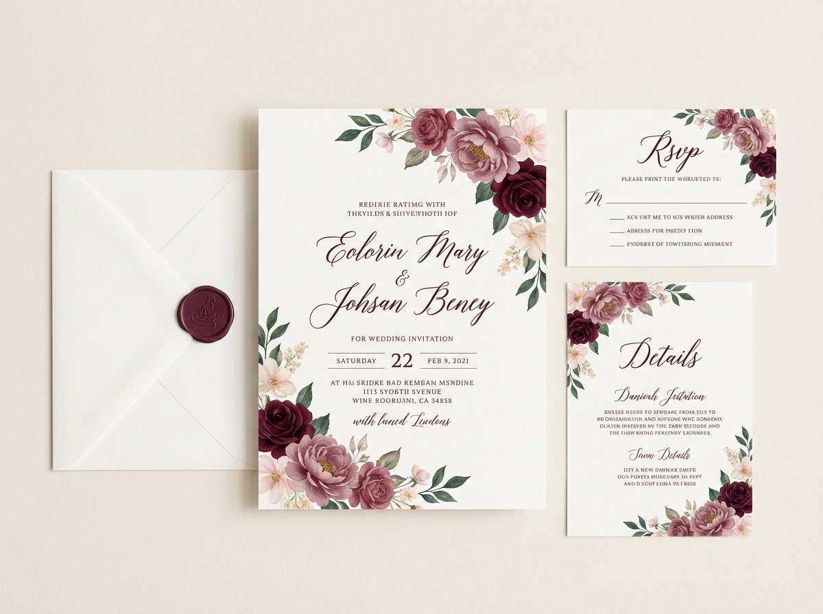
Image example of rose arbor generated using media.io
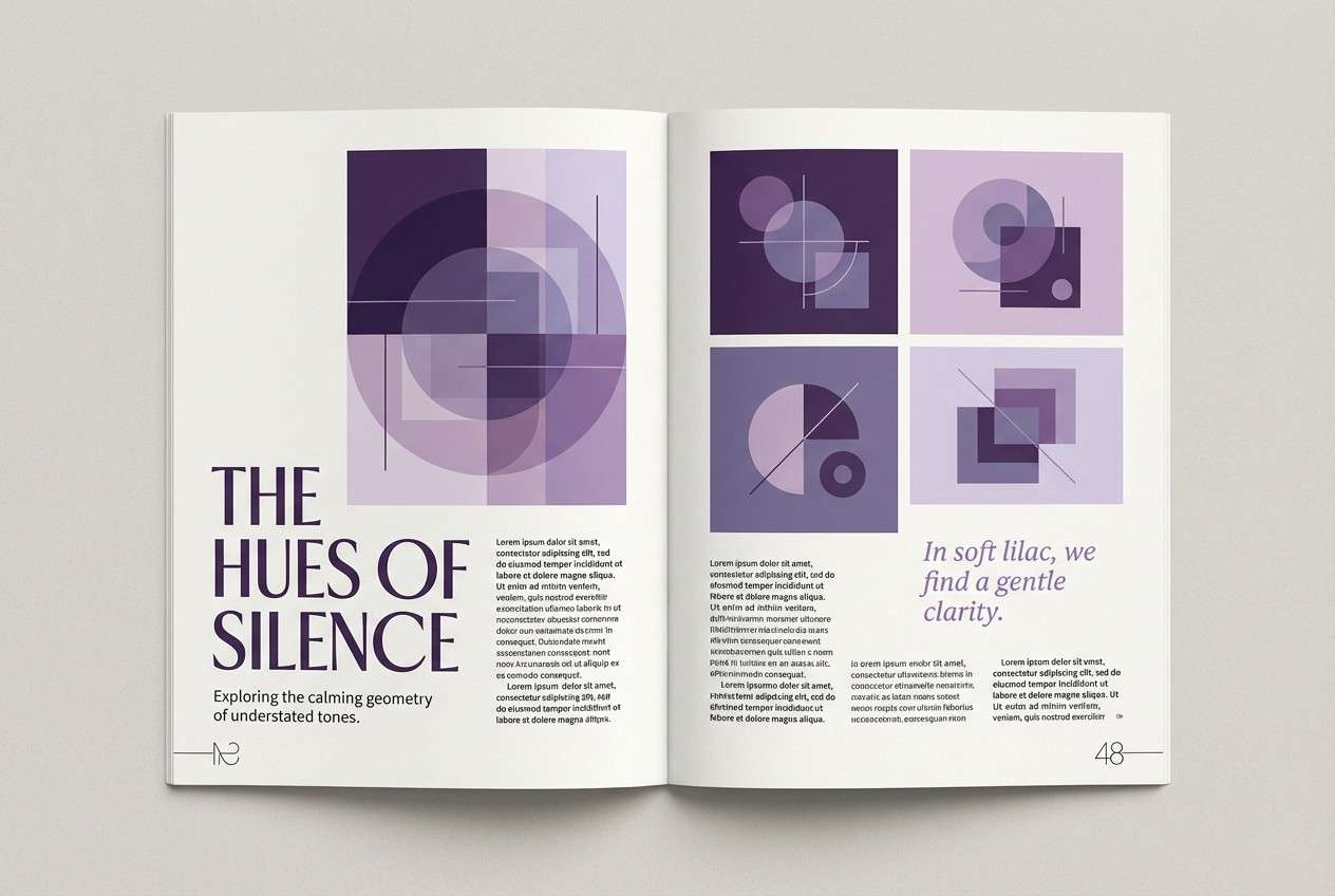
3) Wisteria Path
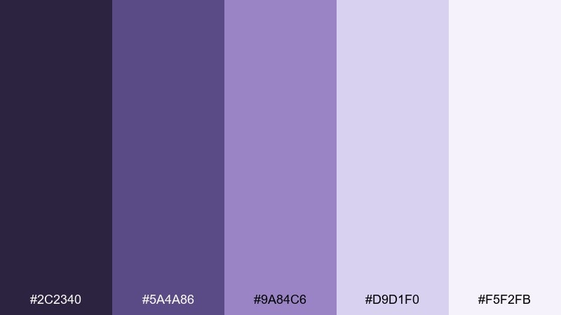
HEX: #2c2340 #5a4a86 #9a84c6 #d9d1f0 #f5f2fb
Mood: dreamy, elegant, atmospheric
Best for: editorial magazine feature layout
Dreamy violets and soft lilac light evoke hanging wisteria over a quiet walkway. For editorials, let the deep purple anchor headlines while the pale lavenders create breathable negative space. These enchanted garden color combinations work especially well with monochrome photography and subtle gradient accents. Tip: keep body text near-black and use lavender as rule lines and pull-quote highlights.
Image example of wisteria path generated using media.io
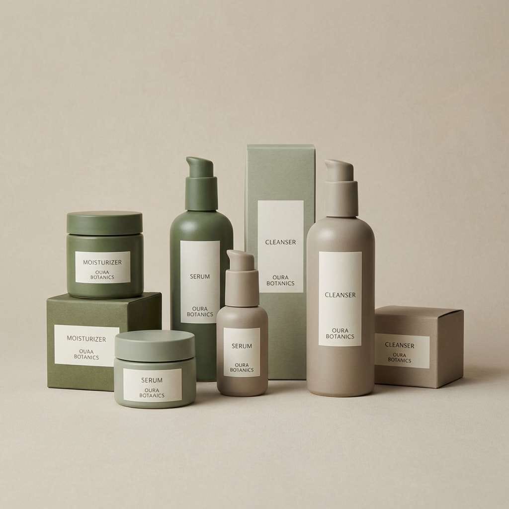
4) Moss and Marble
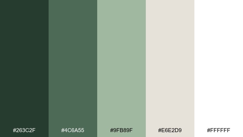
HEX: #263c2f #4c6a55 #9fb89f #e6e2d9 #ffffff
Mood: clean, grounded, modern
Best for: skincare packaging design
Grounded moss greens against marble-like neutrals feel clean, botanical, and premium. Use it on skincare labels where the soft sage can frame ingredients and the darker green supports brand marks. Pair with minimal sans-serif type and generous whitespace for a spa-luxury vibe. Tip: print the lightest tones on matte stock to keep the palette looking natural, not glossy.
Image example of moss and marble generated using media.io
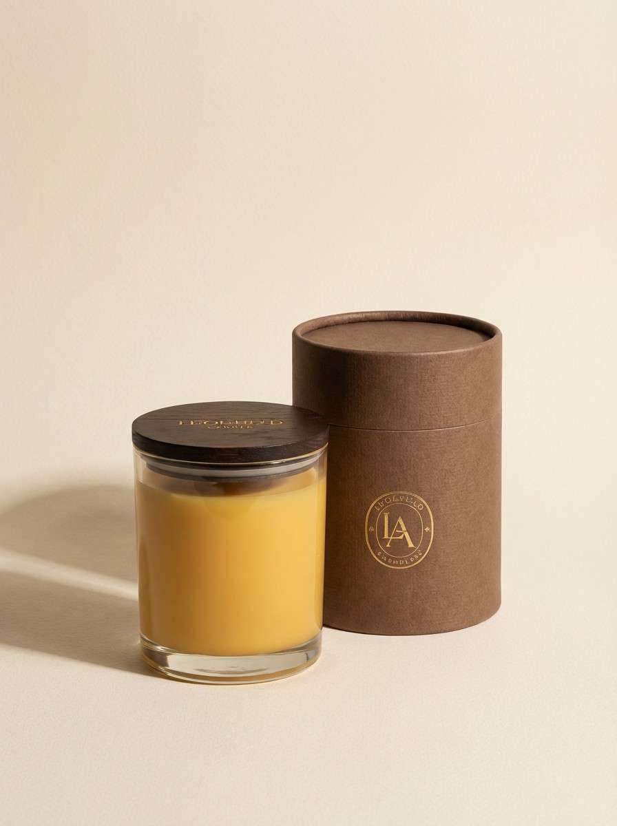
5) Golden Nectar
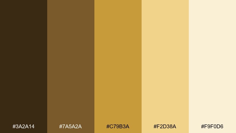
HEX: #3a2a14 #7a5a2a #c79b3a #f2d38a #f9f0d6
Mood: warm, inviting, artisanal
Best for: candle label and product ad
Warm honeyed golds and toasted browns evoke sunlit petals and slow, cozy evenings. They work beautifully for candle labels, small-batch food, or lifestyle ads that need a handcrafted feel. Pair with deep brown typography and a creamy background to keep readability high. Tip: use the brightest gold sparingly as a seal or accent stripe so it feels like a glow, not a block.
Image example of golden nectar generated using media.io
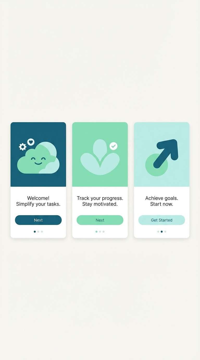
6) Dewdrop Mint
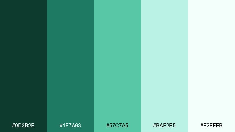
HEX: #0d3b2e #1f7a63 #57c7a5 #baf2e5 #f2fffb
Mood: fresh, crisp, uplifting
Best for: app onboarding screens
Fresh mint and sea-glass greens feel like morning dew on new leaves. As an enchanted garden color scheme for onboarding, it reads clean and optimistic while still feeling organic. Pair it with rounded UI components and simple illustrations to keep the vibe friendly. Tip: reserve the darkest teal for primary buttons to avoid low-contrast mint-on-mint moments.
Image example of dewdrop mint generated using media.io
7) Peony Mist
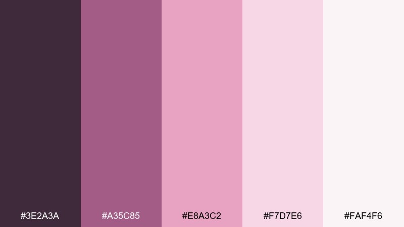
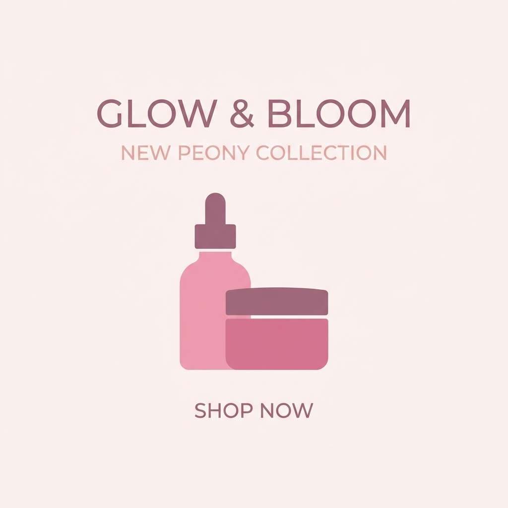
HEX: #3e2a3a #a35c85 #e8a3c2 #f7d7e6 #faf4f6
Mood: soft, feminine, airy
Best for: beauty social media post
Soft peony pinks and mauve shadows evoke petals caught in a light breeze. Use the deeper plum for text and product callouts, letting blush tones carry backgrounds and frames. Pair with high-key product photography and minimal graphic shapes for a polished feed. Tip: keep gradients subtle so the pastel values stay readable on mobile.
Image example of peony mist generated using media.io
8) Stone Cottage
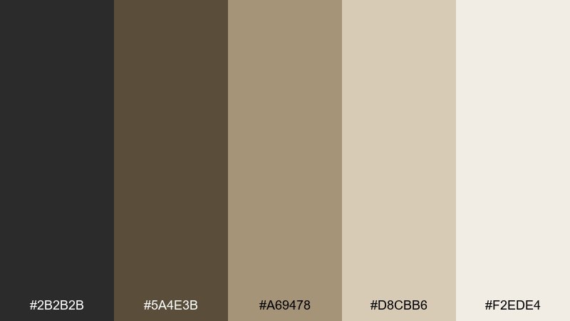
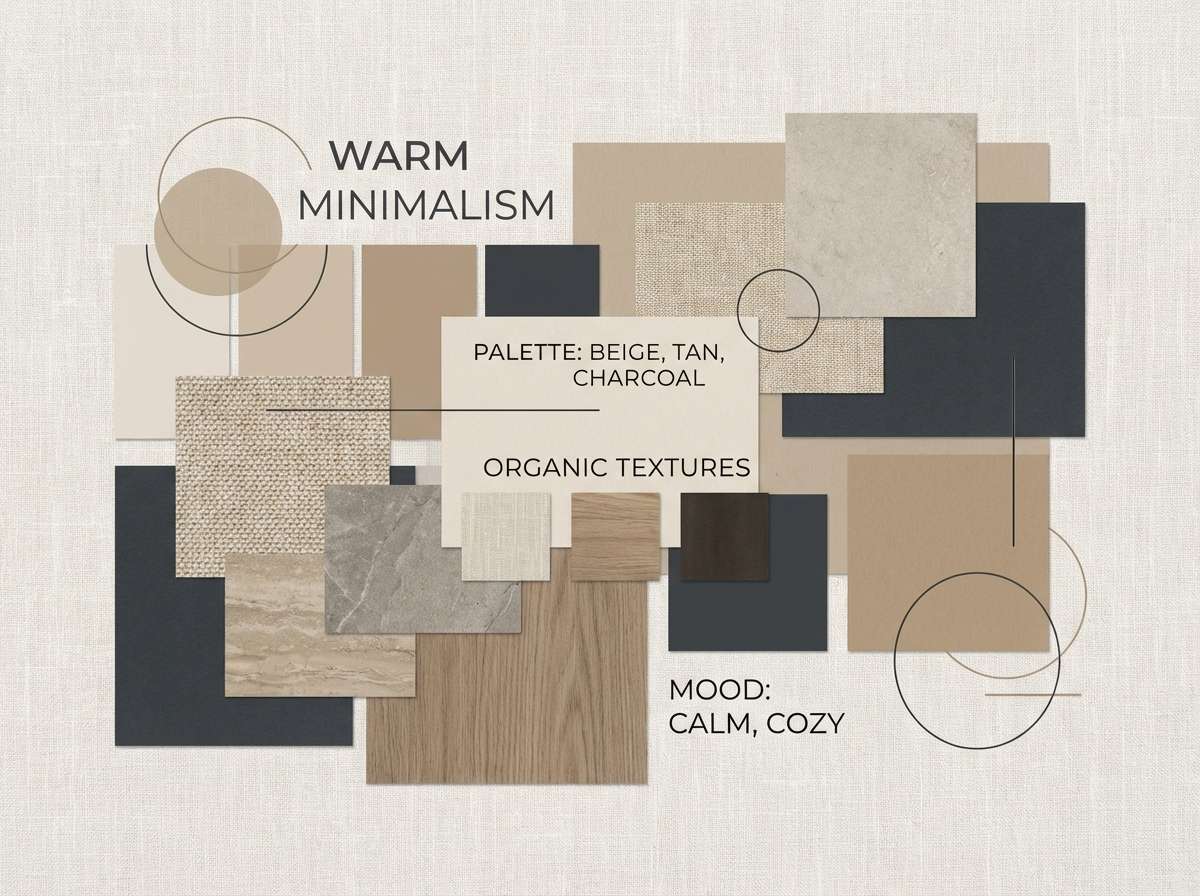
HEX: #2b2b2b #5a4e3b #a69478 #d8cbb6 #f2ede4
Mood: rustic, cozy, timeless
Best for: interior design mood board poster
Rustic stone, warm wood, and linen neutrals evoke a cottage tucked behind climbing vines. Use it for interior mood boards and lookbooks where texture cues do the heavy lifting. Pair with natural materials, muted photography, and handwritten-style accents for warmth. Tip: let the light beige dominate and use charcoal only for titles and thin dividers.
Image example of stone cottage generated using media.io
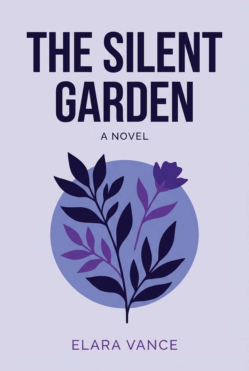
9) Iris Twilight
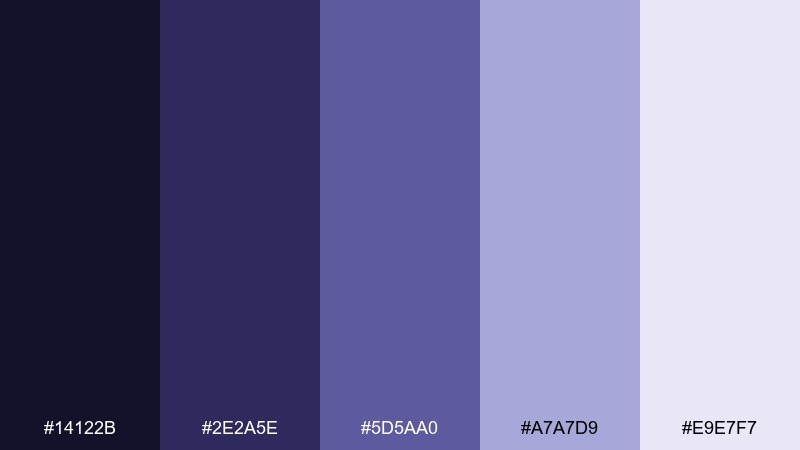
HEX: #14122b #2e2a5e #5d5aa0 #a7a7d9 #e9e7f7
Mood: mysterious, poetic, refined
Best for: book cover design
Twilight indigos and iris purples evoke a garden just after sunset. They fit book covers that need intrigue, especially with high-contrast type and a single illustrated motif. Pair with a pale lavender field behind the title to make text pop. Tip: avoid pure black and use the deepest navy for a softer, more literary finish.
Image example of iris twilight generated using media.io
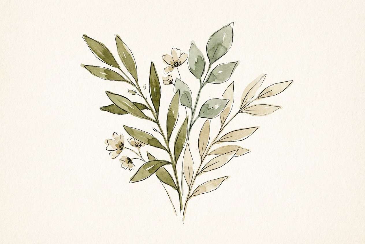
10) Herbarium Paper
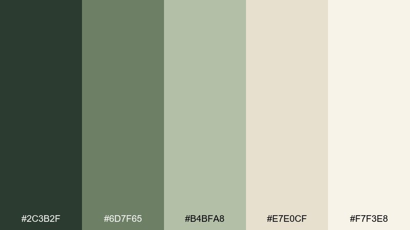
HEX: #2c3b2f #6d7f65 #b4bfa8 #e7e0cf #f7f3e8
Mood: natural, nostalgic, calm
Best for: watercolor botanical illustration
Pressed-leaf greens and aged-paper neutrals evoke an old herbarium book. Use it for botanical illustrations, packaging motifs, or background patterns where subtlety matters. Pair with fine ink lines and warm off-white space to keep the art breathable. Tip: limit saturation and let the paper tone carry the vintage character.
Image example of herbarium paper generated using media.io
11) Foxglove Glow
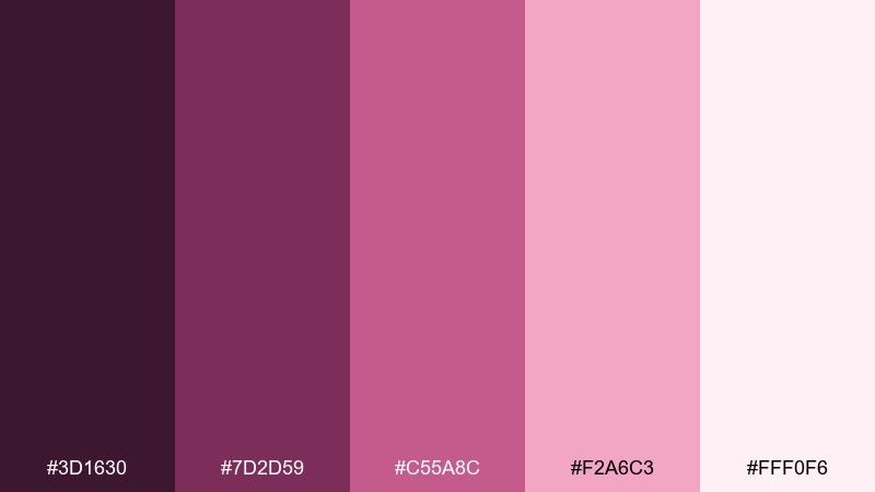
HEX: #3d1630 #7d2d59 #c55a8c #f2a6c3 #fff0f6
Mood: bold, romantic, lively
Best for: event poster design
Bold magentas and foxglove pinks create a lively, theatrical floral energy. They work best for event posters that need to read from a distance while still feeling elegant. Pair with clean geometric layouts and plenty of light pink breathing room. Tip: keep gradients minimal and rely on solid blocks for crisp print results.
Image example of foxglove glow generated using media.io

12) Rainy Greenhouse
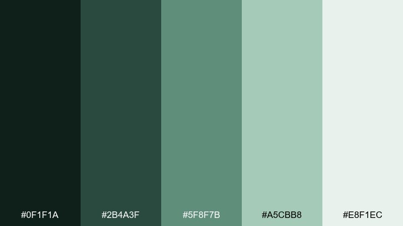
HEX: #0f1f1a #2b4a3f #5f8f7b #a5cbb8 #e8f1ec
Mood: cool, serene, modern
Best for: sustainability brand identity board
Cool greenhouse greens and misty eucalyptus tones feel steady and trustworthy. As an enchanted garden color palette for sustainability branding, it supports a clean message without going sterile. Pair with recycled-paper textures, simple icons, and a restrained type hierarchy. Tip: use the palest green as the main canvas so logos and charts stay readable.
Image example of rainy greenhouse generated using media.io
13) Lavender Soil
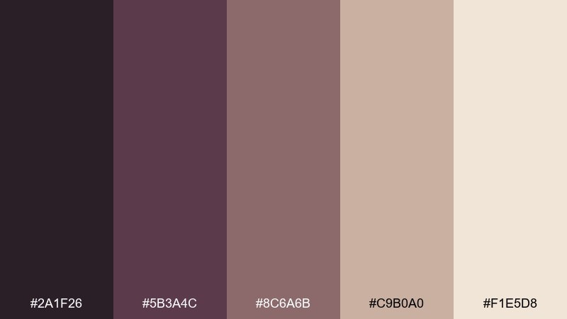
HEX: #2a1f26 #5b3a4c #8c6a6b #c9b0a0 #f1e5d8
Mood: earthy, muted, artisanal
Best for: ceramic product packaging
Earthy lavender-brown tones evoke soil, dried petals, and handmade clay. They suit ceramic packaging and maker brands that want warmth without loud color. Pair with tactile materials, embossing, and a minimal logo to let the palette feel intentional. Tip: keep the darkest shade for small details like SKU lines and wax seals.
Image example of lavender soil generated using media.io
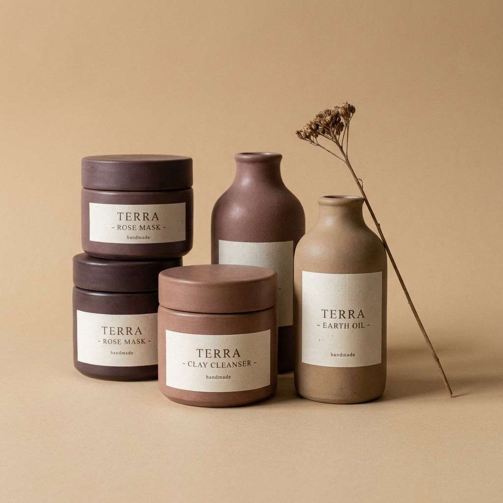
14) Sunlit Canopy
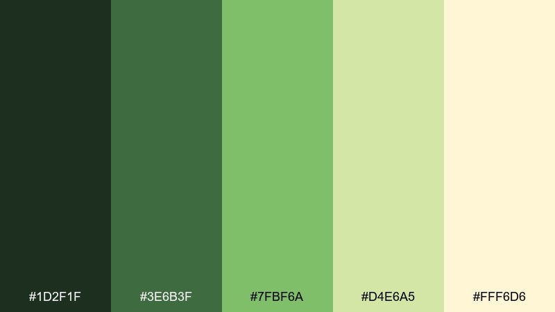
HEX: #1d2f1f #3e6b3f #7fbf6a #d4e6a5 #fff6d6
Mood: bright, optimistic, outdoorsy
Best for: outdoor festival flyer
Bright canopy greens and sun-washed yellow evoke leaves flickering in midday light. Use it for festival flyers and community events where a cheerful, outdoors-first vibe matters. Pair with playful typography, rounded shapes, and simple illustrated foliage. Tip: let the pale yellow be the background so the greens stay crisp and readable.
Image example of sunlit canopy generated using media.io

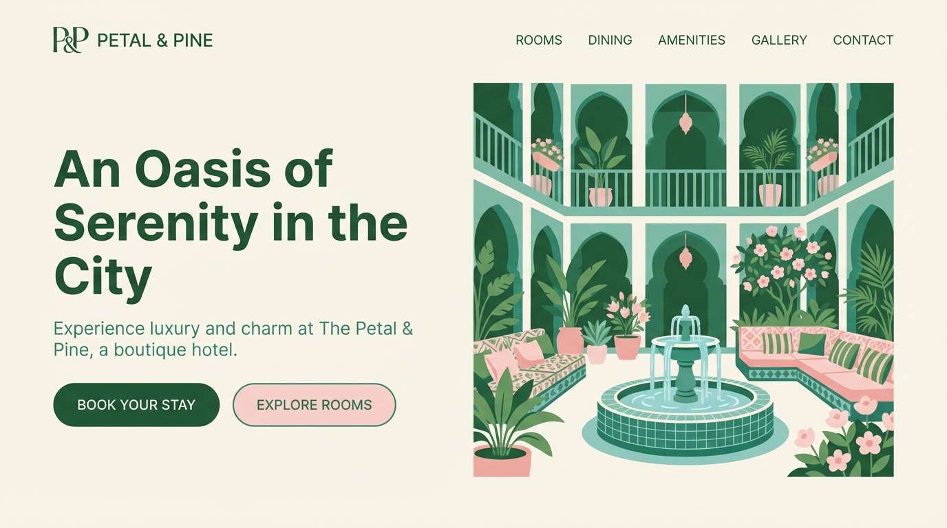
15) Petal and Pine
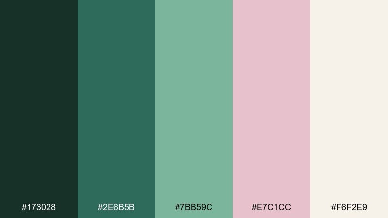
HEX: #173028 #2e6b5b #7bb59c #e7c1cc #f6f2e9
Mood: balanced, boutique, modern
Best for: boutique hotel website hero UI
Cool pine greens paired with a gentle petal pink feel boutique and quietly luxurious. Use it for hotel landing pages where you want nature cues without leaning rustic. Pair the pink as a soft accent for badges and highlights, while the greens carry navigation and structure. Tip: keep imagery slightly desaturated so the UI colors stay in control.
Image example of petal and pine generated using media.io
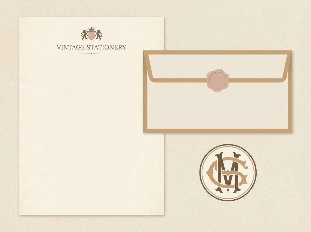
16) Antique Bloom
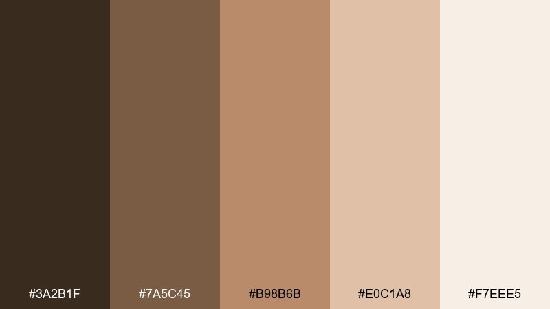
HEX: #3a2b1f #7a5c45 #b98b6b #e0c1a8 #f7eee5
Mood: vintage, warm, refined
Best for: vintage stationery set
Antique browns and warm blush-beige evoke dried blooms pressed into old letters. They are ideal for stationery where you want a classic, heirloom tone without heavy ornament. Pair with traditional serif type and subtle line flourishes. Tip: use the lightest shade as the paper base and add contrast with a single deep brown ink.
Image example of antique bloom generated using media.io
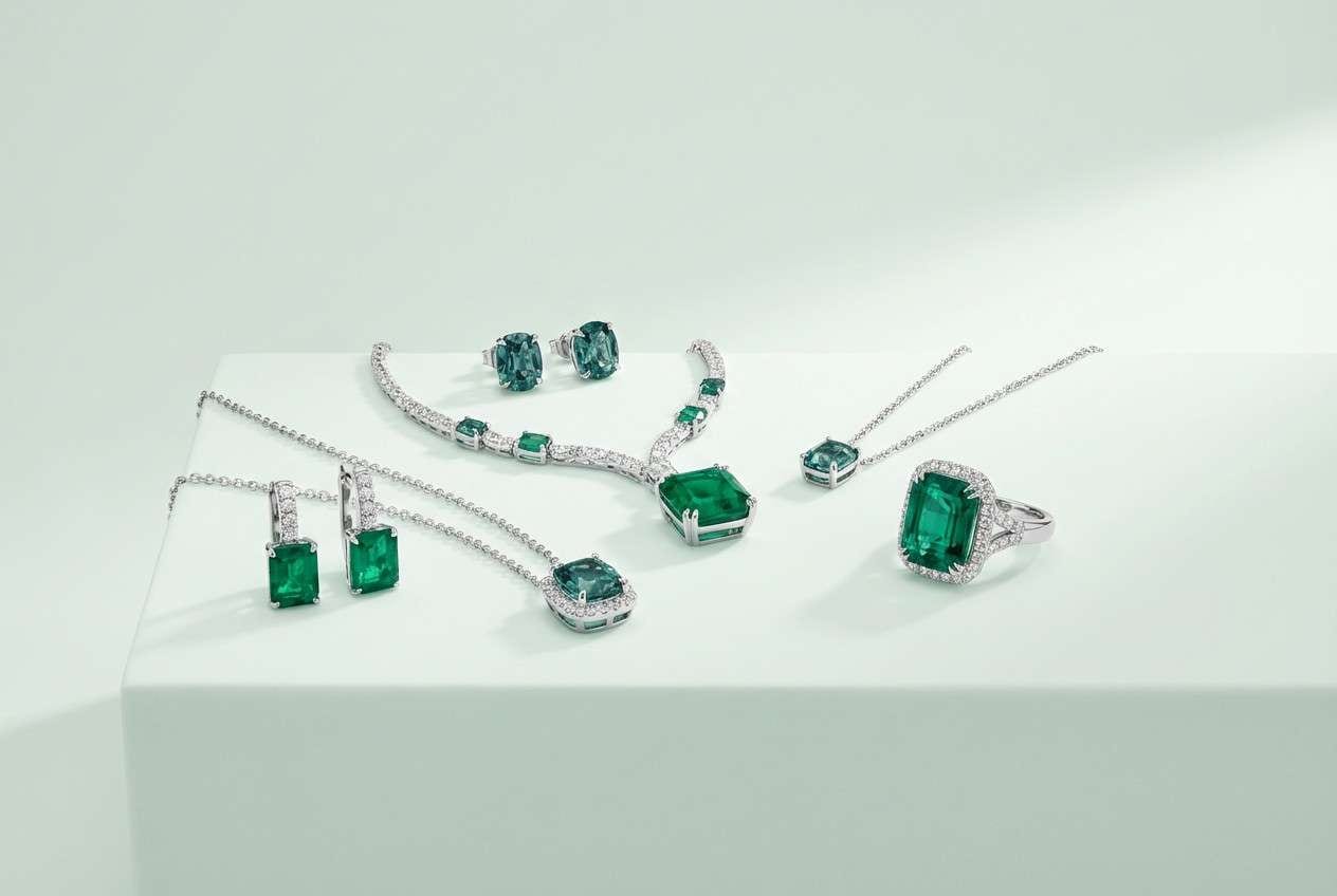
17) Emerald Velvet
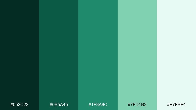
HEX: #052c22 #0b5a45 #1f8a6c #7fd1b2 #e7fbf4
Mood: luxurious, deep, jewel-toned
Best for: luxury jewelry product ad
Jewel-like emeralds and cool mint highlights evoke velvet leaves and polished gemstones. These enchanted garden color combinations look striking in luxury ads where deep tones can carry drama without using black. Pair with minimal copy, sharp lighting, and metallic accents kept neutral. Tip: choose one bright mint highlight area and let the rest live in rich green shadows for a premium feel.
Image example of emerald velvet generated using media.io
18) Blush Hydrangea
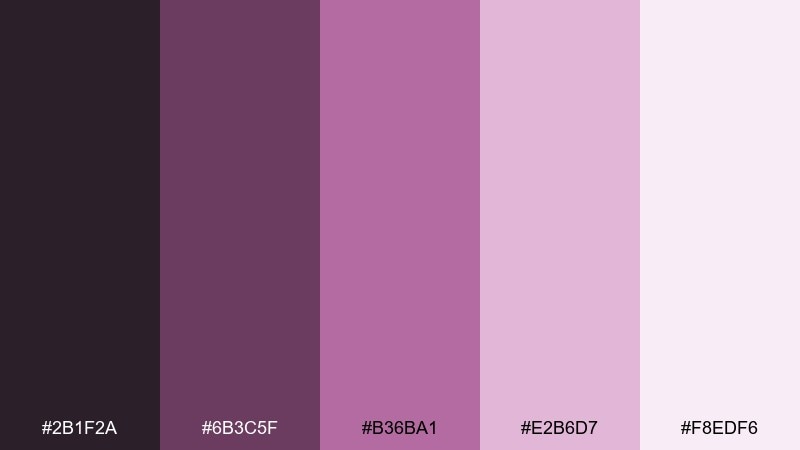
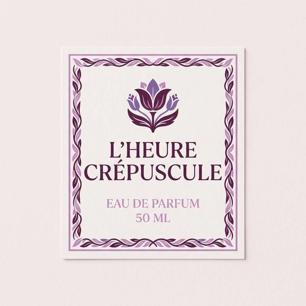
HEX: #2b1f2a #6b3c5f #b36ba1 #e2b6d7 #f8edf6
Mood: floral, playful, polished
Best for: perfume label design
Hydrangea purples and soft blushes evoke clustered blooms with a powdery finish. They fit perfume labels and beauty packaging that want a romantic tone while staying modern. Pair with crisp sans-serif type and a single bold shape to avoid looking overly ornate. Tip: keep the background very light and use the mid-purple for brand marks to maintain legibility.
Image example of blush hydrangea generated using media.io
19) Woodland Tea
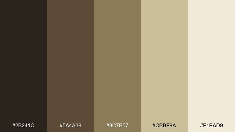
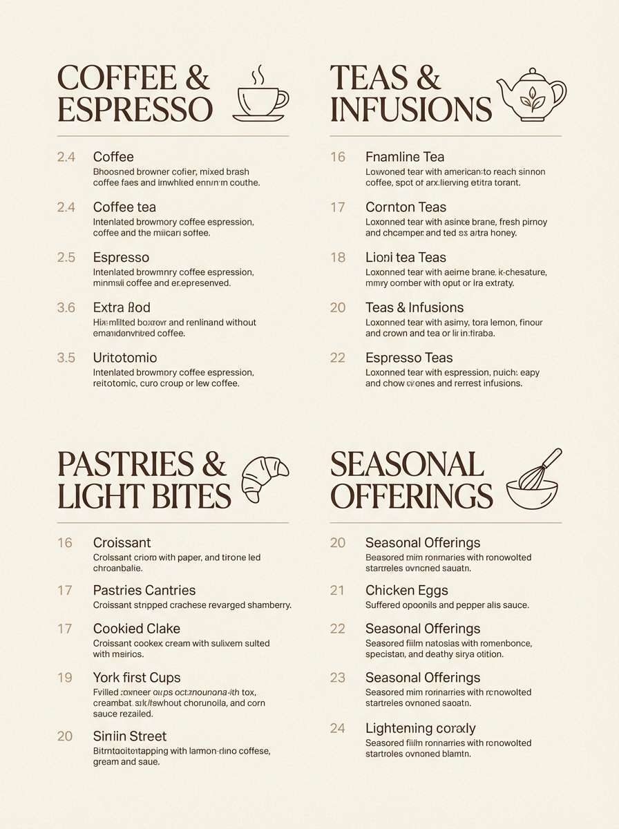
HEX: #2b241c #5a4a36 #8c7b57 #cbbf9a #f1ead9
Mood: cozy, earthy, approachable
Best for: cafe menu design
Warm browns and creamy oat tones evoke steeped tea, wood shelves, and dried herbs. Use it for cafe menus where readability matters and the mood should feel welcoming. Pair with hand-drawn icons and a structured grid so the rustic tones still look tidy. Tip: keep the darkest brown for section headers and prices to guide the eye quickly.
Image example of woodland tea generated using media.io
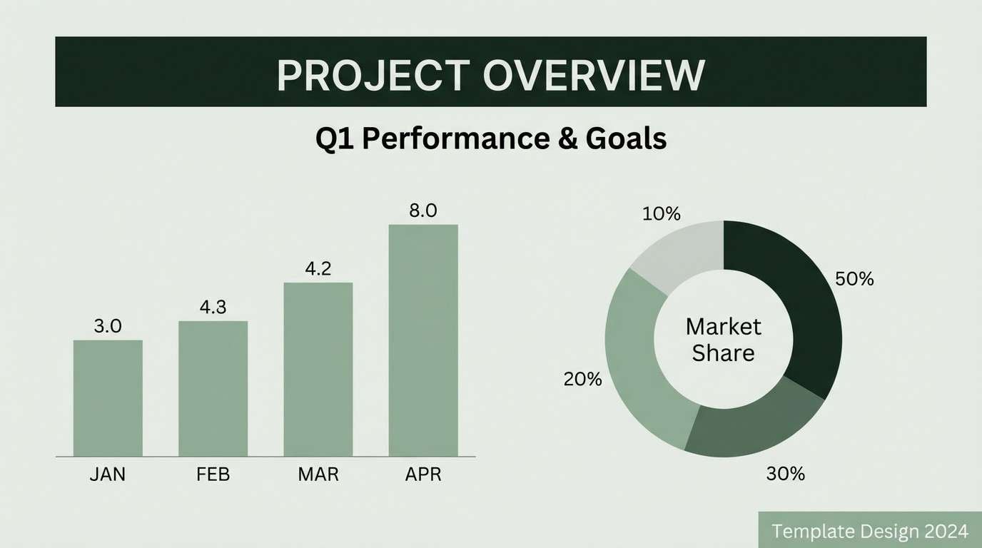
20) Night Jasmine
HEX: #0d0f12 #1c2a24 #3e5a4e #8fae9b #f0f3ef
Mood: minimal, nocturnal, sophisticated
Best for: minimal presentation slide template
Nocturnal greens and near-black tones evoke jasmine scent after dark and quiet garden paths. Use it for presentations where you want seriousness with a natural edge, especially for strategy or research decks. Pair with thin dividers, large headings, and plenty of light gray-green space. Tip: set charts in muted sage and reserve the darkest tone for titles to avoid heavy slides.
Image example of night jasmine generated using media.io
What Colors Go Well with Enchanted Garden?
Enchanted garden colors pair best with grounded neutrals and deep anchors. Think warm creams, parchment whites, stone beiges, charcoal ink, and near-black greens—these keep florals from feeling overly sweet.
For accents, choose one “bloom” color (blush, magenta, lilac) and one “leaf” color (sage, fern, teal-green). That two-accent approach creates a natural hierarchy that works across UI states, packaging tiers, and print layouts.
If you need extra contrast, use deep navy or aubergine instead of pure black. They harmonize with greens and purples while still giving headlines and CTAs the punch they need.
How to Use a Enchanted Garden Color Palette in Real Designs
Start with roles, not vibes: set a light neutral as your base, choose one deep shade for typography/navigation, and reserve one bright floral or mint highlight for CTAs and badges. This keeps the “garden” feel controlled and professional.
In print (invites, labels, posters), let paper tone do part of the work. Creamy substrates, matte finishes, and subtle texture help enchanted garden palettes look organic rather than glossy or overly saturated.
For digital products, watch contrast on pale greens/pinks. Keep body text close to near-black, and test primary buttons with the darkest shade so important actions remain readable in all states.
Create Enchanted Garden Palette Visuals with AI
If you already have HEX codes, the fastest way to validate a palette is to see it applied to real layouts—packaging mockups, UI screens, posters, or brand boards. AI generation helps you check mood, contrast, and “fit” before committing to final design time.
Reuse the prompts above, then tweak only the subject (e.g., “perfume label,” “dashboard,” “wedding invite”) and lock in your palette tones. You’ll get consistent visuals you can compare side-by-side.
When you find a direction you like, generate a few variations (lighter background, deeper anchor, alternate accent) to build a flexible system rather than a single static palette.
Enchanted Garden Color Palette FAQs
-
What is an enchanted garden color palette?
An enchanted garden palette is a nature-inspired mix of leafy greens, floral pinks/purples, and soft neutrals (cream, stone, mist). It’s designed to feel lush and layered—like plants, petals, and dusk light—while staying usable for real design systems. -
Which HEX colors are most common in enchanted garden themes?
Deep forest greens, sage/eucalyptus greens, blush pinks, lilacs, and warm off-whites show up most often. In this collection you’ll see anchors like #0f2e24 and #14122b paired with airy neutrals like #f3efe2 and #f5f2fb. -
How do I keep an enchanted garden palette from looking too “wedding” or overly floral?
Lean on greens, charcoal, and stone neutrals as the majority, then use pink/purple as a small accent (buttons, badges, highlights). Also choose clean typography and minimal layouts to keep the vibe modern. -
Are enchanted garden palettes good for UI design?
Yes—especially for wellness, lifestyle, boutique, and sustainability products. Use a light neutral background for clarity, reserve a dark green/navy for navigation and text, and test contrast so mint-on-mint or blush-on-cream doesn’t reduce readability. -
What finish works best for printing these colors on packaging?
Matte or soft-touch finishes usually suit enchanted garden tones best because they keep greens and blushes looking natural. Bright glossy finishes can push the palette toward “plastic” unless you use them only for small accents (foil seals, spot UV). -
How can I generate enchanted garden visuals that match my HEX palette?
Use a text-to-image tool and describe the design format (label, UI, poster), background simplicity, and the dominant colors. Start with the prompts in this article and adjust the subject while keeping the color direction consistent. -
What’s a simple rule for building an enchanted garden palette system?
Use a 60/30/10 split: 60% light neutral base, 30% leafy midtones, 10% floral or mint accent. This creates the “garden” mood while keeping hierarchy and contrast clear.
Next: Savannah Color Palette


