

Duke blue is a deep, confident navy that instantly signals trust, tradition, and focus. It’s a versatile anchor color for everything from UI systems to print pieces and premium packaging.
Below are 20 curated duke blue color palette ideas (with HEX codes), plus practical tips for pairing and using them in real-world designs.
In this article
Why Duke Blue Palettes Work So Well
Duke blue sits in the “serious but flexible” zone: deep enough to feel authoritative, yet clean enough to work in modern digital interfaces. It’s a natural choice for brands that need credibility without looking overly formal.
As a base color, duke blue creates strong contrast with light neutrals (ivory, cream, cool grays) and makes accent colors look sharper. This helps you build clear visual hierarchy in layouts, signage, and dashboards.
It also pairs beautifully with metallics and warm tones, making it ideal for premium finishes like foil, embossing, and high-end packaging where navy can replace black for a softer luxury look.
20+ Duke Blue Color Palette Ideas (with HEX Codes)
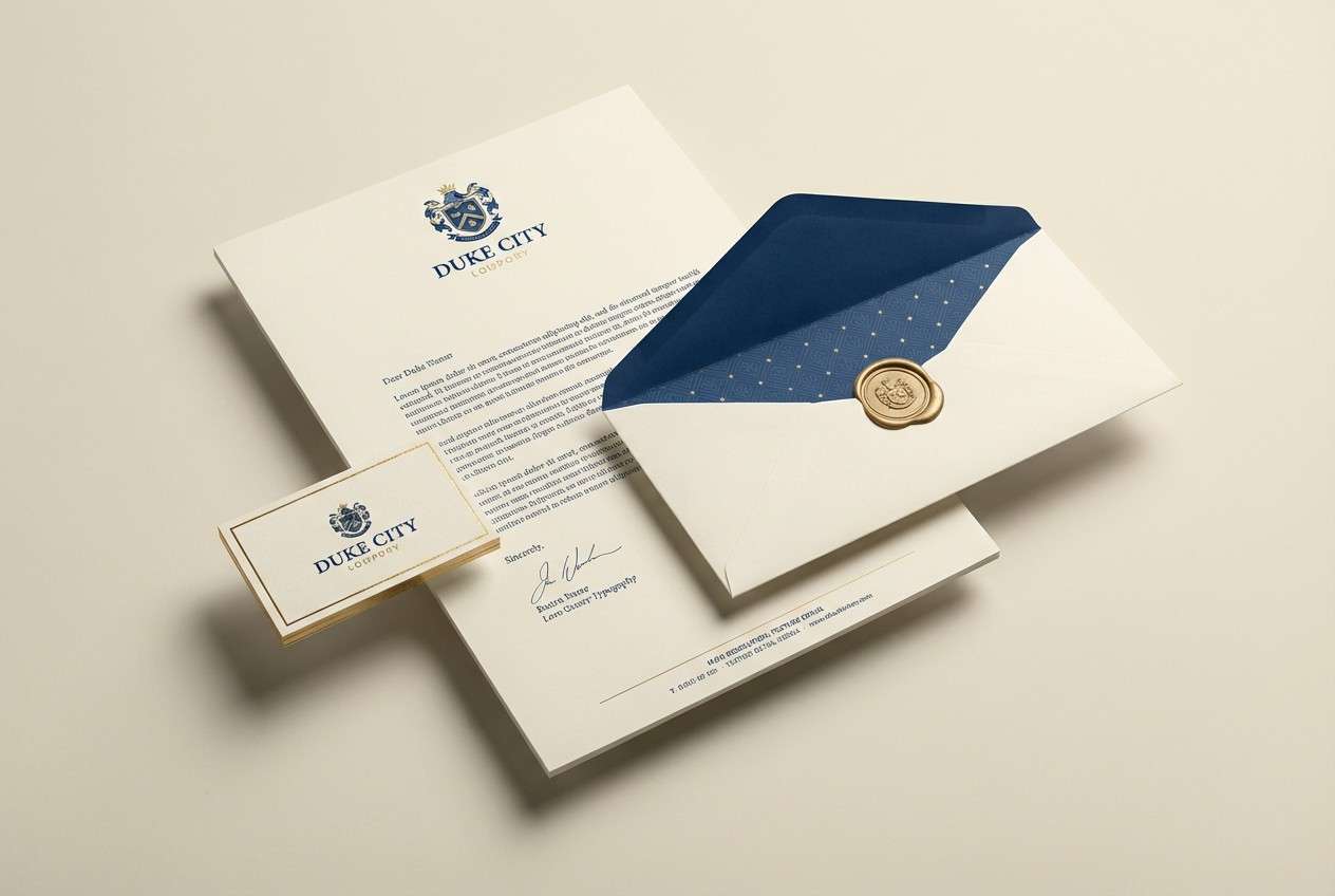
1) Campus Midnight
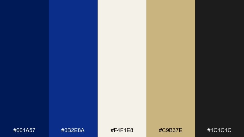
HEX: #001A57 #0B2E8A #F4F1E8 #C9B37E #1C1C1C
Mood: confident, collegiate, classic
Best for: brand identity and stationery for schools, teams, and clubs
Confident and collegiate, these tones feel like midnight stadium lights and crisp letterpress paper. The deep blue anchors the look while cream and antique gold add tradition and warmth. Use this duke blue color palette for logos, letterheads, and merch where you want instant credibility. Tip: keep gold as a thin accent line or foil detail so the navy stays dominant.
Image example of campus midnight generated using media.io
Media.io is an online AI studio for creating and editing video, image, and audio in your browser.

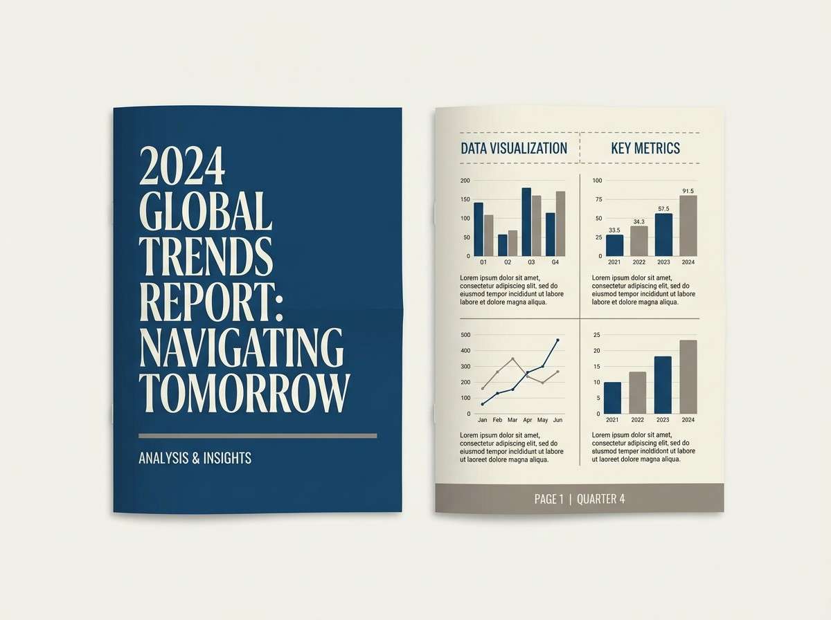
2) Ivory Letterhead
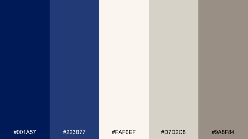
HEX: #001A57 #223B77 #FAF6EF #D7D2C8 #9A8F84
Mood: quiet, professional, refined
Best for: corporate reports, proposals, and long-form documents
Quiet and refined, this mix evokes crisp ivory paper, sharp ink, and a calm boardroom vibe. The blues read trustworthy without feeling loud, while the warm grays keep pages easy on the eyes. It works beautifully for reports, case studies, and document templates with lots of text. Tip: set headings in the darker blue and reserve the lighter neutrals for tables and dividers.
Image example of ivory letterhead generated using media.io
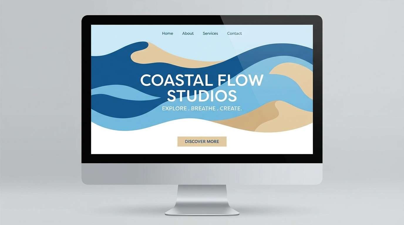
3) Coastal Alumni
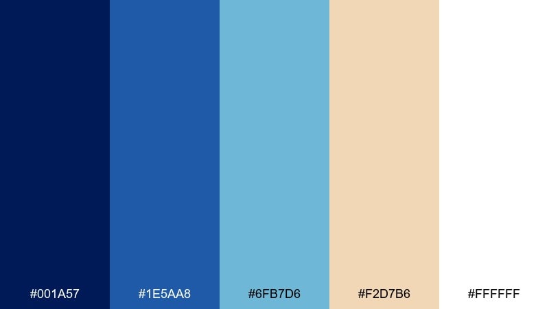
HEX: #001A57 #1E5AA8 #6FB7D6 #F2D7B6 #FFFFFF
Mood: fresh, airy, optimistic
Best for: event landing pages, summer promotions, and travel-style branding
Fresh and airy, these colors feel like sun on water and a clear horizon line. The deep blue keeps everything grounded, while sky and sand tones add a relaxed, welcoming lift. Use it for landing pages, banners, and campaigns that need trust plus a little escape. Tip: choose the lighter blue for big backgrounds and save the darkest shade for navigation and CTA text.
Image example of coastal alumni generated using media.io
4) Neon Scoreboard
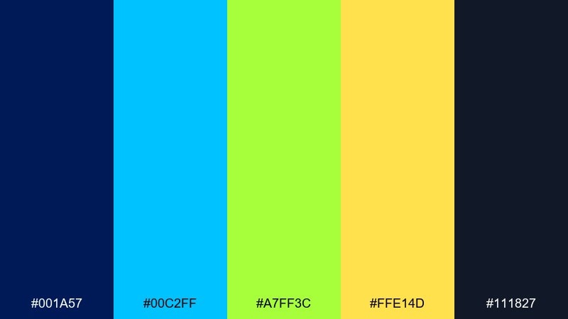
HEX: #001A57 #00C2FF #A7FF3C #FFE14D #111827
Mood: energetic, sporty, high-contrast
Best for: sports posters, esports graphics, and hype social ads
Energetic and punchy, this set looks like a lit scoreboard against a night sky. Bright cyan, lime, and yellow turn the navy into a stage for fast, modern graphics. These duke blue color combinations shine in posters, esports assets, and countdown promos. Tip: limit neon to one primary highlight color per layout to keep readability sharp.
Image example of neon scoreboard generated using media.io

5) Heritage Plaid
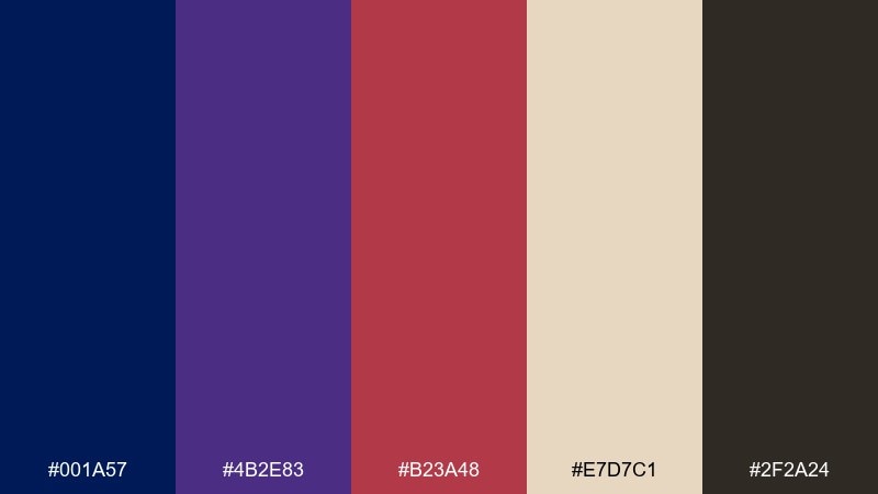
HEX: #001A57 #4B2E83 #B23A48 #E7D7C1 #2F2A24
Mood: heritage, cozy, academic
Best for: fall lookbooks, apparel tags, and classic retail branding
Heritage and cozy, these tones suggest worn leather, vintage scarves, and library stacks. The navy and plum create depth while burgundy and cream make it feel human and seasonal. It fits apparel branding, hang tags, and autumn campaigns with a classic mood. Tip: try a subtle plaid pattern using the cream as the breathing space between darker stripes.
Image example of heritage plaid generated using media.io
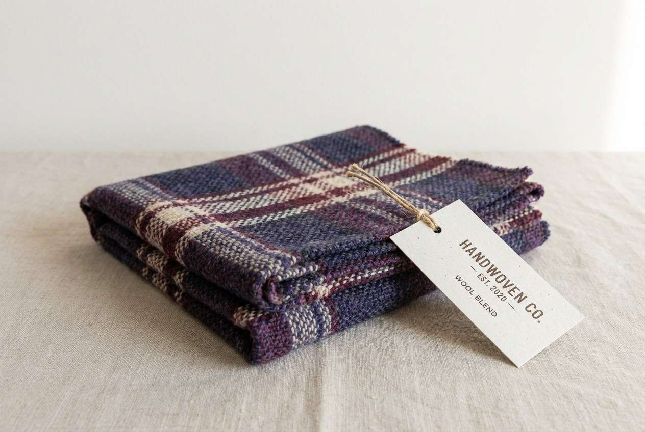
6) Gallery Marble
HEX: #001A57 #2D3E6E #E9E9E9 #B8C2CC #6B7280
Mood: minimal, cool, gallery-like
Best for: architecture portfolios and minimalist presentations
Minimal and cool, this palette feels like polished marble under soft museum lighting. The blues keep the layout structured, while layered grays add a clean, architectural calm. It works well for portfolio covers, slide decks, and layouts with lots of whitespace. Tip: use the mid-gray for captions and UI chrome so the darkest blue can lead the hierarchy.
Image example of gallery marble generated using media.io
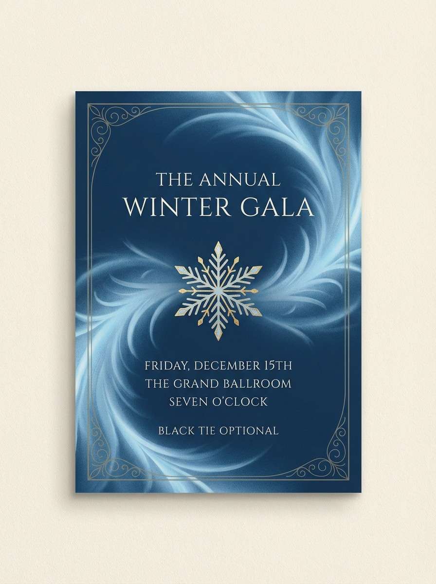
7) Winter Crest
HEX: #001A57 #264E9B #9CC7FF #E8F1FF #B7A57A
Mood: crisp, elegant, wintry
Best for: holiday cards, winter gala invitations, and formal events
Crisp and elegant, these blues look like fresh snow shadows and clear winter skies. Pale ice tones soften the dark base, and a muted gold adds just enough ceremony. The mix makes a polished duke blue color palette for invites, programs, and seasonal announcements. Tip: print on bright white stock and use the gold only for a crest, border, or monogram.
Image example of winter crest generated using media.io
8) Jazz Lounge
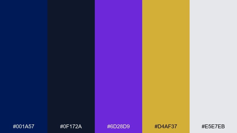
HEX: #001A57 #0F172A #6D28D9 #D4AF37 #E5E7EB
Mood: moody, upscale, night-out
Best for: bar menus, album art, and nightlife branding
Moody and upscale, these colors evoke velvet curtains, low light, and brass instruments. Navy and near-black create drama, while violet and gold bring a luxe edge. Use it for menus, album covers, or event branding that needs night-time sophistication. Tip: pair gold with large dark areas for maximum contrast and a premium feel.
Image example of jazz lounge generated using media.io
9) Indigo Orchard
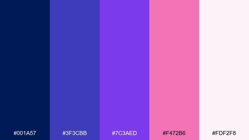
HEX: #001A57 #3F3CBB #7C3AED #F472B6 #FDF2F8
Mood: playful, creative, dreamy
Best for: beauty launches, creator branding, and lifestyle graphics
Playful and dreamy, this set feels like twilight fruit blossoms with a pop of neon petals. The deep blue steadies the palette while indigo, violet, and pink keep it expressive. It is great for creator kits, beauty promos, and bold lifestyle posts that still need structure. Tip: use the soft blush as a background so the bright accents do not fight each other.
Image example of indigo orchard generated using media.io
10) Sunrise Court
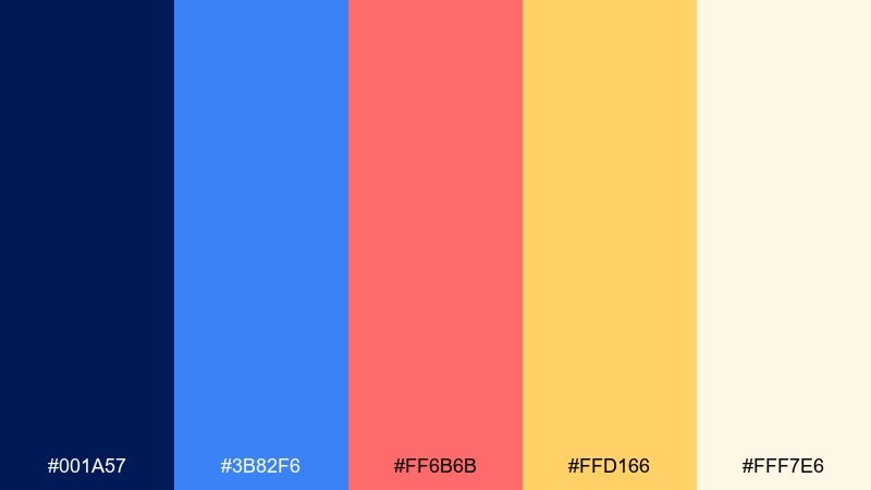
HEX: #001A57 #3B82F6 #FF6B6B #FFD166 #FFF7E6
Mood: cheerful, bold, sunrise-warm
Best for: campaign banners, social promos, and upbeat brand graphics
Cheerful and bold, these hues look like sunrise hitting painted walls after a long night. Navy keeps the layout crisp while coral and marigold add friendly energy. These duke blue color combinations work especially well for social promos and campaign banners with big type. Tip: let the warm cream be your base layer and use coral only for key calls to action.
Image example of sunrise court generated using media.io

11) Cloudy Blueprint
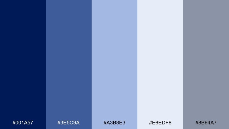
HEX: #001A57 #3E5C9A #A3B8E3 #E6EDF8 #8B94A7
Mood: calm, technical, reassuring
Best for: product presentations, SaaS decks, and explainer visuals
Calm and technical, this mix feels like blueprint lines under a cloudy sky. The layered blues create clarity for charts, while the soft gray keeps everything readable. It suits presentations, onboarding docs, and explainer graphics where structure matters. Tip: use the palest blue for large panels and keep the darkest shade for chart axes and key metrics.
Image example of cloudy blueprint generated using media.io
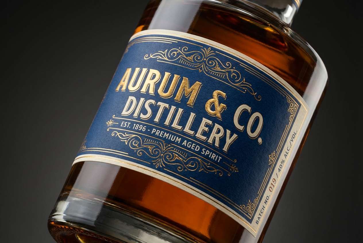
12) Trophy Room
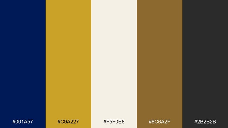
HEX: #001A57 #C9A227 #F5F0E6 #8C6A2F #2B2B2B
Mood: prestigious, timeless, premium
Best for: luxury packaging, awards graphics, and premium labels
Prestigious and timeless, this pairing brings to mind polished metal, dark wood, and spotlighted awards. Deep blue and black create a strong base, while gold tones deliver instant status. Use it for premium labels, packaging, and ceremonial materials where you want a classic finish. Tip: choose matte navy with glossy gold accents to make the details pop without adding extra colors.
Image example of trophy room generated using media.io
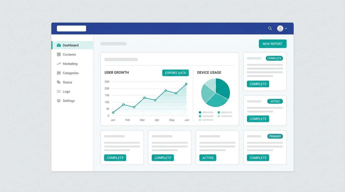
13) Minimal Interface
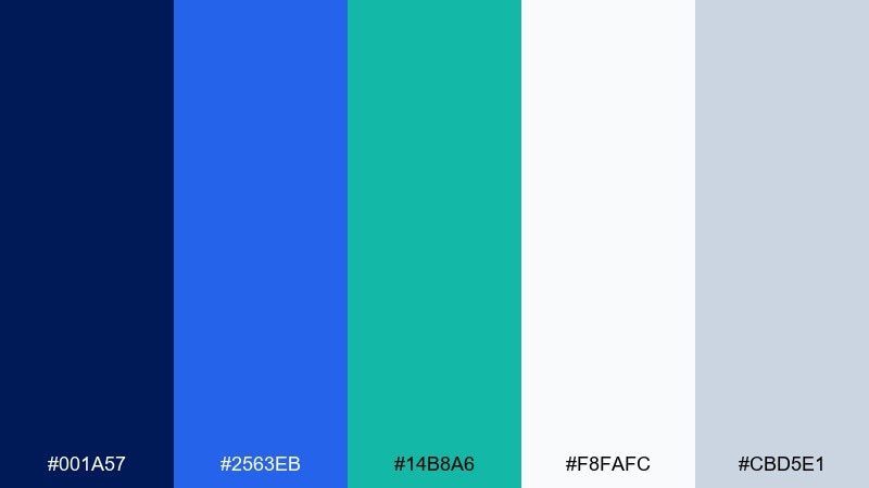
HEX: #001A57 #2563EB #14B8A6 #F8FAFC #CBD5E1
Mood: modern, clean, tech-forward
Best for: SaaS dashboards, mobile apps, and UI design systems
Modern and clean, this set feels like a well-lit workspace with crisp lines and clear focus. The strong navy supports readable navigation, while blue and teal add friendly motion for states and highlights. As a duke blue color scheme for UI, it works best when neutrals do most of the heavy lifting. Tip: reserve teal for success states and key toggles so it stays meaningful.
Image example of minimal interface generated using media.io
14) Night Library
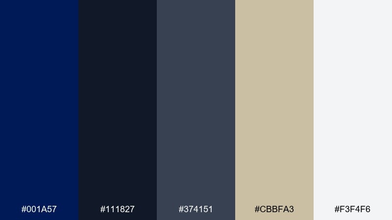
HEX: #001A57 #111827 #374151 #CBBFA3 #F3F4F6
Mood: scholarly, quiet, moody
Best for: book covers, academic posters, and research publications
Scholarly and quiet, this palette suggests late-night reading, soft lamplight, and worn pages. Dark blues and charcoals keep it serious, while the parchment beige adds warmth and approachability. It fits academic posters, book covers, and long-form content where tone matters. Tip: use the beige for pull quotes or section headers to break up dense layouts.
Image example of night library generated using media.io

15) Soft Denim
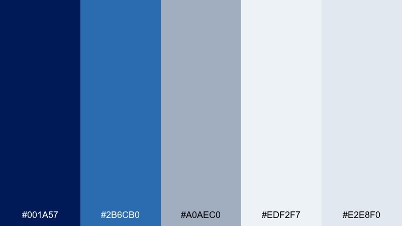
HEX: #001A57 #2B6CB0 #A0AEC0 #EDF2F7 #E2E8F0
Mood: friendly, casual, approachable
Best for: customer support pages, lifestyle blogs, and onboarding flows
Friendly and casual, these blues read like well-worn denim with soft daylight. The deep shade adds structure, while cool grays and pale tints keep everything relaxed and usable. It is a great choice for support pages, blogs, and onboarding where you want calm confidence. Tip: use the lightest tones as page backgrounds and keep the darkest blue for primary buttons.
Image example of soft denim generated using media.io
16) Garden Gala
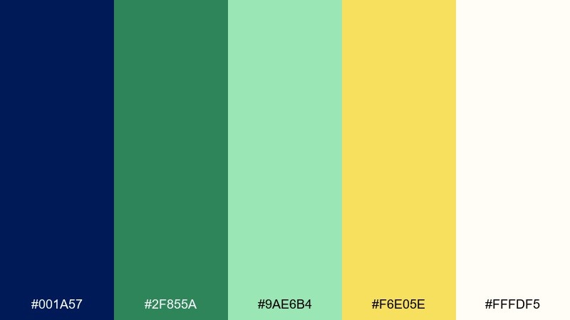
HEX: #001A57 #2F855A #9AE6B4 #F6E05E #FFFDF5
Mood: fresh, celebratory, botanical
Best for: outdoor event branding and spring invitations
Fresh and celebratory, these colors feel like garden lanterns, leafy greens, and warm afternoon light. The navy keeps typography crisp, while mint and butter yellow bring a lively, natural lift. This duke blue color palette is ideal for outdoor events and spring stationery that needs to look polished, not rustic. Tip: keep the yellow to small highlights such as dates, icons, or a thin border.
Image example of garden gala generated using media.io
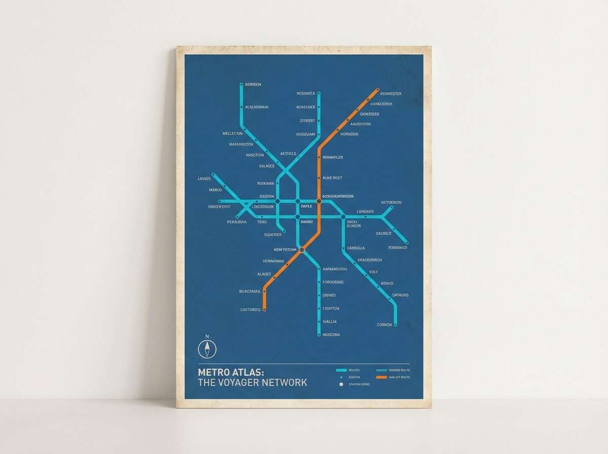
17) City Transit
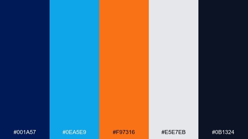
HEX: #001A57 #0EA5E9 #F97316 #E5E7EB #0B1324
Mood: urban, direct, high-energy
Best for: wayfinding graphics, maps, and event signage
Urban and direct, this set looks like clean signage under city lights. The deep base keeps information legible, while bright blue and orange help viewers scan quickly. It is strong for maps, schedules, and directional systems where clarity beats decoration. Tip: assign one accent color per route or section and keep the rest neutral for quick comprehension.
Image example of city transit generated using media.io
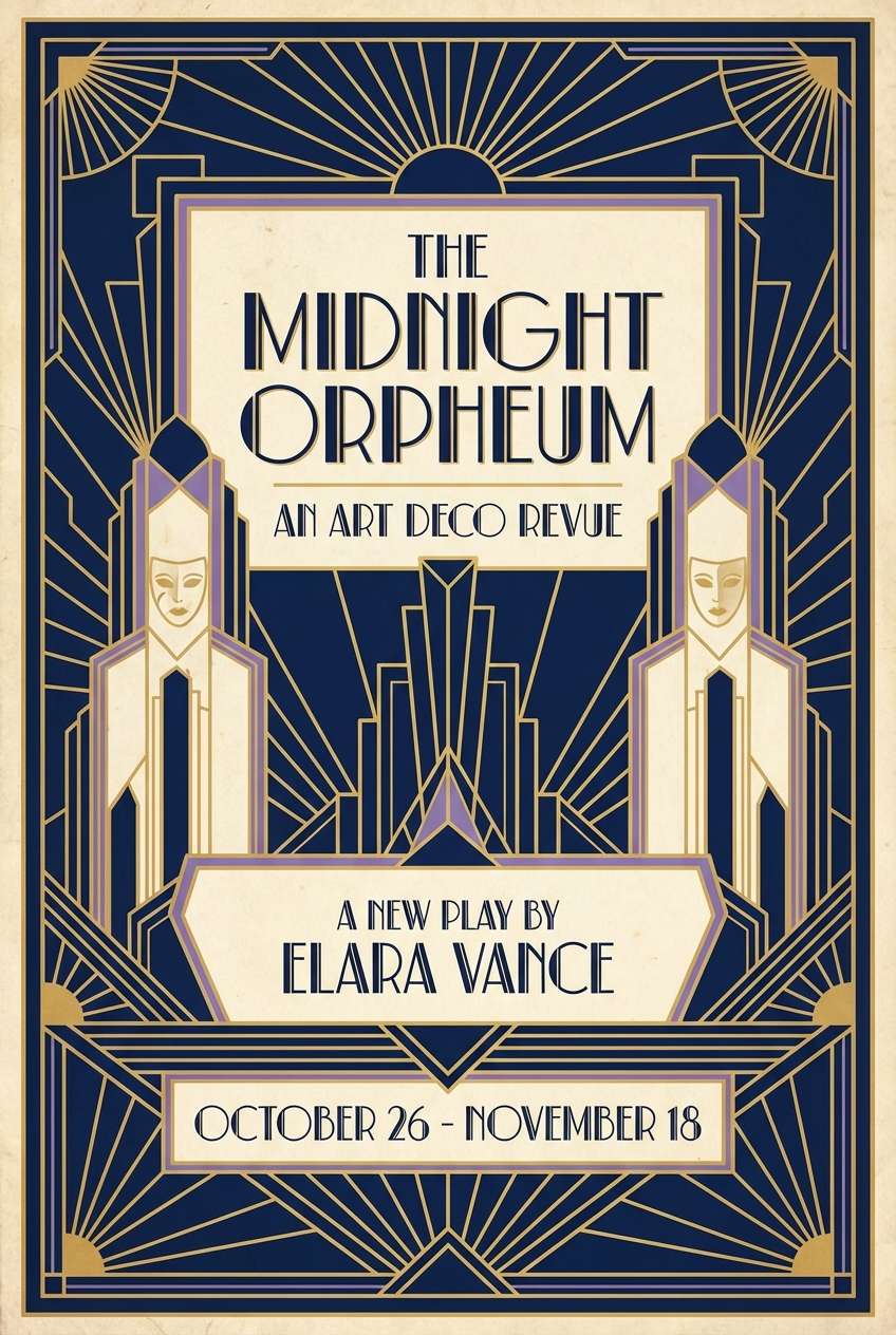
18) Art Deco Duke
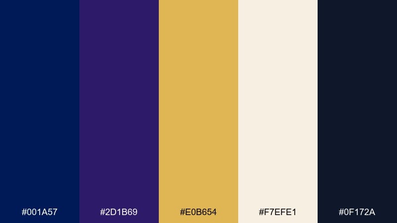
HEX: #001A57 #2D1B69 #E0B654 #F7EFE1 #0F172A
Mood: glamorous, geometric, vintage
Best for: theater posters, gala flyers, and retro branding
Glamorous and geometric, these tones evoke art deco arches, velvet nights, and gold inlays. The navy-to-violet base brings drama, while creamy neutrals keep it elegant rather than heavy. It works especially well for gala flyers, theater posters, and retro-inspired branding. Tip: use symmetrical layouts and thin gold lines to lean into the deco feel.
Image example of art deco duke generated using media.io
19) Film Noir Navy
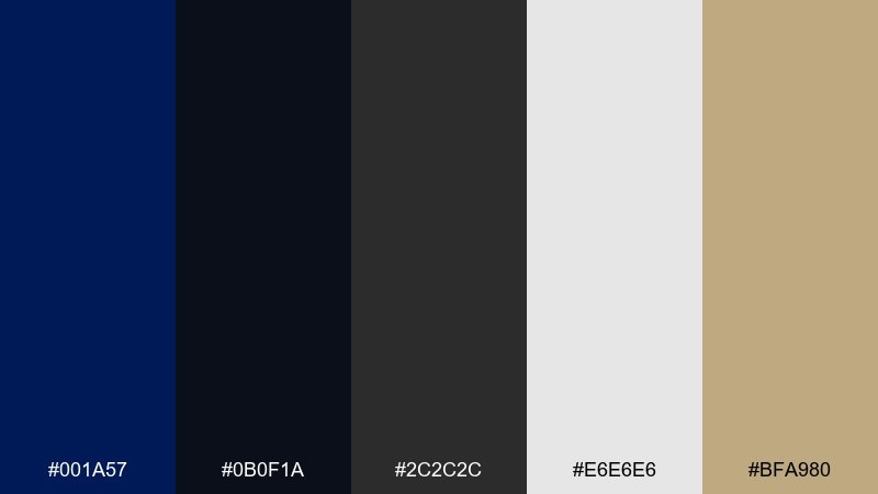
HEX: #001A57 #0B0F1A #2C2C2C #E6E6E6 #BFA980
Mood: cinematic, dramatic, sophisticated
Best for: photography portfolios and luxury service branding
Cinematic and dramatic, this mix feels like noir lighting, sharp shadows, and a hint of champagne. The near-black tones heighten contrast, while the warm metallic accent adds a quiet touch of luxury. It is a strong fit for photography portfolios, legal brands, and premium services. Tip: keep backgrounds dark and let the light gray handle body text for comfortable reading.
Image example of film noir navy generated using media.io
20) Spring Poster Pop
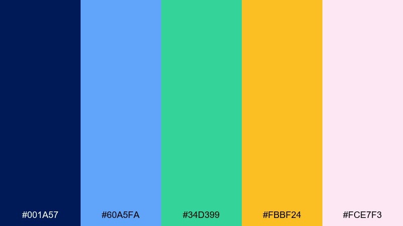
HEX: #001A57 #60A5FA #34D399 #FBBF24 #FCE7F3
Mood: bright, friendly, youthful
Best for: education posters, community events, and cheerful promos
Bright and friendly, these colors feel like a community fair with clear signs and upbeat energy. Navy keeps the message readable, while sky blue, mint, and amber bring a playful rhythm. For a duke blue color combination that stays approachable, use the pink as a soft supporting field behind icons or headings. Tip: choose one bright accent for icons and keep the rest to simple blocks so the design does not get busy.
Image example of spring poster pop generated using media.io
What Colors Go Well with Duke Blue?
Warm neutrals like cream, ivory, beige, and parchment make duke blue feel approachable and premium at the same time. This is one of the easiest ways to get a “classic navy” look that works in both print and web.
Metallic-inspired accents (gold, antique brass, champagne) elevate duke blue for labels, invitations, and luxury branding. Keep these accents small so the palette stays clean and the navy remains the hero.
For modern contrast, add brights like cyan, teal, coral, or lime—especially in UI and sports-style graphics. The key is to choose one dominant accent per layout to avoid visual noise.
How to Use a Duke Blue Color Palette in Real Designs
Start with duke blue as your primary brand color for headers, navigation, or key typography, then build a neutral foundation underneath (white, ivory, light gray). This keeps layouts readable and makes CTAs stand out.
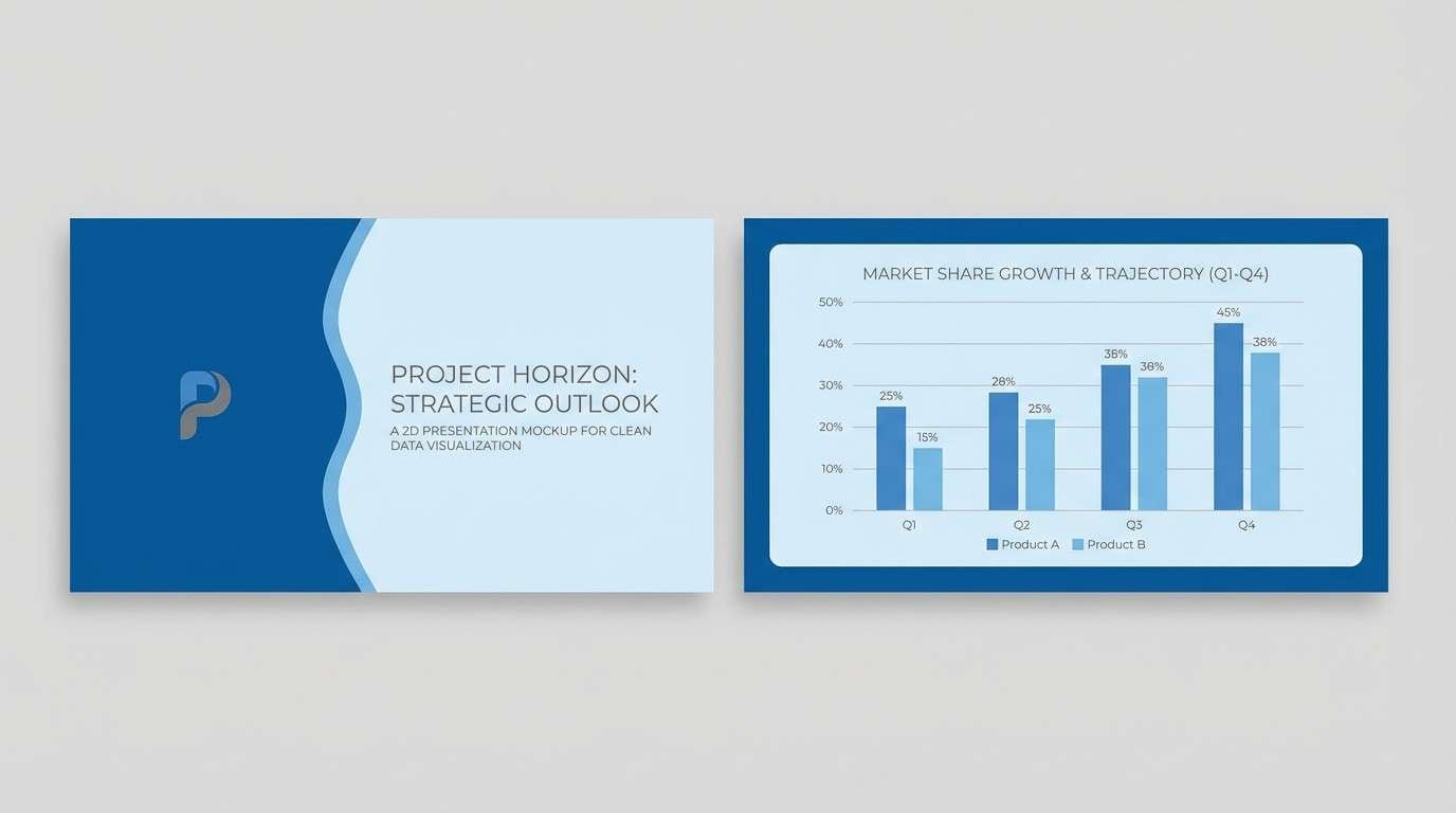
Use tints of blue for structure: cards, panels, and subtle background blocks can help group information without adding extra hues. In data visuals, reserve the darkest navy for axes, labels, and “most important” series.
In print, consider texture and finish: matte navy inks feel refined, while gold foil or spot gloss can create premium contrast. Always check contrast ratios for accessibility when navy is used for text or buttons.
Create Duke Blue Palette Visuals with AI
If you want to preview how a duke blue color palette will look on real assets—posters, packaging, dashboards, invitations—generate quick mockups before committing to a final design.
With Media.io text-to-image, you can paste a prompt, describe the style (minimal, vintage, sporty), and iterate fast until the palette feels right for your brand or project.
Try creating multiple variations by swapping one accent color (gold vs. coral vs. teal) while keeping duke blue fixed, so you can compare moods side by side.
Duke Blue Color Palette FAQs
-
What HEX code is closest to duke blue?
A common duke blue anchor used in palettes is #001A57, a deep navy that works well for backgrounds, headers, and primary brand elements. -
Is duke blue the same as navy?
Duke blue is a type of navy, but it often appears slightly more saturated and “clean” than traditional navy, which can read more muted or gray. -
What colors pair best with duke blue for a classic look?
Cream/ivory, warm grays, and gold accents pair especially well. This combination keeps duke blue formal and timeless without feeling harsh. -
What colors pair best with duke blue for modern UI design?
Try duke blue with cool neutrals (white, light gray) plus one bright accent like cyan, teal, or coral for states, highlights, and CTAs. -
Can I use duke blue as a background color?
Yes—duke blue is excellent for dark-mode layouts and premium print designs. Use off-white or light gray text for comfortable readability and strong contrast. -
How many accent colors should I use with duke blue?
For most designs, one primary accent (plus neutrals) is enough. Add a second accent only if you need extra coding for categories, routes, or UI states. -
Does duke blue work with warm colors like orange or yellow?
Yes. Warm accents like marigold, amber, or orange create high contrast against duke blue and are great for signage, promos, and energetic campaigns.


