

Autumn leaves color palettes are the sweet spot between warm energy and grounded calm—perfect for brands, posters, packaging, and cozy spaces that need instant seasonal character.
Below are 20 modern autumn-leaves-inspired color combos with HEX codes, plus practical tips for pairing neutrals, choosing accents, and generating AI visuals fast.
In this article
- Why Autumn Leaves Palettes Work So Well
-
- maple ember
- harvest gold
- cranberry dusk
- rust and sage
- golden hour orchard
- forest floor neutral
- copper knit
- ocher paper
- spiced terracotta
- misty morning leaves
- chestnut and cream
- burnt umber modern
- olive lantern
- amber trail
- smoky pumpkin
- tawny sunset
- leaf litter pastels
- brick and pine
- honeyed walnut
- golden moss minimal
- What Colors Go Well with Autumn Leaves?
- How to Use a Autumn Leaves Color Palette in Real Designs
- Create Autumn Leaves Palette Visuals with AI
Why Autumn Leaves Palettes Work So Well
Autumn leaves colors naturally balance contrast: deep browns and greens anchor the design, while rust, amber, and gold deliver instant warmth and attention.
They also feel familiar and “human,” which makes them great for storytelling—think heritage, craft, comfort, and outdoorsy adventure without needing heavy graphics.
Finally, these palettes scale well across mediums: they print beautifully on textured paper and also perform in UI when you keep a light neutral for breathing room.
20+ Autumn Leaves Color Palette Ideas (with HEX Codes)
1) Maple Ember
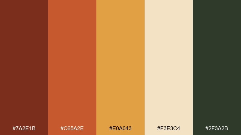
HEX: #7a2e1b #c65a2e #e0a043 #f3e3c4 #2f3a2b
Mood: cozy, grounded, rustic
Best for: coffee shop branding and menus
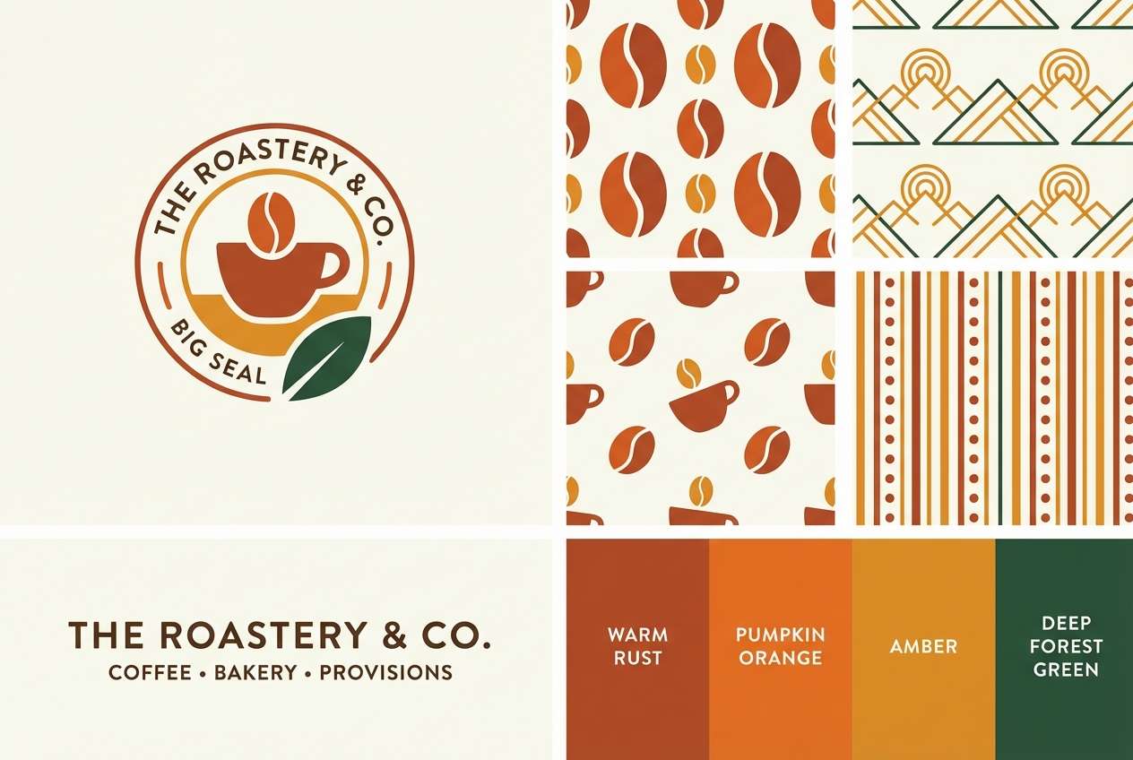
Cozy and grounded like a walk past maple trunks and glowing embers. The rust and pumpkin tones feel instantly welcoming, while the creamy neutral keeps layouts readable. Pair it with kraft textures, simple sans-serif type, and a deep green accent for contrast. Usage tip: keep the dark green for headings and icons so the warm hues stay the hero.
Image example of maple ember generated using media.io
Media.io is an online AI studio for creating and editing video, image, and audio in your browser.

2) Harvest Gold
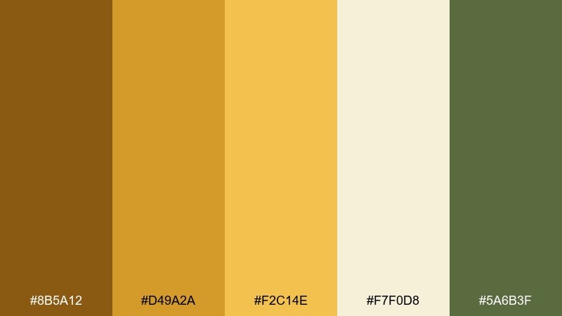
HEX: #8b5a12 #d49a2a #f2c14e #f7f0d8 #5a6b3f
Mood: sunny, wholesome, inviting
Best for: farmers market signage and labels
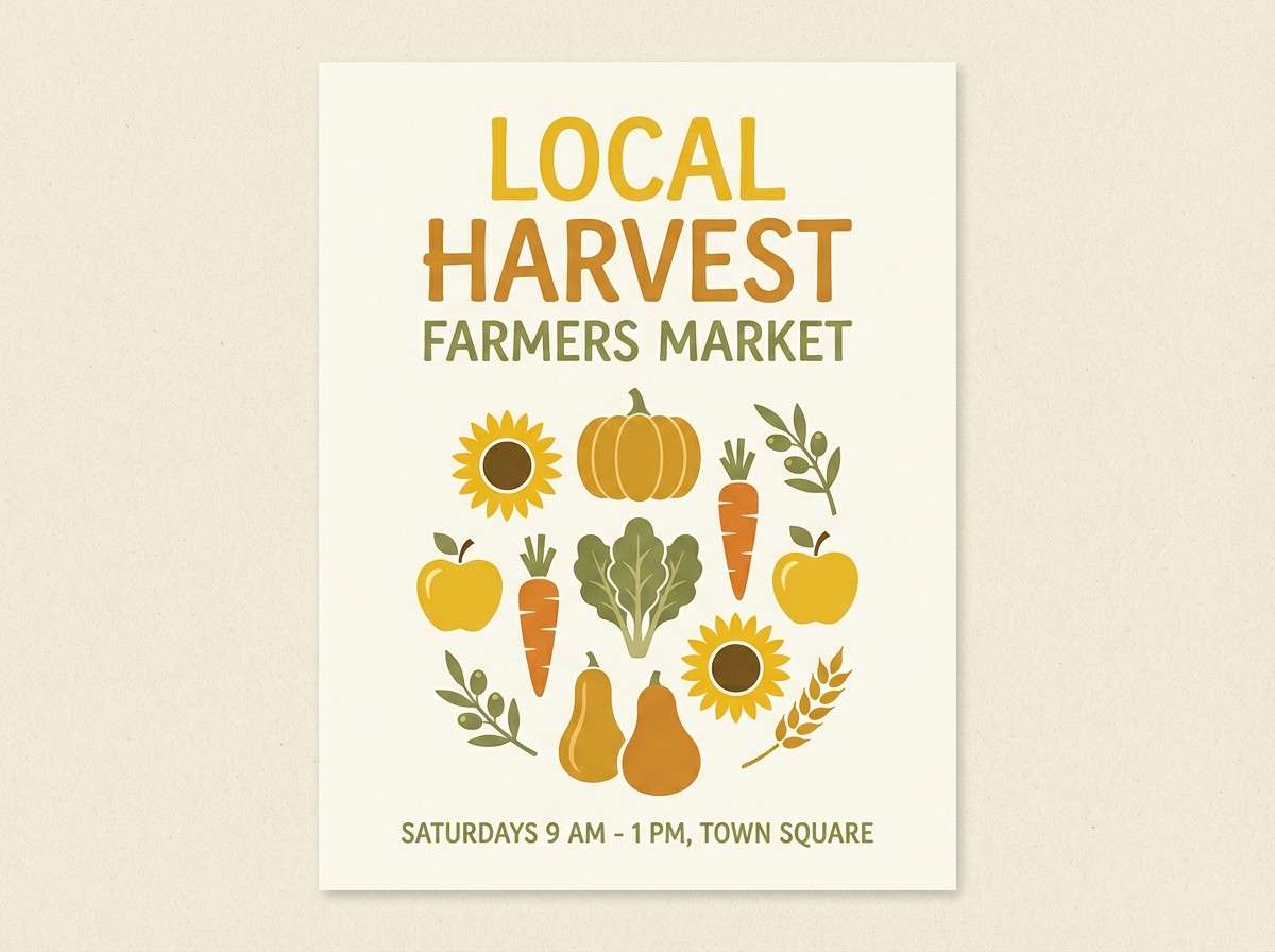
Sunny and wholesome, like late-afternoon light hitting stacked hay bales. The golden steps give you built-in hierarchy for headlines, subheads, and callouts. Add a muted green for a natural counterpoint and keep the cream as breathing space. Usage tip: print on uncoated stock to make the yellows feel softer and more premium.
Image example of harvest gold generated using media.io
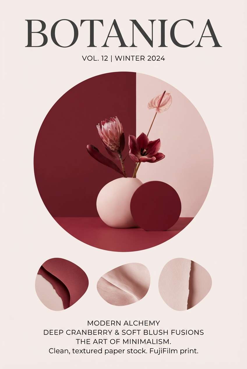
3) Cranberry Dusk
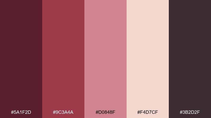
HEX: #5a1f2d #9c3a4a #d0848f #f4d7cf #3b2d2f
Mood: moody, romantic, refined
Best for: editorial layouts and book covers
Moody and romantic, like cranberries pressed into dusk-lit shadows. The deep wine and charcoal create drama, while blush tones soften the edges for a refined finish. Pair with serif typography, generous margins, and subtle grain to avoid a flat look. Usage tip: use the pale blush as a highlight panel behind pull quotes for instant elegance.
Image example of cranberry dusk generated using media.io
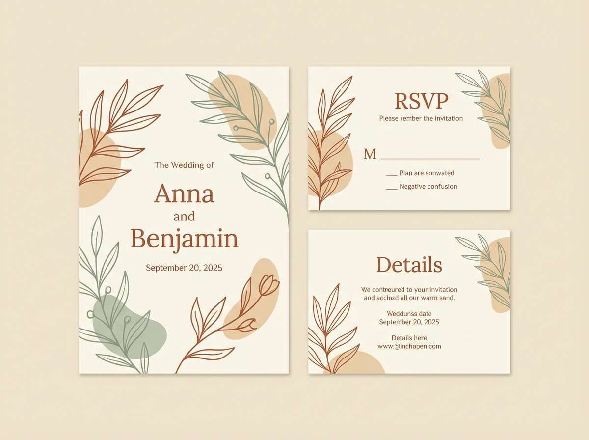
4) Rust and Sage
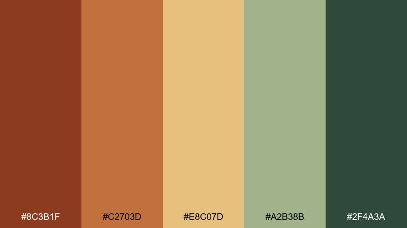
HEX: #8c3b1f #c2703d #e8c07d #a2b38b #2f4a3a
Mood: warm, natural, timeless
Best for: rustic wedding invitations
Warm and timeless, like rusted iron beside sage bundles and dried florals. This autumn leaves color palette balances spice tones with herbaceous greens, making it easy to feel organic without turning muddy. Pair it with deckled edges, letterpress textures, and cream envelopes for a tactile look. Usage tip: reserve the darkest green for names and key details to keep readability crisp.
Image example of rust and sage generated using media.io
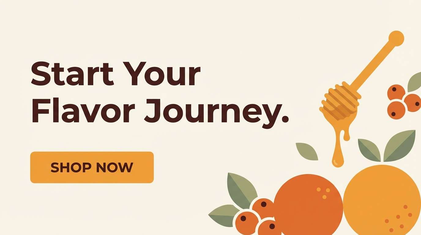
5) Golden Hour Orchard
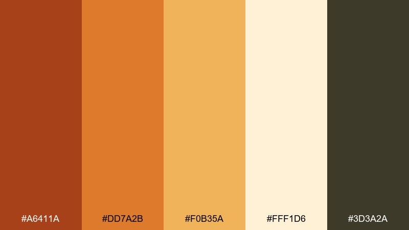
HEX: #a6411a #dd7a2b #f0b35a #fff1d6 #3d3a2a
Mood: glowing, cheerful, comforting
Best for: seasonal landing pages and hero banners
Glowing and comforting, like an orchard at golden hour with fruit skins catching the light. The warm oranges bring energy, while the creamy highlight makes buttons and cards pop. Pair with warm photography, subtle shadows, and espresso-brown text for a grounded finish. Usage tip: keep your primary CTA in the mid-orange and use the brightest cream as the surrounding negative space.
Image example of golden hour orchard generated using media.io
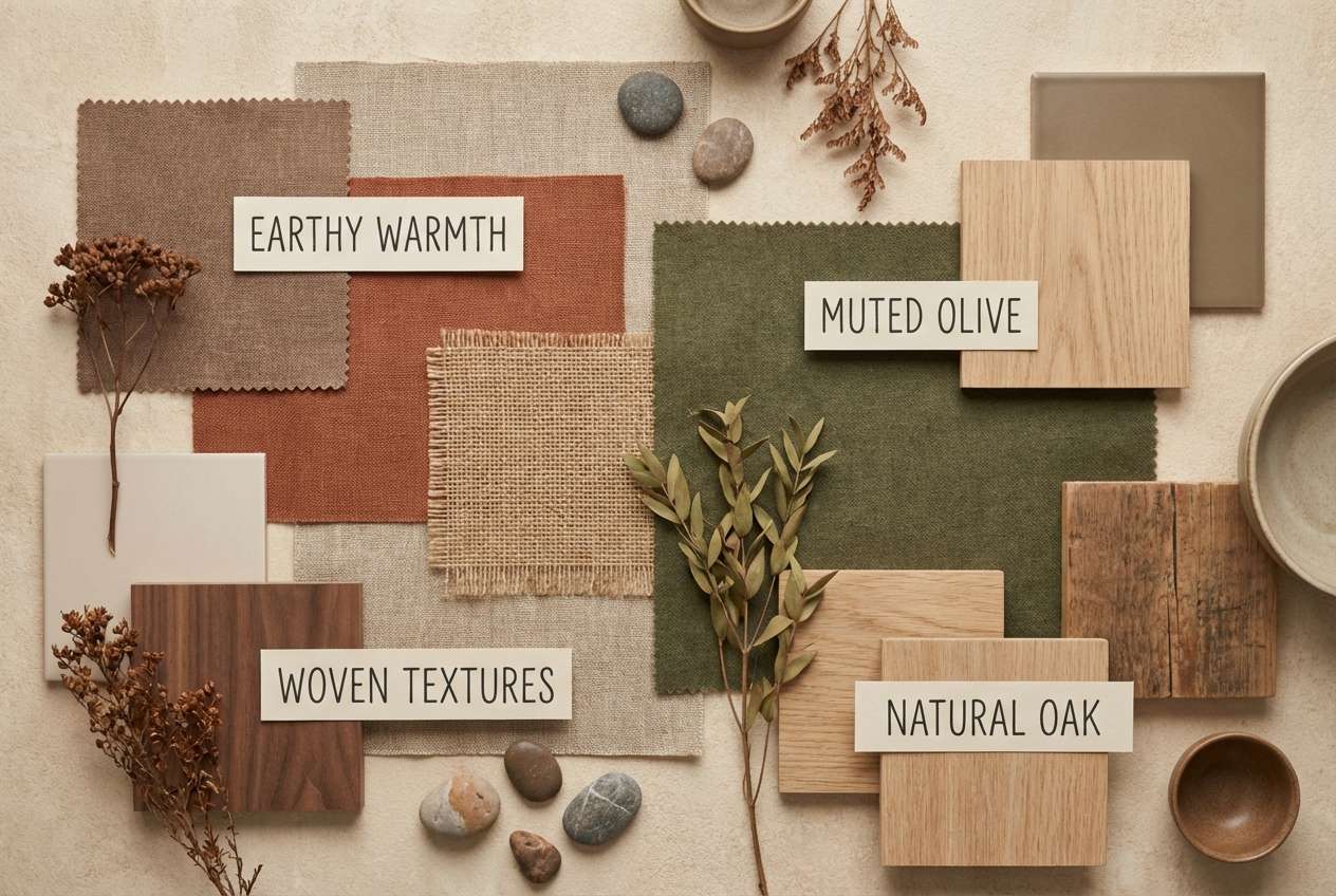
6) Forest Floor Neutral
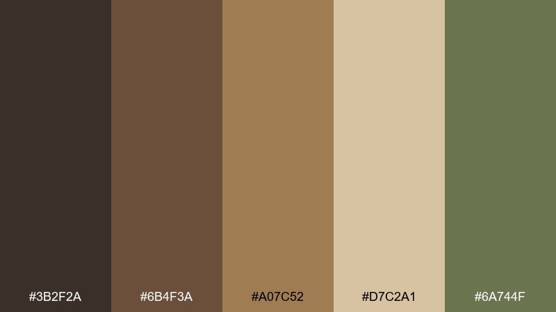
HEX: #3b2f2a #6b4f3a #a07c52 #d7c2a1 #6a744f
Mood: earthy, calm, organic
Best for: interior mood boards and decor mockups
Earthy and calm, like pine needles, bark, and soft soil underfoot. The browns layer beautifully for textiles and wood tones, while the light tan keeps the overall look airy. Pair with natural materials such as linen, walnut, and matte ceramics for a cohesive feel. Usage tip: use the green as a small accent in plants or art so the palette stays serene.
Image example of forest floor neutral generated using media.io
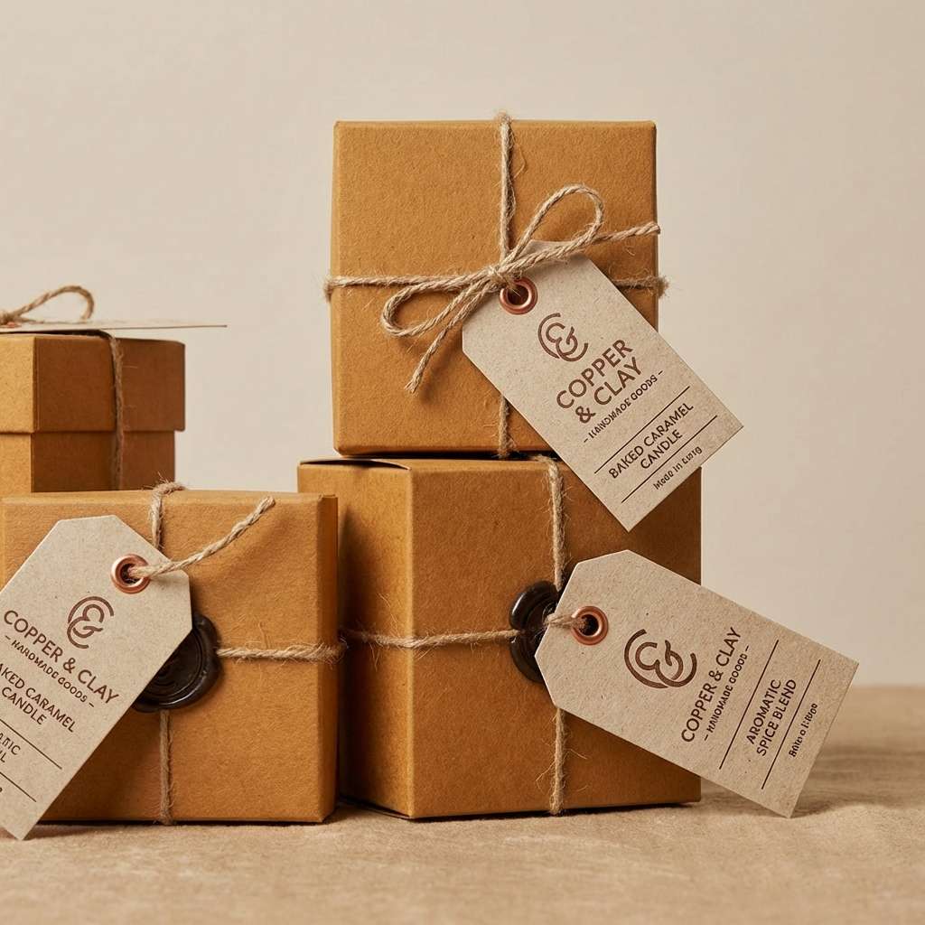
7) Copper Knit
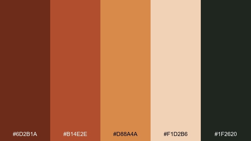
HEX: #6d2b1a #b14e2e #d88a4a #f1d2b6 #1f2620
Mood: snug, artisanal, bold
Best for: handmade product tags and craft packaging
Snug and artisanal, like a copper kettle beside a knitted blanket. The deep brown-green anchor adds weight, making the copper and caramel tones feel richer. Pair with simple stamp graphics, rounded type, and a warm off-white stock to keep it handmade, not heavy. Usage tip: foil the copper shade on tags for a small luxury detail that still feels earthy.
Image example of copper knit generated using media.io
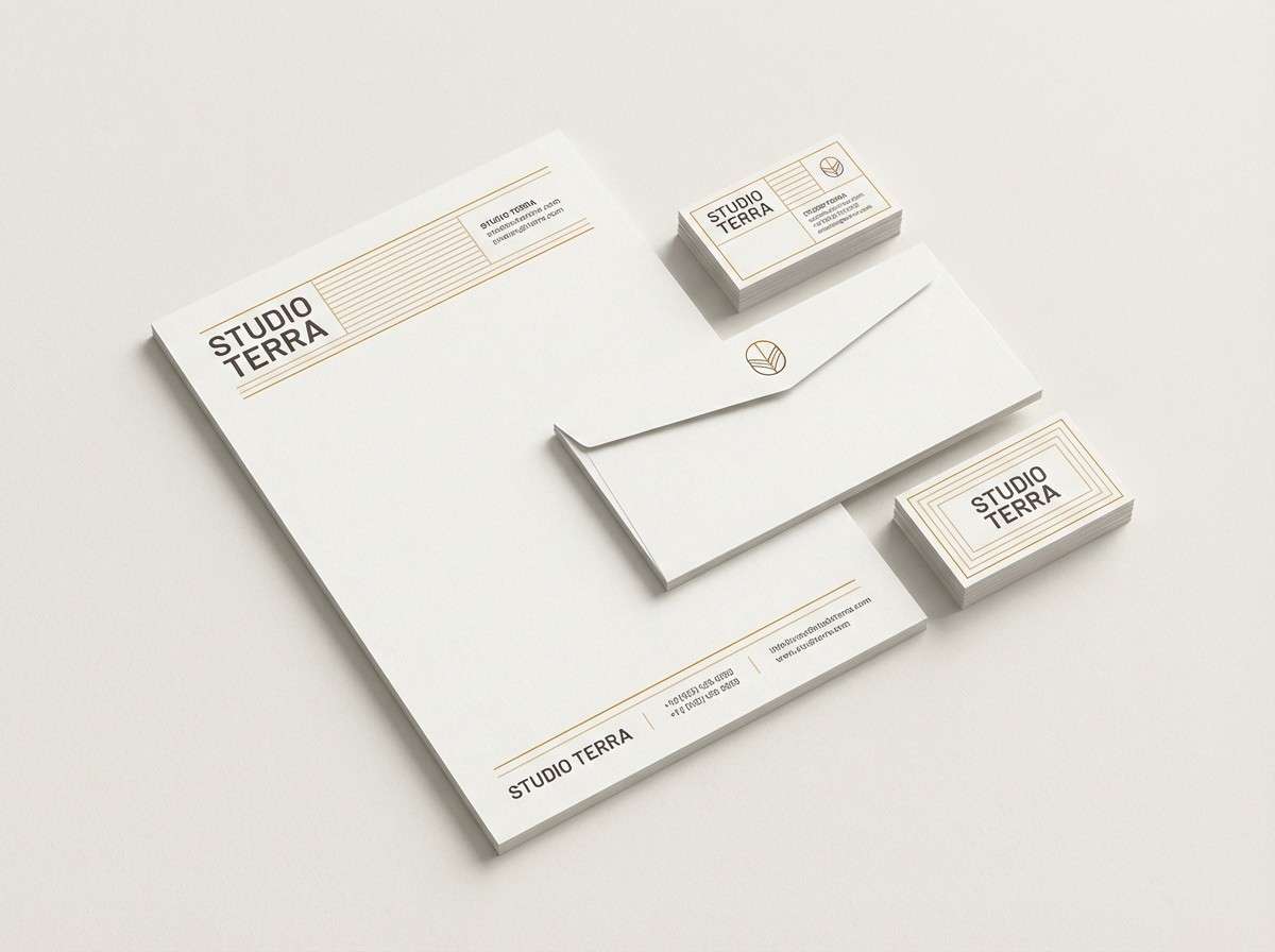
8) Ocher Paper
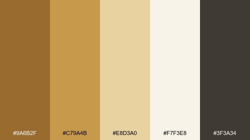
HEX: #9a6b2f #c79a4b #e8d3a0 #f7f3e8 #3f3a34
Mood: soft, vintage, editorial
Best for: blog headers and stationery
Soft and vintage, like aged paper warmed by ocher ink. The gentle transitions make it easy to build calm sections, dividers, and subtle backgrounds. Pair with charcoal typography, thin rules, and a few hand-drawn elements to lean into the editorial feel. Usage tip: set the palest tone as your page background and use the darkest shade for body text to keep contrast accessible.
Image example of ocher paper generated using media.io
9) Spiced Terracotta
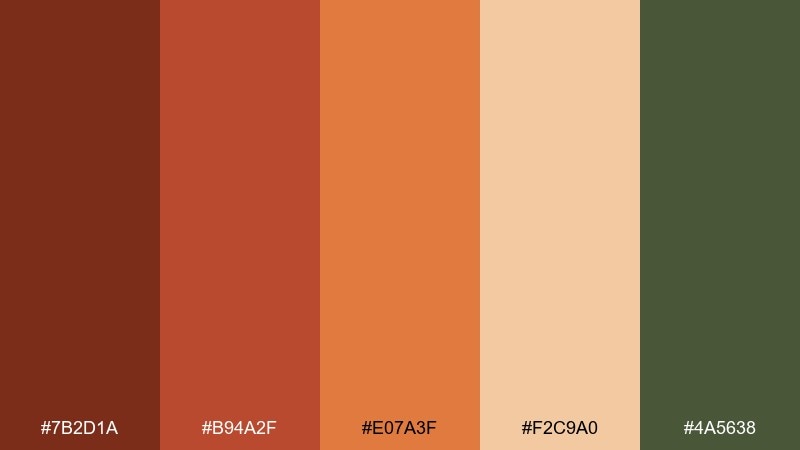
HEX: #7b2d1a #b94a2f #e07a3f #f2c9a0 #4a5638
Mood: zesty, warm, modern
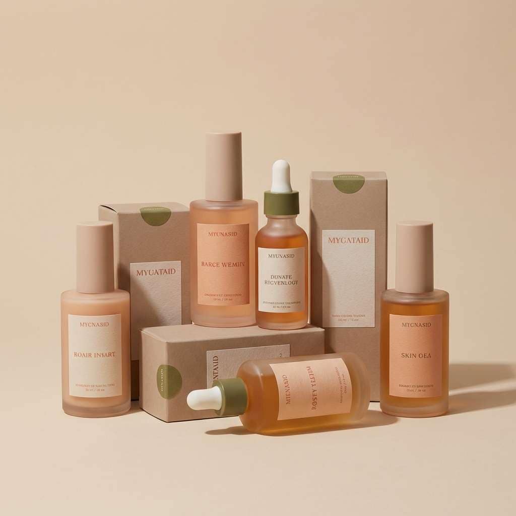
Best for: skincare packaging and product ads
Zesty and modern, like simmering spices and terracotta clay. These autumn leaves color combinations work especially well when you want warmth without looking too traditional. Pair with matte labels, minimal typography, and a muted green accent for a fresh botanical edge. Usage tip: use the pale peach as the label base, then let the deeper terracotta carry your brand mark.
Image example of spiced terracotta generated using media.io
10) Misty Morning Leaves
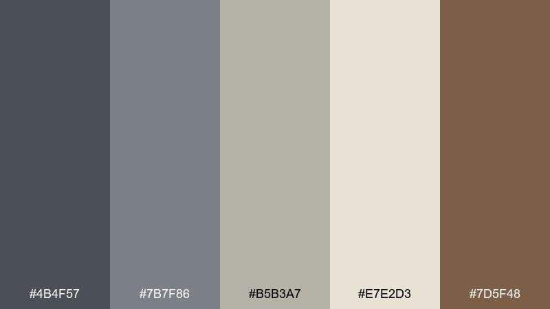
HEX: #4b4f57 #7b7f86 #b5b3a7 #e7e2d3 #7d5f48
Mood: quiet, cool, contemplative
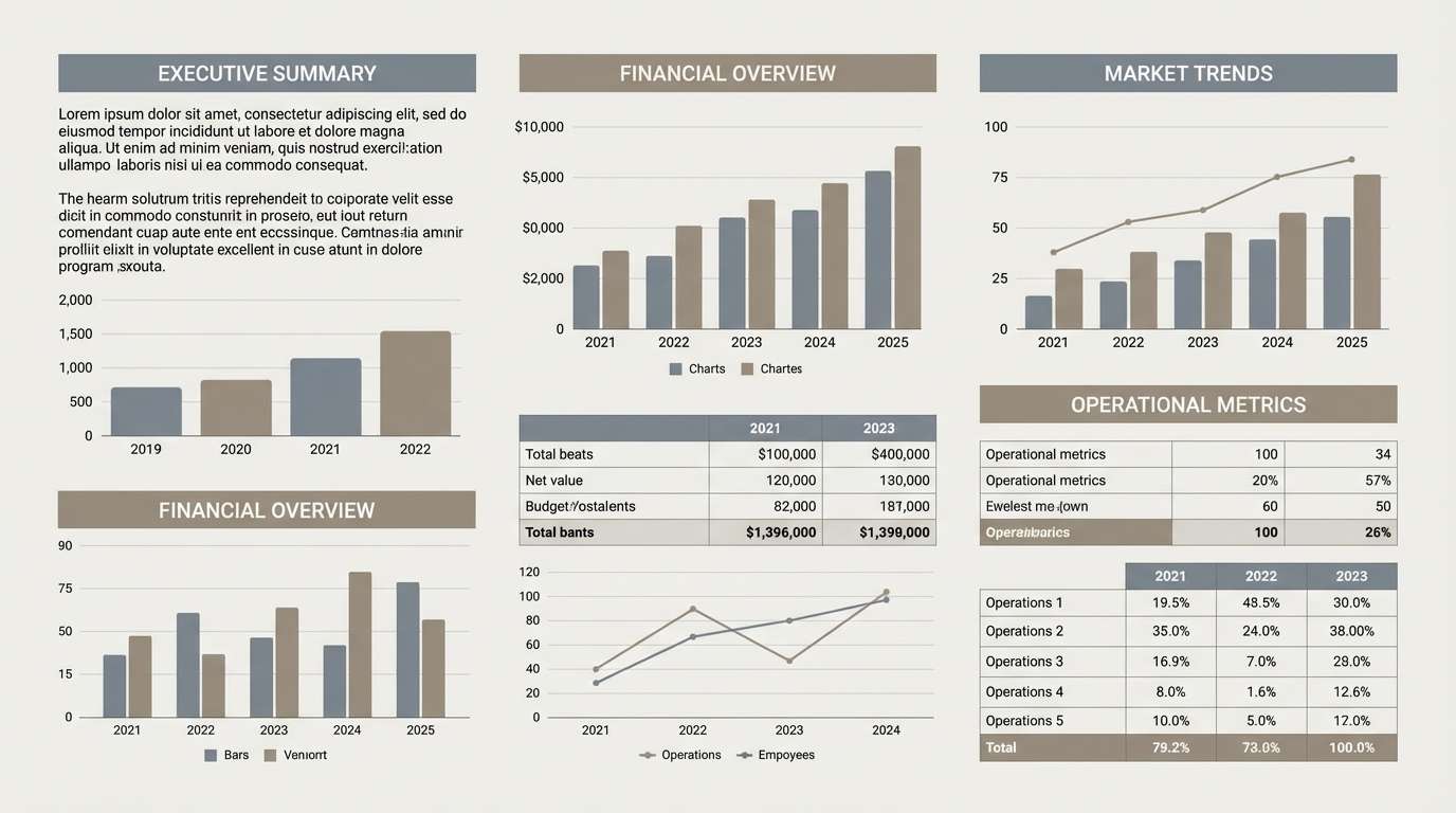
Best for: presentation decks and report templates
Quiet and contemplative, like fog over a trail scattered with damp leaves. The grays create structure for charts and tables, while the warm brown adds a subtle human touch. Pair with clean grids, thin icon strokes, and plenty of whitespace for a polished, professional look. Usage tip: use the warm brown only for highlights or key metrics so it reads as intentional emphasis.
Image example of misty morning leaves generated using media.io
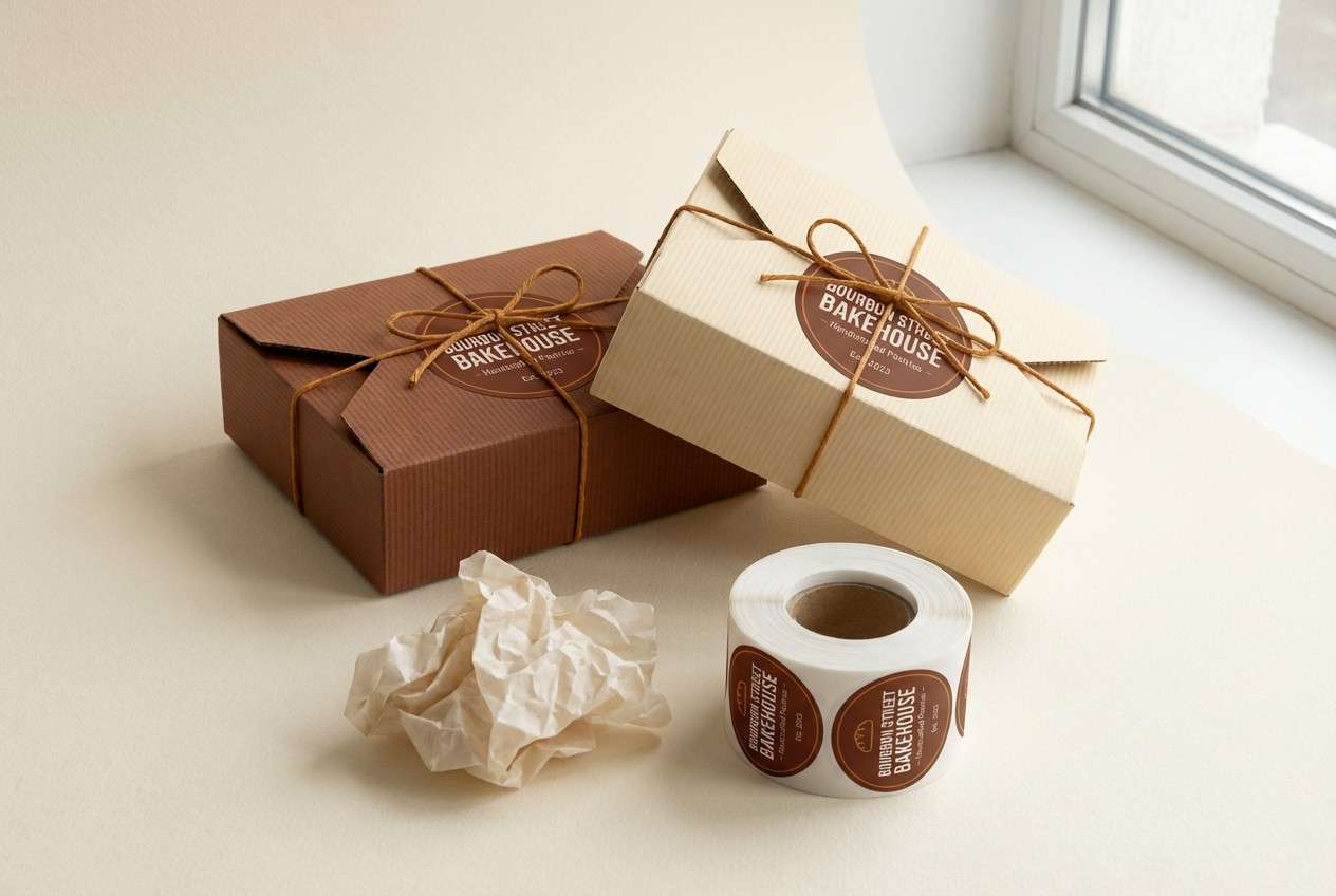
11) Chestnut and Cream
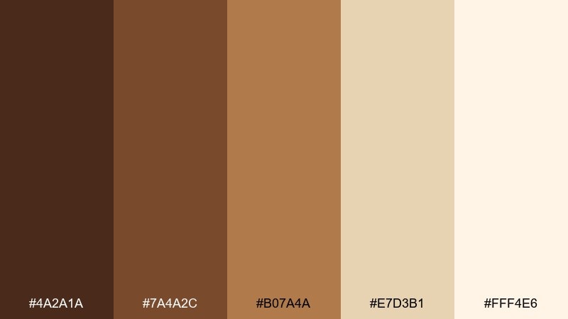
HEX: #4a2a1a #7a4a2c #b07a4a #e7d3b1 #fff4e6
Mood: comforting, classic, cozy
Best for: bakery branding and packaging
Comforting and classic, like roasted chestnuts and whipped cream. The creamy top end gives you lots of room for negative space, while the browns read as rich and trustworthy. Pair with vintage-inspired typography, subtle patterns, and kraft paper for a nostalgic feel. Usage tip: keep the darkest chestnut for outlines and logos so the softer shades stay light and appetizing.
Image example of chestnut and cream generated using media.io
12) Burnt Umber Modern
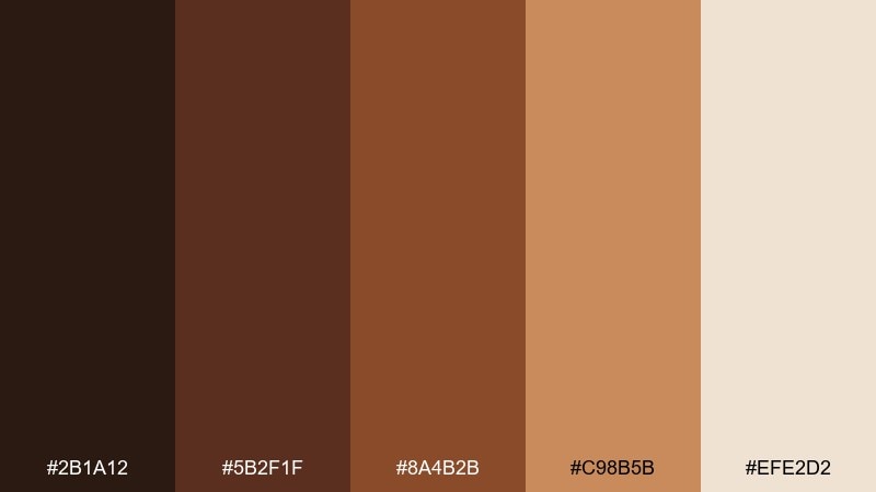
HEX: #2b1a12 #5b2f1f #8a4b2b #c98b5b #efe2d2
Mood: strong, warm, minimalist
Best for: luxury e-commerce product pages
Strong and minimalist, like dark wood and warm leather under gallery lights. The deep umber shades create an upscale base, while the soft beige keeps the layout from feeling heavy. Pair with high-contrast product photography, thin dividers, and restrained motion for a premium experience. Usage tip: set buttons in the mid-brown and reserve the darkest tone for navigation and price emphasis.
Image example of burnt umber modern generated using media.io
13) Olive Lantern
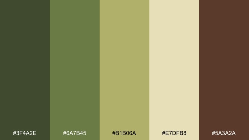
HEX: #3f4a2e #6a7b45 #b1b06a #e7dfb8 #5a3a2a
Mood: outdoorsy, mellow, earthy
Best for: camping event flyers and badges
Outdoorsy and mellow, like an olive lantern glow in the woods. The greens feel grounded and practical, and the warm tan keeps it friendly instead of military. Pair with simple badge shapes, topographic line textures, and sturdy sans-serif type. Usage tip: use the lightest yellow-green as your background so the darker olives can carry icons and headings.
Image example of olive lantern generated using media.io

14) Amber Trail
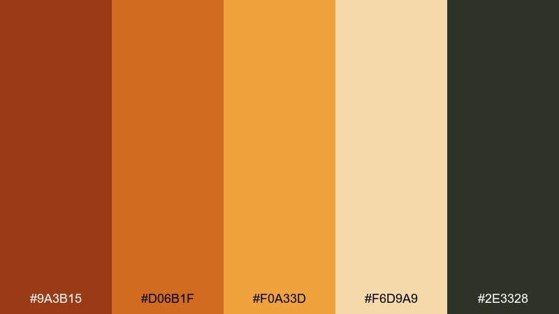
HEX: #9a3b15 #d06b1f #f0a33d #f6d9a9 #2e3328
Mood: energetic, outdoorsy, clean
Best for: outdoor app UI and dashboards
Energetic and clean, like amber light catching a winding trail sign. The warm oranges provide clear emphasis states, and the soft sand keeps screens from feeling harsh. For product work, these autumn leaves color combination ideas shine when paired with simple icons and restrained gradients. Usage tip: keep the darkest tone for navigation and use the brightest amber only for active states and alerts.
Image example of amber trail generated using media.io

15) Smoky Pumpkin
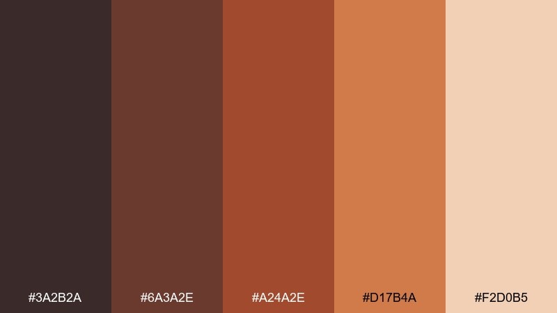
HEX: #3a2b2a #6a3a2e #a24a2e #d17b4a #f2d0b5
Mood: smoky, warm, cinematic
Best for: podcast cover art and thumbnails
Smoky and cinematic, like pumpkin spice drifting through a dim kitchen. The dark base gives you instant contrast for bold typography, while the peachy highlight keeps it approachable. Pair with grain textures, thick type, and simple silhouettes for strong small-size readability. Usage tip: keep the lightest shade behind the title so it stays crisp in thumbnail views.
Image example of smoky pumpkin generated using media.io

16) Tawny Sunset
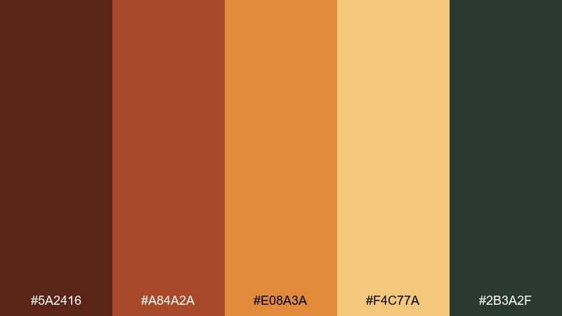
HEX: #5a2416 #a84a2a #e08a3a #f4c77a #2b3a2f
Mood: adventurous, warm, confident
Best for: travel posters and tour ads
Adventurous and confident, like a tawny sunset over a ridgeline. The warm gradient from deep brown to golden sand makes headlines feel bold without shouting. Pair with simplified landscape illustrations and dark green text for a grounded, outdoorsy vibe. Usage tip: use the golden shade for spotlight areas and keep large text in the darkest tones for maximum legibility.
Image example of tawny sunset generated using media.io

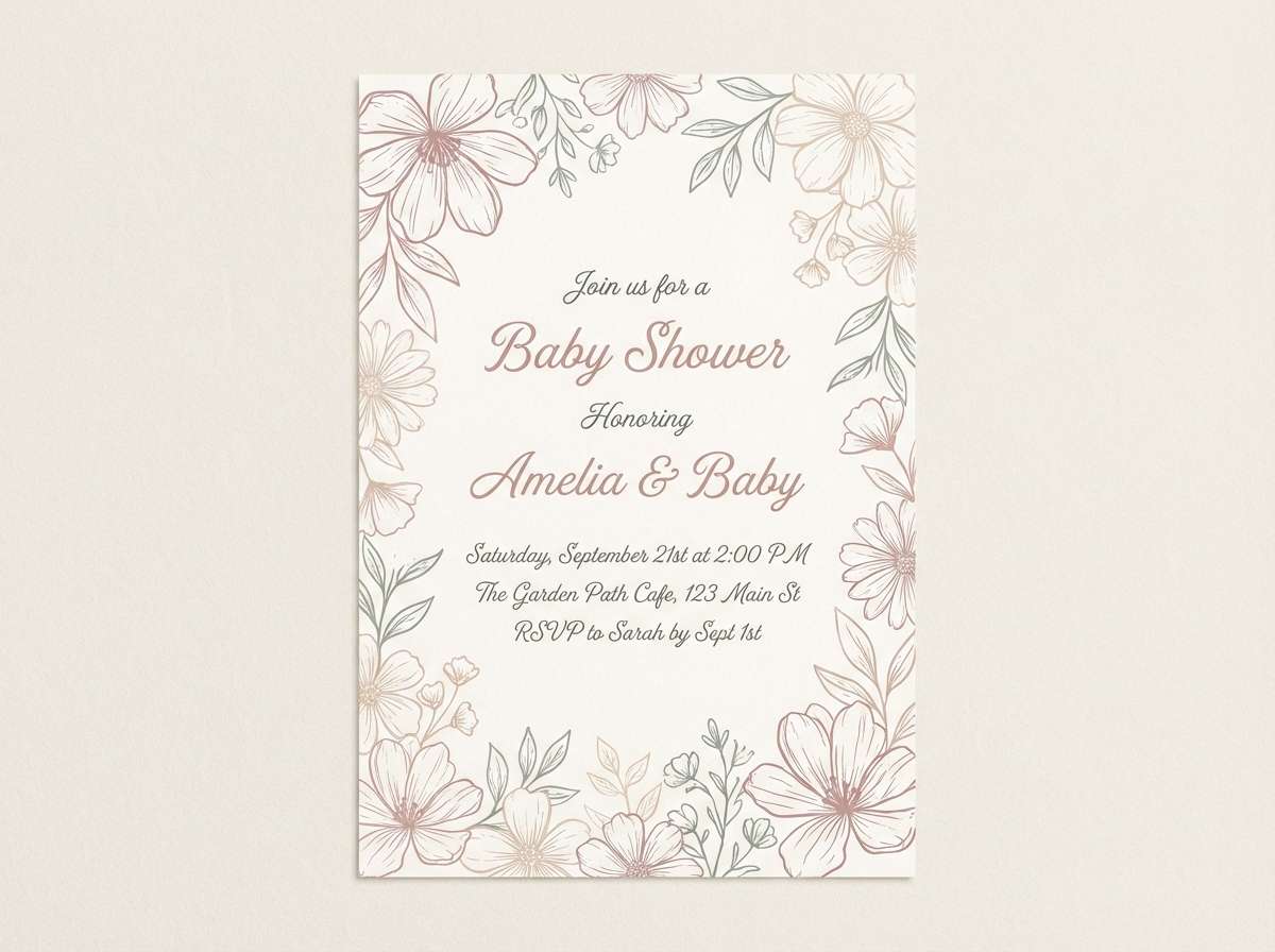
17) Leaf Litter Pastels
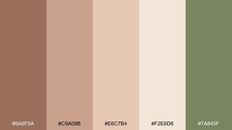
HEX: #9a6f5a #c9a08b #e6c7b4 #f2e6d8 #7a845f
Mood: soft, nostalgic, gentle
Best for: baby shower invites and stationery
Soft and nostalgic, like dried leaves pressed between journal pages. The blushy browns feel gentle and welcoming, and the dusty green adds just enough contrast to keep it from looking flat. Pair with handwritten scripts, light floral line art, and lots of cream space. Usage tip: use the dusty green only for small motifs or borders so the palette stays airy.
Image example of leaf litter pastels generated using media.io
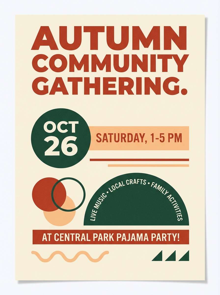
18) Brick and Pine
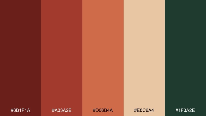
HEX: #6b1f1a #a33a2e #d06b4a #e8c6a4 #1f3a2e
Mood: bold, outdoorsy, heritage
Best for: event posters and community banners
Bold and heritage-inspired, like brick walls framed by pine boughs. This autumn leaves color palette is made for strong typography, with warm reds that feel classic and a deep green that steadies the whole look. Pair it with simple geometric shapes, cream space, and a single condensed headline font. Usage tip: limit the brick tones to two steps in one layout to avoid visual noise.
Image example of brick and pine generated using media.io
19) Honeyed Walnut
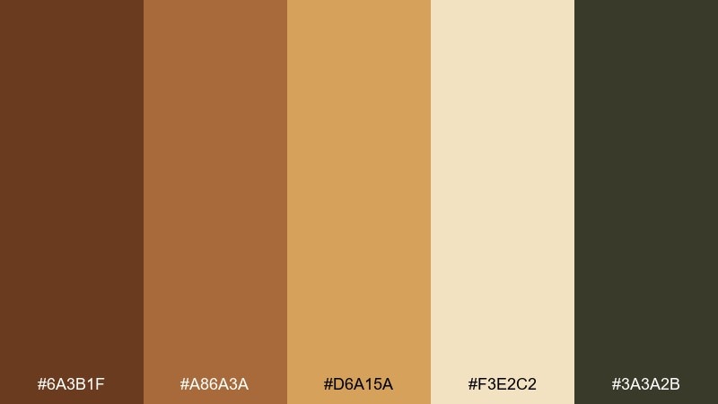
HEX: #6a3b1f #a86a3a #d6a15a #f3e2c2 #3a3a2b
Mood: warm, savory, welcoming
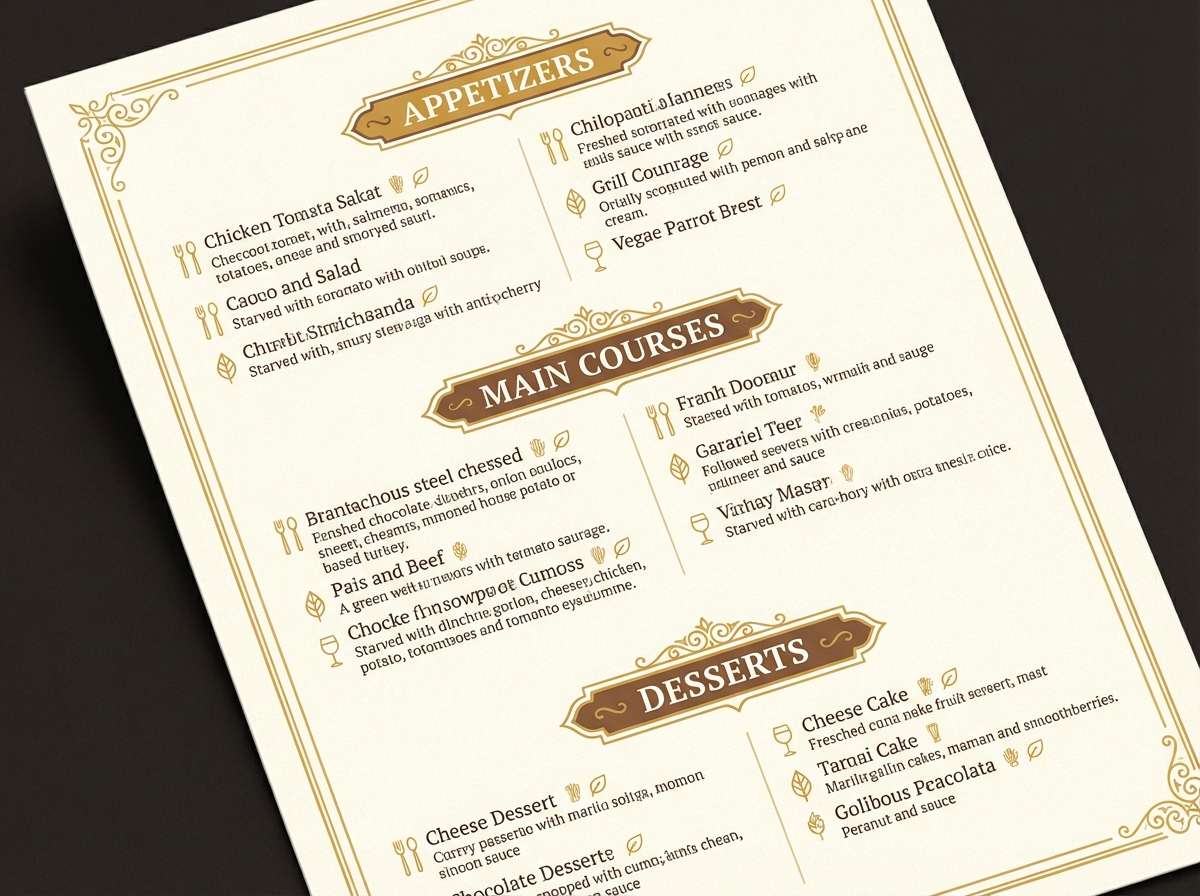
Best for: restaurant menus and table tents
Warm and savory, like honey drizzled over toasted walnuts. The honey and cream tones help food photography look richer, while the darker shades keep menus readable under low light. Pair with textured paper backgrounds, subtle separators, and restrained iconography. Usage tip: use the darkest tone for prices and section headers so scanning feels effortless.
Image example of honeyed walnut generated using media.io
20) Golden Moss Minimal
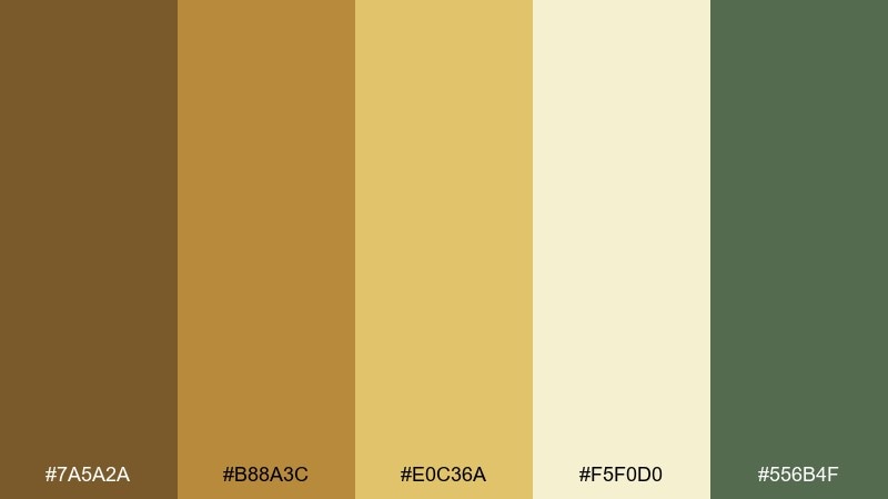
HEX: #7a5a2a #b88a3c #e0c36a #f5f0d0 #556b4f
Mood: fresh, natural, understated
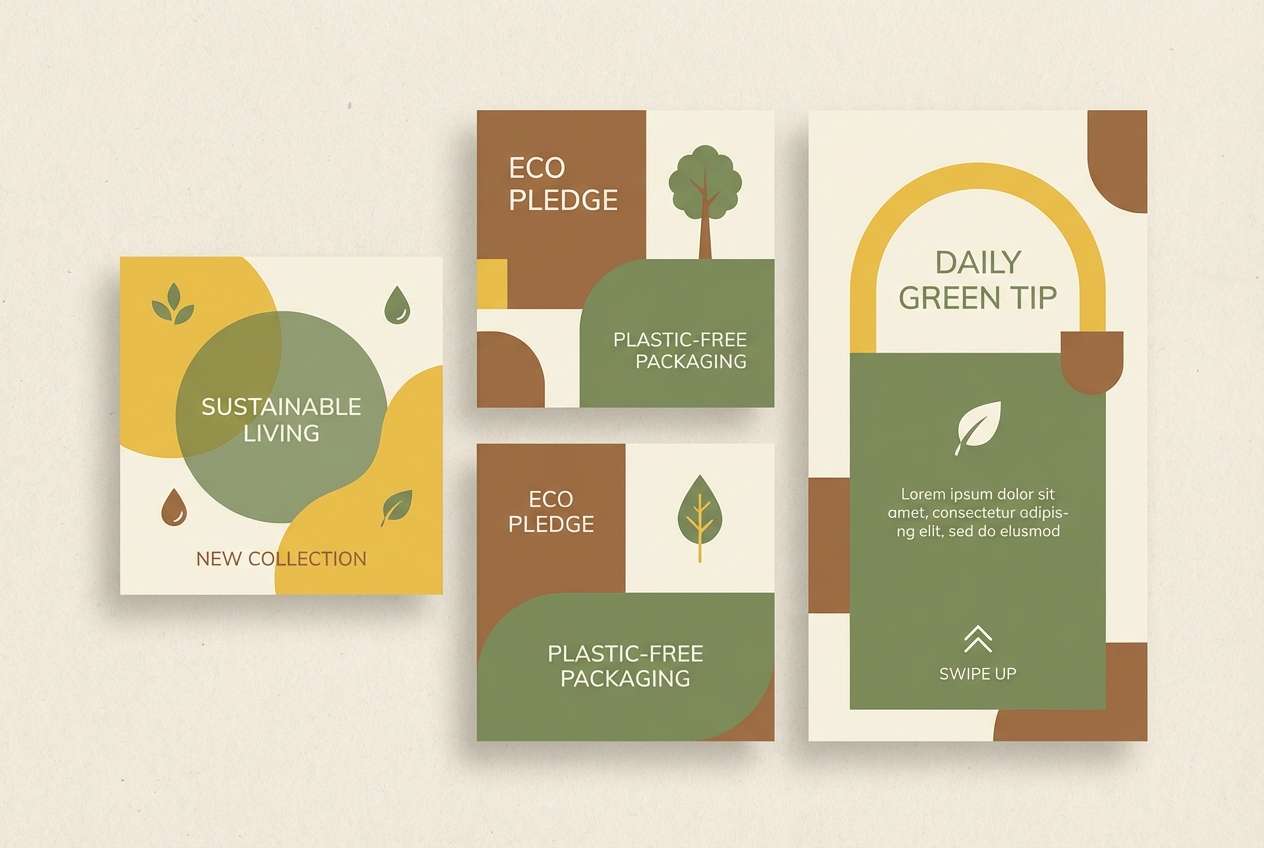
Best for: eco brand identity and social templates
Fresh and understated, like golden moss on stone after rain. The yellow-golds bring warmth, and the muted green keeps the palette feeling eco-forward rather than overly rustic. Pair with lots of cream space, clean grids, and simple line icons for a modern identity. Usage tip: make the green your primary text color to soften contrast without losing clarity.
Image example of golden moss minimal generated using media.io
What Colors Go Well with Autumn Leaves?
Autumn leaves tones pair best with creamy whites, warm beiges, and soft charcoals—these neutrals keep layouts readable while letting rust, amber, and ochre feel intentional rather than overwhelming.
For contrast, add deep forest green, espresso brown, or a cool slate gray. This keeps the palette grounded and helps headings, icons, and navigation stand out.
If you want a modern twist, introduce a misty blush or muted mauve as a highlight color—just keep it secondary so the autumn warmth stays the hero.
How to Use a Autumn Leaves Color Palette in Real Designs
Start with a light neutral as your base (background or paper), then choose one mid-warm tone (amber/terracotta) for primary elements like buttons, labels, or headline blocks.
Use the darkest tone sparingly for typography and UI structure—navigation, dividers, prices, and key details—so your warm colors don’t lose legibility.
When you need more depth, layer two neighboring warm shades (e.g., rust + pumpkin) and keep accent greens or charcoals for small areas like badges, icons, or borders.
Create Autumn Leaves Palette Visuals with AI
Want to see these autumn leaves palettes in action on posters, packaging, invitations, or UI screens? Generate consistent mockups by describing the layout, background, and dominant tones, then paste in one of the prompts above.
With Media.io, you can quickly iterate variations—swap a background from cream to tan, push the mood more “moody editorial” or “sunny market,” and keep your HEX direction consistent.
Once you have a visual you like, reuse it as a brand reference for future assets so your seasonal palette stays cohesive across channels.
Autumn Leaves Color Palette FAQs
-
What are “autumn leaves” colors?
They’re warm, earthy hues inspired by fall foliage—rust, terracotta, amber, ochre, chestnut, and deep greens—usually balanced with cream, tan, or charcoal neutrals. -
How do I keep an autumn palette from looking too dark?
Use a light neutral (cream or warm beige) as the main background and reserve the darkest browns/greens for text, icons, and small accents. -
What’s the best accent color for rust and orange tones?
Muted greens (sage, olive, pine) are the easiest complement. Cool grays also work well when you want a more modern, misty feel. -
Are autumn leaves palettes good for branding?
Yes—these colors communicate comfort, craft, heritage, and warmth. They’re especially strong for food, wellness, outdoor, and lifestyle brands. -
Which autumn palette works best for a modern website UI?
Try palettes with a strong neutral base and clear contrast, like Golden Hour Orchard, Burnt Umber Modern, or Misty Morning Leaves. -
How many colors should I use from a 5-color palette?
A common approach is 1 background neutral, 1 text/structure dark, 1 primary warm, and 1–2 supporting shades for highlights or sections. -
Can I generate matching palette mockups with AI?
Yes—use Media.io text-to-image and specify the design type (poster, packaging, UI), the background color, and the dominant warm/neutral tones for consistent results.


