Cool grey sits in that sweet spot between crisp and cozy: modern enough for UI, neutral enough for print, and calm enough for interiors. It’s a go-to when you want clarity without the harshness of pure black-and-white.
Below are 20 curated cool grey color palette ideas with HEX codes, plus quick tips for pairing accents and using these tones in real design work.
In this article
Why Cool Grey Color Schemes Work So Well
Cool grey color schemes are dependable because they bring structure without demanding attention. They create clean hierarchy for typography, UI components, and layouts while keeping the overall tone understated.
Unlike warm greys that can drift beige, cool greys stay crisp and contemporary. That makes them especially strong for tech branding, data-heavy dashboards, and minimalist editorial design.
They’re also flexible: you can keep them purely neutral for a premium feel, or introduce a single accent (teal, blue, copper, blush) to steer the mood without redesigning the whole system.
20+ Cool Grey Color Palette Ideas (with HEX Codes)
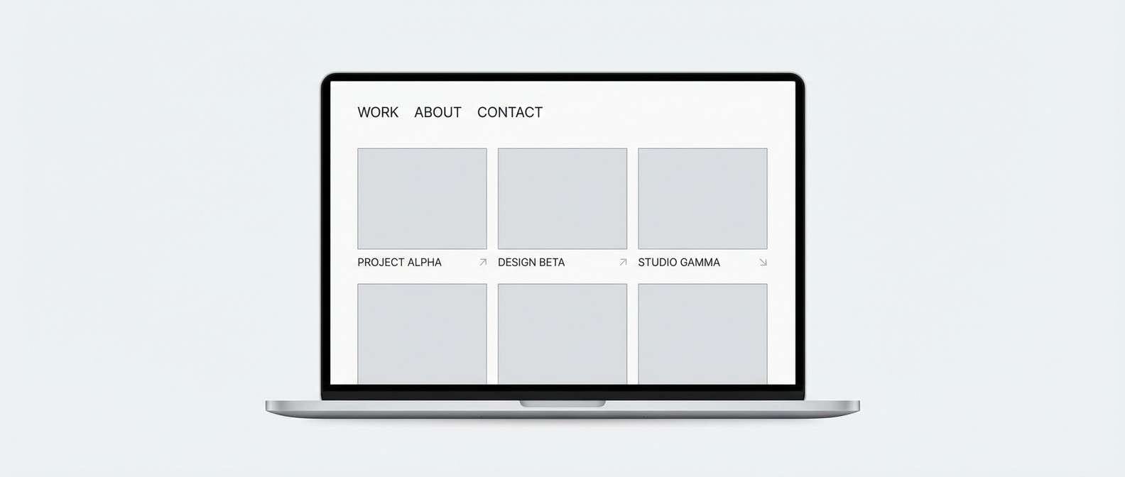
1) Arctic Concrete
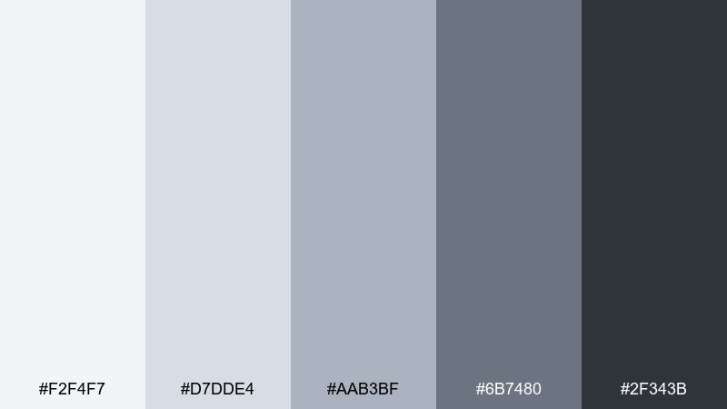
HEX: #f2f4f7 #d7dde4 #aab3bf #6b7480 #2f343b
Mood: clean, calm, professional
Best for: SaaS dashboard UI
Clean and airy like morning light on concrete, these cool grey tones feel quiet and confident. The mix reads crisp on screens, with enough depth for charts, nav, and states. For a polished look, pair it with a single cool accent (teal or icy blue) and keep typography charcoal instead of pure black. Usage tip: reserve #2f343b for headings and key numbers so the interface stays light. It also adapts well as a cool grey color scheme for data-heavy layouts.
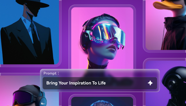
Image example of arctic concrete generated using media.io
Media.io is an online AI studio for creating and editing video, image, and audio in your browser.

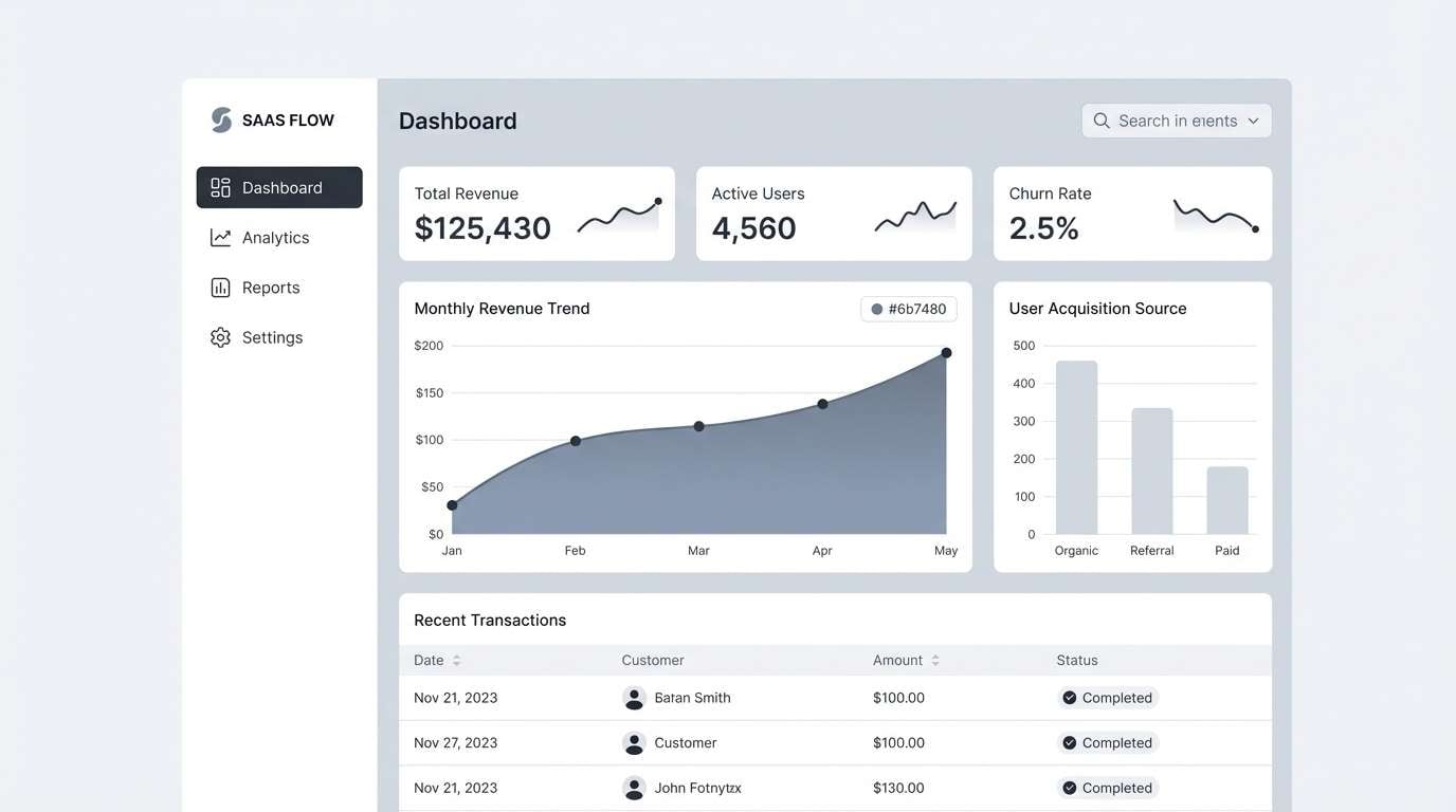
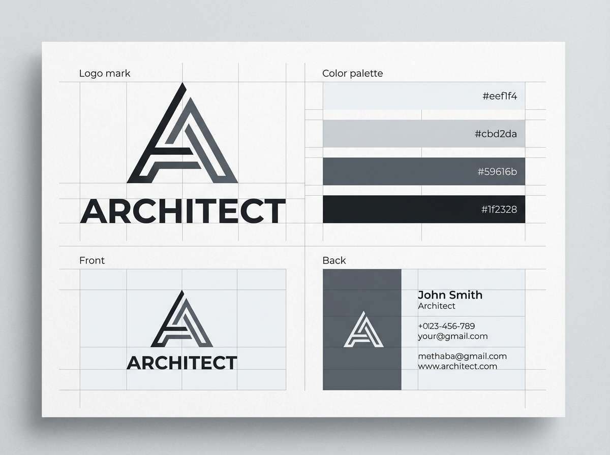
2) Steel Mist
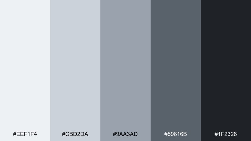
HEX: #eef1f4 #cbd2da #9aa3ad #59616b #1f2328
Mood: sleek, industrial, modern
Best for: tech brand identity
Sleek and slightly industrial, this cool grey color palette set evokes brushed steel and rainy sidewalks. It delivers strong contrast without feeling harsh, which helps logos and wordmarks stay refined. Add a single electric accent for calls-to-action, or keep it pure neutral for a premium look. Usage tip: let #1f2328 anchor the logo while #eef1f4 stays as generous negative space.
Image example of steel mist generated using media.io
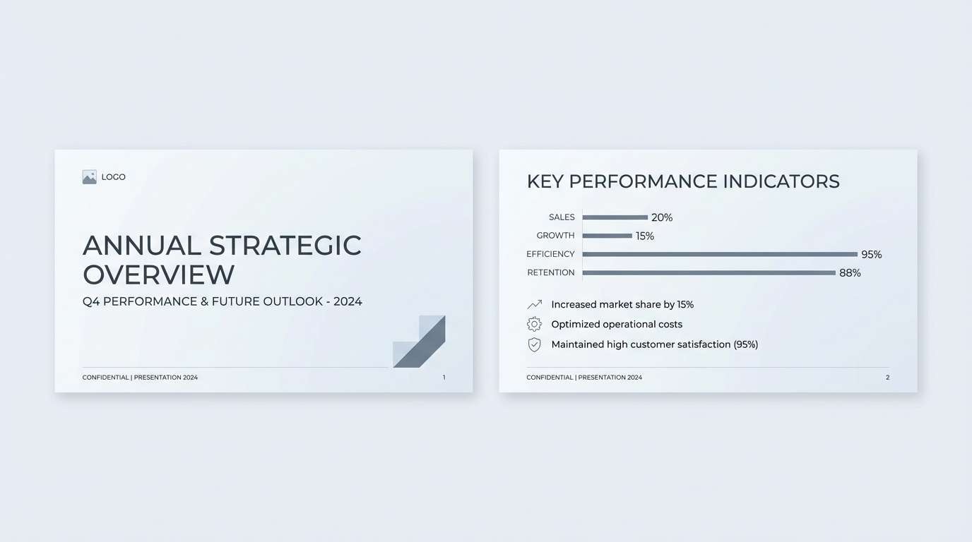
3) Glacier Office
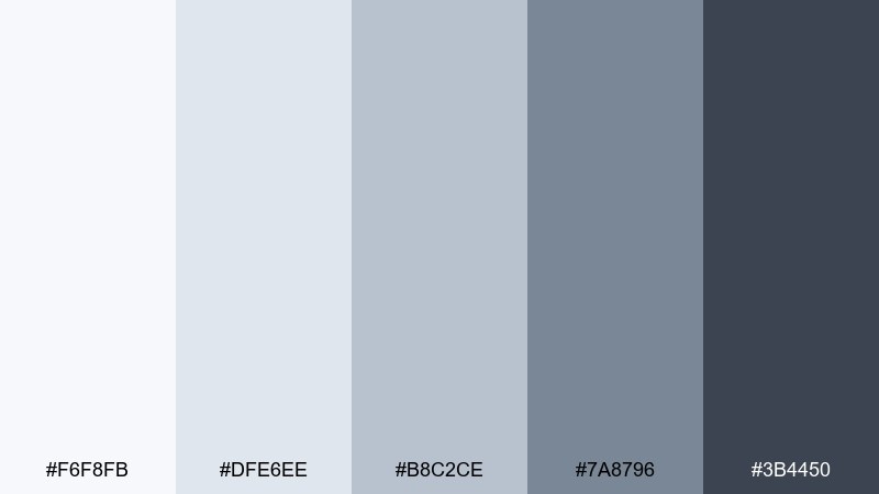
HEX: #f6f8fb #dfe6ee #b8c2ce #7a8796 #3b4450
Mood: bright, organized, minimal
Best for: presentation templates
Bright and orderly, these cool grey colors feel like a glassy glacier with crisp edges. They keep slides looking spacious while still giving you clear hierarchy for headings, charts, and callouts. Pair with a muted navy or slate for emphasis, and avoid warm oranges that can fight the cool undertone. Usage tip: use #dfe6ee for section breaks so the deck stays cohesive without heavy dividers.
Image example of glacier office generated using media.io
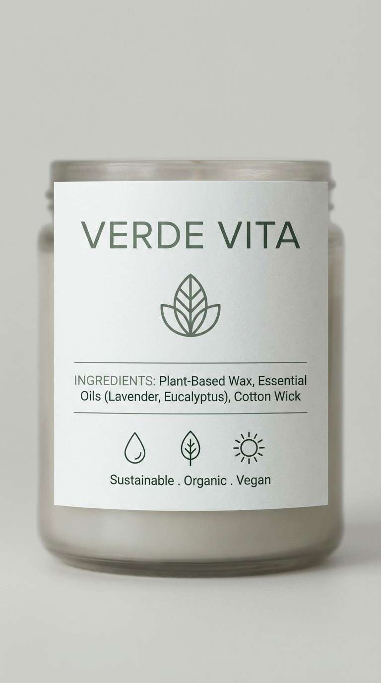
4) Silver Sage
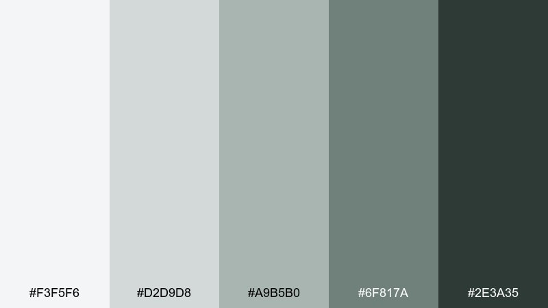
HEX: #f3f5f6 #d2d9d8 #a9b5b0 #6f817a #2e3a35
Mood: natural, soothing, refined
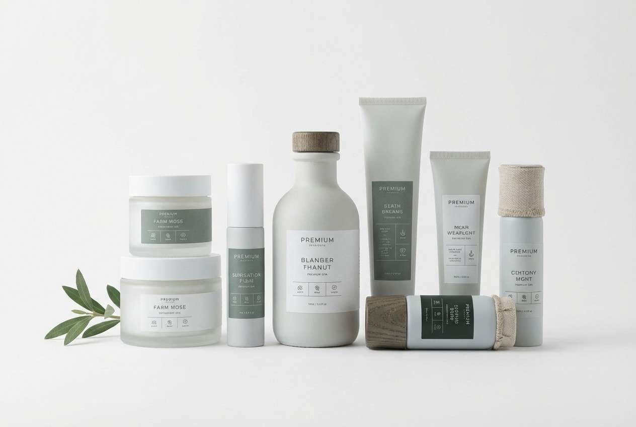
Best for: spa and wellness packaging
Soft and botanical, this cool grey mix suggests sage leaves dusted with silver. The gentle green-grey notes make packaging feel calm, clean, and trustworthy. Pair it with matte white and subtle embossing, or add a muted gold foil if you want a premium finish. Usage tip: keep ingredients text in #2e3a35 for legibility without losing the tranquil vibe.
Image example of silver sage generated using media.io
5) Harbor Morning
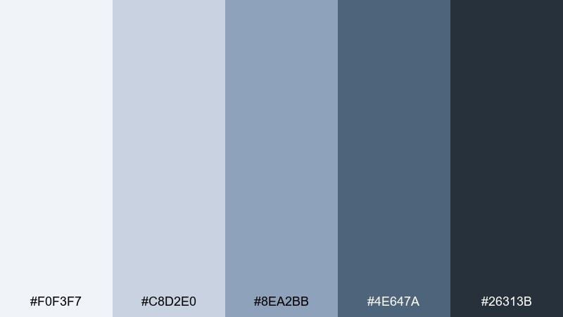
HEX: #f0f3f7 #c8d2e0 #8ea2bb #4e647a #26313b
Mood: coastal, steady, fresh
Best for: website hero section
Cool and coastal, these blues and greys feel like fog lifting over a harbor. The midtones give you enough color to look inviting while staying professional. If you are hunting for cool grey color combinations that still feel friendly, use #8ea2bb for buttons and keep backgrounds in #f0f3f7. Usage tip: add subtle gradients from #c8d2e0 to #f0f3f7 to avoid a flat hero area.
Image example of harbor morning generated using media.io

6) Graphite and Cloud
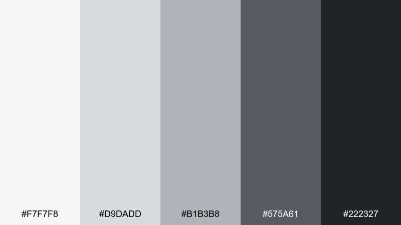
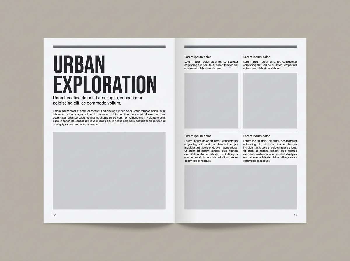
HEX: #f7f7f8 #d9dadd #b1b3b8 #575a61 #222327
Mood: minimal, bold, timeless
Best for: editorial magazine layout
Bold and timeless, these neutrals evoke graphite sketches on bright paper. The range from cloud-white to near-black makes typography and grid systems feel intentional. When you need a cool grey color palette that looks premium in print, lean on #222327 for headlines and #d9dadd for generous margins. Usage tip: use one weight heavier than usual, since greys can read softer on coated stock.
Image example of graphite and cloud generated using media.io
7) Frosted Denim
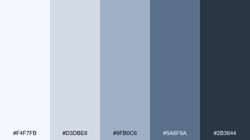
HEX: #f4f7fb #d3dbe6 #9fb0c6 #5a6f8a #2b3644
Mood: casual, crisp, approachable
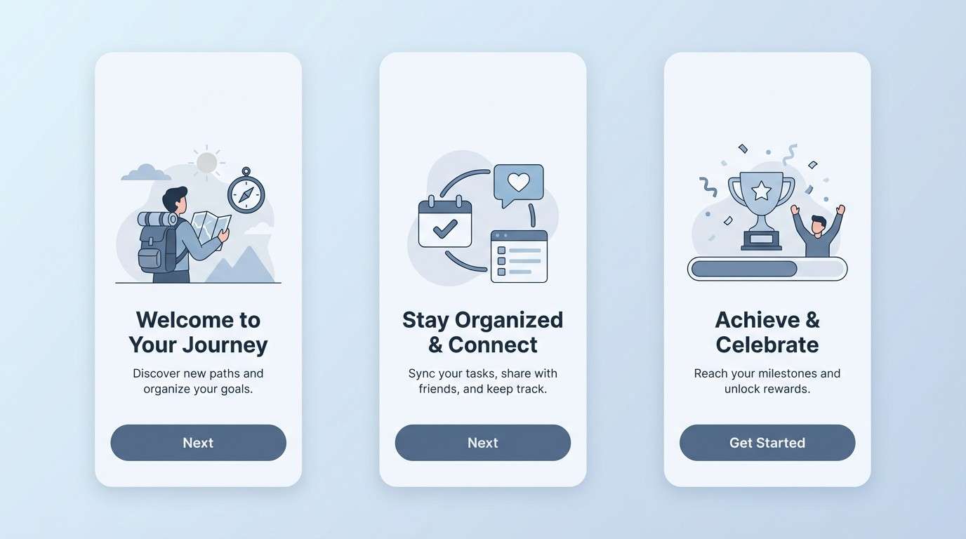
Best for: app onboarding screens
Crisp and casual, this cool grey color scheme feels like light-washed denim under a winter sky. The softer blues work well for onboarding flows where you want guidance without visual pressure. Pair with white space and rounded cards, then use #2b3644 for clear step titles. Usage tip: keep illustrations in two tones (#9fb0c6 and #5a6f8a) so screens stay consistent from step to step.
Image example of frosted denim generated using media.io
8) Quiet Lavender
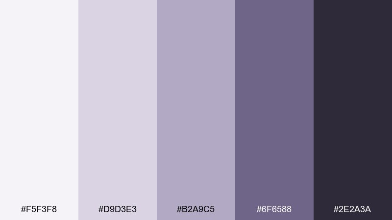
HEX: #f5f3f8 #d9d3e3 #b2a9c5 #6f6588 #2e2a3a
Mood: soft, dreamy, elegant
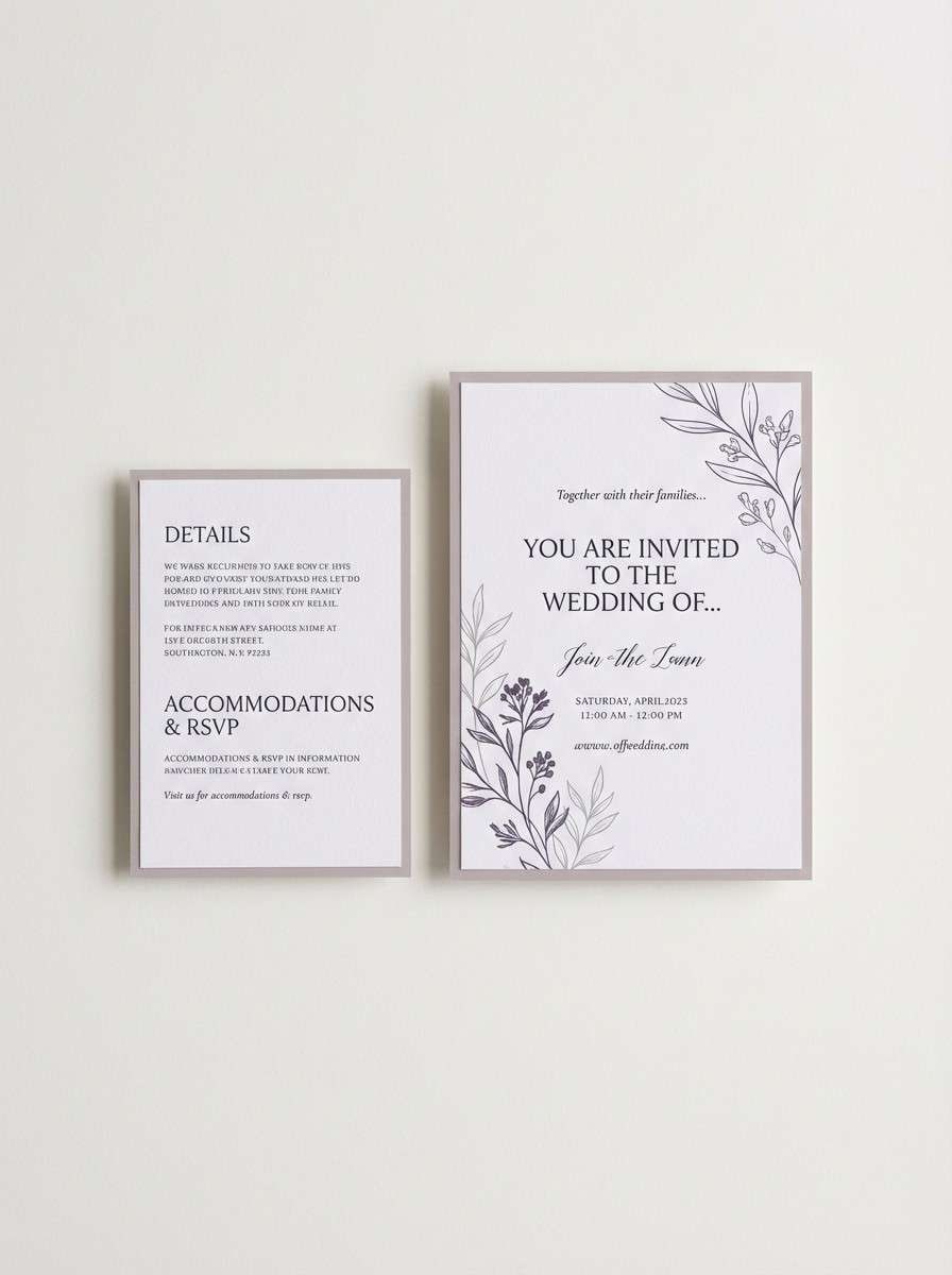
Best for: wedding invitation suite
Soft and dreamy, these cool grey tones bring to mind lavender dusk and satin ribbon. The violet-grey mix is romantic without going overly sweet, making it great for modern stationery. Pair with warm white paper and a delicate serif, and keep embellishments minimal so the color can breathe. Usage tip: print large blocks in #f5f3f8 and reserve #2e2a3a for names and key details to keep contrast sharp.
Image example of quiet lavender generated using media.io
9) Polar Peach
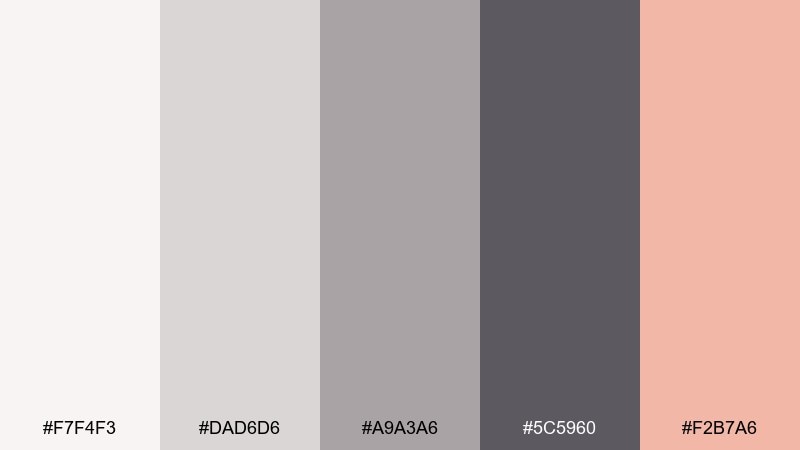
HEX: #f7f4f3 #dad6d6 #a9a3a6 #5c5960 #f2b7a6
Mood: warm-cool balance, gentle, modern
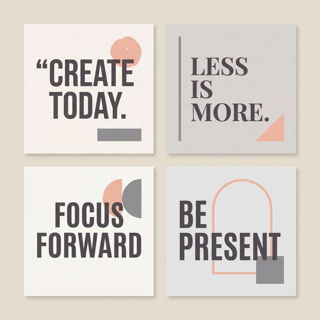
Best for: social media quote templates
Gentle and modern, these cool grey shades feel like soft knitwear with a blush highlight. The peach accent keeps the greys from looking cold, which is perfect for personable content. Pair with simple geometric shapes and let #5c5960 handle the type for readability. Usage tip: use the peach only for emphasis words or icons so the feed stays cohesive.
Image example of polar peach generated using media.io
10) Slate Teal

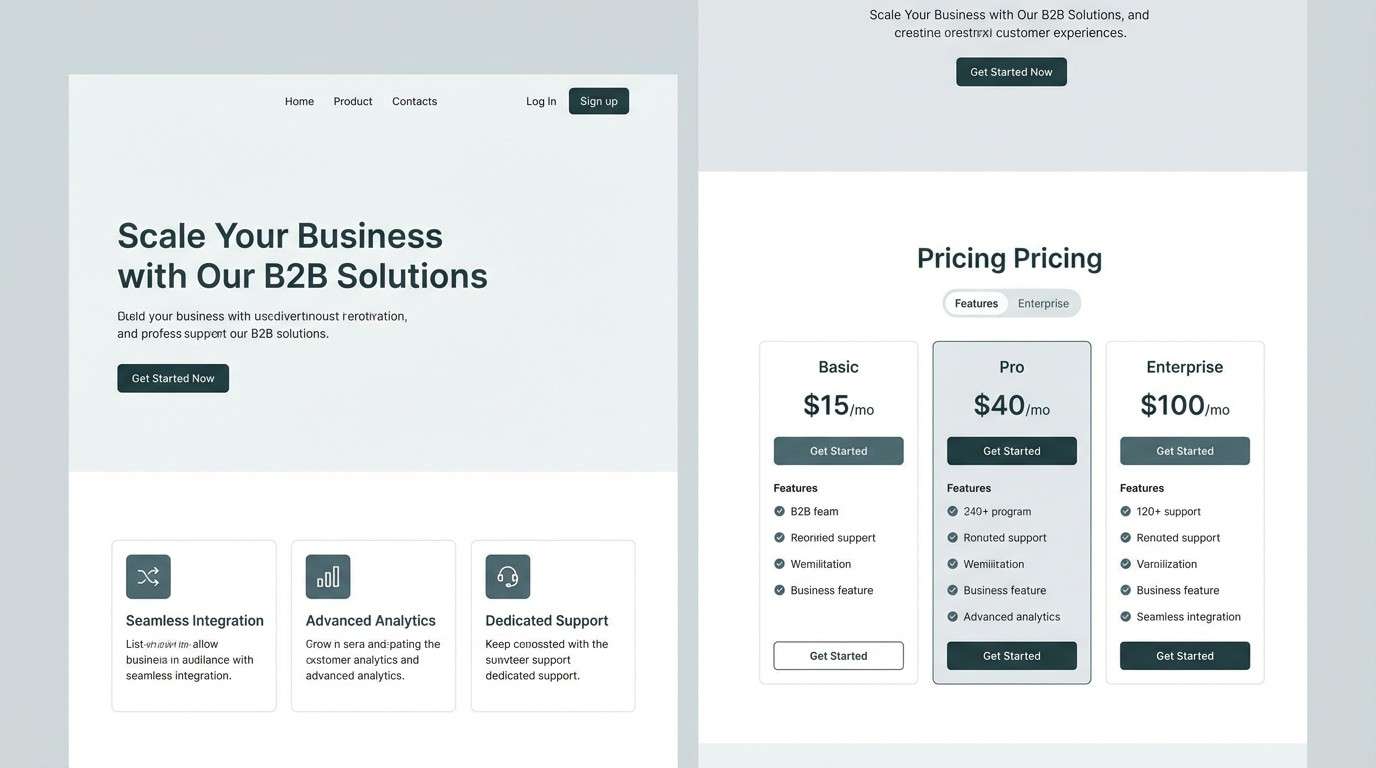
HEX: #f1f4f5 #cfd7db #95a7ad #4b666f #1f3c42
Mood: confident, refreshing, structured
Best for: B2B landing page
Confident and refreshing, these cool grey color combinations recall slate stone and deep water. The teal-leaning greys add personality while staying squarely business-ready. Pair with crisp line icons and plenty of spacing, then use #1f3c42 for CTAs and sticky headers. Usage tip: keep form fields in #cfd7db so they read clearly without heavy outlines.
Image example of slate teal generated using media.io
11) Winter Moss
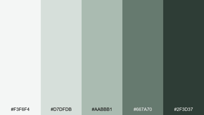
HEX: #f3f6f4 #d7dfdb #aabbb1 #667a70 #2f3d37
Mood: earthy, quiet, grounding
Best for: eco product label design
Earthy and quiet, this cool grey color palette feels like moss under frost and shaded pine. It suits sustainable branding where you want natural cues without loud greens. Pair with recycled-paper textures and minimal icons, then keep copy in #2f3d37 for a grounded finish. Usage tip: avoid pure black outlines and use #667a70 for strokes to stay soft.
Image example of winter moss generated using media.io
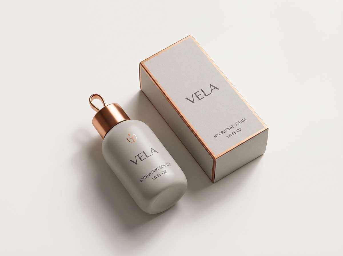
12) Moonlit Copper
HEX: #f6f5f4 #d8d6d4 #a5a2a0 #555352 #b46a52
Mood: elevated, cozy, sophisticated
Best for: product ad creative
Elevated and cozy, these cool grey hues suggest moonlight on metal with a warm copper glint. The warm accent adds depth while the base stays sleek and modern. For cool grey color combinations that feel luxurious, let #b46a52 appear in small highlights like badges or price tags. Usage tip: keep shadows neutral (#555352) so the copper does not shift toward orange in different screens.
Image example of moonlit copper generated using media.io
13) Stormy Minimal
HEX: #fafafa #e1e2e5 #b9bbc1 #70737c #2b2d33
Mood: sharp, minimal, high-contrast
Best for: portfolio website
Sharp and minimal, this cool grey color scheme feels like storm clouds breaking into clean daylight. The contrast is strong enough for galleries and case studies, while still reading softer than pure black and white. Pair with one signature accent color for links, and keep imagery true-to-life so the neutrals do not compete. Usage tip: use #e1e2e5 for section bands to guide scrolling without heavy borders.
Image example of stormy minimal generated using media.io
14) Ink and Ice
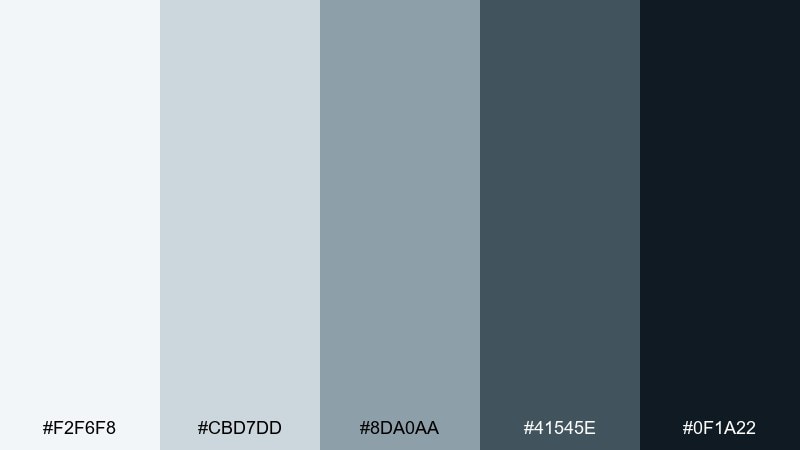
HEX: #f2f6f8 #cbd7dd #8da0aa #41545e #0f1a22
Mood: crisp, serious, editorial
Best for: annual report design
Crisp and serious, these cool grey tones evoke ink on icy paper and clean infographics. The deeper navy-black gives structure for large documents with charts, tables, and pull quotes. Pair with restrained photography and thin rules in #8da0aa to keep pages airy. Usage tip: set long body text in #41545e for reduced glare compared with pure black.
Image example of ink and ice generated using media.io
15) Urban Blush
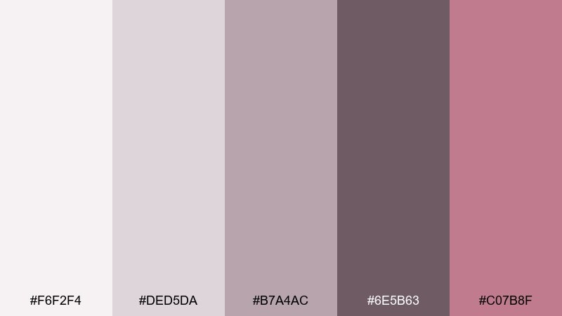
HEX: #f6f2f4 #ded5da #b7a4ac #6e5b63 #c07b8f
Mood: chic, soft, metropolitan
Best for: fashion lookbook
Chic and metropolitan, this cool grey palette feels like pink-tinted concrete and satin lining. The dusty rose accent adds personality without overpowering the neutral base. Pair with minimalist photography blocks and fine-line typography for a runway editorial vibe. Usage tip: keep #c07b8f to small headings or section tabs so the layout stays refined.
Image example of urban blush generated using media.io
16) Modern Monochrome
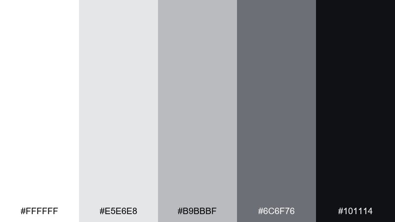
HEX: #ffffff #e5e6e8 #b9bbbf #6c6f76 #101114
Mood: classic, confident, ultra-clean
Best for: logo and icon system
Classic and ultra-clean, these cool grey color combinations feel like a gallery wall with perfect lighting. The steps from white to near-black make icons, marks, and UI components easy to standardize. When you need a cool grey color palette that scales across sizes, use #b9bbbf for secondary strokes and #101114 for key shapes. Usage tip: define a single grey for disabled states (#6c6f76) so the system stays predictable.
Image example of modern monochrome generated using media.io
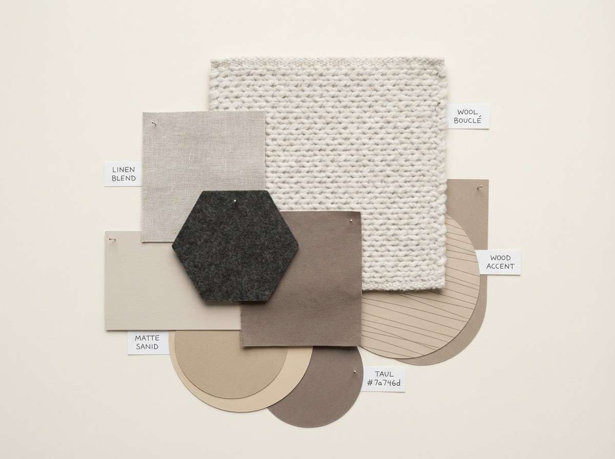
17) Nordic Sand
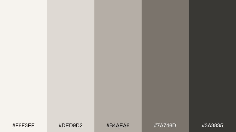
HEX: #f6f3ef #ded9d2 #b4aea6 #7a746d #3a3835
Mood: warm-neutral, calm, lived-in
Best for: interior design moodboard
Calm and lived-in, these neutrals recall pale sand, stone, and soft wool. The slight warmth makes rooms feel welcoming while still reading modern and uncluttered. Pair with light oak, brushed nickel, and textured linens for depth. Usage tip: balance the palette with one deeper anchor (#3a3835) in frames or hardware so the space does not drift too beige.
Image example of nordic sand generated using media.io
18) Blue Hour Slate
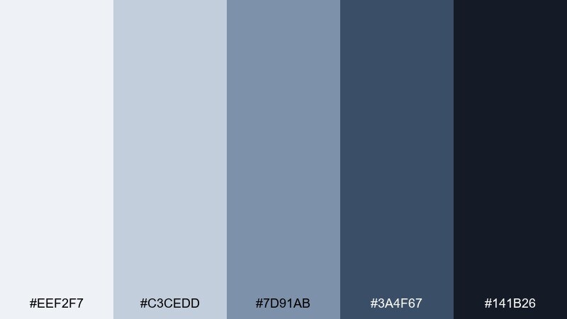
HEX: #eef2f7 #c3cedd #7d91ab #3a4f67 #141b26
Mood: moody, modern, cinematic
Best for: music poster design
Moody and cinematic, these cool grey shades feel like blue hour settling over a city skyline. The deep navy anchor gives posters strong readability while the lighter tints keep gradients smooth. Pair with bold sans-serif type and minimal shapes, and avoid warm yellows unless you want intentional tension. Usage tip: set the background as a gradient from #141b26 to #3a4f67 for depth without clutter.
Image example of blue hour slate generated using media.io

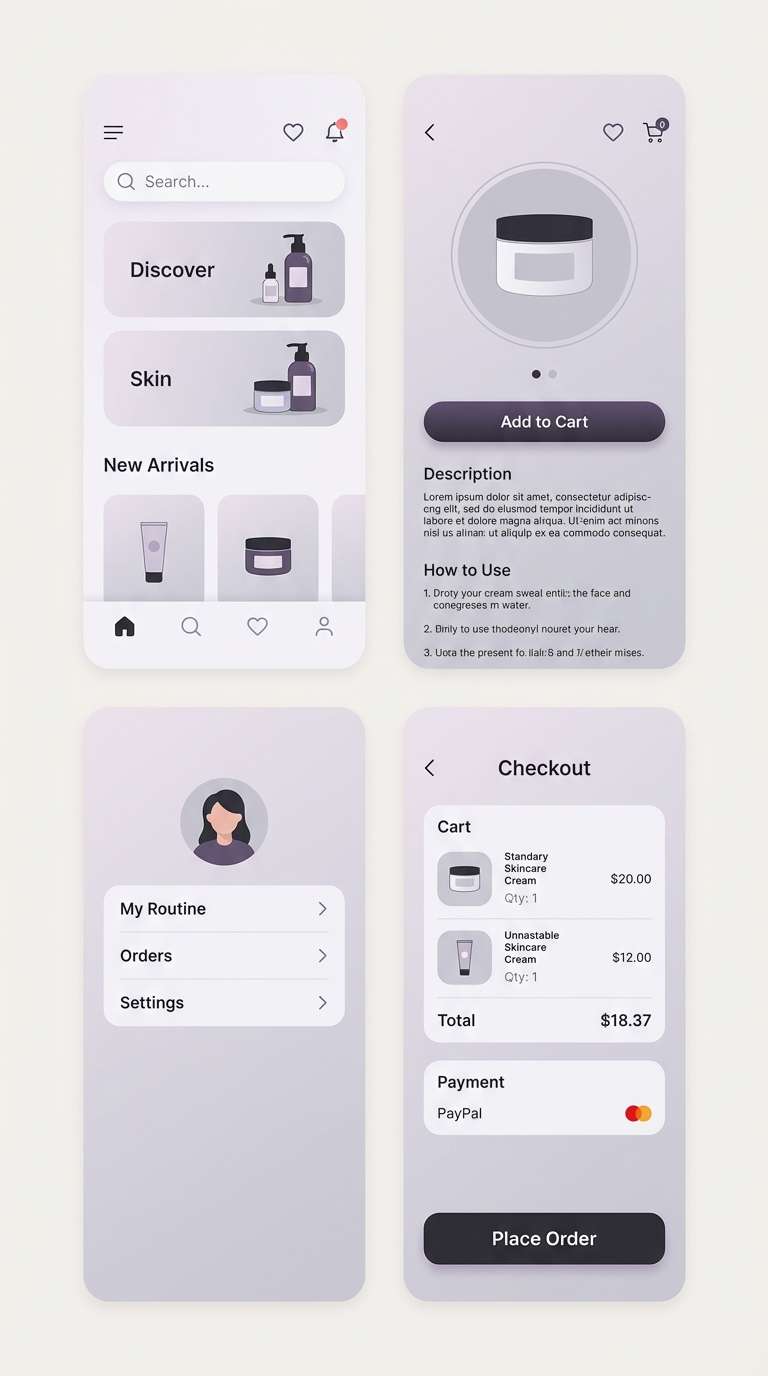
19) Lilac Chrome
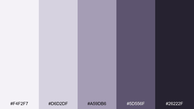
HEX: #f4f2f7 #d6d2df #a59db6 #5d556f #26222f
Mood: futuristic, soft, polished
Best for: beauty app UI
Futuristic yet soft, these cool grey tones suggest lilac-tinted chrome and velvet shadows. The purple-grey direction works beautifully for beauty and lifestyle interfaces that need elegance. Pair with minimal product photography and subtle gradients, then use #26222f for crisp labels. Usage tip: keep buttons in #5d556f with #f4f2f7 text to maintain contrast without going stark.
Image example of lilac chrome generated using media.io
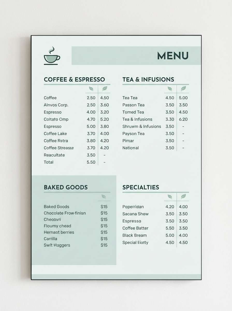
20) Crisp Mint Gray
HEX: #f1f6f5 #d0dfdb #9fbdb4 #5b7f77 #2a3c38
Mood: fresh, clean, quietly energetic
Best for: coffee shop menu design
Fresh and quietly energetic, this cool grey color scheme feels like mint leaves on cool stone. The green-grey tones keep menus clean while still adding a signature personality. If you want cool grey color combinations that read modern in print, use #2a3c38 for headings and #9fbdb4 for category highlights. Usage tip: keep the background #f1f6f5 and limit accent blocks so items stay easy to scan.
Image example of crisp mint gray generated using media.io
What Colors Go Well with Cool Grey?
Cool grey pairs naturally with cool accents like teal, slate blue, icy cyan, and deep navy. These keep the temperature consistent and make interfaces or layouts feel intentional rather than “default.”
For contrast and warmth, add controlled highlights such as copper, blush, or soft peach. A small dose is usually enough to create focus for buttons, badges, headings, or key data points.
If you want to keep everything neutral, layer multiple greys and anchor with near-black or blue-black instead of true black. That preserves the calm, modern look while improving readability.
How to Use a Cool Grey Color Palette in Real Designs
Start with roles, not swatches: choose one light background, one surface grey for cards/sections, one mid grey for borders and secondary text, and one deep anchor for headings and UI controls. This creates a system that scales.
In print and branding, cool greys look best with generous whitespace and strong typography hierarchy. Because greys can feel softer on paper, keep contrast intentional—especially for body text and fine lines.
For interiors, mix cool greys with texture (linen, wool, stone) so the space doesn’t read flat. Add one accent material—brushed metal, dark wood, or muted color—to keep the palette from feeling overly sterile.
Create Cool Grey Palette Visuals with AI
If you want to preview how a cool grey color scheme looks in a dashboard, poster, packaging mockup, or interior moodboard, AI visuals can help you validate contrast and vibe before you commit.
With Media.io’s text-to-image tool, you can paste a prompt, specify aspect ratio, and generate consistent examples for branding systems or UI flows—using your exact HEX colors as guidance.
It’s a fast way to test multiple cool grey color combinations and pick the one that feels right for your audience and medium.
Cool Grey Color Palette FAQs
-
What is a “cool grey” color?
A cool grey is a grey with subtle blue, green, or violet undertones (instead of beige/yellow). It tends to feel crisp, modern, and clean—especially in UI and contemporary branding. -
Which accent colors work best with cool grey palettes?
Teal, slate blue, icy cyan, and deep navy keep the palette cohesive. For warmer contrast, use copper, blush, or soft peach as small highlights for CTAs, tags, or key elements. -
How do I keep cool grey designs from feeling cold?
Increase whitespace, use softer greys instead of stark black, and add one warm accent (like copper or peach). Texture also helps—grain, paper stock, or subtle shadows can make the palette feel more inviting. -
Is cool grey suitable for websites and app UI?
Yes—cool grey is popular for SaaS and product UI because it supports readability and clear hierarchy. Just ensure accessibility by using enough contrast for text, icons, and interactive states. -
What’s the best “dark” color to pair with cool grey instead of pure black?
Try charcoal, blue-black, or deep slate (like #1f2328 or #0f1a22). These keep the overall temperature consistent and can reduce harshness and glare compared with pure black. -
Do cool greys print well?
They do, but greys can shift depending on paper and ink profiles. For print, keep contrast a bit stronger than you think you need, and proof when possible—especially for light grey text and thin lines. -
How can I visualize a cool grey palette before designing?
Generate quick mockups (UI, posters, packaging, moodboards) with an AI image tool. Using prompts that mention your HEX colors helps you compare variations and choose the best cool grey color scheme faster.
