

Dark olive green is a grounded, grown-up shade that instantly adds depth without the harshness of black. It’s a go-to for earthy branding, cozy interiors, and calm UI systems that still need strong contrast.
Below are 20+ dark olive green color palette ideas with HEX codes, mood cues, and practical pairing tips—so you can move from “nice color” to a cohesive design fast.
In this article
- Why Dark Olive Green Palettes Work So Well
-
- forest study
- moss and clay
- olive nightfall
- herbarium neutrals
- vintage safari
- modern military chic
- botanical minimal ui
- autumn orchard
- brass and linen
- deep woodland spa
- earthy editorial
- ceramic studio
- quiet cabin
- citrus accent
- ink and olive
- garden wedding suite
- retro field notes
- desert olive dusk
- sage tech branding
- rainy greenstone
- What Colors Go Well with Dark Olive Green?
- How to Use a Dark Olive Green Color Palette in Real Designs
- Create Dark Olive Green Palette Visuals with AI
Why Dark Olive Green Palettes Work So Well
Dark olive green sits in a sweet spot between neutral and color. It has enough pigment to feel intentional, yet it behaves like a “soft black” in layouts—supporting typography, framing photos, and grounding busy compositions.
Because it’s naturally muted, it pairs easily with warm whites, beiges, taupes, and wood tones for an earthy green palette. At the same time, it can look premium with brass or gold accents, or modern with cool gray-greens in UI.
Most importantly, dark olive green communicates calm confidence. That makes it ideal for branding colors, interiors, and interfaces where you want durability and trust without leaning overly corporate.
20+ Dark Olive Green Color Palette Ideas (with HEX Codes)
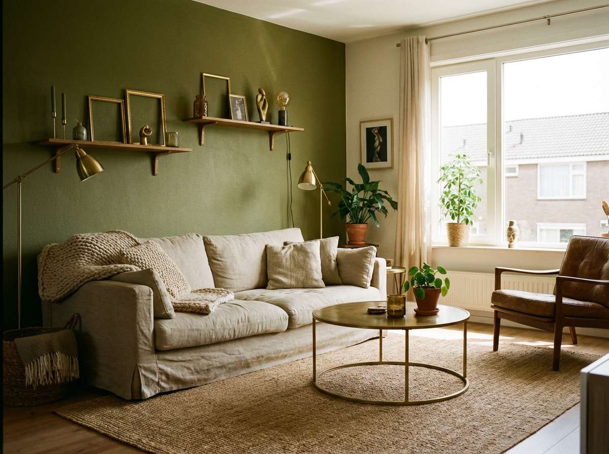
1) Forest Study
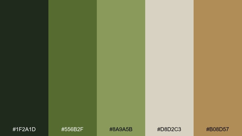
HEX: #1f2a1d #556b2f #8a9a5b #d8d2c3 #b08d57
Mood: grounded, scholarly, natural
Best for: cozy living room interior accents
Grounded and quietly confident, it feels like old libraries, pine shadows, and worn leather. Use the deep green as your anchor and let linen-beige open up the space. Brass or warm wood tones make the palette feel intentional rather than rustic. Tip: keep large surfaces light, and reserve the darkest green for trim, built-ins, or a single statement wall.
Image example of forest study generated using media.io
Media.io is an online AI studio for creating and editing video, image, and audio in your browser.

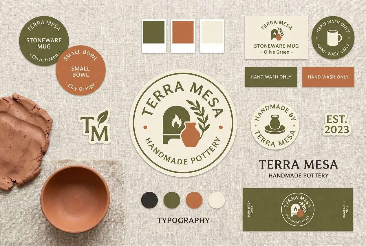
2) Moss and Clay
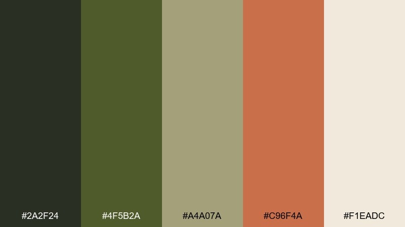
HEX: #2a2f24 #4f5b2a #a4a07a #c96f4a #f1eadc
Mood: earthy, artisanal, warm
Best for: handmade pottery brand identity
Earthy and handcrafted, it reads like moss on stone paired with sun-baked clay. The terracotta note brings instant warmth against muted greens and oatmeal neutrals. It works beautifully for craft packaging, maker logos, and studio signage where texture matters. Tip: use the clay tone as a small accent on labels to keep the look premium and not overly rustic.
Image example of moss and clay generated using media.io
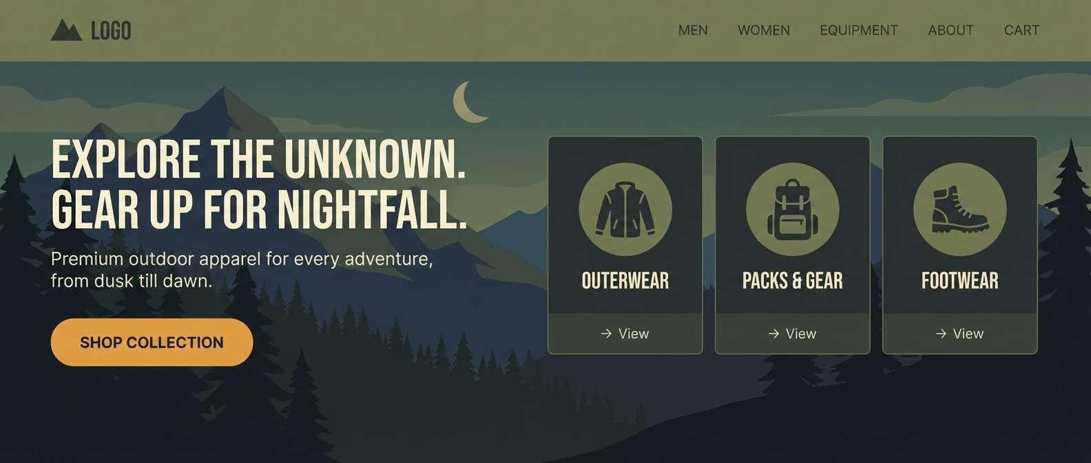
3) Olive Nightfall
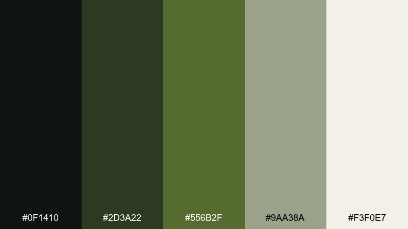
HEX: #0f1410 #2d3a22 #556b2f #9aa38a #f3f0e7
Mood: moody, cinematic, refined
Best for: hero banner for an outdoor apparel site
Moody and cinematic, it evokes twilight hikes and quiet confidence. The near-black green gives you dramatic contrast without feeling harsh like pure black. Pair it with soft off-white for readable type and a misty gray-green for secondary UI surfaces. Tip: keep calls to action light and crisp so the depth stays elegant, not heavy.
Image example of olive nightfall generated using media.io
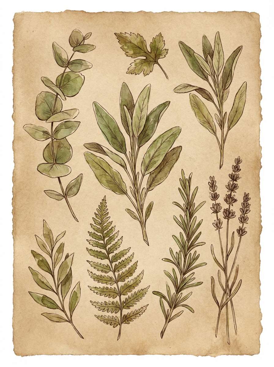
4) Herbarium Neutrals
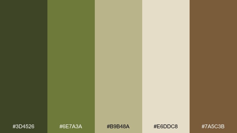
HEX: #3d4526 #6e7a3a #b9b48a #e6ddc8 #7a5c3b
Mood: botanical, calm, vintage
Best for: watercolor botanical illustration series
Botanical and calm, it feels like pressed leaves in an old notebook. The warm brown adds a natural ink-like grounding that complements the greens. Use it for nature illustrations, eco packaging, or calm editorial accents where you want softness over saturation. Tip: let the cream act as paper, and layer the greens in transparent washes for depth.
Image example of herbarium neutrals generated using media.io
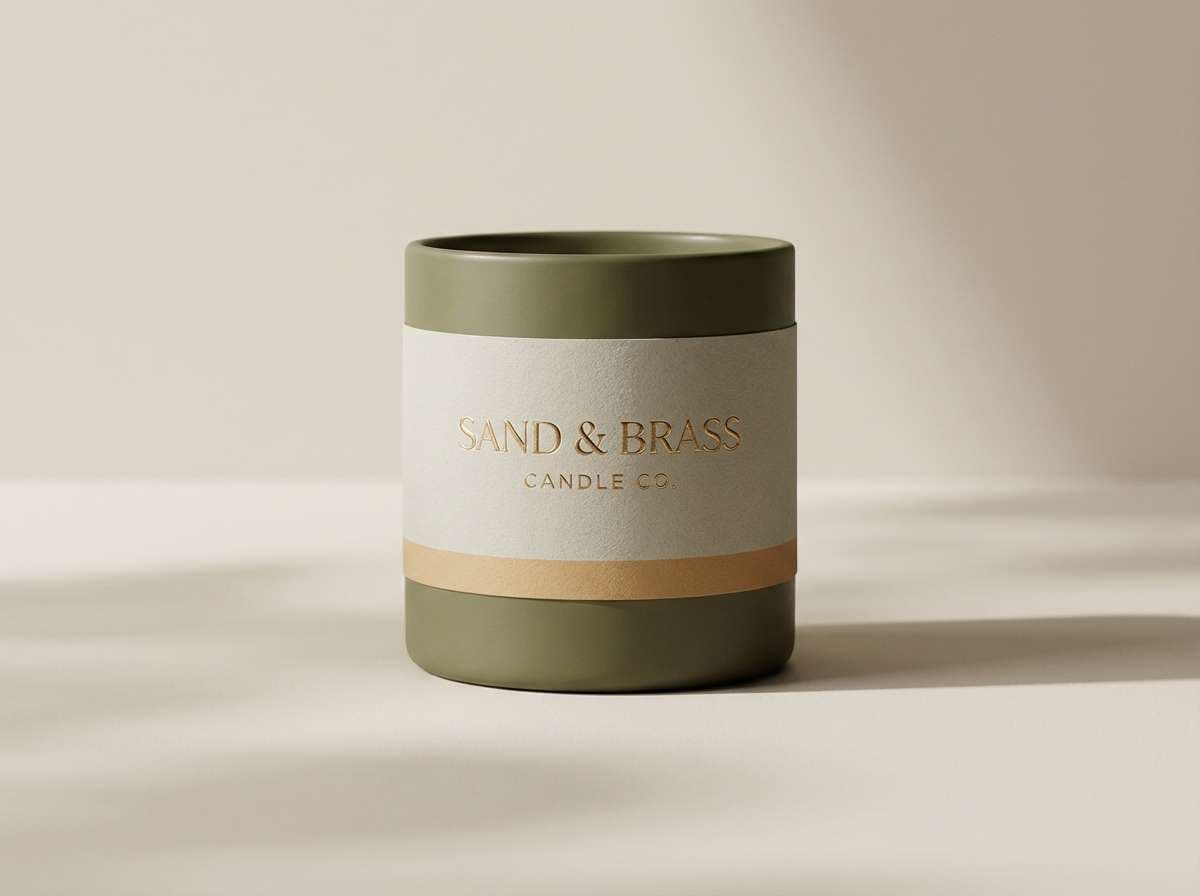
5) Vintage Safari
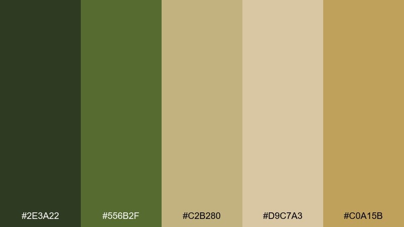
HEX: #2e3a22 #556b2f #c2b280 #d9c7a3 #c0a15b
Mood: adventurous, nostalgic, sun-warmed
Best for: premium candle packaging
Adventurous and sun-warmed, it brings to mind canvas tents, dusty trails, and brass compasses. The sand and parchment tones keep the green from feeling too heavy on shelves. This set fits premium packaging, labels, and lifestyle product ads that lean classic rather than trendy. Tip: use subtle gold-leaning accents for foils and borders, and keep typography simple and spaced out.
Image example of vintage safari generated using media.io
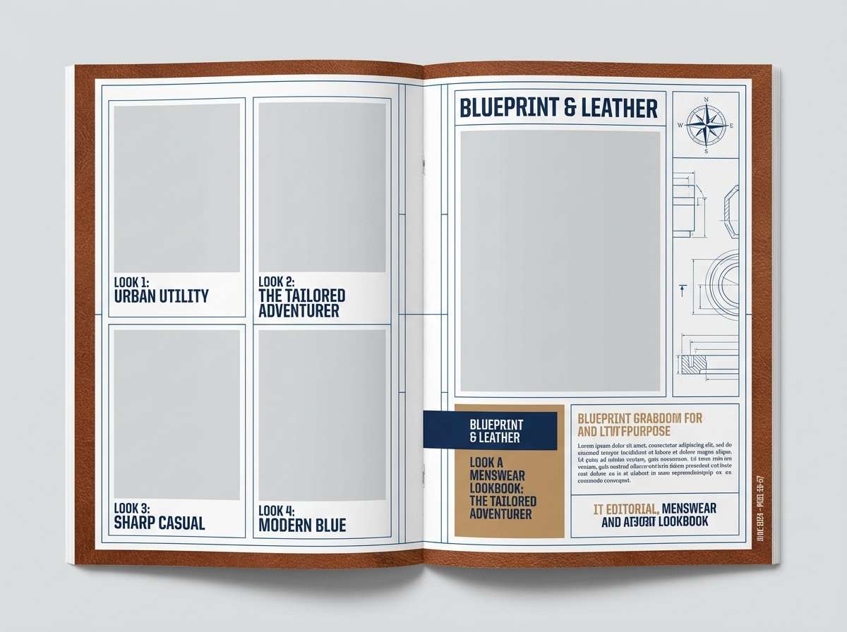
6) Modern Military Chic
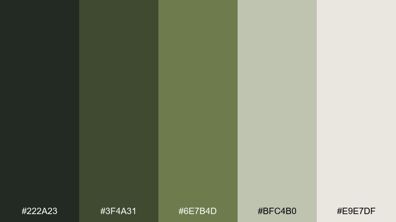
HEX: #222a23 #3f4a31 #6e7b4d #bfc4b0 #e9e7df
Mood: structured, modern, understated
Best for: menswear lookbook layout
Structured and understated, it feels like tailored utility with a modern edge. The cool gray-green steps soften the darker base so layouts stay crisp and readable. Great for lookbooks, minimalist ecommerce, and brand systems that need confidence without loud color. Tip: limit the darkest tone to headings and key blocks, and let the pale neutrals do most of the work.
Image example of modern military chic generated using media.io
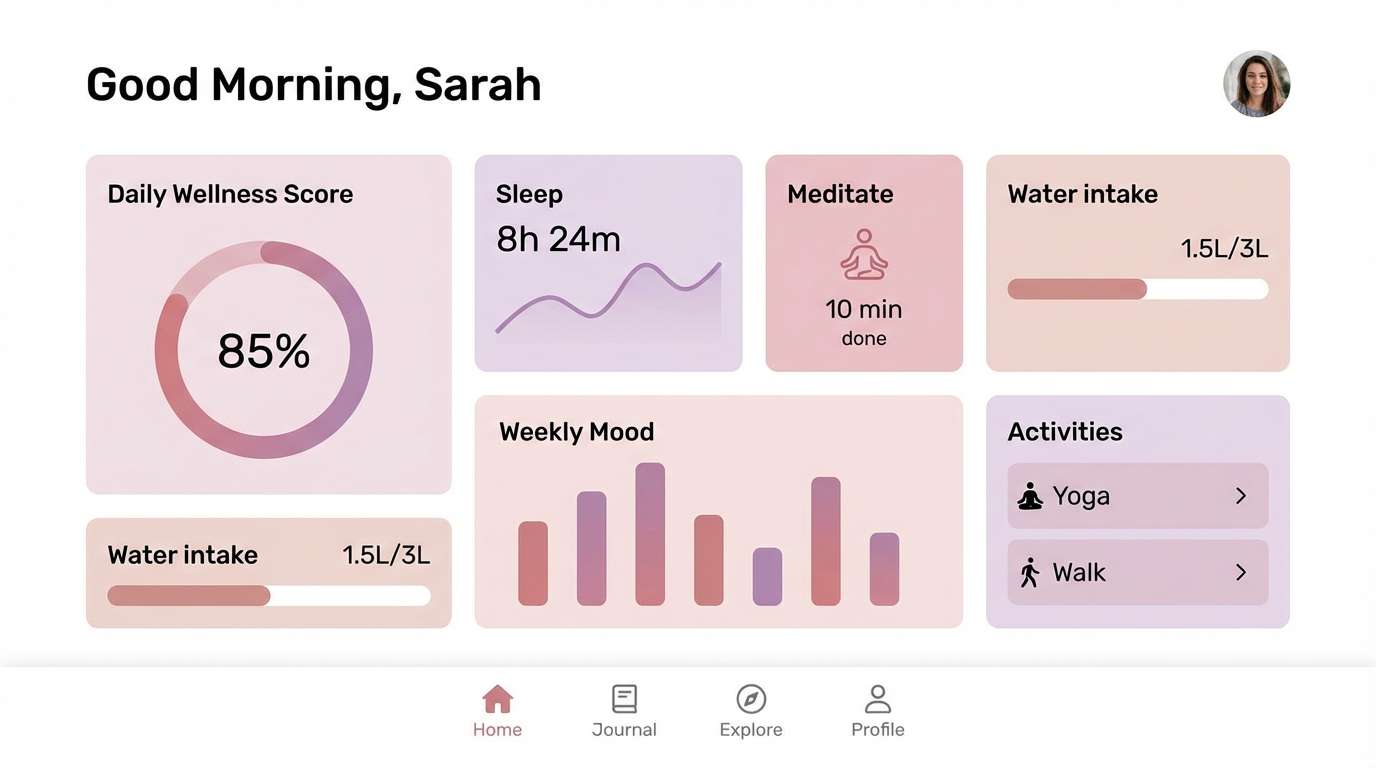
7) Botanical Minimal UI
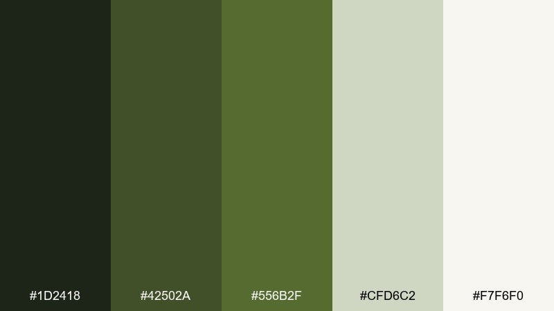
HEX: #1d2418 #42502a #556b2f #cfd6c2 #f7f6f0
Mood: clean, fresh, calming
Best for: wellness app dashboard UI
Clean and calming, it suggests morning tea, soft light, and quiet routines. As a dark olive green color scheme, it gives strong contrast for navigation while keeping the overall feel gentle. Pair it with warm whites and a pale sage surface for cards, then reserve the deep tones for icons and active states. Tip: add subtle borders instead of heavy shadows to maintain a breathable, wellness-first look.
Image example of botanical minimal ui generated using media.io
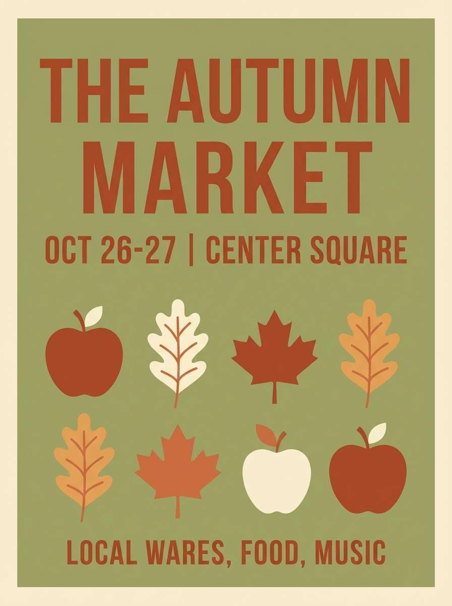
8) Autumn Orchard
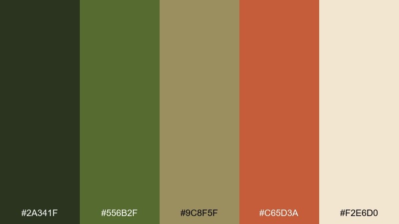
HEX: #2a341f #556b2f #9c8f5f #c65d3a #f2e6d0
Mood: cozy, seasonal, inviting
Best for: fall market event poster
Cozy and seasonal, it feels like apple crates, fallen leaves, and a warm breeze. The rust accent adds energy to olive without turning it neon or overly bright. Use it for seasonal posters, café menus, and social graphics that need a friendly punch. Tip: keep the rust for headlines and small icons, and let the cream background carry the layout.
Image example of autumn orchard generated using media.io
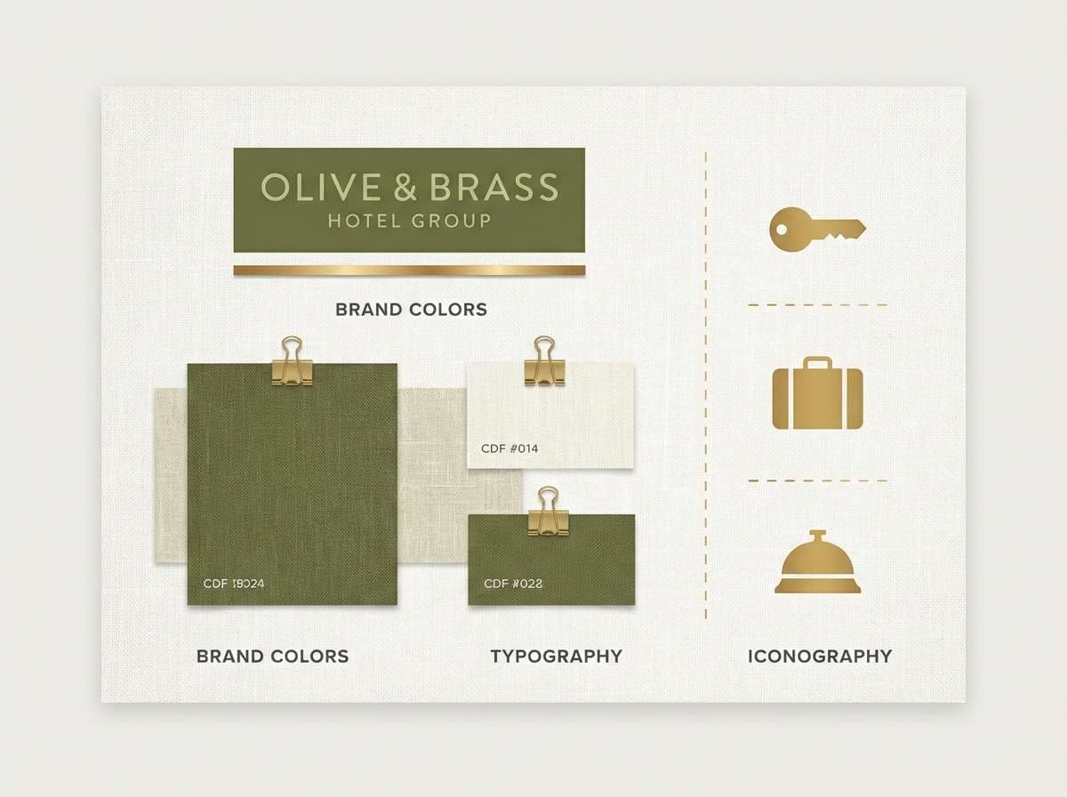
9) Brass and Linen
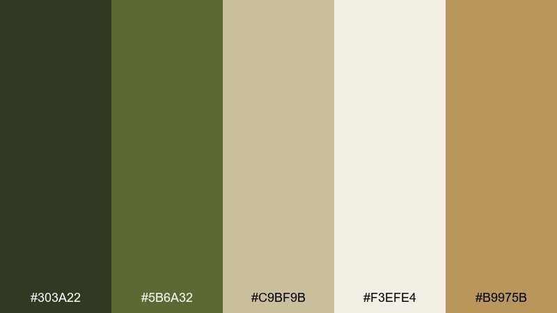
HEX: #303a22 #5b6a32 #c9bf9b #f3efe4 #b9975b
Mood: elegant, warm, timeless
Best for: hotel lobby branding accents
Elegant and warm, it evokes linen textures, soft lighting, and brushed brass details. The pale neutral keeps everything airy while the green reads sophisticated rather than outdoorsy. It suits hospitality branding, signage, and menu systems where you want calm luxury. Tip: use the brass tone for rules, icons, and small highlights so it feels like craft, not glitter.
Image example of brass and linen generated using media.io
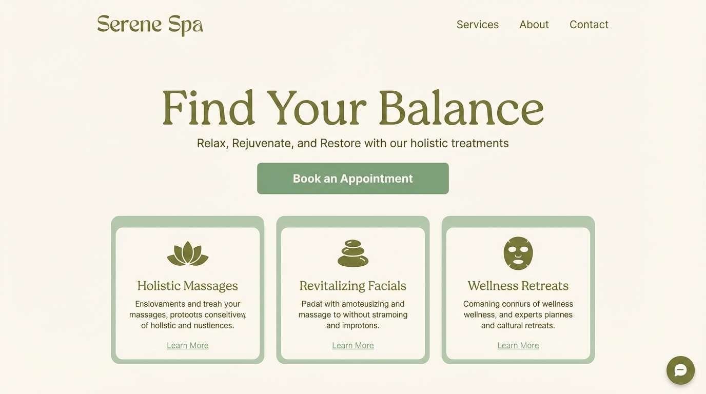
10) Deep Woodland Spa
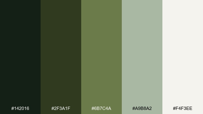
HEX: #142016 #2f3a1f #6b7c4a #a9b8a2 #f4f3ee
Mood: serene, restorative, luxurious
Best for: spa website landing section
Serene and restorative, it feels like a forest bath with cool air and soft moss underfoot. The lighter sage tones make space for content while the deep greens signal calm luxury. Use it for wellness landing pages, service menus, and calm photography overlays. Tip: apply the darkest green to text and navigation, and keep backgrounds near-off-white for a spa-clean finish.
Image example of deep woodland spa generated using media.io
11) Earthy Editorial
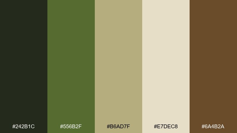
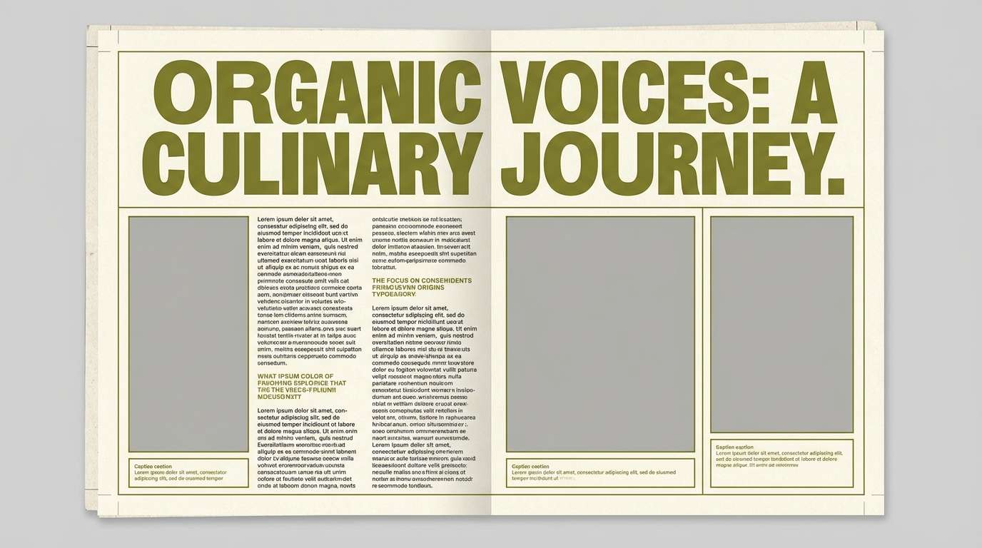
HEX: #242b1c #556b2f #b6ad7f #e7dec8 #6a4b2a
Mood: literary, tactile, curated
Best for: magazine feature layout
Literary and tactile, it suggests matte paper, field journals, and curated travel stories. These dark olive green color combinations balance depth with a creamy page-like neutral, making typography feel rich and readable. Ideal for magazine spreads, blog headers, and long-form layouts where you want warmth without sepia overload. Tip: keep body text on the cream, then use the deep olive for pull quotes and section markers.
Image example of earthy editorial generated using media.io
12) Ceramic Studio
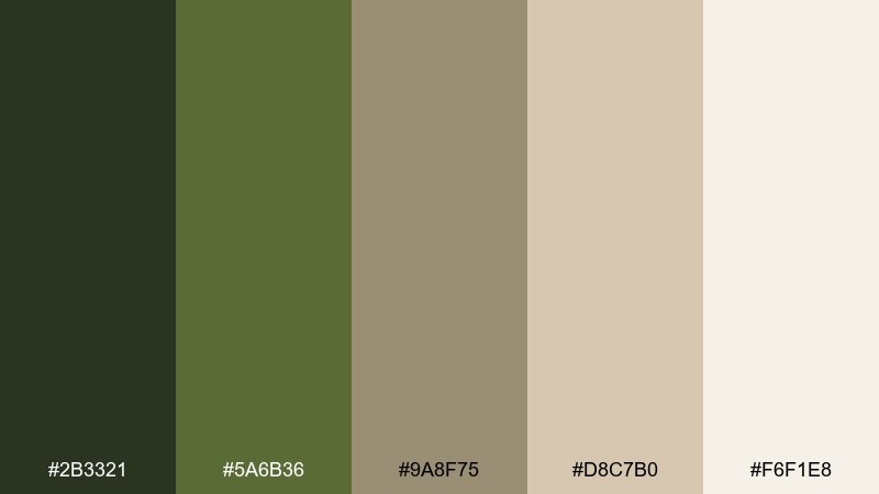
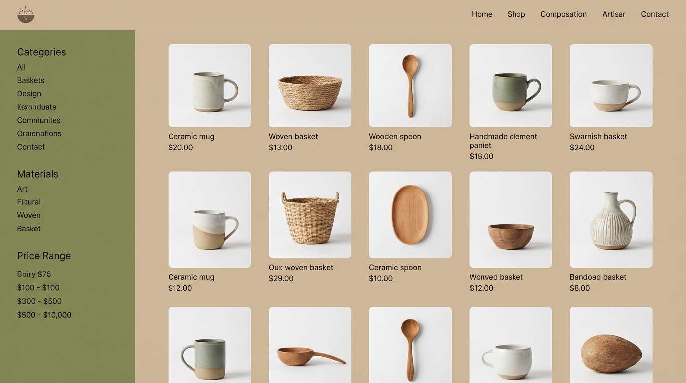
HEX: #2b3321 #5a6b36 #9a8f75 #d8c7b0 #f6f1e8
Mood: soft, handmade, neutral-forward
Best for: artisan shop product grid UI
Soft and handmade, it feels like glazed ceramics on a wooden workbench. The muted taupe and blush-beige notes keep the green grounded and gentle. It works well for product grids, photography-heavy shops, and subtle UI where color should support, not compete. Tip: use olive for filters and active states, and let product photos provide most of the visual variety.
Image example of ceramic studio generated using media.io
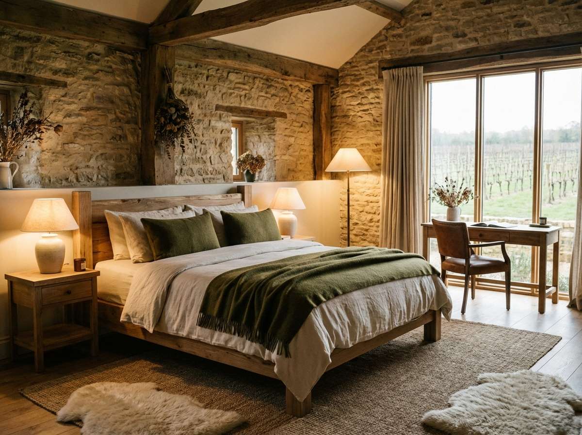
13) Quiet Cabin
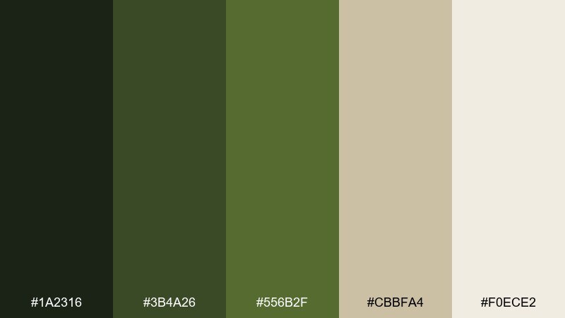
HEX: #1a2316 #3b4a26 #556b2f #cbbfa4 #f0ece2
Mood: cozy, intimate, nature-led
Best for: rustic boutique hotel room styling
Cozy and intimate, it brings up images of a quiet cabin, wool throws, and pine outside the window. This dark olive green color palette pairs especially well with creamy whites and natural woods for an inviting, layered look. Use it in interiors, hospitality branding, or mood boards where you want warmth without turning beige. Tip: add texture first, then color second, so the greens feel lived-in instead of flat.
Image example of quiet cabin generated using media.io
14) Citrus Accent
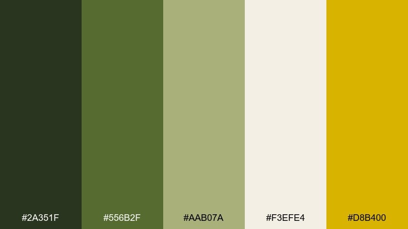
HEX: #2a351f #556b2f #aab07a #f3efe4 #d8b400
Mood: fresh, optimistic, energetic
Best for: seasonal promo banner design
Fresh and optimistic, it feels like sunlight cutting through green leaves. A sharp citrus-gold accent adds energy while the olive base keeps everything mature. This mix is great for promotions, highlight badges, and callouts where you need attention without neon. Tip: keep the yellow to 5 to 10 percent of the layout so it reads as a premium accent, not a warning color.
Image example of citrus accent generated using media.io

15) Ink and Olive
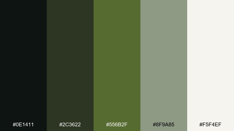
HEX: #0e1411 #2c3622 #556b2f #8f9a85 #f5f4ef
Mood: sharp, modern, high-contrast
Best for: tech startup landing page UI
Sharp and modern, it reads like ink on textured paper with a botanical twist. The near-black base adds authority, while the softened sage keeps sections from feeling stark. Use it for tech or productivity layouts that want a calmer alternative to blue-heavy palettes. Tip: reserve the darkest tone for headers and nav, and use the sage for subtle dividers and inactive states.
Image example of ink and olive generated using media.io
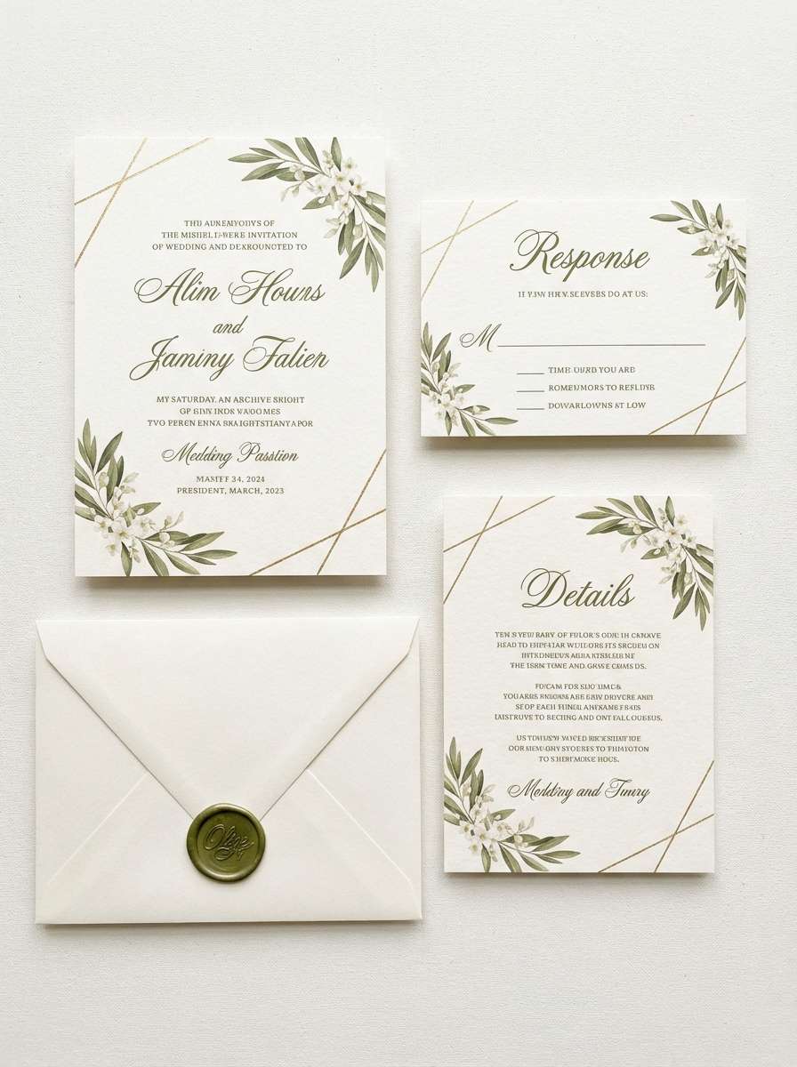
16) Garden Wedding Suite
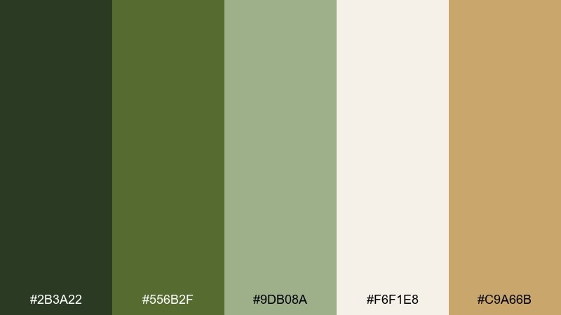
HEX: #2b3a22 #556b2f #9db08a #f6f1e8 #c9a66b
Mood: romantic, botanical, elegant
Best for: wedding invitation suite design
Romantic and botanical, it evokes garden ceremonies, linen stationery, and soft greenery. A dark olive green color palette like this feels formal when paired with warm ivory and a touch of muted gold. Use it across invitations, menus, place cards, and monograms for a cohesive set. Tip: print the olive as the main ink and add the gold only in tiny rules or foil details for restraint.
Image example of garden wedding suite generated using media.io
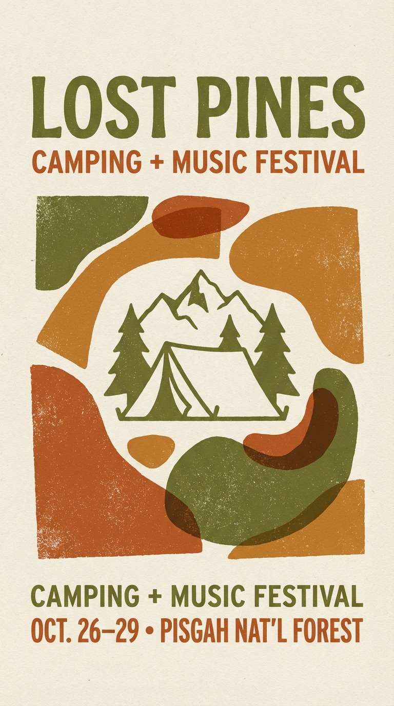
17) Retro Field Notes
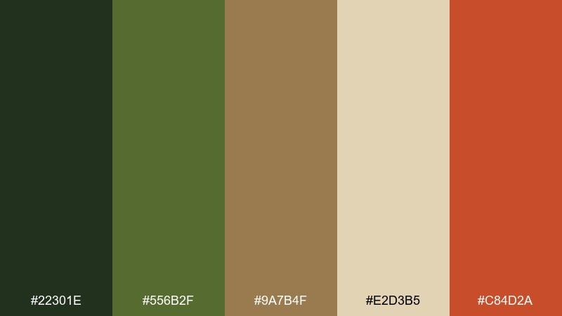
HEX: #22301e #556b2f #9a7b4f #e2d3b5 #c84d2a
Mood: retro, outdoorsy, playful
Best for: camping festival flyer
Retro and outdoorsy, it feels like screen-printed patches and well-used notebooks. The burnt orange brings a playful jolt that still stays warm and grounded. Use it for flyers, badges, merch graphics, and event branding that leans handcrafted. Tip: try a two-ink version first (olive plus orange) and add the beige only as negative space if it gets too busy.
Image example of retro field notes generated using media.io
18) Desert Olive Dusk
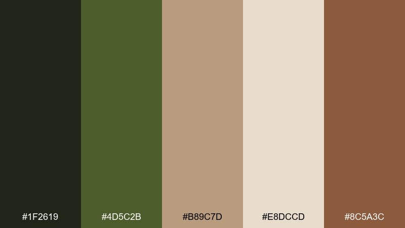
HEX: #1f2619 #4d5c2b #b89c7d #e8dccd #8c5a3c
Mood: dusty, cinematic, warm
Best for: travel blog header artwork
Dusty and cinematic, it feels like late-day desert light with hardy shrubs against the horizon. This dark olive green color combination shines when you pair it with sandy neutrals and a cocoa-brown accent for depth. Great for travel headers, photo overlays, and storytelling graphics where you want warmth without bright saturation. Tip: add a light grain texture to the beige areas to enhance the dusk mood without darkening the layout.
Image example of desert olive dusk generated using media.io

19) Sage Tech Branding
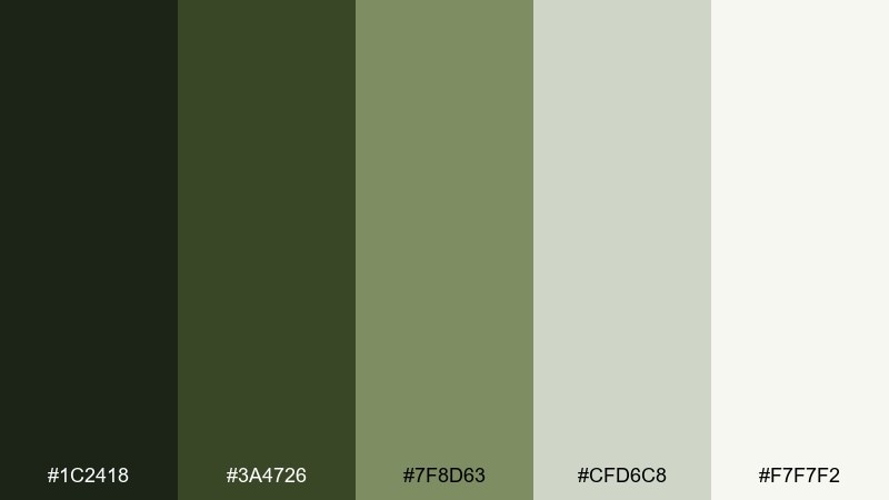
HEX: #1c2418 #3a4726 #7f8d63 #cfd6c8 #f7f7f2
Mood: trustworthy, modern, calm
Best for: saas brand style guide
Trustworthy and calm, it feels like a clean workspace with a subtle nod to nature. The mid-sage keeps the palette friendly while the deeper greens provide structure for headings and icons. Use it for SaaS branding, onboarding screens, and documentation sites where clarity matters most. Tip: keep accent color minimal and rely on tint steps of sage for charts and status tags.
Image example of sage tech branding generated using media.io
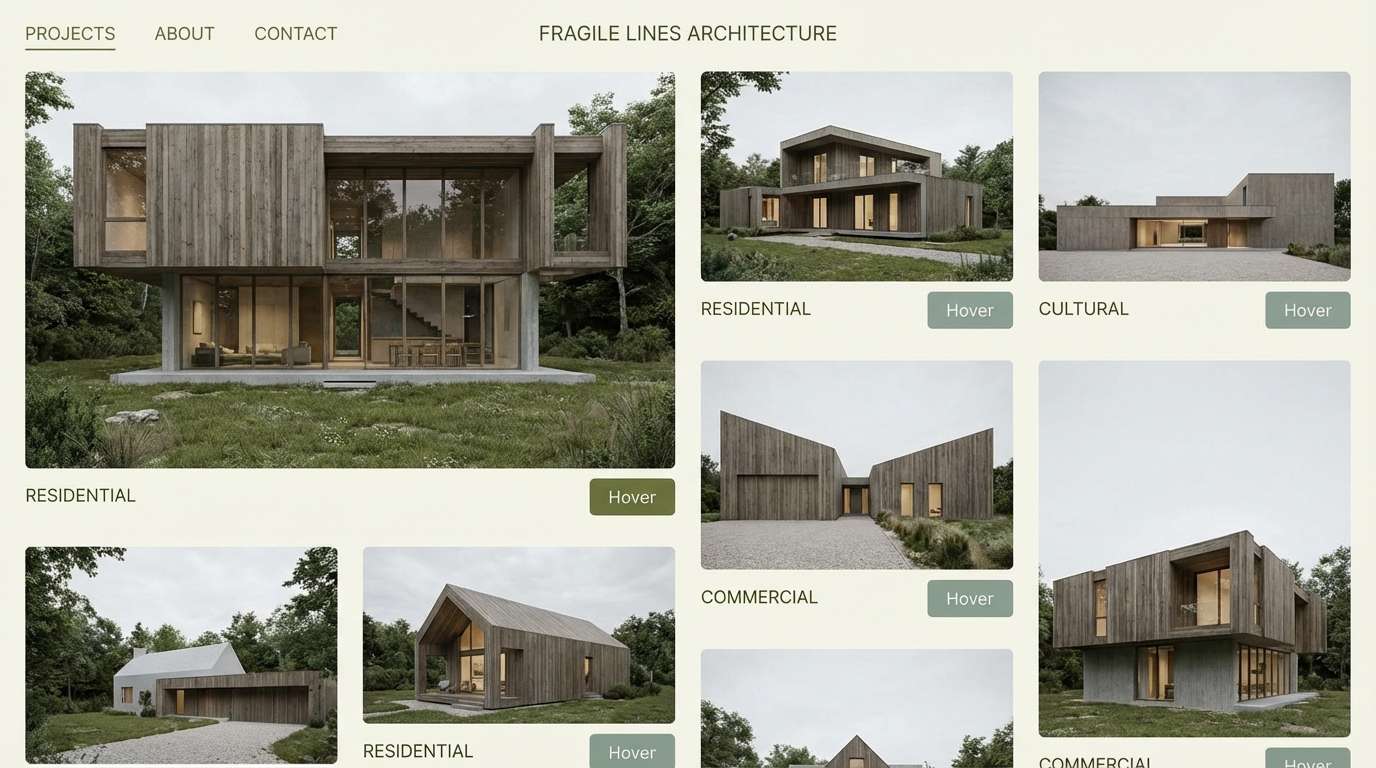
20) Rainy Greenstone
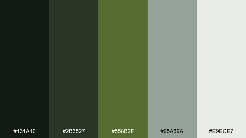
HEX: #131a16 #2b3527 #556b2f #95a39a #e9ece7
Mood: cool, misty, contemporary
Best for: architect portfolio website UI
Cool and misty, it evokes rain on stone, quiet streets, and modern architecture. The gray-green tones make it easy to pair with monochrome photography and clean type. Use it for portfolios, case studies, and minimal brand systems that need a restrained, contemporary edge. Tip: keep contrast high for text, and use the misty gray-green as a subtle background band behind project details.
Image example of rainy greenstone generated using media.io
What Colors Go Well with Dark Olive Green?
Dark olive green pairs naturally with green neutrals like cream, oatmeal, linen, taupe, and warm gray. These keep the look calm and elevated, and they’re especially reliable for interiors and typography-heavy layouts.
For richer contrast, bring in warm metals and earth accents—brass, muted gold, tan leather, cocoa brown, terracotta, and rust. These combinations feel premium and intentional, not “camouflage.”
If you want a cleaner, more contemporary edge, lean into gray-green sages and cool off-whites. This approach works well in UI color ideas, where olive can replace black or navy while still maintaining accessible contrast.
How to Use a Dark Olive Green Color Palette in Real Designs
Start by assigning roles: use the darkest olive for headers, navigation, or trim; place your light neutral as the main background; then pick one accent (gold, terracotta, or rust) for emphasis. This simple hierarchy keeps the palette readable and prevents it from turning muddy.
In branding colors, dark olive green often works best as a primary with a warm neutral secondary—especially for outdoor, wellness, hospitality, and craft products. In packaging, small metallic touches can add polish without increasing saturation.
For interiors, keep large surfaces light (beige, warm white) and use dark olive for cabinetry, built-ins, doors, or a single statement wall. Pair with warm wood and layered textures so the green feels cozy instead of flat.
Create Dark Olive Green Palette Visuals with AI
Once you’ve chosen HEX codes, the fastest way to test them is to generate real-looking mockups: posters, brand boards, UI screens, or interior scenes. Seeing the palette applied helps you validate contrast, warmth, and the overall mood in seconds.
With Media.io Text-to-Image, you can paste a prompt, describe your style, and quickly iterate variations—so you can find the “right olive” balance before committing to production.
Try generating a few versions with different lighting (warm vs. cool) and materials (paper, fabric, metal). Dark olive green shifts noticeably depending on texture and exposure, and AI previews make that easy to compare.
Dark Olive Green Color Palette FAQs
-
What is the HEX code for dark olive green?
“Dark olive green” is often represented by #556B2F, but many palettes use deeper anchors (like near-black greens) plus lighter sages and warm neutrals to create a usable system. -
Is dark olive green warm or cool?
It’s typically a warm-leaning green because it contains yellow/brown undertones, but it can feel cooler when paired with gray-greens, cool whites, and misty neutrals. -
What colors go with dark olive green for interiors?
For interiors, dark olive green pairs best with cream, beige, tan, warm wood, brass, and soft clay/terracotta accents. Use light neutrals on large surfaces and olive on cabinetry, trim, or feature walls. -
What’s a good accent color for dark olive green?
Top accents include muted gold/brass for a premium feel, terracotta/rust for warmth and energy, and citrus yellow in tiny amounts for modern highlight moments in UI or promos. -
Does dark olive green work well in UI design?
Yes. Dark olive green can replace black or navy for navigation and headings, especially when combined with warm off-white backgrounds and pale sage surfaces for cards. Always check contrast for accessibility. -
How do I keep an olive green palette from looking muddy?
Use clear value separation: pick one deep anchor, one light neutral background, and one mid-tone sage. Limit strong accents to small areas, and avoid stacking too many similar mid-dark greens together. -
Can dark olive green look luxury?
Absolutely. Pair dark olive green with linen whites, brass/gold, and refined typography. Keeping accents minimal and materials tactile (paper texture, brushed metal, warm wood) elevates the look.


