

Golden brown is one of those rare colors that feels both grounded and elevated—warm like wood, rich like caramel, and flexible enough for modern digital UI.
Below are 20+ curated golden brown color combinations with HEX codes, plus pairing tips for branding, interiors, packaging, and web design.
In this article
- Why Golden and Brown Color Combinations Work So Well
-
- toasted caramel
- autumn copper
- espresso & cream
- honey walnut
- desert clay
- vintage leather
- cinnamon rosewood
- maple moss
- bronze nightfall
- golden brown minimal ui
- spiced bakery poster
- terracotta orchard
- sandstone studio
- copper kintsugi
- cocoa branding kit
- sunlit rattan
- rustic lodge
- modern heritage scheme
- caramel matcha
- burnished gold accent
- copper dusk botanicals
- What Colors Go Well with Golden Brown?
- How to Use a Golden Brown Color Palette in Real Designs
- Create Golden Brown Palette Visuals with AI
Why Golden and Brown Color Combinations Work So Well
Color combinations for golden brown sit in a “sweet spot” between neutral and statement. They carry the stability of brown while adding a sunlit, premium warmth that makes designs feel more inviting.
They also pair naturally with real-world materials—wood, leather, kraft paper, ceramics—so they instantly communicate authenticity in branding and packaging. In digital products, they soften harsh interfaces without sacrificing contrast.
Most importantly, golden brown is versatile across seasons and industries: rustic and cozy for food, refined and heritage for services, or clean and modern when balanced with cream and charcoal.
20+ Golden Brown Color Palette Ideas (with HEX Codes)
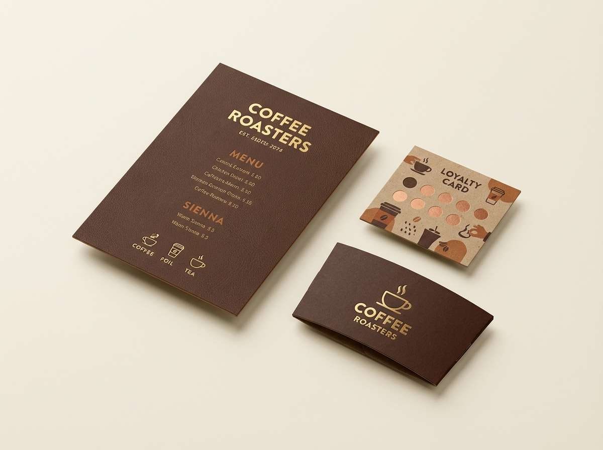
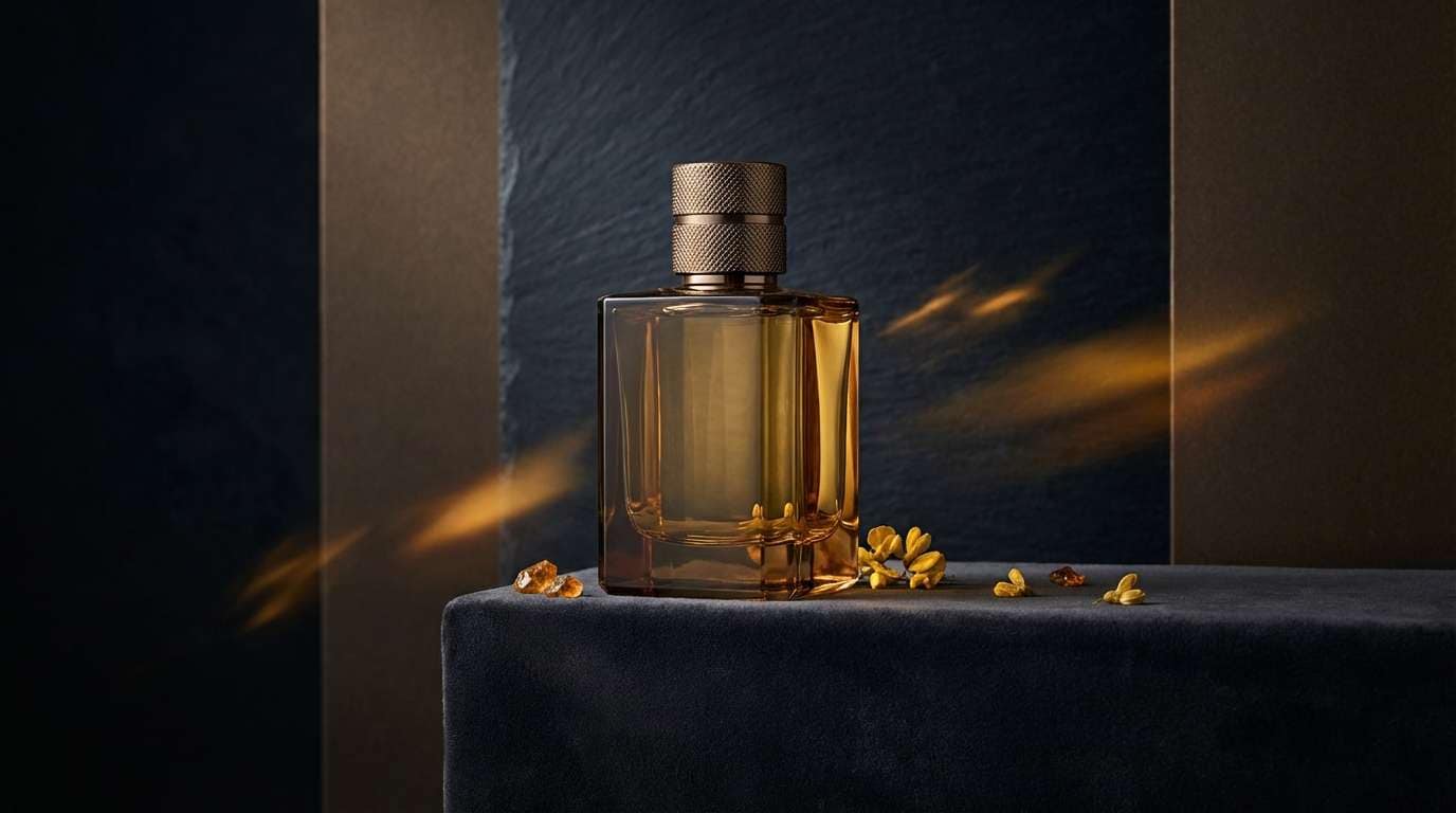
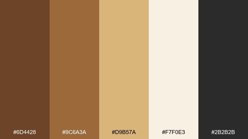
1) Toasted Caramel
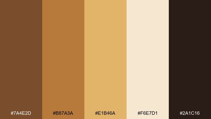
HEX: #7A4E2D #B87A3A #E1B46A #F6E7D1 #2A1C16
Mood: warm, welcoming, handcrafted
Best for: coffee shop branding and menu design
Warm and welcoming like caramelized sugar on a fresh pastry, these golden brown tones feel instantly comforting. Use the deep roast brown for headers, then let honey and cream carry backgrounds and highlights. Pair with matte black or kraft-paper textures to keep it grounded and artisanal. Tip: reserve the light cream for negative space so typography stays crisp.
Image example of toasted caramel generated using media.io
Media.io is an online AI studio for creating and editing video, image, and audio in your browser.

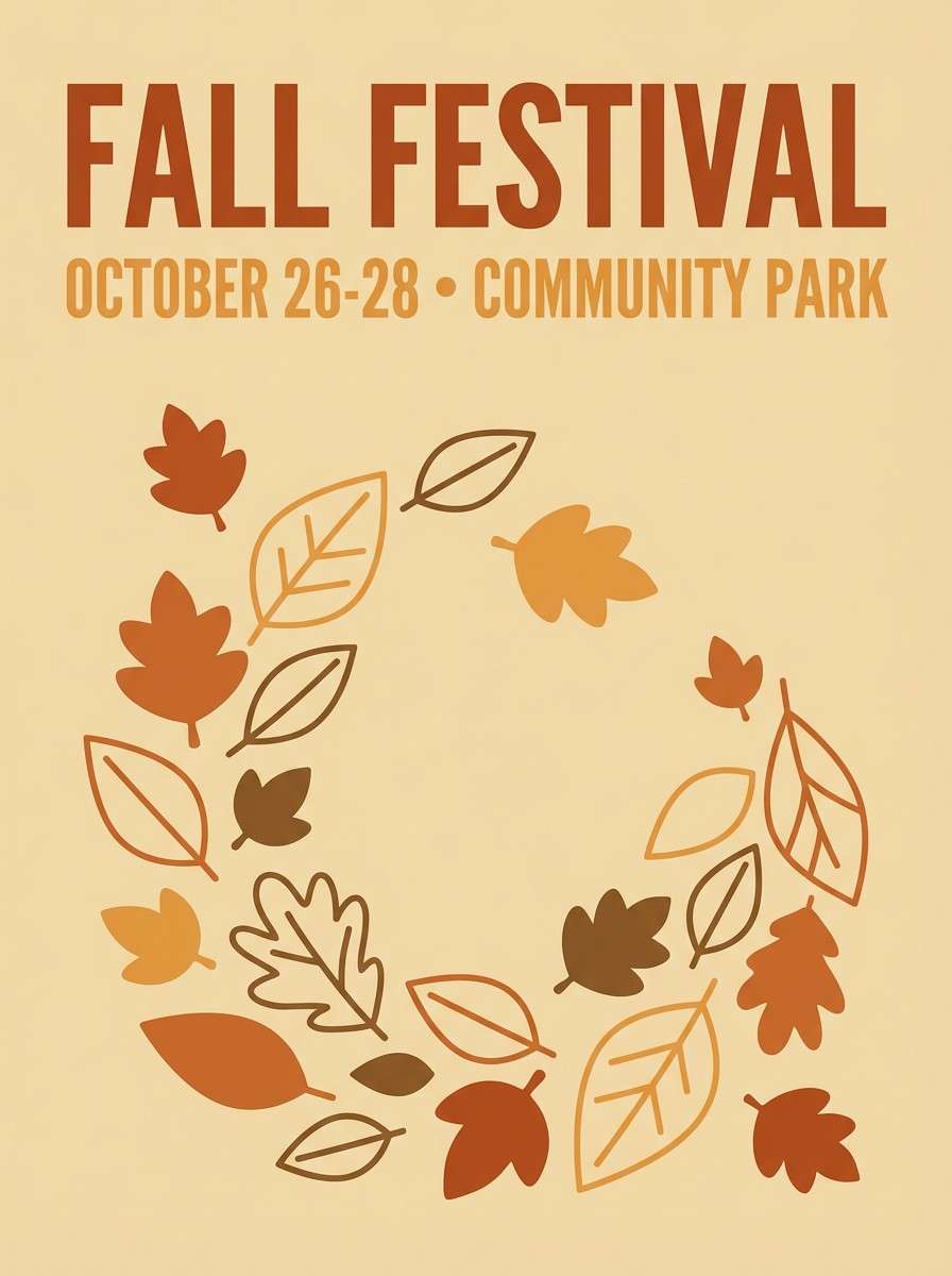
2) Autumn Copper
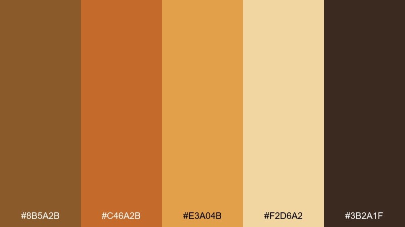
HEX: #8B5A2B #C46A2B #E3A04B #F2D6A2 #3B2A1F
Mood: seasonal, energetic, outdoorsy
Best for: fall event poster and social graphics
Seasonal and lively, this golden brown color scheme reads like copper leaves catching late-afternoon sun. The orange-copper midtones make bold headlines, while the pale wheat softens busy layouts. Add dark bark brown for contrast so posters stay readable from a distance. Tip: keep gradients subtle and let flat blocks of copper do most of the work.
Image example of autumn copper generated using media.io
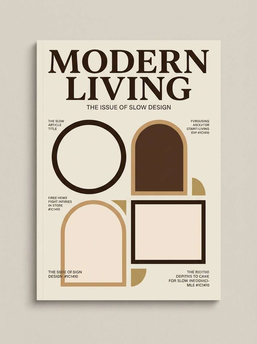
3) Espresso & Cream
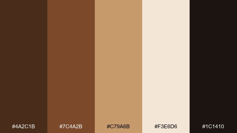
HEX: #4A2C1B #7C4A2B #C79A6B #F3E6D6 #1C1410
Mood: cozy, premium, minimal
Best for: editorial layouts and magazine covers
Cozy and premium, it feels like espresso foam against a ceramic mug. These golden brown color combinations shine in editorial grids where contrast and whitespace matter. Use the near-black for body copy, cream for margins, and the latte tan for pull quotes or section dividers. Tip: add a single warm tan rule line to unify pages without clutter.
Image example of espresso & cream generated using media.io
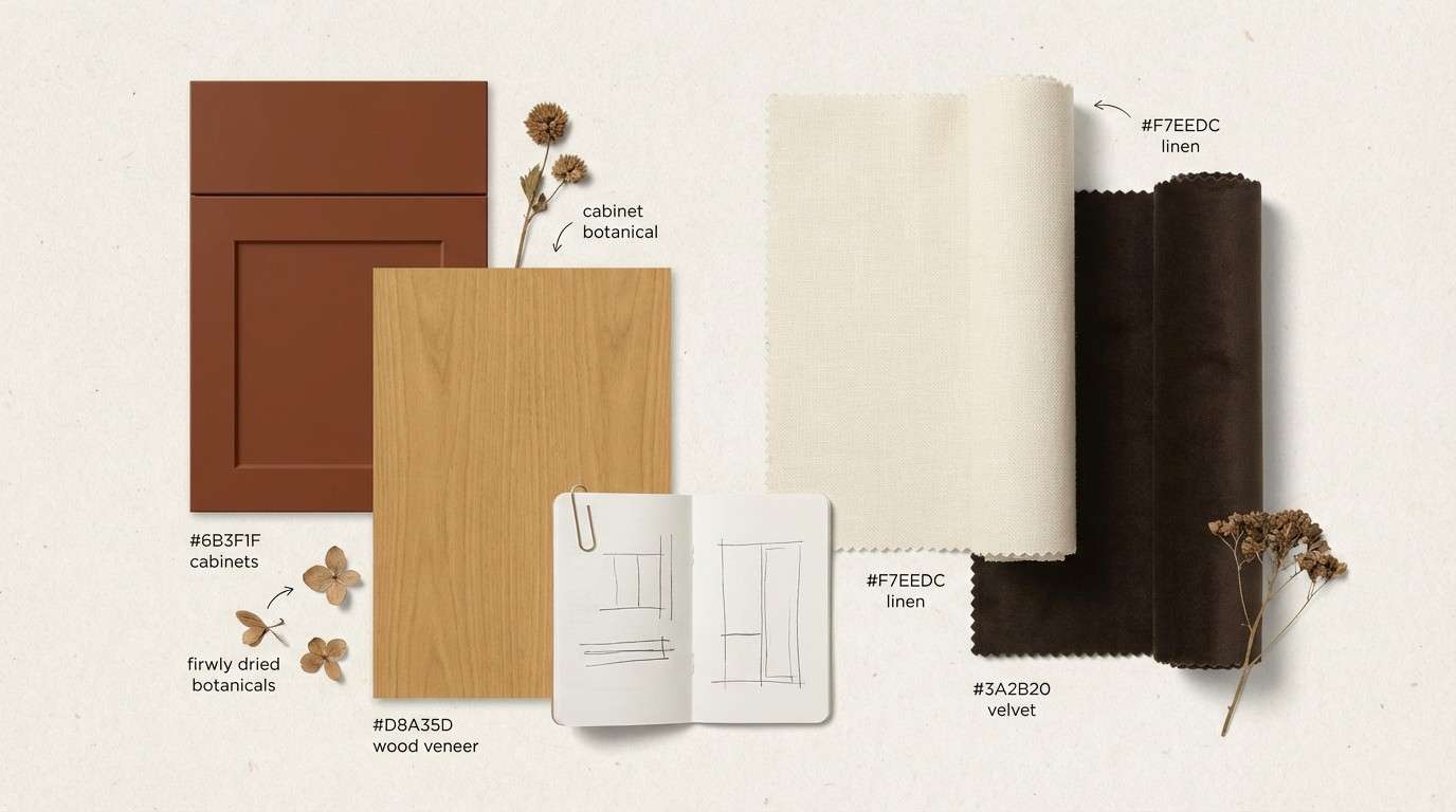
4) Honey Walnut
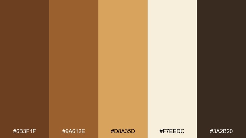
HEX: #6B3F1F #9A612E #D8A35D #F7EEDC #3A2B20
Mood: homey, natural, comforting
Best for: kitchen interior mood boards
Homey and natural, it evokes honey drizzled over toasted walnuts. The walnut brown anchors cabinetry and wood grains, while the honey gold brightens accents like hardware and textiles. Pair with off-white ceramics and linen textures to keep the look airy. Tip: use the darker brown in smaller doses to avoid making the room feel heavy.
Image example of honey walnut generated using media.io
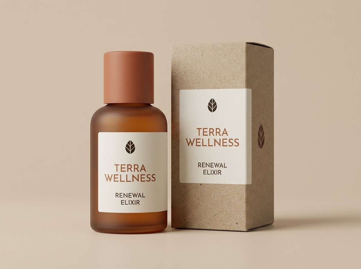
5) Desert Clay
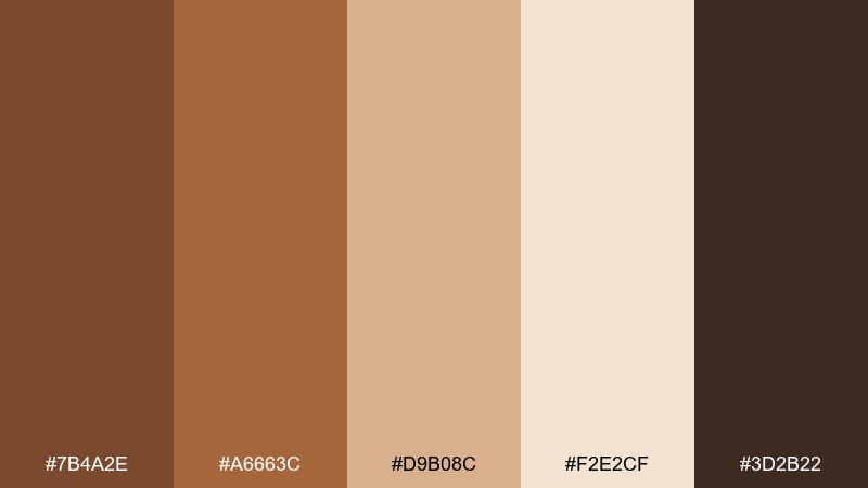
HEX: #7B4A2E #A6663C #D9B08C #F2E2CF #3D2B22
Mood: sunbaked, earthy, calm
Best for: wellness product packaging
Sunbaked and calm, it brings to mind clay pots and warm sand. Use the clay midtone for the package body, then highlight with sandy beige for labels and icons. Pair with minimalist typography and subtle embossing to elevate the earthy vibe. Tip: keep finishes matte so the palette reads modern rather than rustic.
Image example of desert clay generated using media.io
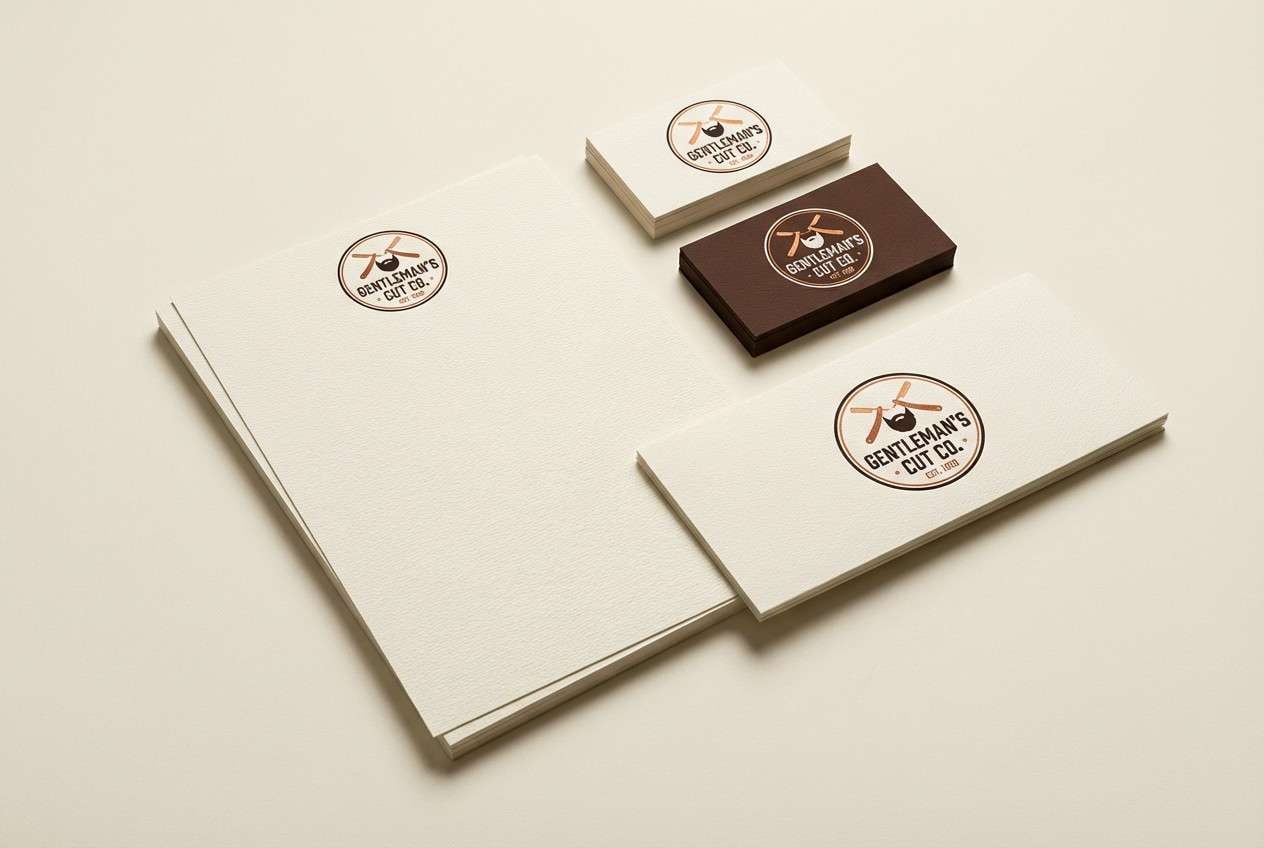
6) Vintage Leather
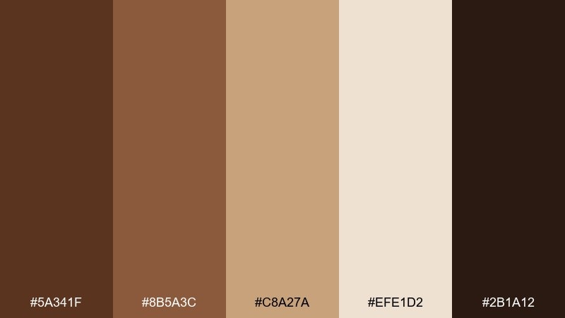
HEX: #5A341F #8B5A3C #C8A27A #EFE1D2 #2B1A12
Mood: classic, masculine, heritage
Best for: barbershop logo and stationery
Classic and heritage-driven, this golden brown color palette feels like worn leather and polished wood. The deep browns support strong marks and monograms, while the warm tan keeps stationery from looking too severe. Pair with cream stock and subtle grain textures for an authentic finish. Tip: limit accent use to one tan tone so the logo stays timeless.
Image example of vintage leather generated using media.io
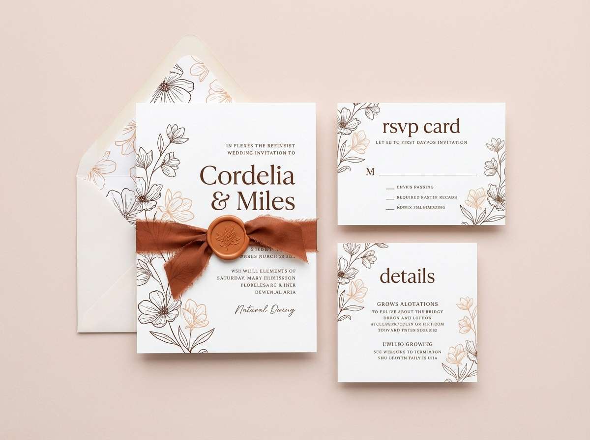
7) Cinnamon Rosewood

HEX: #6A3A23 #A14F2E #D28A5C #F4D7C7 #2A1B16
Mood: romantic, spiced, elegant
Best for: wedding invitation suite
Romantic and spiced, it suggests cinnamon sticks, rosewood, and soft blush paper. These golden brown color combinations work beautifully for invitation typography and ornamental borders without feeling overly traditional. Pair with warm ivory stock and a touch of metallic foil to lift the darker browns. Tip: use the blush-tinted light tone for RSVP cards to keep the set cohesive but varied.
Image example of cinnamon rosewood generated using media.io
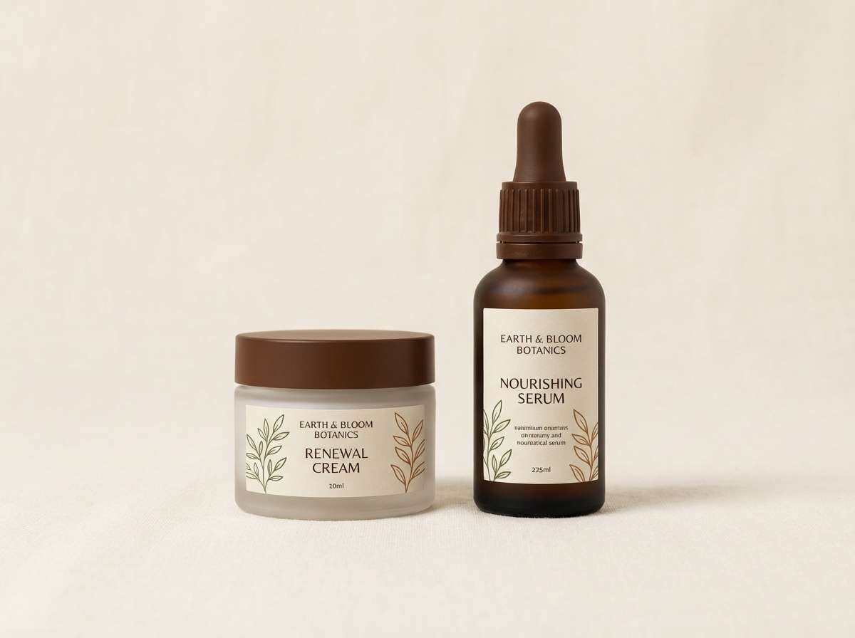
8) Maple Moss
HEX: #7A4B2A #B37A3D #E7C27A #6B7A4A #F3E9D7
Mood: earthy, botanical, grounded
Best for: natural skincare labels
Earthy and botanical, it feels like maple syrup beside fresh moss. The mossy green adds a clean, natural counterpoint to the warm browns, making labels feel eco-minded without going dull. Pair with uncoated paper and simple botanical icons for a believable, modern look. Tip: keep green to accents and let the maple tones remain dominant.
Image example of maple moss generated using media.io
9) Bronze Nightfall
HEX: #8A5A2B #C08B3A #E6C27A #1E1B18 #5C5B56
Mood: dramatic, luxe, evening
Best for: premium product ads
Dramatic and luxe, it reads like bronze jewelry against a night sky. Use the near-black as the stage, then bring in bronze and gold for highlights, buttons, or price tags. Pair with crisp gray for secondary text so the layout doesn't feel heavy. Tip: add subtle spotlight gradients to make metallic tones look richer.
Image example of bronze nightfall generated using media.io
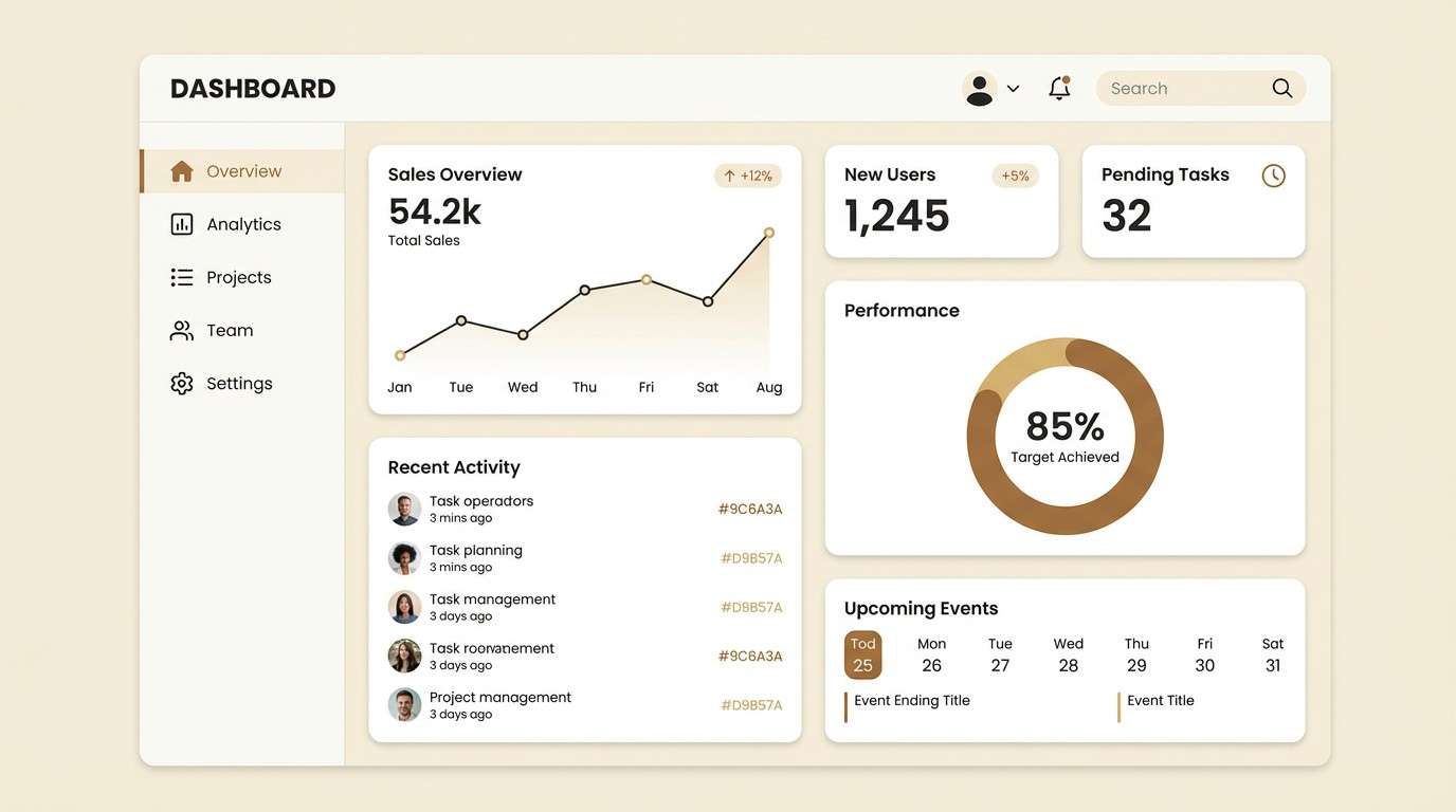
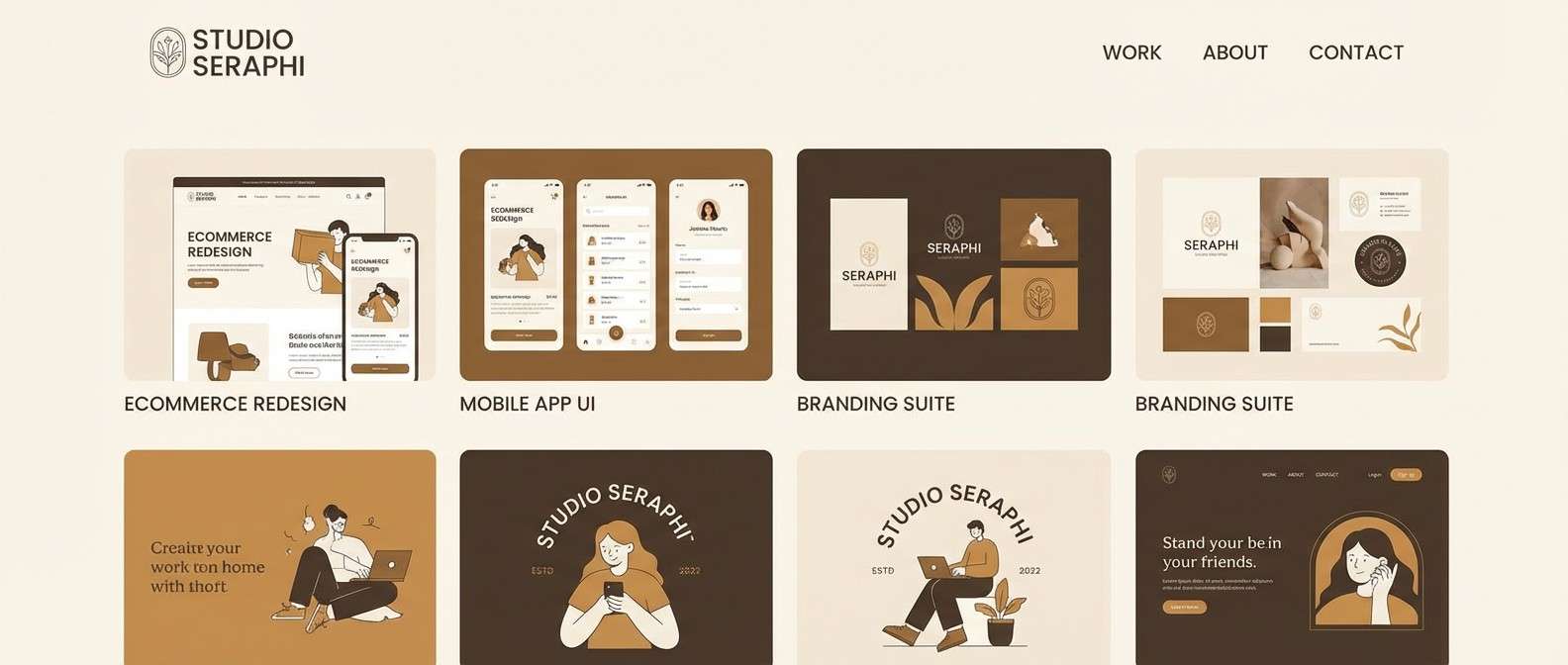
10) Golden Brown Minimal UI
HEX: #6D4428 #9C6A3A #D9B57A #F7F0E3 #2B2B2B
Mood: clean, modern, friendly
Best for: dashboard UI and design systems
Clean and modern, it feels like warm light on brushed wood in a tidy workspace. This golden brown color palette is ideal for dashboards where you want warmth without sacrificing clarity. Use charcoal for text, cream for surfaces, and the gold-tan for buttons or active states. Tip: keep contrast accessible by reserving the mid-brown for icons and navigation highlights.
Image example of golden brown minimal ui generated using media.io
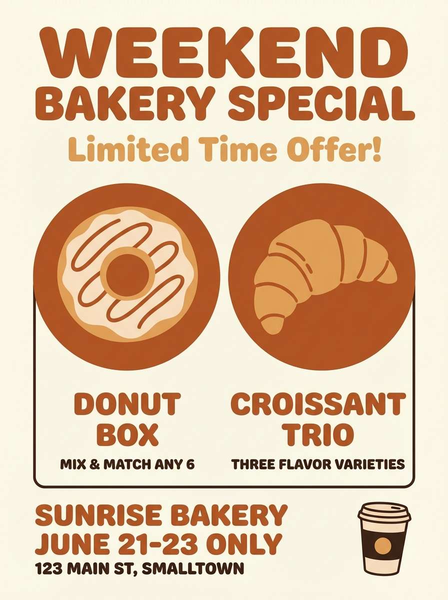
11) Spiced Bakery Poster
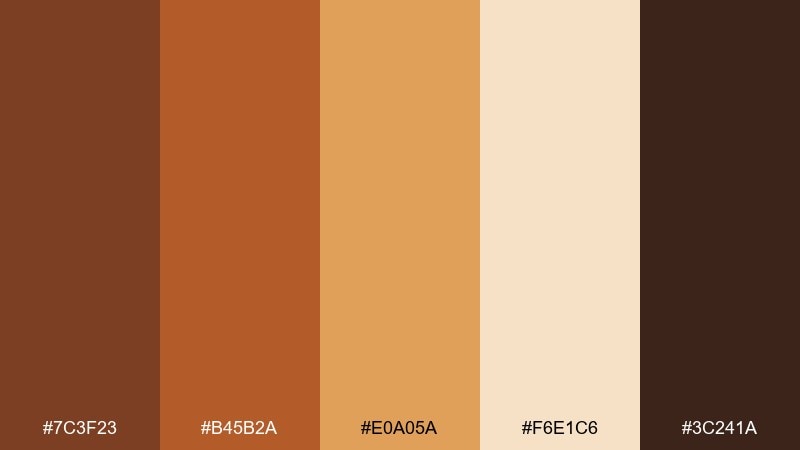
HEX: #7C3F23 #B45B2A #E0A05A #F6E1C6 #3C241A
Mood: playful, appetizing, cozy
Best for: bakery promo flyer
Playful and appetizing, it conjures gingerbread, toasted crusts, and steaming cinnamon rolls. The spiced orange-brown grabs attention for headlines, while the creamy base keeps the flyer light and easy to scan. Pair with hand-drawn icons and rounded type for a friendly, neighborhood feel. Tip: use the darkest brown for a single price badge to create instant hierarchy.
Image example of spiced bakery poster generated using media.io
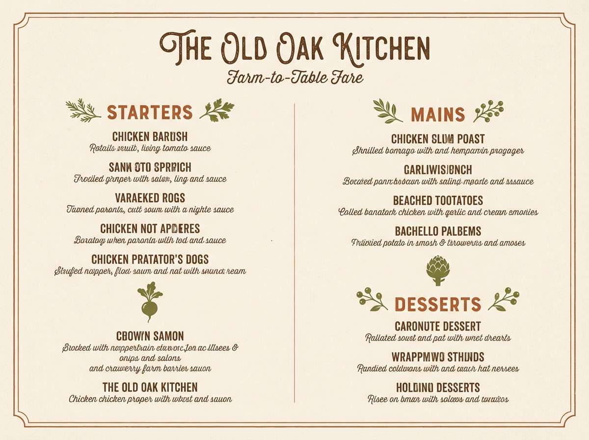
12) Terracotta Orchard
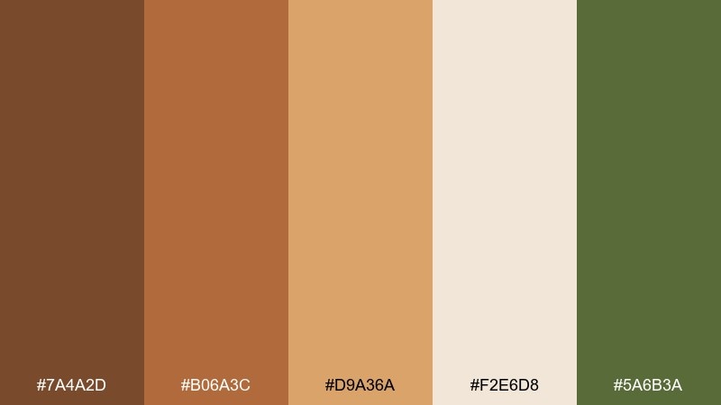
HEX: #7A4A2D #B06A3C #D9A36A #F2E6D8 #5A6B3A
Mood: fresh, rustic, sunlit
Best for: farm-to-table restaurant menu
Fresh and rustic, it feels like terracotta pots in an orchard at golden hour. Use the warm browns for section headers and borders, then let the creamy off-white carry menu body text. Pair with a muted green for small icons or vegetarian markers to add a produce-forward cue. Tip: keep the green subtle so the browns remain the main story.
Image example of terracotta orchard generated using media.io
13) Sandstone Studio
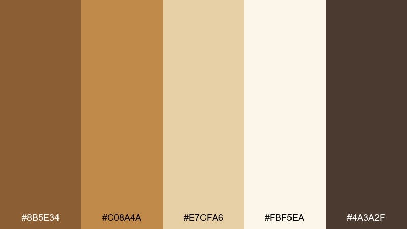
HEX: #8B5E34 #C08A4A #E7CFA6 #FBF5EA #4A3A2F
Mood: airy, neutral, refined
Best for: portfolio website theme
Airy and refined, it resembles sandstone walls and soft studio light. The near-white background keeps work samples front and center, while the warm browns add gentle structure for navigation and buttons. Pair with clean sans-serif type and plenty of spacing for a calm, premium feel. Tip: use the darkest brown only for hover states so the interface stays light.
Image example of sandstone studio generated using media.io
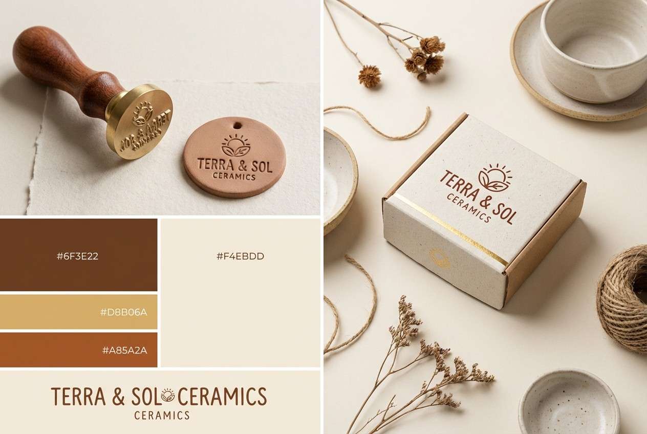
14) Copper Kintsugi
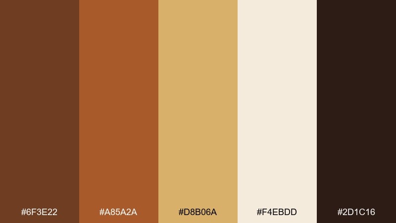
HEX: #6F3E22 #A85A2A #D8B06A #F4EBDD #2D1C16
Mood: artisanal, elegant, soulful
Best for: ceramics brand identity
Artisanal and soulful, it evokes repaired pottery with glowing copper seams. Use the deep clay brown for wordmarks and the warm gold for accent lines, stamps, or seals. Pair with textured paper and minimal layouts so the colors feel intentional and crafted. Tip: use thin metallic-like strokes sparingly to mimic kintsugi without overpowering the logo.
Image example of copper kintsugi generated using media.io
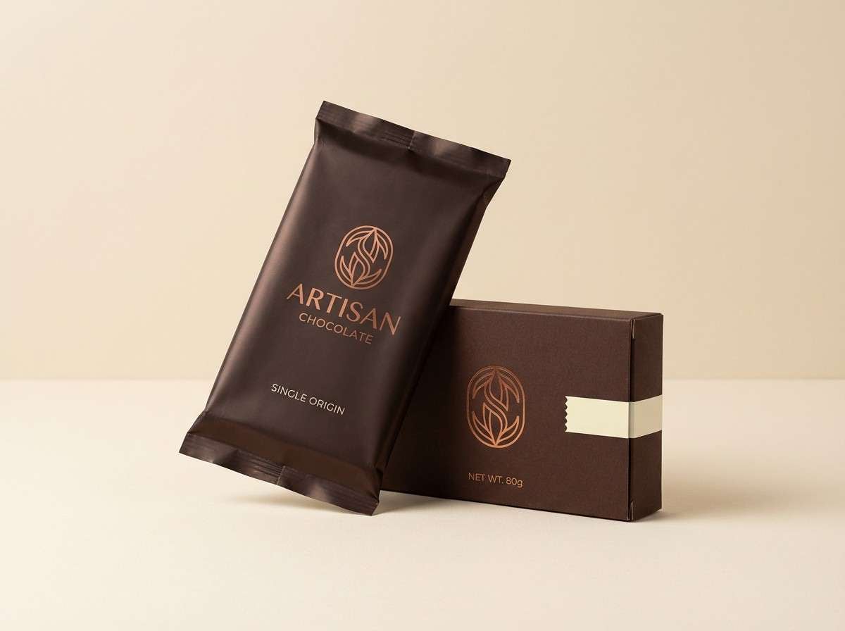
15) Cocoa Branding Kit
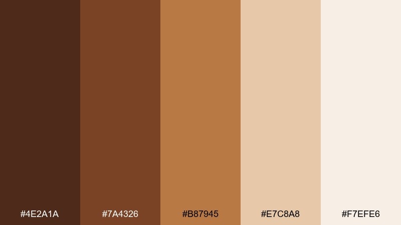
HEX: #4E2A1A #7A4326 #B87945 #E7C8A8 #F7EFE6
Mood: rich, indulgent, trustworthy
Best for: chocolate bar packaging
Rich and indulgent, it feels like cocoa powder, caramel drizzle, and creamy ganache. This golden brown color palette makes chocolate packaging look premium while still approachable. Pair with minimalist type and a single foil accent to add shelf impact without visual noise. Tip: set the darkest cocoa as the base panel so lighter details pop cleanly.
Image example of cocoa branding kit generated using media.io
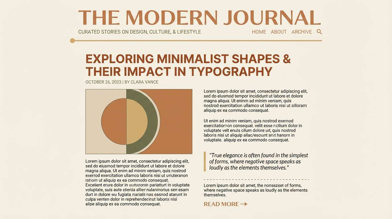
16) Sunlit Rattan
HEX: #81512D #B07A45 #D9B88A #F5EFE4 #8A8F7A
Mood: relaxed, coastal, light
Best for: lifestyle blog header and templates
Relaxed and light, it brings to mind rattan chairs and sunlit linen. The soft beige and cream create a breezy canvas, while the warm browns add definition for titles and buttons. Pair with gentle gray-green accents to keep everything calm and editorial. Tip: use the darkest brown only for key calls to action so the template stays airy.
Image example of sunlit rattan generated using media.io
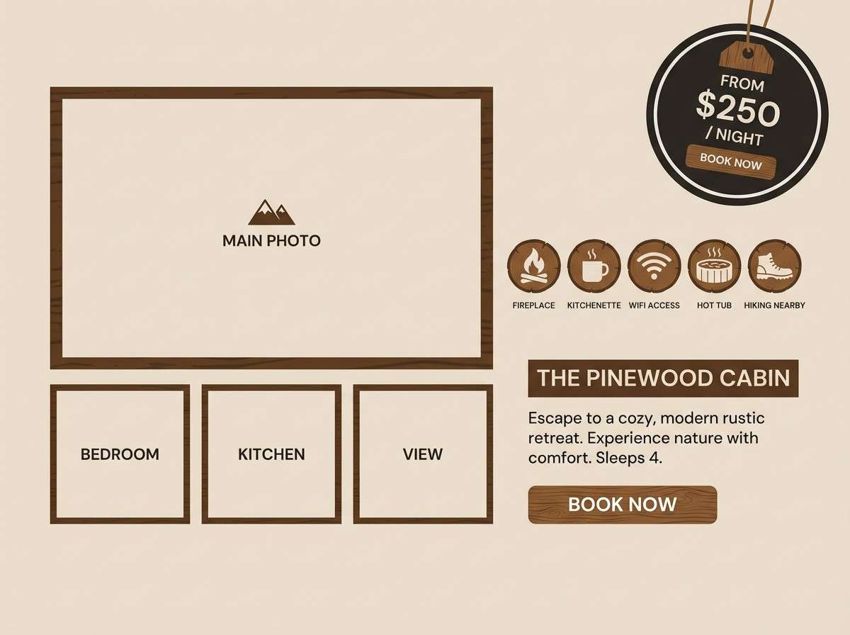
17) Rustic Lodge
HEX: #5B3A22 #8C5A34 #CDA77A #EDE2D2 #2A2623
Mood: rugged, cozy, outdoors
Best for: cabin rental listing graphics
Rugged and cozy, it recalls timber beams, wool blankets, and a fireplace glow. Use the dark charcoal-brown for readable text overlays, then bring in the lighter tans for badges and amenity icons. Pair with subtle wood textures to reinforce the lodge feel without distracting from photos. Tip: keep overlays semi-opaque so the warm tones stay consistent across images.
Image example of rustic lodge generated using media.io
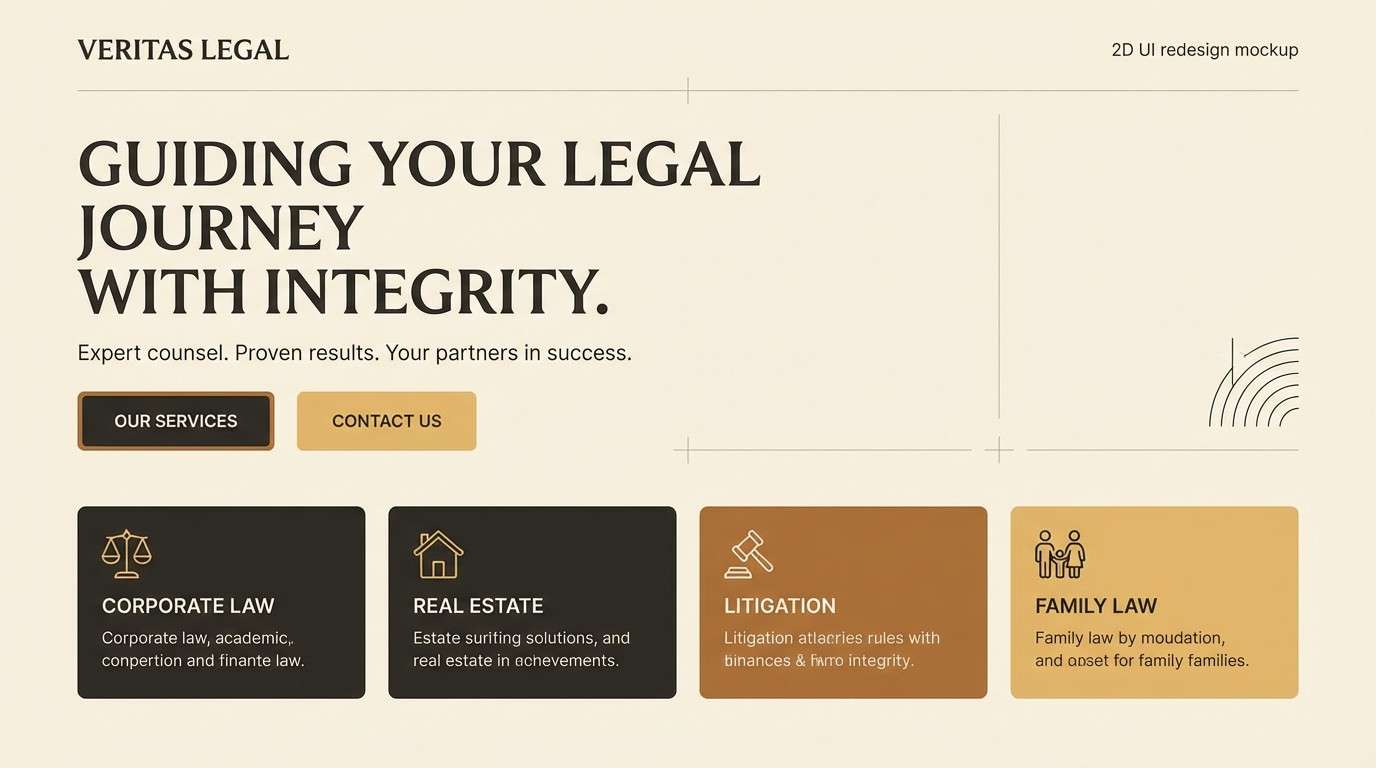
18) Modern Heritage Scheme
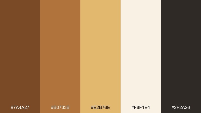
HEX: #7A4A27 #B0733B #E2B76E #F8F1E4 #2F2A26
Mood: heritage, modern, confident
Best for: law firm website redesign
Heritage with a modern edge, it feels like polished wood in a renovated historic building. A golden brown color scheme like this balances authority and warmth when paired with clean typography and generous spacing. Use the near-black for navigation and headings, then reserve the gold-tan for links and highlights. Tip: keep accent use consistent across pages so the site feels cohesive and trustworthy.
Image example of modern heritage scheme generated using media.io
19) Caramel Matcha
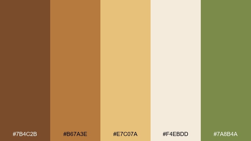
HEX: #7B4C2B #B67A3E #E7C07A #F4EBDD #7A8B4A
Mood: fresh, modern, food-forward
Best for: cafe seasonal drink promo
Fresh and food-forward, it mixes caramel warmth with a matcha-green lift. Use the green for limited edition tags or small icons, and keep the caramel browns as the primary brand tone. Pair with creamy backgrounds and simple product silhouettes so the offer reads instantly. Tip: use the light cream behind prices to maintain contrast on mobile.
Image example of caramel matcha generated using media.io

20) Burnished Gold Accent
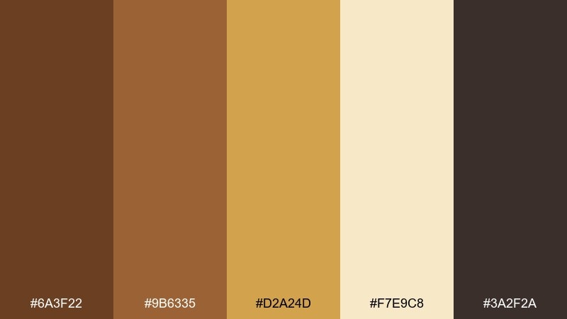
HEX: #6A3F22 #9B6335 #D2A24D #F7E9C8 #3A2F2A
Mood: elevated, warm, celebratory
Best for: holiday sale banner
Elevated and celebratory, it resembles burnished gold on warm wood. The golden accent reads festive without relying on bright reds, making it versatile for different brands. Pair with deep espresso text and a soft cream backdrop to keep the message legible. Tip: add subtle grain or noise only in backgrounds to avoid banding on large banners.
Image example of burnished gold accent generated using media.io

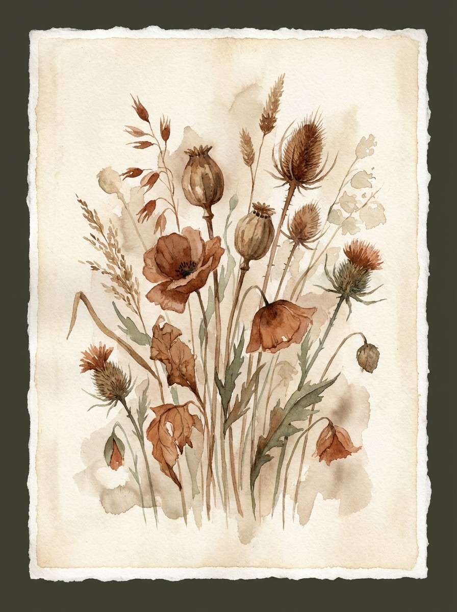
21) Copper Dusk Botanicals
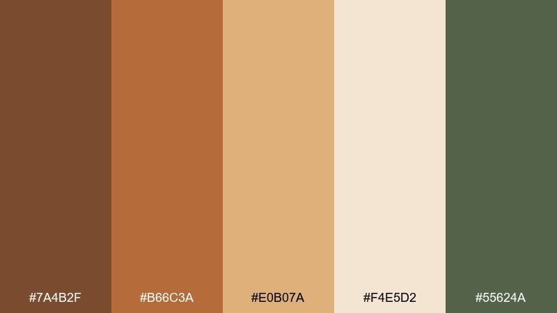
HEX: #7A4B2F #B66C3A #E0B07A #F4E5D2 #55624A
Mood: calm, botanical, artistic
Best for: watercolor botanical illustration
Calm and artistic, it feels like copper dusk settling over dried wildflowers. Warm browns give the stems and seed pods a natural depth, while the muted green keeps the composition believable. Pair with lots of paper texture and soft edges to maintain a watercolor look. Tip: choose two dominant browns and let the rest fade into gentle washes.
Image example of copper dusk botanicals generated using media.io
What Colors Go Well with Golden Brown?
Golden brown pairs best with soft light neutrals like cream, ivory, and warm beige—these keep the palette breathable and help golden tones look more luminous. Charcoal and near-black add readability for text and instantly make the browns feel more premium.
For accent colors, muted greens (moss, olive, sage) create a natural, botanical counterbalance. If you want more energy, copper-orange and honey-gold push the warmth; if you want a modern edge, try cool grays in small amounts.
In brand systems, keep golden brown as the “anchor” and let accent colors show up as small UI states, icons, tags, or thin lines—this preserves the palette’s cozy sophistication.
How to Use a Golden Brown Color Palette in Real Designs
For branding, golden brown works well as a primary logo or packaging base because it signals craft, tradition, and quality. Use lighter creams for background space and reserve the darkest browns for type, borders, and key contrast points.
In interiors, golden browns are strongest when you vary texture: wood grains, linen, matte ceramics, and brushed metal. Balance large brown surfaces with warm off-whites so the space stays bright instead of heavy.
For web and UI, treat golden browns like “warm neutrals.” Use cream for surfaces, charcoal for text, and apply mid-browns or gold-tans to buttons, active states, and small highlights to keep accessibility and clarity.
Create Golden Brown Palette Visuals with AI
If you want to preview a golden brown color scheme in realistic mockups (menus, packaging, posters, UI screens), AI image generation is a fast way to explore directions before committing to a final design.
With Media.io, you can paste a prompt, specify dominant HEX colors, and generate multiple style variations—then refine the composition until it matches your brand vibe.
Try creating a set of visuals for your next campaign (like a fall promo, premium product ad, or minimal dashboard) using the palettes above as your color blueprint.
Golden Brown Color Palette FAQs
-
What does golden brown communicate in design?
Golden brown usually communicates warmth, reliability, craft, and premium comfort. It’s often associated with wood, coffee, caramel, leather, and autumn light, so it can feel both natural and upscale. -
Is golden brown a good choice for website backgrounds?
It can be, but it’s usually best used as an accent or paired with cream/off-white for main surfaces. For readability, keep body text in charcoal/near-black and use golden brown for buttons, navigation highlights, and dividers. -
What colors complement golden brown the most?
Cream, ivory, warm beige, charcoal, and muted greens (sage/moss/olive) complement golden brown especially well. Copper-orange and honey-gold intensify the warmth; cool gray can modernize it. -
How do I keep a golden brown palette from feeling too “rustic”?
Use matte finishes, clean typography, and plenty of negative space. Pair golden browns with crisp cream and charcoal, and keep textures subtle rather than heavy woodgrain everywhere. -
Can golden brown work for luxury branding?
Yes—especially when paired with near-black, soft cream, and controlled gold/bronze accents. Use high-contrast layouts and minimal accent placement to make the palette feel intentional and premium. -
What are common mistakes when using golden brown color combinations?
Overusing mid-browns (which can flatten contrast), skipping a dark “ink” color for text, and making everything warm without a balancing neutral. A strong cream and a near-black usually fix most issues. -
How can I generate golden brown palette mockups quickly?
Use an AI generator like Media.io Text-to-Image: include your HEX codes in the prompt, define the design type (packaging, UI, poster), and iterate by adjusting lighting, materials, and layout until the look matches your brand.
Next: Candy Pink Color Palette


