High-contrast color palettes make designs feel instantly sharper, bolder, and easier to scan—especially on small screens and fast-moving feeds.
Below are 20+ contrast color combinations with HEX codes, plus practical tips for keeping readability strong in UI, branding, posters, and more.
In this article
- Why Contrast Palettes Work So Well
-
- electric midnight
- citrus ink
- coral glacier
- violet lime pop
- sunlit charcoal
- aqua magenta split
- crimson teal punch
- saffron navy studio
- mint rust balance
- fuchsia sandstone
- neon orchid slate
- sky ember contrast
- plum gold velvet
- ocean copper edge
- lemon berry graphite
- turquoise cherry cream
- steel apricot flash
- forest rose spotlight
- indigo tangerine spark
- ruby cyan minimal
- graphite iris glow
- amber azure cut
- peach cobalt clash
- lime plum night
- What Colors Go Well with Contrast?
- How to Use a Contrast Color Palette in Real Designs
- Create Contrast Palette Visuals with AI
Why Contrast Palettes Work So Well
Contrast palettes boost clarity by separating foreground from background—so headlines, buttons, and key UI states become instantly recognizable.
They also create stronger visual hierarchy. When you limit bright accents and pair them with stable dark or light bases, the eye knows exactly where to look first.
Finally, high contrast can feel more “designed” with less effort: a clean neutral base plus one vivid accent often looks modern, premium, and intentional.
20+ Contrast Color Palette Ideas (with HEX Codes)
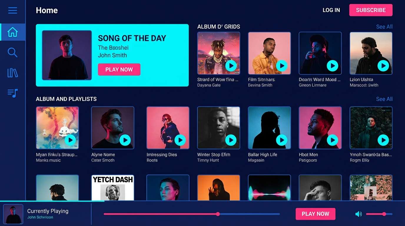
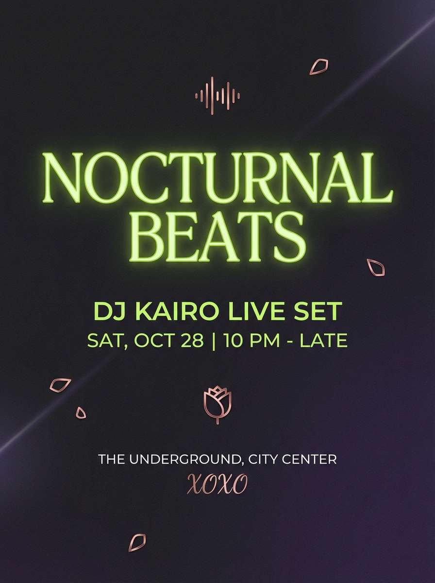
1) Electric Midnight
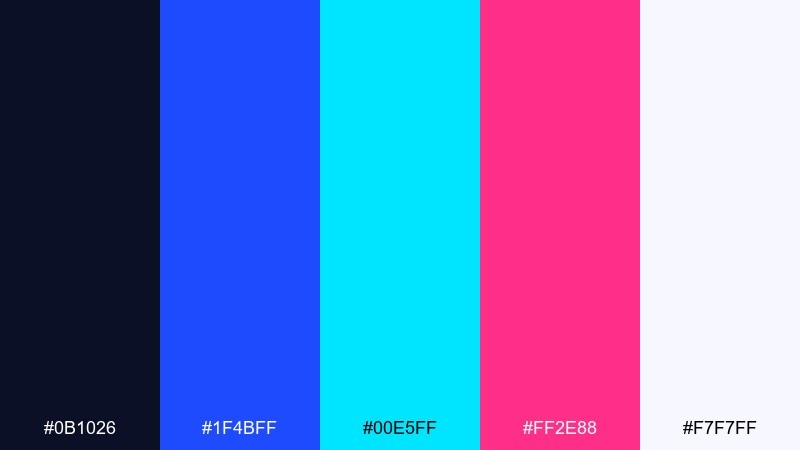
HEX: #0B1026 #1F4BFF #00E5FF #FF2E88 #F7F7FF
Mood: electric, nocturnal, futuristic
Best for: music app UI and nightclub branding
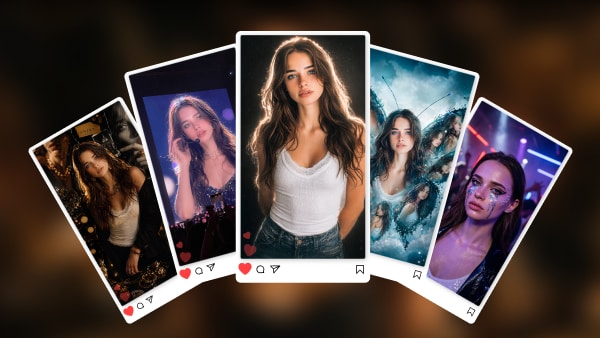
Neon lights over a midnight skyline, with crisp highlights that feel fast and digital. Use the deep navy as the base, then let cyan or hot pink drive the primary actions and key headlines. White keeps small text readable and prevents the brights from vibrating. Tip: reserve the pink for one primary CTA to avoid visual noise.
Image example of electric midnight generated using media.io
Media.io is an online AI studio for creating and editing video, image, and audio in your browser.

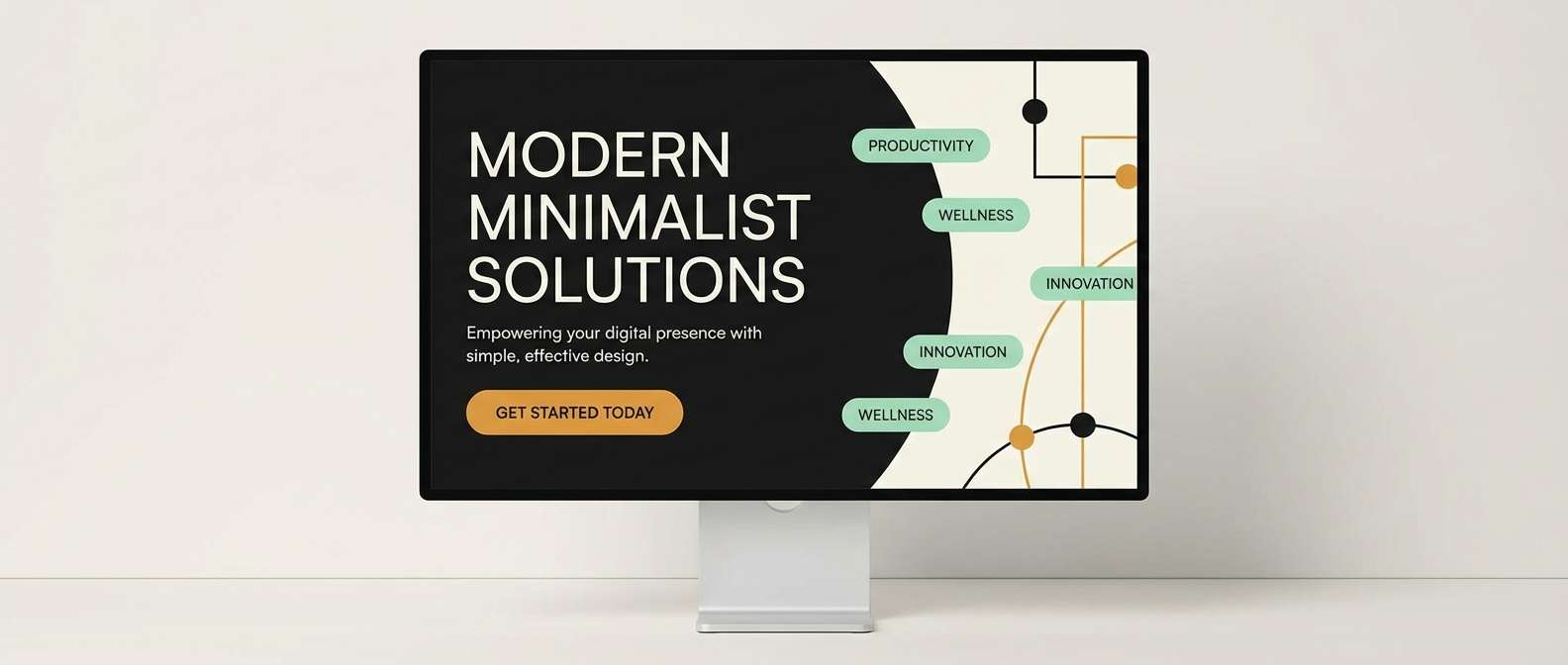
2) Citrus Ink
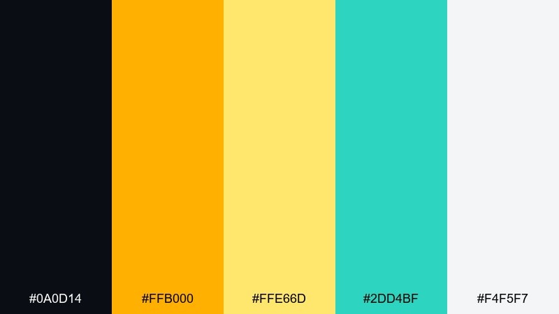
HEX: #0A0D14 #FFB000 #FFE66D #2DD4BF #F4F5F7
Mood: punchy, modern, energetic
Best for: startup landing pages and announcement banners
Bright citrus on dark ink feels like spotlighted typography on a stage. Build the layout with near-black sections and use amber for buttons, badges, and key stats. Mint adds a fresh secondary accent without competing with the yellows. Tip: keep long-form body text on the light background for comfortable reading.
Image example of citrus ink generated using media.io
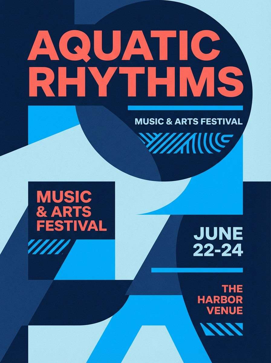
3) Coral Glacier
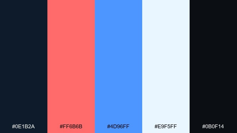
HEX: #0E1B2A #FF6B6B #4D96FF #E9F5FF #0B0F14
Mood: fresh, bold, coastal
Best for: event posters and social ads
Cool glacier blues with coral warmth evoke a seaside sunset with crisp air. This contrast color palette works best when the dark tones frame the layout and the coral is saved for focal typography. Pair the pale ice blue as a background to keep gradients and photos feeling clean. Tip: use coral only at large sizes to avoid eye strain on small text.
Image example of coral glacier generated using media.io
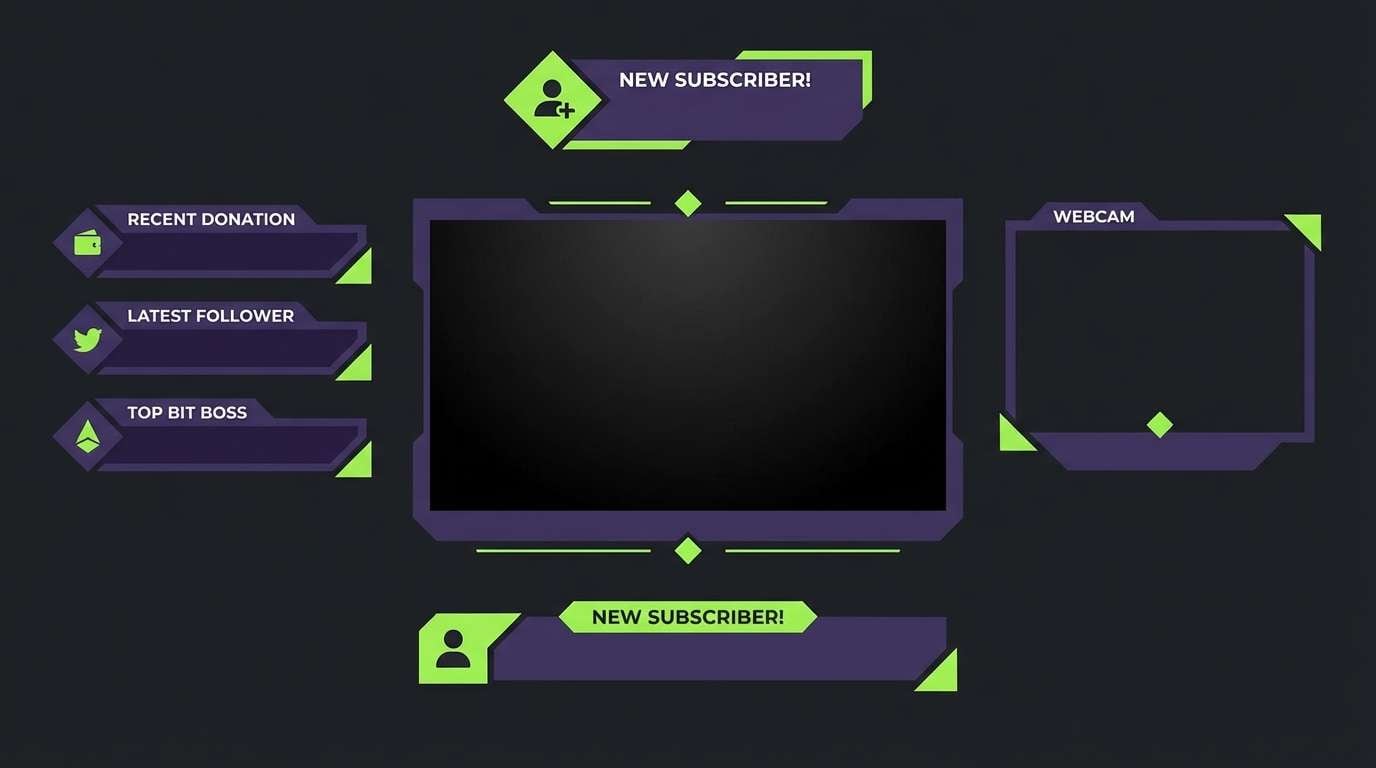
4) Violet Lime Pop
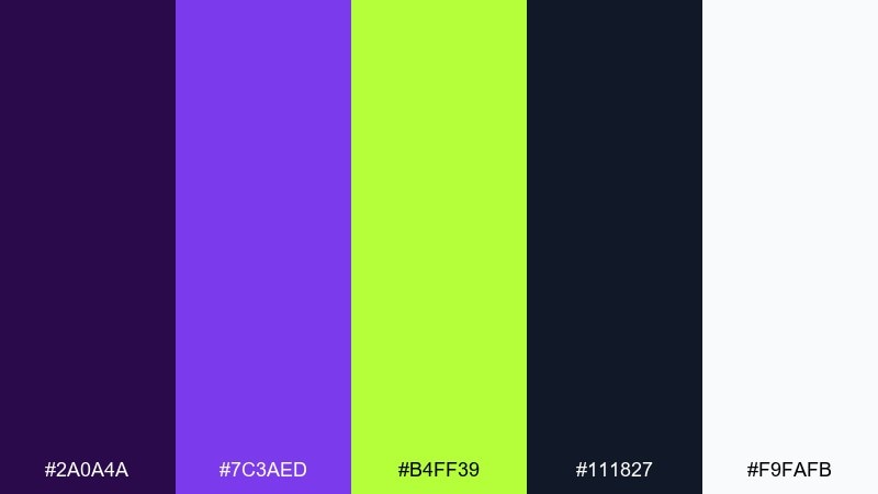
HEX: #2A0A4A #7C3AED #B4FF39 #111827 #F9FAFB
Mood: playful, edgy, high-energy
Best for: gaming stream overlays and promo graphics
Electric violet and lime feel like arcade lights and glitchy motion. Keep the darkest charcoal for panels and text blocks so the bright accents stay controlled. Lime is perfect for live indicators and quick highlights, while violet anchors headers. Tip: avoid using lime for paragraph text and keep it for icons and short labels.
Image example of violet lime pop generated using media.io
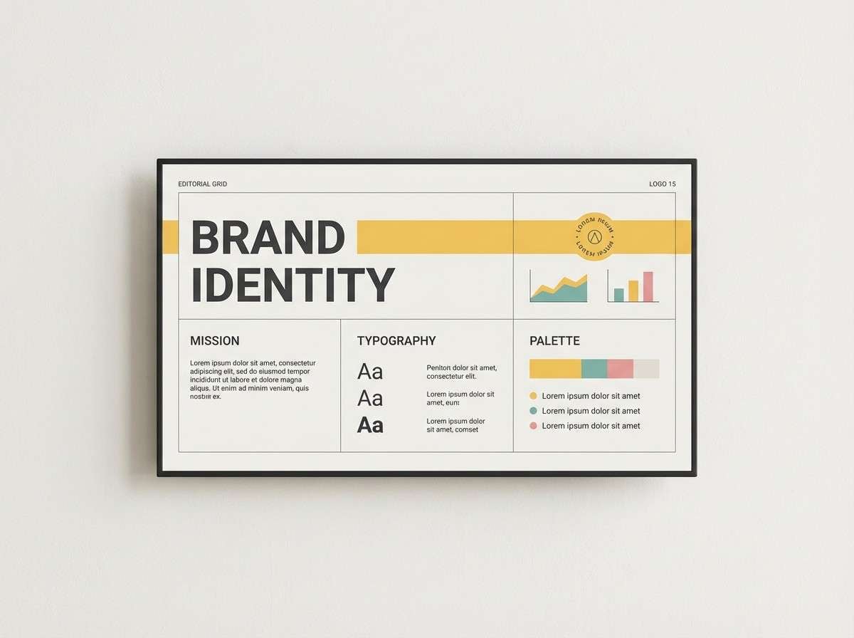
5) Sunlit Charcoal
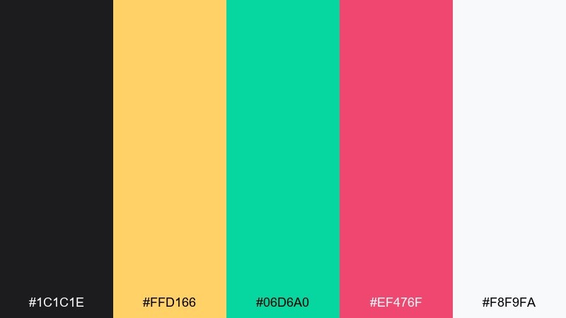
HEX: #1C1C1E #FFD166 #06D6A0 #EF476F #F8F9FA
Mood: confident, sunny, contemporary
Best for: brand identity kits and pitch decks
Warm sunlight against charcoal reads clean, confident, and easy to scan. Use the dark gray for type and dividers, then rotate the three brights as category colors for charts and callouts. Off-white keeps slides and one-pagers feeling airy. Tip: set one accent as the primary and keep the other two as supporting highlights to maintain hierarchy.
Image example of sunlit charcoal generated using media.io
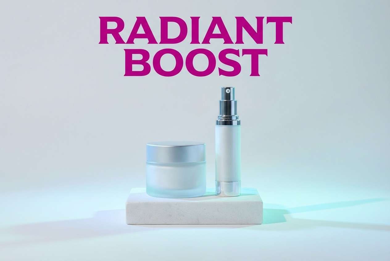
6) Aqua Magenta Split
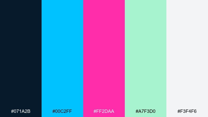
HEX: #071A2B #00C2FF #FF2DAA #A7F3D0 #F3F4F6
Mood: sleek, glossy, pop-forward
Best for: beauty product ads and web banners
Glossy aqua and magenta feel like studio lights on a reflective surface. Let the navy carry the background for high-end contrast, then use aqua for structure and magenta for the hero message. Soft mint works well for secondary badges and gentle gradients. Tip: keep backgrounds simple so the two bright accents stay premium, not chaotic.
Image example of aqua magenta split generated using media.io
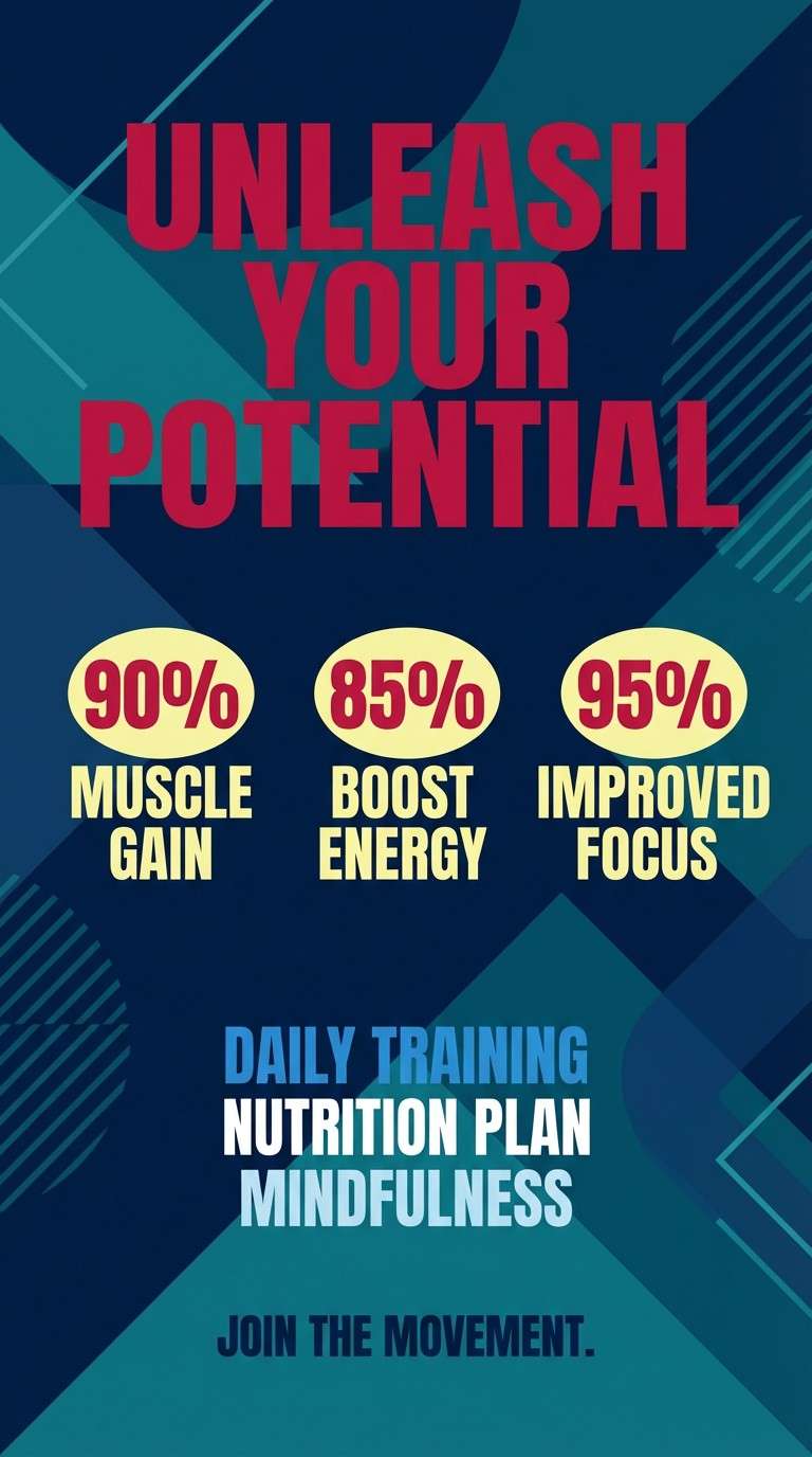
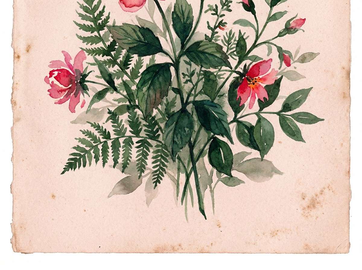
7) Crimson Teal Punch
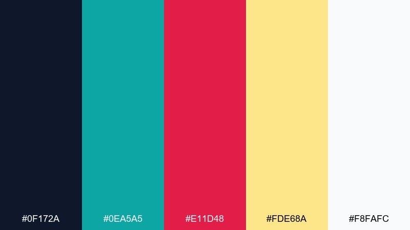
HEX: #0F172A #0EA5A5 #E11D48 #FDE68A #F8FAFC
Mood: sporty, bold, alert
Best for: fitness posters and app onboarding
Crimson and teal create a punchy rhythm, like pace lights in a training studio. Use the dark base for impact and bring in teal for supportive UI elements such as toggles and progress states. Crimson should signal urgency, promos, or key milestones. Tip: use the pale yellow as a warm highlight for stats without competing with the main accents.
Image example of crimson teal punch generated using media.io
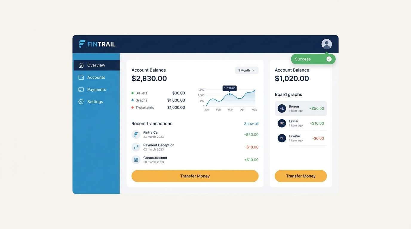
8) Saffron Navy Studio
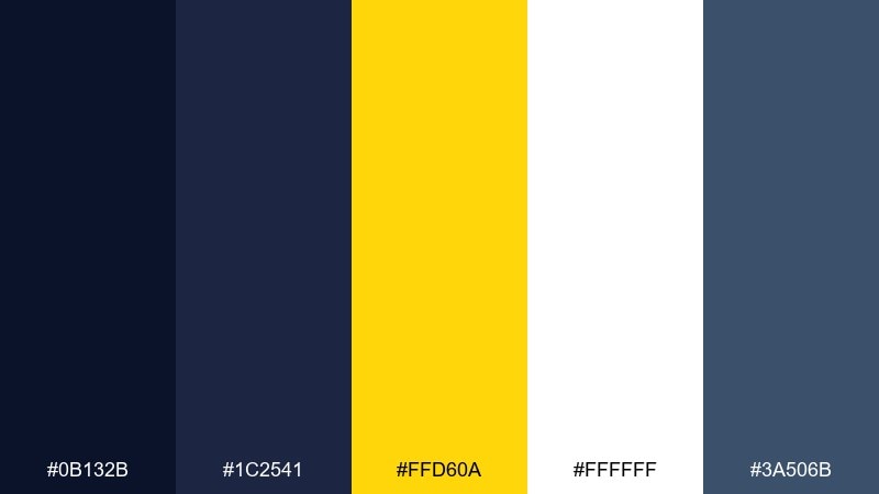
HEX: #0B132B #1C2541 #FFD60A #FFFFFF #3A506B
Mood: clean, professional, high-contrast
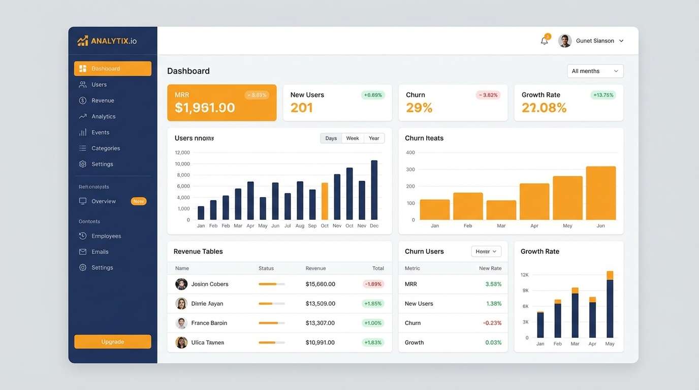
Best for: SaaS dashboards and data-heavy UI
Sharp saffron accents on layered navies feel like a studio spotlight on precise controls. This contrast color scheme is ideal for dashboards where hierarchy matters and focus states must be obvious. Use the two blues for panels and charts, then apply saffron to active tabs, alerts, and key metrics. Tip: keep large content areas white to reduce fatigue during long sessions.
Image example of saffron navy studio generated using media.io
9) Mint Rust Balance
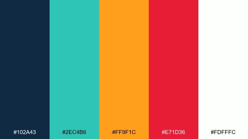
HEX: #102A43 #2EC4B6 #FF9F1C #E71D36 #FDFFFC
Mood: balanced, lively, modern
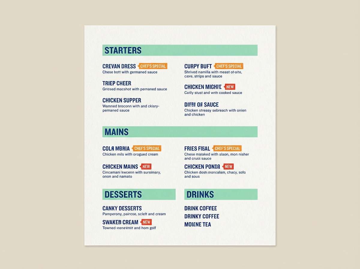
Best for: restaurant menus and food delivery promos
Fresh mint with warm rust tones evokes a modern bistro with bright signage. Use the deep blue for headings and structure, then bring in mint for sections and iconography. The orange and red work best for specials and limited-time tags. Tip: keep the warm accents small and consistent so the menu stays easy to scan.
Image example of mint rust balance generated using media.io
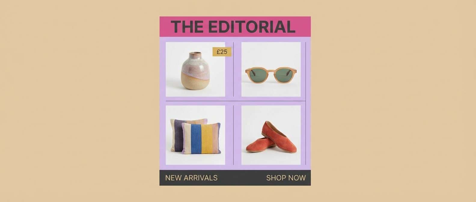
10) Fuchsia Sandstone
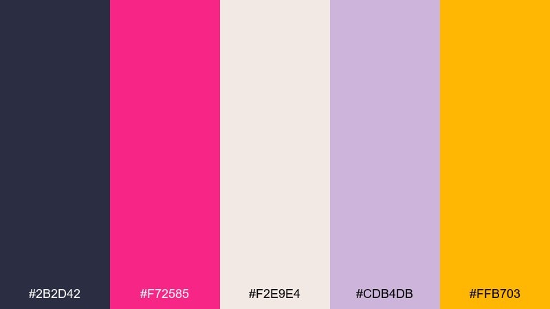
HEX: #2B2D42 #F72585 #F2E9E4 #CDB4DB #FFB703
Mood: fashion-forward, warm, editorial
Best for: lookbooks and boutique email headers
Fuchsia on soft sandstone feels like a runway spotlight over warm paper stock. Use the charcoal for body copy and keep the sandy neutral as the main background. Lavender can soften dividers and secondary sections without losing sophistication. Tip: add the golden accent sparingly for price tags or small buttons to keep the layout premium.
Image example of fuchsia sandstone generated using media.io
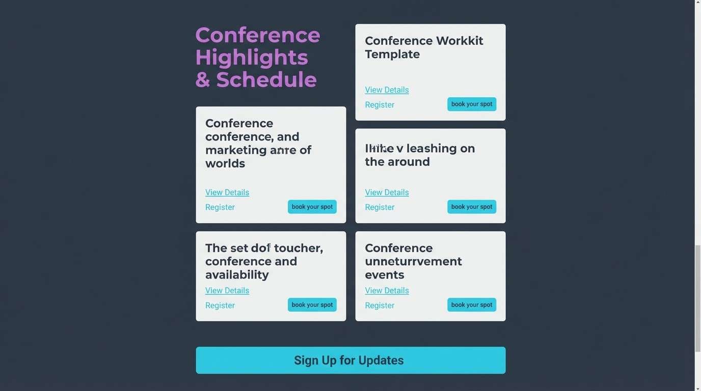
11) Neon Orchid Slate
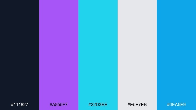
HEX: #111827 #A855F7 #22D3EE #E5E7EB #0EA5E9
Mood: techy, luminous, crisp
Best for: conference websites and speaker cards
Orchid and cyan glow against slate like stage LEDs in a dark auditorium. Make slate your foundation, then use orchid for headlines and cyan for links and hover states. Light gray keeps speaker bios readable and neutral. Tip: pick one neon for primary actions and let the other handle secondary highlights.
Image example of neon orchid slate generated using media.io
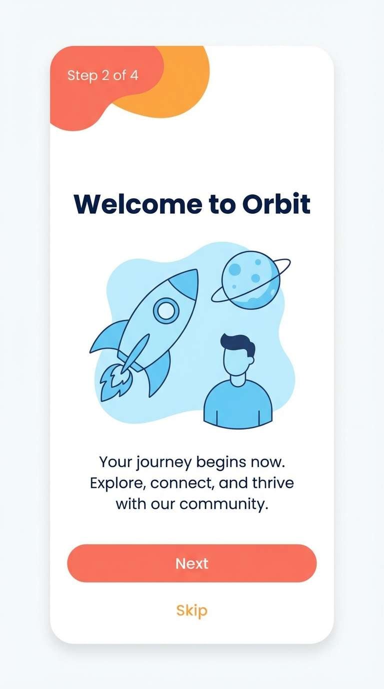
12) Sky Ember Contrast
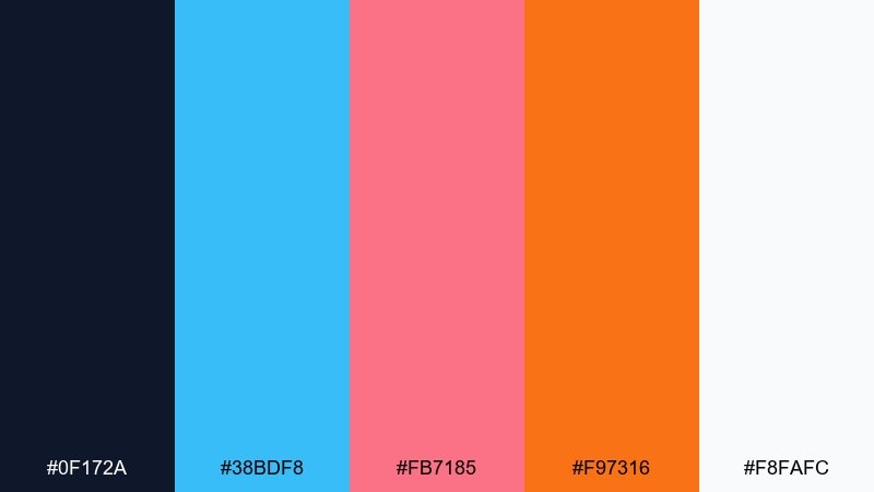
HEX: #0F172A #38BDF8 #FB7185 #F97316 #F8FAFC
Mood: bright, spirited, optimistic
Best for: mobile app onboarding screens
Sky tones with ember accents feel like sunrise gradients and energetic motion. Use the navy for nav bars and key text, then rotate the three brights across onboarding steps to keep the flow engaging. White maintains clarity and gives illustrations room to breathe. Tip: keep buttons consistent in one accent color to reduce decision friction.
Image example of sky ember contrast generated using media.io
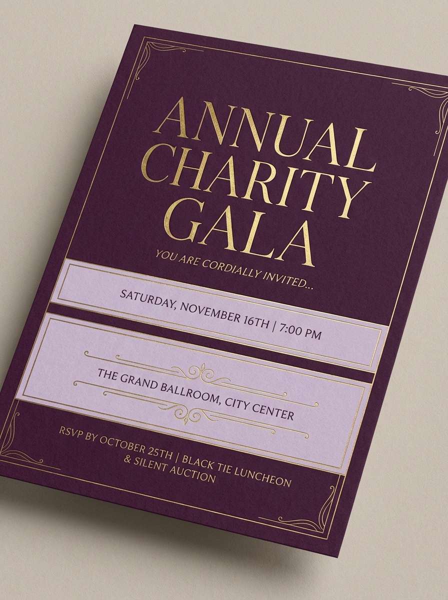
13) Plum Gold Velvet
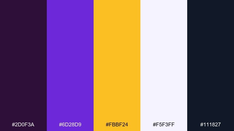
HEX: #2D0F3A #6D28D9 #FBBF24 #F5F3FF #111827
Mood: luxurious, dramatic, refined
Best for: wedding invitations and gala flyers
Velvet plum with gold highlights evokes candlelit elegance and rich fabric. This contrast color palette shines on invitations where deep backgrounds make metallic tones feel brighter. Use the pale lavender as a breathable secondary background for details and RSVP info. Tip: keep the gold for names and key dates to preserve the upscale feel.
Image example of plum gold velvet generated using media.io
14) Ocean Copper Edge
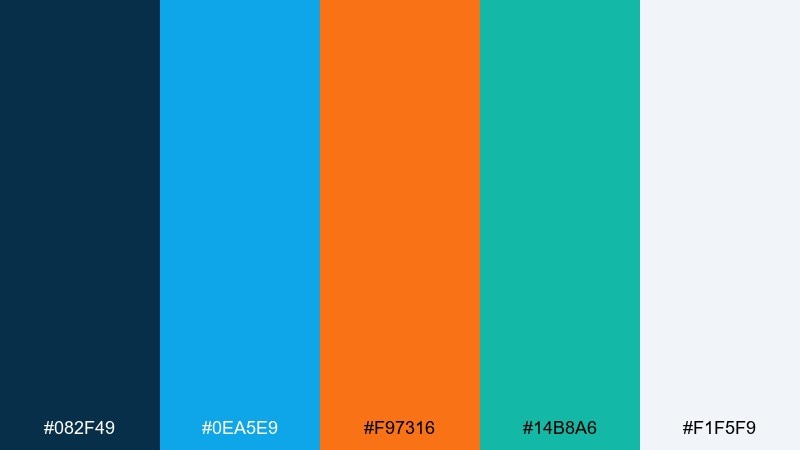
HEX: #082F49 #0EA5E9 #F97316 #14B8A6 #F1F5F9
Mood: fresh, adventurous, outdoorsy
Best for: travel blog headers and hero graphics
Ocean blues with copper orange feel like cliffs above bright water. Use the deep teal-blue for text and navigation, then add sky blue for large shapes and backgrounds. Copper works best as a single focal accent for buttons and key labels. Tip: introduce the green-teal in small UI chips to reinforce an outdoorsy theme.
Image example of ocean copper edge generated using media.io

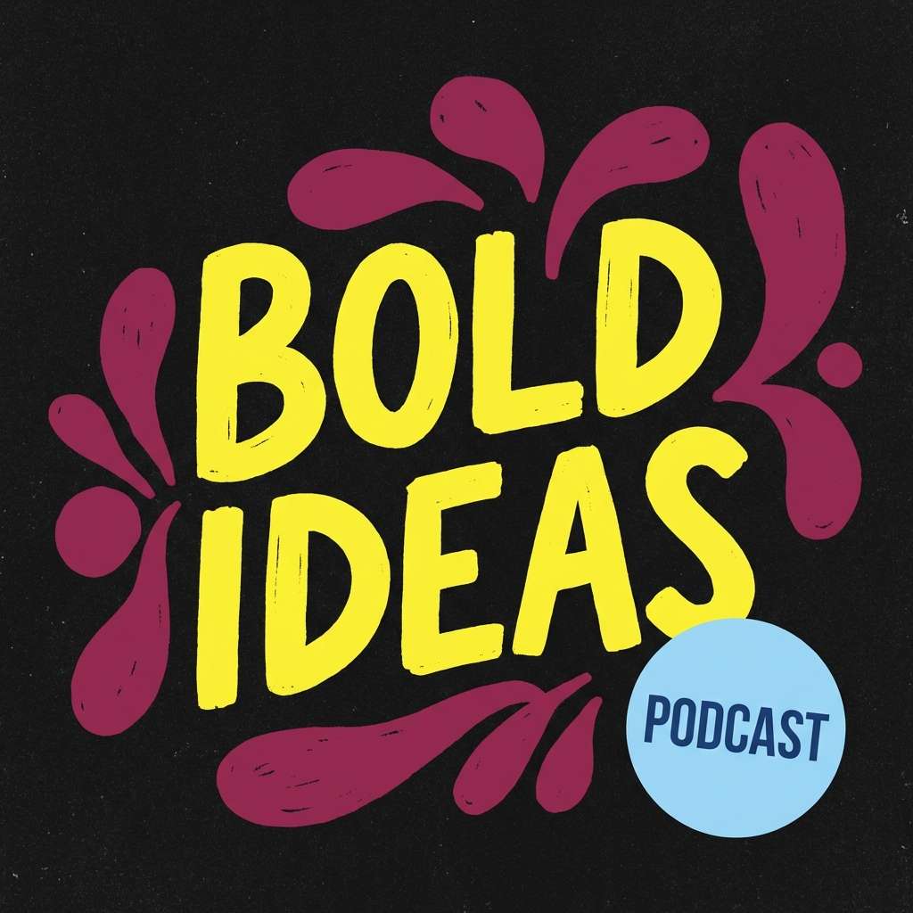
15) Lemon Berry Graphite
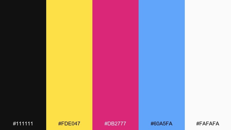
HEX: #111111 #FDE047 #DB2777 #60A5FA #FAFAFA
Mood: bold, pop, youthful
Best for: podcast cover art and thumbnails
Lemon and berry tones pop like stickers on graphite paper. The strongest results come from using black as the canvas and letting lemon carry the main title for instant legibility. Berry adds personality for badges and guest names, while the blue is a clean counter-accent. Tip: keep the palette to two dominant brights per cover to avoid clutter at small sizes.
Image example of lemon berry graphite generated using media.io
16) Turquoise Cherry Cream
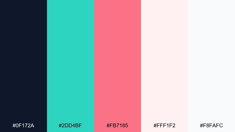
HEX: #0F172A #2DD4BF #FB7185 #FFF1F2 #F8FAFC
Mood: sweet, clean, friendly
Best for: wellness app UI and signup flows
Turquoise and cherry on cream feels like a fresh smoothie bar with soft lighting. Use navy for the core type system so the interface stays readable, then let turquoise handle progress and success states. Cherry is a great accent for primary buttons and gentle alerts. Tip: keep large panels cream-toned to reduce glare and support a calm experience.
Image example of turquoise cherry cream generated using media.io
17) Steel Apricot Flash
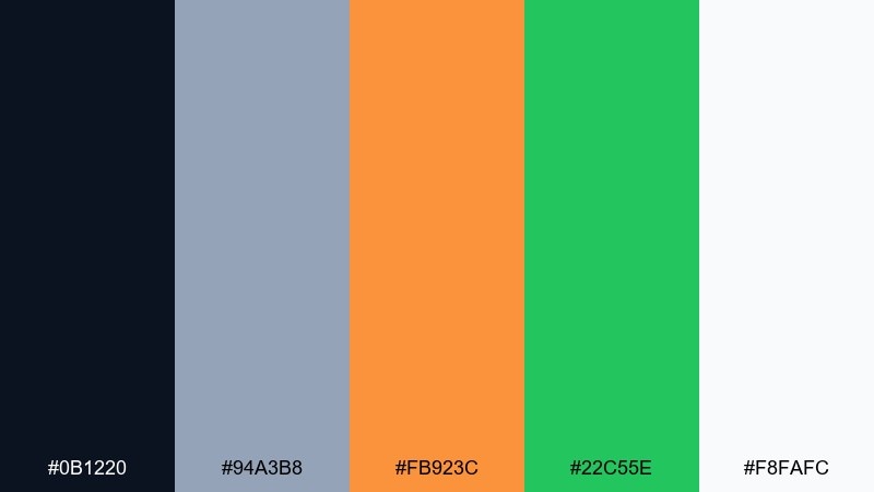
HEX: #0B1220 #94A3B8 #FB923C #22C55E #F8FAFC
Mood: industrial, bright, practical
Best for: product packaging and tool branding
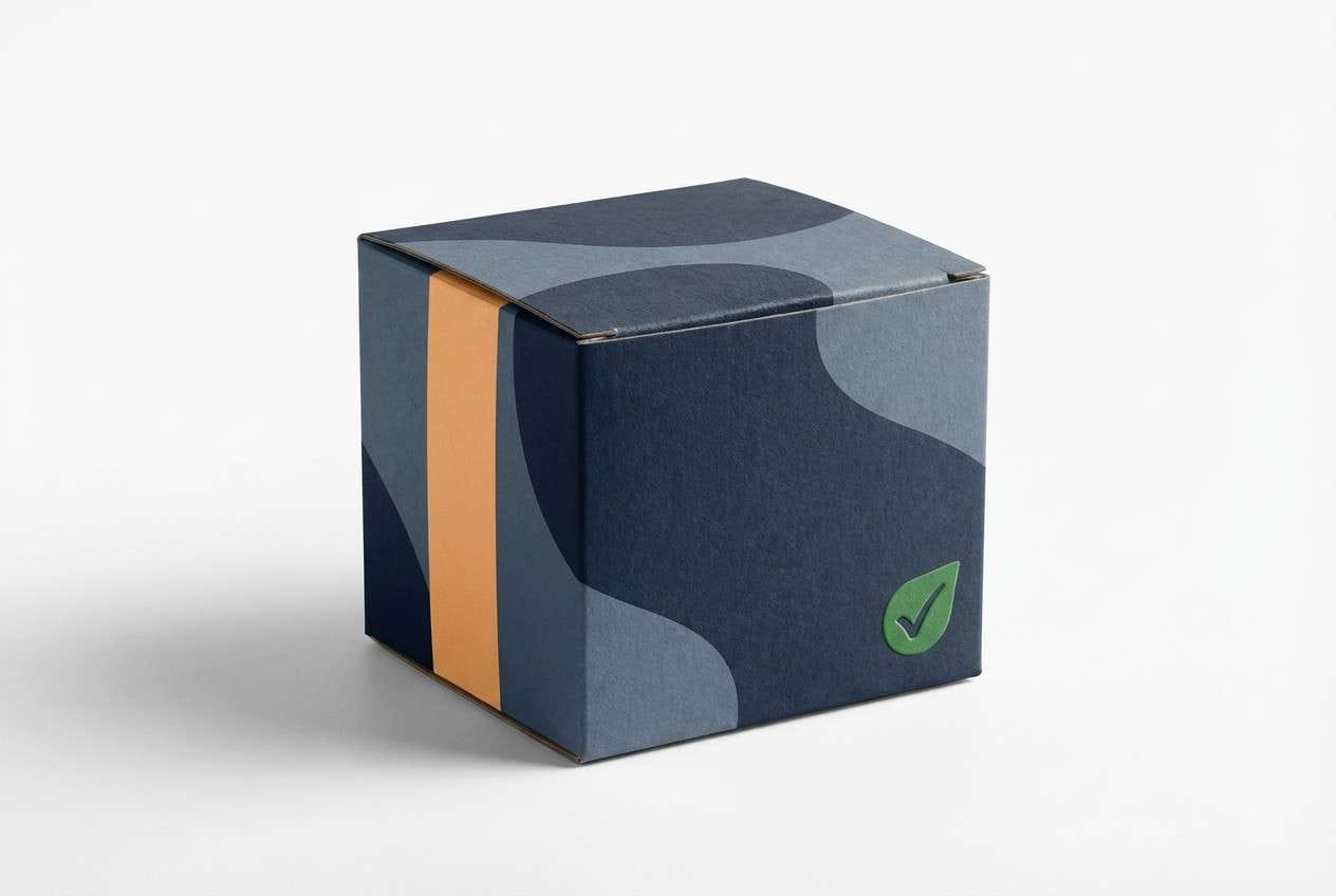
Steel grays with apricot orange evoke workshop lighting and polished metal. Use the dark base for logos and labels, then apply the light steel tone for technical specs and secondary copy. Apricot grabs attention on callouts, while green signals verified or ready states. Tip: keep the orange on one side of the package to create a strong shelf silhouette.
Image example of steel apricot flash generated using media.io
18) Forest Rose Spotlight
HEX: #052E2B #16A34A #F43F5E #FDE2E4 #0F172A
Mood: natural, vibrant, dramatic
Best for: botanical illustrations and spring promos
Deep forest tones with rose highlights feel like flowers under a focused spotlight. Use the dark greens for stems and shadows, then bring rose in for petals and key promotional text. The pale blush works beautifully as negative space for labels and dates. Tip: keep the rose as the only warm hue so the artwork stays cohesive.
Image example of forest rose spotlight generated using media.io
19) Indigo Tangerine Spark
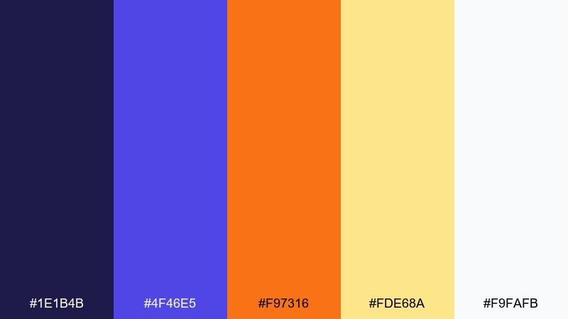
HEX: #1E1B4B #4F46E5 #F97316 #FDE68A #F9FAFB
Mood: creative, upbeat, confident
Best for: brand moodboards and creator kits
Indigo with tangerine feels like a spark of energy in a calm night scene. Use indigo for the main brand blocks and apply tangerine to icons, stickers, and short headlines. The soft yellow can highlight quotes or section titles without overpowering the composition. Tip: keep gradients subtle and let flat color blocks do most of the work.
Image example of indigo tangerine spark generated using media.io
20) Ruby Cyan Minimal
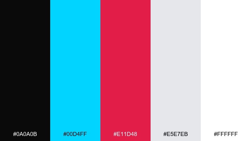
HEX: #0A0A0B #00D4FF #E11D48 #E5E7EB #FFFFFF
Mood: minimal, sharp, high-impact
Best for: portfolio websites and case study pages
Black and white minimalism with ruby and cyan accents feels crisp, intentional, and modern. Use white as the reading canvas, then apply black for headers and strong separators. Ruby is ideal for emphasis and key results, while cyan works as an interactive cue for links and hover states. Tip: limit accents to one per section so the page feels curated, not busy.
Image example of ruby cyan minimal generated using media.io
21) Graphite Iris Glow
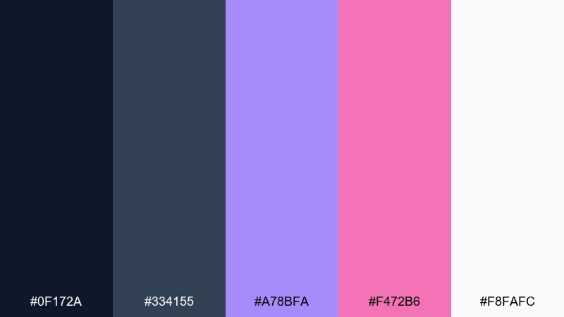
HEX: #0F172A #334155 #A78BFA #F472B6 #F8FAFC
Mood: soft neon, modern, calm
Best for: creative agency UI and pricing tables
Muted graphite with iris and pink glow feels like neon through frosted glass. Build pricing cards on white, then use graphite for legible copy and dividers. Iris works well for plan highlights, while pink is best for a single standout badge or limited-time note. Tip: keep the accent saturation moderate so the UI stays professional.
Image example of graphite iris glow generated using media.io
22) Amber Azure Cut
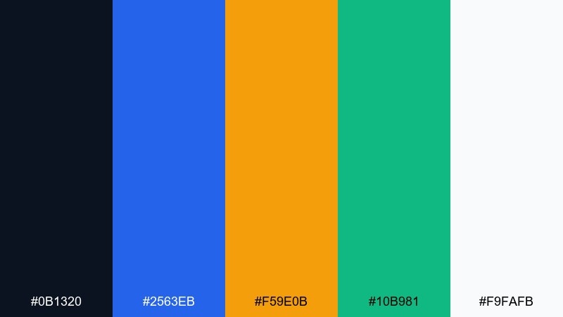
HEX: #0B1320 #2563EB #F59E0B #10B981 #F9FAFB
Mood: clear, decisive, business-ready
Best for: fintech app UI and notification states
Amber and azure create a decisive push-pull, like signal lights on a dark console. A contrast color palette like this helps separate primary actions from informational elements at a glance. Use azure for navigation and links, amber for primary CTAs, and green for success confirmations. Tip: avoid using amber and green together on the same button to keep meanings unambiguous.
Image example of amber azure cut generated using media.io
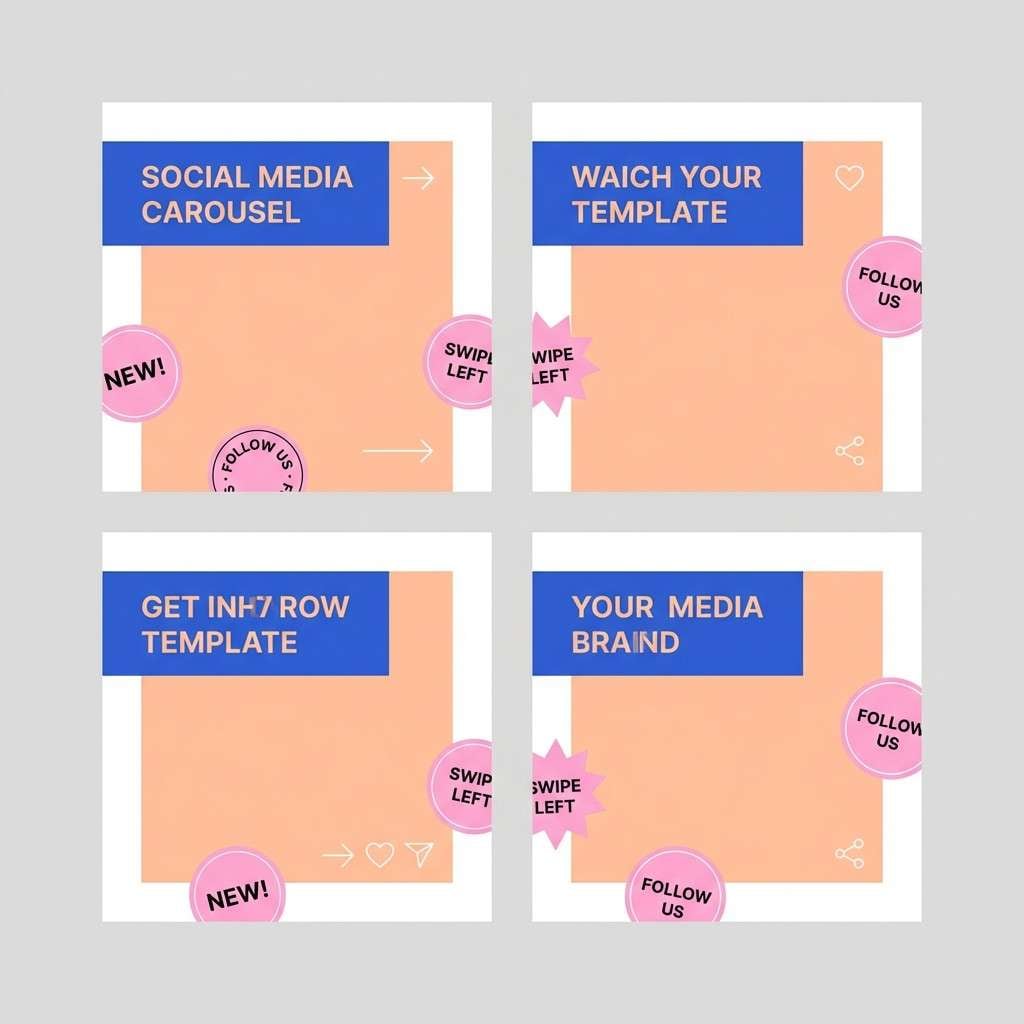
23) Peach Cobalt Clash
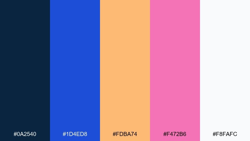
HEX: #0A2540 #1D4ED8 #FDBA74 #F472B6 #F8FAFC
Mood: fresh, trendy, expressive
Best for: social media carousel templates
Peach warmth against cobalt coolness feels like bold typography on pastel paper. Use cobalt for titles and strong shape blocks, then let peach carry background panels and highlights. Pink brings a playful pop for stickers, arrows, or small callouts. Tip: keep the number of fonts low and let color do the personality work.
Image example of peach cobalt clash generated using media.io
24) Lime Plum Night
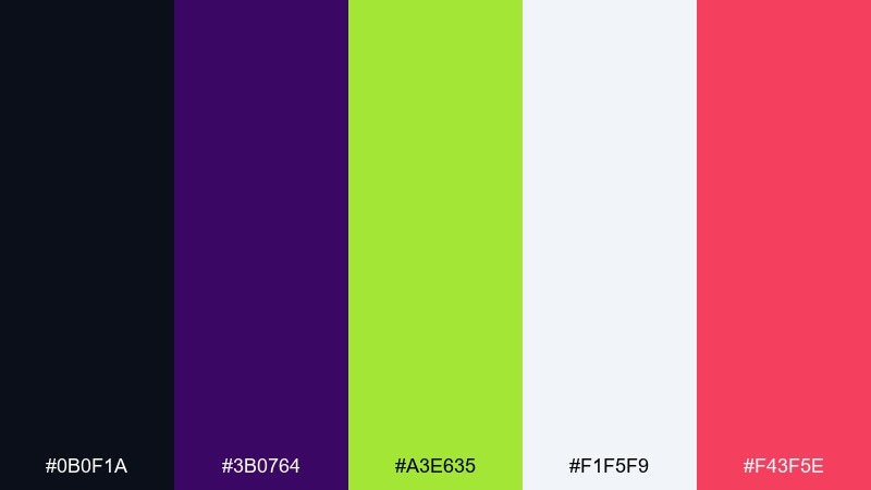
HEX: #0B0F1A #3B0764 #A3E635 #F1F5F9 #F43F5E
Mood: bold, daring, nightlife
Best for: DJ flyers and ticket promos
Lime flashes over plum night like laser beams in a crowded club. For strong contrast color combinations, set your background in the near-black and keep plum as a subtle secondary field. Lime should own the headline and key pricing, while the rose adds small bursts for date and venue. Tip: keep plenty of breathing room around lime text so it stays readable from a distance.
Image example of lime plum night generated using media.io
What Colors Go Well with Contrast?
Neutrals (black, charcoal, white, and soft grays) pair well with contrast because they stabilize the layout and give bright accents a clean stage.
Opposites on the color wheel (complementary pairs like blue/orange, purple/yellow, teal/red) naturally create “pop,” especially when one color is darker and the other is brighter.
For a modern contrast palette, try one deep base + one vivid accent + one soft tint for backgrounds; this keeps both impact and readability.
How to Use a Contrast Color Palette in Real Designs
Start with roles, not vibes: assign a background color, a text color, and one primary action color. Then add one secondary accent only if it has a clear job (links, highlights, or categories).
Protect readability by keeping small text on stable neutrals (white, off-white, deep navy, charcoal) and reserving neon or saturated colors for large headlines, icons, and buttons.
Use contrast consistently across states (default, hover, active, disabled). When color meaning stays predictable, your UI feels faster and more trustworthy.
Create Contrast Palette Visuals with AI
If you want to see how a contrast color combination looks in a real layout, generate quick mockups (posters, landing pages, product banners, UI cards) before committing to a final design system.
With Media.io, you can turn a short prompt into on-brand visuals, then iterate fast by swapping accent colors, backgrounds, and typography mood.
Contrast Color Palette FAQs
-
What is a contrast color palette?
A contrast color palette is a set of colors chosen to create strong separation between elements—commonly a dark base plus bright accents—so content is more legible and visually punchy. -
How do I keep high-contrast designs readable?
Use neutrals for long text (white/off-white on dark, or dark gray on light), keep saturated colors for buttons and headlines, and maintain comfortable line height and font weight. -
Are complementary colors always the best for contrast?
Complementary pairs are a reliable option, but value contrast (light vs dark) often matters more than hue. A navy + white combo can outperform two saturated complements for body copy. -
How many accent colors should I use in a contrast palette?
One primary accent is usually enough. Add a second accent only if it has a distinct function (e.g., success vs warning states) and avoid using both in the same component. -
What background works best with bright neon accents?
Deep neutrals like near-black, charcoal, or midnight navy make neon accents look cleaner and reduce the “vibration” effect that can happen on light backgrounds. -
How can I test contrast for accessibility?
Check text contrast ratios against the background (commonly aiming for WCAG AA for body text). Also test on mobile and in low brightness to catch readability issues early. -
Can I use contrast palettes for branding without looking too loud?
Yes—anchor the identity with one calm neutral base and apply the bright color sparingly (logo detail, one CTA, or key highlights). Consistent spacing and typography will keep it premium.
Next: Jasmine Color Palette
