

Antique brass is a warm, muted metallic that reads as vintage, premium, and human—without the flashiness of bright gold. It’s especially effective when you want heritage cues in branding, inviting warmth in interiors, or a refined accent in UI.
Below are 20+ antique brass color palette ideas with HEX codes, plus practical tips for keeping contrast clean and metallic accents consistent across screens and print.
In this article
- Why Antique Brass Palettes Work So Well
-
- heritage patina
- sunlit workshop
- art deco brass
- olive grove brass
- brass and blush
- midnight brass
- coastal brass
- autumn ledger
- botanical brass
- ink and brass ui
- brass on charcoal
- rustic bistro
- modern minimal brass
- terracotta brass
- brass and denim
- sage studio
- dusty lavender brass
- espresso brass
- champagne brass
- winter evergreen brass
- gallery brass neutrals
- citrus brass pop
- classic brass contrast
- What Colors Go Well with Antique Brass?
- How to Use a Antique Brass Color Palette in Real Designs
- Create Antique Brass Palette Visuals with AI
Why Antique Brass Palettes Work So Well
Antique brass sits between gold and brown, so it reads as “metal” while still feeling grounded and approachable. That warm, aged tone adds instant character to minimal layouts and helps brands feel established rather than trendy.
It also plays nicely with both cool and warm companions: navy and teal sharpen it, while cream, taupe, and terracotta keep it soft and organic. This flexibility makes antique brass ideal as an accent that can travel across print, packaging, and UI.
Most importantly, antique brass supports hierarchy. When you reserve it for highlights—icons, dividers, badges, and key headings—it creates a premium focal point without overwhelming readability.
20+ Antique Brass Color Palette Ideas (with HEX Codes)
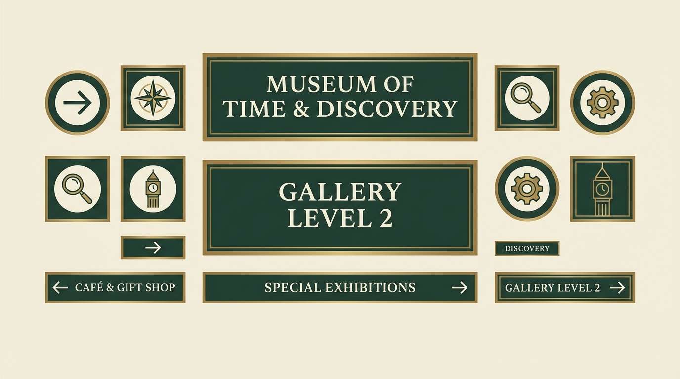
1) Heritage Patina
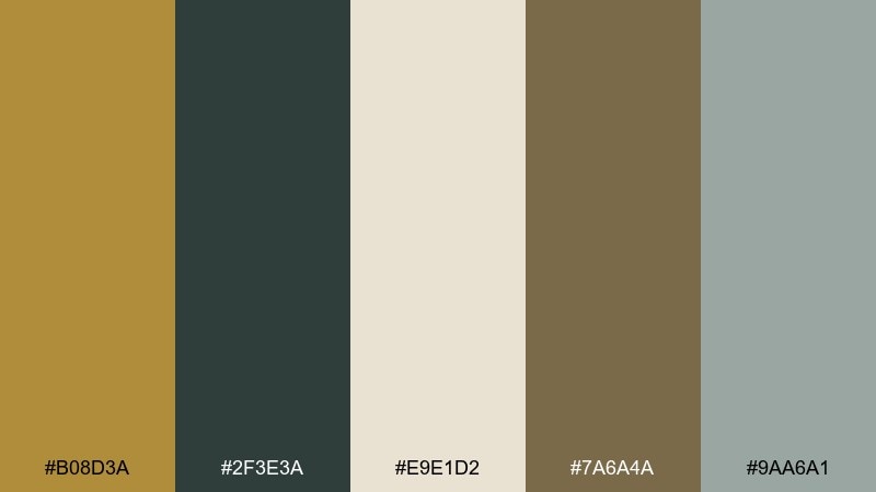
HEX: #B08D3A #2F3E3A #E9E1D2 #7A6A4A #9AA6A1
Mood: warm, storied, grounded
Best for: museum branding and signage
Warm and storied like aged metal and old wood display cases, these tones feel trustworthy and curated. Use the brass as the highlight for headings, seals, and wayfinding icons, then let pine and taupe carry most of the surface area. Ivory keeps copy readable and adds a gallery-like calm. Tip: print small text in the deep green instead of brass for cleaner contrast.
Image example of heritage patina generated using media.io
Media.io is an online AI studio for creating and editing video, image, and audio in your browser.

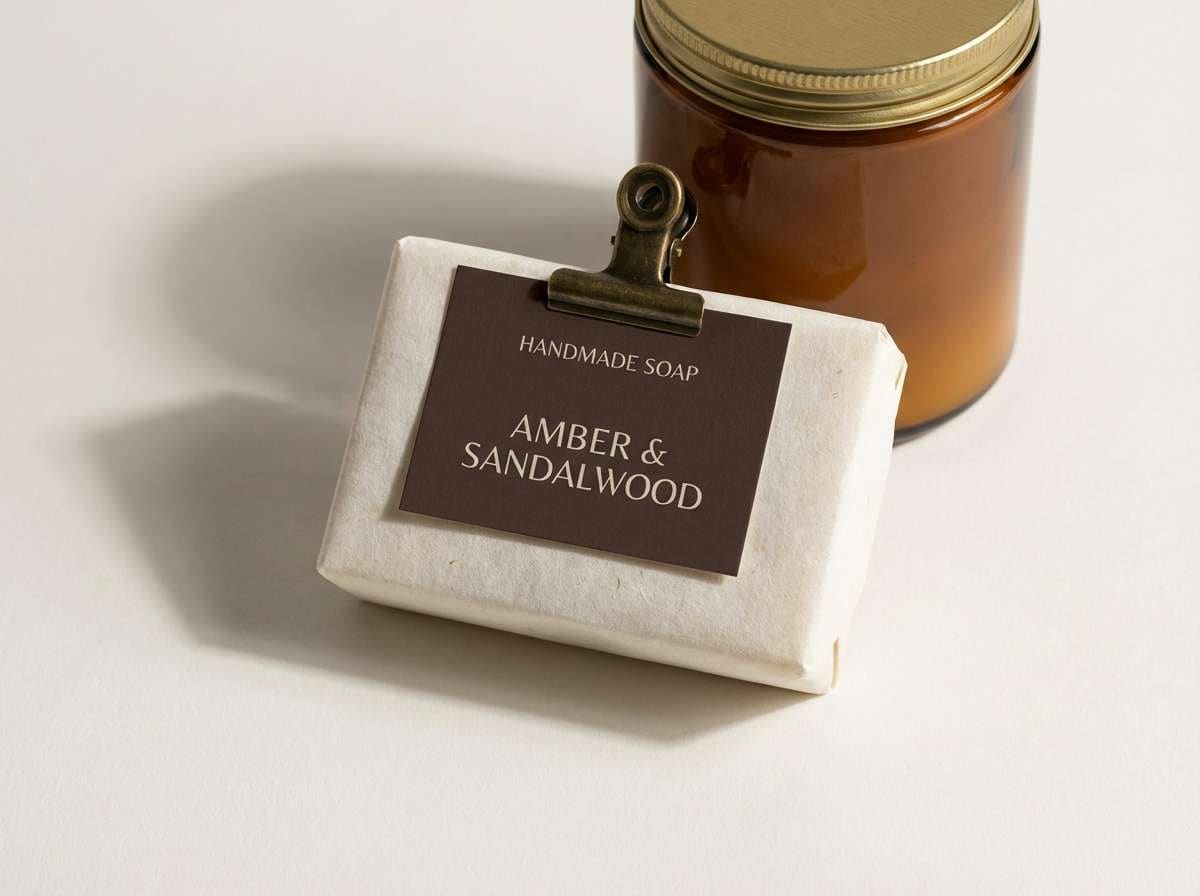
2) Sunlit Workshop
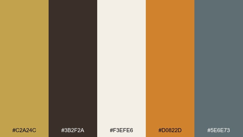
HEX: #C2A24C #3B2F2A #F3EFE6 #D0822D #5E6E73
Mood: crafty, sunny, tactile
Best for: product packaging for handmade goods
Crafty and sun-warmed, it evokes leather aprons, sawdust, and polished tools on a bright bench. Let the brass and amber act as attention-grabbing accents on labels, while espresso and slate handle typography. The creamy off-white gives plenty of breathing room for ingredients and instructions. Tip: add subtle paper grain in the background to amplify the handmade feel without changing the color mix.
Image example of sunlit workshop generated using media.io
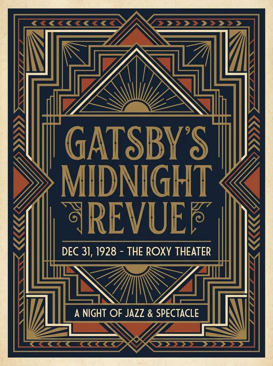
3) Art Deco Brass
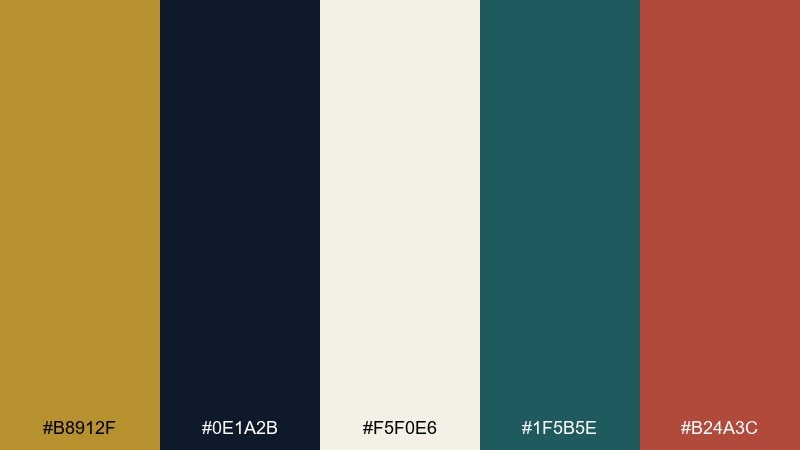
HEX: #B8912F #0E1A2B #F5F0E6 #1F5B5E #B24A3C
Mood: glam, geometric, dramatic
Best for: event posters and jazz nights
Glam and dramatic, it brings to mind lacquered bars, brass trim, and bold Deco geometry. One of the easiest antique brass color combinations to modernize is pairing it with inky navy and a controlled pop of brick red. Keep the cream as the base so the dark tones do not swallow your layout. Tip: use thin linework in brass over navy for instant Deco polish.
Image example of art deco brass generated using media.io
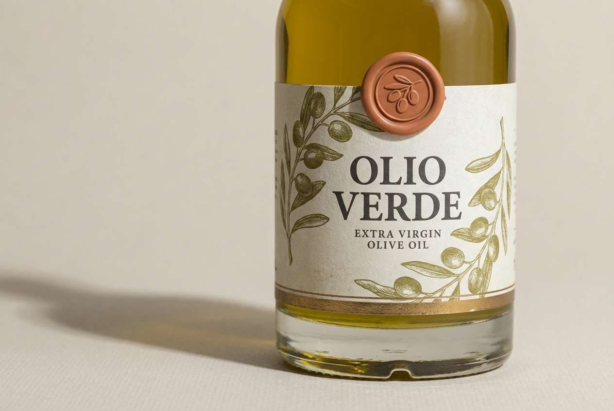
4) Olive Grove Brass
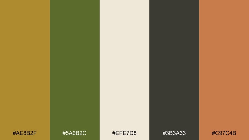
HEX: #AE8B2F #5A6B2C #EFE7D8 #3B3A33 #C97C4B
Mood: earthy, culinary, relaxed
Best for: olive oil labels and gourmet brands
Earthy and relaxed, it feels like a hillside grove at golden hour with terracotta pots and shaded leaves. Olive green and charcoal give the palette structure, while brass adds premium cues without shouting. Creamy beige keeps the look organic and label-friendly. Tip: reserve the terracotta as a small badge color for harvest year or flavor notes.
Image example of olive grove brass generated using media.io
5) Brass and Blush
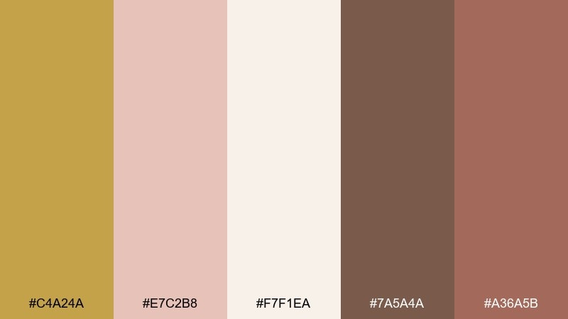
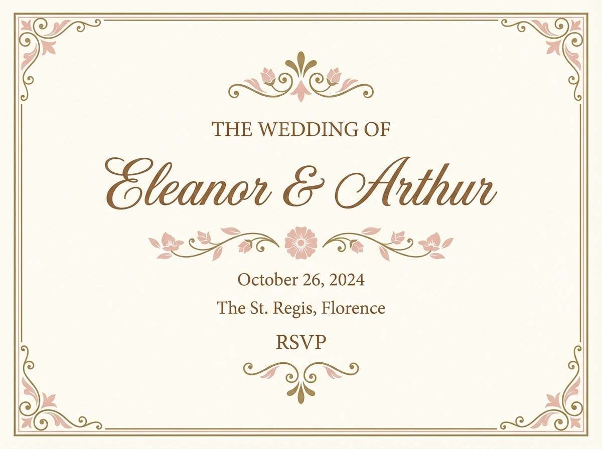
HEX: #C4A24A #E7C2B8 #F7F1EA #7A5A4A #A36A5B
Mood: romantic, soft, elegant
Best for: wedding invitations
Romantic and soft, it suggests blush silk, candlelight, and a warm metallic shimmer. Use the blush and cream for large areas, then introduce brass for monograms, borders, or foil-stamped details. Cocoa-brown typography keeps everything legible and grounded. Tip: keep brass to fine lines and small accents so the invitation stays airy rather than heavy.
Image example of brass and blush generated using media.io
6) Midnight Brass
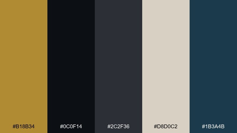
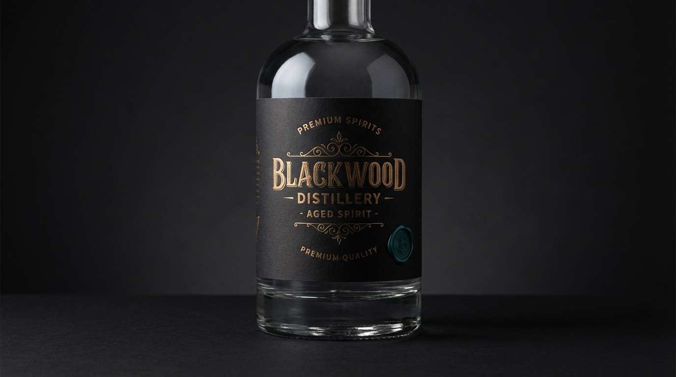
HEX: #B18B34 #0C0F14 #2C2F36 #D8D0C2 #1B3A4B
Mood: moody, luxe, high-contrast
Best for: premium spirits branding
Moody and luxe, it reads like brass hardware against a midnight cabinet door. Use near-black for the bottle label base, then let brass and warm greige carry the focal hierarchy. The deep teal adds a subtle secondary accent that stays refined. Tip: use matte black backgrounds and glossy brass elements to create a believable premium finish in print.
Image example of midnight brass generated using media.io
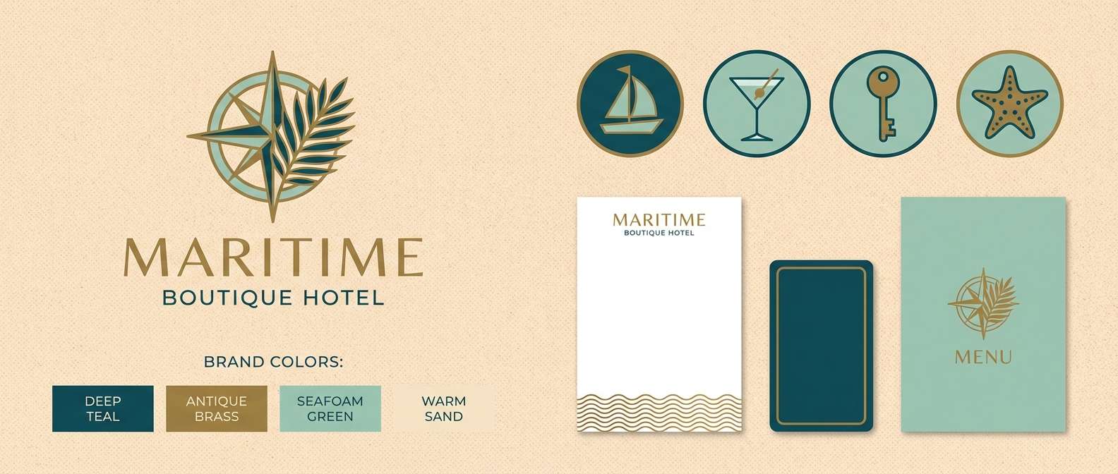
7) Coastal Brass
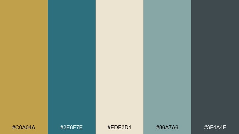
HEX: #C0A04A #2E6F7E #EDE3D1 #86A7A6 #3F4A4F
Mood: breezy, refined, seaside
Best for: boutique hotel branding
Breezy and refined, it evokes sunlit sand, sea glass, and warm metal details in a coastal lobby. Teal and misty aqua make the brass feel fresher, while the creamy neutral keeps the vibe relaxed. Use the charcoal tone for body text and navigation so the brand stays readable across print and web. Tip: set brass as a highlight color for icons and dividers rather than full backgrounds.
Image example of coastal brass generated using media.io
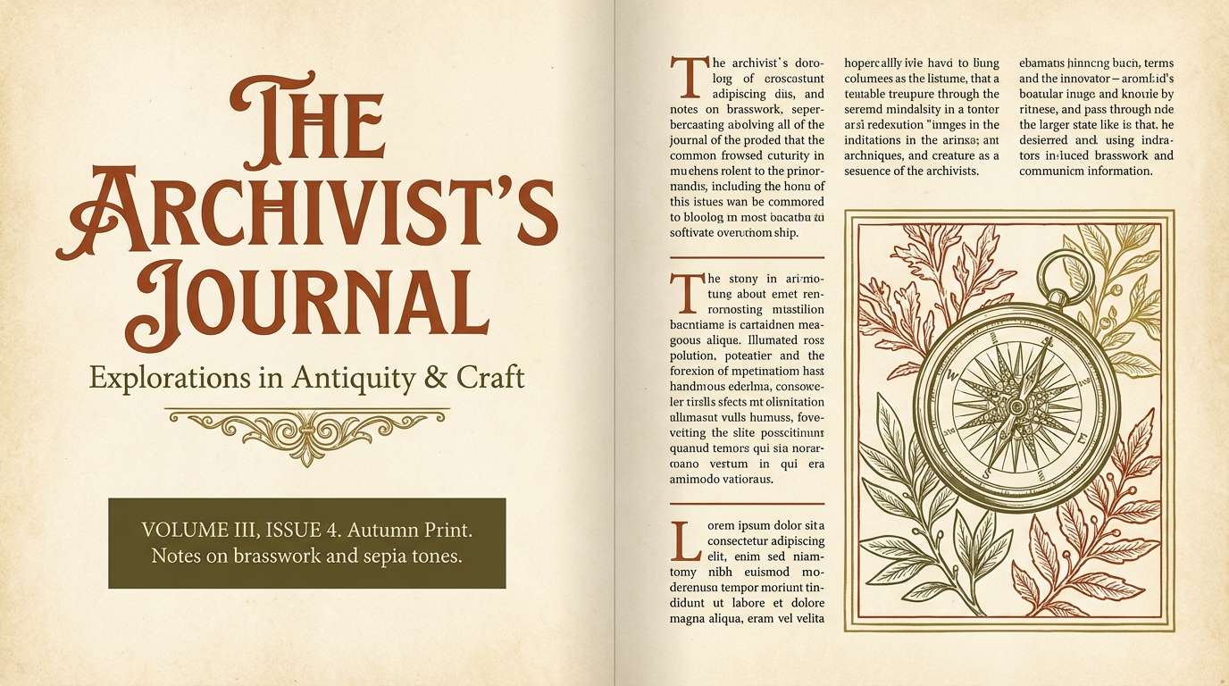
8) Autumn Ledger
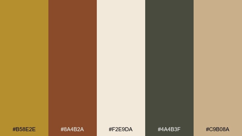
HEX: #B58E2E #8A4B2A #F2E9DA #4A4B3F #C9B08A
Mood: vintage, cozy, literary
Best for: book covers and editorial layouts
Cozy and literary, it feels like aged pages, leather spines, and a brass lamp on a desk. The warm rust and olive-charcoal provide depth without turning the design too dark. Use parchment beige as the main canvas and keep brass for titles or small ornaments. Tip: combine serif typography with generous margins to let the palette read as classic instead of rustic.
Image example of autumn ledger generated using media.io
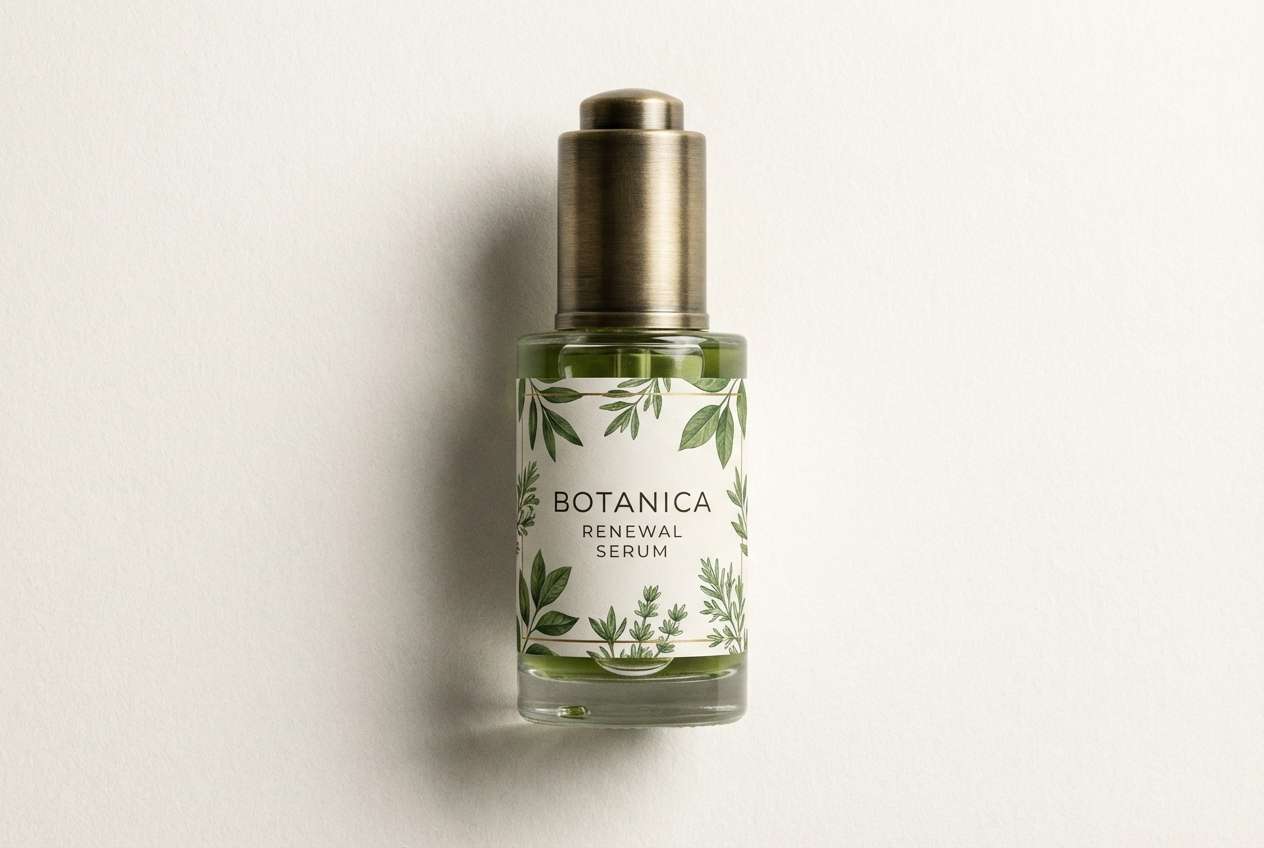
9) Botanical Brass
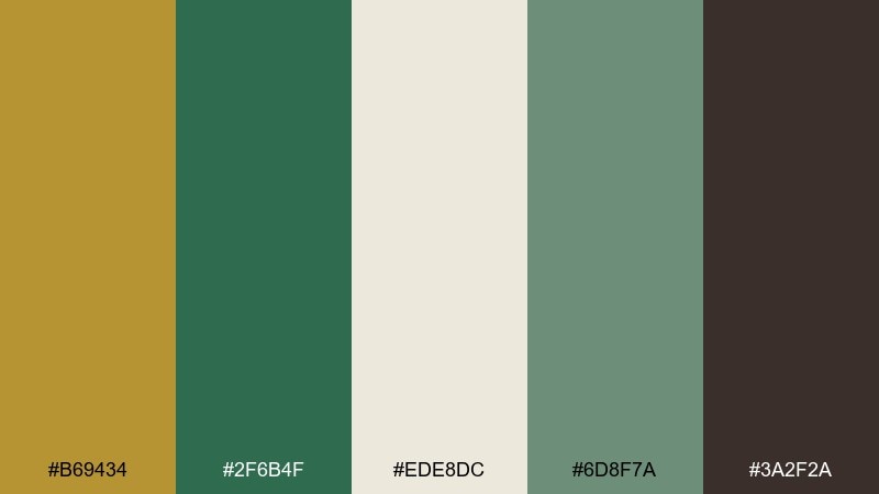
HEX: #B69434 #2F6B4F #EDE8DC #6D8F7A #3A2F2A
Mood: fresh, natural, heritage garden
Best for: skincare packaging and apothecary labels
Fresh and natural, it suggests greenhouse leaves, botanical ink, and vintage apothecary jars with brass lids. Make the greens dominant to keep the look plant-forward, then use brass for caps, seals, or ingredient dividers. Off-white keeps the label readable and clean, while espresso adds an earthy anchor. Tip: pair with fine line botanical illustrations for a premium, ingredient-first feel.
Image example of botanical brass generated using media.io
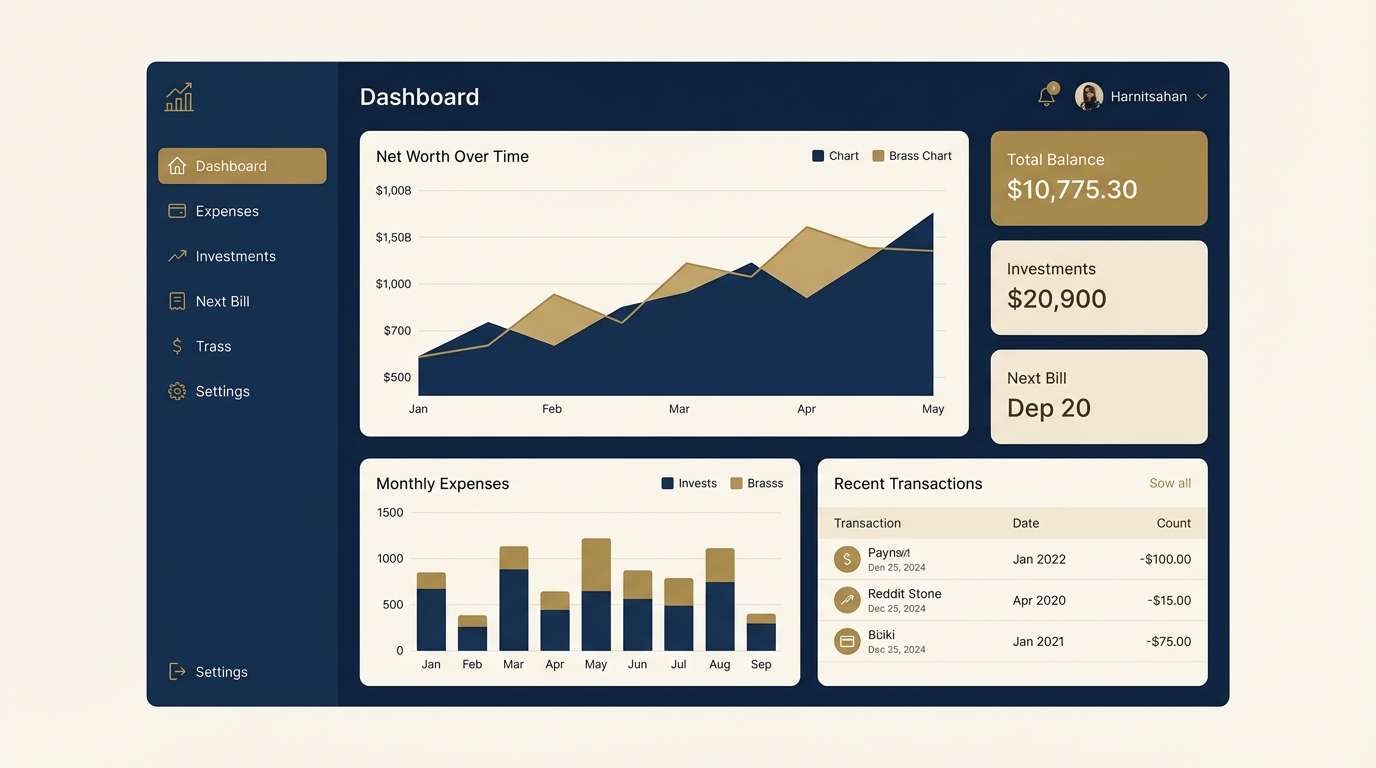
10) Ink and Brass UI
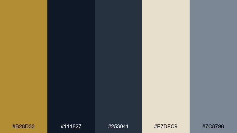
HEX: #B28D33 #111827 #253041 #E7DFC9 #7C8796
Mood: sleek, confident, tech-luxe
Best for: finance dashboard UI
Sleek and confident, it feels like ink-black interfaces with a subtle metallic glint. This antique brass color palette works best when brass is used sparingly for primary actions, badges, or key metrics, while the inky blues handle the layout. The warm parchment neutral keeps cards and charts from feeling cold. Tip: keep hover states in slate tones so brass remains the top-level emphasis.
Image example of ink and brass ui generated using media.io
11) Brass on Charcoal
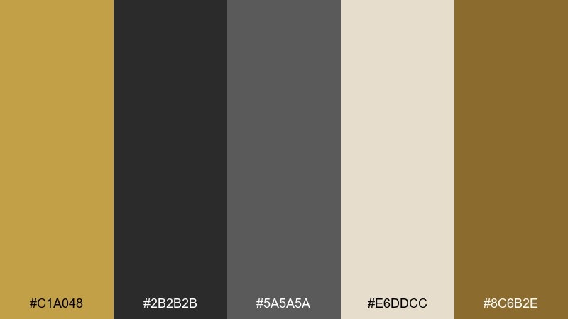
HEX: #C1A048 #2B2B2B #5A5A5A #E6DDCC #8C6B2E
Mood: bold, minimal, industrial
Best for: restaurant menus
Bold and minimal, it calls up charcoal walls, warm lighting, and brass fixtures in a modern dining room. Use the light cream for menu pages, then set charcoal text for high readability and a premium feel. Brass works beautifully for section headers, rules, and small icons, while mid-gray supports secondary information. Tip: limit the darkest backgrounds to small blocks so the menu stays easy to scan.
Image example of brass on charcoal generated using media.io
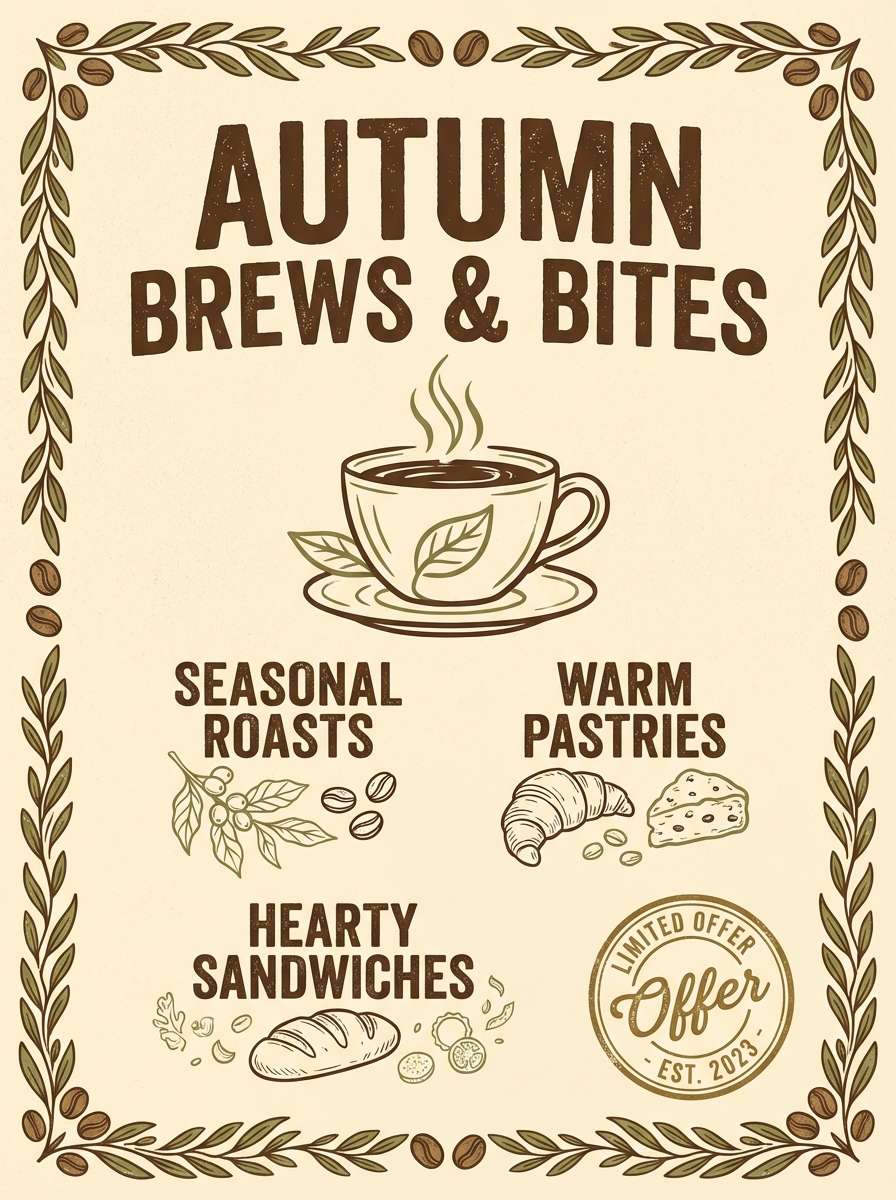
12) Rustic Bistro
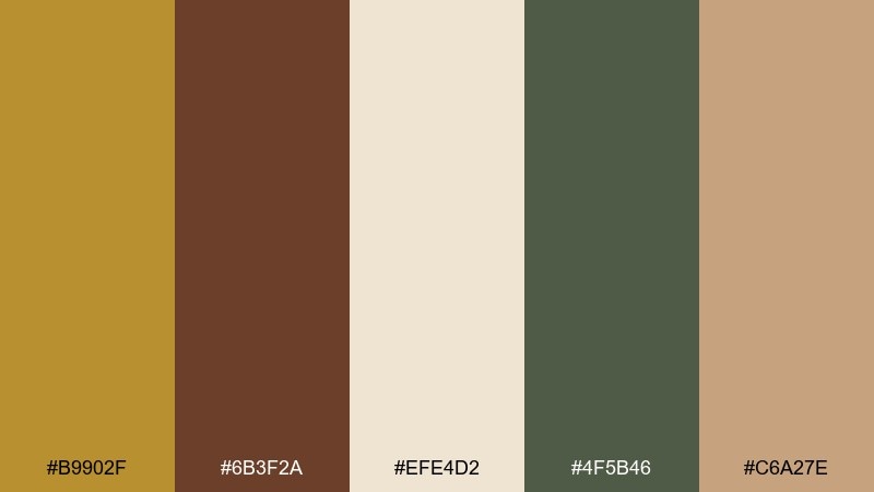
HEX: #B9902F #6B3F2A #EFE4D2 #4F5B46 #C6A27E
Mood: rustic, inviting, warm
Best for: cafe branding and chalkboard-style posters
Inviting and warm, it feels like worn wood tables, herb sprigs, and a soft brass glow above the counter. Use the cream and tan for backgrounds, then lean on walnut and olive for type and illustrations. Brass becomes a tasteful accent for logos, stamps, or price highlights. Tip: if you add textures, keep them subtle so the palette stays clean and not overly vintage.
Image example of rustic bistro generated using media.io
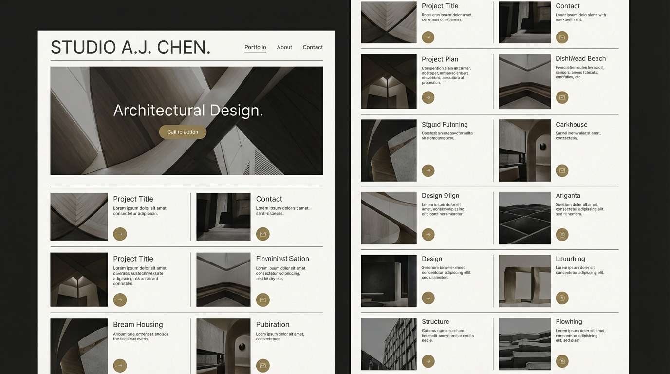
13) Modern Minimal Brass
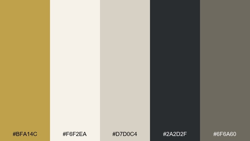
HEX: #BFA14C #F6F2EA #D7D0C4 #2A2D2F #6F6A60
Mood: clean, modern, editorial
Best for: portfolio websites
Clean and modern, it looks like a bright studio with brushed metal details and crisp paper. Let off-white carry most of the page, and use charcoal for typography to keep contrast sharp. Brass should appear as a small, consistent accent for buttons, link states, or separators. Tip: choose one brass shade for all highlights to avoid a patchy metallic look across screens.
Image example of modern minimal brass generated using media.io
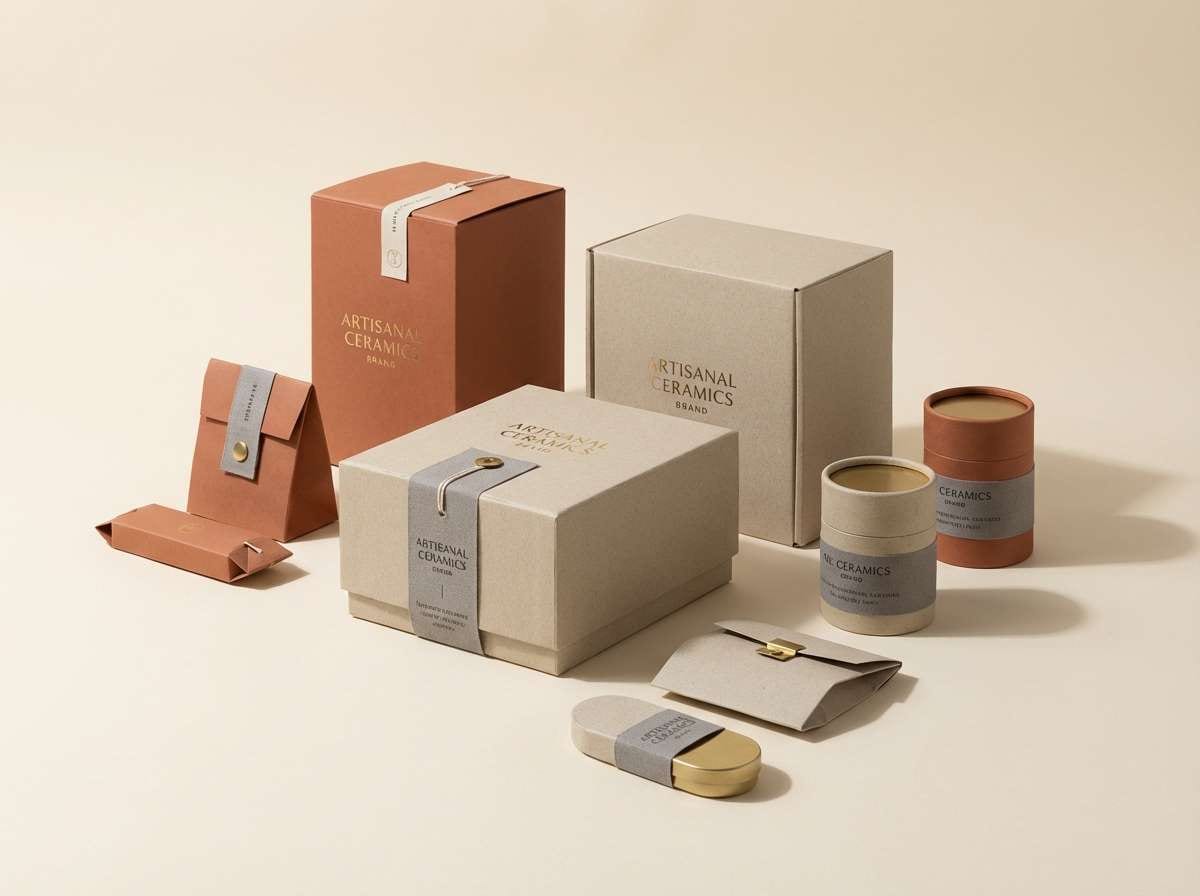
14) Terracotta Brass
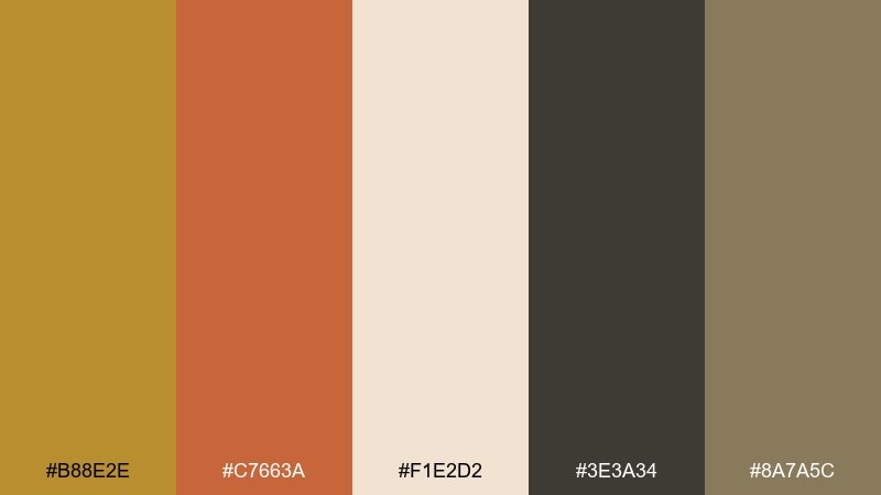
HEX: #B88E2E #C7663A #F1E2D2 #3E3A34 #8A7A5C
Mood: sunbaked, artistic, earthy
Best for: ceramics shop branding
Sunbaked and artistic, it brings to mind kiln-fired clay with a warm metallic glaze. Terracotta takes the lead for bold shapes and product tags, while brass adds a refined highlight on logos or borders. Cream and stone tones keep the palette grounded and easy to print. Tip: use charcoal for small type so the warmer hues can stay expressive without hurting readability.
Image example of terracotta brass generated using media.io
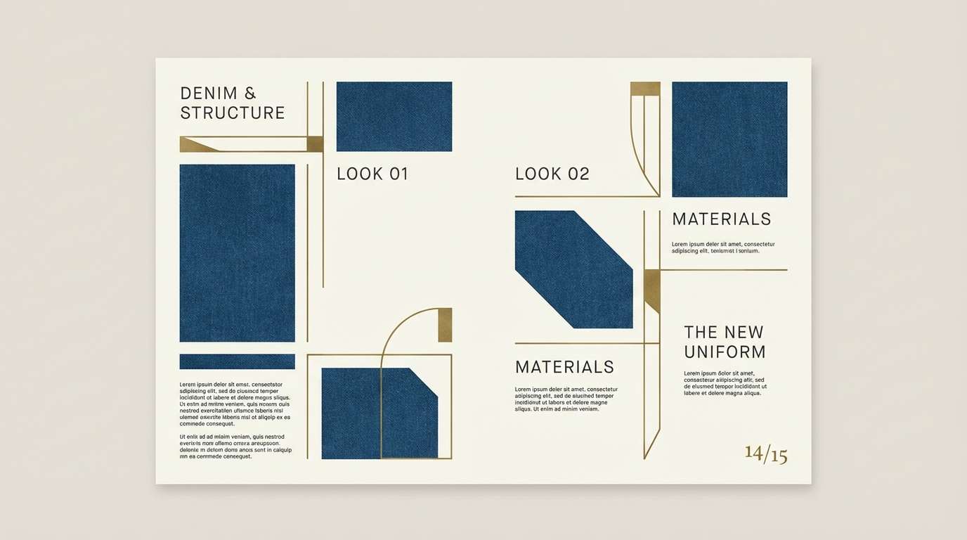
15) Brass and Denim
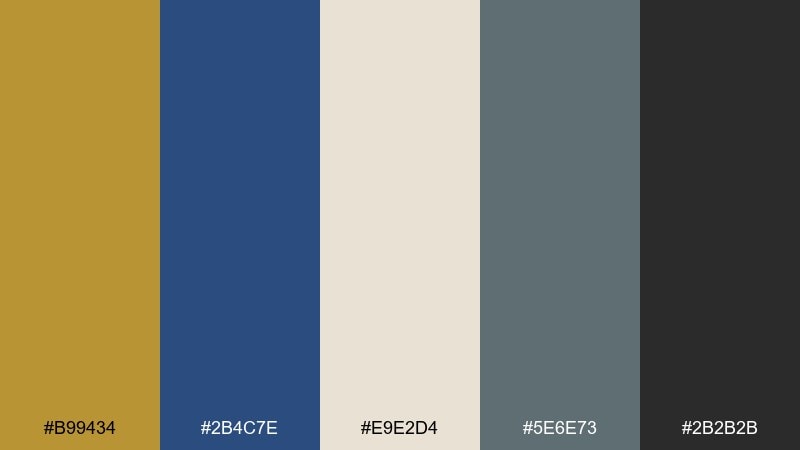
HEX: #B99434 #2B4C7E #E9E2D4 #5E6E73 #2B2B2B
Mood: smart, casual, contemporary
Best for: menswear lookbooks
Smart and casual, it feels like dark denim, crisp stitching, and a brass buckle catching the light. Antique brass color combinations shine here when you let denim blues dominate and keep brass for trims, callouts, or price tags. The cream neutral keeps spreads bright, while charcoal ensures text stays sharp. Tip: use the slate tone for secondary headings to soften the contrast between blue and black.
Image example of brass and denim generated using media.io
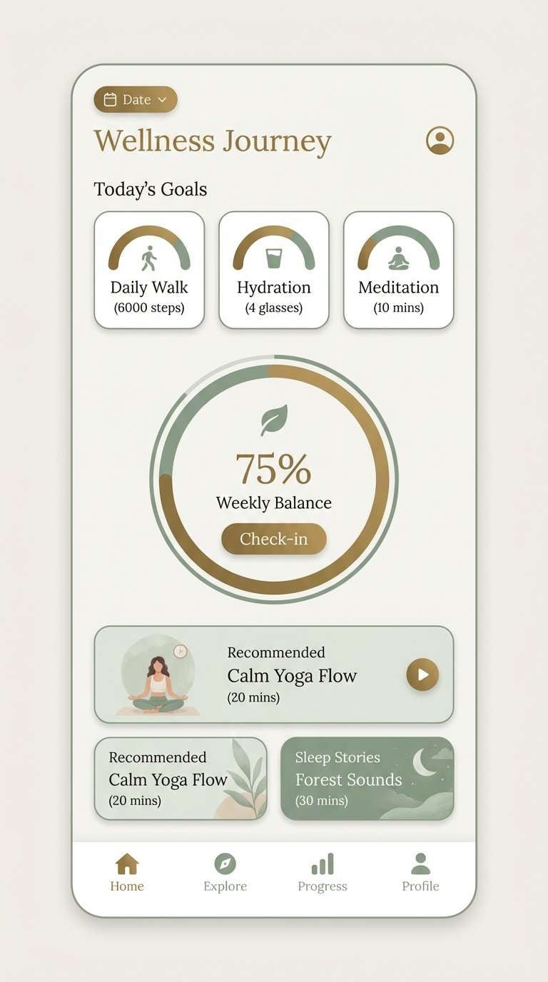
16) Sage Studio
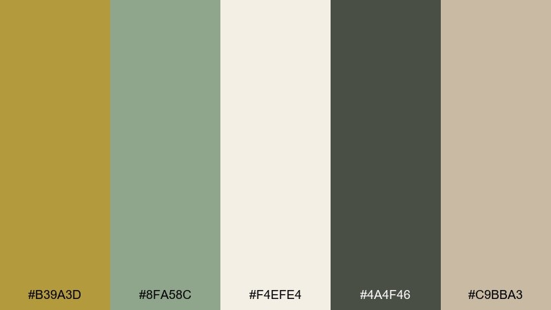
HEX: #B39A3D #8FA58C #F4EFE4 #4A4F46 #C9BBA3
Mood: calm, airy, balanced
Best for: wellness apps
Calm and airy, it reads like soft morning light on sage walls with a quiet brass detail. Use the sage and off-white for primary surfaces to keep the interface soothing, then add brass for key actions or progress highlights. Deep moss works well for body text and icons, avoiding harsh contrast. Tip: keep brass usage consistent across screens so the experience feels intentional and not decorative.
Image example of sage studio generated using media.io
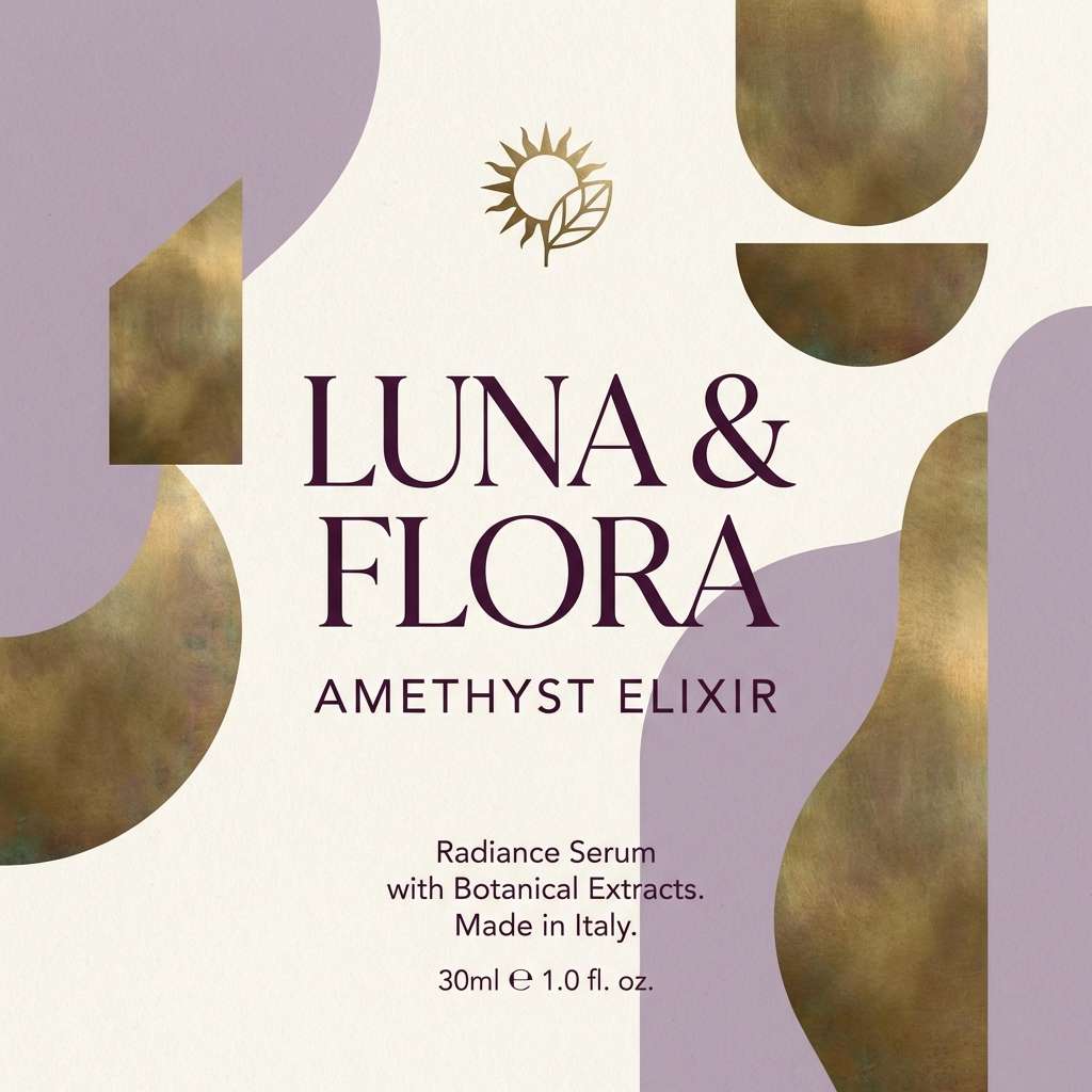
17) Dusty Lavender Brass
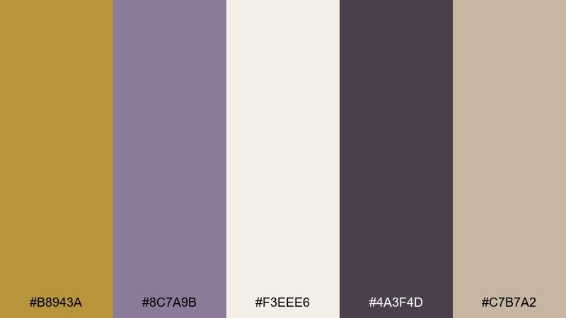
HEX: #B8943A #8C7A9B #F3EEE6 #4A3F4D #C7B7A2
Mood: dreamy, boutique, refined
Best for: beauty brand social posts
Dreamy and boutique, it suggests dried lavender bundles tied with a brass clip. Let the lavender carry large areas to keep things soft, while deep plum anchors headlines and product names. Cream and sand tones smooth the transitions so the brass highlight never feels too loud. Tip: use brass for small decorative marks like stars, separators, or icon strokes to keep the feed cohesive.
Image example of dusty lavender brass generated using media.io
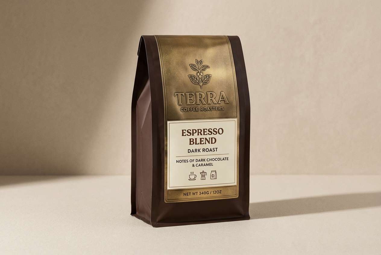
18) Espresso Brass
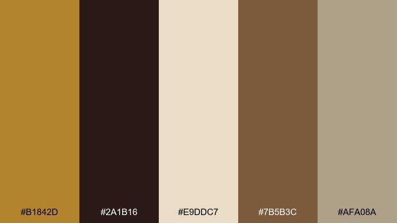
HEX: #B1842D #2A1B16 #E9DDC7 #7B5B3C #AFA08A
Mood: rich, intimate, classic
Best for: coffee packaging
Rich and intimate, it feels like espresso crema under warm brass lighting. The deep coffee brown makes a strong base for bags and labels, while brass adds a premium cue for roaster marks or origin badges. Cream and greige keep information areas readable and less heavy. Tip: use the mid-brown for secondary panels so the darkest tone does not dominate the entire pack.
Image example of espresso brass generated using media.io
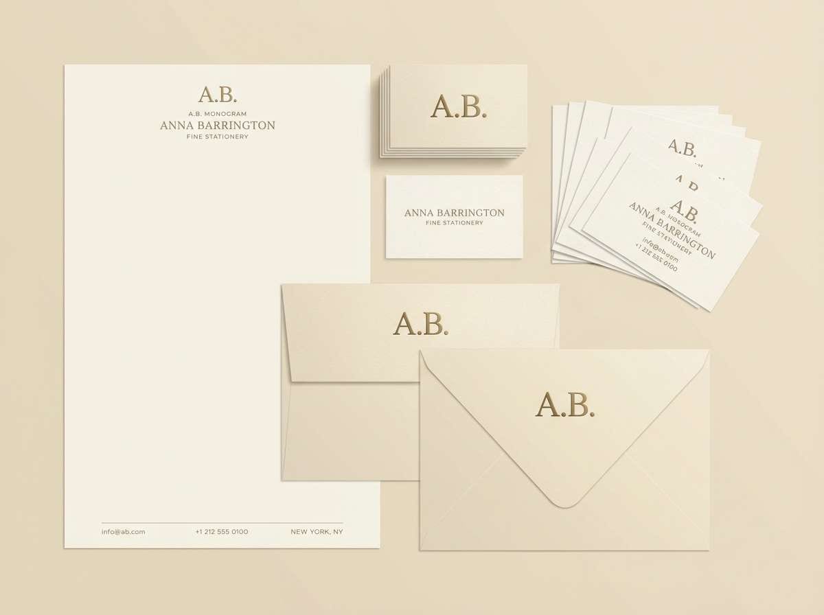
19) Champagne Brass
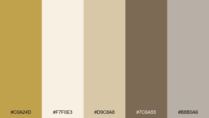
HEX: #C0A24D #F7F0E3 #D9C8A8 #7C6A55 #B8B0A6
Mood: light, celebratory, upscale
Best for: luxury stationery
Light and celebratory, it evokes champagne bubbles, creamy paper, and a soft brass gleam. Keep the palette mostly pale for an upscale feel, using brass and taupe only for headings, borders, and monograms. The gray-beige tone is perfect for back-of-card details and subtle patterns. Tip: pair with blind embossing and thin rules to make the neutrals feel intentional rather than plain.
Image example of champagne brass generated using media.io
20) Winter Evergreen Brass
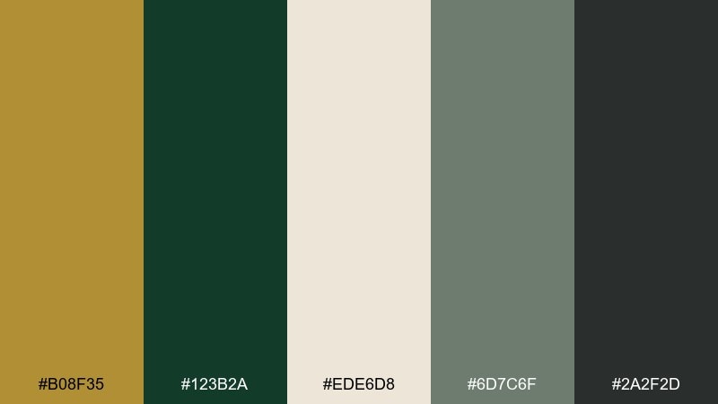
HEX: #B08F35 #123B2A #EDE6D8 #6D7C6F #2A2F2D
Mood: festive, crisp, elegant
Best for: holiday campaign graphics
Festive and crisp, it recalls evergreen needles, winter dusk, and brass ornaments catching warm light. The deep green can own backgrounds and large shapes, while brass adds sparkle without resorting to bright reds. Use the soft cream for copy blocks and the charcoal for fine text and logos. Tip: keep gradients out of the brass and use solid shapes for cleaner digital ads.
Image example of winter evergreen brass generated using media.io

21) Gallery Brass Neutrals
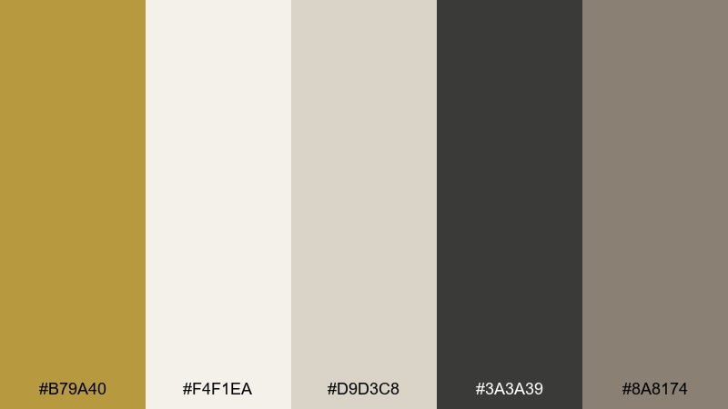
HEX: #B79A40 #F4F1EA #D9D3C8 #3A3A39 #8A8174
Mood: quiet, curated, contemporary
Best for: art gallery websites
Quiet and curated, it feels like a white-walled gallery with a single brass frame. The soft neutrals keep artwork and photography in control, while brass acts as a refined navigation accent. Charcoal gives strong readability and a modern edge. Tip: use brass only on hover or active states so the interface stays calm at rest.
Image example of gallery brass neutrals generated using media.io
22) Citrus Brass Pop
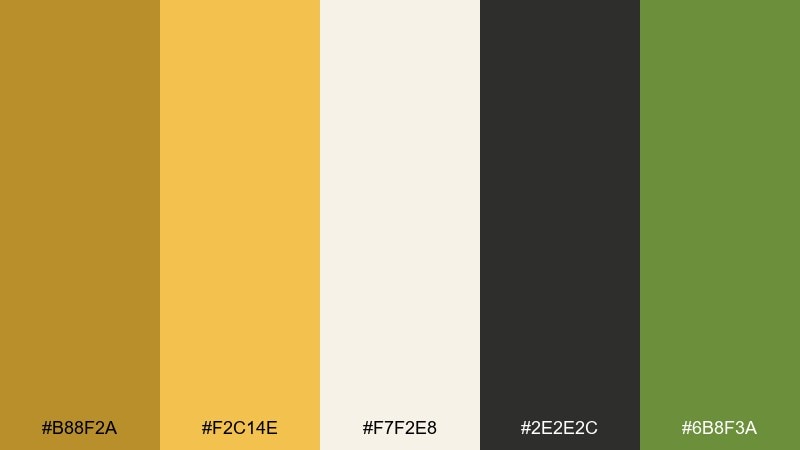
HEX: #B88F2A #F2C14E #F7F2E8 #2E2E2C #6B8F3A
Mood: zesty, energetic, friendly
Best for: food delivery app promo
Zesty and friendly, it brings to mind citrus peel, fresh herbs, and warm brass cutlery. Keep the bright yellow as a punchy secondary accent, with brass reserved for premium highlights and icon strokes. Creamy white helps the layout stay clean while charcoal keeps text crisp. Tip: use the green only for success states and small badges so it does not compete with the yellow energy.
Image example of citrus brass pop generated using media.io
23) Classic Brass Contrast
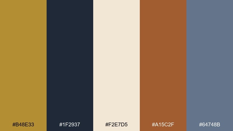
HEX: #B48E33 #1F2937 #F2E7D5 #A15C2F #64748B
Mood: timeless, confident, balanced
Best for: brand guidelines decks
Timeless and confident, it feels like a tailored jacket with a brass button and a crisp cream shirt. The navy and slate form a reliable structure for layouts, while the warm rust adds personality in charts and callouts. This antique brass color scheme stays versatile when you treat brass as the highlight and keep neutrals dominant. Tip: apply brass only to primary brand marks and key data points to maintain hierarchy.
Image example of classic brass contrast generated using media.io
What Colors Go Well with Antique Brass?
Antique brass pairs beautifully with deep, cool anchors like navy, ink blue, teal, and evergreen—these shades make brass look sharper and more “metallic” while keeping the overall design premium.
For softer, more editorial results, use warm neutrals like cream, parchment, greige, and taupe. These backgrounds let brass accents stay visible without forcing harsh contrast.
If you want extra personality, add controlled warm accents such as terracotta, rust, blush, or muted brick red. Keep those pops small so brass remains the hero highlight.
How to Use a Antique Brass Color Palette in Real Designs
Treat antique brass as an accent, not a base color. Use it for interactive states, icon strokes, separators, badges, or a single key headline—then rely on dark neutrals (charcoal, espresso, ink) for body text to protect readability.
Keep brass consistent across pages and components. Mixing multiple “gold” tones often makes interfaces look patchy, especially on different displays; one brass swatch used repeatedly reads more intentional.
For print and packaging, contrast comes from value and finish. A matte dark base plus a brighter brass accent (even as a flat ink) can simulate a premium feel; avoid setting small text in brass on light backgrounds.
Create Antique Brass Palette Visuals with AI
If you already have HEX codes, the fastest way to validate a palette is to see it in context—labels, UI cards, posters, or brand boards. Generating a few variations helps you confirm contrast, hierarchy, and how “metallic” the brass feels next to your supporting tones.
With Media.io, you can turn a palette idea into on-brand visuals using simple prompts, then iterate quickly until the accent balance feels right for your use case.
Antique Brass Color Palette FAQs
-
What is an antique brass color (compared to gold)?
Antique brass is a muted, browned gold with a slightly aged/oxidized feel. Compared with bright gold, it’s less saturated, less reflective-looking on screens, and reads more vintage and grounded. -
What background color makes antique brass look premium?
Deep neutrals like near-black, charcoal, ink navy, and deep evergreen make antique brass feel richer and more metallic. For a lighter premium look, use warm off-white or parchment with brass as a thin accent. -
Can I use antique brass for body text?
Usually no—antique brass lacks contrast on light backgrounds and can look fuzzy at small sizes. Use charcoal/ink for body text, and reserve brass for headings, icons, rules, and small highlights. -
Does antique brass work in modern UI design?
Yes, especially in “tech-luxe” dashboards or premium SaaS. Keep brass usage sparse (primary buttons, badges, active states) and let dark blues/charcoals handle layout and typography. -
What colors should I avoid pairing with antique brass?
Avoid pairing it with very bright yellows/golds in large areas, which can make the palette look muddy or inconsistent. Also be cautious with highly saturated neons that overpower brass’s subtle, aged character. -
How do I keep an antique brass palette consistent across screens and print?
Use one main brass HEX for digital and keep supporting neutrals stable. In print, test proofs and rely on value contrast; if possible, use finishing (foil/spot gloss) to sell the “metal” effect rather than adding extra gold shades. -
What’s an easy 3-color antique brass palette to start with?
Start with antique brass + warm off-white + charcoal. Then add a single secondary accent (teal, evergreen, or rust) only if you need more hierarchy or category colors.


