

Celeste is that clean, sky-to-sea pastel that instantly makes a design feel lighter, fresher, and more modern. It’s a go-to for calm branding, bright UI accents, and airy print pieces.
Below are 20 celeste color palette ideas (with HEX codes) you can copy for real projects—plus quick tips for contrast, readability, and tasteful accent placement.
In this article
Why Celeste Palettes Work So Well
Celeste sits in the sweet spot between airy cyan and soft aqua, so it reads as clean, open, and friendly without feeling cold. That “fresh air” effect makes layouts feel more spacious—even before you add extra whitespace.
It’s also an excellent accent color: celeste pops on dark navies and charcoals, yet stays gentle on warm creams and sand tones. This makes it easy to build contrast and hierarchy while keeping the overall mood light.
Finally, celeste pairs naturally with both modern neutrals (cool grays, slate, near-black) and playful brights (coral, lemon, violet). You can take the same base celeste and steer it toward spa calm, tech crisp, or summer energy.
20+ Celeste Color Palette Ideas (with HEX Codes)
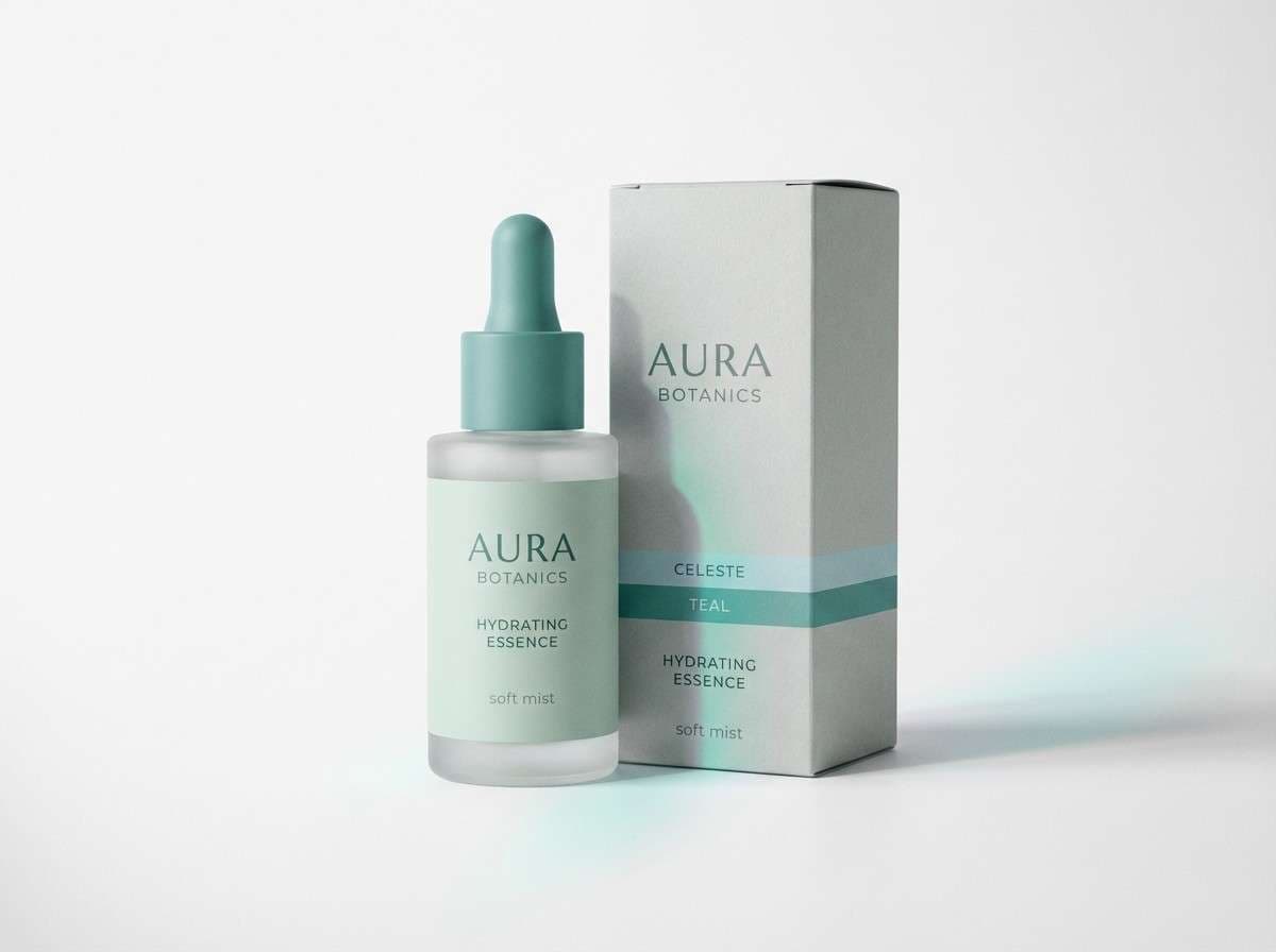
1) Sea Glass Calm
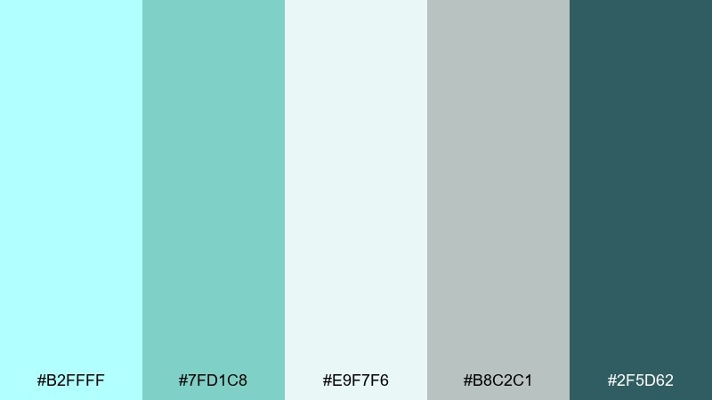
HEX: #B2FFFF #7FD1C8 #E9F7F6 #B8C2C1 #2F5D62
Mood: serene, airy, coastal
Best for: spa branding and skincare packaging
Serene, sea-washed tones evoke glassy shorelines and soft morning light. Use it for wellness brands, labels, and calming product pages where clarity matters. Pair the deeper teal with crisp white space for contrast, and keep typography clean and lightweight. Tip: reserve the darkest shade for ingredients and fine print so the pastels stay breathable.
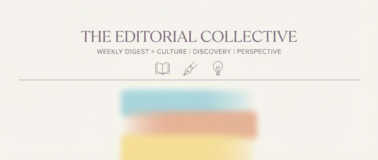
Image example of sea glass calm generated using media.io
Media.io is an online AI studio for creating and editing video, image, and audio in your browser.

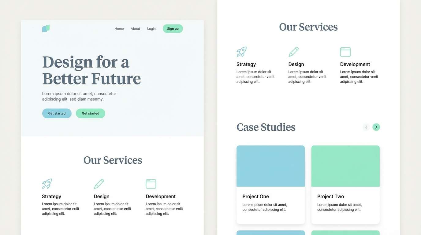
2) Cloudmint Studio
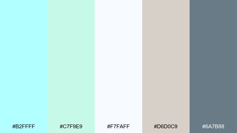
HEX: #B2FFFF #C7F9E9 #F7FAFF #D6D0C9 #6A7B88
Mood: clean, soft, modern
Best for: minimal website design and portfolios
Clean, cloudlike pastels feel quiet and polished, like a sunlit studio with linen curtains. It works beautifully for portfolios, lifestyle sites, and landing pages that need calm confidence. Anchor layouts with the slate tone for headers and navigation, then let minty highlights guide the eye. Tip: keep buttons in the deeper gray-blue so the interface stays readable on bright backgrounds.
Image example of cloudmint studio generated using media.io
3) Coastal Linen

HEX: #B2FFFF #F4E6D3 #E3C7A0 #A9B7B7 #3B4A4F
Mood: warm, relaxed, natural
Best for: home decor shops and product catalogs
Warm, beachy neutrals meet a cool splash of sky-bright aqua, like linen draped near an open window. This celeste color palette is ideal for home goods, catalog spreads, and artisan storefronts. Use tan and oat tones for backgrounds, then add celeste as a small highlight for tags, links, or sale badges. Tip: limit the bright aqua to one or two elements per section to keep the look premium.
Image example of coastal linen generated using media.io
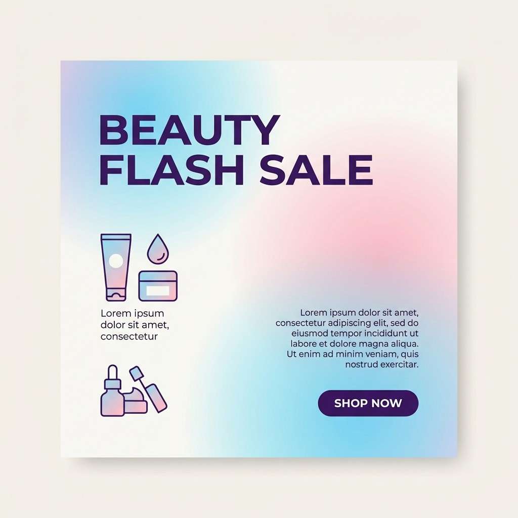
4) Aqua Blossom
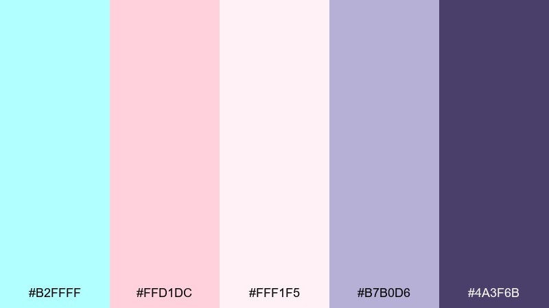
HEX: #B2FFFF #FFD1DC #FFF1F5 #B7B0D6 #4A3F6B
Mood: romantic, dreamy, playful
Best for: beauty promos and social graphics
Romantic pastels feel like petals floating in sparkling water, sweet without being sugary. Use it for beauty promos, creator posts, and soft-gradient backgrounds that need a gentle pop. The violet shadow tone makes headlines and pricing stand out against blush and cream. Tip: apply celeste as a highlight streak or glow to keep pinks from feeling too warm-heavy.
Image example of aqua blossom generated using media.io
5) Nordic Spa
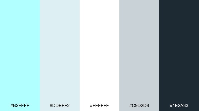
HEX: #B2FFFF #DDEFF2 #FFFFFF #C9D2D6 #1E2A33
Mood: fresh, tranquil, crisp
Best for: health app UI and onboarding screens
Fresh, icy light tones suggest steam, clean tiles, and a quiet reset. It fits health apps and onboarding flows where clarity and trust are essential. Use the near-black for text and icons, and let celeste serve as the primary action accent. Tip: keep shadows subtle and rely on spacing, not borders, to preserve the calm aesthetic.
Image example of nordic spa generated using media.io
6) Retro Poolside
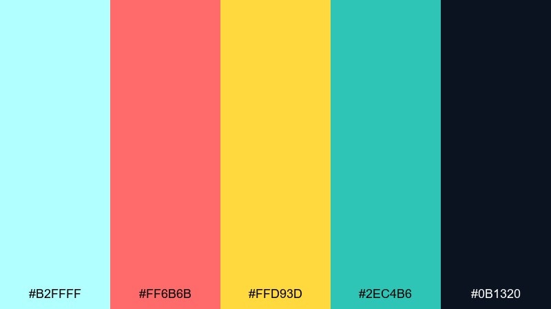
HEX: #B2FFFF #FF6B6B #FFD93D #2EC4B6 #0B1320
Mood: bold, sunny, energetic
Best for: summer event posters and merch
Bold, sun-drenched brights evoke pool tiles, neon signs, and a carefree weekend. These celeste color combinations shine on posters, tees, and punchy social ads. Balance the warm coral and yellow with the deep navy so the layout stays grounded. Tip: keep celeste as the largest color block and use the hottest hues only for calls to action.
Image example of retro poolside generated using media.io

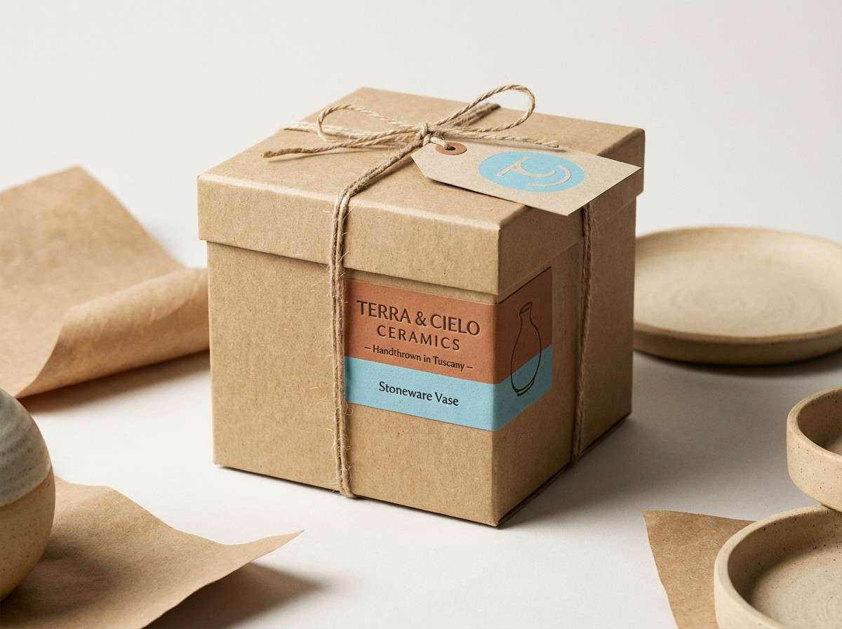
7) Celeste and Clay
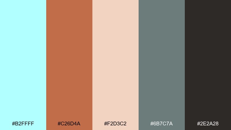
HEX: #B2FFFF #C26D4A #F2D3C2 #6B7C7A #2E2A28
Mood: earthy, balanced, crafted
Best for: ceramics brands and artisan packaging
Earthy clay and soft aqua feel handmade and grounded, like a studio shelf of glazed mugs. It works well for artisan packaging, craft markets, and brand identities that want warmth without losing freshness. Use clay for hero elements and celeste for secondary accents, such as seals or inner box patterns. Tip: add texture in print finishes rather than extra colors to keep the palette intentional.
Image example of celeste and clay generated using media.io
8) Orchard Breeze
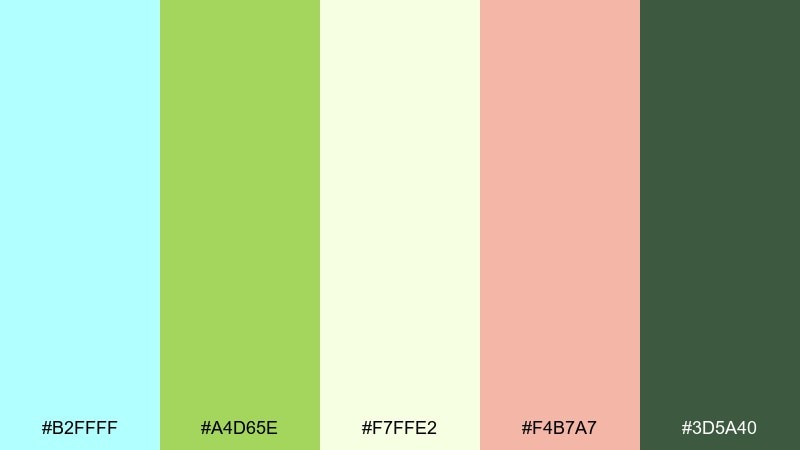
HEX: #B2FFFF #A4D65E #F7FFE2 #F4B7A7 #3D5A40
Mood: fresh, upbeat, springy
Best for: farmers market flyers and food branding
Fresh, garden-bright tones feel like a breeze through new leaves and early fruit blossoms. Use it for local food branding, seasonal flyers, and playful packaging that still feels wholesome. Let the green do the heavy lifting for category cues, and use celeste as a clean, cool counterbalance. Tip: keep the blush accent small so the design reads crisp rather than candy-like.
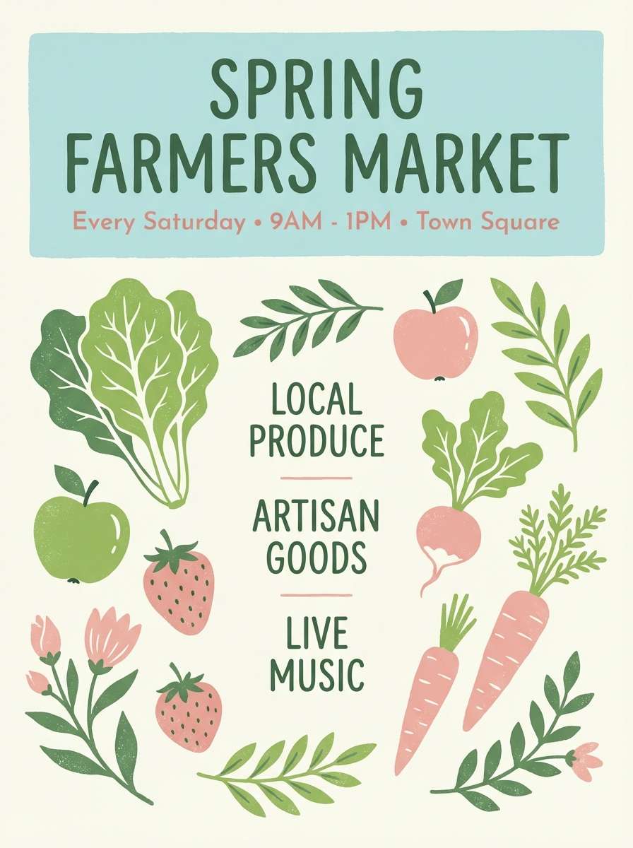
Image example of orchard breeze generated using media.io
9) Minimal Gallery
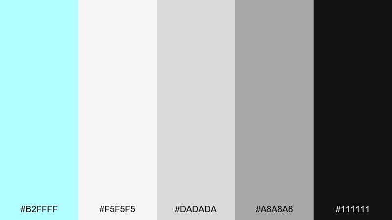
HEX: #B2FFFF #F5F5F5 #DADADA #A8A8A8 #111111
Mood: minimal, sharp, high-contrast
Best for: art portfolios and exhibition signage
Minimal neutrals with a cool aqua hit feel like a quiet gallery wall under crisp lighting. It suits portfolios, exhibition signage, and design studios that want restraint with one memorable accent. Use black for typography and structure, then place celeste only on key details like dates or navigation states. Tip: increase line height and whitespace so the contrast stays elegant, not harsh.
Image example of minimal gallery generated using media.io

10) Ice Pop Contrast
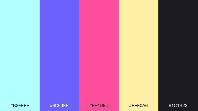
HEX: #B2FFFF #6C63FF #FF4D9D #FFF0A6 #1C1B22
Mood: vibrant, playful, punchy
Best for: creator thumbnails and streaming overlays
Vibrant candy tones feel like frozen treats against a midnight backdrop. A celeste color scheme like this works for thumbnails, overlays, and bold personal brands that need instant energy. Use the dark charcoal as the canvas, then layer celeste and violet for the main shapes, saving hot pink for badges or highlights. Tip: keep text in near-white or pale yellow to maintain readability over saturated blocks.
Image example of ice pop contrast generated using media.io

11) Sunrise Pastels
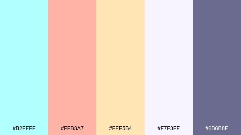
HEX: #B2FFFF #FFB3A7 #FFE5B4 #F7F3FF #6B6B8F
Mood: soft, optimistic, gentle
Best for: wellness newsletters and blog headers
Soft sunrise pastels evoke warm light spilling across a cool morning sky. They are great for wellness newsletters, blog headers, and calm lifestyle content. Use the muted purple for headings and links, while peach and butter tones keep sections friendly and inviting. Tip: apply celeste as a thin underline or icon color to guide attention without overpowering the warmth.
Image example of sunrise pastels generated using media.io
12) Harbor Night
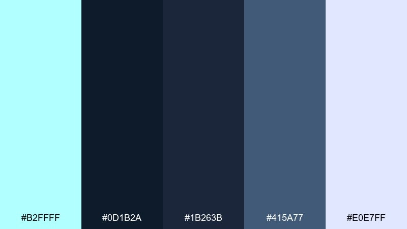
HEX: #B2FFFF #0D1B2A #1B263B #415A77 #E0E7FF
Mood: moody, modern, nautical
Best for: tech landing pages and SaaS dashboards
Moody navies and cool light accents feel like harbor water under city lights. This celeste color palette is a strong fit for SaaS landing pages and dashboards that need depth with crisp clarity. Use celeste for primary actions, and let the pale periwinkle support charts and secondary states. Tip: keep gradients subtle and rely on one bright accent per module to avoid visual noise.
Image example of harbor night generated using media.io
13) Sandbar Serenity

HEX: #B2FFFF #E7D8C9 #CDB4A7 #9AA8A8 #3A4B4B
Mood: calm, balanced, coastal-neutral
Best for: hotel branding and travel brochures
Calm sand-and-stone neutrals with a cool aqua lift evoke quiet coves and soft towels. It works for boutique hotels, travel brochures, and map-style layouts where readability matters. Let the sandy tones fill large areas, then use celeste sparingly for wayfinding icons and highlighted offers. Tip: pick one warm neutral for backgrounds and one for cards to keep the design cohesive.
Image example of sandbar serenity generated using media.io
14) Citrus Mist
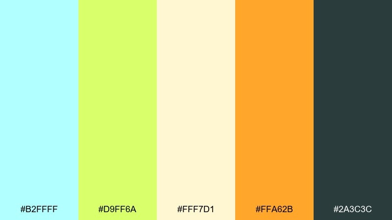
HEX: #B2FFFF #D9FF6A #FFF7D1 #FFA62B #2A3C3C
Mood: zesty, bright, refreshing
Best for: beverage ads and product launches
Zesty citrus tones feel fizzy and refreshing, like sparkling water with a twist. These celeste color combinations are perfect for beverage ads and launch graphics that need instant appetite appeal. Use celeste and pale lemon for the main field, then pop orange for price bursts or limited-edition labels. Tip: keep the deep green-gray only for type and outlines so the bright colors stay luminous.
Image example of citrus mist generated using media.io
15) Botanical Wash

HEX: #B2FFFF #6DBE8A #E6F6EE #8AA1A1 #2D3A3A
Mood: natural, soothing, fresh
Best for: spring botanical illustrations and stationery
Natural greens washed with airy aqua feel like watercolor leaves on damp paper. A set of celeste color combinations like this suits spring stationery, eco brands, and gentle botanical art. Use the pale minty white for negative space, and let the darker green define stems and text. Tip: keep brush textures consistent so the palette feels cohesive instead of mixed-media.
Image example of botanical wash generated using media.io
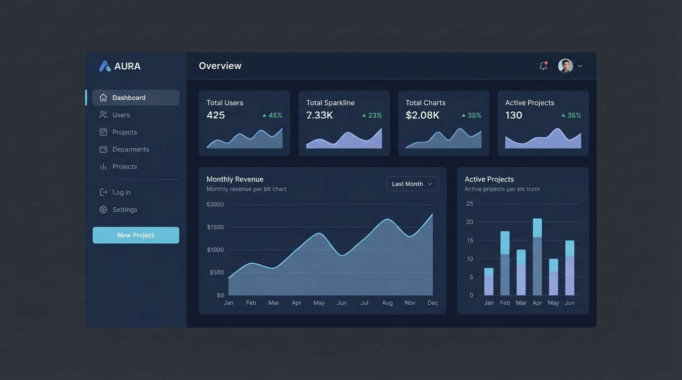
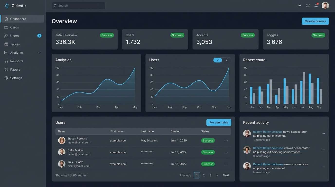
16) Tech Clean UI
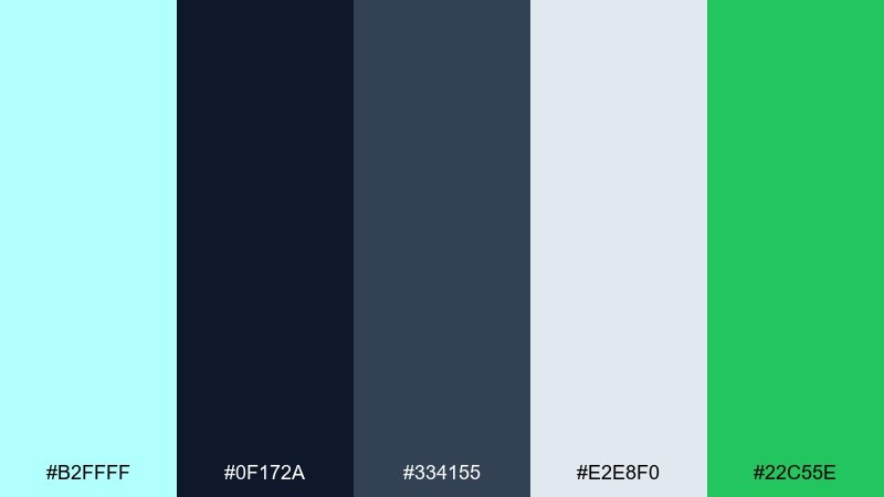
HEX: #B2FFFF #0F172A #334155 #E2E8F0 #22C55E
Mood: confident, crisp, modern
Best for: fintech apps and admin panels
Confident dark bases with crisp aqua highlights feel precise and trustworthy. It fits fintech dashboards, admin panels, and data-heavy interfaces that need clear hierarchy. Use celeste for primary interactions, reserve green for success states only, and keep surfaces in cool grays. Tip: increase contrast ratios by pairing celeste with the darkest navy for buttons and active tabs.
Image example of tech clean ui generated using media.io
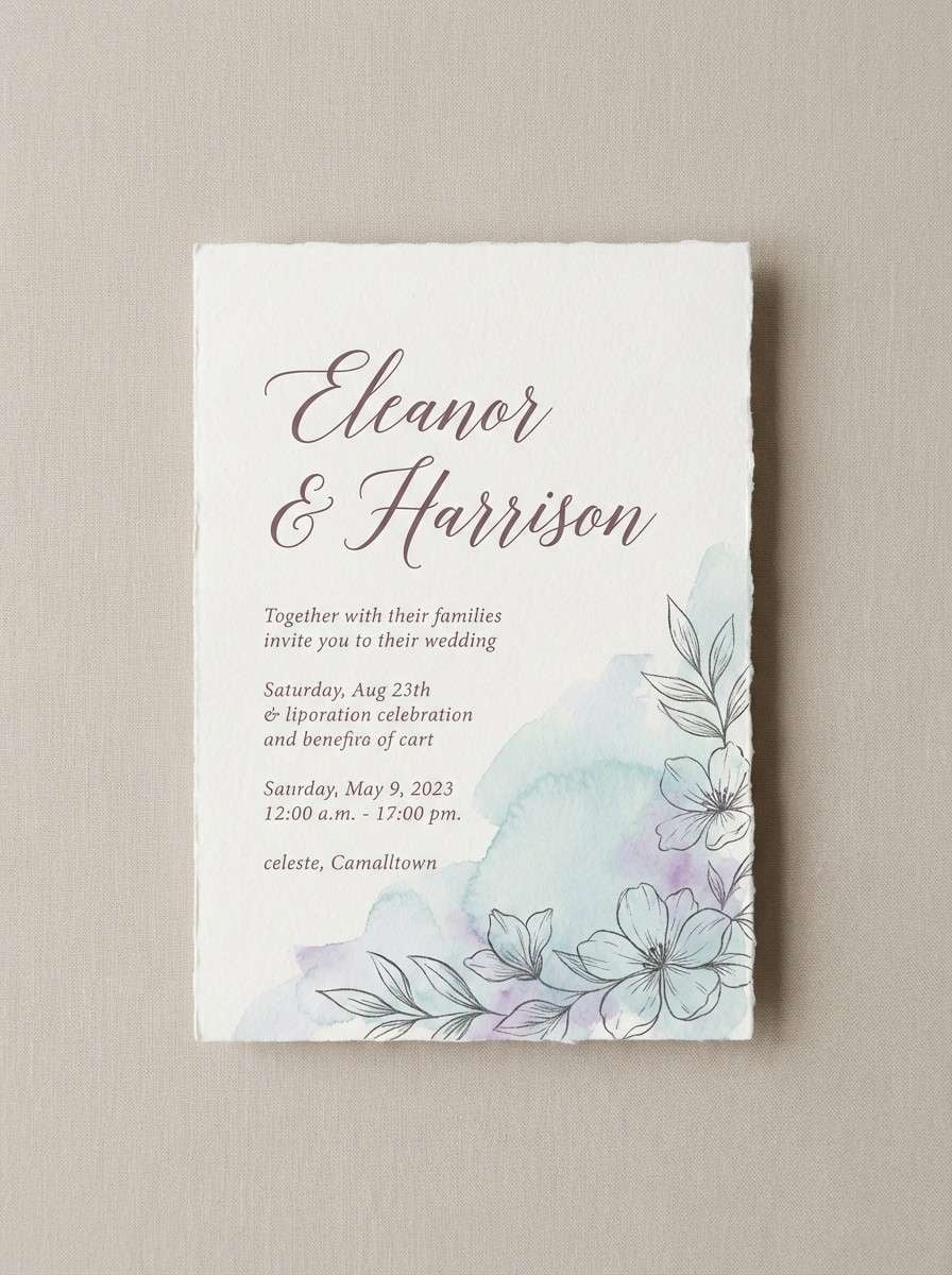
17) Wedding Airy
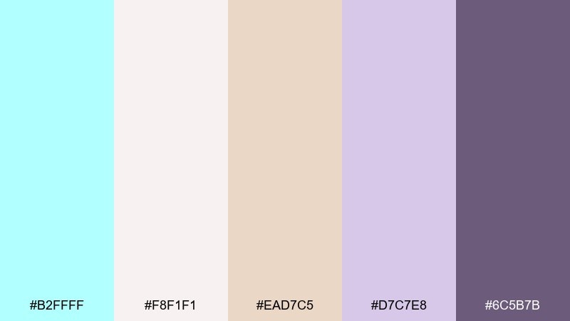
HEX: #B2FFFF #F8F1F1 #EAD7C5 #D7C7E8 #6C5B7B
Mood: romantic, elegant, light
Best for: wedding invitations and save the dates
Romantic, airy pastels feel like tulle, pressed flowers, and soft candlelight. These celeste color combinations work beautifully for invitations, vow books, and modern save-the-date sets. Use the deep mauve for names and key details, keeping the rest in warm blush and cream. Tip: print celeste as a very light background wash so the type stays the star.
Image example of wedding airy generated using media.io
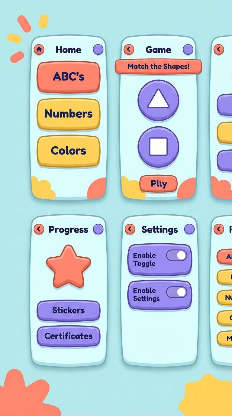
18) Kidsroom Sky
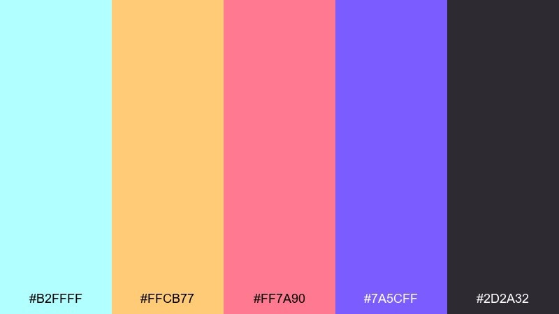
HEX: #B2FFFF #FFCB77 #FF7A90 #7A5CFF #2D2A32
Mood: fun, bright, friendly
Best for: kids learning apps and playful branding
Fun, high-energy brights feel like stickers, storybooks, and a sky-blue playroom wall. A celeste color combination like this is great for kids learning apps, cheerful logos, and onboarding moments. Keep celeste as the base and rotate the warm accents for achievements and badges. Tip: use the dark charcoal for text and outlines so the colors stay playful but readable.
Image example of kidsroom sky generated using media.io
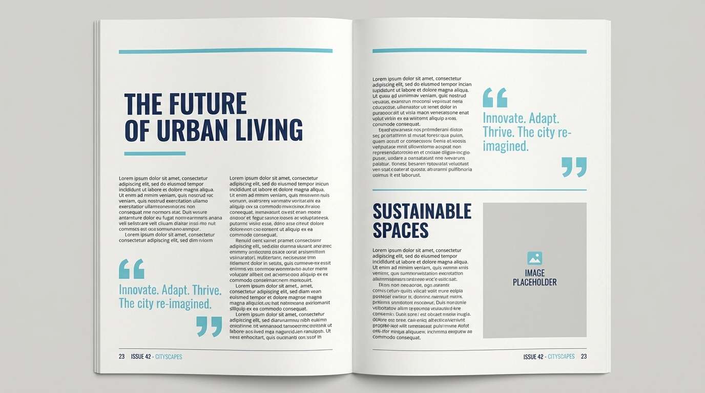
19) Editorial Cool
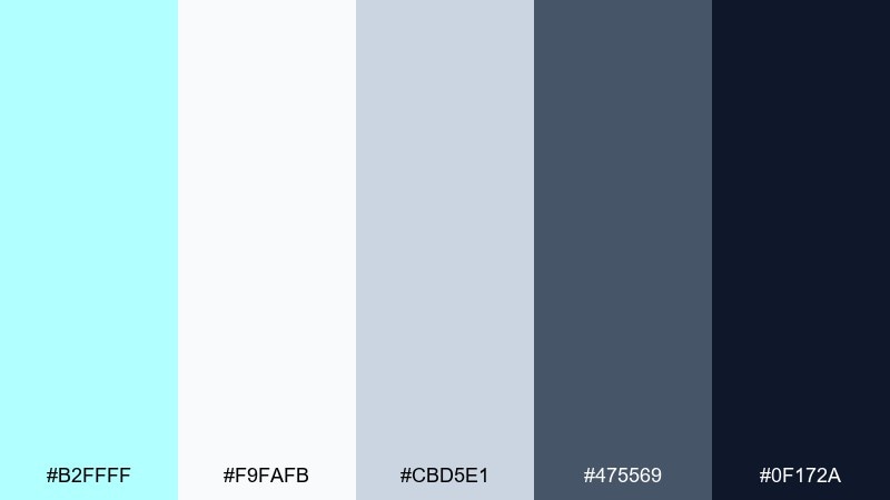
HEX: #B2FFFF #F9FAFB #CBD5E1 #475569 #0F172A
Mood: professional, cool, structured
Best for: magazine layouts and reports
Professional cool tones feel structured and modern, like a clean report with a fresh accent tab. It works for magazines, annual reports, and case studies where hierarchy is everything. Use celeste for section dividers and pull quotes, while slate tones carry body text and captions. Tip: keep accent usage consistent across pages so navigation feels effortless.
Image example of editorial cool generated using media.io
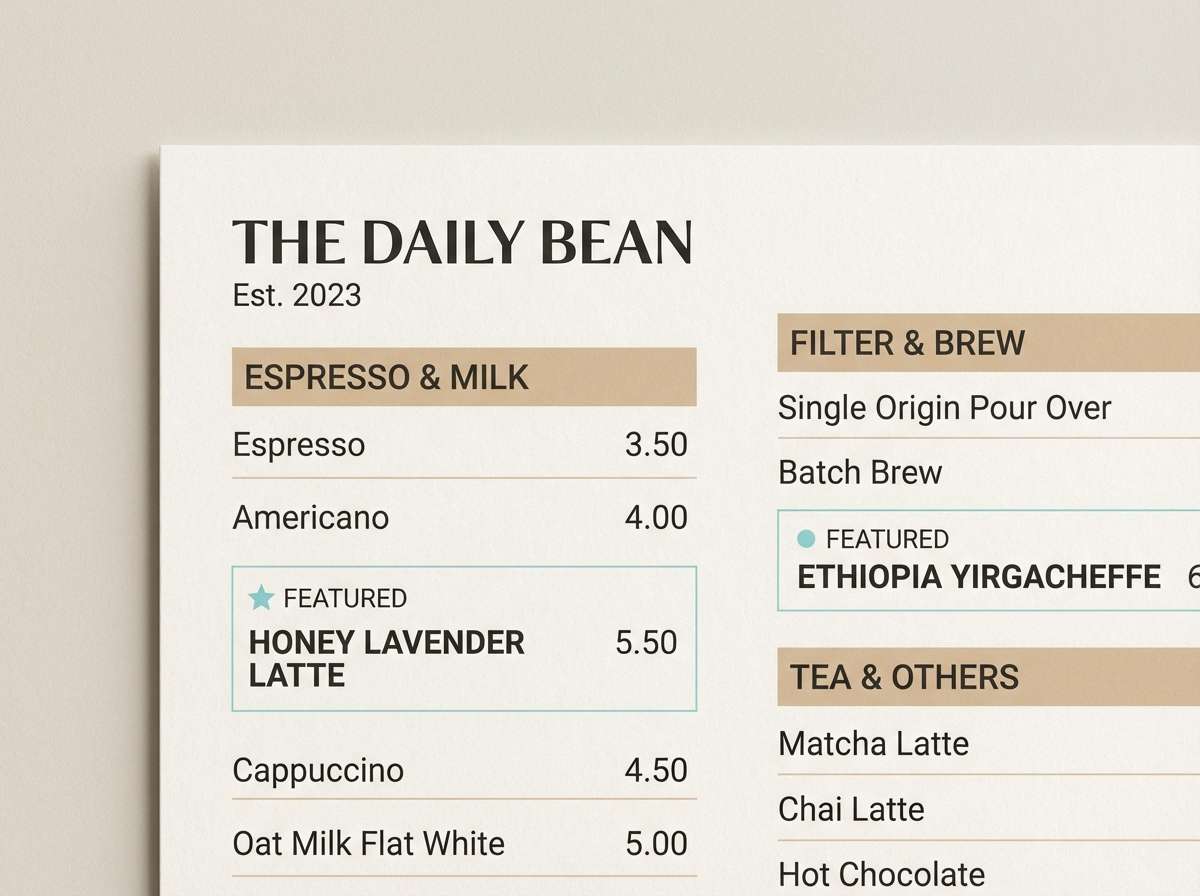
20) Café Window
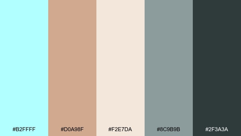
HEX: #B2FFFF #D0A98F #F2E7DA #8C9B9B #2F3A3A
Mood: cozy, modern, approachable
Best for: coffee shop menus and loyalty cards
Cozy café neutrals with a cool aqua highlight feel like morning light through a windowpane. It suits menus, loyalty cards, and small brand systems that need warmth plus a modern edge. Use cream as the base, tan for blocks and price panels, and celeste for small icons or featured items. Tip: print the dark charcoal slightly softer than pure black to keep the mood friendly.
Image example of café window generated using media.io
What Colors Go Well with Celeste?
Celeste pairs beautifully with cool neutrals like slate, steel gray, and near-black—these tones give it structure and keep text readable. For modern UI, a dark navy background with celeste buttons is a reliable, high-clarity combo.
For warmer, more lifestyle-forward design, match celeste with sand, oat, cream, and soft tan. This creates a coastal balance where celeste feels like a crisp “fresh air” accent rather than an all-over wash.
If you want playful energy, combine celeste with coral, lemon yellow, or violet. The key is to keep one bright as the primary pop and let the rest support hierarchy so the palette stays clean, not chaotic.
How to Use a Celeste Color Palette in Real Designs
Use celeste as an accent first: buttons, links, active states, dividers, icons, or small highlight badges. Because it’s light, it often performs best when paired with darker text colors and clear spacing.
In print, celeste works well as a subtle background tint or a light pattern layer—then anchor your typography with charcoal or deep navy. This keeps the piece airy while ensuring names, prices, and details remain crisp.
For branding systems, assign celeste a specific role (primary accent, secondary background, or highlight) and keep it consistent across assets. Consistency is what makes pastel palettes feel premium and intentional.
Create Celeste Palette Visuals with AI
If you already have HEX codes, the fastest way to validate a celeste palette is to generate realistic mockups: packaging, posters, UI screens, or social templates. Seeing colors in context makes balance and contrast decisions much easier.
With Media.io’s text-to-image tools, you can paste a short prompt, specify the vibe, and create multiple visual directions in minutes—then refine until the palette looks right for your brand.
Celeste Color Palette FAQs
-
What is the HEX code for celeste?
A common celeste HEX is #B2FFFF, a light cyan-aqua that works well as a clean highlight or soft background tint. -
Is celeste more blue or more green?
Celeste sits between light cyan and aqua, so it can lean slightly blue or slightly green depending on surrounding colors (navy pushes it bluer; warm sand can make it feel greener). -
What text color is most readable on celeste backgrounds?
Deep navy, charcoal, or near-black typically provides the best readability on celeste. For accessibility, avoid light gray text on celeste because contrast drops quickly. -
What colors pair best with celeste for branding?
For calm brands, pair celeste with whites, cool grays, and muted teal. For warmer lifestyle branding, combine celeste with cream, tan, and soft clay tones. -
How do I keep a celeste palette from looking too “baby” or childish?
Add structure with darker anchors (navy/charcoal), limit candy accents, and use celeste in controlled doses (buttons, dividers, small highlights) rather than everywhere. -
Can celeste work in dark mode UI?
Yes—celeste is excellent for dark mode as a primary action color. Use it for buttons and active states, and keep backgrounds in deep navy or charcoal to maintain crisp contrast. -
How many accent colors should I use with celeste?
Usually 1–2 accents are enough. Let celeste be the signature accent, then add one supporting accent (like coral or lime) for emphasis, while neutrals handle most surfaces.


