

Sandy brown is a warm, sunlit neutral that instantly adds comfort and approachability to a design. It reads natural and tactile, making it a reliable base for everything from branding to interiors.
Below are sandy brown color palette ideas with ready-to-use HEX codes, plus AI prompt examples you can recreate in minutes.
In this article
Why Sandy Brown Palettes Work So Well
Sandy brown sits in the sweet spot between tan, warm beige, and light orange—so it feels friendly without becoming overly loud. That balance makes it easy to use as a primary base color or as a soft accent.
It also pairs naturally with both warm companions (terracotta, caramel, cocoa) and cool counterpoints (sage, teal, slate). This flexibility helps you build contrast and hierarchy while keeping a cohesive, earthy mood.
In print and on screens, sandy brown tends to feel “material”—like kraft paper, clay, linen, or sunlit stone. That tactile association can instantly make a brand or layout feel more authentic and grounded.
20+ Sandy Brown Color Palette Ideas (with HEX Codes)
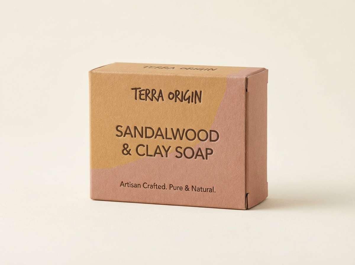
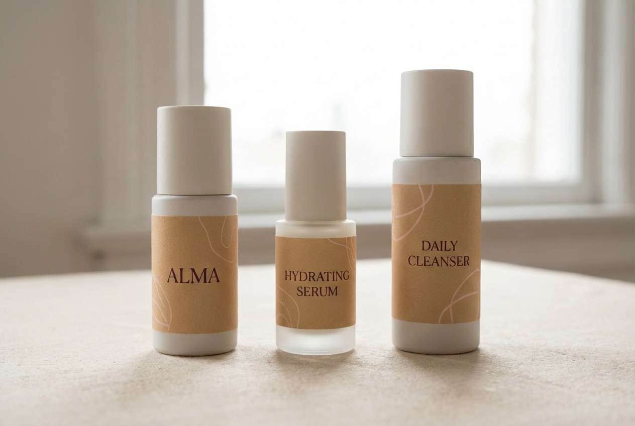
1) Desert Adobe

HEX: #F4A460 #E9D2B0 #C97B63 #8B5A3C #2E2A24
Mood: earthy and grounded
Best for: artisan packaging design
Earthy warmth and sunbaked clay tones evoke adobe walls, dry trails, and hand-thrown pottery. Use it for craft labels, food jars, and small-batch product boxes where authenticity matters. Pair the darker browns for typography and the creamy sand for breathing room. Tip: keep finishes matte and let one deep shade carry your hierarchy for a premium, rustic feel.
Image example of desert adobe generated using media.io
Media.io is an online AI studio for creating and editing video, image, and audio in your browser.

2) Coastal Dune
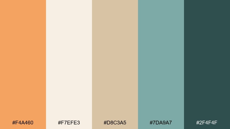
HEX: #F4A460 #F7EFE3 #D8C3A5 #7DA9A7 #2F4F4F
Mood: breezy and calm
Best for: website hero UI
Soft dune beige with a cool sea-glass accent feels like a quiet shoreline at low tide. It works beautifully for travel, wellness, and minimal ecommerce where you want warmth without heaviness. Use the teal tones for CTAs and links while keeping backgrounds airy with off-white. Tip: add subtle separators using the mid sand tone to avoid harsh lines.
Image example of coastal dune generated using media.io
3) Cinnamon Latte
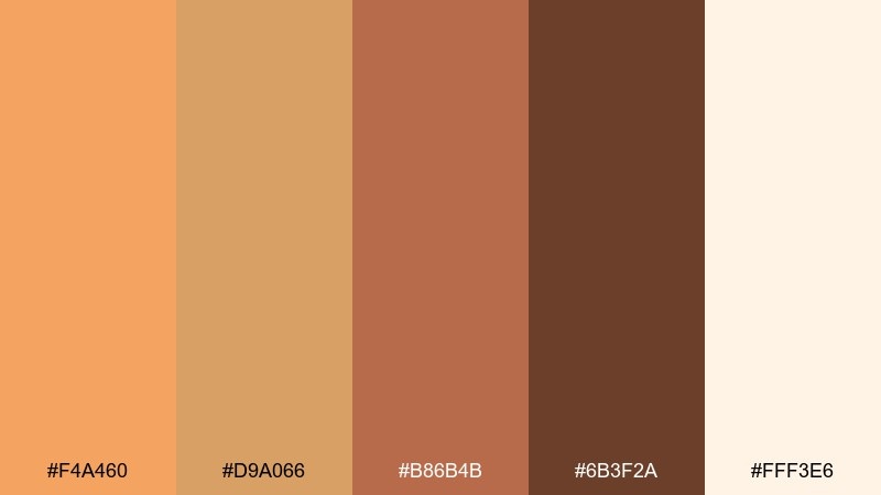
HEX: #F4A460 #D9A066 #B86B4B #6B3F2A #FFF3E6
Mood: cozy and inviting
Best for: coffee shop branding
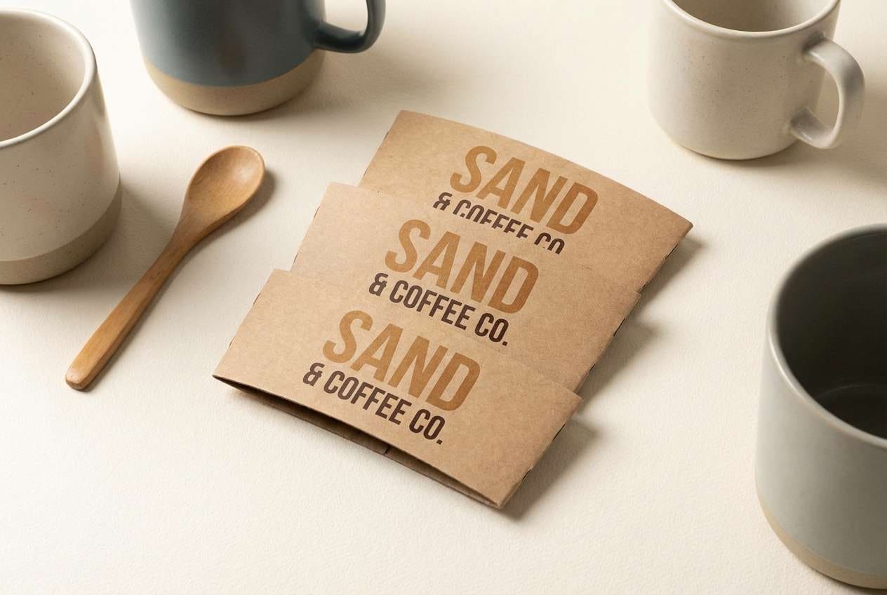
Cozy cafe warmth comes through with milky cream, caramel spice, and espresso depth. This sandy brown color palette is ideal for logos, cup sleeves, and loyalty cards that should feel handmade yet polished. Use the darkest brown for wordmarks and the cream for negative space to keep it readable. Tip: reserve the cinnamon shade for small highlights like stamps or icons so it stays delicious, not loud.
Image example of cinnamon latte generated using media.io
4) Sunbaked Clay

HEX: #F4A460 #E67E52 #C65D3C #A3A59A #3B3A34
Mood: bold and desert-hot
Best for: event poster design
Bold heat and dusty stone give this mix the energy of a late-afternoon desert festival. It suits posters, flyers, and campaign graphics where you want warmth plus contrast that prints well. Pair the charcoal for type and the gray-green as a cooling counterbalance to the clay reds. Tip: use large color blocks instead of gradients for sharper legibility from a distance.
Image example of sunbaked clay generated using media.io

5) Sandstone Minimal
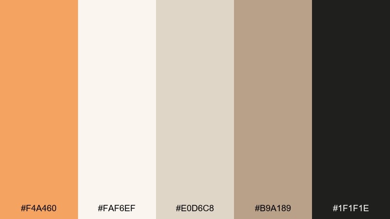
HEX: #F4A460 #FAF6EF #E0D6C8 #B9A189 #1F1F1E
Mood: clean and modern
Best for: interior color planning
Quiet neutrals and gentle tans evoke limestone, linen, and sunlit plaster. Use it for minimalist interiors, mood boards, and material selections where you want warmth without visual clutter. The near-black adds crisp contrast for fixtures, frames, or text labels. Tip: keep the lightest tone dominant and treat the sandy accents like trim for a calm, gallery-like finish.
Image example of sandstone minimal generated using media.io
6) Vintage Sepia

HEX: #F4A460 #D2B48C #A67C52 #6F4E37 #3C2F2F
Mood: nostalgic and classic
Best for: editorial magazine layout
Nostalgic sepia tones feel like aged paper, leather bindings, and film photography. These hues work well for long-form editorial layouts where you want warmth and readability together. Use the tan and cream-like tones for backgrounds, and keep the deeper browns for headings and pull quotes. Tip: limit accent usage to thin rules and small icons so the page stays light.
Image example of vintage sepia generated using media.io
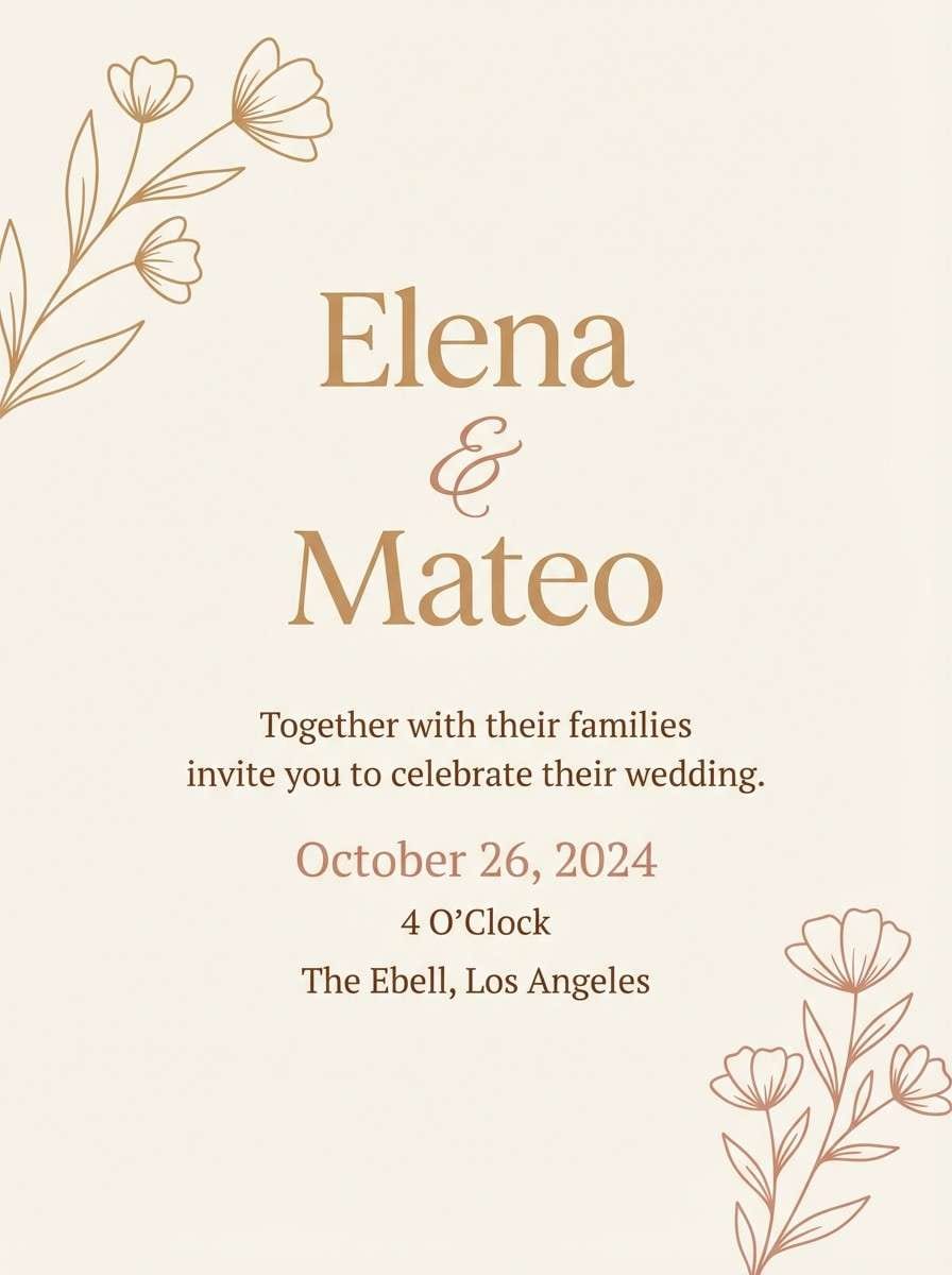
7) Terracotta Bloom

HEX: #F4A460 #F3B7A0 #E56B6F #7C3E3E #F9F1E7
Mood: romantic and lively
Best for: wedding invitation design
Romantic blush and terracotta feel like dried roses, sunset petals, and soft linen. Use this mix for invitations, save-the-dates, and stationery that should read warm and personal. Pair the deeper berry tone with the cream background for elegant typography contrast. Tip: keep floral elements subtle and let the warm sand tone tie everything together.
Image example of terracotta bloom generated using media.io
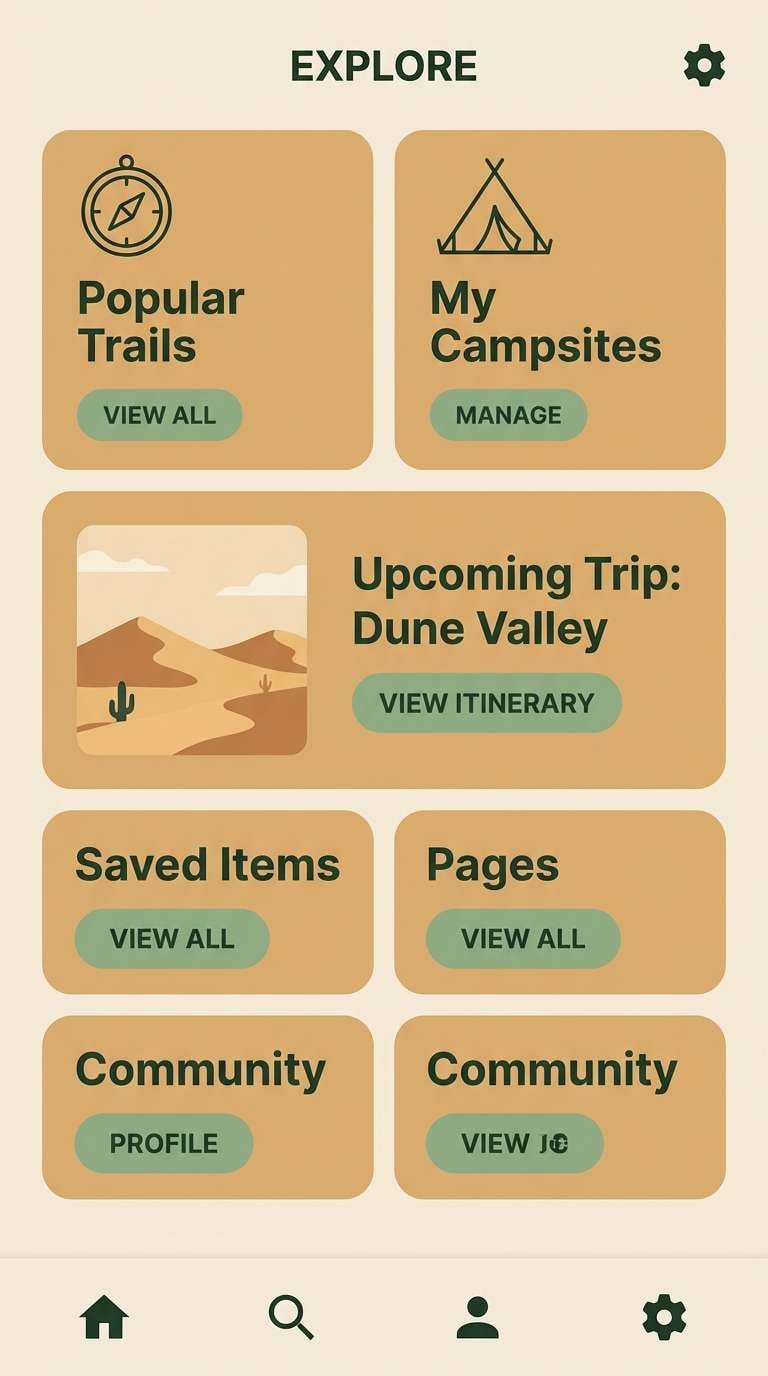
8) Warm Nordic

HEX: #F4A460 #F2E7D8 #C7C2B1 #6E7A6B #2D3A2E
Mood: calm and balanced
Best for: mobile app UI design
Calm hygge neutrals with a muted green feel like wool blankets and natural wood. As a sandy brown color scheme, it fits finance, journaling, and productivity apps that need warmth without distraction. Use the dark green as your primary text color and the sand tones for cards and panels. Tip: keep shadows minimal and rely on tone-on-tone contrast for a refined UI.
Image example of warm nordic generated using media.io
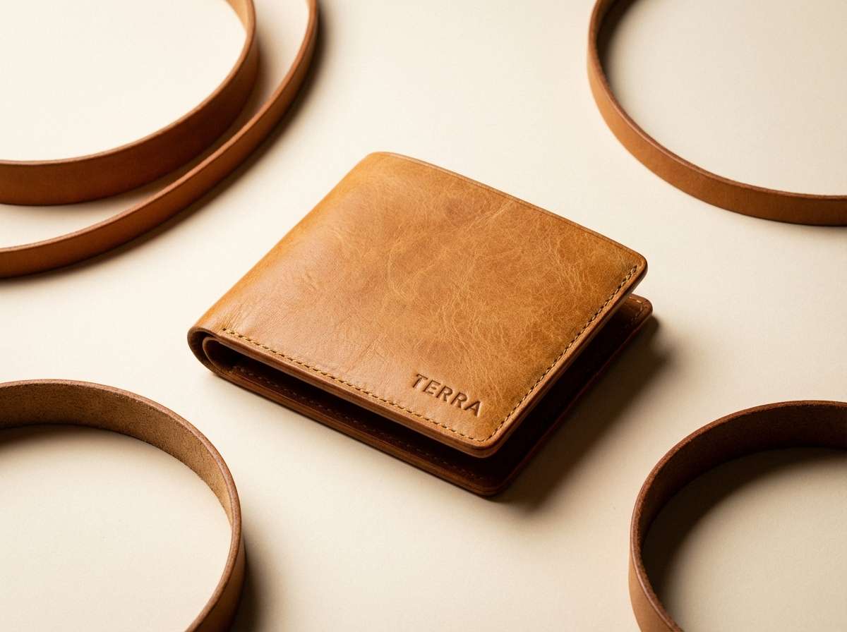
9) Honeyed Leather

HEX: #F4A460 #E0A458 #B9772B #6A4A2E #2B1D0E
Mood: luxurious and rich
Best for: leather goods product ad
Rich honey and deep brown tones evoke well-worn leather, brass hardware, and a vintage workshop. It is great for premium product ads where you want warmth, depth, and a tactile vibe. Pair the darkest shade with a clean cream backdrop to keep the composition sharp and upscale. Tip: use a single metallic accent in photography and let the warm browns do the heavy lifting.
Image example of honeyed leather generated using media.io
10) Autumn Harvest

HEX: #F4A460 #F2C14E #D1495B #5F6F52 #3D2C1E
Mood: cheerful and seasonal
Best for: seasonal marketing graphics
Cheerful harvest warmth shows up in golden squash, berry accents, and earthy greens. These sandy brown color combinations are perfect for fall promotions, farmers market signage, and limited-time offers. Use the yellow as the attention grabber, then anchor with deep brown for copy and outlines. Tip: keep the berry tone for small badges or price tags to avoid overpowering the warm base.
Image example of autumn harvest generated using media.io

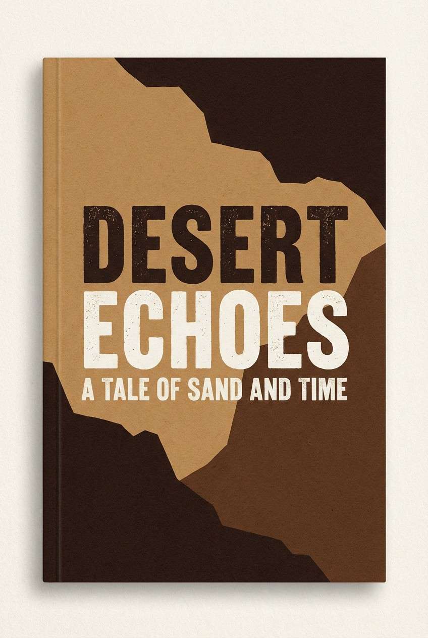
11) Canyon Shadow

HEX: #F4A460 #C98C5A #8C5B3E #4B3A2F #1B1A17
Mood: dramatic and rugged
Best for: book cover design
Rugged canyon depth and smoky browns create a grounded, cinematic atmosphere. Use it for thrillers, memoirs, or outdoor narratives that benefit from strong contrast and earthy grit. Pair the near-black with the warm sand for bold title readability. Tip: use texture sparingly, like a subtle paper grain, so the dark tones do not muddy in print.
Image example of canyon shadow generated using media.io
12) Blush Sand

HEX: #F4A460 #F6D6C9 #FBECE3 #C8A2A8 #4C3B3F
Mood: soft and elegant
Best for: beauty packaging
Soft blush and warm sand feel like powdered makeup, silk ribbon, and gentle lighting. It is a strong fit for skincare and cosmetics packaging that aims for calm, premium simplicity. Use the plum-brown for ingredient text and the pale tones for a clean, airy label. Tip: keep gradients subtle and prioritize high-contrast text for small sizes.
Image example of blush sand generated using media.io
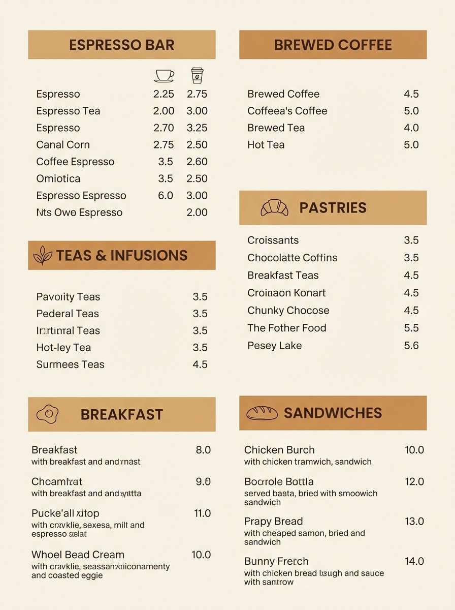
13) Caramel Macchiato

HEX: #F4A460 #E7B47F #C27C4A #7A4E2D #2A201A
Mood: warm and appetizing
Best for: cafe menu design
Creamy caramel tones and roasted browns evoke a layered espresso drink and toasted sugar. Use it for menus, tabletop signage, and bakery branding where food photography needs a warm frame. Pair the darkest brown with plenty of light negative space to keep prices and sections easy to scan. Tip: use the mid caramel shade for section headers to guide the eye without shouting.
Image example of caramel macchiato generated using media.io
14) Rustic Lodge

HEX: #F4A460 #D2A679 #8A6A4F #4E5B4A #2B2A24
Mood: cozy and outdoorsy
Best for: cabin rental branding
Cozy lodge warmth with forested undertones feels like pine beams, stone hearths, and worn canvas. This sandy brown color palette works well for cabin rentals, outdoor retreats, and local tour operators. Pair the green-gray with warm sand to keep the identity nature-forward without going overly rustic. Tip: use the darkest shade for badges and icons to maintain clarity on textured backgrounds.
Image example of rustic lodge generated using media.io
15) Modern Safari

HEX: #F4A460 #E8E1D2 #A2A68F #3F5D5A #1E2A2B
Mood: adventurous and refined
Best for: outdoor gear landing page UI
Refined safari tones blend sunlit sand with cool, technical greens for a modern adventure vibe. Use it for outdoor gear pages, travel booking, or eco brands that need trust and energy. Keep the off-white as the main canvas, then use teal-green for buttons and navigation highlights. Tip: maintain consistent contrast ratios by using the darkest tone for body text instead of pure black.
Image example of modern safari generated using media.io

16) Desert Sunrise

HEX: #F4A460 #FFB07C #FFD6A5 #6D597A #2C2230
Mood: uplifting and dreamy
Best for: social media quote template
Dreamy sunrise warmth with a hint of twilight purple feels optimistic and artistic. These sandy brown color combinations shine on quote templates, story backgrounds, and creator posts that need contrast without harshness. Use the purple for headlines and the lighter peach tones for spacious backdrops. Tip: keep text blocks aligned and add a thin border in the dark plum to frame the composition.
Image example of desert sunrise generated using media.io
17) Clay and Sage

HEX: #F4A460 #CDBA96 #9DB08D #5F7A61 #2F3E34
Mood: natural and soothing
Best for: botanical illustration
Natural clay and sage tones evoke herb gardens, ceramic pots, and soft afternoon light. It is ideal for botanical prints, wellness illustrations, and packaging with a handmade feel. Use the deepest green for linework and the sandy tones for washes and paper warmth. Tip: keep the palette restrained by choosing two dominant washes and one darker outline color.
Image example of clay and sage generated using media.io
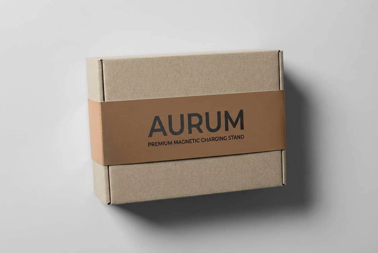
18) Bronze Dust
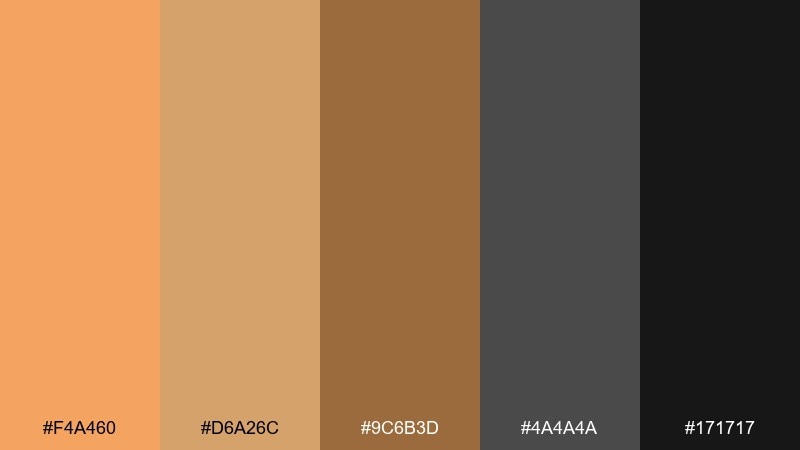
HEX: #F4A460 #D6A26C #9C6B3D #4A4A4A #171717
Mood: industrial and premium
Best for: tech accessory packaging
Bronze warmth against graphite grays feels industrial, sharp, and slightly futuristic. Use it for tech accessories, premium gadgets, and hardware packaging where you want warmth without softness. Pair the sandy tones with deep charcoal for clean type and strong shelf contrast. Tip: add a single spot-UV element on the bronze tone to create a high-end focal point.
Image example of bronze dust generated using media.io
19) Linen and Cocoa

HEX: #F4A460 #F5EFE6 #D7C6B4 #7B5A46 #3B2F2A
Mood: soft and homey
Best for: home decor ecommerce UI
Soft linen neutrals with cocoa depth feel cozy, tidy, and naturally elegant. Use it for home decor storefronts and product grids where imagery should look warm and consistent. Let the light tones carry the background and reserve cocoa for price text and key UI states. Tip: use the mid beige for borders and cards to separate products without heavy lines.
Image example of linen and cocoa generated using media.io
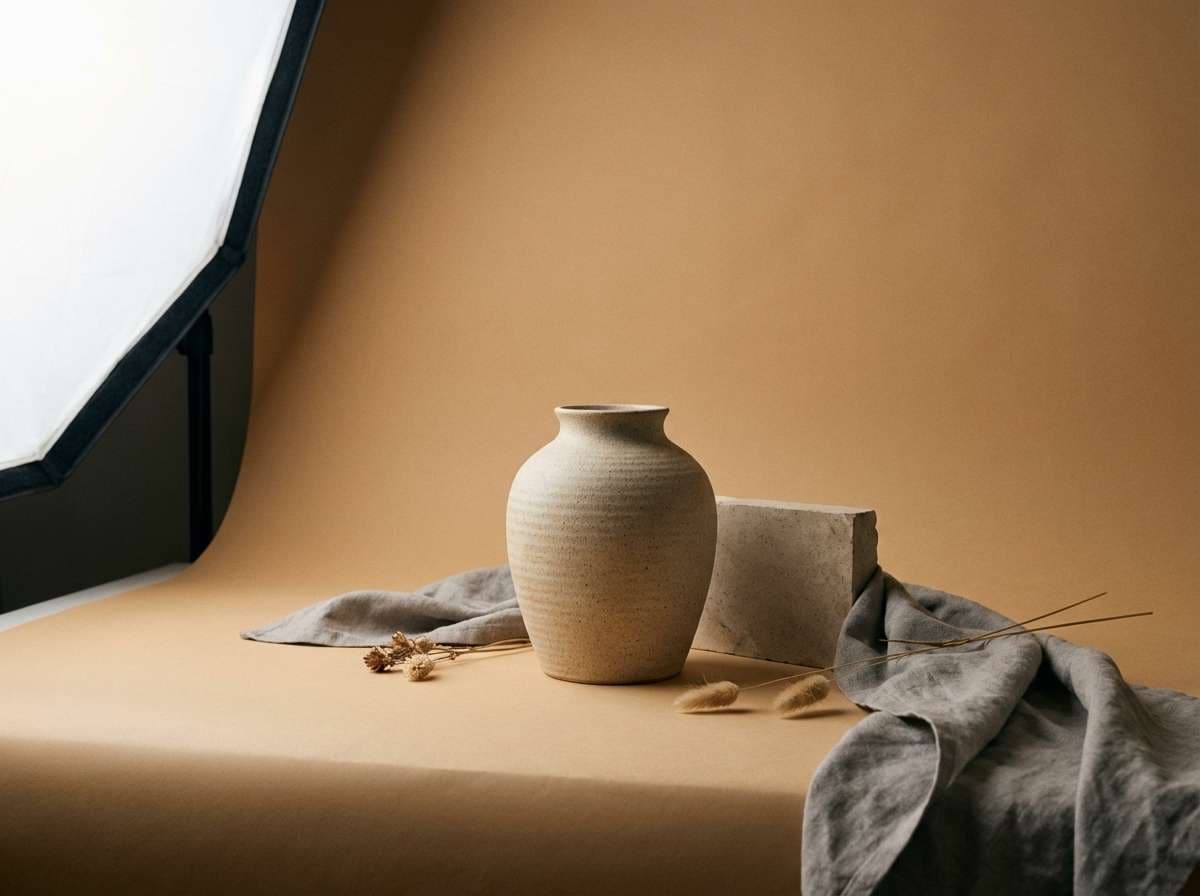
20) Golden Hour Studio
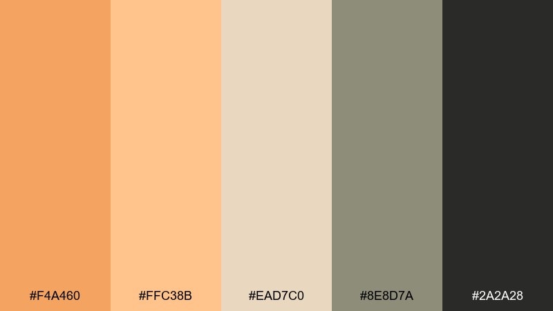
HEX: #F4A460 #FFC38B #EAD7C0 #8E8D7A #2A2A28
Mood: warm and professional
Best for: product photography backdrop
Golden hour warmth with soft neutrals feels like a sunlit studio and creamy seamless paper. It is perfect for product photography where you want flattering tones that do not steal attention from the subject. Use the warm sand as the main backdrop and the dark gray for small props or shadow control. Tip: keep reflections low and avoid glossy surfaces so the palette reads smooth and premium.
Image example of golden hour studio generated using media.io
What Colors Go Well with Sandy Brown?
Sandy brown pairs effortlessly with creamy off-whites, warm beiges, and cocoa browns for an earthy, tonal look. These combinations feel calm, premium, and highly usable for backgrounds, packaging, and editorial layouts.
To add contrast, introduce cool tones like sage, teal, or slate—these make sandy brown feel fresher and more modern, especially in UI design. For a punchier accent, try terracotta, coral, berry, or twilight purple to create focal points without losing warmth.
If readability is a priority, use near-black, charcoal, or deep green for typography instead of pure black. You’ll keep the palette cohesive while maintaining strong contrast on sandy backgrounds.
How to Use a Sandy Brown Color Palette in Real Designs
Start by assigning roles: make sandy brown your base (backgrounds, large blocks, packaging substrates), then choose one dark anchor for type and structure. Add one accent color for calls-to-action, badges, or highlights so your hierarchy stays clean.
In web and app design, keep the lightest tones dominant and use sandy brown for cards, section dividers, or warm hero areas. This approach helps the interface feel friendly while still looking professional and legible.
For print, favor matte textures and subtle grain so sandy brown reads natural rather than overly orange. When in doubt, test contrast with your darkest swatch and avoid using multiple saturated warm accents at once.
Create Sandy Brown Palette Visuals with AI
If you want to preview how a sandy brown palette looks on packaging, posters, UI screens, or invitations, generating quick mock visuals can save hours. The prompts above are designed to produce consistent lighting, clean compositions, and realistic materials.
With Media.io, you can turn a palette idea into a polished concept image, then iterate fast by swapping subjects, layouts, or aspect ratios. This makes it easier to align stakeholders before moving into final design production.
Try creating a few variations with one palette—then compare which accent color gives you the best contrast and brand mood.
Sandy Brown Color Palette FAQs
-
What is the HEX code for sandy brown?
A common digital reference for sandy brown is #F4A460. It’s a warm tan-orange that works well as a base neutral in both web and print. -
Is sandy brown considered a neutral color?
Yes—sandy brown behaves like a warm neutral because it sits close to tan and beige, but with a subtle orange undertone that adds energy and warmth. -
What colors complement sandy brown best?
Great complements include off-white/cream, cocoa/charcoal for contrast, and cool accents like teal or sage. For a more vibrant look, pair it with terracotta, coral, berry, or muted purple. -
How do I make sandy brown look modern in UI design?
Use sandy brown sparingly as an accent or card color, keep backgrounds light (off-white), and choose cool counterpoints like slate or teal for buttons. Use near-black or deep green for text to maintain clean contrast. -
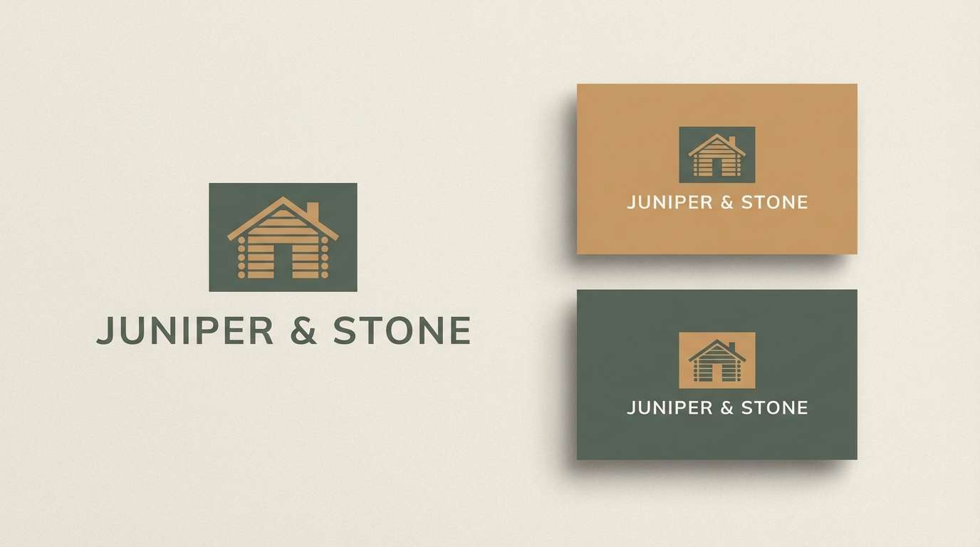
Does sandy brown work for logos and branding?
It works especially well for artisan, food, outdoor, wellness, and home brands because it feels natural and trustworthy. Pair it with a dark anchor color for wordmarks to keep the logo crisp. -
What’s the best way to keep sandy brown palettes from looking “muddy” in print?
Limit the number of mid-browns, keep one light tone dominant, and use a single deep shade for type. Favor matte finishes and avoid stacking multiple dark warm tones in large areas. -
Can I generate sandy brown palette mockups quickly with AI?
Yes. Use a consistent prompt structure (subject + background + palette cues + lighting + aspect ratio) and iterate by swapping only one variable at a time. Media.io makes it easy to generate, compare, and refine concepts fast.
Next: Rococo Color Palette


