

Lemon yellow is one of the fastest ways to make a design feel sunny, friendly, and attention-grabbing—without needing heavy graphics.
Below are 20+ lemon color combinations with HEX codes you can copy for branding, UI highlights, packaging, and fresh seasonal visuals.
In this article
- Why Lemon Color Combinations Work So Well
-
- sunlit zest
- lemon meringue
- orchard morning
- vintage lemonade stand
- citrus and charcoal
- soft buttercream
- lemon basil pop
- amalfi tiles
- minimal highlight
- retro sorbet
- botanical citrus bloom
- golden hour lemon
- lemon and lilac whisper
- clean kitchen label
- citrus noir
- honeyed linen
- festival citrus punch
- earthy citrus grove
- spa citrus calm
- tech accent yellow
- monochrome citrus range
- sunny classroom
- What Colors Go Well with Lemon?
- How to Use a Lemon Color Combination in Real Designs
- Create Lemon Palette Visuals with AI
Why Lemon Palettes Work So Well
Lemon tones sit in a “high-visibility” zone, so they naturally pull attention to key UI states, calls to action, and headline moments. They’re bright, optimistic, and easy to recognize at a glance.
Because lemon yellow is so energetic, it pairs well with grounding neutrals like charcoal, navy, warm browns, and soft whites. This makes it flexible for both playful and premium styles.
In print and packaging, lemon shades also communicate freshness and cleanliness. With the right contrast and restraint, they stay readable and modern instead of overwhelming.
20+ Lemon Color Palette Ideas (with HEX Codes)
1) Sunlit Zest
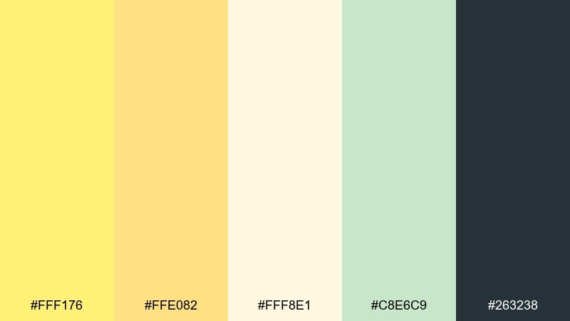
HEX: #FFF176 #FFE082 #FFF8E1 #C8E6C9 #263238
Mood: cheerful, crisp
Best for: landing pages, CTA buttons, modern branding
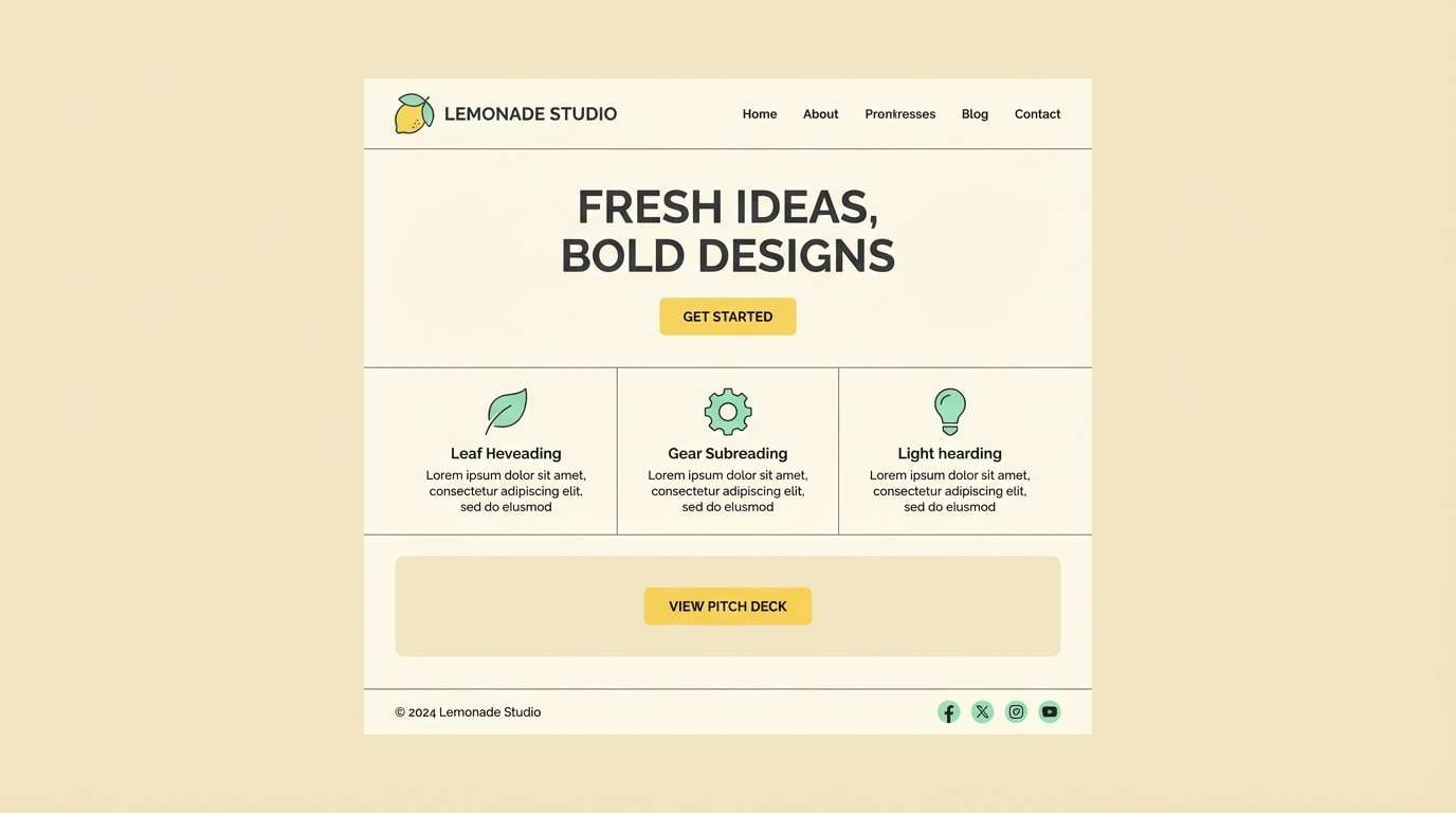
Cheerful and crisp like late-morning sun on citrus peel, this mix feels instantly upbeat. The bright yellow shines best as a focal color, while the cream keeps layouts breathable. Pair the minty green with charcoal for clean contrast in headers, icons, and type. For a balanced lemon color palette, keep yellow to highlights and let the dark neutral carry text-heavy areas.
Image example of sunlit zest generated using media.io
Media.io is an online AI studio for creating and editing video, image, and audio in your browser.

2) Lemon Meringue
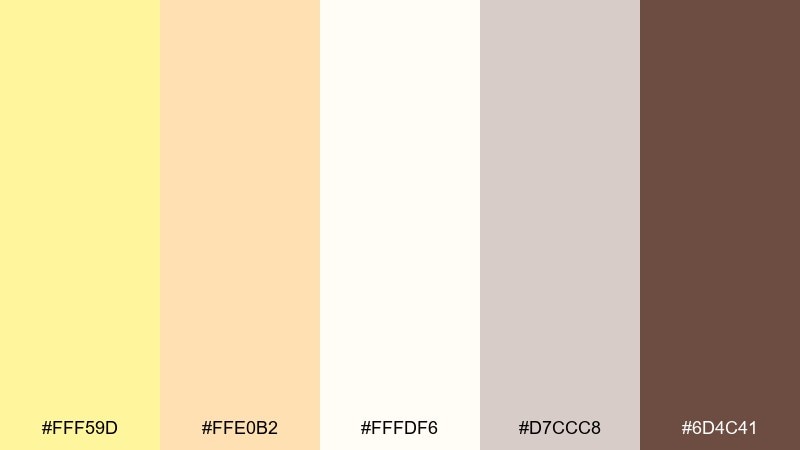
HEX: #FFF59D #FFE0B2 #FFFDF6 #D7CCC8 #6D4C41
Mood: soft, cozy
Best for: bakery packaging, cafe menus, cozy social posts
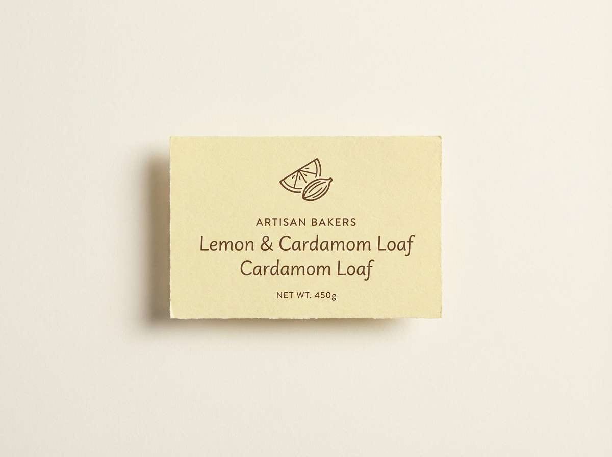
Soft and cozy like whipped meringue with a warm crust, these tones lean sweet and inviting. Use the pale yellow and creamy white as the main field, then add caramel browns for typography and borders. This Lemon color combination works beautifully on menus, labels, and product cards where warmth matters. Tip: print designs benefit from slightly thicker brown text to stay legible on the light base.
Image example of lemon meringue generated using media.io
3) Orchard Morning
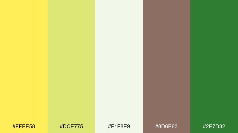
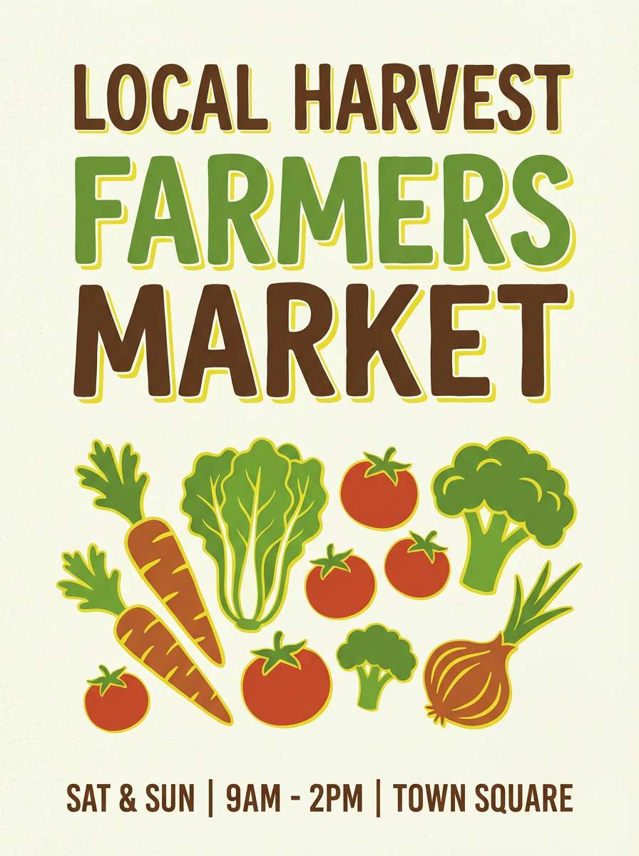
HEX: #FFEE58 #DCE775 #F1F8E9 #8D6E63 #2E7D32
Mood: fresh, outdoorsy
Best for: eco brands, farmers market posters, wellness blogs
Fresh and outdoorsy, it evokes a morning walk through orchards and herb gardens. The yellow and lime-green duo feels lively, while the pale green-white gives plenty of breathing room. Anchor the look with deep leaf green and a touch of earthy brown for headings. Usage tip: keep green as the dominant block color and use yellow as a high-visibility accent for prices or key claims.
Image example of orchard morning generated using media.io
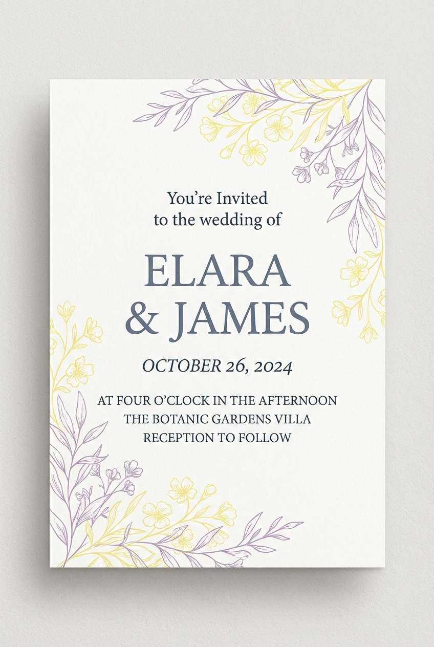
4) Vintage Lemonade Stand
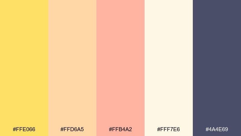
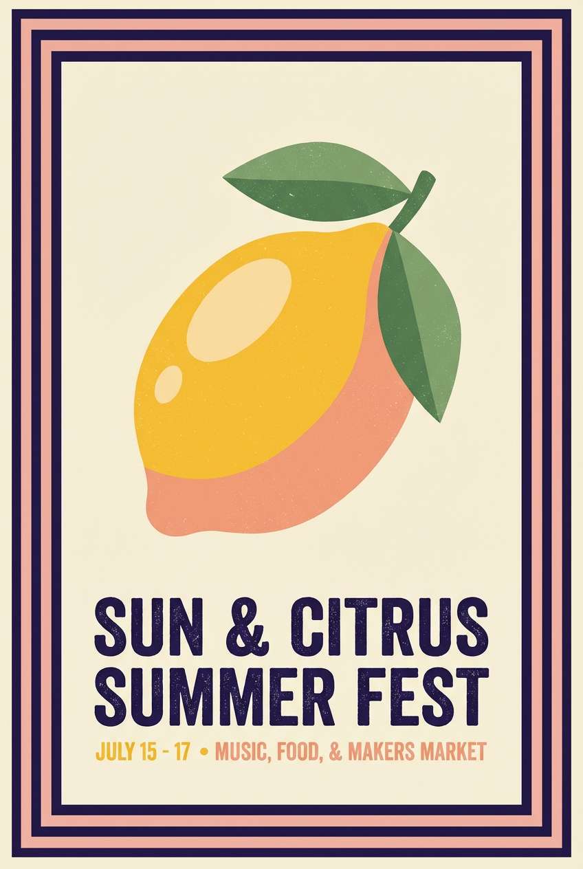
HEX: #FFE066 #FFD6A5 #FFB4A2 #FFF7E6 #4A4E69
Mood: nostalgic, playful
Best for: summer event flyers, retro packaging, kids brands
Nostalgic and playful, it feels like a painted wooden stand and a cold glass on a hot day. The warm yellow and peach create a friendly base, while the blush note adds charm without turning too sugary. Use the deep indigo for strong titles and outlines to keep everything readable. Tip: try a cream background and reserve the pink for small badges or stickers.
Image example of vintage lemonade stand generated using media.io
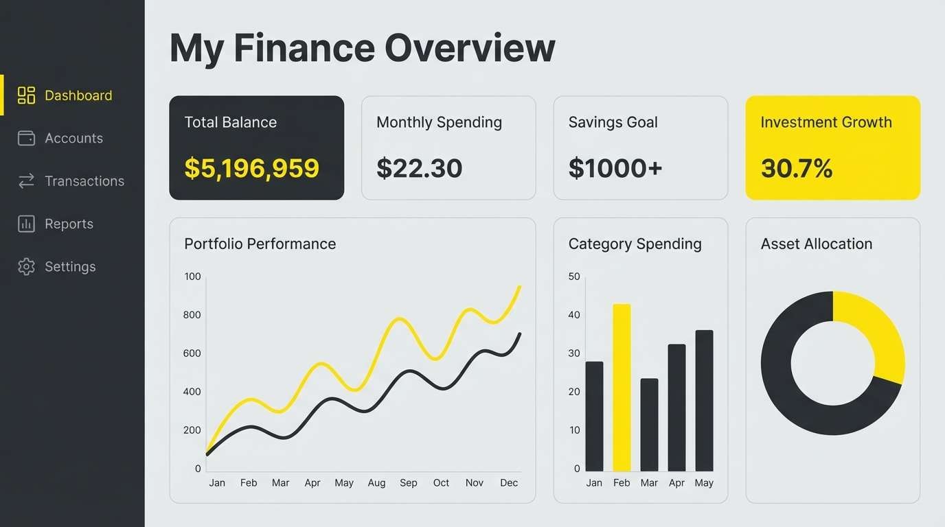
5) Citrus and Charcoal
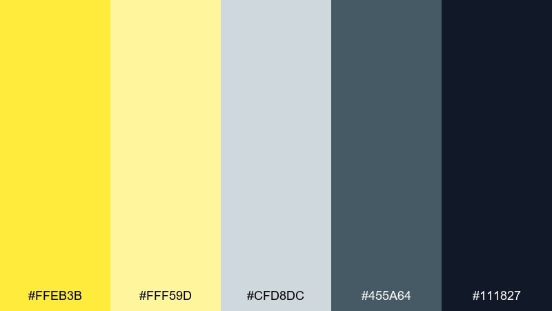
HEX: #FFEB3B #FFF59D #CFD8DC #455A64 #111827
Mood: bold, modern
Best for: startup branding, app UI accents, presentation decks
Bold and modern, this lemon color combination brings to mind bright signage against a city-night backdrop. The vivid yellow pops hard against layered cool grays, making it ideal for alerts, toggles, and key metrics. Keep backgrounds in light gray and save charcoal for text and navigation. Usage tip: limit the brightest yellow to one or two components per screen so the interface stays premium.
Image example of citrus and charcoal generated using media.io
6) Soft Buttercream
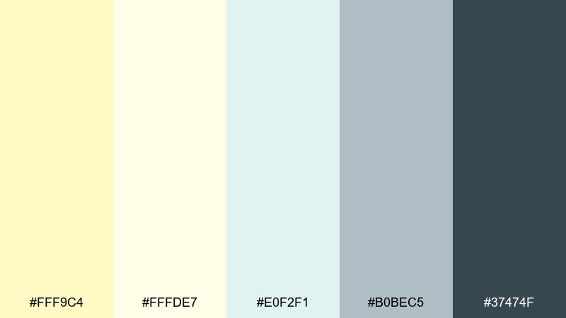
HEX: #FFF9C4 #FFFDE7 #E0F2F1 #B0BEC5 #37474F
Mood: calm, gentle
Best for: wellness websites, journaling templates, newsletters
Calm and gentle, it feels like morning tea, linen paper, and soft light through curtains. The buttery yellow reads as friendly without shouting, especially when paired with airy off-white. Add the cool aqua tint for subtle section breaks and use slate for dependable typography. Tip: in long-form layouts, set most surfaces to off-white and let yellow appear as small callouts or icons.
Image example of soft buttercream generated using media.io
7) Lemon Basil Pop
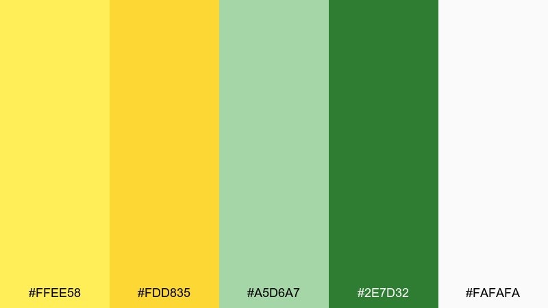
HEX: #FFEE58 #FDD835 #A5D6A7 #2E7D32 #FAFAFA
Mood: energetic, fresh
Best for: juice bar menus, recipe cards, product ads
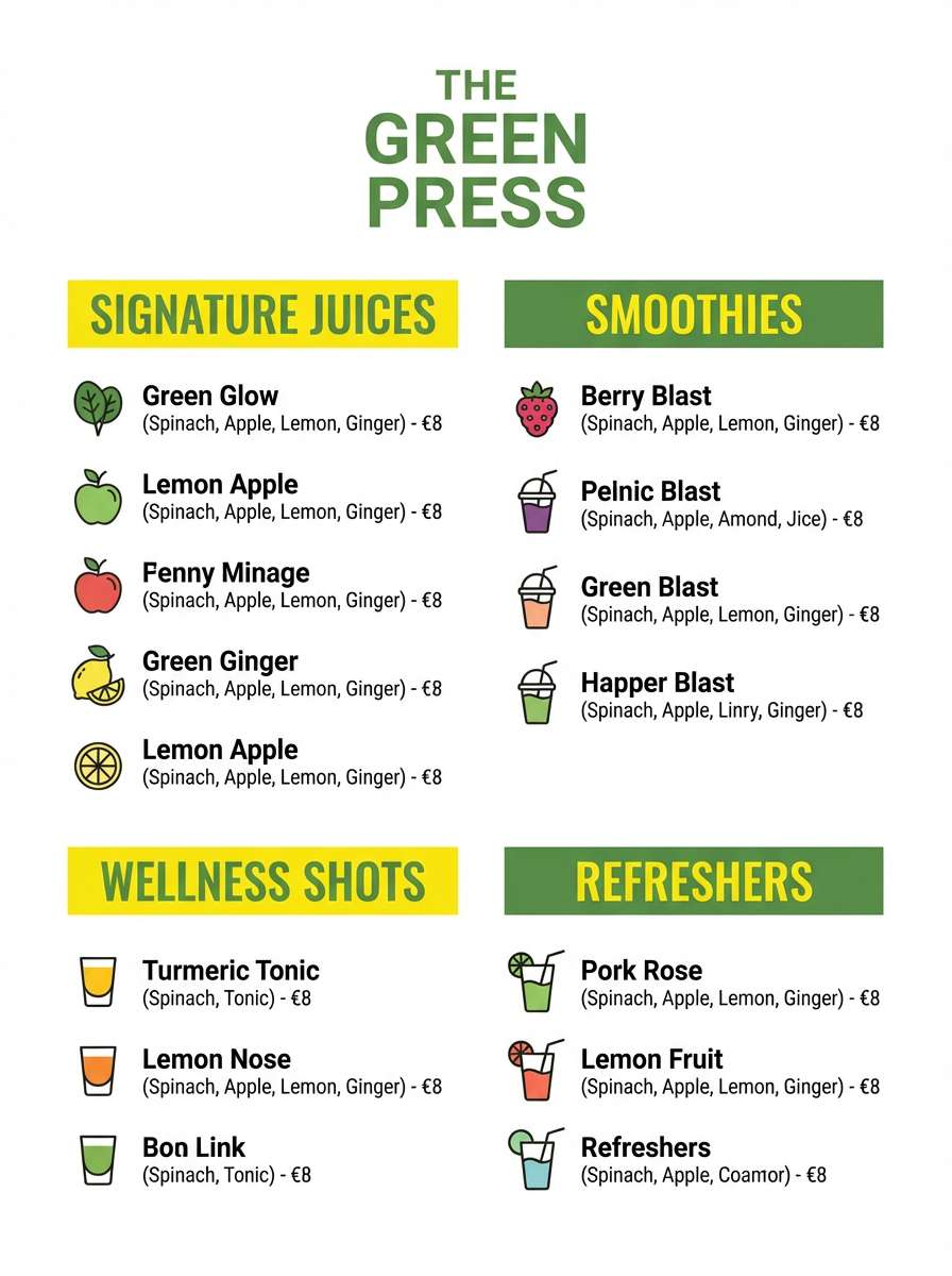
Energetic and fresh, it channels crushed basil, sparkling citrus, and bright kitchen light. The two yellows give you a natural hierarchy for headings and highlights, while the greens ground the design. These lemon color combinations work especially well for menu sections and price callouts where quick scanning matters. Usage tip: keep the darkest green for small text and use the lighter green for blocks and badges.
Image example of lemon basil pop generated using media.io
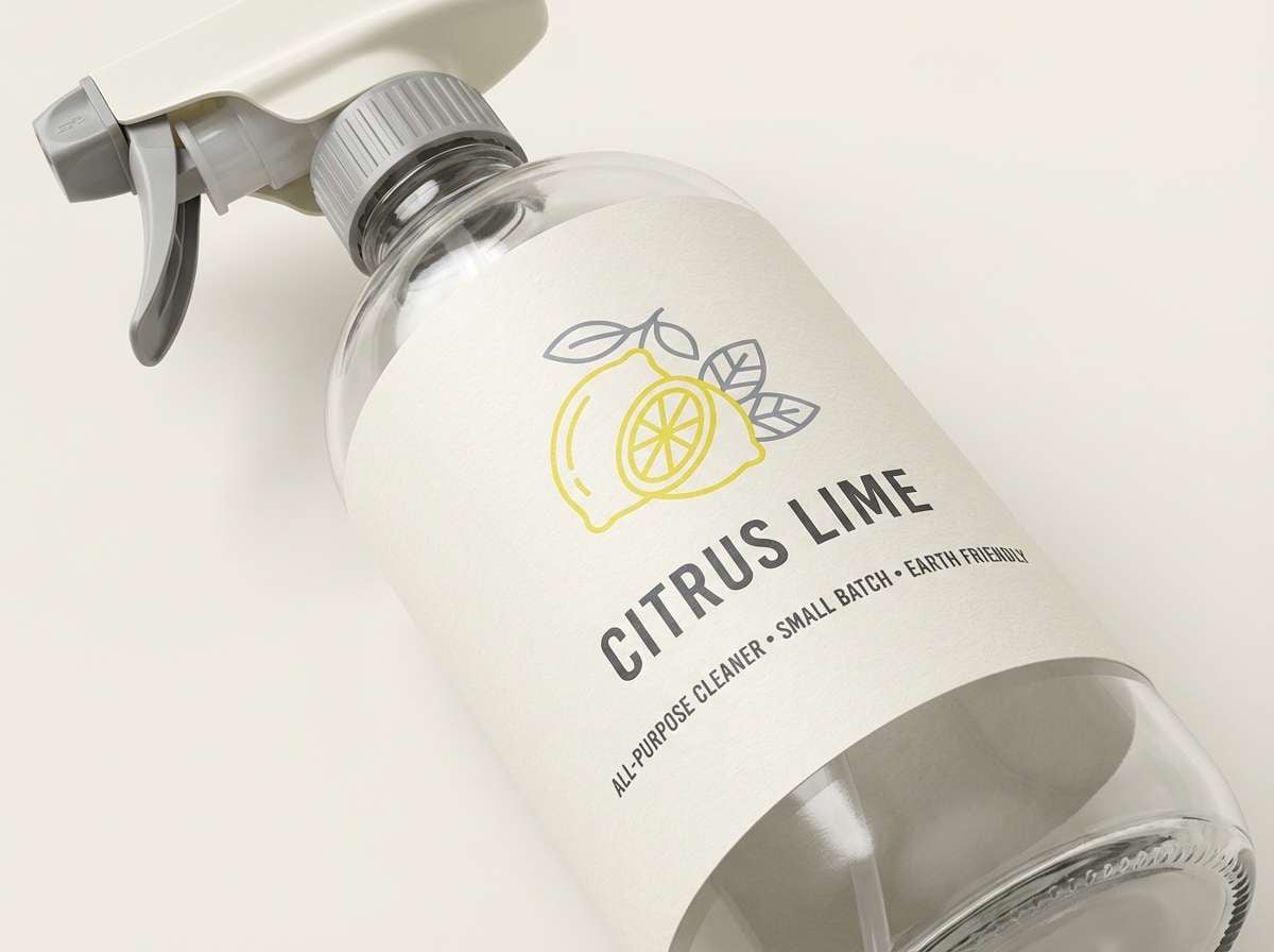
8) Amalfi Tiles
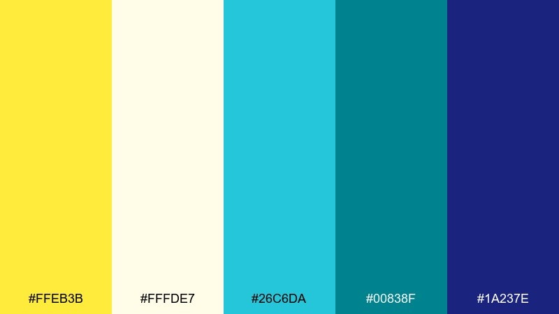
HEX: #FFEB3B #FFFDE7 #26C6DA #00838F #1A237E
Mood: sunny, coastal
Best for: travel posters, boutique branding, social covers
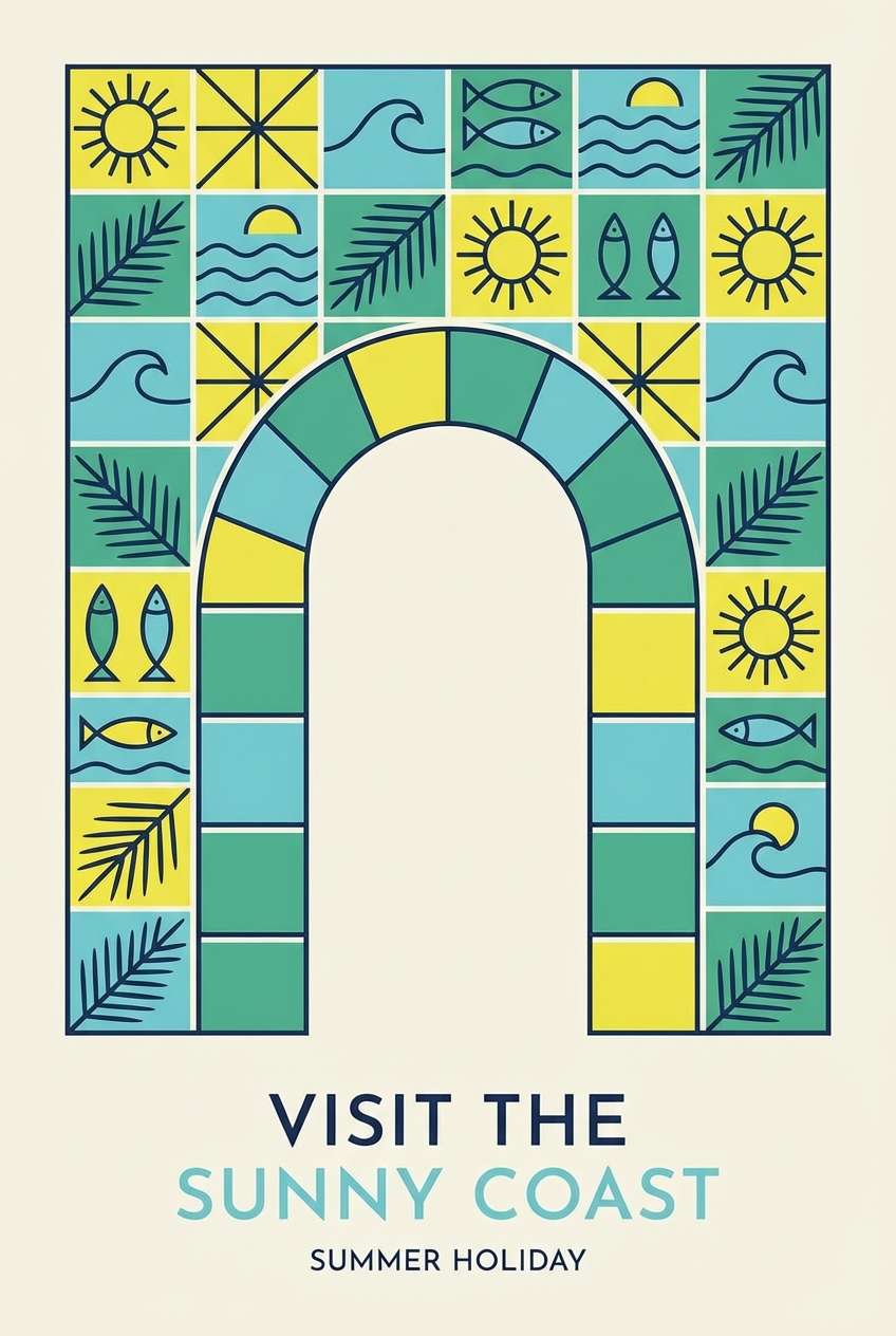
Sunny and coastal, it suggests hand-painted tiles, sea air, and bright umbrellas. The clean off-white keeps it airy, while aqua and deep teal add a Mediterranean splash. Use navy for type and borders so the palette stays crisp. Tip: in posters, let teal take large shapes and use yellow as the punchy highlight for titles or landmarks.
Image example of amalfi tiles generated using media.io
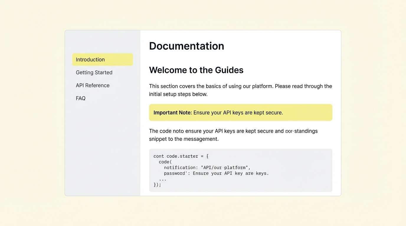
9) Minimal Highlight
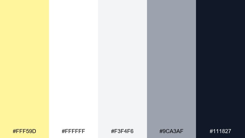
HEX: #FFF59D #FFFFFF #F3F4F6 #9CA3AF #111827
Mood: clean, focused
Best for: SaaS UI, docs sites, minimalist branding
Clean and focused, it feels like a tidy workspace with just one bright marker on the desk. The pale yellow acts as a restrained highlighter against whites and cool grays. Reserve the near-black for body text and navigation for maximum clarity. Usage tip: highlight only one UI state at a time, such as active tabs or key notifications, to keep the minimal feel intact.
Image example of minimal highlight generated using media.io
10) Retro Sorbet
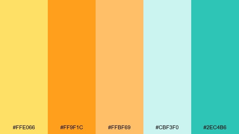
HEX: #FFE066 #FF9F1C #FFBF69 #CBF3F0 #2EC4B6
Mood: fun, summery
Best for: social graphics, festival posters, playful branding
Fun and summery, it brings back boardwalk treats and bright paper cups. The yellows and oranges feel juicy and optimistic, while the cool mint adds a refreshing counterpoint. Use teal for text and icon strokes to keep contrast strong. Tip: try large color-block shapes rather than gradients so the retro vibe stays punchy and graphic.
Image example of retro sorbet generated using media.io

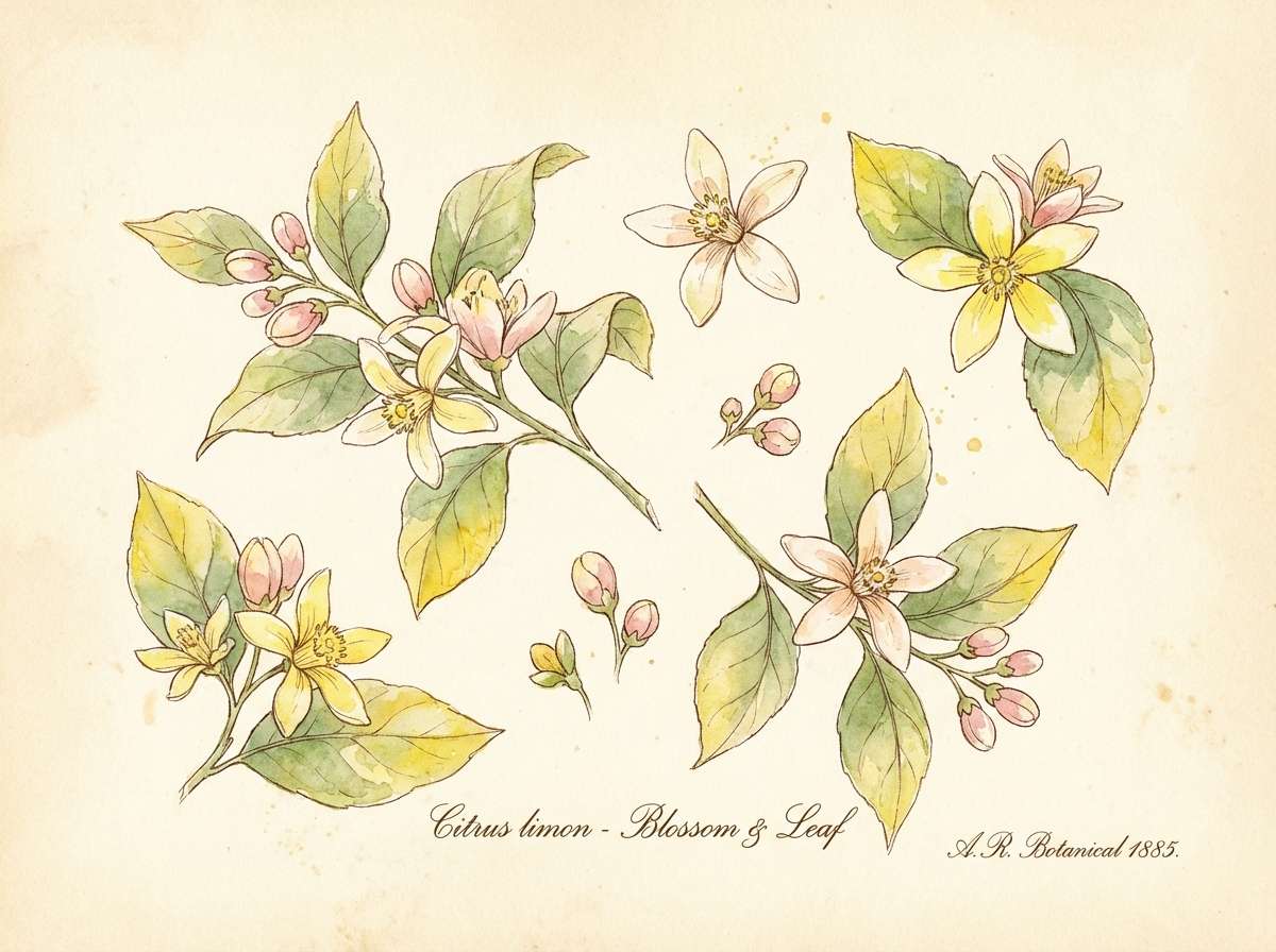
11) Botanical Citrus Bloom
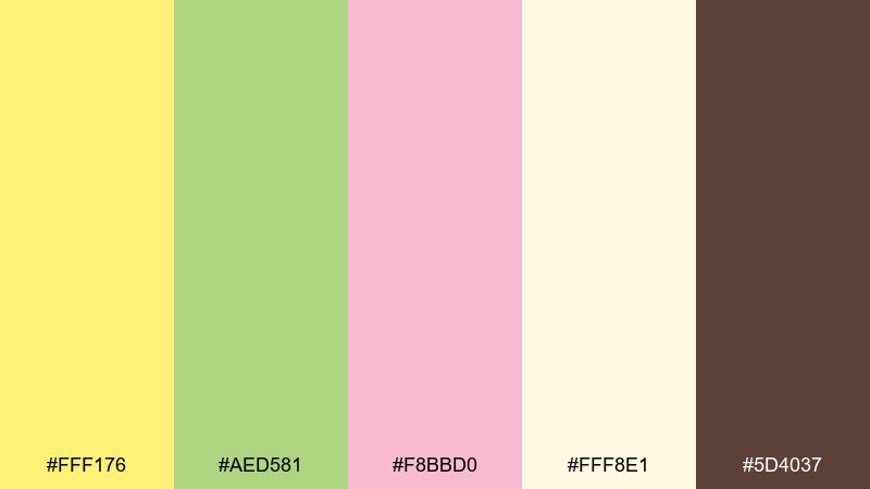
HEX: #FFF176 #AED581 #F8BBD0 #FFF8E1 #5D4037
Mood: romantic, natural
Best for: botanical illustrations, spring invites, skincare branding
Romantic and natural, it evokes citrus blossoms, soft petals, and warm soil. The pastel pink smooths the yellow into something more elegant, while the greens keep it grounded. Use the brown sparingly for fine lines, serif type, or illustration ink. Usage tip: in floral compositions, keep the cream as negative space so the blooms feel airy, not crowded.
Image example of botanical citrus bloom generated using media.io
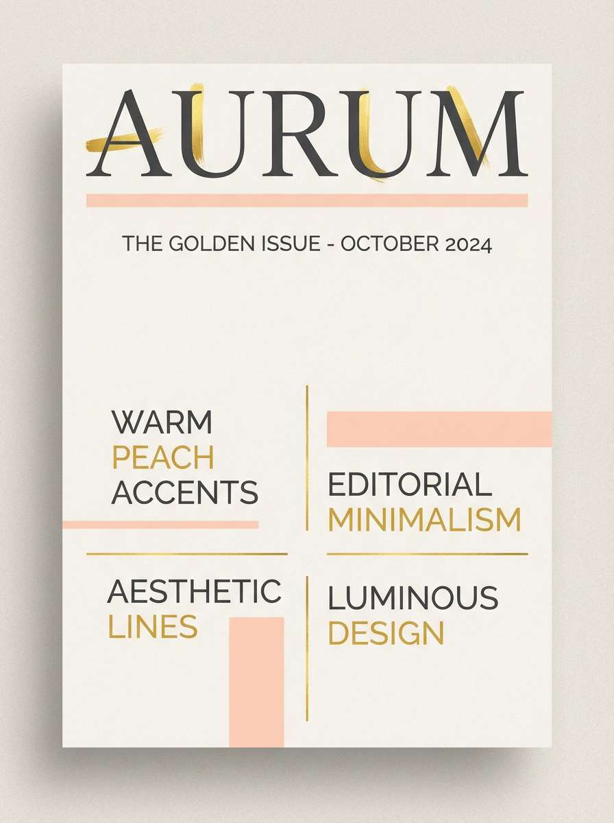
12) Golden Hour Lemon
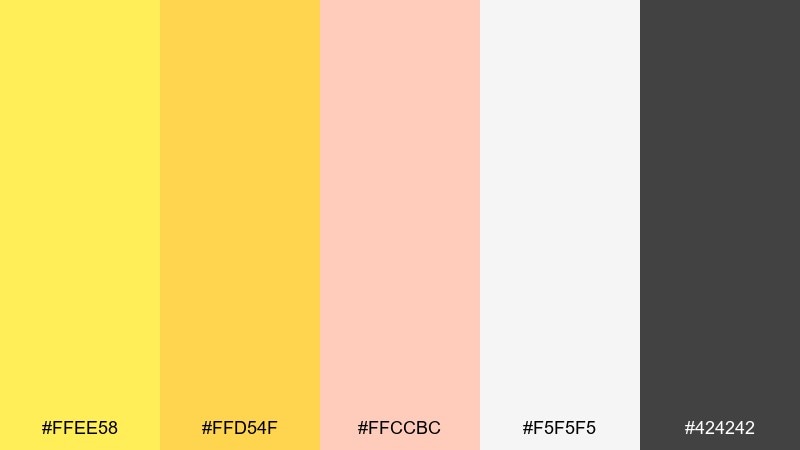
HEX: #FFEE58 #FFD54F #FFCCBC #F5F5F5 #424242
Mood: warm, glowing
Best for: lifestyle ads, editorial covers, photo overlays
Warm and glowing, it feels like late-afternoon sun reflecting off glass and sand. The richer golden yellow pairs naturally with peachy highlights for a soft, flattering look. Use light gray as a quiet base and charcoal for crisp headlines. Tip: for hero banners, set a subtle warm tint behind text so the gold stays vibrant without hurting readability.
Image example of golden hour lemon generated using media.io
13) Lemon and Lilac Whisper
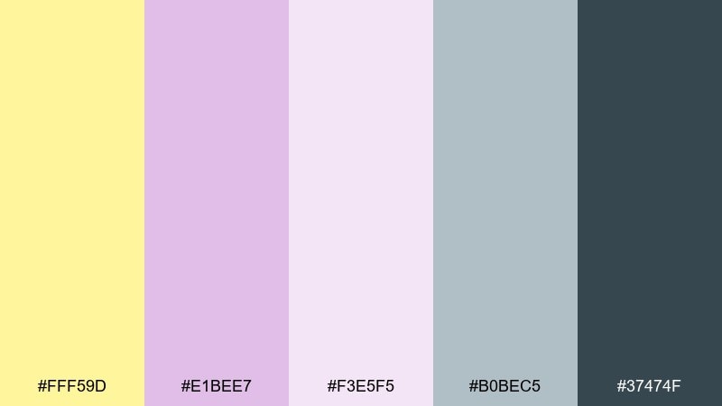
HEX: #FFF59D #E1BEE7 #F3E5F5 #B0BEC5 #37474F
Mood: dreamy, delicate
Best for: beauty branding, pastel UI themes, invitation suites
Dreamy and delicate, it recalls lilac haze with a soft yellow glow. The cool purples temper the brightness and make the overall tone feel more refined. Use slate for type and let the pastels carry large backgrounds or panels. Tip: keep yellow for micro-accents like icons or bullet points so the lavender stays calm and dominant in the layout.
Image example of lemon and lilac whisper generated using media.io
14) Clean Kitchen Label
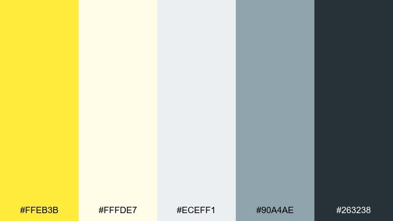
HEX: #FFEB3B #FFFDE7 #ECEFF1 #90A4AE #263238
Mood: bright, hygienic
Best for: household product packaging, labels, ecommerce thumbnails
Bright and hygienic, it feels like sunlight on a spotless countertop and fresh citrus in the air. The crisp off-white and cool gray keep the look clean, while the yellow adds instant shelf visibility. Use deep charcoal for ingredient lists and small regulatory text. For a lemon color palette that prints well, avoid using yellow for thin text and keep it to icons, bands, and badges.
Image example of clean kitchen label generated using media.io
15) Citrus Noir
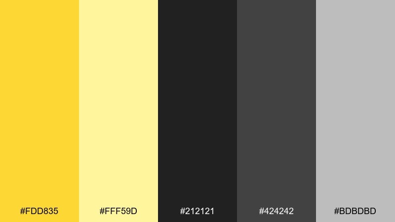
HEX: #FDD835 #FFF59D #212121 #424242 #BDBDBD
Mood: dramatic, premium
Best for: luxury promos, nightlife posters, bold brand systems
Dramatic and premium, it suggests spotlight yellow cutting through a dark room. The layered blacks and grays create depth, making the bright yellow feel more expensive than playful. Use the light yellow only for secondary highlights like subheads or small icons. Tip: on posters, keep most of the background near-black and place yellow type in short, high-impact lines.
Image example of citrus noir generated using media.io
16) Honeyed Linen
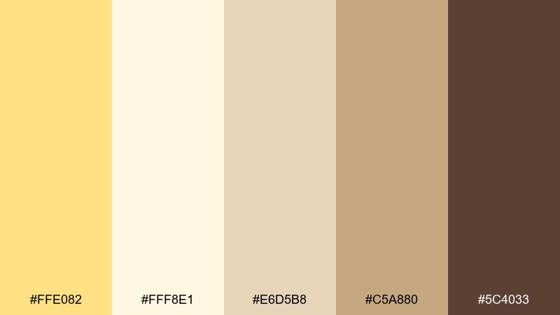
HEX: #FFE082 #FFF8E1 #E6D5B8 #C5A880 #5C4033
Mood: earthy, comforting
Best for: artisan packaging, rustic wedding stationery, cafe branding
Earthy and comforting, it feels like honey drizzle on linen and warm wood grain. The creamy base keeps it soft, while tan and caramel bring a handmade, tactile character. Use the deep brown for monograms, line art, and readable copy. Tip: emboss or use uncoated paper stock to make these warm neutrals look even richer in print.
Image example of honeyed linen generated using media.io
17) Festival Citrus Punch
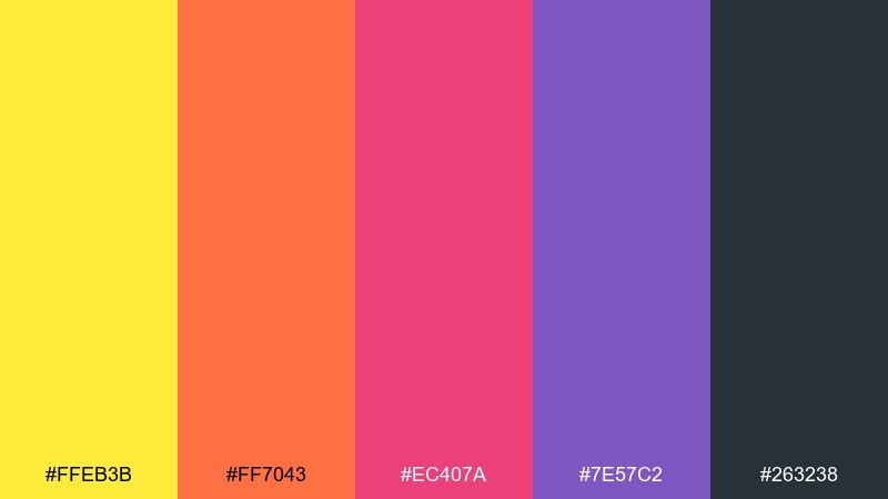
HEX: #FFEB3B #FF7043 #EC407A #7E57C2 #263238
Mood: loud, celebratory
Best for: concert posters, youth campaigns, bold motion graphics
Loud and celebratory, it feels like confetti, stage lights, and fizzy fruit punch. The hot coral and pink bring energy, while purple adds depth and keeps the palette from feeling flat. Use the dark slate to ground type and keep readability strong. Tip: choose one bright accent per section and let yellow lead the hierarchy for the clearest visual rhythm.
Image example of festival citrus punch generated using media.io
18) Earthy Citrus Grove
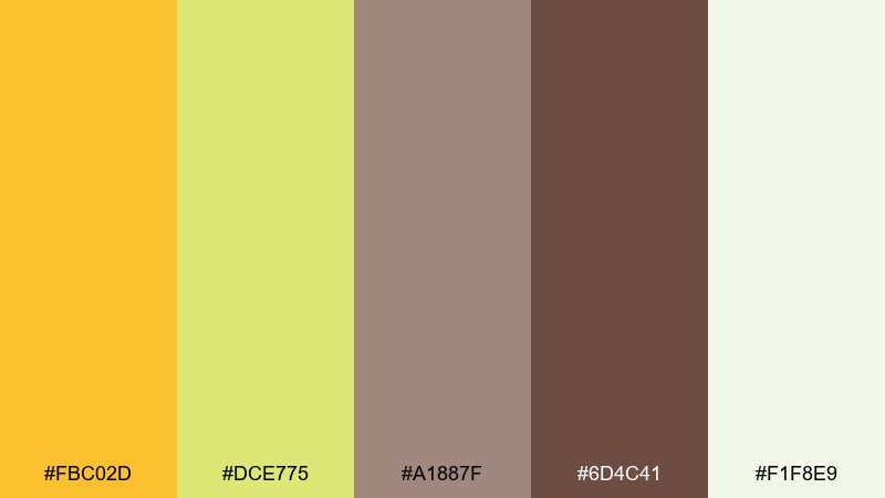
HEX: #FBC02D #DCE775 #A1887F #6D4C41 #F1F8E9
Mood: natural, grounded
Best for: organic food branding, farm labels, sustainable packaging
Natural and grounded, it evokes grove shade, soil, and sun-warmed fruit. The yellow is slightly deeper and more organic, pairing easily with earthy browns. Use the pale green-white to keep labels clean and modern instead of rustic-heavy. These lemon color combinations look best when you keep the brown minimal and let the greens carry most of the secondary areas.
Image example of earthy citrus grove generated using media.io
19) Spa Citrus Calm
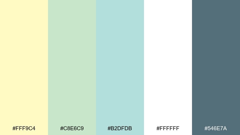
HEX: #FFF9C4 #C8E6C9 #B2DFDB #FFFFFF #546E7A
Mood: soothing, clean
Best for: spa brochures, wellness apps, skincare web design
Soothing and clean, it feels like infused water, fresh towels, and quiet greenery. The pale yellow reads as gentle warmth, while mint and aqua keep everything serene. Use the blue-gray for text and thin dividers to avoid harsh contrast. Tip: in wellness apps, set the main background to white and use soft color blocks for sections like routines and progress.
Image example of spa citrus calm generated using media.io
20) Tech Accent Yellow
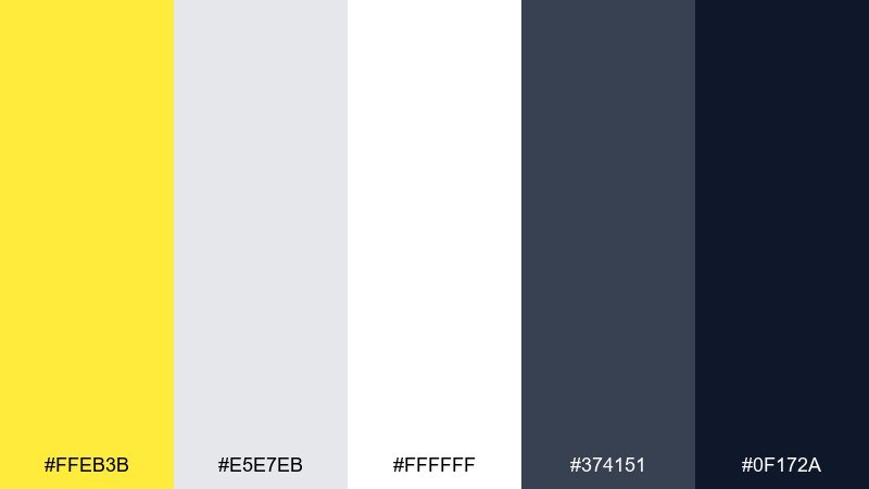
HEX: #FFEB3B #E5E7EB #FFFFFF #374151 #0F172A
Mood: sharp, confident
Best for: product UI, fintech branding, pitch decks
Sharp and confident, it suggests a clean interface with high-visibility cues. The grays and deep navy create a serious foundation, letting yellow act as a precise signal color. Use this lemon color scheme for states like active, warning, or key actions, not for large backgrounds. Tip: pair yellow with the darkest navy for buttons and keep secondary elements in mid-gray to avoid visual noise.
Image example of tech accent yellow generated using media.io
21) Monochrome Citrus Range
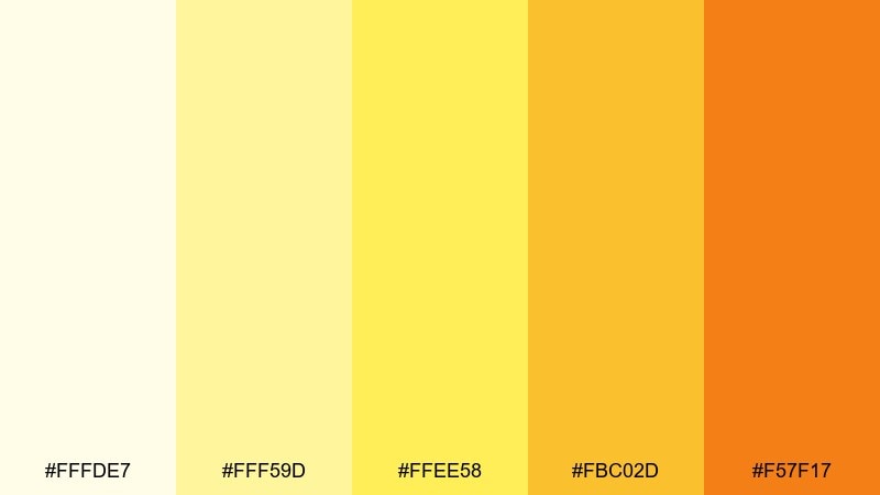
HEX: #FFFDE7 #FFF59D #FFEE58 #FBC02D #F57F17
Mood: bright, cohesive
Best for: infographics, highlight systems, gradient-free branding
Bright and cohesive, it feels like a stack of citrus paper swatches from light to deep. Using only yellow family steps creates instant harmony without needing extra hues. Apply the lightest shades to backgrounds and reserve the darkest amber for emphasis like numbers or icons. Tip: in charts, use the mid tones for series colors and keep the deepest shade for the most important data point.
Image example of monochrome citrus range generated using media.io

22) Sunny Classroom
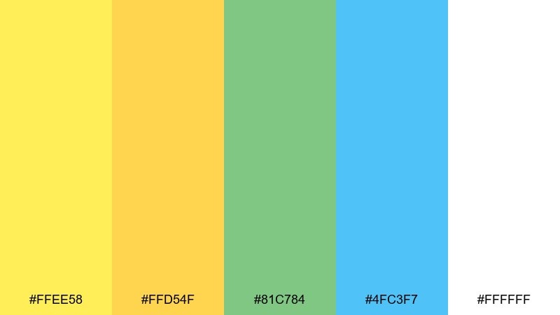
HEX: #FFEE58 #FFD54F #81C784 #4FC3F7 #FFFFFF
Mood: friendly, optimistic
Best for: education posters, kids worksheets, classroom slides
Friendly and optimistic, it recalls bright posters, sticky notes, and cheerful classroom corners. The yellow and gold set an upbeat tone, while green and sky-blue keep it playful and approachable. Use white space generously so the colors do not overwhelm younger audiences. Tip: reserve the blue for headings and icons, and keep the yellows for highlights like key terms or stars.
Image example of sunny classroom generated using media.io
What Colors Go Well with Lemon?
Neutrals are the easiest match: white, cream, light gray, charcoal, and deep navy help lemon yellow look intentional and readable. This is especially useful for UI, where contrast and hierarchy matter.
Fresh pairings like mint, basil green, and aqua push a clean “citrus + nature” vibe that’s perfect for wellness, food, and eco branding. For something softer, try lilac or blush to make lemon feel more delicate.
If you want a bolder look, combine lemon with coral, hot pink, or purple—but keep one bright color in charge so the palette stays balanced.
How to Use a Lemon Color Palette in Real Designs
Use lemon like a spotlight: buttons, active tabs, badges, price tags, and key data points. Keeping yellow as an accent (not a full background) often produces a cleaner, more premium result.
For print and packaging, avoid thin lemon text on light backgrounds; instead, use dark neutrals for copy and let lemon appear as bands, icons, or label blocks. This improves legibility and reduces color-shift issues in printing.
In brand systems, define a small set of roles (primary, secondary, background, text) and assign lemon to one clear role—typically “accent” or “attention.” That consistency makes the palette feel professional.
Create Lemon Palette Visuals with AI
If you want to preview how your lemon color scheme looks on real layouts, generate quick mockups before you commit to a final design. Seeing palettes on posters, labels, and UI screens helps you judge contrast, mood, and hierarchy.
Start with one palette above, paste the included prompt, and tweak the subject (menu, app screen, packaging) to match your use case. You can iterate fast and keep the HEX codes consistent across variations.
When you find a direction you like, generate a small set of matching assets (hero, social cover, product card) so your lemon palette stays cohesive across channels.
Lemon Color Palette FAQs
-
What HEX code is a classic lemon yellow?
A popular lemon yellow HEX is #FFF176, which reads bright but slightly softened—great for modern UI highlights and cheerful branding. -
Is lemon yellow better as a background or an accent?
In most designs, lemon works best as an accent (buttons, icons, badges). Large lemon backgrounds can overpower layouts unless you balance them with lots of white/cream space and strong dark typography. -
What text color is most readable on lemon?
Charcoal, near-black, and deep navy (for example #263238 or #111827) are the safest choices for contrast and accessibility on lemon tones. -
What colors complement lemon yellow without looking childish?
Try lemon with cool grays, charcoal, or navy for a premium feel, or pair it with muted greens (sage/basil) for a natural, modern look. -
Can I use lemon yellow in a minimalist brand?
Yes—use a very pale lemon (like #FFF59D) sparingly as a “highlighter” against white and light gray, and keep typography in dark neutral tones. -
What’s a good “fresh citrus” palette pairing?
Lemon + mint/aqua + off-white is a reliable combo for freshness. It’s common in wellness, beverage, and clean product packaging because it feels bright and hygienic. -
How do I generate lemon palette mockups quickly?
Use Media.io text-to-image: pick a palette, reuse its prompt, and swap the scene (landing page, poster, label) to create consistent visuals while keeping the same HEX direction.
Next: Light Color Palette


