Sand palettes are the shortcut to warm minimal design: soft enough for airy layouts, but structured enough to feel premium. They sit comfortably between beige, tan, and taupe, so they work across branding, interiors, and UI.
Below are 20 sand color palette ideas with HEX codes, plus practical pairing tips and AI prompts you can reuse to generate matching visuals in seconds.
In this article
Why Sand Palettes Work So Well
Sand tones feel human and familiar: they echo natural materials like linen, clay, stone, and wood. That “real-world” association makes designs look calmer and more trustworthy, even when the layout is modern and minimal.
They’re also flexible neutrals with built-in warmth. Compared to cool grays, sand palettes soften harsh contrast and help photography look more inviting—great for lifestyle brands, hospitality, and wellness.
Finally, sand colors create easy hierarchy. Light creams give you spacious backgrounds, mid tans handle cards and sections, and deep browns deliver readable anchors for headlines, buttons, and logos.
20+ Sand Color Palette Ideas (with HEX Codes)
1) Dune Drift
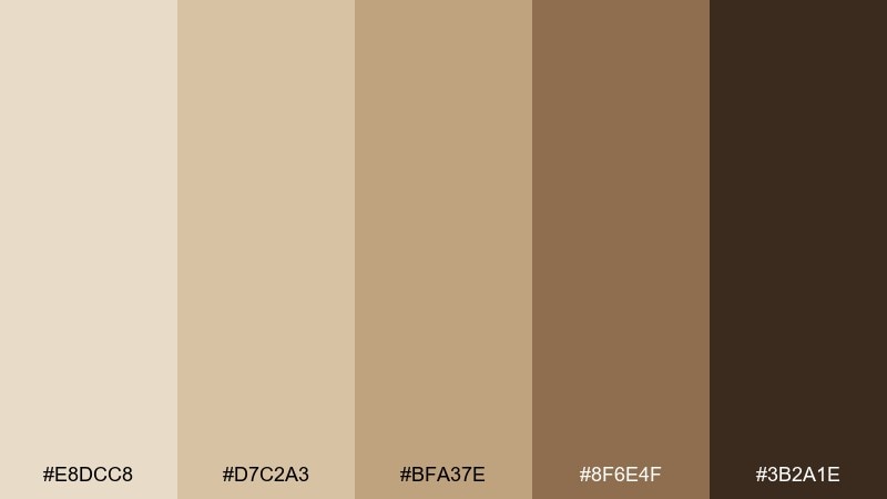
HEX: #E8DCC8 #D7C2A3 #BFA37E #8F6E4F #3B2A1E
Mood: airy, grounded, sun-warmed
Best for: minimal brand identity for a lifestyle studio
Airy dunes and sun-warmed linen set a calm, grounded tone that still feels premium. Use the lighter tans for spacious layouts, then anchor headers and logos with the deep espresso brown. Creamy neutrals pair beautifully with matte black typography and subtle paper textures. Tip: keep contrast high for readability by reserving the darkest shade for key UI or brand marks.
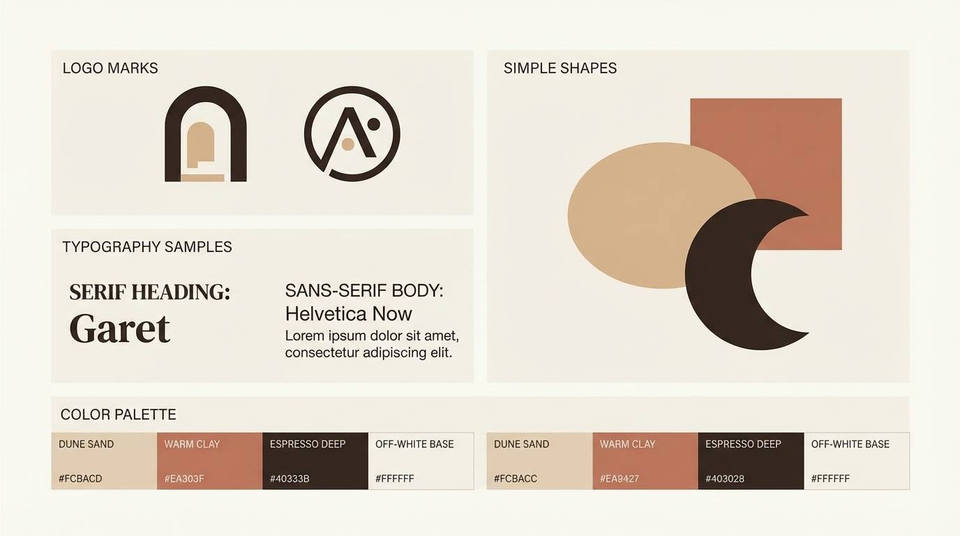
Image example of dune drift generated using media.io
Media.io is an online AI studio for creating and editing video, image, and audio in your browser.

2) Coastal Beige
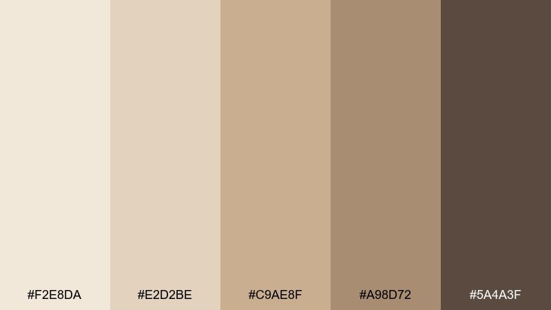
HEX: #F2E8DA #E2D2BE #C9AE8F #A98D72 #5A4A3F
Mood: clean, breezy, relaxed
Best for: airbnb listing hero banner and social posts
Clean beach mornings and salt-air neutrals make this mix feel relaxed but polished. Let the pale cream lead as a background, then layer beige and driftwood browns for depth in text blocks and dividers. It pairs well with warm photography and simple line icons. Tip: add whitespace generously so the mid-tones do not crowd your key callouts.
Image example of coastal beige generated using media.io

3) Desert Linen
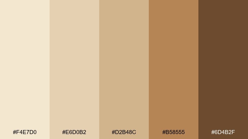
HEX: #F4E7D0 #E6D0B2 #D2B48C #B58555 #6D4B2F
Mood: soft, rustic, welcoming
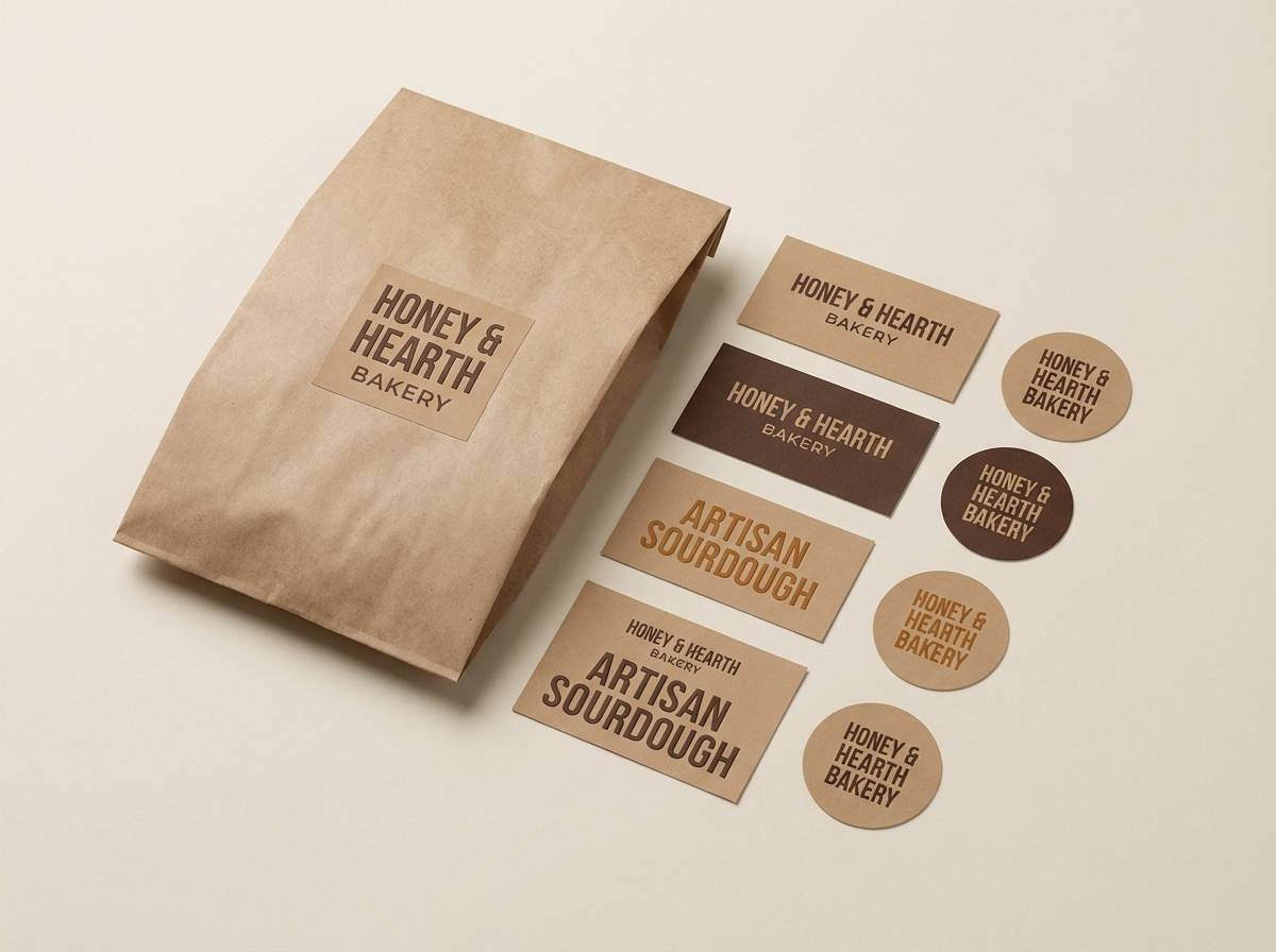
Best for: artisan bakery packaging and labels
Soft linen and toasted crust hues create a welcoming, handmade feel. This sand color palette works especially well on kraft paper, where the caramel tones look richer and more appetizing. Pair it with simple serif type and a small stamped emblem for an artisanal finish. Tip: use the mid tan for label backgrounds so dark text stays crisp without feeling harsh.
Image example of desert linen generated using media.io
4) Warm Quarry
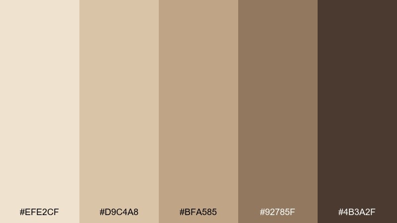
HEX: #EFE2CF #D9C4A8 #BFA585 #92785F #4B3A2F
Mood: architectural, steady, refined
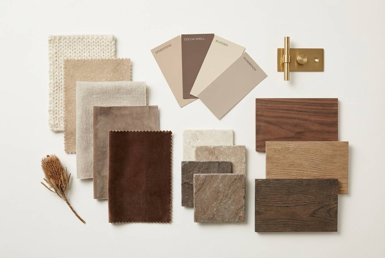
Best for: modern interior moodboard for a living room
Quarried stone and warm plaster give this set an architectural, steady presence. Use the pale neutral for walls or large surfaces, then bring in the taupe and cocoa tones through textiles and wood. It pairs nicely with black metal accents and natural oak. Tip: repeat the mid taupe at least three times across the room to keep the look cohesive.
Image example of warm quarry generated using media.io
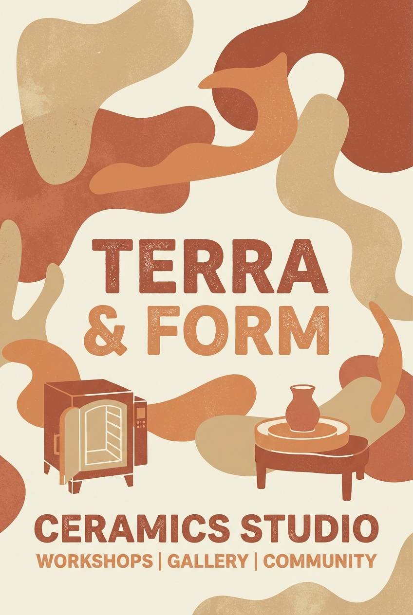
5) Sunbaked Clay
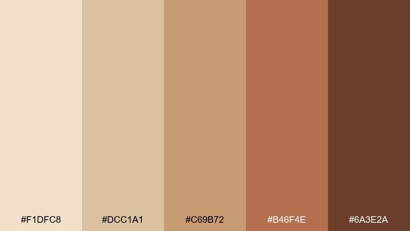
HEX: #F1DFC8 #DCC1A1 #C69B72 #B46F4E #6A3E2A
Mood: earthy, bold, sunlit
Best for: ceramics studio poster on plain background
Earthy clay and sunlit terracotta bring bold warmth without turning loud. Use the terracotta as a focal accent for headlines, while the sandy neutrals keep the layout breathable. The palette pairs well with textured shapes, grain, and minimal iconography. Tip: print on uncoated stock to make the warm mid-tones look richer.
Image example of sunbaked clay generated using media.io
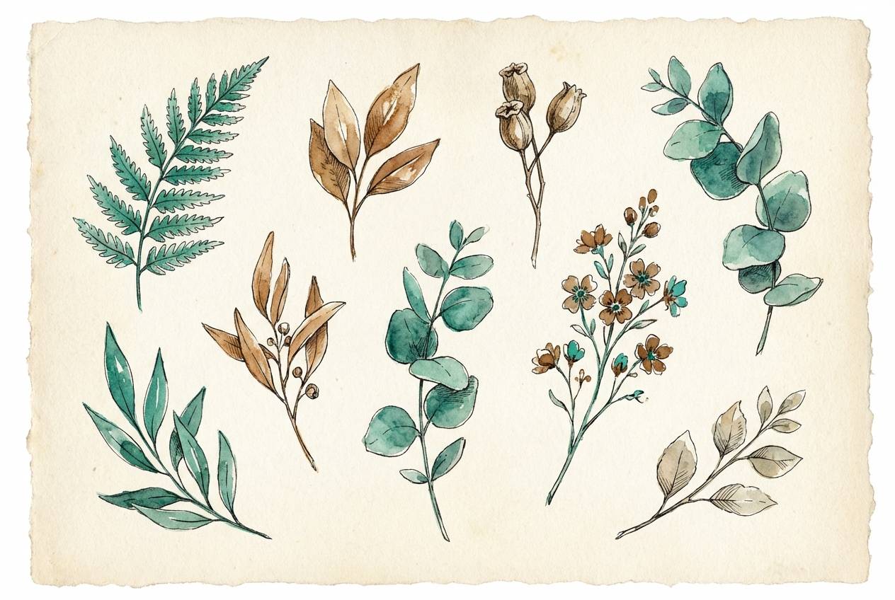
6) Sandstone Sage
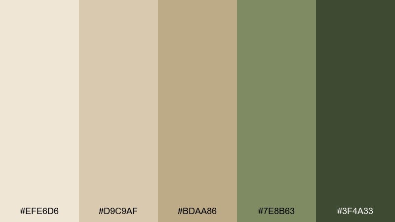
HEX: #EFE6D6 #D9C9AF #BDAA86 #7E8B63 #3F4A33
Mood: organic, balanced, outdoorsy
Best for: botanical watercolor illustration set
Organic sandstone neutrals with a sage twist feel like a quiet hike after rain. These sand color combinations shine in nature brands, wellness packaging, and calm editorial layouts. Pair the green with creamy backgrounds and keep the darkest tone for small details like icons or borders. Tip: use watercolor textures or soft gradients to blend the beige into sage smoothly.
Image example of sandstone sage generated using media.io
7) Oatmilk Glow
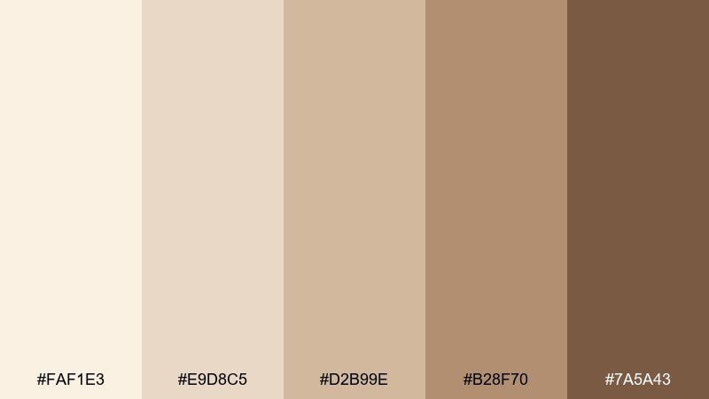
HEX: #FAF1E3 #E9D8C5 #D2B99E #B28F70 #7A5A43
Mood: cozy, gentle, creamy
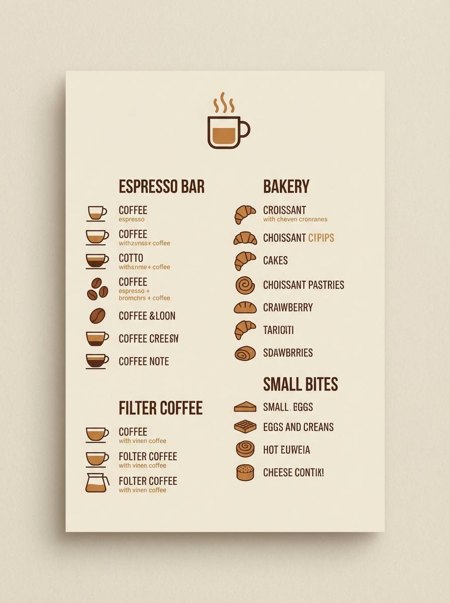
Best for: coffee shop menu board design
Cozy oatmilk and toasted caramel notes make the whole set feel gentle and inviting. Use the soft cream as your base, then reserve the warm browns for prices, dividers, and featured items. It pairs naturally with hand-drawn icons and rounded sans-serif type. Tip: keep line weights slightly thicker so the lightest tones do not wash out in print.
Image example of oatmilk glow generated using media.io
8) Camel Cocoa
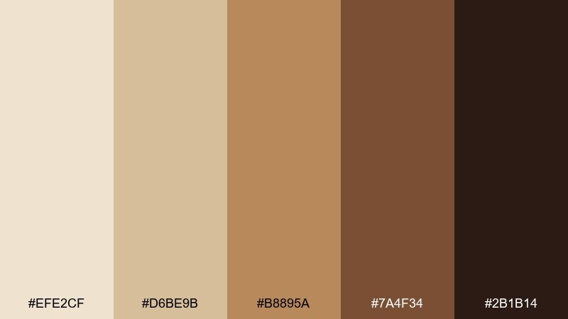
HEX: #EFE2CF #D6BE9B #B8895A #7A4F34 #2B1B14
Mood: luxurious, vintage, masculine
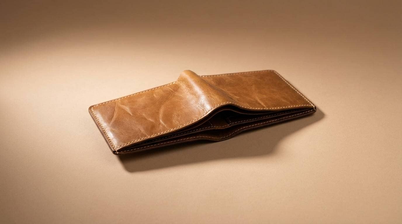
Best for: premium leather goods product ad
Luxurious camel and dark cocoa evoke well-worn leather and old libraries. Use the camel mid-tone for the product spotlight, while deep brown frames the composition and makes metallic details pop. It pairs well with gold foil accents and high-contrast photography. Tip: avoid using all five shades equally; keep the darkest color to under 10% for a premium feel.
Image example of camel cocoa generated using media.io
9) Terrace Stucco
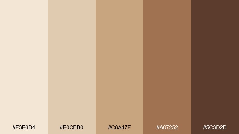
HEX: #F3E6D4 #E0CBB0 #C8A47F #A07252 #5C3D2D
Mood: Mediterranean, sunny, handcrafted
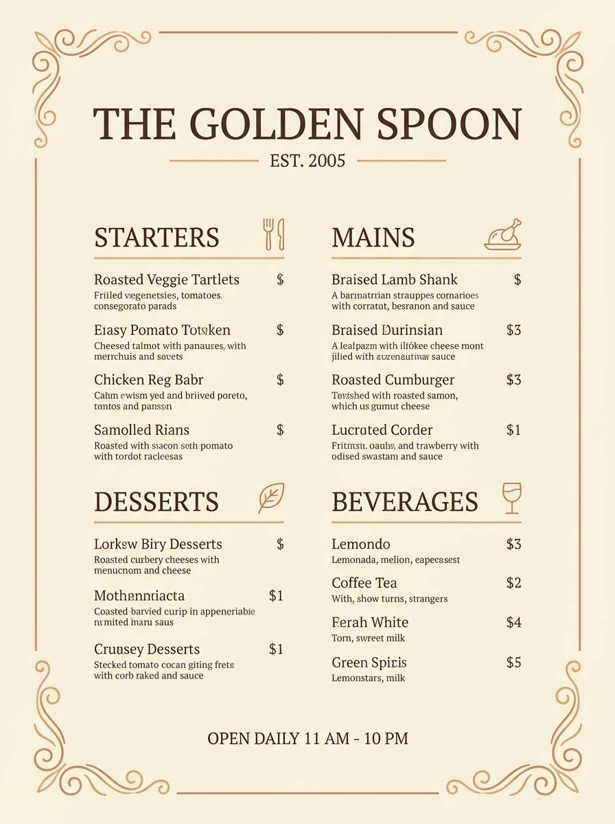
Best for: restaurant menu flyer on plain background
Sunlit stucco and baked stone feel instantly Mediterranean and handcrafted. Use the pale shade as a paper-like base, then bring in the warm browns for section headers and ornamental rules. The tones pair well with simple illustrations of herbs or citrus. Tip: keep typography airy with generous leading so the warm palette stays light.
Image example of terrace stucco generated using media.io
10) Wheatfield Morning
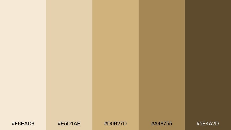
HEX: #F6EAD6 #E5D1AE #D0B27D #A48755 #5E4A2D
Mood: bright, pastoral, optimistic
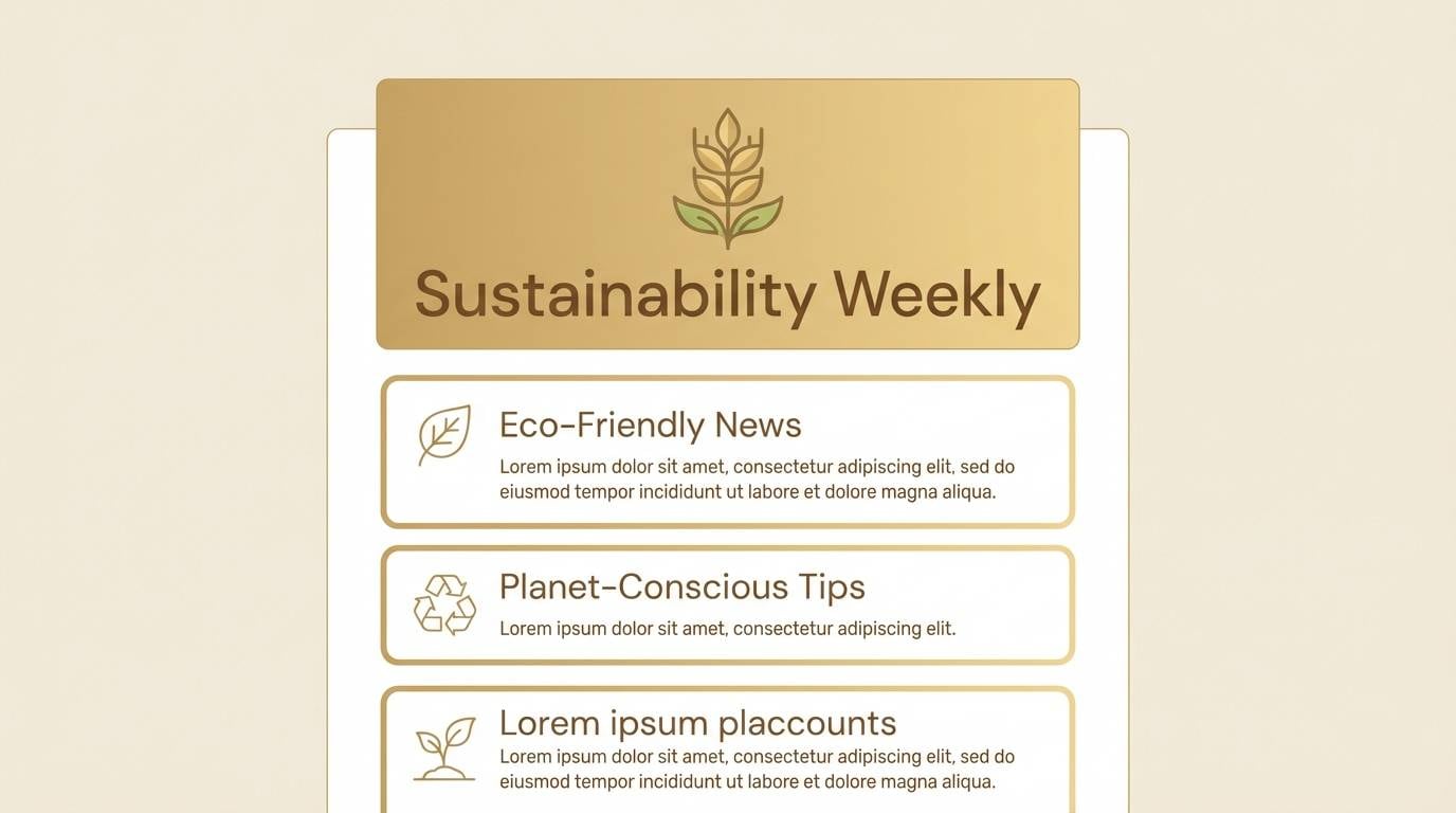
Best for: eco newsletter email header and blocks
Bright wheat and morning light create an optimistic, wholesome vibe. For email layouts, use the palest shade for the canvas, then the golden tan for headers and call-to-action highlights. It pairs well with simple eco icons and lightly textured backgrounds. Tip: choose a single accent (the golden tan) for buttons to keep clicks focused.
Image example of wheatfield morning generated using media.io
11) Antique Canvas
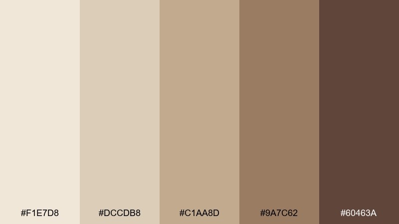
HEX: #F1E7D8 #DCCDB8 #C1AA8D #9A7C62 #60463A
Mood: nostalgic, artistic, museum-like
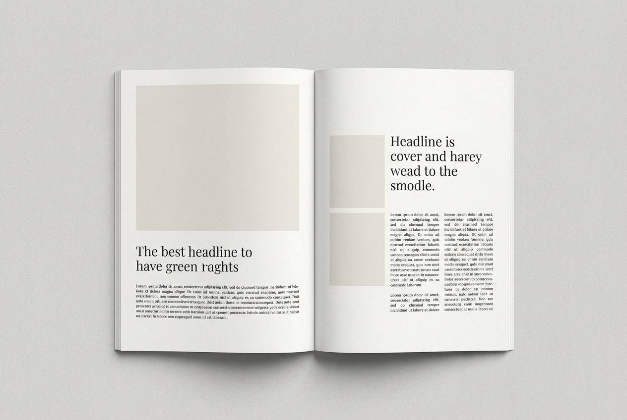
Best for: editorial magazine spread layout
Nostalgic canvas tones and soft browns feel like a quiet gallery wall. Use the light neutrals for margins and negative space, then bring in the mid taupe for captions and pull quotes. It pairs especially well with black-and-white photography and subtle grain. Tip: add a thin rule line in the darkest shade to structure the spread without heavy boxes.
Image example of antique canvas generated using media.io
12) Sepia Pebble
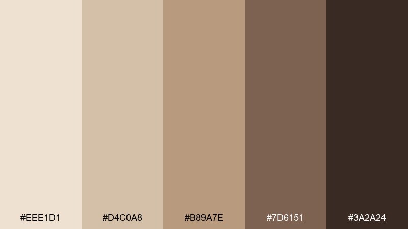
HEX: #EEE1D1 #D4C0A8 #B89A7E #7D6151 #3A2A24
Mood: moody, vintage, grounded
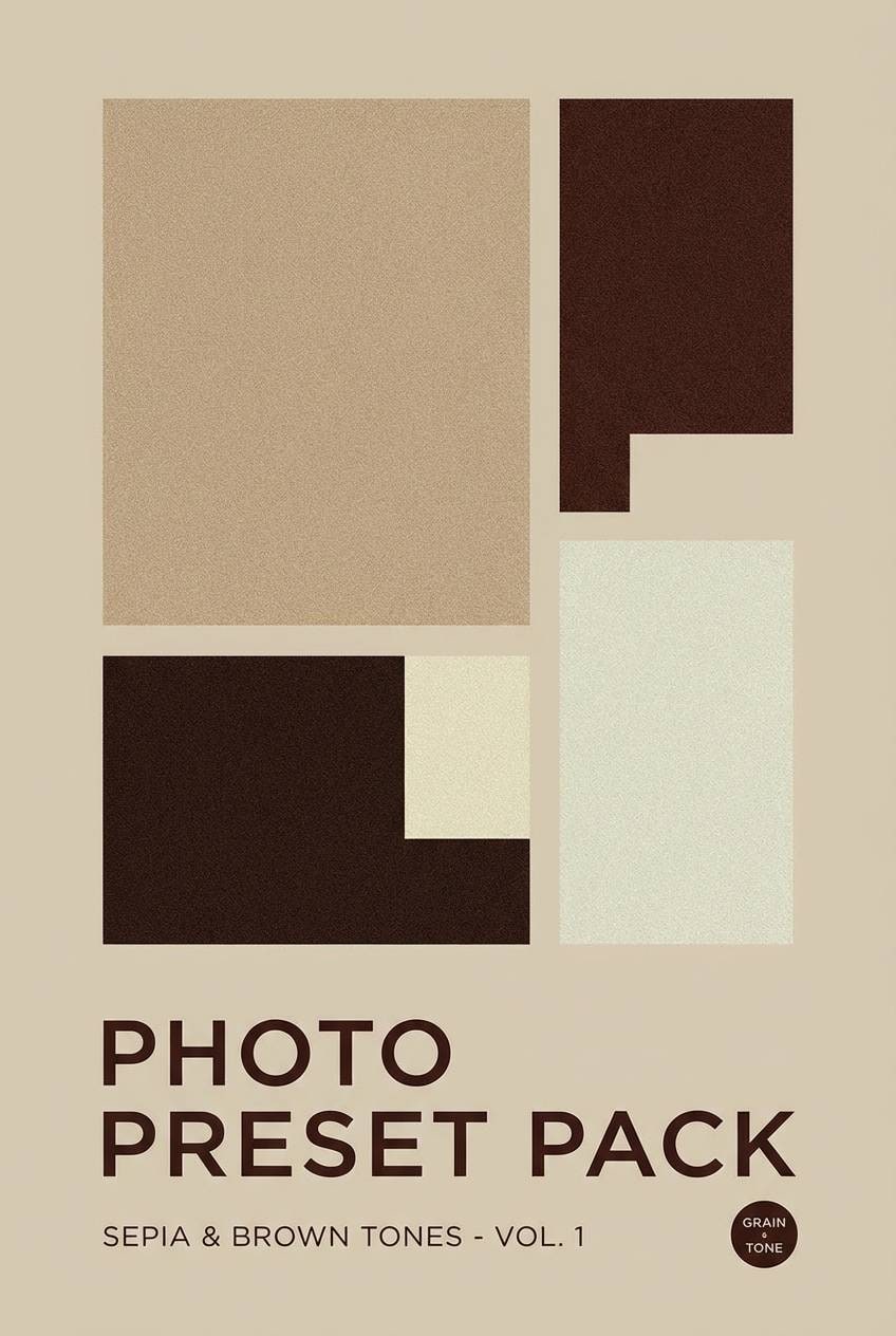
Best for: black-and-white photo preset cover design
Sepia pebbles and smoky browns bring a moody, vintage weight that feels grounded. Use the lighter beige for a soft background behind photography, then add the darker browns for badges and text overlays. It pairs well with film grain and muted shadows. Tip: keep overlays at low opacity so images stay the hero.
Image example of sepia pebble generated using media.io
13) Pale Khaki
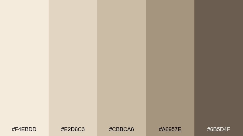
HEX: #F4EBDD #E2D6C3 #CBBCA6 #A6957E #6B5D4F
Mood: practical, modern, understated
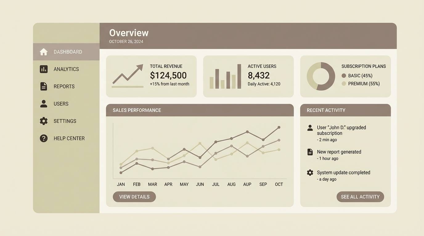
Best for: app UI dashboard mockup
Understated khaki neutrals feel practical, modern, and easy on the eyes. These sand color combinations work well for dashboards where you want calm surfaces and clear hierarchy. Pair the lightest tone with charcoal text, then use the deeper taupe for navigation states and data cards. Tip: add one consistent highlight color outside the palette only for critical alerts, and keep it rare.
Image example of pale khaki generated using media.io
14) Rustic Adobe
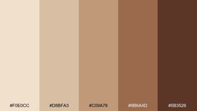
HEX: #F0E0CC #D8BFA3 #C09A78 #9B6A4D #5B3526
Mood: rustic, warm, handcrafted
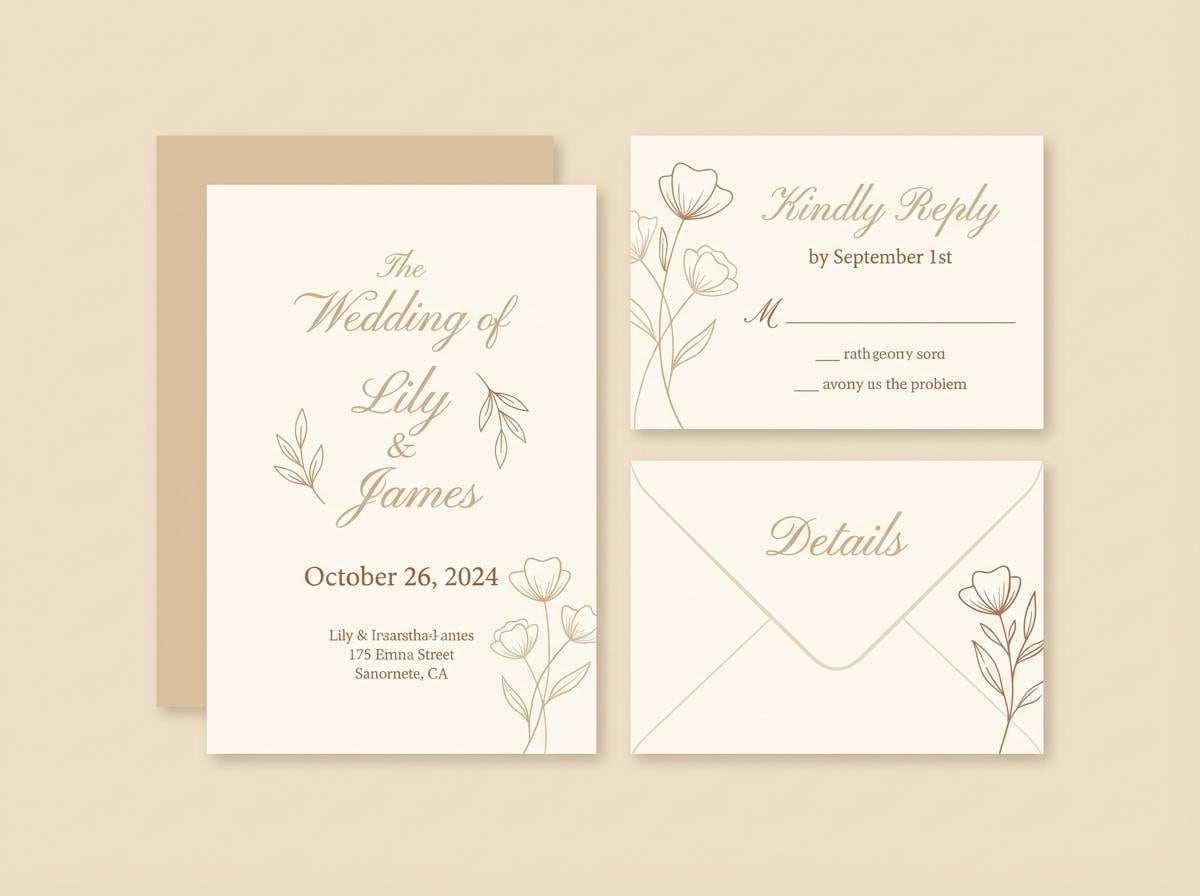
Best for: wedding invitation suite
Rustic adobe walls and warm evening light give this mix a handcrafted romance. Use the creamy base for the paper tone, then feature the adobe brown for names and key details. It pairs beautifully with deckled edges, letterpress textures, and dried-flower motifs. Tip: choose one ink color (the darkest brown) to keep the set elegant and legible.
Image example of rustic adobe generated using media.io
15) Minimal Taupe
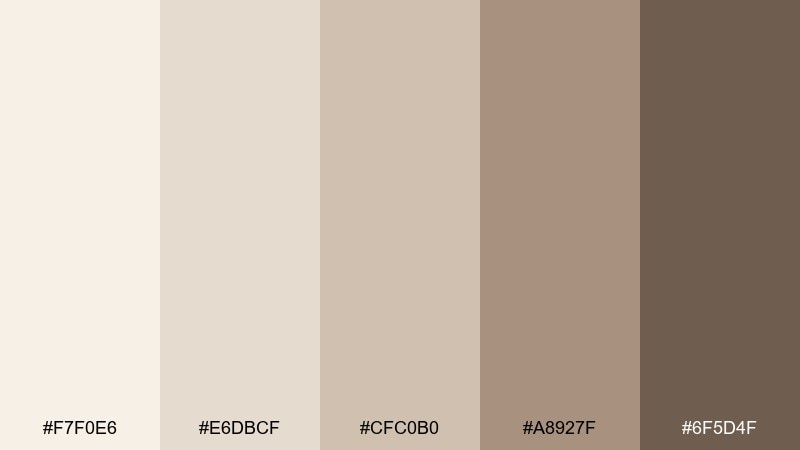
HEX: #F7F0E6 #E6DBCF #CFC0B0 #A8927F #6F5D4F
Mood: minimal, soft, contemporary
Best for: portfolio website landing section
Soft taupe and creamy whites feel contemporary, clean, and quietly confident. This sand color palette is ideal for portfolios where your work needs to stand out against gentle neutrals. Pair it with crisp black type, thin dividers, and large imagery blocks. Tip: use the mid taupe for hover states so interactions feel subtle, not flashy.
Image example of minimal taupe generated using media.io
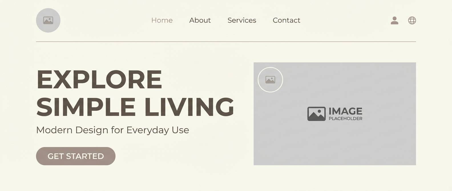
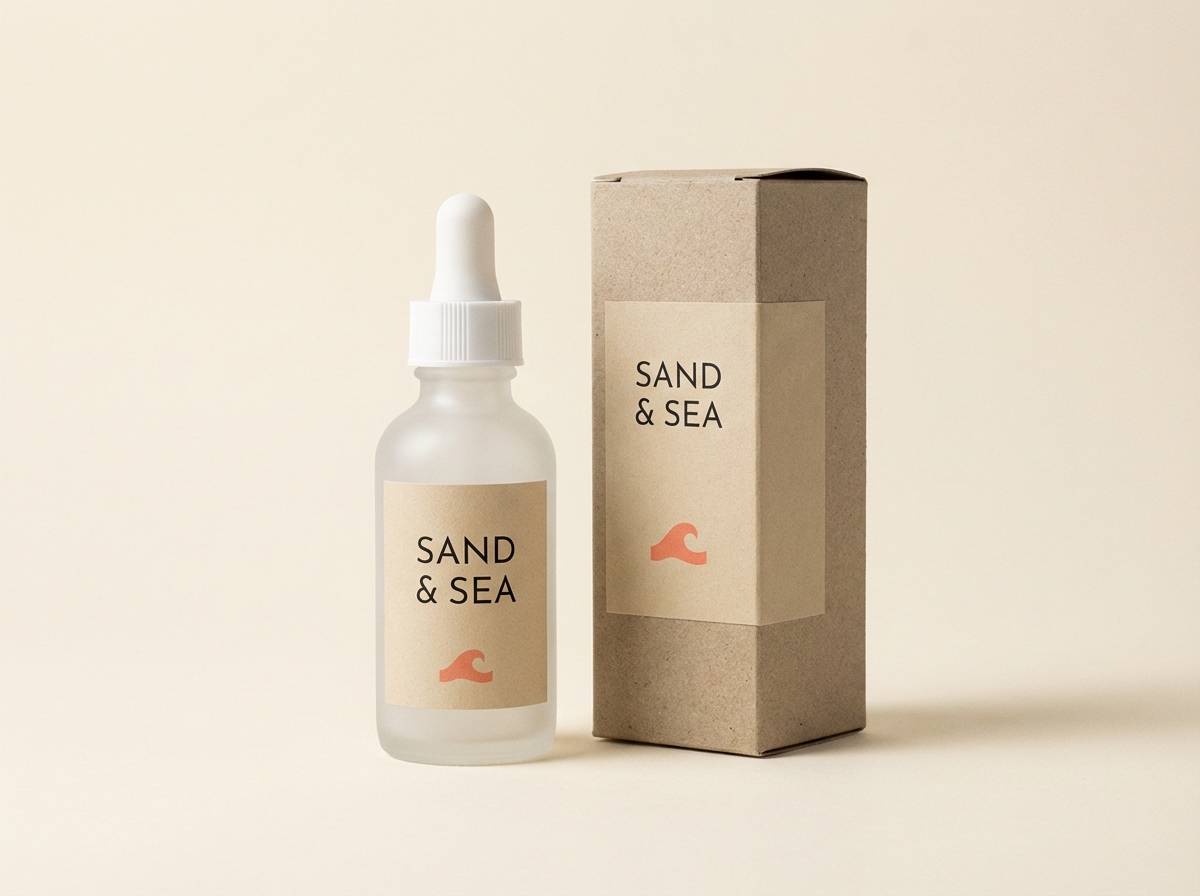
16) Coral Trace
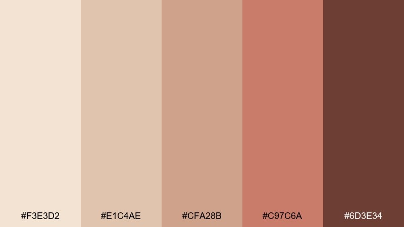
HEX: #F3E3D2 #E1C4AE #CFA28B #C97C6A #6D3E34
Mood: warm, friendly, modern
Best for: skincare product packaging
Warm sandy neutrals with a coral trace feel friendly, modern, and subtly uplifting. Use the blush-coral as a small accent for seals or key benefits, while the beige tones keep the design premium. It pairs well with minimal sans-serif typography and soft gradient backgrounds. Tip: keep coral to one or two elements per panel to avoid a pink overload.
Image example of coral trace generated using media.io
17) Olive Dust
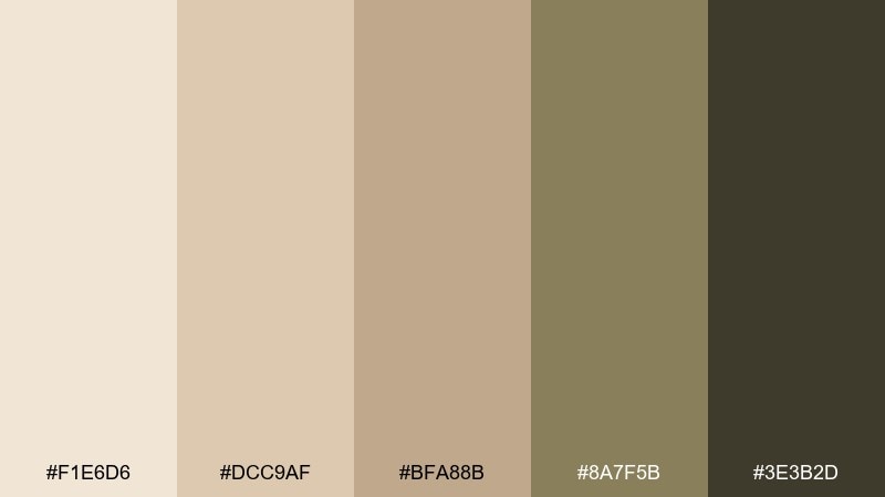
HEX: #F1E6D6 #DCC9AF #BFA88B #8A7F5B #3E3B2D
Mood: earthy, calm, natural
Best for: outdoor gear landing page banner
Dusty olive and sandy stone feel earthy and calm, like trail dust on canvas. These sand color combinations are great for outdoor brands that want warmth without going overly rugged. Pair the olive with simple topographic line patterns and keep the darkest shade for headings and buttons. Tip: use the lightest tone behind product photos so materials and details stay clear.
Image example of olive dust generated using media.io

18) Copper Mirage
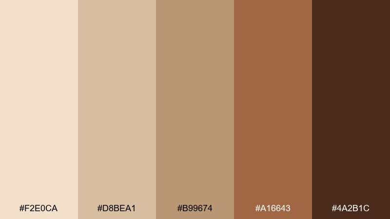
HEX: #F2E0CA #D8BEA1 #B99674 #A16643 #4A2B1C
Mood: glowing, dramatic, upscale
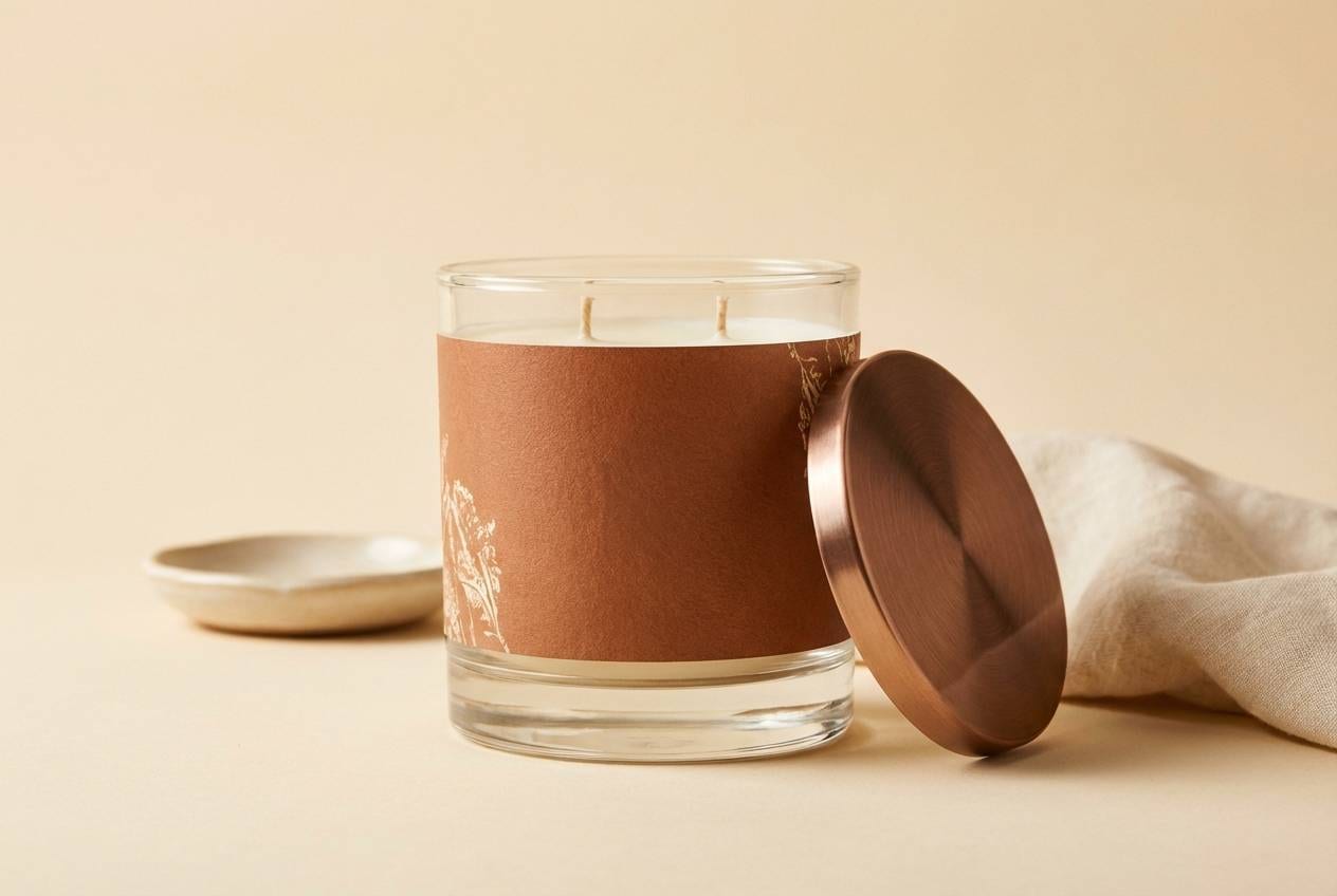
Best for: luxury candle product page visuals
Glowing copper and deep spice tones feel dramatic, like sunset reflecting off metal. Use the copper-brown for focal elements such as badges, prices, or callouts, and let the creamy sand keep everything airy. It pairs well with subtle gradients and elegant serif headlines. Tip: add a soft shadow in the darkest shade to create depth without introducing harsh black.
Image example of copper mirage generated using media.io
19) Blush Shell
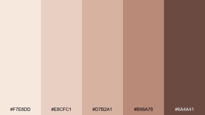
HEX: #F7E8DD #E8CFC1 #D7B2A1 #B98A78 #6A4A41
Mood: soft, romantic, gentle
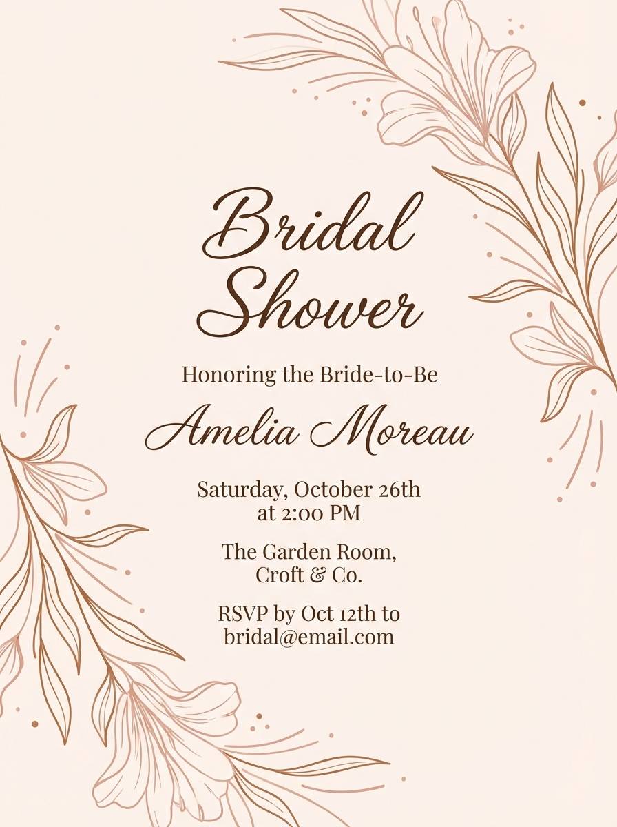
Best for: bridal shower invitation flyer
Soft blush shell tones feel gentle and romantic, like seashells scattered on pale sand. Use the blushes for illustration fills or monograms, and rely on the cocoa brown for readable text. It pairs beautifully with thin line florals and minimal borders. Tip: keep backgrounds very light so the blush accents stay fresh rather than muddy.
Image example of blush shell generated using media.io
20) Nightfall Dune
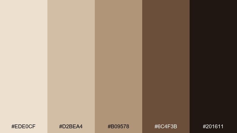
HEX: #EDE0CF #D2BEA4 #B09578 #6C4F3B #201611
Mood: cinematic, moody, sophisticated
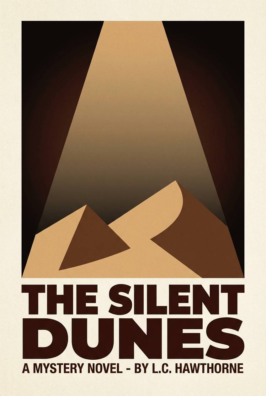
Best for: book cover design for a mystery novel
Cinematic dusk over dunes sets a moody, sophisticated tone with strong contrast. This sand color combination works best when the near-black is used for the title and framing shapes, while the lighter tans soften the backdrop. Pair it with minimal geometry and a single spotlight gradient for drama. Tip: test the darkest shade in print to ensure it reads as rich brown-black, not flat gray.
Image example of nightfall dune generated using media.io
What Colors Go Well with Sand?
Sand pairs naturally with deep browns, espresso, and warm charcoal for structure and readability. This is the easiest way to make sand feel intentional rather than “washed out,” especially in UI and editorial layouts.
For fresh contrast, add muted greens (sage, olive, forest) or dusty blues (slate, steel, denim). These cooler accents balance sand’s warmth without breaking the calm neutral mood.
If you want a more modern pop, use coral, terracotta, or copper as a controlled accent. Keep bright hues small—buttons, seals, or icons—so the palette stays premium and cohesive.
How to Use a Sand Color Palette in Real Designs
Start with role-based color assignment: pick one light tone as the background, one mid tone for surfaces (cards/sections), and one dark tone for text and key controls. This prevents the common “everything beige” problem.
Watch contrast carefully. Sand shades are close in value, so your typography and UI states should rely on the darkest shade (or a near-black) to stay accessible across screens and in print.
Texture helps sand look expensive. Subtle paper grain, watercolor edges, soft gradients, or matte material cues can add depth without adding extra colors.
Create Sand Palette Visuals with AI
If you already have a sand palette, the fastest way to validate it is to generate sample posters, banners, packaging, or UI blocks that match your HEX range. Seeing the colors in context makes decisions like “needs more contrast” immediately obvious.
Reuse the prompts above and simply swap the use case (menu, product ad, landing page) to create consistent variations for brand kits, social templates, and moodboards.
Sand Color Palette FAQs
-
What is a sand color palette?
A sand color palette is a set of warm neutrals inspired by dunes and natural materials—typically cream, beige, tan, taupe, and deep brown—used together to create soft, grounded designs. -
Is sand more beige or more yellow?
Most sand colors sit between beige and muted yellow. Some lean pink (blush sand), some lean olive/khaki, and some lean more brown depending on undertones. -
What accent colors look best with sand?
Sage/olive green, slate blue, terracotta, coral, copper, and warm black/espresso are reliable accents. Choose one accent and keep it limited for a clean, premium look. -
How do I make sand palettes feel modern (not outdated)?
Increase contrast (use a deep brown/near-black for type), keep layouts minimal, and add one contemporary accent (like muted coral or sage). Avoid using all tones at equal intensity. -
Are sand palettes good for UI and dashboards?
Yes—sand tones are easy on the eyes for large surfaces. Just ensure accessible contrast for text and controls, and consider adding a separate alert color for errors and critical states. -
How many sand shades should I use in one design?
Three to five is typical: a light background, a mid surface, a darker supporting neutral, and one deep anchor for text/buttons. Add an accent only if you need emphasis. -
Can I generate sand-themed visuals from these palettes with AI?
Yes. Use Media.io Text-to-Image and paste a prompt (like the examples above), then refine by specifying “warm sand neutrals,” “cream background,” and your preferred mood (minimal, rustic, cinematic).
Next: Peach Color Palette


