

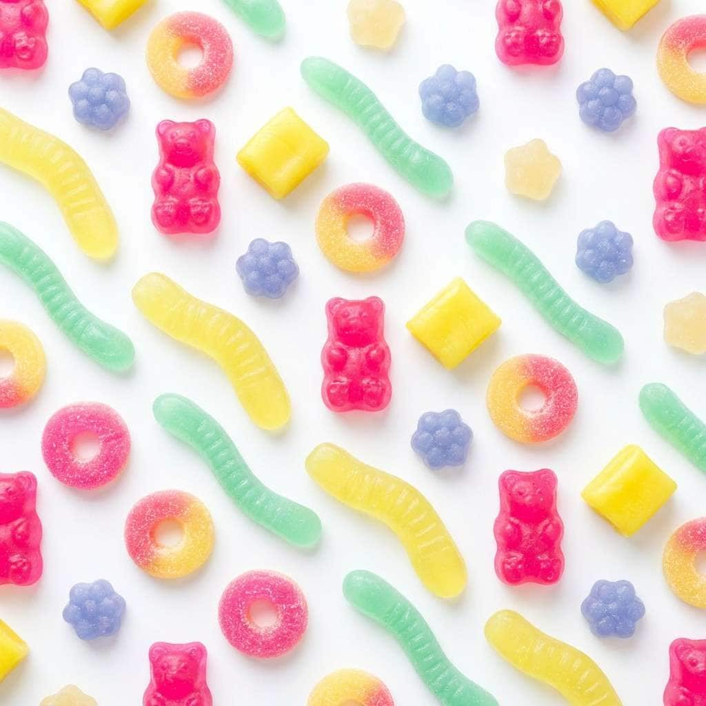
Candy color combinations are bright, friendly, and instantly attention-grabbing—perfect when you want a design to feel fun, youthful, and modern.
Below are 20 candy-inspired palette ideas with HEX codes, plus practical tips for UI, branding, and print so your sweet color combinations stay readable and intentional.
In this article
- Why Candy Color Palettes Work So Well
-
- gummy pop
- cotton candy sky
- lollipop parade
- jellybean garden
- bubblegum mint
- sour patch brights
- peach fizz
- marshmallow cream
- candy coated coral
- rainbow sherbet
- licorice twist
- sprinkle party
- toffee pastels
- candy rose latte
- fizzy lemonade
- iced cupcake
- frosted berry
- mint chocolate chip
- pastel neon arcade
- sugarplum sunset
- What Colors Go Well with Candy?
- How to Use a Candy Color Palette in Real Designs
- Create Candy Palette Visuals with AI
Why Candy Color Palettes Work So Well
Candy colors work because they trigger “treat” associations—playfulness, celebration, and instant delight. Even simple layouts feel more lively when you introduce a confident pink, lemon yellow, or mint.
They also create strong visual hierarchy. Bright accents naturally pull focus, so you can guide users to CTAs, price tags, badges, and headlines without relying on heavy shapes or extra text.
With the right balance of white space and one dark neutral for type, candy color combinations can look surprisingly modern—more “premium playful” than childish.
20+ Candy Color Palette Ideas (with HEX Codes)
1) Gummy Pop
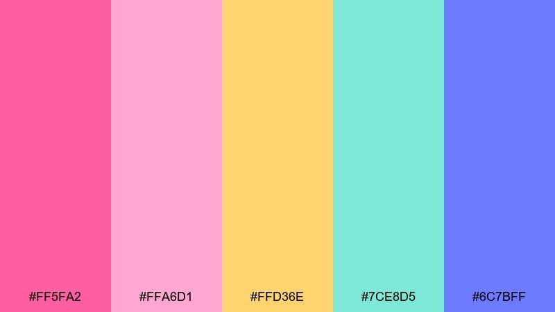
HEX: #FF5FA2 #FFA6D1 #FFD36E #7CE8D5 #6C7BFF
Mood: playful and juicy
Best for: social media promos for a candy shop
Playful and juicy, it feels like a handful of gummies under bright shop lights. Use this candy color scheme for punchy promos, price tags, and limited-time drops where you want instant scroll-stopping color. Pair it with crisp white space and a dark navy for readable type. Tip: keep the hot pink for headlines and use mint as a calming counterbalance.
Image example of gummy pop generated using media.io
Media.io is an online AI studio for creating and editing video, image, and audio in your browser.

2) Cotton Candy Sky
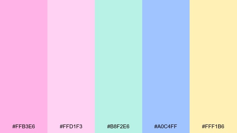
HEX: #FFB3E6 #FFD1F3 #B8F2E6 #A0C4FF #FFF1B6
Mood: dreamy and airy
Best for: baby shower invitation design
Dreamy and airy, this candy palette reads like cotton candy clouds drifting across a morning sky. It shines on invitations, RSVP cards, and soft announcements where warmth matters more than contrast. Balance it with simple black or charcoal typography and plenty of margin. Tip: let the pale blue carry large shapes and reserve the pink for small celebratory accents.
Image example of cotton candy sky generated using media.io

3) Lollipop Parade
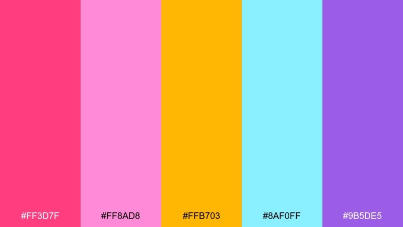
HEX: #FF3D7F #FF8AD8 #FFB703 #8AF0FF #9B5DE5
Mood: bold and celebratory
Best for: festival poster graphics
Bold and celebratory, these candy colors evoke spinning lollipops, stripes, and confetti bursts. Use them on posters and event graphics that need strong hierarchy and instant energy. Pair with thick sans-serif type and geometric shapes for a modern look. Tip: keep yellow as the spotlight color so the pink and purple do not compete for attention.
Image example of lollipop parade generated using media.io

4) Jellybean Garden
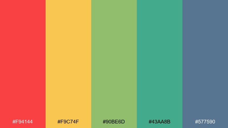
HEX: #F94144 #F9C74F #90BE6D #43AA8B #577590
Mood: cheerful and outdoorsy
Best for: spring botanical illustrations
Cheerful and outdoorsy, it feels like jellybeans scattered through fresh leaves and sunny petals. It works beautifully for seasonal illustrations, packaging art, and playful pattern design. Pair it with warm off-whites and light paper textures to keep the look natural. Tip: use the teal and slate blue for shadows so the bright warm tones stay clean.
Image example of jellybean garden generated using media.io

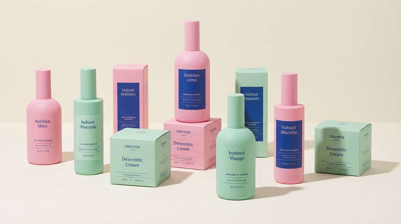
5) Bubblegum Mint
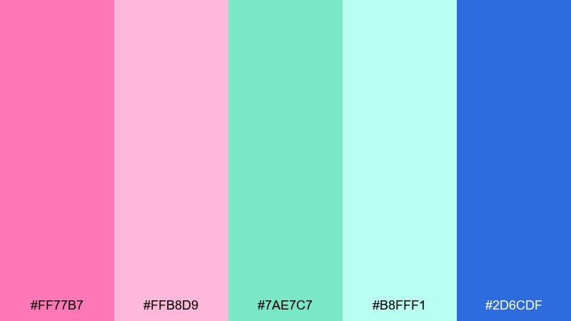
HEX: #FF77B7 #FFB8D9 #7AE7C7 #B8FFF1 #2D6CDF
Mood: fresh and glossy
Best for: skincare packaging and product ads
Fresh and glossy, this candy color palette brings bubblegum sweetness with a cool mint finish. Use it on beauty packaging, product launches, and landing pages where clean trust meets playful charm. Pair with plenty of white and one deep blue for brand authority. Tip: put the deep blue on small type and icons to keep readability without dulling the mood.
Image example of bubblegum mint generated using media.io
6) Sour Patch Brights
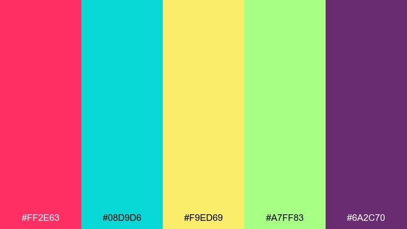
HEX: #FF2E63 #08D9D6 #F9ED69 #A7FF83 #6A2C70
Mood: electric and high-contrast
Best for: gaming stream overlay UI
Electric and high-contrast, it feels like sour candy dust and arcade lights. This candy color palette is ideal for overlays, badges, and alert states where you need instant visibility. Pair it with a dark neutral background so the brights stay crisp. Tip: limit yourself to two dominant accents per screen to avoid visual noise.
Image example of sour patch brights generated using media.io
7) Peach Fizz
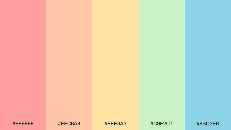
HEX: #FF9F9F #FFC6A8 #FFE3A3 #C9F2C7 #8BD3E6
Mood: light and refreshing
Best for: cafe menu design
Light and refreshing, it evokes peach soda, citrus foam, and a cool breeze. It works well for menus, small posters, and loyalty cards where you want friendly color without shouting. Pair with warm neutrals and simple line icons for a modern feel. Tip: keep the aqua as a thin rule or button color to guide the eye through sections.
Image example of peach fizz generated using media.io
8) Marshmallow Cream
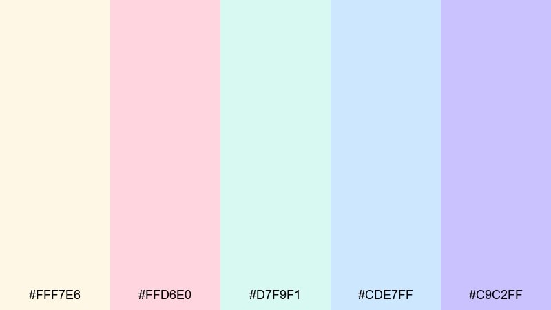
HEX: #FFF7E6 #FFD6E0 #D7F9F1 #CDE7FF #C9C2FF
Mood: soft and comforting
Best for: wedding website hero UI
Soft and comforting, these candy colors feel like marshmallows, blush tulle, and gentle morning light. Use them for wedding sites, RSVP flows, and elegant announcements where calm matters. Pair with refined serif type and subtle texture to avoid a flat look. Tip: use lavender for primary buttons and keep blush for decorative flourishes.
Image example of marshmallow cream generated using media.io
9) Candy Coated Coral
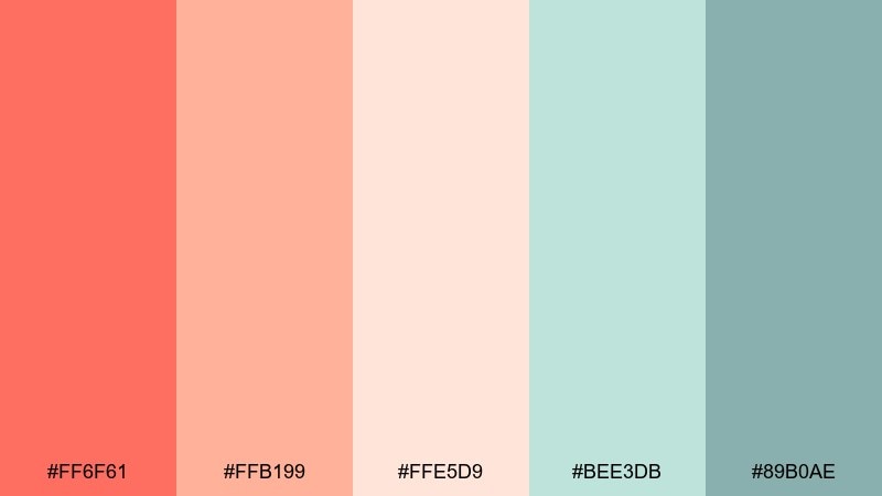
HEX: #FF6F61 #FFB199 #FFE5D9 #BEE3DB #89B0AE
Mood: warm and approachable
Best for: lifestyle blog branding kit
Warm and approachable, it brings coral gloss with a coastal, spa-like calm. As a candy color combination, it fits logo variations, highlight colors, and templates that need a friendly personality. Pair it with clean whites and a dark gray for text so the soft tones stay readable. Tip: use sage-teal for interface elements like links and dividers to keep the coral from dominating.
Image example of candy coated coral generated using media.io

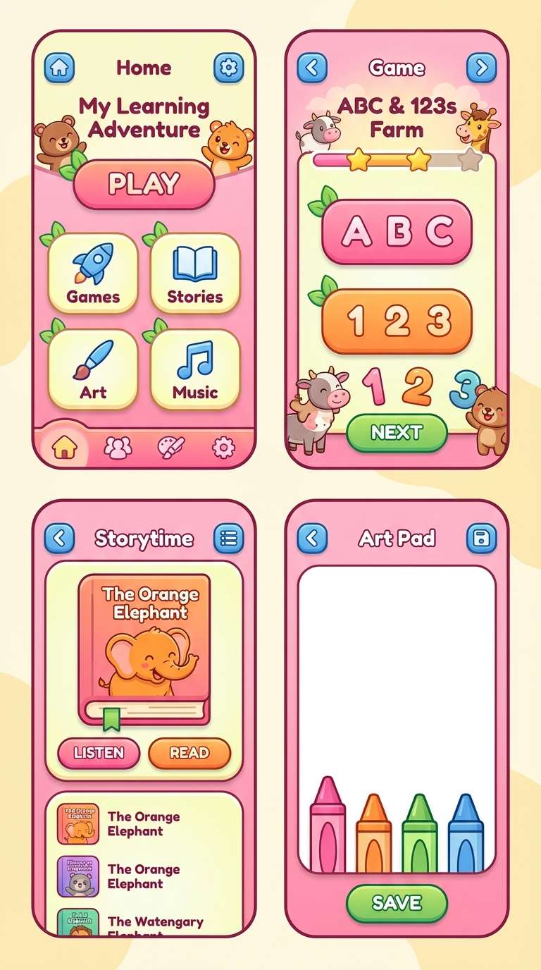
10) Rainbow Sherbet
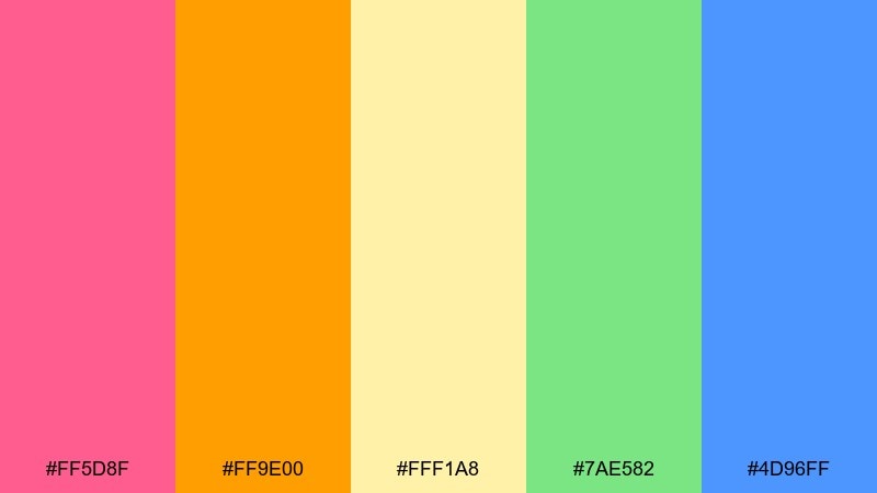
HEX: #FF5D8F #FF9E00 #FFF1A8 #7AE582 #4D96FF
Mood: sunny and upbeat
Best for: kids learning app UI
Sunny and upbeat, it looks like scoops of sherbet melting into bright stripes. It is great for kid-friendly UI, stickers, and playful onboarding where buttons should feel inviting. Pair it with rounded shapes and lots of whitespace to prevent clutter. Tip: keep blue for icons and navigation while the warmer colors handle rewards and highlights.
Image example of rainbow sherbet generated using media.io
11) Licorice Twist
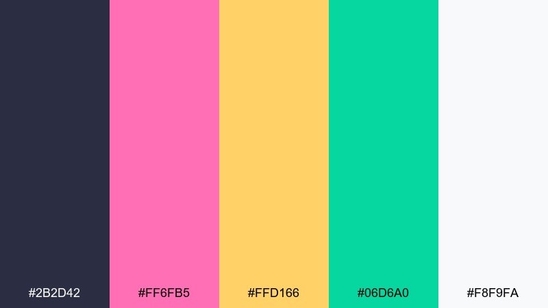
HEX: #2B2D42 #FF6FB5 #FFD166 #06D6A0 #F8F9FA
Mood: punchy and modern
Best for: streetwear product ads
Punchy and modern, it mixes dark licorice depth with sweet, glossy highlights. Use it for product ads, lookbooks, and hero banners where contrast and attitude are key. Pair it with bold typography and plenty of negative space to feel premium. Tip: reserve the pink for callouts and let the dark base carry most backgrounds.
Image example of licorice twist generated using media.io
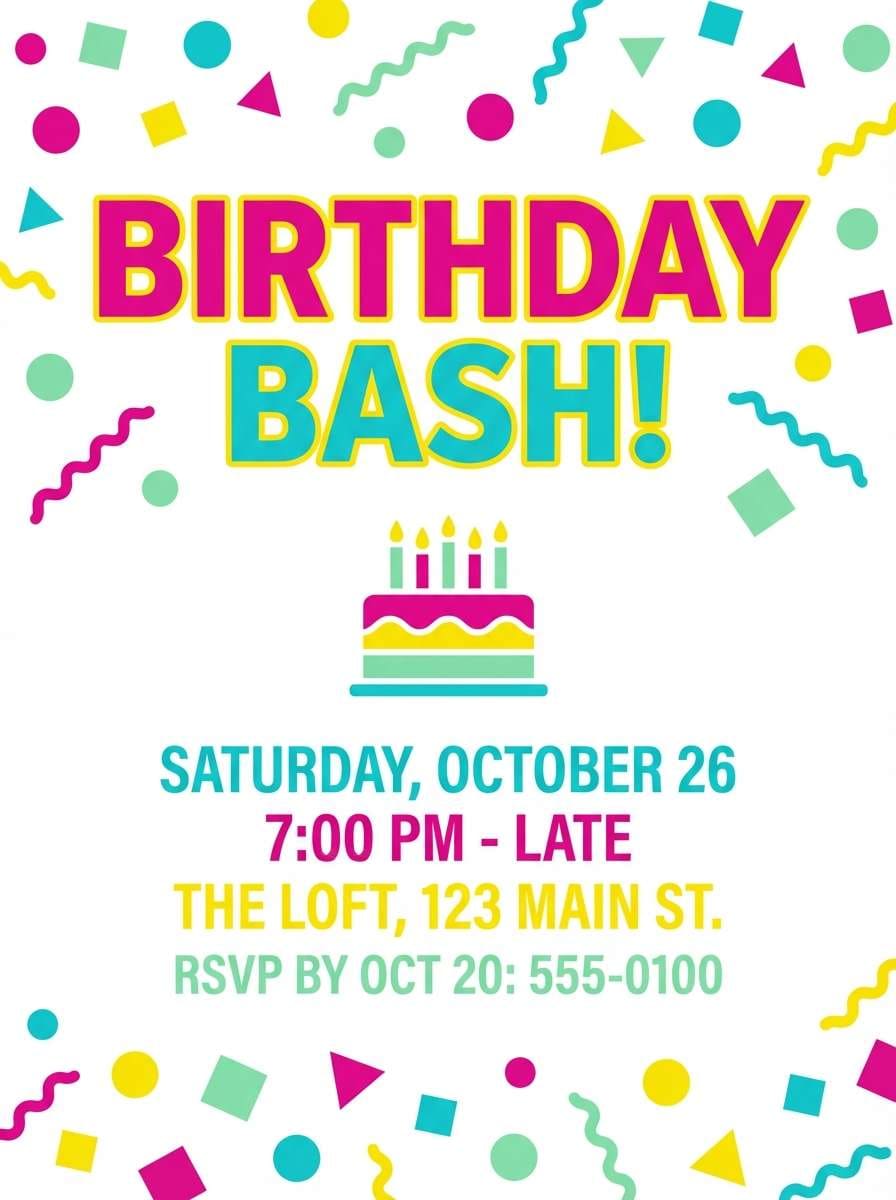
12) Sprinkle Party
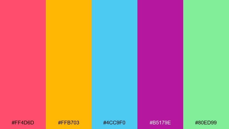
HEX: #FF4D6D #FFB703 #4CC9F0 #B5179E #80ED99
Mood: festive and loud
Best for: birthday flyer design
Festive and loud, it feels like sprinkles bouncing across frosting and party hats. These candy color combinations work best on flyers, stories, and quick promos where bold shapes do most of the talking. Pair it with a plain white background and tight color blocking for clarity. Tip: use aqua for secondary info so the fuchsia can own the headline.
Image example of sprinkle party generated using media.io
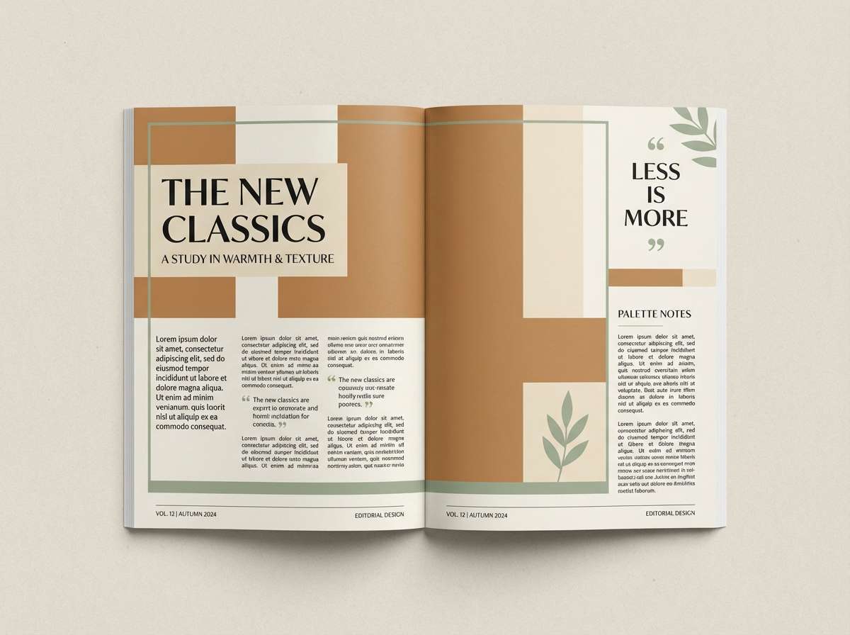
13) Toffee Pastels
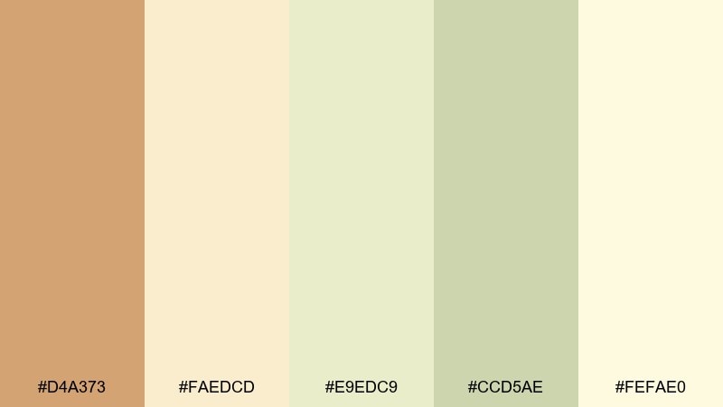
HEX: #D4A373 #FAEDCD #E9EDC9 #CCD5AE #FEFAE0
Mood: warm and mellow
Best for: food blog editorial layouts
Warm and mellow, it suggests toffee drizzle, oat milk, and sunlit parchment. Use it for editorial layouts, recipe cards, and blog templates that need a calm, readable tone. Pair with dark espresso text and subtle grid lines for structure. Tip: let the toffee brown anchor headers while the pale creams carry backgrounds.
Image example of toffee pastels generated using media.io
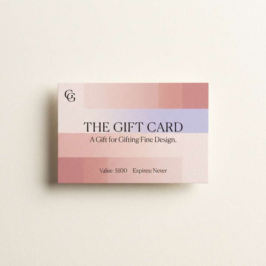
14) Candy Rose Latte
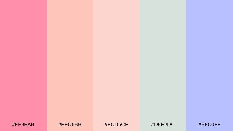
HEX: #FF8FAB #FEC5BB #FCD5CE #D8E2DC #B8C0FF
Mood: romantic and polished
Best for: boutique gift card design
Romantic and polished, it evokes rose latte foam and soft silk ribbons. A candy color scheme like this is perfect for gift cards, boutique promos, and feminine brand touchpoints. Pair it with minimal layouts and a single dark text color for refinement. Tip: use lavender as a thin border or seal element to add structure without heaviness.
Image example of candy rose latte generated using media.io
15) Fizzy Lemonade
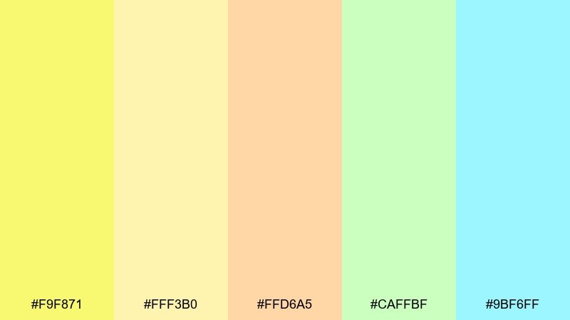
HEX: #F9F871 #FFF3B0 #FFD6A5 #CAFFBF #9BF6FF
Mood: zesty and bright
Best for: summer event web banner
Zesty and bright, it feels like sparkling lemonade with citrus slices and ice. It works great for summer banners, pop-up announcements, and lighthearted campaigns that should feel fresh. Pair with simple sans-serif type and generous spacing for an airy finish. Tip: keep yellow dominant and use aqua sparingly to avoid a washed-out look.
Image example of fizzy lemonade generated using media.io
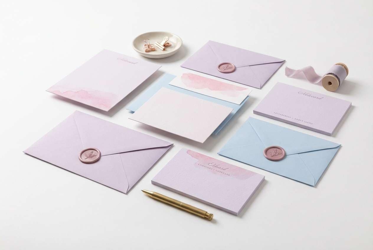
16) Iced Cupcake
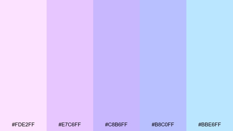
HEX: #FDE2FF #E7C6FF #C8B6FF #B8C0FF #BBE6FF
Mood: sweet and delicate
Best for: stationery set mockups
Sweet and delicate, this candy color palette brings frosted cupcake icing and soft pastel sprinkles. Use it for stationery, thank-you cards, and brand collateral that needs a gentle, thoughtful tone. Pair with light gray typography and subtle emboss-style shapes for depth. Tip: place the lightest pink as the background and layer lilac blocks to define sections.
Image example of iced cupcake generated using media.io
17) Frosted Berry
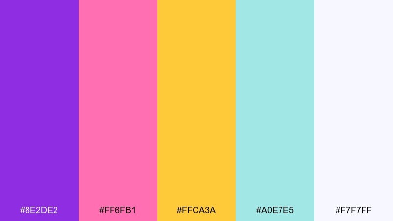
HEX: #8E2DE2 #FF6FB1 #FFCA3A #A0E7E5 #F7F7FF
Mood: vivid and glossy
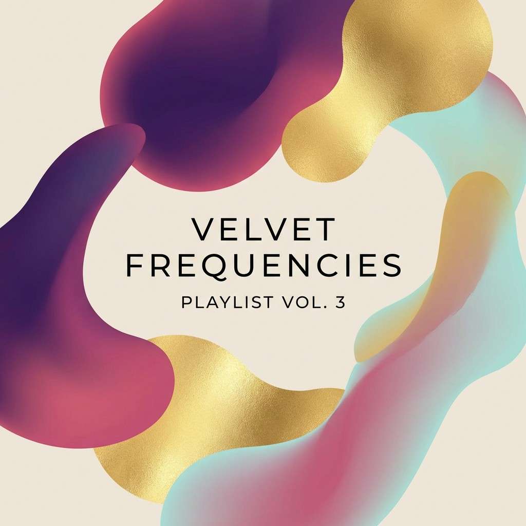
Best for: music playlist cover art
Vivid and glossy, it feels like berry glaze with a bright citrus sparkle. It is a strong fit for cover art, thumbnails, and creator graphics that need clear shapes at small sizes. Pair with high-contrast type and simple gradients to keep it modern. Tip: make purple the base layer and use yellow only for highlights and badges.
Image example of frosted berry generated using media.io
18) Mint Chocolate Chip
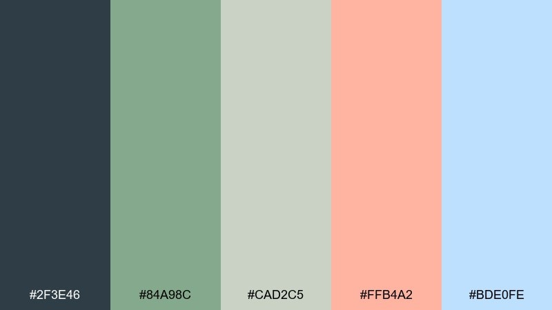
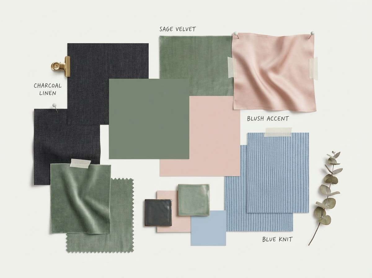
HEX: #2F3E46 #84A98C #CAD2C5 #FFB4A2 #BDE0FE
Mood: cool and grounded
Best for: interior design mood boards
Cool and grounded, it recalls mint gelato with dark chocolate flecks and soft pastel decor. Use it for interior mood boards, home brand lookbooks, and calm presentation slides. Pair it with natural textures like linen and light wood tones to keep it sophisticated. Tip: use the deep charcoal for headers and let sage carry large blocks and panels.
Image example of mint chocolate chip generated using media.io
19) Pastel Neon Arcade
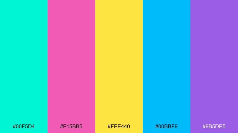
HEX: #00F5D4 #F15BB5 #FEE440 #00BBF9 #9B5DE5
Mood: retro and energetic
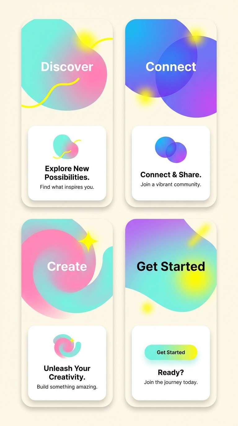
Best for: app onboarding screen UI
Retro and energetic, this candy color combination channels arcade tokens, glowing signs, and pastel neon trails. It works for onboarding screens, feature callouts, and playful microinteractions where color guides the flow. Pair with dark text on light surfaces or invert it for a nighttime mode. Tip: pick one dominant accent per screen and use the rest only for icons and progress states.
Image example of pastel neon arcade generated using media.io
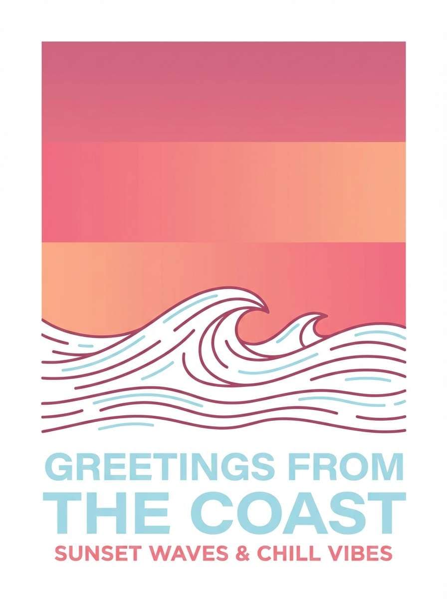
20) Sugarplum Sunset
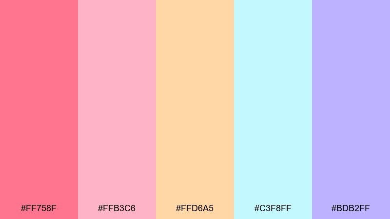
HEX: #FF758F #FFB3C6 #FFD6A5 #C3F8FF #BDB2FF
Mood: soft and optimistic
Best for: travel postcard designs
Soft and optimistic, it feels like a sugarplum sunset fading into pastel dusk. Use it for postcards, travel promos, and cheerful prints that need warmth without heavy saturation. Pair with simple line art and clean margins for a modern souvenir vibe. Tip: let rose and peach form the main gradient and keep the icy blue for small, crisp highlights.
Image example of sugarplum sunset generated using media.io
What Colors Go Well with Candy?
Candy colors pair best with simple neutrals that keep the palette readable: crisp white, warm ivory, light gray, and deep charcoal. These grounding tones prevent bright pinks, yellows, and mints from feeling overwhelming.
For a modern look, add one “ink” color (navy, espresso, or near-black) for typography and UI icons. This keeps contrast high while letting the candy accents stay vibrant.
If you want extra depth, try one muted companion shade (dusty lavender, sage, or slate blue). It helps gradients, shadows, and backgrounds feel more designed—not just colorful.
How to Use a Candy Color Palette in Real Designs
In UI, treat candy colors as accents: buttons, badges, progress states, and illustrations. Keep surfaces light and consistent so the bright tones communicate action instead of noise.
In branding, pick one signature candy hue (like hot pink or sherbet orange) and build a small system around it: 1 primary, 1 secondary, 1 highlight, plus neutrals. This makes templates and social posts easy to scale.
For print, test your candy palette on real paper tones. Pastels can shift on uncoated stock, so use an off-white background and slightly deepen key colors if you need stronger legibility.
Create Candy Palette Visuals with AI
If you want to preview how candy color combinations look in posters, packaging, UI mockups, or mood boards, generating quick visuals helps you decide faster than tweaking swatches in a vacuum.
With Media.io Text-to-Image, you can describe a scene (like “gummy candy flat lay” or “pastel neon onboarding screens”), then iterate on lighting, style, and composition while keeping your palette direction consistent.
Save the best outputs as references for your brand kit, client presentations, or design system documentation.
Candy Color Palette FAQs
-
What are “candy colors” in design?
Candy colors are bright or pastel hues that feel sweet, playful, and high-energy—often including pinks, lemon yellows, mints, aqua blues, and soft purples. They’re commonly used in playful branding, youth-focused UI, and promotional graphics. -
Are candy color palettes the same as pastel palettes?
Not always. Many candy palettes are pastel, but “candy” can also include high-saturation, neon-like accents (for example, hot pink or electric aqua). Candy palettes focus more on a fun, treat-like mood than on lightness alone. -
How do I make a candy palette look modern (not childish)?
Use plenty of white space, limit your accents, and add one dark neutral (charcoal or navy) for typography. Clean layouts, strong hierarchy, and simple shapes keep candy colors feeling polished. -
What’s the best background color for candy UI palettes?
Light neutrals (white, warm ivory, very light gray) are the safest for readability and a fresh look. For high-contrast candy palettes, a deep charcoal background can make neon accents pop—just keep text contrast accessible. -
How many candy colors should I use in one design?
For most designs, pick 1–2 dominant candy colors and reserve the rest for highlights, icons, or small decorative elements. Too many equally loud colors can flatten hierarchy and feel chaotic. -
Do candy colors print well?
They can, but pastels may look lighter on uncoated paper and neons can shift depending on ink and stock. Always run a test print (or proof) and consider slightly deepening key colors used for text or important UI-like labels. -
How can I quickly visualize candy color palette ideas?
Generate mockups with AI (posters, packaging, UI screens, mood boards) using a text-to-image tool, then refine prompts until the vibe matches your brand. This is a fast way to validate color direction before production.
Next: 8 Bit Color Palette


