

An 8 bit color palette is built for clarity: fewer colors, stronger contrast, and shapes that read instantly—even at tiny pixel sizes. That’s why retro game palettes still influence modern UI, branding, posters, and merch.
Below are 20 pixel-ready 8 bit color scheme ideas with HEX codes, plus practical tips on pairing and using them in real designs.
In this article
Why 8 Bit Palettes Work So Well
8 bit palettes prioritize readability. With a small set of strong hues, your characters, icons, and UI states stay recognizable without relying on subtle gradients.
They also create instant mood. High-contrast neons feel arcade-loud, while earthy greens and browns read like classic adventure maps—using the same pixel art colors logic.
Finally, the limitations are a feature: fewer choices means more consistent design. That consistency helps across sprites, UI, posters, and branding color palette systems.
20+ 8 Bit Color Palette Ideas (with HEX Codes)
1) Neon Arcade
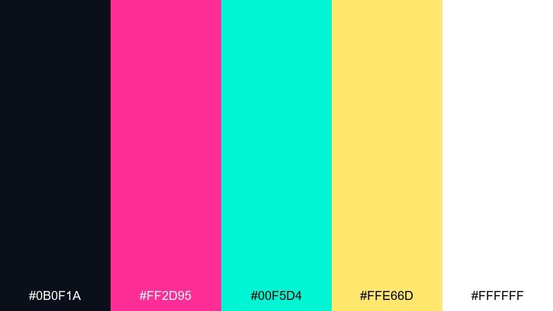
HEX: #0b0f1a #ff2d95 #00f5d4 #ffe66d #ffffff
Mood: electric, playful, high-contrast
Best for: 2D game UI mockup for an arcade-style start screen
Electric and loud, these tones feel like glowing cabinet lights in a dark arcade. The hot pink and aqua pop hard against the near-black, while the warm yellow acts as a coin-slot highlight. Use it for headers, buttons, and score callouts where clarity matters. For balance, keep most panels dark and reserve the brights for interactive states and rewards in your 8 bit color palette.
Image example of neon arcade generated using media.io

Media.io is an online AI studio for creating and editing video, image, and audio in your browser.

2) Pixel Forest
HEX: #1b2a1f #2e7d32 #aeea00 #8d6e63 #f1f8e9
Mood: earthy, adventurous, outdoorsy
Best for: pixel art forest landscape illustration
Earthy and adventurous, it evokes mossy trails, shadowed canopies, and bright leaf shimmer. The deep greens give structure, the lime adds sparkle for pickups or fireflies, and the brown grounds trunks and paths. It works great for side-scroller backgrounds, map tiles, or nature-themed badges. Tip: use the off-white as fog or light rays to keep the scene readable without washing out the greens.
Image example of pixel forest generated using media.io

3) Sunset Cartridge
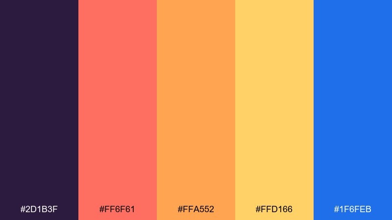
HEX: #2d1b3f #ff6f61 #ffa552 #ffd166 #1f6feb
Mood: nostalgic, warm, energetic
Best for: retro poster design on a plain background
Nostalgic and punchy, it feels like a sunset gradient printed on a well-loved game cartridge label. Coral and orange drive the warmth, while the deep purple and crisp blue add that classic retro tension. These 8 bit color combinations shine on posters, album covers, and limited-run merch where bold shapes do the talking. Tip: keep the blue for small type or icons so it reads as a cool counterpoint, not a second theme.
Image example of sunset cartridge generated using media.io

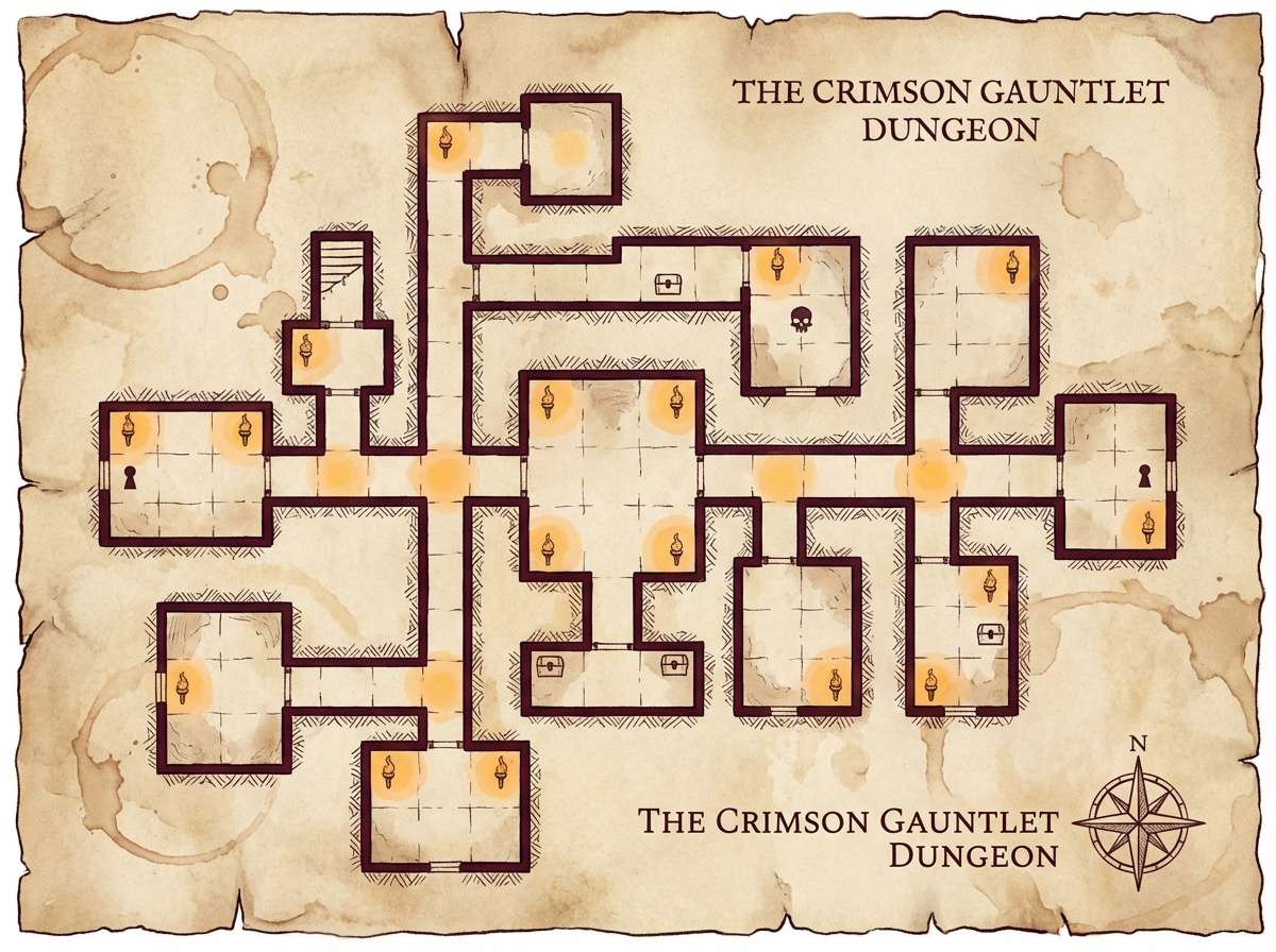
4) Dungeon Torchlight
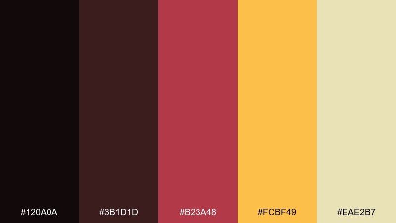
HEX: #120a0a #3b1d1d #b23a48 #fcbf49 #eae2b7
Mood: moody, gritty, dramatic
Best for: tabletop RPG dungeon map illustration
Moody and gritty, it brings to mind stone corridors lit by a single torch flicker. The deep maroons build shadowy depth, and the golden amber reads like firelight for traps, loot, or quest markers. Use it for dungeon maps, roguelike menus, or dark fantasy cover art. Tip: reserve the pale parchment tone for labels and legend boxes so the map stays legible against the reds.
Image example of dungeon torchlight generated using media.io
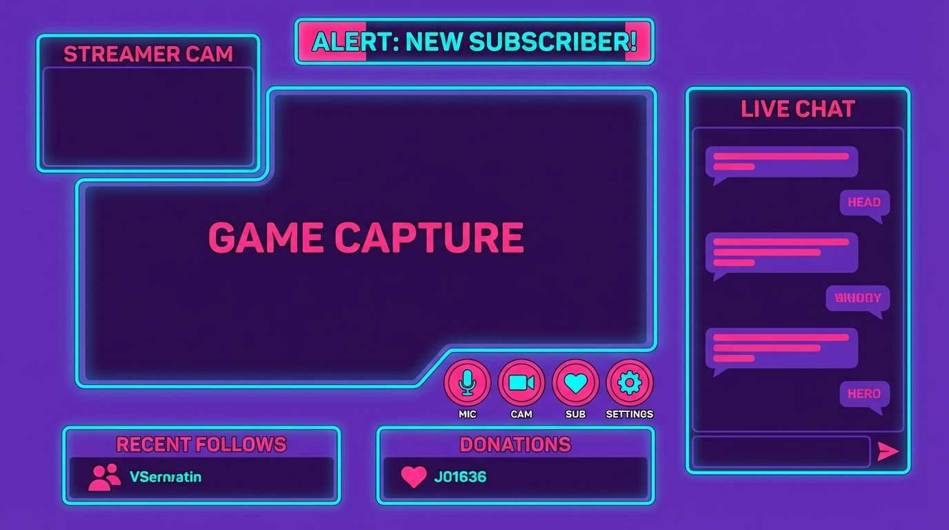
5) Bubblegum RPG

HEX: #2a1e5c #ff4fd8 #7c4dff #00e5ff #f8f9fa
Mood: cute, flashy, upbeat
Best for: 2D streamer overlay UI mockup
Cute and flashy, it feels like sparkly loot drops and upbeat menu jingles. The violet base keeps the neon accents under control, while pink and cyan deliver instant energy for alerts and buttons. It fits overlays, chat badges, and playful brand identities that want a retro twist without looking dusty. Tip: use white for type and leave the neons for edges, glows, and call-to-action elements.
Image example of bubblegum rpg generated using media.io
6) Desert Dither
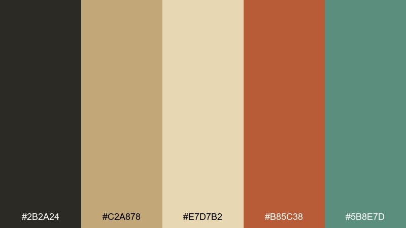
HEX: #2b2a24 #c2a878 #e7d7b2 #b85c38 #5b8e7d
Mood: sunbaked, calm, vintage
Best for: editorial magazine layout
Sunbaked and calm, it suggests dusty trails, faded postcards, and soft afternoon heat. The sand and cream tones make an easy base, while clay red adds warmth and the muted teal provides a cool accent. It works beautifully in editorial spreads, lookbooks, and story-driven branding where photos need breathing room. Tip: keep the teal to small rules, captions, or pull-quote marks for a refined contrast.
Image example of desert dither generated using media.io

7) Ocean Chip
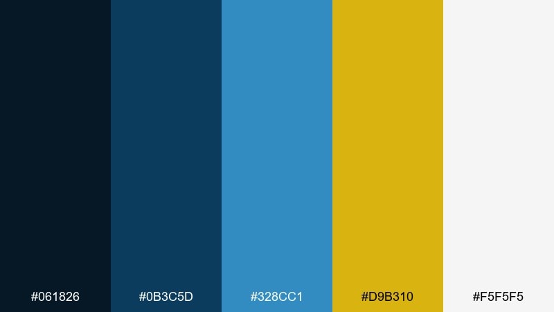
HEX: #061826 #0b3c5d #328cc1 #d9b310 #f5f5f5
Mood: crisp, nautical, confident
Best for: realistic studio shot of product packaging for a sea-salt snack
Crisp and nautical, it feels like deep water, clean air, and a flash of sun on waves. The layered blues carry most of the weight, while the gold reads like a premium seal or flavor badge. Use it for packaging, labels, and web hero sections where you want trust with a spark of energy. Tip: let the light gray act as negative space so the blues stay sharp instead of heavy.
Image example of ocean chip generated using media.io
8) Candy Console
HEX: #1a1026 #ff7aa2 #ffd6e8 #7afcff #5a4fcf
Mood: sweet, dreamy, youthful
Best for: birthday invitation flyer on a plain background
Sweet and dreamy, it evokes glossy buttons, cotton-candy skies, and pastel pixels. The soft pinks are friendly for backgrounds and shapes, while cyan and indigo add a cool, modern edge. Great for invitations, stickers, and playful social posts where you want charm without losing contrast. Tip: set key text in indigo and use cyan only for small icons or confetti details.
Image example of candy console generated using media.io

9) Monochrome CRT
HEX: #050607 #2a2d34 #6c757d #adb5bd #f8f9fa
Mood: minimal, technical, timeless
Best for: 2D UI kit mockup for a settings dashboard
Minimal and technical, it recalls scanlines, terminal windows, and clean monochrome hardware. The stepped grays give you a reliable hierarchy for panels, dividers, and disabled states. As an 8 bit color scheme, it pairs well with a single bright accent if you need one, but it also stands strong on its own. Tip: use the darkest tone sparingly for text so the UI feels modern instead of heavy.
Image example of monochrome crt generated using media.io

10) Lava Boss
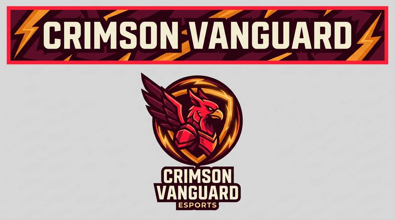
HEX: #1b0b0b #5c1a1b #e63946 #ffb703 #fefae0
Mood: intense, competitive, fiery
Best for: esports logo and brand banner on a plain background
Intense and fiery, it feels like a boss arena lit by magma and warning lights. The reds deliver urgency, the amber works as a power-up highlight, and the warm off-white keeps type readable. These 8 bit color combinations are ideal for esports branding, promo banners, and punchy thumbnails. Tip: keep the off-white for text and use the brightest red only for the main emblem so it stays iconic at small sizes.
Image example of lava boss generated using media.io
11) Space Station

HEX: #0b132b #1c2541 #3a506b #5bc0be #f2f4f8
Mood: cool, futuristic, controlled
Best for: 2D analytics dashboard UI mockup
Cool and controlled, it suggests quiet corridors, blue-lit consoles, and distant stars. The navy stack creates a strong grid foundation, and the teal reads as an active state without turning neon. Use it for dashboards, SaaS UI, and sci-fi branding where clarity comes first. Tip: apply teal to charts and key buttons only, and keep the light tone for surfaces to avoid a cramped interface.
Image example of space station generated using media.io

12) Meadow Sprites
HEX: #1e3a2f #3fb950 #a7f3d0 #f59e0b #fff7ed
Mood: fresh, whimsical, springlike
Best for: watercolor botanical illustration
Fresh and whimsical, it feels like tiny sprites hiding in clover and morning dew. The greens cover everything from stems to shadows, while the soft mint adds airy highlights. The warm amber works nicely for pollen, blossoms, or small focal points. Tip: let the creamy off-white be your paper tone so the illustration stays light and handcrafted.
Image example of meadow sprites generated using media.io

13) Cyber Noir
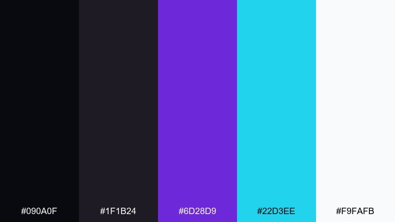
HEX: #090a0f #1f1b24 #6d28d9 #22d3ee #f9fafb
Mood: slick, moody, futuristic
Best for: nightlife event poster on a plain background
Slick and moody, it evokes neon signs reflected in rainy streets and late-night synth beats. The near-black base makes violet feel luxurious, while cyan adds a sharp, digital edge for dates and venues. Use it for event posters, music covers, and tech-forward announcements. Tip: keep body text in off-white and use cyan only for key details so the poster stays readable from a distance.
Image example of cyber noir generated using media.io

14) Peachy Pixels
HEX: #3d2b1f #ffadad #ffd6a5 #fdffb6 #caffbf
Mood: soft, friendly, optimistic
Best for: wedding invitation card design on a plain background
Soft and optimistic, it feels like sunrise pastels and gentle pixel confetti. The peach and butter tones keep the layout warm, while the mint adds a clean breath of freshness. Perfect for invitations, thank-you cards, and lifestyle branding that wants a light touch. Tip: use the brown for names and headings to keep contrast high without turning the design harsh.
Image example of peachy pixels generated using media.io

15) Ice Cave
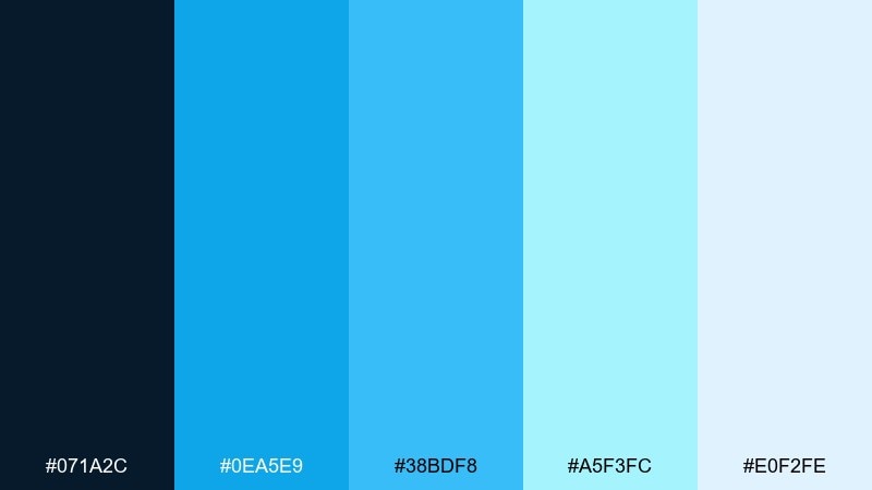
HEX: #071a2c #0ea5e9 #38bdf8 #a5f3fc #e0f2fe
Mood: icy, clean, modern
Best for: 2D app onboarding screen set
Icy and clean, it suggests glacier light, frozen tunnels, and crisp winter air. The bright blues work beautifully for progress steps and illustration highlights, while the deep navy keeps the interface grounded. Use it for fintech, weather apps, or onboarding flows that need a fresh, trustworthy feel. Tip: pair the palest tone with subtle gradients to avoid banding while keeping the look minimalist.
Image example of ice cave generated using media.io

16) Copper Circuit
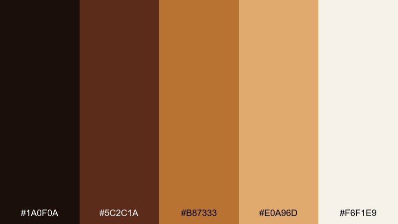
HEX: #1a0f0a #5c2c1a #b87333 #e0a96d #f6f1e9
Mood: warm, industrial, premium
Best for: realistic studio shot of electronic accessory packaging
Warm and industrial, it brings to mind copper traces, solder points, and a polished workshop bench. The browns and metallic copper tones feel premium without going flashy, and the light cream keeps the label clean. It fits hardware packaging, vintage tech branding, and maker-themed graphics where warmth matters. Tip: use the brightest copper for icons and micro-details so the 8 bit color palette still reads sharp at small sizes.
Image example of copper circuit generated using media.io

17) Royal Quest
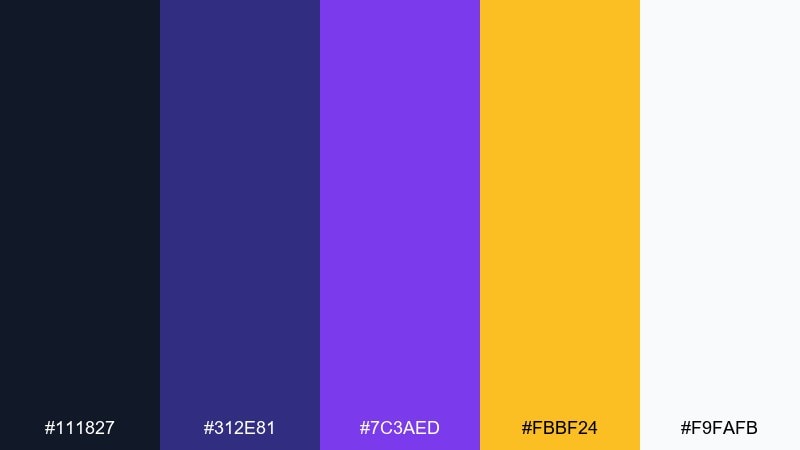
HEX: #111827 #312e81 #7c3aed #fbbf24 #f9fafb
Mood: heroic, rich, dramatic
Best for: 2D game title screen UI mockup
Heroic and rich, it feels like a royal banner hanging in a pixel castle hall. Indigo and violet create depth for panels and shadows, while the gold reads as treasure, rewards, or a crowned logo. Use it for title screens, achievement popups, and fantasy-themed branding. Tip: keep gold to a few focal elements so it stays special, and let off-white carry smaller text.
Image example of royal quest generated using media.io

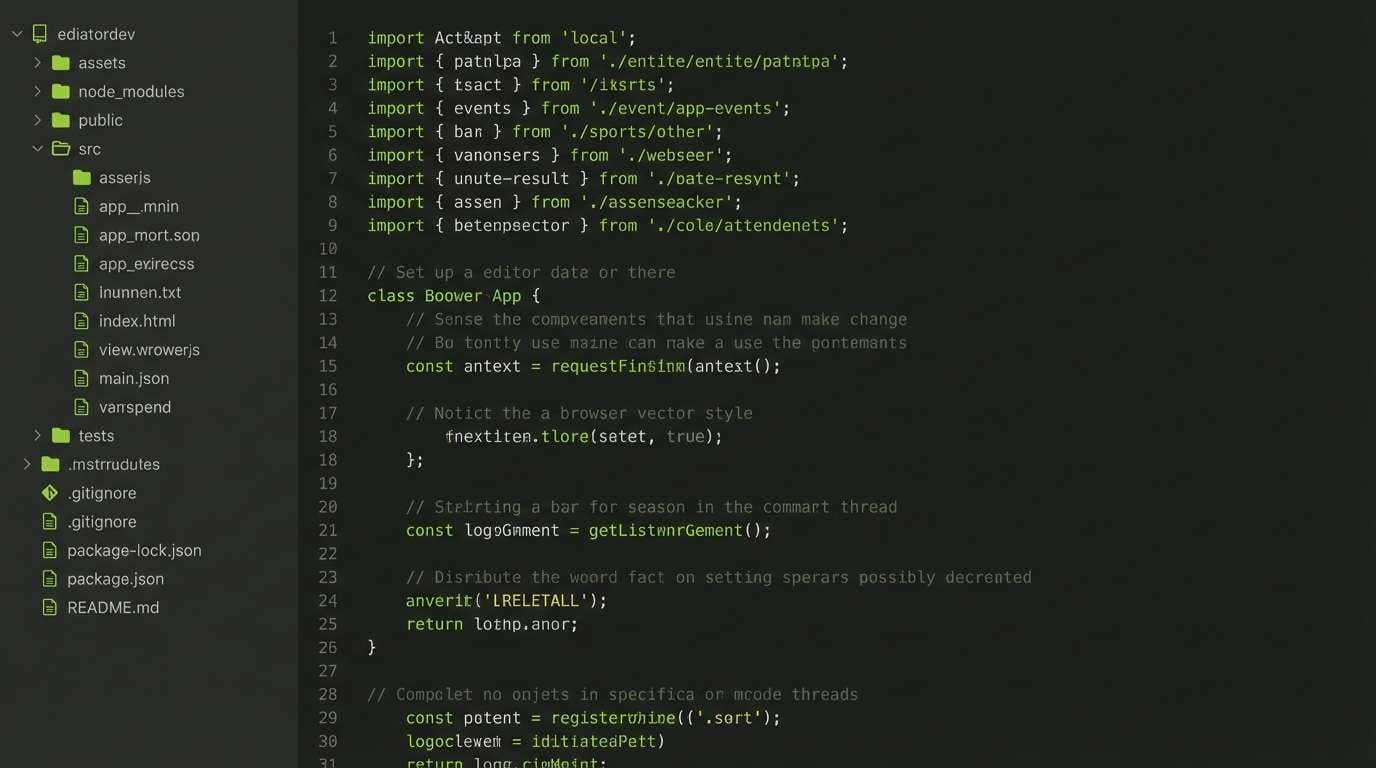
18) Lime Terminal
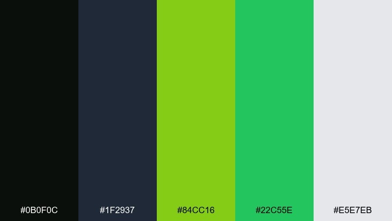
HEX: #0b0f0c #1f2937 #84cc16 #22c55e #e5e7eb
Mood: hacker, sharp, functional
Best for: 2D code editor theme UI mockup
Hacker-sharp and functional, it recalls green phosphor monitors and fast scrolling logs. The near-black and slate tones make the lime and green feel crisp for syntax highlights and status tags. Great for developer tools, dashboards, and tech branding that leans utilitarian. Tip: use the light gray for comments and secondary labels so the green accents stay focused and meaningful.
Image example of lime terminal generated using media.io
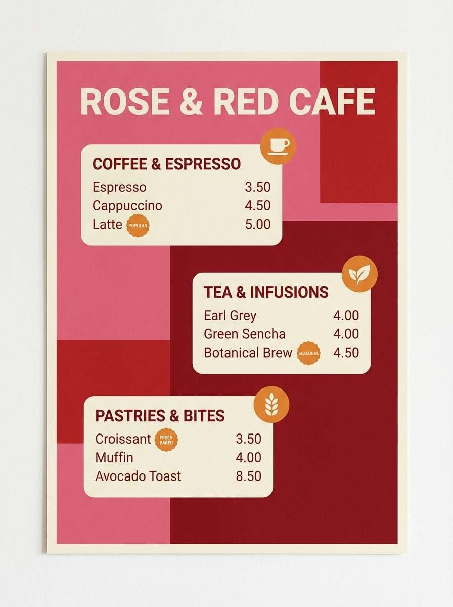
19) Rose Brick

HEX: #2b1b1b #8a2c2c #d1495b #f4a261 #f1faee
Mood: cozy, bold, inviting
Best for: cafe menu poster on a plain background
Cozy and bold, it feels like warm brick walls, berry jam, and a glowing bakery window. The rose and red tones create appetite appeal, while the soft cream keeps spacing comfortable for pricing and item names. Use it for menus, food promos, and local event flyers that need warmth without clutter. Tip: let the orange sit on badges and callouts only, so the reds remain the main story.
Image example of rose brick generated using media.io
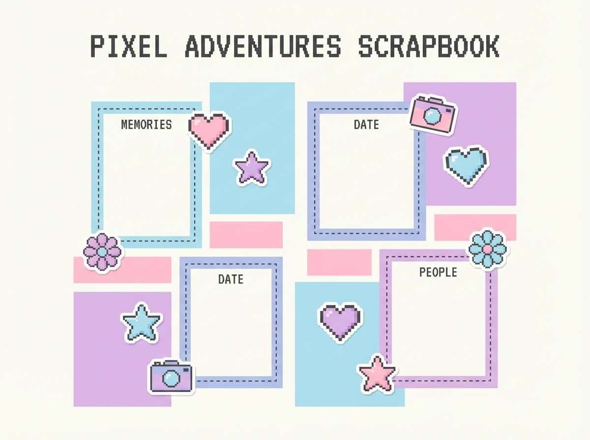
20) Classic Pastel Pixels
HEX: #2d2a32 #a9def9 #e4c1f9 #fde2e4 #fff1e6
Mood: gentle, nostalgic, airy
Best for: scrapbook page template design
Gentle and nostalgic, it brings back sticker books, soft gradients, and quiet handheld game moments. The pastel blues and lilacs keep everything airy, while the deep charcoal adds just enough structure for headings. Use it for scrapbook templates, planner pages, and calming social graphics. Tip: keep the charcoal as a thin outline or small type so the pastels stay the main visual mood.
Image example of classic pastel pixels generated using media.io
What Colors Go Well with 8 Bit?
High-contrast anchors pair best with 8 bit hex codes: near-black, deep navy, charcoal, or dark brown help bright pixel colors “snap” into focus. Add an off-white or light gray for readable UI and clean negative space.
For accents, choose one “reward” color (neon pink, cyan, gold, lime) and keep it rare—this mirrors classic arcade color combinations where highlights signal interactivity, loot, or status.
If you want a more modern-retro look, mix one saturated color with a muted counterpart (for example, neon pink with dusty purple, or bright cyan with slate blue) to avoid overwhelming the screen.
How to Use a 8 Bit Color Palette in Real Designs
Start by assigning roles: one background, one surface, one text color, and 1–2 accent colors. This simple hierarchy makes pixel color scheme choices consistent across menus, buttons, icons, and banners.
Use “dithering thinking” even in non-pixel work: instead of gradients, try stepped shades (dark → mid → light) for depth. It keeps the retro vibe while improving legibility on small UI elements.
For branding, keep the palette tight on logos and key shapes, then expand with tints only when needed. A controlled 8 bit color scheme reads more iconic at thumbnail size.
Create 8 Bit Palette Visuals with AI
If you already have a palette you like, turn it into usable visuals fast: posters, UI mockups, game screens, packaging concepts, and social graphics. The key is describing the scene and style clearly, then iterating.
With Media.io’s text-to-image tool, you can test multiple retro looks (flat vector, pixel art, print poster layouts) while keeping your color direction consistent—perfect for quick moodboarding.
Pick one of the prompts above, swap in your subject, and generate a few variations until the balance of contrast and accents feels right.
8 Bit Color Palette FAQs
-
What is an 8 bit color palette?
An 8 bit color palette is a limited set of colors inspired by retro hardware and pixel art workflows, designed to keep visuals readable and consistent with fewer, bolder hues. -
How many colors should an 8 bit palette include?
Many modern “8 bit” palettes use 4–8 core colors (plus shades). For UI and branding, 5 colors is a practical sweet spot: background, surface, text, and 2 accents. -
Are 8 bit palettes only for pixel art?
No. They work well for posters, merch, social graphics, and UI systems because high contrast and limited choices create a clear visual hierarchy. -
How do I keep text readable in a pixel color scheme?
Use a dark anchor (near-black/navy/charcoal) and an off-white for type. Reserve bright accent colors for buttons, badges, and highlights rather than long text. -
What’s the best way to add depth without gradients?
Use stepped shades (dark → mid → light) or light “highlight” pixels along edges. This mimics classic dithering logic and keeps the retro feel clean. -
Can I mix modern colors with retro game palettes?
Yes—pair one saturated neon with muted supporting tones (slate, dusty purple, cream). The mix feels modern while still reading unmistakably retro. -
How can I generate 8 bit palette visuals quickly?
Use an AI generator like Media.io text-to-image: describe your layout (UI, poster, packaging), set the style (pixel/flat vector/print), and iterate until the colors land correctly.


