

Apple green is bright, clean, and instantly “fresh”—a punchy green that can feel natural, modern, or even neon depending on what you pair it with.
Below are 20 curated apple green color combinations with HEX codes, mood notes, and practical pairing tips for UI, branding, packaging, and print.
In this article
Why Apple Green Color Combinations Work So Well
Apple green sits in the sweet spot between natural and energetic. It reads as “alive” and healthy, so it’s perfect for brands that want to signal freshness, growth, or positivity.
Because it’s brighter than most earthy greens, apple green also performs well in digital UI—especially for states like success, active navigation, and primary calls-to-action. It grabs attention without relying on red.
Most importantly, apple green is flexible: soften it with creams and sages for a calm feel, or sharpen it with near-black and cool grays for a high-contrast, tech-forward look.
20+ Apple Green Color Scheme Ideas (with HEX Codes)
1) Orchard Fresh
HEX: #8DB600 #CFEA8A #FFF3D6 #2F3A1F #FFB85C
Mood: crisp and optimistic
Best for: organic grocery branding and labels
Crisp and optimistic, this apple green color palette feels like sunlight on a just-picked apple with a clean, natural bite. Use the bright green as the hero color, then soften it with creamy off-white for breathing room. Charcoal grounds the look for readable type, while the warm orange works as a call-to-action accent. Tip: keep the orange to small highlights so the green stays fresh, not loud.
Image example of orchard fresh generated using media.io
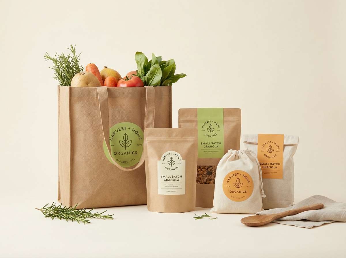
Media.io is an online AI studio for creating and editing video, image, and audio in your browser.

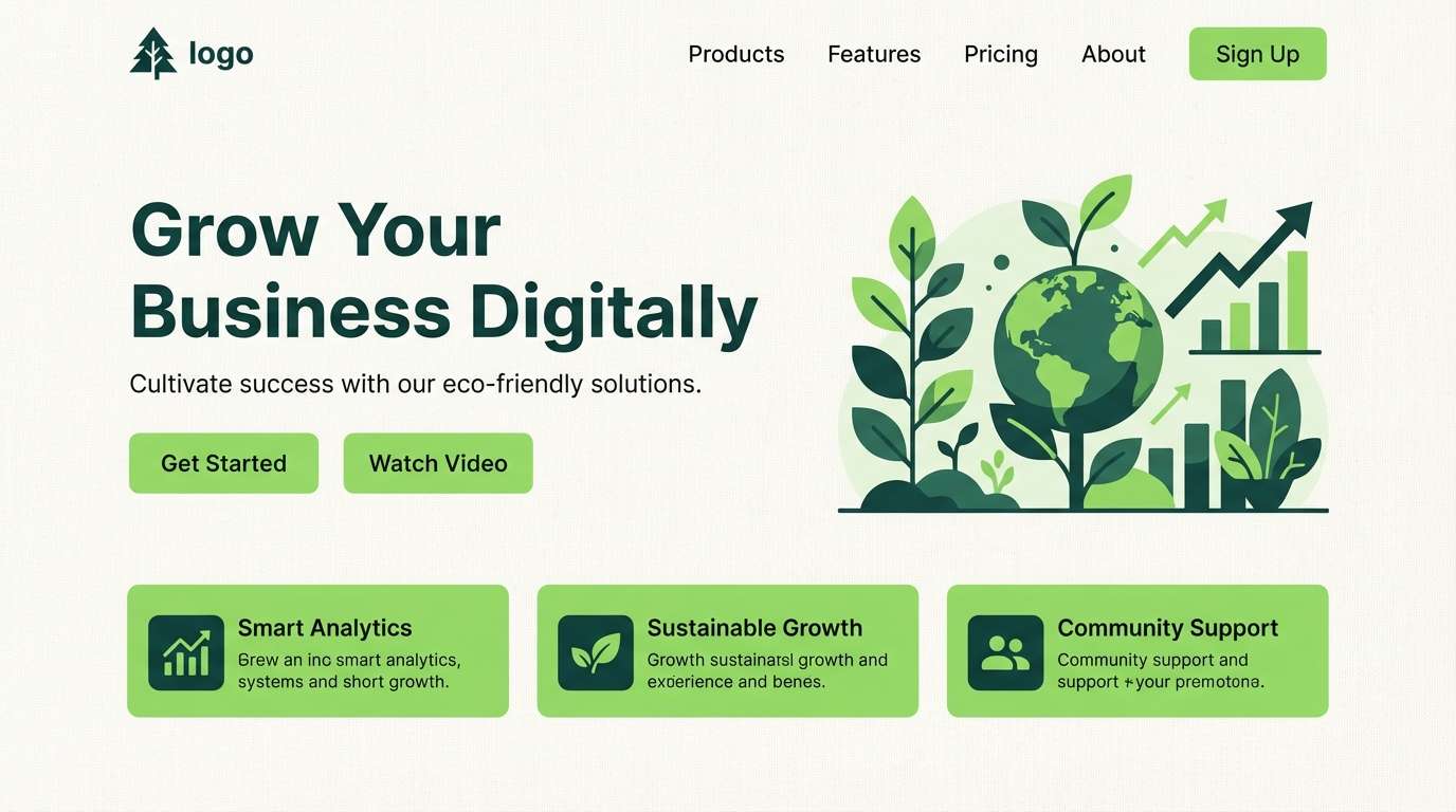
2) Lime and Linen
HEX: #7FB800 #EAF2E3 #F7F3EA #8A8F86 #1E2A1C
Mood: minimal and airy
Best for: modern landing pages and clean UI
Minimal and airy, these apple green tones read like fresh lime over warm linen. Use the green for primary buttons and active states, then rely on the light neutrals for large surfaces and cards. The gray-green supports dividers and subtle UI borders, while the deep pine adds contrast for headings. Tip: reserve the darkest shade for text only to keep the interface light.
Image example of lime and linen generated using media.io
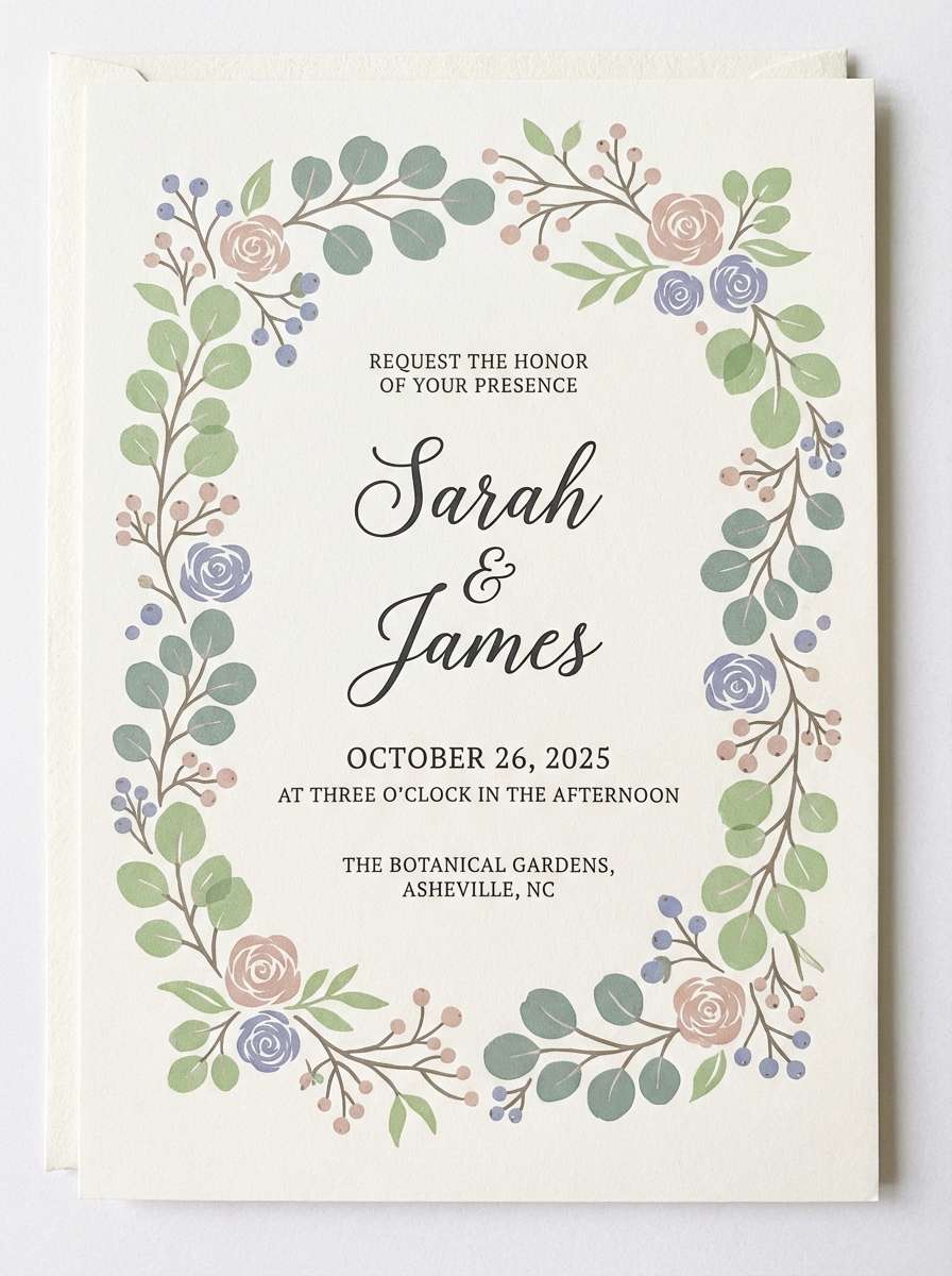
3) Garden Party Pastels
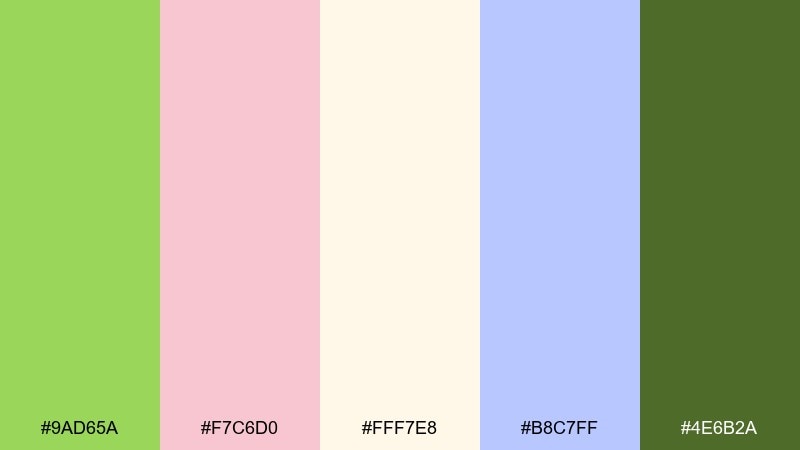
HEX: #9AD65A #F7C6D0 #FFF7E8 #B8C7FF #4E6B2A
Mood: playful and romantic
Best for: spring wedding invitations and stationery
Playful and romantic, it evokes a backyard garden party with petals, ribbons, and new leaves. This apple green color scheme shines when the green is balanced by blush and a soft cream base. Add periwinkle for a gentle twist that still feels elegant, and use the olive tone for typography to avoid harsh black. Tip: keep backgrounds cream and let color live in borders, florals, and headings.
Image example of garden party pastels generated using media.io
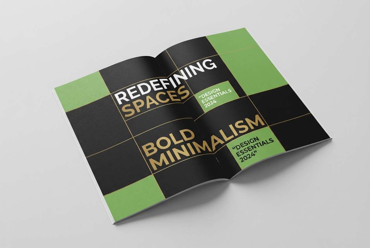
4) Matcha Noir
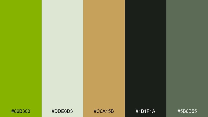
HEX: #86B300 #DDE6D3 #C6A15B #1B1F1A #5B6B55
Mood: modern and luxe
Best for: fashion editorials and premium lookbooks
Modern and luxe, this apple green color scheme feels like matcha foam against black lacquer with a hint of brass. Use the near-black as the primary canvas so the green reads sophisticated rather than sporty. Gold-brown accents elevate headlines, section rules, and small icons without overpowering the page. Tip: pair the green with generous whitespace for a high-end, editorial rhythm.
Image example of matcha noir generated using media.io
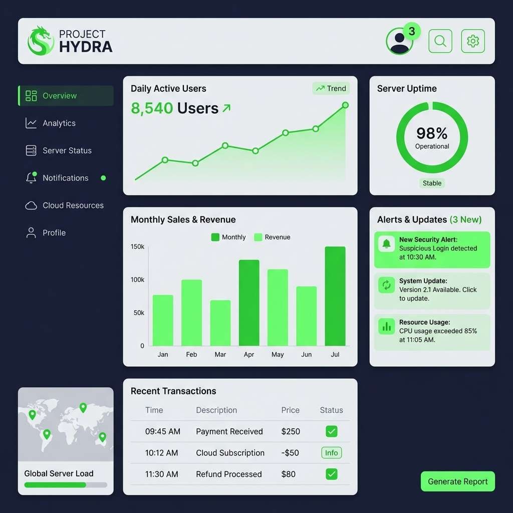
5) Citrus Tech
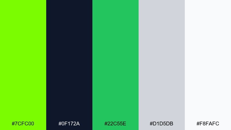
HEX: #7CFC00 #0F172A #22C55E #D1D5DB #F8FAFC
Mood: energetic and high-contrast
Best for: app icons, badges, and UI accents
Energetic and high-contrast, it channels a neon citrus glow on a dark screen. These apple green color combinations work best when the vivid green is used for states and notifications, not full backgrounds. Cool grays and near-white keep components readable, while the extra green adds depth for gradients or secondary actions. Tip: test accessibility early and use the near-white for text on the darkest navy.
Image example of citrus tech generated using media.io
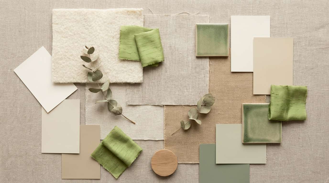
6) Meadow Neutrals
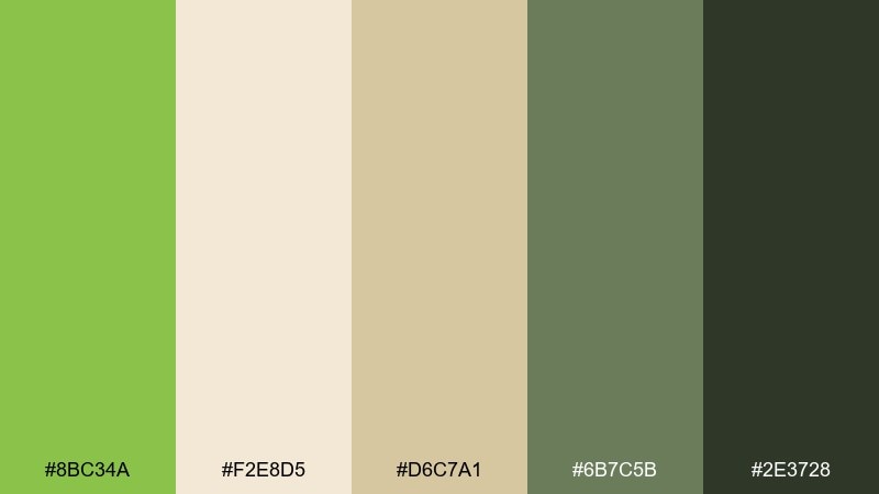
HEX: #8BC34A #F2E8D5 #D6C7A1 #6B7C5B #2E3728
Mood: grounded and calm
Best for: interior moodboards and home decor styling
Grounded and calm, it feels like a meadow path with sun-warmed grasses and earthy clay. Use the apple-toned green as an accent on textiles, plants, or small decor pieces, letting the creams and tans dominate. The muted moss and deep bark shades are great for frames, furniture, and serif headlines in moodboards. Tip: keep the green to one or two focal areas to avoid a monotone room.
Image example of meadow neutrals generated using media.io
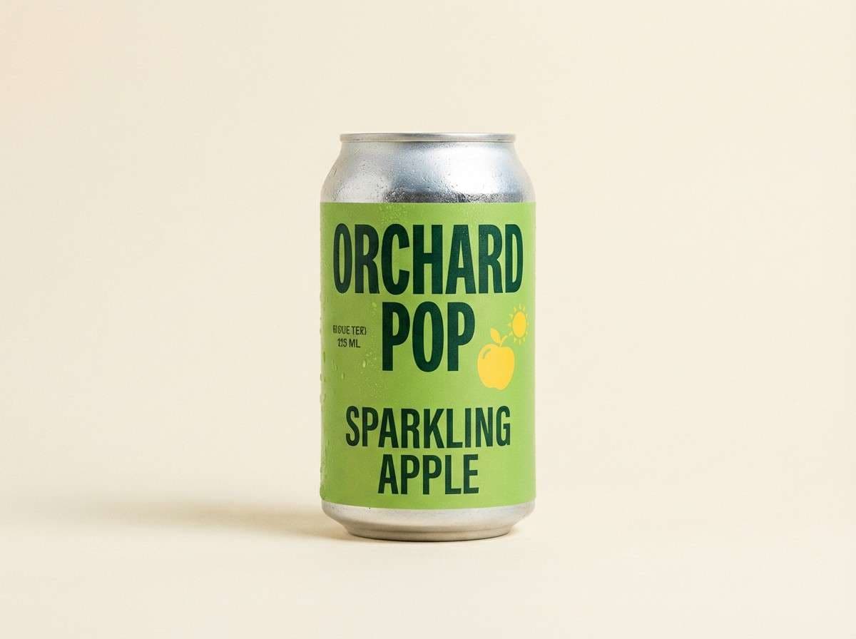
7) Forest Spritz
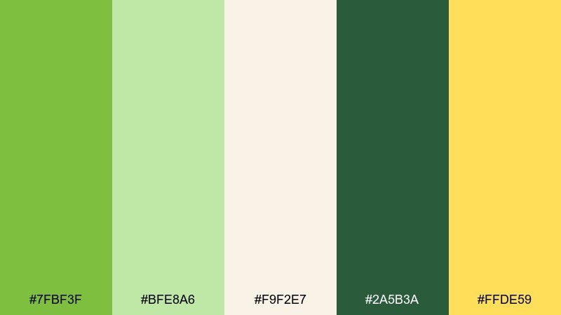
HEX: #7FBF3F #BFE8A6 #F9F2E7 #2A5B3A #FFDE59
Mood: refreshing and outdoorsy
Best for: beverage can design and product ads
Refreshing and outdoorsy, this color combination with apple green brings to mind a sparkling spritz served under trees. Let the bright green headline the can, then use pale mint for secondary panels and highlights. Cream keeps the design friendly, while the deep forest shade adds structure for type and icons. Tip: use the yellow as a small burst near the logo to suggest citrus without overwhelming the label.
Image example of forest spritz generated using media.io
8) Kiwi Coral Pop
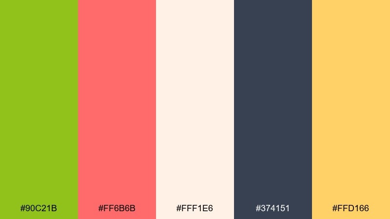
HEX: #90C21B #FF6B6B #FFF1E6 #374151 #FFD166
Mood: bold and upbeat
Best for: summer event posters and social graphics
Bold and upbeat, this apple green color scheme feels like kiwi slices and coral confetti in bright daylight. Pair the green with coral for headlines and key shapes, then keep plenty of warm off-white to avoid visual fatigue. Charcoal anchors typography, while the sunny yellow works for stickers, price tags, or date callouts. Tip: use large blocks of off-white so the coral and green read intentional, not chaotic.
Image example of kiwi coral pop generated using media.io
9) Sage Graphite
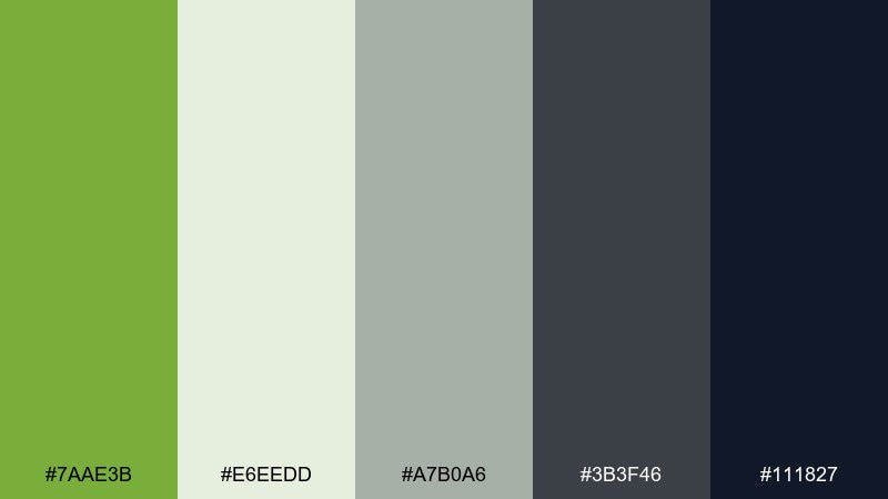
HEX: #7AAE3B #E6EEDD #A7B0A6 #3B3F46 #111827
Mood: professional and steady
Best for: SaaS dashboards and data-heavy UI
Professional and steady, it reads like sage notes against smooth graphite. Use the apple-leaning green for success states, progress bars, and selected navigation. The light sage background keeps tables calm, while graphite and near-black deliver crisp hierarchy for text and icons. Tip: keep charts mostly neutral and reserve green for key metrics to prevent misreading.
Image example of sage graphite generated using media.io

10) Pear Blossom
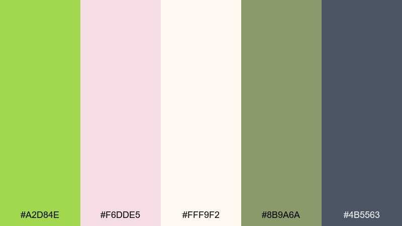
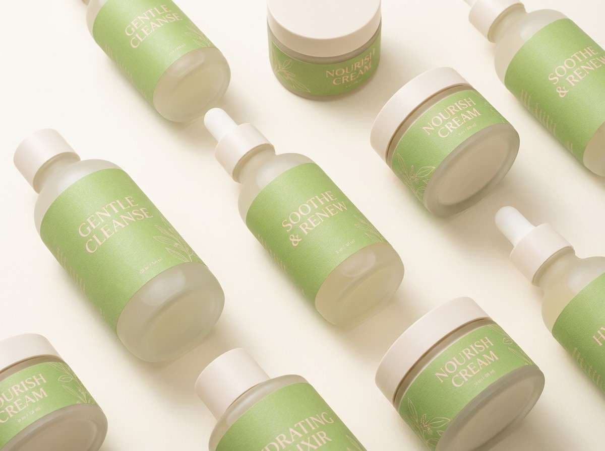
HEX: #A2D84E #F6DDE5 #FFF9F2 #8B9A6A #4B5563
Mood: soft and friendly
Best for: skincare branding and gentle packaging
Soft and friendly, this apple green palette suggests pear blossoms and a clean, hydrated finish. Use the light apple green as the brand cue on caps, seals, and small shapes, while blush adds warmth to supporting panels. Cream works beautifully for the main packaging base, and the muted olive keeps ingredient lists easy to read. Tip: print the green slightly desaturated for a more premium, spa-like feel.
Image example of pear blossom generated using media.io
11) Alpine Trail
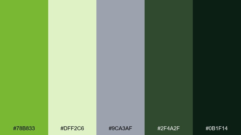
HEX: #78B833 #DFF2C6 #9CA3AF #2F4A2F #0B1F14
Mood: rugged and fresh
Best for: outdoor brand logos and merch
Rugged and fresh, it feels like mountain air, wet leaves, and deep evergreens. Put the apple green on patches, stitch details, or logo marks so it pops against darker fabric tones. The pale mint is great for secondary lockups or hang tags, while slate keeps layouts neutral and utilitarian. Tip: use the near-black green for outlines and type to avoid the harshness of pure black.
Image example of alpine trail generated using media.io
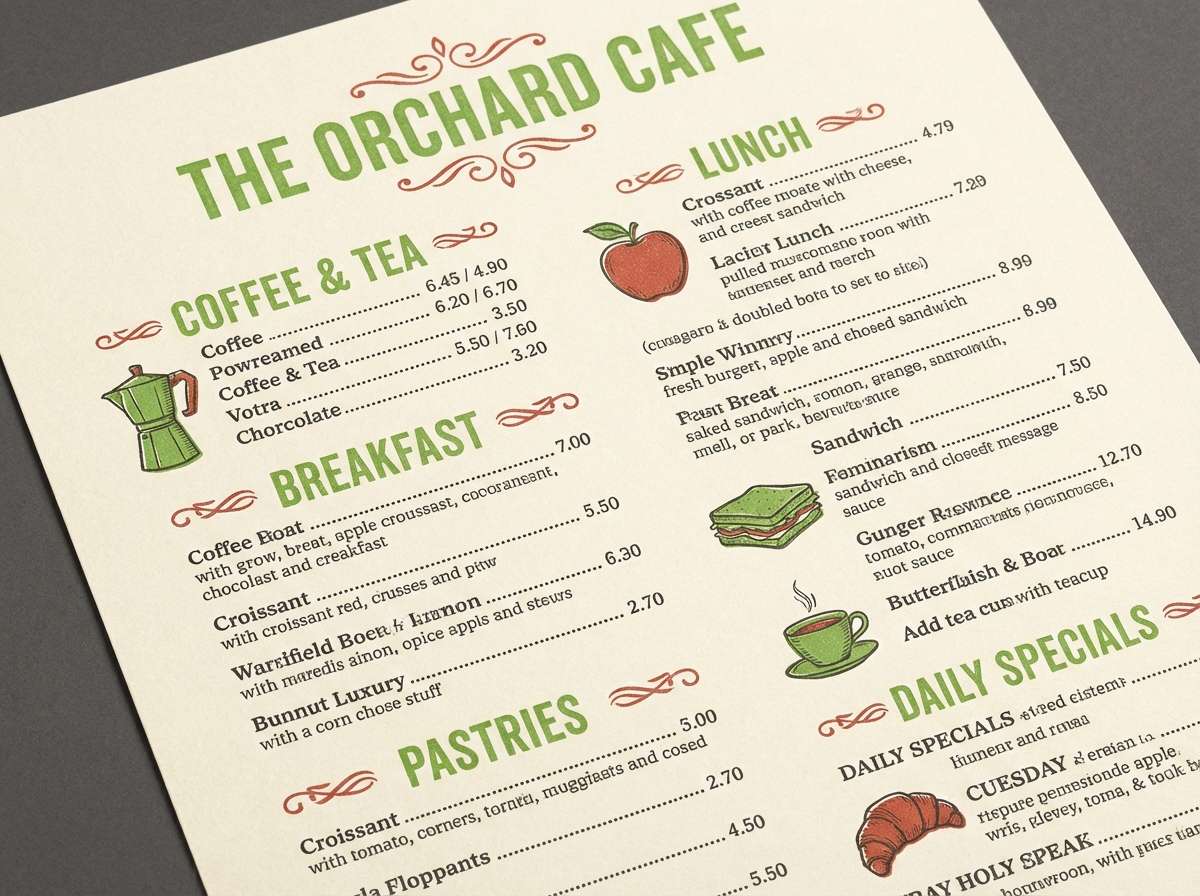
12) Retro Orchard
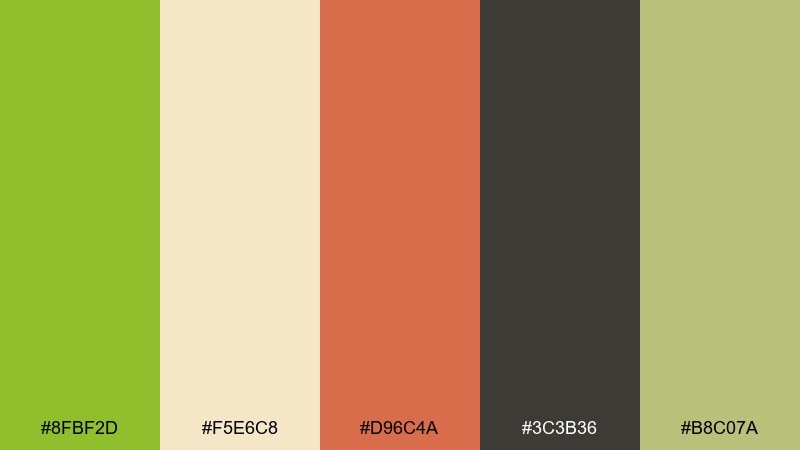
HEX: #8FBF2D #F5E6C8 #D96C4A #3C3B36 #B8C07A
Mood: warm and nostalgic
Best for: cafe menus and vintage-inspired print
Warm and nostalgic, it recalls paper menus, sun-faded signage, and orchard stands by the road. These apple green color combinations pair beautifully with toasted cream and a brick red accent for section headers or specials. Use the smoky charcoal for type and icons, then bring in the dusty olive for borders and subtle pattern work. Tip: add a simple check or stripe pattern using two muted tones to reinforce the retro feel.
Image example of retro orchard generated using media.io
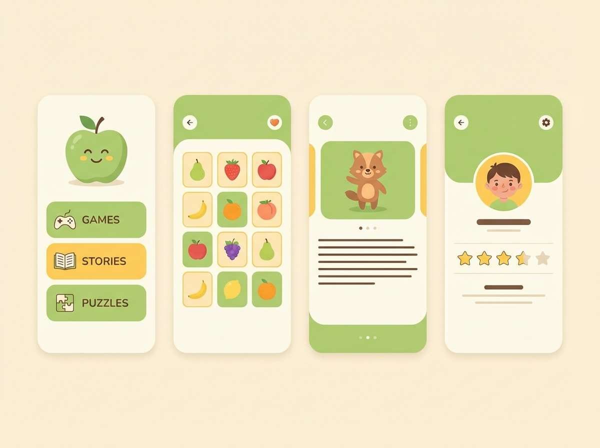
13) Soft Classroom
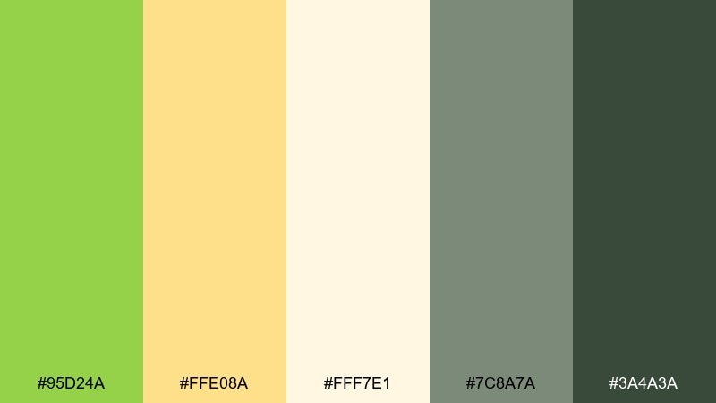
HEX: #95D24A #FFE08A #FFF7E1 #7C8A7A #3A4A3A
Mood: cheerful and approachable
Best for: kids learning app UI and lesson slides
Cheerful and approachable, this apple green color scheme feels like sticky notes, crayons, and sunny classroom posters. Use the green for progress and success cues, then lean on buttery yellow for friendly highlights and badges. Cream keeps screens calm, while the two greens provide a clear hierarchy for headings and navigation. Tip: round corners and keep contrast strong for readability on small screens.
Image example of soft classroom generated using media.io
14) Mint Copper
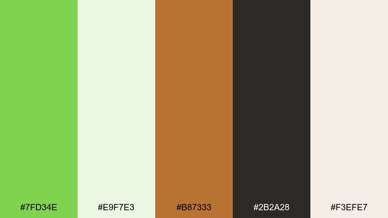
HEX: #7FD34E #E9F7E3 #B87333 #2B2A28 #F3EFE7
Mood: polished and modern
Best for: jewelry ads and premium product highlights
Polished and modern, the apple green mix suggests mint light catching on warm copper metal. Use the apple green as a clean backdrop tone or accent band, then let copper carry the luxury cue in product details. Off-whites keep the layout airy, while near-black adds sharp contrast for pricing and headlines. Tip: keep copper confined to one focal element so it reads intentional and refined.
Image example of mint copper generated using media.io

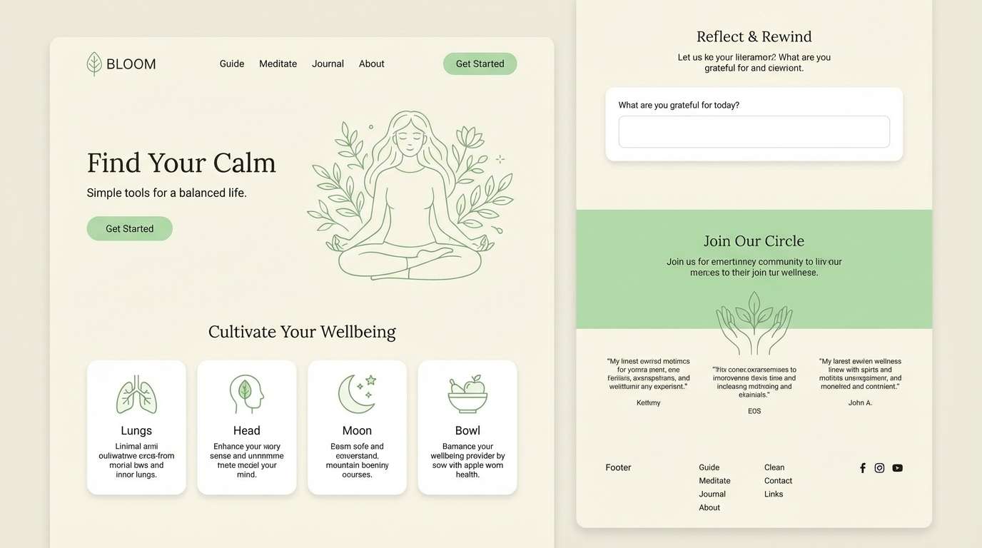
15) Zen Bamboo
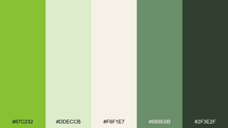
HEX: #87C232 #DDECCB #F6F1E7 #6B8E6B #2F3E2F
Mood: peaceful and restorative
Best for: wellness blogs and meditation landing pages
Peaceful and restorative, these apple green shades feel like bamboo leaves over warm paper. Use the apple-green tone for buttons and section dividers, while the pale greens create soft page backgrounds. The muted moss works well for icons and subtle illustrations, and the deep green is ideal for headings that need calm authority. Tip: keep typography slightly lighter in weight to match the gentle palette.
Image example of zen bamboo generated using media.io
16) Neon Granny Smith
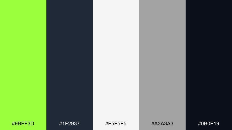
HEX: #9BFF3D #1F2937 #F5F5F5 #A3A3A3 #0B0F19
Mood: sharp and street-ready
Best for: streetwear posters and drop announcements
Sharp and street-ready, this color combination with apple green looks like a neon tag under city lights. Use the bright green for oversized type, keylines, and stickers against near-black for maximum punch. The grays help create depth in layouts without stealing focus, and white can be used for small legal copy or dates. Tip: add texture with halftone or grain in gray so the neon feels less flat.
Image example of neon granny smith generated using media.io

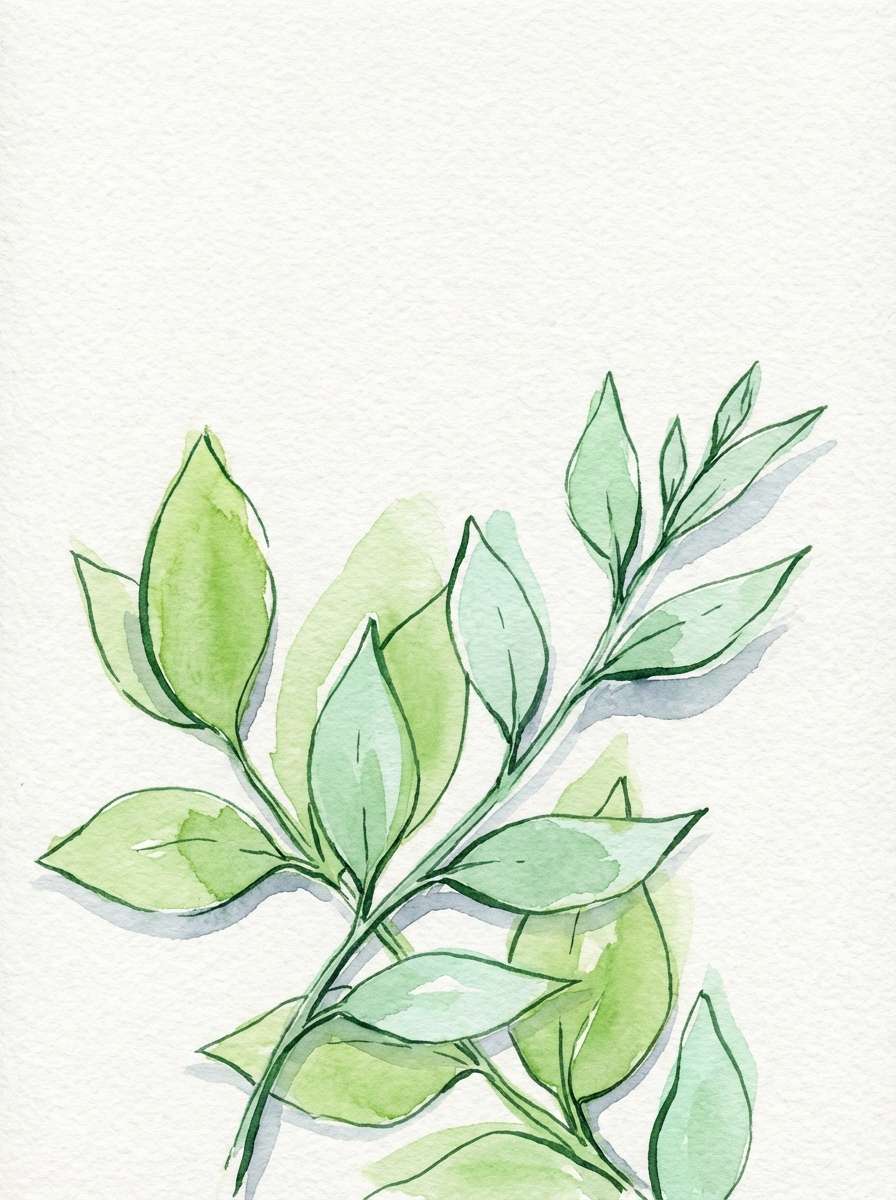
17) Botanical Ink
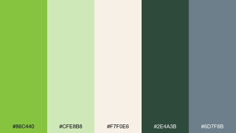
HEX: #86C440 #CFE8B8 #F7F0E6 #2E4A3B #6D7F8B
Mood: natural and illustrative
Best for: botanical prints and garden-themed art
Natural and illustrative, it feels like inked leaves washed with watercolor on textured paper. These apple green color combinations are perfect for botanical linework, where the deep green defines stems and the lighter greens fill petals and highlights. Cream keeps the piece soft, and the cool gray-blue adds a quiet shadow tone without turning the artwork cold. Tip: limit the gray-blue to background washes so the greens stay the story.
Image example of botanical ink generated using media.io
18) Rainwashed Greens
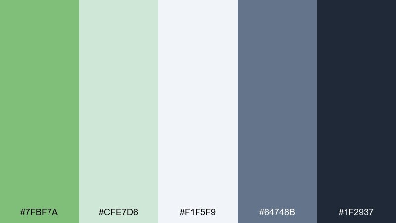
HEX: #7FBF7A #CFE7D6 #F1F5F9 #64748B #1F2937
Mood: cool and balanced
Best for: presentation templates and report decks
Cool and balanced, these apple green tones read like rain on glass and softened garden greens. Use the mid green for section headers and chart highlights, while the pale mint supports slide backgrounds. Slate and deep charcoal keep body copy crisp and professional without feeling harsh. Tip: keep charts mostly gray and use green only for the key series you want remembered.
Image example of rainwashed greens generated using media.io
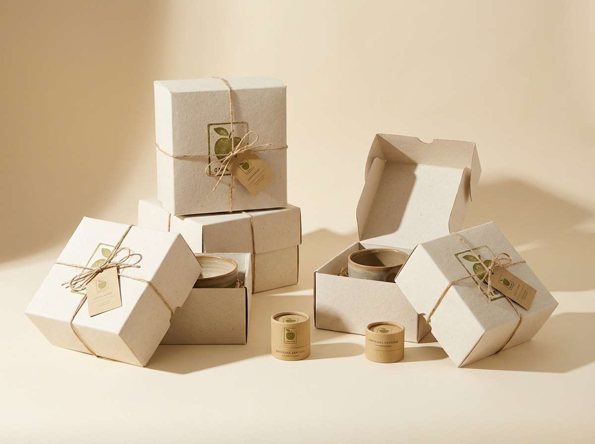
19) Olive Cream Studio
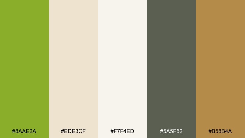
HEX: #8AAE2A #EDE3CF #F7F4ED #5A5F52 #B58B4A
Mood: artisanal and warm
Best for: ceramics packaging and maker brands
Artisanal and warm, it feels like hand-thrown clay beside olive leaves and creamy glaze. Use the green for stamps and seals, letting the creams handle the primary packaging surface. The soft charcoal works for ingredient lists and care notes, while the warm tan brings a craft, handmade accent. Tip: try uncoated paper stock so the palette looks tactile and authentic.
Image example of olive cream studio generated using media.io
20) Night Orchard Glow
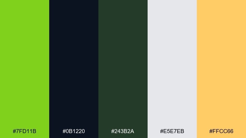
HEX: #7FD11B #0B1220 #243B2A #E5E7EB #FFCC66
Mood: dramatic and electric
Best for: music festival flyers and nightlife promos
Dramatic and electric, this apple green color palette feels like green stage lights cutting through a midnight crowd. Use the bright green for the main artist name and key shapes, then layer deep navy and forest tones for depth. Light gray keeps small details readable, and the warm amber adds a subtle spotlight effect for dates or venue info. Tip: keep the amber minimal so it reads like glow, not a second headline color.
Image example of night orchard glow generated using media.io

What Colors Go Well with Apple Green?
Apple green pairs beautifully with warm neutrals like cream, linen, sand, and soft tan—these keep the green feeling organic and breathable, especially in packaging and print.
For modern digital design, combine apple green with near-black or deep navy plus cool grays. This creates clean hierarchy and makes bright green accents feel intentional rather than overwhelming.
If you want more personality, try blush pink, coral, or a restrained amber/yellow highlight. Keep the accent color small so apple green stays the main “fresh” signal.
How to Use a Apple Green Color Combination in Real Designs
In UI, treat apple green as an accent and state color: primary buttons, toggles, success messaging, active tabs, or key data points. Let off-whites and soft grays carry most backgrounds to reduce glare.
In branding, use apple green as a recognizable cue on seals, caps, icons, or wordmark highlights, then choose a grounded dark (charcoal or deep green) for readable typography and structure.
For print, test on real paper stock—bright greens can shift. Slightly desaturating apple green often looks more premium, while keeping contrast high protects legibility for small text.
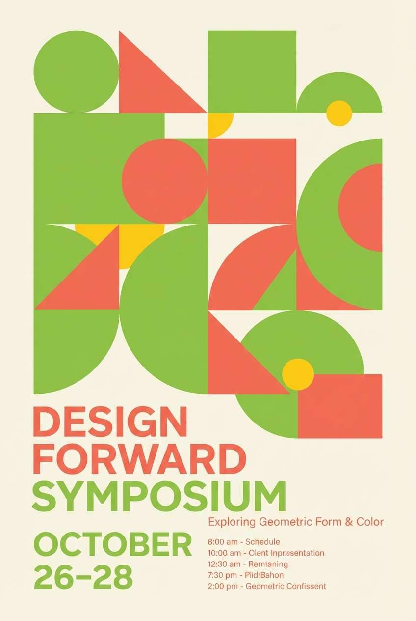
Create Apple Green Color Scheme Visuals with AI
Want to see these apple green color schemes in action before you design? Generate mockups like landing pages, packaging, posters, and editorial layouts with the same apple green HEX direction.
With Media.io, you can turn a short prompt into consistent visuals fast—helpful for moodboards, client presentations, and early concept exploration.
Start with one palette above, reuse its prompt style, and iterate by swapping scene types (UI, label, flyer) while keeping the color intent consistent.
Apple Green Color Combination FAQs
-
What is apple green (as a color)?
Apple green is a bright yellow-green that reads as fresh, lively, and modern. It’s often used to communicate growth, health, and energy in branding and UI. -
Is apple green good for UI design?
Yes—apple green works well for primary actions and positive states (success, active, selected). Use it as an accent with light neutrals or dark-mode foundations for best readability. -
What neutral colors pair best with apple green?
Cream, linen off-white, warm beige, and soft gray-green are the easiest pairings. They keep the palette natural while letting apple green stay the focal highlight. -
What accent colors look good with apple green?
Coral and blush add playful contrast, while amber/yellow can feel citrusy and upbeat. For a premium look, try copper or brass tones in small amounts. -
How do I keep apple green from looking too neon?
Limit it to small areas (buttons, badges, logos), add warm off-white space, and pair it with charcoal or deep green instead of pure black. Slightly desaturating for print also helps. -
Can I use apple green in dark mode?
Absolutely. Use a deep navy/near-black background and reserve apple green for highlights and notification states. Keep text on dark backgrounds near-white to maintain accessibility. -
How can I generate palette mockups quickly?
Use Media.io text-to-image: describe the design (e.g., “landing page UI” or “packaging label”), specify the mood, and iterate with the palette’s green as the hero accent.
Next: Portfolio Color Palette


