

Mint green sits right between fresh and calming—light enough to feel airy, but colorful enough to build a clear visual identity. It’s a go-to for wellness, UI, packaging, and spring-inspired design because it reads clean and optimistic.
Below are 20+ mint green color palette ideas with HEX codes, plus practical tips for contrast, neutrals, and accents so your designs stay readable and polished.
In this article
- Why Mint Green Palettes Work So Well
-
- sea glass serenity
- matcha latte minimal
- retro diner mint
- spring botanica wash
- nordic spa stone
- coastal cottage linen
- deco mint & gold
- neon mint pop
- pastel candyshop
- moody mint & charcoal
- fresh citrus spritz
- sage-to-mint gradient
- mint & terracotta clay
- lavender mint haze
- mint & navy classic
- mint blossom wedding
- urban concrete mint
- tropical mint splash
- mint & coral sunset
- eco market paper
- kids room mint play
- What Colors Go Well with Mint Green?
- How to Use a Mint Green Color Palette in Real Designs
- Create Mint Green Palette Visuals with AI
Why Mint Green Palettes Work So Well
Mint green is naturally “lightweight,” which makes layouts feel open and breathable. It supports generous whitespace, soft gradients, and subtle surfaces without making designs look unfinished.
It also pairs well with both warm and cool accents. You can push mint toward cozy (terracotta, beige, gold) or crisp (navy, teal, charcoal) while keeping a consistent, fresh foundation.
Finally, mint is easy to scale across branding systems: as a background tint, a highlight color, or a product “freshness” signal. The key is reserving a darker anchor for legibility and hierarchy.
20+ Mint Green Color Palette Ideas (with HEX Codes)
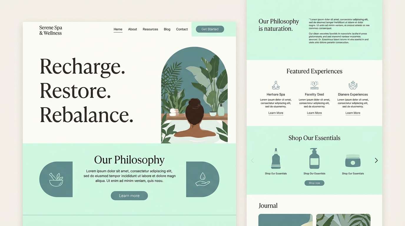
1) Sea Glass Serenity
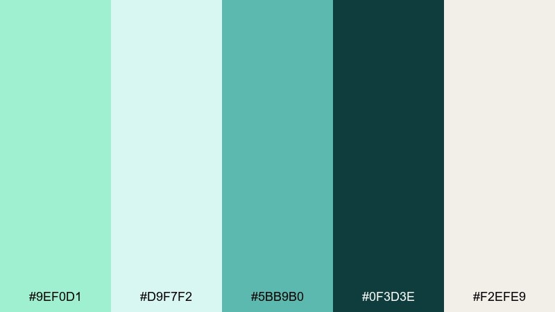
HEX: #9ef0d1 #d9f7f2 #5bb9b0 #0f3d3e #f2efe9
Mood: airy, coastal, calm
Best for: wellness brand identity and spa landing pages
Airy and coastal, this mix feels like sunlit sea glass and quiet waves. It shines in wellness branding, skincare, and calm landing pages where whitespace matters. Pair the deep teal with the mint tones for readable headings and confident CTAs. Usage tip: keep the darkest color for type and buttons, and let the pale aqua act as the soft background.
Image example of sea glass serenity generated using media.io
Media.io is an online AI studio for creating and editing video, image, and audio in your browser.

2) Matcha Latte Minimal
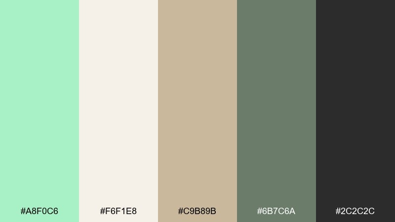
HEX: #a8f0c6 #f6f1e8 #c9b89b #6b7c6a #2c2c2c
Mood: minimal, warm, modern
Best for: cafe menus and minimalist packaging
Warm and minimal, it evokes matcha foam, oat milk, and paper labels. The creamy off-white and latte beige keep everything feeling premium instead of sugary. Use it for cafe menus, stationery, or packaging where you want calm sophistication. Usage tip: print the mint as a spot accent and let charcoal carry small text for crisp legibility.
Image example of matcha latte minimal generated using media.io
3) Retro Diner Mint
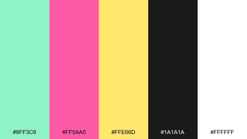
HEX: #8ff3c8 #ff5aa5 #ffe66d #1a1a1a #ffffff
Mood: playful, retro, bold
Best for: event posters and social graphics
Playful and punchy, it channels neon diner signs, bubblegum, and vinyl booths. The hot pink and sunshine yellow turn mint into a headline-ready accent without losing the fun. It works beautifully for posters, promo tiles, and playful brand drops. Usage tip: keep backgrounds white and reserve black for type so the bright colors stay clean and readable.
Image example of retro diner mint generated using media.io

4) Spring Botanica Wash
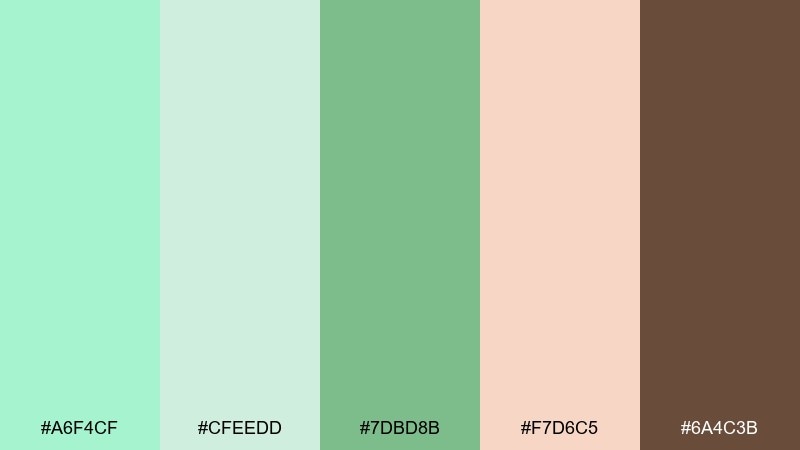
HEX: #a6f4cf #cfeedd #7dbd8b #f7d6c5 #6a4c3b
Mood: fresh, botanical, handmade
Best for: floral invitations and artisan labels
Fresh and botanical, it feels like watercolor leaves, soft petals, and garden soil. This mint green color palette pairs especially well with kraft paper textures and hand-drawn line art. Try it on wedding stationery, floral brands, or farmers market labels for a gentle, natural vibe. Usage tip: use the brown as your anchor for typography and outlines to keep the wash effect from feeling too light.
Image example of spring botanica wash generated using media.io
5) Nordic Spa Stone

HEX: #9debc9 #e7f6f3 #b7c4c7 #7a8b8f #1f2a2e
Mood: clean, quiet, premium
Best for: healthcare dashboards and calming UI
Clean and quiet, it suggests steam, stone tiles, and crisp linens. The blue-gray steps create a soothing structure that feels trustworthy for healthcare or habit-tracking apps. Use mint for highlights and success states rather than full panels. Usage tip: set body text in the near-black tone and keep gray as separators for a calm, organized interface.
Image example of nordic spa stone generated using media.io
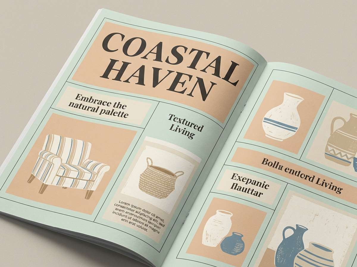
6) Coastal Cottage Linen
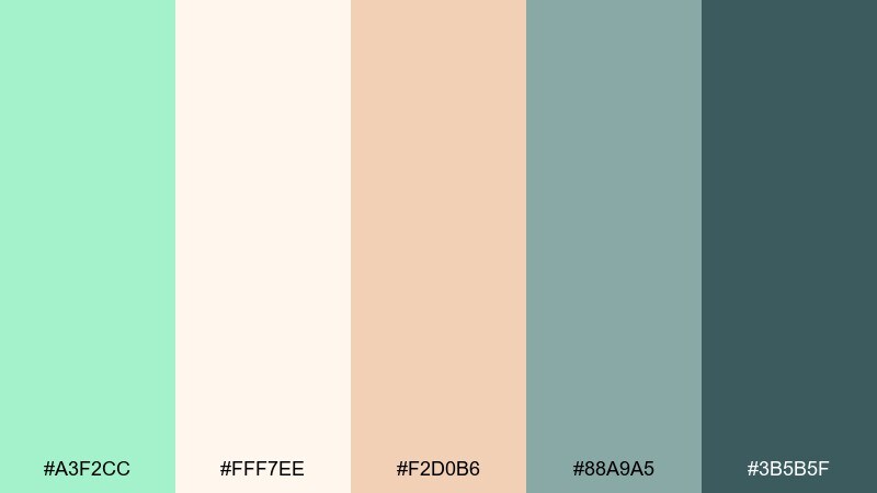
HEX: #a3f2cc #fff7ee #f2d0b6 #88a9a5 #3b5b5f
Mood: sunny, relaxed, homey
Best for: home decor mood boards and lifestyle blogs
Sunny and relaxed, it evokes linen curtains, driftwood, and a breeze off the shore. The peachy sand tone warms the mint so it feels lived-in rather than clinical. It’s a strong fit for home decor mood boards, lifestyle blogs, and boutique storefronts. Usage tip: repeat the deeper teal in small touches (icons, headings, trim) to keep the palette cohesive across pages.
Image example of coastal cottage linen generated using media.io
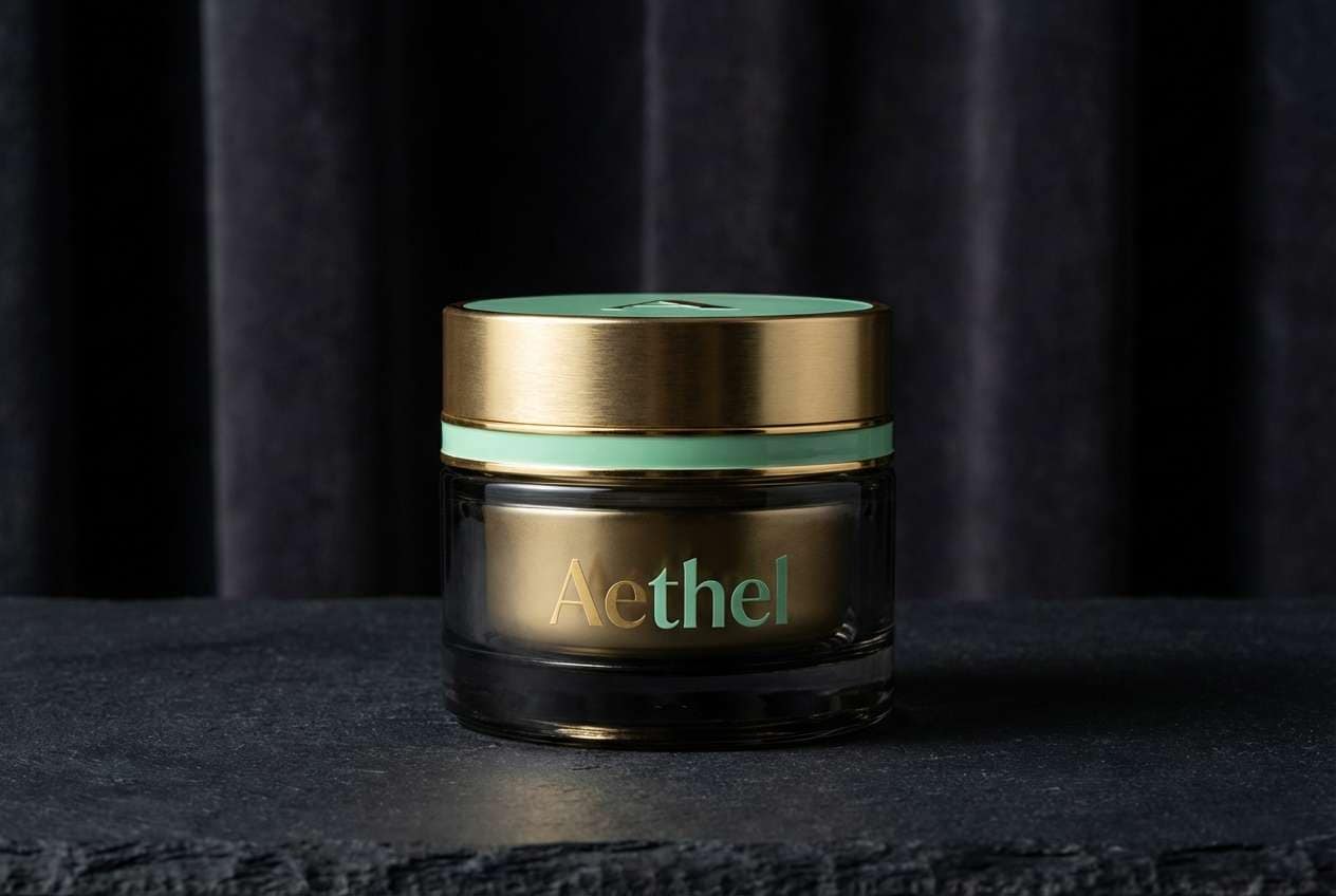
7) Deco Mint & Gold
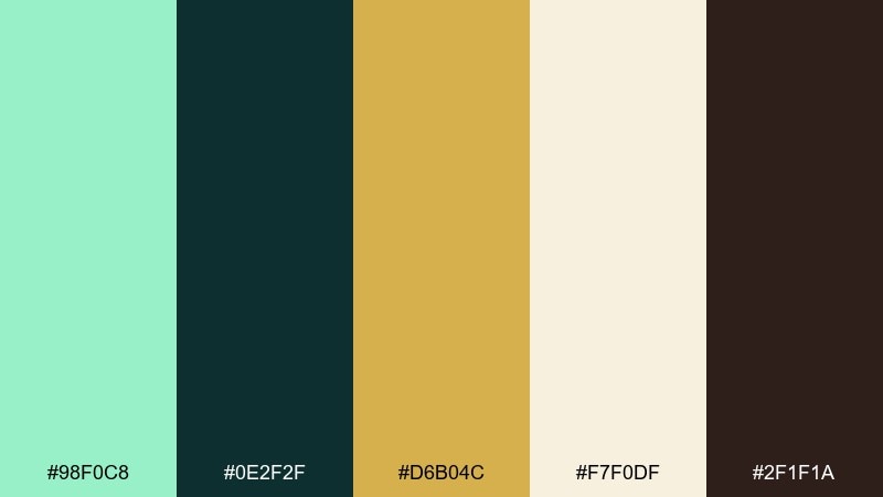
HEX: #98f0c8 #0e2f2f #d6b04c #f7f0df #2f1f1a
Mood: glam, structured, vintage-luxe
Best for: premium branding and product ads
Glam and structured, it brings to mind art deco arches, brass trim, and speakeasy elegance. The gold creates instant luxury against dark green-black, while mint keeps it fresh. Use it for premium branding, boutique product ads, or restaurant identities. Usage tip: limit gold to borders, icons, and small highlights so it reads as metallic rather than mustard.
Image example of deco mint & gold generated using media.io
8) Neon Mint Pop
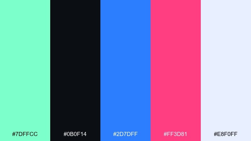
HEX: #7dffcc #0b0f14 #2d7dff #ff3d81 #e8f0ff
Mood: energetic, techy, nightlife
Best for: music app UI and startup marketing
Energetic and techy, it feels like club lights cutting through a dark room. Mint reads electric against near-black, while cobalt and pink add momentum for modern marketing. Use it for music apps, product launches, or creator tools where you want high contrast. Usage tip: keep bright colors for key actions and graphs, and let the pale blue act as a calm secondary surface.
Image example of neon mint pop generated using media.io
9) Pastel Candyshop
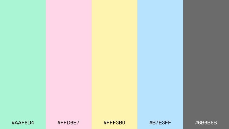
HEX: #aaf6d4 #ffd6e7 #fff3b0 #b7e3ff #6b6b6b
Mood: sweet, soft, cheerful
Best for: kids brands and playful social posts
Sweet and soft, it resembles taffy wrappers, cotton candy, and pastel balloons. The gentle gray keeps the sugar tones from feeling overwhelming on text-heavy layouts. It’s perfect for kids brands, playful announcements, and lighthearted social graphics. Usage tip: use the gray for all type and push color into shapes, stickers, and highlights to maintain clarity.
Image example of pastel candyshop generated using media.io
10) Moody Mint & Charcoal
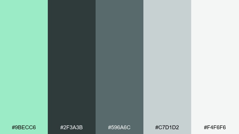
HEX: #9becc6 #2f3a3b #596a6c #c7d1d2 #f4f6f6
Mood: moody, modern, understated
Best for: portfolio sites and editorial branding
Moody and modern, it suggests rain-washed concrete with a cool mint glow. The charcoal and slate tones add seriousness, making the mint feel more sophisticated than cute. These mint green color combinations work well for portfolios, editorial brands, and product pages that need restraint. Usage tip: set mint as a single accent (links, hover states, small badges) and keep the rest neutral for a polished rhythm.
Image example of moody mint & charcoal generated using media.io
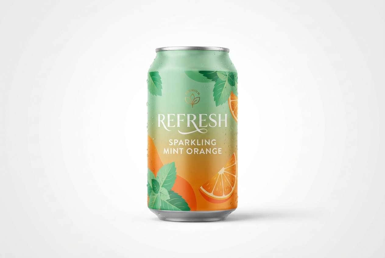
11) Fresh Citrus Spritz
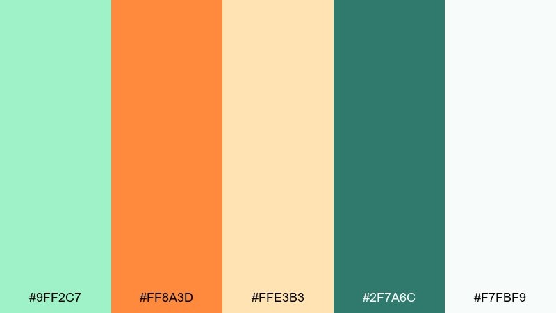
HEX: #9ff2c7 #ff8a3d #ffe3b3 #2f7a6c #f7fbf9
Mood: zesty, sunny, refreshing
Best for: beverage packaging and summer ads
Zesty and sunny, it feels like sparkling water, citrus peel, and a bright patio afternoon. Orange brings instant energy while the soft cream keeps it friendly and clean. Use it for beverage packaging, cafe promos, and summer campaign graphics. Usage tip: treat orange as the hero for badges and pricing, and let mint support backgrounds and secondary elements.
Image example of fresh citrus spritz generated using media.io
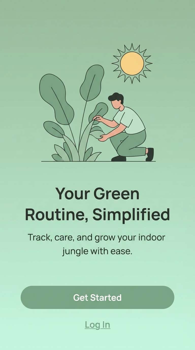
12) Sage-to-Mint Gradient
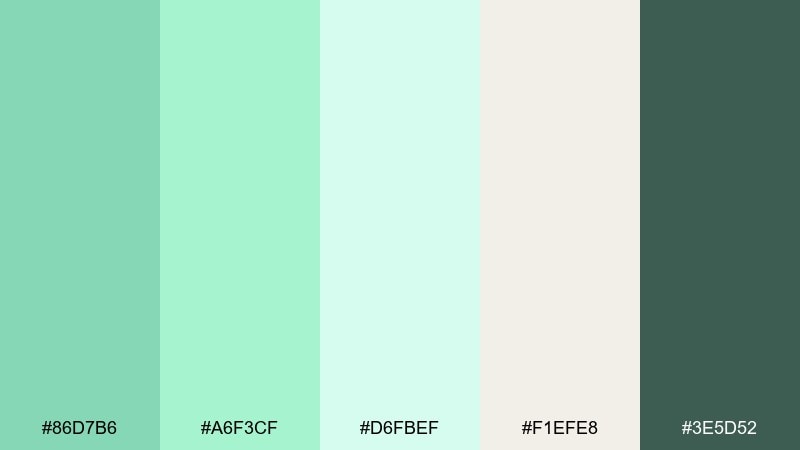
HEX: #86d7b6 #a6f3cf #d6fbef #f1efe8 #3e5d52
Mood: natural, smooth, balanced
Best for: background gradients and app onboarding
Natural and smooth, it reads like a soft gradient from leafy sage into fresh mint. The creamy neutral gives the lighter greens room to breathe, while deep forest keeps things grounded. It’s ideal for onboarding screens, section backgrounds, and gentle transitions in UI. Usage tip: apply the gradient only to large areas and keep buttons in the darkest tone for contrast.
Image example of sage-to-mint gradient generated using media.io
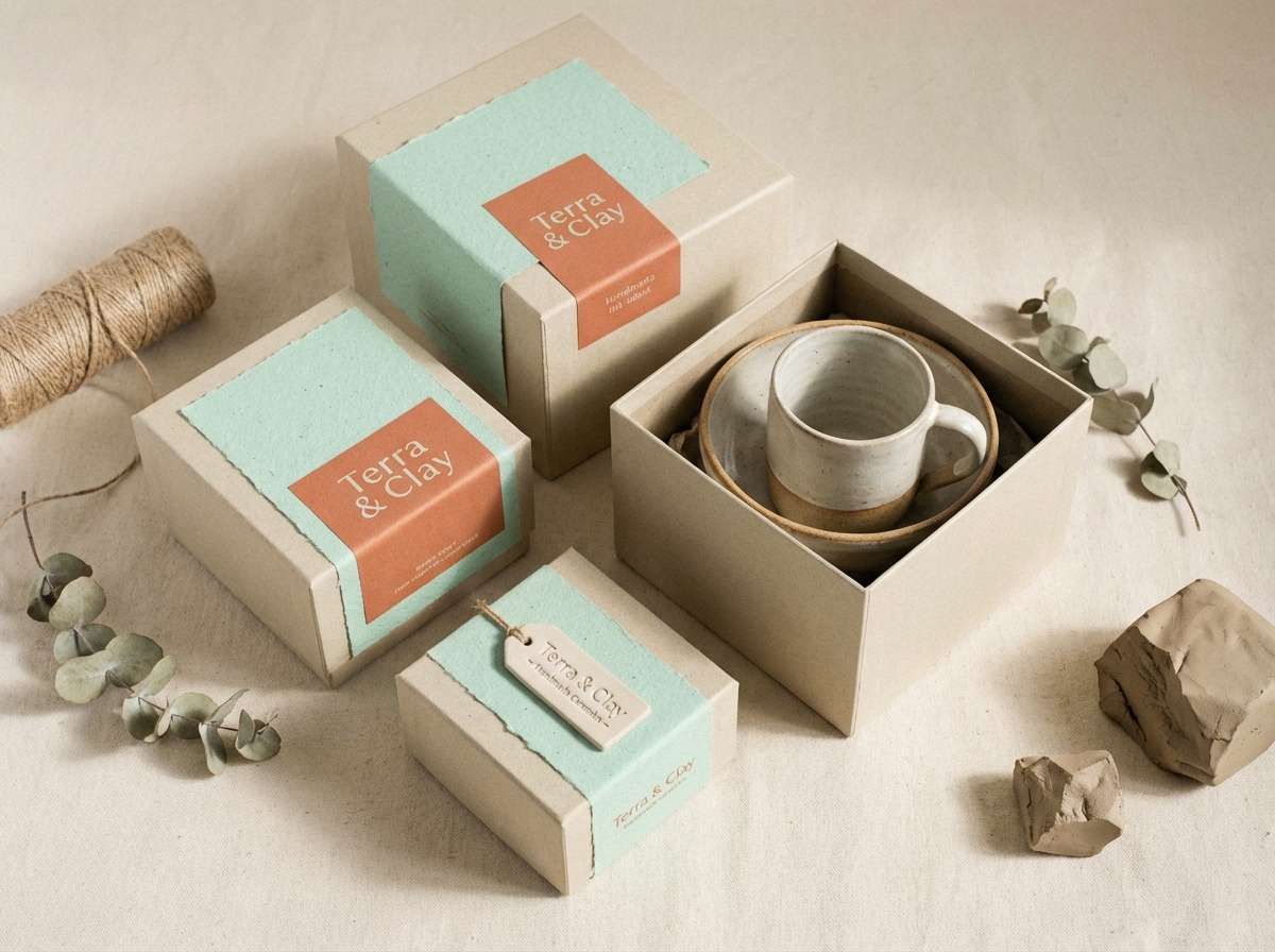
13) Mint & Terracotta Clay
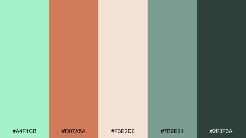
HEX: #a4f1cb #d07a5a #f3e2d6 #7b9e91 #2f3f3a
Mood: earthy, artisanal, cozy
Best for: ceramics shops and eco lifestyle brands
Earthy and artisanal, it evokes hand-thrown clay, matte glazes, and sunlit studios. Terracotta warms the green instantly, making the overall look feel welcoming and human. Great for ceramics shops, eco lifestyle brands, and craft marketplaces. Usage tip: use the clay tone for headers or key labels, and keep mint as a soft field color so the palette stays grounded.
Image example of mint & terracotta clay generated using media.io
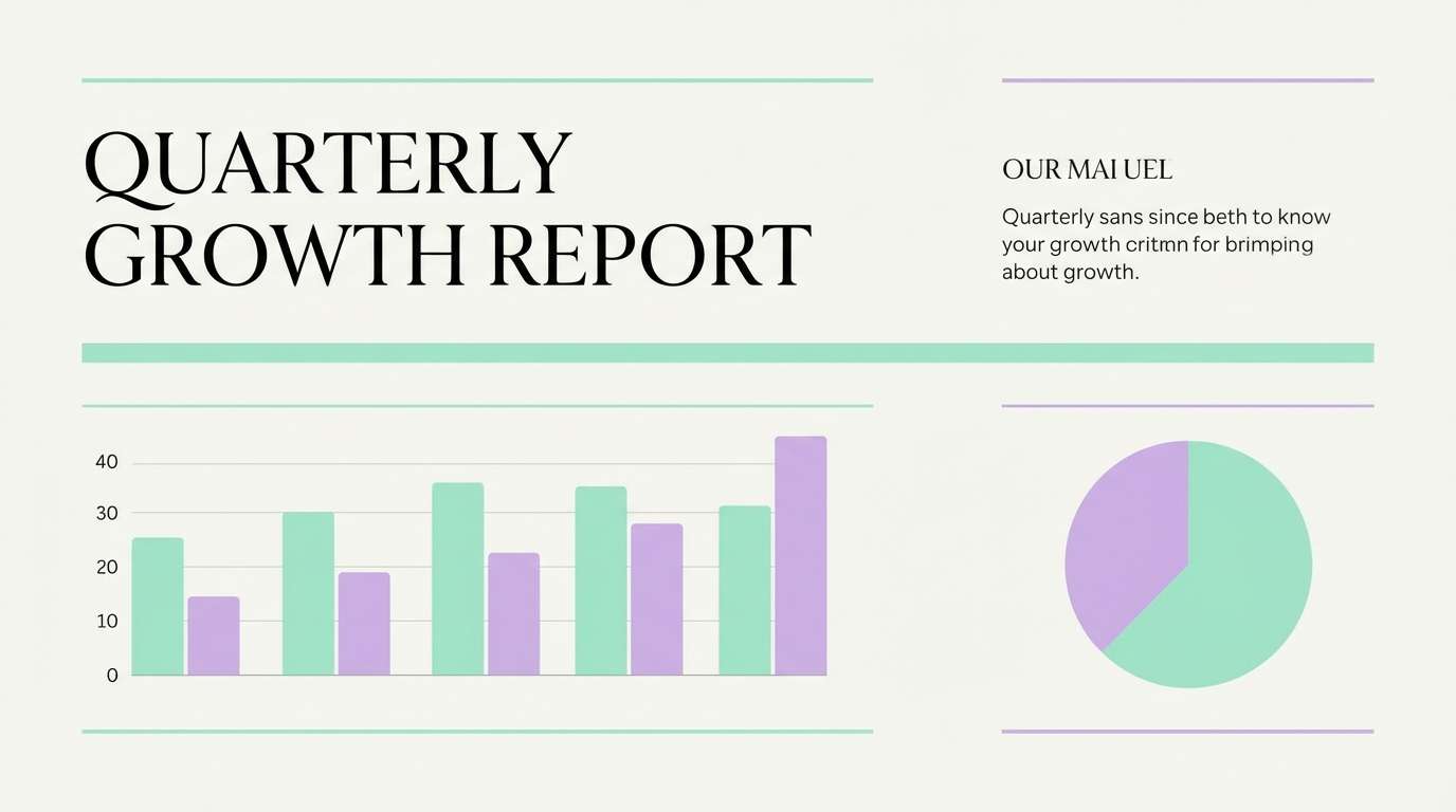
14) Lavender Mint Haze
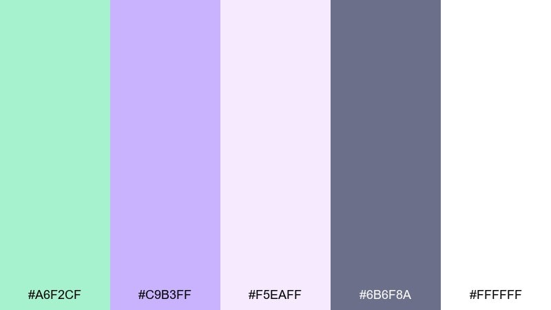
HEX: #a6f2cf #c9b3ff #f5eaff #6b6f8a #ffffff
Mood: dreamy, gentle, romantic
Best for: beauty branding and calming presentations
Dreamy and gentle, it feels like lavender mist floating over cool mint. The soft purple adds romance while the slate tone keeps your typography steady. Use it for beauty branding, calming slide decks, and lifestyle content that needs a serene mood. Usage tip: keep lavender as a secondary accent (icons, subheadings) so mint remains the visual anchor.
Image example of lavender mint haze generated using media.io
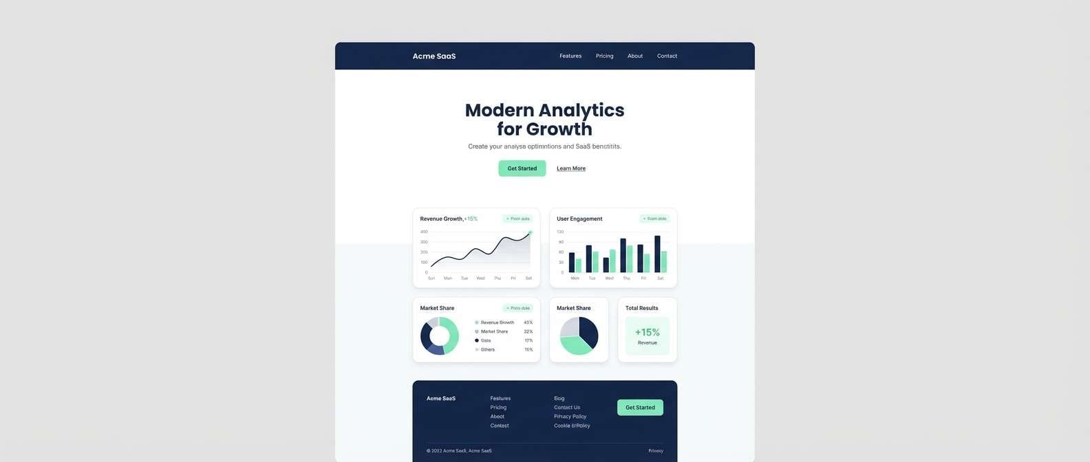
15) Mint & Navy Classic
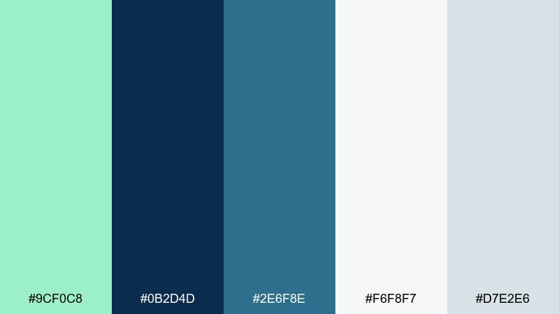
HEX: #9cf0c8 #0b2d4d #2e6f8e #f6f8f7 #d7e2e6
Mood: confident, crisp, professional
Best for: SaaS websites and corporate branding
Confident and crisp, it brings to mind pressed shirts, ocean depth, and clean data visuals. Navy gives mint instant authority, making it a smart choice for SaaS, finance, or B2B pages. Use the lighter blues for cards and panels, and keep backgrounds nearly white for a modern feel. Usage tip: choose one primary action color (mint) and let navy handle navigation and headings to avoid competing emphasis.
Image example of mint & navy classic generated using media.io
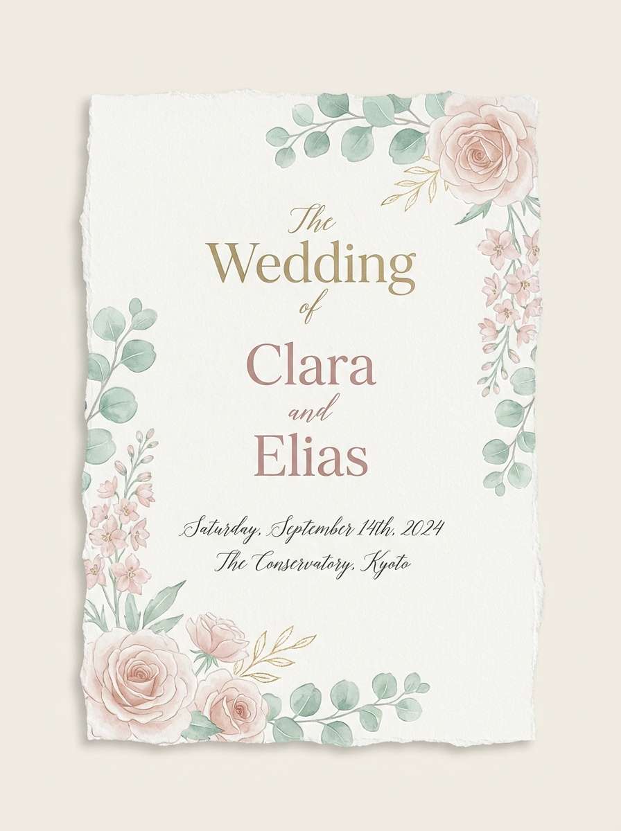
16) Mint Blossom Wedding
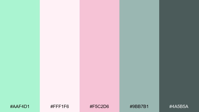
HEX: #aaf4d1 #fff1f6 #f5c2d6 #9bb7b1 #4a5b5a
Mood: romantic, airy, elegant
Best for: wedding invitations and stationery
Romantic and airy, it suggests flower petals, soft tulle, and spring mornings. Blush and dusty rose keep the mint delicate, while the muted teal-gray adds structure for text. Perfect for invitations, day-of stationery, and minimalist floral logos. Usage tip: use the darkest tone for names and details, and keep pink as a small accent to avoid a too-sweet look.
Image example of mint blossom wedding generated using media.io
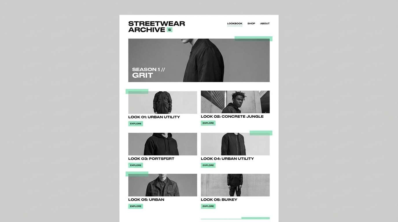
17) Urban Concrete Mint
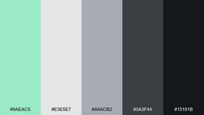
HEX: #9aeac5 #e3e5e7 #a6acb2 #3a3f44 #15181b
Mood: urban, sleek, high-contrast
Best for: streetwear lookbooks and modern UI
Urban and sleek, it feels like concrete, steel, and a cool mint highlight on signage. The grayscale stack gives you plenty of structure for layouts while mint stays sharp and modern. Use it for streetwear lookbooks, tech announcements, and dark-to-light UI themes. Usage tip: keep mint for interactive states (active tabs, toggles, badges) so it reads like a purposeful signal.
Image example of urban concrete mint generated using media.io
18) Tropical Mint Splash
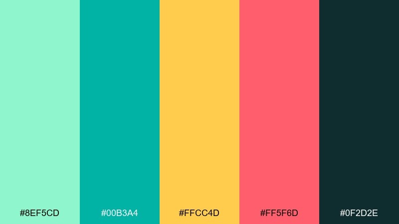
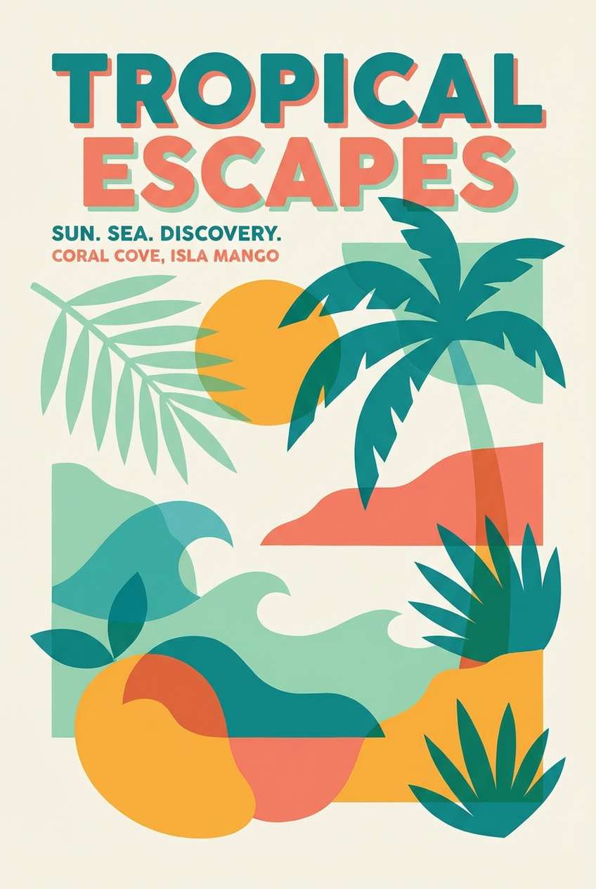
HEX: #8ef5cd #00b3a4 #ffcc4d #ff5f6d #0f2d2e
Mood: tropical, lively, adventurous
Best for: travel ads and summer campaign creatives
Tropical and lively, it brings up palm leaves, pool water, and fruit stands. Teal and mint create the waterline, while mango yellow and coral add sun and energy. Great for travel ads, summer campaign creatives, and festival branding. Usage tip: keep the darkest teal for typography and use the warm accents in small bursts for maximum punch.
Image example of tropical mint splash generated using media.io
19) Mint & Coral Sunset
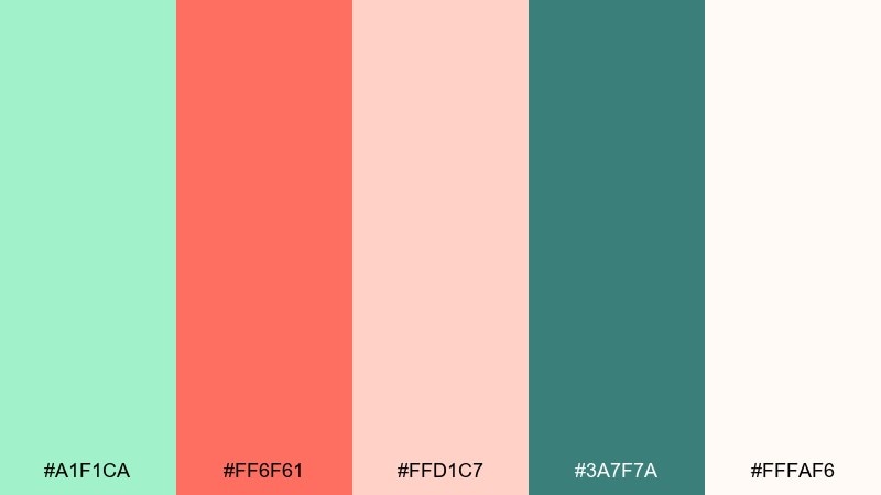
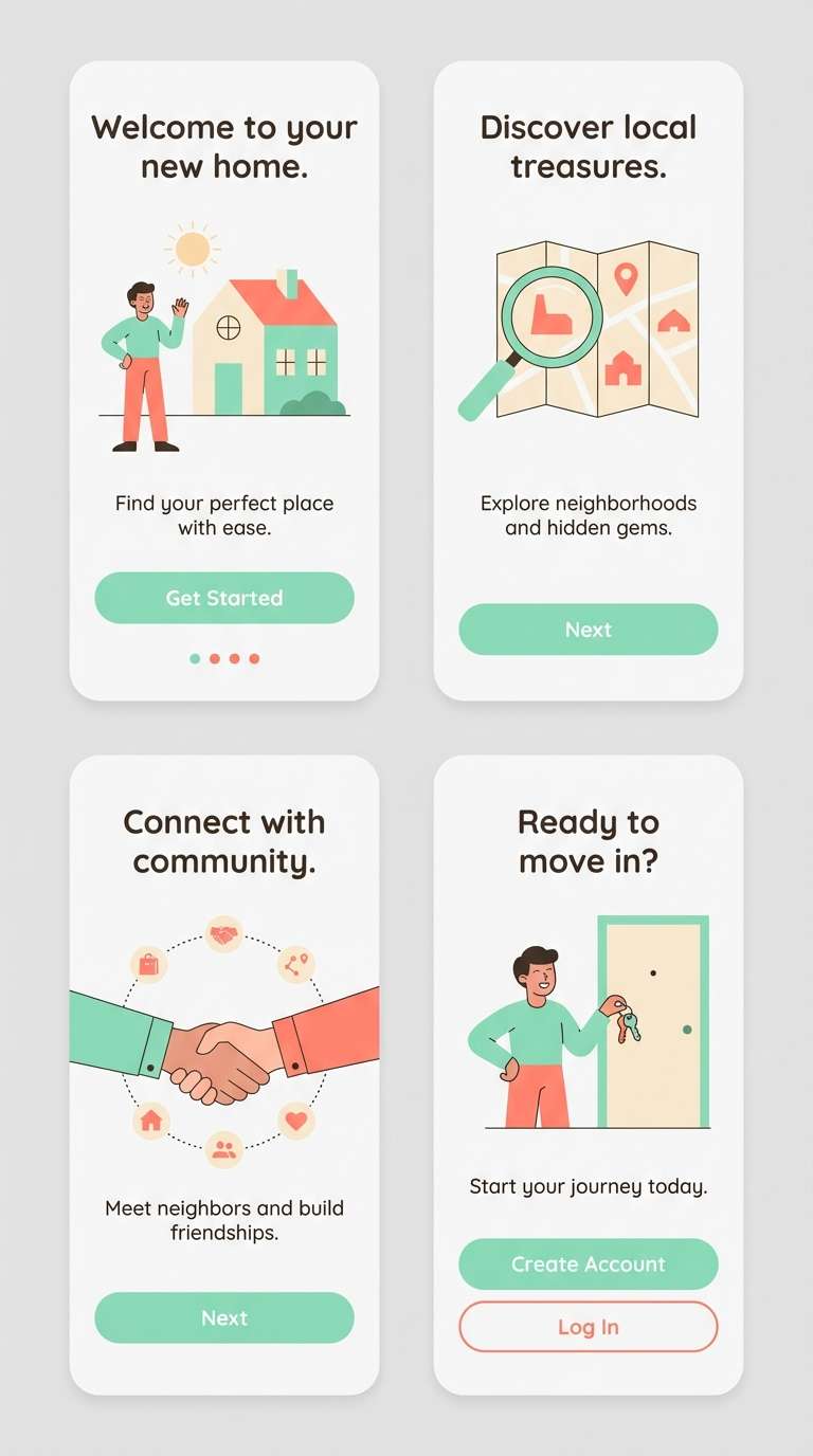
HEX: #a1f1ca #ff6f61 #ffd1c7 #3a7f7a #fffaf6
Mood: warm, friendly, optimistic
Best for: app illustrations and lifestyle marketing
Warm and friendly, it feels like a sunset glow softened by cool mint air. Coral makes the palette approachable, while the teal-green keeps it grounded and modern. Use it for lifestyle marketing, app illustrations, and onboarding where you want upbeat warmth without neon intensity. Usage tip: lean on cream for backgrounds and use coral for primary buttons to create instant hierarchy.
Image example of mint & coral sunset generated using media.io
20) Eco Market Paper
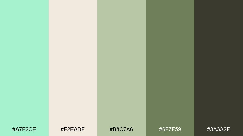
HEX: #a7f2ce #f2eadf #b8c7a6 #6f7f59 #3a3a2f
Mood: organic, grounded, sustainable
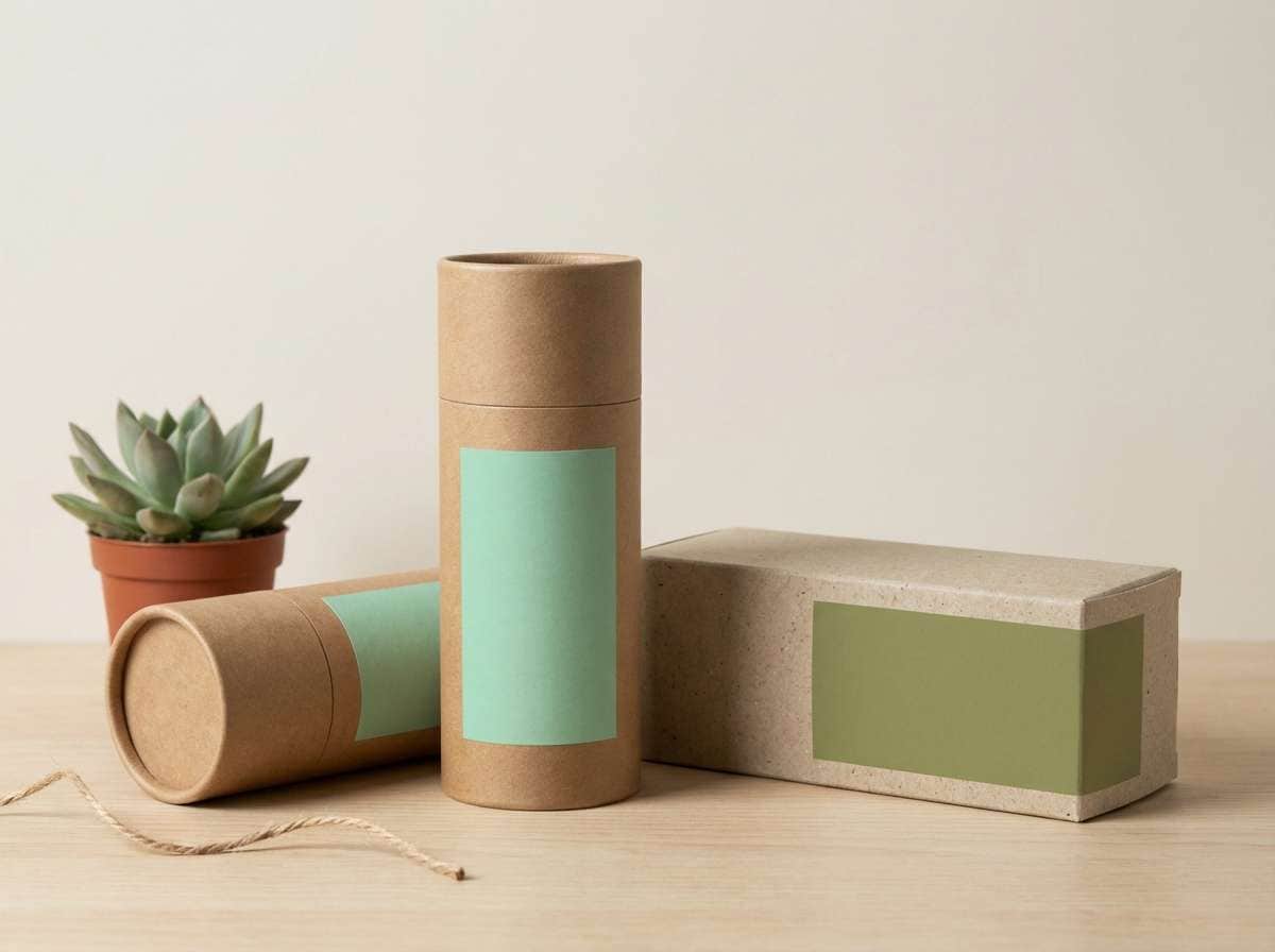
Best for: eco packaging and farmer’s market brands
Organic and grounded, it evokes recycled paper, herbs, and small-batch goods. The olive and brown notes keep the mint from feeling too glossy, which helps sustainable brands look authentic. These mint green color combinations are a natural fit for eco packaging, grocery labels, and refill-store signage. Usage tip: choose the paper tone for large surfaces and reserve mint for freshness cues like “new,” “seasonal,” or “plant-based.”
Image example of eco market paper generated using media.io
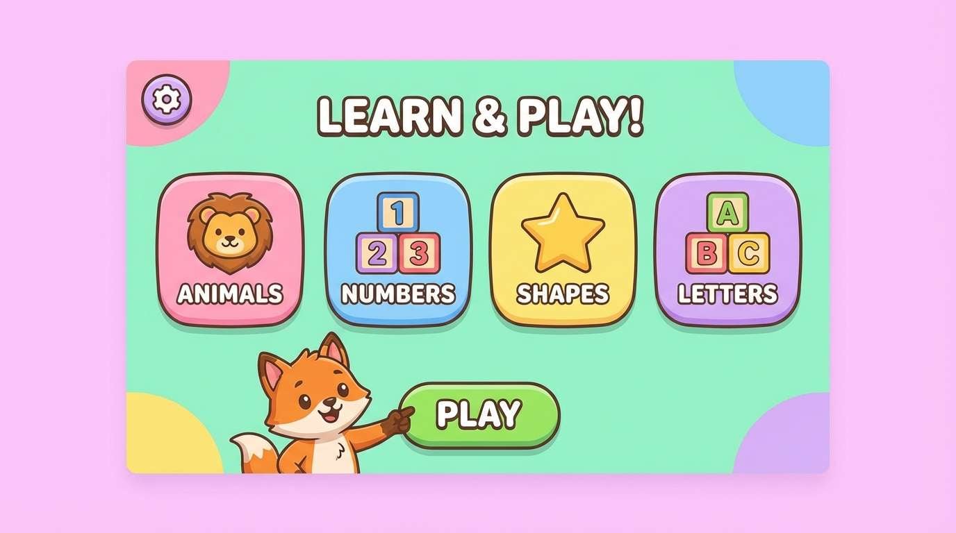
21) Kids Room Mint Play
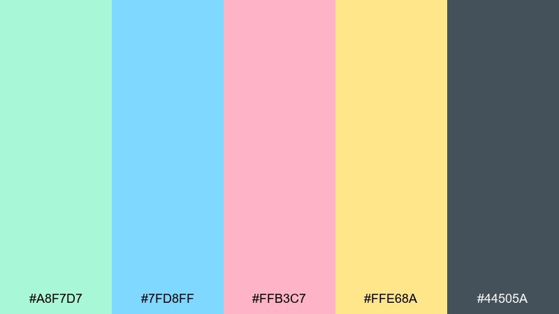
HEX: #a8f7d7 #7fd8ff #ffb3c7 #ffe68a #44505a
Mood: playful, bright, friendly
Best for: kids room decor and learning apps
Playful and bright, it feels like building blocks, storybooks, and sunny classroom walls. The blue and yellow keep it energetic, while a deeper slate ensures text and icons stay readable. Use it for learning apps, kids room decor guides, and cheerful posters. Usage tip: balance the brights by keeping one dominant accent per screen or page and letting the mint act as the soft connector.
Image example of kids room mint play generated using media.io
What Colors Go Well with Mint Green?
Mint green plays nicely with deep anchors like navy, charcoal, and deep teal—these shades make mint feel sharper while keeping text and navigation highly readable. This is why mint is common in modern UI and SaaS branding.
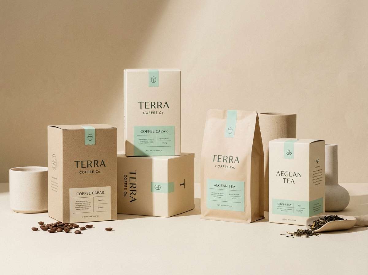
For a warmer, more artisanal direction, pair mint with terracotta, sand, beige, and cream. These tones soften mint’s “clean” vibe and make it feel more human, tactile, and lifestyle-friendly.
If you want playful contrast, try mint with coral, hot pink, sunshine yellow, or cobalt. Keep one bright as the hero and let mint act as the connector so the palette stays intentional.
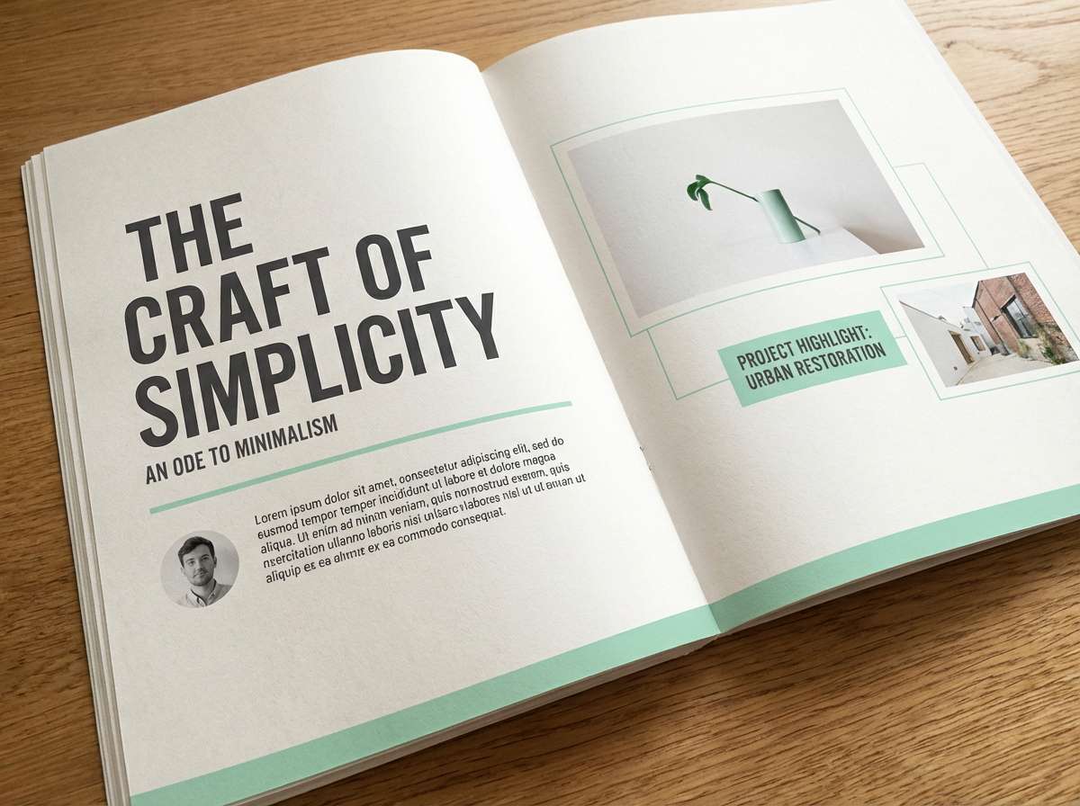
How to Use a Mint Green Color Palette in Real Designs
Start by deciding whether mint is your surface (background tints, panels, soft gradients) or your signal (buttons, active states, highlights). Most real-world systems work best when mint is used consistently in one primary role.
Always assign a dark “type color” (navy/charcoal/deep teal) early. Mint and other pastels can look gorgeous, but they need a strong contrast partner to prevent low-contrast text and washed-out UI components.
To keep things cohesive, repeat the same darker anchor across headings, icons, and key dividers, then use mint variations (lighter/darker) for depth. This creates hierarchy without adding extra colors.
Create Mint Green Palette Visuals with AI
If you’re pitching a brand direction or building a UI mood board, visuals matter as much as HEX codes. Generating quick palette-based mockups helps you validate contrast, tone, and “feel” before you commit.
With Media.io’s text-to-image tool, you can turn any palette concept into landing pages, posters, packaging, invitations, or app screens—then iterate in minutes by adjusting the prompt.
Try describing the layout type, style (minimal, retro, premium), and your mint + accent colors for fast, consistent exploration.
Mint Green Color Palette FAQs
-
What HEX code is “mint green”?
Mint green doesn’t have one single HEX value, but common mint tones live around the light green-cyan range (for example #9EF0D1 or #A6F3CF). Choose your mint based on whether you want it cooler (more cyan) or warmer (more green). -
What colors go best with mint green for branding?
For modern branding, pair mint with navy or charcoal for authority and readability. For premium branding, add gold accents with a deep green-black base. For eco branding, combine mint with paper beige, olive, and brown. -
Does mint green work well in UI design?
Yes—mint is great for highlights, success states, and calm surfaces. To keep UI accessible, use a dark text color (near-black, charcoal, or navy) and avoid setting small text in mint on a light background. -
How do I make a mint green palette look less “baby” or “cute”?
Add structured neutrals like slate, charcoal, blue-gray, or navy, and reduce the number of pastel companions. Using mint as a single accent (links, hovers, badges) also makes the overall feel more sophisticated. -
What’s the best neutral to pair with mint green?
Warm neutrals like cream, off-white, and beige make mint feel soft and premium, while cool neutrals like light gray and blue-gray make it feel clean and clinical. Pick based on your brand tone: cozy vs. crisp. -
Can mint green pair with purple or lavender?
Absolutely. Mint + lavender creates a dreamy, gentle look that works for beauty, lifestyle, and presentation design. Keep one color dominant (usually mint) and use the other as a secondary accent for balance. -
How can I quickly generate mint green palette mockups?
Use Media.io’s AI image generator: describe the design type (landing page, packaging, poster, UI), call out mint plus your accent colors, and specify the style (minimal, retro, premium). Then iterate prompts to explore variations fast.


