

Burgundy dark red sits in that sweet spot between bold and refined—deep enough to feel premium, but warm enough to stay inviting. It’s a go-to for moody branding, modern UI, and print pieces that need instant depth.
Below are 20 curated burgundy dark red palette ideas with HEX codes, plus practical pairing tips and AI image prompts you can reuse to visualize each look.
In this article
- Why Burgundy Dark Red Palettes Work So Well
-
- velvet merlot
- smoked rosewood
- garnet and champagne
- cabernet night ui
- brick and oatmeal
- wine label luxe
- plum smoke
- autumn velvet
- minimal maroon poster
- cherrywood and sage
- museum editorial
- rustic winery packaging
- dusty cranberry wedding
- midnight sangria
- rose garnet cosmetics
- fireside leather
- cranberry ink ui
- holiday velvet card
- mocha burgundy
- burgundy noir social
- What Colors Go Well with Burgundy Dark Red?
- How to Use a Burgundy Dark Red Color Palette in Real Designs
- Create Burgundy Dark Red Palette Visuals with AI
Why Burgundy Dark Red Palettes Work So Well
Burgundy dark red reads as mature, expressive, and intentional. It carries the energy of red, but with added black and brown undertones that feel grounded and upscale rather than loud.
That depth makes it exceptionally flexible: it can anchor high-contrast minimal layouts, add warmth to neutral-heavy designs, or create a “night mode” atmosphere without relying on pure black.
In print, burgundy tones translate beautifully on textured stocks, uncoated papers, and foil details—ideal when you want a design to feel tactile and premium.
20+ Burgundy Dark Red Color Palette Ideas (with HEX Codes)
1) Velvet Merlot
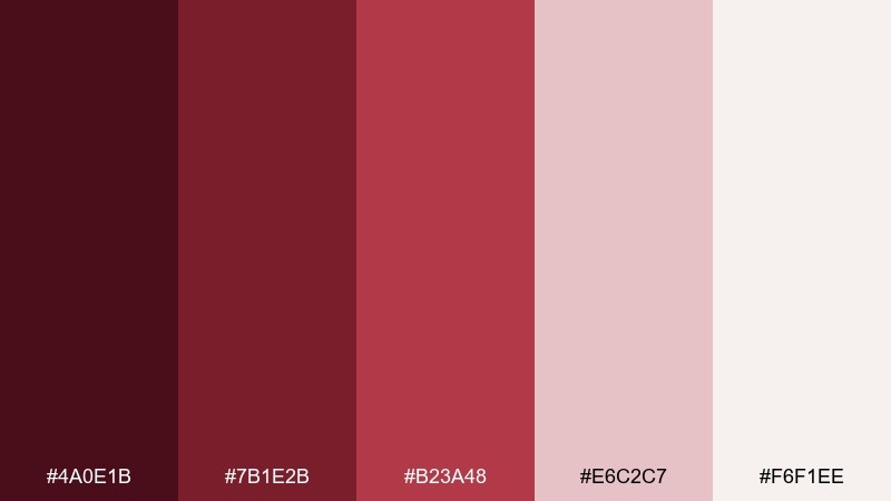
HEX: #4A0E1B #7B1E2B #B23A48 #E6C2C7 #F6F1EE
Mood: lush, romantic, upscale
Best for: beauty branding and product ads
Lush and romantic like crushed velvet in candlelight, these tones feel instantly premium. Use the deep merlot as your anchor, then let rose and blush lift the layout without turning sweet. Pair with warm ivory for negative space and a restrained, editorial look. Tip: keep typography in near-black or merlot for a clean luxury finish.
Image example of velvet merlot generated using media.io
Media.io is an online AI studio for creating and editing video, image, and audio in your browser.

2) Smoked Rosewood
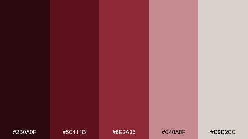
HEX: #2B0A0F #5C111B #8E2A35 #C48A8F #D9D2CC
Mood: moody, smoky, classic
Best for: restaurant menus and wine bars
Moody and smoky like old rosewood and dim bar lighting, this mix feels intimate and classic. Use the near-black burgundy for backgrounds and let dusty rose soften section headers and dividers. It pairs beautifully with textured paper stocks and subtle metallic foils. Tip: reserve the mid red for callouts so the menu stays refined.
Image example of smoked rosewood generated using media.io

3) Garnet and Champagne

HEX: #5B0B1A #8A1F2D #C24B58 #E9D6C5 #FFF7EF
Mood: celebratory, elegant, warm
Best for: wedding invitations and RSVP cards
Celebratory and elegant like a toast at golden hour, garnet and champagne create instant warmth. This burgundy dark red color palette works best with generous cream space and a single strong garnet header. Pair it with delicate serif type, embossing, or subtle foil accents for a formal feel. Tip: keep the pink-red as a small floral or border detail to avoid overpowering the paper.
Image example of garnet and champagne generated using media.io

4) Cabernet Night UI
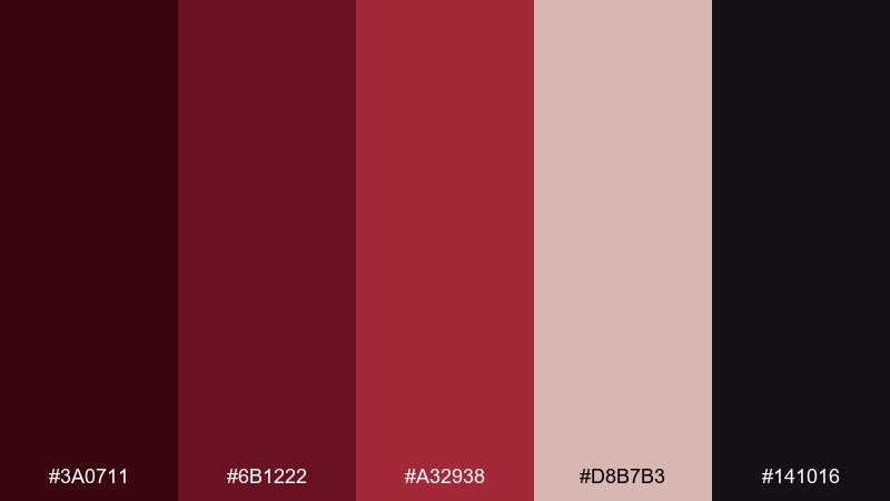
HEX: #3A0711 #6B1222 #A32938 #D8B7B3 #141016
Mood: sleek, nocturnal, modern
Best for: finance or loyalty app UI
Sleek and nocturnal like city lights reflected on a dark glass, these tones feel modern and controlled. Use the inky base for navigation and surfaces, then bring cabernet into primary buttons for crisp hierarchy. Soft blush is ideal for subtle states like badges or highlights. Tip: increase contrast with off-white text and keep gradients minimal for accessibility.
Image example of cabernet night ui generated using media.io
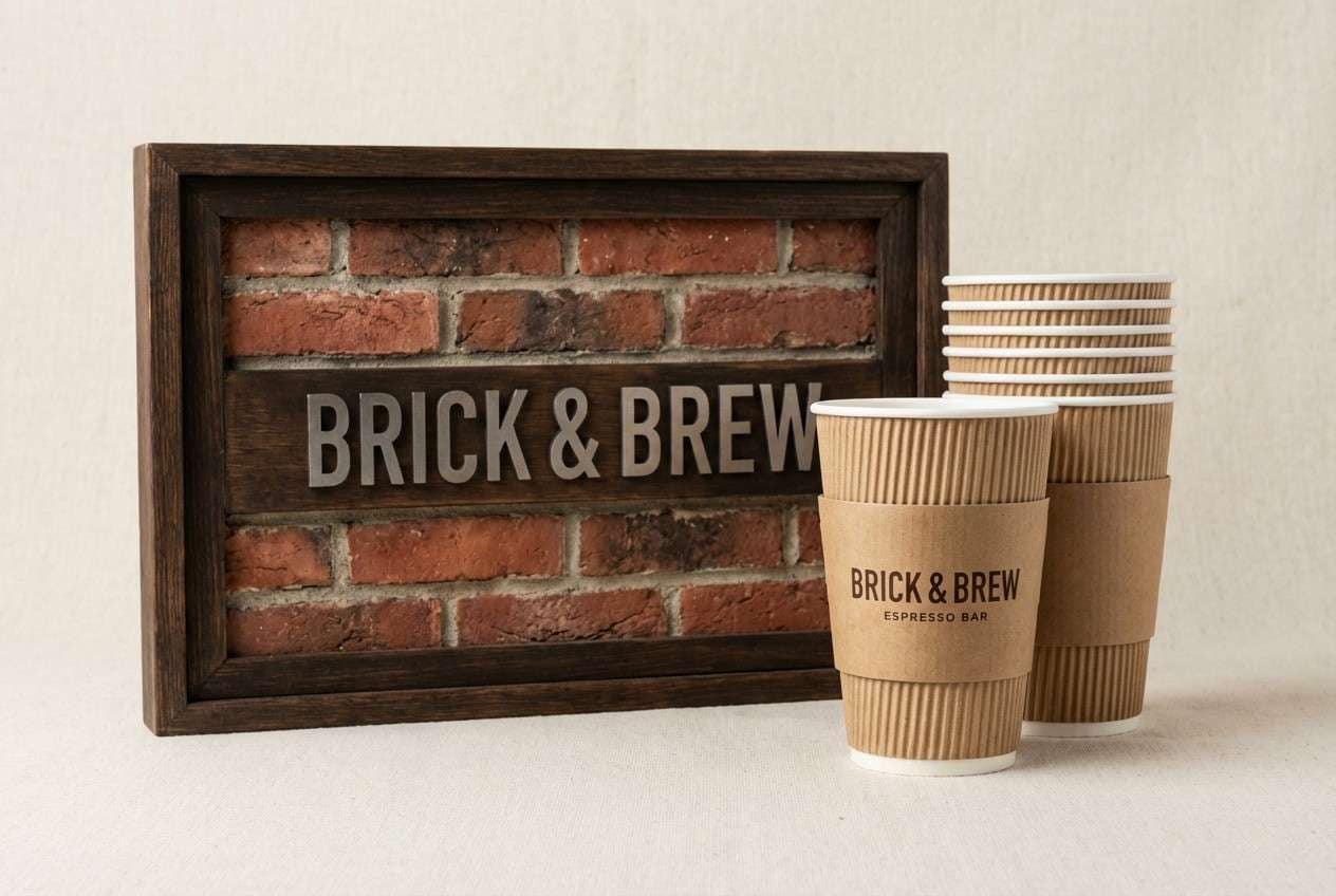
5) Brick and Oatmeal
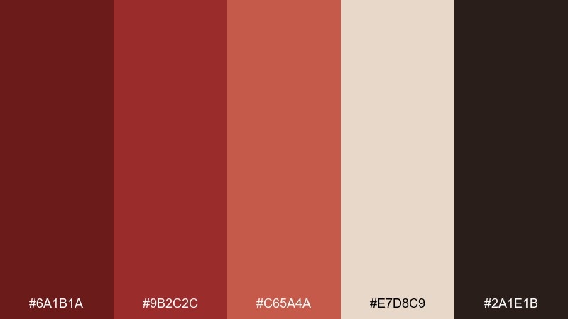
HEX: #6A1B1A #9B2C2C #C65A4A #E7D8C9 #2A1E1B
Mood: earthy, cozy, approachable
Best for: cafe branding and signage
Earthy and cozy like warm brick and steamed milk, this set feels welcoming rather than formal. Use oatmeal as the base for signage and packaging, with brick and terracotta for friendly emphasis. The espresso brown gives structure for logos, icons, and type. Tip: keep red tones matte and pair with natural textures like kraft paper or linen.
Image example of brick and oatmeal generated using media.io
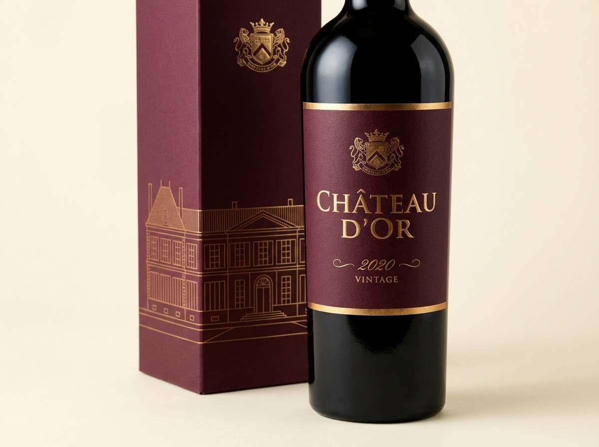
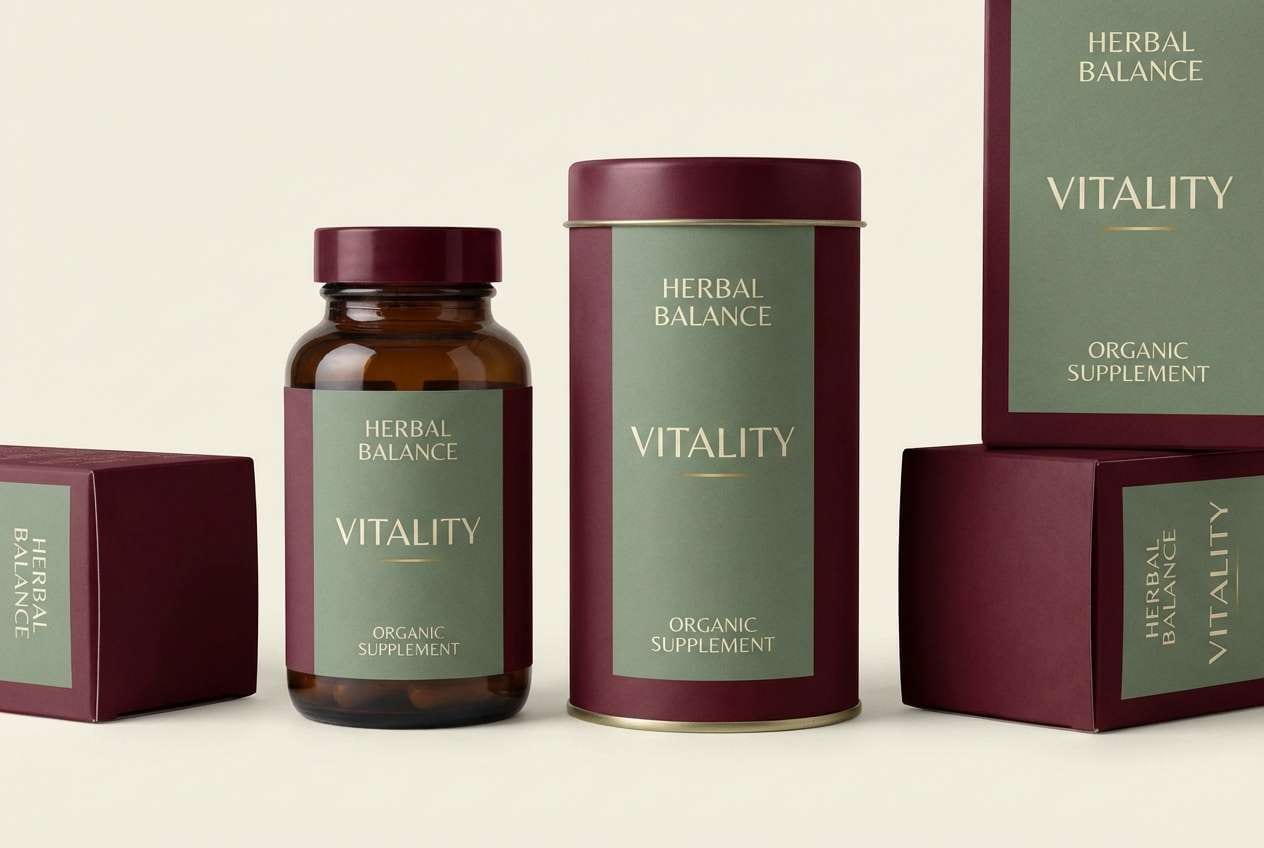
6) Wine Label Luxe
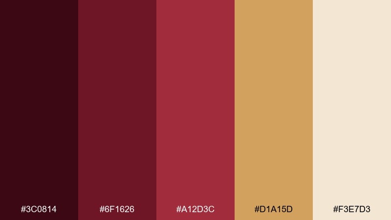
HEX: #3C0814 #6F1626 #A12D3C #D1A15D #F3E7D3
Mood: opulent, heritage, refined
Best for: premium bottle labels and packaging
Opulent and heritage-driven like a cellar reserve, these tones signal craftsmanship. Burgundy dark red color combinations shine here when gold is treated as a small, high-impact accent for borders and seals. Use cream for readability and keep the darkest shade for background panels or capsule details. Tip: avoid large gold fills and opt for thin foiled lines to keep it classy.
Image example of wine label luxe generated using media.io
7) Plum Smoke
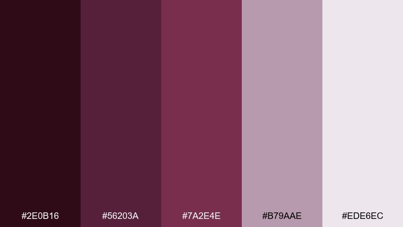
HEX: #2E0B16 #56203A #7A2E4E #B79AAE #EDE6EC
Mood: mysterious, artistic, soft
Best for: music posters and album covers
Mysterious and artistic like smoky stage lights, plum-leaning reds bring depth without harshness. Let the darkest tone carry the background while mauve and dusty lilac shape gradients and spotlight typography. It pairs well with monochrome photography and grain textures. Tip: use the pale lilac as a margin glow to keep dark layouts from feeling heavy.
Image example of plum smoke generated using media.io
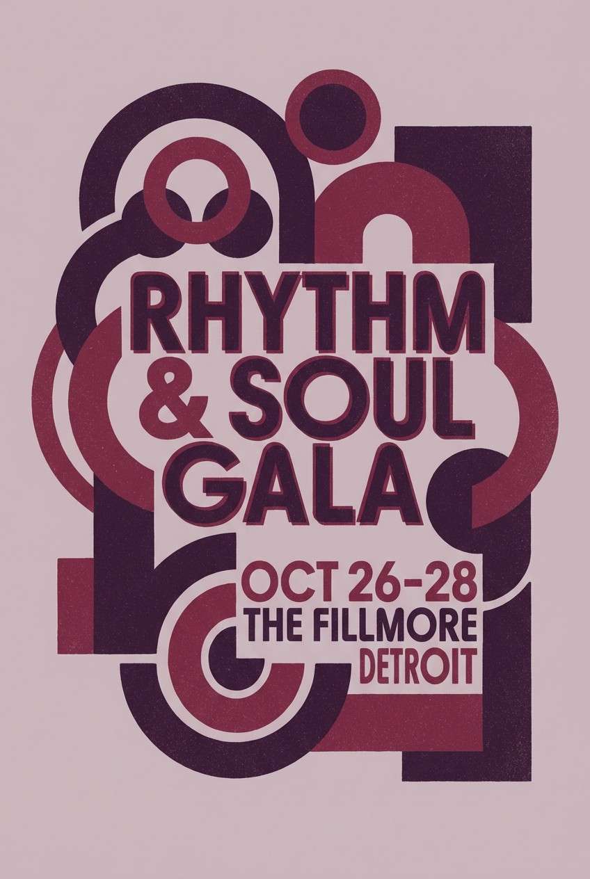
8) Autumn Velvet
HEX: #4B0C14 #7C1D24 #B13A3A #D6A24A #F1E5D1
Mood: seasonal, inviting, bold
Best for: fall sale banners and social ads
Seasonal and inviting like leaves under soft sun, these reds pair naturally with honeyed gold. Use cream as the canvas and keep the gold to highlights, icons, or price badges. The mid red gives energy for CTAs without fighting the deeper tones. Tip: add subtle shadows instead of extra colors to keep the banner crisp.
Image example of autumn velvet generated using media.io

9) Minimal Maroon Poster
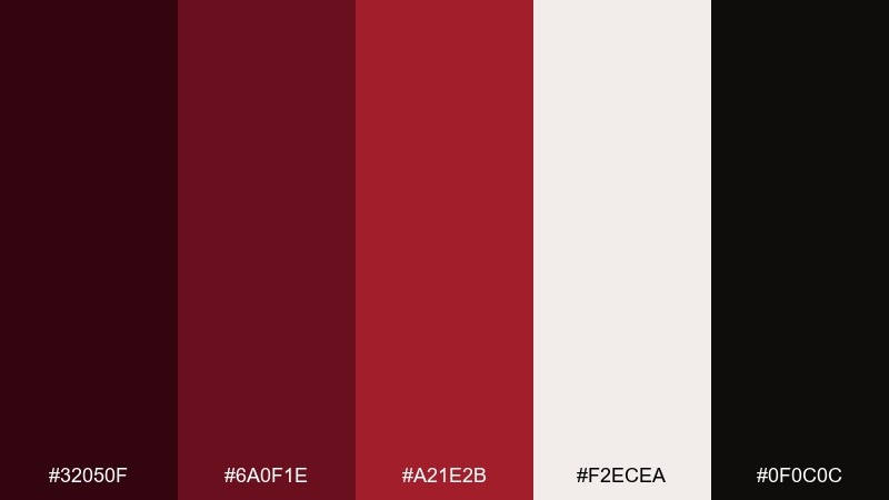
HEX: #32050F #6A0F1E #A21E2B #F2ECEA #0F0C0C
Mood: minimal, high-contrast, dramatic
Best for: gallery posters and event flyers
Minimal and dramatic like ink on paper, this set is built for contrast. Use off-white as the primary field, then place maroon and black in large typographic blocks. The brighter red works best as a single underline, dot, or date stamp. Tip: keep spacing generous so the dark tones feel intentional, not crowded.
Image example of minimal maroon poster generated using media.io

10) Cherrywood and Sage

HEX: #4A0A12 #7D1521 #B0282F #A3B18A #F4EFE7
Mood: balanced, natural, contemporary
Best for: wellness branding and packaging
Balanced and contemporary like cherrywood next to fresh herbs, this pairing feels calm but memorable. Use sage as a large supporting color to soften the reds and make layouts feel breathable. Cream keeps labels readable and helps the darker shades look richer. Tip: let sage own secondary buttons or ingredient lists while red stays for the brand mark.
Image example of cherrywood and sage generated using media.io
11) Museum Editorial
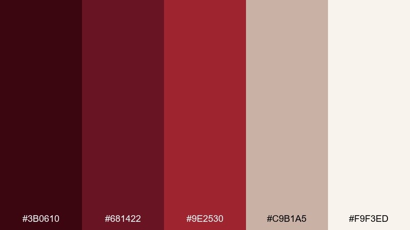
HEX: #3B0610 #681422 #9E2530 #C9B1A5 #F9F3ED
Mood: curated, academic, timeless
Best for: magazine spreads and lookbooks
Curated and timeless like a museum catalog, these reds read sophisticated and scholarly. Use warm paper tones as the base, then introduce deep burgundy in headers and pull quotes. The muted taupe-pink works well for section tabs and subtle rules. Tip: pair with classic serif type and keep photo borders thin for a refined finish.
Image example of museum editorial generated using media.io
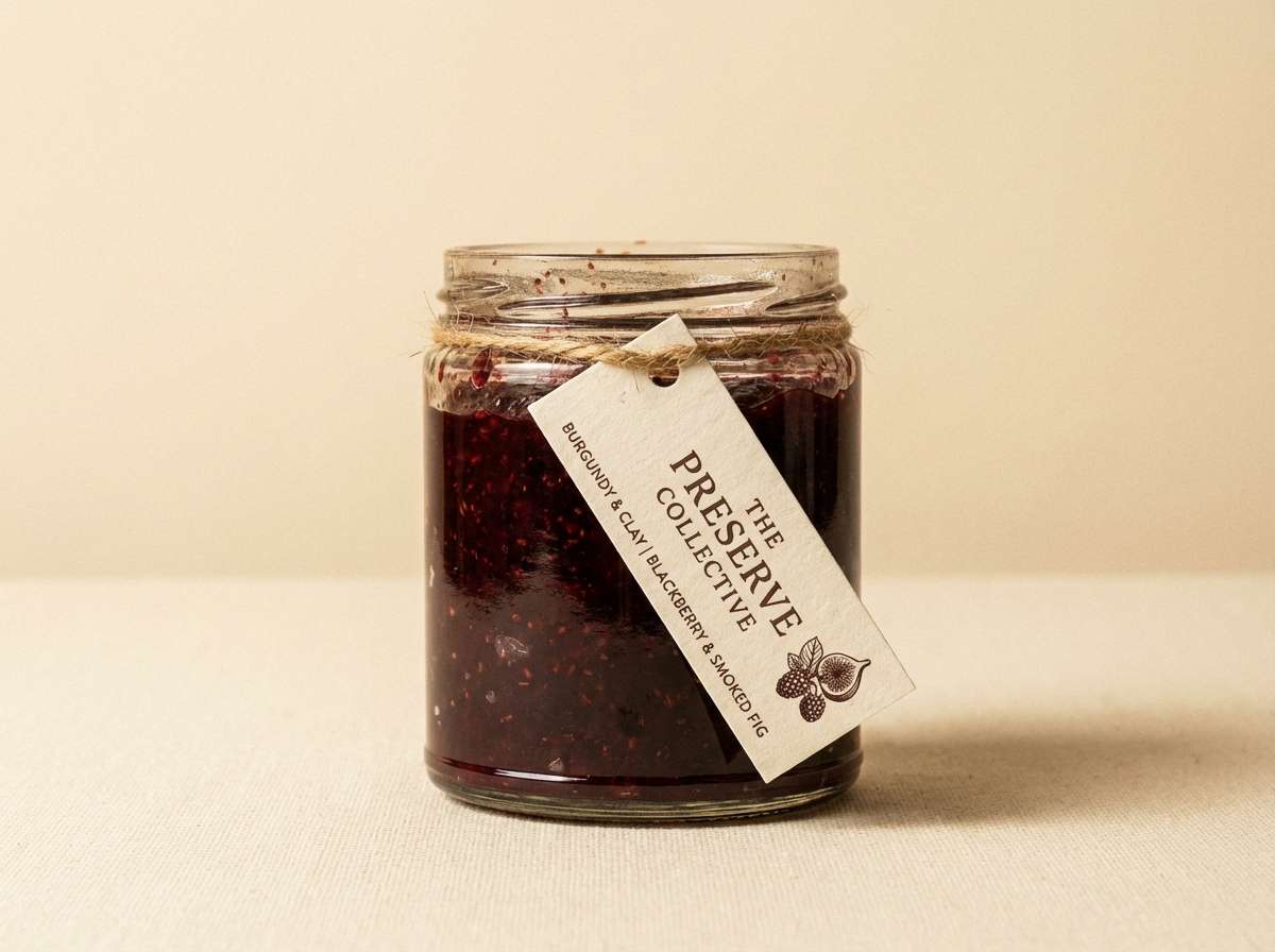
12) Rustic Winery Packaging
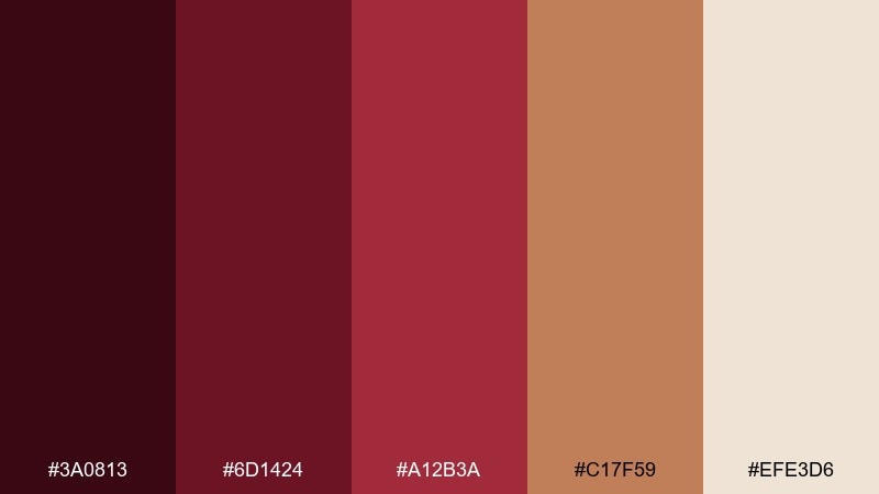
HEX: #3A0813 #6D1424 #A12B3A #C17F59 #EFE3D6
Mood: rustic, warm, handcrafted
Best for: artisan food labels and jars
Rustic and handcrafted like a tasting room shelf, these hues feel honest and warm. Use the clay brown to bridge the reds with natural materials like paper labels and twine. Cream keeps ingredient text clear while the darker burgundy adds heritage depth. Tip: add a small stamp or seal in the mid red to make the label pop at a distance.
Image example of rustic winery packaging generated using media.io
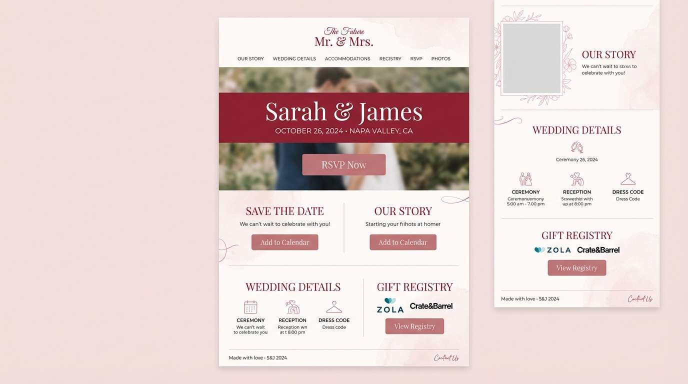
13) Dusty Cranberry Wedding

HEX: #5A0F1F #8D2432 #C04A5A #F0D7DA #F7F2F0
Mood: romantic, soft, modern classic
Best for: wedding websites and stationery suites
Romantic and soft like dried florals, this set is gentle while still feeling grown-up. Use the pale blush as the background and keep cranberry for headings and key details like dates. It pairs nicely with warm neutrals, vellum overlays, and subtle botanical line art. Tip: keep accent blocks translucent so the suite stays airy.
Image example of dusty cranberry wedding generated using media.io
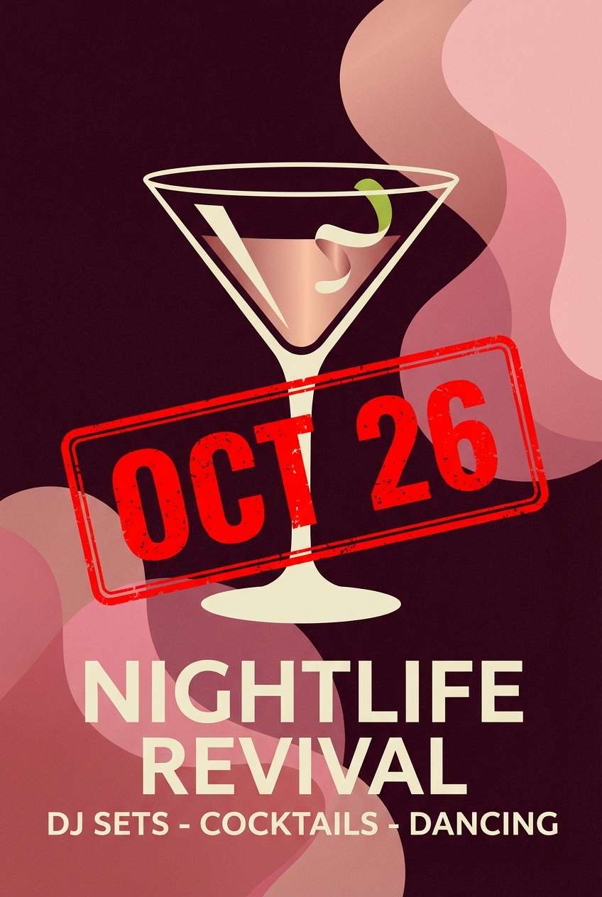
14) Midnight Sangria
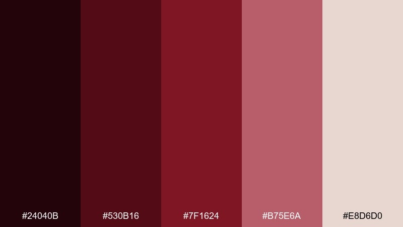
HEX: #24040B #530B16 #7F1624 #B75E6A #E8D6D0
Mood: intense, cinematic, sultry
Best for: nightlife posters and cocktail promos
Intense and cinematic like sangria under neon-free streetlight, these tones feel sultry and bold. This burgundy dark red color palette is strongest when the darkest shade owns the background and the lighter rose is used as a glow. Pair with clean condensed type and simple geometric shapes to keep it modern. Tip: highlight only one element, like the event date, in the brighter red for instant hierarchy.
Image example of midnight sangria generated using media.io
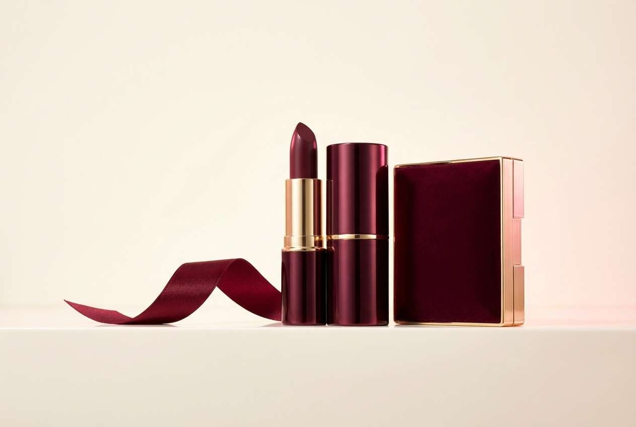
15) Rose Garnet Cosmetics
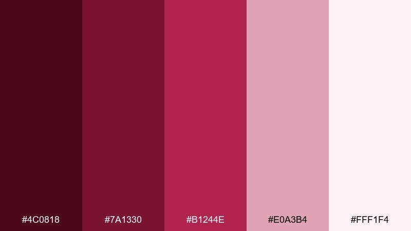
HEX: #4C0818 #7A1330 #B1244E #E0A3B4 #FFF1F4
Mood: glam, feminine, vibrant
Best for: cosmetics launches and landing pages
Glam and vibrant like a satin lipstick swipe, this range feels confident and polished. Use the pale pink as a soft backdrop, then bring garnet into hero headings and key buttons. The bright magenta-red works best for small highlights like badges or icons. Tip: add plenty of white space so the saturated tones feel luxe, not loud.
Image example of rose garnet cosmetics generated using media.io
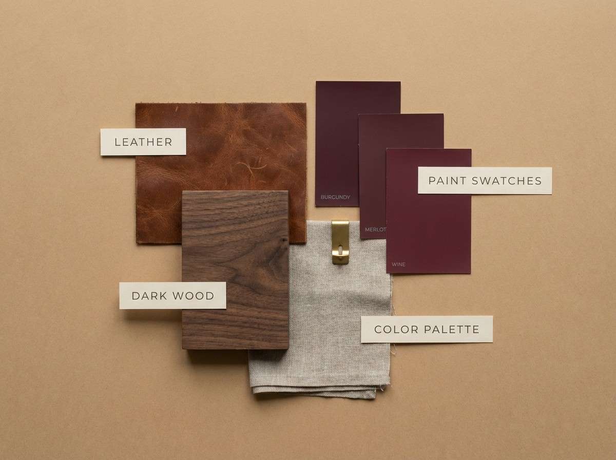
16) Fireside Leather
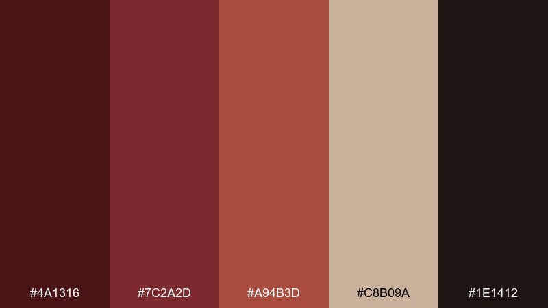
HEX: #4A1316 #7C2A2D #A94B3D #C8B09A #1E1412
Mood: cozy, masculine, heritage
Best for: interior design mood boards
Cozy and heritage-rich like worn leather by a fireplace, this palette leans warm and grounded. Use the tan as the main field and bring the darkest tone into framing, captions, and swatches. It pairs naturally with walnut wood, brass, and wool textures. Tip: keep the red-browns matte and avoid high gloss for a more authentic feel.
Image example of fireside leather generated using media.io
17) Cranberry Ink UI
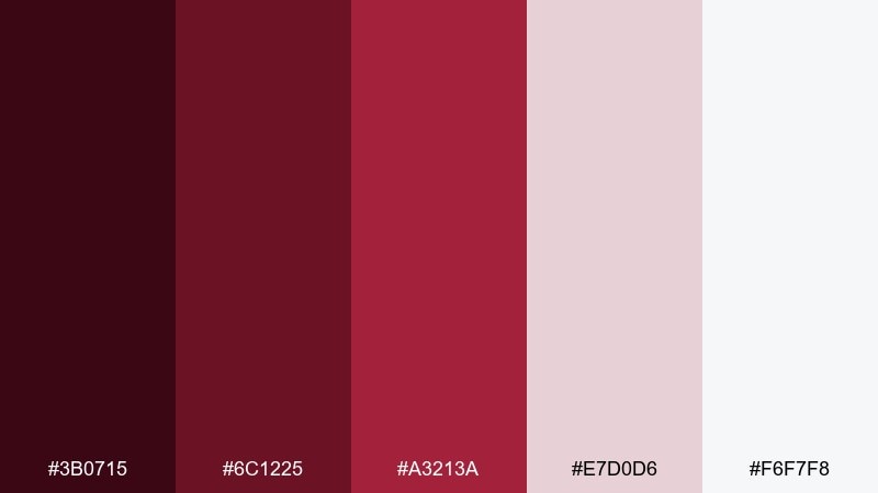
HEX: #3B0715 #6C1225 #A3213A #E7D0D6 #F6F7F8
Mood: clean, confident, professional
Best for: dashboard UI and data cards
Clean and confident like fresh ink on bright paper, these reds feel professional and sharp. Use the light gray as your base UI canvas and reserve cranberry for primary actions and key metrics. The soft blush works well for hover states and subtle chart fills. Tip: keep icons and labels in deep burgundy for consistency without overusing red.
Image example of cranberry ink ui generated using media.io

18) Holiday Velvet Card

HEX: #4B0A18 #7A1427 #B11F3A #F1C8B6 #F7F0E8
Mood: festive, warm, nostalgic
Best for: holiday cards and email headers
Festive and nostalgic like ribbon and mulled wine, these tones feel warm without going overly bright. Burgundy dark red color combinations work beautifully with soft peachy blush to keep the design friendly and modern. Use the light cream for the base and keep the strongest red for a single focal element like a greeting wordmark. Tip: add subtle paper grain or a simple border to enhance the handcrafted vibe.
Image example of holiday velvet card generated using media.io

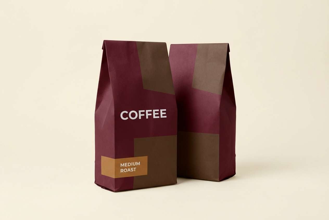
19) Mocha Burgundy

HEX: #3E0B12 #6A1A22 #9A2E32 #B88C74 #EFE7E1
Mood: warm, muted, sophisticated
Best for: coffee packaging and labels
Warm and muted like mocha foam, this set feels sophisticated and quietly bold. Use the creamy neutral for label clarity, then build brand blocks with burgundy and cocoa tones. The dusty caramel makes an excellent secondary accent for roast notes or origin badges. Tip: pair with a simple monoline icon system to keep the look modern.
Image example of mocha burgundy generated using media.io
20) Burgundy Noir Social
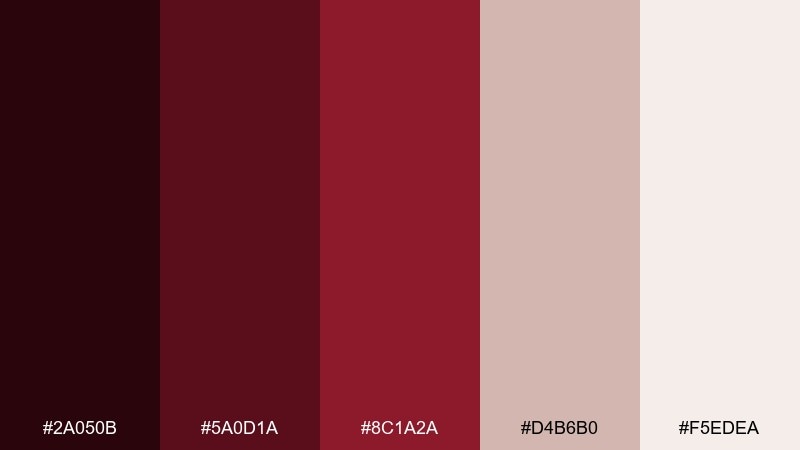
HEX: #2A050B #5A0D1A #8C1A2A #D4B6B0 #F5EDEA
Mood: bold, elegant, high-impact
Best for: social media quote templates
Bold and elegant like noir typography on tinted paper, these tones are made for high-impact posts. Use the pale blush as the base and frame content with deep burgundy blocks for instant structure. The mid red is perfect for a single emphasis word or underline. Tip: keep the layout consistent across a series so the color rhythm becomes your brand signature.
Image example of burgundy noir social generated using media.io

What Colors Go Well with Burgundy Dark Red?
Warm neutrals are the easiest wins: ivory, cream, oatmeal, and soft beige make burgundy feel elevated and readable, especially in print and editorial layouts. For darker compositions, near-black and espresso browns add structure without turning the palette cold.
For contrast, try muted greens like sage or olive—these complementary-leaning tones calm the intensity of dark red and create a modern, nature-inspired balance. Dusty pinks and blush tones also pair naturally, keeping the look romantic instead of heavy.
Metallic accents (gold, brass) work best when used sparingly: thin borders, seals, or small badges. Large metallic fills can overpower the subtle depth that makes burgundy feel premium.
How to Use a Burgundy Dark Red Color Palette in Real Designs
Start by choosing one deepest burgundy as your anchor for headers, navigation, or key brand blocks. Then assign a mid-tone red for emphasis (CTAs, price tags, stamps) and reserve the lightest neutral for breathing room and readability.
In UI, treat burgundy like a “primary action” color and keep surfaces neutral (warm gray, off-white) to prevent visual fatigue. If you’re doing dark UI, increase text contrast and use blush shades for subtle states rather than adding more saturated colors.
In print, burgundy shines on uncoated stocks and textured papers. Use clean type hierarchy, avoid overprinting too many reds at once, and let negative space do the heavy lifting for a refined finish.
Create Burgundy Dark Red Palette Visuals with AI
If you want to preview how a burgundy dark red palette will look in real designs—like packaging, posters, or UI—generate quick concept visuals with AI. It’s ideal for pitching mood boards, testing styles, or exploring multiple directions before committing.
Reuse the prompts above, swap in your product type (label, landing page, invitation), and keep the aspect ratio that matches your target format. You’ll get consistent, on-brand imagery faster—without starting from a blank canvas.
Burgundy Dark Red Color Palette FAQs
-
What HEX code is considered burgundy?
Burgundy isn’t a single HEX code, but common burgundy anchors include deep wine tones like #4A0E1B, #5B0B1A, or #3C0814. Pick the exact shade based on whether you want more brown (warmer) or more purple (plum-leaning). -
Is burgundy the same as maroon?
They’re related, but not identical. Maroon typically leans browner and heavier, while burgundy often feels more “wine-like” with subtle purple/berry undertones. In palettes, burgundy usually pairs more naturally with blush and champagne neutrals. -
What colors complement burgundy dark red?
Muted greens (sage/olive), warm neutrals (cream, oatmeal), and soft blush tones complement burgundy dark red well. For a luxe look, add restrained metallic gold as a small accent. -
How do I keep burgundy from looking too dark in UI?
Use burgundy mainly for primary actions and headings, then keep the main surfaces light (off-white or light gray). If you’re designing a dark UI, increase contrast with off-white text and use blush tints for hover states instead of adding extra saturated reds. -
Does burgundy work for wedding color palettes?
Yes—burgundy is a classic wedding color because it feels formal and romantic. Pair it with champagne/ivory for stationery, or with dusty pink and soft neutrals for a modern, airy suite. -
What’s a good accent color for burgundy branding?
Sage green is a strong modern accent because it balances burgundy’s warmth and intensity. Gold also works as an accent when used minimally (thin lines, seals, small badges) to maintain a premium look. -
How can I generate burgundy palette mockups quickly?
Use Media.io’s text-to-image tool with a simple prompt that specifies the design type (label, UI, poster), your key burgundy HEX direction (deep merlot/garnet), and a clean background color (cream or off-white) for readability.
Next: Cardinal Color Palette


