

Maroon is a modern classic: rich enough to feel premium, warm enough to feel human, and versatile across branding, UI, and print.
Below are curated maroon palette ideas (with HEX codes) plus practical pairing tips—so you can move from inspiration to real layouts fast.
In this article
- Why Maroon Palettes Work So Well
-
- velvet winery
- rosewood & oat
- garnet nightfall
- maroon meadow
- cocoa mulberry
- antique library
- terracotta cabernet
- plum smoke
- blush merlot
- forest cherry
- midnight claret ui
- rustic vineyard invitation
- modern bistro packaging
- autumn journal editorial
- minimalist museum poster
- cozy cabin interiors
- holiday cranberry
- desert wine sunset
- orchid espresso
- steel & sangria
- What Colors Go Well with Maroon?
- How to Use a Maroon Color Palette in Real Designs
- Create Maroon Palette Visuals with AI
Why Maroon Palettes Work So Well
Maroon sits between red and brown, so it carries energy without feeling loud. That makes it ideal for brands that want confidence, craft, and depth rather than bright urgency.
It also plays nicely with neutrals: cream, parchment, stone, charcoal, and near-black all help maroon look clean and readable. With the right balance, it can feel both modern and timeless.
Finally, maroon supports strong hierarchy. Use deep maroon for anchors (headers, logos, hero blocks), lighter blushes for accents, and soft off-whites for breathing room.
20+ Maroon Color Palette Ideas (with HEX Codes)
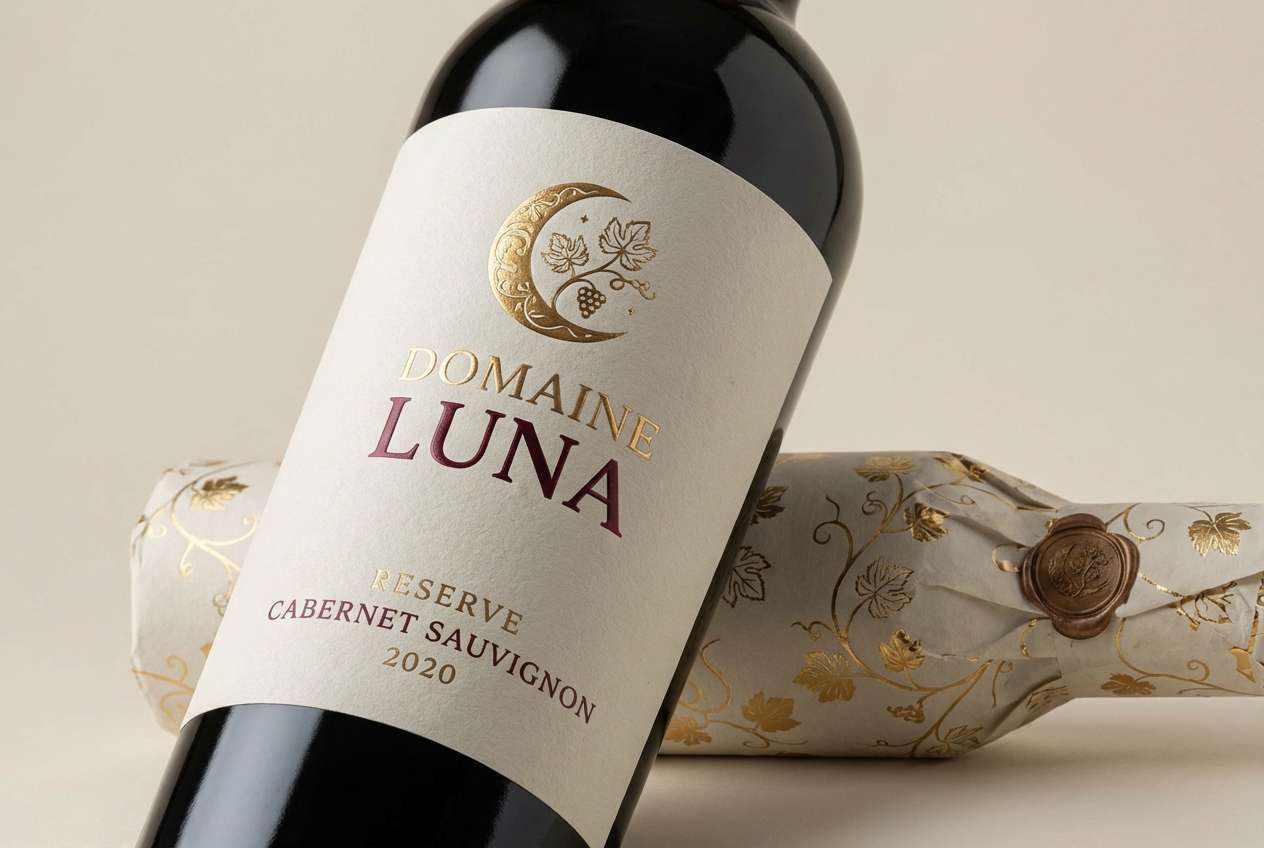
1) Velvet Winery
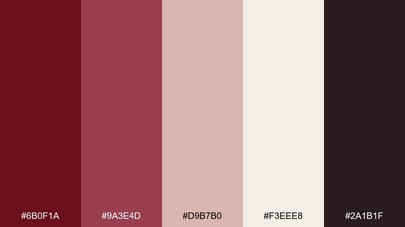
HEX: #6b0f1a #9a3e4d #d9b7b0 #f3eee8 #2a1b1f
Mood: luxurious, romantic, grounded
Best for: boutique wine branding and premium labels
Velvet reds and soft blush tones evoke candlelit tastings and oak-aged warmth. Use it for upscale packaging, tasting-room menus, or a refined website hero. Pair the deep red with creamy off-white for readability, then add the near-black as a crisp type color. Tip: keep the blush as a secondary accent so the maroon stays the star.
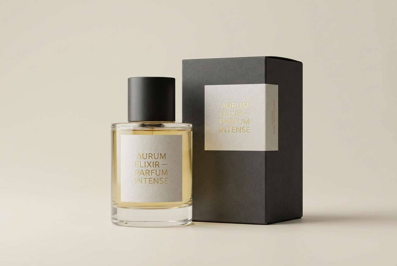
Image example of velvet winery generated using media.io
Media.io is an online AI studio for creating and editing video, image, and audio in your browser.

2) Rosewood & Oat
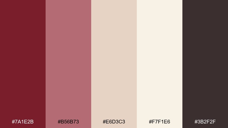
HEX: #7a1e2b #b56b73 #e6d3c3 #f7f1e6 #3b2f2f
Mood: soft, cozy, approachable
Best for: lifestyle blogs and calm ecommerce brands
Rosewood reds with oat and linen neutrals feel like knitwear, warm light, and slow mornings. The palette works beautifully for product pages, social templates, and editorial banners that need warmth without shouting. Pair the muted pink with oatmeal backgrounds to keep layouts airy. Tip: use the dark brown for headings and reserve the deep red for CTAs.
Image example of rosewood & oat generated using media.io
3) Garnet Nightfall
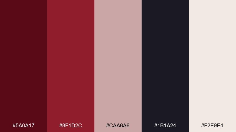
HEX: #5a0a17 #8f1d2c #caa6a6 #1b1a24 #f2e9e4
Mood: dramatic, sleek, nighttime
Best for: music events, cocktail bars, and luxury campaigns
Garnet reds against inky shadows bring to mind neon reflections and late-night glamour. This maroon color palette is ideal for bold posters, nightlife branding, and moody campaign visuals. Pair the deep red with the near-black for high contrast, and soften large areas with the warm off-white. Tip: add the dusty rose only in small highlights to keep the look cinematic.
Image example of garnet nightfall generated using media.io
4) Maroon Meadow
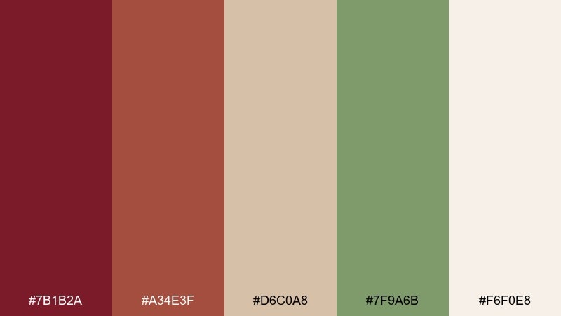
HEX: #7b1b2a #a34e3f #d6c0a8 #7f9a6b #f6f0e8
Mood: earthy, pastoral, balanced
Best for: farm-to-table brands and rustic packaging
Warm reds and meadow green feel like autumn fields, dried flowers, and hand-tied bundles. It suits artisanal food labels, farmers market signage, and cozy restaurant menus. Pair the green with the beige to create calm sections, then use the deeper red for stamps or seals. Tip: keep backgrounds light so the earthy tones do not feel heavy.
Image example of maroon meadow generated using media.io
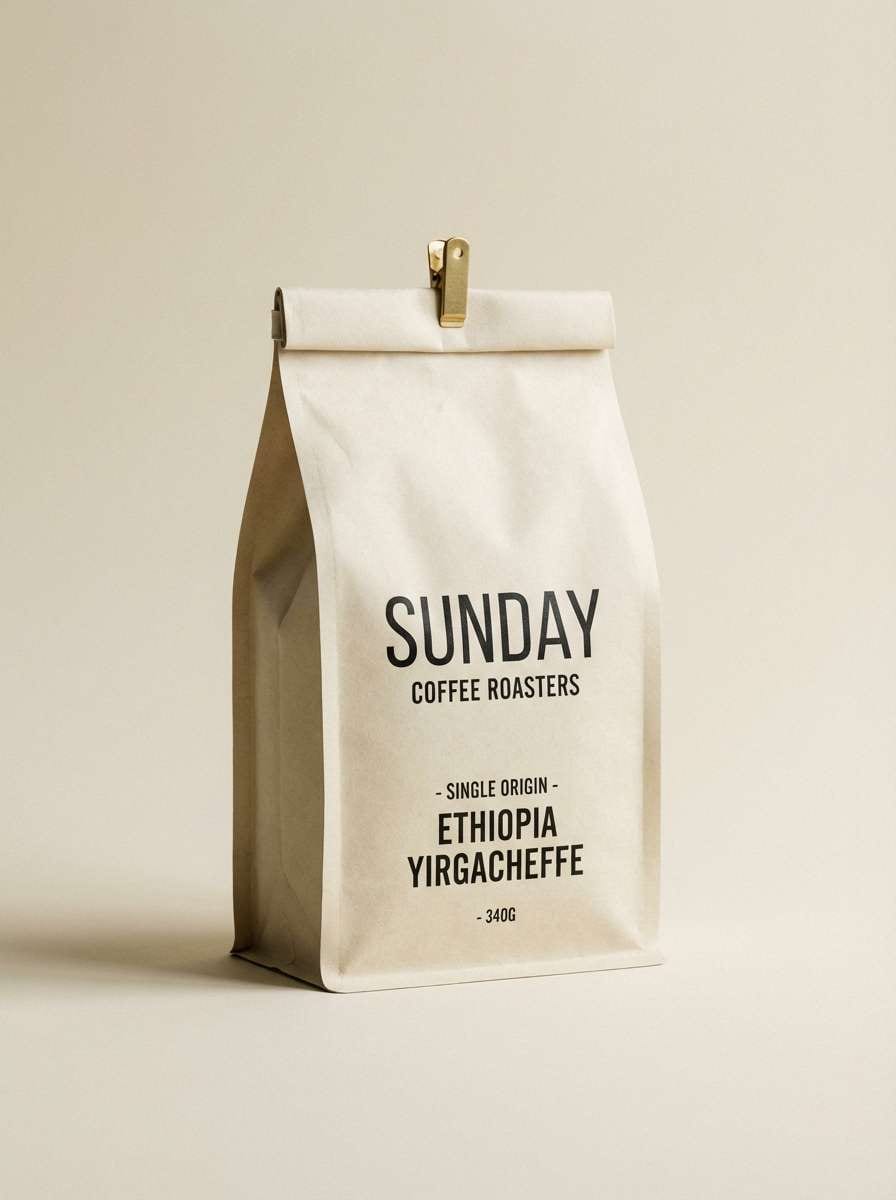
5) Cocoa Mulberry
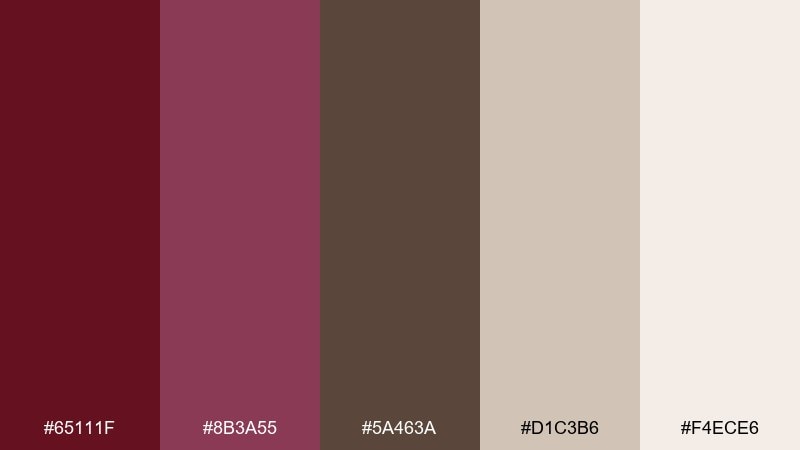
HEX: #65111f #8b3a55 #5a463a #d1c3b6 #f4ece6
Mood: rich, comforting, refined
Best for: coffee shops and gourmet dessert brands
Mulberry reds blended with cocoa browns evoke truffles, espresso crema, and warm wooden counters. Use it for café menus, loyalty cards, and premium dessert packaging where you want a decadent feel. Pair the brown with the light cream for clean type and clear hierarchy. Tip: let the deeper red appear in small accents like icons or separators.
Image example of cocoa mulberry generated using media.io
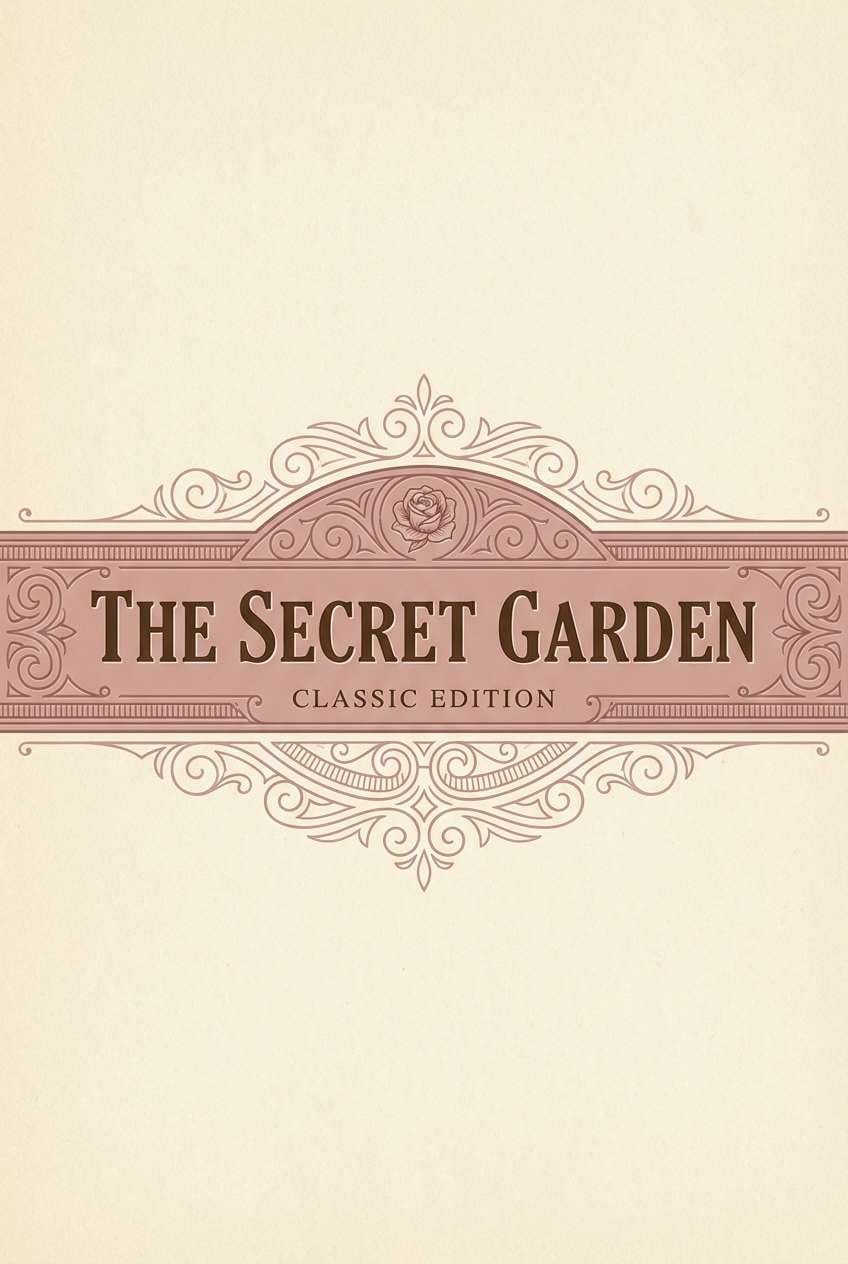
6) Antique Library
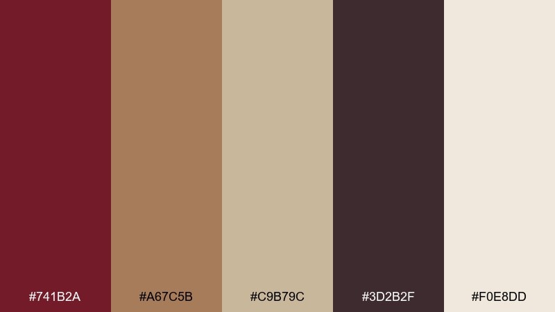
HEX: #741b2a #a67c5b #c9b79c #3d2b2f #f0e8dd
Mood: vintage, scholarly, warm
Best for: book covers, stationery, and heritage branding
Dusty reds, leather browns, and parchment neutrals suggest worn spines and quiet reading rooms. It works well for notebooks, book jackets, museum shops, and classic logos. Pair the parchment with the dark plum-brown for elegant contrast, then use the tan for secondary blocks. Tip: add subtle grain textures to enhance the antique feel without hurting legibility.
Image example of antique library generated using media.io
7) Terracotta Cabernet
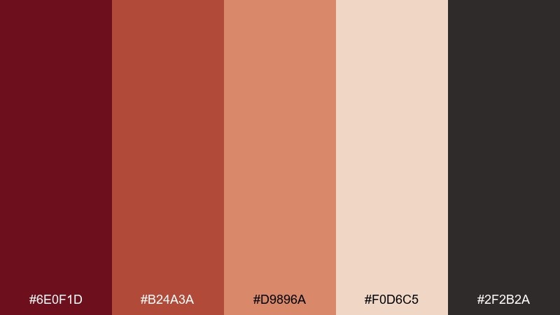
HEX: #6e0f1d #b24a3a #d9896a #f0d6c5 #2f2b2a
Mood: sunbaked, bold, inviting
Best for: restaurant branding and seasonal campaigns
Cabernet depth mixed with terracotta warmth feels like clay ovens, spice, and late-afternoon sun. These maroon color combinations shine on menus, promo posters, and food photography frames. Pair the near-black with the peachy neutrals for crisp text, then bring in terracotta for highlights and dividers. Tip: keep the darkest red for key moments like prices, buttons, or headlines.
Image example of terracotta cabernet generated using media.io
8) Plum Smoke
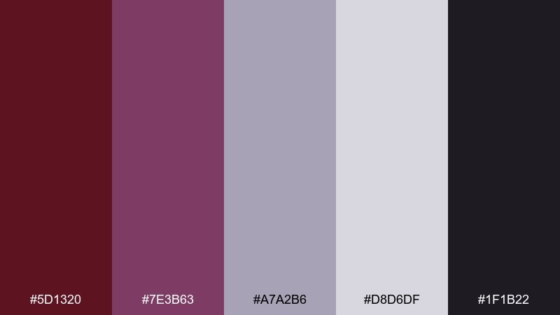
HEX: #5d1320 #7e3b63 #a7a2b6 #d8d6df #1f1b22
Mood: modern, moody, artistic
Best for: creative portfolios and fashion lookbooks
Smoky plum and cool lilac-gray create a chic, gallery-like atmosphere. It is perfect for portfolio sites, lookbook spreads, and minimalist social graphics. Pair the near-black with the pale gray-lilac for sharp contrast and a premium feel. Tip: use the plum as a gradient partner to add depth without adding extra colors.
Image example of plum smoke generated using media.io
9) Blush Merlot
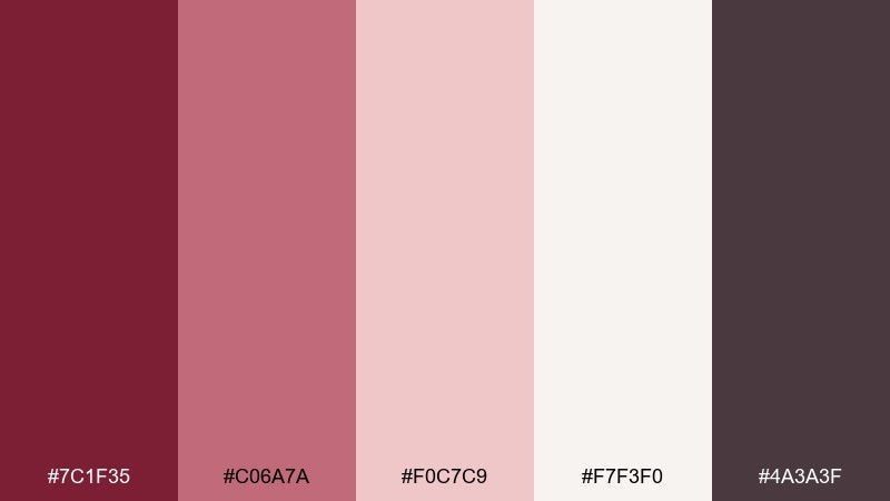
HEX: #7c1f35 #c06a7a #f0c7c9 #f7f3f0 #4a3a3f
Mood: sweet, romantic, airy
Best for: wedding stationery and beauty brands
Merlot reds softened by blush and porcelain neutrals feel like silk ribbons and rose petals. Use it for wedding invitations, skincare packaging, or gentle brand refreshes that need warmth. Pair the soft blush with the off-white for a clean base, then anchor the design with the deep plum-gray. Tip: keep typography thin and elegant to match the light, romantic tone.
Image example of blush merlot generated using media.io
10) Forest Cherry
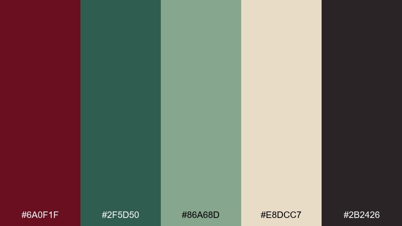
HEX: #6a0f1f #2f5d50 #86a68d #e8dcc7 #2b2426
Mood: natural, confident, outdoorsy
Best for: outdoor brands and sustainable packaging
Deep cherry red with forest greens suggests trail maps, pine shade, and sturdy canvas. It works well for eco-friendly packaging, outdoor apparel tags, and brand systems that want nature without going pastel. Pair the beige with green for calm backgrounds, then use cherry red as a strong accent for badges. Tip: avoid using both dark tones in large blocks; balance them with the light neutral.
Image example of forest cherry generated using media.io
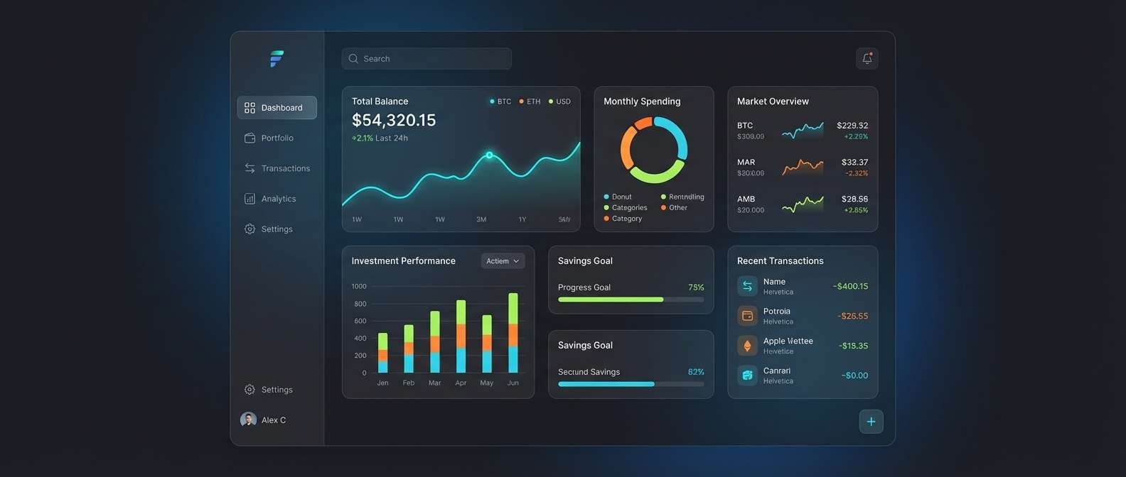
11) Midnight Claret UI
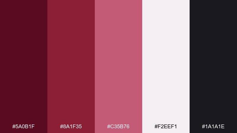
HEX: #5a0b1f #8a1f35 #c35b76 #f2eef1 #1a1a1e
Mood: sleek, high-contrast, premium
Best for: finance apps and dark-mode dashboards
Claret reds on a near-black base feel polished and high-trust, like a modern lounge with low lighting. This maroon color palette works especially well for dark-mode UI where highlights must read fast. Pair the off-white with the near-black for body text, then reserve the mid red for active states and alerts. Tip: use the pink-rose tone for charts and data points to keep the interface calm.
Image example of midnight claret ui generated using media.io
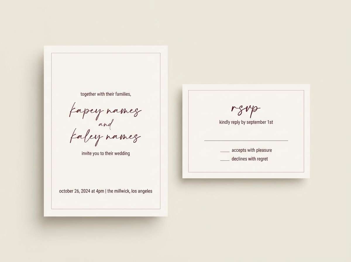
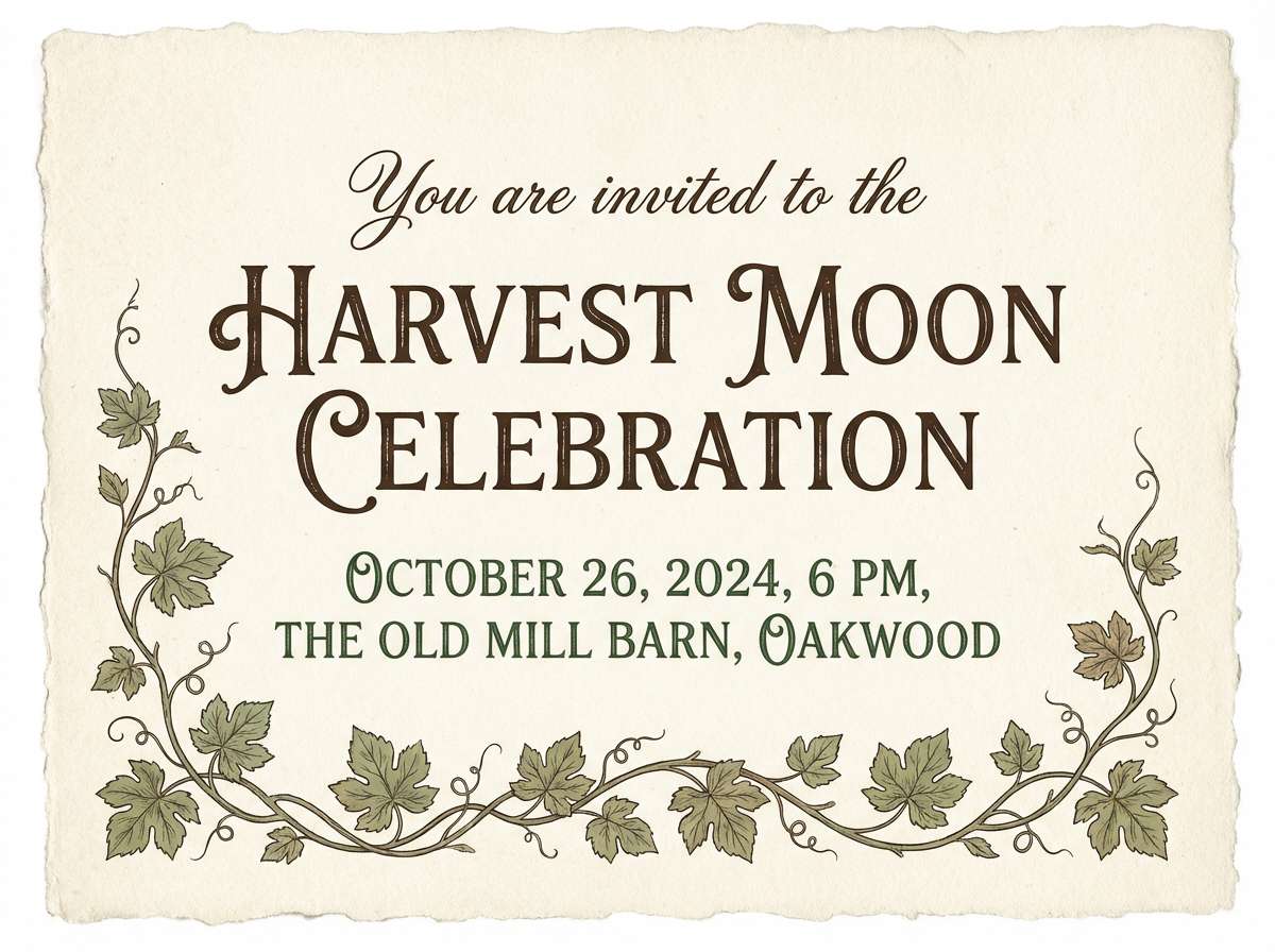
12) Rustic Vineyard Invitation
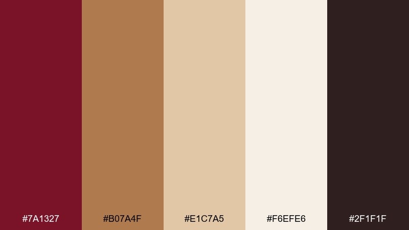
HEX: #7a1327 #b07a4f #e1c7a5 #f6efe6 #2f1f1f
Mood: warm, rustic, celebratory
Best for: vineyard weddings and event invitations
Warm reds with toasted browns evoke grapevines, wooden barrels, and sunset ceremony light. Use it for invitations, RSVP cards, and day-of signage where you want charm and authenticity. Pair the cream background with the dark brown for readable text, then add the deep red for monograms or borders. Tip: a subtle paper texture will make the whole set feel more handcrafted.
Image example of rustic vineyard invitation generated using media.io
13) Modern Bistro Packaging
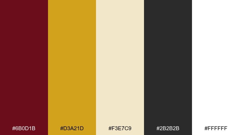
HEX: #6b0d1b #d3a21d #f3e7c9 #2b2b2b #ffffff
Mood: modern, upbeat, appetizing
Best for: food packaging and quick-service branding
A deep red paired with mustard-gold feels energetic, like a busy bistro sign on a city street. It is great for takeout boxes, sauces, and modern deli labels that need strong shelf impact. Pair the gold with white for clean nutrition panels, then use charcoal for barcodes and fine print. Tip: limit the deep red to large brand blocks so the gold can pop as a highlight.
Image example of modern bistro packaging generated using media.io
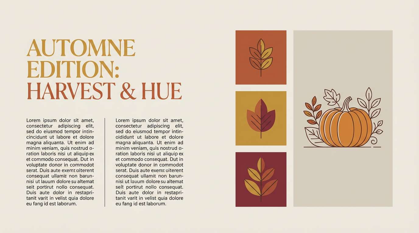
14) Autumn Journal Editorial
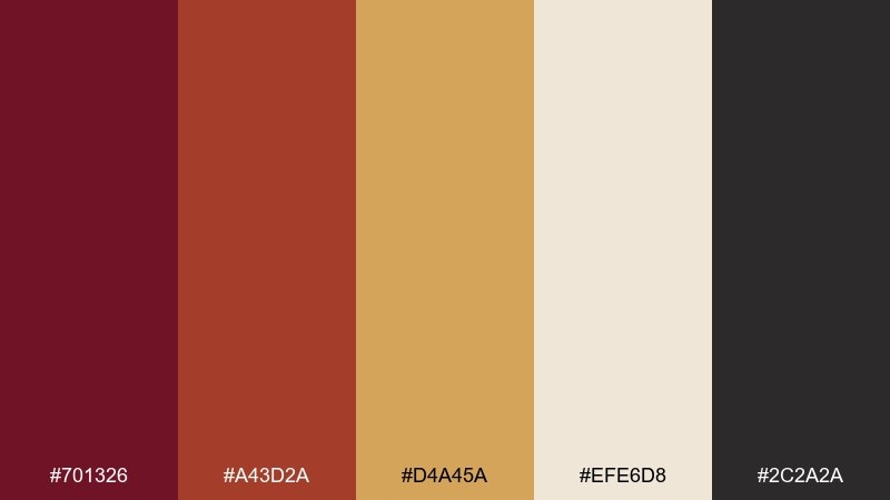
HEX: #701326 #a43d2a #d4a45a #efe6d8 #2c2a2a
Mood: editorial, warm, curated
Best for: magazines, newsletters, and blog headers
Burnt reds and golden tans feel like pressed leaves and crisp paper pages. Use this maroon color scheme for editorial layouts, seasonal newsletters, or longform blog graphics. Pair the light neutral as the main canvas, then use the deep red for section headers and pull quotes. Tip: keep body text in the near-black so the warm colors stay decorative, not tiring.
Image example of autumn journal editorial generated using media.io
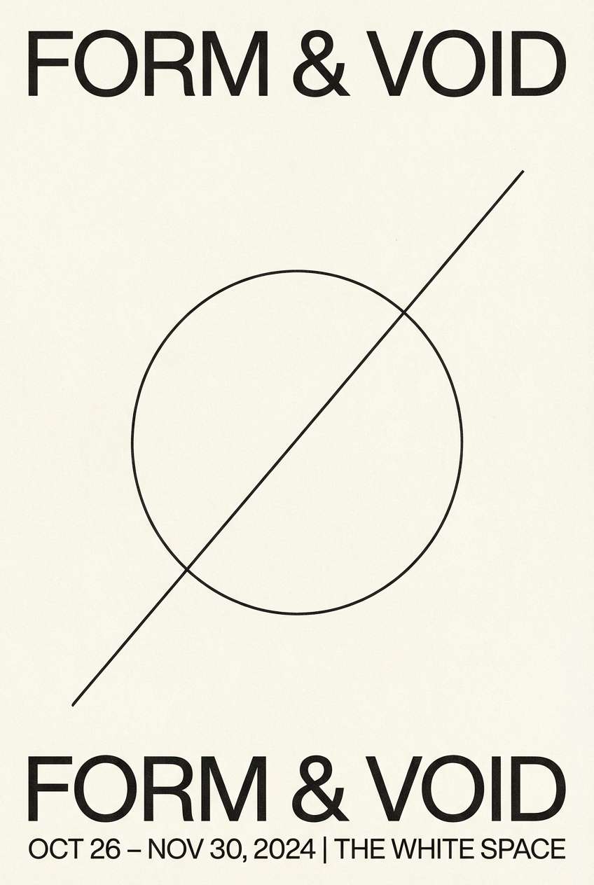
15) Minimalist Museum Poster
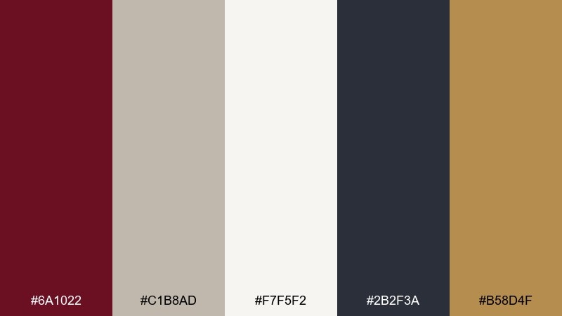
HEX: #6a1022 #c1b8ad #f7f5f2 #2b2f3a #b58d4f
Mood: minimal, cultured, understated
Best for: gallery posters and exhibition branding
Muted maroon with stone and slate reads like quiet hallways, framed prints, and soft spotlights. These maroon color combinations suit minimalist posters, museum signage, and refined event collateral. Pair the stone neutral with off-white for large negative space, then use the deep red for a single focal title. Tip: keep the gold-tan as a small accent line to elevate the composition.
Image example of minimalist museum poster generated using media.io
16) Cozy Cabin Interiors
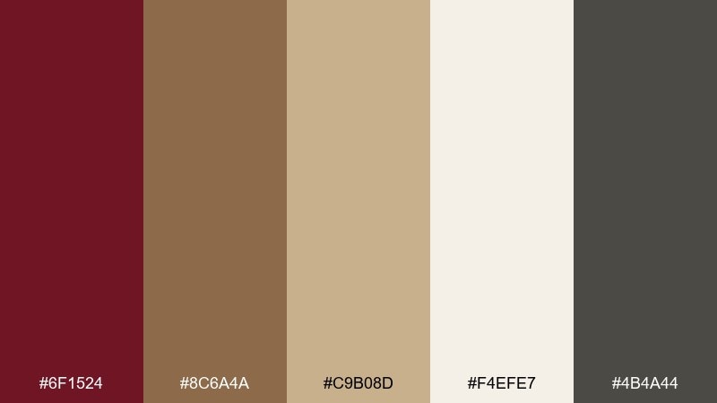
HEX: #6f1524 #8c6a4a #c9b08d #f4efe7 #4b4a44
Mood: cozy, homey, rustic
Best for: interior mood boards and home decor branding
Cabin reds with wood and oatmeal neutrals evoke flannel throws, cedar, and a steady fireplace glow. It is a strong fit for interior mood boards, furniture catalogs, and home goods packaging. Pair the light cream as the primary background and use the brown for text and outlines. Tip: introduce the maroon only in textiles or small decor accents to avoid overwhelming a room.
Image example of cozy cabin interiors generated using media.io
17) Holiday Cranberry
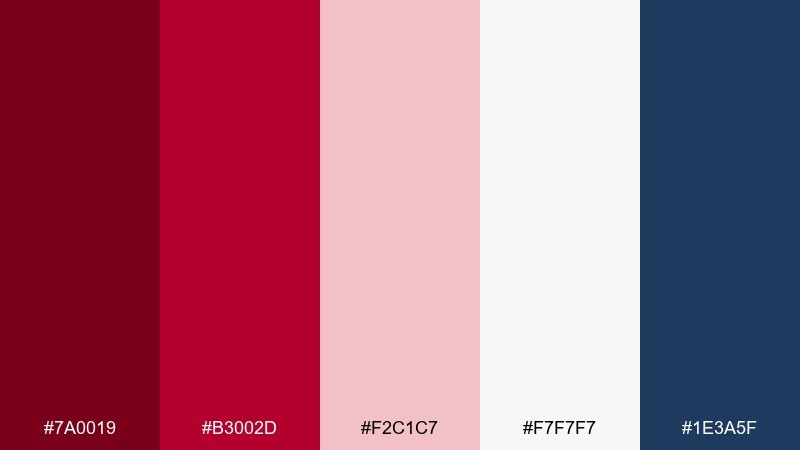
HEX: #7a0019 #b3002d #f2c1c7 #f7f7f7 #1e3a5f
Mood: festive, bright, classic
Best for: holiday promos and seasonal email campaigns
Cranberry reds with icy white and a navy anchor feel like winter ribbons and crisp wrapping paper. Use it for holiday sale banners, gift tags, and seasonal social posts where you want cheer with structure. Pair navy with white for text-heavy sections, then use red for badges and countdowns. Tip: keep the pink tint for subtle gradients so the bold reds stay sharp.
Image example of holiday cranberry generated using media.io

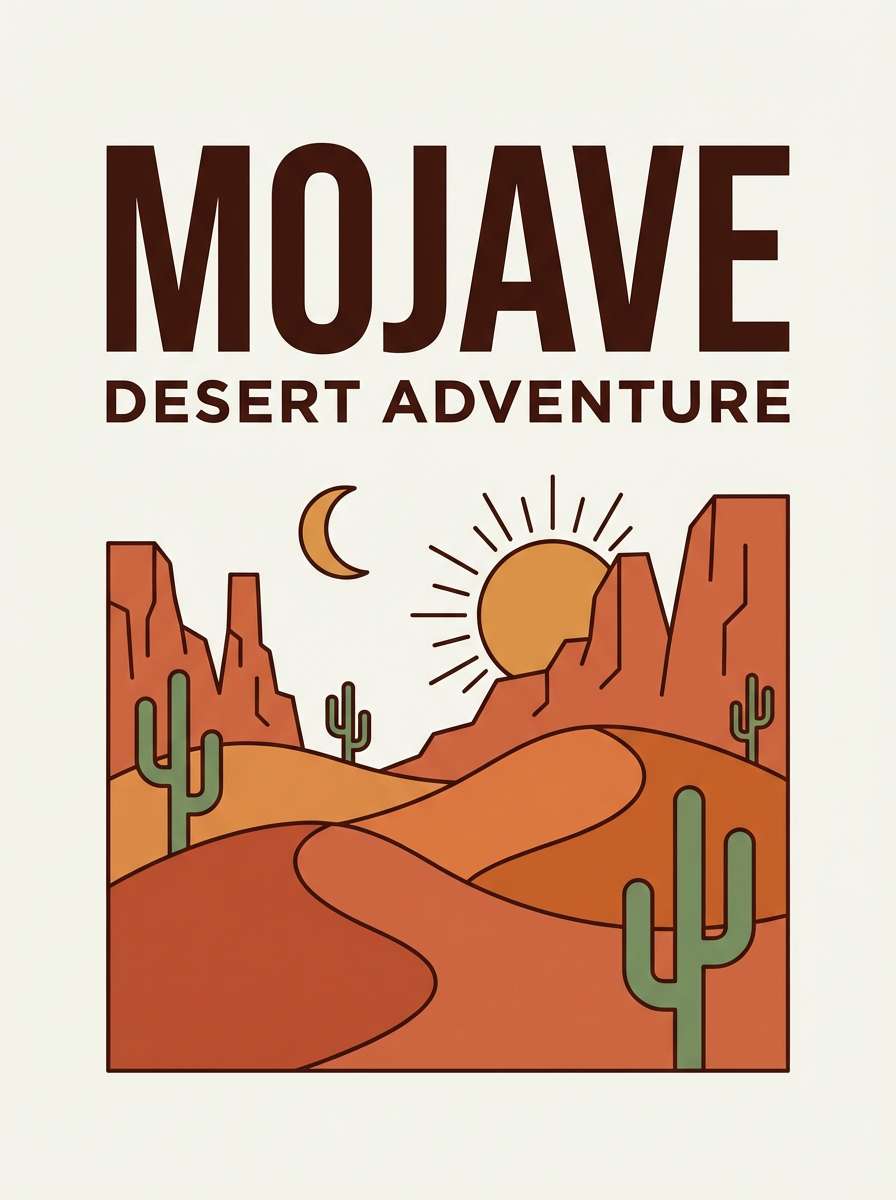
18) Desert Wine Sunset
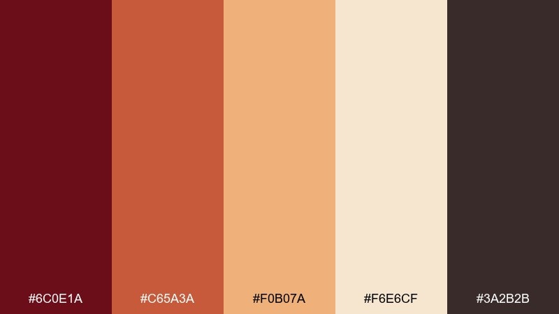
HEX: #6c0e1a #c65a3a #f0b07a #f6e6cf #3a2b2b
Mood: warm, adventurous, sunlit
Best for: travel brands and outdoor event posters
Wine red with desert oranges feels like canyon sunsets and dusty trails. It works well for travel posters, festival flyers, and adventurous brand stories that still want warmth and polish. Pair the pale sand tone with the dark brown for readable captions, then let the orange lead as the highlight color. Tip: use gentle gradients between orange and sand for a natural sky-like transition.
Image example of desert wine sunset generated using media.io
19) Orchid Espresso
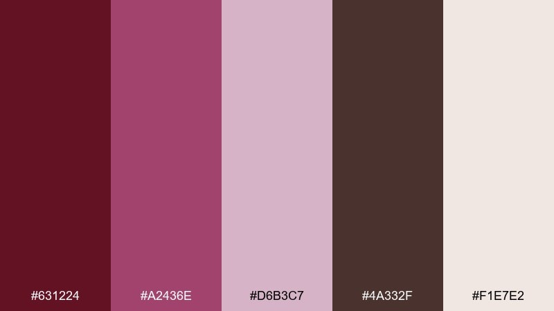
HEX: #631224 #a2436e #d6b3c7 #4a332f #f1e7e2
Mood: sensual, elegant, boutique
Best for: beauty packaging and fragrance branding
Orchid rose and espresso brown create a sophisticated, boutique vanity vibe. Use it for perfume boxes, lipstick packaging, or landing pages that need softness with depth. Pair the blush-lilac with the warm off-white for breathable space, then ground the design with espresso for text. Tip: keep the deeper berry as a single hero block for maximum premium impact.
Image example of orchid espresso generated using media.io
20) Steel & Sangria
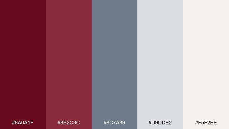
HEX: #6a0a1f #8b2c3c #6c7a89 #d9dde2 #f5f2ee
Mood: modern, confident, balanced
Best for: tech branding and professional presentations
Sangria reds with cool steel blues feel contemporary, like polished slides and smart product decks. It is a strong option for SaaS branding, pitch presentations, and clean web layouts that need warmth without losing trust. Pair the blue-gray with off-white for charts and tables, then use the deep red for key highlights. Tip: keep the mid red for hover states so the interface stays calm at rest.
Image example of steel & sangria generated using media.io
What Colors Go Well with Maroon?
Maroon pairs beautifully with warm neutrals like cream, oatmeal, parchment, and sand because they keep the look inviting and readable. Add charcoal or near-black for crisp typography and strong contrast.
For a fresher, more modern direction, combine maroon with cool tones like steel blue, slate, or blue-gray. This balance makes maroon feel more contemporary and “tech-friendly.”
If you want a statement accent, try muted gold, mustard, or terracotta. These warm highlights amplify maroon’s richness without tipping into overly bright reds.
How to Use a Maroon Color Palette in Real Designs
Start by assigning roles: a deep maroon as your hero/brand anchor, an off-white as the main background, and a dark neutral for text. This keeps interfaces and print layouts clean while still feeling distinctive.
Use lighter blush or dusty rose shades for secondary UI states (tags, chips, charts) and small decorative touches. In print, those mid tones are great for borders, icons, and subtle patterns.
For accessibility and readability, avoid setting long body text in maroon. Instead, use maroon for headings, buttons, and highlights—then let neutrals carry the content.
Create Maroon Palette Visuals with AI
If you already have HEX codes, the fastest way to validate a palette is to see it on real-world mockups—packaging, posters, UI dashboards, and social templates. Visual context immediately reveals contrast issues and whether the mood matches your brand.
With Media.io’s text-to-image tools, you can generate consistent examples by describing the scene (menu cover, invitation set, dark-mode dashboard) and keeping your palette colors front and center.
Once you have a few options, compare them side by side and pick the one that best supports your typography, imagery, and overall tone.
Maroon Color Palette FAQs
-
What is the HEX code for maroon?
A common standard maroon HEX is #800000. Many “maroon” palettes also include darker wine tones (closer to burgundy) or softer berry tints depending on the style. -
Is maroon warm or cool?
Maroon is usually considered a warm color because it’s red with brown undertones. However, maroons that lean toward plum can feel slightly cooler, especially when paired with slate or blue-gray. -
What neutral colors work best with maroon?
Cream, off-white, parchment, stone, and warm gray are the easiest neutrals to pair with maroon. For text and UI structure, charcoal or near-black often reads cleaner than pure black. -
What accent colors make maroon pop?
Mustard/gold, terracotta, dusty pink, and muted greens can make maroon feel more dynamic. Use accents sparingly so maroon stays the anchor rather than competing with the highlight color. -
Can I use maroon in a dark-mode UI?
Yes—maroon can look premium in dark mode when used as an accent on near-black backgrounds. Keep body text in off-white and reserve maroon for active states, buttons, or key indicators for clarity. -
How do I keep a maroon palette from feeling too heavy?
Increase the proportion of light neutrals (off-white, cream) and use maroon in focused blocks. Adding one airy mid-tone (blush, dusty rose, or light stone) helps the palette breathe. -
How can I preview a maroon palette on real designs quickly?
Generate mockups (labels, posters, landing pages, dashboards) with an AI image tool, then evaluate contrast and mood before committing. This helps you catch readability issues early and choose the best palette for your use case.


