

Black burgundy palettes blend inky depth with wine-red richness, creating designs that feel premium, intimate, and intentional. They’re a go-to choice when you want drama without the harshness of pure black-and-red.
Below are 20+ curated black burgundy color palette ideas with HEX codes, plus practical tips and AI prompts you can reuse for branding, UI, print, and social graphics.
In this article
- Why Black Burgundy Palettes Work So Well
-
- midnight merlot
- velvet cabaret
- rosewood noir
- garnet smoke
- burgundy brass
- dark cherry latte
- plum eclipse
- oxblood linen
- claret stone
- ink and sangria
- mulberry minimal
- wine cellar neutrals
- satin cranberry
- noir ribbon
- espresso bordeaux
- mahogany blush
- charcoal pomegranate
- antique burgundy paper
- blackened berry glam
- soft burgundy fog
- bordeaux night market
- crimson onyx studio
- What Colors Go Well with Black Burgundy?
- How to Use a Black Burgundy Color Palette in Real Designs
- Create Black Burgundy Palette Visuals with AI
Why Black Burgundy Palettes Work So Well
Black burgundy sits in a sweet spot between classic and expressive: black brings structure and authority, while burgundy adds warmth, emotion, and a refined edge. Together, they feel elevated—more “luxe” than a standard red-and-black pairing.
Because burgundy is naturally muted and earthy, it plays nicely with neutrals (cream, taupe, greige, cool gray) that make layouts breathable. That balance helps designs stay dramatic without becoming visually heavy.
In digital work, near-black anchors navigation and typography, while burgundy becomes a strong accent for calls to action, highlights, and brand signatures. In print, burgundy reads rich and tactile, especially on warm papers and uncoated stocks.
20+ Black Burgundy Color Palette Ideas (with HEX Codes)
1) Midnight Merlot
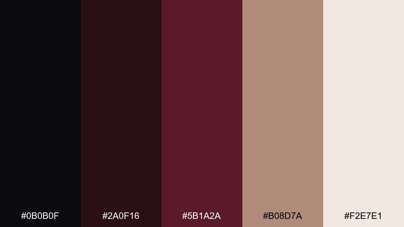
HEX: #0b0b0f #2a0f16 #5b1a2a #b08d7a #f2e7e1
Mood: dramatic, luxe, intimate
Best for: luxury brand identity and logo system
Dramatic and candlelit, these tones feel like velvet curtains and a glass of merlot after dark. Use the near-black as your anchor, then let the wine reds carry headings, icons, and hero blocks. Pair with warm taupe for softer transitions and cream for breathable negative space. Tip: keep gradients subtle and reserve the deepest red for key calls to action so it reads premium, not heavy.
Image example of midnight merlot generated using media.io
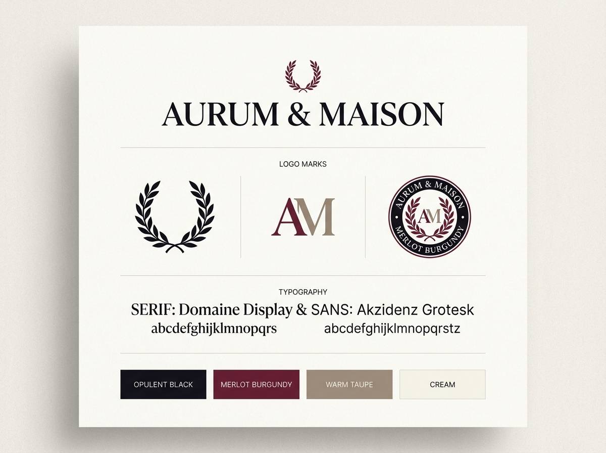
Media.io is an online AI studio for creating and editing video, image, and audio in your browser.

2) Velvet Cabaret
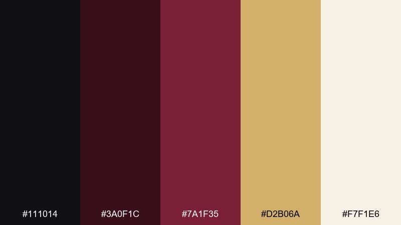
HEX: #111014 #3a0f1c #7a1f35 #d2b06a #f7f1e6
Mood: theatrical, glamorous, bold
Best for: nightlife event poster and promo graphics
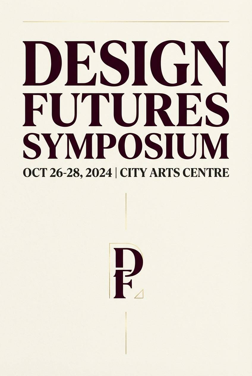
Theatrical and glamorous, this mix evokes stage lights, velvet seating, and late-night energy. Let burgundy lead the typography while near-black frames the layout for contrast. Gold works best as a sparing highlight for dates, tickets, or a thin border. Tip: use cream as the background for legibility when the poster needs to read from a distance.
Image example of velvet cabaret generated using media.io
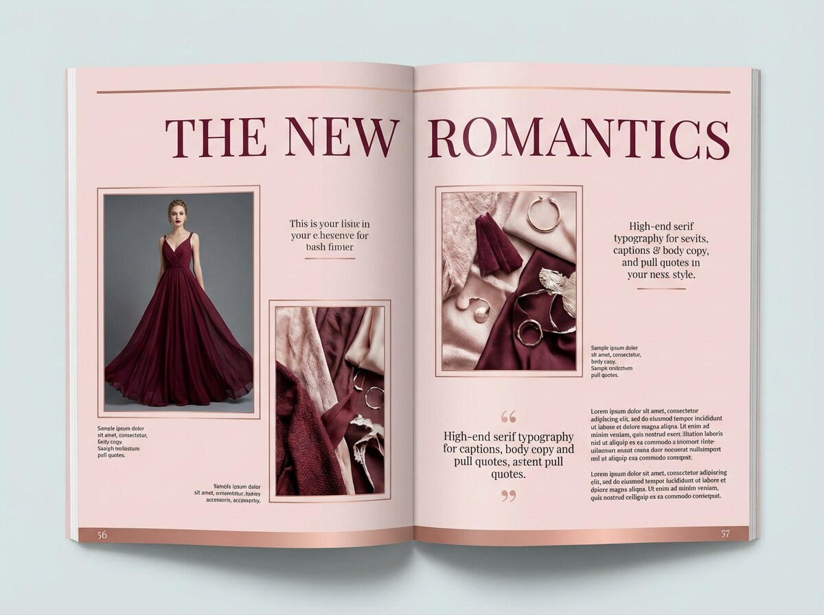
3) Rosewood Noir
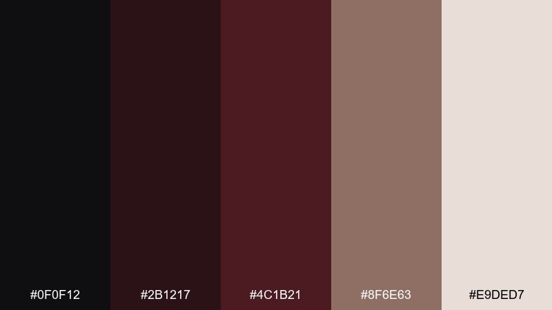
HEX: #0f0f12 #2b1217 #4c1b21 #8f6e63 #e9ded7
Mood: warm, refined, understated
Best for: editorial magazine layout
Warm and refined, these shades feel like polished rosewood and matte ink on textured paper. The mid burgundy works beautifully for pull quotes and section headers without overpowering body text. Balance it with the muted wood-brown for sidebars and small UI-like labels. Tip: keep line rules and dividers in the near-black to maintain crisp editorial structure.
Image example of rosewood noir generated using media.io
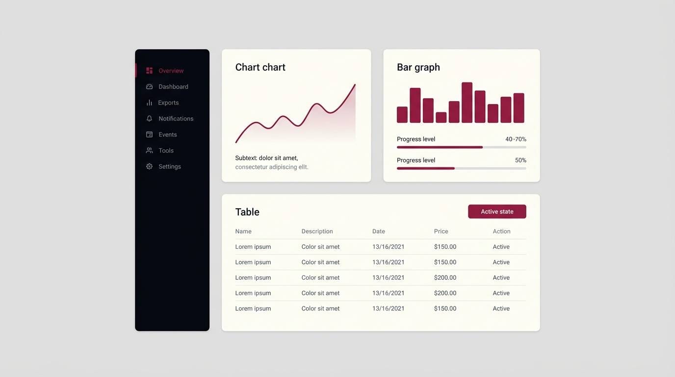
4) Garnet Smoke
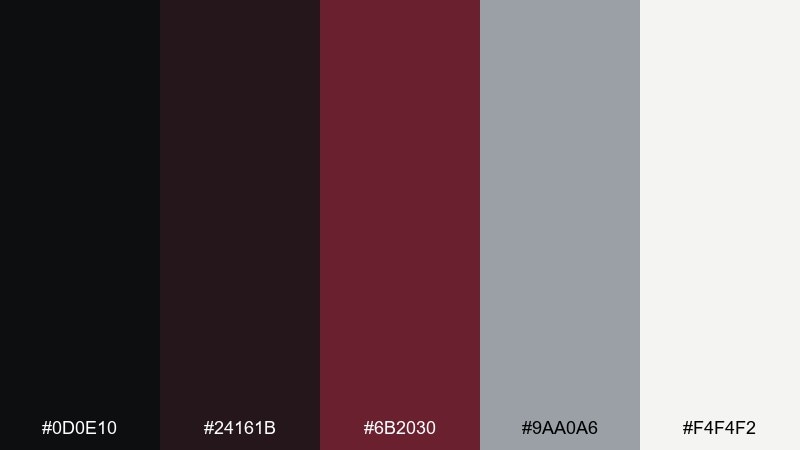
HEX: #0d0e10 #24161b #6b2030 #9aa0a6 #f4f4f2
Mood: moody, modern, clean
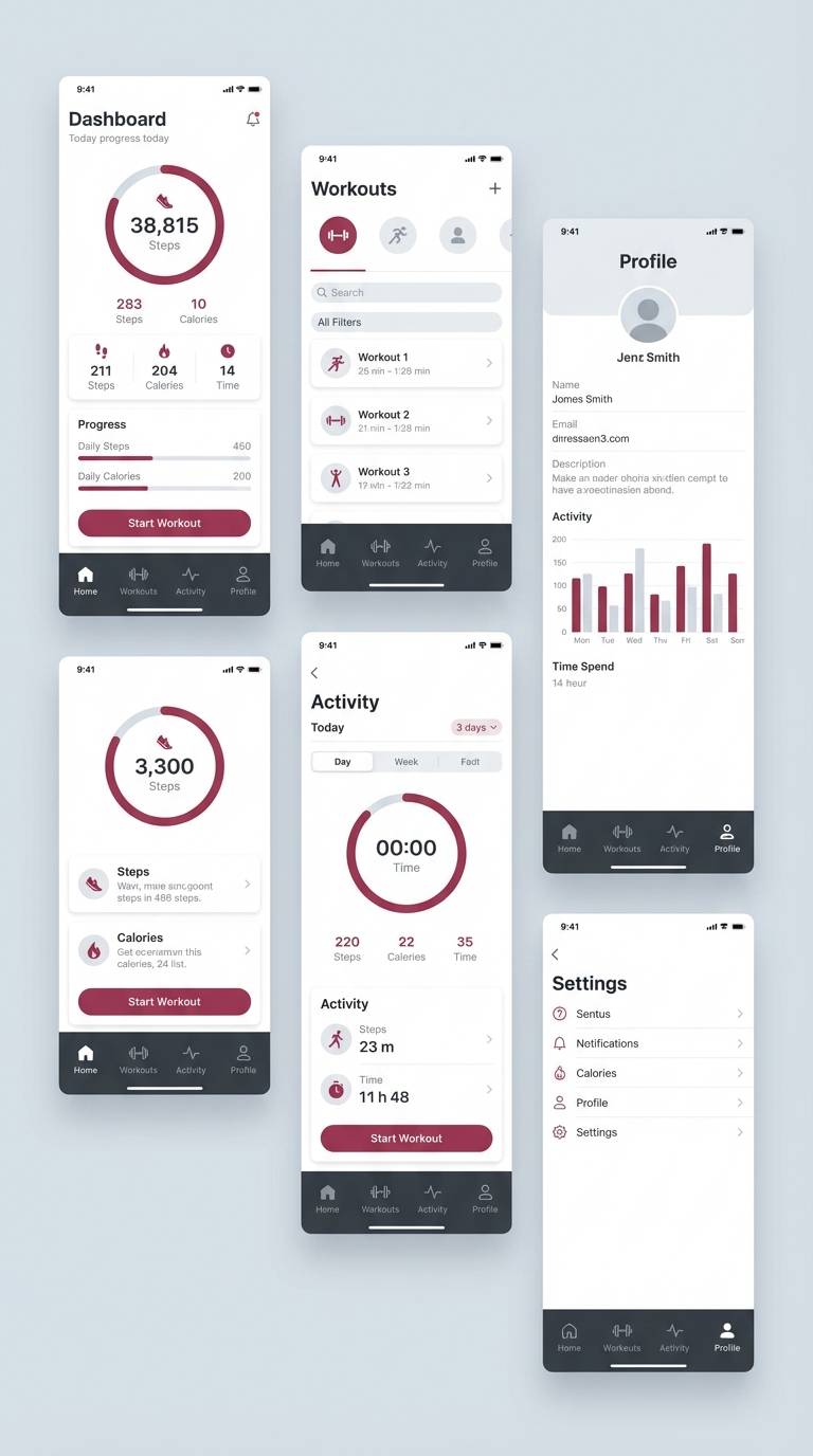
Best for: 2d ui dashboard mockup
Moody and modern, this palette feels like smoke drifting through a city at night. Use the cool gray to prevent the reds from getting too intense, especially in data-heavy screens. The garnet tone is ideal for active states, badges, and key metrics. Tip: keep surfaces light with off-white cards so burgundy accents stay readable and intentional.
Image example of garnet smoke generated using media.io
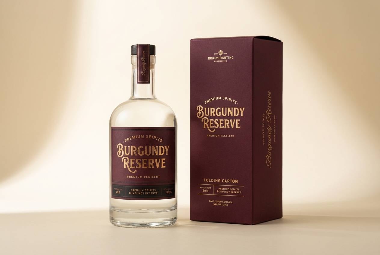
5) Burgundy Brass
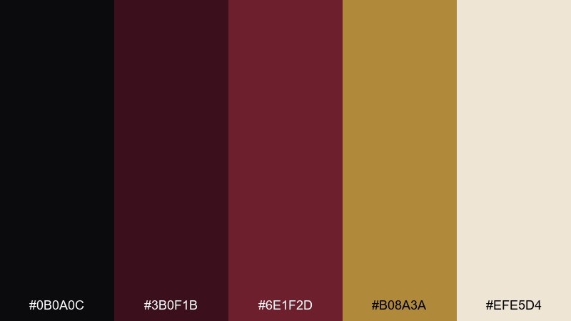
HEX: #0b0a0c #3b0f1b #6e1f2d #b08a3a #efe5d4
Mood: opulent, vintage, confident
Best for: product packaging for spirits
Opulent and vintage, these colors suggest brass hardware, aged labels, and a private tasting room. Let the deep red dominate the label field while black keeps typography sharp and premium. Brass-gold shines as foil for seals, borders, and small icons, but use it sparingly to avoid visual noise. Tip: print a warm cream base to make metallic accents pop and keep the burgundy from going flat.
Image example of burgundy brass generated using media.io
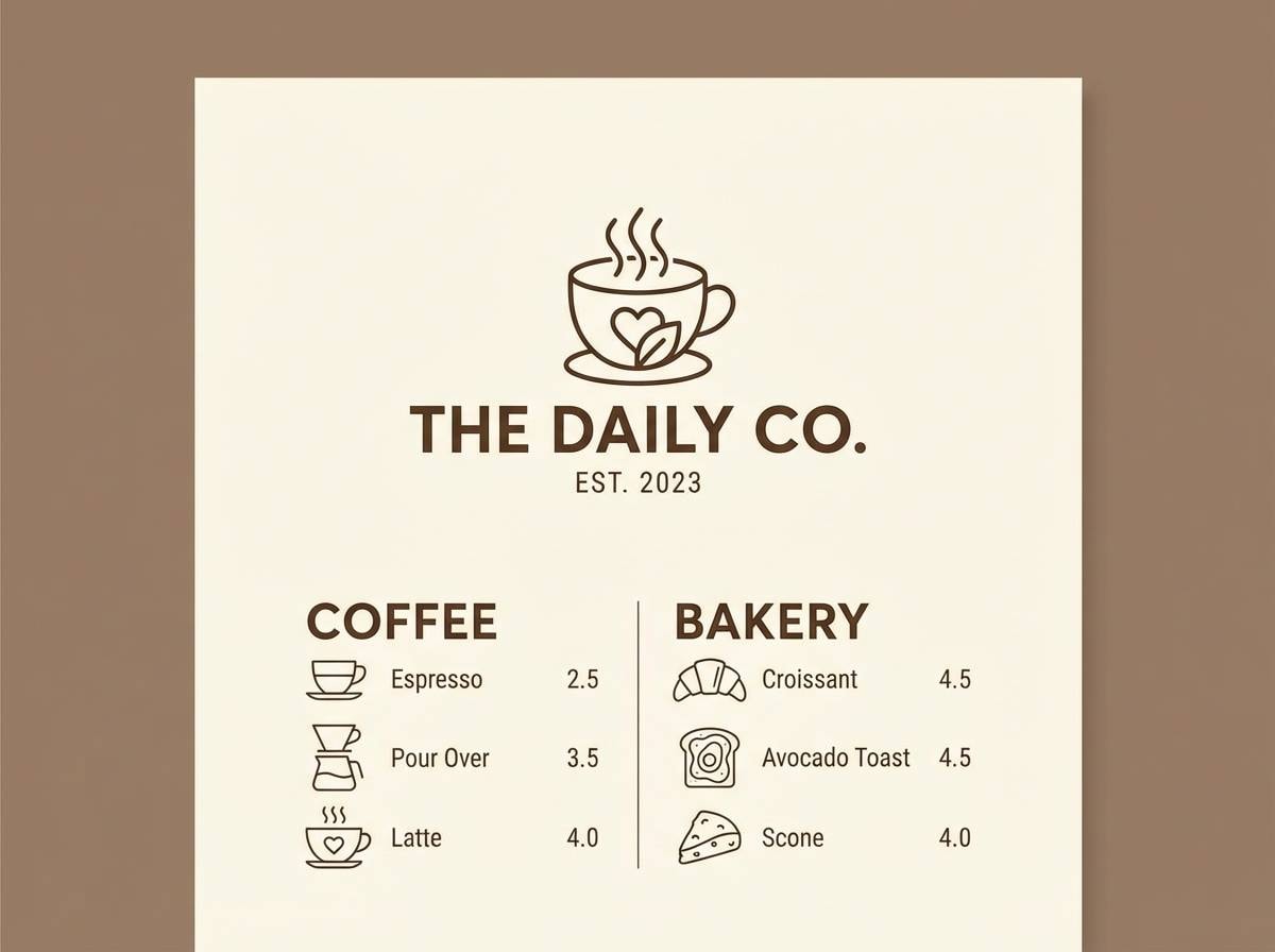
6) Dark Cherry Latte
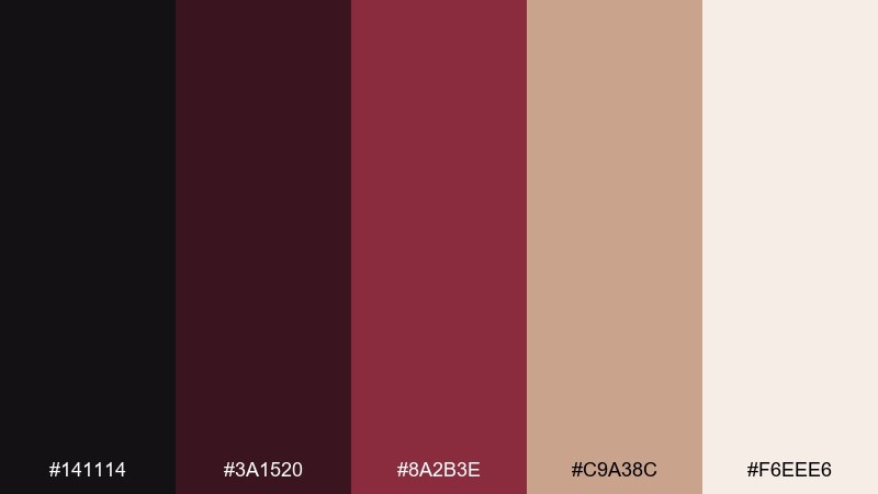
HEX: #141114 #3a1520 #8a2b3e #c9a38c #f6eee6
Mood: cozy, romantic, approachable
Best for: cafe menu design
Cozy and romantic, it reads like dark cherry syrup swirling into a latte. Use the milky cream and latte beige for the background, then set typography in deep charcoal-black for clean readability. Cherry burgundy works well for section titles and price highlights without feeling too loud. Tip: keep iconography simple and let the warm neutrals do the heavy lifting for a welcoming menu.
Image example of dark cherry latte generated using media.io
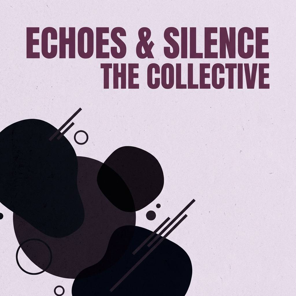
7) Plum Eclipse
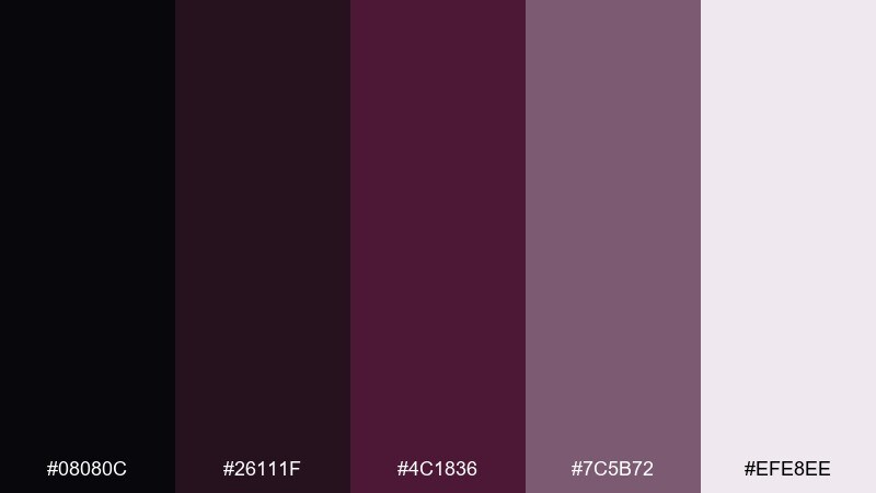
HEX: #08080c #26111f #4c1836 #7c5b72 #efe8ee
Mood: mysterious, artistic, nocturnal
Best for: album cover artwork
Mysterious and artistic, these hues feel like an eclipse with a plum-colored glow. The soft mauve-gray helps blend shadows while keeping the overall look modern. Use the mid plum for title typography and the pale lavender-white for small credits. Tip: add texture with grain and keep contrast high so the cover remains legible at thumbnail size.
Image example of plum eclipse generated using media.io
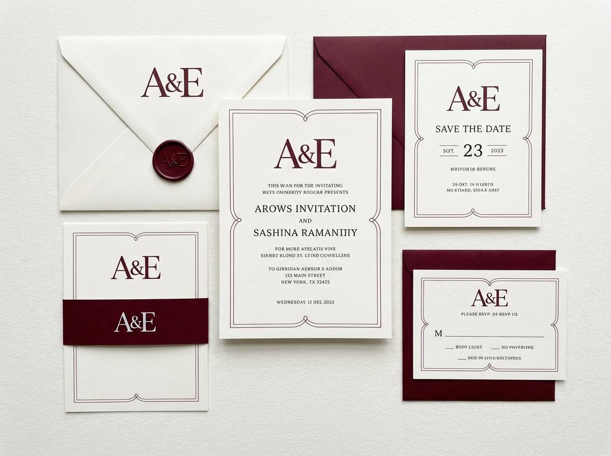
8) Oxblood Linen
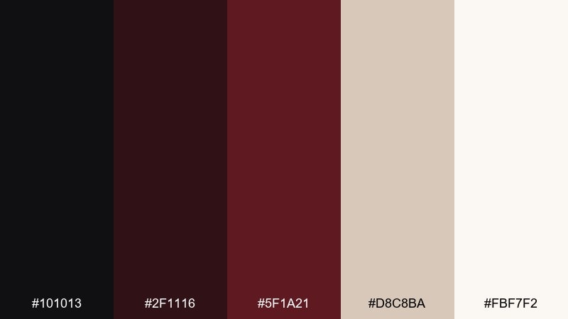
HEX: #101013 #2f1116 #5f1a21 #d8c8ba #fbf7f2
Mood: calm, tactile, heritage
Best for: wedding invitation suite
Calm and tactile, this pairing evokes oxblood wax seals on soft linen stationery. Use the light linen tones as the paper base and keep body copy in the near-black for a timeless feel. Bring in burgundy for monograms, RSVP headings, or a thin border to add formality. Tip: if you letterpress, choose the mid burgundy so impressions stay crisp without going muddy.
Image example of oxblood linen generated using media.io
9) Claret Stone
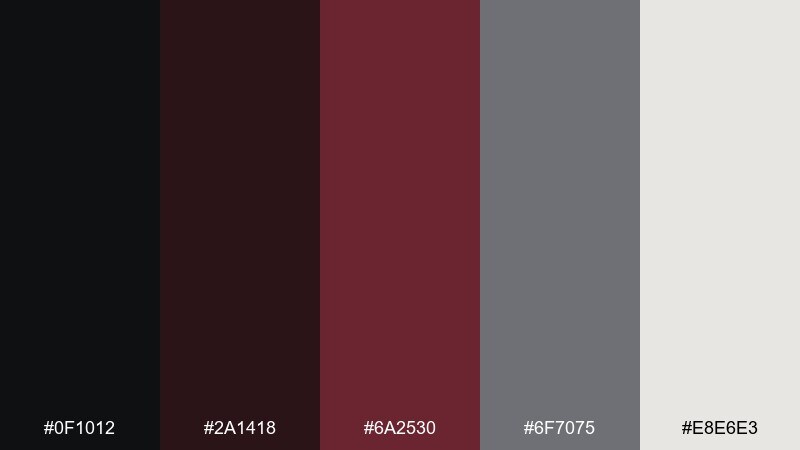
HEX: #0f1012 #2a1418 #6a2530 #6f7075 #e8e6e3
Mood: architectural, grounded, mature
Best for: interior design moodboard
Architectural and grounded, these tones suggest claret-painted walls against cool stone and concrete. The gray is a strong balancing color for large surfaces, while burgundy works best as an accent on textiles or statement pieces. Use the off-white to keep the board airy and to showcase materials clearly. Tip: limit burgundy to one hero material swatch so the composition feels curated, not busy.
Image example of claret stone generated using media.io
10) Ink and Sangria
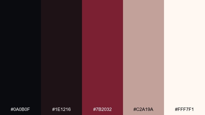
HEX: #0a0b0f #1e1216 #7b2032 #c2a19a #fff7f1
Mood: romantic, clean, high-contrast
Best for: beauty product ad banner
Romantic and clean, it feels like ink lines on creamy paper with a splash of sangria. Use the soft blush-taupe to warm up shadows and keep the banner from looking stark. Sangria burgundy is ideal for lips or product accent styling, while near-black keeps copy sharp. Tip: in this black burgundy color scheme, stick to one bold burgundy block and surround it with cream space for a modern luxury look.
Image example of ink and sangria generated using media.io
11) Mulberry Minimal
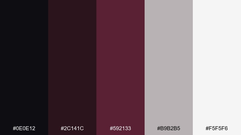
HEX: #0e0e12 #2c141c #592133 #b9b2b5 #f5f5f6
Mood: minimal, cool, sophisticated
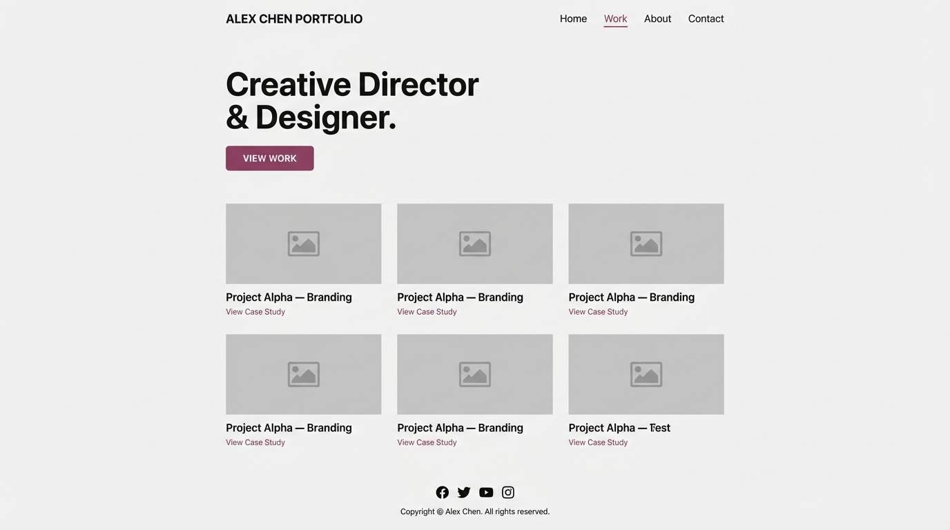
Best for: portfolio website ui
Minimal and cool-toned, this set reads like mulberry ink on clean stationery. Use light gray-white for most surfaces, then introduce mulberry for hover states and selected navigation. The soft gray-lilac works nicely for dividers and secondary text in a calm, modern interface. Tip: keep contrast checks on small type, using near-black for body copy and reserving mulberry for emphasis.
Image example of mulberry minimal generated using media.io
12) Wine Cellar Neutrals
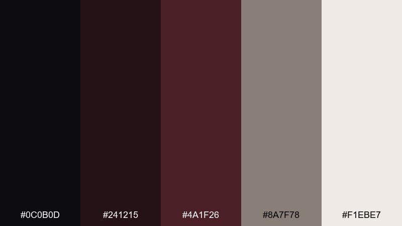
HEX: #0c0b0d #241215 #4a1f26 #8a7f78 #f1ebe7
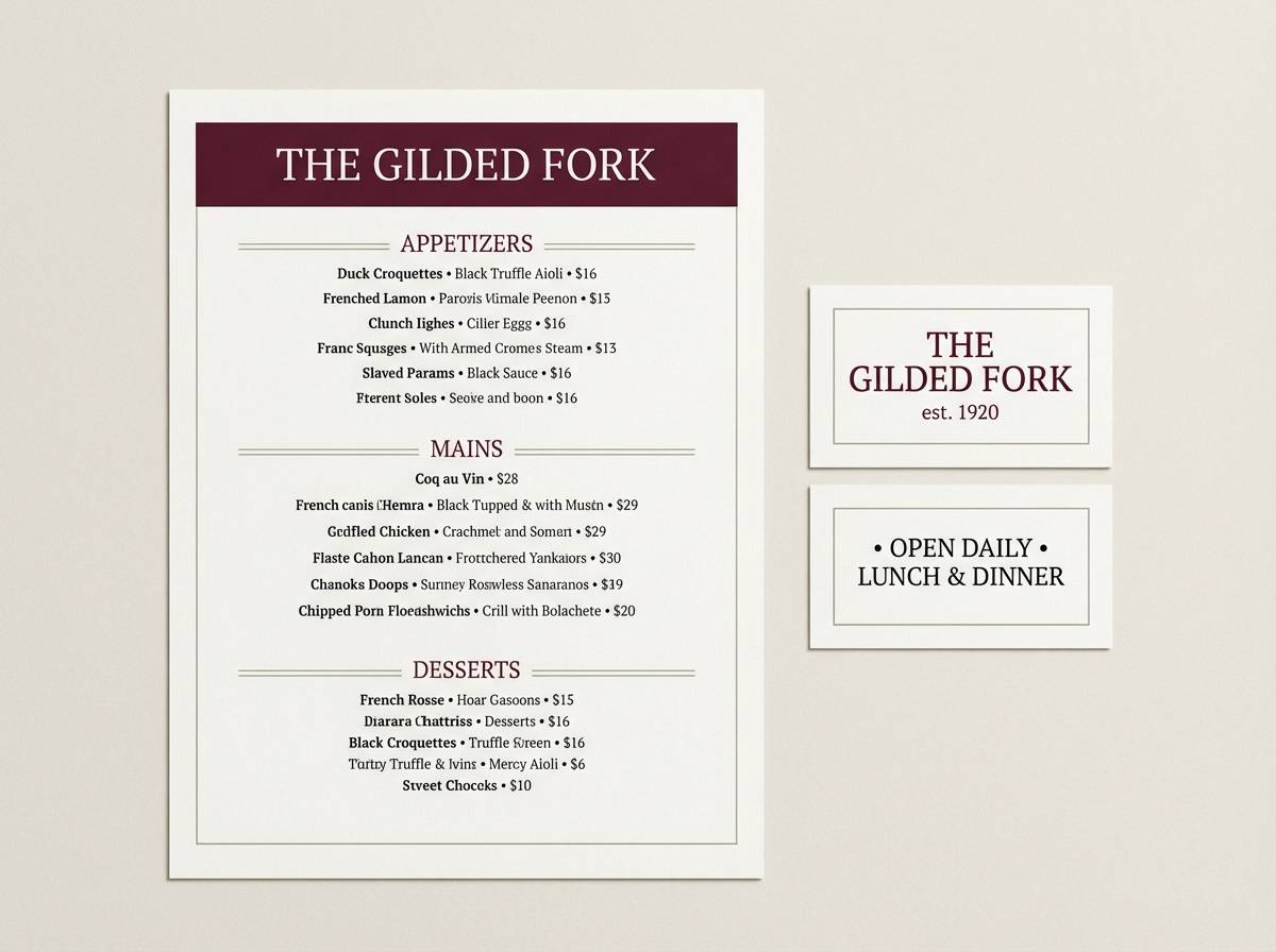
Mood: earthy, intimate, timeless
Best for: restaurant brand menu and signage
Earthy and intimate, it brings to mind oak barrels, dim lighting, and handwritten labels. The dusty greige helps bridge dark sections into lighter areas without harsh contrast. Use burgundy for the restaurant name, category headers, and subtle icon accents. Tip: these black burgundy color combinations work best with uncoated paper stocks, which enhance the warm, cellar-like softness.
Image example of wine cellar neutrals generated using media.io
13) Satin Cranberry
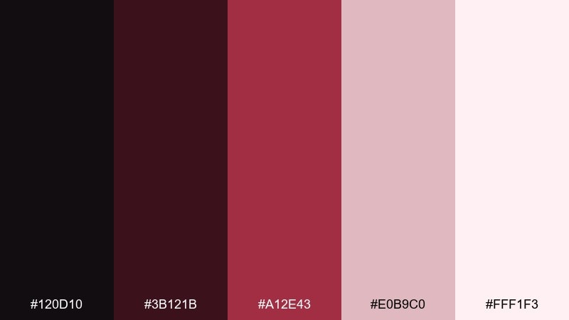
HEX: #120d10 #3b121b #a12e43 #e0b9c0 #fff1f3
Mood: playful, romantic, glossy
Best for: valentines day social post template
Playful and glossy, these shades feel like satin ribbon and cranberry candy. Use the pale pink-white as your canvas, then layer cranberry for headlines and stickers. The soft blush is perfect for gradients, bubbles, and background shapes that keep the design light. Tip: set small body text in near-black to avoid low-contrast readability issues on blush areas.
Image example of satin cranberry generated using media.io

14) Noir Ribbon
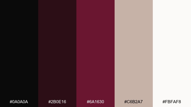
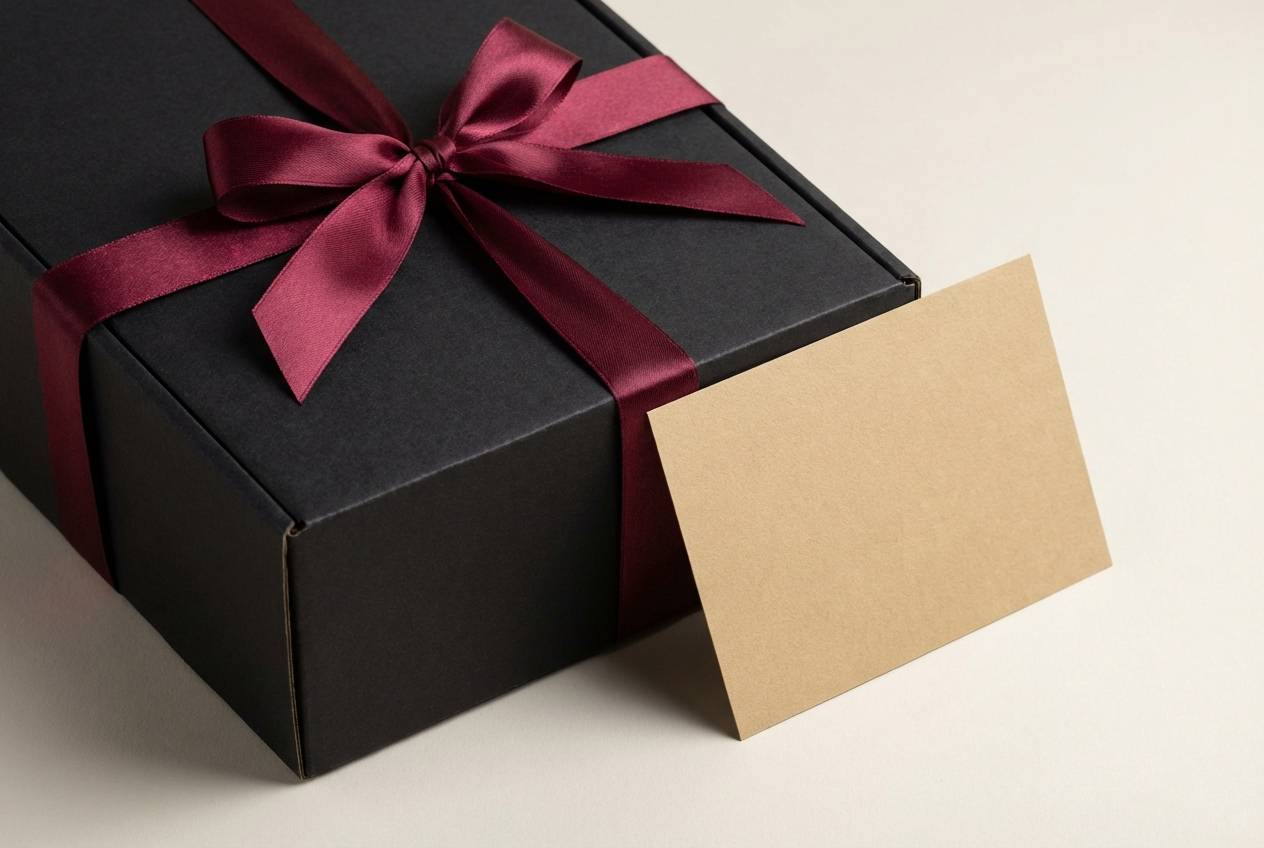
HEX: #0a0a0a #2b0e16 #6a1630 #c6b2a7 #fbfaf8
Mood: elegant, formal, polished
Best for: gift box packaging
Elegant and formal, it resembles a noir gift box tied with a burgundy ribbon. Use the black as the primary package color and let the red handle the ribbon, seal, or brand mark. Warm beige keeps any inserts or tissue paper looking upscale rather than clinical white. Tip: consider a matte finish for black and a spot gloss on the burgundy to create touchable contrast.
Image example of noir ribbon generated using media.io
15) Espresso Bordeaux
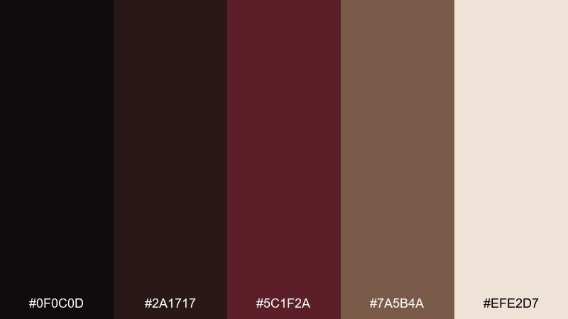
HEX: #0f0c0d #2a1717 #5c1f2a #7a5b4a #efe2d7
Mood: rich, grounded, cozy
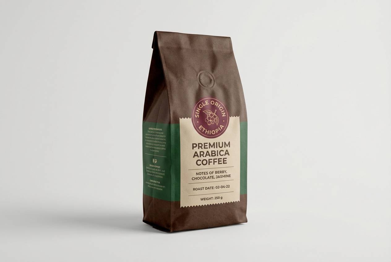
Best for: coffee label and bag design
Rich and grounded, it feels like espresso crema with a Bordeaux undertone. Use the cocoa-brown for supporting blocks and patterns, while burgundy handles the brand name and roast notes. Cream is ideal for ingredient lists and barcodes, keeping everything easy to scan. Tip: add a simple geometric pattern in the darkest tones to hint at craft without cluttering the label.
Image example of espresso bordeaux generated using media.io
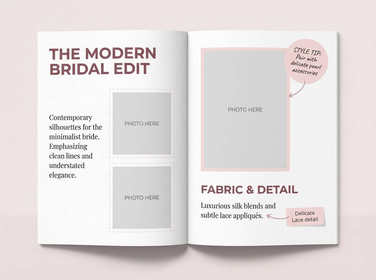
16) Mahogany Blush
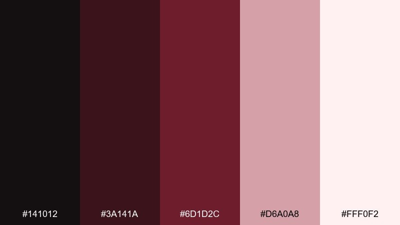
HEX: #141012 #3a141a #6d1d2c #d6a0a8 #fff0f2
Mood: soft, romantic, classic
Best for: bridal makeup lookbook page
Soft and romantic, it evokes mahogany furniture against a blush veil. Use the pale blush-white as the page base, then place mahogany and burgundy in headers and small decorative rules. The rosy pink supports gentle callouts, swatches, and annotations without stealing focus. Tip: keep photo frames neutral and let burgundy appear only in typography so skin tones remain natural.
Image example of mahogany blush generated using media.io
17) Charcoal Pomegranate
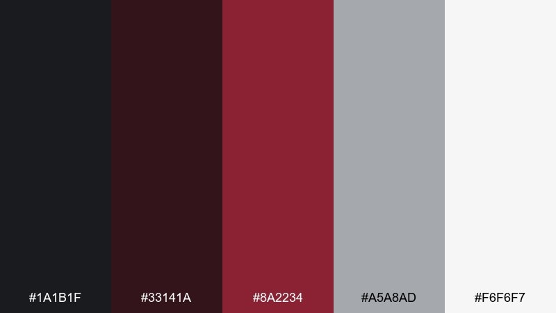
HEX: #1a1b1f #33141a #8a2234 #a5a8ad #f6f6f7
Mood: sharp, urban, energetic
Best for: fitness app ui
Sharp and urban, it feels like pomegranate juice against charcoal concrete. The cool gray is perfect for secondary UI labels, while the vivid burgundy calls attention to buttons and progress indicators. Use white for card surfaces and charts to keep the interface clean and readable. Tip: reserve the brightest red only for primary actions so the app stays focused and not aggressive.
Image example of charcoal pomegranate generated using media.io
18) Antique Burgundy Paper
HEX: #100c0d #2b1416 #5f232a #cdbfae #f7f0e6
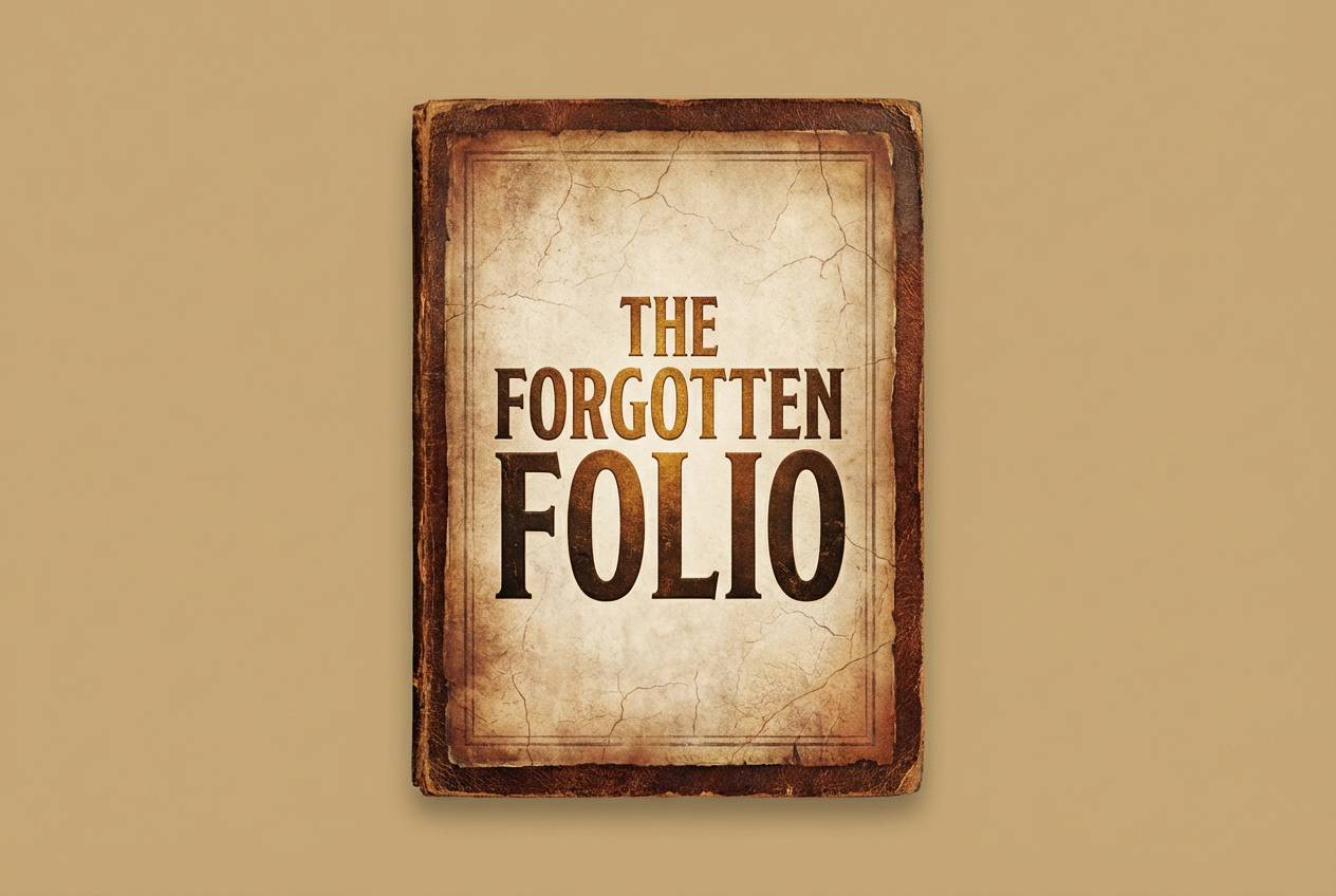
Mood: heritage, bookish, warm
Best for: book cover design
Heritage and bookish, it recalls antique paper, worn leather, and inked margins. Use the warm paper tones for the cover field and set the title in near-black for classic contrast. Burgundy works well for ornamental borders, publisher marks, or a small emblem. Tip: apply a subtle paper grain texture so the neutrals feel authentic rather than flat.
Image example of antique burgundy paper generated using media.io
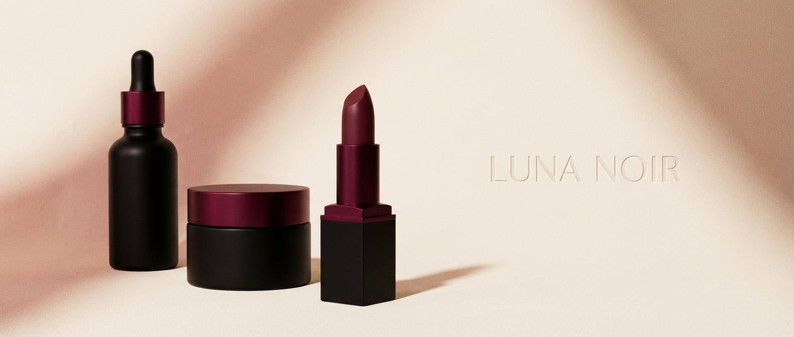
19) Blackened Berry Glam
HEX: #070709 #250f18 #7d1b3c #d0a7bf #fff5fb
Mood: glam, high-fashion, bold
Best for: cosmetics landing page hero
Glam and high-fashion, it feels like black satin with berry lipstick and a soft blush highlight. Use near-black for the hero background, then layer berry as the main accent for buttons and headlines. The pale pink-white keeps product details readable and adds a gentle glow. Tip: these black burgundy color combinations shine when you keep layouts simple and let one berry accent carry the drama.
Image example of blackened berry glam generated using media.io
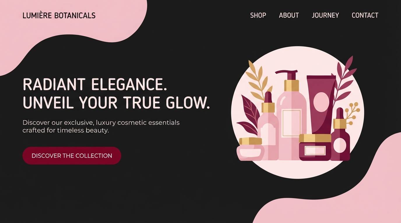
20) Soft Burgundy Fog
HEX: #121214 #2a141a #5a2430 #b8b0b4 #f2f1f3
Mood: misty, calm, modern
Best for: presentation template slides
Misty and calm, these tones feel like burgundy seen through morning fog. Use the light gray-white as the slide base, keeping most content airy and easy to scan. Bring in burgundy for section dividers, charts, and key numbers, while the foggy gray supports captions and notes. Tip: if you need a darker slide, flip to near-black and keep burgundy accents consistent for continuity.
Image example of soft burgundy fog generated using media.io
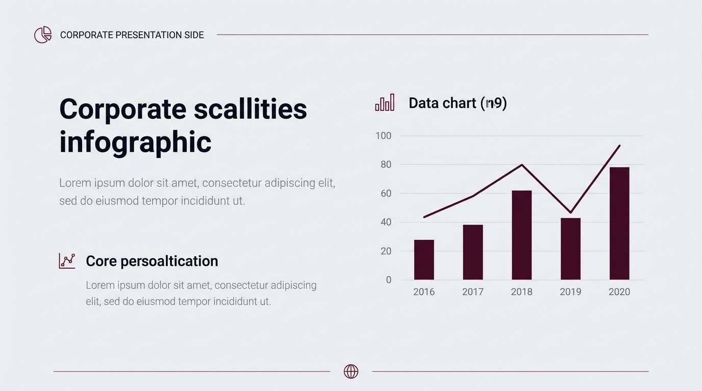
21) Bordeaux Night Market
HEX: #0d0d10 #2a1017 #6c1c2d #e2c7a7 #faf2e8
Mood: moody, artisanal, inviting
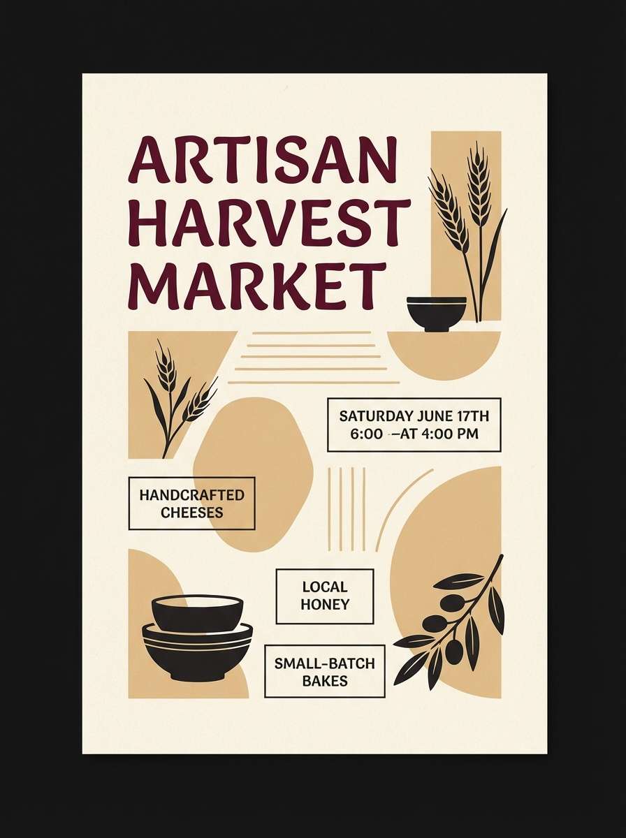
Best for: artisan food flyer
Moody yet inviting, it suggests a night market with warm lights and rich bordeaux signage. Keep the layout on a soft cream background and use near-black for body copy so details stay readable. Use the warm sand tone for borders, price tags, and small icons, then let burgundy headline the event name. Tip: this black burgundy color palette works best with one strong typeface pair, so the colors do not compete with noisy typography.
Image example of bordeaux night market generated using media.io
22) Crimson Onyx Studio
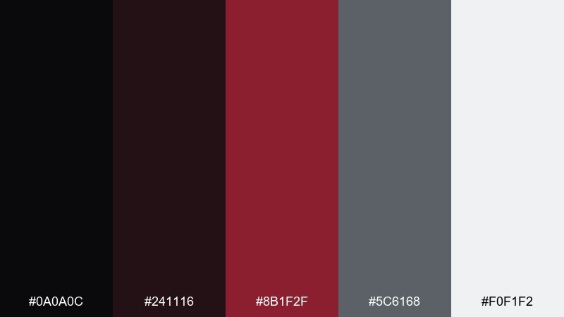
HEX: #0a0a0c #241116 #8b1f2f #5c6168 #f0f1f2
Mood: cinematic, confident, sleek
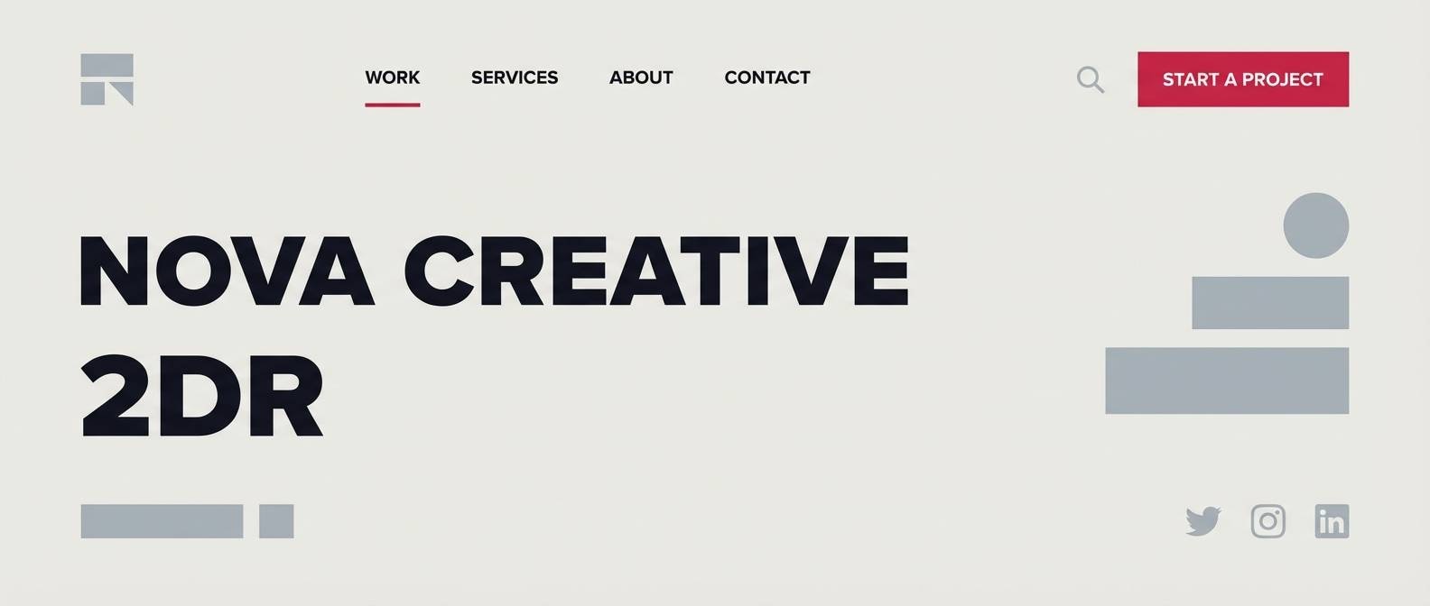
Best for: creative agency website header
Cinematic and sleek, it reads like onyx stone with a crisp crimson spotlight. Use the light neutral for negative space in navigation and keep large headlines in near-black for clarity. Crimson is best as a single accent for underlines, buttons, or micro-interactions. Tip: if you want extra punch, place crimson next to the cool gray, which makes the red feel sharper without adding more colors.
Image example of crimson onyx studio generated using media.io
What Colors Go Well with Black Burgundy?
Warm neutrals are the easiest match: cream, ivory, sand, taupe, and warm greige soften the contrast and make burgundy look more expensive. They also create “breathing room” so near-black backgrounds don’t feel overpowering.
Cool balancing tones (slate gray, steel, blue-gray) modernize the palette and keep it from leaning too vintage. For accents, brass/gold reads luxurious, while blush pinks add romance and a lighter, editorial vibe.
If you want a cleaner, more contemporary look, pair black burgundy with soft whites and a single cool gray. For heritage or print-forward styles, lean into warm paper tones and muted browns.
How to Use a Black Burgundy Color Palette in Real Designs
Start with role assignment: use near-black for structure (navigation, body text, frames), burgundy for brand voice (headlines, key icons, hero shapes), and a light neutral for backgrounds and negative space. This prevents “red overload” and keeps hierarchy clear.
For UI, reserve the brightest burgundy shade for primary actions only (CTA buttons, active states), and keep secondary elements in gray or taupe to reduce visual noise. For print, test burgundy on the intended paper stock—warm creams often make it feel richer and less flat.
When adding metallics (gold/brass), treat them like jewelry: small, intentional highlights for seals, borders, or micro details. Too much metallic detail can compete with the naturally strong black-and-wine contrast.
Create Black Burgundy Palette Visuals with AI
If you want to preview how a black burgundy palette looks in real layouts, generate quick mock visuals (posters, landing headers, packaging, menus) before committing to a full design system. This helps you validate contrast, mood, and spacing in context.
Reuse the prompts above, then swap keywords like “menu,” “landing page,” or “moodboard” to match your project type. Keep the palette consistent and adjust only one variable at a time (layout, texture, lighting) for predictable results.
Media.io makes it simple to turn palette ideas into polished image examples—no local installs, just prompt and iterate in your browser.
Black Burgundy Color Palette FAQs
-
What is a black burgundy color palette?
A black burgundy color palette combines near-black or charcoal tones with deep wine reds (burgundy/oxblood/bordeaux), usually supported by light neutrals like cream or gray for contrast and readability. -
Is burgundy warmer or cooler than red?
Burgundy is typically a darker, muted red with added black/brown or purple influence, which often makes it feel warmer and more sophisticated than bright primary red. -
What background works best with black and burgundy?
Cream, warm off-white, and light greige are the most forgiving backgrounds because they soften the heavy tones and keep typography legible. For dark themes, use near-black with burgundy as a controlled accent. -
Can I use black burgundy palettes for UI design?
Yes—use near-black for text and navigation, keep surfaces light (cards/off-white) for clarity, and reserve burgundy for primary actions, active states, and key highlights to maintain a clean hierarchy. -
What accent colors pair well with black burgundy?
Brass/gold for luxury, blush pink for romance, cool slate gray for modern balance, and warm taupe for a softer, heritage feel are all strong accent options. -
How do I keep black and burgundy from looking too heavy?
Add generous negative space with light neutrals, reduce the number of dark blocks on a page, and use burgundy as an accent rather than a full background—especially for text-heavy layouts. -
Are black burgundy palettes good for print?
They work especially well in print on warm paper stocks; burgundy looks richer on cream or uncoated materials. Always run a test print to confirm the darkest tones don’t plug up in shadows.
Next: Rainy Day Color Palette


