

Yellow, orange, and blue is one of the most reliable “instant energy” color trios: warm tones grab attention while blue adds structure and trust.
Below you’ll find ready-to-use yellow orange blue color palettes with HEX codes, plus practical ways to apply them to branding, UI, packaging, and posters.
In this article
- Why Yellow Orange Blue Color Schemes Work So Well
-
- sunlit harbor
- citrus surf
- retro boardwalk
- desert skyline
- festival flags
- cozy breakfast
- clear day ui
- nautical pop
- autumn koi
- playroom primary
- market fresh
- sunny streetwear
- tropical transit
- golden hour splash
- modern mural
- clean infographic
- kidlit adventure
- summer sports
- cloudy coast
- minimal accent trio
- What Colors Go Well with Yellow Orange Blue?
- How to Use a Yellow Orange Blue Color Palette in Real Designs
- Create Yellow Orange Blue Palette Visuals with AI
Why Yellow Orange Blue Color Schemes Work So Well
Yellow and orange bring warmth, motion, and optimism—great for drawing the eye to key messages, product highlights, or calls to action. Blue counterbalances that intensity with clarity and trust, which is why the trio reads as both exciting and dependable.
This warm-cool contrast also creates natural hierarchy. You can let blue handle structure (navigation, headings, body text), then use yellow/orange as “attention colors” for buttons, tags, icons, and emphasis without losing readability.
Finally, yellow orange blue palettes are versatile across mediums. They stay punchy in posters and packaging, yet can be tuned down with whites and grays for UI systems that still feel friendly and modern.
20+ Yellow Orange Blue Color Palette Ideas (with HEX Codes)
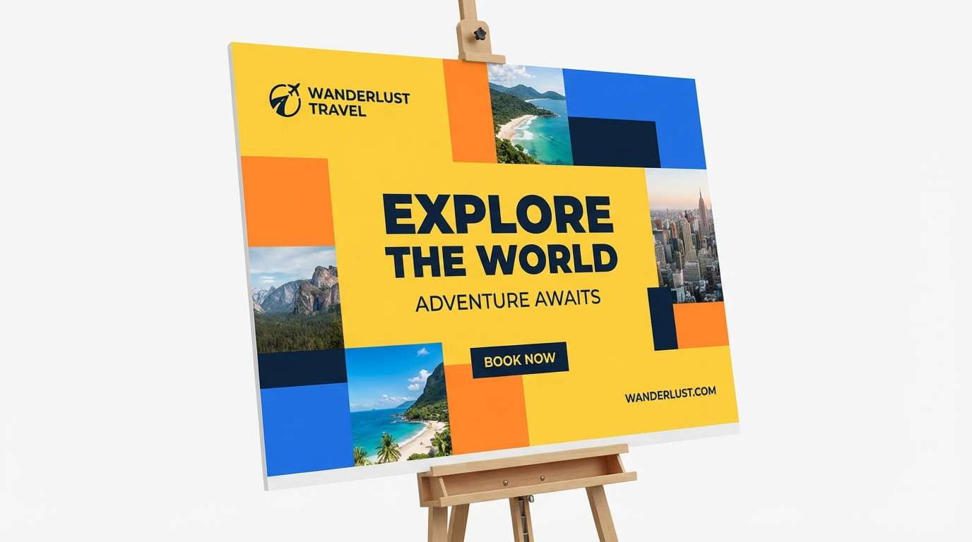
1) Sunlit Harbor
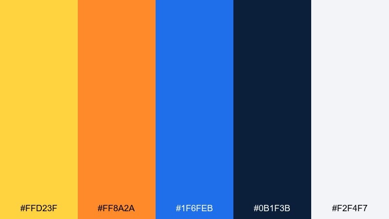
HEX: #ffd23f #ff8a2a #1f6feb #0b1f3b #f2f4f7
Mood: bright, coastal, confident
Best for: travel branding and hero banners
Bright seaside energy with sun-glare yellows, buoy orange, and deep harbor blue. It works beautifully for travel ads, event hero sections, and lifestyle landing pages where you want instant optimism. Pair it with lots of white space and a navy headline for legibility. Usage tip: let the blue handle typography while yellow and orange stay as calls to action and icons.
Image example of sunlit harbor generated using media.io
Media.io is an online AI studio for creating and editing video, image, and audio in your browser.

2) Citrus Surf
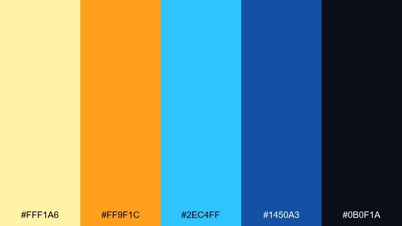
HEX: #fff1a6 #ff9f1c #2ec4ff #1450a3 #0b0f1a
Mood: playful, sporty, punchy
Best for: sports posters and social graphics
Zesty citrus tones crash into clean surf blues for a high-energy feel. This mix shines on sports posters, sale graphics, and punchy social templates where contrast needs to read fast. Keep the dark ink color for titles and small text so the brights can stay bold. Usage tip: use the pale yellow as a background wash to soften the overall intensity.
Image example of citrus surf generated using media.io
3) Retro Boardwalk
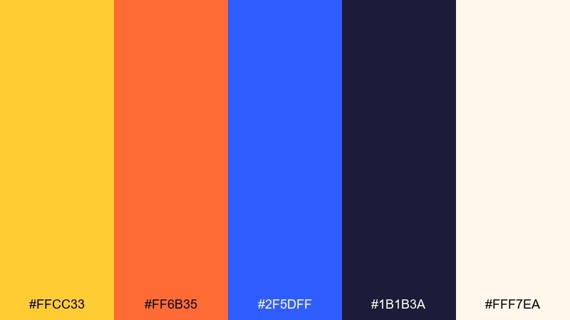
HEX: #ffcc33 #ff6b35 #2f5dff #1b1b3a #fff7ea
Mood: nostalgic, bold, sunny
Best for: vintage-style packaging and labels
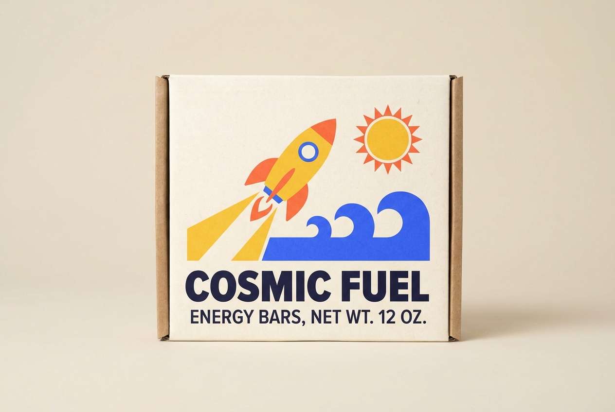
Nostalgic boardwalk vibes come through with candy yellow, tangerine pop, and a punchy cobalt. This yellow orange blue color palette is ideal for retro packaging, sticker sets, and limited-edition labels that need shelf impact. Add cream as the base to keep it friendly, then use navy for outlines and small print. Usage tip: try chunky icons and simple shapes to lean into the throwback feel.
Image example of retro boardwalk generated using media.io
4) Desert Skyline
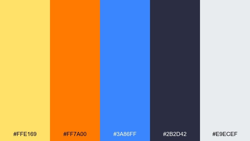
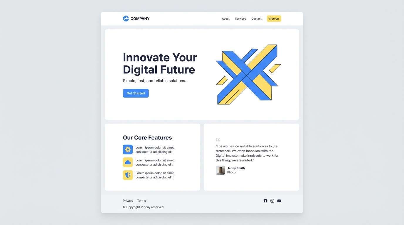
HEX: #ffe169 #ff7a00 #3a86ff #2b2d42 #e9ecef
Mood: warm, spacious, modern
Best for: landing pages and SaaS marketing
Warm desert light meets a crisp skyline blue, creating a clean modern contrast. It fits SaaS landing pages and marketing sections where you want optimism without losing professionalism. Use the cool gray and charcoal for structure, grids, and long-copy readability. Usage tip: reserve orange for one primary button style so the interface stays calm.
Image example of desert skyline generated using media.io
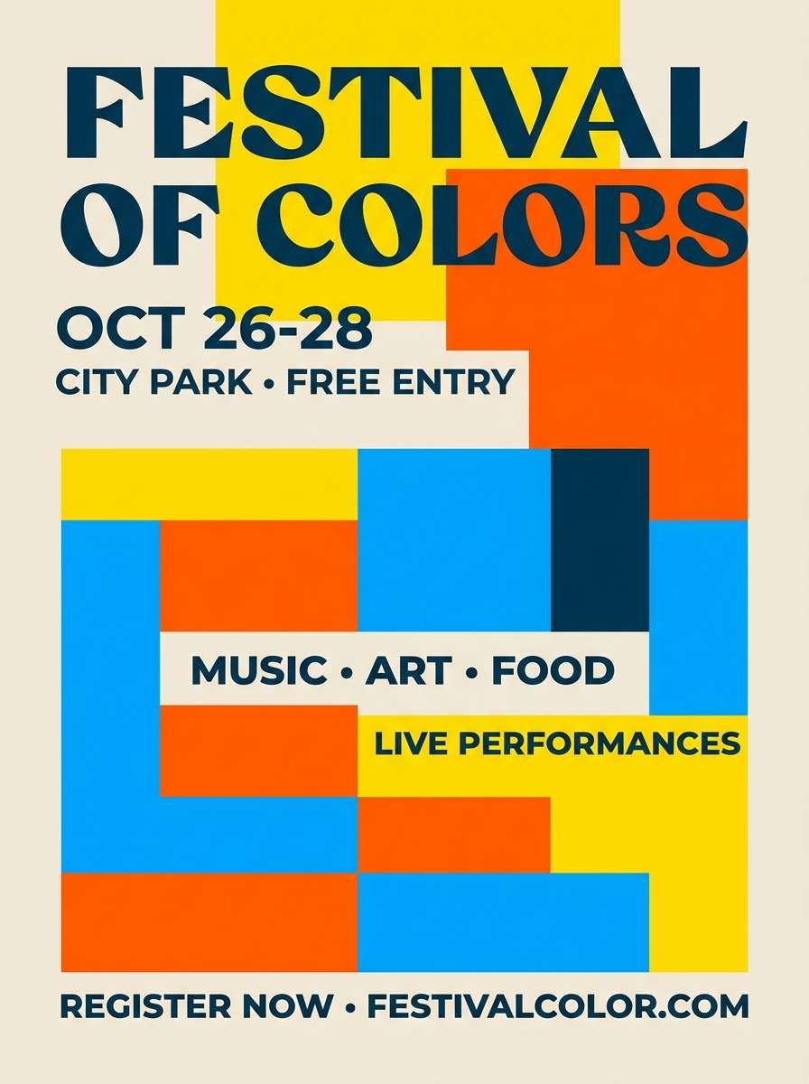
5) Festival Flags
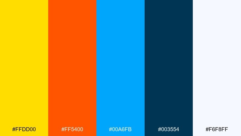
HEX: #ffdd00 #ff5400 #00a6fb #003554 #f6f8ff
Mood: loud, celebratory, energetic
Best for: event flyers and ticket promos
A parade of saturated color feels like flags snapping in the wind. This yellow orange blue color scheme is perfect for festival flyers, ticket promos, and punchy countdown posts that need to stop the scroll. Ground the layout with deep teal for type and dividers. Usage tip: stack color blocks behind text rather than outlining letters for cleaner readability.
Image example of festival flags generated using media.io
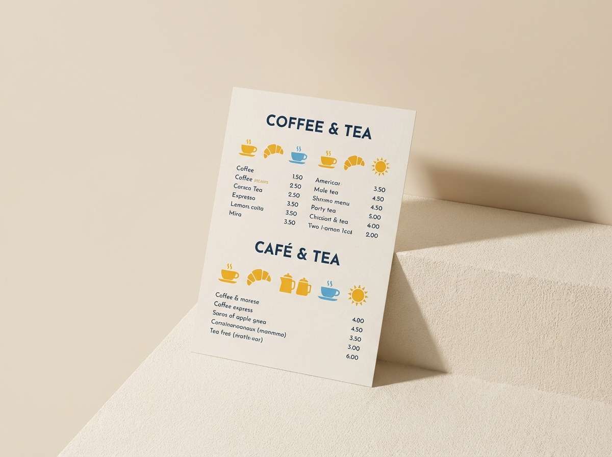
6) Cozy Breakfast
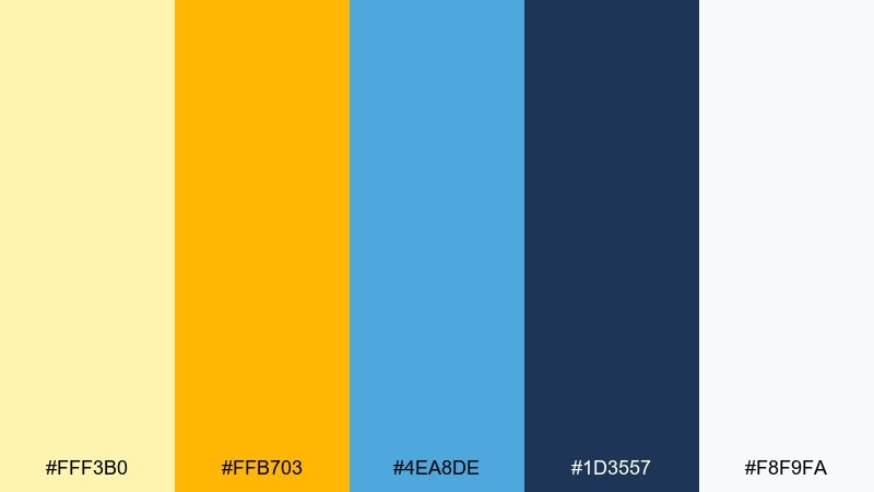
HEX: #fff3b0 #ffb703 #4ea8de #1d3557 #f8f9fa
Mood: friendly, cozy, inviting
Best for: cafe menus and food branding
Soft morning light, butter-yellow warmth, and a calm blue note create an inviting feel. It works well for cafe menus, breakfast packaging, and food blog headers where you want cozy without looking dull. Pair with off-white backgrounds and a classic serif for a handcrafted vibe. Usage tip: keep the bright yellow as small highlights on prices, badges, or key ingredients.
Image example of cozy breakfast generated using media.io
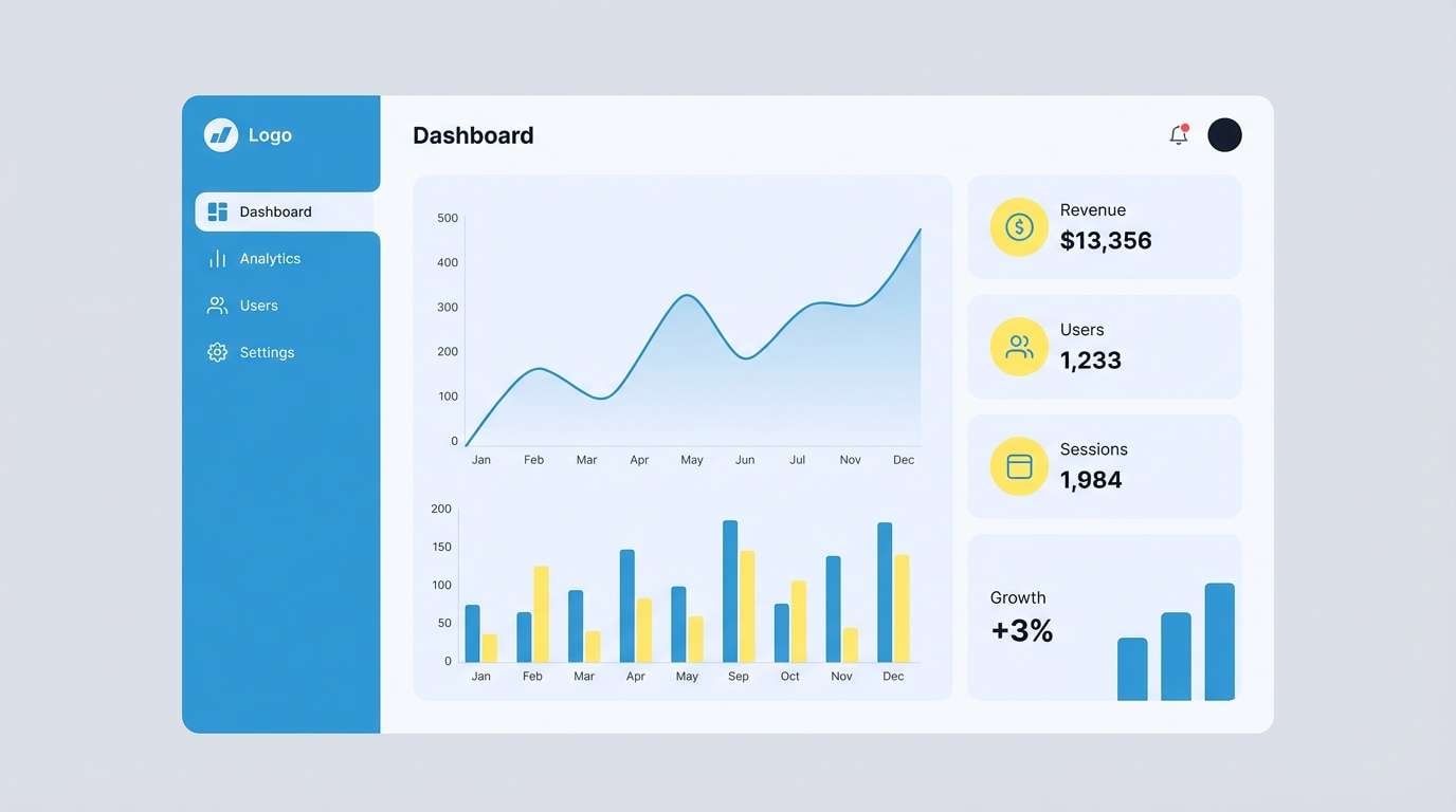
7) Clear Day UI
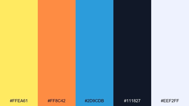
HEX: #ffea61 #ff8c42 #2d9cdb #111827 #eef2ff
Mood: clean, upbeat, tech-friendly
Best for: dashboard UI and app components
Crisp daylight blues balanced by sunny highlights makes the interface feel optimistic and clear. It suits dashboards, settings screens, and onboarding flows where hierarchy must be obvious. Let the dark charcoal carry body text, then use blue for links and active states. Usage tip: use orange only for warnings or secondary emphasis so it keeps its meaning.
Image example of clear day ui generated using media.io
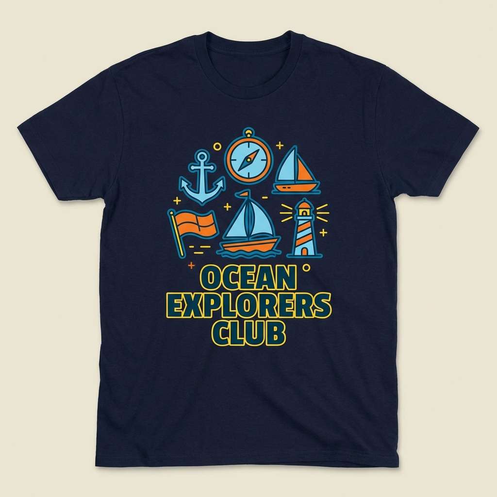
8) Nautical Pop
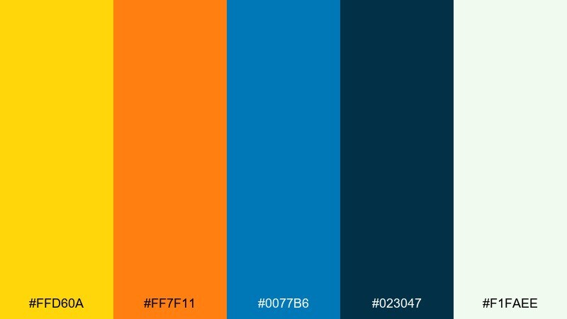
HEX: #ffd60a #ff7f11 #0077b6 #023047 #f1faee
Mood: crisp, maritime, bold
Best for: summer campaigns and merch graphics
Maritime blues with a pop of buoy orange feel clean and confident, like signage on a pier. Great for summer campaign graphics, tote bags, and merch designs where contrast needs to hold up in print. Keep the deep navy for outlines and type to avoid a washed look. Usage tip: try a cream base so yellow stays bright without vibrating against white.
Image example of nautical pop generated using media.io
9) Autumn Koi
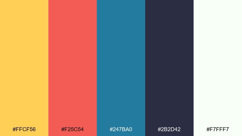
HEX: #ffcf56 #f25c54 #247ba0 #2b2d42 #f7fff7
Mood: artful, warm, balanced
Best for: art prints and boutique branding
Warm koi-orange and golden leaves swirl against a steady pond blue. The contrast feels artistic and composed, ideal for boutique branding, art print series, and shop lookbooks. Use the soft near-white to keep layouts airy, then anchor with charcoal for text. Usage tip: lean on organic shapes or brush textures to make the colors feel hand-made.
Image example of autumn koi generated using media.io
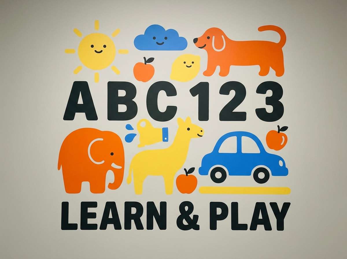
10) Playroom Primary
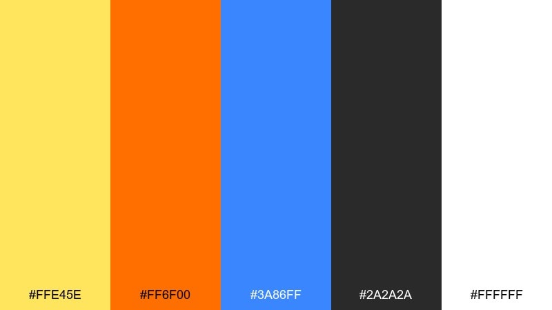
HEX: #ffe45e #ff6f00 #3a86ff #2a2a2a #ffffff
Mood: cheerful, kid-friendly, simple
Best for: kids apps and learning posters
Cheerful primary energy feels like blocks, crayons, and playtime. It fits kids learning posters, playful app screens, and classroom handouts where clarity beats subtlety. Keep black text for maximum accessibility, and let blue carry navigation states. Usage tip: limit gradients and use flat fills so the palette stays crisp and readable.
Image example of playroom primary generated using media.io
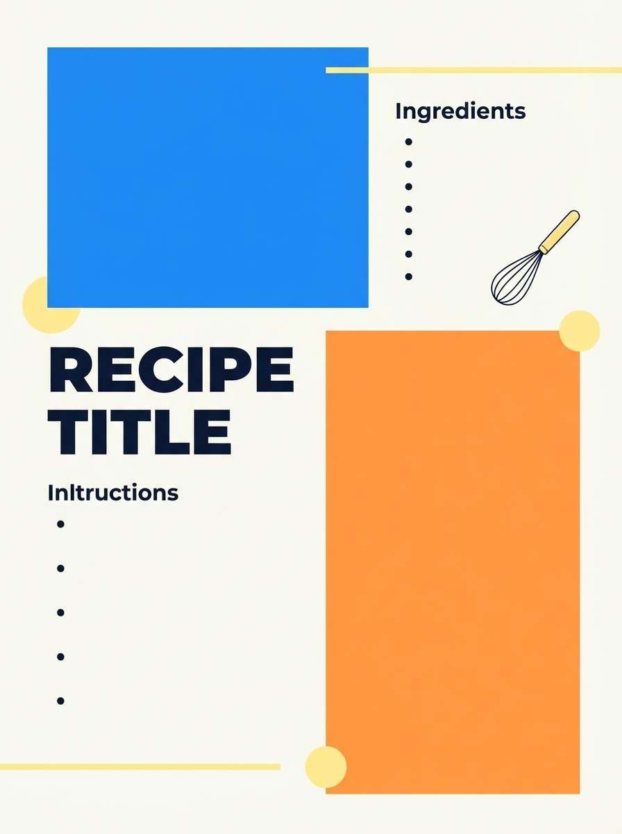
11) Market Fresh
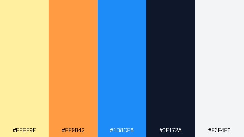
HEX: #ffef9f #ff9b42 #1d8cf8 #0f172a #f3f4f6
Mood: fresh, friendly, modern
Best for: grocery promos and recipe cards
Fresh market warmth with a clean blue pop feels friendly and modern. It works great for grocery promos, recipe cards, and subscription food boxes that need to look bright and trustworthy. Pair with cool grays for whitespace and use navy for ingredient lists. Usage tip: keep the orange as the key badge color to guide attention on busy layouts.
Image example of market fresh generated using media.io
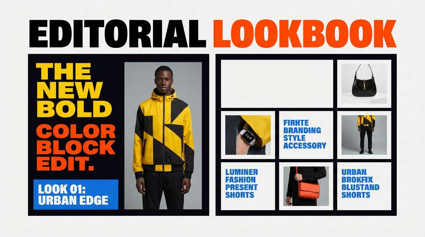
12) Sunny Streetwear
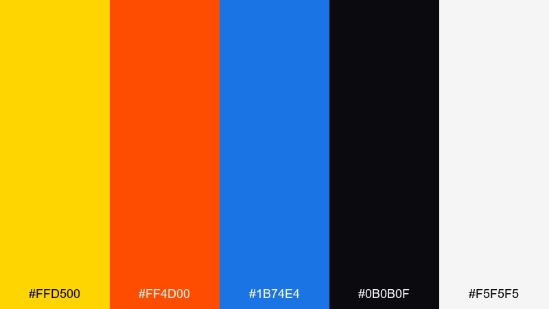
HEX: #ffd500 #ff4d00 #1b74e4 #0b0b0f #f5f5f5
Mood: urban, edgy, high-contrast
Best for: streetwear lookbooks and drops
High-contrast brights over near-black feel like street posters under city lights. Perfect for streetwear drops, lookbook pages, and bold announcement tiles. Let the black do most of the heavy lifting and keep yellow for logos or tags. Usage tip: use blue as a secondary accent on links and small UI chips to avoid overpowering the orange.
Image example of sunny streetwear generated using media.io
13) Tropical Transit
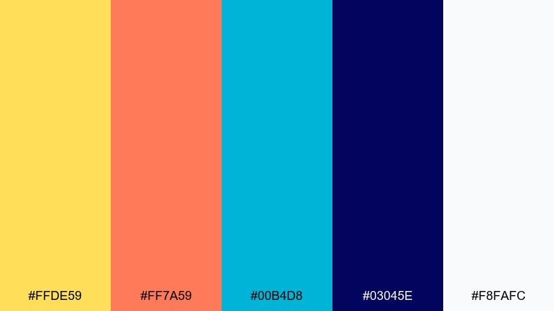
HEX: #ffde59 #ff7a59 #00b4d8 #03045e #f8fafc
Mood: lively, breezy, contemporary
Best for: transit ads and campaign posters
Lively tropical warmth with a breezy cyan feels contemporary and easy to notice from afar. It suits transit ads, campaign posters, and billboards where color blocks must read quickly. Use the deep indigo for headlines and legal copy, and keep cyan for directional cues. Usage tip: build simple two-color backgrounds and place the third bright as a punchy badge.
Image example of tropical transit generated using media.io
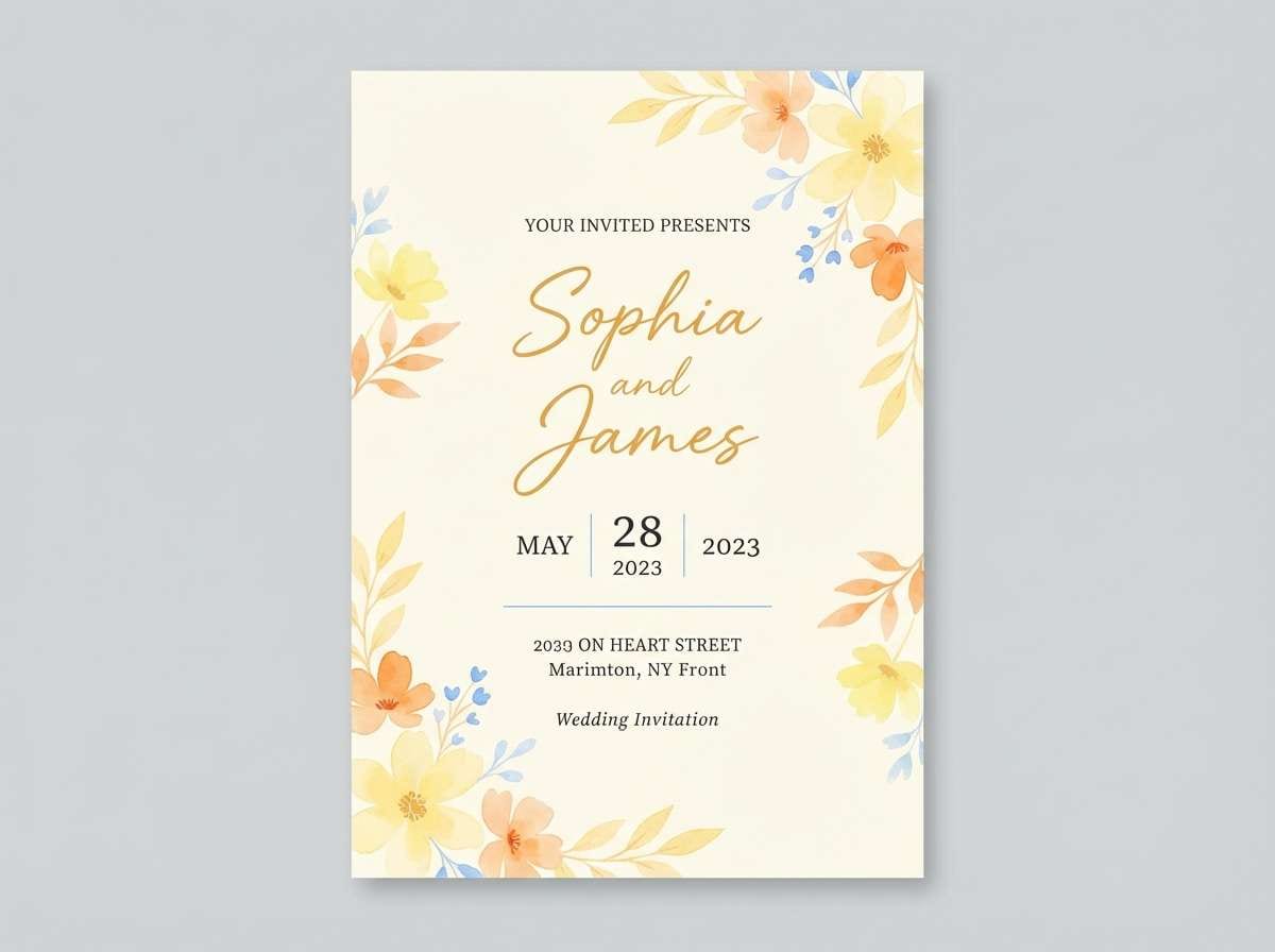
14) Golden Hour Splash
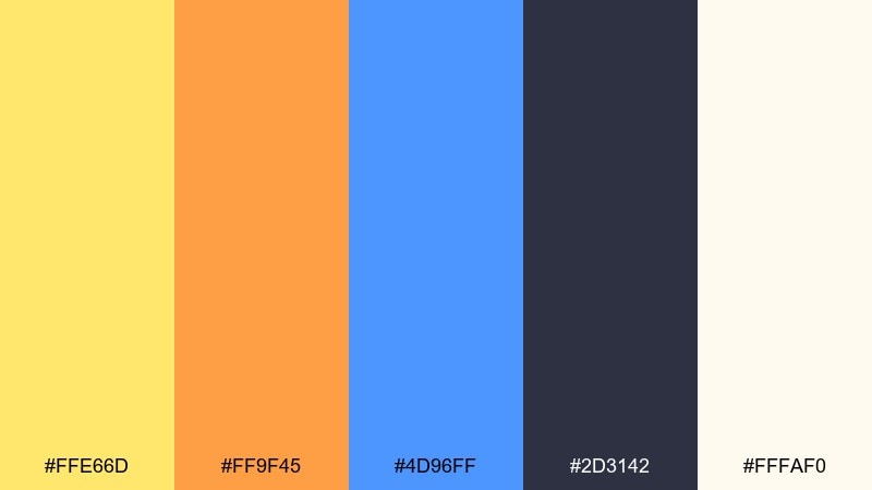
HEX: #ffe66d #ff9f45 #4d96ff #2d3142 #fffaf0
Mood: warm, dreamy, optimistic
Best for: wedding websites and invitations
Golden-hour warmth with a soft blue splash feels romantic and optimistic. It works for wedding websites, save-the-dates, and invitation suites that want color without looking childish. Pair with elegant typography and plenty of cream space for a refined finish. Usage tip: use blue sparingly for section dividers or RSVP buttons so the warmth stays dominant.
Image example of golden hour splash generated using media.io
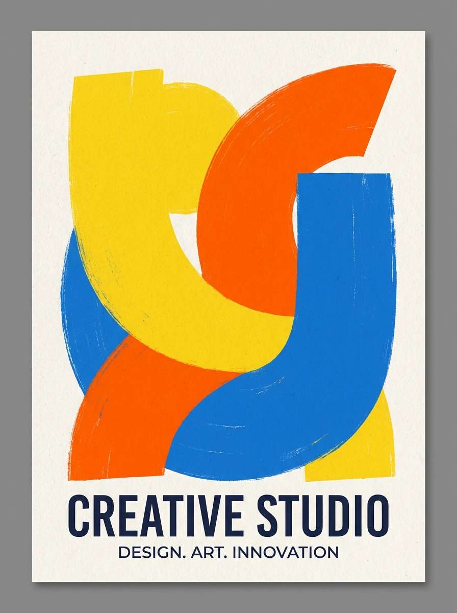
15) Modern Mural
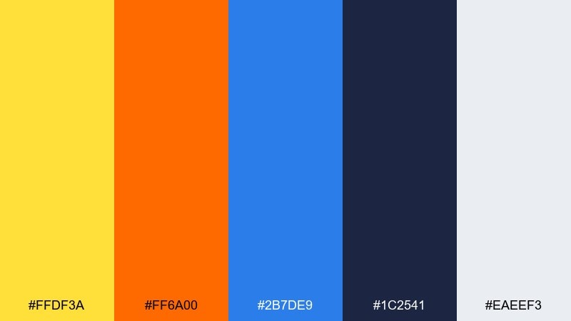
HEX: #ffdf3a #ff6a00 #2b7de9 #1c2541 #eaeef3
Mood: bold, graphic, creative
Best for: creative studio branding and posters
Bold mural energy with crisp edges feels creative and intentional. This yellow orange blue color palette is a strong fit for studio branding, gallery posters, and portfolio sections where you want a signature look. Use the cool light gray to give shapes breathing room, then anchor with deep navy for typography. Usage tip: keep the mural shapes large and avoid thin lines so the colors stay clean at distance.
Image example of modern mural generated using media.io
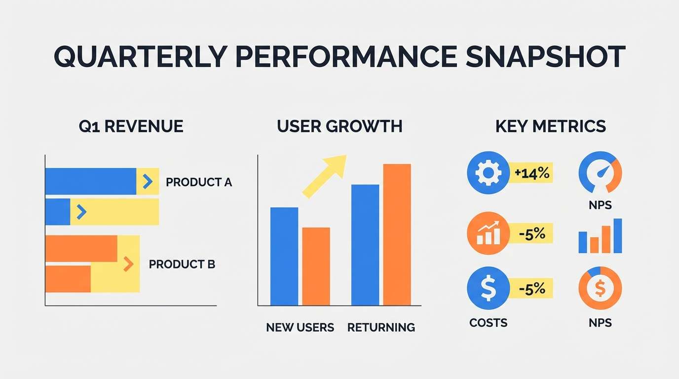
16) Clean Infographic
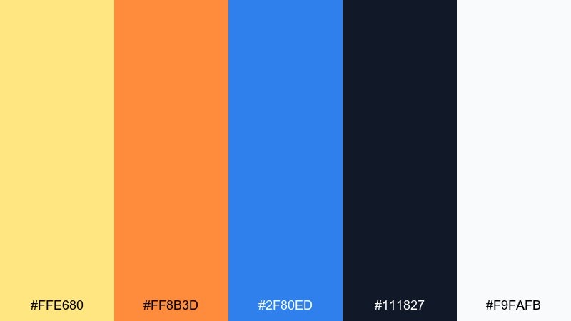
HEX: #ffe680 #ff8b3d #2f80ed #111827 #f9fafb
Mood: clear, informative, polished
Best for: reports, charts, and slide decks
Clear, informative tones feel like well-labeled charts with just enough personality. A yellow orange blue color scheme like this works especially well in reports, slide decks, and explainers where categories must be easy to track. Keep backgrounds near-white and use charcoal for axis labels and notes. Usage tip: assign one color per data series and stick to it consistently across pages.
Image example of clean infographic generated using media.io
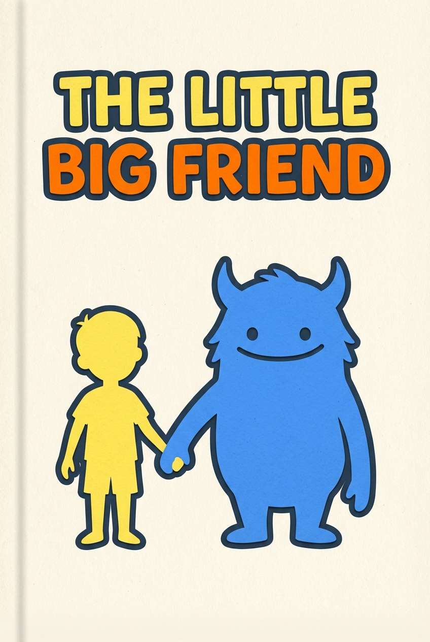
17) Kidlit Adventure
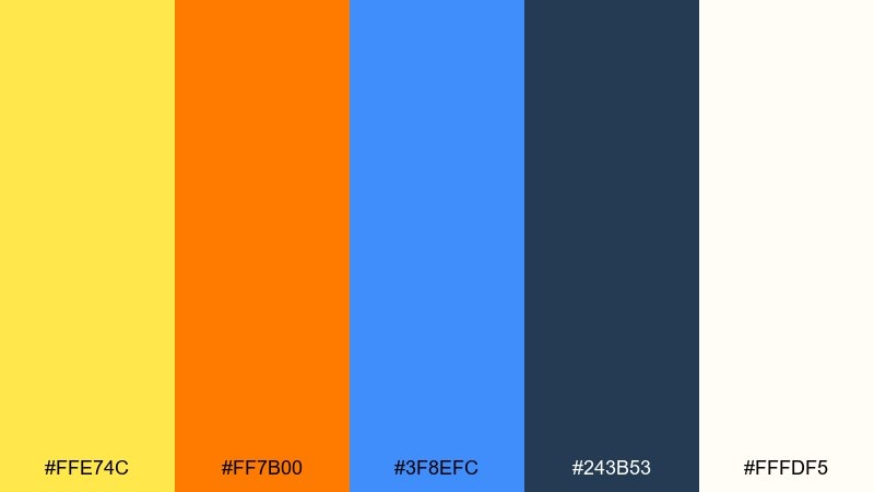
HEX: #ffe74c #ff7b00 #3f8efc #243b53 #fffdf5
Mood: adventurous, friendly, storybook
Best for: children book covers and posters
Adventurous storybook color with sunny highlights and a trustworthy blue feels instantly kid-friendly. Great for children book covers, reading program posters, and library event graphics. Use the deep slate for titles and character outlines to keep everything readable. Usage tip: add simple illustrated textures like paper grain to make the brights feel softer.
Image example of kidlit adventure generated using media.io
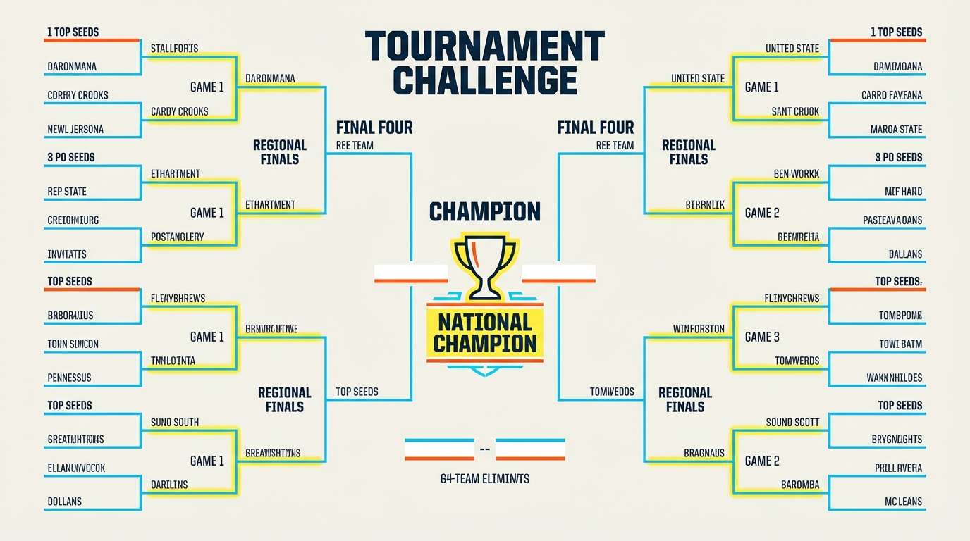
18) Summer Sports
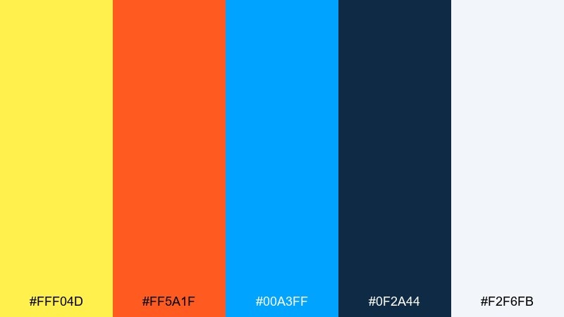
HEX: #fff04d #ff5a1f #00a3ff #0f2a44 #f2f6fb
Mood: fast, competitive, vibrant
Best for: team promos and tournament graphics
Vibrant, fast-moving color feels like sunlit courts and loud cheers. Ideal for team promos, tournament brackets, and highlight reels where you need strong contrast on screens. Balance the brights with a sturdy deep blue for headers and scorelines. Usage tip: use yellow for key stats and orange for callouts so they never compete in the same spot.
Image example of summer sports generated using media.io
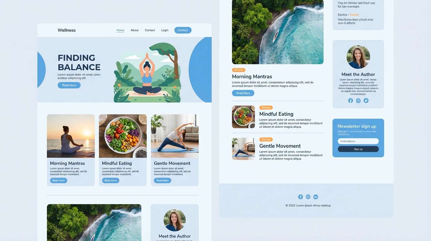
19) Cloudy Coast
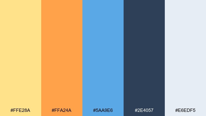
HEX: #ffe28a #ffa24a #5aa9e6 #2e4057 #e6edf5
Mood: soft, calm, coastal
Best for: wellness branding and blog design
Soft coastal calm with muted sunshine and a gentle ocean blue feels restorative. It fits wellness branding, blog headers, and calm ecommerce sections that need warmth without shouting. Pair with airy light-gray backgrounds and understated icons. Usage tip: use the orange as a tiny accent for links or badges, not as large blocks.
Image example of cloudy coast generated using media.io
20) Minimal Accent Trio
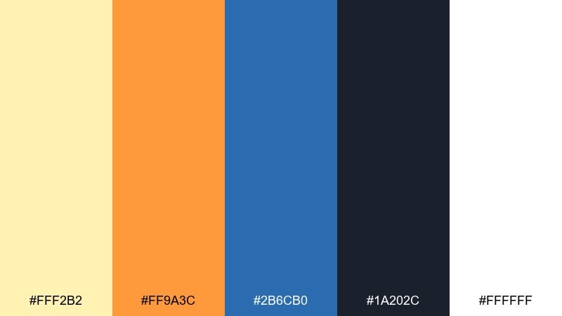
HEX: #fff2b2 #ff9a3c #2b6cb0 #1a202c #ffffff
Mood: minimal, smart, approachable
Best for: startup branding and UI accents
Minimal warmth with a confident blue accent feels smart and approachable. These yellow orange blue color combinations are great for startups that want a simple neutral base with memorable highlights. Keep the layout mostly white and charcoal, then use orange for a single standout action. Usage tip: stick to one blue tint for interactive states to maintain a consistent system.
Image example of minimal accent trio generated using media.io
What Colors Go Well with Yellow Orange Blue?
Neutrals are the easiest enhancers: white, cream, light gray, and charcoal keep the palette readable while letting the warm tones stay lively. If your design feels too loud, add more neutral area and move yellow/orange into smaller accents.
Deep navies and inky blues pair naturally with yellow and orange because they stabilize contrast for typography. For softer variations, try dusty blues or blue-grays alongside muted yellows (butter) and apricot oranges.
For richer, more editorial combinations, add one “support” hue like teal (ocean vibe), forest green (earthy), or a small violet/purple accent (creative contrast). Keep that fourth color minimal so the trio remains the hero.
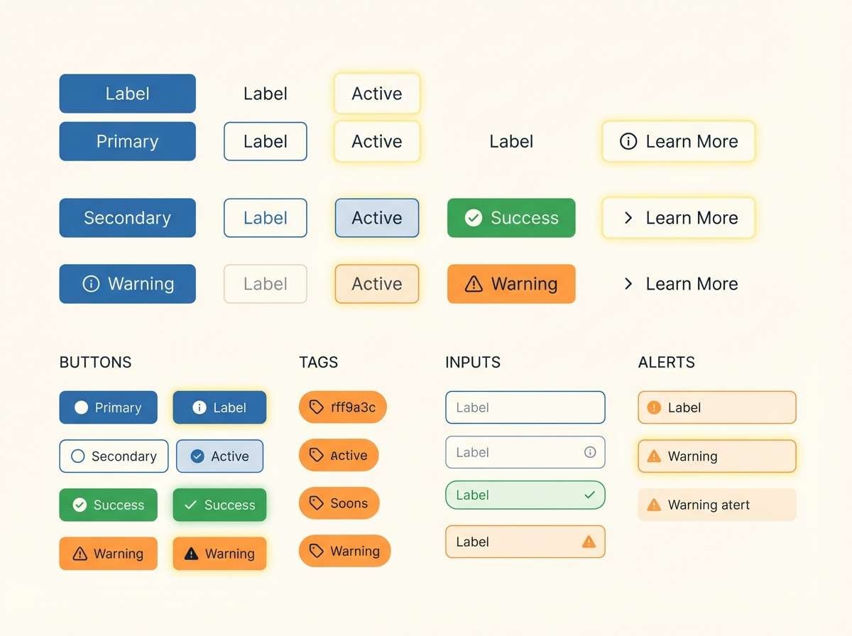
How to Use a Yellow Orange Blue Color Palette in Real Designs
In branding, assign roles: blue as the core brand color (logo, headings, trust cues), yellow for highlights (badges, icons), and orange for action (CTAs, promos). This prevents warm colors from competing and gives you a consistent system.
In UI, prioritize accessibility by using dark text on light neutrals and reserving saturated colors for states. Blue works well for links and active selections, while orange can signal warnings or secondary emphasis; use yellow sparingly because it can reduce contrast on white.
For posters and packaging, increase impact with big color blocks and simple shapes. Let the darkest color handle fine detail and small copy, and test print proofs—yellow/orange saturation can shift on different paper stocks.
Create Yellow Orange Blue Palette Visuals with AI
If you have HEX codes but need real mockups (posters, landing pages, labels, or UI screens), generating quick visuals helps you validate contrast, hierarchy, and “feel” before committing to production.
With Media.io’s text-to-image, you can paste a short prompt, include your palette HEX values, and iterate on layout styles (minimal, retro, sporty, editorial) in minutes—ideal for early concepting and A/B directions.
Start with one palette above, then generate 2–3 variants by changing only the subject (e.g., “event flyer”, “dashboard”, “product label”) to keep your color system consistent.
Yellow Orange Blue Color Palette FAQs
-
What vibe does a yellow orange blue palette create?
It typically feels energetic and optimistic (yellow/orange) while still structured and trustworthy (blue). The overall vibe can shift from playful to sleek depending on how much neutral space you add and how dark your blue is. -
How do I keep yellow and orange from overwhelming the design?
Give blue and neutrals the largest areas, then use yellow/orange as accents. A practical approach is 60–30–10: neutrals as the base, blue as the main brand color, and warm tones for highlights and CTAs. -
Which text color is most readable with yellow/orange backgrounds?
Dark navy, charcoal, or true black usually provides the best contrast on yellow and many oranges. For accessibility, always check contrast ratios—some bright yellows won’t support white text. -
Is yellow orange blue good for UI design?
Yes, when you assign clear roles: blue for links/active states, orange for warnings or secondary emphasis, and yellow for small highlights. Pair with off-white and dark text to avoid eye strain. -
What neutrals pair best with yellow orange blue?
Cream, warm white, and light cool grays help the palette feel modern without harsh contrast. For anchoring, use deep navy or charcoal for typography and fine details. -
Can I use this palette for professional branding (not just playful designs)?
Yes—choose a deeper, slightly muted blue and reduce saturation of the warm tones, then increase whitespace. Using orange as a single primary CTA color can keep the system polished and business-friendly. -
How can I generate consistent visuals using these HEX codes?
Include the HEX codes directly in your prompt, describe the layout style (e.g., “minimal landing page,” “retro label,” “bold poster”), and keep one constant element (like typography style or grid). Iterating small prompt changes helps maintain consistency.


