

Violet purple sits right between expressive magenta and grounded blue, so it can feel both creative and trustworthy in the same layout. That range makes it a reliable choice for branding, UI, print, and packaging.
Below are 20+ violet purple color palette ideas with HEX codes, plus practical tips for pairing, contrast, and real-world usage—so you can pick a direction fast and apply it with confidence.
In this article
- Why Violet Purple Palettes Work So Well
-
- twilight orchid
- royal velvet
- lilac mist
- grape soda pop
- amethyst dusk
- plum and pearl
- cosmic bloom
- vintage mauve paper
- neon nightclub
- lavender latte
- mulberry forest
- iris and sand
- eggplant noir
- spring wisteria
- berry sorbet
- smoky orchid
- regal chapel
- tech violet gradient
- artisan bouquet
- dreamy galaxy
- orchid ink
- velvet plum minimal
- iris circuit
- What Colors Go Well with Violet Purple?
- How to Use a Violet Purple Color Palette in Real Designs
- Create Violet Purple Palette Visuals with AI
Why Violet Purple Palettes Work So Well
Violet purple palettes are flexible because they naturally cover both depth and softness—deep eggplant tones can anchor a layout, while lilac tints keep the overall feel airy. This built-in range makes it easier to create hierarchy without reaching for extra colors.
Psychologically, violet purple often reads as imaginative, premium, and a little mysterious, which is why it shows up so often in beauty, tech, music, and editorial design. You can push it romantic with blush accents, or sharpen it with cool grays and crisp whites.
From a practical standpoint, violet purple is also great for contrast control: dark violets support white typography well, and pale lavenders can serve as gentle backgrounds. The key is choosing the right neutral partner and keeping accessibility in mind for text and UI states.
20+ Violet Purple Color Palette Ideas (with HEX Codes)
1) Twilight Orchid
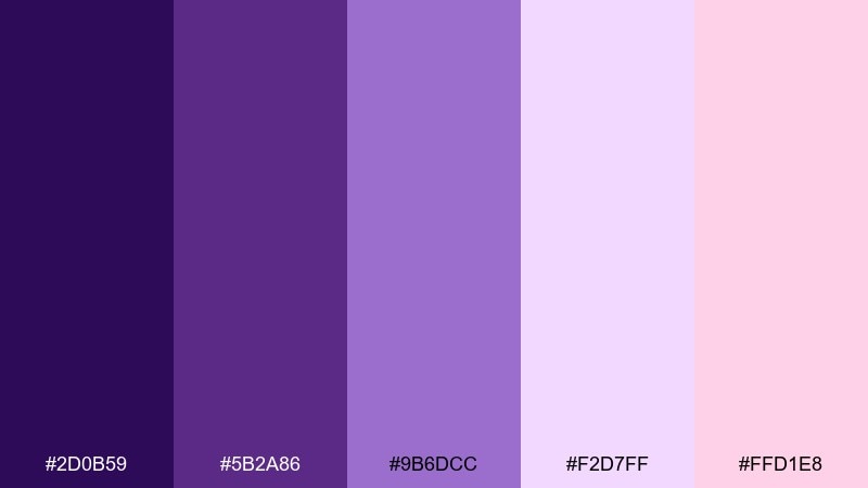
HEX: #2D0B59 #5B2A86 #9B6DCC #F2D7FF #FFD1E8
Mood: romantic, dreamy, modern
Best for: beauty branding and social templates
Dreamy twilight purples and orchid blush feel like soft lights after sunset. This violet purple color palette works beautifully for beauty, wellness, and boutique brands that want elegance without looking heavy. Pair it with clean whites or warm ivory, and use the blush as a friendly callout color. Tip: keep body text dark and reserve the light lavender for backgrounds to preserve contrast.
Image example of twilight orchid generated using media.io

Media.io is an online AI studio for creating and editing video, image, and audio in your browser.

2) Royal Velvet
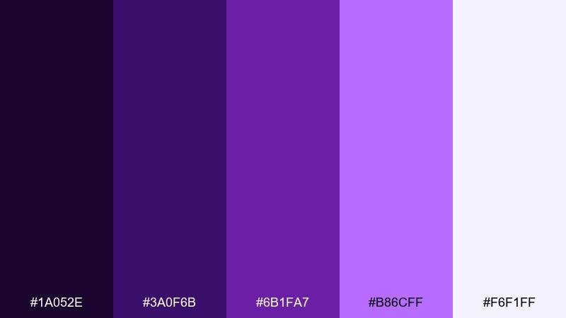
HEX: #1A052E #3A0F6B #6B1FA7 #B86CFF #F6F1FF
Mood: luxurious, dramatic, premium
Best for: jewelry or fragrance packaging
Velvety shadows and jeweled highlights create a high-end, night-out vibe. The deep base tones make metallic foils and embossing feel instantly more premium. Pair with silver or pearl neutrals, and let the bright violet act as the hero color on labels. Tip: use the palest lavender as negative space so the darker inks do not overwhelm the design.
Image example of royal velvet generated using media.io
3) Lilac Mist
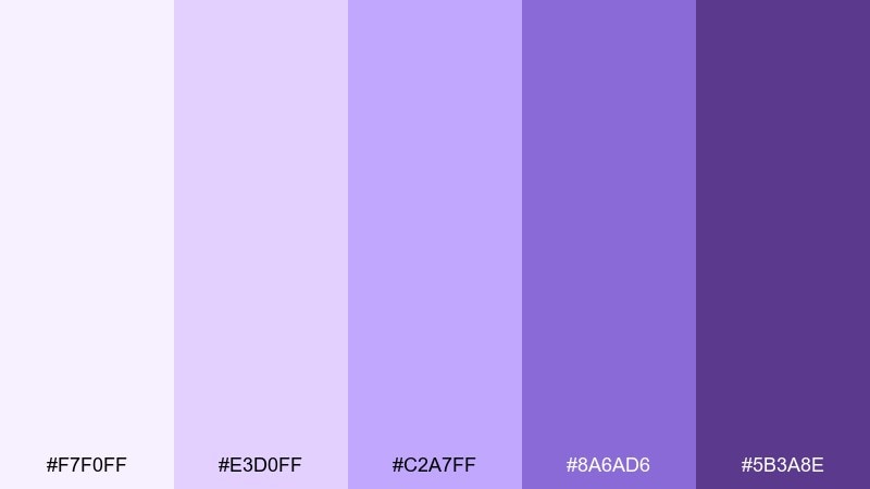
HEX: #F7F0FF #E3D0FF #C2A7FF #8A6AD6 #5B3A8E
Mood: airy, calm, friendly
Best for: wellness UI and onboarding screens
Soft lilac fog and gentle violets feel light, breathable, and reassuring. These tints are ideal for calming apps where the interface should stay quiet and supportive. Pair with cool grays and plenty of whitespace, then use the deeper violet for buttons and active states. Tip: keep gradients subtle so form fields and labels remain crisp.
Image example of lilac mist generated using media.io
4) Grape Soda Pop
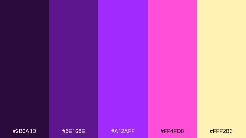
HEX: #2B0A3D #5E168E #A12AFF #FF4FD8 #FFF2B3
Mood: playful, energetic, pop
Best for: event posters and youth campaigns
Punchy grape tones with a fizzy pink burst feel loud in the best way. The warm buttery highlight keeps the neons from turning cold and adds a retro candy twist. Pair with black for contrast or creamy off-white for a softer poster look. Tip: limit the yellow to small highlights like dates or badges so the main violet stays dominant.
Image example of grape soda pop generated using media.io

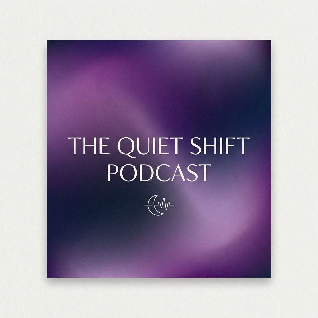
5) Amethyst Dusk
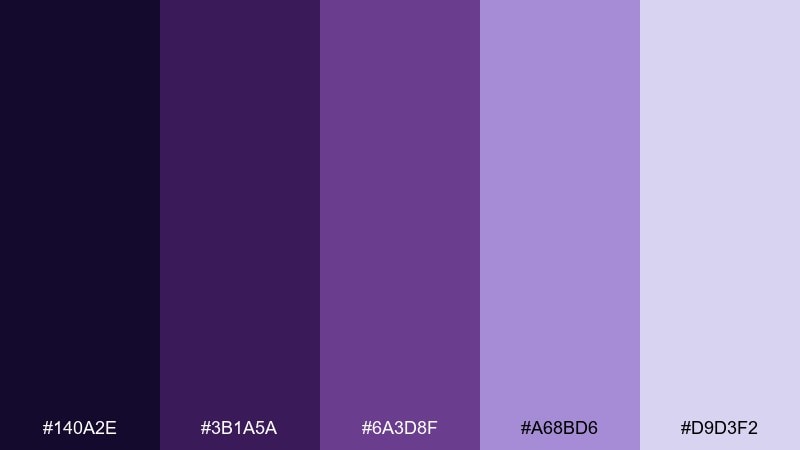
HEX: #140A2E #3B1A5A #6A3D8F #A68BD6 #D9D3F2
Mood: moody, cinematic, refined
Best for: book covers and podcast art
Amethyst shadows and dusty highlights evoke a quiet, cinematic evening. The mid violets give you readable depth for titles without feeling harsh. Pair with warm parchment neutrals, and consider a single subtle texture to add atmosphere. Tip: set your headline in the lightest tint and keep supporting text in the mid tone for balance.
Image example of amethyst dusk generated using media.io
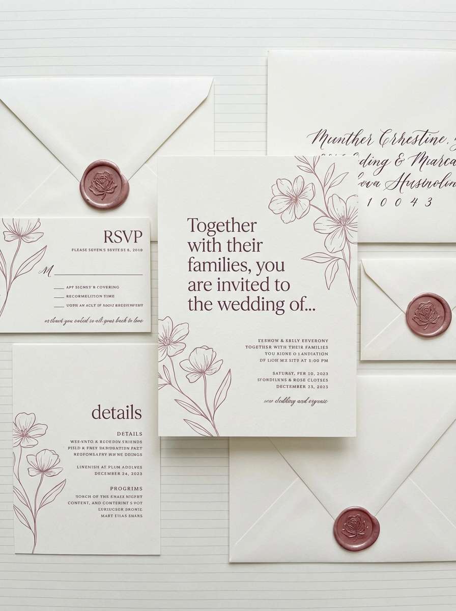
6) Plum and Pearl
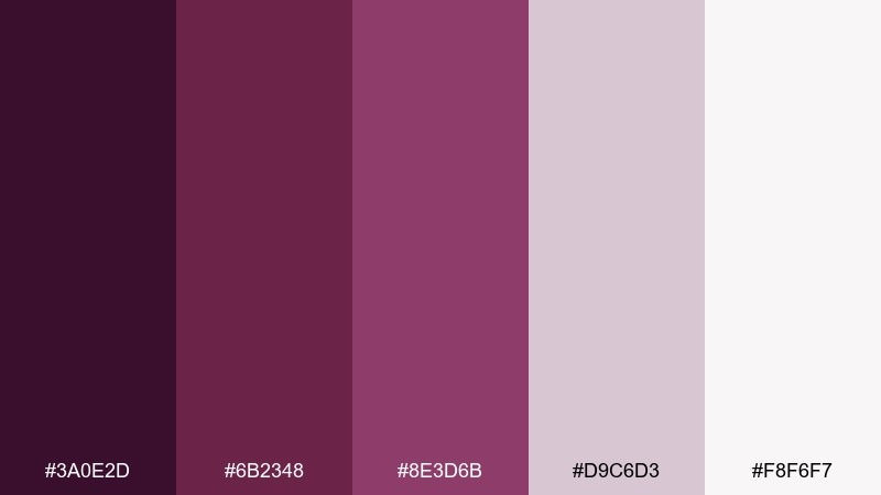
HEX: #3A0E2D #6B2348 #8E3D6B #D9C6D3 #F8F6F7
Mood: soft, intimate, classic
Best for: wedding invitations and stationery
Plum wine tones with pearly blush neutrals feel intimate and timeless. These violet purple color combinations suit romantic stationery, especially when paired with ivory paper and subtle gold foil. Keep the darkest plum for names and headings, then use the pale pearl as generous breathing room. Tip: add a thin border line in muted rose to tie the set together across inserts.
Image example of plum and pearl generated using media.io
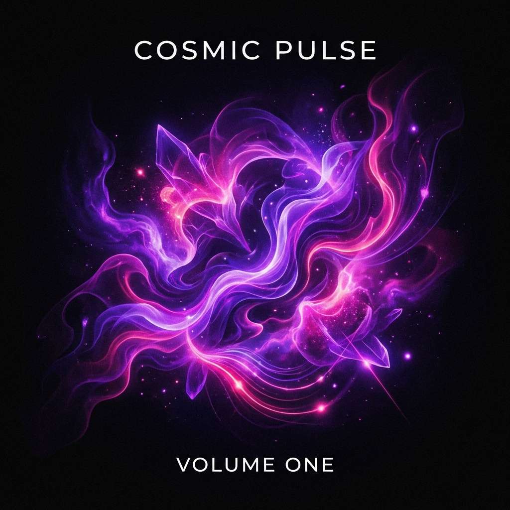
7) Cosmic Bloom
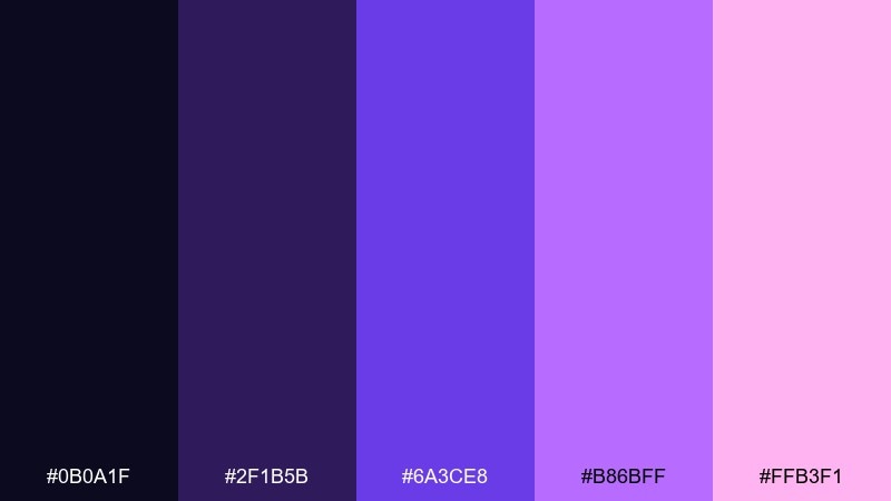
HEX: #0B0A1F #2F1B5B #6A3CE8 #B86BFF #FFB3F1
Mood: futuristic, vibrant, dreamy
Best for: music artwork and motion graphics
Galaxy-deep indigo with electric bloom violets feels futuristic and bright. The contrast between the dark base and the neon accents is ideal for album art and animated backgrounds. Pair with minimal white type and let the pink-lilac glow act as the focal flare. Tip: use the darkest shade as a full-bleed background to make the neon colors feel luminous.
Image example of cosmic bloom generated using media.io
8) Vintage Mauve Paper
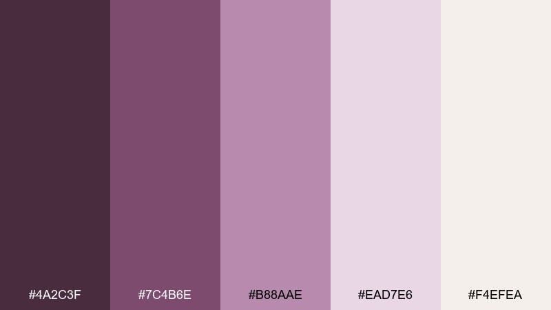
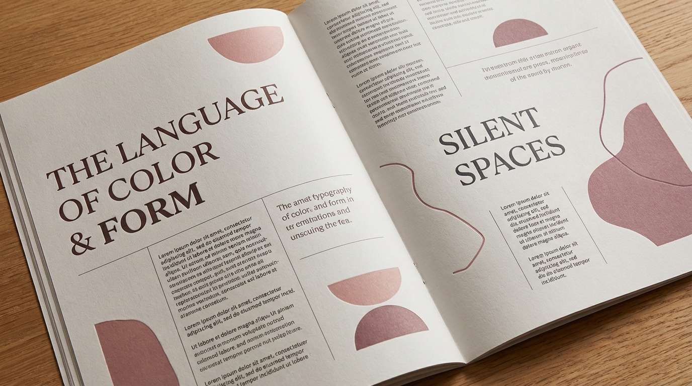
HEX: #4A2C3F #7C4B6E #B88AAE #EAD7E6 #F4EFEA
Mood: nostalgic, warm, editorial
Best for: magazine layouts and lookbooks
Warm mauves and soft paper neutrals feel nostalgic, like a well-loved book jacket. The palette supports long-form layouts where readability matters and color should stay understated. Pair with charcoal text and muted photography, then use the darker mauve for section dividers. Tip: apply the blush tint to pull quotes or sidebar blocks for gentle emphasis.
Image example of vintage mauve paper generated using media.io
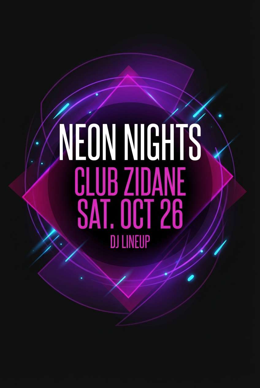
9) Neon Nightclub
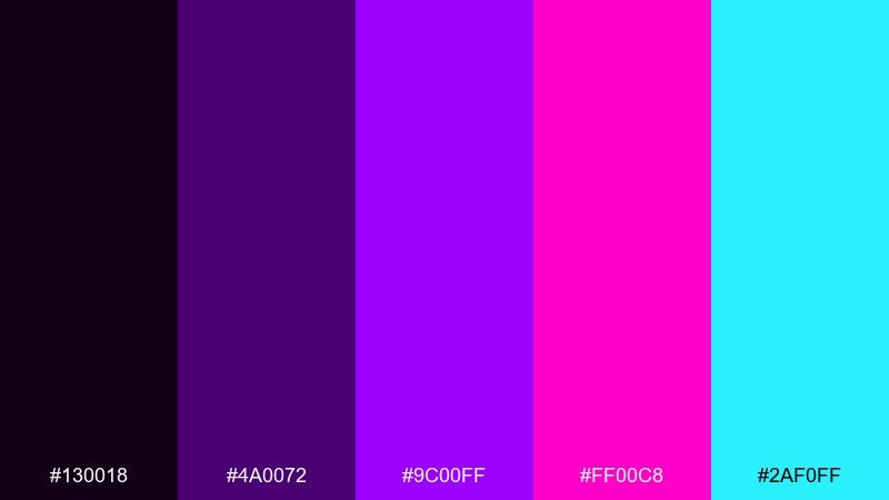
HEX: #130018 #4A0072 #9C00FF #FF00C8 #2AF0FF
Mood: bold, nightlife, high-contrast
Best for: club flyers and DJ promos
Hard-hitting neon violets with a cyan flash channel late-night lights and bass-heavy energy. The inky background gives your typography and shapes a crisp stage to pop from. Pair with black and a touch of white for legibility, and reserve cyan for key highlights like dates or QR codes. Tip: keep gradients controlled so the layout stays readable at a distance.
Image example of neon nightclub generated using media.io
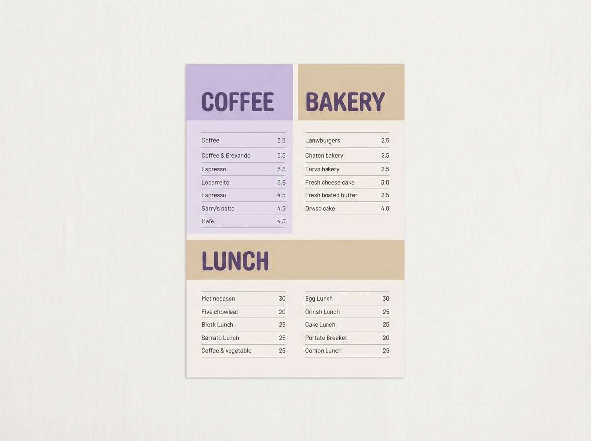
10) Lavender Latte
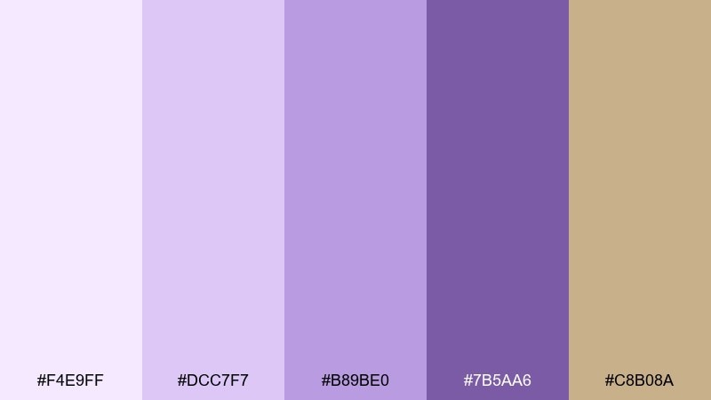
HEX: #F4E9FF #DCC7F7 #B89BE0 #7B5AA6 #C8B08A
Mood: cozy, soft, approachable
Best for: cafe branding and menu design
Creamy lavender with a latte beige note feels cozy and welcoming. These tones work especially well for cafes, lifestyle brands, and product menus that need warmth without going fully pastel. Pair with deep cocoa or charcoal typography to keep the look grounded. Tip: use the beige as a consistent background and let violet accents highlight categories and pricing.
Image example of lavender latte generated using media.io
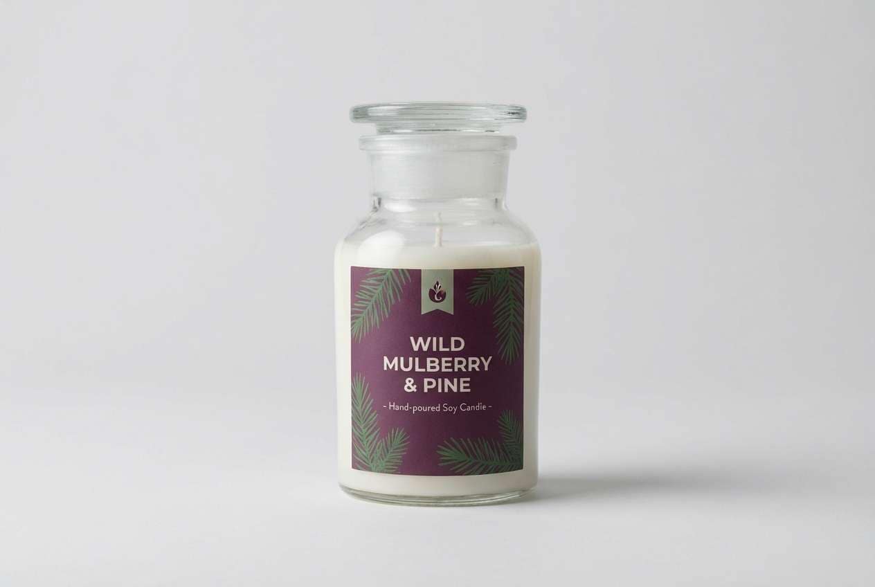
11) Mulberry Forest
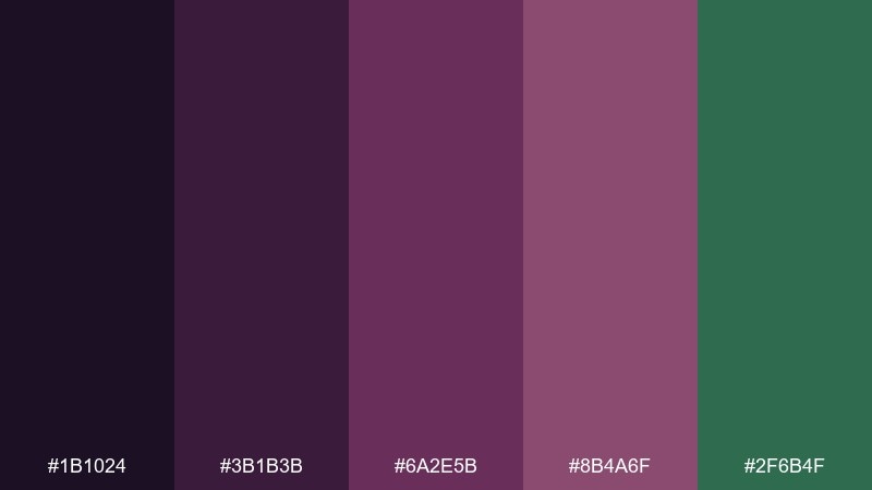
HEX: #1B1024 #3B1B3B #6A2E5B #8B4A6F #2F6B4F
Mood: earthy, mysterious, grounded
Best for: artisan product labels
Mulberry purples with a forest green twist feel earthy and a little mysterious. It is a great fit for artisan goods where you want rich color but still a natural mood. Pair with uncoated paper textures and minimal iconography for a crafted finish. Tip: keep the green as a secondary accent so the purples stay clearly in charge.
Image example of mulberry forest generated using media.io
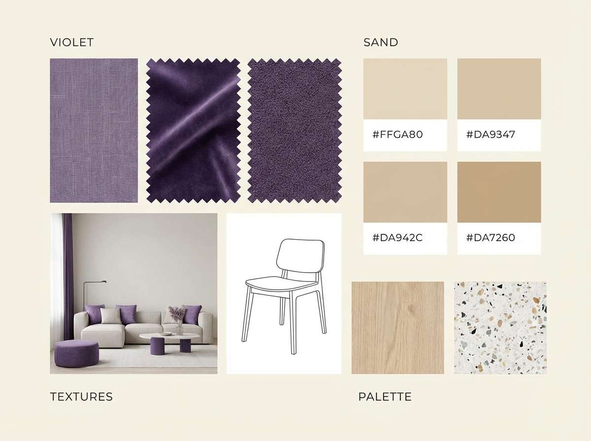
12) Iris and Sand
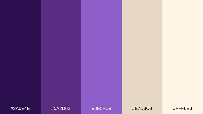
HEX: #2A0E4E #5A2D82 #8E5FC9 #E7D8C6 #FFF6E8
Mood: balanced, elegant, sun-warmed
Best for: interior mood boards and home decor
Iris violets against sandy neutrals feel balanced, like a gallery lit by warm afternoon sun. The contrast is gentle enough for interiors, yet still interesting for accent walls, textiles, or decor styling. Pair with matte black hardware or brushed brass for a refined finish. Tip: use the sand shades as the main field and bring violet in through smaller repeated accents for cohesion.
Image example of iris and sand generated using media.io
13) Eggplant Noir
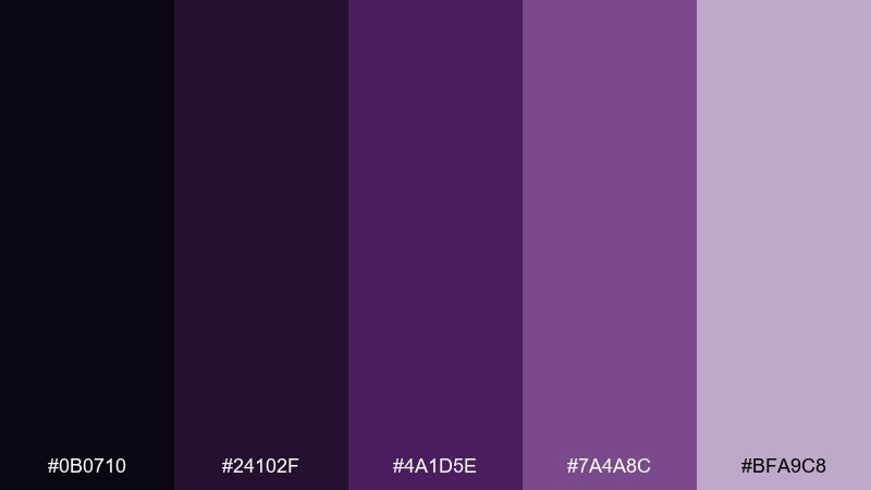
HEX: #0B0710 #24102F #4A1D5E #7A4A8C #BFA9C8
Mood: sleek, moody, sophisticated
Best for: premium web headers and hero sections
Eggplant noir tones feel sleek and cinematic, perfect for dramatic hero sections. This violet purple color palette gives you deep layers for backgrounds while keeping enough lift for readable overlays. Pair with soft gray UI lines and a single bright accent from within the set for buttons. Tip: add subtle noise or a low-contrast gradient to prevent large dark areas from banding on screens.
Image example of eggplant noir generated using media.io

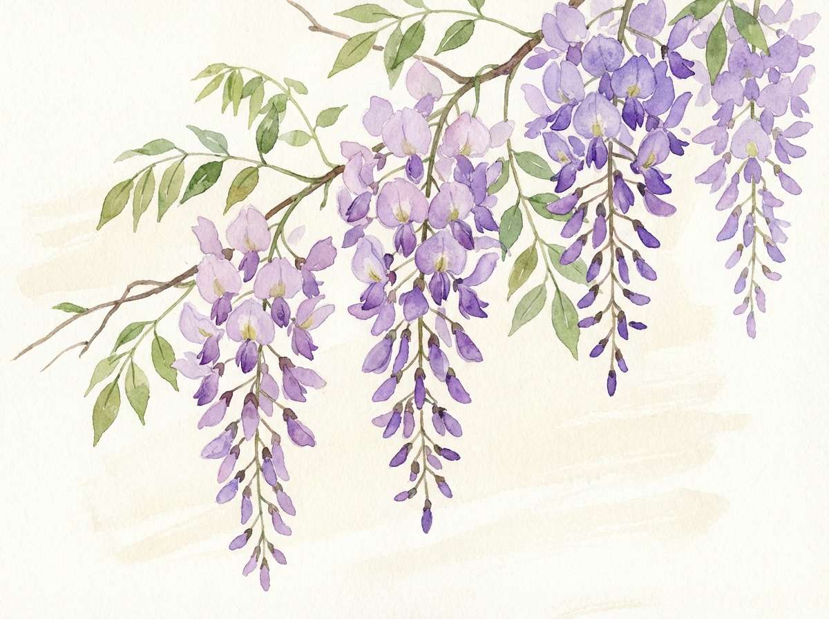
14) Spring Wisteria
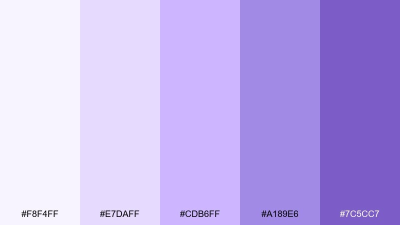
HEX: #F8F4FF #E7DAFF #CDB6FF #A189E6 #7C5CC7
Mood: fresh, floral, light
Best for: botanical illustrations and seasonal promos
Fresh wisteria tints feel like spring blossoms and soft morning air. The pale end of the range is perfect for backgrounds, while the deeper violet makes crisp stems, headings, or stamps. Pair with cream paper tones and delicate linework for a gentle, handmade finish. Tip: use two adjacent tints for petals to create depth without adding extra colors.
Image example of spring wisteria generated using media.io
15) Berry Sorbet
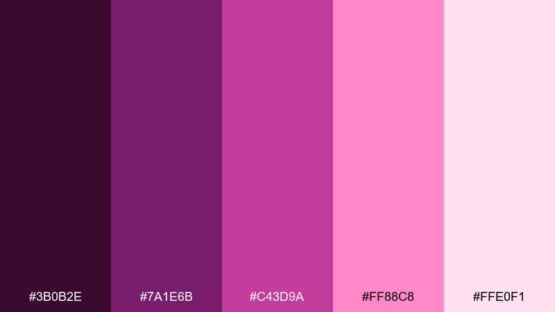
HEX: #3B0B2E #7A1E6B #C43D9A #FF88C8 #FFE0F1
Mood: sweet, bold, youthful
Best for: cosmetics ads and promo banners
Berry sorbet pinks and purples feel sweet, bold, and a little flirty. The range supports high-impact promos where you want color to do most of the talking. Pair with clean white space and simple type, then let the darkest shade anchor prices and key messages. Tip: keep the bright pink to small bursts so the overall look stays premium, not noisy.
Image example of berry sorbet generated using media.io
16) Smoky Orchid
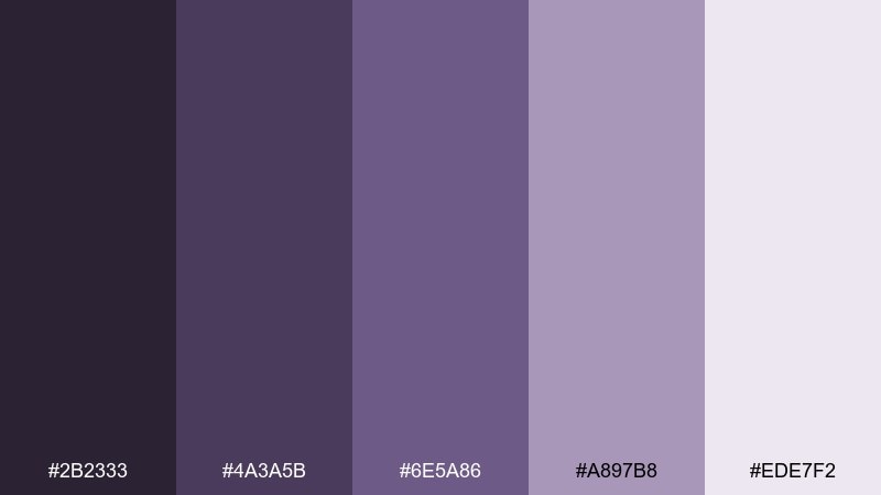
HEX: #2B2333 #4A3A5B #6E5A86 #A897B8 #EDE7F2
Mood: muted, minimal, calming
Best for: presentation decks and corporate refresh
Smoky orchid grays with violet undertones feel minimal and calming. It is a smart choice for decks and brand systems that need color without looking loud. Pair with cool white, slate text, and thin line icons for a tidy, professional finish. Tip: use the mid violet-gray for charts and reserve the lightest tint for section headers and slide backgrounds.
Image example of smoky orchid generated using media.io
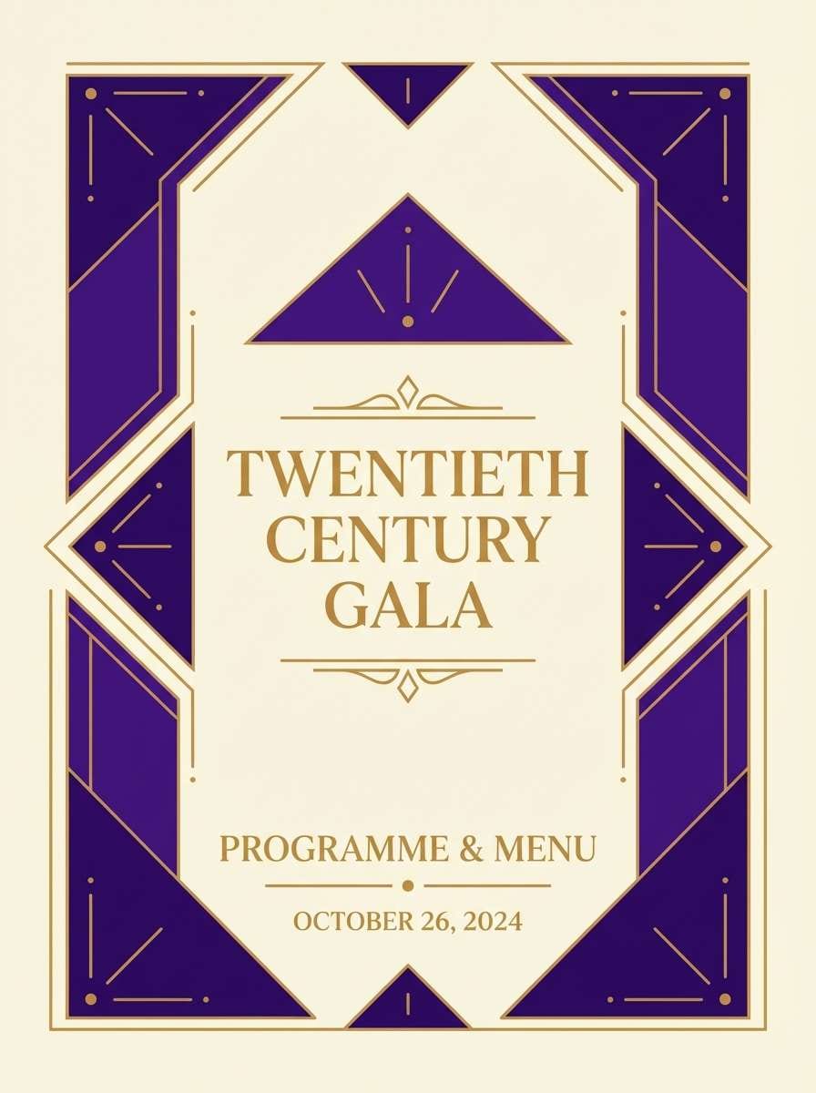
17) Regal Chapel
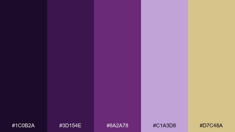
HEX: #1C0B2A #3D154E #6A2A78 #C1A3D8 #D7C48A
Mood: regal, classic, ceremonial
Best for: luxury invitations and formal programs
Regal purples with a warm gilt accent evoke velvet drapes and candlelit halls. The gold-like highlight adds ceremony, making it perfect for formal programs, gala invites, or premium certificates. Pair with creamy paper and restrained ornament lines, and keep typography classic to match the mood. Tip: use the gold tone sparingly as rules, seals, or monograms for maximum impact.
Image example of regal chapel generated using media.io
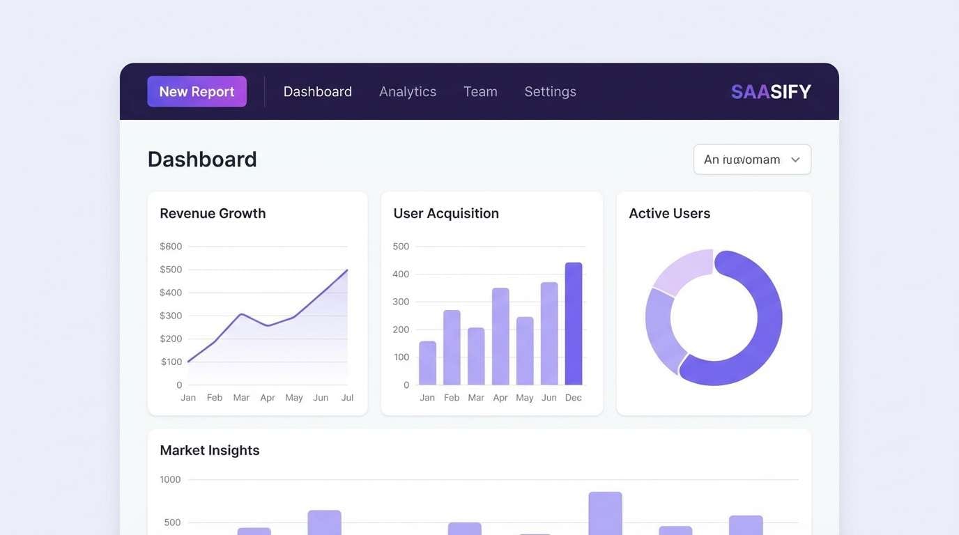
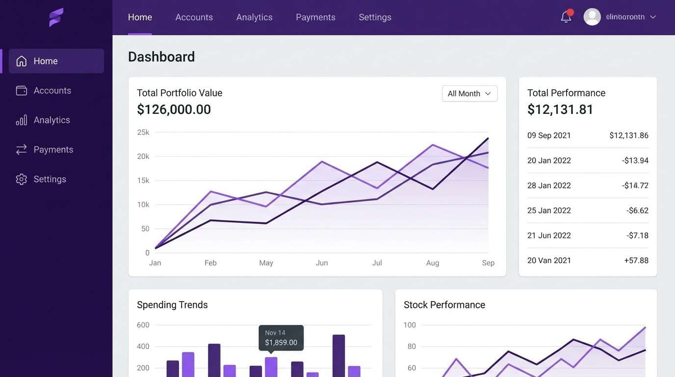
18) Tech Violet Gradient
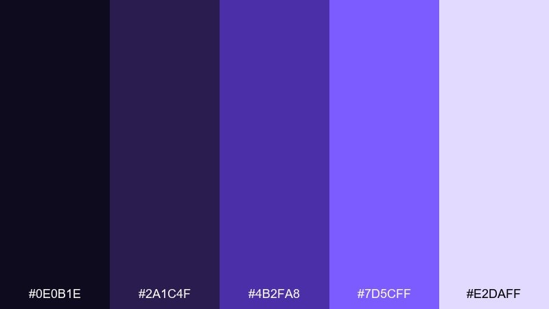
HEX: #0E0B1E #2A1C4F #4B2FA8 #7D5CFF #E2DAFF
Mood: techy, clean, confident
Best for: SaaS dashboards and landing pages
Clean tech violets moving into a bright glow feel confident and modern. These violet purple color combinations are excellent for SaaS where gradients add depth without stealing attention from data. Pair with cool grays, simple charts, and plenty of spacing for clarity. Tip: map the gradient to primary actions only, and keep secondary buttons in neutral outlines.
Image example of tech violet gradient generated using media.io
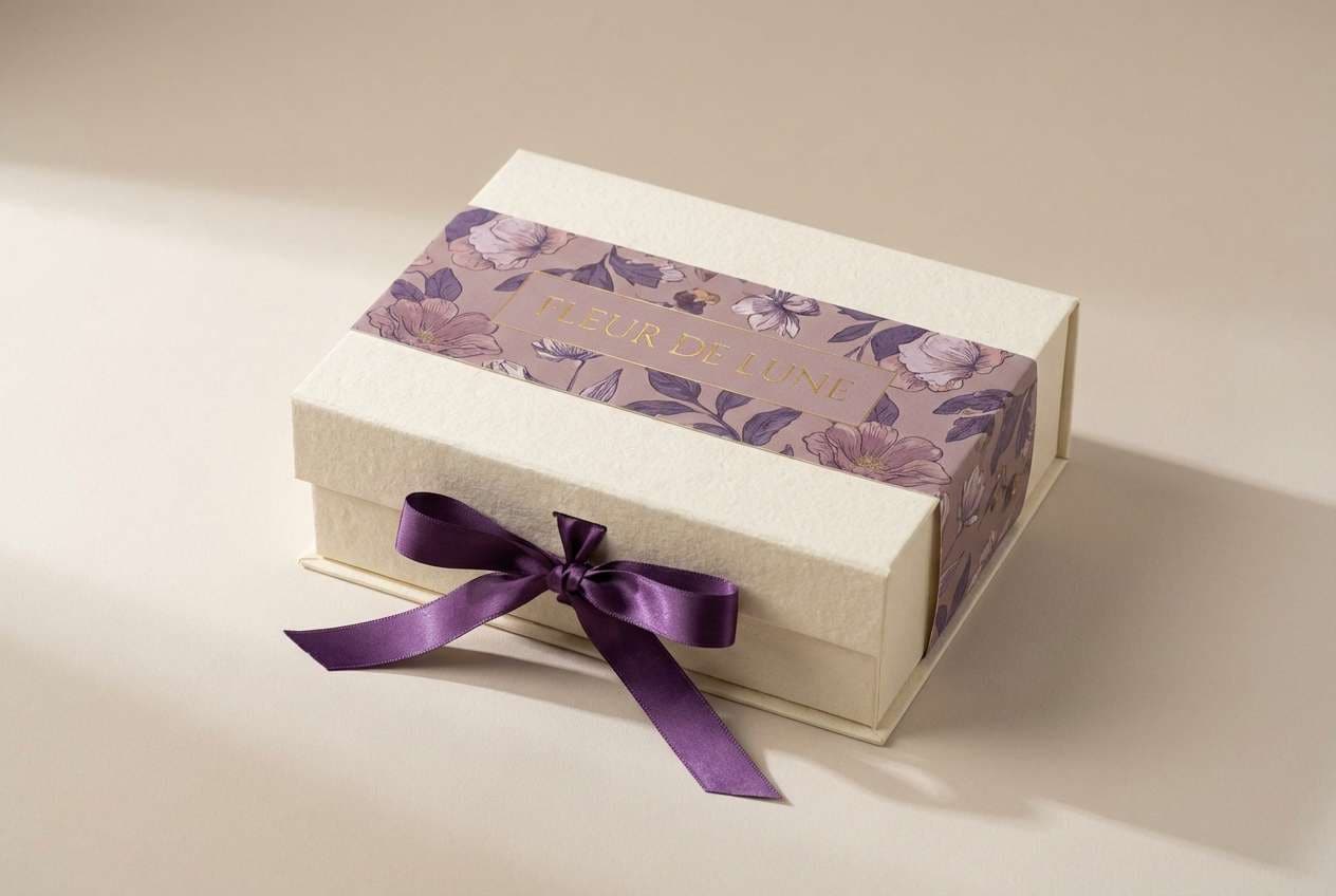
19) Artisan Bouquet
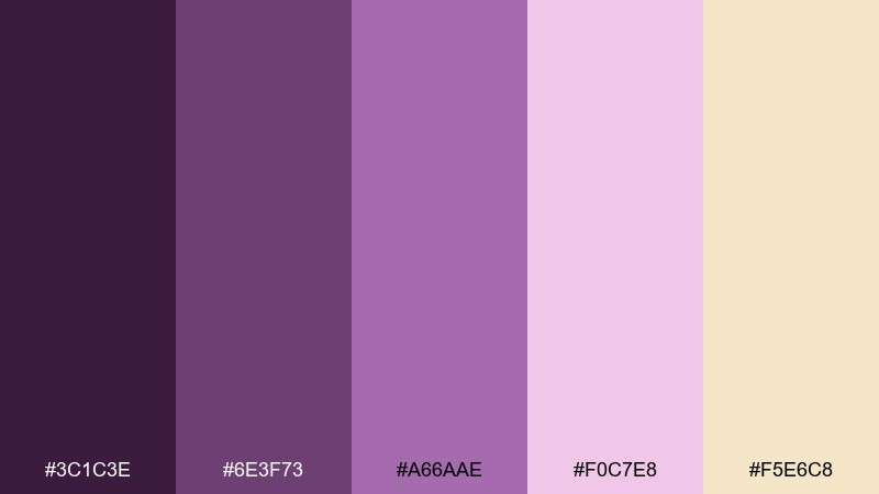
HEX: #3C1C3E #6E3F73 #A66AAE #F0C7E8 #F5E6C8
Mood: handcrafted, gentle, romantic
Best for: florist branding and gift packaging
Handcrafted bouquet purples with a soft cream base feel romantic and personal. It suits florists, gift shops, and small-batch makers who want warmth alongside elegance. Pair with textured paper, simple botanical icons, and muted photography to keep it grounded. Tip: repeat the cream tone across tags and boxes so the purples read as curated accents, not clutter.
Image example of artisan bouquet generated using media.io
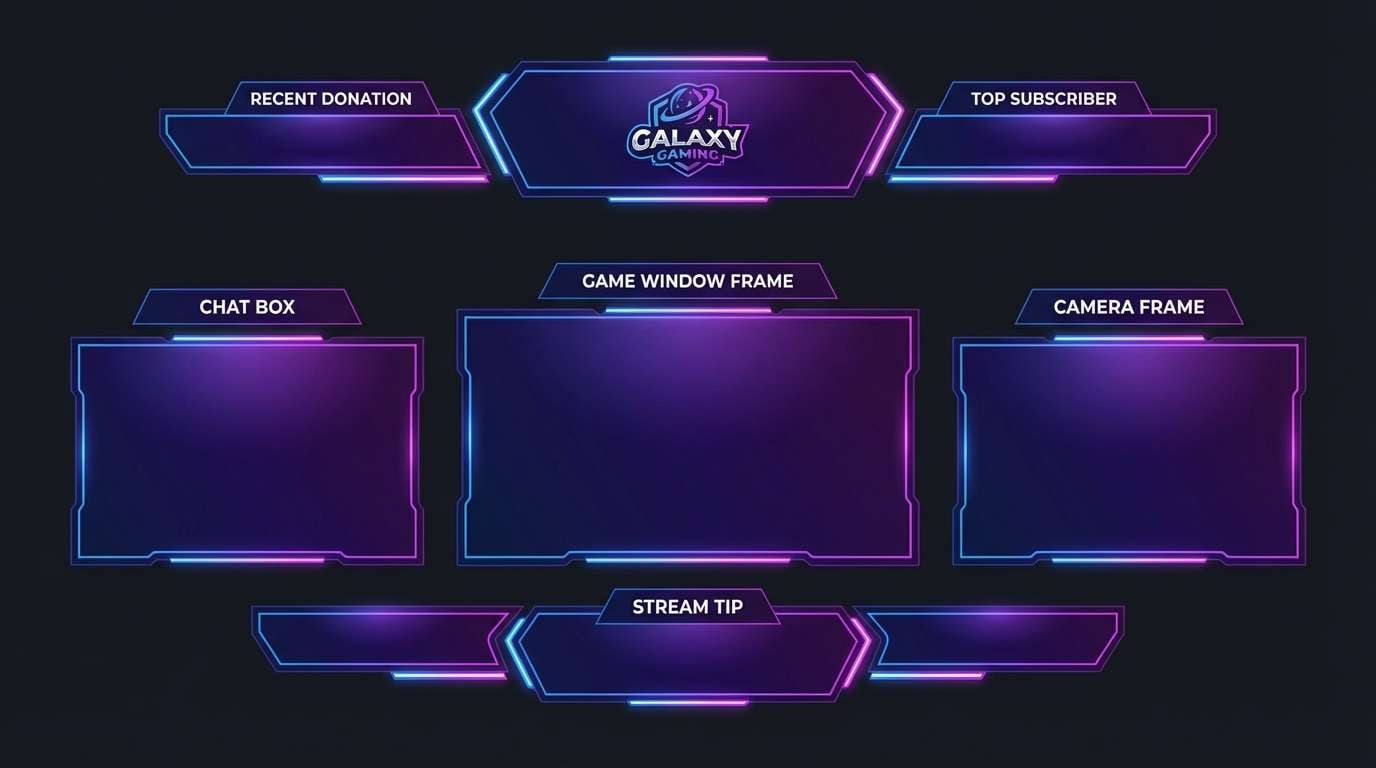
20) Dreamy Galaxy
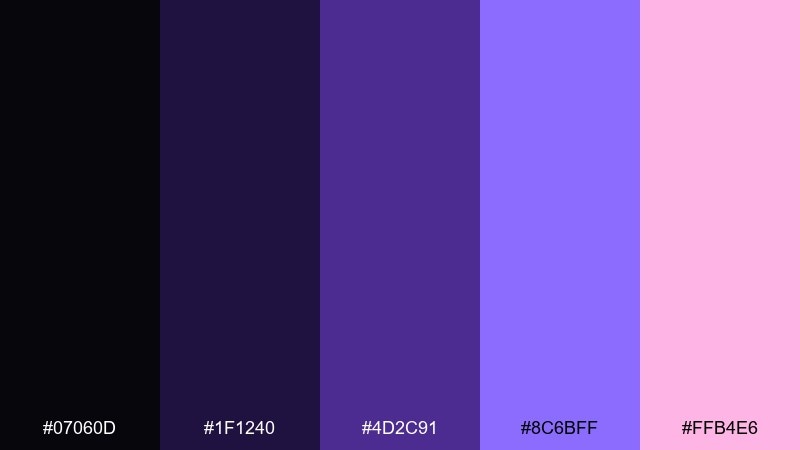
HEX: #07060D #1F1240 #4D2C91 #8C6BFF #FFB4E6
Mood: mystical, bold, imaginative
Best for: gaming banners and streamer overlays
Mystical galaxy violets with a bright candy highlight feel imaginative and bold. The deep shades build strong contrast for overlays, while the light violet and pink give you readable accents. Pair with clean white type and minimal icons so the colors stay the star. Tip: apply the brightest tones to alerts and labels only, and keep the base dark for a cohesive stream look.
Image example of dreamy galaxy generated using media.io
21) Orchid Ink
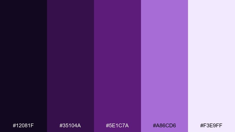
HEX: #12081F #35104A #5E1C7A #A86CD6 #F3E9FF
Mood: artsy, elegant, high-contrast
Best for: tattoo studio branding and merch
Orchid ink tones feel artsy and precise, like fresh ink on smooth paper. The dark-to-light range supports bold logos, line art, and merch prints without losing detail. Pair with black or off-white tees, and keep the light lavender for secondary graphics or back prints. Tip: test thin strokes in the mid violet so fine details do not fill in on fabric.
Image example of orchid ink generated using media.io
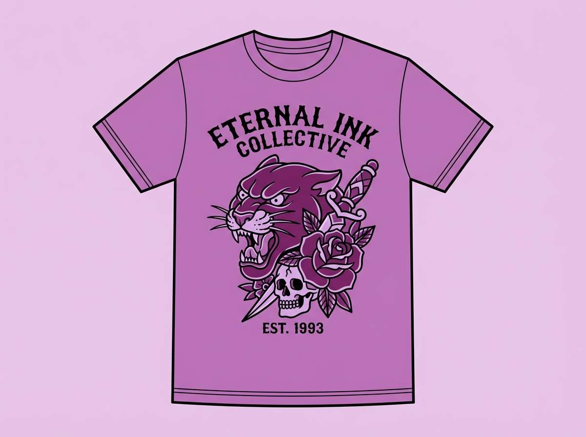
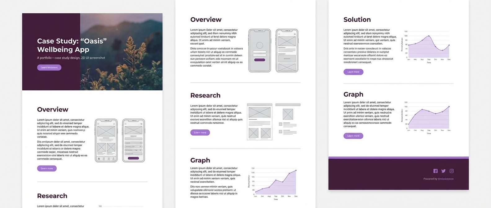
22) Velvet Plum Minimal
HEX: #220A24 #4E124F #7E2A7F #B98DBA #F6F0F6
Mood: minimal, chic, confident
Best for: portfolio sites and case studies
Chic velvet plums with soft lilac whites feel minimal yet confident. This set reads polished in long-scrolling case studies where you need consistent accents across sections. Pair with neutral grays and plenty of whitespace, then use the saturated plum for buttons and hover states. Tip: keep headings in the darkest shade and limit the bright violet to interactive elements for clarity.
Image example of velvet plum minimal generated using media.io
23) Iris Circuit
HEX: #0D0B1A #25164A #4A2AAE #9A7BFF #EAE4FF
Mood: sleek, futuristic, precise
Best for: fintech UI and data visualization
Sleek iris violets with a bright lift feel precise and futuristic, like circuitry in low light. This violet purple color scheme is a strong fit for fintech interfaces where trust and clarity matter. Pair with cool neutrals and simple icons, and use the lightest tint for tables and panels. Tip: keep charts to two dominant violets and reserve the brightest shade for highlights or thresholds.
Image example of iris circuit generated using media.io
What Colors Go Well with Violet Purple?
Violet purple pairs beautifully with clean neutrals like white, pearl, cool gray, and charcoal—these keep the palette modern and help typography stay crisp. For a warmer, more romantic feel, try ivory, beige, or sand to soften the purple’s edge.
If you want contrast and energy, use bright accents sparingly: hot pink adds pop, cyan creates a futuristic neon vibe, and gilt/gold tones add a ceremonial premium look. Green can also work (especially forest or muted sage) as a natural counterpoint—just keep it secondary so the violets remain dominant.
When in doubt, pick one “anchor” dark violet, one mid violet for UI or headings, one tint for backgrounds, and one accent color. This keeps the system cohesive across web, print, and social.
How to Use a Violet Purple Color Palette in Real Designs
For branding, treat violet purple as a signature tone and build a supporting cast of tints for backgrounds and deep shades for wordmarks. This makes it easy to stay consistent across packaging, web pages, and ads without relying on too many extra colors.
For UI design, prioritize readability: use light lavender panels with dark text, and reserve saturated violet for buttons, active states, and key highlights. On dark themes, add subtle gradients or noise to reduce banding and keep large areas feeling premium.
For print and packaging, test swatches early—deep purples can shift depending on paper and finish. Foil, embossing, and spot UV often look especially strong on dark violet bases, while uncoated stocks pair better with mauves and smoky orchid tones.
Create Violet Purple Palette Visuals with AI
If you have the HEX codes but need real-looking visuals (posters, packaging mockups, UI screens, or cover art), generating a few concepts with AI can speed up exploration. It is also a practical way to test how a violet purple color scheme behaves with typography, spacing, and contrast.
Start with a clear subject (for example: “SaaS dashboard UI” or “perfume box packaging”), then specify the palette mood (luxury, dreamy, neon), and finally call out the dominant color blocks. Once you like a direction, keep the prompt consistent and iterate by changing only one variable at a time.
Violet Purple Color Palette FAQs
-
What is the difference between violet and purple in design?
Violet usually leans bluer and cooler, while purple often leans redder and warmer. In practice, “violet purple” palettes sit in the middle, so they can feel both modern (cool) and expressive (warm) depending on the accents you add. -
What neutral colors pair best with violet purple?
White, pearl, cool gray, and charcoal create a clean, modern pairing. For a softer and warmer look, ivory, beige, and sand tones work well—especially in print or packaging. -
How do I keep violet purple text readable?
Use strong contrast: dark violet text on very light lavender/white backgrounds, or white text on deep eggplant backgrounds. Avoid placing mid-tone violet text on mid-tone lavender panels—use a darker shade for body copy and reserve brighter violets for buttons or highlights. -
Is violet purple a good choice for tech and SaaS UI?
Yes. Violet purple can feel innovative and confident, especially with cool grays and a controlled gradient for primary actions. Keep the palette structured (dark for nav, light for panels, one bright accent) to maintain clarity. -
What accent colors make violet purple feel more premium?
Gold/gilt tones, silver, pearl white, and deep near-black accents tend to read premium. Use metallic-like accents sparingly (lines, seals, icons) and let the violet do most of the visual work. -
How many colors should a violet purple palette use in a real project?
For most projects, 4–6 colors is enough: 1 dark anchor, 1–2 mid tones, 1–2 light backgrounds, and 1 accent. This makes it easier to maintain consistency across pages, components, and marketing assets. -
How can I quickly preview these palettes in posters, packaging, or UI?
Use an AI text-to-image tool to generate mock visuals from a prompt that specifies the subject, style, and dominant violet tones. Iterating on prompts helps you see contrast and hierarchy before committing to production files.


