

Yellow ochre is a warm, grounded color that brings instant earthiness to branding, interiors, and digital design. It reads as natural and timeless—like clay, sandstone, and sunlit wheat.
Below are 20+ yellow ochre color combinations with HEX codes, plus quick tips on what to pair with ochre and how to use it in real projects.
In this article
- Why Yellow Ochre Color Combinations Work So Well
-
- sunbaked adobe
- museum parchment
- harvest dusk
- artisan brass
- desert botanical
- retro canteen
- modern terracotta
- wheat and graphite
- golden lichen
- curry linen
- rustic market
- stoneware studio
- autumn poster
- safari minimal
- candlelit bistro
- heritage book cover
- calm atelier
- midcentury foyer
- ochre coastline
- ink and marigold
- saffron clay
- quiet mustard neutral
- What Colors Go Well with Yellow Ochre?
- How to Use a Yellow Ochre Color Combination in Real Designs
- Create Yellow Ochre Palette Visuals with AI
Why Yellow Ochre Color Combinations Work So Well
Yellow ochre sits in a sweet spot between “gold” and “tan,” so it feels warm without looking loud. It carries a natural, mineral quality that works across rustic, modern, and vintage aesthetics.
Because ochre is inherently muted, it plays nicely with both creamy neutrals and deep shadows. That makes it easy to build contrast for readability in UI, posters, packaging, and editorial layouts.
It also pairs beautifully with adjacent earth tones—terracotta, cocoa browns, olives, and slate grays—creating palettes that feel cohesive, grounded, and easy on the eyes.
20+ Yellow Ochre Color Palette Ideas (with HEX Codes)
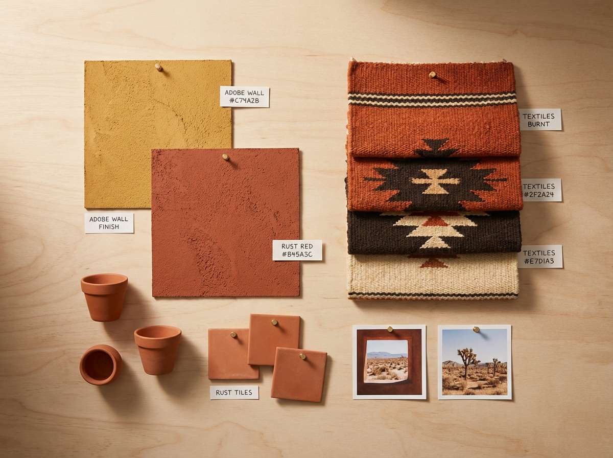
1) Sunbaked Adobe
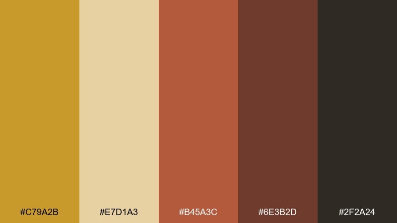
HEX: #C79A2B #E7D1A3 #B45A3C #6E3B2D #2F2A24
Mood: warm, rustic, grounded
Best for: southwestern interior mood board
Warm and earthy, this yellow ochre palette feels like sunlit clay walls and late-afternoon dust. Use it for interiors, hospitality branding, or lifestyle photography overlays where you want a grounded warmth. Pair the deep cocoa with plenty of light sand to keep the room from feeling heavy. Tip: repeat the ochre on small accents like pillows, trim, or icon highlights to unify the look.
Image example of sunbaked adobe generated using media.io
Media.io is an online AI studio for creating and editing video, image, and audio in your browser.

2) Museum Parchment

HEX: #B98B1D #F3E6C8 #D7C1A0 #7A6A55 #1F1C18
Mood: quiet, archival, refined
Best for: editorial magazine spread layout
Quiet and archival, it evokes old paper, linen bindings, and softly lit galleries. It shines in editorial layouts, book covers, and premium packaging where legibility matters. Keep body text in near-black and use the ochre as a restrained rule line or pull-quote accent. Tip: add generous margins so the warm paper tones feel intentional, not muddy.
Image example of museum parchment generated using media.io
3) Harvest Dusk
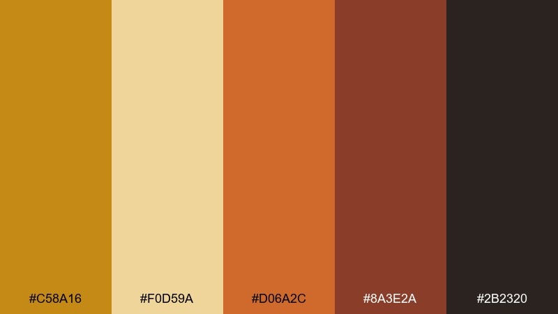
HEX: #C58A16 #F0D59A #D06A2C #8A3E2A #2B2320
Mood: cozy, festive, sunset-warm
Best for: seasonal event poster design
Cozy and festive, it recalls pumpkin fields at sunset and warm string lights. These yellow ochre color combinations work beautifully for seasonal posters, menus, and social graphics where you want instant warmth. Let the pale grain tone carry the background while the burnt orange drives headlines. Tip: use the darkest brown sparingly for contrast so the palette stays glowing, not heavy.
Image example of harvest dusk generated using media.io

4) Artisan Brass

HEX: #B88415 #EAD7B0 #9C7B5C #4E3A2C #12110F
Mood: craft, premium, masculine
Best for: premium product packaging
Craft-forward and premium, it suggests brushed metal, leather, and workshop patina. Use it for spirits labels, grooming products, or any packaging that needs a heritage feel without looking dated. Keep the cream as the label base and reserve the dark tones for typography and borders. Tip: a small brass-ochre mark or seal can carry the entire brand impression.
Image example of artisan brass generated using media.io

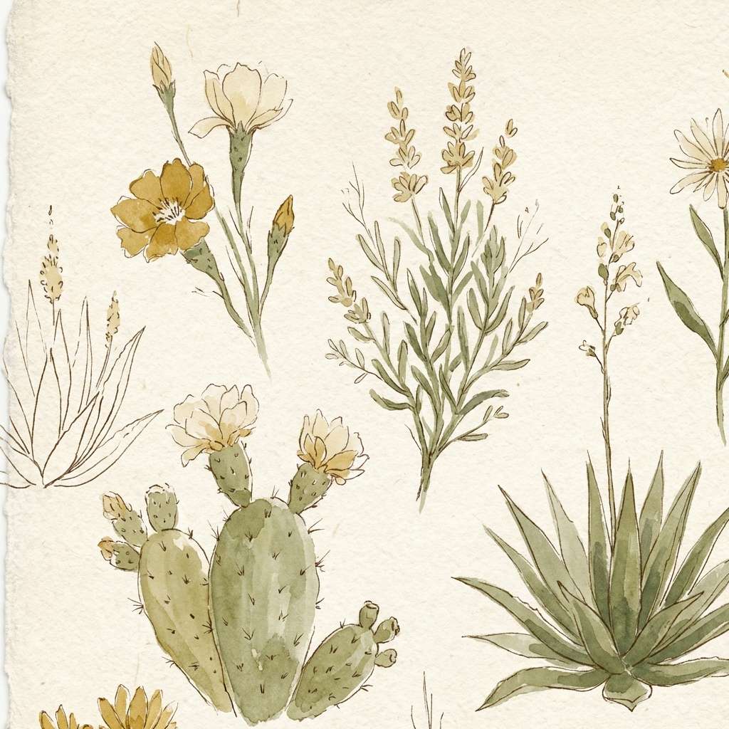
5) Desert Botanical
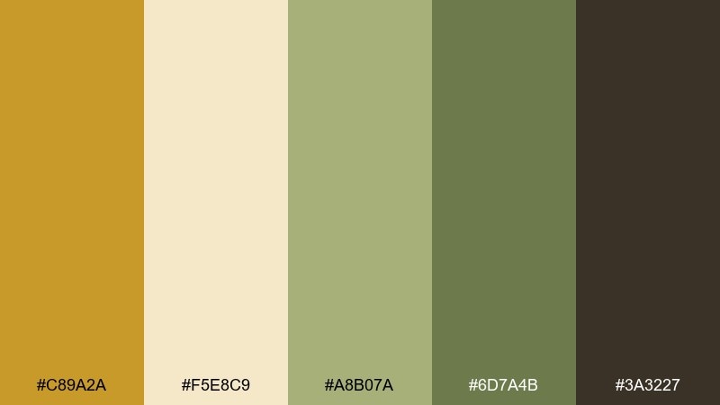
HEX: #C89A2A #F5E8C9 #A8B07A #6D7A4B #3A3227
Mood: natural, airy, restorative
Best for: botanical watercolor illustration
Natural and restorative, it feels like desert blooms against sun-washed sand. The soft greens calm the warmth and make the ochre feel fresher for wellness, skincare, or sustainable brands. Let the cream stay dominant, then layer botanical shapes in olive and sage for depth. Tip: keep outlines minimal so the watercolor effect stays light and modern.
Image example of desert botanical generated using media.io
6) Retro Canteen
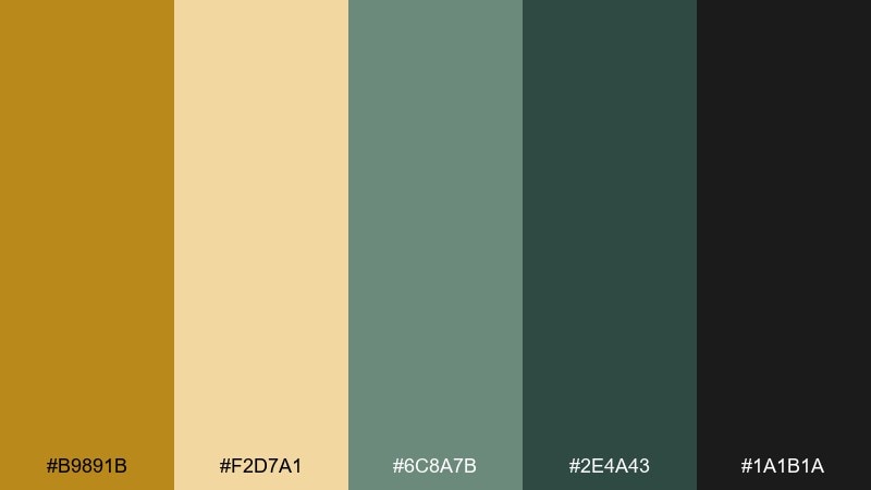
HEX: #B9891B #F2D7A1 #6C8A7B #2E4A43 #1A1B1A
Mood: nostalgic, casual, outdoorsy
Best for: camping brand logo and label set
Nostalgic and outdoorsy, this yellow ochre color palette brings to mind enamel mugs, trail maps, and vintage canteens. The teal greens cool the warmth, making the overall mix feel balanced for casual brands. Use the dark green for badges and outlines, then let the ochre act as the main fill. Tip: try a slightly worn texture to sell the retro vibe without losing clarity.
Image example of retro canteen generated using media.io

7) Modern Terracotta

HEX: #C5921D #F6E2BF #C45C3A #8D6B56 #2A2522
Mood: modern, warm, architectural
Best for: brand identity for a ceramics studio
Modern and architectural, it evokes clay studios, kiln heat, and matte glazes. A yellow ochre color palette like this works especially well for craft brands that want warmth with clean structure. Pair the terracotta with the light cream for packaging and stationery, then use the deep charcoal-brown for type. Tip: choose uncoated paper or a soft-touch finish to match the matte vibe.
Image example of modern terracotta generated using media.io

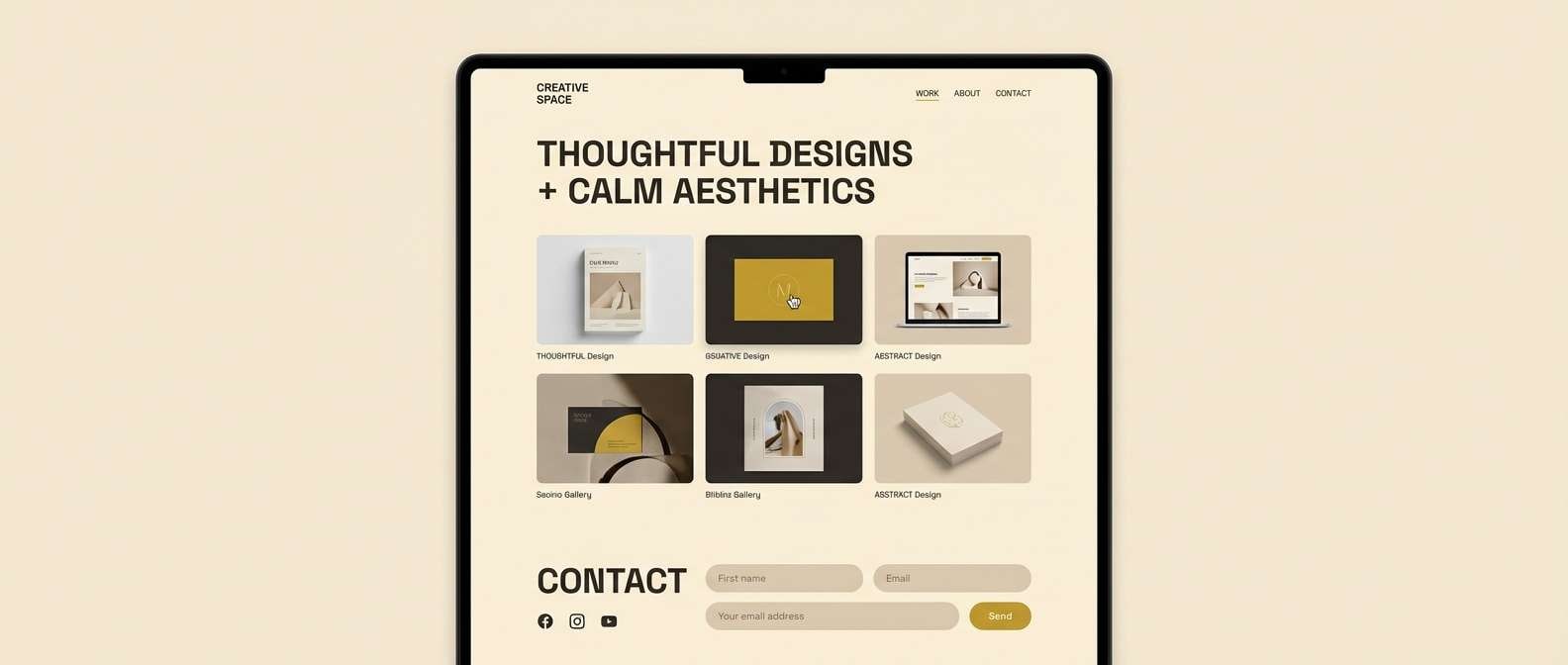
8) Wheat and Graphite
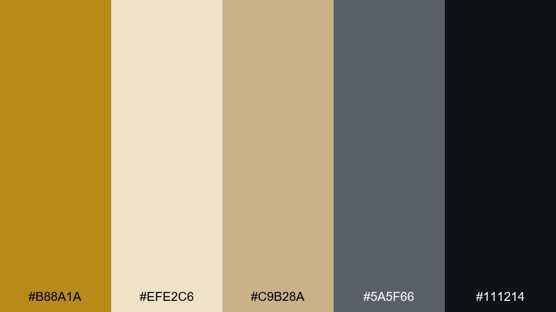
HEX: #B88A1A #EFE2C6 #C9B28A #5A5F66 #111214
Mood: minimal, smart, contemporary
Best for: 2d ui dashboard mockup
Minimal and smart, it feels like warm daylight on concrete and clean typography. The graphite tones bring structure, making it ideal for dashboards, fintech UI, or data-heavy tools. Use wheat and cream for surfaces and cards, then reserve ochre for active states and key metrics. Tip: keep contrast high for accessibility by leaning on near-black for text.
Image example of wheat and graphite generated using media.io

9) Golden Lichen
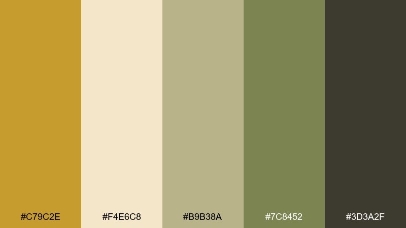
HEX: #C79C2E #F4E6C8 #B9B38A #7C8452 #3D3A2F
Mood: organic, calm, outdoorsy
Best for: nature blog header illustration
Organic and calm, these yellow ochre color combinations suggest lichen-covered stone and soft morning light. The muted greens soften the gold so it feels natural rather than flashy. Use it for eco storytelling, outdoor brands, or calm lifestyle content. Tip: keep gradients subtle and let texture do the heavy lifting for depth.
Image example of golden lichen generated using media.io

10) Curry Linen
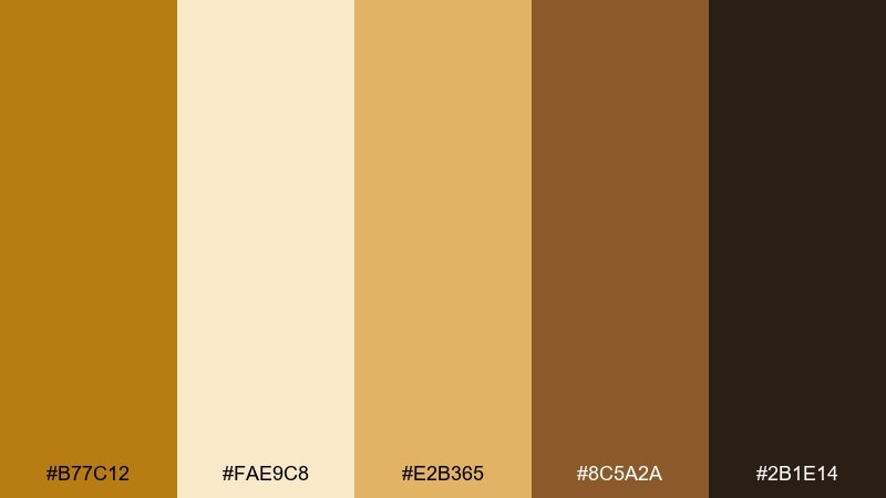
HEX: #B77C12 #FAE9C8 #E2B365 #8C5A2A #2B1E14
Mood: spiced, inviting, cozy
Best for: restaurant menu design
Spiced and inviting, it feels like curry steam, toasted cumin, and warm linen napkins. The creamy base keeps things readable for menus, flyers, and small-format print. Use the darker brown for section headers and the golden tones for highlights like specials or callouts. Tip: avoid using the mid-gold for long text blocks to maintain crisp contrast.
Image example of curry linen generated using media.io

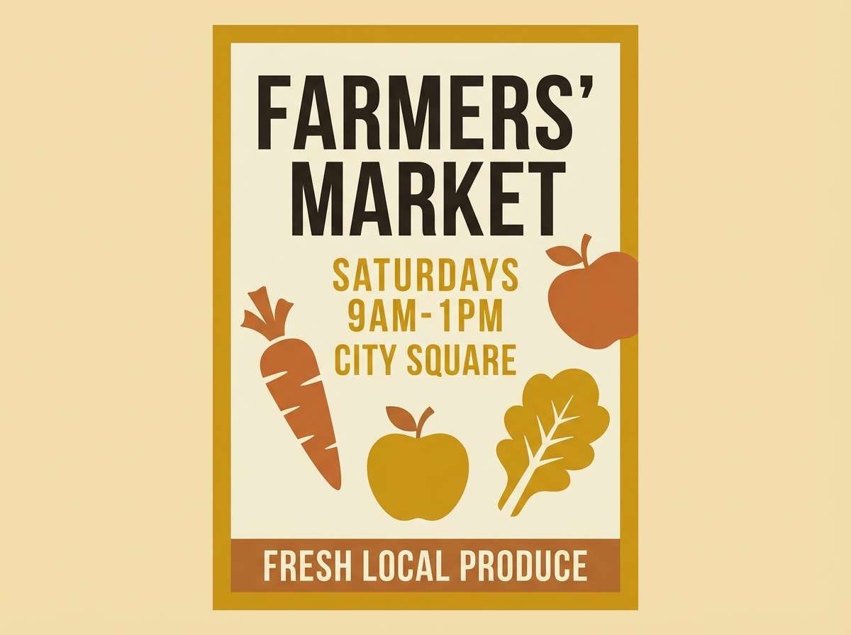
11) Rustic Market
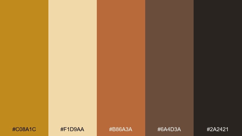
HEX: #C08A1C #F1D9AA #B86A3A #6A4D3A #2A2421
Mood: handmade, friendly, community
Best for: farmers market flyer
Handmade and friendly, this yellow ochre palette brings up wooden stalls, baked bread, and paper bags. The warm orange-brown adds energy without turning neon, perfect for community events and local food branding. Use the pale wheat as the flyer background and build hierarchy with dark brown type. Tip: add simple illustrated icons in ochre to keep the design approachable.
Image example of rustic market generated using media.io
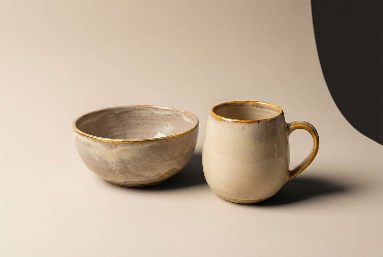
12) Stoneware Studio
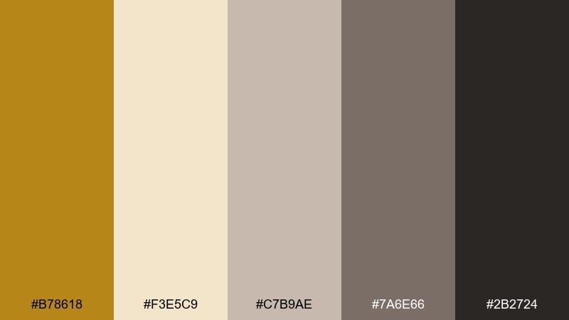
HEX: #B78618 #F3E5C9 #C7B9AE #7A6E66 #2B2724
Mood: soft, tactile, minimalist
Best for: product ad for handmade ceramics
Soft and tactile, it feels like raw clay, glazing days, and quiet studio shelves. The warm gray-beige tones make the ochre feel subtle and premium. Use it for product ads where texture is the hero and color supports the story. Tip: keep the background creamy and let shadows define the form instead of adding extra colors.
Image example of stoneware studio generated using media.io
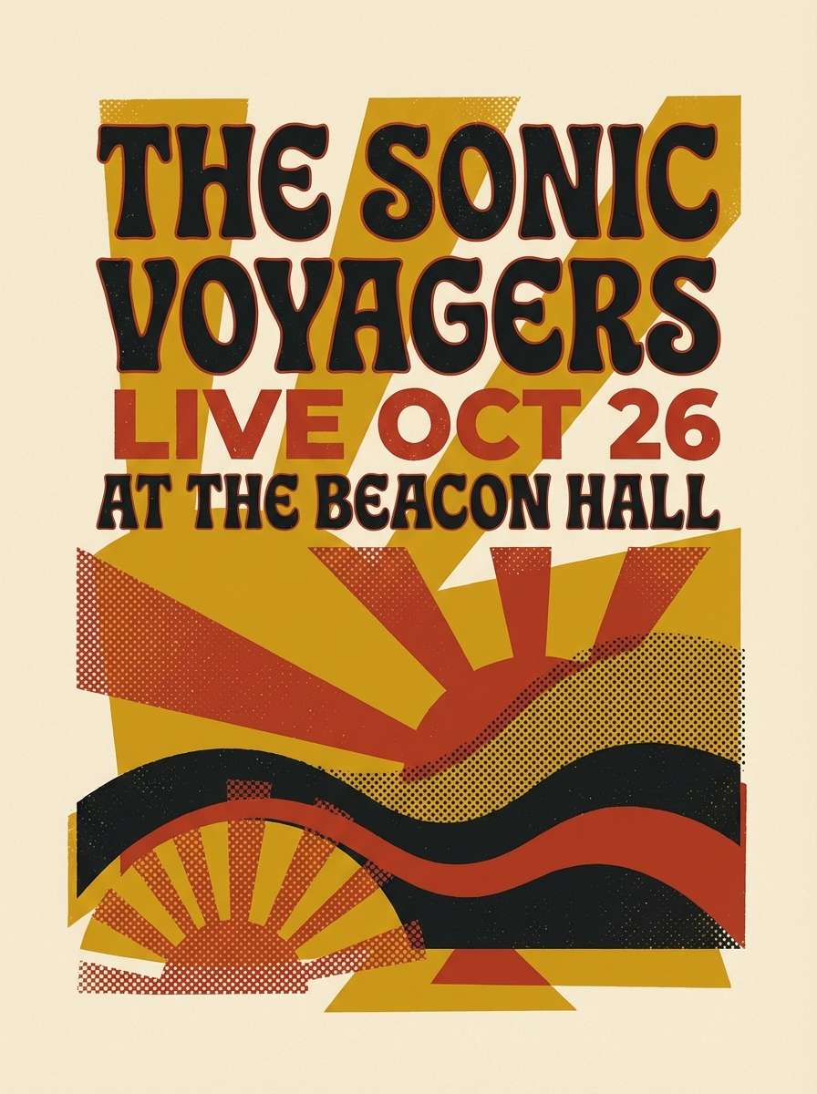
13) Autumn Poster
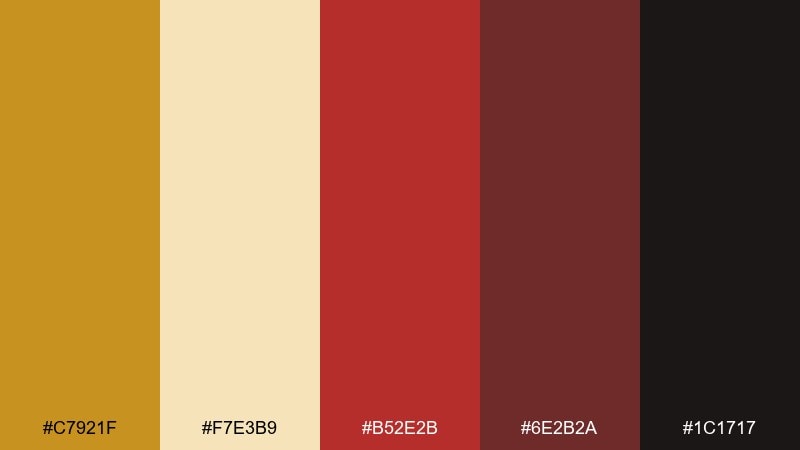
HEX: #C7921F #F7E3B9 #B52E2B #6E2B2A #1C1717
Mood: bold, nostalgic, high-contrast
Best for: retro gig poster
Bold and nostalgic, it channels screen-printed ink and late-season leaves. Yellow ochre color combinations like this pop on posters, album art, and promo graphics where you want sharp contrast. Let the deep red carry the headline and use ochre as a framing color to keep the layout tight. Tip: limit gradients and lean into flat shapes for an authentic retro feel.
Image example of autumn poster generated using media.io
14) Safari Minimal
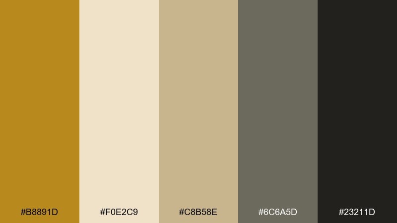
HEX: #B8891D #F0E2C9 #C8B58E #6C6A5D #23211D
Mood: minimal, earthy, travel-ready
Best for: travel landing page 2d ui mockup
Minimal and travel-ready, it feels like sun-bleached canvas and quiet savannah mornings. The restrained neutrals make it easy to build clean sections and readable CTAs. Use the ochre for buttons and location pins, while graphite handles navigation and text. Tip: keep imagery warm-toned so the interface and photos feel cohesive.
Image example of safari minimal generated using media.io

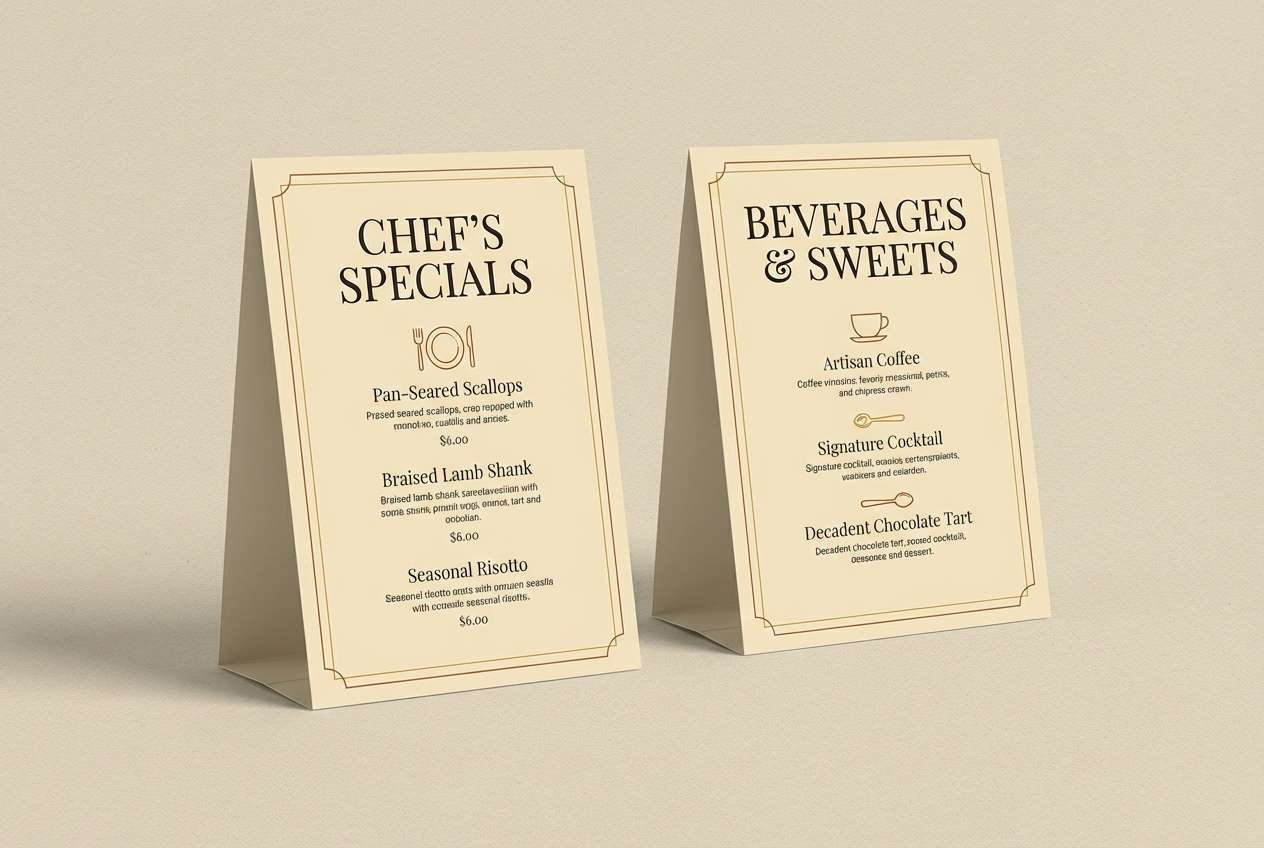
15) Candlelit Bistro
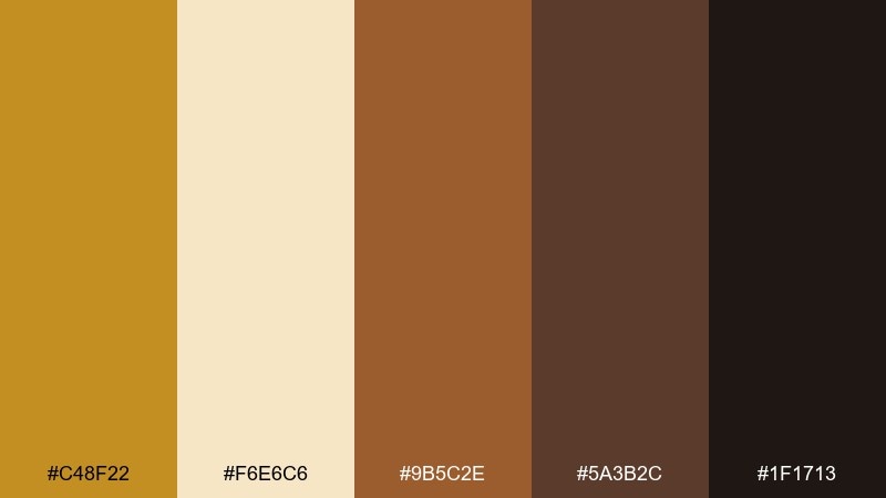
HEX: #C48F22 #F6E6C6 #9B5C2E #5A3B2C #1F1713
Mood: intimate, warm, elegant
Best for: restaurant table tent card
Intimate and elegant, these yellow ochre color combinations evoke candle glow on wood tables and brass cutlery. The creamy highlight keeps the set from going too dark, which is ideal for small print pieces like table tents and drink menus. Use the dark espresso for text and the ochre for borders and icons. Tip: a subtle paper texture can make the warmth feel more real.
Image example of candlelit bistro generated using media.io
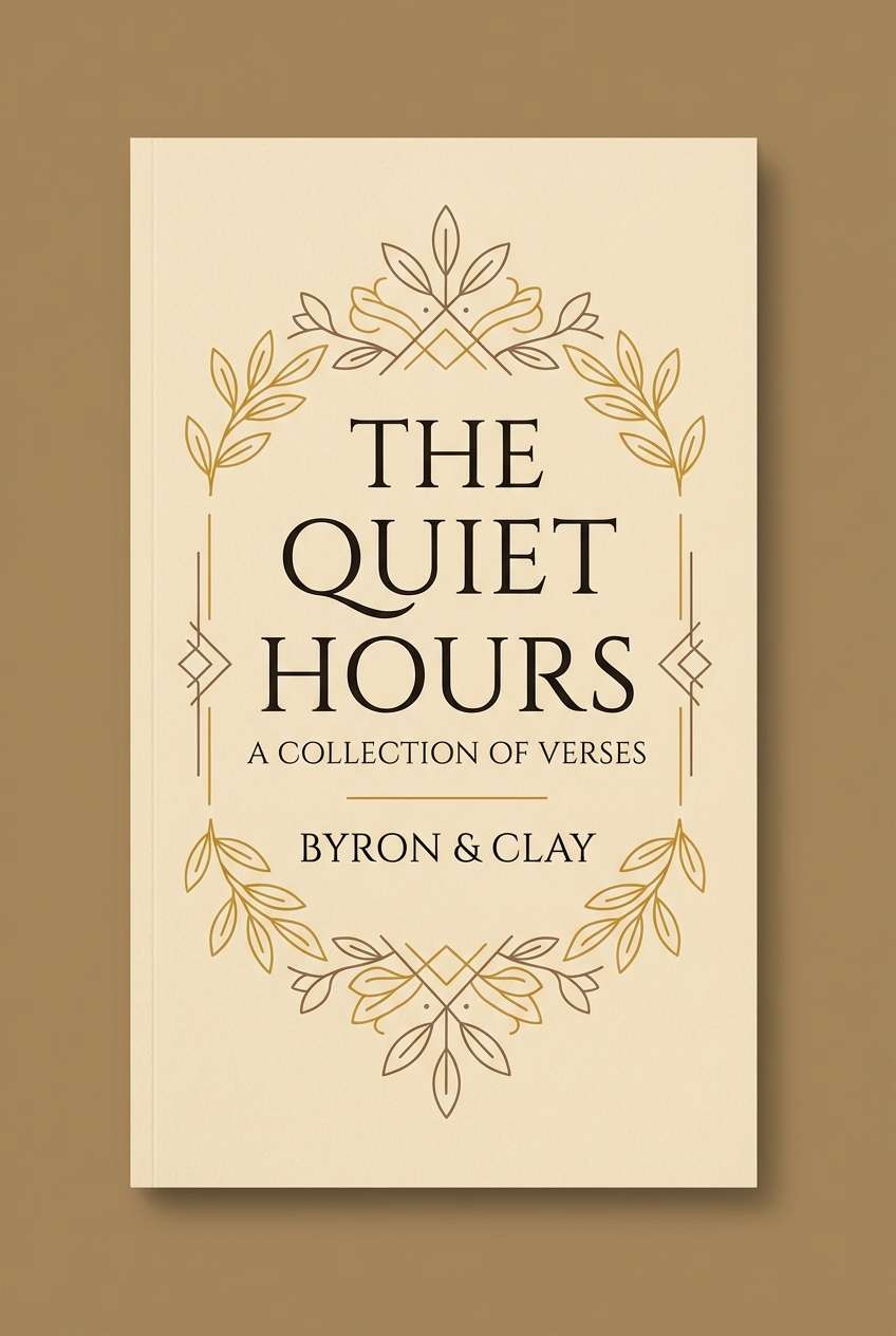
16) Heritage Book Cover
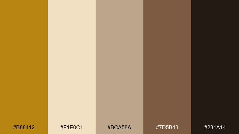
HEX: #B88412 #F1E0C1 #BCA58A #7D5B43 #231A14
Mood: classic, literary, warm
Best for: book cover design
Classic and literary, it feels like well-worn covers and gilded chapter headings. The brown range gives you strong hierarchy for title, subtitle, and author while staying warm. Use the light parchment as the main field, then add ochre as a thin border or foil-like accent. Tip: keep typography simple and let color and spacing suggest the heritage vibe.
Image example of heritage book cover generated using media.io
17) Calm Atelier
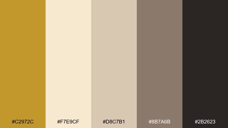
HEX: #C2972C #F7E9CF #D8C7B1 #8B7A6B #2B2623
Mood: calm, airy, creative
Best for: portfolio website 2d ui mockup
Calm and airy, it suggests daylight in an atelier with canvas and soft shadows. The gentle neutrals help work samples stand out without fighting the interface. Use the cream for backgrounds, taupe for dividers, and ochre for hover states or small badges. Tip: keep accent usage consistent across components to avoid a scattered feel.
Image example of calm atelier generated using media.io
18) Midcentury Foyer
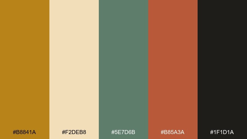
HEX: #B8841A #F2DEB8 #5E7D6B #B85A3A #1F1D1A
Mood: midcentury, playful, balanced
Best for: home decor branding
Playful and midcentury, this yellow ochre color palette feels like a tidy foyer with walnut furniture and geometric art. The green adds a cool counterweight, while the terracotta brings a friendly pop. Use the near-black for logo type, then rotate the three warm accents across patterns and packaging. Tip: stick to simple shapes and a limited set of icons to keep it period-clean.
Image example of midcentury foyer generated using media.io

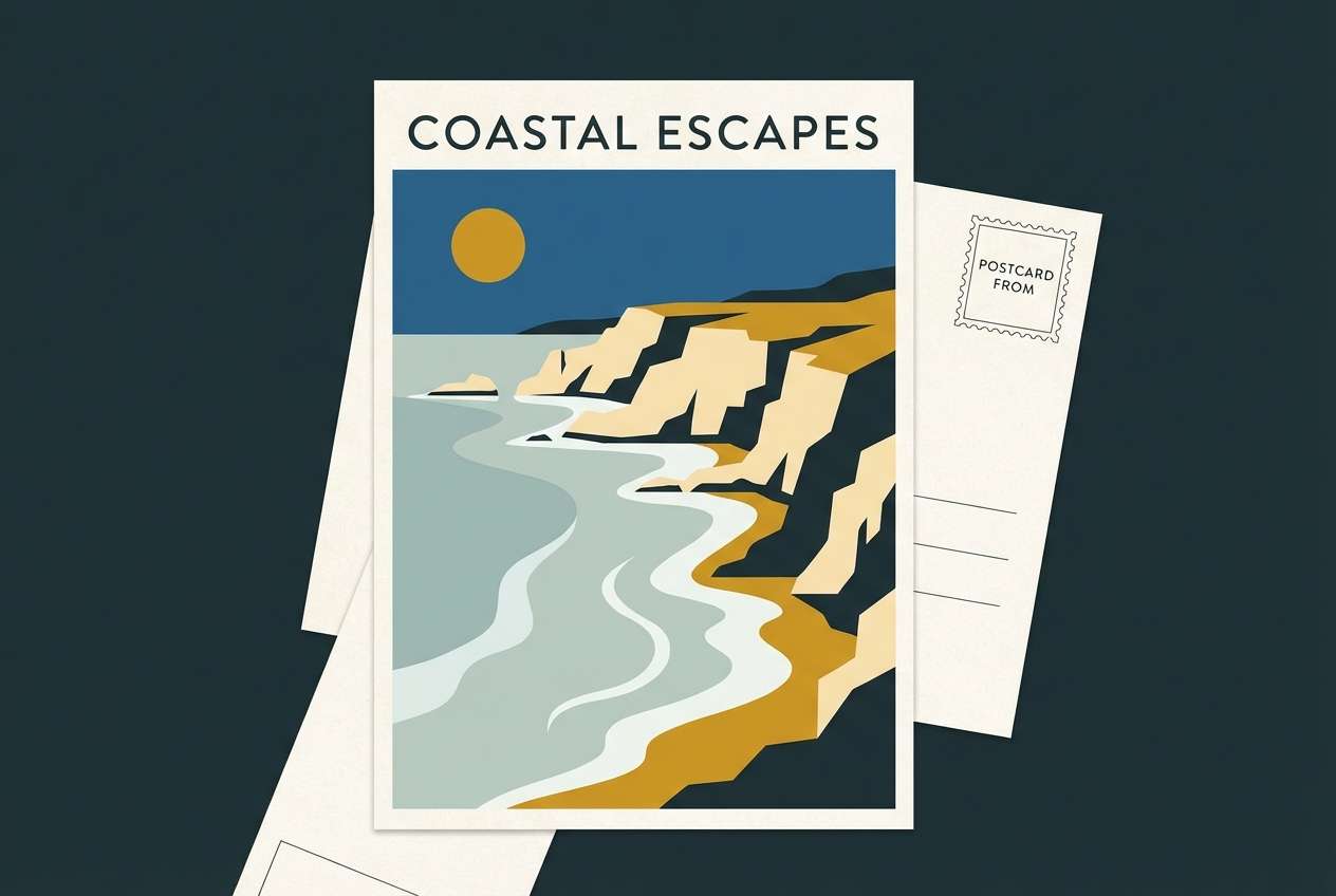
19) Ochre Coastline
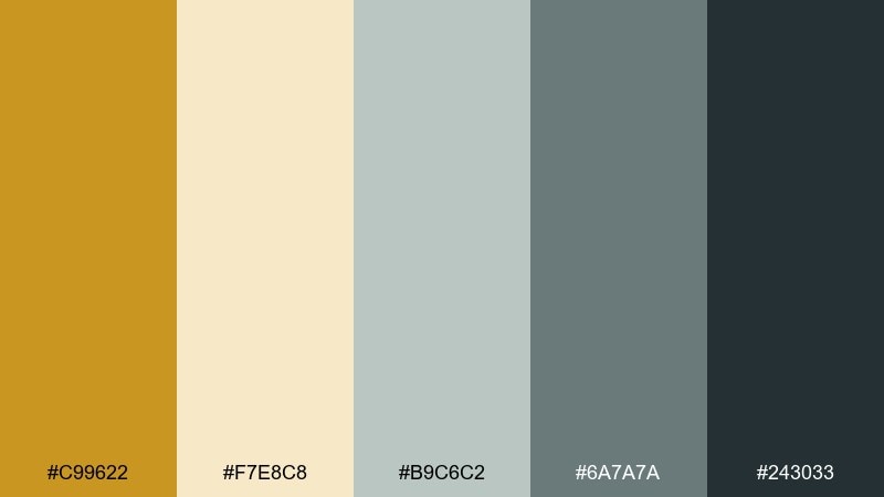
HEX: #C99622 #F7E8C8 #B9C6C2 #6A7A7A #243033
Mood: fresh, coastal, grounded
Best for: travel postcard illustration
Fresh and grounded, it brings to mind sunlit cliffs meeting cool sea air. The blue-gray range keeps the warmth from feeling too desert-like, making it great for travel, resorts, or calming lifestyle brands. Use ochre for the sun and highlights, while the slate tones shape waves and shadows. Tip: keep the palette airy by avoiding heavy fills in the darkest color.
Image example of ochre coastline generated using media.io
20) Ink and Marigold
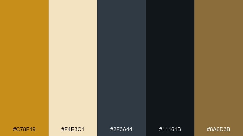
HEX: #C78F19 #F4E3C1 #2F3A44 #11161B #8A6D3B
Mood: confident, modern, editorial
Best for: saas pricing page 2d ui mockup
Confident and modern, it feels like dark ink on warm paper with a marigold highlight. A yellow ochre color combination like this is ideal when you want a premium SaaS look that still feels human. Use the deep blue-black for backgrounds and headers, then let ochre guide attention to pricing tiers and primary CTAs. Tip: add subtle borders in the muted gold to separate cards without extra colors.
Image example of ink and marigold generated using media.io

21) Saffron Clay
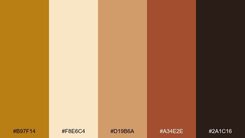
HEX: #B97F14 #F8E6C4 #D19B6A #A34E2E #2A1C16
Mood: sunny, artisanal, appetizing
Best for: bakery packaging and stickers
Sunny and artisanal, it recalls fresh pastries, warm ovens, and kraft paper bags. The soft caramel bridge makes transitions between light and dark feel smooth on labels. Use the cream for the base, then build sticker accents with saffron and clay for a handmade look. Tip: keep typography bold and simple so it prints cleanly on textured stock.
Image example of saffron clay generated using media.io

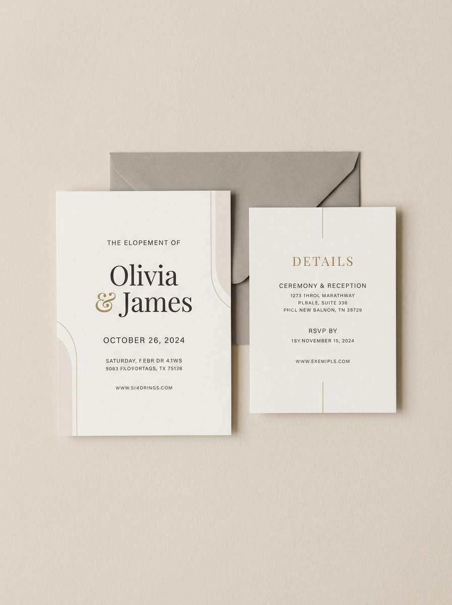
22) Quiet Mustard Neutral
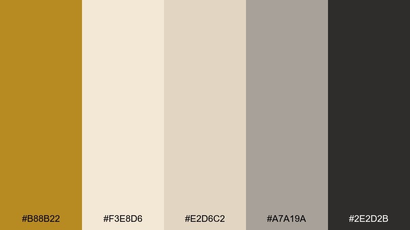
HEX: #B88B22 #F3E8D6 #E2D6C2 #A7A19A #2E2D2B
Mood: soft, neutral, contemporary
Best for: minimal wedding invitation suite
Soft and contemporary, it feels like vellum, dried florals, and a calm ceremony space. The gentle grays keep the mustard from overpowering delicate typography. Use the off-white for the card stock look, then add ochre as a thin line, monogram, or wax-seal accent. Tip: choose plenty of whitespace so the design stays elegant and airy.
Image example of quiet mustard neutral generated using media.io
What Colors Go Well with Yellow Ochre?
Yellow ochre pairs naturally with warm neutrals like cream, parchment, beige, and cocoa brown—great for grounded, premium looks. These combinations keep the palette cohesive and “earth-made,” not synthetic.
For contrast and structure, add near-black, charcoal, graphite, or deep blue-black. Dark anchors make ochre feel more intentional and improve readability for text-heavy layouts.
If you want a fresher direction, mix ochre with muted greens (sage, olive) or cool blue-grays (slate, sea glass). These hues balance ochre’s warmth and help it work for wellness, travel, and modern UI.
How to Use a Yellow Ochre Color Combination in Real Designs
Use ochre as the “attention color,” not the background color—especially in UI. Buttons, highlights, active states, and small badges look crisp when placed on cream or graphite surfaces.
In print and branding, let texture do some of the work: uncoated paper, kraft stock, soft-touch lamination, or subtle grain can make ochre feel richer and more tactile. Pair it with dark typography for clear hierarchy.
For interiors or lifestyle graphics, repeat ochre in small accents (trim, icons, patterns) to create rhythm. Balance it with plenty of light space so the warmth stays airy rather than heavy.
Create Yellow Ochre Palette Visuals with AI
If you already have HEX codes, you can quickly turn them into mood boards, poster concepts, UI mockups, and packaging-style visuals using AI prompts. This is useful when you want to preview how ochre behaves in different lighting, textures, and styles.
Start with a clear subject (menu, logo set, interior mood board), then specify your five colors, layout style, and an aspect ratio. Keep prompts focused so the palette stays consistent across variations.
With Media.io, you can iterate fast—generate multiple compositions, then refine the prompt until the palette balance feels right for your brand or project.
Yellow Ochre Color Palette FAQs
-
What is the HEX code for yellow ochre?
Yellow ochre doesn’t have one single HEX code because it varies by shade, but common digital ochre values often sit around #B88A1A to #C79A2B. Use the palette HEX codes above to pick the exact undertone you need (more mustard, more gold, or more clay). -
Is yellow ochre warm or cool?
Yellow ochre is typically a warm color. It leans earthy and muted, which makes it feel softer than bright yellow while still providing warmth and energy. -
What colors complement yellow ochre?
Deep blue-black, charcoal, and slate create strong contrast with yellow ochre. Muted greens (sage/olive) and terracotta also complement it for natural, balanced palettes. -
Does yellow ochre work for modern UI design?
Yes—especially as an accent color. Pair ochre with cream surfaces and graphite text, and reserve ochre for primary actions, toggles, and key metrics to keep the interface clean and accessible. -
How do I keep a yellow ochre palette from looking dull?
Increase contrast with a near-black anchor and keep a light neutral (cream/parchment) as the dominant background. Using one crisp accent (like terracotta or deep red) can also add energy without making the palette neon. -
What industries commonly use ochre tones in branding?
Ochre tones are popular in interiors, ceramics/craft brands, coffee and food packaging, outdoor and eco brands, and editorial-style premium products because they signal warmth, heritage, and authenticity. -
Can I generate yellow ochre palette images from text prompts?
Yes. Use an AI text-to-image tool and include your subject, layout style, and the five HEX colors you want to feature. This helps the generator keep the look consistent while exploring different compositions.


