

Black, red, and orange is one of the most attention-grabbing color combinations you can use—dark, bold, and instantly energetic. It’s a go-to for posters, branding, and dark UI where contrast and urgency need to feel intentional.
Below are 20 curated black red orange color schemes with HEX codes, plus practical tips to balance heat with readability and use the right accent in the right place.
In this article
- Why Black Red Orange Color Schemes Work So Well
-
- ember noir
- charcoal chili
- sunset asphalt
- brick furnace
- copper punch
- spiced cinema
- neon ember ui
- autumn riot
- volcano leather
- street food heat
- retro raceway
- firelight minimal
- crimson cinder
- urban bonfire
- saffron smoke
- festival contrast
- red hot clay
- molten typography
- ember blossom
- night market lanterns
- What Colors Go Well with Black Red Orange?
- How to Use a Black Red Orange Color Palette in Real Designs
- Create Black Red Orange Palette Visuals with AI
Why Black Red Orange Color Schemes Work So Well
Black gives structure and seriousness, while red and orange deliver urgency and heat. Together, they create a high-contrast system that pulls attention fast—perfect for CTAs, headlines, and focal elements.
Red tends to feel intense and emotional, and orange reads as energetic and friendly. When both sit on a dark base, you can shape the message: lean more red for drama and warning, or more orange for optimism and motion.
The key is control. Because these hues are naturally loud, adding one light neutral (cream, beige, or near-white) helps maintain readability and prevents the design from feeling heavy or over-saturated.
20+ Black Red Orange Color Palette Ideas (with HEX Codes)
1) Ember Noir

HEX: #0B0B0C #9F0F1F #FF4D1A #F2D3B1 #2E2A29
Mood: moody, cinematic, high-contrast
Best for: movie poster design
Moody and cinematic, it feels like glowing embers cutting through a midnight alley. The black base keeps the reds and oranges punchy, while the warm beige adds breathing room for credits and taglines. Use it for thriller posters, album covers, or bold event promos where contrast matters. Pair with condensed sans-serif type and keep the orange reserved for the focal element. For a clean finish, let beige be your only light tone and avoid extra colors.
Image example of ember noir generated using media.io

Media.io is an online AI studio for creating and editing video, image, and audio in your browser.

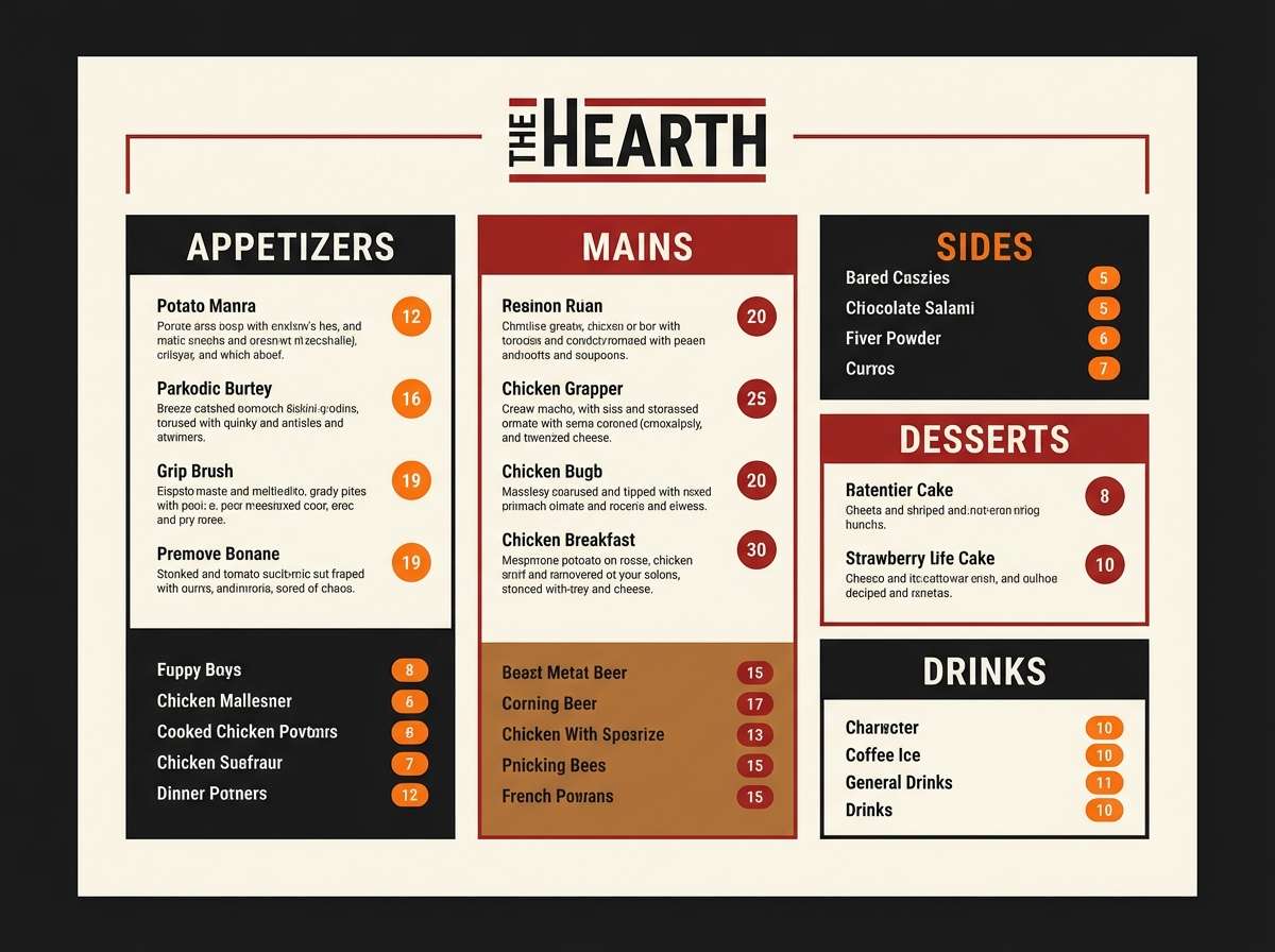
2) Charcoal Chili
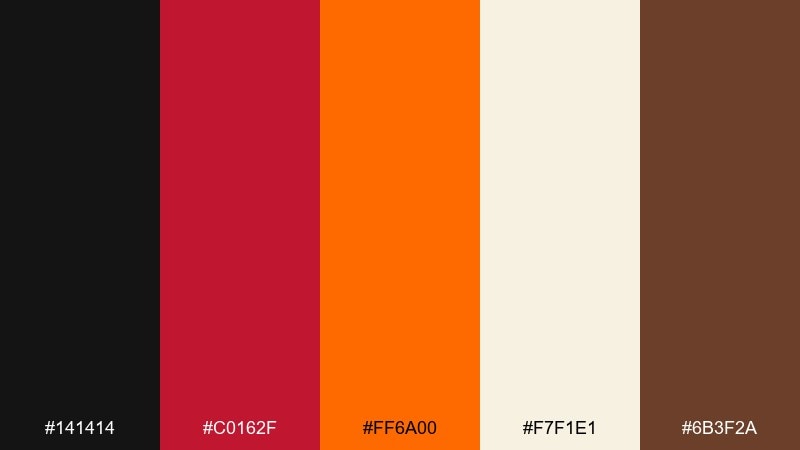
HEX: #141414 #C0162F #FF6A00 #F7F1E1 #6B3F2A
Mood: bold, appetizing, modern
Best for: restaurant menu design
Bold and appetizing, it brings to mind sizzling peppers on a charcoal grill. The creamy off-white keeps layouts readable, while the brown adds a grounded, craft feel. It works especially well for spicy food brands, menus, and delivery promos that need instant heat. Pair with textured paper backgrounds or subtle grain, and keep red for key prices or callouts. Tip: use orange for section headers so the eye moves quickly down the page.
Image example of charcoal chili generated using media.io
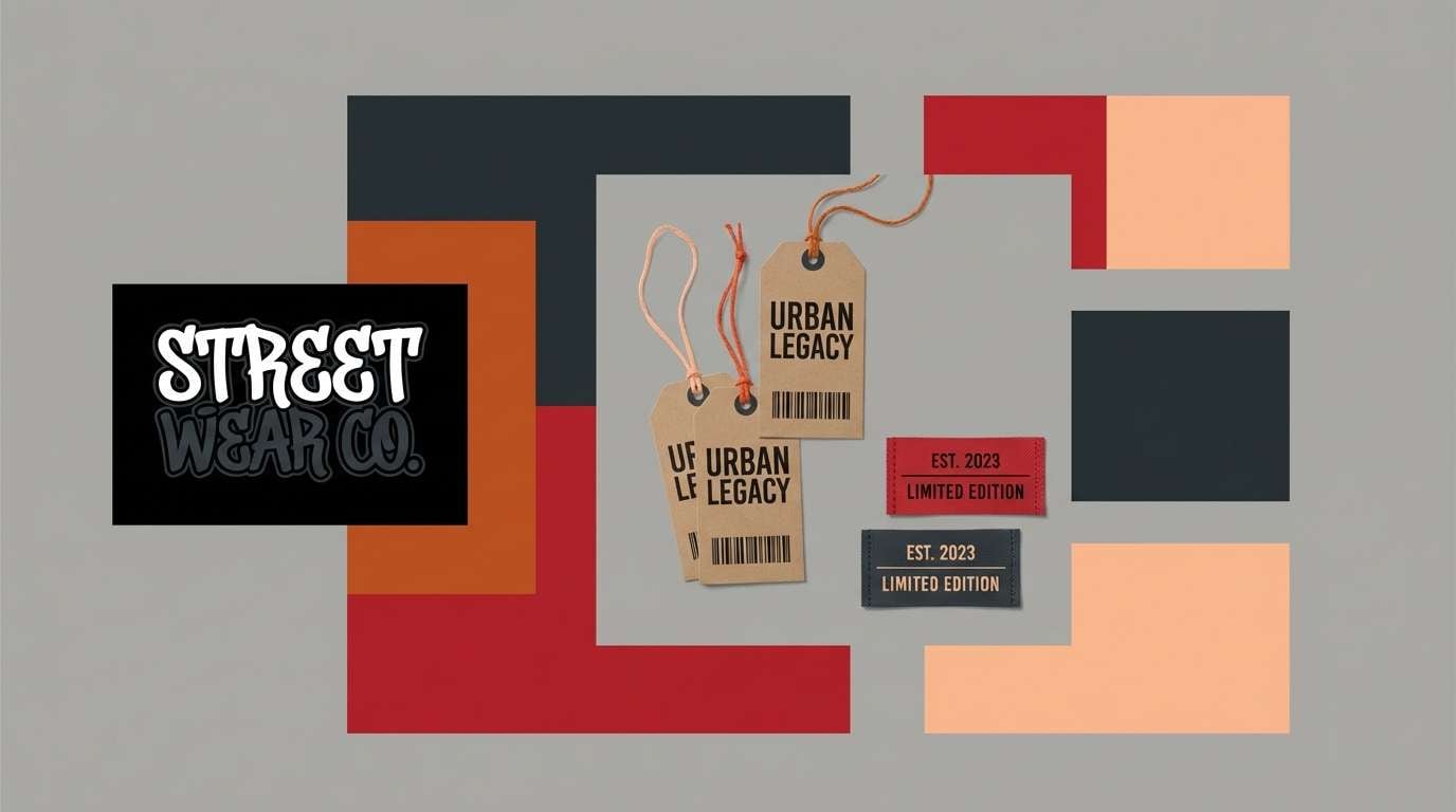
3) Sunset Asphalt
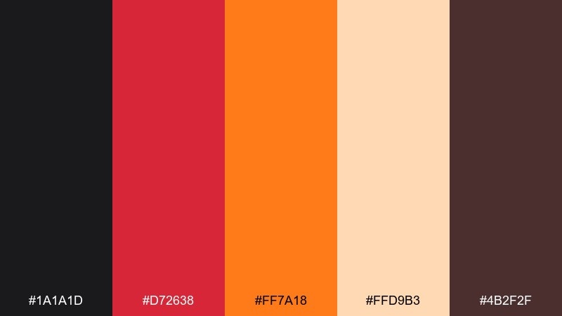
HEX: #1A1A1D #D72638 #FF7A18 #FFD9B3 #4B2F2F
Mood: energetic, urban, sunset-warm
Best for: streetwear branding
Energetic and urban, it looks like a sunset reflecting off wet asphalt. The deep maroon softens the jump between red and orange, while the peachy tint adds a wearable, lifestyle-friendly warmth. Use it for streetwear labels, lookbooks, and social posts that need grit without going fully harsh. Pair with monochrome product photography and bring in the peach only for overlays or stickers. Tip: keep your logo in near-black for consistency across fabrics.
Image example of sunset asphalt generated using media.io
4) Brick Furnace

HEX: #0F0F10 #8D1B1B #FF3B1A #D9A441 #F4EFE7
Mood: industrial, rugged, warm
Best for: craft beer label design
Rugged and warm, it evokes brick kilns, iron tools, and a steady furnace glow. The amber note adds an artisanal vibe that fits fermentation, wood, and smoke-forward stories. Use it for can labels, taproom signage, or merch where you want a handcrafted edge. Pair with illustration linework in near-black and keep the cream for readable legal text. Tip: reserve the bright orange for one hero badge so the label stays premium.
Image example of brick furnace generated using media.io

5) Copper Punch

HEX: #080808 #B21F35 #FF6B2D #C06C2B #F1E2D2
Mood: luxurious, spicy, editorial
Best for: beauty product packaging
Luxurious and spicy, it feels like copper metal catching candlelight. The copper-brown bridges the hot hues and makes the palette look more expensive than pure primaries. Use it for lipstick boxes, fragrance sleeves, or limited-edition drops that need a bold shelf moment. Pair with matte black finishes and small cream typography for ingredients. Tip: try orange as a thin foil line instead of a full block for instant polish.
Image example of copper punch generated using media.io

6) Spiced Cinema

HEX: #0D0D0F #A40D1F #FF5E0E #F6C28B #3A2B2B
Mood: dramatic, warm, nostalgic
Best for: YouTube thumbnail template
Dramatic and warm, it reads like a vintage theater lobby lit by neon. The soft apricot keeps faces or icons from looking too harsh against the dark base. Use it for YouTube thumbnails, podcast covers, or punchy social cards where you need instant contrast at small sizes. Pair with thick outlines and keep red for urgency words like new or live. Tip: add a subtle dark gradient behind text to improve readability without adding new colors.
Image example of spiced cinema generated using media.io
7) Neon Ember UI

HEX: #101012 #E11D48 #FF6D00 #F8FAFC #3F3F46
Mood: sleek, techy, punchy
Best for: dark mode app UI
Sleek and punchy, it feels like neon signs reflected in a glossy dashboard. The near-white is crisp for text, while the gray keeps cards and dividers subtle. This black red orange color scheme works best for fintech, fitness, or music apps that need energetic CTAs without clutter. Pair with rounded components and keep orange strictly for primary actions. Tip: use red only for alerts and status so it never competes with your main button color.
Image example of neon ember ui generated using media.io

8) Autumn Riot

HEX: #0A0A0A #C1121F #F77F00 #FCBF49 #EAE2B7
Mood: festive, warm, outdoorsy
Best for: fall festival flyer
Festive and warm, it recalls bonfires, cider, and leaves turning at golden hour. The two lighter tones make room for friendly illustrations and readable schedules. Use it for fall festival flyers, seasonal promos, or community event posters where warmth is the main emotion. Pair with hand-drawn icons and keep the black for headers and footers. Tip: use the light cream as the main background to avoid an overly heavy look.
Image example of autumn riot generated using media.io

9) Volcano Leather
HEX: #0E0E0F #7F1020 #FF4B1F #B85C38 #E7D7C9
Mood: masculine, grounded, premium
Best for: leather goods branding
Grounded and premium, it suggests volcanic heat under worn leather. The clay-brown adds heritage energy, while the warm beige keeps hangtags and stamps readable. Use it for leather goods, barbershop identities, or rugged lifestyle brands that want warmth without bright sweetness. Pair with serif typography and embossing textures for a tactile feel. Tip: keep orange as a small stitch-like accent so the overall mark stays timeless.
Image example of volcano leather generated using media.io

10) Street Food Heat

HEX: #121212 #D00000 #FF5400 #FFBA08 #F3F0E8
Mood: playful, energetic, tasty
Best for: food truck logo and signage
Playful and energetic, it feels like bright sauces and sizzling pans under night lights. The golden yellow lifts the palette so it reads friendly instead of aggressive. Use it for food truck logos, signage, and social promos where speed and appetite are everything. Pair with chunky type and simple icons like flames or skewers. Tip: keep the off-white for negative space so the brand stays readable from a distance.
Image example of street food heat generated using media.io
11) Retro Raceway

HEX: #0C0C0D #AD2831 #F77F00 #F4D35E #EEEFEF
Mood: sporty, vintage, fast
Best for: sports team poster
Sporty and vintage, it brings back race posters and classic sponsor decals. The pale gray and buttery yellow prevent the darker tones from feeling too heavy in large prints. Use it for sports team posters, tournament graphics, or energetic countdown ads. Pair with angled shapes and bold numbers, then keep red for the key stat. Tip: let orange carry the background blocks and save black for typography so it stays sharp.
Image example of retro raceway generated using media.io
12) Firelight Minimal

HEX: #0B0B0B #BF1D2D #FF7B00 #FFF1E6 #3B3B3B
Mood: minimal, warm, refined
Best for: modern interior styling guide
Minimal and warm, it looks like firelight bouncing off clean plaster walls. The soft cream and mid-gray make it easy to build calm layouts without losing the dramatic accents. A black red orange color palette like this fits interior styling guides, lookbooks, and presentation decks that need sophistication with a spark. Pair with lots of whitespace and one strong orange highlight per page. Tip: keep red on small details like icons or section tabs for a controlled, editorial feel.
Image example of firelight minimal generated using media.io
13) Crimson Cinder

HEX: #0F0F0F #A11D33 #F2542D #F7B32B #D6D6D6
Mood: confident, warm, modern
Best for: tech conference branding
Confident and warm, it feels like sparks rising from coals at a night meetup. The bright amber and light gray help charts, badges, and wayfinding stay readable under stage lighting. Use it for tech conference branding, lanyards, and social templates where you want high energy without neon overload. Pair with geometric patterns and keep black as the main background for consistency. Tip: use amber for secondary buttons and orange for primary so actions feel clearly tiered.
Image example of crimson cinder generated using media.io

14) Urban Bonfire

HEX: #181818 #B80C09 #FF8C42 #F9F9F9 #6F1D1B
Mood: bold, gritty, inviting
Best for: music event poster
Bold and gritty, it evokes lantern glow in a concrete courtyard. The bright off-white keeps type crisp, while the deep maroon adds depth to shadows and textures. Use it for music event posters, club promos, or tour flyers that need attitude and warmth at the same time. Pair with distressed type or halftone patterns, but keep the palette tight. Tip: put orange behind the headliner name and let everything else sit on black or white.
Image example of urban bonfire generated using media.io

15) Saffron Smoke

HEX: #0A0A0A #C81D25 #FF6F00 #FFD166 #FEFAE0
Mood: cozy, sunny, inviting
Best for: cafe packaging and cups
Cozy and sunny, it feels like saffron steam curling up from a warm cup. The pale cream and soft gold keep the mood welcoming, not aggressive. Use it for cafe packaging, cup designs, and loyalty cards where warmth equals comfort. Pair with simple line illustrations and let black anchor the logo for clarity. Tip: keep the gold as a background tint and use orange only for seasonal highlights.
Image example of saffron smoke generated using media.io
16) Festival Contrast

HEX: #101010 #E10600 #FF5F1F #FFFFFF #FFCF99
Mood: loud, celebratory, clean
Best for: Instagram ad creative
Loud and celebratory, it looks like confetti heat against a night sky. The pure white and soft peach make it easy to build clean ad layouts with sharp punch. Use it for Instagram ads, promo tiles, and limited-time offers that need instant stops in the feed. These black red orange color combinations work best when you keep one dominant hot color and let the rest support. Tip: keep text on white panels so the reds stay vibrant without readability issues.
Image example of festival contrast generated using media.io

17) Red Hot Clay
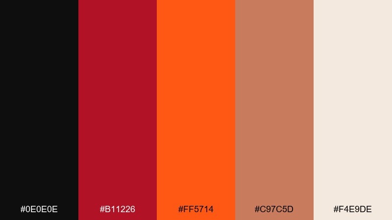
HEX: #0E0E0E #B11226 #FF5714 #C97C5D #F4E9DE
Mood: earthy, warm, handcrafted
Best for: ceramics shop branding
Earthy and warm, it brings to mind terracotta clay beside a kiln at night. The clay-brown and soft beige make the palette feel handmade and approachable. Use it for ceramics shops, artisan marketplaces, and packaging inserts where story matters as much as style. Pair with natural textures and simple stamps rather than glossy gradients. Tip: set product names in black and use orange only for collection labels.
Image example of red hot clay generated using media.io

18) Molten Typography

HEX: #000000 #CC0022 #FF4500 #F0E7D8 #333333
Mood: assertive, graphic, editorial
Best for: typography poster series
Assertive and graphic, it feels like molten ink poured into sharp letterforms. The off-white gives just enough softness for large type to breathe against the dark. Use it for typography posters, print zines, and bold quote cards where words are the main visual. Pair with oversized type, tight leading, and simple rectangles rather than illustrations. Tip: keep orange for one word or underline so the message hits instantly.
Image example of molten typography generated using media.io
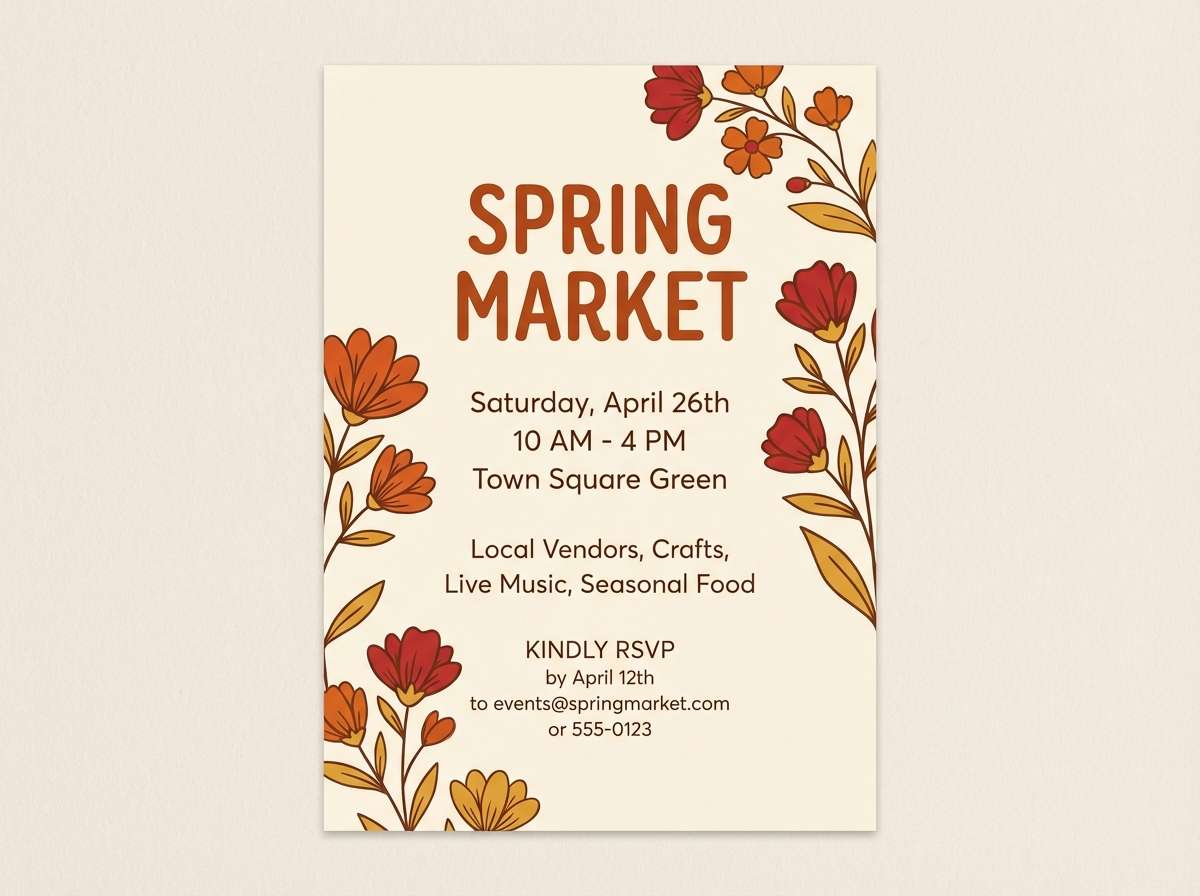
19) Ember Blossom

HEX: #120A0A #D62828 #F77F00 #FCBF49 #FAEDCD
Mood: cheerful, warm, approachable
Best for: spring market invitation
Cheerful and warm, it feels like a sunrise spilling into a lively market. The soft cream background keeps the reds and oranges friendly, while the golden tone adds optimism. Use it for invitations, vendor spotlights, and seasonal banners that need warmth without looking heavy. Pair with simple floral illustrations or rounded icons and keep dark brown-black for body text. Tip: place red only on key RSVP elements to guide attention.
Image example of ember blossom generated using media.io
20) Night Market Lanterns

HEX: #0D0D0E #C81F34 #FF5A00 #F6E7D8 #4A1C1C
Mood: romantic, atmospheric, warm
Best for: travel blog header graphics
Atmospheric and warm, it suggests lanterns glowing over a crowded night market. The creamy highlight keeps text blocks readable, while the deep wine tone adds richness to shadows. Use it for travel blog headers, story covers, and destination highlight templates where you want a sense of heat and motion. Pair with minimal line icons and let black carry the navigation elements. Tip: use orange as a single accent bar to frame headlines without overpowering the layout.
Image example of night market lanterns generated using media.io
What Colors Go Well with Black Red Orange?
Neutrals are the easiest win: warm white, cream, beige, and light gray give your design space to breathe and keep text readable. Charcoal and graphite also help you add hierarchy without introducing new hue families.
For a more premium or earthy direction, bring in browns like tobacco, clay, or copper. These sit naturally between red and orange and reduce the “primary color” intensity, especially in packaging and lifestyle branding.
If you need a cool counterbalance, small touches of teal or deep cyan can work—but use them sparingly. With black red orange tones, one cool accent is usually enough to avoid visual competition.
How to Use a Black Red Orange Color Palette in Real Designs
Start by choosing roles: let black (or near-black) be your base, pick either red or orange as the dominant accent, and assign the other to supporting details. This prevents both hot colors from fighting for attention.
Use light tones strategically for legibility—think cream panels behind headlines, UI cards in soft gray, or beige blocks for fine print. On dark backgrounds, keep saturation high but limit the number of large, bright areas.
For consistency across formats, lock one “signature” accent (often orange for buttons or highlights) and reserve red for urgency states like alerts, sale tags, or key emphasis words.
Create Black Red Orange Palette Visuals with AI
If you already have HEX codes, you can turn them into posters, branding mockups, UI screens, or social creatives quickly by describing the layout and mood you want. The fastest results come from being specific about style (minimal, gritty, editorial), composition (poster, ad tile, brand kit), and contrast level.
Try generating multiple variations with the same palette: one with orange as the hero, another with red as the hero, and a third where cream becomes the background. This makes it easier to choose a direction without redesigning from scratch.
Black Red Orange Color Palette FAQs
-
What does a black red orange color palette communicate?
It usually communicates intensity, energy, and urgency. Black adds authority and drama, while red and orange signal heat, excitement, and action—great for bold branding and attention-first layouts. -
Is black red orange a good palette for branding?
Yes, especially for entertainment, streetwear, food, fitness, and events. To keep it premium, use black as the main base, keep one hot color dominant, and add a light neutral for clarity. -
How do I keep black red orange designs readable?
Use cream/white panels for text, keep body copy off the most saturated reds/oranges, and rely on near-black for typography. In UI, reserve red for alerts and use orange for primary buttons. -
Which is better as the main accent: red or orange?
Orange often works better for primary CTAs because it feels energetic without reading as “error.” Red is best used for urgency, warnings, or limited-time emphasis so it stays meaningful. -
What neutrals pair best with black red orange tones?
Warm neutrals like beige, cream, and off-white pair especially well because they match the warmth of red and orange. Light gray also helps modernize the palette for tech and editorial use. -
Can I use black red orange in dark mode UI?
Yes—use near-black for backgrounds, soft gray for surfaces/dividers, and a crisp near-white for text. Keep orange for primary actions and limit red to status or error states. -
How many colors should I use at once from a 5-color palette?
In most designs, 2–3 is enough: a base (black/charcoal), a dominant accent (red or orange), and a light neutral for breathing room. Use the remaining tones as optional supporting accents.


