

Yellow and dark green is a modern classic: sunny energy paired with grounded, nature-forward depth. It’s one of the easiest ways to make designs feel both optimistic and trustworthy.
Below you’ll find curated yellow and dark green color palette ideas with HEX codes, mood notes, and practical pairing tips for branding, UI, and print.
In this article
- Why Yellow and Dark Green Combinations Work So Well
-
- sunlit canopy
- citrus grove
- mustard moss
- golden fern
- honeyed pines
- lemon sage
- saffron forest
- vintage conservatory
- olive lantern
- woodland glow
- retro botanical
- harvest veranda
- tropical understory
- art deco garden
- minimal herbarium
- campfire picnic
- modern eco brand
- spring meadow notes
- deep jungle accent
- cozy cabin kitchen
- What Colors Go Well with Yellow Dark Green?
- How to Use Yellow and Dark Green Combinations in Real Designs
- Create Yellow and Dark Green Color Palette Visuals with AI
Why Yellow and Dark Green Combinations Work So Well
Yellow brings instant visibility and upbeat momentum, while dark green adds stability and sophistication. Together, they create a high-contrast pair that still feels natural—great for brands that want to look confident without feeling harsh.
Because dark green can replace black for typography and UI chrome, it keeps layouts softer and more premium. Yellow then becomes a controlled accent for CTAs, highlights, and key metrics that need immediate attention.
This combo also adapts well across mediums: it looks rich in print (yellow can read like gold) and stays legible on screens when you keep backgrounds light and use yellow sparingly.
20+ Yellow and Dark Green Color Palette Ideas (with HEX Codes)
1) Sunlit Canopy
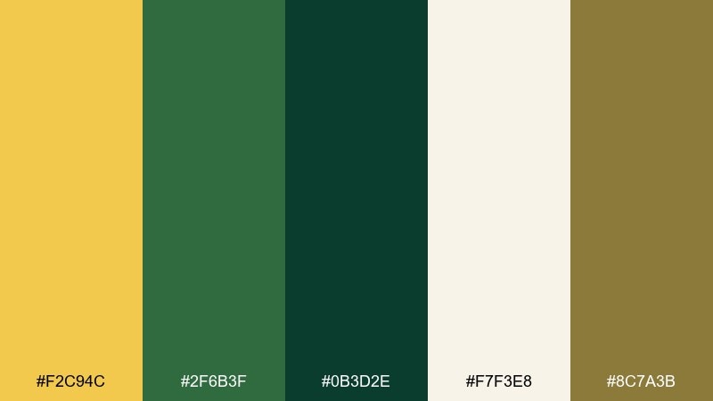
HEX: #f2c94c #2f6b3f #0b3d2e #f7f3e8 #8c7a3b
Mood: warm, grounded, optimistic
Best for: eco branding and landing pages
Warm sunlight filtering through leaves gives this set a confident, outdoorsy calm. Use the bright yellow for calls to action, and keep the dark green for headers and navigation to anchor the layout. Cream softens the contrast for roomy sections, while the olive-brown works well for outlines and icons. Tip: reserve the yellow for one primary action per screen to keep it premium.
Image example of sunlit canopy generated using media.io
Media.io is an online AI studio for creating and editing video, image, and audio in your browser.

2) Citrus Grove
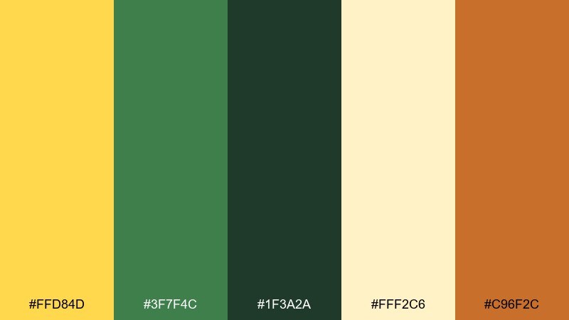
HEX: #ffd84d #3f7f4c #1f3a2a #fff2c6 #c96f2c
Mood: bright, fresh, zesty
Best for: food packaging and product ads
Juicy citrus energy meets crisp garden greens for a look that feels clean and appetizing. The yellow pops best on matte cream, while the deep green keeps labels readable and upscale. Add the amber tone as a subtle flavor cue for seals, stickers, or ingredient highlights. Tip: keep typography mostly dark green and use yellow as the hero color on the front panel.
Image example of citrus grove generated using media.io
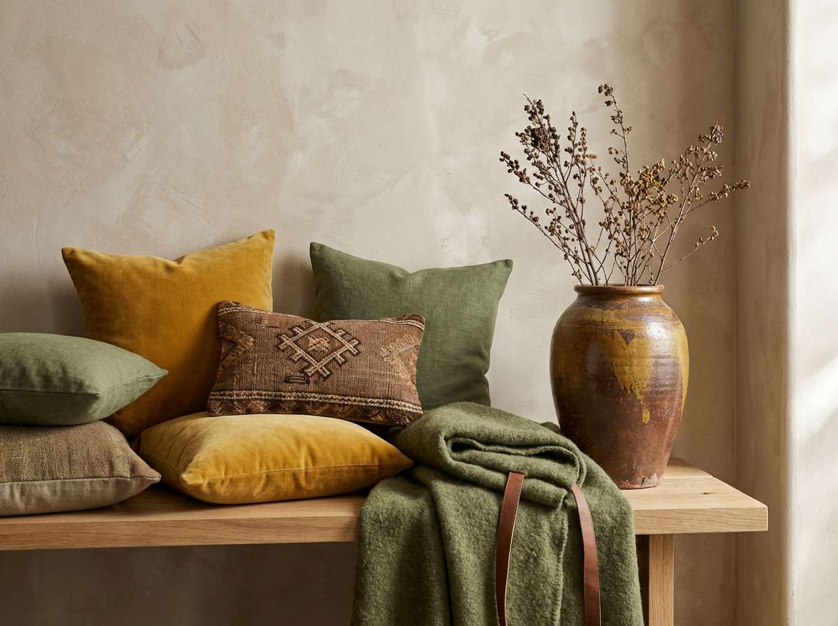
3) Mustard Moss
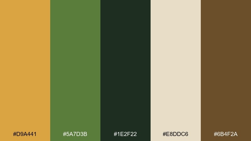
HEX: #d9a441 #5a7d3b #1e2f22 #e8ddc6 #6b4f2a
Mood: rustic, earthy, vintage
Best for: cozy home decor and textiles
A lived-in mustard and moss pairing that feels like thrifted ceramics and worn linen. Use the cream as your wall or base fabric tone, then layer greens in larger blocks for depth. The brown works nicely for wood accents, frames, or stitched details. Tip: repeat the mustard in small touches across a room to avoid a single loud focal point.
Image example of mustard moss generated using media.io
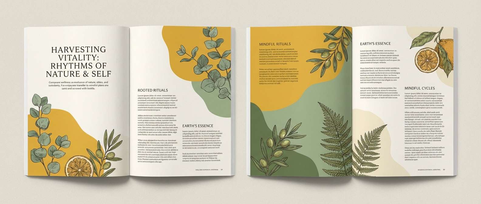
4) Golden Fern
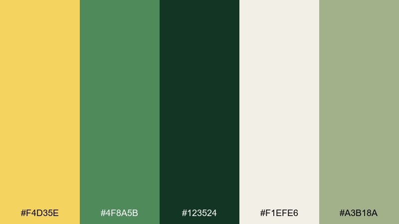
HEX: #f4d35e #4f8a5b #123524 #f1efe6 #a3b18a
Mood: airy, botanical, calm
Best for: wellness brands and editorial layouts
Soft golden light and ferny greens create an airy, restorative feel. This dark green and yellow color palette works especially well with generous white space and gentle photography. Use the pale sage as a secondary background tone to add depth without darkening the page. Tip: set body text in the darkest green and keep yellow for pull quotes or section markers.
Image example of golden fern generated using media.io
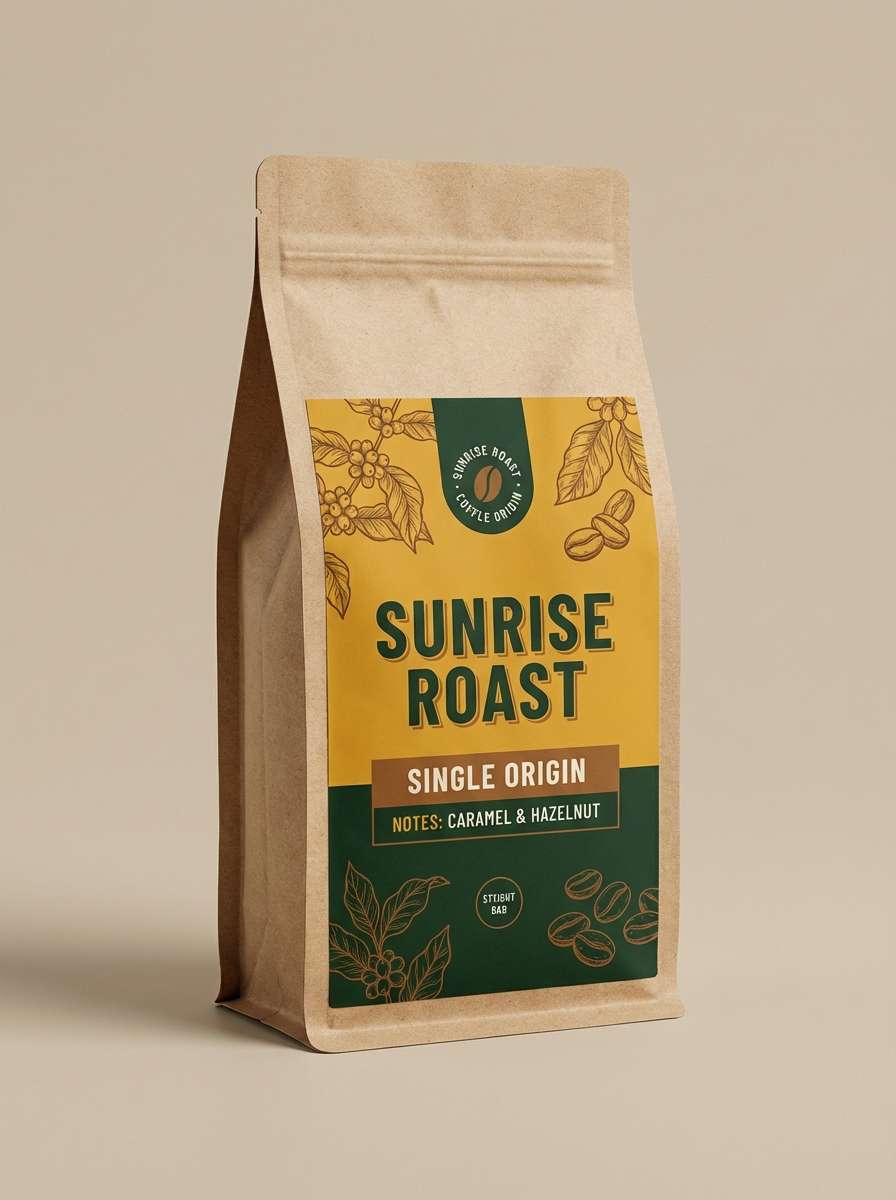
5) Honeyed Pines
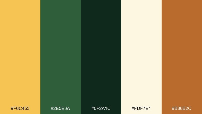
HEX: #f6c453 #2e5e3a #0f2a1c #fdf7e1 #b86b2c
Mood: cozy, outdoorsy, confident
Best for: craft coffee labels and badges
Golden honey and pine needles give this set a campfire-cozy confidence. The dark greens hold up for small type on labels, while the warm yellow brings instant shelf visibility. Use the cream for negative space and the toasted orange-brown for roast notes or flavor icons. Tip: pair with a sturdy serif headline to emphasize the artisanal vibe.
Image example of honeyed pines generated using media.io
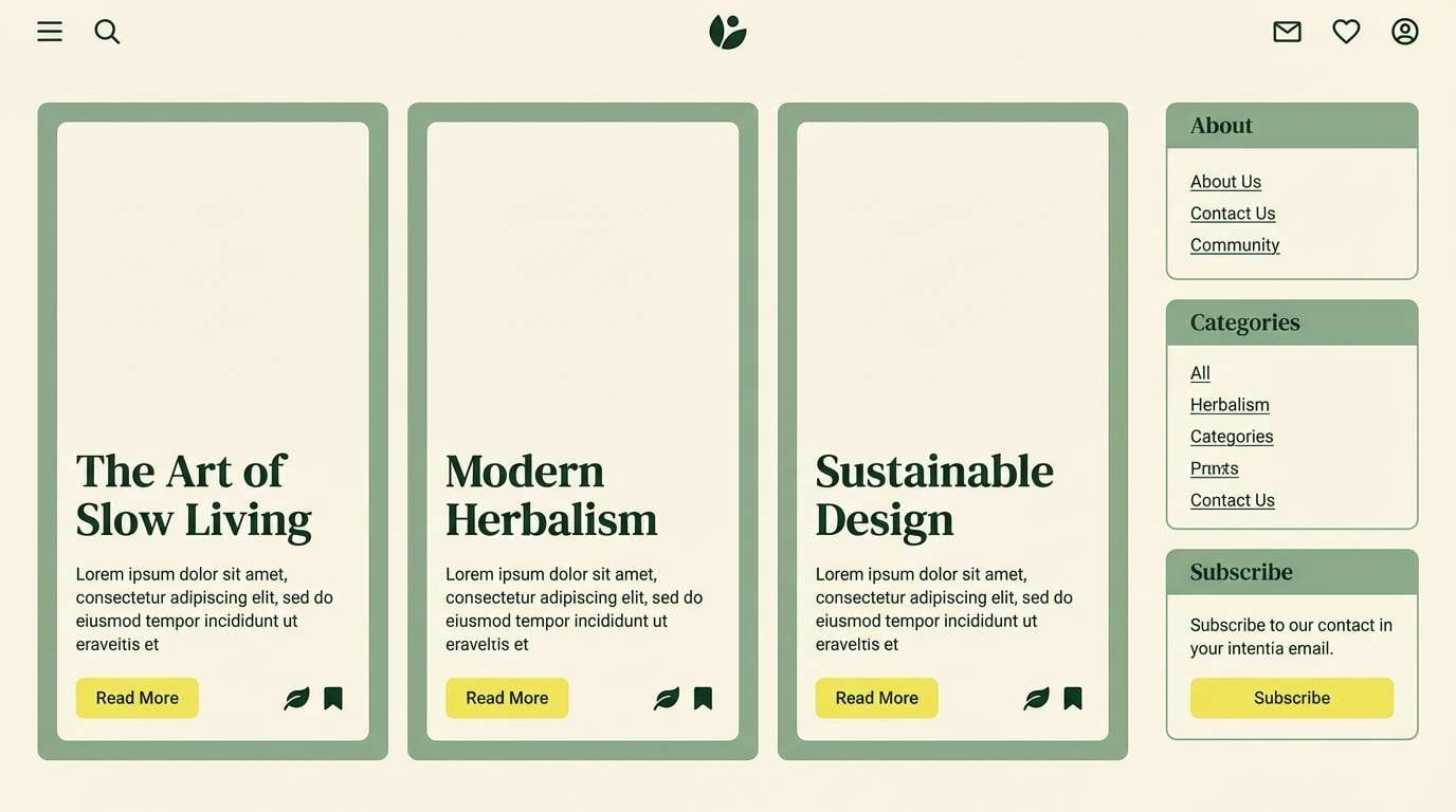
6) Lemon Sage
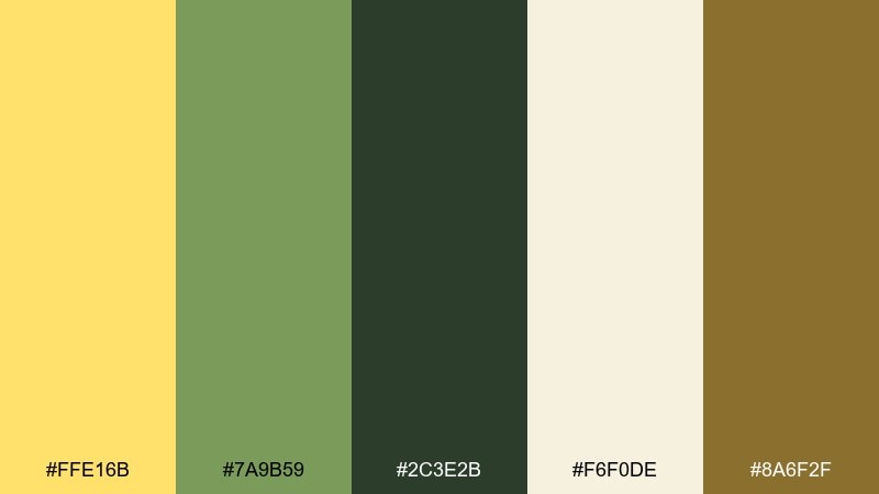
HEX: #ffe16b #7a9b59 #2c3e2b #f6f0de #8a6f2f
Mood: soft, relaxed, approachable
Best for: shopify themes and lifestyle blogs
Gentle lemon meets powdered sage for a relaxed, friendly mood. Keep the cream as the main canvas, then use sage for cards, dividers, and subtle backgrounds. The dark green is ideal for navigation and long-form text, while the muted gold-brown makes a tasteful accent for links. Tip: avoid pure black and let the greens carry all the contrast.
Image example of lemon sage generated using media.io
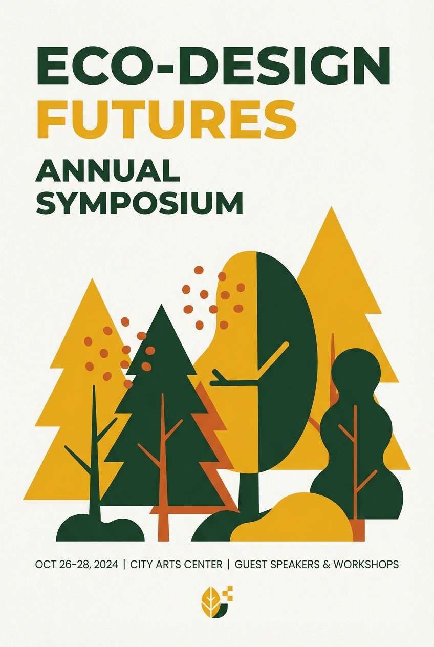
7) Saffron Forest
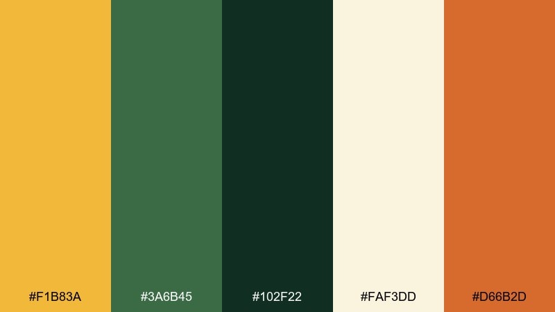
HEX: #f1b83a #3a6b45 #102f22 #faf3dd #d66b2d
Mood: bold, spicy, adventurous
Best for: event posters and promo graphics
Spicy saffron against deep forest tones feels energetic, like lanterns in the woods. These yellow and dark green color combinations shine on posters where you need punchy hierarchy and quick readability. Use the dark green for big typography, and let saffron and orange carry the highlights and date blocks. Tip: keep backgrounds light to prevent the greens from swallowing details.
Image example of saffron forest generated using media.io
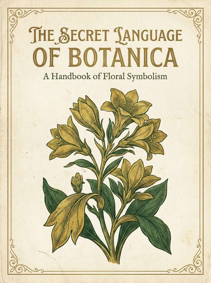
8) Vintage Conservatory
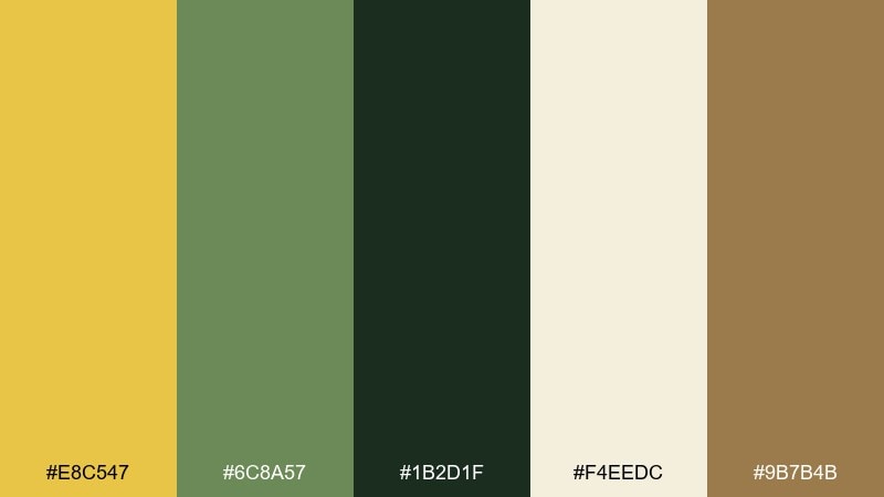
HEX: #e8c547 #6c8a57 #1b2d1f #f4eedc #9b7b4b
Mood: heritage, curated, timeless
Best for: museum programs and book covers
Like brass fixtures and shaded glasshouses, this palette feels curated and timeless. The creamy paper tone makes a perfect base for print, while the darkest green adds classic seriousness. Use the brass-yellow for titles and section heads, and sprinkle the tan as a supporting neutral in borders and rules. Tip: choose one display typeface and keep ornament minimal to let the colors do the storytelling.
Image example of vintage conservatory generated using media.io
9) Olive Lantern

HEX: #f9d75c #556b2f #243316 #fff8e6 #c7a15a
Mood: warm, muted, classic
Best for: restaurant menus and signage
Muted lantern light and olive greens create a classic, welcoming tone. Use the dark green for menu type to keep long lists readable, and reserve the yellow for section highlights or specials. The pale cream keeps everything airy, while the tan accent works for dividers and price dots. Tip: keep line weights thin so the palette stays elegant rather than heavy.
Image example of olive lantern generated using media.io
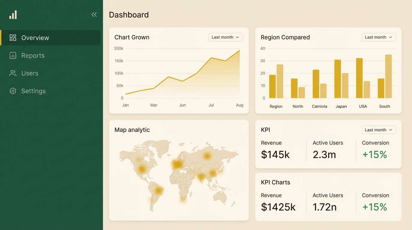
10) Woodland Glow
HEX: #f3c969 #2f7a4a #0e2b1e #e9e1cf #7d6a3a
Mood: moody, modern, nature-forward
Best for: dashboard UI and data cards
A woodland-at-dusk vibe with a clean modern edge, perfect for interfaces that need warmth without noise. This dark green and yellow color palette gives you strong contrast for charts, badges, and status tags. Use the beige as the main background, then layer the two greens for navigation and card headers. Tip: apply yellow only to key metrics or alerts so it reads as intentional emphasis.
Image example of woodland glow generated using media.io
11) Retro Botanical
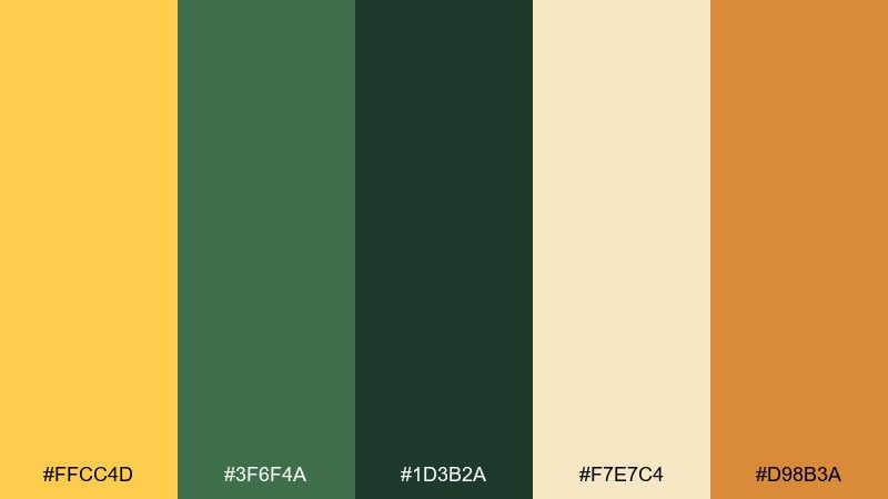
HEX: #ffcc4d #3f6f4a #1d3b2a #f7e7c4 #d98b3a
Mood: playful, nostalgic, sunny
Best for: sticker sets and social posts
Sunny retro energy with a botanical twist, like vintage seed packets reimagined. The creamy peachy neutral keeps posts bright, while the greens provide structure for shapes and lettering. Use the orange as a small pop for icons, sparkles, or limited-edition tags. Tip: pick two dominant colors per post and let the rest support for a cohesive feed.
Image example of retro botanical generated using media.io
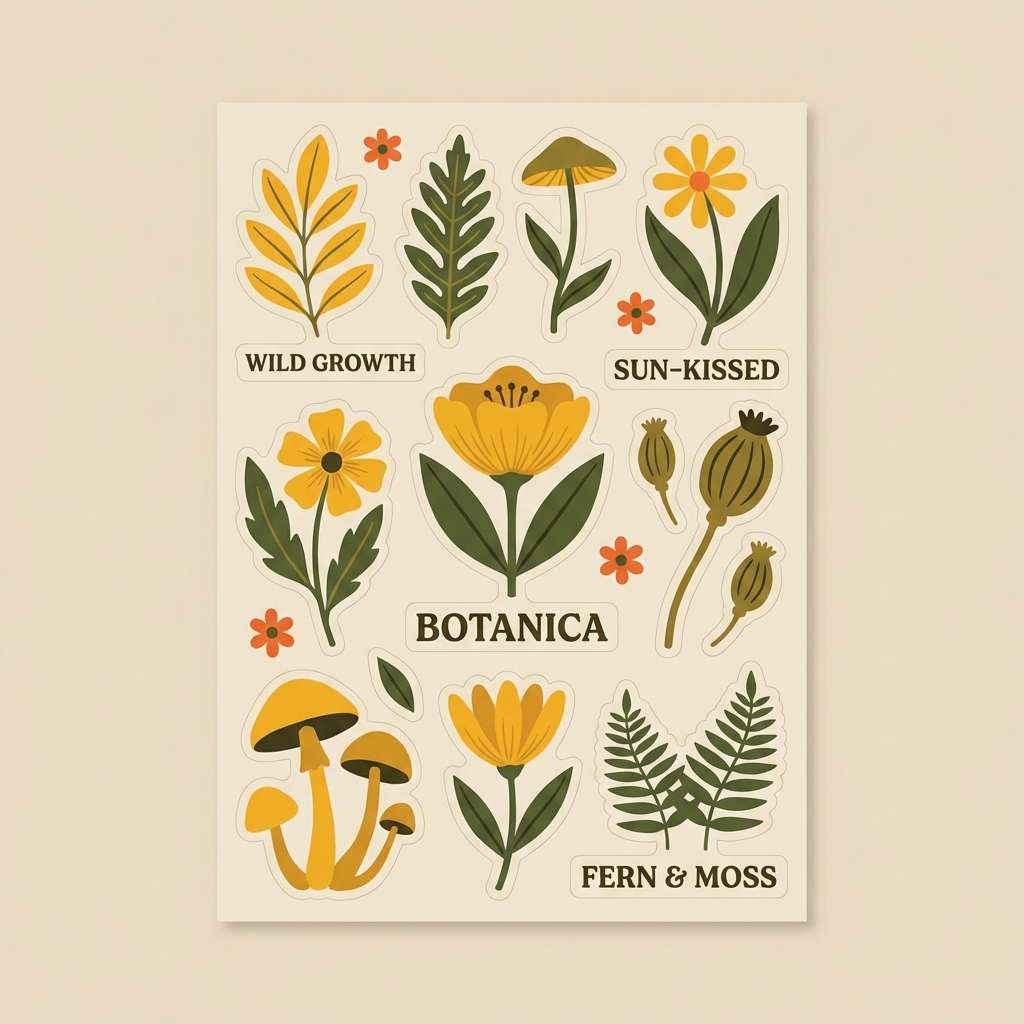
12) Harvest Veranda
HEX: #eecb5f #4a7b43 #152a1e #fff0d8 #a45a2a
Mood: welcoming, homestyle, autumnal
Best for: recipe cards and newsletter templates
Like warm bread on a veranda table, these tones feel welcoming and homestyle. Use the soft cream as the base for recipe cards, then bring in green for headings and ingredient sections. The toasted brown helps with icons and separators, while yellow adds cheerful emphasis to ratings or serving size. Tip: keep photos warm-toned so they blend with the harvest mood.
Image example of harvest veranda generated using media.io
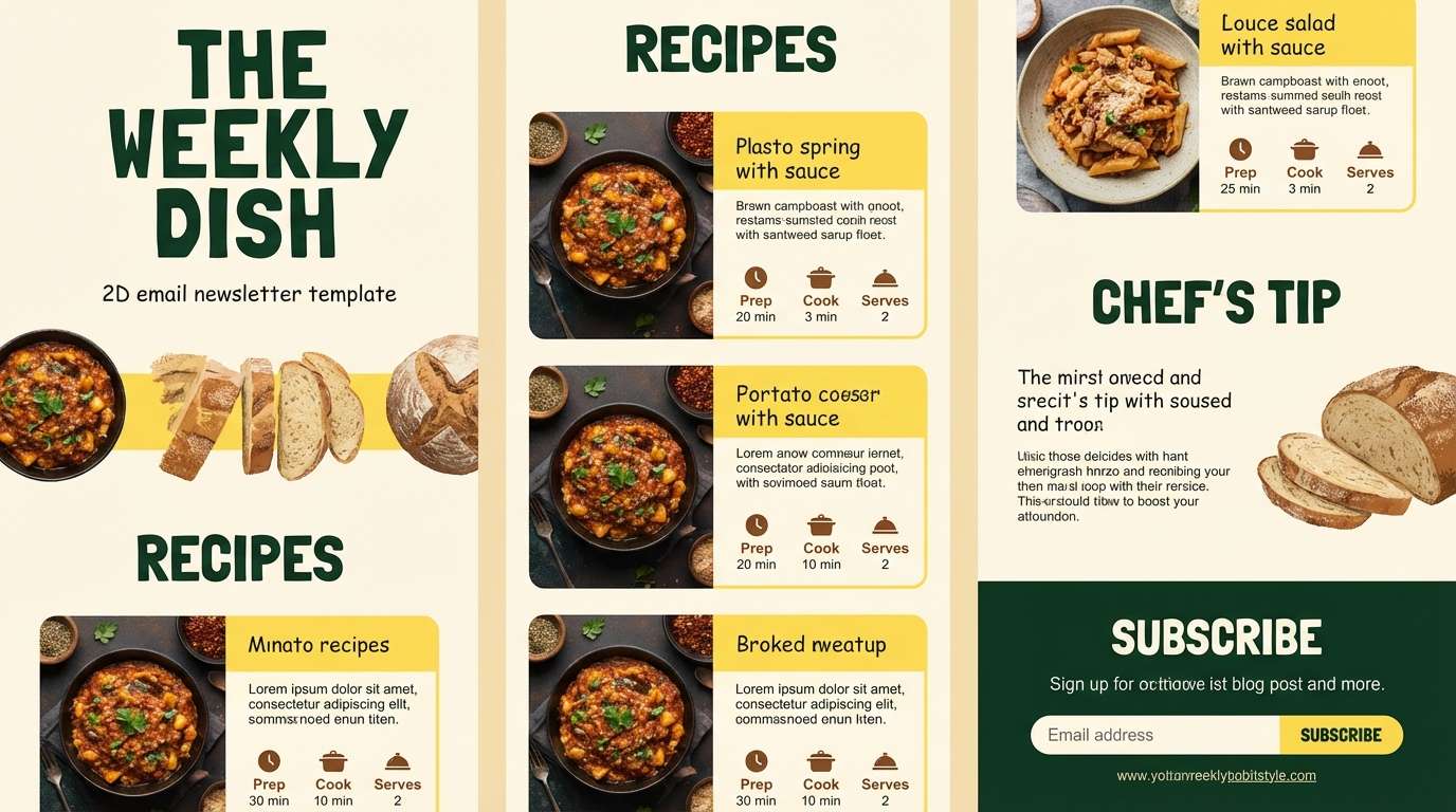
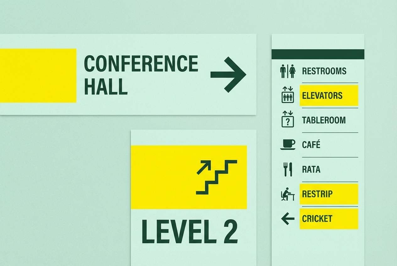
13) Tropical Understory
HEX: #ffd24a #2aa06b #0c3b2a #eaf7ee #1f6f5b
Mood: lush, energetic, modern
Best for: spa signage and wayfinding
Lush understory greens with a bright sunlit yellow feel clean, modern, and tropical. These yellow and dark green color combinations are great for signage where you need quick scanning and a fresh atmosphere. Use the pale mint as the main field color, then assign dark green to text and arrows for clarity. Tip: keep yellow limited to directional highlights so the system stays calm and consistent.
Image example of tropical understory generated using media.io
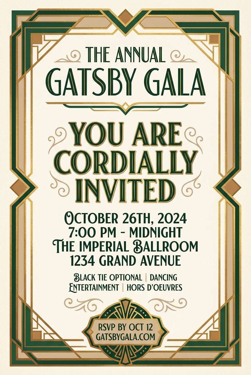
14) Art Deco Garden
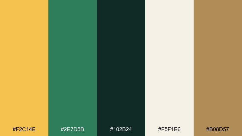
HEX: #f2c14e #2e7d5b #102b24 #f5f1e6 #b08d57
Mood: glam, structured, sophisticated
Best for: cocktail invitations and gala flyers
Structured glam with garden depth, like a deco lobby wrapped in foliage. Use the cream as your paper tone, then build strong geometry with the deepest green. The warm yellow reads as metallic gold in print, especially when paired with the tan accent in borders. Tip: keep shapes symmetrical and let one bold headline carry the design.
Image example of art deco garden generated using media.io
15) Minimal Herbarium
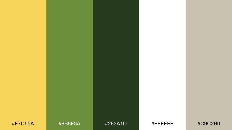
HEX: #f7d55a #6b8f3a #263a1d #ffffff #c9c2b0
Mood: clean, minimal, botanical
Best for: skincare labels and ingredient lists
A pressed-leaf minimalism that feels clean and ingredient-forward. Use white as the main label field, then apply dark green for typography to keep everything legible at small sizes. The yellow is best as a thin band, cap color, or small seal, while the warm gray keeps layouts tidy. Tip: stick to one accent area per package to maintain that lab-clean look.
Image example of minimal herbarium generated using media.io
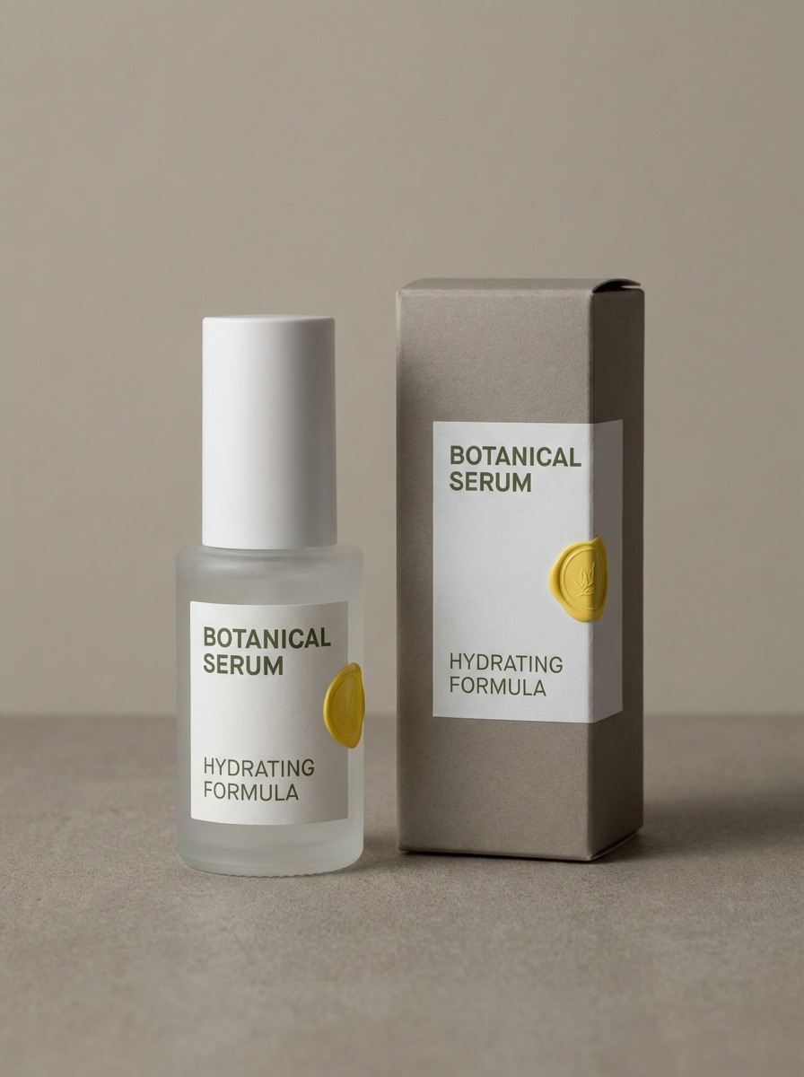
16) Campfire Picnic
HEX: #f0b94a #3d7a3d #1c2e1f #f7efe1 #a86a3a
Mood: friendly, rustic, adventurous
Best for: outdoor brand posters
A friendly campfire mood with practical, rugged contrast. The warm yellow reads like lantern light, while layered greens feel like a trail map and tree line. Use the cream to open up negative space, and bring the brown in for badges, stamps, or secondary type. Tip: roughen textures slightly to sell the outdoorsy authenticity.
Image example of campfire picnic generated using media.io
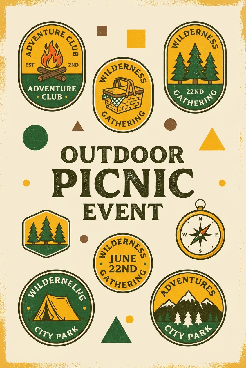
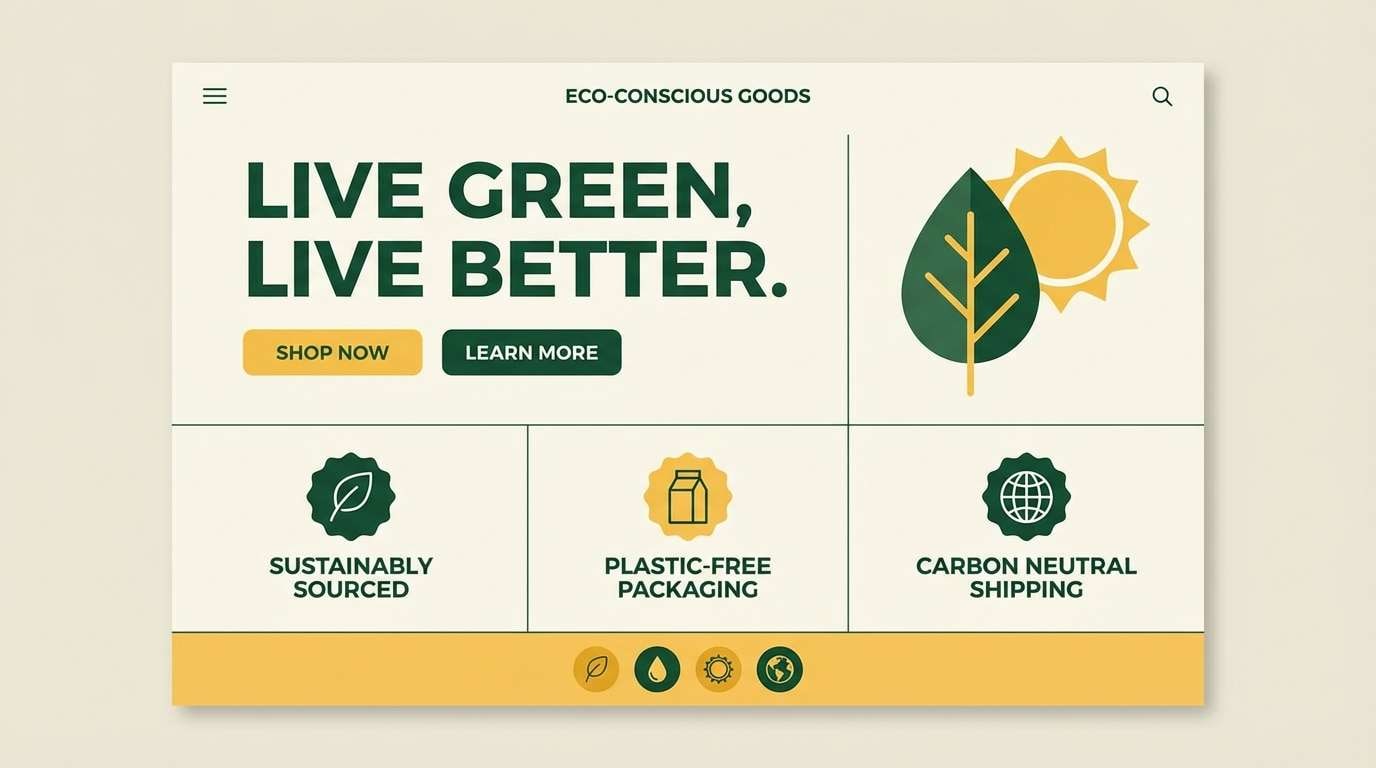
17) Modern Eco Brand
HEX: #f6d04d #1f6f3d #0a2b1c #eef2e6 #9aa06d
Mood: confident, modern, sustainable
Best for: brand guidelines and logo systems
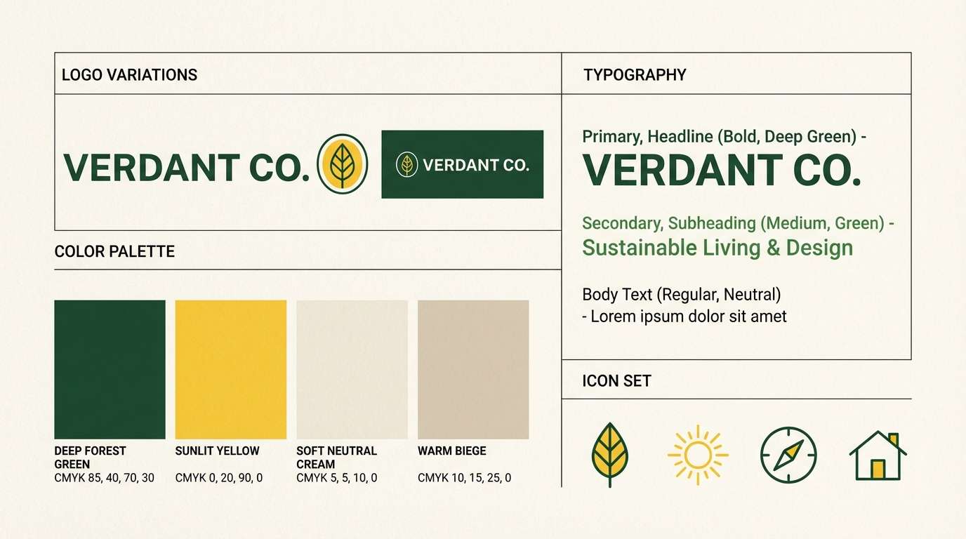
Crisp and confident, these tones feel like modern sustainability without the cliche. The deep greens make strong logo marks and wordmarks, while the yellow energizes highlights and brand moments. This yellow dark green color palette also works nicely with photography that features wood, stone, or plants. Tip: use the muted olive for secondary UI states to avoid overusing the brightest yellow.
Image example of modern eco brand generated using media.io
18) Spring Meadow Notes
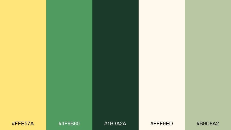
HEX: #ffe57a #4f9b60 #1b3a2a #fff9ed #b9c8a2
Mood: light, cheerful, natural
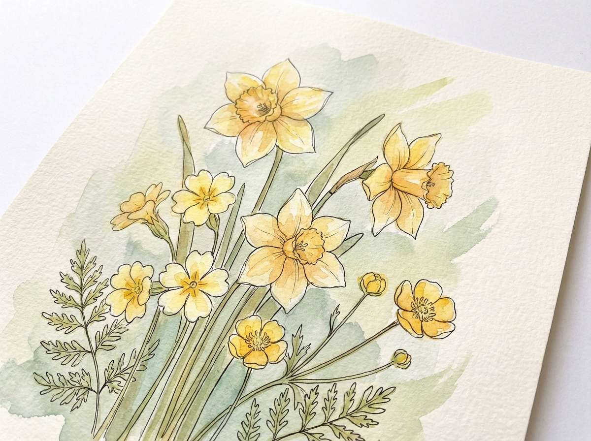
Best for: watercolor botanical prints
Light meadow sunshine and fresh greens create an easy, cheerful calm. The pale cream keeps the overall look soft, while the darkest green adds crisp definition for stems and captions. Use the pastel sage as a wash to make the composition feel airy and layered. Tip: let yellow appear in small blossoms so it stays delicate rather than loud.
Image example of spring meadow notes generated using media.io
19) Deep Jungle Accent
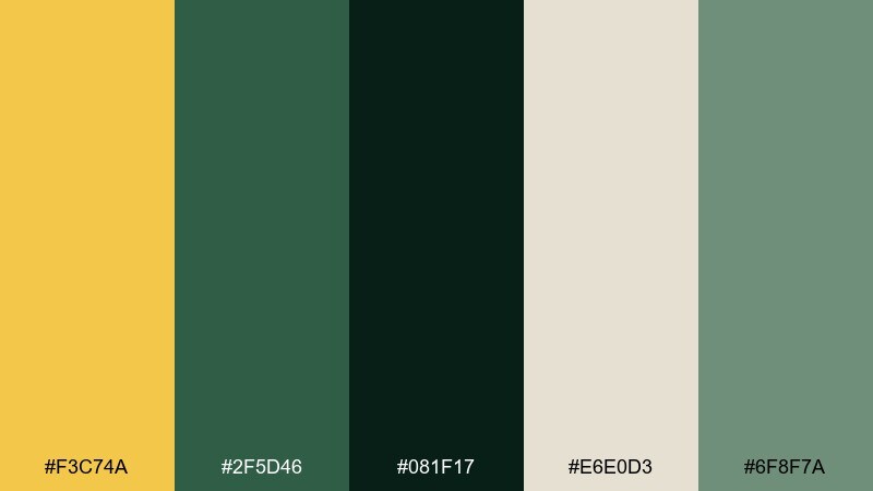
HEX: #f3c74a #2f5d46 #081f17 #e6e0d3 #6f8f7a
Mood: dramatic, luxe, mysterious
Best for: high-end product ads
Deep jungle shadows with a single golden accent feel dramatic and luxe. Use the near-black green for backgrounds and let the yellow become the hero highlight on a product or headline. The soft gray-beige keeps the composition from feeling too heavy, and the muted green-gray supports secondary elements. Tip: increase spacing and keep copy short so the palette reads premium.
Image example of deep jungle accent generated using media.io

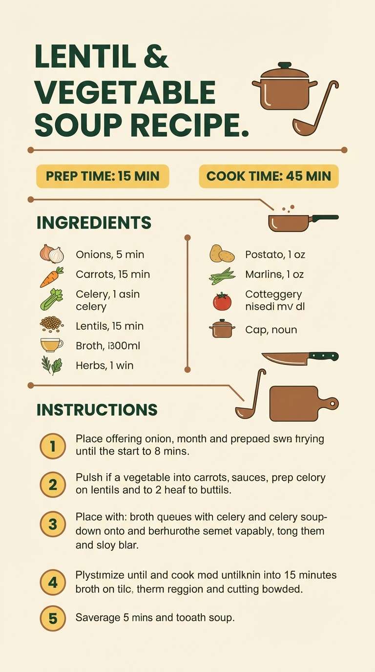
20) Cozy Cabin Kitchen
HEX: #f6cf5a #4b6b3c #203020 #fbf4e3 #a0783a
Mood: cozy, practical, homey
Best for: kitchen brands and recipe posters
Homey cabin warmth with practical contrast, like enamel cookware against wood cabinets. Use the cream as a poster background, then build titles and frames with the greens for readability. The warm brown helps with icons and small decorative lines, while yellow adds friendly emphasis to key steps or ingredients. Tip: keep illustration simple and let the colors deliver the cozy character.
Image example of cozy cabin kitchen generated using media.io
What Colors Go Well with Yellow Dark Green?
Warm neutrals like cream, off-white, and paper beige keep the contrast readable and help yellow look more refined. They’re also the easiest way to make dark green feel lighter in UI and print layouts.
Earth accents—tan, toasted brown, terracotta, and amber—pair naturally with mustard/forest combinations and add depth without fighting the palette. For a cleaner, modern edge, introduce soft gray (warm, not blue-gray) as a supporting neutral.
If you want extra freshness, try muted mint or sage as secondary backgrounds. Keep saturated blues or purples minimal, since they can compete with yellow and make the greens feel less organic.
How to Use Yellow and Dark Green Combinations in Real Designs
Use dark green as your “structure” color: navigation, headings, frames, and body text. This creates a premium baseline that reads softer than pure black while keeping accessibility easier to manage.
Let yellow do one job at a time—primary CTA, key stat, special offer badge, or directional highlight. When yellow appears everywhere, it stops feeling intentional; when it’s scarce, it feels like a spotlight.
For print, yellow can mimic metallic warmth (especially next to cream and tan). For digital, choose a slightly muted yellow for large areas and save the brightest yellow for small UI components.
Create Yellow and Dark Green Color Palette Visuals with AI
Want to see these palettes on real layouts—labels, posters, dashboards, invitations, or brand sheets? Generate fast, on-style concept images using the prompts included under each palette.
In Media.io, you can iterate quickly: keep the same prompt, swap a palette name, and test multiple compositions until the contrast and mood feel right for your brand or project.
Yellow and Dark Green Color Palette FAQs
-
What does a yellow and dark green color palette communicate?
It usually signals optimism + stability: yellow adds energy and visibility, while dark green adds trust, nature, and premium depth. Together, they feel modern, grounded, and confident. -
Which yellow works best with forest green: lemon or mustard?
Mustard reads warmer, more vintage, and print-friendly; lemon feels fresher and more modern. If you want a “gold” impression, choose mustard; for a crisp UI accent, choose a brighter lemon yellow. -
How do I keep yellow from overpowering dark green in UI?
Use dark green for typography and layout structure, then limit yellow to one primary action or highlight per screen. Keep backgrounds light (cream/off-white) so you don’t need large yellow blocks for contrast. -
What neutral background pairs best with yellow and dark green?
Cream, warm off-white, and light beige are the safest choices. They soften the contrast, keep layouts airy, and make yellow look more refined than it does on stark white. -
Is yellow and dark green good for branding?
Yes—especially for eco, wellness, food, outdoor, and sustainability brands. The key is consistency: pick one hero yellow, one primary dark green, and use supporting neutrals to avoid a noisy look. -
Can I use dark green instead of black for text?
Often yes. A near-black green can improve warmth and reduce harshness while staying readable. For accessibility, test contrast against your background and reserve the deepest green for long-form text. -
How do I generate palette-based mockups quickly?
Use a text-to-image tool and include your design type (e.g., “dashboard UI,” “packaging label,” “event poster”) plus the palette mood and colors. Start with the prompts above, then iterate by adjusting layout, lighting, and texture.


