

Navajo White (#FFDEAD) is a warm, creamy neutral that instantly softens layouts and spaces while still feeling clean and modern. It’s especially effective when you want a welcoming look without going overly yellow or beige.
Below are 20+ navajo white color palette ideas with HEX codes you can use for branding, interiors, UI, and print—each with an AI prompt you can reuse to generate matching visuals.
In this article
- Why Navajo White Palettes Work So Well
-
- desert linen
- apricot clay
- coastal dune
- vintage parlor
- minimal cafe
- sage window
- terracotta hearth
- blush wedding
- warm nordic
- golden hour
- soft contrast ui
- botanical cream
- chocolate spice
- peachy nursery
- stone and sand
- copper luxe
- sunlit editorial
- quiet gallery
- autumn picnic
- nightfall neutrals
- honeyed canvas
- paper and ink
- What Colors Go Well with Navajo White?
- How to Use a Navajo White Color Palette in Real Designs
- Create Navajo White Palette Visuals with AI
Why Navajo White Palettes Work So Well
Navajo White sits in the “warm neutral” sweet spot: light enough to act like a background, but creamy enough to feel intentional. It adds comfort and approachability to brands, interfaces, and interiors without stealing attention from your main content.
Because it’s soft and low-saturation, it pairs easily with both earthy browns and modern near-blacks for readable contrast. You can also nudge the mood warmer with peach/terracotta accents, or cooler with sage and muted teals.
Most importantly, navajo white palettes scale well. They look good across large surfaces (walls, hero sections) and small UI elements (cards, chips, inputs) as long as you keep one darker anchor color for text and navigation.
20+ Navajo White Color Palette Ideas (with HEX Codes)
1) Desert Linen
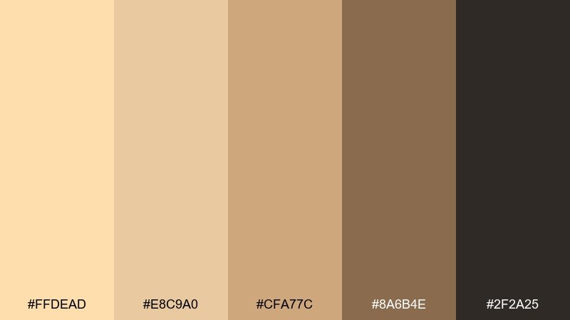
HEX: #FFDEAD #E8C9A0 #CFA77C #8A6B4E #2F2A25
Mood: sunbaked, calm, timeless
Best for: rustic branding and packaging
Sunbaked and calm, this mix feels like linen fabric, warm sand, and weathered wood. It suits rustic branding where you want friendly warmth without looking overly sweet. Pair the cream base with cocoa browns for legible type and add the mid tan for labels and trims. Usage tip: keep the darkest brown for logos and small text so the light tones stay airy.
Image example of desert linen generated using media.io
Media.io is an online AI studio for creating and editing video, image, and audio in your browser.

2) Apricot Clay
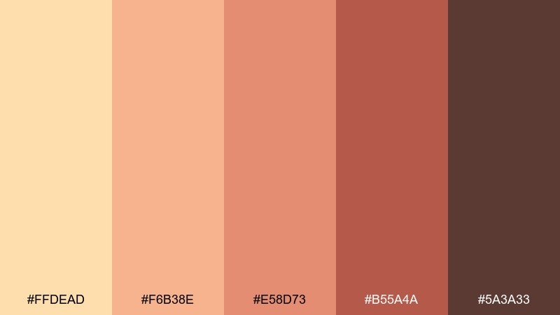
HEX: #FFDEAD #F6B38E #E58D73 #B55A4A #5A3A33
Mood: warm, handmade, inviting
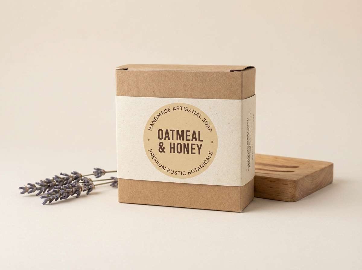
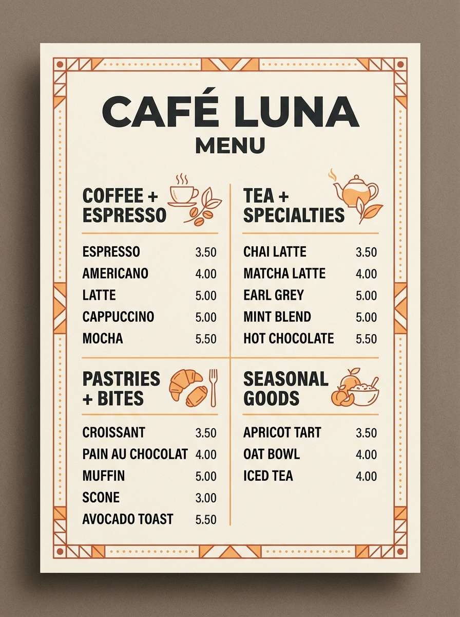
Best for: cafe menu and food posters
Warm and handmade, these tones evoke apricot jam, clay pottery, and toasted crust. They work beautifully on cafe menus, bakery posters, and seasonal specials where appetite appeal matters. Let the creamy base carry the background, then bring in apricot and terracotta for headings and highlights. Usage tip: reserve the deepest brown for prices and small copy to keep contrast crisp.
Image example of apricot clay generated using media.io
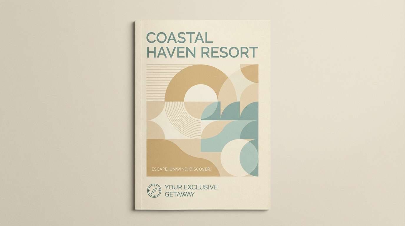
3) Coastal Dune
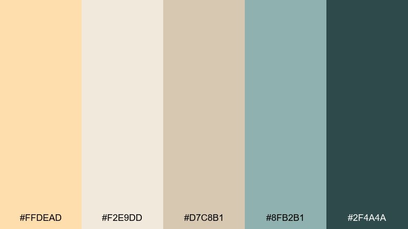
HEX: #FFDEAD #F2E9DD #D7C8B1 #8FB2B1 #2F4A4A
Mood: breezy, relaxed, coastal
Best for: hotel websites and travel brochures
Breezy and relaxed, this set suggests dune grass, driftwood, and sea-glass calm. It fits boutique hotel sites and travel brochures that need softness with a clean, modern edge. Use the pale cream and sand for large sections, then lean on muted teal for buttons and links. Usage tip: keep the dark teal for navigation and headings to maintain clarity on light backgrounds.
Image example of coastal dune generated using media.io
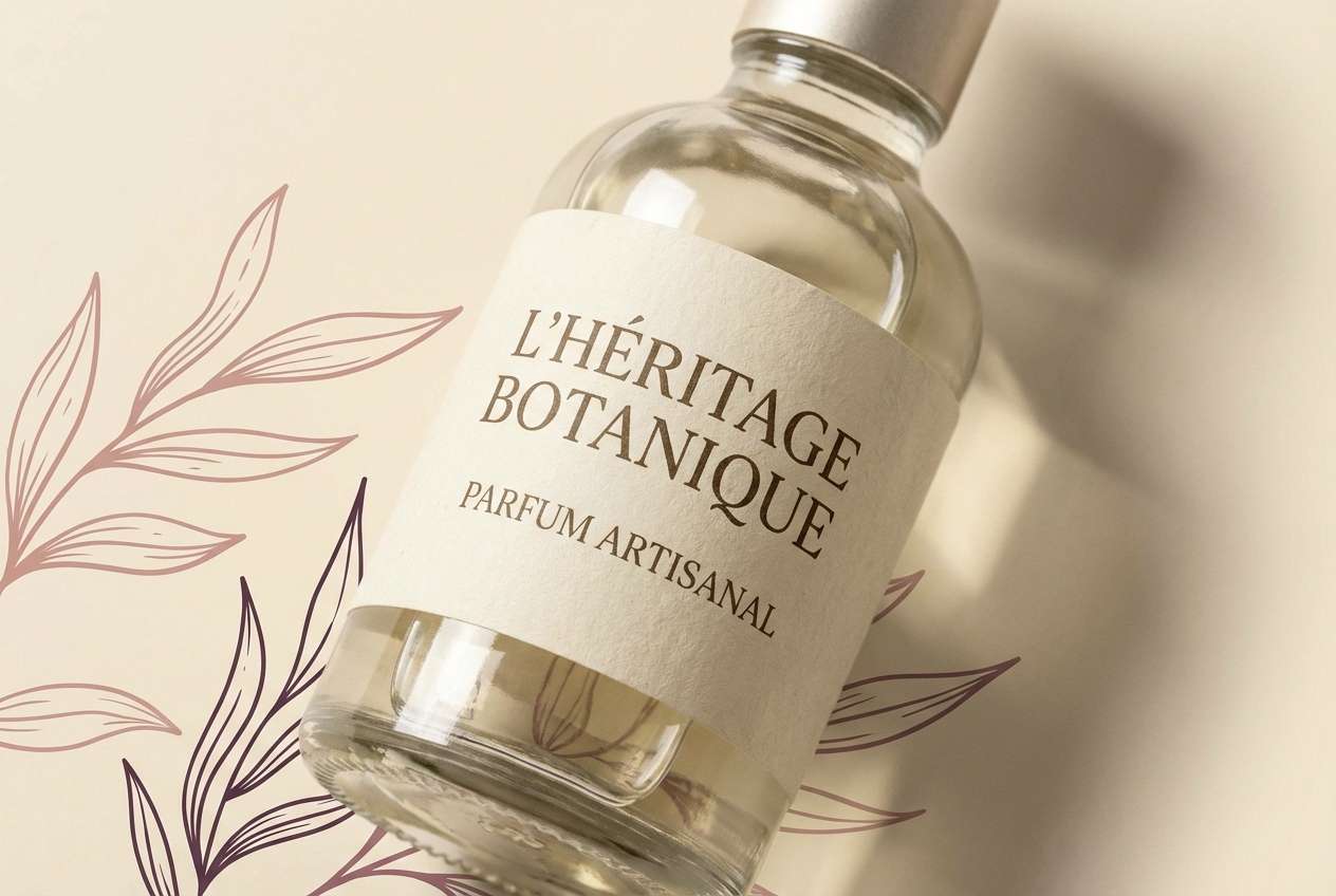
4) Vintage Parlor
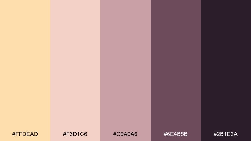
HEX: #FFDEAD #F3D1C6 #C9A0A6 #6E4B5B #2B1E2A
Mood: romantic, nostalgic, intimate
Best for: beauty branding and boutique labels
Romantic and nostalgic, these navajo white hues feel like blush velvet, antique roses, and candlelit corners. They shine for boutique beauty labels and perfume branding that wants softness with a little mystery. Balance the creamy base with dusty rose for backgrounds and use plum for logos and borders. Usage tip: apply the near-black sparingly as fine lines so the palette keeps its vintage glow.
Image example of vintage parlor generated using media.io
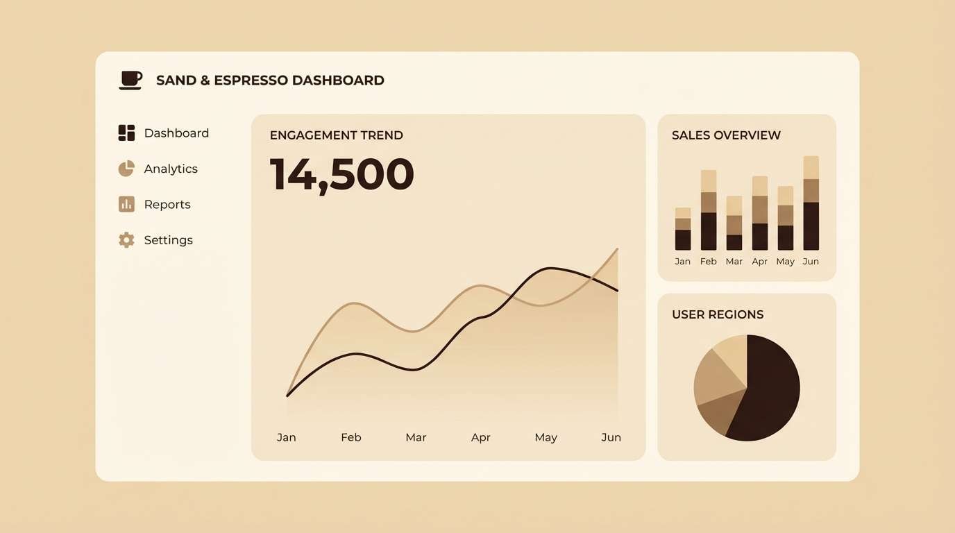
5) Minimal Cafe
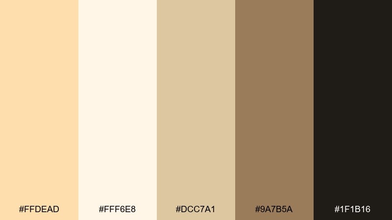
HEX: #FFDEAD #FFF6E8 #DCC7A1 #9A7B5A #1F1B16
Mood: clean, cozy, modern
Best for: minimal UI and dashboard themes
Clean and cozy, this navajo white color palette reads like steamed milk, oat biscuits, and espresso depth. It is a strong choice for minimal UI where you want warmth without losing structure. Use the near-white for surfaces, navajo white for cards, and espresso for text and icons. Usage tip: keep the mid brown for focus states and subtle dividers instead of heavy borders.
Image example of minimal cafe generated using media.io
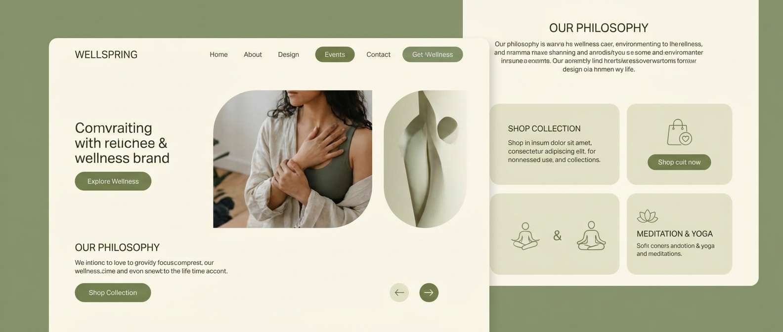
6) Sage Window
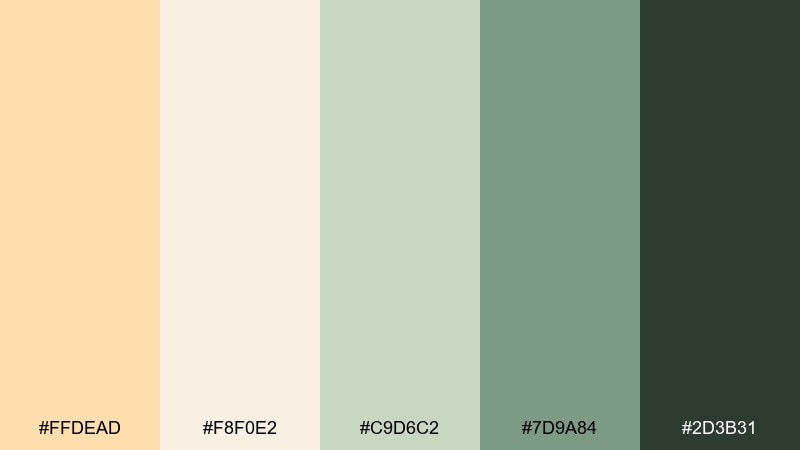
HEX: #FFDEAD #F8F0E2 #C9D6C2 #7D9A84 #2D3B31
Mood: fresh, airy, grounded
Best for: wellness landing pages
Fresh and airy, these shades resemble sunlit curtains, sage leaves, and shaded garden paths. They suit wellness landing pages where calm trust is more important than loud contrast. Let the creams carry generous whitespace, then use sage and olive for CTAs and icons. Usage tip: choose the darkest green for headings so the softer greens can stay soothing accents.
Image example of sage window generated using media.io
7) Terracotta Hearth
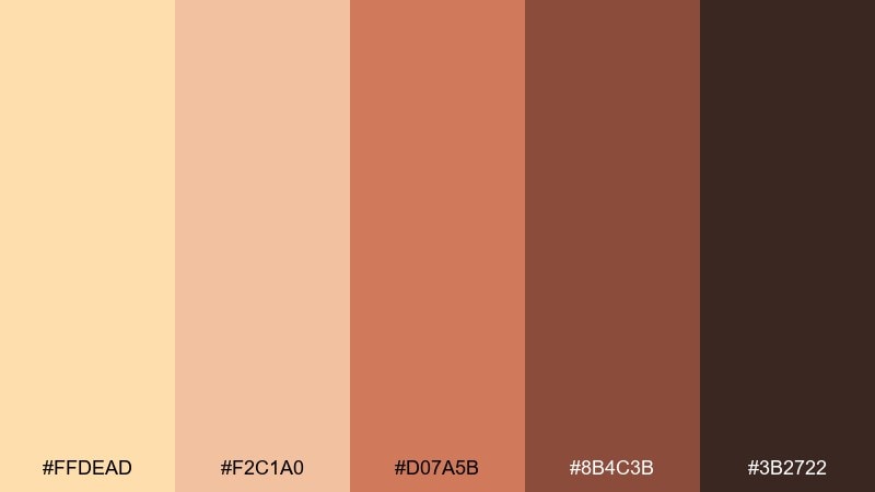
HEX: #FFDEAD #F2C1A0 #D07A5B #8B4C3B #3B2722
Mood: cozy, earthy, fireside
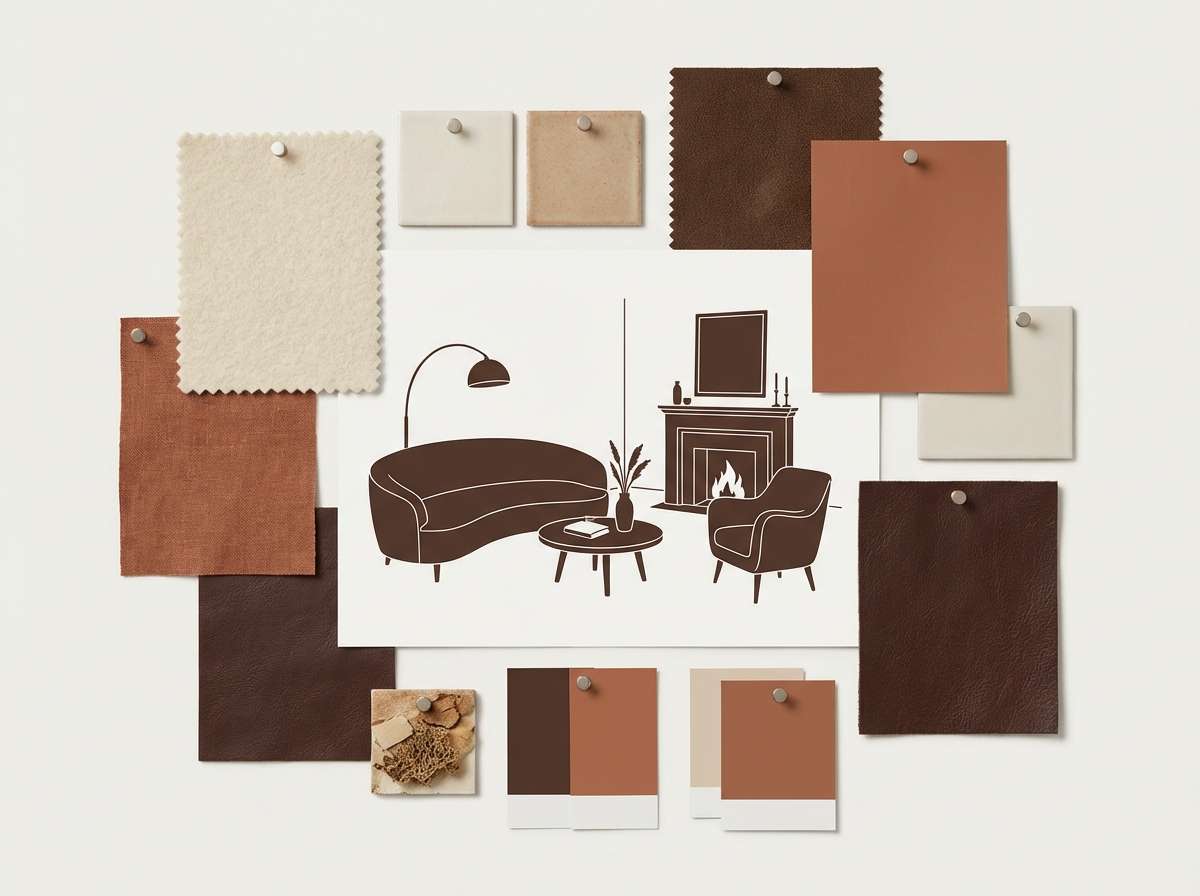
Best for: living room interiors and paint planning
Cozy and earthy, this lineup brings to mind a terracotta hearth, warm plaster, and late-afternoon glow. These navajo white color combinations feel especially natural in living rooms, kitchens, and entryways. Use the creamy tone for walls, terracotta for accents like textiles, and the deep brown for hardware or framing. Usage tip: repeat the mid clay shade in two places (rug and artwork) to make the room feel intentional.
Image example of terracotta hearth generated using media.io
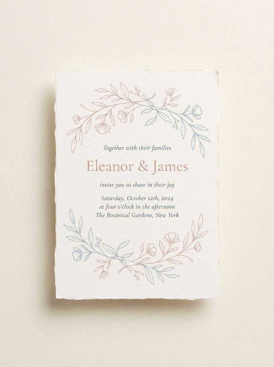
8) Blush Wedding
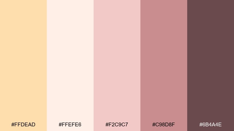
HEX: #FFDEAD #FFEFE6 #F2C9C7 #C98D8F #6B4A4E
Mood: soft, romantic, celebratory
Best for: wedding invitations and stationery
Soft and celebratory, these navajo white tones feel like blush petals, champagne foam, and silk ribbons. They are ideal for wedding invitations when you want romance with readable typography. Keep the background creamy, use blush for borders and motifs, and lean on the deeper rose-brown for names and key details. Usage tip: add a thin line rule in the muted rose to organize sections without heavy boxes.
Image example of blush wedding generated using media.io
9) Warm Nordic
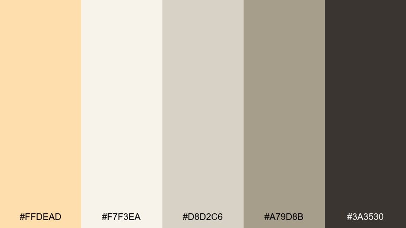
HEX: #FFDEAD #F7F3EA #D8D2C6 #A79D8B #3A3530
Mood: minimal, warm, balanced
Best for: scandinavian-style interiors
Minimal and balanced, this navajo white color palette recalls light wood, knit throws, and soft winter daylight. It is perfect for Scandinavian-style interiors that need warmth without turning yellow. Use the pale cream as a base, add greige for furniture and rugs, and keep the charcoal for contrast in fixtures. Usage tip: stick to matte finishes so the subtle neutrals read rich rather than flat.
Image example of warm nordic generated using media.io

10) Golden Hour
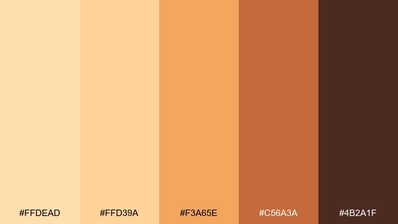
HEX: #FFDEAD #FFD39A #F3A65E #C56A3A #4B2A1F
Mood: glowing, optimistic, energetic
Best for: social media promos for creators
Glowing and optimistic, these colors capture golden hour light, citrus zest, and warm caramel. They are great for creator promos where you want energy without harsh neon. Use the cream for breathing room, then push orange and copper for headline blocks and stickers. Usage tip: keep the darkest brown for tiny text overlays to ensure readability on bright gradients.
Image example of golden hour generated using media.io

11) Soft Contrast UI
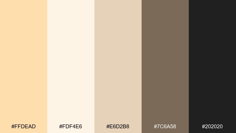
HEX: #FFDEAD #FDF4E6 #E6D2B8 #7C6A58 #202020
Mood: polished, friendly, readable
Best for: app UI kits and design systems
Polished and friendly, this set feels like warm paper with confident ink. As a navajo white color palette for UI kits, it delivers soft surfaces while keeping text sharp and accessible. Use the light creams for backgrounds, the taupe for secondary elements, and the near-black for primary type and icons. Usage tip: define two neutral layers (surface and card) so elevation is clear even without shadows.
Image example of soft contrast ui generated using media.io
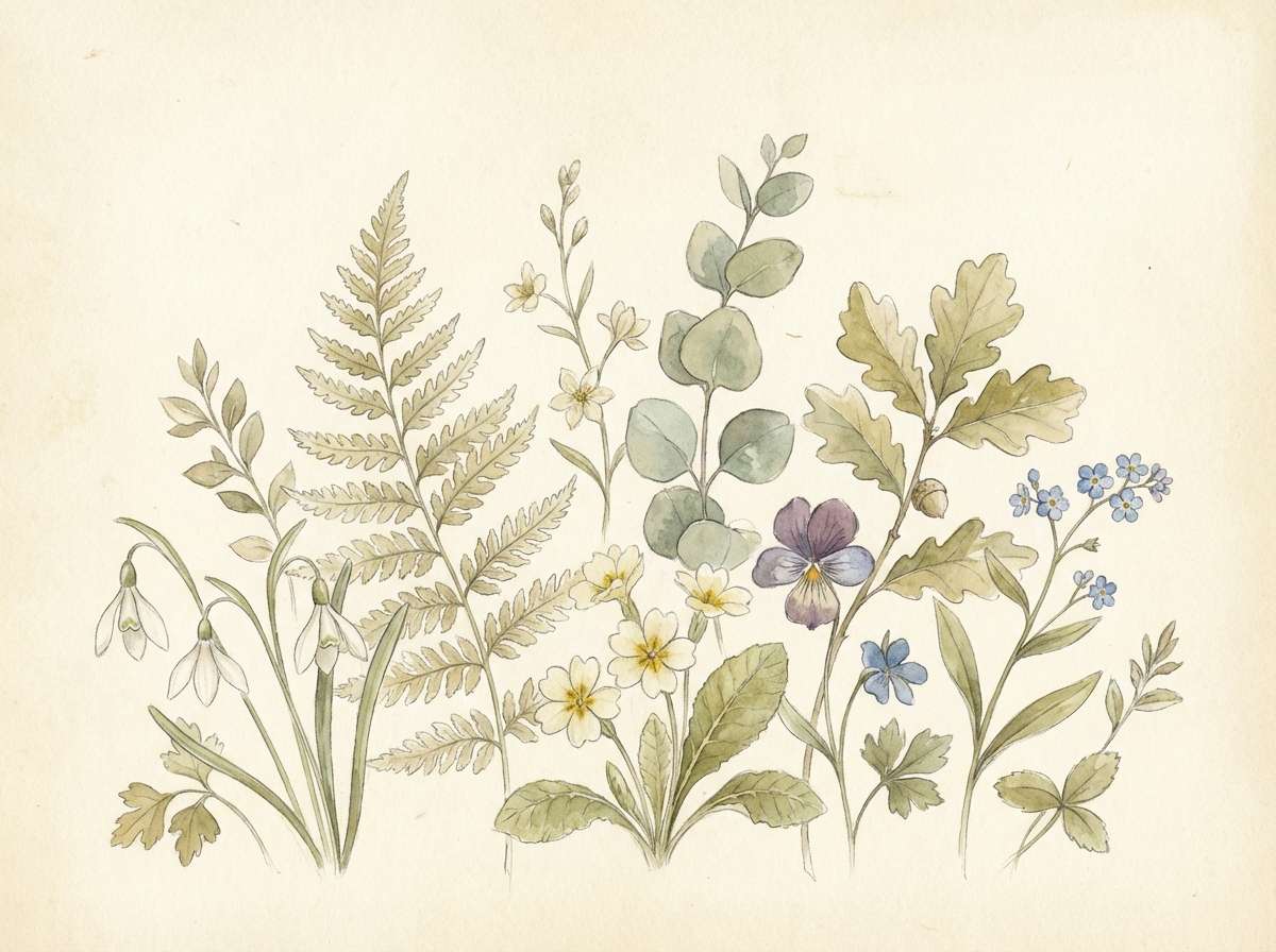
12) Botanical Cream
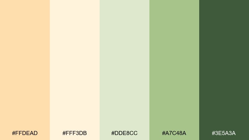
HEX: #FFDEAD #FFF3DB #DDE8CC #A7C48A #3E5A3A
Mood: springy, natural, uplifting
Best for: botanical illustrations and labels
Springy and natural, these tones suggest fresh shoots, creamy petals, and sunlit greenery. They work well for botanical labels and gentle packaging that feels eco-minded. Let the cream tones frame the artwork, then use leaf green as the hero accent and the deep green for outlines. Usage tip: keep gradients subtle so the illustration stays light and airy.
Image example of botanical cream generated using media.io
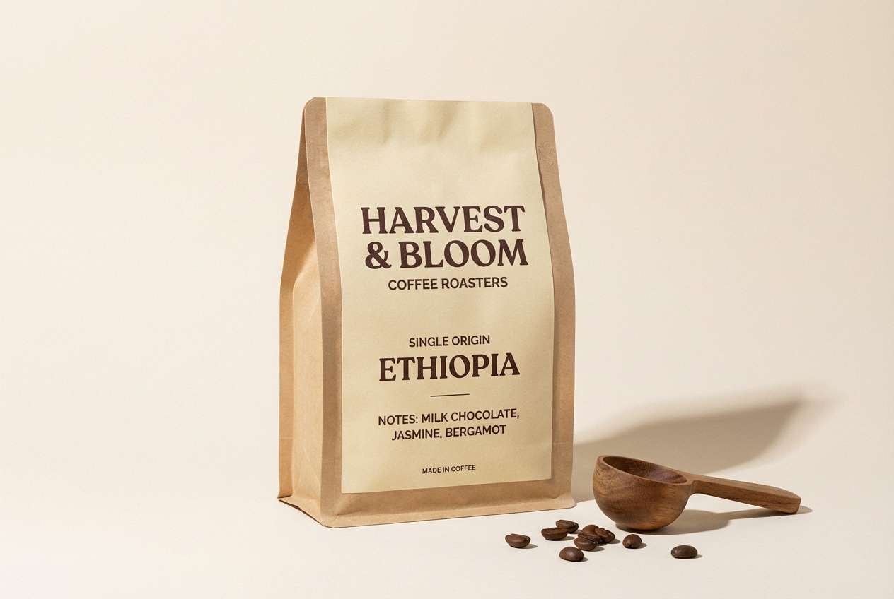
13) Chocolate Spice
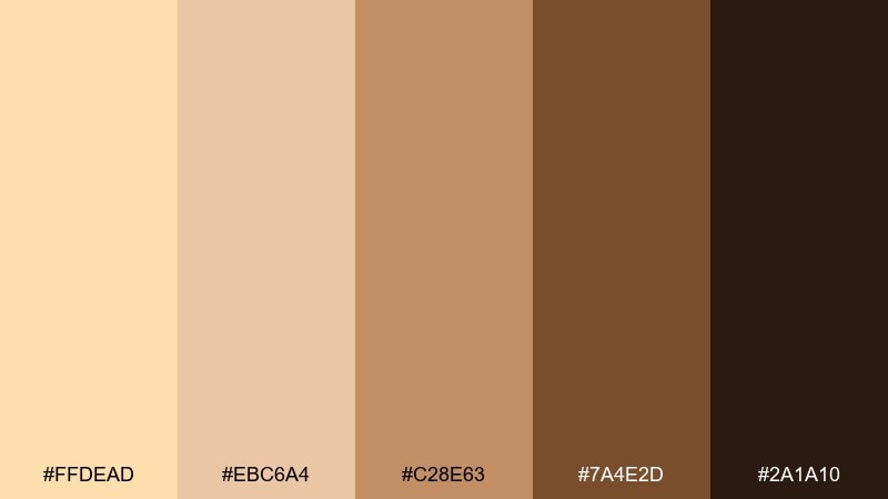
HEX: #FFDEAD #EBC6A4 #C28E63 #7A4E2D #2A1A10
Mood: rich, comforting, indulgent
Best for: coffee packaging and ads
Rich and comforting, this mix reads like cocoa dust, brown sugar, and roasted beans. It is ideal for coffee packaging and ads that want to feel premium but approachable. Use the cream and tan for bag backgrounds, then push espresso and dark cocoa for badges and flavor notes. Usage tip: add small tan highlights around icons so dark elements do not look too heavy.
Image example of chocolate spice generated using media.io
14) Peachy Nursery
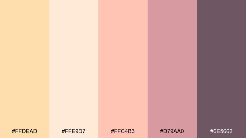
HEX: #FFDEAD #FFE9D7 #FFC4B3 #D79AA0 #6E5662
Mood: sweet, gentle, comforting
Best for: nursery decor and baby shower invites
Sweet and gentle, these navajo white colors feel like peach sherbet, cotton blankets, and soft dusk. They are great for nursery decor and baby shower invites where the vibe should stay soothing. Keep the warm cream dominant, use peach for playful shapes, and ground it with muted mauve for text. Usage tip: limit the darker shade to small headings so the design stays light.
Image example of peachy nursery generated using media.io

15) Stone and Sand
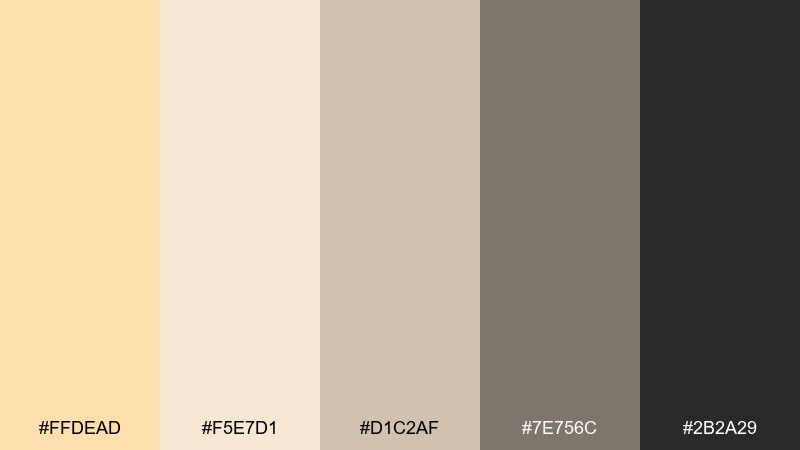
HEX: #FFDEAD #F5E7D1 #D1C2AF #7E756C #2B2A29
Mood: neutral, architectural, steady
Best for: real estate brochures and listings
Neutral and steady, this set evokes sandstone blocks, smooth concrete, and clean lines. It works for real estate brochures where you want a polished look that does not distract from photos. Use the creams for margins and info panels, then rely on stone gray for captions and icons. Usage tip: keep black for key numbers and section headers to guide scanning.
Image example of stone and sand generated using media.io
16) Copper Luxe
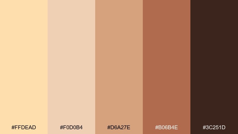
HEX: #FFDEAD #F0D0B4 #D6A27E #B06B4E #3C251D
Mood: luxurious, warm, refined
Best for: jewelry ads and premium landing pages
Luxurious and warm, these navajo white hues suggest polished copper, satin highlights, and a creamy glow. They make elegant navajo white color combinations for jewelry ads and premium landing pages. Use the light tones as soft backdrop, then bring copper and chestnut into product callouts and buttons. Usage tip: introduce metallic texture only in small areas so the palette stays sophisticated, not flashy.
Image example of copper luxe generated using media.io

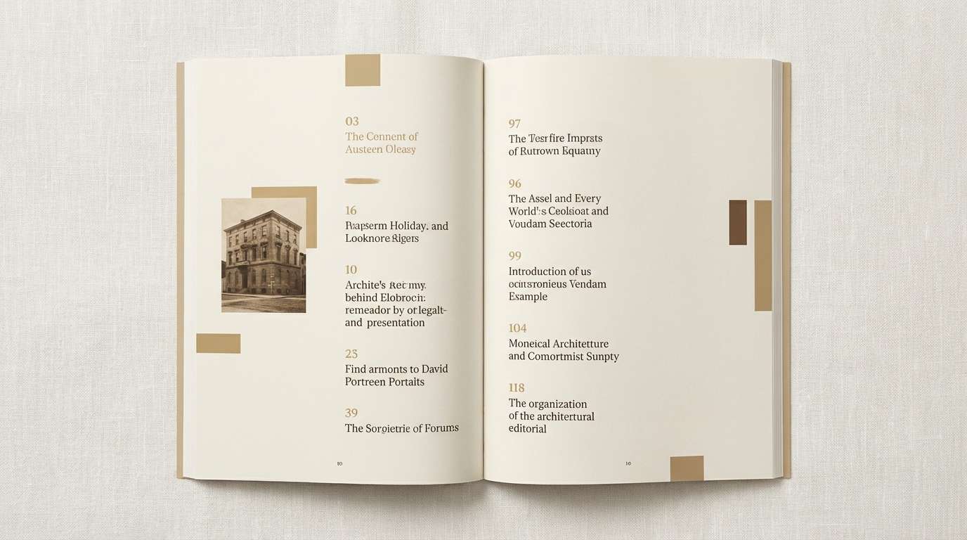
17) Sunlit Editorial
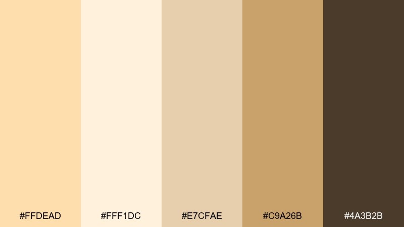
HEX: #FFDEAD #FFF1DC #E7CFAE #C9A26B #4A3B2B
Mood: bright, curated, magazine-like
Best for: editorial layouts and lookbooks
Bright and curated, this navajo white color palette feels like sunlit pages, vintage paper stock, and warm highlights. It is a great fit for lookbooks that need a soft neutral base with golden sophistication. Use creams for page backgrounds, gold-tan for section headers, and deep brown for body text. Usage tip: keep color blocks narrow to preserve an editorial, airy rhythm.
Image example of sunlit editorial generated using media.io
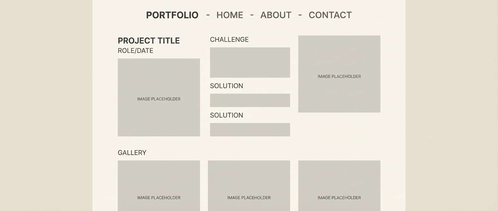
18) Quiet Gallery
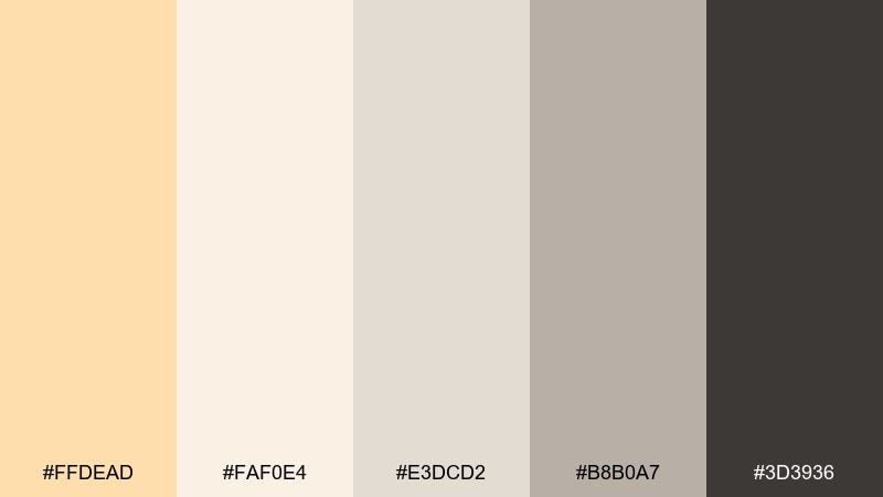
HEX: #FFDEAD #FAF0E4 #E3DCD2 #B8B0A7 #3D3936
Mood: quiet, modern, understated
Best for: portfolio websites and case studies
Quiet and understated, these neutrals resemble gallery walls, matte frames, and soft shadows. They are ideal for portfolios where the work should take center stage. Use the warm off-white for backgrounds, the light gray for cards, and the charcoal for navigation and captions. Usage tip: keep accent usage minimal and rely on spacing to create hierarchy.
Image example of quiet gallery generated using media.io
19) Autumn Picnic
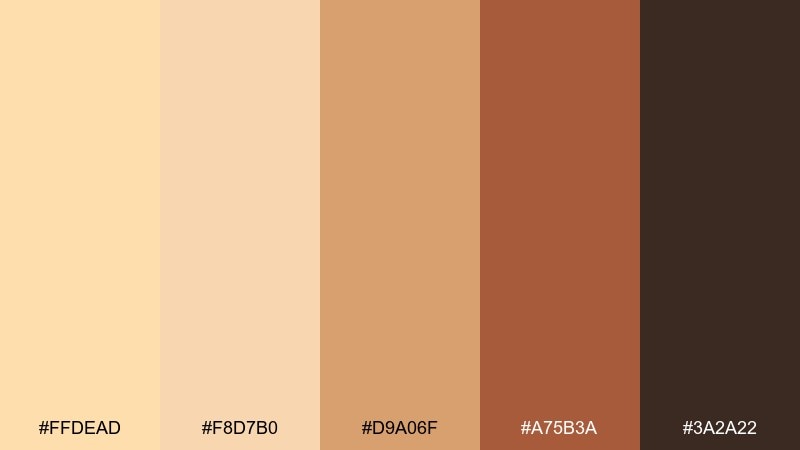
HEX: #FFDEAD #F8D7B0 #D9A06F #A75B3A #3A2A22
Mood: cozy, seasonal, friendly
Best for: fall event flyers
Cozy and seasonal, these colors conjure fallen leaves, warm pastries, and picnic blankets. They are well suited to fall event flyers that need warmth and quick readability. Use the cream as the base, then alternate caramel and rust for banners and callouts. Usage tip: set important details in the dark brown and avoid placing small text on the mid orange.
Image example of autumn picnic generated using media.io

20) Nightfall Neutrals
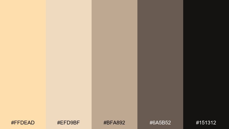
HEX: #FFDEAD #EFD9BF #BFA892 #6A5B52 #151312
Mood: moody, elegant, grounded
Best for: modern branding with dark mode accents
Moody and grounded, these shades feel like late-evening light over warm stone. The contrast between creamy beige and near-black creates confident brand presence without looking stark. Use the dark tone for hero sections, then bring in warm beige for cards and highlights. Usage tip: add generous padding around light text on dark backgrounds to keep it luxurious and readable.
Image example of nightfall neutrals generated using media.io

21) Honeyed Canvas
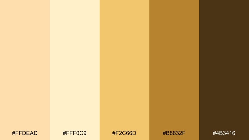
HEX: #FFDEAD #FFF0C9 #F2C66D #B8832F #4B3416
Mood: sunny, creative, optimistic
Best for: handmade product labels
Sunny and creative, this set looks like honey drizzle, warm canvas, and golden craft paper. It is a friendly fit for handmade labels where you want an upbeat, artisanal feel. Use the pale cream for the main label field, then bring in honey gold for stamps and icons. Usage tip: keep the deep brown for batch numbers and small legal text for maximum clarity.
Image example of honeyed canvas generated using media.io
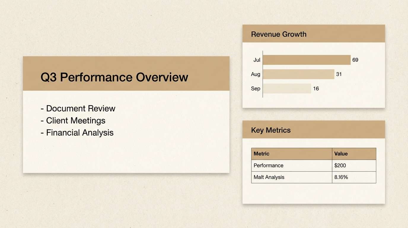
22) Paper and Ink
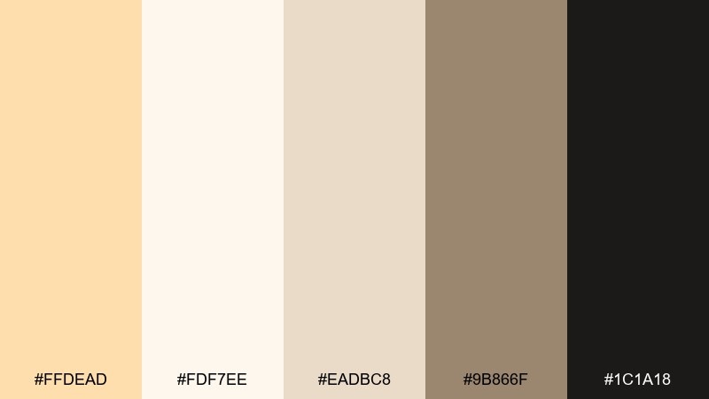
HEX: #FFDEAD #FDF7EE #EADBC8 #9B866F #1C1A18
Mood: classic, readable, professional
Best for: documents, reports, and slide decks
Classic and readable, these tones mimic creamy paper, soft shadows, and inked margins. As a navajo white color palette for reports and slides, it keeps pages warm while staying highly legible. Use the lightest cream for backgrounds, the tan for section blocks, and near-black for text and charts. Usage tip: apply the mid taupe to secondary charts so primary data still stands out.
Image example of paper and ink generated using media.io
What Colors Go Well with Navajo White?
Navajo White works best with grounded neutrals like cocoa brown, espresso, greige, and charcoal—these give it structure and keep typography readable. For a soft, premium look, pair it with warm metallics (copper, gold-tan) in small doses.
If you want a fresher direction, muted greens (sage, olive) and dusty teals add calm contrast without breaking the cozy feel. For playful warmth, peach and terracotta create a sunlit, handmade vibe that still feels refined.
When in doubt, choose one dark anchor (for text/nav), one mid tone (for UI borders, secondary blocks), and let navajo white handle the largest surfaces.
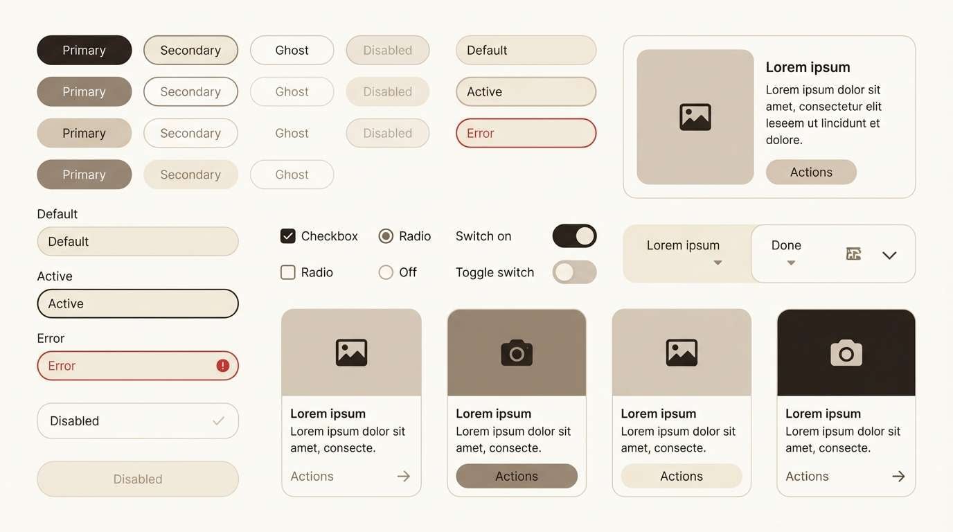
How to Use a Navajo White Color Palette in Real Designs
For branding, use navajo white as packaging space or website background to make logos and product shots feel warmer and more approachable. Pair it with a deep brown/near-black for type, then add one accent color for highlights like badges, buttons, or callouts.
For UI, define at least two light layers (e.g., background vs. card) so layouts don’t look flat. Use the darker shade for primary text and icons, and keep accent colors consistent for interactive states (hover, focus, active).
For interiors, treat navajo white as a wall or base paint, then repeat your accent (terracotta, sage, teal) across two to three elements—textiles, art, and small decor—to make the room feel cohesive.
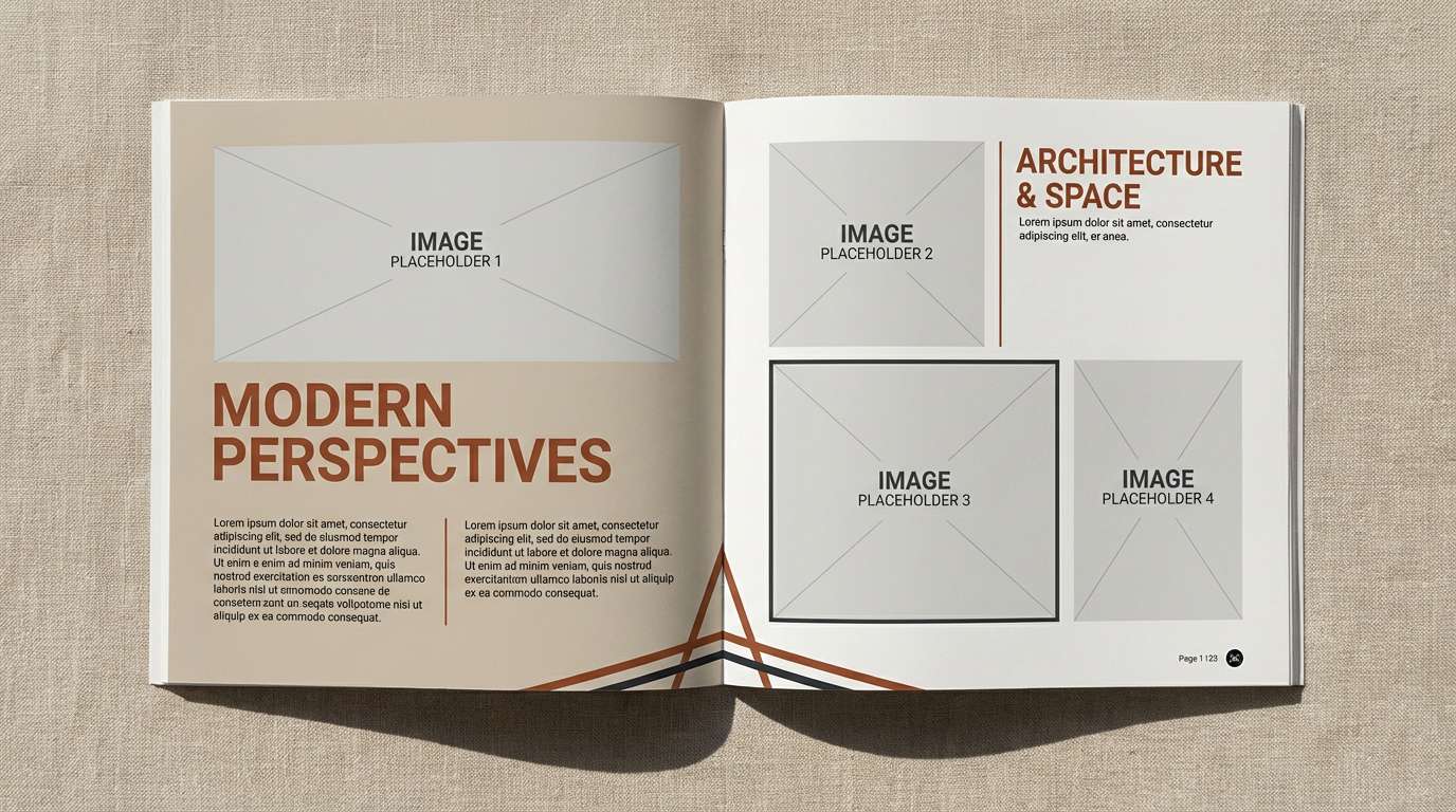
Create Navajo White Palette Visuals with AI
If you’re pitching a concept or building a mood board, AI-generated visuals help you validate a palette before production. With Media.io, you can turn each palette prompt into posters, UI mockups, packaging shots, and editorial layouts in minutes.
Start by reusing the prompts above, then tweak the subject (menu, landing page, label) while keeping the same five HEX colors as your guide. This keeps your exploration fast and your results consistent.
Once you find a direction you like, generate a small set of variations (light, dark, seasonal) so your brand or design system has room to scale.
Navajo White Color Palette FAQs
-
What is the HEX code for Navajo White?
Navajo White is commonly represented as #FFDEAD. It’s a warm, creamy light tone that works well as a background neutral. -
Is Navajo White more beige or more yellow?
Navajo White reads as a warm cream that leans slightly peach/yellow compared to cooler beiges. Pairing it with greige or charcoal can reduce any “yellow” feel. -
What dark color gives the best contrast with Navajo White?
Near-black and deep espresso browns provide the cleanest contrast for text and icons. Charcoal also works well if you want a softer, less stark look. -
Can I use Navajo White in a modern UI design?
Yes. Use it for cards or backgrounds, then add a dark anchor for typography and one muted accent (sage, teal, terracotta) for buttons and highlights. -
What colors pair well with Navajo White for a cozy interior?
Terracotta, warm wood browns, and clay tones create a fireside, earthy feel. Add a deep brown for framing/hardware to keep the palette grounded. -
Does Navajo White work for wedding invitations?
It’s a great base for wedding stationery because it feels soft and premium while staying readable. Combine it with blush or dusty rose and use a deeper rose-brown for names and key details. -
How do I keep a Navajo White palette from looking flat?
Use at least one mid-tone neutral (taupe/stone gray) for structure and one dark tone for contrast. In layouts, create clear layer separation (background vs. card) and rely on spacing for hierarchy.
Next: Jade Color Palette


