

A wild west color palette captures the heat of desert light, the texture of worn leather, and the quiet drama of night skies. It’s a look that feels rugged, nostalgic, and instantly recognizable.
Below are 20+ wild west color palette ideas with HEX codes—built for branding, posters, UI, packaging, and content that needs a warm, earthy backbone with bold accents.
In this article
- Why Wild West Palettes Work So Well
-
- dusty saddle neutrals
- desert sunset trails
- prairie sage and sand
- saloon velvet and brass
- canyon clay mix
- denim and dune
- cactus bloom pastels
- whiskey barrel browns
- rodeo poster punch
- gold rush minimal
- mesa nightfall
- tobacco and linen
- adobe and agave
- bandana red accents
- spur and silver
- sunbaked orchard
- frontier cabin cozy
- dust storm grays
- stagecoach signboard
- wildflower range
- copper creek contrast
- What Colors Go Well with Wild West?
- How to Use a Wild West Color Palette in Real Designs
- Create Wild West Palette Visuals with AI
Why Wild West Palettes Work So Well
Wild west colors are grounded in real materials—sand, wood, denim, metal, clay—so they feel believable and timeless. That natural foundation makes designs look warmer, more tactile, and less “digital-flat.”
They also balance neutrals with strong accent potential. You can build a calm interface with sage and sand, then add punch with terracotta, brass gold, or bandana red when you need hierarchy and energy.
Most western color schemes naturally support vintage typography and print-inspired layouts. Even modern brands can borrow that heritage feel to signal durability, craft, and story.
20+ Wild West Color Palette Ideas (with HEX Codes)
1) Dusty Saddle Neutrals
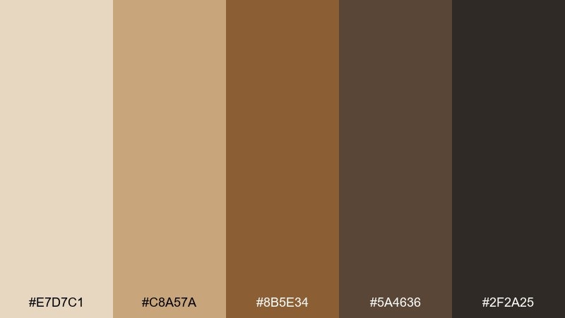
HEX: #E7D7C1 #C8A57A #8B5E34 #5A4636 #2F2A25
Mood: rugged, grounded, timeless
Best for: heritage brand identity and leather goods packaging
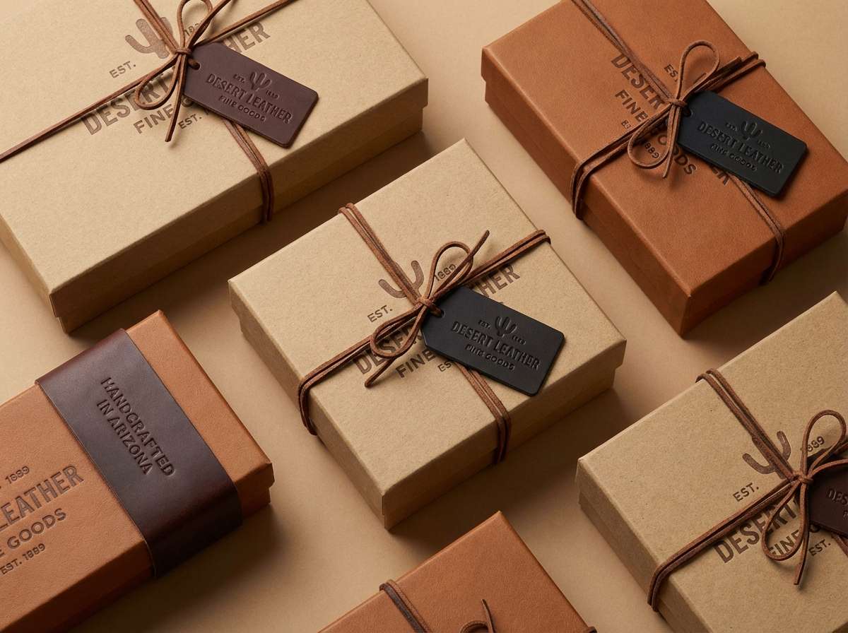
Rugged saddle leather and sun-bleached canvas set a grounded, timeless tone. These warm neutrals work beautifully on heritage logos, hang tags, and minimalist packaging where texture matters. Pair with uncoated paper, debossing, or a single metallic ink for restraint. Usage tip: keep the darkest brown for type and outlines to maintain contrast on kraft-like backgrounds.
Image example of dusty saddle neutrals generated using media.io
Media.io is an online AI studio for creating and editing video, image, and audio in your browser.

2) Desert Sunset Trails
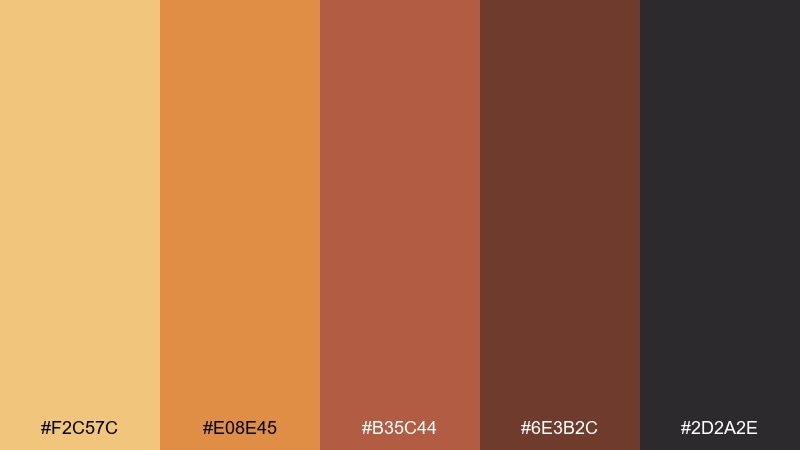
HEX: #F2C57C #E08E45 #B35C44 #6E3B2C #2D2A2E
Mood: adventurous, warm, cinematic
Best for: travel poster and event flyer design
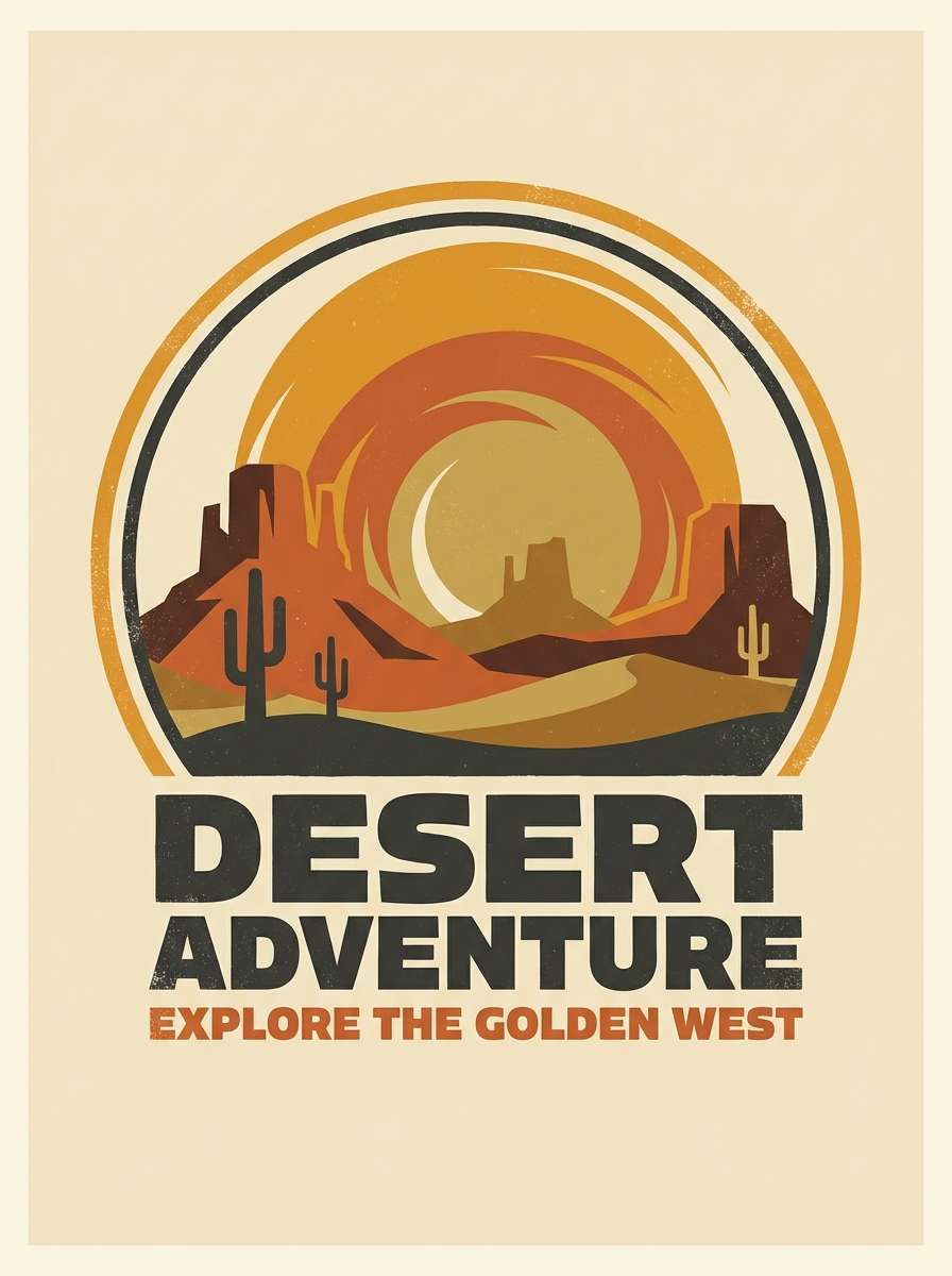
Adventurous sunset heat and dusty trails give this set a cinematic glow. This wild west color schemes shine on posters and flyers where you want bold warmth without going neon. Pair with cream backgrounds and chunky slab-serif type for a vintage print feel. Usage tip: use the dark charcoal for small text to keep readability over orange gradients.
Image example of desert sunset trails generated using media.io
3) Prairie Sage and Sand
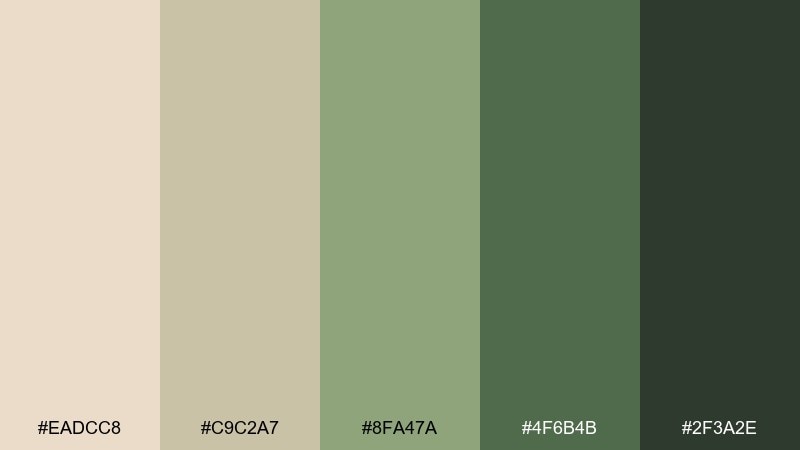
HEX: #EADCC8 #C9C2A7 #8FA47A #4F6B4B #2F3A2E
Mood: calm, natural, airy
Best for: wellness website UI and eco product branding
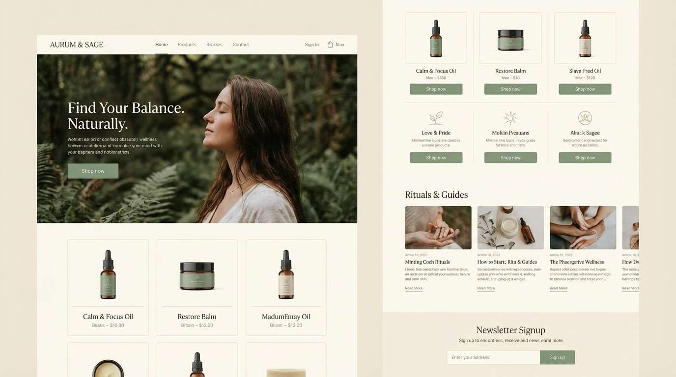
Calm prairie air and soft sagebrush greens create a breathable, natural look. The gentle contrast makes it great for wellness UI, eco landing pages, and calm brand systems. Pair with warm ivory whitespace and subtle line icons for a clean, organic finish. Usage tip: reserve the deepest green for primary buttons so the interface stays light.
Image example of prairie sage and sand generated using media.io
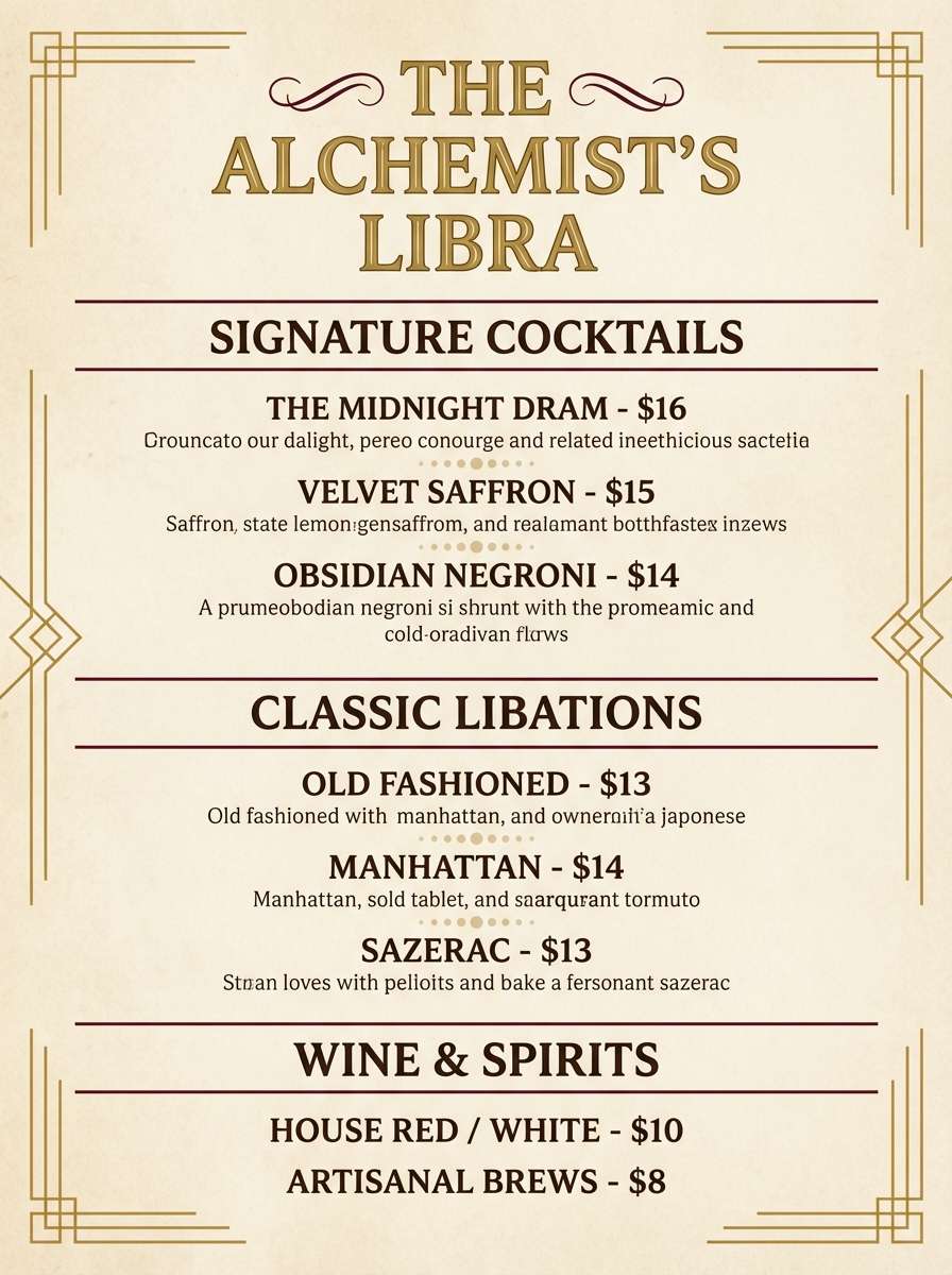
4) Saloon Velvet and Brass
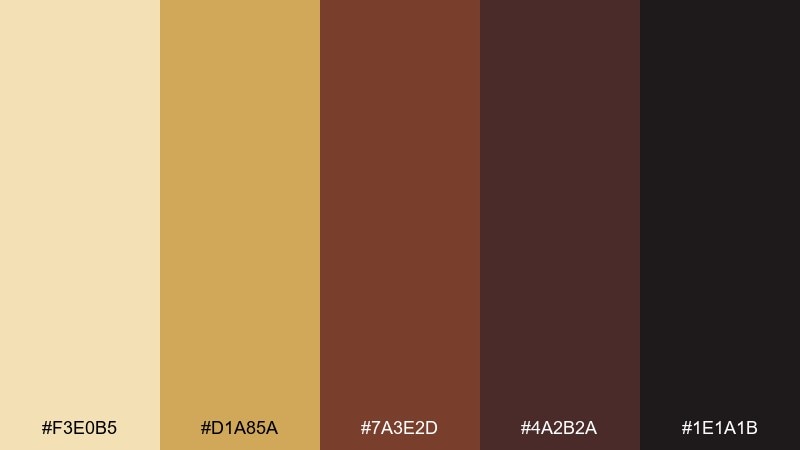
HEX: #F3E0B5 #D1A85A #7A3E2D #4A2B2A #1E1A1B
Mood: moody, luxe, vintage
Best for: cocktail bar menu and nightlife branding
Moody velvet shadows and warm brass highlights bring a luxe, vintage atmosphere. This wild west color palette fits menus, labels, and nightlife branding that wants richness without bright primaries. Pair with serif typography and thin brass-like rules to emphasize elegance. Usage tip: keep the gold to small accents so the deep maroons stay in control.
Image example of saloon velvet and brass generated using media.io
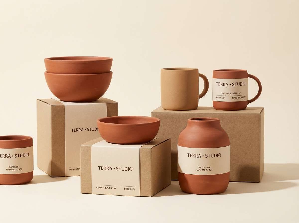
5) Canyon Clay Mix
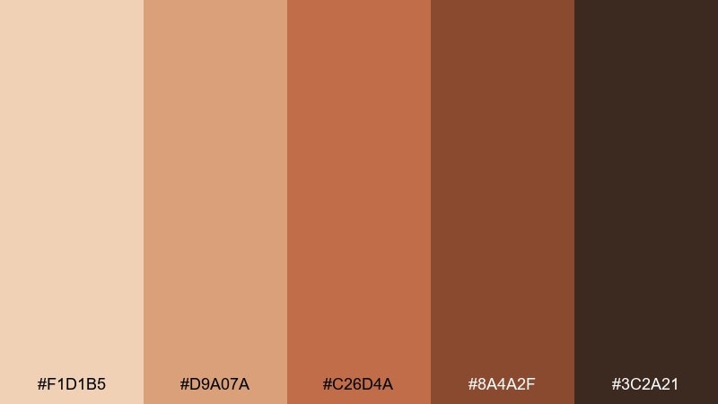
HEX: #F1D1B5 #D9A07A #C26D4A #8A4A2F #3C2A21
Mood: earthy, handmade, warm
Best for: ceramics brand packaging and Etsy shop visuals
Earthy canyon clay and sun-warmed terracotta give a handmade, welcoming vibe. These wild west tones look especially good on product labels, ceramic packaging, and small business storefront graphics. Pair with off-white space and simple stamp-style icons for an artisan feel. Usage tip: use the mid terracotta as a hero color and let the darkest brown anchor your logo.
Image example of canyon clay mix generated using media.io
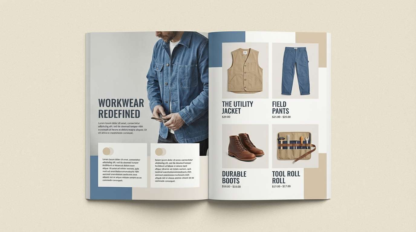
6) Denim and Dune
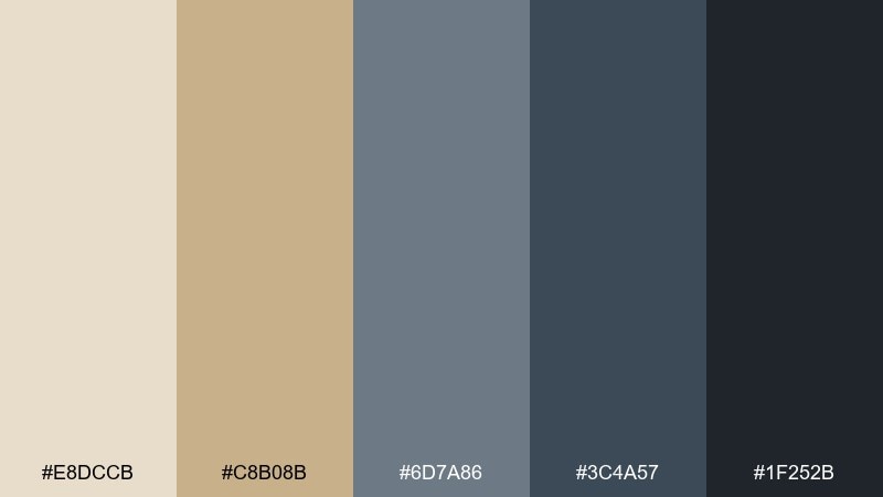
HEX: #E8DCCB #C8B08B #6D7A86 #3C4A57 #1F252B
Mood: cool, rugged, modern
Best for: workwear ecommerce banners and editorial layouts
Cool denim blue against dune beige feels rugged but surprisingly modern. This wild west color scheme works well for workwear ecommerce visuals, editorial grids, and product callouts where you want calm contrast. Pair with monochrome photography and sandy UI surfaces to keep it cohesive. Usage tip: keep the darkest blue-gray for navigation and price text to avoid a washed-out look.
Image example of denim and dune generated using media.io
7) Cactus Bloom Pastels
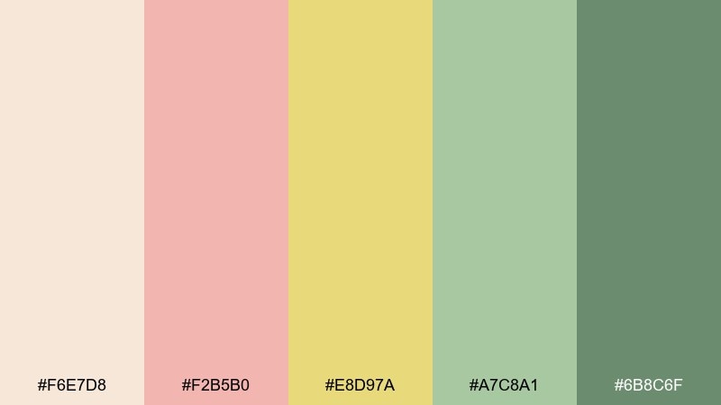
HEX: #F6E7D8 #F2B5B0 #E8D97A #A7C8A1 #6B8C6F
Mood: soft, friendly, sunlit
Best for: spring illustration sets and boutique social posts
Soft cactus blooms and sunlit petals create a friendly, airy look. These pastels are perfect for spring illustration packs, boutique social templates, and gentle lifestyle branding. Pair with thin line art and generous cream space to keep it fresh. Usage tip: let the muted green do the grounding while pink and yellow stay as accents.
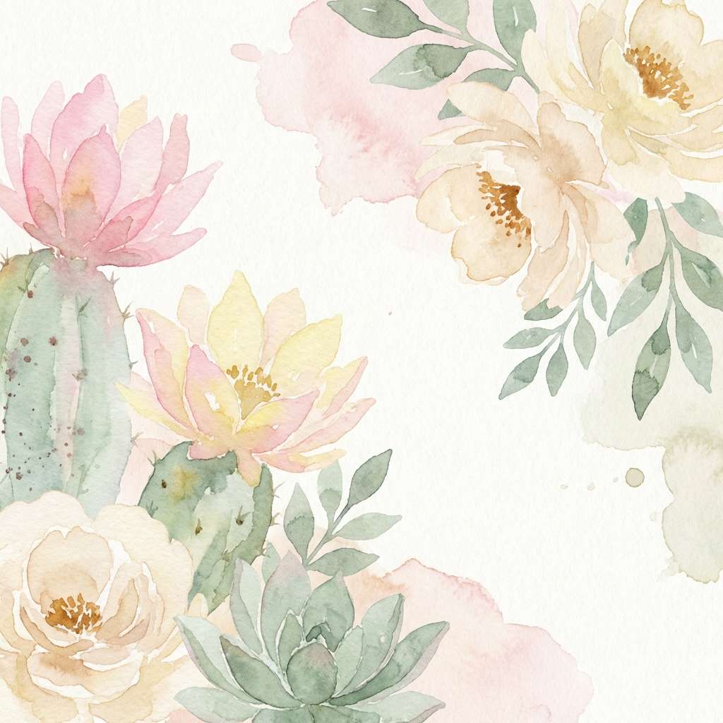
Image example of cactus bloom pastels generated using media.io
8) Whiskey Barrel Browns
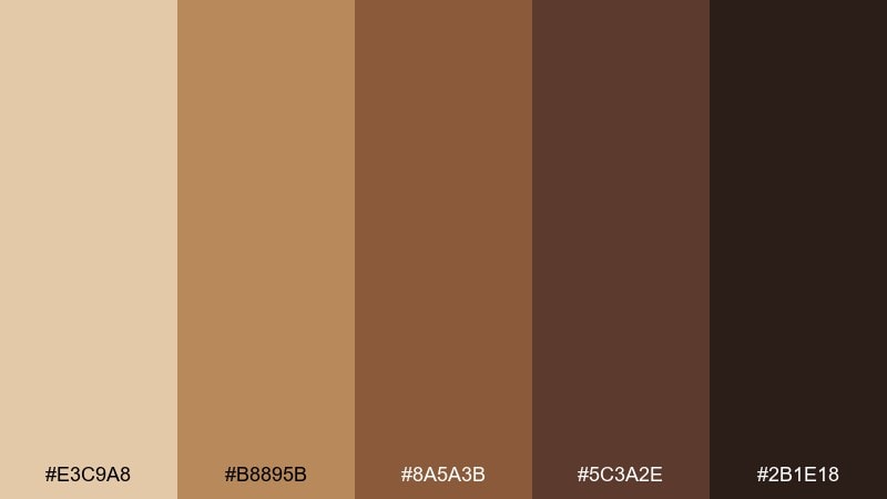
HEX: #E3C9A8 #B8895B #8A5A3B #5C3A2E #2B1E18
Mood: cozy, smoky, classic
Best for: spirits label design and bar signage
Cozy whiskey warmth and toasted oak depth make this set feel classic and smoky. This wild west color palette suits spirits labels, bar signage, and premium product pages that lean into heritage. Pair with cream stock, engraved-style typography, and subtle grain textures. Usage tip: keep the near-black brown for fine print so details stay crisp on warm midtones.
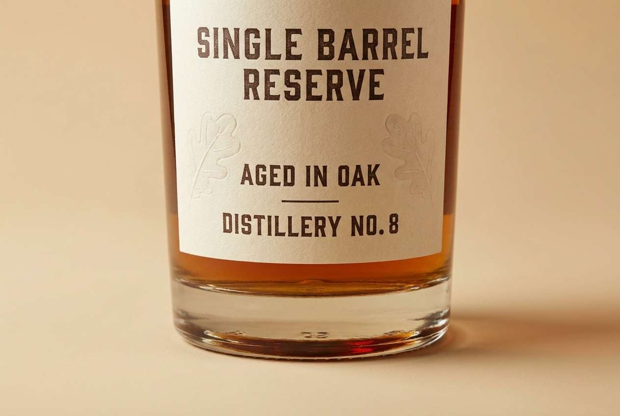
Image example of whiskey barrel browns generated using media.io
9) Rodeo Poster Punch
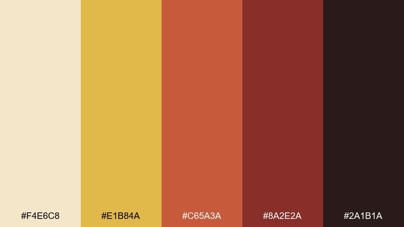
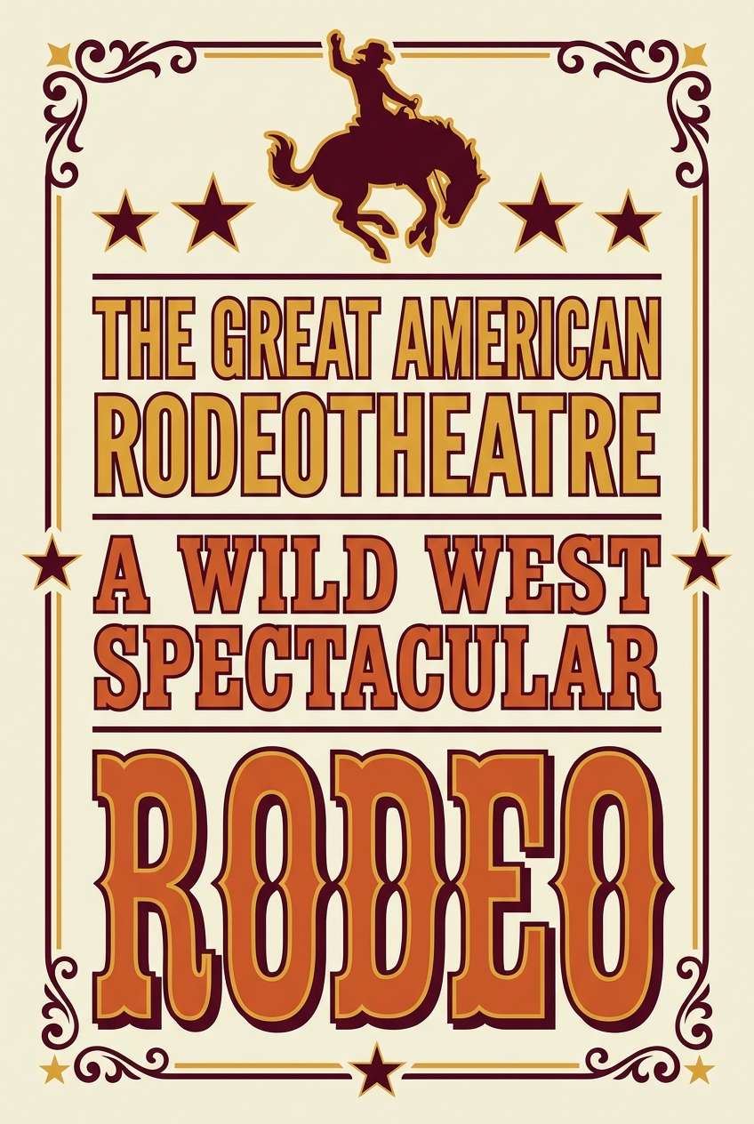
HEX: #F4E6C8 #E1B84A #C65A3A #8A2E2A #2A1B1A
Mood: bold, festive, high-energy
Best for: rodeo announcement posters and ticket graphics
Bold rodeo energy and dusty arena drama give these colors real punch. They are great for announcement posters, ticket graphics, and social ads that need quick readability. Pair with chunky display type and high-contrast blocks for a screen-printed feel. Usage tip: use the bright gold for headers and limit the red-brown to key callouts so it does not overpower.
Image example of rodeo poster punch generated using media.io
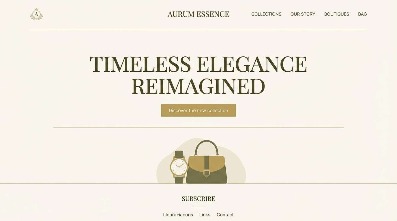
10) Gold Rush Minimal
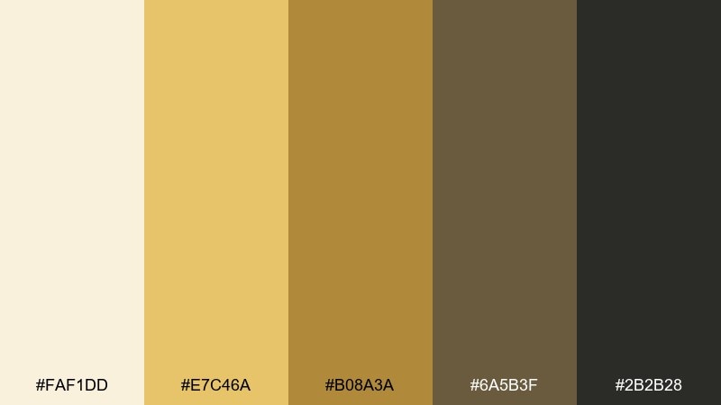
HEX: #FAF1DD #E7C46A #B08A3A #6A5B3F #2B2B28
Mood: clean, premium, restrained
Best for: luxury landing pages and fintech branding
Clean gold notes on soft ivory feel premium, restrained, and modern. This wild west color scheme is a smart fit for luxury landing pages, boutique fintech branding, or any design that wants warmth without clutter. Pair with plenty of whitespace and sharp geometric layouts for a contemporary edge. Usage tip: use the darker olive-brown for body text and reserve the bright gold for micro-accents and icons.
Image example of gold rush minimal generated using media.io
11) Mesa Nightfall
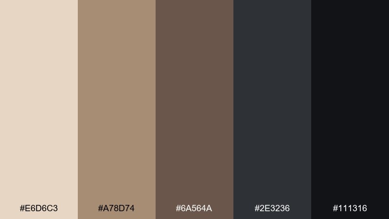
HEX: #E6D6C3 #A78D74 #6A564A #2E3236 #111316
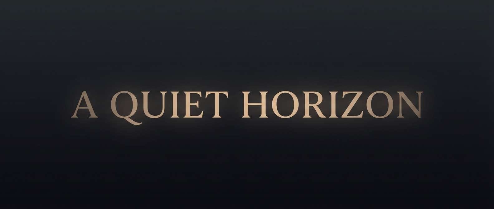
Mood: dramatic, quiet, cinematic
Best for: film title cards and moody brand photography overlays
Quiet mesa silhouettes at night bring dramatic contrast without feeling harsh. These tones work well for title cards, moody overlays, and premium photography captions. Pair with warm beige highlights to soften the charcoal and keep it human. Usage tip: apply the darkest shades as a transparent gradient so text stays readable over images.
Image example of mesa nightfall generated using media.io
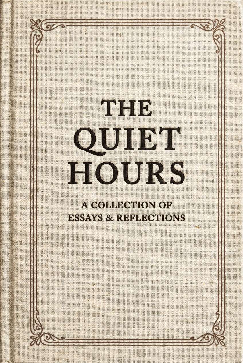
12) Tobacco and Linen

HEX: #F2E7D8 #D8C3A5 #A67C52 #6E4B2F #3A2A20
Mood: warm, classic, editorial
Best for: book covers and long-read editorial design
Warm tobacco browns and linen neutrals feel classic, calm, and editorial. They are ideal for book covers, long-form articles, and product storytelling where readability matters. Pair with serif headlines and subtle paper textures for a tactile look. Usage tip: keep the mid tan as the main background and use deep brown for headings to avoid low-contrast pages.
Image example of tobacco and linen generated using media.io
13) Adobe and Agave
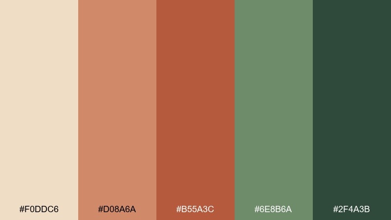
HEX: #F0DDC6 #D08A6A #B55A3C #6E8B6A #2F4A3B
Mood: sunbaked, artisanal, balanced
Best for: restaurant branding and menu systems
Sunbaked adobe reds with agave greens create a balanced, artisanal pairing. The mix is great for restaurant branding, menu systems, and food packaging that wants warmth with a fresh edge. Pair with cream space and simple iconography for easy navigation. Usage tip: use green for section labels and terracotta for highlights to guide scanning.
Image example of adobe and agave generated using media.io
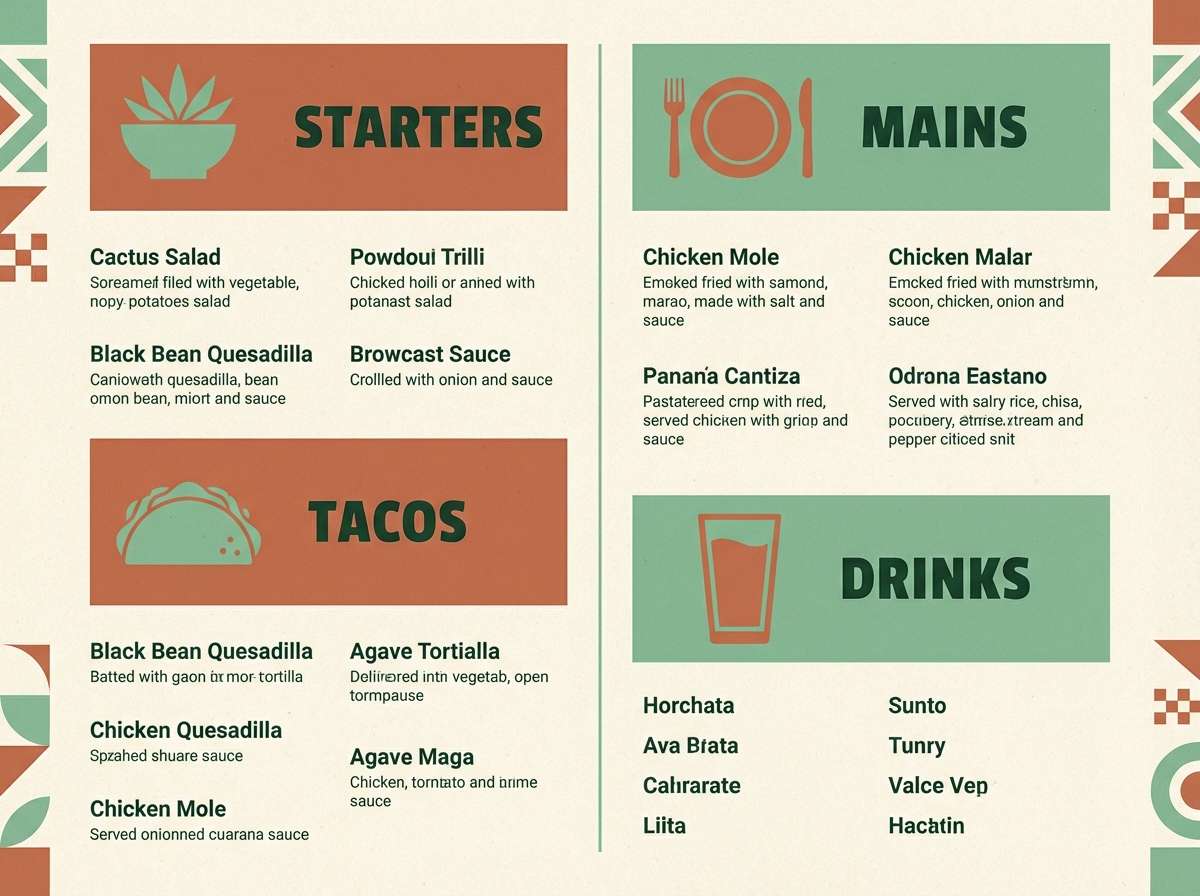
14) Bandana Red Accents
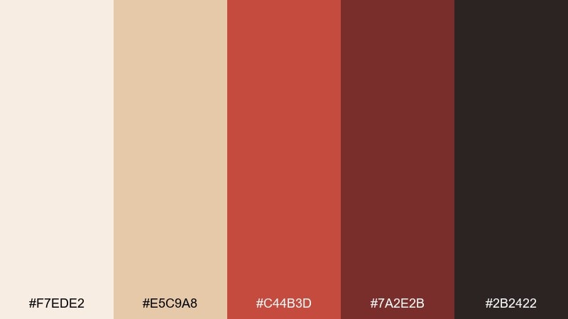
HEX: #F7EDE2 #E5C9A8 #C44B3D #7A2E2B #2B2422
Mood: confident, rustic, punchy
Best for: sale banners and western-themed campaign ads
Confident bandana red with dusty neutrals feels rustic yet punchy. These wild west color combinations work well for campaign ads, sale banners, and bold call-to-action sections. Pair with cream backgrounds and simple shapes so the red reads as intentional, not loud. Usage tip: limit red to buttons and key numbers, and keep body text in the dark charcoal-brown.
Image example of bandana red accents generated using media.io
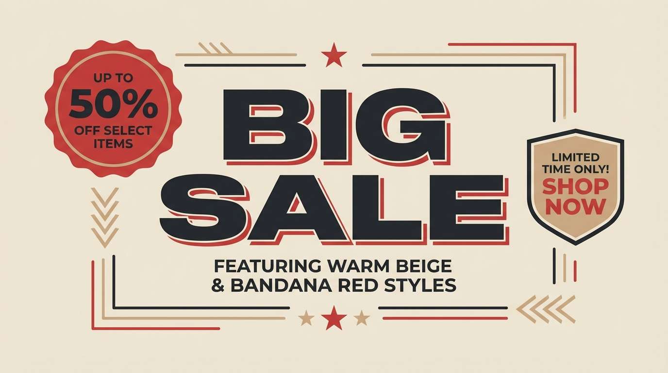
15) Spur and Silver
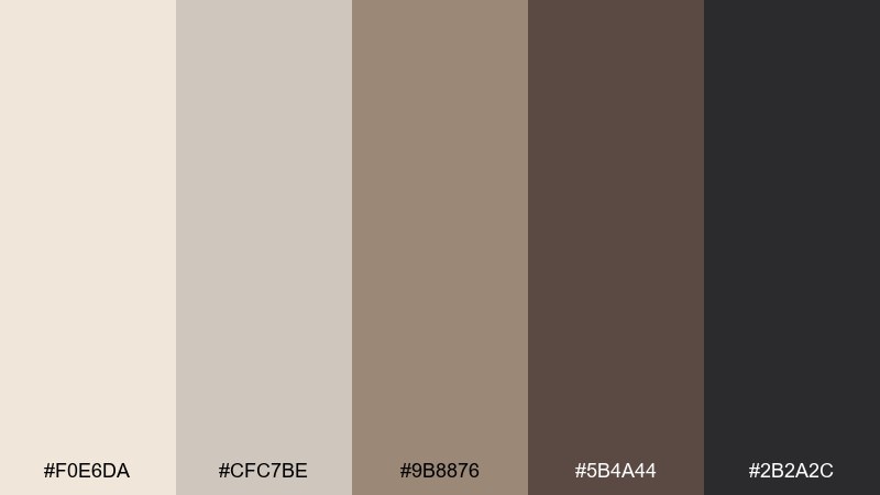
HEX: #F0E6DA #CFC7BE #9B8876 #5B4A44 #2B2A2C
Mood: refined, neutral, industrial
Best for: tool branding and monochrome UI components
Refined neutrals with a silvered edge evoke worn metal, spurs, and polished hardware. This wild west color palette fits tool branding, monochrome UI components, and product catalogs that need a tough-but-clean look. Pair with high-contrast photography and thin lines to emphasize precision. Usage tip: use the mid taupe for surfaces and keep the darkest shade for icons and dividers.
Image example of spur and silver generated using media.io
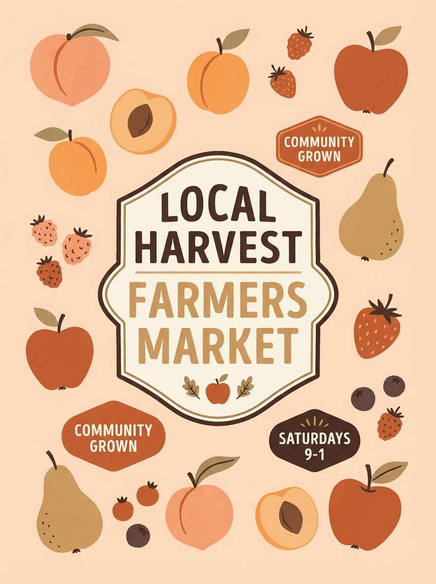
16) Sunbaked Orchard
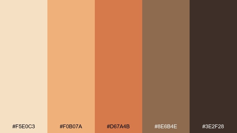
HEX: #F5E0C3 #F0B07A #D67A4B #8E6B4E #3E2F28
Mood: wholesome, warm, nostalgic
Best for: farmers market posters and food label design
Wholesome fruit skins and sunbaked wood tones create a warm, nostalgic mood. It is a strong choice for farmers market posters, food labels, and recipe cards where warmth sells the story. Pair with hand-drawn illustrations and simple badges to keep it approachable. Usage tip: keep the peach tone for highlights and use the deep brown sparingly for borders and type.
Image example of sunbaked orchard generated using media.io
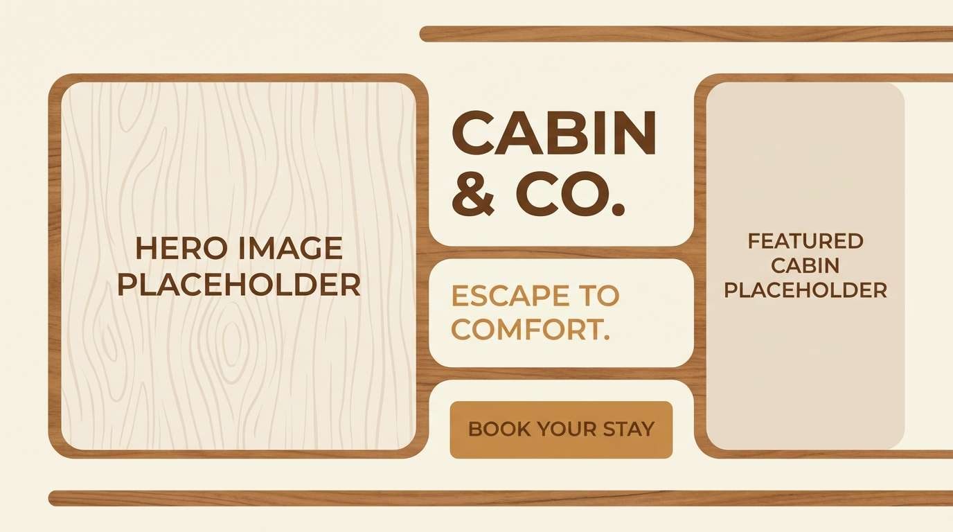
17) Frontier Cabin Cozy
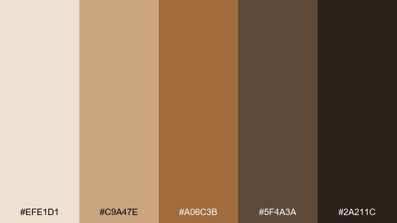
HEX: #EFE1D1 #C9A47E #A06C3B #5F4A3A #2A211C
Mood: cozy, rustic, inviting
Best for: cabin rental listings and travel blog headers
Cozy cabin light and worn wood grain make this mix feel inviting and rustic. It is ideal for rental listings, travel blog headers, and outdoor hospitality branding that wants warmth over gloss. Pair with cream overlays and large lifestyle photos for an easy, friendly vibe. Usage tip: use the mid caramel as a highlight color for icons and review badges.
Image example of frontier cabin cozy generated using media.io
18) Dust Storm Grays
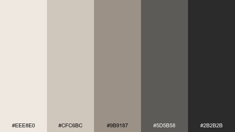
HEX: #EEE8E0 #CFC6BC #9B9187 #5D5B58 #2B2B2B
Mood: minimal, calm, modern
Best for: portfolio sites and typographic posters
Minimal dust-storm grays feel calm, modern, and quietly confident. This wild west color palette is a great foundation for portfolios and typographic posters where content should lead. Pair with one warm accent from your brand system if you need extra energy. Usage tip: keep backgrounds light and use the near-black for headlines to maintain a crisp hierarchy.
Image example of dust storm grays generated using media.io
19) Stagecoach Signboard
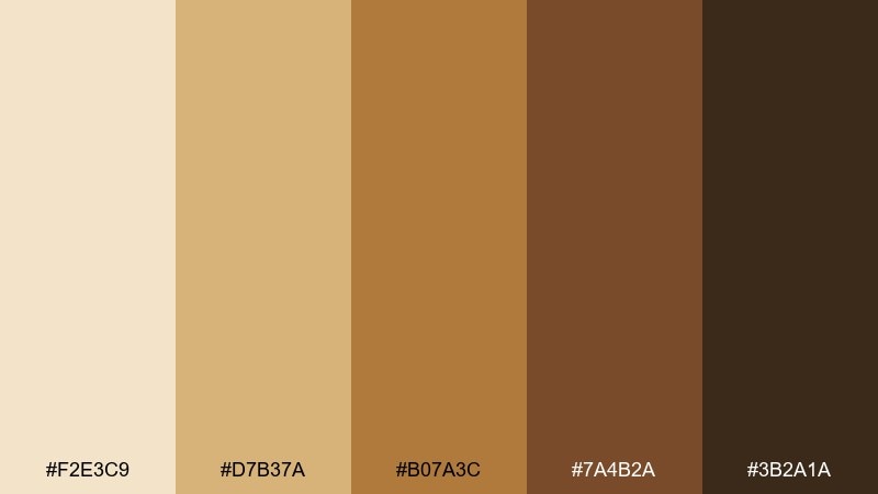
HEX: #F2E3C9 #D7B37A #B07A3C #7A4B2A #3B2A1A
Mood: vintage, sturdy, handcrafted
Best for: shop signage and logo lockups
Vintage signboard warmth and sturdy wood tones give a handcrafted look. It works well for shop signage, logo lockups, and badge-style marks that need to feel established. Pair with border frames, stars, or rope motifs if you want a classic storefront vibe. Usage tip: print the mid gold-brown as the main fill and outline it with the darkest brown for extra legibility.
Image example of stagecoach signboard generated using media.io
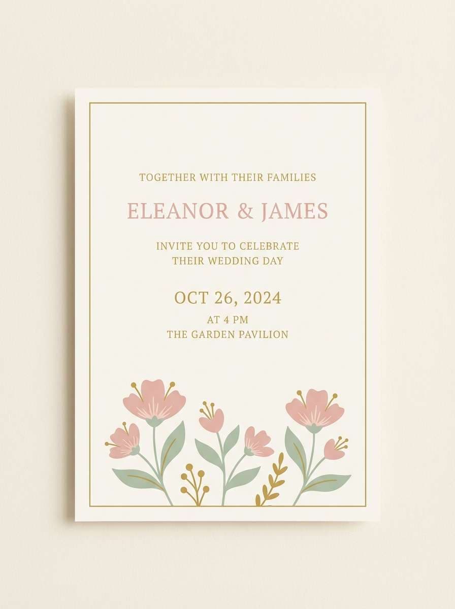
20) Wildflower Range
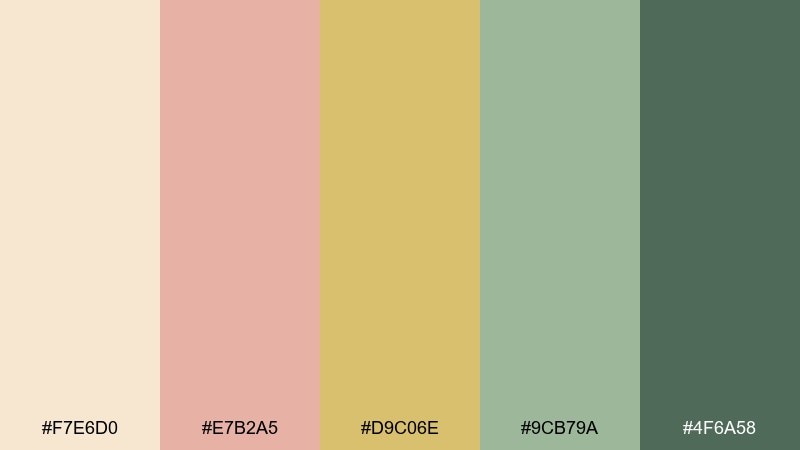
HEX: #F7E6D0 #E7B2A5 #D9C06E #9CB79A #4F6A58
Mood: cheerful, airy, romantic
Best for: wedding invitations and spring announcements
Cheerful wildflowers and open-range skies give this palette an airy, romantic lift. It is a lovely choice for wedding invitations, spring announcements, and boutique stationery. Pair with delicate serif type and watercolor florals to keep everything soft. Usage tip: let cream stay dominant and use green for stems and supporting details so the pink stays elegant.
Image example of wildflower range generated using media.io
21) Copper Creek Contrast
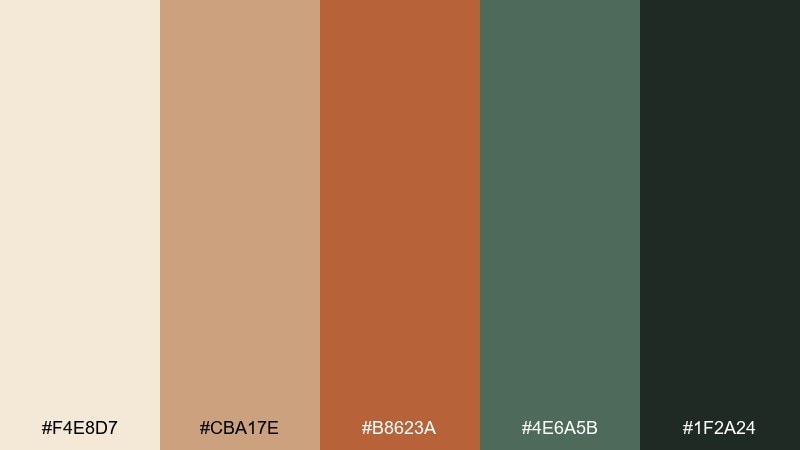
HEX: #F4E8D7 #CBA17E #B8623A #4E6A5B #1F2A24
Mood: bold, outdoorsy, balanced
Best for: outdoor gear product ads and banner ads
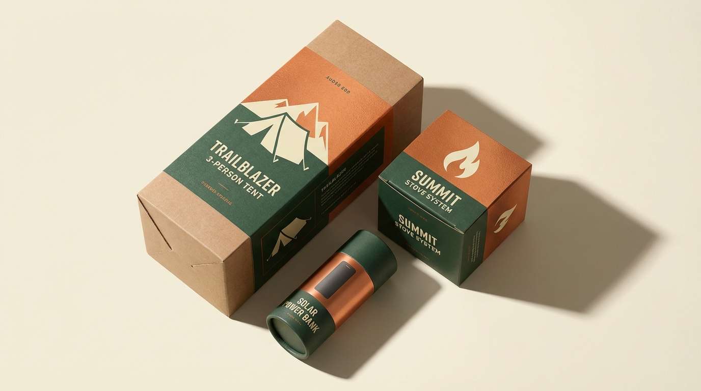
Bold copper warmth against deep forest green feels outdoorsy and balanced. This wild west color palette is ideal for outdoor gear ads, hero banners, and product cards that need clear hierarchy. Pair with crisp cream space and strong sans-serif type for a modern edge. Usage tip: use copper for the call-to-action and keep the darkest green for pricing and specs.
Image example of copper creek contrast generated using media.io
What Colors Go Well with Wild West?
Wild west colors pair best with warm neutrals (ivory, sand, linen, taupe) because they mimic paper, dust, and sun-bleached materials. Those backgrounds also make darker browns and charcoal text highly readable.
For accents, lean into terracotta, adobe red, brass gold, and sunset orange to add “story” and highlight key elements. If you want a fresher twist, sage and agave greens balance the heat without breaking the western vibe.
To modernize the look, add cool counterpoints like denim blue or spur-silver grays. This keeps the palette from feeling too vintage while still staying rugged and grounded.
How to Use a Wild West Color Palette in Real Designs
Start with a neutral base (cream, sand, or light gray) and pick one dominant “material” color like leather brown, tobacco, or dune beige. This creates a stable foundation that works across UI surfaces, packaging, or page backgrounds.
Then choose one accent for hierarchy: brass gold for premium highlights, bandana red for calls to action, or terracotta for warm emphasis. Keep the darkest shade for type, icons, borders, and small details to protect contrast.
Finally, reinforce the theme with texture and type choices—uncoated paper, subtle grain, stamp-style icons, slab serifs, or condensed display fonts. The palette will feel more authentic when the styling matches the colors.
Create Wild West Palette Visuals with AI
If you need fast mockups for posters, menus, product labels, or landing pages, generate wild west-themed visuals from a prompt and then fine-tune the colors to match your HEX palette. This is especially useful for exploring multiple moods (cozy, cinematic, minimal, or festive) before committing.
With Media.io, you can create image examples that match western tones like sand, leather, sage, brass, and sunset—then reuse them across social posts, ads, and brand presentations.
Try describing the design format (menu, poster, UI, label), set the dominant colors, and include a clean background so your palette stays the hero.
Wild West Color Palette FAQs
-
What are the most common wild west colors?
Most wild west color palettes are built from sand/ivory neutrals, leather and tobacco browns, terracotta or adobe reds, sage/agave greens, and near-black charcoal for contrast. -
Is a wild west color palette good for modern UI design?
Yes. Use light sand or linen as the main background, keep buttons in deep green or dark brown, and add brass gold or terracotta as restrained accents for a modern-but-rugged interface. -
How do I keep western colors from looking too dark or muddy?
Increase the amount of warm whitespace (cream/ivory), limit the number of mid-browns used together, and reserve near-black for typography only. One strong accent (gold, red, or copper) also helps separate elements. -
What’s a good wild west palette for branding and packaging?
Leather-forward neutrals like Dusty Saddle Neutrals or Whiskey Barrel Browns work well for heritage branding, labels, and packaging because they feel tactile and premium while staying readable. -
What’s the best palette here for posters and flyers?
Desert Sunset Trails and Rodeo Poster Punch are strong for posters because they deliver bold warmth and fast hierarchy, especially when paired with cream backgrounds and high-contrast type. -
Can wild west colors work for weddings or invitations?
Yes. Softer sets like Wildflower Range or Cactus Bloom Pastels keep the western mood but feel airy and romantic, especially with cream stock and delicate serif typography. -
How can I generate wild west palette visuals quickly?
Use Media.io text-to-image: describe the design type (menu, label, poster, UI), specify the dominant colors, and request a clean background. Then iterate prompts until the visuals match your HEX palette.


